
Click to enlarge
What you see above is a spreadsheet showing the year-by-year facemask color progression for each NFL team since 1974, which is when the Chargers and KC became the first teams to deviate from the then-standard grey. The numbers across the top are the years, from 1974 to 2021, and the sequence of the teams in the left-hand column is based on when each team adopted a non-grey facemask (so the Chargers and KC are first, and the teams that still wear grey are last). The row for the Titans includes the years that the franchise played as the Oilers.
The lower chart shows how many teams wore a particular color in a season. The number in red above each year is the number of NFL teams that season.
The spreadsheet (which you can see in its native state here) was created by longtime Uni Watch reader Lee Stokes, who also provided a summary of his findings:
I didn’t include alternate or throwback facemasks — just the teams’ primary masks. The colors are not exact matches to the on-field masks but are the best representations my spreadsheet would allow. For the Seahawks, for example, you can see (I hope) that they’ve worn three different shades of blue.
Also, I categorized silver/chrome masks separately from grey (for example, the Lions wore grey from 1974-83 and chrome from 2017-21), although those two color designations on the spreadsheet look very similar.
Some observations:
• After the Chargers and KC, the next teams to abandon grey masks were the Giants and Browns in 1975 — two teams generally considered “old-school.” Both subsequently returned to grey (although the Browns then switched again, to brown).
• The Chiefs have had the same non-grey facemask for the longest period of time — 48 seasons. The Saints (46 seasons) and Steelers (45 seasons) are next.
• Raiders, Cowboys, and Cardinals are the only teams that have never worn a non-grey facemask.
• The Panthers, Jaguars, Ravens and Texans are the only teams to have worn only one mask color for their entire existence.
• With the Bills changing to white this season, they have changed facemask color five times. That ties them with the Jets for the most changes.
• In 1974, 88.5% of teams still wore grey facemasks. By 1978, it was down to 53.6%; by 1982, 25%. The grey percentage bottomed out at 9.7% in 1999. When the Giants went back to grey in 2000, that marked the beginning of a slight grey uptick: Four teams wore grey that year; by 2011 that number was up to eight.
That’s some good work there by Lee — my thanks to him for sharing it with us.
Click to enlarge
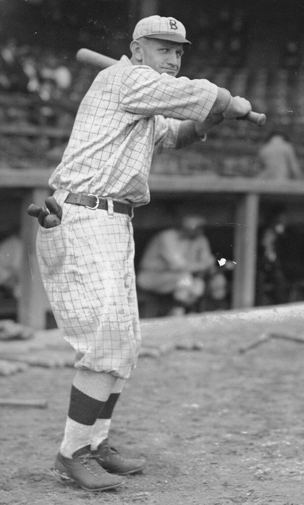
Casey at the bat: So much to like in this 1916 photo of Casey Stengel. The windowpane check pattern, the glove in the back pocket, the hip-positioned belt buckle — chef’s kiss!
(Big thanks to Phil for this one.)
Click to enlarge
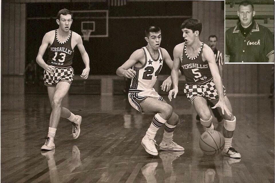
Too good for the Ticker: Love this 1966 photo showing Versailles and North Dearborn High Schools, both from Indiana. My god, those checkerboard shorts!
(Big thanks to @BallparkHunter for this one.)

Uni Watch Screening Room: I’m not sure how many Uni Watch readers are into free jazz — not too many, I’m guessing — but if you are into it, or if you just want to learn more about an important form of avant-garde music, you should definitely check out the documentary Fire Music: The Story of Free Jazz, which my brother and I saw last night.
The movie is packed with performance footage and interviews with essential geniuses like Ornette Coleman, Cecil Taylor, Sun Ra, Albert Ayler, Eric Dolphy, John Coltrane, Rashied Ali, and many more. Spectacular stuff, and some great storytelling and reminiscing. Here in New York, it’s playing at Film Forum; other cities where it’s playing are listed here.
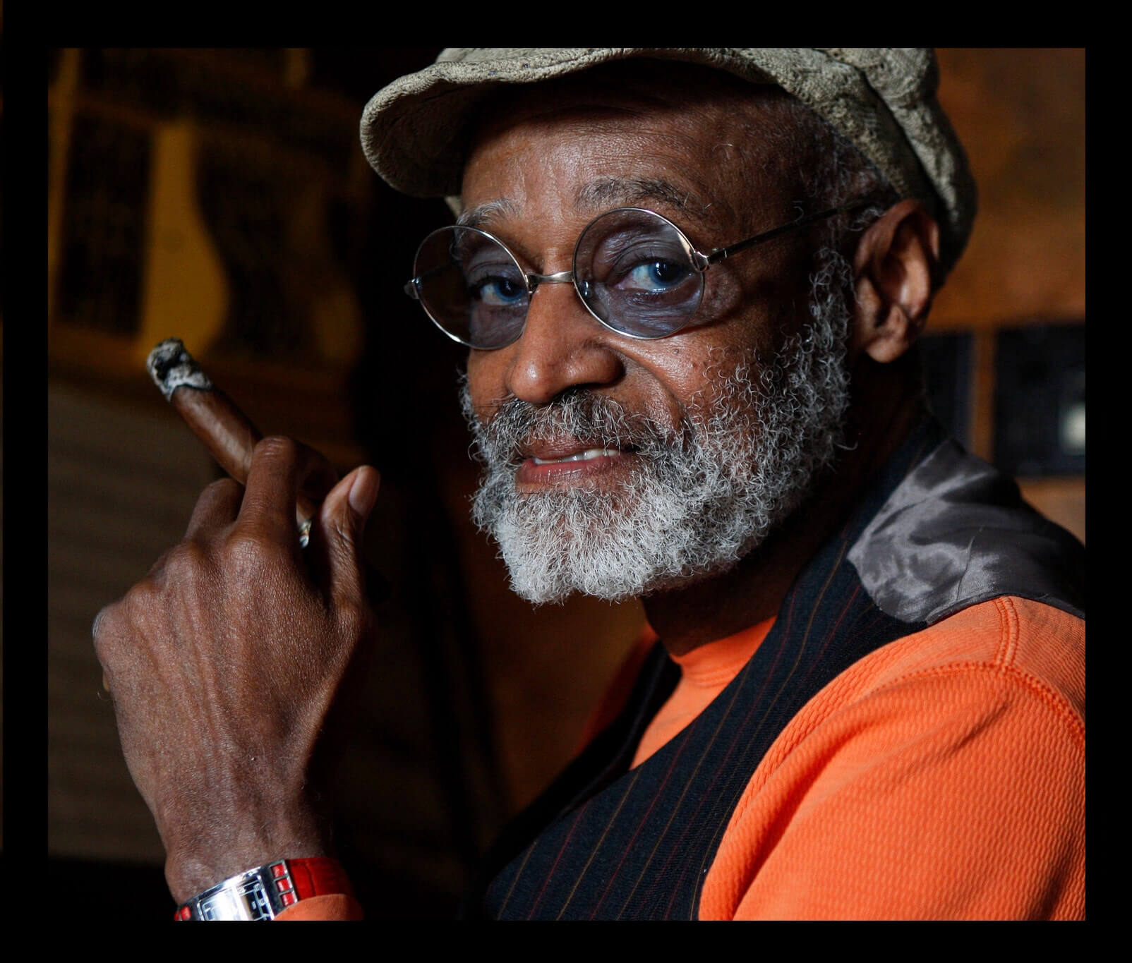
Speaking of the movies, I was sorry to see that pioneering Black filmmaker Melvin Van Peebles died yesterday. He’s best known for his 1971 hit, Sweet Sweetback’s Baadasssss Song, which demonstrated the commercial viability of Black cinema, inspired a generation of Black filmmakers, and became the template for the Blaxploitation genre (and later became the basis of the excellent biopic Baadasssss, directed by his son, Mario Van Peebles).
But Melvin was also a novelist (in English and in French!), a successful Broadway director and producer, a successful options trader (he wrote a book about it), an enthusiastic amateur astronomer, and a lot more. Much like the musicians profiled in Fire Music, he was an American original and a unique character. He’ll be missed. R.I.P.
The Ticker
By Paul
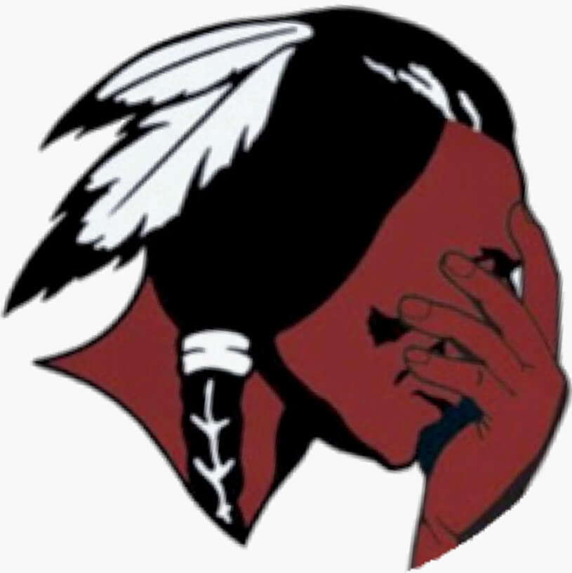
Indigenous Appropriation News: As the school board in Wilson, Pa., considers whether to change the school’s Native American headdress logo, opponents of the change say the board has presented too many options for a new logo (thanks, Phil). … Former president Trump is opposing Ohio State Senator Matt Dolan’s U.S. Senate candidacy because Dolan is the son of Cleveland MLB owner Larry Dolan, who changed the team’s name (from Mike Rosenberg).

Baseball News: The Red Sox, who’ve currently won seven in a row, including the last five while wearing their yellow CC alternates, plan to keep wearing that uniform as long as they keep winning (thanks, Phil). … Blake Noud was looking at game-used Cardinals jerseys for sale at Busch Stadium and noticed that a Yadier Molina jersey had a little Velcro placket patch. I’ve seen that before here and there — some players prefer it. … On at least two occasions in the mid-2010s, switch-hitting Dodgers C Yasmani Grandal wore the wrong-handed batting helmet. … Blue Jays slugger Vlad Guerrero Jr. is now selling his own signature bat design. … Reader Jason Margolis was donating blood at Nassau County Police HQ on Long Island (thank you, Jason!) and saw this vintage NCPD baseball uni, along with an old team portrait. Look at the flap pockets on those jackets! … This article is from last year, but once more won’t hurt: Here’s a look at MLB uni numbers by historical WAR value (from Neil Vendetti). … This story about the history of baseball in Los Angeles’s Mexican-American community includes several great old uniform photos and a chorizo ad featuring a baseball-playing cartoon pig (from Kary Klismet). … This is pretty awesome: Hall of Fame curator John Odell schooling Lindsey Berra — Yogi’s granddaughter — on what a squatchee is (big thanks to Dan Cichalski).

NFL News: Here are this this week’s uni combos for the Bills, Browns (the debut of the new throwbacks), and Titans (thanks to all who shared). … Speaking of the Titans, they used an Oilers theme on their Twitter account yesterday (thanks, Phil). … New practice jersey sponsor advertiser for the Broncos (from Zach Miller). … The Panthers have brought back their “mixed reality mascot” (from Kary Klismet). … Here’s Jason Von Stein’s weekly NFL uni-matchup extravaganza. … San Francisco subway system BART has clarified that its seat colors do not match the Seahawks’ colors (from Nick Roberts).
College and High School Football News: Boise State’s equipment staff repaired a tear in RB George Holani’s jersey with a shoelace on Saturday (from @BSUtracker). … Here are this week’s uni combos for Iowa State, Old Dominion, UNLV, Virginia, UNC, and Arizona State (thanks to all who shared). … Here’s one writer’s take on what makes a good football uniform (thanks, Phil). … Ohio State plans to install new turf next year (from Kary Klismet). … Also from Kary: Here’s a history of Notre Dame’s Shamrock Series uniforms.

Hockey News: Slight pants alteration for the Devils (from Patrick Lavery). … In a rare bit of positive arena naming news, the Panthers’ arena will not have a corporate-advertised name this season. … New goalie gear for Leafs G Petr Mrázek and Princeton women’s G Rachel McQuigge (both from John Muir).

Basketball News: The 76ers are the latest team to wear a crypto ad patch. Kudos to the author of that article for actually referring to the uni ad as an “ad.” … Speaking of the Sixers, their next alternate uniform will apparently have some 1970s details (thanks, Phil). … A Timberwolves press release misspelled the word “Timberwolves” (from Trevor Williams). … New sneakers for Louisiana Tech women’s (from James Poisso).

Soccer News: New third shirt for Scottish side Hibernian (from Ed Zelaski). … Also from Ed: Here’s an animation showing the uniform history of German side Hertha BSC. … Kansas City NWSL will start playing at Sporting KC’s stadium next year. “This is a big deal, because SKC wouldn’t let them play there initially, so they’ve been playing at a minor league baseball stadium, which is as weird as it sounds,” says our own Jamie Rathjen. “They’ve had to cover over the diamond and pitcher’s mound, so it’s really seam-y and patchy in one corner of the pitch.” … A clue on Jeopardy! this week referred to “the Blackburn Rovers.” “A Brit would never talk about the Blackburn Rovers — they’re just Blackburn Rovers,” notes Max Weintraub. … Nike-outfitted teams across Europe’s top-tier leagues have new third kits (from Kary Klismet).

Grab Bag: Not uni-related, but longtime Uni Watch pal and ace glove restorer Jimmy Lonetti, who lives in Minnesota, embarked on an epic culinary project to create his own Detroit-style Coney sauce, and documented it in this absolutely heroic Twitter thread. Highly recommended. … With the Ryder Cup taking place in Sheboygan, Wis., the European team wore cheeseheads! (Thanks, Phil.) … Here’s a comparison of a modern auto racing firesuit with one from 2000. “It should also be noted that the newer suits are much more breathable than the old ones,” says David Firestone. … New logo for car maker Volvo. … NAIA school Evangel University has changed the name of its teams from “Crusaders” to “Valor” (from Phillip Dowden).
The facemask chart is excellent!
One thing I noticed while glancing at it. The Patriots wore grey masks as their regular masks in 1993 instead of red. Was just that one season after switching to Flying Elvis and then they went to red masks in 1994.
link
Whoops, made that same comment down below before even seeing yours. You beat me to it!
I was about to make the same comment. Great spreadsheet, it’s a fantastic resource!!!
Dang, you’re (as well as others are) correct, I missed the Patriots in gray for 1993.
Lee
Seems like the author tripped himself up with a double negative here.
• Raiders, Cowboys, and Cardinals are the only teams that have never worn a non-grey facemask.
• The Panthers, Jaguars, Ravens and Texans are the only teams to have worn only one mask color for their entire existence.
If the Raiders, Cowboys and Cardinals have never worn non-gray, doesn’t that mean they’ve only worn gray, thereby canceling out the second bullet point?
Just here to pick a nit, because that’s what happens here. The check pattern in the Stengel photo looks like a windowpane to me. All of the lines appear to be the same color. A tattersall would have alternating lines of two different colors. Admittedly, it could be a trick of black and white photography.
Good call. Admittedly, I kinda wanted an excuse to use the excellent word “tattersall.”
No harm no foul. link
Whatever happened to check patterns? For a brief moment, just as pinstripes were coming into the league, checks gave pinstripes a run for the money as a uniform base pattern. Then zip. Pinstripes too almost petered out, but limped along and became normalized. Which is weird when you think about it in the abstract, without considering the decades of pure, otherwise senseless, habit. Pinstripes are just a suit/shirt fabric pattern. Not even a very common one. Tattersall or windowpane checks are more common; true plaid is probably up there with stripes. It’s a shame those patterns didn’t survive as well as banker’s stripes. I mean, just look at how great the great Casey looks up there. Baltimore, Tampa Bay, Milwaukee, the Giants would all look great with some variation on checks. Pinstripes should not be the only pattern accepted as a uniform background.
Reading this, my main takeaway is that I want R. Scott Rogers to be in charge of designing uniforms for MLB. Windowpane checks instead of absurd City Connect monotones? Yes, please!
The check pattern trend might have quickly petered out because it makes it look like the uniforms were made out of graph paper. The praise for them seems to confirm the idea that prevailing attitude among Uni-Watchers is that “anything old looks good”.
*Sigh.* Jasper, this point has been debated ad nauseum in the comments section of this website for more than fifteen years now, and your smug reassertion of it again today does not make it any more true than the countless other times in the past that it has been debunked. I like the check-patterned baseball uniforms because they are interesting, not simply because they are old. There are plenty of plain and not particularly interesting uniform designs that are old, and I have no particular affinity for them.
Are there several of us who are active on the Uni Watch website who like a lot of older designs? Sure, but that’s because many of those designs were done at a point when the primary purpose of the designs was how they looked on the field, not how they’d sell to casual consumers. Correlation is not causation. And classicism is not the same thing traditionalism.
You like the new designs? Fine. Defend them on their merits and explain what details of the design you like and why, don’t resort to ad hominem attacks and straw man arguments.
Couldn’t have said any of this better myself, Kary.
Jasper, you know better. Now *be* better.
Thanks.
I really don’t see how my comment is particularly objectionable. Of course whether or not any individual likes any particular design is totally subjective. I’m just noting that between Paul and the other UW writers and the comments that readers make, there is a very strong pattern of newer or more nontraditional designs getting negative marks while throwbacks and photos of uniforms from the past tend to be reviewed favorably.
I think what this points to is that nostalgia probably plays a stronger role in our collective views on athletics aesthetics than most want to admit. There’s nothing wrong with this but I think it’s an interesting aspect of why sports fan often form a strong emotional bond to team uniforms and are quick to react strongly when a team moves away from a traditional look.
What you just posted is a lot different than what you originally posted (i.e., that the prevailing attitude among Uni-Watchers is that “anything old looks good”).
Moreover, while it’s easy to chalk everything up to nostalgia, you’re conveniently ignoring a frequently cited *reason* for the old/new split, namely that older uniforms were created to look good as uniforms, while newer ones are created primarily to be sold as lifestyle merchandise. That doesn’t automatically make newer designs worse than older ones, but it may help explain *why* so many of us find so many newer designs to be lacking. For you to ignore that while simply citing “nostalgia” is serious gap in your analysis; for you to go further by suggesting that people just like anything old because it’s old is insulting. Please don’t do that again. Thanks.
Looking at the spreadsheet and Gridiron Uniform database, the Broncos also switched to white face masks in 1974.
The chart indicates Broncos wearing white facemasks in 1974, along with the Chiefs, and Chargers with yellow.
Lee
I was also confused by this, not because of the chart because that shows the Broncos wearing white in 1974, but Paul wrote that the Chiefs and Chargers were first starting in 1974 without mentioning the Broncos and Paul also included your observation in the article Lee that said:
After the Chargers and KC, the next teams to abandon grey masks were the Giants and Browns in 1975 — two teams generally considered “old-school.” Both subsequently returned to grey (although the Browns then switched again, to brown).
Ahhh gotcha, makes sense for the confusion. My bad on the wording.
Lee
The Red Sox are a disgrace for abandoning home whites. Probably due to Alex Cora trying to “be cool” to his players and letting them wear weird colors.. I hope Cora gets fired in favor of an old school manager.
Harsh, dude.
Love the face mask information.
Thank you for sharing Paul.
Man, I wish I would have known about the Browns wearing their throwbacks.
I’m surprised they waited so long to let people know this info.
So this facemask chart is up my alley in just the best way and I love it to death…
…but I think the Seahawks may have only had 2 different shades of blue for their masks, because I think their current blue and their previous blue are the same.
link
link
Obviously the helmets are different blues, but I think the masks are the same shade.
Also the Patriots went ‘back’ to gray for a single season when they first switched to the Flying Elvis: 1993
link
The Seahawks sure have had an interesting helmet history.
With the newer helmet colors it does make it hard to determine the facemask shades.
You may be correct.
I will see if I can get a definitive answer somehow.
Thanks!
Lee
Patriots had gray masks in 1993, first year of Flying Elvii:
link
Good stuff, Lee!
I always thought the Vikings wore white masks for a much longer period (well through through the ’80s)…I was surprised by the fact that they were ditched after just 5 seasons. Thanks!
Got a typo on Rashied Ali, btw.
Count me as a reader very into free jazz. I am also into game music in the vein of John Zorn, fwiw. Glad to know that others have these intersecting interests.
Typo fixed. And you’ll definitely love the movie!
Thanks, Paul! Will try to check it out!
Couple notes on the spreadsheet that confused me:
Broncos appear to be white in 74?
Cowboys and Raiders began in ’60. If grey was standard until ’74, would they not be included in franchises who only wore one color ever? Cardinals nominally would be included as well, however they did not always wear facemasks.
Amazing work, nonetheless!
Within the notes, I did specify “Raiders, Cowboys, and Cardinals are the only teams that have never worn a non-grey facemask.”
I suppose that would include them as franchises who only wore one color ever?
For clarification, the chart starts at 1974, nothing prior is included.
Lee
Love the Casey Stengel photo. 26 years old there. Never get over how much more “mature” people from that era look compared to today.
As much as I liked the Stengel photo, this Cleveland baseball fan equally disliked the story on Matt Dolan, the owner’s son, running for Senate. The comments on his website about cancel culture sure leave the impression that they only changed the team name because they were forced to and not because they realized it was time to (which is what they’ve said publicly).
Saw the news of Melvin Van Peebles passing this morning. I was telling my son a few weeks ago about the movie Watermelon Man, so strange to hear it mentioned today as one of MVP’s first films…RIP.
MLS club Sporting KC also played their games at the same baseball field while Children’s Mercy Park was under construction. It was a weird setup and had some really tight areas for corner kicks. The two stadiums are only a couple of blocks away from each other so I guess it’s a relatively seamless transition?
Oh. My. God. The Detroit Coney Twitter thread. Now I’m starving.
Nice work, Lee! What a great reference for uni-watchers!
And it’s Coltraine’s birthday today.
I wish the KC would go with a yellow facemask. I hate that their helmets are completely yellowless. Does not fit the rest of the kit.
I wish the Niners would switch to gold masks like UCLA. I think that’s a pretty sharp look, and I don’t like gray and gold together.
Gray masks on the Cardinals is ridiculous with that uni.
Gray perfectly suits the Indy’s getup.
Yes, the Cardinals should have had their olde-timey helmet license revoked when they modernized.
Since the sun set on the USFL and the Stars, I’ve wanted the 49ers to go with a white mask. Always liked their gold/white combo.
Red helmet/yellow mask is best left to DC (hope they retain that once they settle on a new name), and I would like the Colts to go back to blue masks.
High school basketball? #13 is clearly at least 30!
The North Vernon player has a bald spot – or just a really bad haircut. Sadly neither high school still exists.
Am I alone in my belief that almost all helmets, with a few notable exceptions, would look better with gray facemasks?
I am the opposite. All helmets would look better with a colored facemask.
If I was in charge, gray/silver/chrome/etc colored facemasks would be officially banned.
Alas, I’m not in charge.
Lee
I’m with you Lee! (All helmets would look better with a colored facemask)
The only exception would be if your teams *official* colors include grey.
+1
Great info on the facemask history Lee.
I will never understand why the Cardinals have so stubbornly stuck with grey facemask all these years. It’s why they are my #1 NFL team in need of a complete uniform overhaul. Just start over from scratch.
Free jazz is a genre of music I know little about and have probably never listened to (at least not knowingly). Sounds like a project to embark on. Thanks for the idea!
Spinal Tap experimented with free jazz for a short time in their careers. It did not go over well with the “festival audience”.
I love the facemask chart. My one very minor suggestion would be that for the teams that did not exist yet in ’74, that the boxes prior to their creation be something other than a white box. Perhaps an X, or something, to differentiate it from the teams that wore a white facemask.
Thanks so much for the facemask chart! I’ve been keeping that all in my head since 1979!
Good on you Jimmy Lonetti for using beef heart in your recipe! I think it gives the sauce a bit of hardiness (heartiness?). But if you’re going to use Koegel you should try a Flint-style coney. Less saucier, almost a loose meat topping.