Good morning, and happy autumnal equinox! Autumn is my favorite season and “autumnal” is my favorite adjective (I like how the silent “n” suddenly gains a voice), so I count this as a Very Good Day.
Now then: One of MLB’s lesser-known initiatives is something called Fans at Bat, an program in which fans can register to offer feedback via online surveys. Fans at Bat participants are asked about things like their experiences at the ballpark, health and safety protocols — and, sometimes, uniforms.
The other day I heard from a Fans at Bat participant who had just been sent a new survey. It began like so:
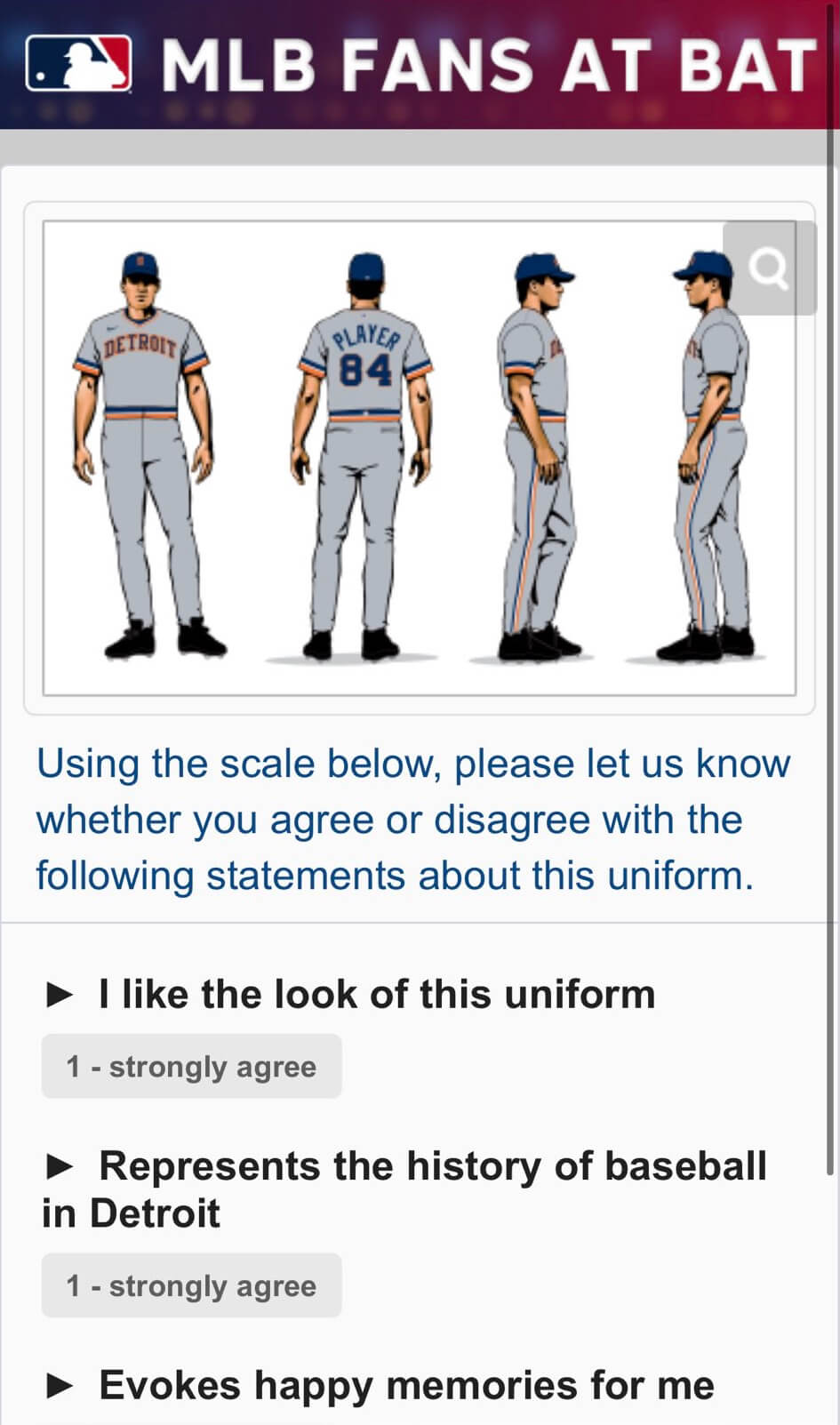
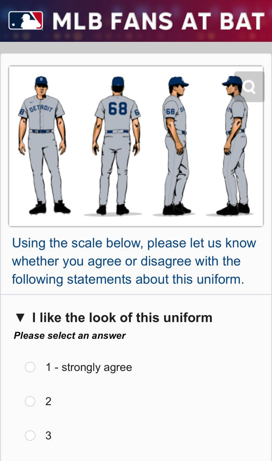
The survey then offered views of several different throwback uniforms. The first two were road designs keyed to the Tigers’ last two championships — 1984 and 1968:
Next was a Detroit Stars design from the Negro Leagues:
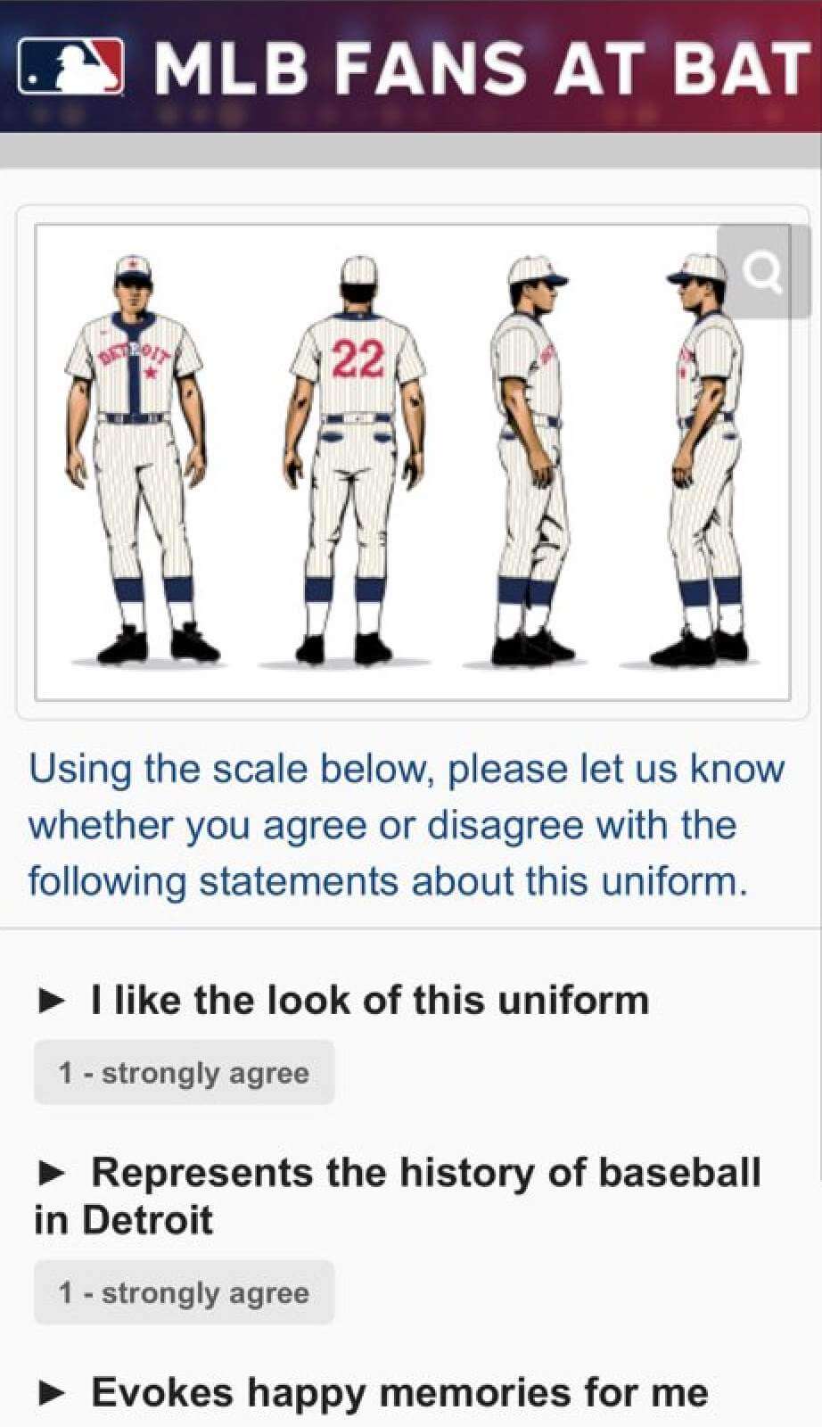
My source, who prefers to remain anonymous, says there were two other designs that he didn’t get screen shots of: a road version of the Stars set and a uniform that he initially described as “a navy blue jersey with a white old English ‘D’ and white pants.”
When I heard this, I thought to myself, “Wow — they’re bringing back the one-day Sunday alternate from 1995!” But when I asked my source if that’s what he meant, he said it was just a plain navy jersey with a plain white “D” (no orange trim, no tiger walking through the “D”) — more like this recent spring training design:

———
Okay, so that’s as much as we know. It’s not clear what the timeline would be for any of these being added to the Tigers’ uni set, but they clearly have something cooking. Aside from that ill-fated 1995 Sunday alternate, which was retired after one game, the Tigers have never had a solid-colored alternate jersey. They’ve done a fair number of throwbacks over the years, but all as one-offs — never as a full-fledged season-long alternate. So if they’re thinking about adopting any of these designs as a true alternate, that would be a major shift for them.
It’s worth noting that, according to Bill Henderson’s jersey guide, the Tigers have worn all of these designs as throwback one-offs in the past. The 1984 road design, for example, has appeared as a throwback on three previous occasions: once in 2007 and for two games in 2012. (In each case, the Tigers wore it on the road as part of another team’s throwback promotion, not on their own initiative.) They have also worn the 1968 road throwbacks on two occasions: on the road in Seattle in 2006 and at home in 2018. They’ve worn the home version of the Detroit Stars uniform many times over the years for Negro Leagues throwback games, and they wore the road version just a few months ago. So while it would be a big change for them to adopt a new full-time throwback or alternate, they’re not really breaking any new ground with the design options.
Meanwhile: I encourage everyone reading this to sign up for Fans at Bat. We need to pack that survey electorate with Uni Watch readers!
The Ticker
By Lloyd Alaban

Baseball News: A data card apparently came loose from Blue Jays C Alejandro Kirk’s wristband during a play at the plate last night, and Rays OF Kevin Kiermaier picked it up and brought it back to the Rays dugout. … Pirates LF Yoshi Tsutsugo appears to still be wearing blue socks from his time with the Rays instead of the Pirates’ black socks. The socks also have his former number, 25, instead of his new number, 32 (from Joanna Zwiep). … Nats IF Alcides Escobar (left) has his helmet logo riding higher than those of his teammates (from John Muir). … The Mets’ broadcast used the Red Sox City Connect number font when showing Boston’s lineup last night (from Shane Bua). … Former Astros Jeff Bagwell and Craig Biggio received Houston Sports Hall of Fame rings. Inside the rings are tributes to the late Ken Caminiti (No. 11) and Darryl Kile (No. 57) (from Ignacio Salazar). … The El Paso Chihuahuas, affiliate of the Padres, unveiled Loteria-themed jerseys (from our own Phil Hecken). … Six years after the Huntsville Stars of the old Double-A Southern League left for Biloxi, Miss., the city is renovating their abandoned ballpark into a new multi-use stadium (from Kary Klismet).

Football News: Mono-white for the Bengals this week (from our own Phil Hecken). … The Raiders have added a display in their stadium featuring 96 Nevada high school football helmets (from Brian Catlett). … Not a great photo, but here’s an old Browns basketball uni, as worn by the late Ernie Davis (from Jerry Wolper). … A mannequin at the NFL offices in New York shows the Buccaneers’ current jersey over their old pants (from @McGirtsBurner). … BYU has unveiled a new navy turnover belt (from Kary Klismet).

Hockey News: Flyers G Martin Jones’s new mask shows the team’s retired numbers inside the logos running along the backplate (from @kodywiddak). … The Coyotes have released renderings of their proposed new arena in Tempe (from Kary Klismet). … Also from Kary: Colorado College has opened the doors to its newly completed arena. … Here’s a video of the Abbotsford Canucks, affiliates of Vancouver, placing their inaugural logo at center ice (from Wade Heidt). … The Rochester Americans of the AHL added the city’s logo to their home ice red line (from Mike Weston).

Basketball News: Numerologist Etienne Catalan has the latest NBA uni number assignments. … New unis for Saginaw Valley State University (from our own Phil Hecken).

Soccer News: There’s going to be a new USL Super League, which is to be the women’s equivalent of the USL Championship. It has a logo in the same style as the other USL leagues (from our own Jamie Rathjen). … Burnley wore shirts with Alzheimer’s Society ads on them yesterday (from Mark Coale). … New shirts for Shamrock Rovers AFC of Ireland’s Wexford Football League (from Kary Klismet). … A CBS Sports graphic included Louisville City FC in their announcement of the expanded Leagues Cup. The problem is Louisville City plays in the USL Championship and is not eligible for the Leagues Cup (from Adam Franz).

Grab Bag: New logo for the NASCAR Xfinity Series (from Dell Michaels). … New kits for France’s national rugby union teams (from Sy Hart). … New unis for the Albany FireWolves of the National Lacrosse League (from Wade Heidt). … Golfer Justin Thomas revealed America-themed golf shoes for the Ryder Cup (from Griffin Smith). … Salford Red Devils, an English rugby league side in the Super League, have a new mascot (from Kary Klismet). … Also from Kary: New marching band uniforms for the University of Nebraska at Kearney. … The U.S. Space Force unveiled prototype dress uniforms (from many readers). … New patches for the California City Police Department (from Timmy Donahue). … The Olympia Theatre in Dublin, Ireland, has sold its name, and people are angry about it (from Scott Turner).
For the Bucs item in the ticker (link), it also appears that the mannequins are arranged in alphabetical order for their location, but the Chargers and Rams are still in their San Diego and St. Louis positions, respectively.
Hard to be 100% sure but looks like the Raiders are in their Oakland position too.
Doesn’t seem “hard to tell” to me! Oakland is in between New York (Jets) and Philadelphia alphabetically but Las Vegas is not
From one side, Justin Thomas’s shoes say “We the people” in script on parchment. From the other side, they show Uncle Sam pointing and shouting “Me.” Perhaps the most truly America-themed shoes ever.
I signed right up (knowing full well I will get so much spam and they won’t consider my opinion because of my age) for Fans At Bat, just to have the remote chance of being given some input on a Tigers throwback. While they’re at it, the home uniform they’ve had most of their existence (with the different D than on the cap – the one they switched away from a couple years ago to sell more merch) could now be considered a throwback. Unless they bring it back. BRING. IT. BACK.
i always like the jersey D better than the cap D and i wish they’d bring it back as well. the tigers don’t change things too much (kinda like the giants, they are always tinkering with alternates and such but the main unis largely stay the same for decades at a time) so not much to look at or consider here, other than the negro leagues uni, which, aside from having historical significance, and being a unique look, hasn’t aged well in terms of design, its just a little too old fashioned and clunky to me as a regular rotation jersey (looks good in small doses). they had some pullover jerseys a long time ago with the old jersey D outlined in orange and orange and white trim that i really liked aside from them being mesh practice style jerseys.
the tigers aren’t a team that should consider a wholesale redesign or reworking, and looking to these mostly bland and uninteresting throwbacks is no way to find inspiration for a CC jersey, or even a new alternate. generally i am not interested in alternate jerseys that dont particularly stand out against the normal home/away set. when i say stand out that could be something like the jazz red/yellow gradient uni that’s screaming DIFFERENT, or it could be something as simple as one or two tweaks that make a jersey significantly more attractive like dropping or adding an outline to the word mark. but the tigers uni set it pretty no frills and straight forward currently and historically, so adding another uniform that recreates or in inspired by one of these isn’t going to do much for th uni-verse, particularly given how ineffectual the tigers are as a team at the moment, its not like all eyes are on them to notice something like this. i say go bigger or leave it alone.
The reason the Tigers gave back in 2018 for changing from the round-top D to the pointy D on the uniform was that manufacturers were being inconsistent with the designs themselves. Standardizing to one design would correct that. As if anybody noticed! So maybe they saved a few bucks on production of merch, but the only real way to sell more is to have a good team!
As far as the road uniform, like you, I am old so they won’t care about my opinion. Of course I like the 1984 uniform. Winning the WS in steamroller fashion will do that. But the current version is fine, too. As long as there are no shenanigans like BFBS and it says “Detroit” and nothing else, go nuts.
“A mannequin at the NFL offices in New York shows the Buccaneers’ current jersey over their old pants.”
Same thing with the Rams.
white pants with a thick blue stripe.
They don’t have those anymore.
Re: Detroit.
Keep the homa uniform. It ain’t broke.
As for the roadie: Make it a gray uniform with navy piping and use the “D” that was used in the mid-90s with the tiger crawling through the Olde English D.
Problem is, they “broke” it two years ago when they went to the cap D on the jersey. That broke 80+ yrs of tradition of the mismatched olde English D’s.
I signed up for Fans at Bat and took the Tigers uniform survey. I wish there would have been a place to provide written feedback. The question about if each uniform represents the history of baseball in Detroit makes me think they might be looking for input on a possible city connect jersey instead of a new away jersey. The only thing I don’t want to see is a navy alt.
If the expanded Leagues Cup begins play in 2023 the graphic arguably should have included St. Louis City SC’s crest, as they will begin MLS play that year and presumably would be eligible.
I’m guessing that’s where they made the mistake. I assume they got confused as to which team was being added in 2023. They also made errors on the Crew logo.
I could not stop laughing at the new space force dress unis. I thought they were for the Guardians Marching Band but, alas this is what the Guardians will wear going to work.
The brass that gets to decide these things for everyones edification, is the respective departments Uniform Board. Made up of well… you can read link.
Sounds very democratic and all that, in action, not so much. The final deciders tend to be white middle aged very conservative male types who apply their own “god knows what all” decision process to pick uniforms. This is a nice way of saying (apologies to Paul)
“Aesthetics? We don’t need no stinkin’ aesthetics!”
There is a history of bad uniform design in the last few decades in the DoD. The Army (ours) has a entire shop dedicated to making the right uniform decisions by using good research tools and techniques to get it right. The US Marines battle dress Unis (BDU’s) followed the groups recommendations and the rest is history. The US Army, Air Force and Navy did not. C’mon Navy blue BDU’s? So when the seaman falls in the water… well you can add the punchline.
One may ask why? I would say in a word, hubris.
How to fix this? Well a step in the right direction would be to follow the Uniform board process all the way through with oversight and transparency by let’s say an “Independent civilian board” made up of selected people with backgrounds in design, fashion, and sport with an understanding of “aesthetic centric” design principles. Who are willing to follow the design process all the way through to the end. Also adhere to values not driven by profit or ego and such things we have come to expect in out system. You know Serving.
I of course would nominate Paul Lucas to serve on this board. Throw in Ru Paul too. I think that we would get a great improvement in the Uniforms our warriors wear.
As an Air Force veteran, every time I see something about the Space Force, I feel like I’m being trolled by the previous administration. What’s with the Star Trek-like insignia?
And speaking of the Army, pick a uniform and stick with it. You guys are as bad as some college football teams.
I wish I had said that myself. I too am a USAF veteran.
I’m surprised they showed the entire Space Force uniform. We all know that fans only buy jerseys, not the pants.
How long until we get City (Universe?) Connect versions?
The uniforms from above the waist are nice, as are the coat color and buttons…even though the coat sorta flairs out like a dress below mid-waist.
The pants bulge weirdly. They should have been sent to a tailor to make them fit right for the unveiling.
Then again, they are just prototypes.
The Navy digi-camo unis being blue is silly, yes. But as far as these dress unis for USSF…I kinda like them? The buttons on the side are really cool, I think. A great blend of looking futuristic in certain details while still looking classic overall.
Futuristic is a good name for these…
link
The only thing missing from these Space Force prototype uniforms are the red versions for the expendable
crew membersGuardians.Maybe Cleveland will wear the alternate red versions on opening day next season. ;)
Re: the Coyotes’ new arena proposal
So Greater Phoenix has the Suns’ first arena (Veterans Memorial Coliseum), the Suns’ second arena (AmericaWest Arena, AKA USAirways Arena, AKA Talking Stick Resort Arena, AKA Footprint Center, built 1992), the Coyotes’ current arena (currently Gila River Arena, built 2003), and now the area needs a FOURTH indoor stadium? And this does not count Arizona State’s home gym in Tempe.
I wonder what the total cost of these last 3 venues is in 2021 dollars. What a waste.
If you have been in Veteran’s Memorial recently… wooof.
They tried AWA for the Coyotes, the site lines were awful.
Coyotes Arena.. well we all know the story there.
ASU Activity Center seats 14,000 and is a college venue through and through. It is slightly better than the Madhouse, but just slightly.
An arena would (probably) be built if the Yotes moved, so what is wrong with them trying to stay in the Phoenix area and actually attempting to make the game day experience more approachable and centrally located? I know there were plenty of times that I was not going to drive 40 miles from Chandler to go see a hockey game on a weeknight.
Coyotes Arena.. well we all know the story there.
Actually, I don’t know it all that well. All I know is that there’s a general perception that the Coyotes have been mismanaged for years, which probably contributed to decreased revenue for the arena and its owners, the City of Glendale.
I’d love some insight from a local who knows the ins and outs of the story. Was Glendale’s decision to terminate the Coyotes’ arena lease a hardline bargaining tactic that backfired? Did the city truly believe they would be better off without a major league sports tenant in their arena than with one? If so, what revenue streams do the expect to find to replace the loss of the Coyotes?
If the Coliseum is decrepit, why keep it?
I don’t know how many people outside metro Phoenix know the story about Coyotes Arena.
If the Coyotes moved, most candidate cities have arenas ready to go (Houston, Quebec City, Kansas City, Hamilton, to name 4), so an arena probably wouldn’t be built. Even cities that aren’t candidates have large arenas.
As far as location goes, if you are a fan, you go where the arena is. I live about 15 miles from Wells Fargo Center, in the second or third ring of the Philadelphia suburbs. A large portion of the Flyers fan base lives 40 miles from the stadium complex, 3 miles south of Center City, yet they manage to get to the games. If stadium location is enough to change your mind about going to a game, maybe the problem isn’t simply the stadium’s location. Meanwhile, you will potentially have 4 arenas for 2 teams. How is that not wasteful and poor planning?
I’ve been clamoring for years to have the Tigers return to those road unis. I’ve disliked the script Detroit roadies since they came out. I think the old ones would look even better as a button-front as the placket would fall better. I wouldn’t really like a navy alt (lame) and a Stars throwback would be best left as a special uni, maybe twice a year.
Re: Red Sox City Connect
Anyone have insight why New Era and other MLB retailers are selling a different hat than what the players are wearing? The “on-field” retail version has the “stencil B” while the on-field hat has the tradtional Red Sox B.
I was pleasantly surprise to see that Starter has pretty accurately developed a throwback 1986 era Mets jacket, complete with pretty accurate chenille emblem. Great for fans and, just maybe, these could make it onto the field again? The only quibble I have is the orange trim striping is a bit too thick.
link
Much like the Cowboys with their various shades of blue or Notre Dame’s various shades of gold, the charm of the Tigers for years is that the “D” on the jersey was different from the cap. I always preferred the olde english “D” on the jersey with the rounded top and softer edges. The thicker lines created a bolder look that suited the jersey well. The “D” on the cap worked well but once you enlarge that version and place it on the jersey, there is too much negative space and something about it just doesn’t feel right.