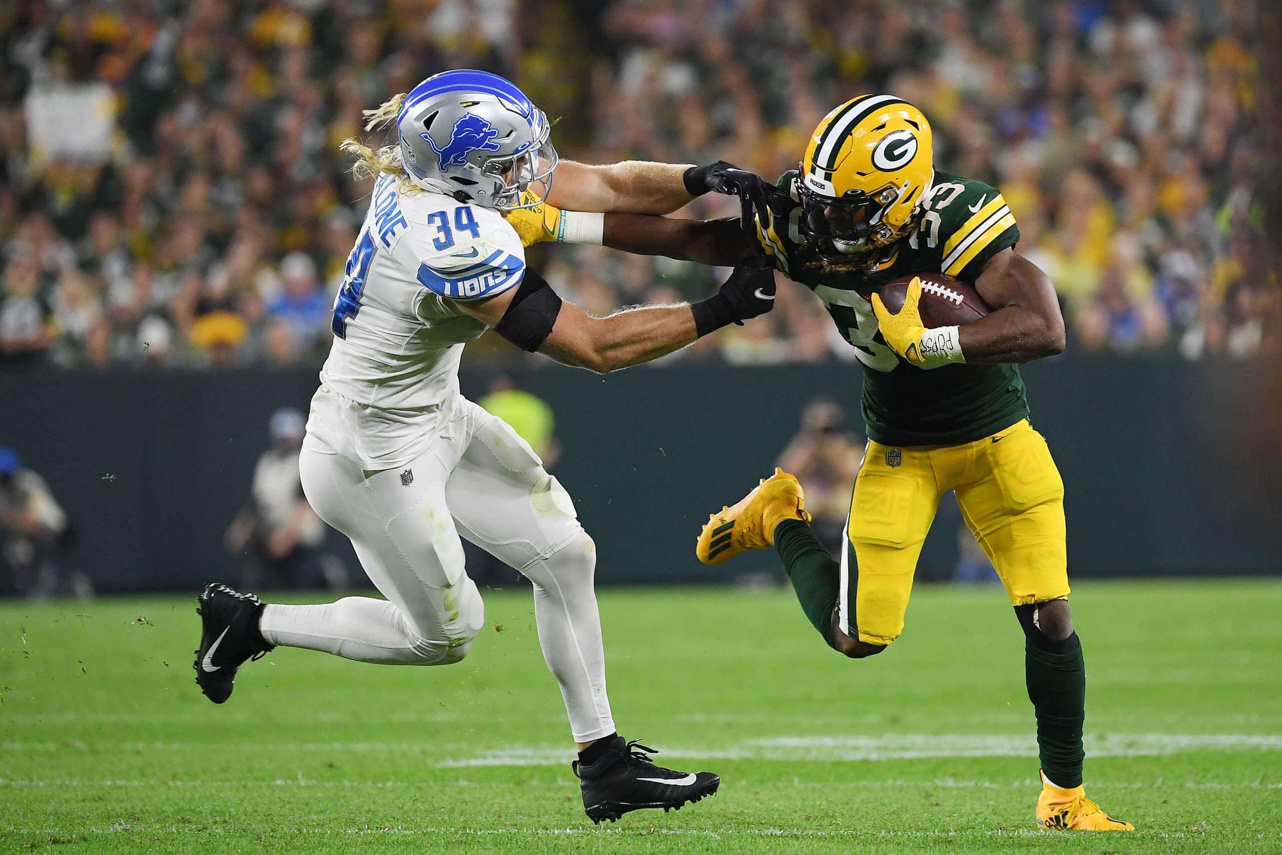
Photo by Quinn Harris/Getty Images; click to enlarge
There are few things in sports more routine and less novel than a Lions/Packers game. The two teams have been playing each other twice a year for nearly a century. But last night’s game between the two NFC North mainstays was uni-unusual on several levels.
The weirdness started yesterday morning at 8:30am Eastern, when the Lions announced via social media that they’d be wearing white pants:
#Lions will be wearing their white-on-white uniforms for tonight's road game against the Packers❕🏈
What do you think? pic.twitter.com/JnEkyol4SZ
— Detroit Lions (@Lions) September 20, 2021
As you can see, that animation featured illustrations, not photos, and it wasn’t clear how photo-realistic the illos were. For example, would the pants really be plain white, with no stripes, or was that just a bit of stylistic minimalism? And would they really be going with white facemasks, as shown in the illos, or was that another bit of stylistic license?
Either way, the Lions were clearly staking out some long-dormant aesthetic turf. According to the Gridiron Uniform Database, the team’s long uniform history includes only two previous years in which they wore white pants: 1948 (the white britches were worn four times with red jerseys and three times with black jerseys that season) and 1949 (10 times, all with the team’s now-familiar Honolulu blue, which debuted that season). Here’s a shot from that era, showing Lions receiver Bob Mann:
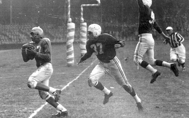
So prior to last night, the Lions hadn’t worn white pants in over seven decades, and they had never gone mono-white.
Aside from the history, it seems a bit odd that the Lions waited until gameday to announce their new pants, right? But there are no NFL rules governing how many sets of pants a team can have or how much notice they need to give regarding pant choices. Remember how the Ravens surprised everyone by wearing gold mustard pants in 2015? Or when the Browns suddenly broke out the orange pants last year? In a hopelessly regimented NFL, pants are one of the last bastions of spontaneity.
Anyway: Once the game started, we learned that the pants really were striping-free, just like in the illustrations. No white facemasks, though — the Lions stuck with their usual grey (lots of additional pics here and here):
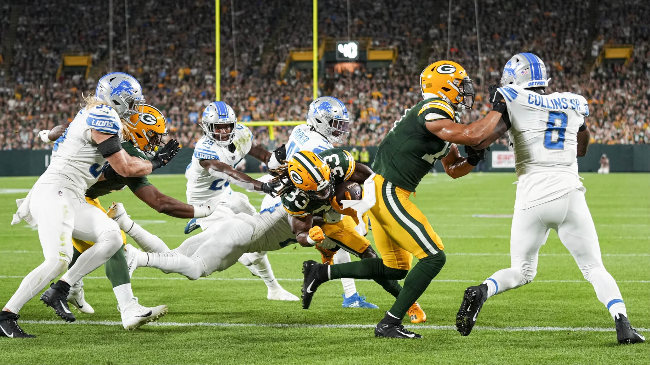
From my perspective, this was a case of “less is less.” The plain white pants were too minimalist, especially when paired with the white socks. Get some striping on the pants, some blue in the socks, and then you have a serviceable uniform — although I think they’d still be better off pairing the white jersey with the grey/silver pants or the blue pants.
I’ll say this much for Detroit’s mono-whites: At least they’re better than the mono-greys.
The question now is whether they’ll try these new white pants with the blue home jersey. From a strictly uni-based perspective, I’d say, “I hope not.” But when looking at the larger aesthetic framework, I find that Lions home games tend to look very drab because of the dome lighting and plastic turf (the Falcons and Saints have similar issues in their domes), so maybe the white pants would brighten things up a bit. I’d be willing to see them try that, just from a curiosity standpoint.
Okay, enough about the Lions — let’s talk about the Packers. As I mentioned in last week’s Monday Morning Uni Watch report, Green Bay wore a “TT” memorial decal for former GM Ted Thompson in their season opener two Sundays ago. The team made no announcement about this decal at the time (I just happened to notice its existence while looking at game photos), and I didn’t see anyone else report on it. I was wondering if maybe it was going to be just a one-game thing for the season opener.
Nope! Yesterday afternoon the Packers announced the decal’s existence, making it seem like a new thing (although not explicitly stating that):
Paying tribute to the late Ted Thompson. pic.twitter.com/O2tgjlcA6Q
— Green Bay Packers (@packers) September 20, 2021
USA Today’s packers blog basically copy/pasted the team’s tweet, reporting, “Packers to Wear Special Helmet Decal” — but not mentioning (or, probably, realizing) that it had already been worn the week before.
Last night was the Packers’ home opener, and they held a memorial for Thompson at halftime, so that helps to explain why they put special emphasis on the decal for this game. But why didn’t they even announce the decal’s existence for the previous game? When they finally announced it yesterday, why didn’t they acknowledge that they had worn it the week before? If they wanted to showcase the decal for the home opener, why not just skip it for the first game and then add it for last night’s game? It all seems a bit awkward to me.
Meanwhile, in an additional and probably unprecedented note from that game: Packers running back Aaron Jones lost his necklace — which contained his late father’s ashes!
Click to enlarge
Collector’s Corner
Follow @brinkeguthrie
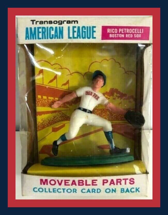
Here’s a 1969 plastic Rico Petrocelli Red Sox figure, made by Transogram. On the back of the box you got a player card, and the box says “realistic reproduction” and “interchangeable parts.” Hmmm, does that mean you could stick his leg on his shoulder?
Now for the rest of this week’s picks:
• Let’s go back 113 years (!) for this May 1908 copy of The Baseball Magazine. Just 15¢, or $1.50 a year. Nice how the artist stuck the player’s arm right between the “E” and the “B.”
• The year 1974 brought us a short-lived upstart challenger to the NFL, in the form of the World Football League. It didn’t even last two full seasons, but teams such as the Southern California Sun did push the uni design envelope, as shown on this media guide. Hot pink over orange? A worthy predecessor to “Color Rash”!
• Check out the artwork on this ticket for the 1964 World’s Championship Games (also known as the World Series) between the Yanks and the Cards, at Busch Stadium in St. Louis. Not good if detached!
• Looks like the designer kinda ran out of room for the facemask on this 1965 Green Bay Packers World’s Champion Storm King lighter.
• Wear what the Pittsburgh Penguins wore! These warm-up pants belonged to former coach Ken Schinkel, who wore them during practice sessions (and was also an original member of the team).
• Brownie, the Cleveland Browns’ mascot elf, was hard at work as a sportswriter covering a game on the front of this 1948 Browns Press-Radio Guide.
• Bucco Bruce is featured on the front of this glorious, disco-y, shiny Tampa Bay Bucs jacket from Starter.
• Here’s a money clip for the 1962 Los Angeles Angels, and it includes a drawing of Dodger Stadium (aka “Chavez Ravine”), where the Angels played from 1962-1965.
• Not sure why this 1955 Baltimore Orioles “sketch book” looks more like a program or yearbook.
• This 1989 New York Mets Collectible Team Action Puppet belongs at Uni Watch HQ, does it not?
An essential cog in the uni-verse: The Athletic Equipment Managers Association has designated this as Equipment Manager Appreciation Week — a cause that I’m happy to promote.
The reality, of course, is that for athletes who wear uniforms and fans who appreciate uniforms (to say nothing of journalists who write about uniforms), equipment managers deserve recognition every week. They help keep the players safe and looking good; they make sure all the gear is where it’s supposed to be; they react quickly to the endless churn of roster moves; they coordinate with suppliers, vendors, stitchers, and other specialists; they respond to player requests for customized gear; and a lot more.
Throughout my career, I’ve tried to shine a spotlight on the great work that equipment managers do (my recent interview with A’s equipment guy Steve Vucinich is a good example), but the reality is that I should probably do more to make people aware of the essential work that these dedicated professionals do. They are truly the unsung heroes of the uni-verse, and so much of what we enjoy would not be possible without them.
You can learn more about equipment managers this week by following the #EQAppreciationWeek2021 hashtag. And for any EQ guys who are reading this, thanks for all you do!
The Ticker
By Alex Hider

Baseball News: Back on Sept. 10, Giants 1B Brandon Belt took the field wearing a homemade captain’s patch fashioned out of black electrical tape. It’s a little hard to see, but he took the captaincy theme a step further on Sunday by donning a boat captain’s hat in the dugout. Jameson Costello’s brother snapped that photo at the game in San Francisco. … Reader Raymond Neal found himself uni-watching while browsing a real estate listing — check out the framed Postum Cereal baseball team photos in this house. … Red Sox 2B Kiké Hernandez had a new “B” decal placed over his pine-tar covered City Connect helmet this weekend (from Sean). … The Twins, like many teams, allow their starting pitchers to choose the team’s uniform combo. Here’s how Minnesota’s starters make their picks (thanks to all who shared).

NFL News: Browns QB Baker Mayfield commissioned a pair of custom cleats to honor a fallen Cleveland-area military member, though he did not wear them in Sunday’s game. … Chargers lineman Michael Schofield III is on his third stint with the team and wearing his third different number (from Phil). … Remember when Panthers QB Sam Darnold tried (and failed) to draw the team’s logo? The Panthers put Darnold’s drawing on a helmet shell as a social media gag (from Rob Harrigan). … Woof! The movie poster for American Underdog, the Kurt Warner biopic, uses the wrong NOB color on the Rams’ “Greatest Show on Turf” jerseys (from @JayJayDean). … Brandon Savokinas found a listing for a Steelers item that includes a helmet logo I’ve never seen before. … A Giants helmet visible during the Eli/Peyton Manning feed of last night’s Packers/Lions game appeared to have smaller front numbers than a typical Giants helmet (from @WFTuniforms).
College Football News: The next two submissions are from Phil: A Twitter account is doing a different kind of uni-watching by tracking Clemson coach Dabo Swinney’s game-day outfits. … BYU will be wearing navy jerseys and white helmets and pants for their game against USF this weekend. The Bulls will wear mono-white. … UTEP will wear throwbacks inspired by their Texas Western days this weekend (thanks to all who shared).

Hockey News: The Coyotes have confirmed that they are reviving the white version of their Kachina sweaters for the team’s 25th anniversary this year, and that the colored and white versions will serve as their primary home and road jerseys for the upcoming season. They’ve also made the “Kachina” logo their new primary mark, and have relegated their old red coyote head sweater to alternate status — it’ll be worn eight times this season (thanks to all who shared). … It appears the Flyers’ sweater crest for this upcoming season has a thicker white outline than in years past (from @egajdzis). … Here’s a series of fan-designed NHL BFBS “dark-mode” jerseys (from Phil). … Neil Hochman found this 1990 Pro Set hockey card featuring Kings G Kelly Hrudey in an LA uniform, but still wearing Islanders pads and gloves. … The University of Maine will have a memorial helmet decal for head coach Red Gendron, who died in April (from Wade Heidt). … The Granite City Lumberjacks of the NA3HL will wear their 15th-season logo on the chest of their sweaters this upcoming season (from Paul D. Vold).

Basketball News: The Lakers have a new patch partner jersey advertiser. The first photo also provides a good view of the diamond-style maker’s mark that the NBA is using for its 75th-anniversary season. (thanks to all who shared). … The Arizona Republic (hard paywall) has more on the controversy surrounding the Aztec-inspired uniform concept the Suns floated last month (from Phil). … A player for Italian club Virtus Bologna recently suffered a serious knee injury after he slipped on an on-court decal (from Greg Franklin). … Two number changes for the Heat: PG Marcus Garrett will wear No. 0, and guard/forward Caleb Martin will wear No. 16 (from NBA numerologist Etienne Catalan). … We have our first look at the Nike-made, Jordan-branded uniforms that the UCLA women will wear this season (from Phil).

Grab Bag: There’s a ton of great vintage photos of Louisiana Tech athletics in this Facebook album (from James Poisso). … Here is what both the American and the European teams will wear during the Ryder Cup later this week (from Phil). … The Space Force has released the new specifications for its enlistment insignias (thanks to all who shared). … Illinois has passed a new law that allows for Illinois students to modify athletic uniforms for cultural or religious reasons without penalty (from Phil).
Happy Birthday to the one and only Wafflebored. Enjoy your special day, buddy! — Paul
The Lions have one of the best uniform color combos in the NFL AND have staked out a unique color for themselves. They have gorgeous helmets and a great logo. WHY WHY WHY must they screw that up with goofy details, black for black’s sake, and now white for white’s sake? They can be cool without trying. STOP TRYING!
Sorry, got up early and need coffee.
But you’re not wrong, even while decaffeinated.
At first, I thought my TV was off, and the silver pants didn’t look right.
But those are bad. Like practice pants. And the all-white socks didn’t help.
Honolulu blue and silver are perfect. Stop trying to mess with perfection. The bespoke number don’t, the team name in the sleeve stripe, the dabbling in BFBS in the past, the all-gray… none of it made their look better.
Block numbers, silver pants (with traditional stripes), and leave the rest alone. (Maybe add white stripes between the blue on the helmets). And leave it alone.
Yeah, Paul is correct that in this case “less is less”. The Lions looked like the equipment manager forgot to pack the actual pants and the team all had to just wear long underwear.
Longjohns was the first thing that came to mind. Looked like a Pop Warner team.
OMG those Pens practice pants!!!!!
Regarding the white pants last night, as I said on twitter, a lot of the younger players in the league (and I believe ESPN showed a graphic that the Lions have a really young roster) are coming from college where these white out/icy whites/storm trooper looks are in abundance. I think at the NFL level it just looks dull, like practice uniforms. They definitely needed some Honolulu Blue to break it up.
The shift from socks to tights is killing NFL uniforms. I agree that some striping would have helped, but these could have been serviceable with some blue socks to break up the monotone.
Re: The Southern California Sun
I know the home uniforms were fuchsia with white numbers and orange trim, but I have seen variations with orange numbers and white trim. Might these have been worn in the bankruptcy-shortened 1975 season?
I have already extensively complained about the Detroit Lions’ Monday look on social media enough so I will spare this forum of most of my grievances.
I will applaud something. A surprise uniform change without much advance notice or leaks is something I love to see. Wish we would see more of that.
When I first heard about it, I couldn’t believe the Lions were going to wear just plain white pants until I saw it in their social media. Didn’t believe it because I thought it was ridiculous. Why would they wear plain white pants that doesn’t make sense. Well, it was real.
Since we have a photo of Kelly Hrudey in the Hockey Ticker, let’s share one that is rare to see. Hrudey back in his junior days with the WHL’s Medicine Hat Tigers. Wearing the face hugging mask (which he did not do in NHL). Great mask!
link
When I first put the game on I assumed they forgot to ship their pants with them and the NFL or Packers had some plain white practice pants or something sitting around for them to use.
The all white with black shoes look is awful to me. Its like being naked but still wearing your shoes.
Back in my day, we called that “streaking.”
Comment of the day??? LOL.
Steven Wright: “I used to be a varsity cheerleader. The other team’s cheerleaders said, ‘Your football team is naked.’ I said, ‘Our school color is fleshtone.”
If you’re gonna do BFBS, those Dark Mode NHL jerseys are the way to do it. Some seriously good designs there.
Happy birthday, Wafflebored!
I want the Steelers to go white on white with a gray face mask, black socks with white socks pulled up to the calf. Black spikes.
Dear Lions (and every other franchise),
You are professionals so please, at least try to look like an NFL team even if you suck. Leave the white-out, black-out, whatever-out color rash nonsense to the college ranks. Which, BTW, it looks really stupid there as well. Why does the entire stadium have to be one color? Who cares? Anyway, stop trying to re-invent the wheel. Just stick with your best ever uni combo and call it good.
Small nitpick: the Lions’ facemasks are chrome, not grey.
They ‘should’ be blue.
Reference to last post: link
Counter-nitpick: They don’t really *present* as chrome, at least to me. I mean, look at the game photos — does that look like chrome to you? Not to me.
Just because they’ve come up with a gimmicky marketing-speak term doesn’t mean we have to parrot it.
Counter-counter nitpick: In the reference I provided, the Lions do not mention chrome in their release. Chrome is your quote.
You do have a point though. I think they changed at some point:
Chrome: link
Grey: link
Yeah, but that was based on what they were calling it at the unveiling. And it *did* look chome-ish in the unveiling pics — but not on the field.
Chrome link again: link
Might I suggest a counter-counter-counterpoint that’s somewhere between the point and counterpoint. The Lions’ masks clearly are not chrome the same way the old Bucs’ masks were chrome:
link
but they’re also not the flat ‘standard’ gray that so many teams paired over the years to silver helmets to ‘match’ and even continue to pair, like the Cowboys:
link
They’re not chrome, and they’re not gray. They are in fact…silver.
Paul hit this one on the head. The only nice thing you could say about the all-white is it’s better than the mono-gray. The mono-gray looks like sweats. The mono-white looks like high school practice uniforms on the first day of issue before the grass and dirt stains won’t wash out. And if they need to wear white pants, put some stripes on them. But I agree with the comment that they should own their unique 70-year-old base color scheme.
It’s bad enough Michigan is straying from the maize pants that are the essence of their unmistakable look. Michigan State has a solid color scheme with a beautiful helmet and they keep playing around.
I know I am sounding like a “I hate change” guy, walking right into Paul’s recent thought experiment, but I don’t feel that way about everything. I’m from Michigan but left for New England over 40 years ago. Yes, I prefer Pat Patriot, but Paul’s ESPN article on the subject made me understand why it was changed. The recent changes post-Brady? Don’t really care. The Flying Elvis era has produced nothing sartorially memorable.
End of rant. PS– no messing with the Winged Wheel either!
Blame it all where the blame belongs. Jumpman and Nike wanting mo money.
It’s true that retailing drives a lot of this. But nobody’s buying white Lions football pants (or any other football pants), so you can’t really blame this development on that.
Thanks for the EQ shoutout, Paul!
I’m pleased that the Coyotes are brining back the Kachina Coyote as their primary logo. The white sweater with that logo on it is a thing of beauty.
My only wish is that the team would figure out what its color scheme is. According to the great link website, they have seven – seven! – team colors: black, brick red, hunter green, sand, sienna, purple, and white
It’s not that I mind that wide variety of colors as part of the logo, but it seems like they try to make ALL of those colors their primary colors, especially on link. I wish they’d focus the color scheme on just a couple of those colors – perhaps the brick red and hunter green – and relegate the rest of the color scheme to just the logo.
They actually wouldn’t have to look further than the Kachina Coyote logo itself for inspiration. If the team just emulated the logo’s brick red sweater and hunter green pants, I think they’d have a solid-looking home uniform to go with what is already a gorgeous road sweater.
Many hockey teams have colours in their primary secondary logos that aren’t otherwise part of the uniform (Thinking Blackhawks and Canucks with colour of the orca).
I would describe the Coyotes as black with brick red, hunter green and sand trim.
Great point about the Blackhawks and Canucks having colors in their logos that aren’t found in the rest of their color schemes. I think the Minnesota Wild could be included in that category, too, since the yellow in their logo doesn’t seem to be used in any other part of their uniform.
Switching sports, that’s obviously true of the Pittsburgh Steelers, too, and the Kansas City Chiefs, for that matter. And probably wouldn’t be too heard to find several other examples across other major leagues.
So having colors in your logo that you don’t use across the rest of your uniform can definitely work. And, I would daresey, if a team includes more than three or four colors in their color scheme, I’d say it’s preferable to take that approach.
Unfortunately, the Coyotes don’t do that. With black, brick red, hunter green, sand, and white all being used rather prominently, that’s one or two colors too many, in my opinion. Throw in the team’s purple, black, and sienna link, and it makes my head spin trying to figure out what their visual identity is.
That’s not to say I dislike the Coyotes’ uniforms. I love their newly reintroduced white sweater and, in a vacuum, I think their alternates look cool. The black uniforms don’t do that much for me, though, just because they have so many other colors they could (should) choose, and their overuse of black feels like BFBS, even it it is one of their official colors. I just think if they went with hunter green and brick red as their primary colors and deemphasized the black, they might be the best-looking team in the NHL.
I like all-white uniforms in general, don’t like any other mono uniforms. But I agree with prior posts that what the Lions wore screamed college. Very generic practice pants even, not a good look. Stripes on the pants and Honolulu blue socks would make it look great in my opinion. Can someone mock that up?
Put me in the “I liked the Lions look”. Less is more.
Happy birthday, Wafflebored! Your imaginative textile creations are always highlights whenever they’re featured on Uni Watch.
The Lions may have some history using white facemasks…on their midfield helmet logos during the late 1970s/early 1980s?:
15:10 mark –
link
6:18 mark –
link
55:45 mark –
link
Could be poor video quality or maybe bad Silverdome lighting (or both?)
I love that the athletic managers have an association and have their own week! Great folks working in the background, for sure?
Question, do we know what dash within lower half of the “E” in their logo is for?
I love that the athletic managers have an association and get their own week! Great folks working in the background, for sure?
Question, do we know what dash within lower half of the “E” in their logo is for?
I wonder what the limits are regarding pants that NFL teams can wear. If they aren’t limited to a fixed number of varieties and can add new ones without much lead-time, how crazy can they get? Are they limited to the colors defined in the team’s palette? Can we have a week where for example the Jets run onto the field wearing orange/purple plaid pants straight out of a retirement home or golf course?
Maybe resurrect the Zubaz once see on Arena League fields.
We need some Bill Veeck-esque pant hijinks.
I like the way you think!
Hopefully some team goes crazy with their pants soon.
Yeah. A special “lounge pants” game!
First off, let us recognize the beauty of those UTEP/Texas Western throwbacks. My goodness are those gorgeous! That game should automatically be in Sunday’s top 5. I’m calling it.
I’m very pleased to see the Coyotes go with the white kachina uniform. Much more unique than a random howling coyote. For whatever reason those unis have always spoken to me.
The white facemask on the Lions helmet looks pretty good, in my opinion.
The white facemask on the Lions helmet looks pretty good.
When I was little, that Kelly Hrudey card was my defense for having ugly goalie pads! haha!! Thanks for the memory!