[Editor’s Note: Paul is on his annual August break from the site. Deputy editor Phil Hecken is in charge from now through the end of the month, although Paul may be popping up here occasionally.]
By Phil Hecken
Follow @PhilHecken
A good Thursday morning to you all. Hope everyone’s doing well and getting ready for the penultimate weekend before Laborious Day. I’m going to try to keep today’s lede short, as Paul has his next Bulletin piece going live this morning — link and more info follows directly.
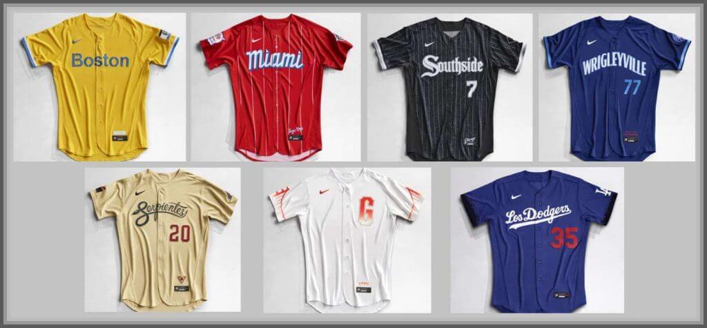
I’ve already had a lot, over the course of the past several months, to say about the “City Connect” (CC) uniforms — and I’ll have a lot more to say about the whole concept at another time, but today, I’m going to simply rank the uniforms from best to worst. I’ve mentioned one cannot really “judge” the uniform without the stupid word salads rationales behind the uniforms — and that’s true to an extent — but today they’ll be ranked solely as on field uniforms. In other words, if you’d never seen a baseball game before and simply saw these uniforms in game play, which team had the best and which team had the worst?
#1: Chicago White Sox
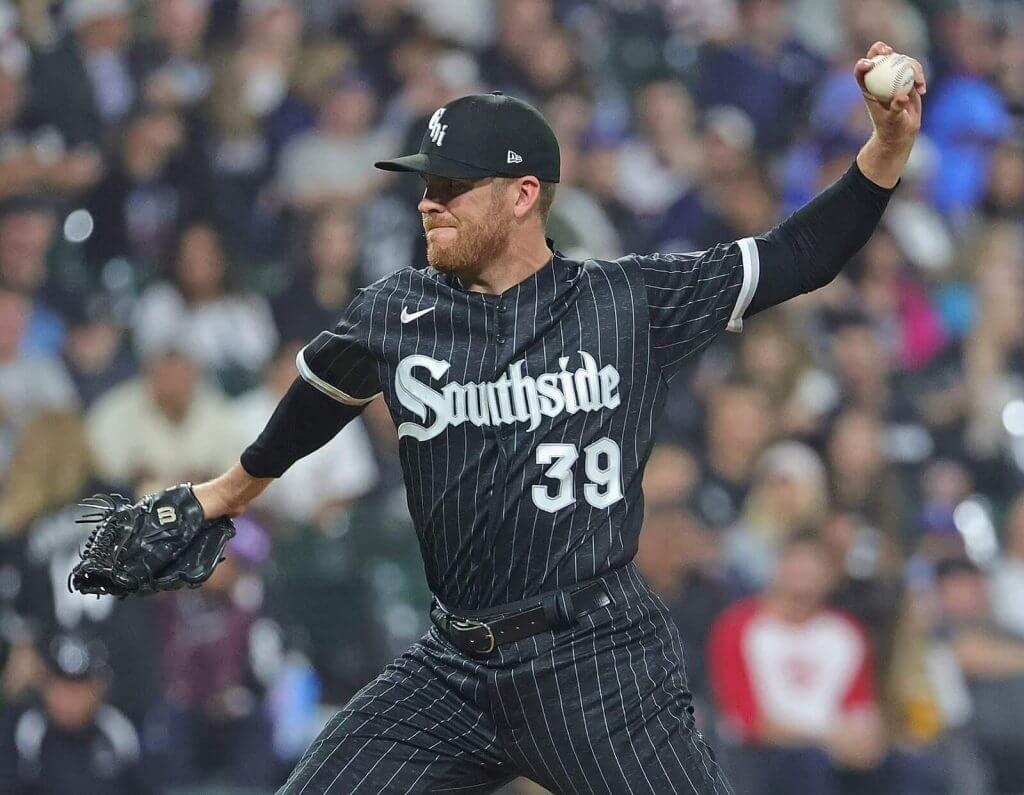
I definitely think there is a place in baseball for a black (or very dark gray) pinstriped uniform — which does have historical precedent in the Negro Leagues — and this one is well done. I might relegate it for Sunday Night games (or at least night games in the summer), but otherwise it’s a fresh look and a solid uni. I would not feel the same way if the team had paired it with white pants.
#2: Boston Red Sox
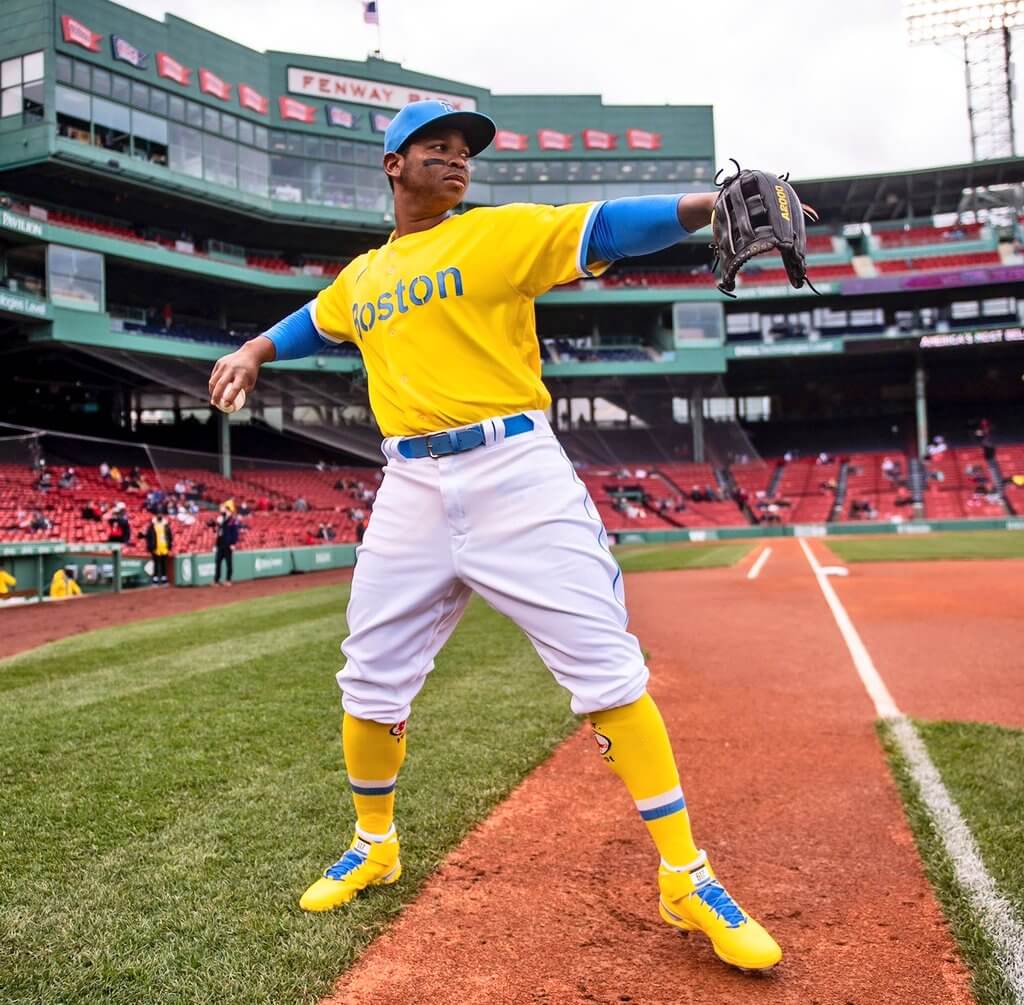
Divorcing myself from any history and tradition (and of course the nickname) and looking solely at this as a uni, I loved this. The powder blue and gold pair well together, and aside from making this a mono-gold uni, I think the white pants are really the only color that doesn’t hurt the look in the least. Baseball needs more bright and pastel colors (enough with the navys and darker reds already!), and this one is a breath of fresh air!
#3: Arizona Diamondbacks

This one could have used Sonoran sand (or whatever color that cap and jersey are) pants, but other than that it’s a nice uniform. In fact, I think an all sand uni (similar to what the Padres wore back in the day) would be a great road uni, breaking up the mostly gray (and a couple powder blue) unis in the game today.
#4: Chicago Cubs
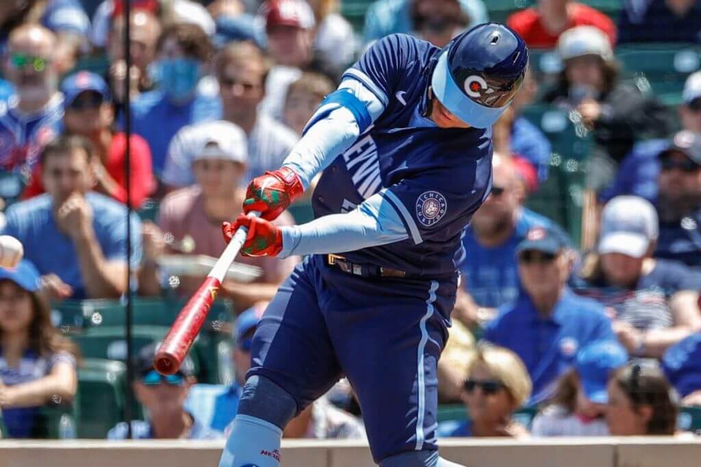
Like a black, pinstriped uni, I think there’s a place in baseball for a solid navy (road please!) uniform, and this one is nicely put together. The powder accents complement the navy base well, and now that the team has custom helmets for this (the team initially wore their regular royal helmets), I think the look has real potential.
#5: Miami Marlins
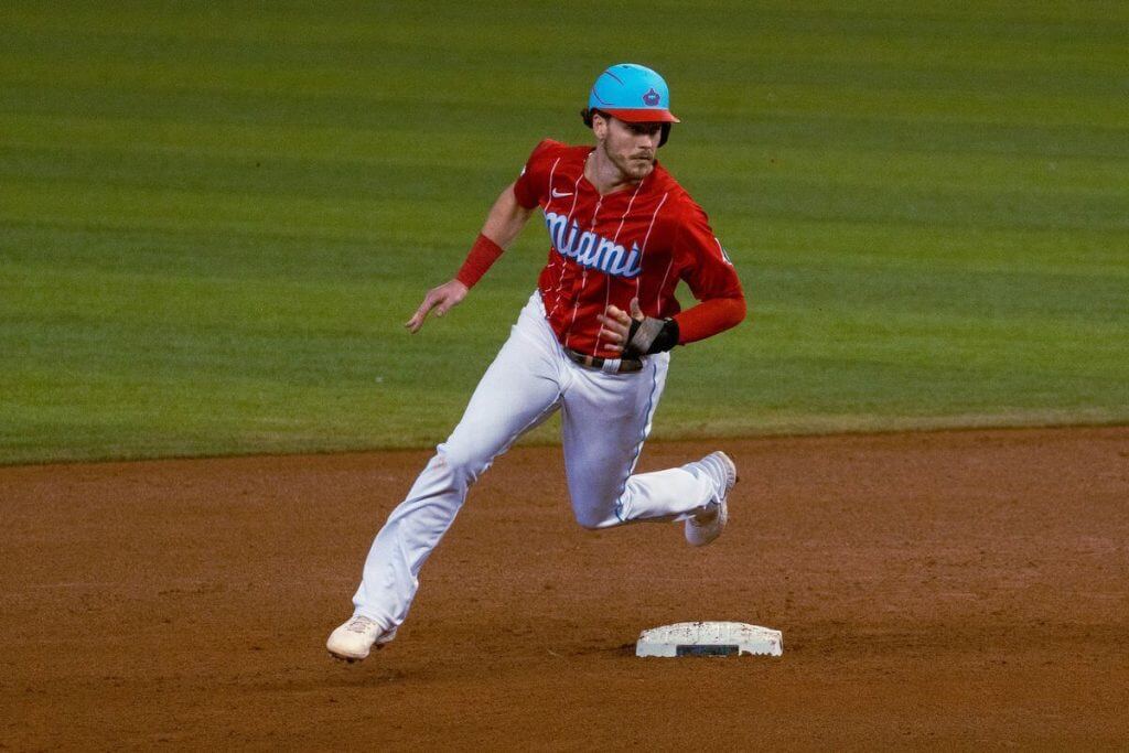
I know a lot of you liked this, but until the Giants and Dodgers unveiled their CC unis, this one was my least favorite. I figured it would stay at the bottom of the list…until the Giants and Dodgers unveiled their CC unis. I’m not a fan of the powder and red, and the pinstripes on the jersey are annoyingly wide (and truncate at the shoulders/arms).
#6: Los Angeles Dodgers
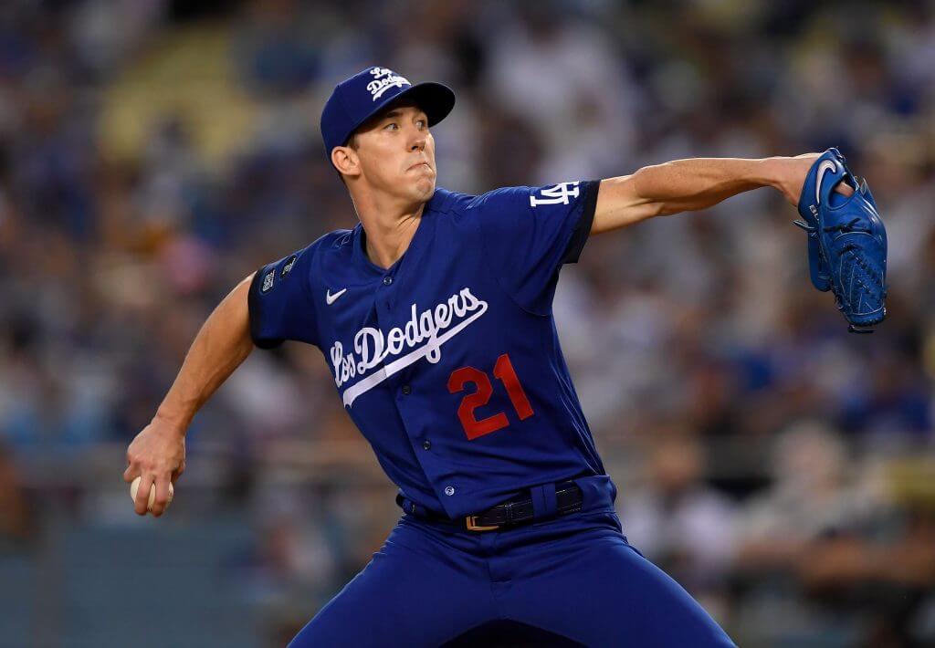
We don’t need two teams with dark blue full uniforms (these are supposed to be “royal” but they look darker than that on the field), and the Cubs already fit that bill. The red front numbers are hard to read (a white outline would have helped), and that cap. Ugh — double stacked script just doesn’t work.
#7: San Francisco Giants
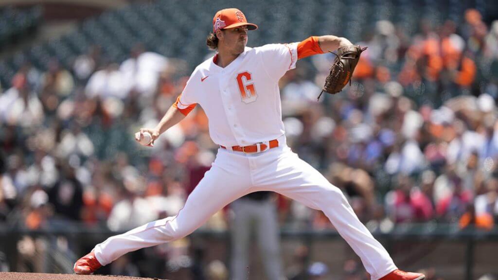
In their attempt to tell a story and be clever, the designers failed in perhaps the most important purpose a uniform serves: legible uniform numbers. I otherwise didn’t hate this uniform, but that design flaw relegates these to the bottom of this list.
And there you have it: my CC uni rankings. Feel free to disagree in the comments below!
Bulletin update: Paul here. My latest Bulletin article is a think piece that addresses a question that’s been on my mind: Is the rapid rise of legalized sports gambling good or bad for uniforms? Those of you who’ve subscribed to my Bulletin content should already be seeing this article in your in-boxes. Everyone else can check it out on my Bulletin page.
On a completely different matter, I want to give a birthday shout-out to one of the uni-vere’s key figures: SportsLogos.net founder and Unified podcast co-host Chris Creamer. Enjoy your special day, buddy!
Okay, now back to Phil.
Phoenix Suns Introduce “Aztec” Uniform Concept
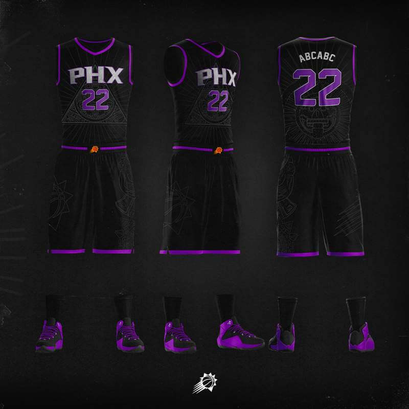
On Wednesday morning, the Phoenix Suns unveiled a new “Aztec” uniform concept on Twitter. The idea behind it is a “tribute to early ancestors of The Valley, our Mexican and Mexican-American fans.” They added, “and the warrior spirit we bring to battle everyday.” Ooooph.
I’m not sure a team has ever introduced a “concept” uniform before — or whether this has any real chance of actually becoming an official uniform. But as it has the gravitas of coming from the team’s official Twitter account, I suppose it’s entirely possible.
In that same tweet, the team asked followers for their thoughts.
Per this article:
The design features a triangular Aztec Sun Stone on the chest within the “PHX” logo. According to Suns officials, the Sun Stone symbolizes deities working together as one. The jersey also features rays surrounding the Sun Stone, representing heat and unity coming from “The Sun.”
The shorts have armor with a jaguar, depicting that “those who bear the armor are ready to strike and attack at any time.” The Aztec Death Stone is on the back of the jersey, depicting warriors who look at death in the face. According to officials, it also represents an “all-or-nothing” mindset in battle.
“Stepped in symbolism, the uniform boldly blends the grit, unity, and history of the Aztec civilization, harnessing the prowess and battle-hardened strength of its people and the influence it has had on Latin culture for centuries.”
Discounting the cringeworthy marketing-speak (and seriously, in this day and age, isn’t this “warrior” and “battle-hardened strength” verbiage bucking the current trends away from using Native Peoples’ naming conventions and imagery? Yes, I know SDSU is called the “Aztecs” and feature similar iconography in their uniforms, but still…), I wonder if this will ever see the light of day.
Anyway, here are some additional looks at the “concept” uniform:
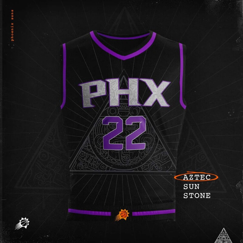
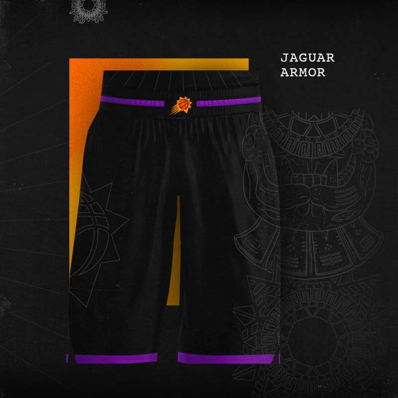
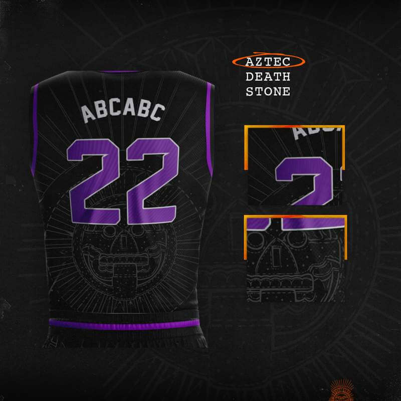
I’d be interested on hearing your thoughts on these.
Toronto Blue Jays Fan Club, 1979

In case you missed it on Monday, long time reader/contributor Walter Helfer shared with us some of his incredible correspondence with Marc Okkonen (scroll down), which was very generous of him to share. But he wasn’t done!
Walter also shared various items he received from the Toronto Blue Jays — as you’ll see, Walter was an early fan of the (then) new club, and he requested they send him anything that might be great for a new fan of the team — and man did they oblige! I’ll let Walter take it from here.
Dear Phil,
In 1979 one of my favorite American League teams was Toronto, an expansion club with scads of room for improvement and an opportunity to create a bandwagon. I wrote to the front office and asked if they could provide anything to an early fan.
Boy, did they provide! Stickers, rosters, player signatures, pocket schedules, a ticket order form, and a souvenir list (from which I bought the patch shown}. The detail I appreciate most is the one-color logo on the signature copy, with its horizontal lines standing in for the red leaf and baseball.
Of the 1977 expansion twins, I thought Toronto owned the marketing game, as Seattle fought a more-desperate battle for identity; it was hard for them to shake the idea they were merely a contractual obligation to replace the Pilots.”
Thanks for the opportunity, guys!
-Walter
Thanks Walt — and just what did they send? Check it out!!!!
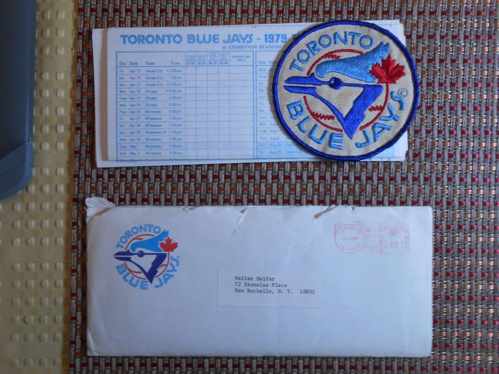
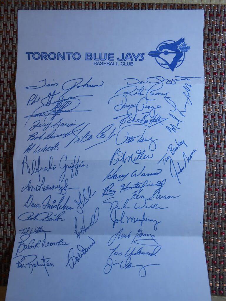
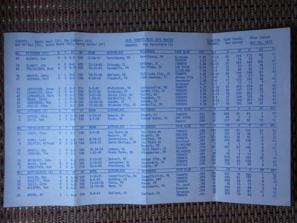
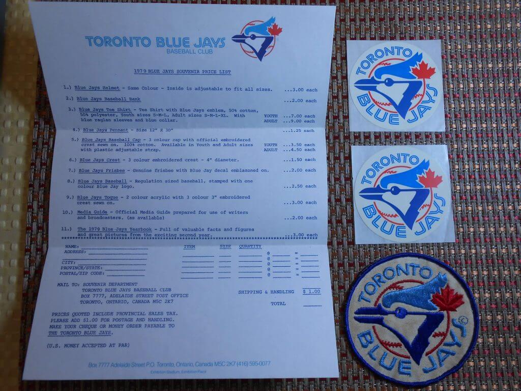
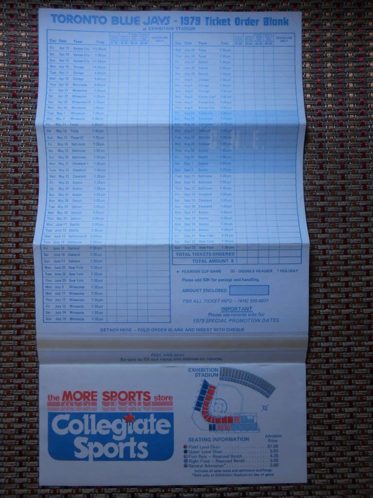
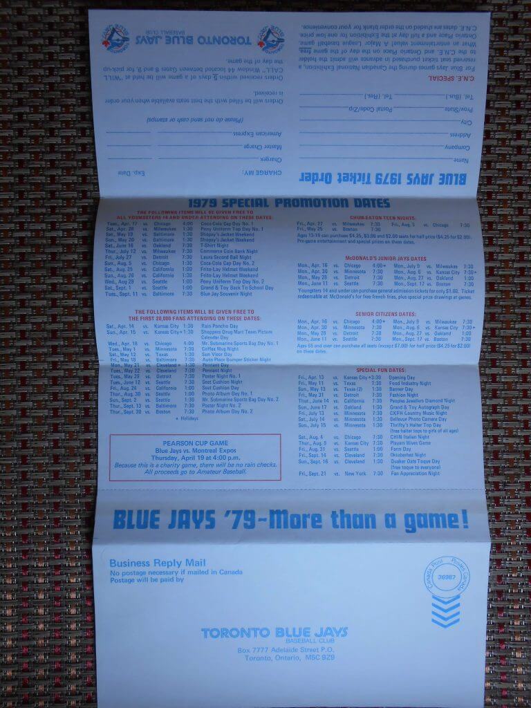
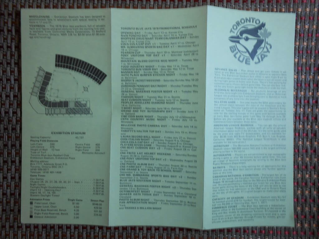
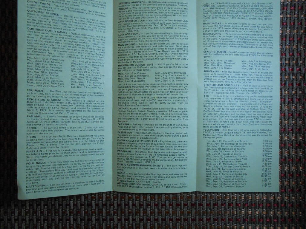
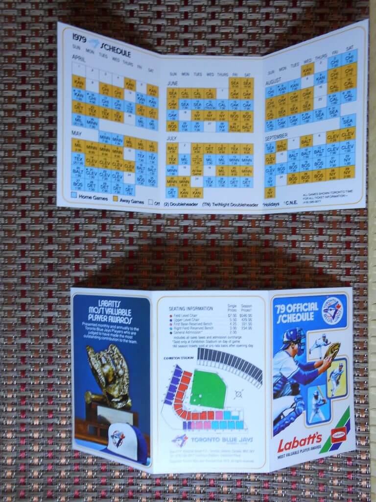
How great is that? Big ups to Walter for sharing these wonderful Blue Jays ephemera after all these years and for having the wherewithal to save them all!

Guess The Game…
from the scoreboard
Today’s scoreboard comes from Graham Clayton.
The premise of the game (GTGFTS) is simple: I’ll post a scoreboard and you guys simply identify the game depicted. In the past, I don’t know if I’ve ever completely stumped you (some are easier than others).
Here’s the Scoreboard. In the comments below, try to identify the game (date & location, as well as final score). If anything noteworthy occurred during the game, please add that in (and if you were AT the game, well bonus points for you!):
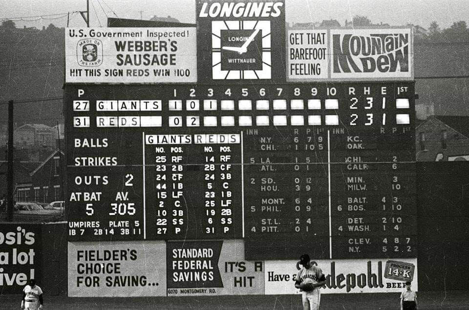
Please continue sending these in! You’re welcome to send me any scoreboard photos (with answers please), and I’ll keep running them.
The Ticker
By Anthony Emerson

Baseball News: The first base umpire during last night’s Red Sox/Twins game at Fenway was wearing a snapback cap (from Phil Pane). … Also posted in the hockey section: The Durham Bulls will wear Hurricanes-inspired unis for Hockey Night on Sept. 10. … The Ballpark in Arlington has a new corporate name (from @heyvittas).

NFL News: The Bills have released their game-day pin collection, and the design for the Pats game in December strongly implies that the Bills will be wearing throwbacks for that game (from Mike Monaghan). … Cardinals rookie wideout Rondale Moore paid P Andy Lee to take No. 4. Lee is now wearing No. 14 (thanks, Brinke).
College/High School Football News: Illinois has unveiled new home unis. … WKU have new mono-white alternates (from @The_Real_Kub).

Hockey News: Sharks G Adin Hill’s new mask design goes after the Seattle Kraken, depicting a shark swimming with a squid in its mouth (from Brandon Weir). … Also from Brandon: The Red Wings have revealed some uni numbers for their new players. … Cross-posted from the baseball section: The Durham Bulls will wear Hurricanes-inspired unis for Hockey Night on Sept. 10.

Soccer News: Red shorts have returned to Southampton’s repertoire after several years, but they have black numbers even as their jerseys have white numbers, creating an odd clash (from Mike Miller). … Everton have incorporated Prince Rupert’s Tower — the building depicted on their badge — into their custom typeface used in cup competitions. Unfortunately, the effect was inconsistent at least during last night’s match, as Lucas Digne’s number did not include the tower motif (from @jayappletree).

Grab Bag: French rugby team Stade Toulousain have a new kit, inspired by their 1996 kit. … Fast food restaurant Raising Cane’s has a 25th anniversary logo (from John Cerone).
Uni Tweet of the Day
Now we know what happened to Nike’s second attempt to remake the Jags…
Bobcats home opener uniforms!! 💪🏾🔥🏈 pic.twitter.com/9GEDUJ5BKT
— SFCC Bobcats Athletics (@BobcatsSFCC) August 24, 2021
And finally… that’s gonna do it for today. Big thanks (again) to Walter for sharing that 1979 Blue Jays stuff! Hope birthday boy Chris Creamer enjoyed it. Happy B-day Chris!
Everyone have a good Thursday and I’ll catch you back here tomorrow.
Peace,
PH
Last game at Crosley Field?
Pretty solid contingent of future Hall of Famers on the field that day. At a glance I see Mays, McCovey, Marichal, Bench and Perez. Plus, Pete Rose.
One thing you could not get at those ’79 Jays games was a beer! No beer from inception to 1982!
link
Nestor, yes, that’s it. June 24, 1970. Back in the 1980s in another baseball-oriented group, a member ran a photo of Willie Mays and Pete Rose meeting the umps to go over the ground rules and asked if anyone could guess the occasion, and in those pre-Internet days it was a complete guess on my part but I got it as this farewell game at Crosley. And this time it was once again my first guess even before checking on the Internet.
That Suns uniform concept prompted this insightful Twitter thread from basketball historian Curtis Harris (@ProHoopsHistory):
Aesthetically great jerseys.
*puts on history hat*
Weird on a number of other fronts cuz 2021 is 500 years since the Aztec Empire was conquered by Spain and alliance of other Native nations (who were fed up with the domineering Aztecs’ “warrior spirit”).
Also, the @Suns could mention that Aztecs and other Mesoamericans played a sport (tlachtli) that while not a direct precursor to basketball was basketball-like in ways.
Would be an actual sports tie in and better than once more trotting out the trope of Native Americans as warriors… or chiefs… or braves… when it comes to sports.
(“warrior spirit we bring to battle everyday”)
Oh that’s a fantastic observation!
I would agree that when you talk Aztecs it is not quite the same as talking the history of treatment of native tribes by European colonists and then by the US Government in North America.
The negatives of being a conquering empire don’t just disappear because you happened to conquer people that look like you and are on the same land mass as you are from.
From a cultural sensitivity/historical sense using the Aztec name as mascot is probably closer to Vikings than it is to Indians, Redskins, etc.
lets also not forget that the Aztecs performed human sacrifice on a horrific level
Regardng Paul’s Bulletin article — I agree with his point that betting on sports (including fantasy-league play) pulls one away from loyalty to the teams themselves and what their uniforms represent. I remember getting in a Super Bowl pool one year and spending more energy rooting for, say, a field goal that would allow me to win part of the pot than focusing on which team won the game itself. And yes, it would be interesting to bet based on uniform combinations, and that would only be a minor leap for me — I’m so uniform-centric that during a double-header I may find myself rooting for one team in the first game because they’re NOT wearing their “softball tops” and then switching in the second if the other team has eschewed the softball tops and gained my support.
Paul’s article got me thinking about an old What’s Happening episode where the character Dwayne has a run of successfully predicting the outcome of NFL games. Everyone thinks he’s a wiz, until the part where he describes his process. It’s somewhat scientific, until the end… I recall the game being the Raiders vs the Buccaneers, and he ultimately picks the Bucs to win because “I like their helmets!” Of course, the Raiders win big. Heart vs head indeed.
I’ve been in an AL only Roto league since 1995 (finally won it last year in the abbreviated 60 game season lol) but I could never be in an NFL or NHL league because I have strong rooting interests in the Vikings, Bruins and Winnipeg Jets. I don’t have a problem with being in a fantasy baseball league since I don’t have a team that I’m passionate about. I would hate to be pulled in different directions rooting for my teams and opposing individual players.
GTGFTS: June 24, 1970, Reds beat the Giants 5-4 in the final game at Crosley Field before they moved to Riverfront Stadium.
Sox
Dbacks
Marlins
Cubs
Dodgers
Giants
Sawks
#7-Arizona
#6-Los Angeles
#5-Boston
#4-San Francisco
#3-Chicago AL
#2-Chicago NL
#1-Miami
I really like those Suns uniforms!
Referencing Aztecs is totally different than using Native American imagery since the Aztecs were an established culture that wasn’t systematically eliminated.
Aztecs is more like Irish or even Americans in my opinion
Their original logo-free helm…err, tops from 1976…err, 1968 remains their best look ; )
Really?
Millions of natives of what is now Mexico were killed, enslaved or died of European diseases, often deliberately introduced.
link
Agree 100% on CC unis. Happy Birthday to Chris!
Looks like Nike recycled all of the old Syracuse uniforms and gave them to Illinois.
We get a comment like this every time Illinois uniforms are shown. Illinois has been a blue and orange team for a very long time. In fact, George Halas decided to use blue and orange for the Chicago Bears because of the Illini. Illinois isn’t copying Syracuse.
I thought the same thing. These are SO close to what Syracuse wore during the late teens.
Hey Phil – Great article on the city connect uniforms. I appreciate that you lay out your reasoning for the rankings. My only difference is I would move Miami up to #2. I like the design. Out of all of them, I bought into the silly story behind it. Otherwise we are alligned. THANKS!
Thanks — I know there are many readers who like the Miami effort. I’m just not one of them. We’ll agree to disagree!
I agree with Jim, except I would switch the D-Backs and Miami. The D-Backs uniform would be three for me if they had the sandy pants
Two years ago, for my 6-year-old son’s Little League team, there was a team vote on what to call the team. One of the nominees was “Aztecs.” I objected to the coach about the name Aztecs on grounds of cultural appropriation. The coach agreed and the team ended up being the “Flying Squirrels.”
I think this is the reason it came out as a uniform “concept” — the Suns are waiting to see what the reaction is. Personally, I am disappointed by this: they are clearly clinging to myths and stereotypes regarding the Aztec people, while using imagery inspired by them without offering anything in return to indigenous people in Mexico.
And unfortunately, in Mexico there is also a tradition of appropriating indigenous imagery while simultaneously accepting enormous racism against indigenous people. If the Suns want a uniform that honors the local Mexican-American population or if they want to honor the indigenous peoples of Arizona, they can do much better than this.
Flying Squirrels… I would buy that hat.
You can do so with the Richmond Flying Squirrels shop:
link
Local AA team for the Giants.
MLB has done a great crime, esthetically, with these city connect jerseys.
All seven are LAME-O. Criminally ugly. These are of the level of the Colorado Caribous.
I’d agree. None of them are good. What I would say is to some degree elements from their designs could be adopted into a well designed uniform.
While I am a gray-on-the-road traditionalist. I wouldn’t hate it if say Arizona had the sand color pants and jersey (though not hat) as their road set, assuming a better design.
Likewise I am a no-alternates-just-home-and-roads type of traditionalist, but I also don’t hate the idea of a black with white pinstripe road set for the White Sox. It just isn’t practical under the summer sun, so as a road alternate it isn’t bad. Again, assuming it had a better design to it.
I remain in the camp that all of these uniforms should go in the trash bin ASAP. City Connect uniforms only serve to diminish the brands of each team.
I am not a fan of dark colored mono-uni looks (either in NFL or MLB)…both Chicago & LAD CC uniforms could have been much be better. I think Boston & Miami is the right idea of what a City Connect concept should be. Ties to the city/region that do not mix with the current team colors. I am already worried one of the NY teams will be in Statue of Liberty colors (like the NY WNBA team already is).
The dark jersey/light trousers look should have died the day the Reds became the last team to return to a belt and buttons. The Sansabelt provided a strong accent to the player’s equator, and harmonized well with the contrasting jersey. But belt tunnels don’t offer much contrast at all; they make the dark jersey look like a mistake.
But I can surely get behind the monochrome look. It’s an idea whose time has come.
Most of the City Connect uniforms were good, but I think Boston, Arizona, and Miami could have been improved by going monochrome. Funny, isn’t it, that powder blue and red look so much better when the blue is prevalent (think of the Houston Oilers). Not a fan of the contrived chest scripts; The D-Backs could have made a shout-out to Phoenix, and Los Angeles could have repped the “Doyers”.
The Illinois football helmets will be new this season. With the exception of a block I on the pants, the home uniform is unchanged.
I’ll give all the City Connects a rating of 0.
Dodgers CC uniform is just so lazy. And I agree that the Diamondbacks Sonoran Tan would look great as a road uniform with matching pants. Also I would love to see a major league team have the light blue and yellow colors.
Interesting that “Hockey Night” for the Durham Bulls falls on the height of the Atlantic hurricane season – intentional, or happy accident?
The Marlins by far are the best city connect, nothing close.
Paul, can someone remind the Bills they switched to white face masks this year. Wake up marketing department !
Hard to tell from the pic provided, so I checked their team shop…but the masks on the pins are white.
Had they switched to blue, there’d be no question (an no question that their helmets would look so much better).
Chris, thanks, I stand corrected. The grainy images make all the face masks look gray.
Good call checking with team shop.
The only possible City Connect rankings; complete epic fail.
7. Sox, Dbacks, Marlins,Cubs,Dodgers, Giants, White Sox
Just read Paul’s Bulletin article on gambling. I’m concerned that as these teams and leagues make more and more revenue from gambling, they will be more likely to put these gambling sites on their uniforms. I mean the NBA and NHL already have, or will have, ads on uniforms, but I could see these becoming bigger and more prominent. And I won’t be surprised when MLB and NFL are offered huge sums to shill for these gambling sites on their uniforms.
As a arizona native I find that the Aztec concept uniforms don’t fit well historically or thematically. The Aztec empire never made its way past mid-Mexico let alone into the southwest. I feel it is picking a culture and style that is disconnected from the region. If they went the route of drawing inspiration and honoring native groups in the area, there are many groups to chose from. The Phoenix area has two current native groups with reservations and the state of arizona is home to 19 more. Hell the Phoenix basin is famous for it’s ancient cannals and irrigation systems left behind from the ancient Hohokam people, why stretch all the way to southern Mexico when you have plenty to draw from in your back yard.
1. Red Sox
2. Marlins
3. Cubs
4. Diamondbacks
5. Dodgers
6. White Sox
7. Giants
#1 Marlins (Their best look since the days of teal)
#2 Red Sox (Underutilized color combo)
#3 Giants (Love the white/orange, hate the numbers)
#4 Cubs (Kinda fun, kinda boring)
#5 White Sox (A high school team wearing these would be okay. That’s not a compliment when you’re a MLB team)
#6 Diamondbacks (Illegible and ugly script front, the tan color seems off)
#7 Dodgers (Not a single thing to like about these. The old Trolley Dodgers should be dodging eggs and tomatoes thrown by the fans)
Just want to mention that A’s equipment manager Steve Vucinich is the subject of a nice article in today’s link
Happy Birthday to Chris Creamer! I hope you got as big a kick out of the Blue Jays correspondence as I did!
If you took the airport code off the jersey and replaced it with wingdings and asked me which basketball team the jersey was for, I would say: “Purple, black, silver – it has to be the Sacramento Kings, right?”
I like most of the City Connect uniforms, and particularly like the Dodgers’ use of white socks. Back in the original days of blue monochrome uniforms, link.
I’d do them all without NOBs, though. The Cubs in particular should dump them, and also go back to either their normal number font, or the original variation that Otis Shepard designed for them about 70 years ago. I have no idea what that Nike font is supposed to be about. The “4” in particular looks terrible.