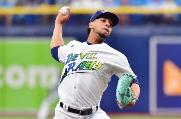
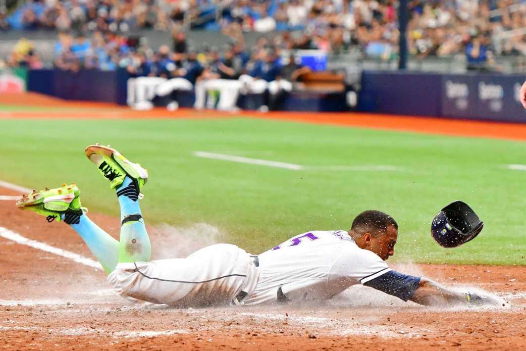
In a Saturday afternoon game against the (also) first place White Sox, Tampa Bay slipped into the old “Devil Rays” unis from, err, way way back in the late 90s. Despite being a bit of a traditionalist when it comes to baseball uniforms, I’ve always secretly liked this set. But it really is odd that a uniform 20-ish years old now qualifies as a throwback.
I think part of that weirdness is that they still play in the same stadium that they did when these were originally worn. Which, if I’m being generous, is a rather unremarkable dome with little to no personality, poor lighting, and a blown-out sound system. The Red Sox and Cubs certainly have no trouble pulling this off, for obvious reasons. Perhaps it’s just my hatred of Tropicana Field that is bleeding over into this, but it does feel a little off.
Check out the socks here.
• • • • •
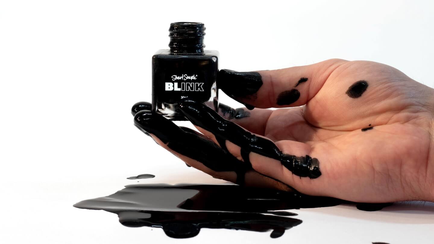
Jason Hillyer shares an interesting story about a feud surrounding color trademarks.
Painter Yves Klein registered a trademark for a shade of ultramarine called International Klein Blue in 1957, and jewelry brand Tiffany & Co.’s signature blue is also protected. More recently, in 2016 sculptor Anish Kapoor purchased the artistic rights to Vantablack, a material described as the “the darkest man-made substance.” The substance is made of carbon nanotubes, that reflect virtually no light.
But Kapoor’s exclusive license of Vantablack proved controversial, sparking a years-long feud with Stuart Semple, a British artist who has since set out to “liberate” colors from private ownership. Having created several of his own “coloriest colors,” Semple then made them available to everyone in the world — apart from Kapoor.
You can read the full story here.
• • • • •
Check out this trophy for The Hundred, which is an English cricket tournament that just wrapped up.
• • • • •
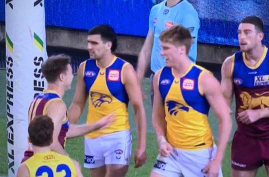
You have to wonder how this happened. One of the players for the West Coast Eagles was playing with a version of their jersey with a misprinted logo. Instead of being a blue outlined eagle, the logo was inverted with the blue filling the eagle’s head.
Eagle-eyed West Coast fans have noticed a rare mistake on one of its jerseys, which the club explained was a “misprint”.
Eagles defender Harry Edwards was spotted wearing a slightly different guernsey to the rest of his teammates during his side’s clash against Brisbane at the Gabba on Saturday night.
Harry Edwards' clash jumper has a misprint of our logo. The club has notified the AFL. https://t.co/GdOtXXqbzI
— West Coast Eagles (@WestCoastEagles) August 21, 2021
• • • • •
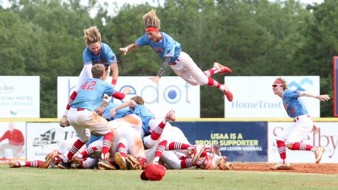
Brett Thomas passed along this image of the Idaho Falls Bandits after they won the American Legion World Series. Look at those stirrups!
• • • • •
The Frisco RoughRiders billed this as an “80s Night” promotion, but this looks more like a doctor’s coat to me? I was looking for the the stethoscope.
*insert Miami Vice theme song* pic.twitter.com/6EOuYByGXr
— Frisco RoughRiders (@RidersBaseball) August 22, 2021
• • • • •
This is fun. Imagine having this “problem.”
@UniWatch Nola brothers playing each other so Dad has to rep both jerseys. pic.twitter.com/8V8rBIt16L
— Dustin Perez (@Pez1865) August 22, 2021
Several MiLB teams have done Miami Vice theme colors. Frisco should have gone that route and added a light blue cap to match the jersey. As is, it’s a pretty lazy set. Tampa’s throwbacks don’t bug me. It’s either those or their great fauxback uniforms.
Agreed on the Trop. Horrible facility in a horrible location. Place was outdated before the Rays ever played a game in it.
Tampa Bay Rays uniform technically a fauxback for the real youngsters out there. Was worn with black back in the day instead of the Rays’ current navy blue shade and was a different hat for the most part.
Maybe we should enjoy seeing it while we can. Read recently the Rays have been getting really low attendance even for them. The defending AL champs that are a really good team still. The stadium is sub-par. How much longer can the Rays stay there considering these factors? Hardly substantiates the market should have an MLB team.
Both a fauxback and an improvement. The black accents of the early Rays uniforms were meant to be a neutral contrast to their bold colors, but instead the black just drearified the whole uniform.
The Rays play in Tampa Bay because MLB at the time wanted to keep the Washington market open as a relocation threat for other teams trying to extort public subsidies for new stadiums. “Fund a new stadium or we’ll move to Tampa Bay” was not a credible threat. “Fund a new stadium or we’ll move to Washington, DC” was. So mid-1990s expansion went to Tampa Bay rather than an actual viable market. But the team’s lease is pretty ironclad through 2027, and the current environment nationally doesn’t seem to favor the team getting significantly better public subsidies anywhere else after that.
Tampa was a linked to the White Sox, Giants and Indians and maybe a couple others. It was a legitimate threat in those cases and it resulted in new stadiums for all three clubs.The low attendance is due to the stadium and it’s location. It was a mistake to build it in St. Pete as it is hard to get to from the Tampa area. Like Oakland, the city and owner have been locked in a long dispute. The lease is the only difference. The Rays proposal to call both Montreal and Tampa home is one of the dumbest relocation ideas ever proposed. I would love to see what the team could draw with a waterfront stadium in Tampa proper.
Wearing black in FL is always a bad idea. The Marlins would look a lot better in the city connect colors they wore.
Build the Rays a new retractable dome in Tampa and the attendance will go up. Last I heard, the team had good TV viewership, so there’s definitely interest in the product being put on the field.
“Maybe we should enjoy seeing it while we can….How much longer can the Rays stay there…? Hardly substantiates the market should have an MLB team.”
There’s no reason that a relocated Rays team could not wear their Devil Rays uniforms in their new home…that identity, even if they rebrand completely, in theirs to celebrate (or not). I’d prefer that they stay in ‘Tampa Bay’’ but if that’s not going to be the case down the road I’d like to see them go to a new market rather than return a team to a failed one (aka Montreal). Ditto for the A’s, whose time in Oakland may also be expiring soon…they should retain the colors and name and the history.
Well, you might be surprised. Virtually all the firmly viable markets now have an MLB team, and any alternative market for the Rays has AT LEAST as many problems as Tampa Bay suffers from. Once the Trop’s lease expires, I like Tampa’s odds of landing them at least as much as places like Montréal, Vegas, Portland, or what have you.
Tampa Bay is by any metric a viable market. They just need a more appealing stadium.
The city that’s always puzzled me is St. Louis: How come a baseball slam-dunk locale only supports one other pro team?
I’ve never seen a game at Tropicana Field (so I can’t comment on the actual game day experience), and I get that the overwhelming sentiment is that the place is indeed “unremarkable” and has “no personality”.
That said, it kind of seems like it would be one of the more unique venues in MLB given the abundance of Camden Yards clones most teams play in. In other words, the “retro style” ballpark is the new “cookie-cutter”.
I get this. In the land of faux-retro, the Trop is a throwback in and of itself to those concrete stadiums of the 70s. We may not have the Kingdome or the Metrodome anymore, but we have Tropicana Field.
I for one hope to get out there for a game before it’s gone.
Unique doesn’t mean it’s good. As an Os fan we have been forced to watch too many games at the Trop, the ground rules alone will drive you crazy. It is a dive in the worst sense of the word. Too bad the team can’t find a place in Tampa, but when they move hopefully the go West and out of the AL East, we could use the help.
It’s basically a giant concrete mausoleum, which is pretty on-brand considering the demographics in St. Pete, which is basically Heaven’s waiting room.
Uniqueness is not an inherent virtue. And in the (vanishingly rare) cases where the prevailing architectural aesthetic is actually GOOD, resembling one another is not an inherent vice.
Re: The Hundred.
This made-for-TV cricket league, much like the ones in India, Pakistan, and Australia, are rife with amazing colors in the uniforms of the players. The Hundred, which is in England and Wales, had a matchup this year with two different shades of bright green — the Oval Invicibles are a mint green, and the Southern Brave’s green looks like the Seattle Sounders.
Also, watching the Premier League in disbelief today. What the heck kind of Matisse painting is Tottenham Hotspur wearing? Holy uglies!
Not my favorite Rays set (that would be the ‘05-‘07 green/vest set), but so much better than the pretend Padres/phony blue-oneys.
“ Brett Thomas passed along this image of the Idaho Falls Bandits after they won the American Legion World Series. Look at those stirrups!”
The ones with the out-of-place string that doesn’t pair well with those splendid powder blue/red tops? Ugh.
“string” should be striping.
West Coast Eagles misprint – It seems that the misprinted jumper is favored judging by twitter. Wonder if maybe it wasn’t a sneaky little “oopsie” to gauge fan’s reaction for next season…
I go to several games a year at the Trop and I love it. No matter what is happening with the unpredictable Florida summertime weather, I know I’ll see a game in 72-degree, 50 percent humidity weather.
I was absolutely miserable at a night game in St. Louis earlier this year. It was 88 degrees and 75% humidity with occasional light rain. (In other words, a nice day in Tampa Bay.) I longed for the Trop the whole time.
Idaho Falls Bandits after they won the American Legion World Series.
Based on that great photo, honestly stirrups take a backseat. I’m more interested by how high that guy is flying towards the team pile. Would like to see the video version to be sure he survived the landing w/o injuring himself or some teammates?
Ask, and you shall receive. link