By Phil Hecken, with Jamie Rathjen
Follow @PhilHecken
[Editor’s Note: Paul is on his annual August break from the site. Deputy editor Phil Hecken is in charge from now through the end of the month, although Paul may be popping up here occasionally.]
Greetings and Happy Thursday, Uni Watchers — we’ve got some BIG uni news on tap today. Today’s short lede, written by our own Jamie Rathjen, will take a look at Puma’s new third jerseys for their Euro clubs, which have an interesting design template. Paul also has a new Bulletin article (link below). If that weren’t enough, both the Packers (unveiling their new alternate jersey — and hopefully full uniform) AND the Dodgers (unveiling their City Connect jersey — and hopefully full uniform) will also be releasing those this morning. I’ll have full writeups on both the Dodgers and Packers new uniforms in tomorrow’s post, but will be updating today’s post once photos become available. That’s like a week’s worth of uni news all packed into a couple days. With so much to get to, I’m turning this over to Jamie now, and be sure to keep scrolling for Paul’s latest piece over on Bulletin.
Puma Releases New Third Shirts for Euro Clubs
by Jamie Rathjen
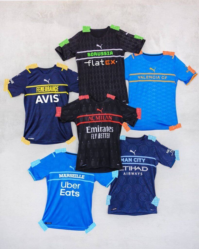
Puma released third shirts for 10 of its European soccer clubs yesterday. That’s not that unusual, but what is is the design they all share, which to understate it is a departure from soccer’s usual style. All the designs have a large club name on the front, almost American-style, instead of the usual crest on the left chest. The crest only features at the top of the back and as a sublimated pattern. At least one of the affected clubs, Manchester City, also has the same design for goalies with the colors reversed.
The company already started with idea when it gave some of its national teams new second shirts earlier this year, but the names were much smaller compared to these and did include the crest nearby.
As you might expect, as big a departure from the norm as this represents came with reaction to match. I tend to have a feeling with these sorts of big changes that while they get a lot of attention, they’re only temporary because of how frequently soccer changes designs. If somebody has a relatively unusual design one season, you can bet it’ll be more conventional for the next. But these definitely are unusual in a sport with little history of club names on uniforms except primarily in Germany, where they’re fairly ubiquitous above or below the number.
You can read more, and see all 10 new shirts, in Puma’s press release.
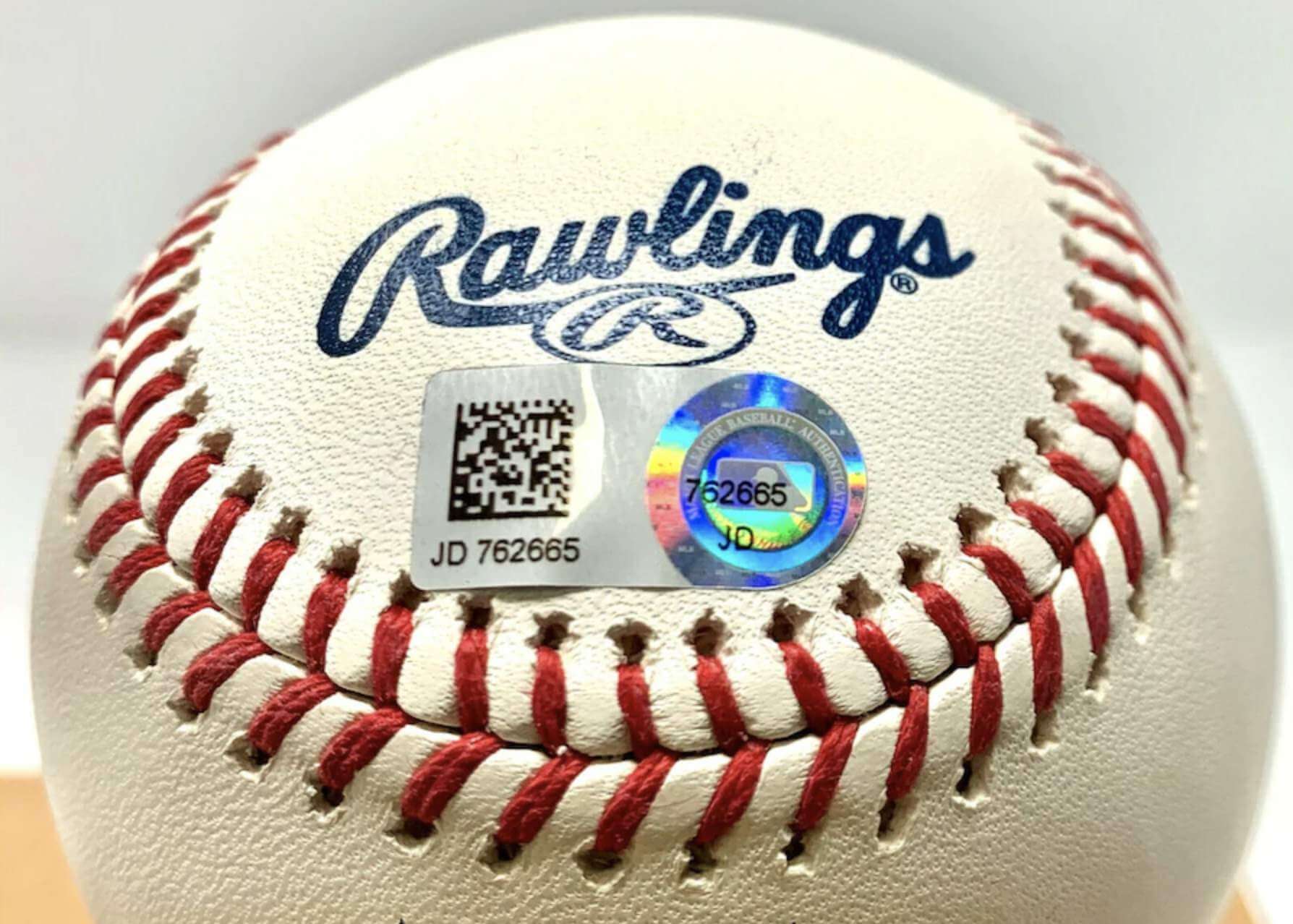
ITEM #1! New Bulletin article: Paul here. Ever wonder about the ins and outs of MLB’s authentication program and all those little hologram stickers? My latest piece for Bulletin is an in-depth interview with Mike Acosta, who served for years as the Astros’ authentication manager, and it’s full of faaaascinating info on game-used gear and a lot more. Those of you who’ve subscribed to my Bulletin content should already be seeing this article in your in-boxes. Everyone else can check it out on my Bulletin page.
Also: Up until now, only people who subscribed to my Bulletin articles were able to post comments on them. But I’m happy to report that as of now, any registered Facebook user can post a comment on my Bulletin articles, even if you’re not a subscriber. I’m hoping this will lead to a more robust discussion.
Okay, now back to Phil!
ITEM #2: Packers Unveiled New Alternates This Morning
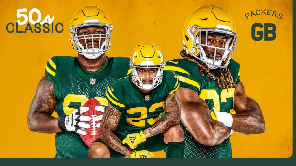
UPDATE — as expected the Packers unveiled their new third uniform, as seen above. It’s a “50’s Classic” mono-green uniform.
Per the team:
The uniforms are all green, with gold numbers and stripes similar to the jerseys worn in the 1950s. In those days, the green was a Kelly green and the team alternated between wearing it with green or gold pants. This alternate jersey, which is the Packers’ traditional green color, with gold numbers and stripes, will be worn with matching green pants with gold stripes, and matching green socks.
I’ll have a full rundown on these tomorrow.
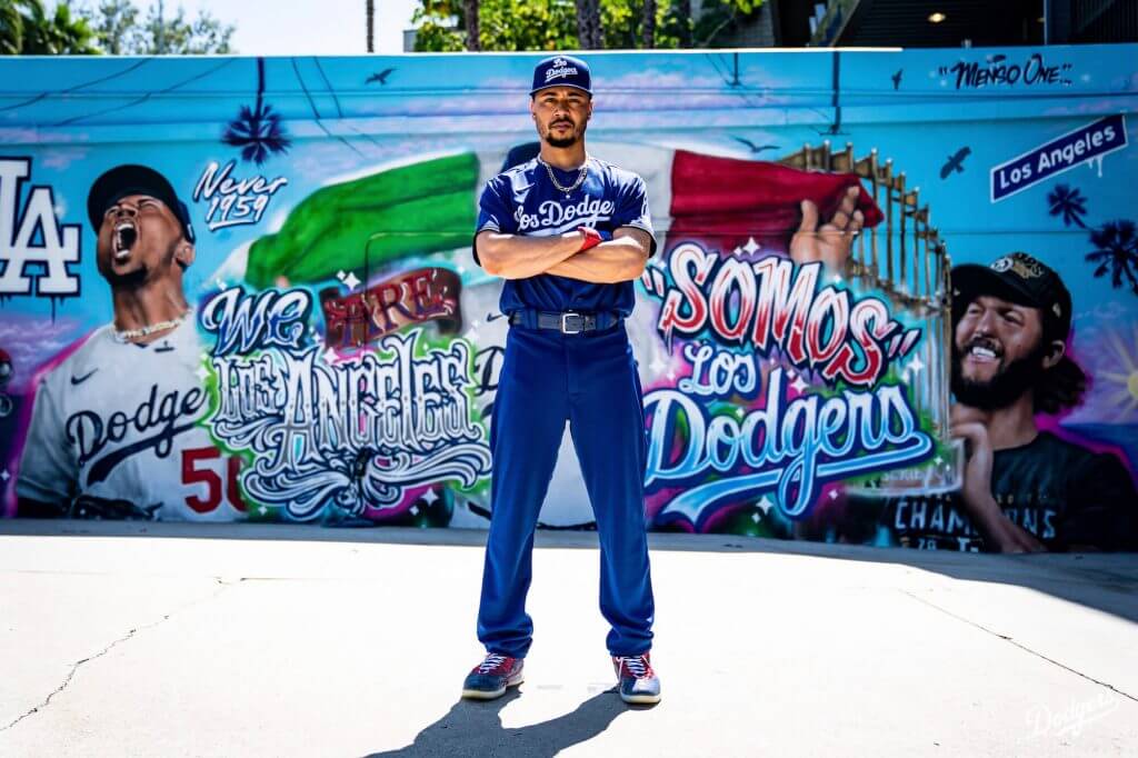
ITEM #3: Dodgers Unveiled City Connect Uniform This Morning
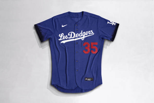
UPDATE: The team has now released the City Connect jersey, pictured above. Per the team:
The Nike Los Angeles Dodgers City Connect Jersey celebrates the link between Los Angeles’ distinct culture and sport. The club unites all Angelenos through their passion for team, its color and a shared pursuit of greatness. The blue jersey is a tribute to a fanbase who have powered the club for over six decades.
Releasing ahead of Latino Heritage Month, the jersey features “Los Dodgers” across the chest. The graphic recognizes the club’s deep connection with the Latino community and the lasting impact of the club’s Latino fans and players, which are celebrated throughout the season at Viva Los Dodgers festivals.
On the jersey’s sleeves, a spray-paint design honors L.A.’s mural culture. Throughout the city, artists have illustrated iconic Dodgers’ moments that commemorate the legacy of the club and its players.
It’s a full mono-blue uniform:
I’ll have more on the unveiling in tomorrow’s post.

Guess The Game…
from the scoreboard
Today’s scoreboard comes from Kelly Hannon.
The premise of the game (GTGFTS) is simple: I’ll post a scoreboard and you guys simply identify the game depicted. In the past, I don’t know if I’ve ever completely stumped you (some are easier than others).
Here’s the Scoreboard. In the comments below, try to identify the game (date & location, as well as final score). If anything noteworthy occurred during the game, please add that in (and if you were AT the game, well bonus points for you!):
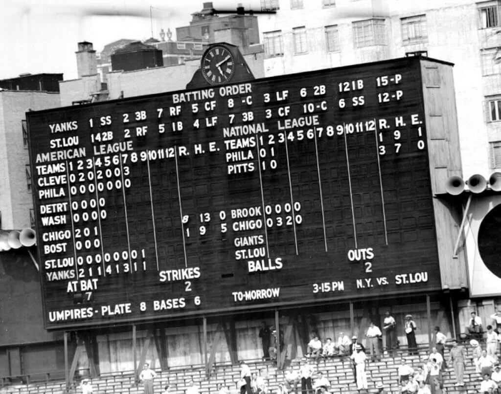
Please continue sending these in! You’re welcome to send me any scoreboard photos (with answers please), and I’ll keep running them.
A Modest Proposal…
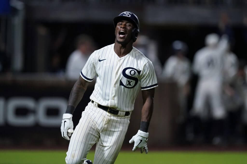
Like many of you, I watched and very much enjoyed last Thursday’s “Field of Dreams” game (scroll down) between the Chicago White Sox and the New York Yankees, and despite the White Sox wearing the (incorrect) blue socks, otherwise loved their special 1919 “throwbacks.”
I happened to catch a bit of the Sox/Yanks game this past Sunday, and was reminded that the Sox continue to wear their beach blanket bingo throwbacks for every home Sunday game. I think it’s time the team retires those and adopts the FOD 1919 Throwbacks as their new Sunday alternate.
I mean — c’mon, despite the blue socks, these uniforms are just drop dead gorgeous and really should become the full time Sunday home uniform. They’ve gotten a lot of mileage out of the City Connect black pins, which I actually also like, and wouldn’t be averse to them continuing to trot those out on occasion. But damn, that 1919 throwback — if they won’t make it a permanent uni — at least deserves to be seen on 13 Sundays starting in 2022.
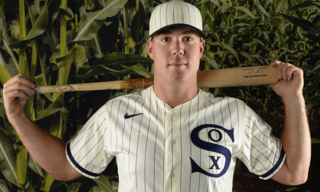
What do you guys think? Time to retire the Winning Ugly unis and replacing them with the 1919s?
The Ticker
By Alex Hider

Baseball News: MLB has unveiled the Spring Training, Cactus League and Grapefruit League logos for next season (from Phil). … Royals 2B Whit Merrifield took BP yesterday in a Kansas City NWSL soccer jersey (from Matt Mac). … The Twins are trying to draw fans to the ballpark by releasing exclusive single-game merch items (from John Cerone). … Dylan Bercu notes that the Charlotte Knights use solid white nameplates atop their white pinstriped uniforms — a pretty rough look.

NFL News: In the latest episode of Washington’s web series about the team’s process in picking a new team name, team officials confirmed that the club has narrowed it down to a final three (from Phil). … Reader Hector Cendejas spotted the Ravens using an outdated Rams logo at Baltimore’s preseason game on Saturday.
College/High School Football News: Idaho State University has released renderings of planned upgrades to Holt Arena, the school’s combined football stadium and basketball arena (from Kary Klismet). … This blog predicts which uniform combinations Iowa State will wear this season (from Phil). … A New Orleans grocery store is currently displaying a pretty great Tulane soda sculpture (from Griffin T. Smith). … A TV station in Huntington, West Virginia mistakenly used an Oklahoma logo instead of an Ohio University logo — and an old West Virginia logo — in a graphic yesterday (from @at_smithers). … New uniforms for NCAA D-III school Hardin-Simmons University (from Jordan Hofeditz). … New turf for Denver North High School in Colorado (from Kary Klismet). … There was some uni watching going on at an Indiana school board meeting the other day — one member said he was concerned about the BFBS creep at Triton High School (from Chad Stegemiller).

Hockey News: This business analysis piece predicts a “cluttered” market for sports advertising now that NHL is adding ads to sweaters (from Phil). … The next three notes are from Wade Heidt: The British Columbia Hockey League has released more info about the 60th-anniversary logo that was mentioned in yesterday’s ticker. … More anniversary news: The Sault Ste. Marie Greyhounds have a new logo celebrating the team’s 50th season in the OHL. … The Canucks released RW Jake Virtanen three weeks ago, but a banner of Virtanen is still hanging outside of the Rogers Center.

Basketball News: The Sixers have announced a new ad partnership with Ticketmaster, and @PhillyPartTwo notes that such a deal could mean the team could have a new ad patch to replace the StubHub ad they’ve worn for several seasons. … The Pelicans announced several new number assignments yesterday. For more, check out NBA numbers guru Etienne Catalan’s Twitter feed. … New court design for Meridian High School in Mississippi (from Kary Klismet).

College Hoops: For years, courts at the NCAA men’s tournament have been emblazoned with “March Madness,” but not at the women’s tournament. Reports indicate that will change next year (from @bryanwdc). … Reposted from college basketball: Idaho State University has released renderings of planned upgrades to Holt Arena, the school’s combined football stadium and basketball arena (from Kary Klismet).

Soccer News: Man City has officially unveiled its new third jersey. As our own Jamie Rathjen notes, the large team name and sublimated logos is a template look Puma is trying with other teams (thanks to all who shared). … Staying in Machester, United will wear their new third jerseys on Sunday (from Griffin T. Smith). … F Bradley Wright-Phillips and the Columbus Crew took on New York Red Bulls last night. Wright-Phillips wore his traditional No. 99 for Columbus — a number that the Red Bulls retired in his honor in 2018 (from Josh Berger). … Repost from baseball: Kansas City Royals 2B Whit Merrifield took batting practice yesterday in a Kansas City NWSL jersey (from Matt Mac).

Grab Bag: Several high schools have unveiled new team names and logos in recent days: Wilson Area High School in Pennsylvania may retire its Native American logo; new logos to go with Saugatuck High School’s new nickname, the Trailblazers; and Indianola High School in Iowa is considering dropping “Indians” as its team name (from Kary Klismet). … Britt Baker of All Elite Wrestling is a Pittsburgh native, and her outfit from a recent match included Steelers, Penguins and Pirates uniform elements (from @SteveinLC).
.
Uni Tweet of the Day
Now that is a drum. And a gorgeous one at that…
As pointed out by @kerba1123, the logo on the drumhead nods back to the original drum, celebrating it’s 100th year. https://t.co/N1tfiQFqDK pic.twitter.com/9TJ0DMcQk3
— Boiler Uniforms 🚂 (@BoilerUniforms) August 18, 2021
And finally… that’s going to do it for today. Be sure to check back in tomorrow for full coverage of the Packers & Dodgers new alternates.
Peace,
PH
Packers – if we’re going with the green on green with gold strips, then gold socks would have made the 50s Classic unis GREAT!
*stripes
Damn, even Purdue’s Big Drum is a victim of Logo-Creep now.
Anyone else getting strong Packers / Edmonton Elks mash-up vibes from the GB throwback?
Yeah the manufacturer logo on the drum is just ridiculous. It’s huge!
It really made me angry!!
I have to say, that Remo logo is pretty proportional to the drum head itself. Purdue’s drum is 2-3 times larger than any “normal” bass drum, and the logo isn’t too out of whack in context.
For reference, this is a normal retail drum head by Remo: link
At least it’s not this big: link (and Pearl doesn’t even manufacture the head!)
Compared to what the logo was even a few years ago though it is huge. They had a big logo on the 150th anniversary of the university head two years ago and last year it wasn’t really seen much. When I was in the band 2006-10 there was none or a smaller one near the bottom by the wheel of the carriage, so this size is noticeable. Maybe it’s something they are doing on their special edition heads. The lettering has always been the script it is in, so not necessarily a throwback, just hasn’t changed much.
Also not trolling on the name, genuinely mine too! Nice to see another G
The White Sox beach blanket unis were out of style when they introduced them; belts, buttons and old-fashioned insignia were the coming trend in 1982.
Out of their rich history of great designs, it’s baffling the respect they’ve shown these Astro-ripoff duds over the years.
Not so much the design, but the 83 division-winning team. Plus, they hosted the All-Star Game that year.
It’s long overdue to put those faux-backs on the shelf.
If the 1977 Sox had won their division, we’d be in the 9th season of the Veeck unis as their Sunday homes.
I have to respectfully disagree but I understand the portion of the fanbase that does not like these unis.
IMHO the Pig-tail C uniforms were far worse.
I respectfully disagree – I think the early 80’s set; especially the 83’s with the All Star Patch are a classic. Maybe I have a soft spot in my heart because it is so nostalgic for me and my little league years.
IMHO the Pig-tail C set was far worse than what we are discussing here. I love tuning in on Sundays and sporting my 72 Fisk Winning Ugly throwback.
Meh on the Packers. Feels like they chose this one just because teams are so into mono now. Would have been better off going with the 1936 design, which was actually a championship year for them as well. And would actually have been a historically accurate matchup if they chose to wear them against the Bears with their most recent throwback design.
Seconded.
Scoreboard:
July 26, 1939
The New York Yankees tied a major league record by scoring in every inning against the St. Louis Browns. Bill Dickey hit three home runs in the 14-1 win.
Some notable facts about that game – Yankees LF George Selkirk was the only person to wear #3 for the team after Babe Ruth (it was retired in 1948). Two other Yankees are wearing numbers later retired for them (#5 for Joe DiMaggio, #8 for Bill Dickey and also Yogi Berra).
No subs were used in this game by the Yankees, and the nine players included 4 Hall of Famers (DiMaggio, Dickey, Joe Gordon & Red Ruffing).
Every Yankee player in this game made an All-Star team and won a World Series during his career, and the nine players totaled a combined 4 MVP awards (3 by DiMaggio, 1 by Gordon), 53 All-Star nods and 48 World Championships!
Looks like it was July 25, 1939.
Meh on the Los Dodgers uni. Instead of the dark trim on the sleeves, it should be red to match the number. And a thin red stripe on the pants would make this mono uni pop a little better
Yeah, it’s easy to miss the goofy spray paint thing. Like the Giants’ City Connect, it’s like somebody came up with a nice, understated design; then somebody in an expensive suit walked over, suggested a silly tweak, and here we are. Not nearly as bad a tweak on this one, though.
Yup, looking closer at the sleeves, I see the spray paint motif. I wouldn’t mind it in red!
It’s like when most Yard Sale signs you might see stuck to a telephone pole. It looks fine when you’re a foot away from it, but driving by in a car you can barely tell it has writing on it.
Those Dodgers uniforms are less ugly than I expected. They look like Nike just mailed it in by mashing up a spring training jersey with a Mexican Heritage Night promotion. Even then, they’d look reasonable when paired with the blue pants. But then Nike being Nike, they asked each player to do dishes in a vat of crude oil while wearing them. Those black spray paint sleeves just ruin the whole thing. Sad look for a franchise with one of the most iconic looks in all of American sports.
I will say as an Oakland resident, that the Dodgers will still look less foolish than the classic franchise across the Bay despite the idiotic sleeve treatment.
as a fan of “the classic franchise across the Bay”, i am frustrated at how easy the dodgers got it here. this uni is fine, not special, not interesting, but not ugly or ill conceived either (save for the hat, which is terrible). knowing that the giants could have just used their (locally) iconic “gigantes” jerseys as their city connect, i would much prefer that option to the bridge fog unis we got. subtle nikefied “story” elements aside, this is just their latin heritage jersey plus blue pants and arguably the worst on-field hat in the league. granted, they refrained from another grand theft auto rip-off “homage” to the late 80s early 90s west coast rap scene, but honestly, if they wanted to, they could have done a dodgers hat in the style of that cultural era with an arched old english “los angeles”, “dodgers”, or even “chavez ravine” word mark, and sold a few million easy.
i am man enough to take the L, even against the dodgers, but this one stings.
ICYMI: I’ve updated the post to show the new Packers alternate (it’s mono green), as well as the full Dodgers City Connect uniform (it’s mono blue). Refresh if you haven’t seen.
Typo in ticker: “The MLB has unveiled”
MLB does not take an article.
Fixed
As a lifelong White Sox fan, I’ve had a mixed relationship with the Winning Ugly unis. It’s what they wore the first time I visited original Comiskey Park and on that day all of the kids got a replica jersey which I cherished (I so wish I still had it!). Then after a few years I came to think of them as both hideous and embarrassing, but now as I’m approaching 50, I have fallen in love with them all over again. The Winning Ugly unis must stay!
Lifer here too – I say hard pass on retiring the current Sunday alternates…Plain gorgeous and so unique. I love tuning in on Sundays to see the Winning Ugly Unis and sport my 72 Fisk red and blue!
Fisk was my favorite player growing up; so much so when I was a kid I sent him a letter asking him to visit my childhood home in New Mexico and stay in our Guest Room.
Go, Go WHITE SOX!!!
Those Dodgers City Connect unis look like knockoffs from the swap meet at the drive-in.
No Facebook for me, so I’ll have to leave this here instead of the bulletin article (which was really interesting, and gives me an idea for maybe a little retirement gig!) Was really interesting to see how it’s evolved over the years and the attention to detail, especially the chain-of-custody mindset.
Was at Camden the other month and was actually sitting behind the authenticator in the well by the Orioles dugout and since the O’s were getting their butt kicked, I found myself paying a little more attention to what was going on down there. I was stunned at the sheer amount of balls that were getting kicked to each of the wells for the authenticators. At one point, I think it was Mancini, broke a bat and they brought that over for authentication, which really blew my mind. The log sheet for the game had to have at least 50 entries (just on the side I was sitting since obviously I couldn’t see the other side’s!), and I think that might be a little conservative of an estimate.
And forgive me for sounding like a curmudgeon, but if you’re gonna ask the the usher nearby for a spare (non-officially-authenticated but one of the set-asides that got sent into the well during the game) baseball for your kid, just ask, don’t beg or give a sob story, I witnessed some pretty pathetic behavior by adults/parents in front of their kids trying to get a ball.
As far as the 83 White Sox, I’m not seeing that hat being made available to team dealers through the Outdoor Cap “TeamMLB” program anymore. Generally that would mean that the hat is not going to be retained for next year. Hoping the reverse pinstripes or (pleasepleaseplease) the 1919 uniforms will replace them.
Those Puma third shirts are BAD.
The maker’s mark at the top dead center is nauseating. I thought the MLB swoosh was bad.
twice in one week, i’m going olde school.
the 1919 sox uniforms are completely unremarkable. other then being navy instead of black, changing the hat colour, and using the subpar hug and kiss logo, they are pretty much exactly the same design as what they are wearing currently. if you were at the game, and not in a $300 seat, would you even know other then the hat? the sox are in desperate need of a bold overhaul.
also, these puma kits, i’ll keep it simple…they look like the old “property of” shirts.
You win the day with “hug and kiss logo”.
For GTGFTS, why do the Pirates have a 3 in the run column? And an 8 for the White Sox? The inning by inning don’t add up. And other games don’t have the total at all. Odd.
First game of doubleheader perhaps?
Perhaps the Chicago-Boston game (and also the Philly-Pittsburgh game on the NL side) had gone final and they were in process of taking down the inning-by-inning scores? None of the other games have totals because they’re still in progress maybe?
It was July 25, 1939 and those were the first games of DH’s. The Google MLB page goes back to 39, but lists teams with their current names, so the Browns are shown playing the Yankees. link
Actually the Orioles are shown playing the Yankees. The Twins are also in that scoreboard. Why would they do that??
Because the Washington Senators team that was playing on that day moved to Minnesota to become the Twins in 1961.
Sorry, turns out my reply ended up as its own comment.
Had to laugh at the Nike marketing blurb on this. “Special relationship between the Latinx community and the Dodgers” (I’m paraphrasing here)? Yes, like the glorious memories of being evicted and watching your house being torn down to make way for Dodger Stadium. I’m sure THAT’s a memory they want to cherish forever.
So much this. It’s a disgrace to have Los Dodgers on their unis, not to mention being lame.
Because the Washington Senators team that was playing on that day moved to Minnesota to become the Twins in 1961.
Didn’t the White Sox have 1917 turn-back-the-clock uniforms as their Sunday attire a few years ago?
It’s weird that the White Sox would throwback to 1919, and that MLB would be okay with it given that year ended in the Black Sox scandal.
Why does Green Bay insist on calling it gold when it’s clearly yellow? Notre Dame’s helmets are gold, for reference. Are they afraid of calling it yellow as if it were a “weak” color?
The team nickname is the “Green and Gold” and the color they wear is also known as “Athletic Gold” — you may refer to it as yellow, but many of us (myself included) call it gold. Yellow is the color worn by Oregon.
Regarding the new logos for the Cactus and Grapefruit leagues:
The Cactus League has a Cactus, but the Grapefruit League doesn’t have a Grapefruit Tree.
I have a problem with this.
For GTGFTS, this appears to be July 26, 1939 at Yankee Stadium, a 14-1 Yankees victory over the St. Louis Browns, notably with Babe Dahlgren at 1B, Gehrig having removed himself from the lineup some weeks earlier. Bill Dickey homered three times. The Yankees scored in each inning and at the end of the game were 39-1/2 games ahead of the Browns. Cal Hubbard was the HP umpire. Red Ruffing got the win and attendance was 4,843. The game lasted a few minutes shy of two hours. In other eventual news that day, John Winston Howard, 25th Prime Minister of Australia, was born in Mew South Wales.