
[Editor’s Note: Paul is on his annual August break from site. Deputy editor Phil Hecken is in charge from now through the end of the month, although Paul may be popping up here occasionally.]
By Phil Hecken
Follow @PhilHecken
Greetings and a good Wednesday morning to you all.
We’ll be taking a brief break from our Olympics-themed ledes today as yesterday the Golden State Warriors, New York Knicks, and Boston Celtics all unveiled what the Nike National Basketball Association is calling the “Classic” edition, which we’ll be referring to from now on as a throwback (because that’s what they are). Before we get into the details, a bit of history…
As you’re likely all aware, the NBA is celebrating the 2021-22 season as its 75th Anniversary. Officially, the NBA was founded in New York City on June 6, 1946, when the Basketball Association of America (BAA) was formed, and changed its name to the National Basketball Association on August 3, 1949, after merging with the National Basketball League (NBL), which operated independently and was a competitor. So, while technically it’s not quite the 75th Anniversary of the NBA (as an official name for the league), it is nonetheless the 75th Anniversary of the league that would become the NBA. Got that?
Anyway, to tip off the upcoming season (and the holiday buying spree), yesterday the three aforementioned teams all released throwback uniforms. Why (just) those three? Well, the 1946 season launched with 11 original teams, but the Warriors (playing in Philadelphia then), the Knicks and the Celtics are the only surviving original clubs. So these three teams were given Classic throwback uniforms bearing that edition’s moniker. Since these are the sole remaining original 1946-47 teams, they will be the only ones to receive the Classic throwback uniforms for this season.
Let’s take a look at the uniforms:
Golden State Warriors
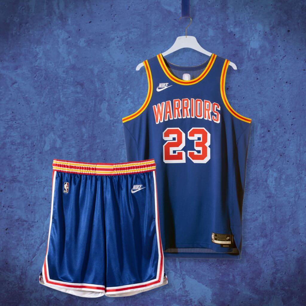
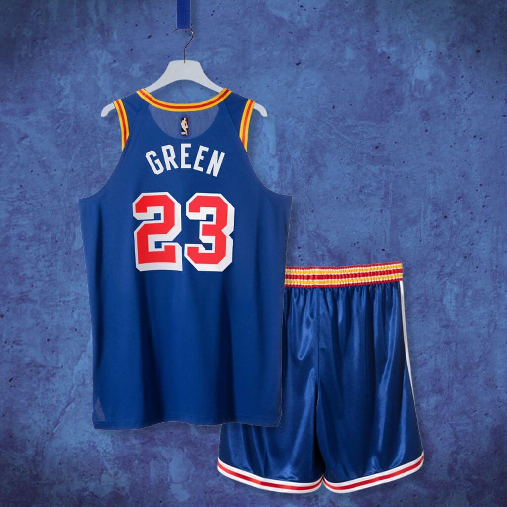
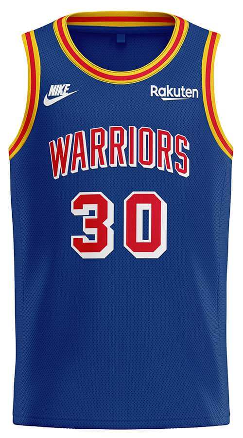
The Warriors will be sporting a blue uniform featuring gold and red trim, with “WARRIORS” in red vertically arched lettering, with white blockshadow. Numbers are also red with white blockshadow. The pants will have a gold/red/gold waistband, with red and white piping down the sides and on the hem. Here’s a look at the back:
Interestingly, this particular throwback is not to the original 1946-47 road uniform, but rather, to the 1961-62 season, and takes a bit of a liberty with the “throwback” because those jerseys read “PHILA” and not “WARRIORS” across the chest. Why did the team choose that season? According to this article, it was their final season in Philadelphia and one of those games included Wilt Chamberlain’s infamous 100 point game against the Knicks. The team actually won the “NBA” title in 1947 (the first year of the league) and five others, but did not during the 1961-62 season.
New York Knicks
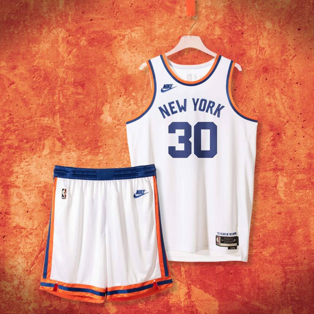
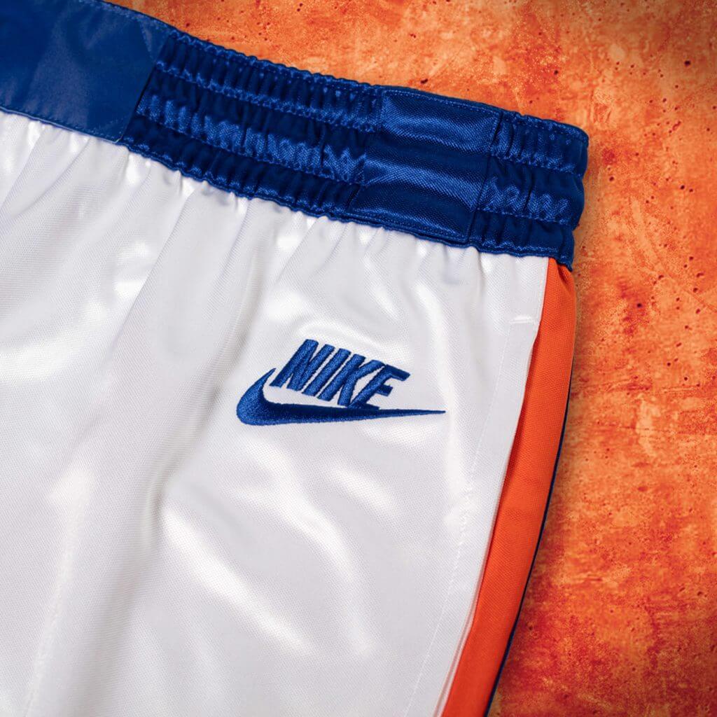
The Knicks will be sporting the teams inaugural 1946 home uniform, which is quite plain, and features orange and blue piping on the jersey, with a radially arched “NEW YORK” in blue letters on the chest. Numbers are block and also rendered in blue. The shorts have a blue waist band, with orange/blue/orange striping on the sides and hem. Here’s the back:
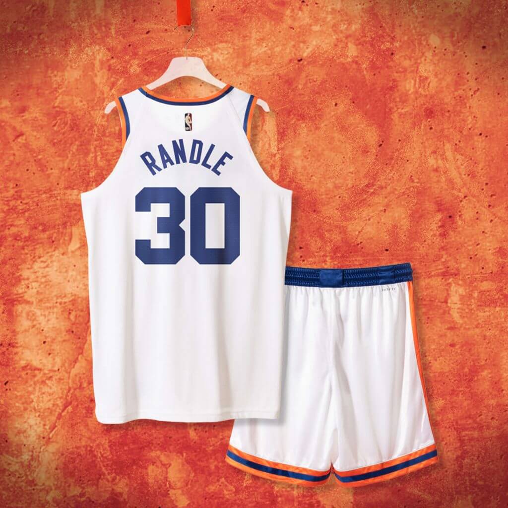
Although it’s tough to tell, back in 1946 (and later years) the Knicks uniforms had “large scale” numbers, which have been pretty accurately replicated in the throwbacks. The “NEW YORK” font face is also unique and has been reproduced well. Additionally, those original uniforms were belted, and while the throwbacks will feature elastic waistbands, they also feature loops, which are used to simulate the old belted look:
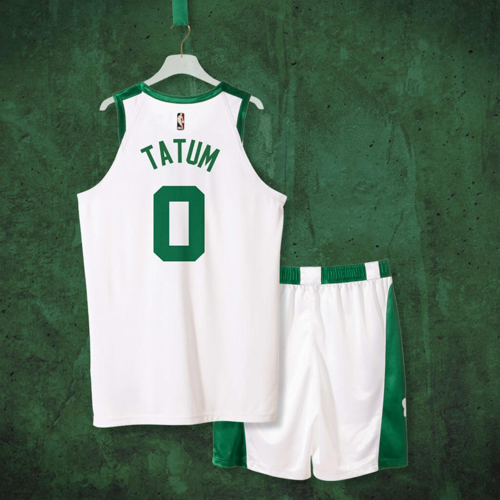
Boston Celtics
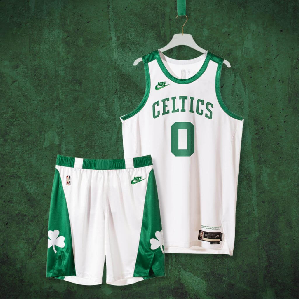
This uniform is pretty close to the inaugural 1946-47 uniform, but you’ll notice the original uniform was sleeved(!). After one season with the sleeves, in 1947 the team went to the traditional tank top, so that’s what the team is throwing back to this fall. It’s a white uniform with thick green trim and shoulder stripes, and features “CELTICS” in vertically arched lettering across the chest, with a thick solid green number. The pants have a green waistband (with white loops to simulate the old belt tunnels) and pyramidally shaped green stripes with a shamrock logo down the sides. Here’s a look at the back:
Like the Knicks, and as mentioned above, the Celtics pants will have the simulated belt tunnels, but since the Celtics are rendered in white on the green waist band, they’re much more readily apparent than the Knicks’.

The teams will wear these uniforms throughout the season. Interestingly, although Nike did not exist in 1946 (and teams of course did not wear maker’s marks on their uniforms), these unis will feature the “throwback” Nike logo, rather than the larger “swoosh” which currently adorns all non-Jordan NBA uniforms. The jock tags are different for each team, with the Knicks’ reading “75 Years In The Making,” the Warriors’ has no slogan, and the Celtics’ features a quote from legendary coach Red Auerbach that reads, “The Boston Celtics are not a basketball team, they’re a way of life.”
As a fan of throwbacks, I genuinely love all three of these uniforms, but the many and varied NBA uniform shenanigans under Nike has taken a bit of luster off these. With many teams’ “City” editions not even bearing a faint resemblance to a team’s current color scheme or theme, one often doesn’t know what team is playing if one turns on a game these days. It’s great that these three teams are offering what are as close to a throwback as can be reasonably expected, and I hope the teams will choose to wear these often. As far as these three “new” uniforms go, I have no complaints.
Paul (who’s never really on vacation, is he) e-mailed me yesterday to point out how much the front of the Warriors jersey resembles the back of the New York Rangers (the biggest difference is the different angle of the blockshadow and the size of the numbers):

Like I said, I love these, and I am anxious to see how they look on the court. If you look closely, all the shorts have a “sheen” to them that also replicates the look of the early NBA years. The belt loops detail was a nice touch (even if the Knicks’ probably won’t be visible from any distance), and I think the designers/manufacturers took some pains to ensure as much authenticity to the originals as possible.
One minor complaint: I can’t stand the way the Nike jersey is cut in such a way that any striping doesn’t go completely around the armpit, as the originals did. That’s not unique to the throwbacks — all Nike jerseys have this feature bug. But that’s about all I dislike here!
Your thoughts?
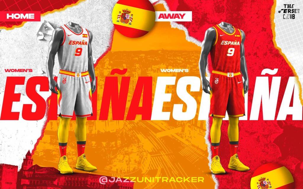
Olympic Hoops Unis … Reimagined
The guys from the “Jersey Club” (whose designs I’ve featured on UW before) embarked on a new project which I’d like to share with you today. After seeing the uniforms for both the Men’s and Women’s teams for the Tokyo Olympics, they thought they’d have a little fun and “tweak” them a bit (I think in many cases, their designs are far superior to those actually worn on court). Both Mike Joseph and Casey Vitelli are what I’ll call the “main” designers in the Jersey Club, but all the designers are top notch — and Casey will describe the project briefly and then you’ll see their designs. Take it away!
Reimagining the Olympic Basketball Unis
by Casey Vitelli
Ever since my interest in basketball started, in 2003, I have found myself a fan of international basketball. I would try my best at recreating the uniforms to use in the old NBA Live games, and a full USA mod in NBA 2K14. Being a fan of the international game, I am so excited to present the Olympic Refresh Project.
We, The Jersey Club, recruited 2 new members and went to work bringing you a refreshing take on basketball uniforms for the 18 countries representing the men’s/women’s side and a court for the Tokyo Olympics.
This time around we did a random wheel that picked which team each designer created for.
Special thanks to Shape Arts (@shapeedits) for the work he put in on the artwork for the project.
We had a great time designing these, and we hope you enjoy the work we put in. Feel free to check out each designer’s individual work on their twitter pages.
– Casey Vitelli (@caseyvitelli)
TEAM LIST:
@emmegraphic_
@Lance_Hinesman
@djossuppah
@SunsUniTracker
@caseyvitelli
@icniivad
@evxz17
@shapeedits
@DenverGravitt
@JazzUniTracker
@SethR94
@SlamStudios
@petemrogers
MEN
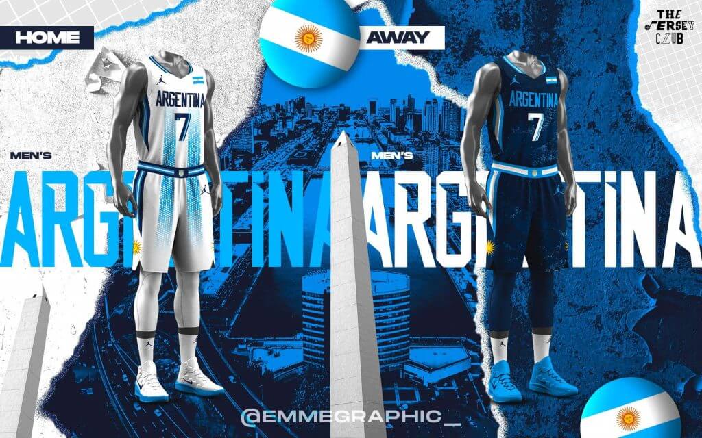
Argentina
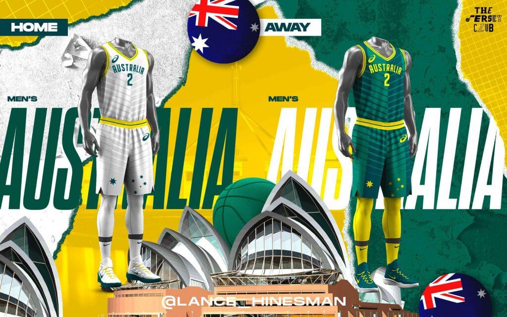
Australia
Czech Republic

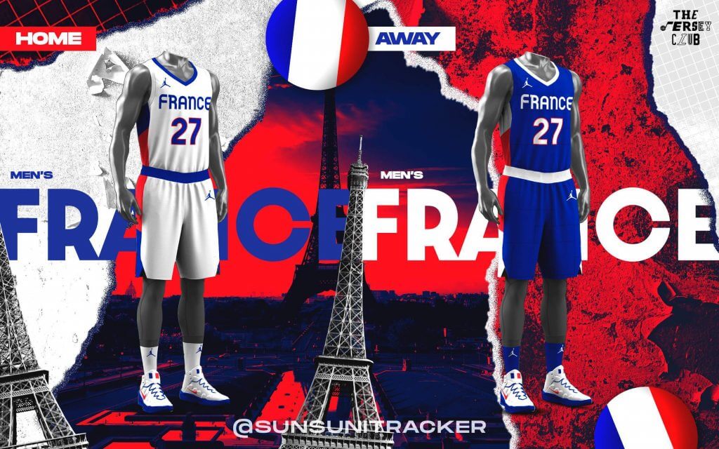
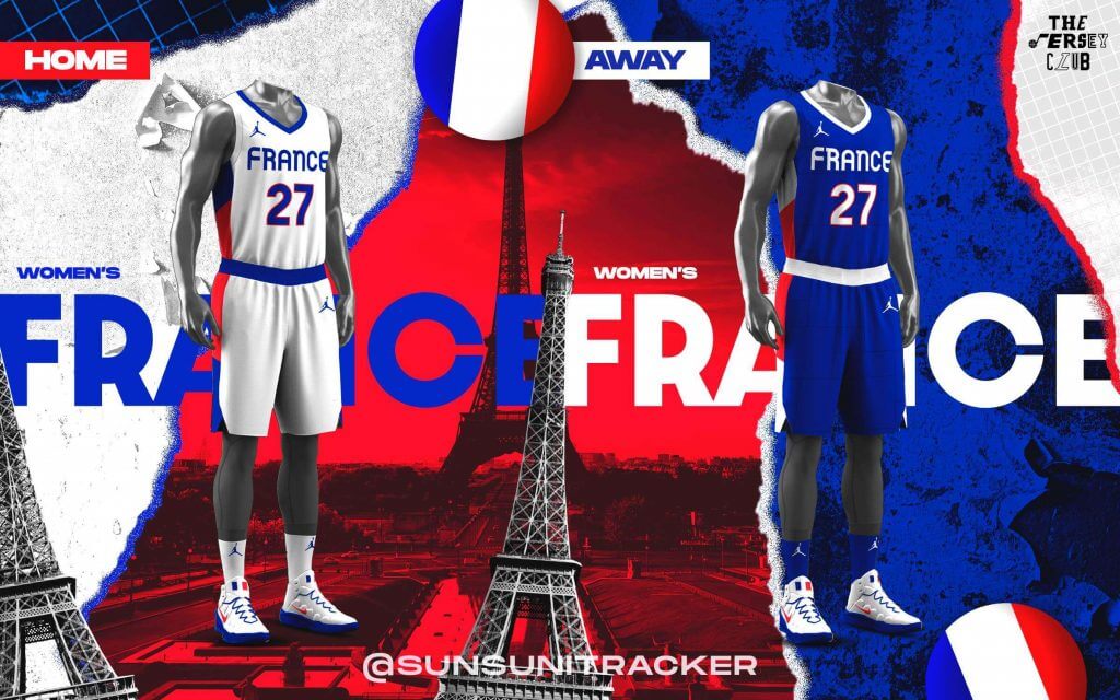
France
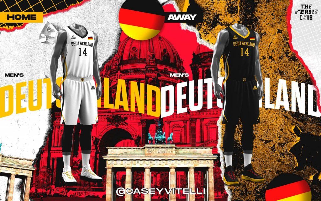
Germany
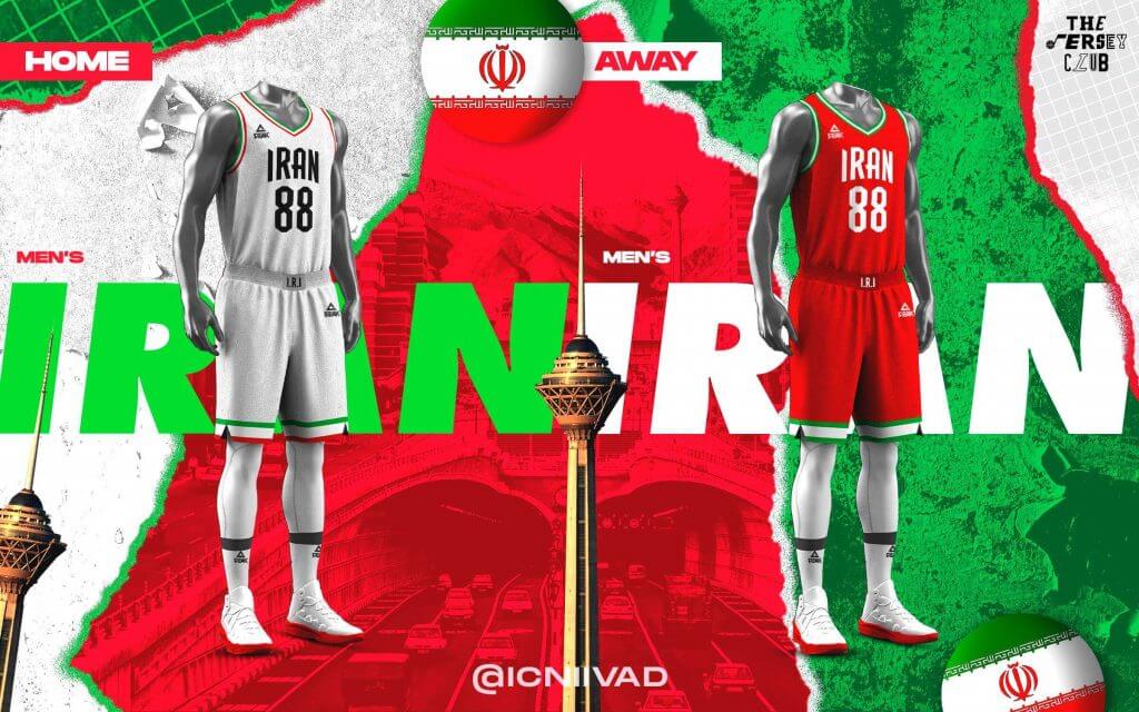
Iran
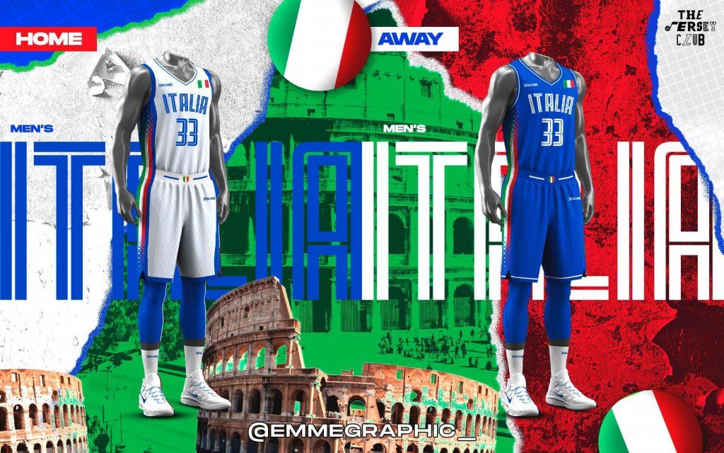
Italy
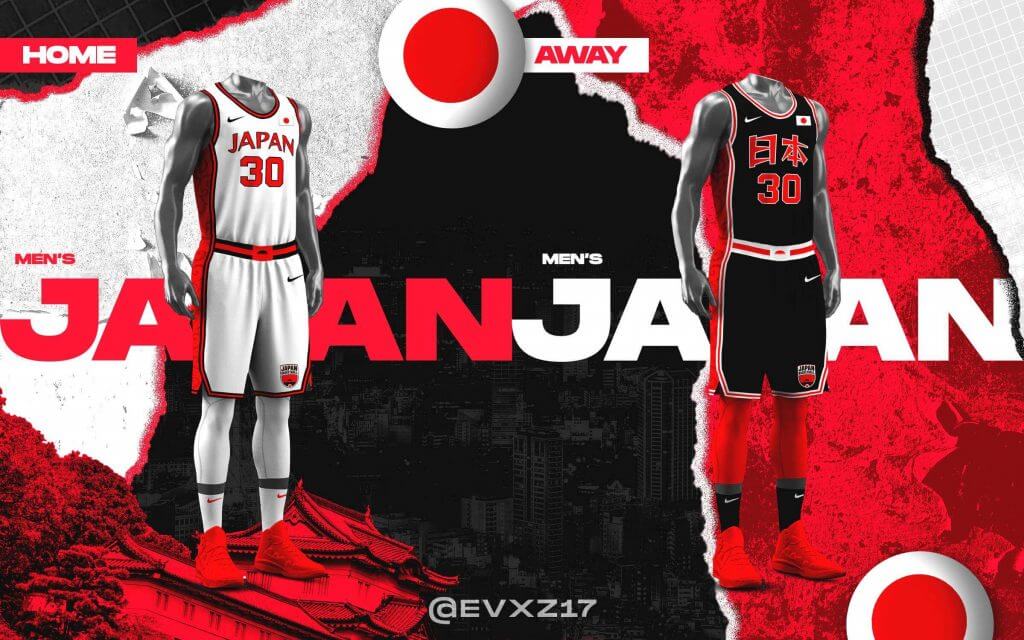
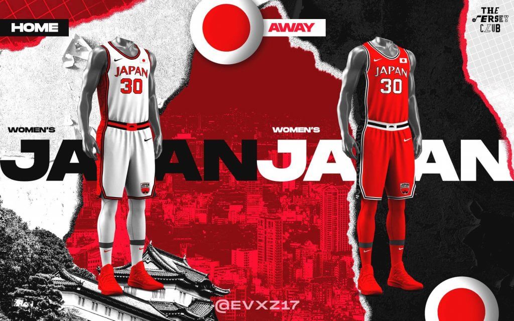
Japan
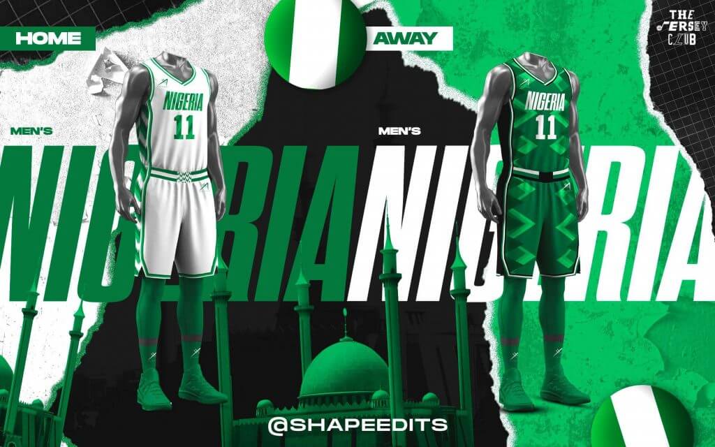
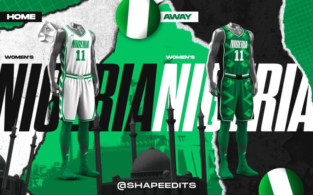
Nigeria
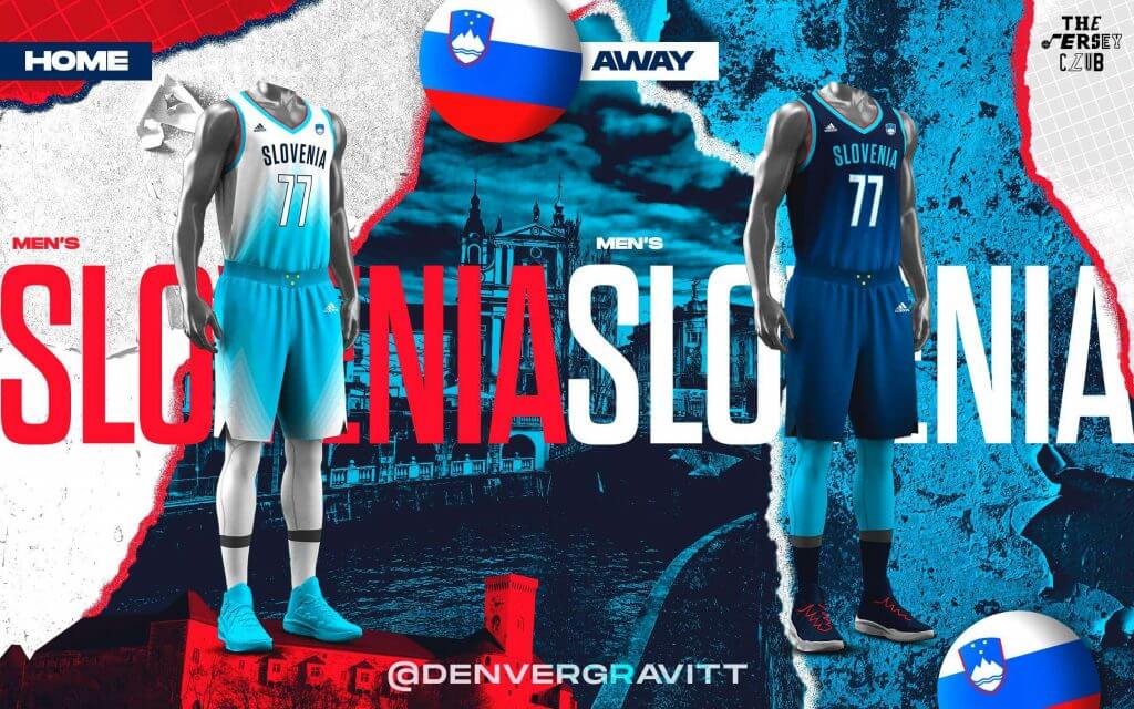
Slovenia
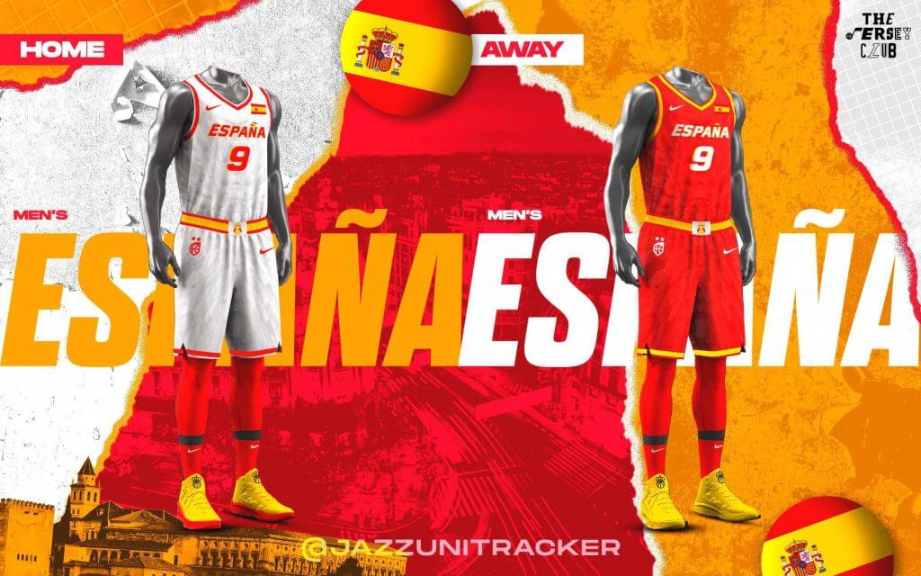
Spain
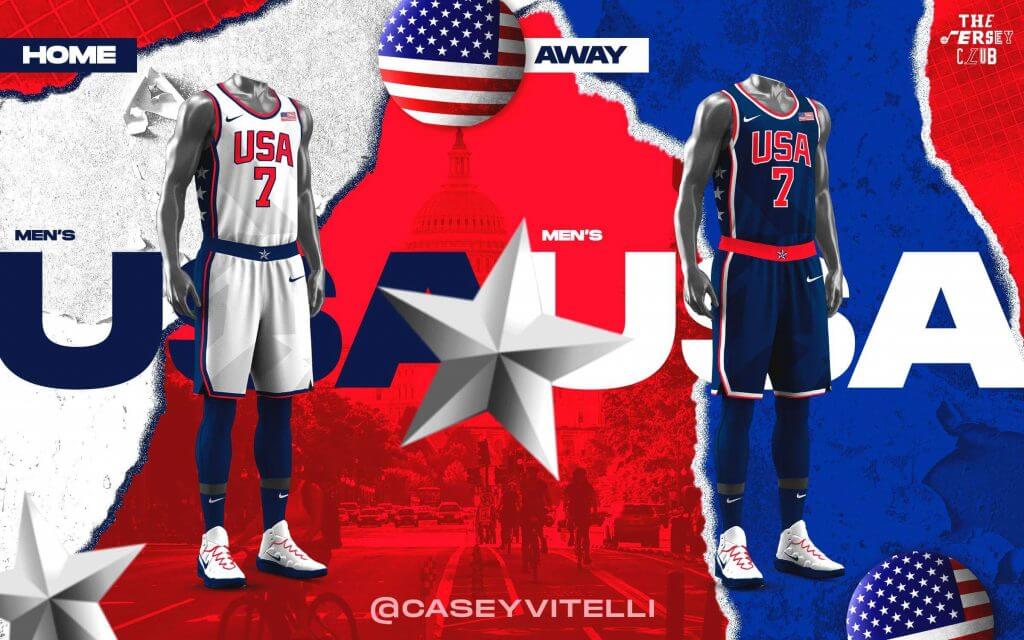
USA
WOMEN
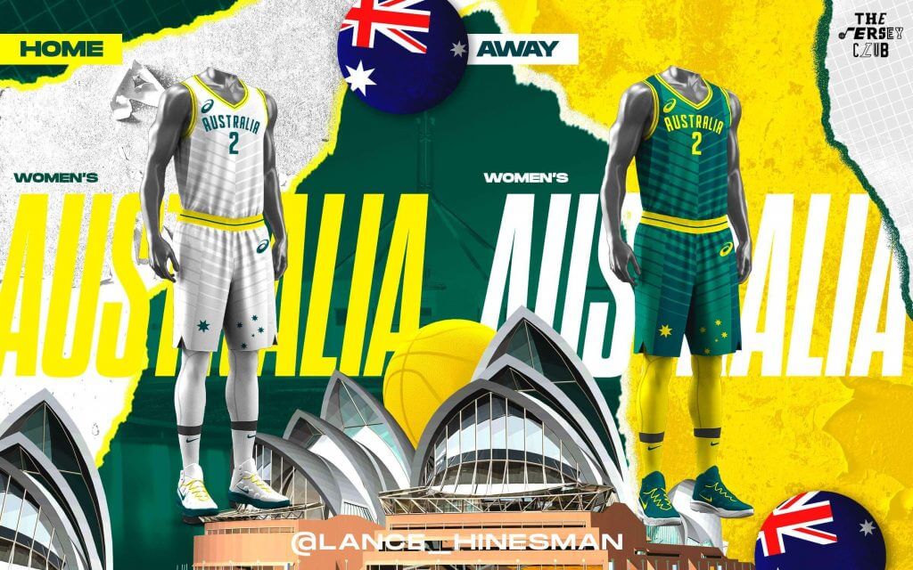
Australia
Belgium
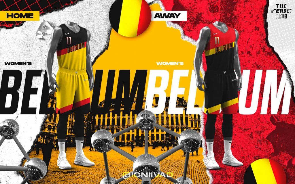
Canada
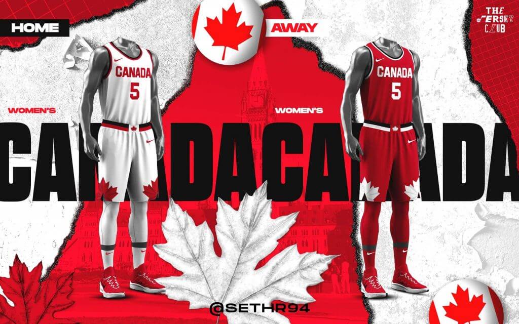
China
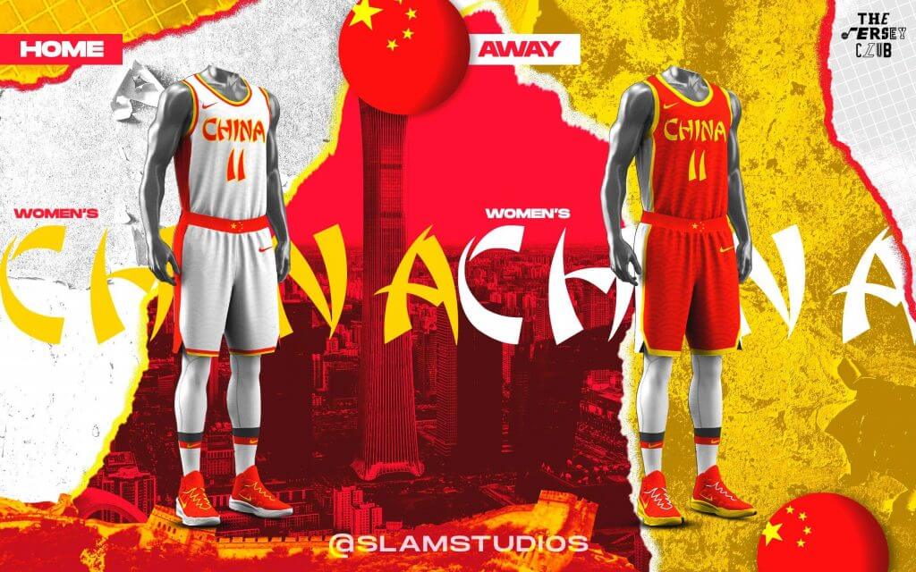
France
Japan
Nigeria
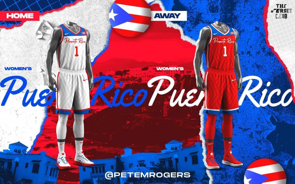
Puerto Rico
Serbia

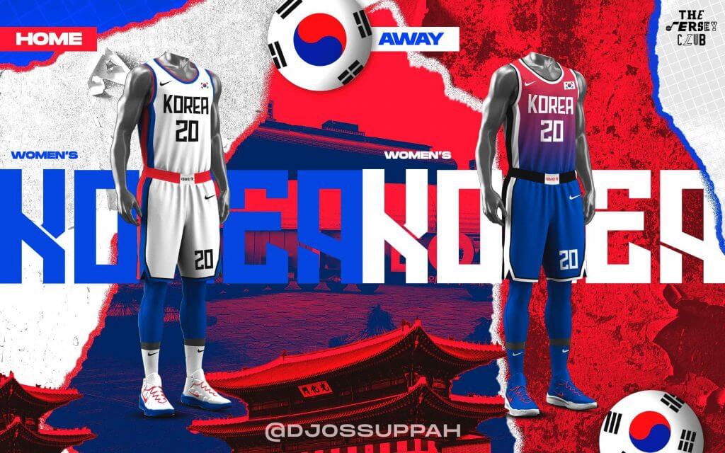
South Korea
Spain
USA

Thanks, guys!

Guess The Game…
from the scoreboard
Today’s scoreboard comes from Merv Bronte.
The premise of the game (GTGFTS) is simple: I’ll post a scoreboard and you guys simply identify the game depicted. In the past, I don’t know if I’ve ever completely stumped you (some are easier than others).
Here’s the Scoreboard. In the comments below, try to identify the game (date & location, as well as final score). If anything noteworthy occurred during the game, please add that in (and if you were AT the game, well bonus points for you!):
Please continue sending these in! You’re welcome to send me any scoreboard photos (with answers please), and I’ll keep running them.
The Ticker
By Lloyd Alaban

Baseball News: P Ryan Pepiot of the Oklahoma City Dodgers wore some nice-looking stirrups Monday (from Drew, who didn’t give his last name). … The St. Louis Cardinals retired Ted Simmons’ number and unveiled a statue of him outside of Busch Stadium last weekend. Simmons wore a red blazer with a cardinal on the left breast for the occasion. It looks like something given to members of the team’s hall of fame. Anyone know for sure? (from Kary Klismet). … P Joe Biagini of the Iowa Cubs, affiliate of the Cubs, wore an Indianapolis Indians—affiliate of the Pirates—batting helmet at an at-bat last night (from Dylan Heuer). … Here’s a 3-minute-ish chatter about the New Era Cap upside down logos and how the Orioles logo “looks like a bird with a pompadour,” (from Josh Berger).

Football News: The NFL isn’t saying which teams were allowed to adopt a second shell (from our own Phil Hecken). … Here’s a partial oral history of the early Bronco Mendenhall era (which started in 2016) at the University of Virginia. The players talk quite a bit about having to earn numbers and even earn logoed gear and more about the annual selection of jersey numbers (from our own Jamie Rathjen). … Here’s how the Hall of Fame’s gold jackets are made (from Jason Hillyer). … ESPN has named Notre Dame’s football uniforms the best in college football. … BYU will go mono-royal when they kick off their season vs. Arizona on September 4th.

Hockey News: The Coyotes are mulling a new look (from @aetk28). … New numbers for the Flames (from Wade Heidt). … Also from Wade: Ak Bars Kazan revealed players with new numbers using a clip from the video game Grand Theft Auto: San Andreas.

Basketball News: SF/PF Rudy Gay will wear No. 8 with the Jazz (from Mark Pereira). … Nets SF Kevin Durant talks about how he would design the Sonics’ unis if they were ever to come back to the league (from our own Phil Hecken). … New jerseys for Missouri State (from Sara Corman). … The Mackay Meteors, who have McDonald’s as their advertiser, wore Hamburglar-themed uniforms (from Thomas Clouse). … Work has begun on a new basketball arena for Carnegie Mellon University in Pittsburgh, set to open in 2024, the 100th anniversary of their current arena, Skibo Gymnasium.

Soccer News: New home shirt for Polonia Warszawa (from Ed Zelaski). … Also from Ed: New 115th anniversary kit for Wisla Krakow. … Premier League players (at least) are going to continue to kneel before games and they’re also going to continue to wear the No Room for Racism sleeve patch (from our own Jamie Rathjen). … New first kit for Crystal Palace (from multiple readers). … New third shirt for Benfica (from Mike D.). … Some kits are based on maps (from @csuper). … Here’s an article on the history behind the new Columbus Crew smokestack (from John Flory).

Olympics News: Slovenia PG/SF Luca Doncic wore Jordan Brand socks while the rest of his teammates wore Adidas (from Alex, who didn’t give his last name). … The Olympic Equestrian jumping competition has a Rio 2016 gate on the first jump (from Cole Streeper). … Two life-size mascots of a kangaroo and emu that were stolen from the Australian Olympic delegation’s quarters have been recovered near the German team’s dorms (from Kary Klismet). … Two Chinese cyclists are under investigation after they wore pins depicting former Chinese Communist Party leader Mao Zedong on their uniforms at the Olympics. … The Olympic bullpen cart is the gift that keeps on giving (from Michael Ortman).

Grab Bag: Ohio State will now start selling merchandise with the names and numbers of current players. … New jerseys for New Zealand rugby. … New shirt and kit provider for Stade Rochelais (from Sy Hart). … Also from Sy: New kits and kit provider for Montpellier Hérault Rugby. … The NCAA D-III North Eastern Athletic Conference will now be known as United East (from Kary Klismet).
Uni Tweet of the Day
I remember this day vividly. I wasn’t a Yankees fan (nor particularly a Thurman Munson fan), but it was chilling to me as a young fan of the game…
After Thurman Munson’s death 42 years ago, the Yankees added black arm bands to their uniforms before their next game. Here’s Joe Fosina, the long-time tailor, hustling the uniforms into the Stadium. The anguish in his face is palpable. This appeared on The Daily News back page pic.twitter.com/YBsBHLw8b8
— Jack Curry (@JackCurryYES) August 3, 2021
And finally… that’s all for today, folks! Everyone have a good Wednesday and I’ll catch you all back here on the morrow.
Peace,
PH
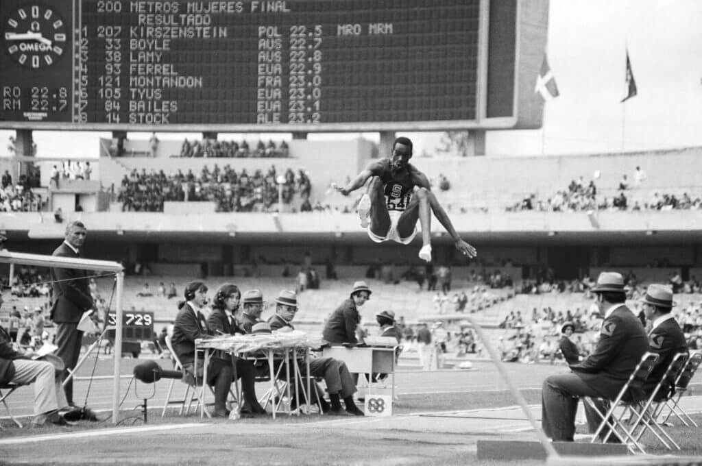
GTGFTS –
Bob Beamon shatters the long jump record at the mexico city olympic games, October 18th 1968.
29 ft 2+1⁄4 in
Excellent choice!
The scoreboard indicates the final results of the womens 200m from those Games.
Irena Kirszenstein set a new world record time for the event. Fun Fact: She is the only athlete to have held the world record in the 100m, 200m and 400m.
All members of the Baseball HOF associated with the Cardinals and members of the Cardinals Hall of Fame wear red jackets. I believe they wear different lapel pins to signify which HOF they are a member of.
I have what may be a dumb question:
The women’s basketball designs got a male template as well? They couldn’t have had their own template?
Also, I can’t believe the item on maps on soccer shirts didn’t include Shimizu S-Pulse, the team that’s been doing that for most of the past 30 years.
Why would you call Wilt’s 100 point game “infamous”?
Its one of the greatest accomplishments in the history of sports. The bombing of Pearl Harbor is infamous, Wilt dropping 100 is famous.
I suppose it’s infamous if you’re a Knicks fan; the team he scored all those points against.
Maybe he’s using the “Three Amigos” logic where they figured that if it’s good to be famous, it’s even better to be infamous?
Never heard the word “blockshadow”. Is that distinct from “drop shadow”?
Yes, it is. It includes the outline and the connected lines. Drop shadow is like a projected shadow behind the character, block shadow is connected to the character.
Yes. You can see the differences link.
That moment when you realize you’re going to be noticing something for the rest of your life…thanks I guess…:)
I still call it: “3D” Numbers” (regardless of nuances). Great stuff…
I still call it “3D Numbers”. Regardless of nuance, most 3D numbers look great.
Finally! Some good-looking, proper uniforms from the NBA compared to a lot of the crappy ones that have been recently released. These 3 Classic uniforms are excellent.
Also liking the international basketball uniform concepts. Good work!
Would have preferred if the Warriors somehow referenced their home region rather than nickname, as the originals had PHILA on them.
Regarding the incomplete armpit striping. It is crazy to me how Nike specifically tailors their uniforms against the designs. Be it all arm piping in basketball, or butchering the shoulder stripes for teams like the Colts in the NFL. Surely they could meet the actual design specs, but seem to put their nonsense specialized cuts as a priority over the actual uniform design.
First Warrior’s graf: “The Warriors will be sporting a blue uniform featuring bold and red trim”. Should probably say “gold and red”.
I believe you meant to put “radially arched” for the NY uniform!
There are some great reimagined Olympic basketball uniforms here. Clearly the designers have gone with white as the traditional home colour, but that just doesn’t work for Australia with its national (sporting) colours of Green and Gold. In most sports, Australian team uniforms are predominantly Gold. The Australian Rugby League (as opposed to Rugby [Union]) jerseys are an obvious outlier, being Green with Gold highlights. Otherwise, Gold with Green highlights would be the first choice. I understand there are studies indicating that, for teams that require the use of alternate strips, Australia has a better winning percentage when Gold is worn. There have been a few times when Australian teams have worn white jerseys (mainly football/soccer, who have even worn dark blue at times). The men’s basketball team has worn white a couple of times (warm-up games prior to the Sydney 2000 Olympics for example) but these were an anomaly and an abomination. Gold it is.
I really like the Warriors throwback, but why is the short piping white-red-white when the jersey piping is gold-red-gold? A little more consistency would have made this a top-3 uniform. As it is, top 6 or so. As for the other two, I think the modern typography works better for both teams. They’re already the two best uniforms in the NBA. These are still good, but not as good as the default (if that still means anything in NBA uniforms).
Also, I usually don’t like a lot of the uni concepts and tweaks, but the Team USA basketball jerseys today are beautiful.
I really like the Celtics’ shorts with the triangular green panel. I’m surprised they didn’t do this earlier. Yes, there was a black throwback treatment a few years ago with a triangular panel, but this is a true throwback to the early days.
I’m still surprised the Celtics didn’t throw back to the original 1946 unis when Adidas was pushing sleeved jerseys on the teams a few years back.
Seems odd that Nike wouldn’t make the warriors throwbacks with Phila on them, but they have the lakers wearing Minneapolis units and the clippers wearing buffalo ones
Notre Dame has the best uniforms? They are nice, but I could do without the chrome helmets. I have always preferred UCLA, LSU and Auburn, none of which were mentioned. I could never understand the love for the plain Penn State uniforms. Most teams probably have better practice uniforms.
It’s actually possible to love something *for* its plainness.
I think basically it’s because ND and Penn State’s plain designs have been around forever. If those schools had never fielded a football team until this season and then came out with those uniforms, everybody would hate them.
That’s one thing I’ve becoming increasingly convinced of since reading Uni Watch: opinions of uniforms rely heavily on nostalgia rather than true aesthetics.
If Notre Dame took the field for their first ever game against, say, the 2018 Tampa Bay Bucs, I know which team I would find aesthetically pleasing.
But denying historical appeal is silly. It’s a huge part of sports.
They’re not chrome. If they were, during a night game they would reflect the night sky and look almost black. Instead, they have a textured finish that reflects light whether real or artificial and makes it look gold day or night.
Of course a Notre Dame slappy blog is going to proclaim their unis are the best ever. Personally I think Ohio State or USC have better uniforms.
NBA uniforms include the “throwback” Nike logo, which is louder than a simple swoosh.
A true throwback would have no logo at all, which we know could never happen.
The final link (that of Melo in NY) on the throwback NBA unis section in which you talk about the armpit loops not going all the way around is actually an Adidas uniform. Knicks were the only team who had that feature and it was intentional.
Thanks Sam — swapped in a new photo!
NP
The Olympic basketball mockups are nice. But I would have worked in a lot of light green into Slovenia’s set, they use that as their international color like the Netherlands uses orange or Italy uses blue. And I was wondering why some countries were designed with their English names but others got their name in their native language?
I’m somewhat terrified of what the Coyotes could be conjuring up.
The Arizona NHLers have played both sides of the fence, going wild in the Kachina days but being conservative during their days of red uniforms. My wish is that the Prairie Wolves go for a “symbolic” approach; that is, employing the crescent moon, or saguaro cacti on the crest, or shaping the crest like a map of the state. Insignias like the Flyers’, Canadiens’ or Red Wings’ seem to age better than ones which are too literal. I like to say, “How would the WHA have done it?”
Any idea why these throwback uniforms (see: knicks) have such small font for the name? The NEW YORK is clearly smaller than the original. The original reaches way past the numbers on either side, whereas the reproduced version barely hangs off the numbers? I notice this all the time, and it’s so annoying! I was also surprised to see that while you compliment Nike on getting the font close, you don’t mention the clearly smaller font size? Am I on my own in noticing this?
Sorry for the late reply. I may not have worded it particularly well, but Nike got the link correct. And for the time, those numbers were quite large. But yes, the giant numbers actually came in their link, which also had the awesome tiled stripe motif.
I’m not much of a basketball fan but those Celtics and Warriors unis are chef’s kiss perfect.
They’re not throwbacks if they feature a major visual element, the Nike ad patch, that wasn’t on the original. Also a disappointment to see another concept series posted here that features jersey ad patches. It’s wack unless the designer and uni-watch are getting paid to show those ad patches on there.