[Editor’s Note: Paul is on his annual August break from site. Deputy editor Phil Hecken is in charge from now through the end of the month, although Paul may be popping up here occasionally.]
By Phil Hecken, with Jamie Rathjen
Follow @PhilHecken
Greetings and good Tuesday, Uni Watch readers. In the absence of any big new uni news (although I suspect that will change tomorrow), we’re continuing to take a look at some of the lesser-known Olympic sports. In case you missed it yesterday, correspondent Jeremy Brahm had a nice look at volleyball, and today, our own Jamie Rathjen has put together a really nice piece on a sport that gets very little uni-attention here at Uni Watch: Field Hockey. Jamie’s done a great job breaking down the field hockey kits at the Tokyo Olympics. Enjoy!
Olympic Field Hockey
by Jamie Rathjen
The Olympic field hockey competitions are both 12-team tournaments and rank highly on the calendar in a sport with a lot of opportunities for national teams to play each other, including the new FIH Pro Leagues for the top countries. Unlike soccer, for example, the top of both the men’s and women’s games feature most of the same countries, so many of the same color schemes are on display in both competitions. Of the 14 countries participating, 10 managed to qualify both teams, and each competition has two countries that didn’t qualify for the other.
In general, most of the teams look at least somewhat different than they normally do because almost all wear ads outside of the Olympics and, like other team sports, may have different manufacturers than normal.
You’ll perhaps note the absence of the U.S. from this piece. The U.S. women’s team, which was top-five in the world in 2016, is a mess right now — while still being ranked 15th — and in November 2019 failed to qualify for the Olympics for the first time since 2004 after losing to India in a two-legged series for one of the final spots. They’ve spent much of the past two and a half years playing in the Pro League without much success.
The U.S. men’s team was eliminated one game short of those two-legged series and last qualified without hosting in 1956. I would be impressed if the U.S. had a drought in another Summer Olympics event that came remotely close to that.
Because of that, you may not have even seen field hockey during these Olympics unless you’ve gone looking for it on NBC’s streams. I haven’t seen it on real TV channels at all, which is odd and frustrating because handball, the other sport the U.S. didn’t qualify for, has been on TV relatively often.
Argentina

Both teams generally look like their soccer counterparts, mostly using sky blue and white in their first choices. Black is often paired with those two in both sports and it’s the color of the second kits here. That’s an improvement for the women’s team over the usual unnecessary amount of pink or pink accents they wear.
Australia
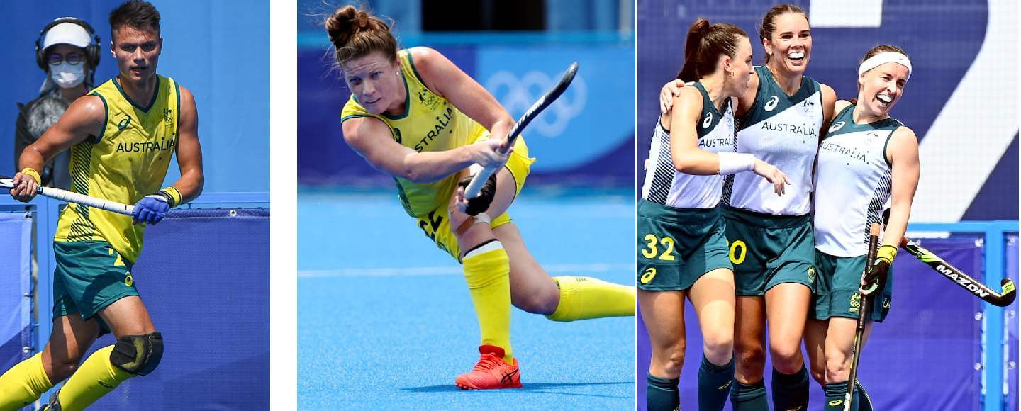
Australia usually use a lighter shade of green in particular than most of their counterparts in other sports, but at the Olympics they look more conventional. Only the women’s team has worn a second kit so far and it was white/green/green instead of the perhaps expected green with gold accents.
Belgium (men only)
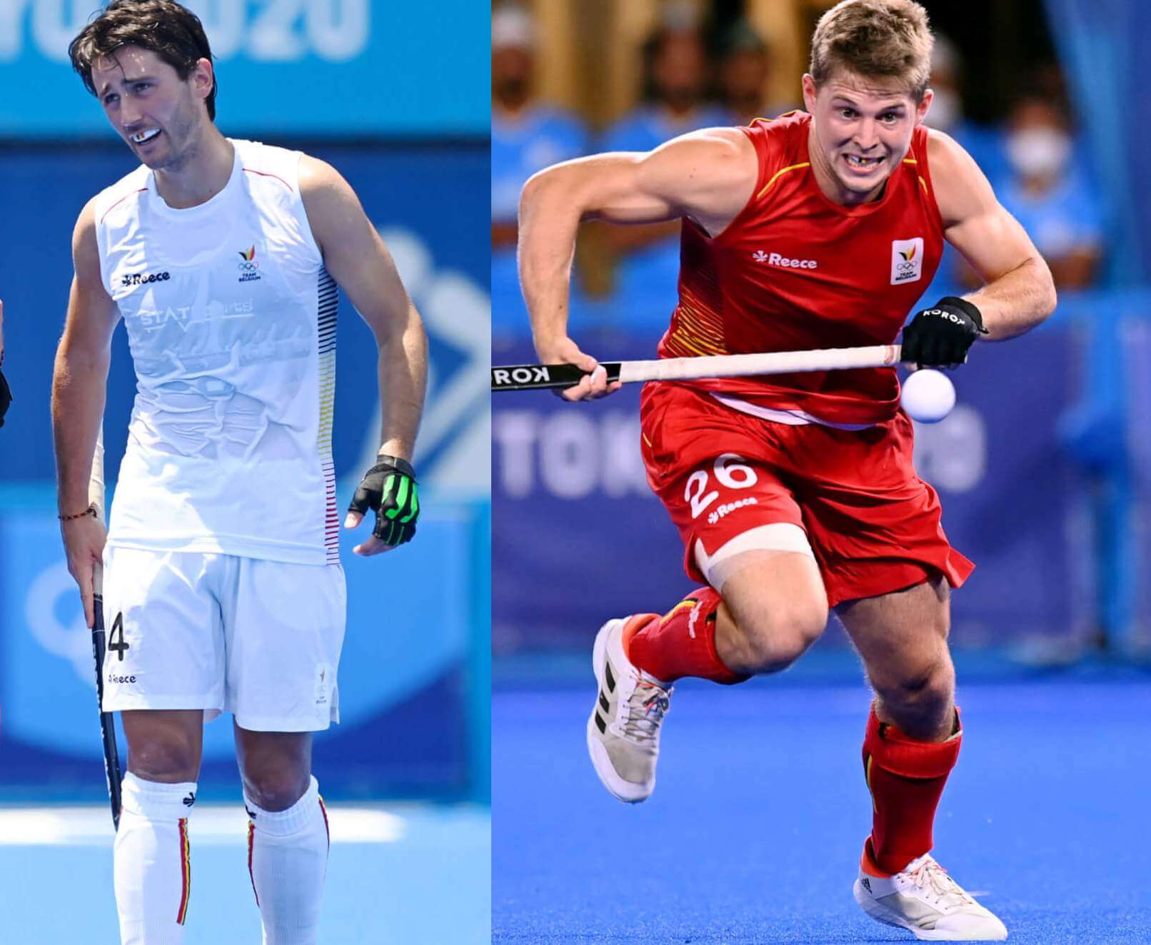
Belgium wore white sleeveless shirts with flag-colored accents for the entire group stage. That’s not their normal first-choice color, which as you might guess is red, but red first appeared for the quarterfinals. They don’t even normally wear sleeveless shirts.
Canada (men only)
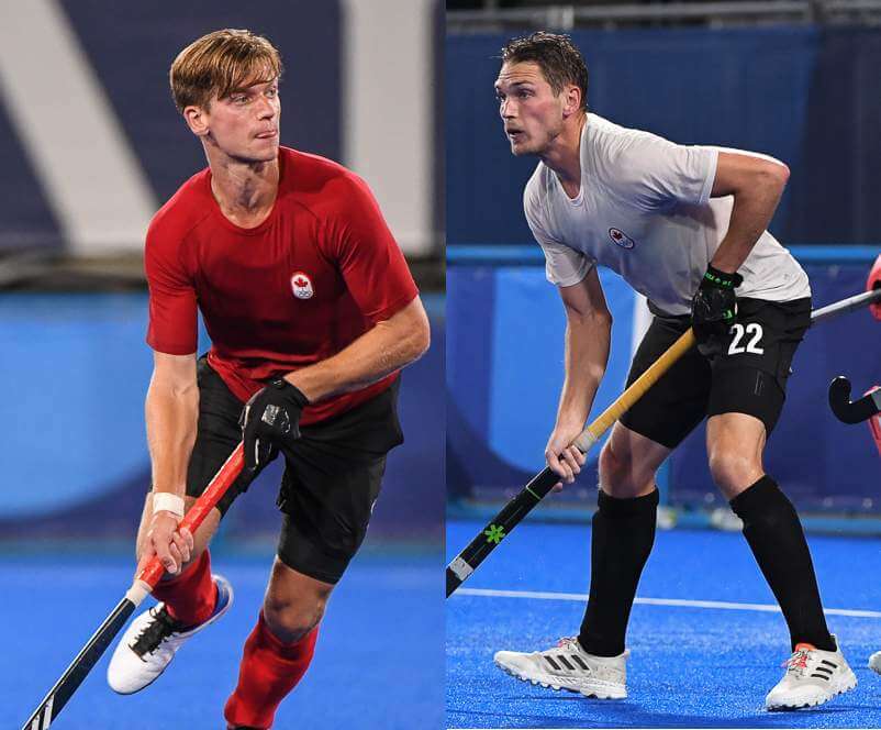
Canada already have minimalist designs because that seems to be the trademark of their outfitter, Osaka, who also now outfit the U.S. teams. But these are even more so because they don’t even have maker’s marks and the shirts actually look like T-shirts in every sense.
China (women only)
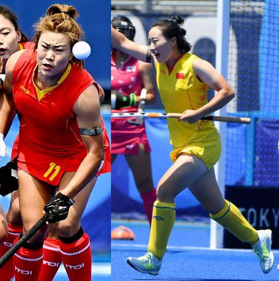
There are red and yellow options here with a flower pattern that isn’t as obvious or recongizable as Japan’s, though the team is nicknamed after the snow lotus. The accents on the socks don’t match the rest of the kits, because they’re white on the red socks and blue on the yellow socks.
Germany
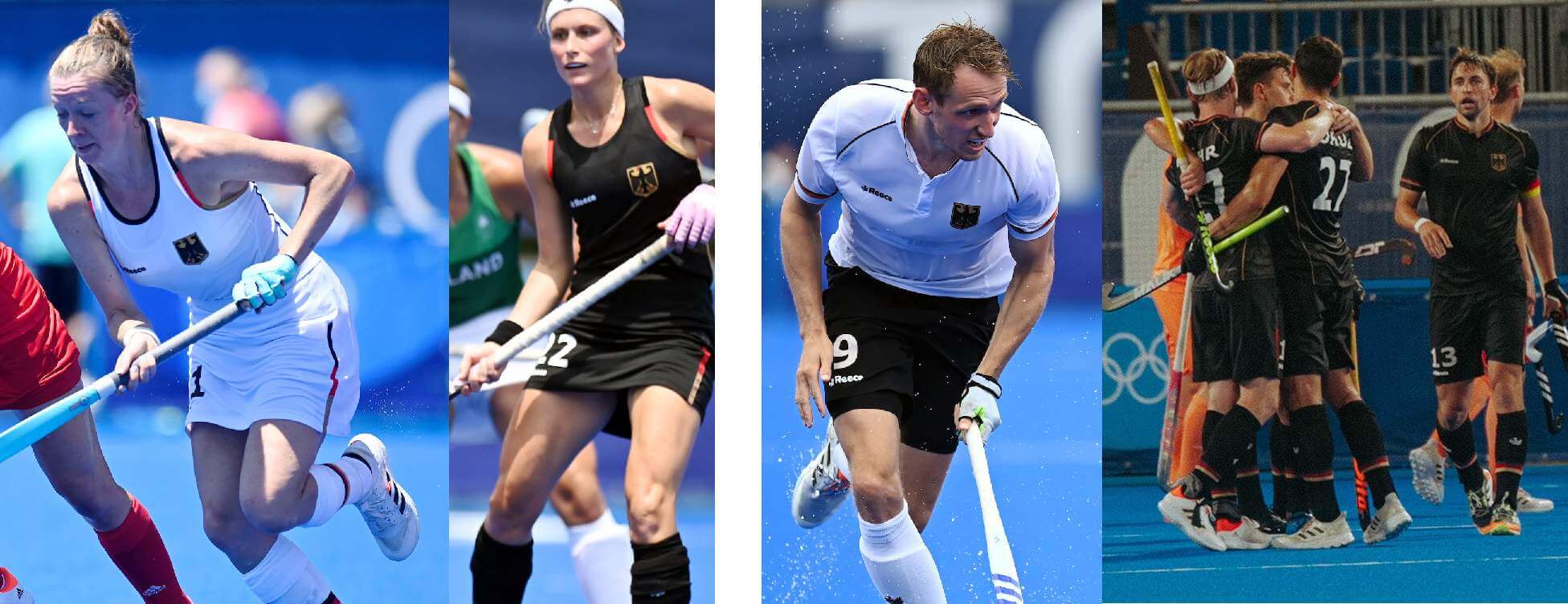
Both teams use their soccer counterparts’ color scheme of white and black, though they wear black more regularly than the soccer teams do. The federation got permission for women’s captain Nike Lorenz to wear a rainbow captain’s sock-band — you’ll usually seen the armband worn around the sock by teams who wear sleeveless shirts, but of course several players on sleeveless teams at this very tournament aren’t doing so.
Great Britain
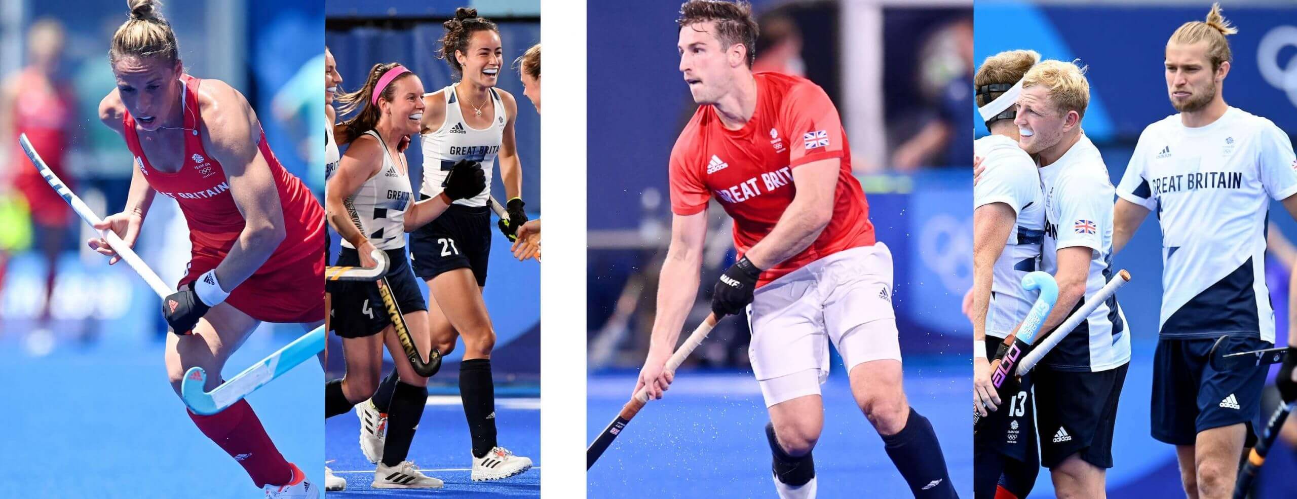
Field hockey is one of the few sports where there are already regularly active Great Britain teams that exist alongside English, Scottish, Welsh, and Irish national teams. So GB’s first choices look a lot more like what they normally do than like the rest of the Olympic team, with the normal combos of mono-red for the women and red/white/blue for the men. The second choices are white and dark blue and do look more like the Olympic team. The back of the women’s white shirt has an ill-placed blue blotch. Women’s captain Hollie Pearne-Webb also has a rainbow captain’s sock-band.
India
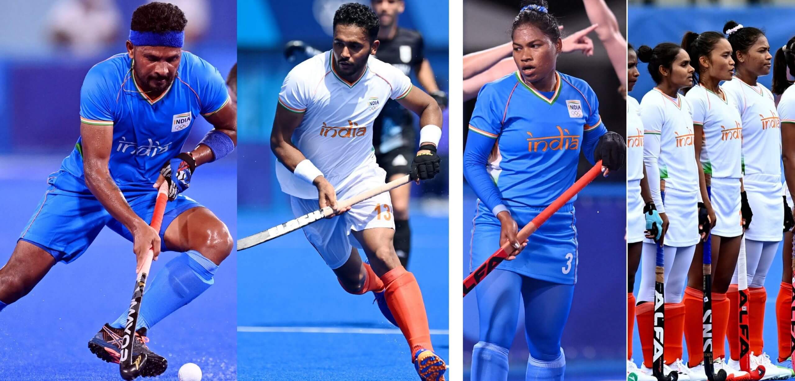
India wear blue and white, in common with other Indian national teams. The second choice is primarily white but in the colors of the flag. Many, if not all, players on both teams wear first name on back — the men’s team in Tokyo has nine players named Singh. I didn’t notice until I was putting the pictures together that the “India” script is white on the men’s blue shirts and orange on the women’s.
Ireland (women only)
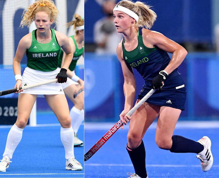
Ireland only have green and blue options, which don’t provide the greatest amount of contrast in the world and actually resulted twice in both they and their opponents wearing their second choices. Both kits have at least a little green on the front, but the blue one is solid blue on the back of the shirt and everywhere else.
Japan

The men’s team wears red, but the women’s team wears a very pale pink that has a cherry blossom theme — which is their nickname — and is the same basic idea as what they wore last time. The second choices are mono-blue for the men and white/blue/blue with pink blossoms for the women.
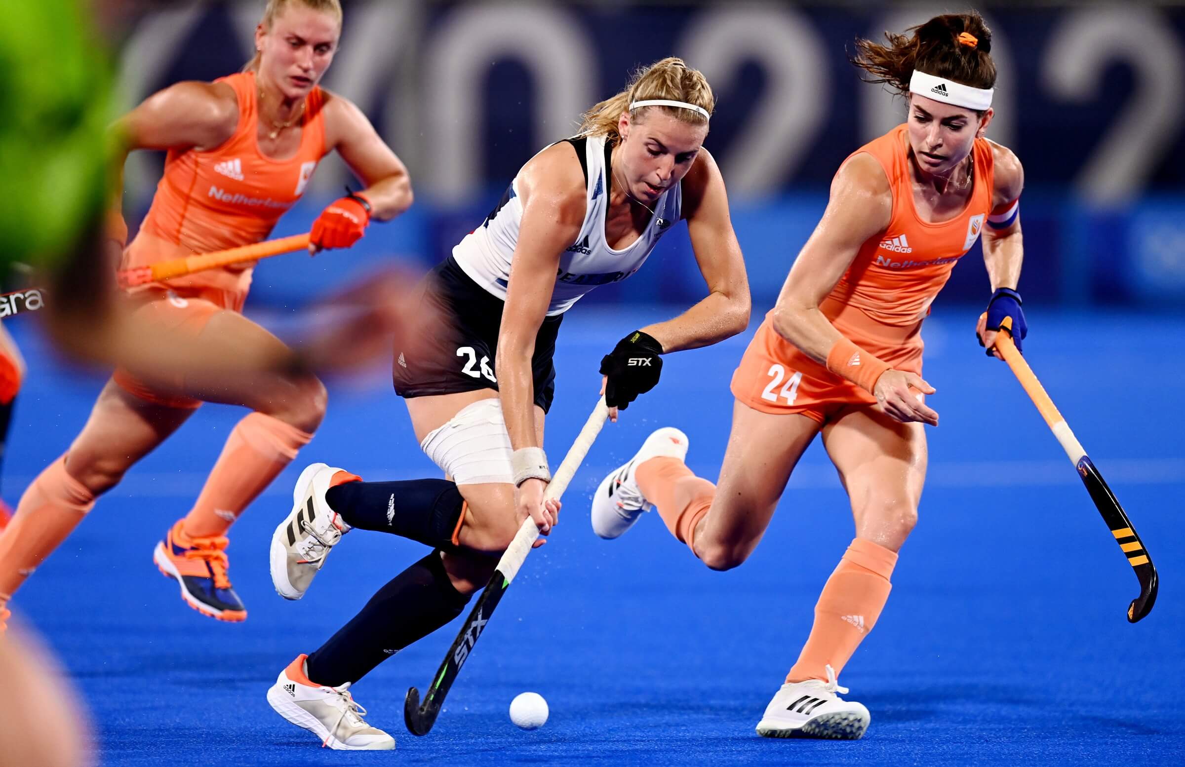
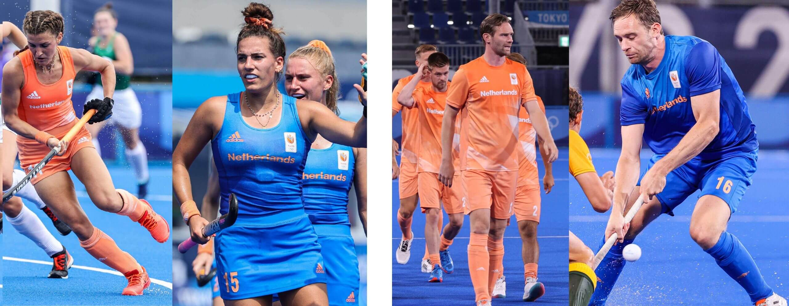
Netherlands
The Dutch of course wear orange, but it’s much paler here than in soccer, for example. The second kits are both blue, and together the two teams form sleeved and sleeveless versions of essentially the exact same designs.
New Zealand
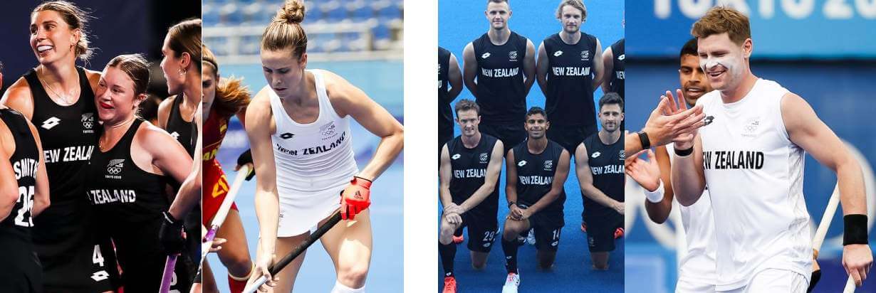
The Black Sticks, which is a shared nickname for both teams, wear black and white like other New Zealand teams. Both kits are black with white accents and vice versa. New Zealand is one of the two countries, with Australia, that has two sleeveless teams in Tokyo.
South Africa
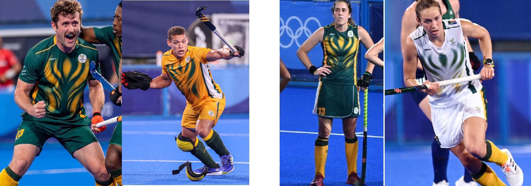
The pattern on the front looks like it’s based on the South Africa Sports Confederation and Olympic Committee logo and is in common with other team sports. The second kits are different, as they’re white for the women and gold for the men.
Spain
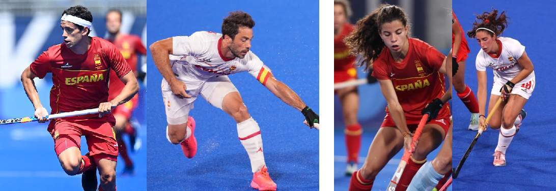
Both of Spain’s teams have straightforward red with yellow and white with red options. They look similar to other Spanish team sports in Tokyo.
Thanks, Jamie! As fate would have it, I watched my first bit of Field Hockey yesterday, and rather enjoyed it. Readers? What do you think of the unis/kits of Field Hockey? Have you watched any of the men’s or women’s Field Hockey this Olympics (or do you plan to)? Love to hear your thoughts.
Collector’s Corner
By Brinke Guthrie
Follow @brinkeguthrie
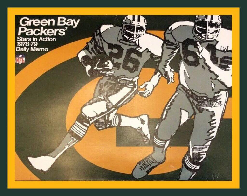
Leading off this week with this 1978-1979 Green Bay Packers “Stars In Action” calendar sponsored by the friendly folks down at Schappe Pontiac-Subaru. What’s interesting about the art is, that’s Preston Pearson (#26) and Blaine Nye (#64) of the Cowboys- I’ve seen this photo somewhere, I am sure of it. A little artistic license here, as Nye wore #61. The original photo had to have been from the 1975 or 1976 seasons, the only two years those players played together for the Cowboys.
Now for the rest of this week’s picks:
• Holy cats! Here’s an entire set of Gresh NFL helmet plaquesfrom the 1970s- 28 total!
• Here’s a terrific looking set of Chicago Cubs memorabilia. This auction includes a snow globe, two baseballs, a cup, and a bench seat. Take particular note of the snow globe; it’s sitting inside a baseball glove- a cool design!
(P.S. On a personal note as a Giants fan, I’d like to thank the Cubs for the Kris Bryant deal.)
• Staying in the Windy City, here’s an auction for a pair of Comiskey Park seats along with a Dave Gallagher jersey. The seats as well as the jersey had belonged to Gallagher, who played for the Sox from 1988-1990, the final year for that stadium.
• Check out the smilin’ hockey player on the cover of this 1952-1953 Calvary Stampeders hockey program. Is it just me, or does he look just like Ward Cleaver?
• This mint condition Oakland Ray-duhz bobblehead is sporting black and gold uniform colors, so it’s from their first season of 1960. The seller says “This Nodder hasn’t seen the light of day in probably 50 to 60 years.”
• Going all the way back to the late 1940s for this Quaker Oats-sponsored Montreal Canadiens pennant.
• The slogan on this set of three 1988 New York Yankees bumper stickers is “Pride And Power.” (That slogan got them an 85-76 fifth place finish.)
• This Jostens Super Bowl XIX World Champions clock was given to the player’s wives. The design of this solid brass clock includes the Golden Gate Bridge and the Lombardi Trophy.
• One more for the Niners; here’s a 1960 Weico Kezar Stadium ashtray. At least I guess it’s Kezar; the item doesn’t mention a stadium name, but that’s where they played at the time.
• Here’s a set of three Welch’s NFL/AFC glasses.

Guess The Game…
from the scoreboard
Today’s scoreboard comes from Hank Tate.
The premise of the game (GTGFTS) is simple: I’ll post a scoreboard and you guys simply identify the game depicted. In the past, I don’t know if I’ve ever completely stumped you (some are easier than others).
Here’s the Scoreboard. In the comments below, try to identify the game (date & location, as well as final score). If anything noteworthy occurred during the game, please add that in (and if you were AT the game, well bonus points for you!):
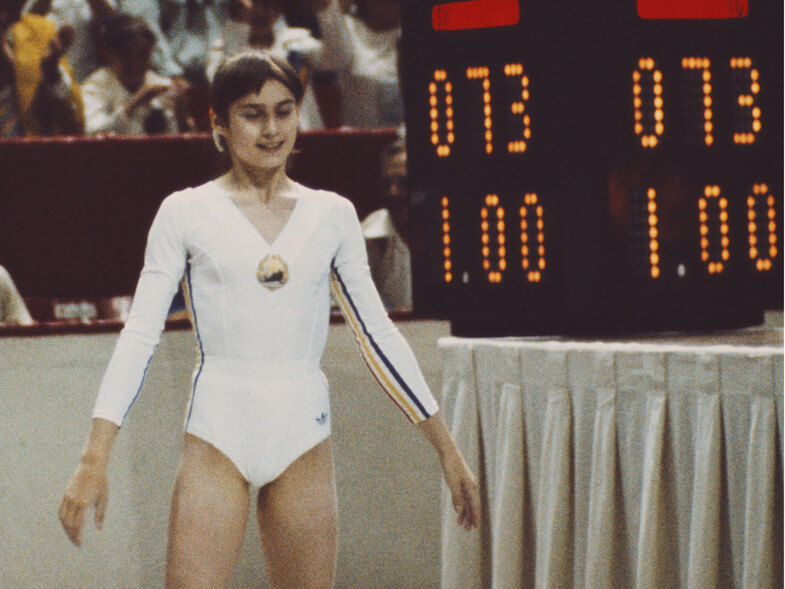
Please continue sending these in! You’re welcome to send me any scoreboard photos (with answers please), and I’ll keep running them.
The Ticker
By Paul, pinch-hitting for birthday boy Alex Hider

Baseball News: Take this for what it’s worth: A reader who prefers to remain anonymous says he was told by a staffer at a retail shop in the Mets’ ballpark that the BFBS uni will be replacing the alternate road uni next season. … Although this article is paywalled, I’m seeing more and more of these pieces indicating that the “Guardians” trademark situation isn’t looking great for the MLB team. Meanwhile, the roller derby team with the same name has opened up an online merch shop. … Nats OF Victor Robles had a praying mantis on his cap during last night’s game against the Phillies (thanks to all who shared). … In other wildlife news, a cat got loose on the field at Yankee Stadium last night (from Marcus Hall). … New Miami Marlins pitcher Jesús Luzardo has a “954” on his glove, which just happens to be the area code for Broward County, FL (from Noah Berger).

Football News: In another “take this for what it’s worth” item sourced from a retail employee, Miles Cliatt says a Packers Pro Shop staffer told him that the team’s new throwback won’t be revealed until the first week of the season. … The Giants are partnering with Marvel on a comic book that will be given away at the team’s Oct. 24 game against the Panthers. … Lots of new uni looks on Oregon’s Twitter feed. Some additional notes here (thanks to all who shared). … As you may be aware, the BC Eagles have switched from UA to adidas for this season, and they have a new shade of gold for their helmets, which should better match the pants (from Bill Abley).

Hockey News: The ECHL’s Kalamazoo Wings have selected 10 finalists for the fan-created uni design they’ll wear on New Year’s Eve. You can see the 10 designs, and vote for your favorite, here (from Wade Heidt). … Here’s a cool story about how Tiffany & Co. recreated a Maple Leafs 1967 Stanley Cup championship ring for Hall of Famer Terry Sawchuk’s son after the original was stolen decades earlier (from Kary Klismet).

Basketball News: Golden State is teasing a 1946 throwback that will apparently be unveiled today. … Three high schools in Indiana have new floor designs (from Kary Klismet). … Lots of new uni number deveopments on Etienne Catalan’s Twitter feed.

Soccer News: New kits for South African sides Wolfsburg and Kaizer Chiefs (from Robert Marshall). … Here’s a ranking of new Premier League kits (from Kary Klismet).

Olympics News: Pretty astonishing that Olympians in some sports — mostly track and field — still have their name tags safety-pinned to their jerseys (from @arynkeen). … Want a gold medal? Some former Olympians are selling theirs. … Mexico’s softball team is taking some heat for dumping their uniforms in a trash can, leading one player to apologize. … In one of the shooting finals, Ukraine’s Serhiy Kulish got distracted because one of the buttons on his jacket came undone, so he accidentally shot at the wrong target (thanks, Jamie). … USA baseball P Edwin Jackson is wearing MLB pants (from Chris Mycoskie). … “While watching the 3,000-meter steeplechase, i noticed that the two Moroccan athletes were not wearing team-issued shorts,” says Anthony Gonsalves. The race winner, Soufiane El Bakkali — second from left in this photo — was wearing a plain pair of red Nike shorts. Mohamed Tindouft (far right), was wearing shorts from this year’s Adidas pro kit.”

Grab Bag: Numbers on NASCAR cars will reportedly be moving forward in the near future (from Chris Hickey). … New throwback packaging for Cheerios (from John Cerone).
Uni Tweet of the Day
This! ⟱
🔥 take this morning:
All neutral site games should allow both teams to wear their home colored uniforms ⬇️⬇️⬇️ pic.twitter.com/VOSTQVejpr
— ACC Bias (@acc_bias) August 2, 2021
And finally… that’s all for today. Big thanks to Jamie for that great look at the Olympic Field Hockey unis, and Paul for pinch hitting for Alex on the ticker. Good stuff all around!
Everyone have a good Tuesday and I’ll catch you here again tomorrow.
Peace,
PH
Apologies if this has already been discussed, but there seems to be little uniformity on the various USA uniforms at the Olympics.
Some countries’ Olympic committees have an exclusive apparel contract with one company giving them a more uniformed look. Others, like the US, leave it up to each countries individual national governing bodies. This leads to some situations like the Mexican national soccer team being sponsored by Adidas, but their Olympic soccer jerseys were made by Li-Ning
One way or another, there’s no way in hell that an MLB franchise is going to be forced to retract an already-announced name because of an amateur roller derby team.
Exactly. The owner of the club is a lawyer. I have a hard time believing that a MLB club and it’s lawyers and the league office and their lawyers would make a move like this without having the law on their side. The roller derby team suddenly opening up online merchandise sales after the baseball announcement doesn’t help the roller derby team’s case.
I agree it’s hard to believe that nobody with the baseball team even apparently bothered to even type “clevelandguardians.com” into a browser, but that appears to be where we are.
One figures that whatever the case, the baseball team will easily be able to afford a settlement offer to the roller derby club to resolve things.
Much ado about nothing IMO.
link
link
Guardians (baseball) should be good to go next season.
If the Mets really are gonna replace the road blues with the blacks, then Mr. Cohen must be a Uni-Watcher and saw my National League tweaks from a couple years ago!
Hi. Please provide us a link to your tweaks.
Re: the move to undo culturally appropriated names. Eventually we will have to address the state of Indiana and it’s capitol city, Indianapolis, right?
I always wonder why more people don’t talk about this, especially after Columbus came under scrutiny.
The difference is that “Columbus” is a problem with an actual person. It will still never be changed.
I live in Indy … the amount of talk around Indiana or Indianapolis is zero. Ditto for the amount of talk around the AAA Indians. My assumption is that the logo has the input of the Miami Nation and the stadium being across the street from one of the top Western and Indian-related museums in the country. (Irrelevant to the name – the team has used it for 100+years … and which the Miami Nation partners intimately and has zero issue with the word “Indian” being in the museum name)
And Alaska and Michigan and Utah…I don’t think the names of states are culturally appropriating. I live in a city named after a native American chief and not one drop of ink has ever been spilled about a name change. It’s rather an honorific.
Maybe I shouldn’t have called it appropriation. It’s more that the term Indian is by and large out of favor when referring to native peoples and the city and state names are were basically invented for the purpose of naming those locations as “the place where Indians are” and “the big Indian city”.
I don’t mean this to be a soapbox thing. It doesn’t bother me personally (but I’m not from that culture or that state), what bothers me (or more like what nags me) is that the Cleveland Indians had to change the name, but the aforementioned city and state aren’t even mentioned in basically any major discussion on the topic.
The Spokane Indians are another great example of diplomacy prevailing. They reached out to the local tribes and asked for guidance. The name stood, the tribes had input into the logo, the logos began to include the native alphabet and traditional spelling of Spokane, all parties were satisfied.
Again, it’s just a George Carlin level pet peeve. Like why doesn’t 2+2=4 in this particular instance?
“Pretty astonishing that Olympians in some sports still have their name tags safety-pinned to their jerseys”
What would suggest they use? Thumbtacks?
Decking screws would hold better.
I know this is going to sound crazy, maybe even outlandish, but maybe sew a nameplate on like in most sports? Although, it wasn’t until pretty recently that names were on the participants at all. So, evolution is slow.
They don’t get their lane assignments until pretty late and they might run a bunch of times with different numbers though.
I’m sure the safety pins are titanium and aerodynamic for maximum performance.
But the lane assignments are handled with a form-fitting sticker on the runner’s hip/upper thigh. The racer’s last name (which doesn’t change from race to race) is printed on a piece of paper and pinned on their front, though.
Here’s an example:
link
BibBoards … it’s the only thing I use for a race (“race” is relative since my personal goal is to not finish last).
Somehow, even the beach volleyball bikinis are able to fit a name and a number, despite the relatively small amount of area to work with. But running has to safety pin a giant piece of paper to flap around on the front and back of each contestant, and cover up a good amount of the uniform top. .
“Have you tried staples?!” -Frank Cross, ‘Scrooged’.
Olympics are fun because it is the only time I will ever see a variety of sports like field hockey. Have watched a bit of field hockey this time. Don’t think it is a game I would want to play unless I have a longer stick. Looks hard on the back with all the bending due to short sticks.
My country needs to step up its uniform game for the next Olympics. Canada has gone too minimalist with uniforms in team sports. Would rather see some sort of design compared to the t-shirts in field hockey.
That scoreboard image shows Nadia Comăneci at the 1976 Montreal Olympic games. She was 14 years old and was awarded the first ever perfect score of 10 in gymnastics. The particular event was the uneven bars. It’s showing as 1.00 because nobody had ever received a 10 before so the scoreboard was designed to display it.
*was not designed to display it. Also the event occurred on July 18, 1976.
yup, that’s correct.
At the Montreal Forum, IIRC.
FYI in the soccer section, Wolfsburg is a German club, and Kaizer Cheifs are South African. The two shirts are using the same template from Nike (albeit different colors) and Nike has used different marketing-speak to justify it in each case. It’s supposed to represent car-prototype camouflage for Wolfsburg and it is supposed to represent Africa for Kaizer Chiefs. As if we needed any more proof that the marketing gobbledy-gook was trash, Nike just proved it.
Calvary noun, plural Cal·va·ries for 2, 3.
Golgotha, the place where Jesus was crucified. Luke 23:33.
(often lowercase) a sculptured representation of the Crucifixion, usually erected in the open air.
(lowercase) an experience or occasion of extreme suffering, especially mental suffering.
Golgotha had a hockey team?
Actually, it should be “Calgary”, not Calvary.
It appears as if the field hockey players aren’t wearing cleats, kind of surprising, anyone know why?
All high-level games are on artificial surfaces, so they wear different cleats that have smaller studs on the bottom than in soccer, for example. You can see them in some of the pictures.
Well, that blue surface they are playing on sure doesn’t look like grass! I assume cleats wouldn’t work well on that surface.
Is that a new jersey template for Adidas football?
Collector’s Corner:
Those ’87-’90 White Sox uniforms were under-rated but perhaps not ‘gone too soon’.
They were a nice traditional transition away from the beach blankets even if the red/blue scheme was carried over.
I was surprised to see none of the field hockey players wearing eye protection. I assume it’s mandatory in the NCAA and that’s been my only exposure to the sport.