
For all photos, click to enlarge
A few weeks ago I showed you photos of Kevin “Gashouse” Cearfoss’s 1970 NFL merchandise catalog, the oldest item in his collection of sport merch catalogs. Today we’re going to take a look at the next catalog in his collection — NFL 1971.
Like all of Kevin’s catalogs, this one was intended for retailers looking to stock their stores, not for consumers. The embossed cover is shown above, and here’s the introductory note (“No other spectator sport in history has generated the interest and excitement of professional football!”) and table of contents:

The section dividers featured the now-familiar montage of NFL team wordmarks:

“In-store promotion means profit and prizes!” and “Window displays put team loyalties out front!”:

The 1970 catalog didn’t mention anything about Punt, Pass & Kick, but the ’71 catalog had a page devoted to it. Note that all of the kids are wearing Northwestern-striped socks, and most of them appear to be wearing Adidas footwear:

“Sweet dreams of pajama profits” is my favorite line in the entire catalog. Check this out:

Here are some additional pages from the Apparel section. Note that one of the photos features a Black boy hanging out with two White boys — the first of several Black models who appeared in this catalog. That’s a shift from the 1970 edition, whose models were all White.

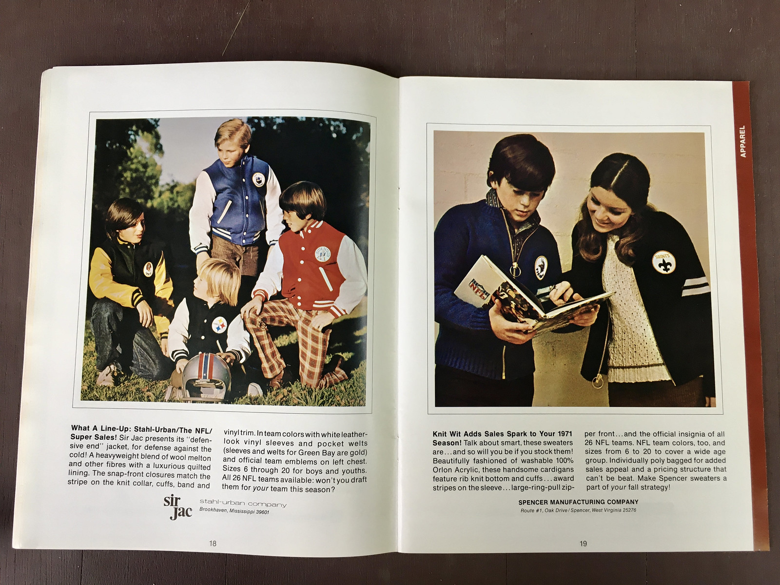


Here are some pages from the Toys and Games section, including a two-page spread devoted to Electric Football, which wasn’t mentioned at all in the 1970 catalog:


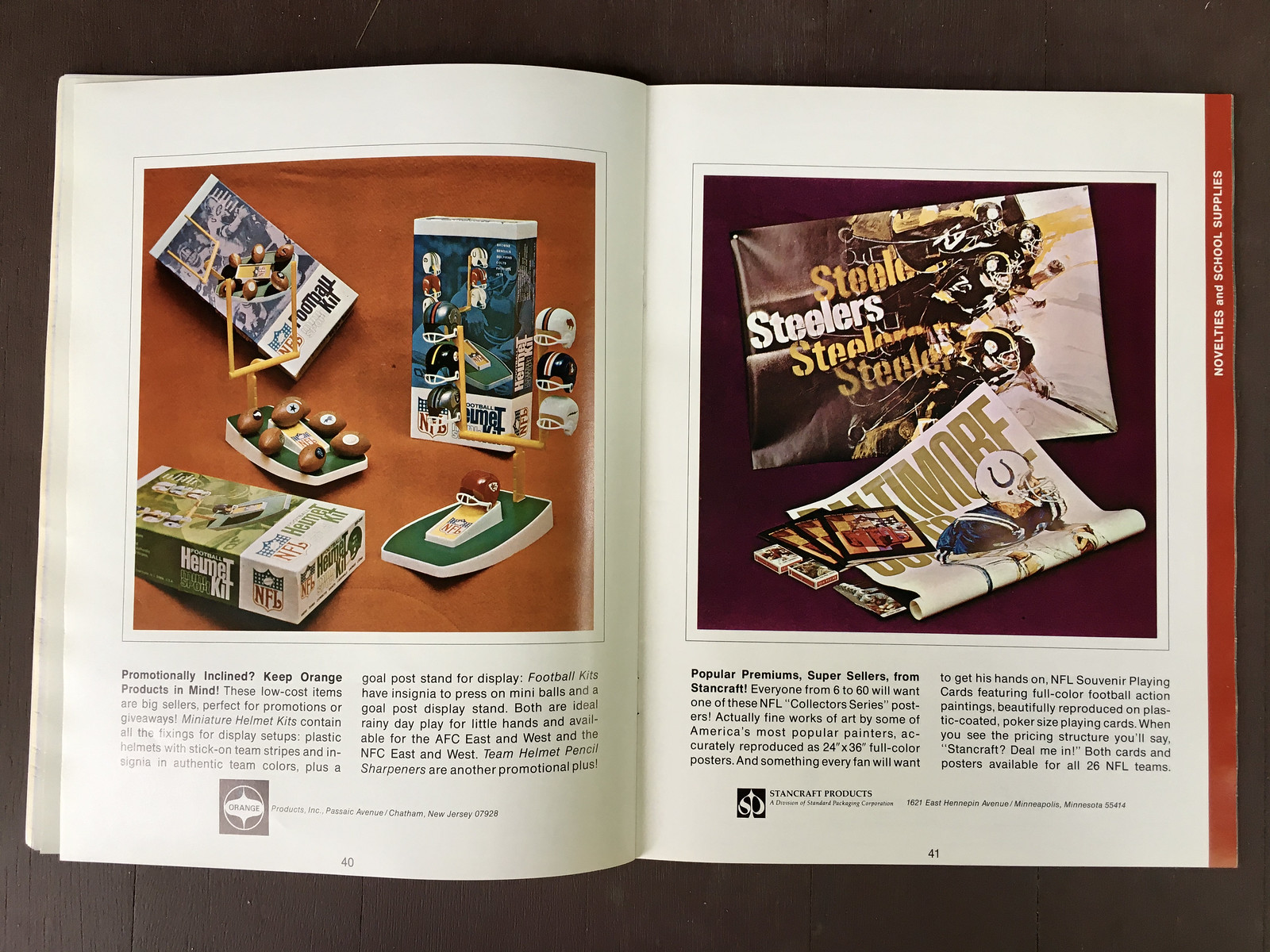
Moving on, here are some pages from the Novelties and School Supplies section (although, as I’m sure is apparent by now, some designations of which products went in which category seem to have been fairly arbitrary). Note that the left-hand page on the third spread begins with the line “The NFL’s got a brand new bag” — whoa, the NFL quoting James Brown!


And now a few pages from the Specialty Gifts section (again, these category distinctions seem pretty random — I’m not sure what the difference is between a “Novelty” and a “Specialty Gift” — but whatever). In the first spread, left-hand page, check out that poster on the wall behind the director’s chairs, with “the national football league” heading — all-lowercase lettering! Such a period-specific detail.


Here’s an anomaly: One of the spreads in this section featured Bears linebacker Dick Butkus! As far as I can tell, he’s the only player to be shown in any of these catalogs:

Just like the 1970 catalog, the ’71 edition concludes with a page about the NFL Mascot of the Year competition, along with a photo showing the previous year’s winner at the Pro Bowl:

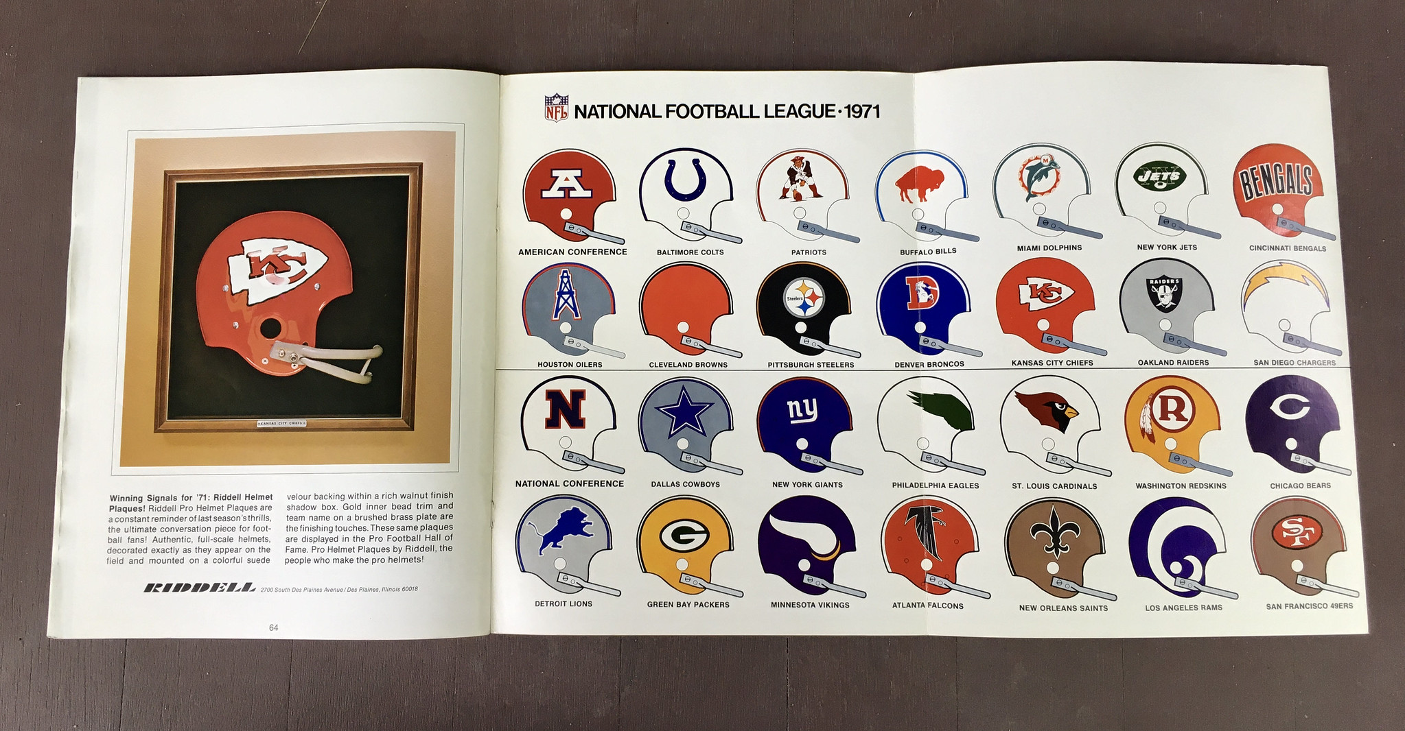
And then there’s a foldout spread showing all of the then-current NFL helmet designs:
———
I skipped a few pages that were essentially dupes from the 1970 edition. You can see the entire catalog here.
I’ll be showing more of Kevin’s catalogs in the weeks and months to come.
(My continued thanks to Kevin Cearfoss for sharing his catalog collection with me, and allowing me to share it with you.)
Click to enlarge
Collector’s Corner
By Brinke Guthrie
Follow @brinkeguthrie
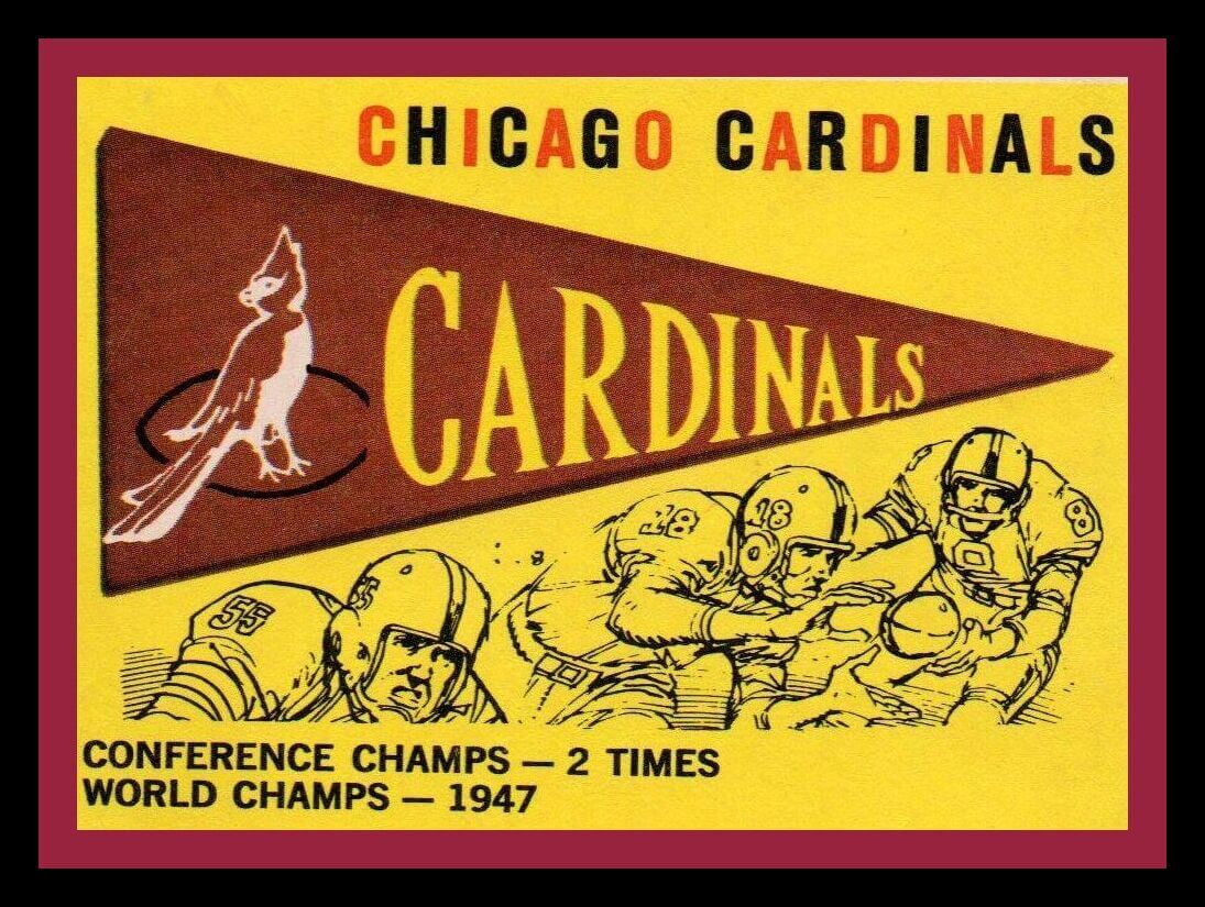
Once upon a time, the Arizona Cardinals were in St. Louis. And before that, they were in Chicago. So here’s a 1959 Chicago Cardinals trading card from Topps. Nice design, even if the yellow lettering on the pennant looks a bit misaligned.
Now for the rest of this week’s picks:
• Proving once again that any product can be licensed by the NFL, here we have an empty carton of “Frozen Tundra Chip ice cream,” from Edy’s. This rolled out following their 1997 Supe victory.
• The Seattle Pilots existed for only one season, so you don’t often see much memorabilia from them. But check out this 18″ Pilots medallion/pendant from 1969!
• This 1970s Blatz Beer coaster says “NFC/AFC,” so it could theoretically appeal to every fan.
• Luv Ya Blue! Here’s a Houston Oilers bike reflector for young Houston fans and their powder-blue Schwinn 10-speeds.
• Remember the NFL Punt, Pass & Kick (PPK) library? Here’s a set of 16 titles!
• Here’s a 1950s screened white felt Chicago White Sox patch. The seller thinks it might’ve been a Bazooka gum premium.
• Danbury Mint offered this Yankees bullpen buggy model back in 2000.
• Tom “The Bomb” Tracy of the Steelers, Norm Van Brocklin of the Eagles, and Bill George of the Bears recommend “Favorite” chewing tobacco on this reproduction 1950s store display stand. “You Can Taste The Quality!”
• In honor of the Milwaukee Bucks winning their first NBA title since 1971, here’s a Bucks watch from that era, “made in Switzerland for basketball fans of all ages!”
• I think whoever did the layout for this 1979-80 Seattle SuperSonics T-shirt thought, “Let’s jam as much text on this design as we can.”

Click to enlarge
Too good for the Ticker: Reader Matthew Houk recently came across a copy of the Feb. 18, 1952, issue of Life magazine, which featured an article on Red Wings goalie Terry Sawchuk, who was then 22 years old. Man, look at that blocker — the waffleboard style didn’t yet exist!
Here are some additional photos from the article:

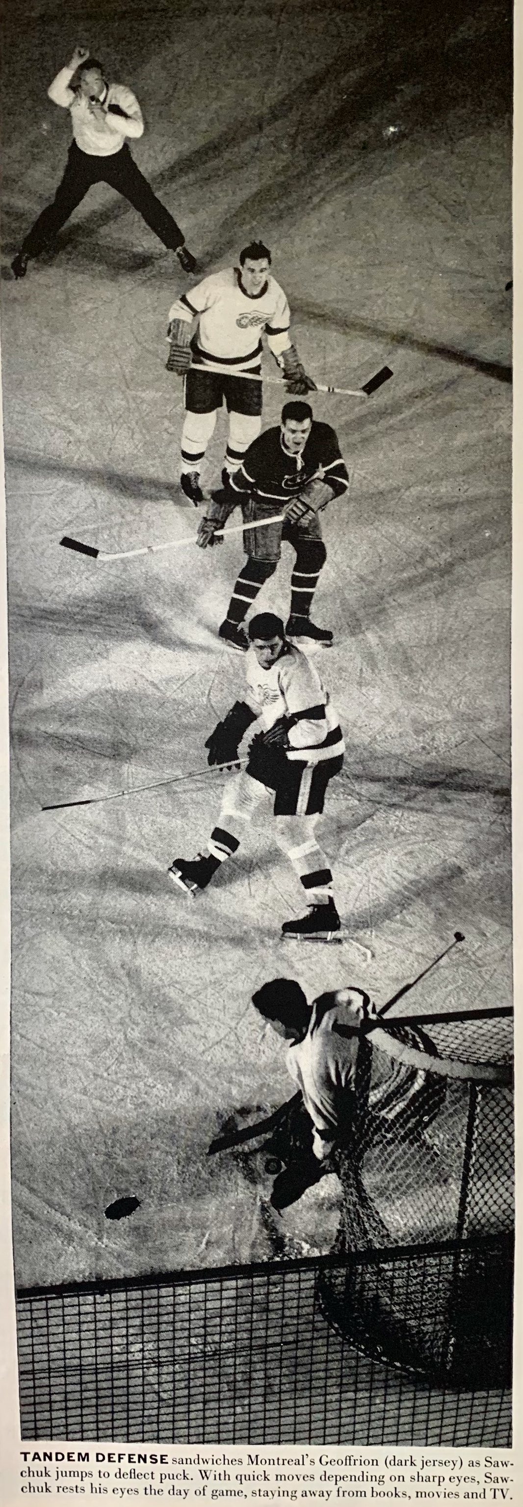
Love that last photo, including the ref wearing the old-style sweater!
(Big thanks to Matthew Houk for sending these great images my way.)
The Ticker
By Alex Hider

Baseball News: Here’s more background on how Cleveland landed on “Guardians” (from John Cerone). … Speaking of Cleveland, friend of the site Todd Radom has some thoughts on the new name and is quoted a fair amount in this article (from Brinke). … Here’s a shirt that pokes fun at the Indians to Guardians name change (from Terry Mark). … Reader BillJ spotted a White Sox fan in an “I Still Call It Comiskey” shirt during Sunday night’s Sox/Brewers broadcast. … The Yankees are holding Syracuse alum night at the Stadium in August and will give away these caps (from @PhillyPartTwo). … A Reds fan has been depicting team greats as comic book covers. Here’s their take on Ted “Big Klu” Kluszewski (from @BannedUser001). … Seen at the Peshtigo Fire Museum in Wisconsin: vintage baseball uniforms worn by teams in the area through the years (from Jason Collins). … Looks like Phillies P Archie Bradley was wearing one of teammate Bryce Harper’s belts (from Kyle DeLash).

NFL News: The Broncos have unveiled their 2021 uniform schedule. They’ll wear their blue jerseys twice and their Color Rash getup once (from Wade Heidt). … Here’s what the Superdome will look like with its corporate-name ad signs (from Dan Kennedy). … KC team execs say they have no plans to change their team name but will stop running “Warpaint”, a Native American-themed horse, before games this season (from Brinke). … Also from Brinke: The NFL Players Association is opposed to the use of colored wristbands to distinguish between vaccinated and unvaccinated players on the practice field. … Browns LT Jed Wills shared a good side-by-side comparison of the team’s home and throwback uniforms (from Griffin T. Smith). … Seahawks QB Russell Wilson has inked an exclusive memorabilia deal with Fanatics.
College Football News: If this retail posting is to be believed, this will be the “Shamrock Series” jersey that Notre Dame will be wearing against Wisconsin when they face off at Soldier Field in Chicago in September (from Jeff Cox). … NC State will wear a new helmet design featuring a throwback logo for their season opener (from Kary Klismet). … Mizzou players have apparently leaked the team’s new uniform design (thanks to all who shared). … New uniforms for Towson (from Ben Rosenbaum). … Here’s more on Texas’ new FieldTurf (from James Gilbert). … The Pac-12 has sold its championship game’s naming rights to a beef jerky brand (from Timmy Donahue). … New front bumper design for BYU.

Hockey News: Can’t get enough of this video, which features a bunch of vintage goalie mask designs (from Moe Khan).
.

Basketball News: The Pelicans’ new GD-League team in Birmingham will be known as the Squadron, which, aside from the military connotation, is also the collective name for a group of pelicans (from Griffin T. Smith). … The Pac-12 has sold the naming rights for its 2022 basketball tourney to a beef jerky brand (from Timmy Donahue).

Soccer News: The Athletic (hard paywall) continued its “football kit week” by having writers share their all-time favorite uniforms (from John Flory). … Crystal Palace has unveiled their new third jersey for next season. The design draws from a previous Crystal Palace club that was founded in 1861. The club says the design is the first shirt the old Palace club ever wore, but as Jamie Rathjen points out, there’s no evidence that the pattern was actually used (also from @CrystalPalaceDC). … New jerseys for second-tier South African side Royal AM Football Club (from Kary Klismet). … FC Dynamo Kyiv teased new uniforms yesterday (from Ed Żelaski). … New jerseys for English fifth-tier club FC Halifax Town (from Neil Barraclough). … New second shirt for Scottish club Aberdeen. “I absolutely do not mind that it’s blue and orange,” says our own Jamie Rathjen.
Olympics News: Great Britain women’s field hockey captain Hollie Pearne-Webb wore a rainbow captain’s sock-band the other day (from Jamie Rathjen). … Jeremy Brahm came across the IOC branding guidelines and the volleyball uniform guidelines for the Tokyo Olympics. … The New York Times published a piece about First Lady Jill Biden’s apparel during her trip to the Games (from Tom Turner). … An American competing in air rifle is breaking one of the sport’s biggest taboos by eating candy before she competes (WSJ link, hard paywall) (from Trevor Williams). … Timmy Donahue notes that all four members of the U.S. 3×3 women’s basketball team had the waistbands of their shorts rolled during a recent competition.

Grab Bag: New 75th-anniversary logo for U. of Houston Athletics (from Robert Malvaez). … Arlington County, Va., has released several new potential logo designs (from Dave Raglin). … Rob St. Clair put together a ranking of his favorite uniforms from the recent Volleyball Nations League. … Next two submissions are from Kary Klismet: New team name and logo for Clarksdale Collegiate Public Charter School in Mississippi. … Formula 1 driver Lewis Hamilton wore a new helmet at last weekend’s British Grand Prix. … More racing: David Firestone notes that the NHRA Sonoma Nationals take place at Sonoma Raceway, which is both a road course and a drag strip. Not only that, but the drag strip is located in the center of the NASCAR restart zone. … NCAA D-II school Missouri Western State has a cool Easter egg hidden in its Griffon logo — its wings resemble Missouri’s eastern border (from Tim Burgess). … The Wall Street Journal (hard paywall) has a feature about a guy who invented a new shade of purple for his low-rider truck (from Trevor Williams). … BBC has a podcast episode about the history and impact of the high-vis safety vest. … Speaking of high-vis, here are some statistics about the safety vests (from James Gilbert). …. Which defunct pro sports teams had the best uniforms? This blog investigates (from Brinke). … Clint Richardson over at Auburn Uniform Database investigates whether the Tigers should seek a new apparel deal in light of Under Armour’s financial difficulties in recent years. … Two police officers in famously conservative Orange County, Cal., wore rainbow Pride badges in June (from @CantankerousRex). … In other law enforcement news, the police department in Saint John, NB, Canada, is asking officers not to wear “Thin Blue Line” apparel (from Timmy Donahue).
Just to clear something up in the College Football Ticker: The Pac-12 Championship Game already has a title sponsor. The beef jerky brand is added to the list of advertisers for the football and basketball championships.
Catalog “all the helmets” page simply shows “Patriots” while all the others show the locators.
Moved to Foxborough in ‘71. Perhaps they hadn’t yet figured out what to call them at press time.
“As a result of the move, they announced they would change their name from the Boston Patriots to the Bay State Patriots, after the state of Massachusetts. The name was rejected by the NFL and on March 22, 1971, the team officially announced they would change its geographic name to New England.”
Wow, you learn something new every day.
Right…I believe someone figured out that it would get shortened to B.S. Patriots and realized that would be a bad idea.
“Warpaint” is spelled wrong in KC Football Team ticker item.
Fixed.
The catalog is awesome, with one flaw: they used the proper word marks for 23 of the 26 NFL teams at the time. But the Chiefs and Dolphins share a font that neither used, and the Steelers’ classic stencil font isn’t used. Any idea why?
That Big Klu comic art is amazing. The details, too – the dog-eared corner and torn corner.
I was going to mention that the Chiefs have never used that font. Maybe because it was around the time of the AFL-NFL merger and they didn’t have all the logos and style sheets in one place?
The AFL-NFL merger was planned and announced in the mid-1960’s…should have been plenty of time to get the branding/merchandising ducks in a row.
The Dolphin font, if memory serves, was used in SB VI. That one, plus the Chiefs’ and Steelers’ were changed fairly quickly.
I remember that montage from my blanket and bedroom set, purchased at Sears in the early 70s.
I think the sentence,
That’s a shift from the 1971 edition, whose models were all White.
Is supposed to read, “from the 1970 edition.”
Thanks to Paul and Gashouse for sharing the catalogs!
Good catch — fixed.
That NFL poster- text in left justified in both left and right columns, while helmet graphics are in two centered columns. Makes me go cross-eyed.
The NFL catalogs are great…and it was right at that time, early 70s, that my brother and I were begging for NFL gear. As out-of-town Vikings and Pack fans, thank god for the Penneys’ Christmas catalog, which often arrived the day after Labor Day, taking a little sting out of the first day of school. Keep ’em coming Paul!
Orange County’s traditional conservatism has been receding rapidly. Biden won there by almost 10 percentage points.
Did anyone else notice on the page with the James Brown reference, the kid with the magnificent ‘fro and shirt is holding a bag with a Broncos helmet, but it appears to be white with an orange “D”? The bag is bent a little, so it’s hard to see, but later, it shows the blue Broncos helmet we are used to. Hmmm.
OMG. That photo of Sawchuk lunging out of the box for the puck has “a stick in the face” written all over it. Made me cringe.
Love these old catalogs. The statue on the page with the old fashioned tumblers (“A Most Tasteful Way To Toast A Team”) reminds me of the Walter Payton Man of the Year patch.
I was watching the Sunday night game and saw the “I still call it Comiskey” tee shirt. I chuckled and fully expected to see it mentioned here.
Love these catalogs. Pure nostalgia.
These aren’t the exact same years, but they sure are a reminder of my youth in the late 70s/early 80s.
I remember being at my grandparents house and fighting with my cousins over the Sears Wishbook. We all circled the things we liked & made our Christmas lists. I know at some point in time during the elementary to middle school years, I had a branded “varsity letterman” looking jacket, a full length sideline style raincoat, of course the team pom-pom hat, the pajamas, the licensed youth uniform w/ helmet & I even had NFL bed sheets. Quite possibly where my appreciation of uniform & logo designs was born.
The infamous “new digs” error resurfaces in that Printmag article about the Guardians.
A Browns helmet lamp like the one in the catalog has been a circulating gag gift in my family for decades.
Re: the Frozen Tundra Chip ice cream, I distinctly remember buying/consuming that particular variety. Little did thirteen year old me know I could have kept the container and been $10 richer in 2021!
I love looking through these old merch catalogs. I was born in the 80’s so never got these items at the store or anything but through the 80’s and 90’s, my grandma would find a lot of these things at garage sales and thrift shops and get them for us. We liked these things well enough at the time but eventually got tired of all the old stuff and found another purpose for it, boxed it up, or mostly tossed it. I’d love to have these things back now.
Wow such great NFL stuff! I had a lot of what is shown, incl that NFL trunk-mine had the Cowboys on it- but I don’t recall you could sit on it!
I’ve never seen this Broncos logo (in the catalog) before: link
The Sonoma (or Sears Point as I still call it) road course start/finish straight used to be on the drag strip, but they paved a separate section of new track years ago to get the two surfaces away from each other. Now they’re alongside with a wall dividing one from the other. It’s the most important portion of the drag strip just after the start line. That pavement takes a real pounding from Top Fuel cars and has to be prepared in a very specific way that wasn’t great for stock cars; also it was not a great idea to add the extra wear from any road course races onto the most important and most expensive pavement in the whole complex. There is a later portion of the road course that’s on the drag strip further down the run, but the forces aren’t as great on that pavement so it apparently wasn’t enough of an issue to split the courses.
Those pennants are great when you consider other manufacturers put them in their product displays.
Two Bronco items: A bucking Bronco inside the D for Varsity House Clothing and the white helmet mentioned earlier for SporTowels bags.
And there is some aquatic creature on the Pendleton blankets. It’s nit shaped like a sleek dolphin, and it’s white with an aqua helmet.
Squadron is a bangin name
Why has no one thought of “Clevelandians” for the baseball team?!