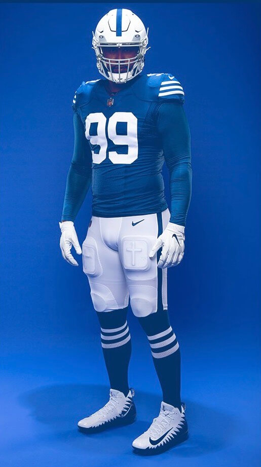
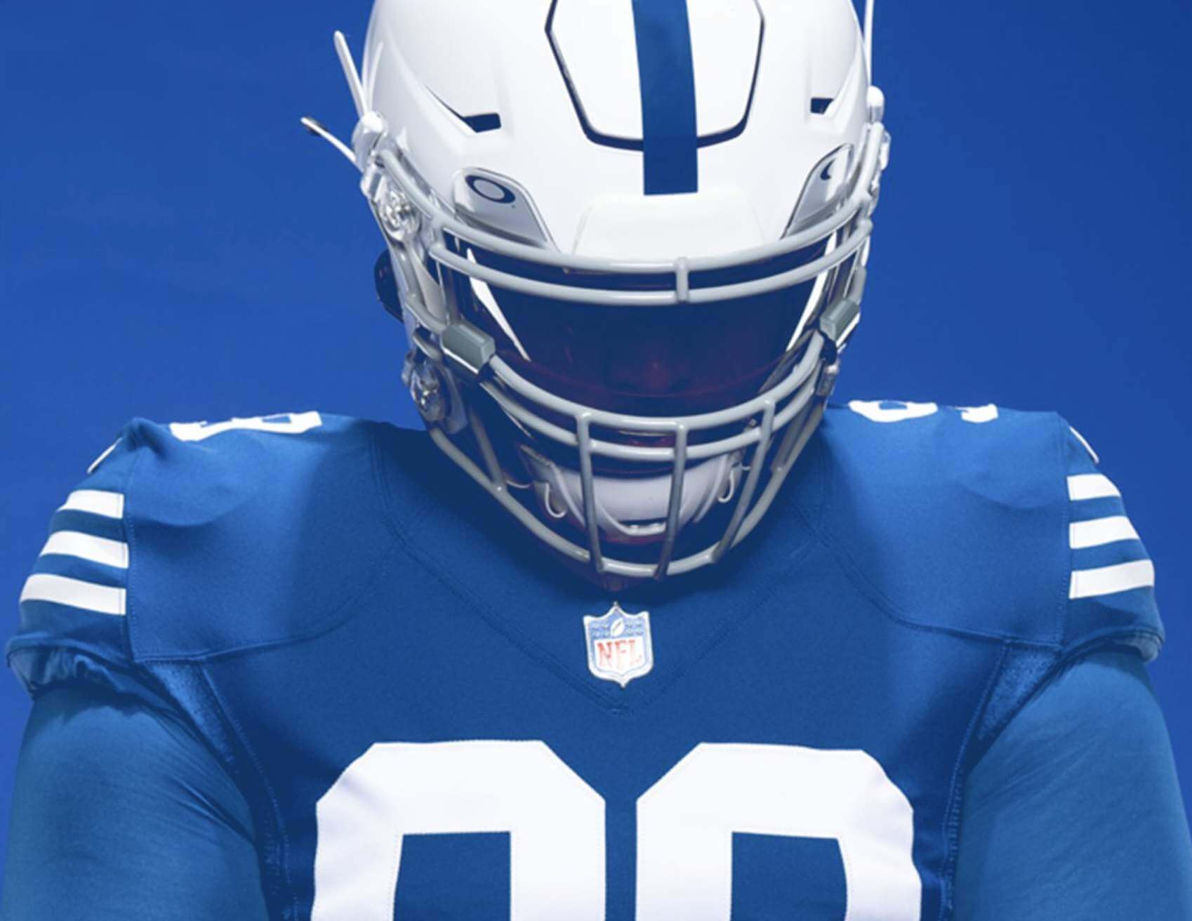
In a surprise move yesterday (or at least it was a surprise to me), the Colts unveiled a new 1956 throwback uniform, which will be worn for the team’s home game against the Buccaneers on Nov. 28. As you can see above, it looks fairly similar to the team’s current look (that’s what happens when you have a franchise that’s largely maintained its aesthetic approach over several generations), but with the following distinctions:
• Instead of the UCLA-style shoulder striping, the sleeves have three stripes.
• To make room for the sleeve stripes, the TV numbers have been moved from the sleeves to the shoulders (which is era-inappropriate for the throwback, but that’s the reality now that NFL jerseys don’t have real sleeves anymore).
• The socks also get the triple-striped treatment (something I wish they’d do as their primary look).
• The pants have a single stripe down each leg, instead of the current double-stripe design.
• The nose bumper is blank.
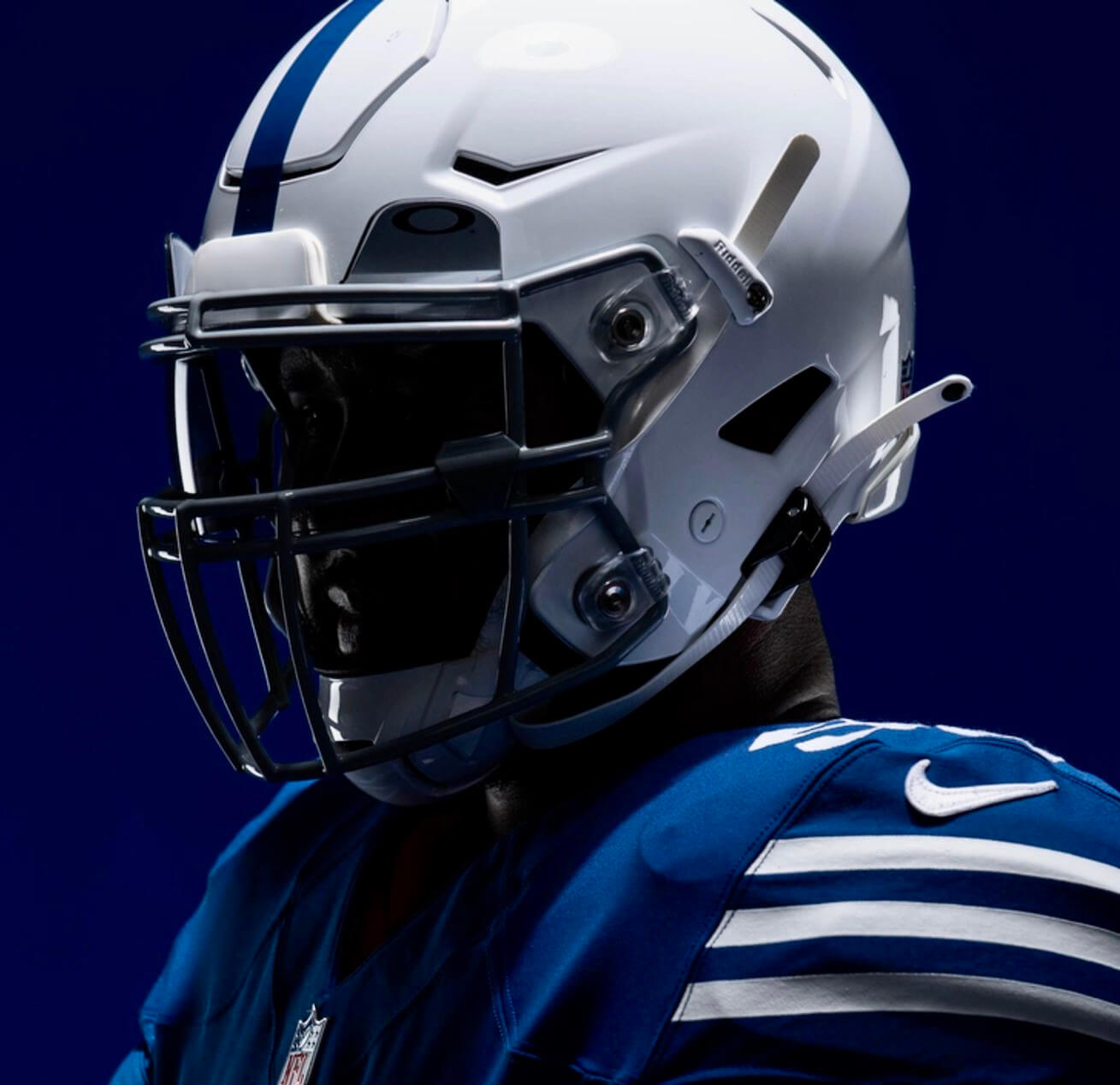
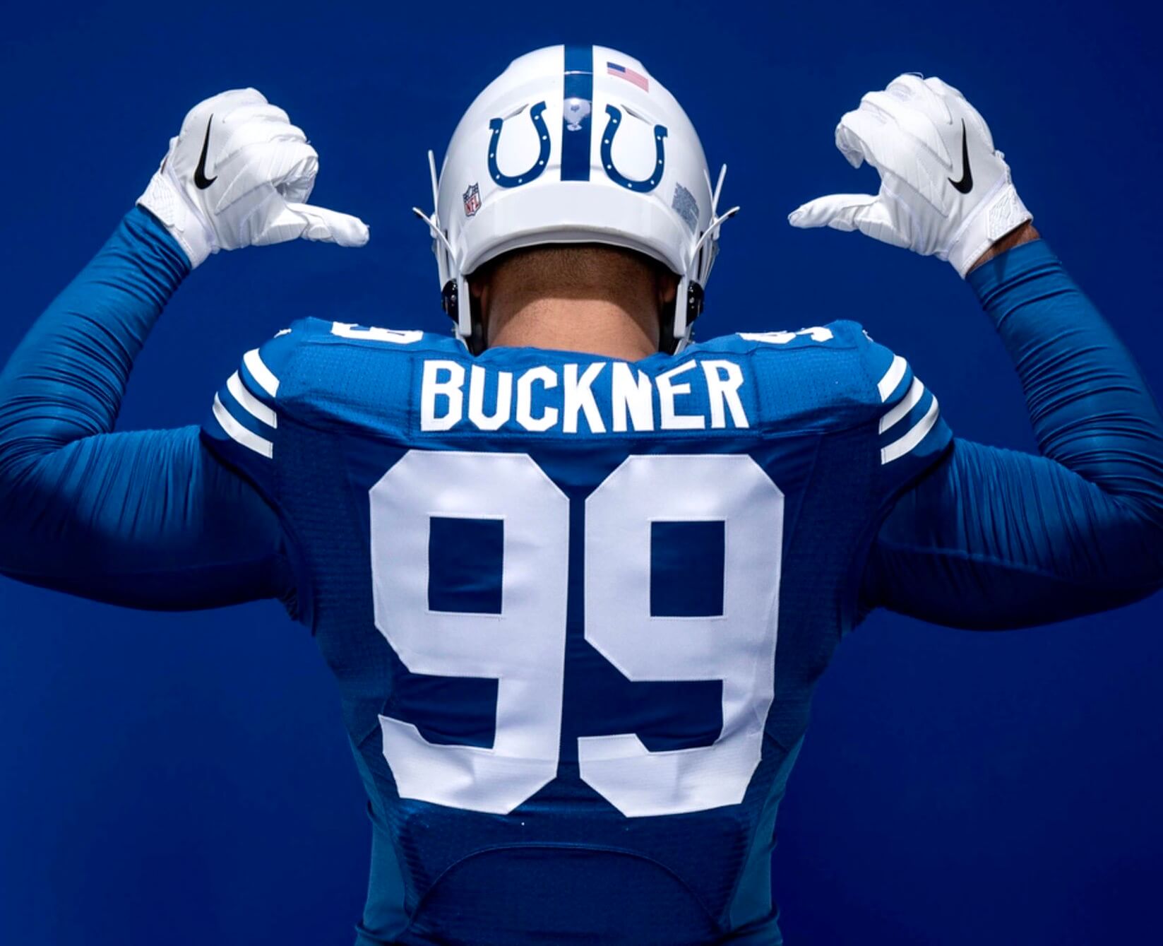
• Although you can’t see it in the top photo, the helmets are blank on the sides and have two small horseshoes on the back (click to enlarge):
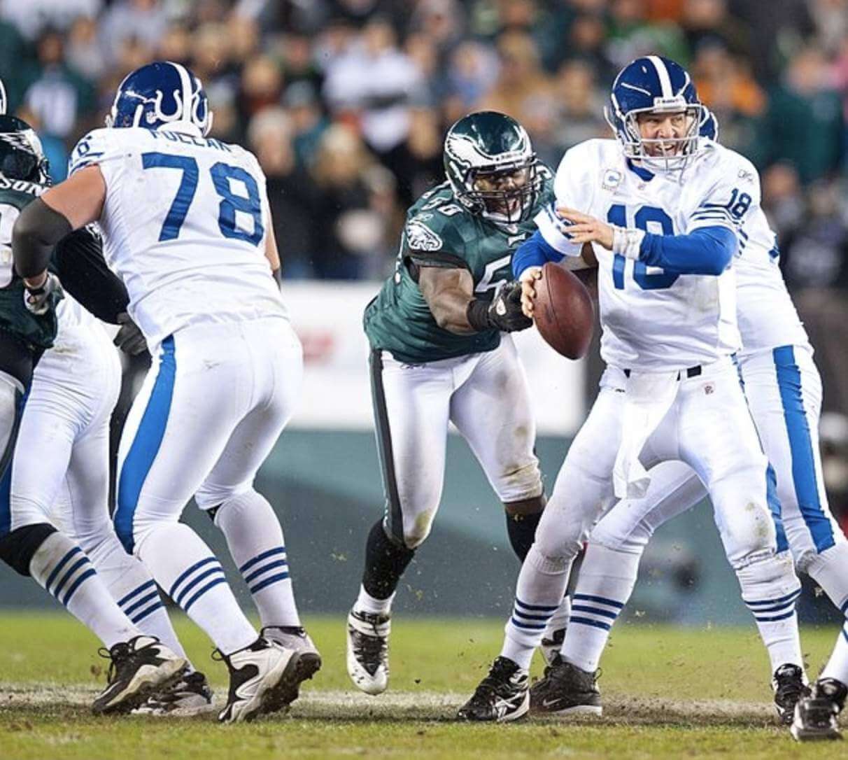
This will be the first throwback the Colts have worn since 2010, when they wore this 1955 design (click to enlarge, and you can see video of this game here):
This means there will be at least four NFL teams with new throwbacks this season: the Colts, 49ers, Packers (not yet released), and Browns (ditto). Am I missing anyone?
As a nice bonus, the Colts posted some photos of the original 1956 uniform, along with some throwback cell phone wallpaper and — my favorite touch — a PDF of their 1956 media guide. Well done.
One final note: If you look closely at the throwback jersey, you can see that the Colts are still still using the old Elite 51 tailoring template:
I believe the Colts and Ravens were the only teams still using this template last year (and of course the Packers were still using the Reebok template). Looks like the Colts are sticking with it for another season. Surprising!
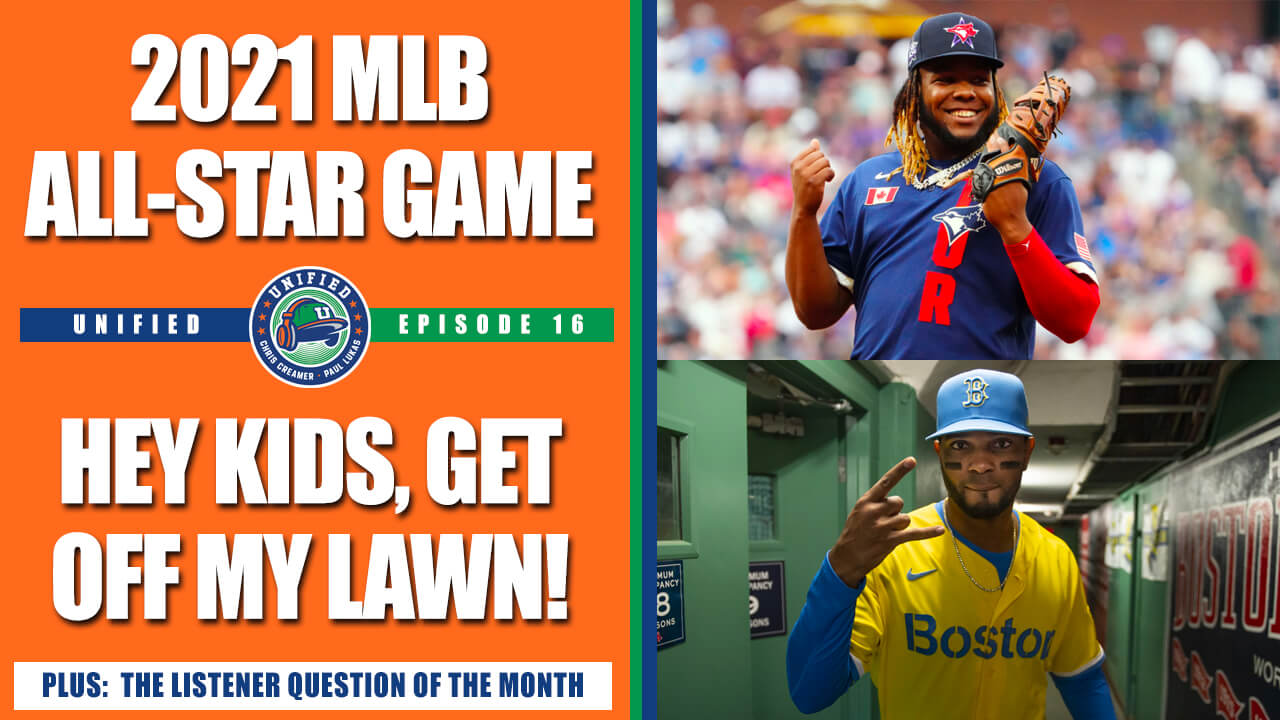
ITEM! New podcast episode: For our latest episode of Unified, Chris and I talked about the MLB All-Star uniforms and the larger issue of uni designs specifically geared to appeal to younger fans. Or to put it another way: Did the All-Star unis suck, or are we just too old and crotchety to appreciate them?
Plus we had a really good listener-submitted question about which teams should get to wear certain throwbacks. When we recorded the episode, we didn’t know that the Indianapolis Colts would be releasing a throwback from the franchise’s Baltimore days, but that’s exactly the sort of situation we discussed.
As always, the audio is avaialble on Apple, Google, Stitcher, TuneIn, and Spotify (it may not have propagated to all of those platforms yet, but it will definitely do so during the course of the day), or just use the player below:
The show notes for this episode are here but very sparse this time around, sorry. Plenty of photos in the video version of the episode, however, which you can see here:
Enjoy the episode, and thanks for listening.
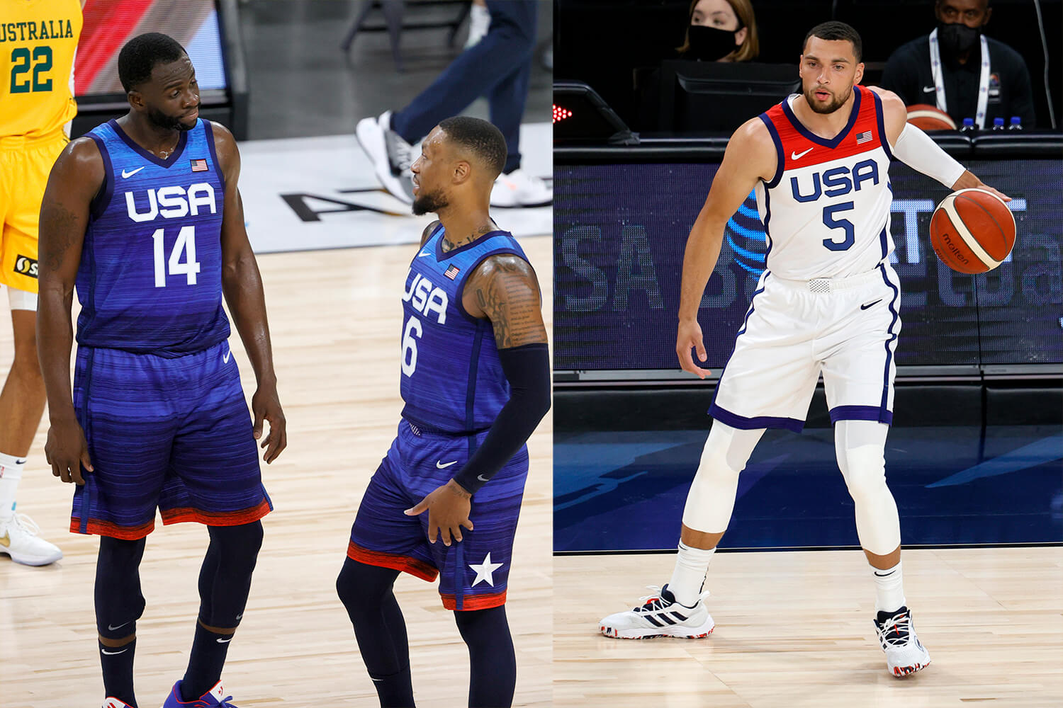
Click to enlarge
Olympics Preview reminder: In case you missed it on Wednesday, my latest piece for InsideHook is a rundown of Olympics uniform storylines to keep an eye on during the Tokyo Games (including the Team USA hoops unis, shown above). Check it out here.
The Ticker
By Paul
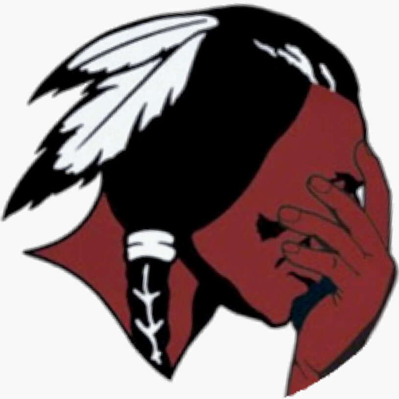
Indigenous Appropriation News: Schools in North Haven, Conn., will no longer call their teams the Indians (from John Dankosky). … The swim and dive teams at Dominion Hills Pool in Arlington, Va., will no longer be called the Warriors (from William Yurasko). … A bill introduced in the Massachusetts state legislature would prohibit Native American mascots and team names for public schools (thanks, Phil). … Colorado has banned racist mascots and team names, but one school, which uses Native-themed images and calls its teams the Savages, would rather fight the restrictions in court than make a change (from Austin White). … In a related item, here’s more info on the Colorado law and how schools are dealing with it (from Tyler Maun). … Lemont High School in Illinois will no longer call its teams the Indians (from Griffin Smith). … The TBSA Wahoos — a girls’ softball team in Springfield, Ill. — uses a ponytailed and apparently female version of Chief Wahoo while also poaching the Washington Nationals’ script “W” for good measure (from David Craske). … The rest of these are from Kary Klismet: Algonquin Regional High School in Massachusetts, whose teams are known as the Thunderhawks, is asking for public input on a new athletics logo after retiring its tomahawk-themed logo. … The Native American Heritage Fund is providing Saugatuck (Mich.) High School with $43,000 in grants to cover costs associated with changing the school’s team name from “Indians” to “Trailblazers.”

Baseball News: The Red Sox are giving away a Sox jersey in “Puerto Rican colors” for Puerto Rican Heritage night on July 27. No indication that the team will wear this jersey on-field, however (from Daniel Robinson). … Remember how Reds OF Nick Castellanos showed up at the All-Star Game wearing a T-shirt designed by his seven-year-old son? A Cincy apparel company is now creating a retail version of that shirt (from John Cerone). … I don’t know if Orioles C Austin Wynns cut himself shaving or what, but he had a very Nelly-esque face bandage yesterday (from Andrew Cosentino). … Red Sox P Chris Sale has been wearing No. 3 while on a minor league rehab assignment with the Double-A Portland Sea Dogs (from Ariel Shoshan).

Football News: Here are some photos from the Dolphins’ new training complex (thanks, Brinke). … New uniforms for East Carolina (from Chad Smith and Phil). … Southmoreland High School in Pennsylvania is adding a memorial decal for a teammate who was killed in a traffic accident last winter (from Joe Werner). … New helmets for Jackson State (from Bill Hetrick). … New uniforms for Hawaii, which is now being outfitted by Adidas (from Rob DeMello). … New helmets for Louisiana Tech (from Chris Mycoskie). … Iowa wants to name the field at Kinnick Stadium after Duke Slater, a player from 1918-21 who was later the first Black NFL lineman (thanks, Jamie). … Here’s a good look at UCLA’s new Jordan uniforms. Video footage here (thanks, Phil).

Hockey News: Here’s a nice side-by-side view of the Kraken’s home and road sweaters, which were showcased during last night’s NHL expansion draft. … New logo for the USHL’s Waterloo Black Hawks (from Wade Heidt). … The WHL’s Edmonton Oil Kings will wear this fan-designed jersey for a home game next season (from Steven Schapansky).

Basketball News: New uniforms for the Harlem Globetrotters (from @HawkeyeOnAir). … Did you know that the Bulls used to wear team-branded socks? (From @NFL_Journal.)

Soccer News: New advertiser for Inter Milan (from Germán Cabrejo). … English club Bedale AFC has a bizarre see-through kit to help raise prostate cancer awareness (thanks to all who shared). … New away kit for PSG (thanks to all who shared). … Nashville SC striker Aké Loba went FNOB — complete with the accent — in his debut with the team last night. … The Mexican flag patch on Mexico FB/MF Érick Aguirre’s shirt was upside-down in yesterday’s Olympic match against France. Additional info here (thanks to all who shared).
Olympics News: Here’s an assessment of the best Olympic logos according to various design experts. … In a related item, here’s an interesting analysis of why creating an Olympic logo is so challenging in an increasingly diverse world (from James Gilbert). … Netherlands women’s soccer goalie Sari van Veenendaal held up injured teammate Sherida Spitse’s shirt for yesterday’s team photo. “Spitse had a knee injury in training on Monday,” explains our own Jamie Rathjen. … Also from Jamie: The Great Britain women’s soccer team had previously revealed their white kit, but here’s the blue one. … Here’s one columnist’s picks for the most stylish uniforms at the Tokyo Games (from Kary Klismet). … Also from Kary: Here’s an article about how the official mascots for the Tokyo Games must compete for attention in Japan’s mascot-driven culture, where cartoon-style characters are ubiquitous in promotions and advertising. … Cross-listed from the soccer section: The Mexican flag patch on Mexico soccer player Érick Aguirre’s shirt was upside-down in yesterday’s match against France. Additional info here (thanks to all who shared).

Grab Bag: New logo for Green Bay’s tourism bureau. … Here’s the logo for the Major Series Lacrosse Classic, which is MSL’s return-to-play tourney (from Wade Heidt). … Something I missed from last week: Dennis Murphy, who founded or co-founded the ABA, the WHA, World Team Tennis, and the International Women’s Professional Softball League, has died. … New logo for the NCAA’s Big West Conference (from Sy Hart). … American gymnast Simone Biles now has her own Twitter emoji (from Ignacio Salazar).
The first article on the Olympics section of the Ticker is not a ranking of the best Olympic logos. It is a collection of critiques by various experts within the design field, explaining why certain Olympic logos are their particular favorite. It is not “one writer’s” ranking, rather a pretty informative read on design.
My bad for not looking more closely at the article. Thanks for the correction — text now adjusted!
The Colts throwback is spectacular!
Super disappointed to wake up this morning and learn the Harlem Globetrotters are going GFGS for their uniform.
The Inter Milan fan token? As someone who has crypto clients . . . this may be getting out of hand. . .
I’m still unhappy that the Colts didn’t come up with real throwbacks like these in 1994 for the NFL’s 75th Anniversary.
Love the note in the media guide about Don Shula – “…should some day make a successful coach.”
The Colts should wear era appropriate black shoes.
Without black shoes it just looks like a stripped-down, less fussy modern uniform.
Shoes are the last thing any team thinks about today. The feet have been liberated from uniformity.
The Colts’ 1956 media guide says that halfback Don Shula is a “smart student of the game and someday should make a successful coach.”
After ESPN referred to the Carolina Hurricanes as the Panthers during the NHL expansion draft, both teams had some fun on Twitter.
link
link
In my eyes, the logo on the white Kraken jersey looks significantly larger because of the navy outline (that can’t be seen on the navy sweater)… feels like it takes up way more jersey real estate.
Agreed. The size really overpowers the sweater. -C.
I love how large the jersey-front logo is, but I also suspect that when the Kraken take the ice, the logo will be smaller. I can see players complaining about feeling the inflexible logo too much when skating.
Austin Wynn had been hit in the face with a bat earlier in the game
link
The Colts Media Guide is worthy of a separate entry! Great stuff in there!
The picture of Johnny U on page 39 makes me laugh every time I look at it.
“There’s a haircut you set your watch to!”
Can’t unsee what looks like a cross on the Colts players’ thigh pads.
Yes! That was the first thing my eye was drawn toward as well. It seems unintentional but then again, the proportions look about identical to the Christian cross.
It’s absolutely intentional.
link
Some nice nominative determinism in that 1956 Colts media guide. Check the name of the backfield coach. (And the center-guard coach, for that matter.)
Paul, I can’t imagine for a second that you do not share my fascination with nominative determinism.
I was not familiar with that term until now — thank you for introducing me to it!
Always happy to help a fellow trivial obsessive!
The Wikipedia page is very interesting; check the study on this phenomenon in medicine written by four unrelated doctors called ‘Limb.’
Nomen est omen, always. ;)
Seinfeld covered this topic! (I’m just learning of the term now as well)
link
I’ve made references to this sort of thing many times, but never knew there was actually a term for it! For example, where I work we have someone whose last name is “Fix”. He works in our powder coating department, but I’ve said before that with his last name, he really needs to be working in the maintenance dept.!
I always thought Speed Racer just seemed like a guy who should drive a race car.
Colts throwback is great. Hoping the Kansas City football team breaks out the Dallas Texans helmets for their game against the Cowboys. The rest of the uniform is largely unchanged since 1963.
Holy God. A see-thru strip for a soccer team. Now, I’ve seen it all.
I see what you did there, Colts. BUCKner! You made a funny!
I said it when it was all first revealed, and I’ll say it again despite feeling like I’m in the minority, but I just don’t care for the Seattle’s Kraken’s branding at all. The name, the color palette, the logo… just none of it works for me. As someone who likes to think they “get it,” man that’s a big old whiff from where I sit.
But I live on the east coast. They aren’t my team. So if Seattle fans dig it, more power to you. Welcome to the NHL. Prepare to be annoyed and infuriated with the league more often than satisfied.
Yeah, that’s been my reaction to the whole Kraken branding as well. I lived in the Seattle area for more than three years as a kid, was really into the Sonics and Pilots, but sure don’t have any fondness for this Kraken look. Also disappointed in where the Seahawks visuals have gone since their great initial look.
Agreed. Not sure why they didn’t go with green as a primary. And had some better name options to go along with that; Emeralds, Evergreens, etc.
I definitely have a bias against non-plural nicknames, but that aside naming the team after silly line from a 10 year old, otherwise completely forgettable movie seems like it won’t age well.
That said, I think the logo itself is a decent enough design.
Seagram’s agrees!
Just another drug reference for the 420 crowd in Seattle… They’ll call the fans Krak-heads.
Bob “Butterbean” Love and Jerry West in the early ’70s.
Always loved those original Bulls’ road uniforms, red with white, rather than black, letters and numbers. Wish they would resurrect that one.
It would make for a great throwback.
Im surprised NFL allows the tredcals, and the religious imagery doesnt seem appropriate either. Tredcals break the uniforms so much for me. It feels so unneccasary and juvenile like writing band logos on your trapper keeper in school or stickers on your bike helmet. Anyone else feel similar?
I completely agree. Less uniform-y, more personal expression-y. But that’s the direction things are moving these days.
I wouldn’t mind them quite as much if:
A) Every player wore them, and
B) They were all the same, such as having the team logo, or the player’s number.
But then I guess it gets back to being “uniform-y”!!!
I remember when the Colts left Baltimore. 18 days shy of my 6th birthday. I remember wondering “Where are the Mayflower trucks taking the team?”. Reading through the Media guide both is me taking a trip through various memories and solidifying associations that I didn’t really know were related to my city.
-Phone number listings with letters and numbers (HOpkins-8080)
-John Steadman, THE John Steadman who had a Cal Ripken-esque streak of attending Colts and Ravens games), was the Publicity Director
-Ed Block was the Team Trainer. (Yes, THAT Ed Block). And his tie to Kernan Hospital is a personal one, as my twin brother had surgery there when he was a toddler
-I miss hearing Chuck Thompson saying “Ain’t the beer cold!” (I drink Natty Bohs still to this day. Really the only beer I drink consistently, unless I’m trying other types like IPAs and such)
Seeing a picture of Memorial Stadium brought back many memories. I actually learned how to ride my bike on that parking lot and the lot across the street!
Also (from the wiki page): As of 2005, the former site of Memorial Stadium housed Maryland’s largest YMCA facility and the developing vision of “Stadium Place”, a mixed income community for seniors in Baltimore City. Currently there are four senior apartment complexes up and running on site. All of this, the political wranglings, the sports history and the city’s attachment to a doomed landmark was captured in a documentary, “The Last Season, The Life and Demolition of Memorial Stadium.”
New field
In 2010, work started on developing a new recreational baseball/football field on the site (Cal Ripken Senior Youth Development Field), with home plate being in the same exact location as it was when Memorial Stadium existed.[21] The field was completed in December 2010. A ribbon-cutting ceremony on December 7 was attended by Billy and Cal Ripken, and Governor Martin O’Malley
And finally, Mr Boh as the ref is WONDERFUL!
It really sounds like the Colts broke your young heart, no? The way they left town was cooooold man.
I’m curious: did you become a fan of the CFL Stallions? The reason I ask is the oral history of that team (below) was one of the best longform articles I’ve ever read. No bs. Really interesting, fun & kind of sad as well.
link
Didn’t really break my heart as I was only 6 and just really discovering team sports. But I CAN say that I naturally gravitated to loving baseball around 7 or 8.
And I did enjoy having the Stallions in town. I based my Uni-Watch membership card on the team!
An additional interesting note on the Red Sox “Puerto Rican Colors” jersey giveaway, I can’t resist the opportunity to go down another design rabbit-hole and point out that the Puerto Rican flag’s colors are not universally agreed upon, with political and historical implications over which tones are used:
link
Thanks for sharing that! Also, though this is completely informal, Puerto Rican statehood activists tend to use a very different 51-star flag to promote their movement than do DC statehood activists. PR folks have long tended to use a version of the flag with 51 stars arranged in a circle, while DC folks tend to use a version of the 51-star flag that follows the US Army Institute of Heraldry’s pattern for rectangular star alignment. The Army’s heraldry office will set the official US government specs for any new flag requiring more than 50 stars, though that will be binding only for government contracting purposes. Everyone is absolutely free to arrange the stars in whatever pattern they want, and it’s still a valid US flag for the purposes of the Flag Code and etiquette.
I like the Colts reveal. Always nice to see some classy looking stuff. Too bad it actually wont be worn like the model is wearing it. Unfortunately we will see ugly ass long undershirts, mismatched sleeves, the gorgeous socks will be to the knees or the ankles so there will be no uniformity there. Plus, who knows what the camo accessories will be with it being military month.
The scouting report on a halfback out of John Carroll (my dad’s alma mater, BTW!!!) named Don Shula:
“Smart student of the game and someday should make a successful coach.”
I’d say they hit the mark on that one!!!!!
Man, that news about the MA ban on Native American mascots will not sit well with the people in the town I live in. Or the town next to us. Or the one next to that one.
Some of these mascot names are without question offensive, especially the imagery, shortened nicknames & old traditions can be very inappropriate. This will continue to be an issue in many towns & eventually it is going to be problematic beyond just school mascots.
Example further down in the same ticker today: Algonquin Regional HS in MA. I am familiar with this school. They were previously Tomahawks, in recent years (unofficially, I believe) they have been using “T-hawks” now officially changed to Thunderhawks. However the school district & regional high school itself is still called Algonquin?
Many things in the state have native American names: dozens of regional school districts, 100s of places: cities, towns, villages, mountains, lakes, rivers, etc. Plus “Massachusetts” is derived from native American language. I know that mascots are different than names, but there is a lot of potential for future renaming requests… town meetings & public forums & debates, very time consuming.
There has been a large portion of the town that is very much against changing the name (which is currently “Redmen”) simply because that’s what it has always been.
Redmen is a tough one to stand by, especially when so many other schools have already changed that nickname long ago (including UMass). But I’m still not surprised to hear that many of the traditionalist townies are against any change.
The “that’s the way it has always been” crowd was still very vocal in my hometown, Grafton, this past year when the students & school committee both voted to drop Indians.
A team named after Indians is problematic, but a school (or town) named after Indians is most assuredly a tribute.
Another note on the Uni Watch “Tequila Sunrise” bike jersey I wore yesterday (including a picture posted on my Facebook page at link). My brother responded by suggesting the green-hued version of the “Tequila Sunrise” design might be dubbed the “Frozen Margarita” look.
Just a heads-up, Tom: That link didn’t work for me yesterday, and it’s not working today either. Might need to change the post to Public.
Sorry about that, Paul, I’ve put my IT department (my wife) to work and I believe we’ve managed to change the post to “public,” so with luck it’s accessible now.
Ah, that’s better. Looking sharp!
Seems unnecessary to create a throwback that doesn’t look much different from the team’s current uniform that was worn in a city they don’t play in anymore.
I hated the All Star unis on TV, but I have to say, I saw them for sale at the ballpark this week, and as a shirt/uniform top, I thought it looked kinda sharp…
Ironic to see three stripes, synonymous with adidas, right below the Nike logo on the sleeve of Colts throwback jersey.
Sigh. I was really hoping we could avoid this trope.
For the umpteenth time: The Bears have had triple-striped sleeves and socks for decades; until last season, the Patriots’ road uniform had featured triple-striped socks for 20 years; the 49ers have been wearing throwbacks with triple-striped sleeves for the past two years (and they’re adding another triple-striped-sleeve throwback this season); and so on.
In short: There’s nothing new or unusual about this. Sometimes three stripes are just three stripes.
The Colts 1956 media is quite the treasure chest of football lore….the promising young QB George Shaw….. the training camp invitee QB Johnny Unitas who took advantage when Shaw broke his leg….the recognition that defensive back Don Shula perhaps had a future in coaching….and the note that defensive end Gino Marchetti fought in the Battle of the Bulge at age 18.
But another person of interest is end Dick Donlin, a second round draft pick out of tiny Hamline College. As the story goes, a Rams scout jokingly wrote a glowing scouting report on Donlin, portraying him as a super prospect just waiting to be discovered….and left the report in the Rams office, where it was found by the rest of the scouting staff…..who begin calling around and eventually determined it was a hoax. However, other NFL teams heard about the Rams calling around to check out Donlin….and the Colts, apparently believing (sight unseen) that the Rams were hiding a true small college phenomenon, took him in the second round. When camp opened and Donlin appeared in the flesh….he supposedly lasted about five days. Don’t you miss the old NFL ?
I’m glad that panel of graphic designers thought so highly of the insignia of the 1972 Munich Games. It’s long been my favorite logo.
The Padres do have a road gray jersey that they regularly wear, contrary to the assertion by Chris that their only option is a brown jersey.
That “see-through” soccer kit reminded me of Slim Goodbody! “Home – Slim Goodbody” link
By the way, how about that Don Shula huh?
Indianapolis theft of the Baltimore uniform is just another insult to the true COLTS by the Irsay mob. Stick to the uniforms you stole.
Your only history begins with Mayflower trucks from outside of Maryland.