Click to enlarge
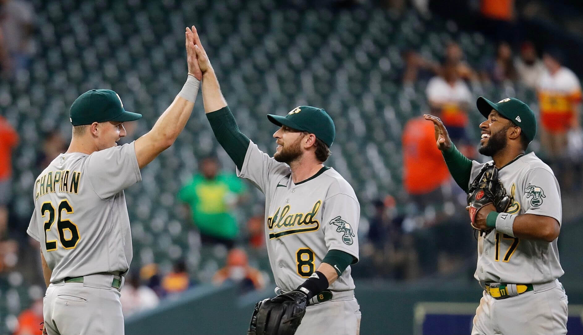
Notice anything unusual about this photo of A’s infielders (from left) Matt Chapman, Jed Lowrie, and Elvis Andrus celebrating their victory over the Rockies on April 10? Well, you’re a Uni Watch reader, so of course you spotted right away that Lowrie’s cap did not include the New Era maker’s mark, which has been a fixture on MLB caps since the 2016 postseason.
That was one of many, many games in which the maker’s mark has been missing from Lowrie’s cap this season — something I wasn’t aware of until reader Casey Coneway noticed the missing logo while watching last Friday’s A’s/Giants game. Photo-researching the left side of a position player’s cap on a game-by-game basis is tricky, because most wire photos will show the player batting (photo-researching a pitcher is much easier), and even some of the photos showing the player in the field won’t provide a left-side view. But based on photos I’ve been able to find, Lowrie’s headgear was blissfully free of logo creep this season on at least the following dates:
April: the 9th, 10th, 12th, 20th, 23rd, 24th, and 27th.
May: the 2nd, 4th, 7th, 19th, and 22nd.
June: the 5th, 8th, 24th, 25th, and 26th.
If you look at those photos, you’ll see that they’re all from games when the A’s wore their green/yellow home caps or their solid-green road caps. But when they wore their Kelly green alternates, Lowrie always had the maker’s mark. He also had the logo on commemorative and holiday caps, like for Jackie Day. Hmmmmm.
I wanted to see if this was a long-running thing with Lowrie. He sat out last season and was with the Mets in 2019, when injuries limited him to just nine games — all as a pinch-hitter — so I started looking at photos from 2018, when he was with the A’s (his current stint with them is his third!). He appeared to have the maker’s mark on all of his caps that season.
Just to be safe, I looked at photos from 2017 — the first year that the maker’s mark appeared on caps during the regular season. To my surprise, I found several games in which Lowrie didn’t have the logo. In fact, I discovered that I even tweeted about one such instance, from May 9 of that year:
A's infielder Jed Lowrie wore a cap without the New Era logo last night. pic.twitter.com/zKetsUJ4hW
— Paul Lukas (@UniWatch) May 10, 2017
Here are the other 2017 dates for which I found no-logo photos of Lowrie:
April: the 4th, 17th, 20th, and 22nd.
After that, the logo was consistently on his cap, at least in photos that I was able to find. (I devoted a ridiculous portion of my Saturday to this project.)
Now, the New Era maker’s mark was still a new thing in 2017, so maybe it’s not so surprising that a player ended up wearing a cap from the previous season’s stock, especially early in the season. But what explanation could there be for Lowrie apparently wearing the logo for the rest of 2017 and all of 2018, then leaving the A’s for two years, and then returning this season and suddenly not having the maker’s mark again? (I should add here that I didn’t see the logo missing from any other Oakland players during my photo research.)
When a similar situation arose earlier this year regarding Phillies pitcher Aaron Nola, I had no option but to ask the Phils’ PR people (who never got back to me). But A’s equipment manager Steve Vucinich is a longtime Uni Watch pal, so I gave him a call yesterday afternoon and told him what I’d discovered about Lowrie’s caps.
“Awww, don’t tell me that,” he said, sounding pained by the breach in protocol. “I didn’t even notice.”
Steve knew right away what had happened, and it’s an interesting explanation: It turns out that Lowrie is the only A’s player who prefers a low-profile cap, so Steve thinks they may have pulled some old, pre-2017 low-profiles for him to wear. That was presumably also the case in 2017, although it’s not clear why it didn’t come up in 2018.
This also explains why Lowrie’s Kelly green caps have the maker’s mark. Oakland’s Kelly alternate didn’t exist until 2018, so there was no old, pre-logo inventory for them to use.
Even better, this appears to explain the Aaron Nola situation. When Nola’s cap hasn’t had the maker’s mark, it appears to have been a low-profile model:
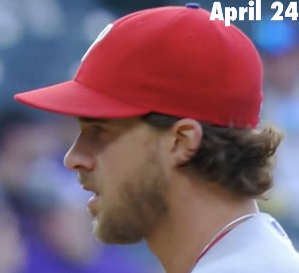

But when Nola has had the maker’s mark, it looks like it’s been a conventional high-profile 5950:
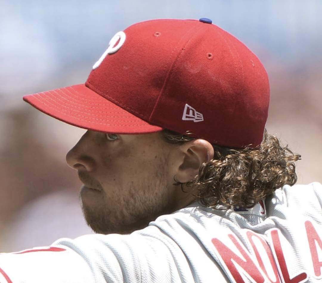
I don’t know why Nola would be flip-flopping back and forth between high- and low-profile caps, but this at least seems to explain the variation his “on again, off again” logo creep: The logo-free cap is apparently an older low-profile model.
If there’s a down side to all of this, it’s that Steve V. will now ensure that Lowrie’s caps have the maker’s mark going forward, presumably starting tonight (the A’s were off yesterday). That’s too bad, but at least now we understand what was going on.
The next big question to tackle: How many MLBers besides Lowrie prefer low-profile caps? I confess that cap silhouettes aren’t something I’ve been attuned to over the years. Does anyone track this?
(Big thanks to Casey Coneway, whose observation made this post possible, and to Steve Vucinich for helping to solve both the Lowrie and Nola mysteries.)
Click to enlarge
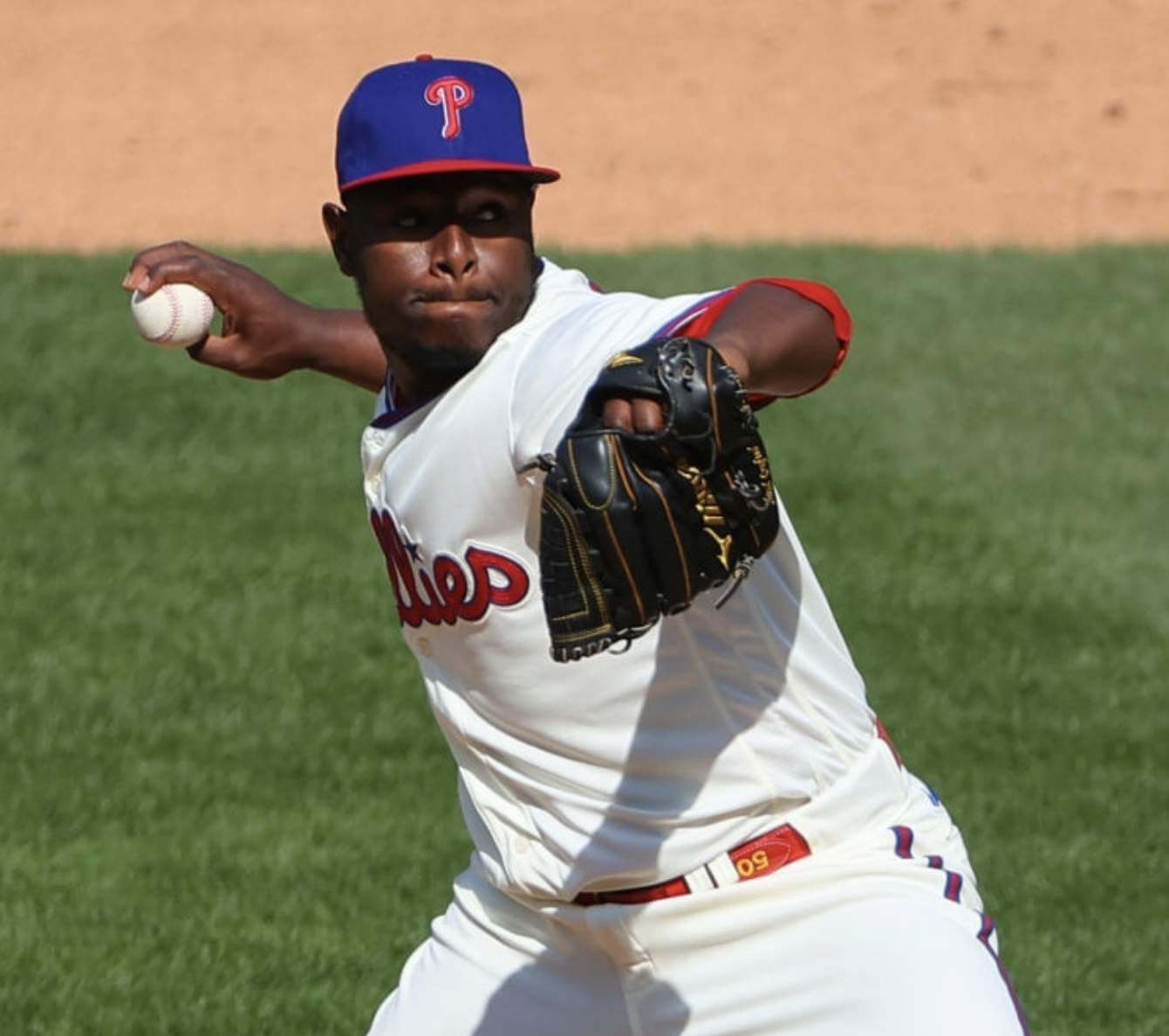
Belt Watch, continued: Yesterday’s post about left- and right-handed belt-wearing styles in MLB prompted a great note from reader Shawn Sweeney, who points out that Phillies reliever Hector Neris has been wearing a uni-numbered belt with the number upside-down! The photo above is from a game in May, but photo research indicates that Neris has been doing this all season long, even back in spring training. This means means his belt was designed for the left-handed style, but he wears it right-handed (which makes sense, because he’s a righty). Bizarre!
Meanwhile, longtime reader Benji Boyter reports he has a co-worker who says wearing the belt in the lefty style is common among hockey players. “According to him, the reasoning was that the strap to tighten his garter belt was on his right side and so because of that, he always wore his belts with the strap pointing to the right instead of the left,” says Benji. “He also added that he once noticed a guy wearing his belt in the same manner and asked if he was a hockey player and the guy responded that he was and added, ‘Could you tell by the belt?'”
That concludes this installment of Belt Watch. I’m fairly certain there’ll be more where this came from.
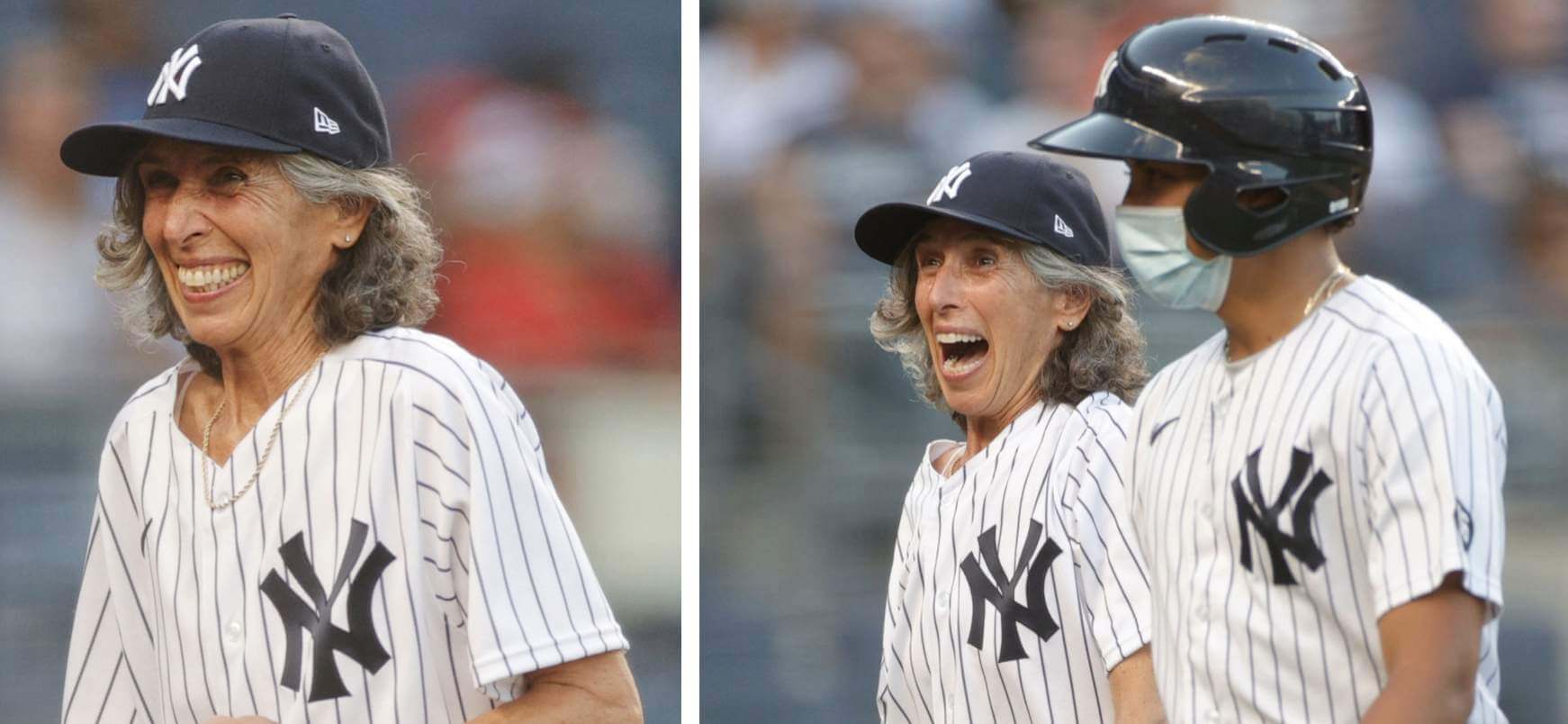
Click to enlarge
Better late than never: Nice move last night by the Yankees, who allowed 70-year-old Gwen Goldman to suit up as an honorary bat”girl.” She had applied for that position back in 1961, when she was 10 years old, but was turned down because of her gender. When the situation was recently brought to the attention of Yanks GM Brian Cashman, he decided to do something about it.
The good uni news: Goldman went high-cuffed. The bad news, as you can see above, is that the Yanks neglected to include the Whitey Ford memorial patch on her jersey, even though the regular batboy has it. So even now, Goldman is still a bit “less than.” Dang.

Click to enlarge
Sacre bleu! The Stanley Cup Final(s) got underway last night, with the Canadiens (my favorite NHL team!) facing the Lightning. As you can see above, the Habs wore a French-language version of the Stanley Cup patch — the first time that’s ever been done. Kind of funny that the patch includes the LNH shield (that’s Ligue Nationale de Hockey), but the Habs’ jersey includes the standard NHL shield at the base of the collar. They wear the French version on their home jerseys, so the patch and the jersey logo will match when the series moves to Montreal for Game Three. (Hopefully the series will be knotted up by that point, as the Habs were the Hab-Nots last night.)
Meanwhile, following up on an NHL item from yesterday: Commish Gary Bettman now says that jersey ads will not be happening next season (although helmet ads are here to stay, which we already knew). So we’ll have at least one more season of unsullied NHL sweaters. Phew.
Click to enlarge
Collector’s Corner
By Brinke Guthrie
Follow @brinkeguthrie
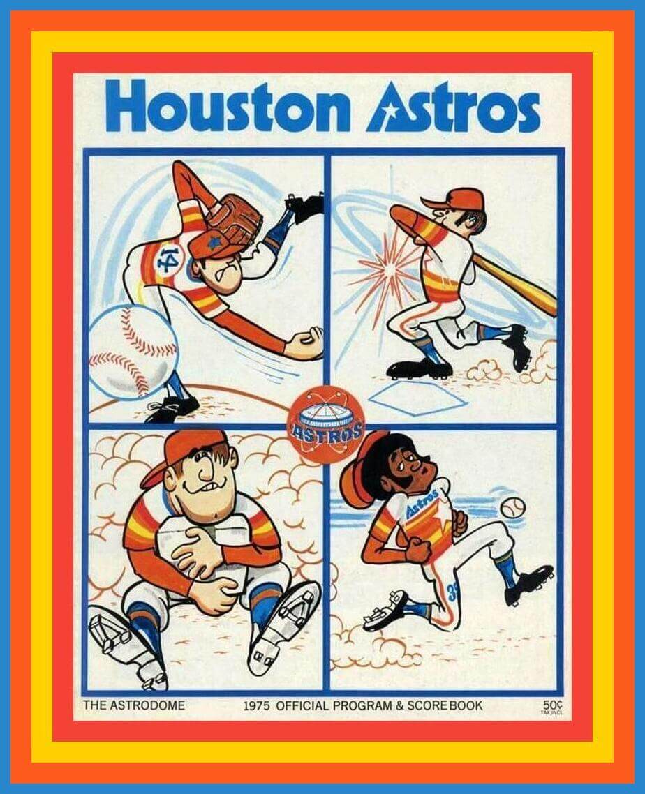
Take a look at the sensational cover art for this 1975 Houston Astros game program! This was the first season for the tequila sunrise look. Also, look at the “star-A” in the type at the top of the cover — that’s based on the original tequila sunrise prototype design!
Now for the rest of this week’s picks:
• One more ’Stros program for you: The 1976 National League centennial logo is one of my all-time favorites, and it’s right there in the middle of the cover for this (of course) 1976 Padres/Astros game program. (Nowadays, of course, the ’Stros are in the American League, but that switcheroo didn’t take place until 2013.)
• I love the title of this 1963 paperback written by Yankees Hall of Famer Whitey Ford and sportswriter Jack Lang (I suspect Lang did most of the heavy lifting): The Fighting Southpaw! Sounds like a John Wayne movie.
• Hockey art from the 1970s just doesn’t get any better than this set of four NHL team posters, originally from Wheaties. This set includes the Montreal Canadiens, Vancouver Canucks, Philadelphia Flyers, and Boston Bruins.
• Nice-looking graphics on this 1970s Los Angeles Rams equipment foot locker. This is “Official Team Property” wink-wink, and the interior looks to be in fine shape. The outside has some wear on it, including rust in one corner. Well, at least it’s not done up in “Bone,” right?
• This 1996 San Diego Padres canvas tote bag says, “60th Anniversary 1936-1996.” The MLB Padres didn’t come into existence until 1969, of course, but the date range on the bag takes into account the PCL history of the minor league team of the same name.
• This 1970s Mr. Met ashtray is in excellent condition.
• The 1969 MLB National League Eastern Division is depicted on this mini-helmet hat tree.
• You too can, er, smell like a (Dallas) Cowboy with this 1994 bottle of NFL Cologne.
• Looks like Phil “Scrap Iron” Garner on this 1979 Iron City/Pirates World Series commemorative beer can.
• This Parker Brothers board game, The National-American Baseball Game, dates back 108 years!
• Almost looks like Brownie the Elf on this 1959 Chicago White Sox megaphone/popcorn holder. The little dude was still takin’ his cuts in 1983, too.
Got an item to include on Collector’s Corner? Tweet submissions to @brinkeguthrie.
The Ticker
By Alex Hider

Baseball News: The Reds’ Lou Gehrig Day game on June 2 was rained out, so they wore the Lou Gehrig Day patch for last night’s makeup game. The visiting Phillies did not wear the patch. … Speaking of the Reds, they mistakenly had former pitcher Trevor Bauer in the lineup and playing shortstop on their scoreboard last night (from Kyle Sutton). … Rockies P Daniel Bard had his grey glove confiscated by umpires last night because there wasn’t enough contrast with the baseball (from @HollarDollar). … The baseball helmet sundae is a summer staple — but it’s not often you see an earflap on the helmet! What’s next — C-flap spoons? (From Scott Rogers.) … Back in 1970, the Astros ran a giveaway promotion where fans attending games received team patches — not just for the Astros, but also for the Dodgers, Cubs, Pirates, and Cardinals (from T. McElwee). … WABC-TV in New York used an old Angels logo in a graphic during a segment last night (from @doueventrainufc). … Brady West, a catcher for the Idaho Falls Chukars of the independent Pioneer League, patched his lucky pants with a “Dogecoin”-themed patch (from Clint Dickinson).

Pro Football News: A Texans blog has proposed a few ways for the team to take advantage now that teams will be able to add a new helmet color next season (from Kary Klismet). … Also from Kary: Tom Brady marks his golf balls by listing all the Super Bowls he’s won. … The CFL’s Saskatchewan Roughriders are offering fans an opportunity to have their name inscribed on a wall within their stadium (from Wade Heidt). … In 1977, Broncos QB Craig Morton’s sewn-in jersey pocket was apparently made from an orange towel (from Tom Jacobsen and Dave Guidera).
College Football News: Wisconsin QB Graham Mertz has a personal logo ready to go for when the NCAA formally begins allowing players to profit from their name, image, and likeness (from Griffin T. Smith). … If this photo is any indication, Texas A&M will again feature maroon pants this season. “They stuck to strictly white pants in the previous season,” Connor Russell says. … Here’s an ACC uniform power ranking (from Phil and Kary Klismet). … Gerry Dincher sends along this excellent footage of Penn State’s 1969 season, featuring a color-on-color matchup with West Virginia and my Ohio Bobcats wearing an enormous SNOB on their jerseys.

Hockey News: Paul mentioned this in one of today’s sub-ledes, but it bears repeating: The good news? No sweater ads next season. The bad news? Helmet ads are sticking around (thanks to all who shared). … The NHL has unveiled the logo for the Seattle Kraken’s expansion draft (from Ephraim Vorzman). … There was no Stanley Cup Final(s) logo on the ice for Game 1 in Tampa last night (from Steven Vegh). … A Montreal bagel shop is supporting the Canadiens’ title run with Habs logo-shaped bagels (from Andreas Papadopoulos). … Speaking of the Habs, Formula One driver Lance Stroll is a Canadiens fan and has a helmet emblazoned with their logo (from Omar Jalife).

Soccer News: The Crew will open their new stadium on Saturday. Here’s some photos from inside the new venue (from Kary Klismet). … Two new shirts for Scottish club Greenock Morton, including an ad-less jersey commemorating the 100th anniversary of the 1922 Scottish Cup win (from our own Jamie Rathjen). … Also from Jamie: England will feature a rainbow captain’s armband at Euro 2020 today. … Interesting to watch this 1978 BBC piece on the then-new retail market for soccer merchandise through today’s prism (from Trevor Williams). … Nashville SC’s uni tracker shows that they’ve been most successful in their yellow kit so far this season (from @NashvilleSCkits). … The rest of these are from Ed Zelaski: New away shirt for Dutch club Willem II. … The new Hertha BSC shirt has leaked. … New kits and outfitter for fifth-tier English side Grimsby Town, which is switching from Macron to Errea.
Olympics News: Here’s what the U.S. Golf team will wear in Tokyo next month (from Jason Hillyer and Kary Klismet). … China has unveiled its podium uniform (from Phil). … In case you haven’t been keeping up, here’s what several countries will be wearing during the Opening and Closing Ceremonies next month (also from Phil).

Grab Bag: Repost: NASCAR Whelen Euro Series driver Alex Sedgwick will drive a Kobe Bryant-themed car this weekend. … This article recaps the history of girls’ school uniforms and how they became a fashion trend (from Kary Klismet). … Here’s yet another story about Edina High School in Minnesota, which is in a trademark dispute over the school’s hornet logo with its creator — a former student who designed it back in 1981 (from Scott Gurrola and Sam). … With the NCAA poised to roll back name/image/likeness regulations, Houston has launched a program to help its athletes navigate the new rules (from Ignacio Salazar). … After a trial period, the UK has officially introduced new uniforms for postal workers (from Timmy Donahue). … Also from Timmy: Ontario Provincial Police officers are now permitted to wear baseball caps as part of their uniform. … We’ve talked before about schools that have male-gendered team names for their boys’ teams, leaving the girls’ teams with diminutive variations on the boys’ name or the stupid “Lady” modifier. Now Thomas Foote has an interesting example of the gender default running the other way: “Converse College, a D2 school in Spartanburg, S.C. (now rebranding as Converse University), has been all-women since it opened in 1889, and its teams are known as the Valkyries. Converse went co-ed this past year will field its first men’s teams this fall. Based on the initial announcements, it looks like they will be using ‘Valkyries’ for everyone, though I haven’t seen anything officially confirming that.”
Our latest raffle winners are Cole Robison and Mike Menner, each of whom has won a Uni Watch koozie. Congrats to them, and thanks to Chris Hickey for sponsoring this one.
I originally planned to have a big announcement today, but instead it will be tomorrow. Sorry for the tease, and thanks for your patience. Nope, it now turns out that it won’t be tomorrow either. Soon, but I’m not sure exactly when. Sorry for the moving target. — Paul
Mystery solved! Very interesting that the low profile hats have always had the New Era logo since the regular ones were added as well. I’m a low profile guy myself. Must be teams simply not wanting to waste old stock.
Quick correction: Idaho Falls Chukars play in the Pioneer League, not the Frontier League.
Thanks. Fixed.
Odd that the NHL went to the extent of placing the patch in French but the Candian anthem was not bilingual last night.
The game was in Tampa, so why would it be bilingual? The English-only version is used in most of the world. Ottawa uses French for the first verse and English the rest of the way. Montréal uses French for the first 2 verses but goes English at the end. I can’t remember what the Nordiques did; given the very pro-French and separatist feelings in Quebec City, I would presume that they would have gone all-French. But the rest of Canada and the US use an all-English version.
A few things for you MJ. First, Canada is a bilingual country. Second, you’re right, the anthem in Quebec City was played only in French. Third, Quebec City was the only region that voted against the separation in the 1995 referendum. Thank you, have a good day.
1. Fully aware that Canada is bilingual (I had family in Montréal, one of my favorite cities in the world, and my wife had family in Peterborough, ON). From what I know, the majority of Francophones live in Quebec (or at least east of Ontario), and I believe that none of the Canadian teams west of Ottawa incorporate any French into their anthems at NHL games. It is a unique kind of bilingualism for sure.
2. Thanks for that!
3. Thanks for that! I was thinking more of the first referendum in the late 1970s but your point is well taken and appreciated.
So, when the US anthem is ever sung in another country, it should be that countries respective language?
Montreal (and the French it represents) should have been ack’d appropriately with the anthem that is played in their home.
It doesn’t look like Gwen’s batgirl uni has the Nike logo. Not sure if the regular batpeople uniforms include that, but to me that’s a plus!
In other photos her jersey did have the swoosh on the front. link
Paul, Brett Gardner of the Yankees is another low profile cap wearer.
This is where the comic-geek and uni-geek personalities collide.
I couldn’t imagine why Batgirl would be called Gwen since that is clearly an Marvel character called Spider Gwen.
Literally had to reread this three times to unclog my brain.
I had to click on the link before I could get it through my head what was what. And I even have the anti-excuse of once having written for a baseball blog called “Bat-Girl,” so I really should not have had any Babs/Gwen dissonance here!
AH. Of course! I saw where this was headed as soon as I saw your old Jed Lowrie tweet. High profile case. Low profile cap.
Paul-
the statement that New Era didn’t make low profile caps prior to 2018 is incorrect. New Era has made them for quite some time, going back to when New Era’s caps were 100 % wool, which was pre 2008. I have some in both 100 % wool and the poly blend/”performance “fabric now used. I don’t track which players use the low pro’s, but there is a preference for them because the crown on the standard 5950 appears “high” on the head, at times giving what I call the “Elmer Fudd” look.
I didn’t say New Era didn’t make low-profile caps. I said that the A’s Kelly cap didn’t exist prior to 2018, because that’s when the Kelly alternate uni came into existence. So there are no pre-2018 Kelly caps (low or high) to choose from.
I’ve adjusted the text to make this point clearer.
Ichiro was a low profile cap guy, too.
The poster boy for low pro’s, definitely. His always seemed to be even lower than normal, too. Almost like a little league hat.
link
I’m thinking Max Scherzer used to wear a lo-pro when he was in Detroit. But the years don’t match up, so maybe he just pulled it to the point of distortion. Either way, a good look. Lo-pro is my preference and just another reason I like the guy.
Anything to counter images of Joe Torre going high hat in the Yankees dugout. Hate that look with a passion.
-C.
link
From the moment you ran the first story about Nola, something looked off with his cap, but I couldn’t put my finger on it. i chalked it up to no maker’s mark, but that is it! Low pro cap.
Well done Paul!
Tom Brady “lists” his NFL “titles” on a Titleist?
Interesting that the players can actually choose between a “normal” and low profile hat. All the “normal” hats have always appeared overly boxy to me, low profile actually looks proper. I always assumed there was just a standard hat they all had to wear, especially since the official on field hat sold in retail is not a low profile.
Based on this it appears players choosing the low profile style are very tiny minority. I’d be curious to know the ratio.
I’ve been ’47 franchise style only for some years now, but I can’t recall new era marketing two styles of on field caps. They’d be smart to do so for the many hat wearers that prefer low profile.
You can make any high-profile hat into a low-profile hat by removing the wire backing that runs from that squatchee to the bill, behind the 2 front panels. Then, wear them in the shower a couple of times and it molds nicely to your head. I’ve done it on a lot of my hats.
Two points on this, as someone who routinely deconstructs all of my fitted caps and who prefers low-profile 59Fiftys:
1) Low-profile is an entirely different cut of cap. It has less fabric; each panel is smaller than the equivalent panel on a regular-profile cap. No amount of deconstructing will change this. A deconstructed regular-profile cap is not a low-profile cap.
2) Modern MLB caps are made of entirely synthetic materials, with no wool content. So they do not and will not shrink with water. I can swim the English Channel in my deconstructed regular-profile cap and it will fit no more tightly than before I began my swim.
Good to know. Haven’t bought a hat in a while but if I do, I buy retro.
Greg: Low profile on-field hats are an option in online team stores (I have two). On your second paragraph, do you find the ’47s don’t fit quite as well as they used to? My last few have just felt so-so.
MJ: I’ll have to remember that for the day when low-profiles are no longer produced, which I’m sure will happen soon since MLB can’t let us have anything nice.
Yeah, they definitely changed up the sizing a bit, I had always gone with the large, and it fit perfect, however the most recent one I bought seems a little tighter. Still fits, but noticeably smaller and not as perfect a fit for me as it once was.
Also annoyed they went back to the green underbrim. Not sure why they went back to that antiquated style when the matching underbrim looks so much better.
I find the lower profile and shorter brims on the 39thirties fit my narrow face better.
A couple of notes on the Penn State video that I forgot to mention in my email. The WVU Mountaineer mascot looks an awful lot like Hank Williams, Jr. and isn’t wearing anything close to resembling the current Davy Crockett mountaineer costume that I remember from my younger days. I assume the WVU mascot still wears the same coonskin cap and buckskins. Also, Syracuse’s QB is #44 and Penn State’s Chuck Burkhart wears #22 at QB.
That Astros program cover is great. Couple additional comments:
— The jerseys are also based on the prototype uniforms, they have the same design on the A and a white (not blue) star.
— So why are the hats orange and not white? Either there was an intermediate design with orange hats or the hats got recolored after the art was delivered. (The star on the pitcher’s hat isn’t as crisp as the linework on the rest of the cover, so I’d guess it was redrawn.)
— Interesting that the base-stealer’s hat is turned around backwards. I don’t remember people wearing their hats backwards being a thing in the ‘70s. (Although I was six years old and hopelessly uncool at the time so maybe I just missed it.) Catchers wore their helmets backwards of course but you wouldn’t steal a base with your catching gear on.
— Those stirrups! Those sideburns! Living through the ‘70s was kind of a drag but looking back at them is kind of fun.
And the base stealer has the shoes on the wrong feet…..
The NHL is LNH in French, not LHN.
Great detective work on the Nola/Lowrie mark issue.
Right. Fixed.
Sorry Paul, as much I admire your work,
can’t say same for your hockey team,
le habitants are laying an egg and going down four straight.
Au revoir
Hey Paul-This is the first time that version of the Stanley Cup Final patch was in French. In 1993, the then-current version of the patch was provided in French for the Canadiens as well.
I’m really happy to see they used the French version on the whites, and now I’d like to see them use the “LNH” shield on the whites as they do the reds.
Here’s my non-scientific theory on Aaron Nola. When his hair is longer he wears a standard 5950, and when his hair is shorter, he’s a low profile wearer.
But there was that one game where he switched *during the game*!
Hair grows quickly! (Well, not for me….)
Possible explanation for the Reds’ scoreboard error: they started rarely used Mike Freeman at SS last night, who wears the same jersey number (27) that Bauer wore with the club. Looks like maybe someone just plugged the number into their system and didn’t realize that it hadn’t been updated.From what I can tell this was Freeman’s first home start for them.
About the the guy who designed the hornet logo in a contest lawsuit: this is why some contests now spell out that the logos in their design a [blank] contest will belong to them, even the ones that lost, for better or worse. And that if an artist (pro or amateur) doesn’t want to give up their rights or not be compensated, then just do not enter the official contest at all so that they will not get taken advantage of and lose the rights to their work.
It’s not at lawsuit point yet. He’s issued a cease and desist, and so far the school district seems to be complying. Back in 1981 they didn’t think about the legal complexities of such things, and even if they had, they’d have been hard-pressed to argue that a rights assignment would be enforceable against a teenage kid.
I’m curious as to what specific use he objects to. He alludes to certain uses being ‘disrespectful,’ but doesn’t cite any in particular. And it doesn’t appear as if his aim is to get a cut of any financial windfalls; if that were the case, he’d have taken a different path, and done so several years ago.
That said, I bet they, nor any school district within 100 miles of it, ever conducts another logo contest again.
Any guesses as to why the Habs get the “LNH” version of the shield on the collars of their home jerseys, but the Senators don’t? I was always under the impression that Ottawa was even more of a French-speaking town than Montreal.
Been to Ottawa several times being that our daughter and husband used to live there. They now live about 30 miles south of there. But I’ve never really noticed much French being spoken, but go across the Ottawa River to Quebec and it is much different.
Ottawa is conspicuously bilingual because it is the nation’s capital. Montréal is the largest city in Quebec, where the vast majority of French speakers live.
Link to the Ontario Provincial Police officers now allowed to wear baseball caps goes to the Craig Morton picture.
Hi Paul,
The Ontario Provincial Police baseball caps link is linking to the Craig Morton towel pic
Thanks, Nick. Now fixed.
Cheers for getting to the bottom of the logo-less caps, but all the attention resulting in its likely return is a bit “teacher, you forgot to give us homework” of you. ;)
I would be proud to be a Converse University Valkyrie. There are more than a few female nouns that convey a dynamic character, such as “Mermaids”, “Athenas”, “Riveters”, “Black Widows”, and “Amazons”.
Is “Mud Hens” the only female name of an all-male team?
The 49ers State of The Franchise is tomorrow at 6pm. We might have our first view of the red home 94 throwbacks if they are going to happen this season. It will be shown on the 49ers app.
Low-profile caps are the only fitted caps I will wear. The high profile cap looks ridiculous on me because of my peanut head.
Great find on the Rams footlocker. I still have my original Steelers Official foot locker.
How much better of a story would it have been if the Yankees arranged for Gwen Goldman to hand over her bat “girl” duties to a new/permanent bat “girl.”
Righting a wrong and then making it better.
Missed opportunity there.
“A Texans blog has proposed a few ways for the team to take advantage now that teams will be able to add a new helmet color next season”.
Is there an explanation as to why they ‘one day’-ed the white helmets in the first place?
It’s well known that what a vocal number of Texans fans really want is for the team to throw back to the Oilers, a stance I disagree with. I suspect that anything short of doing that or simply trotting out there with a different color helmet/fauxback uniform just because everyone else can (there are exceptions of course) won’t be well received. Personally, I think the Texans look great as-is…so what if they have nothing to throw back to?
I’m way late to the belt commentary, but I just realized, as someone who is RIGHT-handed, I both wear my belt LEFT-handed…and when I wore a watch (which I did for many years, and may again some day), it was on my RIGHT wrist.
I’m way late to the belt discussion, but I just realized: I’m RIGHT-handed, but not only do I wear my belt LEFT-handed (Moore-style), but when I wear a watch, I wear it on my RIGHT wrist.
Graham mertz logo looks like a ripoff of tiger woods TW logo
Maybe Neris has his belt number upside down so he can read it while wearing it…