Click to enlarge
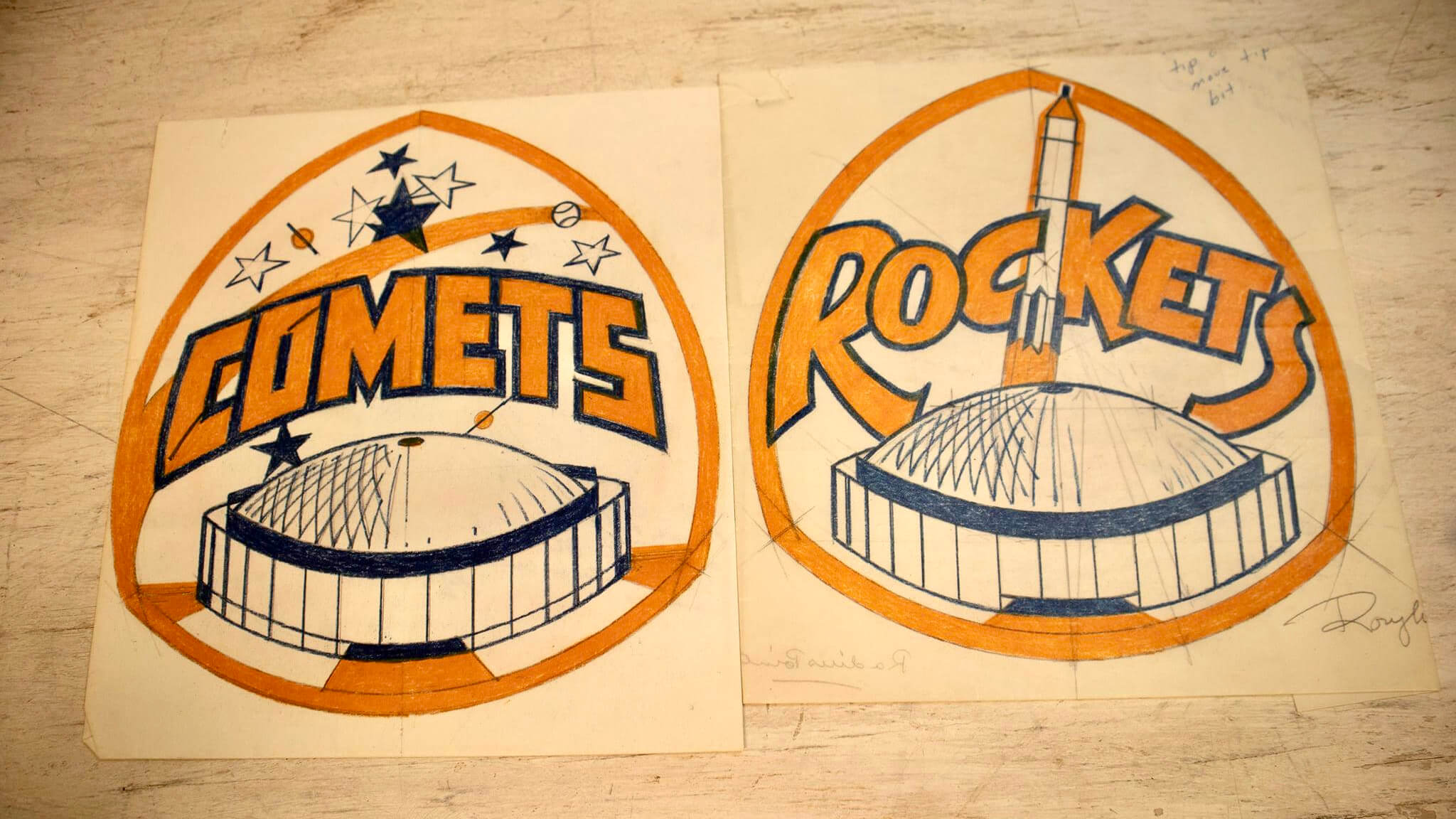
Judge Roy Hofheinz, the original owner of the Houston Astros, died in 1982. Nearly four decades later, a huge stash of items from his estate has come up for auction — including a bunch of original sketches that show some of the directions the team was considering as it prepared in 1965 to move into its new domed stadium and transition from the Colt .45s to a new identity.
As you can see above, two of the team names under consideration at the time were “Comets” and “Rockets” (both of which later became the monikers of Houston pro basketball teams). Both sketches are nice, especially the Rockets design. Love that lettering!
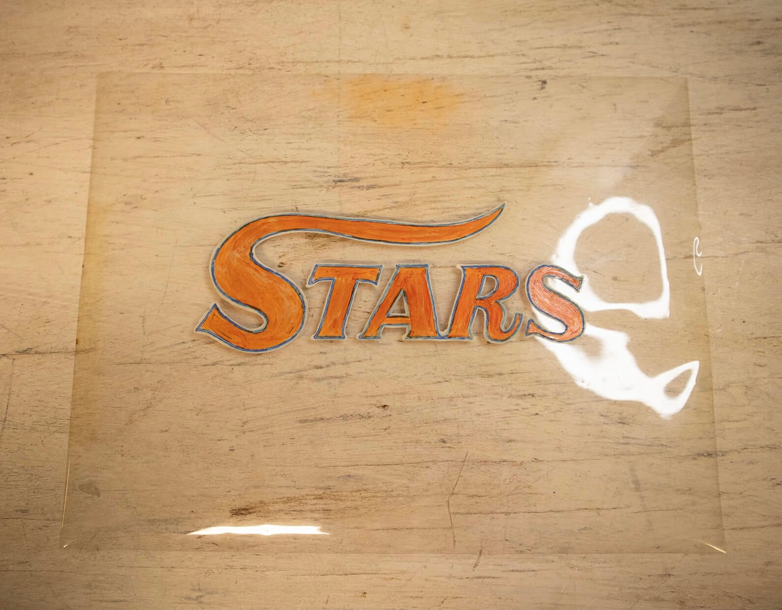
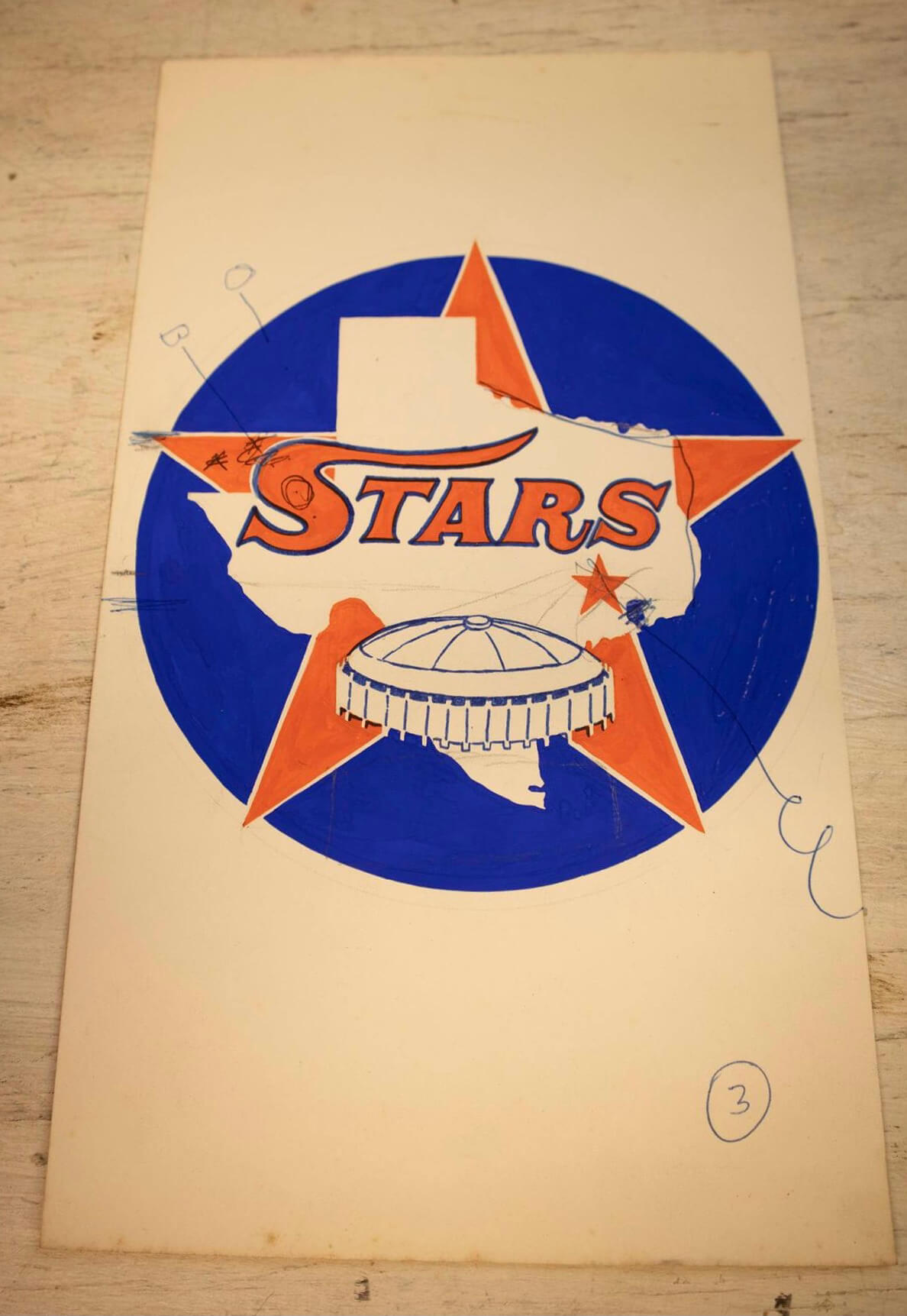
The other name that was apparently given serious consideration was “Stars.” Here are some sketches showing a wordmark based on the outgoing Colt .45s lettering:
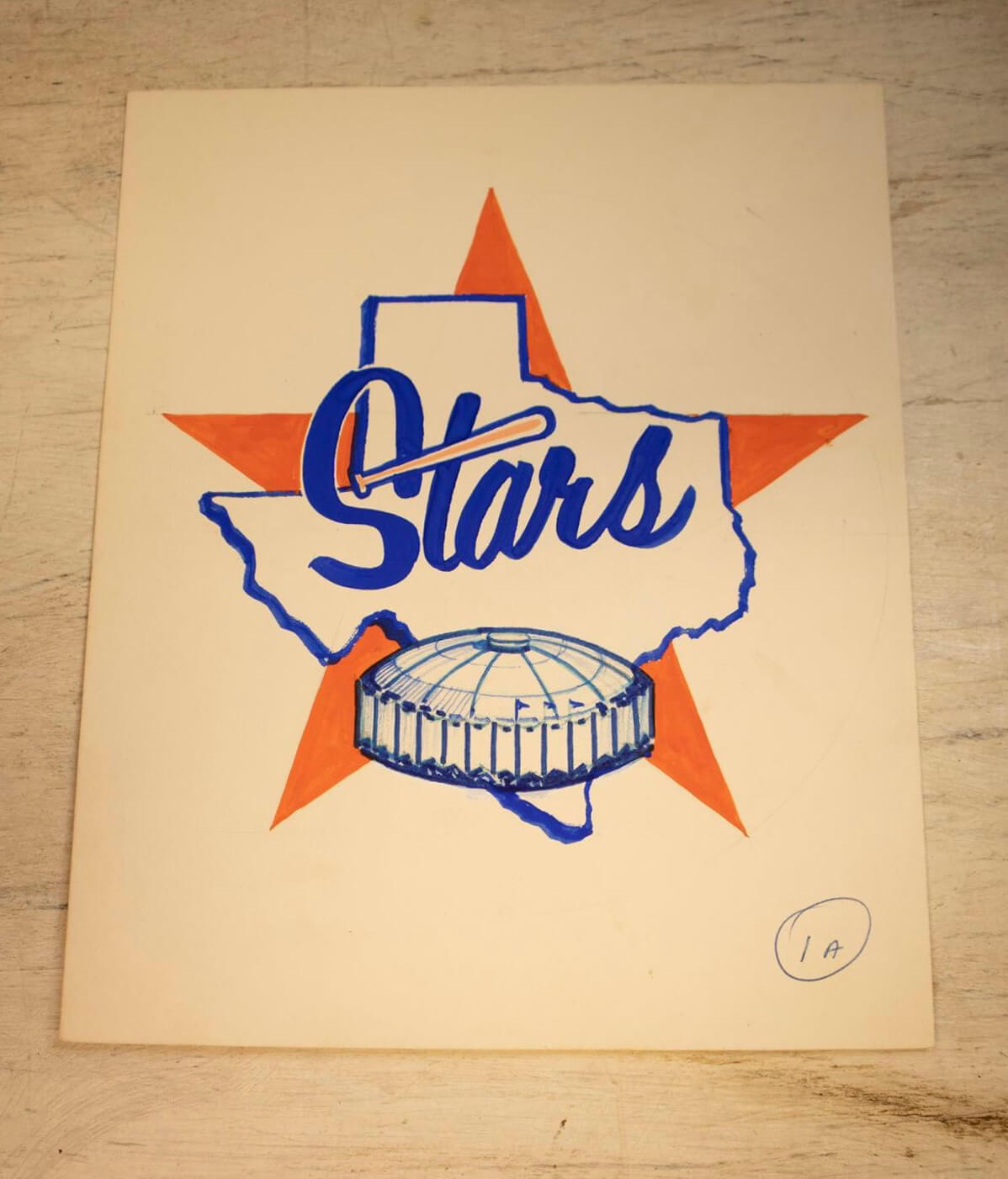
And here are some designs showing a new “Stars” script, with a bat crossing the “t” (something you almost never see in baseball logos, even though — or maybe because — it seems like a fairly obvious approach):
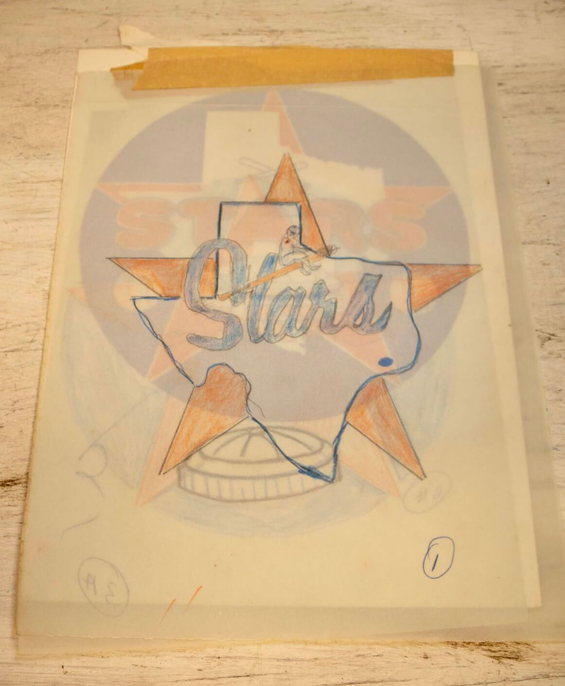
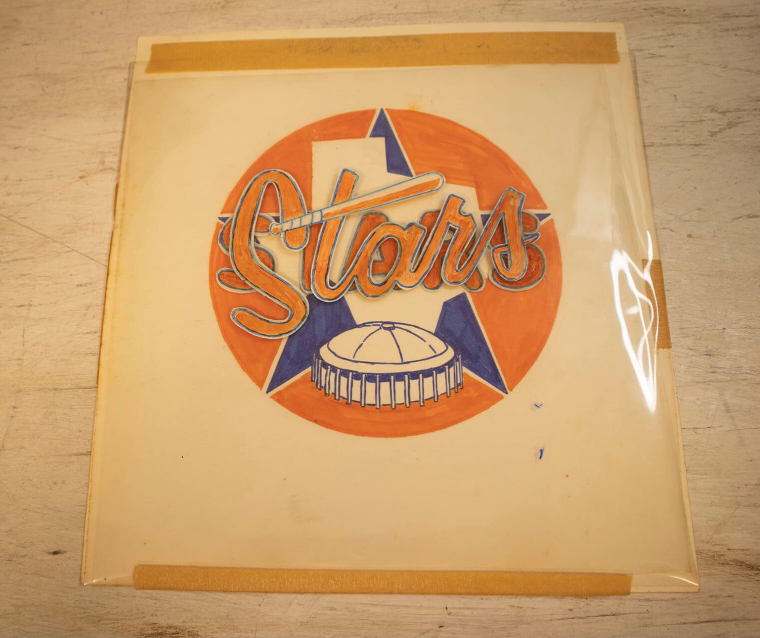
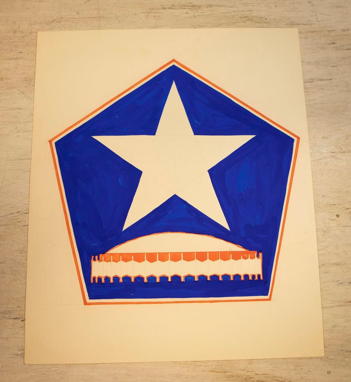
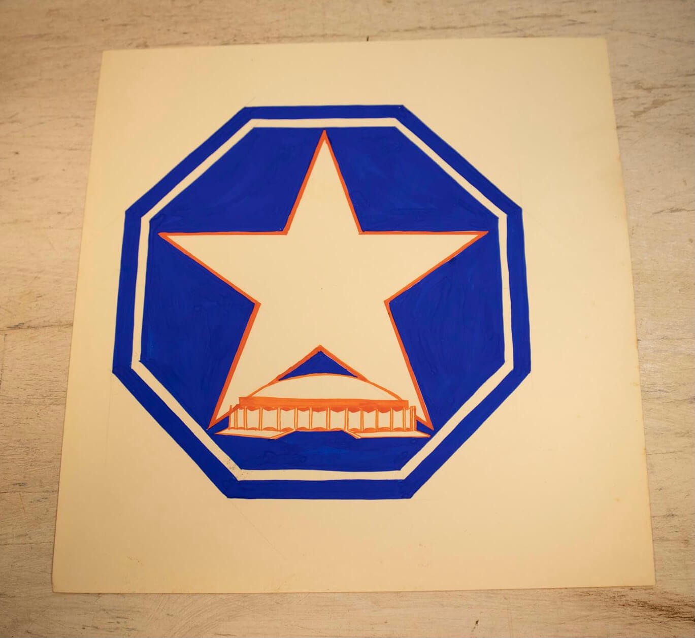
Here are some additional explorations of how a Stars logo might work, but without the lettering. There were apparently playing around with lots of different shapes, including a pentagon, an octagon, and a circle:
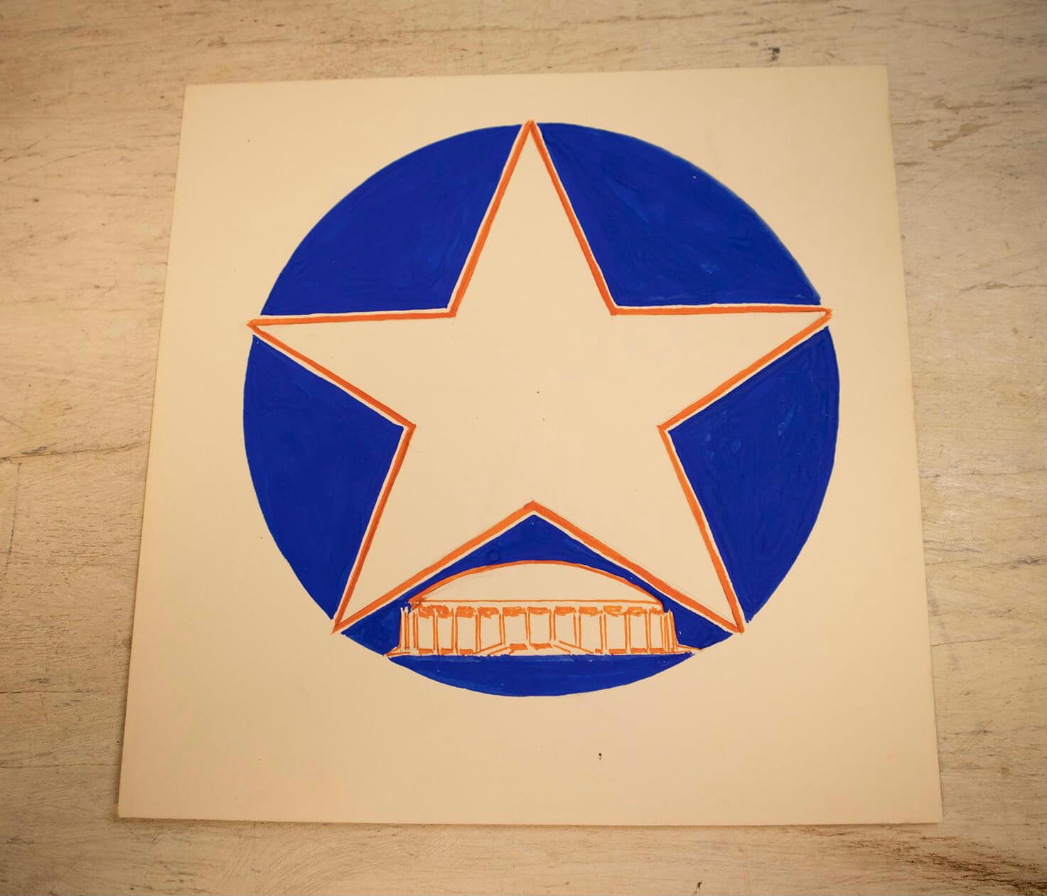
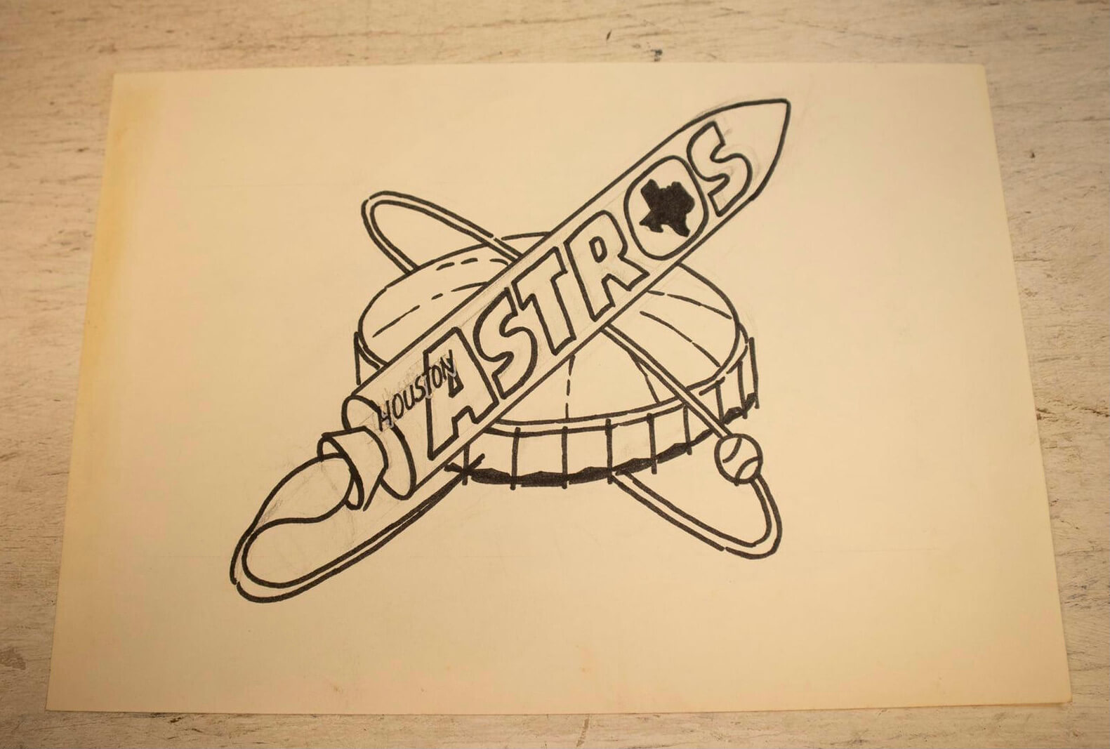
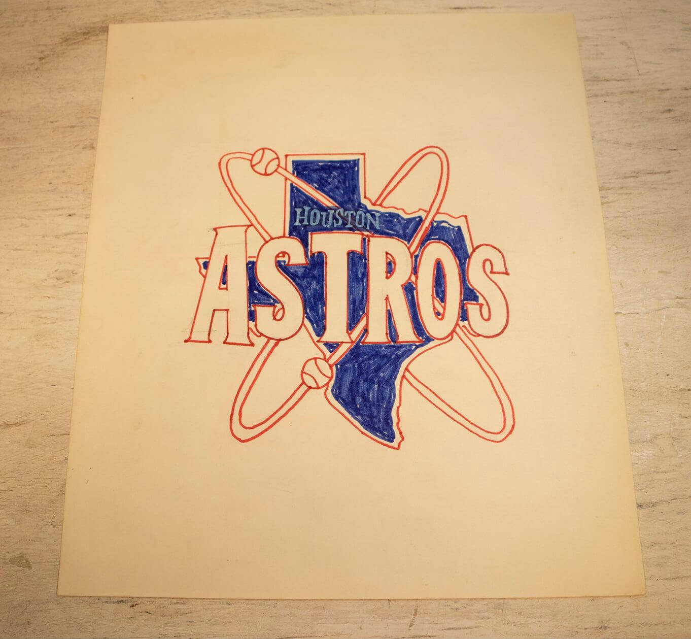
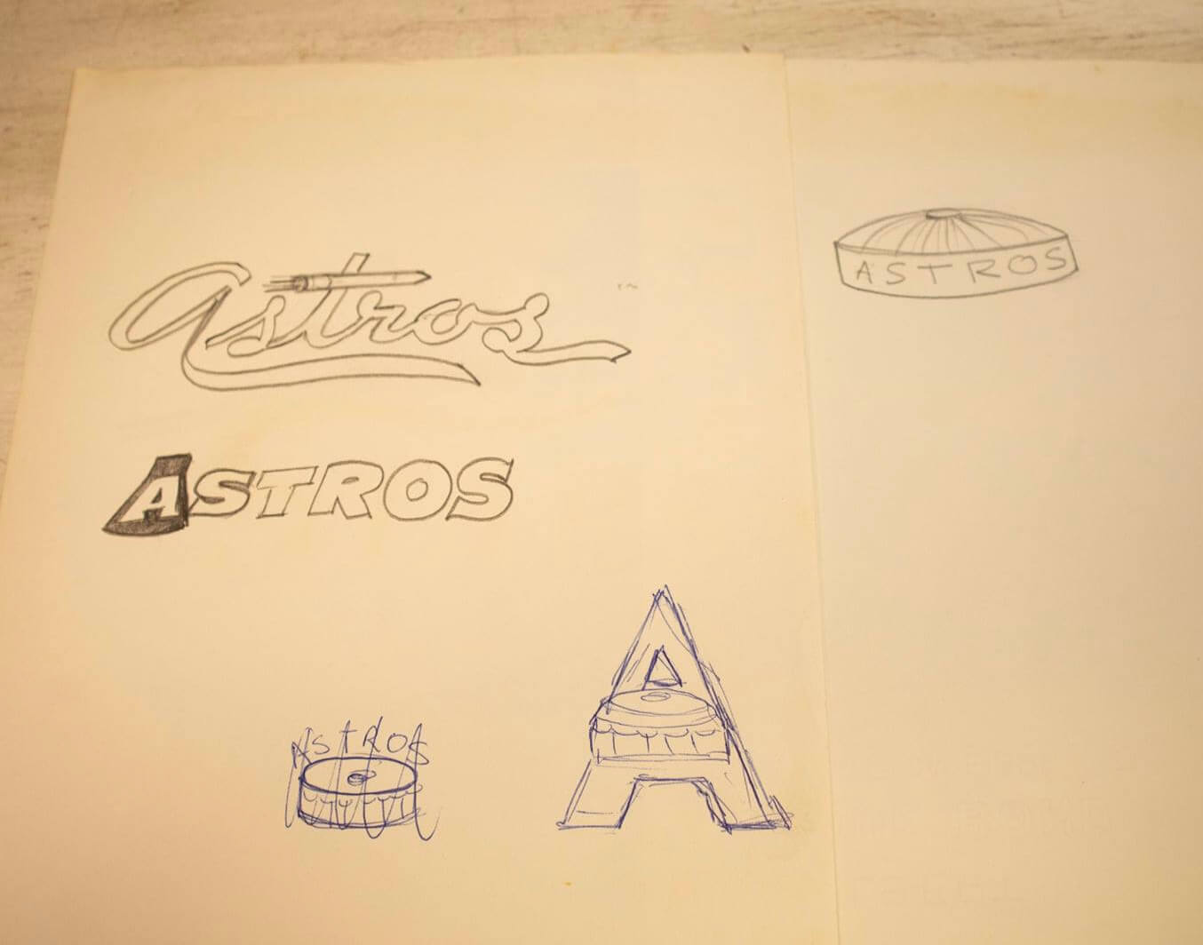
In addition to these design concepts for team names that didn’t make the cut, the auction items also include several sketches showing some of the directions that were considered for the Astros:
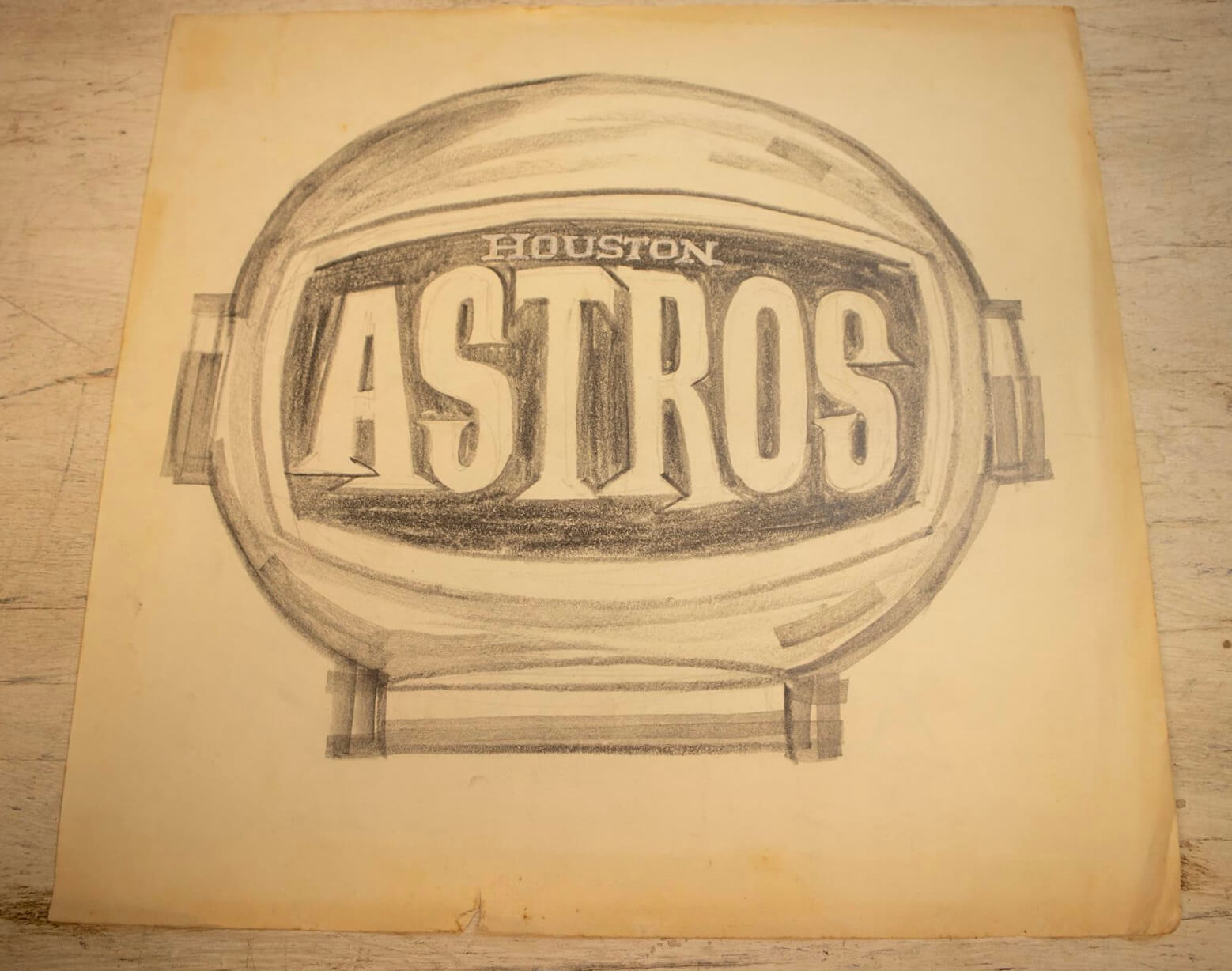
Then there’s this one, based on an astronaut’s space helmet, which I really like. The Astros could do a lot worse than to use this design now:
I saved the best logo for last. Check out this one, featuring a little cartoon spaceman who’s straight out of Hanna-Barbera. This was the heyday of The Jetsons (the show — which, of course, featured a dog named Astro — had aired in primetime in 1962 and ’63, with reruns becoming a Saturday-morning mainstay for the rest of the decade), which was almost certainly the inspiration for the cartoon guy:
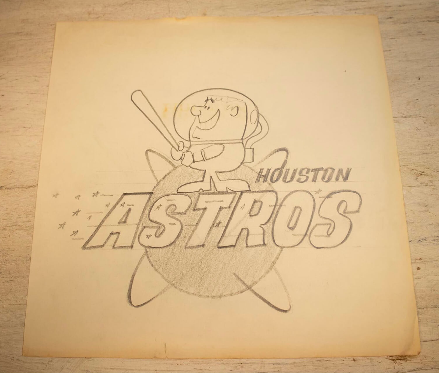
Is that great or what? Really captures how logos used to project a sense of fun rather than intimidation. Imagine that cartoon guy as a sleeve patch!
Even better than the logos is this completely mind-blowing sketch showing a proposed Astros uniform. Check this out:
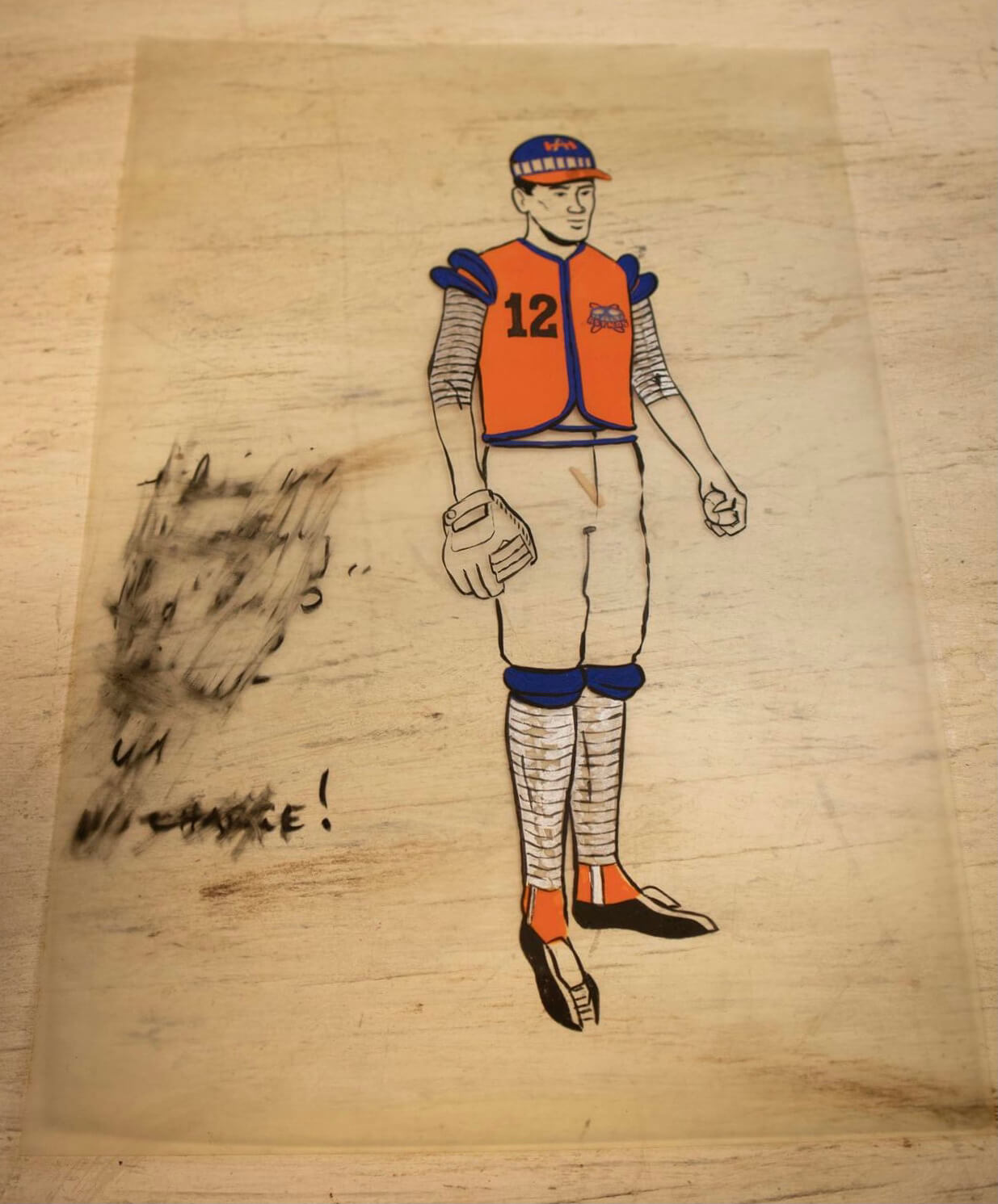
Yikes! I guess it’s supposed to look space-age or something, but to me it looks more like a cross between an old-school valet, a lawn jockey, and a vendor. Bizarre! It kinda kills me that the writing on the side was smudged out. Can anyone decipher it?
Unfortunately, I have no idea who created all these designs. But man, what a trove of amazing materials!
The auction also includes some fun memorabilia. For example:
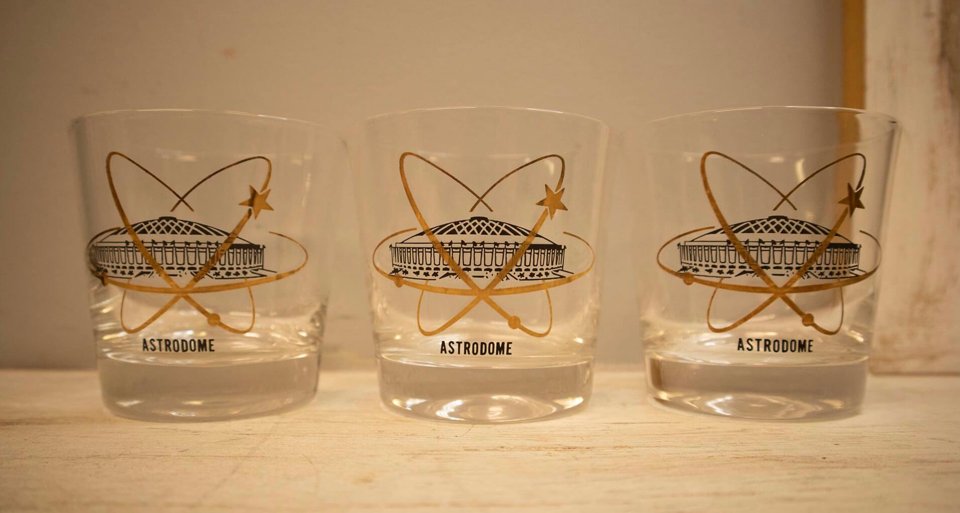
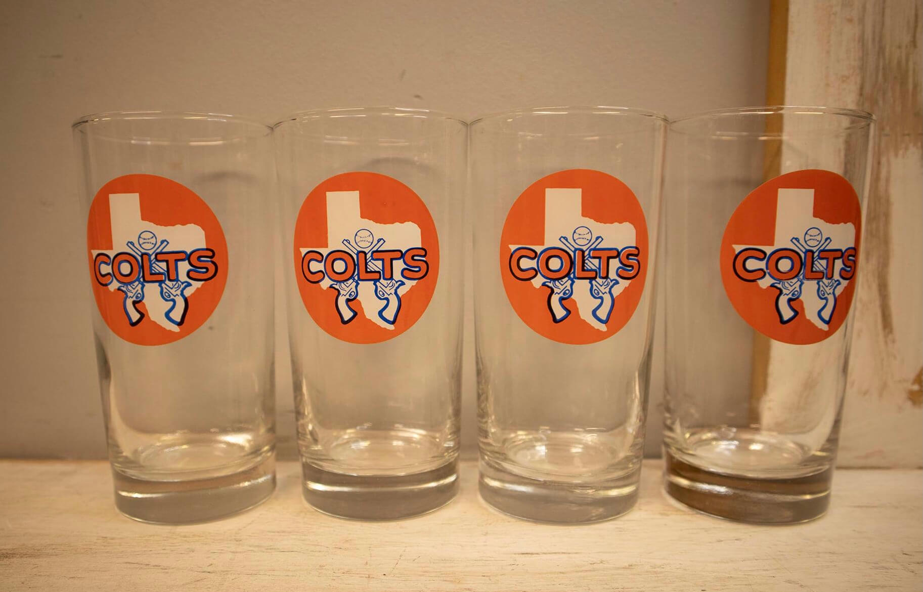
• Here’s some glassware:
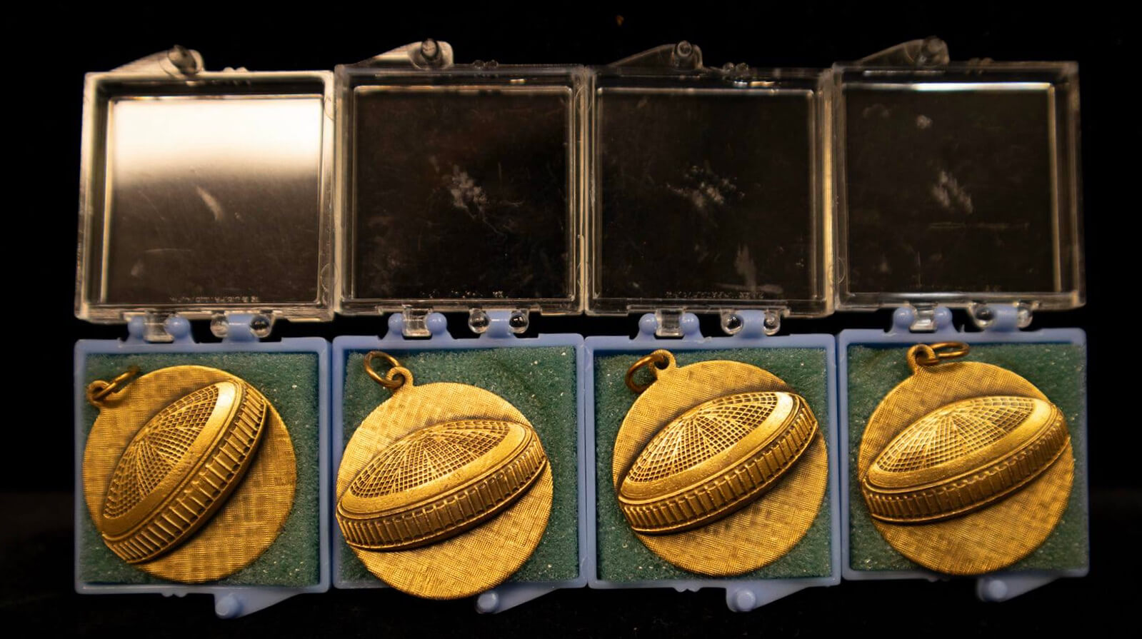
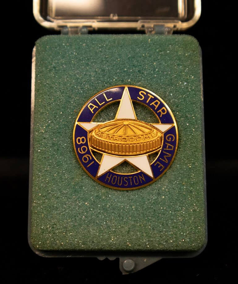
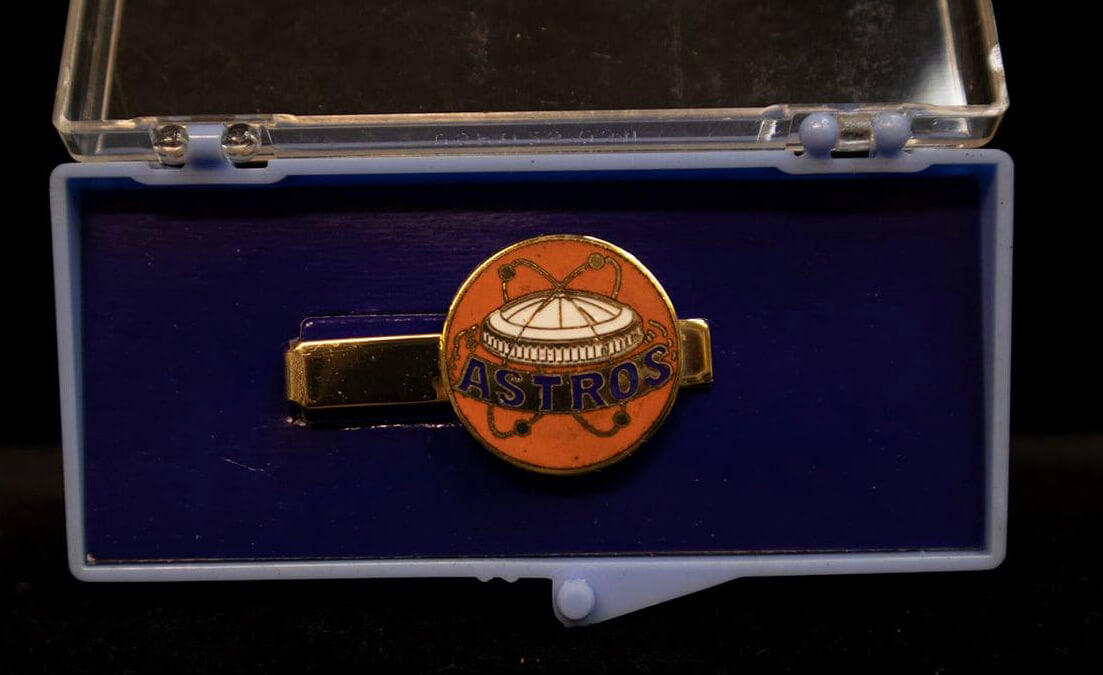
• Here’s some jewelry (the Astrodome charms are particularly nice, and the team’s star motif is a natural fit for the All-Star Game pin):
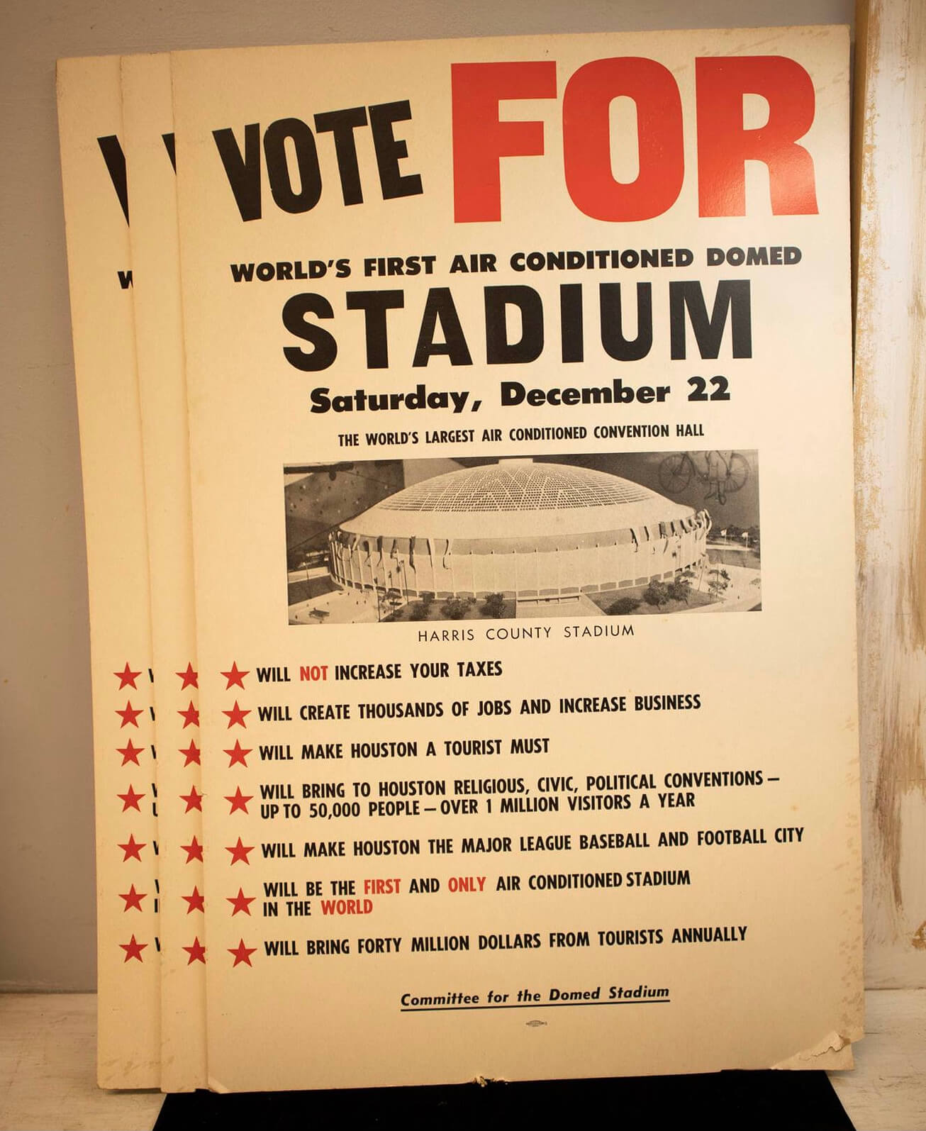
• Arguments in favor of stadiums haven’t changed very much over the years (note that the photo caption simply reads, “Harris County Stadium,” and the sign was produced by “Committee for the Domed Stadium,” none of which has quite the same ring as “Astrodome”):
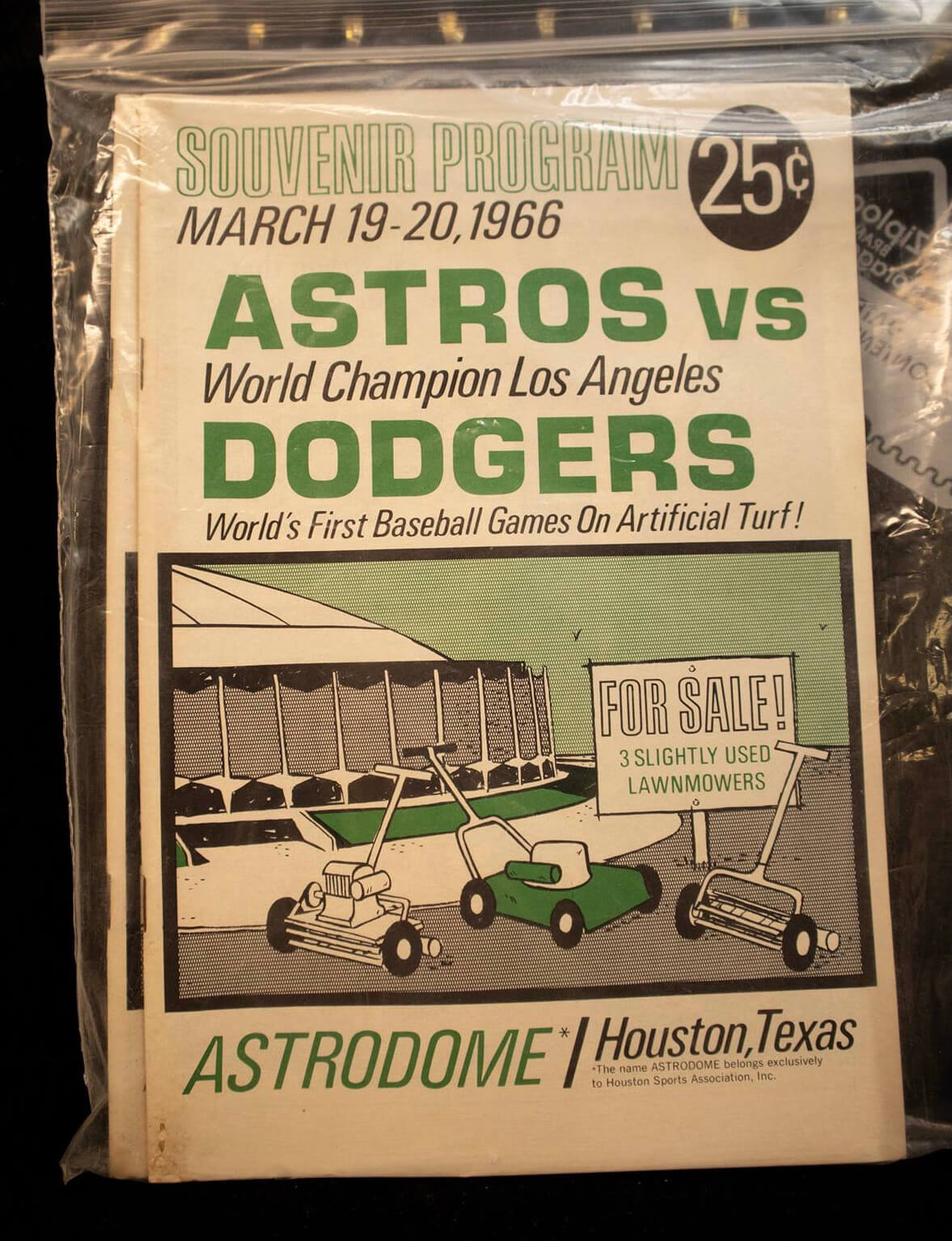
• The Astrodome had grass during its first season and then switched to Astroturf in 1966. For the first games on the new surface, the team created an amusing program cover based on its newfound freedom from lawnmowing:
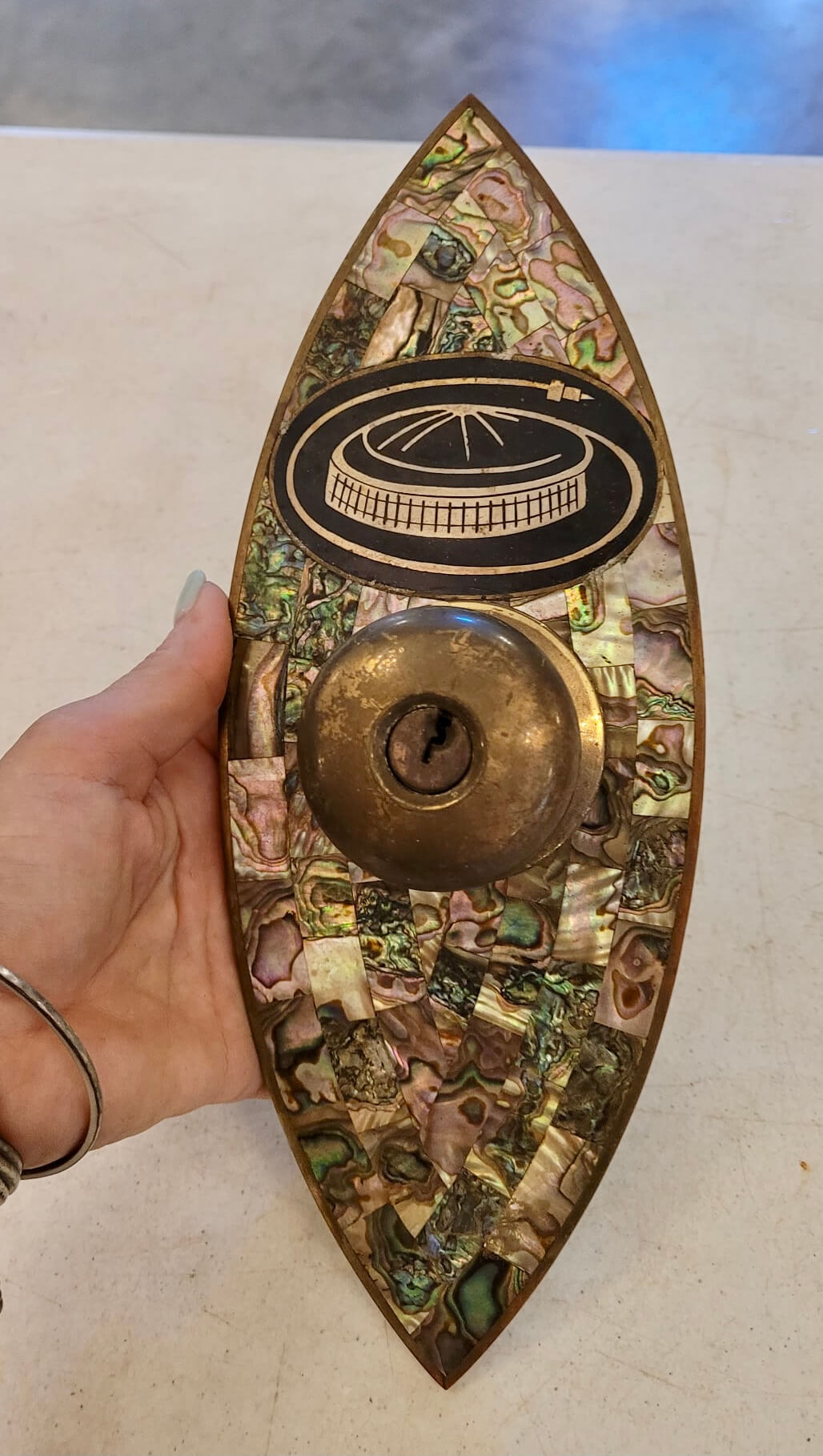
• I’m not sure, but I think this was a doorknob from the Astroworld hotel. I really love the Astrodome logo:
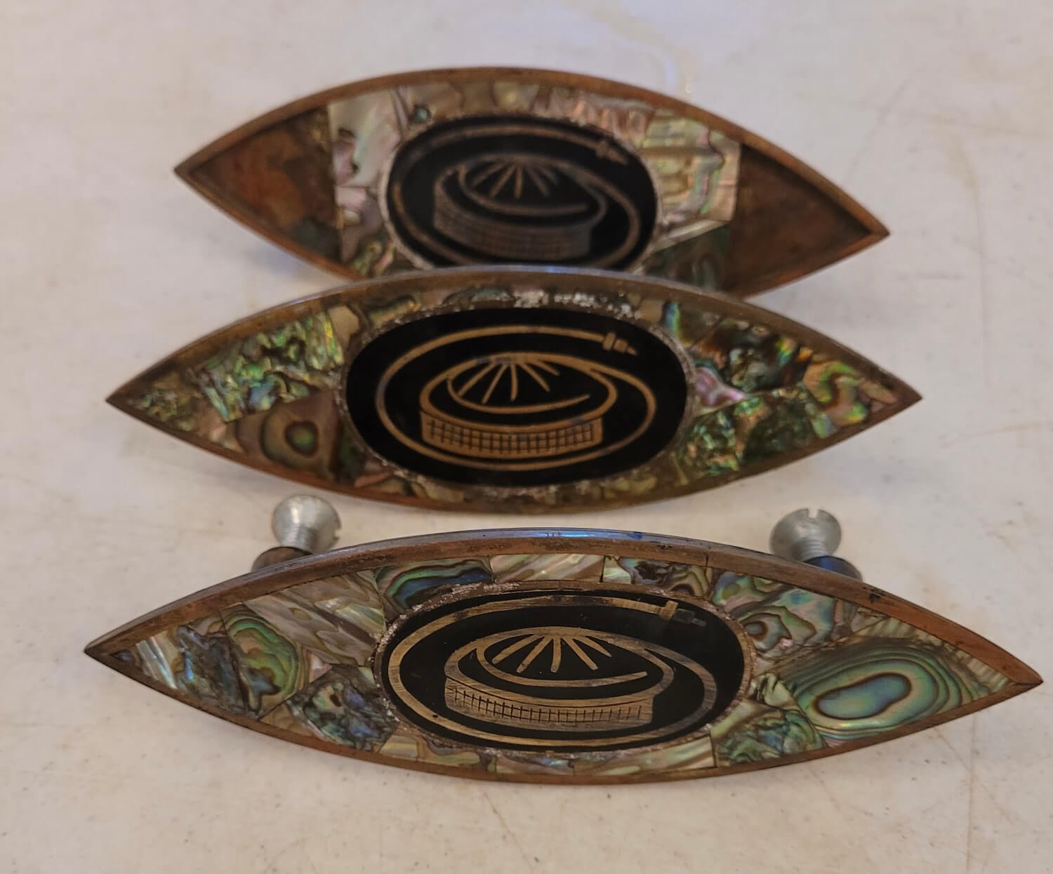
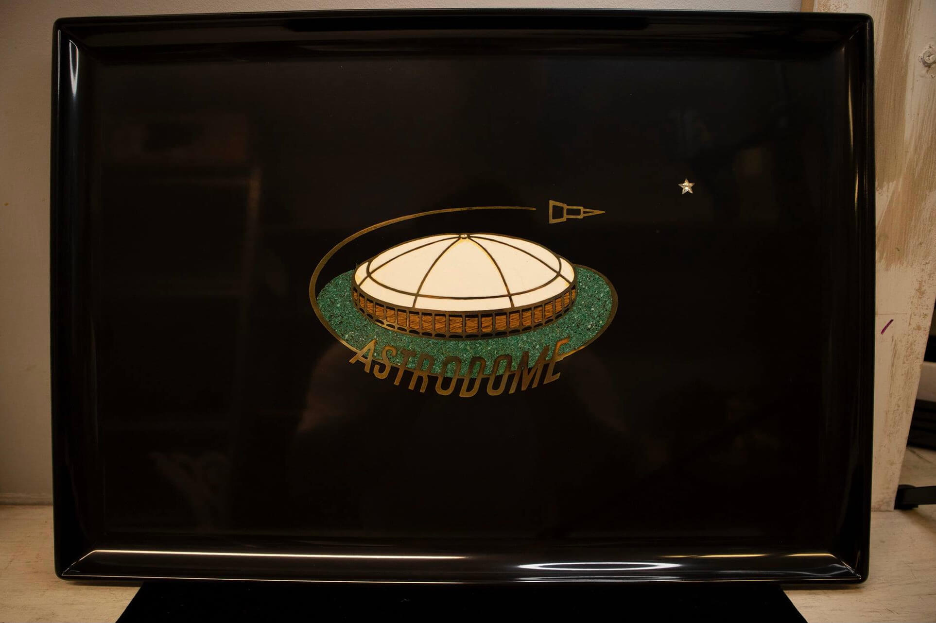
• That same logo appears on a few similar fixtures (not sure what they were for), and a similar logo appears on a tray:
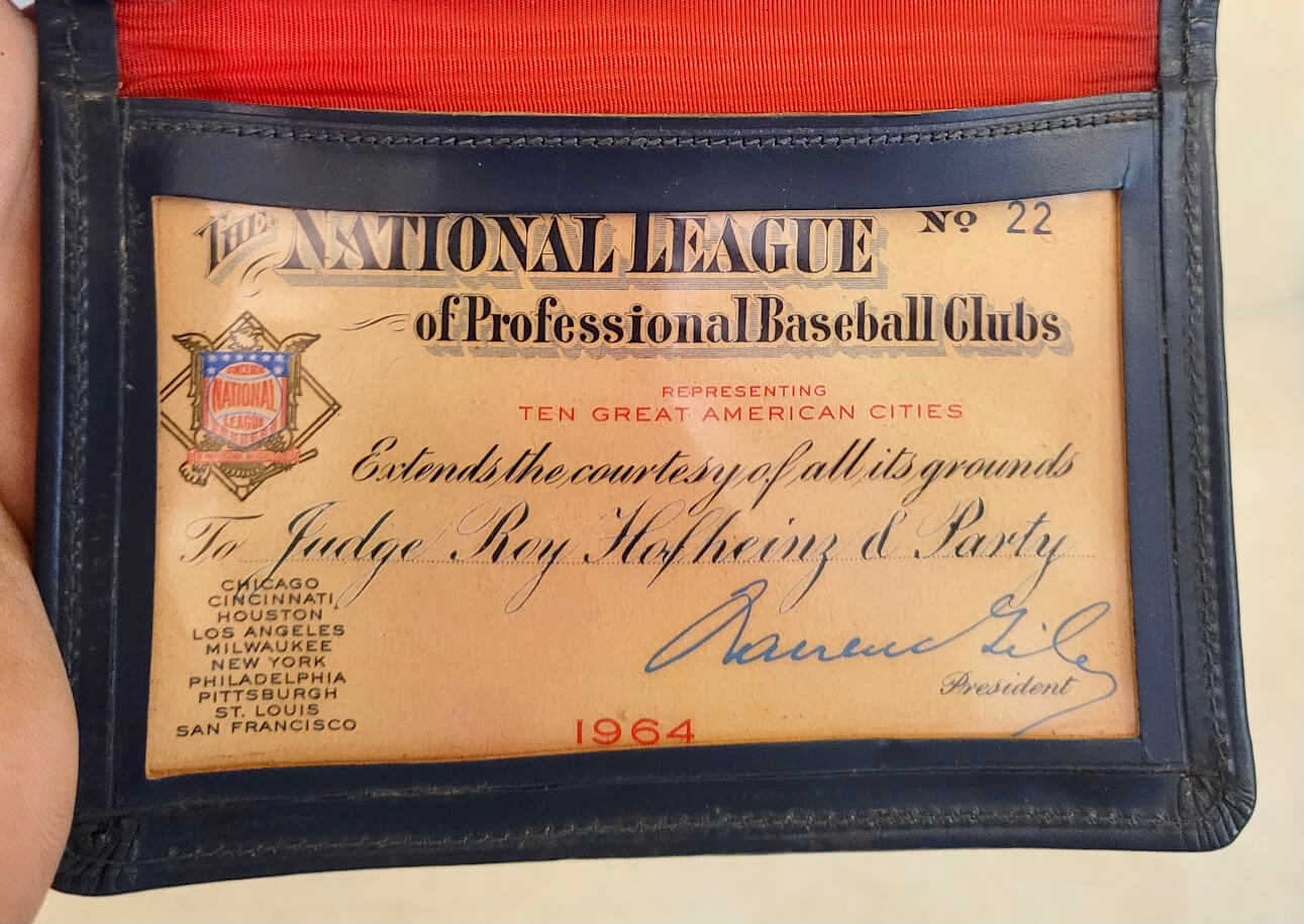
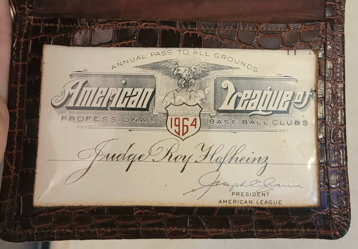
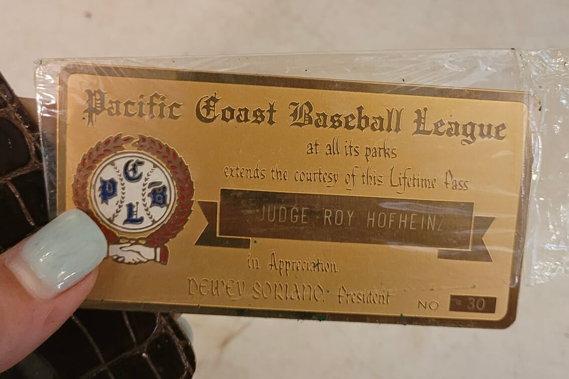
• Here are some of Hofheinz’s stadium passes, which granted him access to all of the ballparks in various leagues:
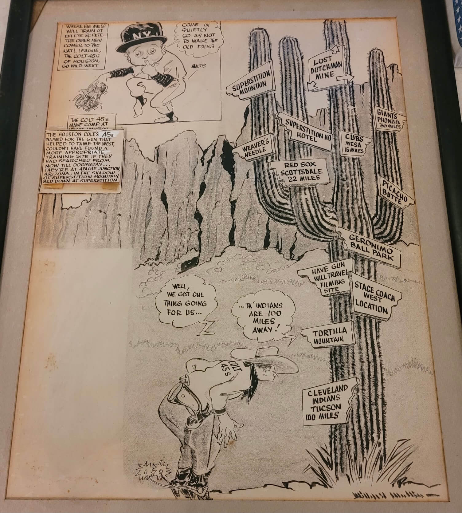
• Longtime Uni Watch readers know I’m a huge fan of sports illustrator Willard Mullin, so I’m totally geeked out over this original artwork for a 1962 Mullin cartoon:
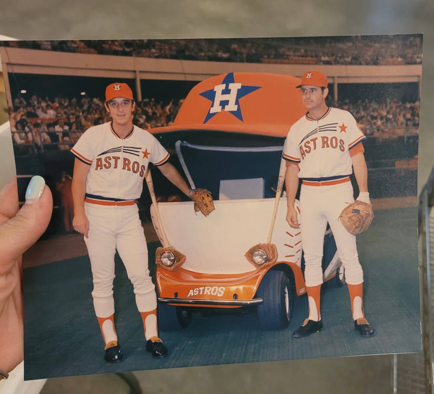
• Finally, I’m including this photo just because it’s so cool, even though it’s from the 1970s and doesn’t really fit the feel of all the other stuff I’ve presented here:
(My thanks to longtime reader Susan Freeman for bringing these amazing materials to my attention. She deserves all the credit for today’s post.)
Click to enlarge
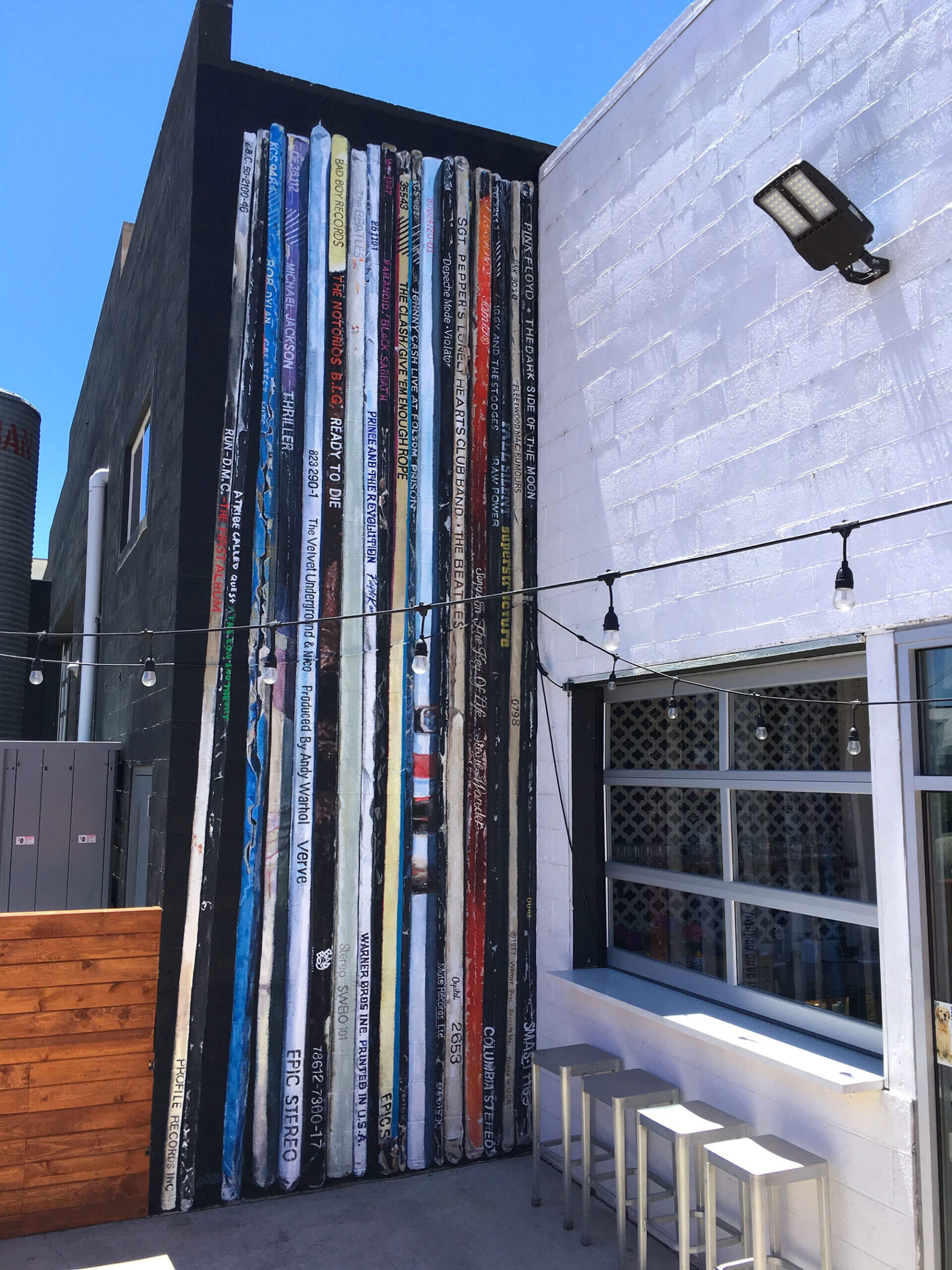
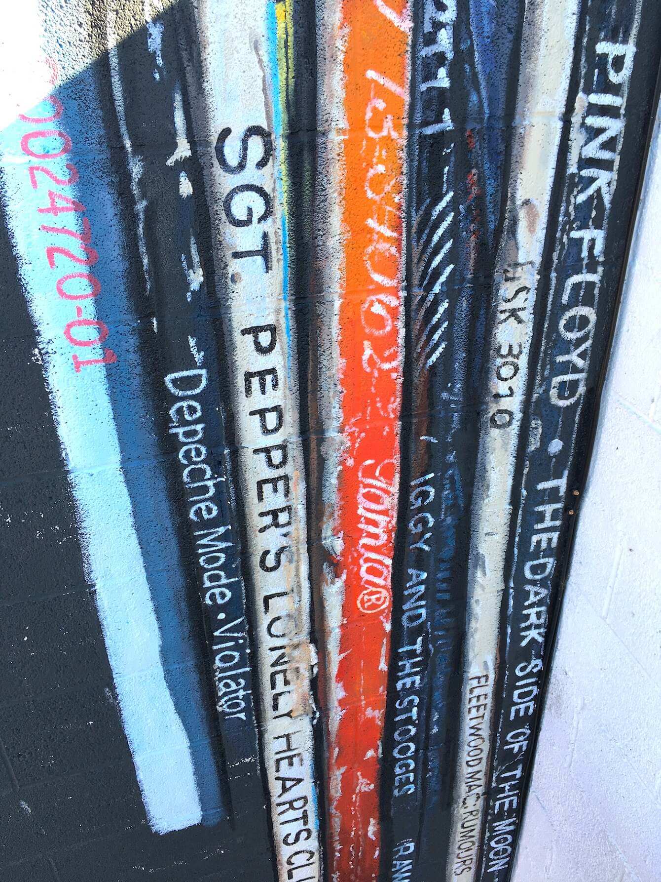
Oh. My. Fucking. God. This photo looks like a bunch of LPs tucked into a narrow compartment. But it’s actually a mural painted on a narrow strip wall at a brewpub in Reno. The record jacket spines, which represent a diverse range of well-known albums (The Velvet Underground & Nico, Michael Jackson’s Thriller, the Notorious B.I.G.’s Ready to Die, the Beatles’ Sgt. Pepper, etc.), are just painted onto a cinderblock surface, as you can see more clearly in this close-up shot:
It’s all the work of an artist named Erik Burke. You can learn more about the mural, and also see more photos of it, here and here.
As a record collector who’s particularly interested in obsessed with LP cover spine design (expect a full Uni Watch post about that in the near-ish future), I find it hard to express how much I love this. Genius!!
(Big thanks to my Facebook pal Anna Nut for bringing this one to my attention.)
Click to enlarge
Collector’s Corner
By Brinke Guthrie
Follow @brinkeguthrie
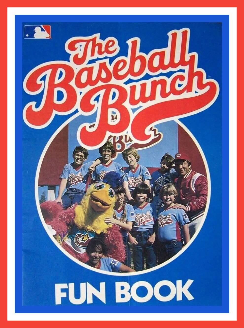
Leading off this week with an item from the early 1980s, The Baseball Bunch Fun Book. As you may recall, the show was hosted by Reds catcher Johnny Bench, and included Tommy Lasorda and the San Diego Chicken. This book includes a crossword puzzle and a “Name That Team” page.
Now for the rest of this week’s picks:
• Speaking of Johnny Bench, here’s a 6″ record that details his home run against the Pirates in the 1972 National League Championship Series (which you can see here). I remember that home run well, because on that date I was playing in a seventh grade soccer game, and all the soccer moms had their station wagons backed up to the field sidelines with the tailgates up so we could listen to the Reds while we played!
• Great box art on this 1954 Bobby Shantz baseball board game! (Shantz was a Philadelphia A’s pitcher, yet the main player in the photo is a Brooklyn Dodgers infielder?)
• This is framed sheet music for a song called the “American League Two-Step,” by Grace Comiskey, “Dedicated to the Pennant Winners of 1905,” the aforementioned Philadelphia A’s. (I don’t think this was the same Grace Comiskey who would go on to own the Chicago White Sox from 1939-1956; she was born in 1893, so she would’ve been 12 when this was published.)
• This watch has “1995 Stanley Cup Championship” on the face, in between the Detroit Red Wings and New Jersey Devils, and comes with a card that says “With Compliments of the NHL.”
• They didn’t skimp on the stripes for this 1970s-80s San Francisco 49ers NFL Pro Line sweater.
• Nine different pro athletes are featured on this 1980s set of 7Up Super Cups, including Larry Bird, Magic Johnson, and John McEnroe. (“Super Size! Super Quality! Super Value!”) Interestingly, team logos are shown — with this type of merch, they’re usually left off due to licensing issues.
• The Swinging Friar is shown on this 1996 San Diego Padres bumper sticker. “Catch It on 760 KFMB!”
• Back when people were getting cell phones hard-mounted in their cars, someone decided we needed notepads to write stuff down when people would call. Which is why we have this Chicago Bulls/ESPN Radio 1000 auto clipboard. It comes with suction cups to stick on the inside of your windshield, above the dash. It’s “Ideal for Automobile, Office, Home or Laboratory.”
• 1950 Player of the Year Phil Rizzuto of the New York Yankees is your cover star on this Major League Baseball 1951 Facts, Figures & Official Rules magazine.
• Here’s a 1977 Major League Baseball Pitch, Hit and Run Tips booklet, sponsored by Thom McAn Jox. The seller notes that “There are pictures of Jim Palmer, Rod Carew and Joe Morgan in the book with tips to become a better baseball player. Still has the official Pitch, Hit & Run scorecard and the application to participate in the competition.”
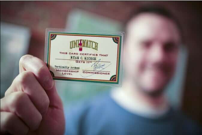

ITEM! New raffle: Reader David Moravcik was the winner of our recent raffle for a Uni Watch hoodie, and he’s decided to pay it forward by donating a Uni Watch membership card for me to raffle off, so that’s what we’re going to do today.
This will be a one-day raffle. No entry restrictions. To enter, send an email to the raffle in-box by 8pm Eastern tonight. I’ll announce the winner tomorrow. Thanks to David for sponsoring this one!
The Ticker
By Alex Hider

Baseball News: A source tells Paul that the Cubs are working on a new batting helmet design to pair with the “Wrigleyville” alternate uni. … Atlanta C Kevan Smith was wearing teammate Travis d’Arnaud’s chest protector yesterday (from Benjamin Alexander Hochberg). … Cleveland P Aaron Civale is among those who sews their jersey plackets shut (from Carlos Laboy). … The Big Red Machine-era Reds were notoriously strict when it came to uniforms — regular readers surely know about the team rules requiring no facial hair, polished black cleats and “dumpy” low stirrups. But according to relief pitcher Tom Carroll, the team had multiple uniform sets that, I assume, were laundered together to keep them color-consistent. On his SABR page, Carroll that said one time, Reds GM Bob Howsman noticed he was mixing and matching his uni sets. “My pants and shirts were not matching — and he called down and I had to change.” That link also notes that the team chose not to use FIOB for Tom and Clay Carroll after Clay Carroll argued that he and Tom looked nothing alike (from Brice Wallace ). … A Rangers fan was recently spotted at a game in a No. 19 jersey with a “Covid” NOB (from Kary Klismet). … Zac Fascia, a catcher for the Frederick Keys of the MLB Draft League, was wearing a bunch of stickers on his batting helmet on Sunday. “I thought it might be something like the achievement stickers that college football teams have, but Fascia was the only player who had them,” says Judy Adams. … Here’s a deep dive into the 1985 Toledo Mud Hens and the logos the team used that year (from @TheCatchBlog). … Astros Double-A affiliate Corpus Christi will wear “Coastal Bend” uniforms this weekend (from Ignacio Salazar). … The Tulsa Drillers, the Dodgers’ Double-A affiliate, will be wearing these jerseys for Muscogee Nation Night on June 25 (from Kyle).

NFL News: The Bills are considering temporarily playing home games at Penn State’s Beaver Stadium should a new stadium in Buffalo not be ready by the time their current lease expires in 2023 (from Kary Klismet). … The Giants will retire Eli Manning’s No. 10 and induct him into the team’s ring of honor on Sept. 26 (from Brinke). … A Browns blog published a comprehensive look at all the helmet decals the team has worn through the years (yes, there’ve been a few), along with some of the rumored/prototype helmet designs that have popped up recently (from Phil and Kary Klismet). … Speaking of the Browns, Blake Brandon spotted some Baker Mayfield jerseys at his local Marshall’s — but in a style the team last wore in 2014, before Mayfield even joined the team.
College Football News: Virginia Tech will hold its annual “Orange Effect” game on Sept. 3. During that game, the team asks fans to wear orange, and occasionally the Hokies will sport orange jerseys (from Andrew Cosentino). … Reader Brad Eenhuis was recently watching the 1977 Sugar Bowl and noticed a few Georgia players wearing Chuck Taylors on the Superdome’s Astroturf. He also noticed that Pitt players had some jersey material and number trim and inconsistencies. … BYU unveiled its renovated locker room, which includes a new uniform display in the equipment department (from @someguyku).

Hockey News: The Coyotes published a Father’s Day story on their website about Stan and Denver Wilson, the only father-son equipment duo in the NHL. The article also includes links to some “Equipment Chronicles” stories from last year about sticks and tape, skates and gloves, and new player acquisitions and training camp (from Jerry Wolper).

Basketball News: The Suns will be wearing only two uniforms during the Western Conference Finals: their black City alts at home and their orange unis on the road (from @SunsUniTracker). … New court design for D-II program Texas A&M-Kingsville (from Kary Klismet).

Soccer News: SC Freiburg of the German Bundesliga has unveiled new renderings of a planned stadium (from Kary Klismet). … Couple of notes about Scottish football from our own Jamie Rathjen: Scottish club Falkirk has two new kits, and it appears Dundee United’s women’s team has reversed the designations of their two uniforms for this season. While the women primarily wear purple and wear orange and black in the event of a change, the men are the opposite. … Also from Jamie: Regarding yesterday’s Ticker item about Munich’s stadium potentially being lit up in rainbow colors for Wednesday’s UEFA match between Germany and Hungary on Wednesday, he clarifies that the decision is ultimately UEFA’s. However, the city of Cologne will illuminate its stadium in rainbow colors on Wednesday. … This blog recalls the best uniforms ever made by kit manufacturer Kappa (from Phil). … Also from Phil: Liga MX club Club América will wear floral print warm-up jerseys this season. … Morecambe F.C., newly promoted to England’s League One, unveiled new home and road shirts yesterday (from Ed Żelaski). … Warner Bros. is now selling customizable jerseys for AFC Richmond, the fictional club featured in the TV show Ted Lasso (from James Gilbert). … Three Dutch fans wore jerseys with Covid vaccine manufacturer NOBs. … Fourth-tier English side Forest Green Rovers are seeking a new naming rights advertiser for their stadium, with one stipulation: The advertiser must be eco-friendly (from Timmy Donahue).
Olympics News: Liberia’s Olympic uniforms have been designed by fashion designer Telfar Clemens, a Liberian-American whose work has been influential in fashion circles lately (from Phil and Stephanie Suarez). … John W. Tomac spotted a truck for a construction company in Brooklyn that included the logo for the 1984 Olympics in Los Angeles.

Grab Bag: Following up on Paul’s note yesterday about finding his name “in the wild,” Michael Cusack notes that he shares the name of the founder of the Gaelic Athletic Association, who is also the namesake of a GAA club in Sydney, Australia. Naturally, Michael bought himself a jersey. … Friday night’s edition of All Elite Wrestling featured a MMA-style match in a cage instead of a traditional wrestling ring. Referee Aubrey Edwards went the extra mile by switching to the black polo shirt traditionally worn by MMA referees. She was back to the traditional black-and-white stripes later on in the program (from Lee Wilds). … The next five submissions are from Kary Klismet: Union College in Lincoln, Neb., has announced plans to build a new athletics arena. … The Brookline High School (Massachusetts) student newspaper has a piece about the challenges the school’s equipment manager faced during the pandemic. … New logo for Australian Taekwondo. … Here’s a history of the uniforms worn by postal carriers for Great Britain’s Royal Mail service. … Speaking of Great Britain, the country’s National Health Service is contemplating introducing a nationwide standard nursing uniform. … New 50th-anniversary logo for fast food restaurant Pollo Campero (from John Cerone).
regarding kappa kits, I have this Porto jersey which I think is still awesome. I haven’t worn it in 20 years, I should just frame it. But I would love it if Porto revived the dragon into a future away kit, especially since they have what I think is a better version in their stadium logo (link)
link
The smudged writing looks like “No Charge” to me or maybe “ No Change”?
The top part is really tough to make out but my total guess is the artist submitted a bonus sketch of a uniform at “No charge”
I agree, the “No charge!” is pretty clear. I’m going to say that the smeared text above it says something like “This is not a serious submission, it’s just for fun.”
Where it is talking about potential shapes it should say pantagon instead of pentagram
Yes, of course. Now fixed!
That uniform concept art looks like something straight out of the Jetsons. It’s just missing a ringed antenna sticking out of the squatchee at the top of the hat!
Now that’s a Turn Ahead the Clock uniform (from the past).
Something uglier than the Tequila Sunrise?
Correction: Pronoun “the team” lacks an antecedent, presumably the Cubs, at the start of the baseball Ticker.
Thanks. Fixed.
But now it reads “the Cubs is”.
Argh. NOW fixed.
Is there a link for that auction? Doubt I could afford anything, but it would be fun to look.
Now then. As I am reading this, the Braves have actually been identified in the baseball section instead of just reffering them as Atlanta. I know that will change in a matter of moments
Editing error. Now fixed.
SC Freiburg link appears to go to the wrong article.
Thanks Susan Freeman for bringing this to our attention!
Yes! Great stuff here!
Then there’s this one, based on an astronaut’s space helmet, which I really like.
I LOVE that! I also LOVE the logo where the A is inside a Mercury capsule (or maybe a Gemini capsule in re-entry mode?).
And I had one of those Astrodome shot glasses! Now, some lucky UW Vilkmas winner has it.
The official name of the Astrodome (to this day) is Harris County Domed Stadium. For many years the navigation signs on Houston freeways called it that. In fact they may have been taken down only after the stadium closed.
As the above program cover states, “The name ASTRODOME belongs exclusively to Houston Sports Association, Inc.”
I wonder if they had selected the Comets, Rockets, or Stars, if the stadium and artificial turf would have been named that? Comet Turf, Rocket Turf, Star Turf, Cometdome, Rocketdome, Stardome.
Good points!
Also if they had chosen the Rockets, would the NBA team have been forced to change their nickname when they moved from San Diego to Houston in ’71? Or maybe it would have been an incidental pairing like when the Chicago Cardinals moved to St. Louis.
Some great stuff from the Astros vault. Always wondered why they didn’t simply transition to the Houston Colts.
I really like the design that has Astros written across the state of Texas with the baseballs in orbit around it. They should have something like this as their primary logo, rather than just the cap logo inside a roundel.
I always found it interesting how much the Astrodome was imbedded into their identity early on.
Those sketches embody the best of mid-century and Soace Age graphic design. Inject that into my veins! Brandiose could learn a thing or two from this.
YES!
The album spine mural is beautiful.
I get targeted ads online for a company that sells coffee mugs and insulated tumblers that have the same look. Can’t recall the company name at the moment, but I’m guessing others here get similar ads popping up based on their algorithms. Anyone out there seen or bought one of the mugs/tumblers?
The Astros star all-star pin looks like it’s promoting an event in the year 8961. Which is perfect for a 60’s futuristic motif.
And those Astroworld doorknobs look like something straight out of Starfleet.
Only Trek characters don’t use doorknobs. They just walk straight. Unless you’re Jonathan Frakes …
You’re right, of course…but even though their doors are automatic those doorknobs looked as if they’d fit right in to that era.
My dad received the pins and tie tacs from the Astros when he covered the 1968 All Star Game. I still have them. I used to have the media guide and program. Wish I still did.
Fifth photo in today’s (wonderful) Astros piece: I’m surprised no one has brought up the sketch of the person sitting on the bat. I flashed back to my Richfield Coliseum vendor days, when I saw a guy at a rock concert wearing a t-shirt with a woman sitting on either a bullet… or something humanly anatomically similar (that was some time ago)…
Motley Crue had a t-shirt like that (she was sitting on a missile) during the Girls Girls Girls tour in 1987; I almost bought one at a Louisiana show, but didn’t want to risk my mom seeing it in the laundry (I was 15).
The 1970’s Astro uniform is head and shoulders above anything they have now.
1974…the Astros, Oilers and Rockets never looked better. They were the best looking city in pro sports history.
I counter with LA in 74.
Rams
Dodgers
Lakers
Kings
However, I know Forum Blue (nee Purple) isn’t liked very well here
Well played. Call it a tie?
Oh, come on! In 1974, NYC had the Mets (still in button-fronts), Yankees, Knicks, Dr J-era Nets, Giants and Jets before their subsequent makeovers, Rangers, and Isles. Now *that* is a good-looking sports town!!
If the Knicks were wearing the ’81 look I would’ve proposed giving NY the top spot.
You present a very good case. But it would take something along the lines of the ’75 Giants to even come close to the awesomeness of the ’74 Oilers.
74 Rams were in the second year of the Royal/Yellow. The best look the Rams ever had.
74 Dodgers unis about the same as today.
74 Lakers…The classic era of Forum Blue and gold
74 Kings…Their best ever Forum Blue and gold. A Kings crown on the front.
I’ll throw in the 74 Angels (Still the California Angels at that time) in their second best Navy/Red/White unis. The best were the lower case A treatment of 1971. The state of California logo with the halo draped across it still looks great.
The best look the Rams ever had
I realize I’m going to be That Guy here, but I have to admit I loved the mismatched look of the blue and gold jerseys with the blue and white helmets of a couple of years ago. The white facemasks in particular really popped with the rest of that uniform.
Montreal in ’74 looked sharp, too!
Agree in principle. My preference is for the 1965-69 blue one with orange highlights rather than the color flipped one from 1970-74. But yes, I also think the shooting star jerseys were far and away their best.
Here’s a 1977 Major League Baseball Pitch, Hit and Run Tips booklet, sponsored by Thom McAn Jox.
I think I had that book! I signed up for a Pitch Hit & Run day but it got rained out and I never tried again.
The Bills are considering temporarily playing home games at Penn State’s Beaver Stadium should a new stadium in Buffalo not be ready by the time their current lease expires in 2023
Wouldn’t the Carrier Dome be more convenient?
The Giants will retire
Eli Manning’sFran Tarkenton’s No. 10About time…
A Browns blog published a comprehensive look at all the helmet decals the team has worn through the years (yes, there’ve been a few), along with some of the rumored/prototype helmet designs that have popped up recently
In theory, I love the CB logo. But the only thing I want to see on a Browns helmet is nothing. Or a number.
They should go with the numbers. While I am not 100% against a logo-less helmet, I think it is problematic for the Browns because well, they are the Browns, and their primary color is brown, but their only identifying mark is their helmet, which is plain orange.
Bring back the 1960s era Brownie logo as their primary logo, and put numbers on the helmet.
“Wouldn’t the Carrier Dome be more convenient?”
Sure does, but it’s -50k seating capacity (all bleacher?)is well below the average attendance for a Bills game (season ticket holders alone account for over 50k) and there’s less parking space. Toronto makes more sense than Happy Valley logistically but the current owners burned that bridge(?) when the home-on-the-road series was ended. It’s encouraging that the Pegula’s seem committed to staying in Buffalo-metro…I suspect as long as they get a new stadium built, for which there is no agreement as yet.
I hope they can come to some sort of agreement. After all, it would be a shame for New York’s *only* football team to leave the state, eh?
Regarding the Frederick Keys, many of them still wear their college team helmets. So Zac is wearing his Purdue helmet with award stickers.
That is some awesome Astros material!
Thanks to Susan for sharing.
Comets is too similar to Mets…glad they didn’t go with that.
The second Stars script logo includes a Dr. Strangelove reference(?).
The star-in-pentagon is much like a certain car brand logo which was developed around the same time…and why not use a home plate shape instead?
And of course I have no issue with Paul including a photo of the ’72-’74 Astros uniforms…though the 1971 belted version is my favorite.
I *live* here and I never new the Colt .45s trained here. Apache Junction is BFE now, I can imagine what it was like in 1962. (Also, “Phoenix” is misspelled in the cartoon!)
I had no idea either. Had to look it up.
link
Hey Paul-
You may remember my comment last week about teams wearing two different alt colored tops in both halves of a double header. I originally noticed the Jays wear Royal/Powder on 5/27.
Turns out it has only happened two other times this year.
Seattle wore Teal/Navy on 4/15 and the Jays ran it back with Royal/Powder again on 5/30
Will be reviewing 19/20, so I’ll get back to you. Also open to ideas on what to call this
Also open to ideas on what to call this. “Too many damn uniforms.”
Looked up the serial number of the record between Johnny Cash and Depeche Mode. It’s Licensed to Ill by the Beastie Boys.
Zac Fascia played for Purdue University and they use those achievement decals on their helmets. Here’s an example
link
Looks like Fascia is understandably continuing to use his college helmet in the Draft League.
Maybe I’m just not seeing it, but where is the link to that auction. I MUST thrown my hat into the ring for some of that bounty!
I’ve been asked not to share the auction link. Sorry!
Bummer. I’d so make sure to at least win one of these to preserve for all time. Time to put on my detective hat! Thanks!
I’m assuming the “Baker Mayfield” jerseys in the 2014 style are actually just Brian Hoyer jerseys since he was still a Brown and he was number 6.
Yeah, that was a weird item. Places like Marshall’s are always full of old stock, and I’m sure Hoyer’s jerseys didn’t exactly fly off the shelves.
Great Houston memorabilia; particularly enjoyed the comic from the team’s notorious first training camp at Apache Junction AZ……and that picture from the seventies featuring the great Doug Rader is terrific.
Visited the Astrodome with my dad in 1969 and still have my piece of souvenir Astroturf….people don’t realize how mind-bending the concepts of artificial turf and indoors baseball was at the time, and tying it into the burgeoning space program….pretty savvy.
PROOFREADING: The last item in the soccer Ticker says the team is seeking a naming rights advertiser for its fixture. They’re seeking such an advertiser for their stadium. A “fixture” in soccer is a specific match, not a building.
I would pay real American dollars to see a cosplayer make and wear that Astros uniform!
Every time I see old Astros/Astrodome stuff I think of Brewster McCloud. This was a great story today as for some reason I get fascinated with anything Astros or Oilers. The fact that they went with Astros and not just Colts was very prescient. Could they have worn the rainbow guts uniforms as the Colts? I don’t think so.
Posts like the Astros design sketches are what make this site so enjoyable. Thanks for sharing.
Any of those Astros’ insignias would be preferable to what they use now- Astrodome included.