By Phil Hecken
Follow @PhilHecken
Good Saturday morning, Uni Watchers, and Happy Juneteenth (now a Federal holiday!). I hope everyone had a good week and you’re all getting set for a nice Father’s Day tomorrow. As always, I’ll be running the annual (and very special) “Fathers in Uniforms” piece tomorrow, so please be sure to check back in for that.
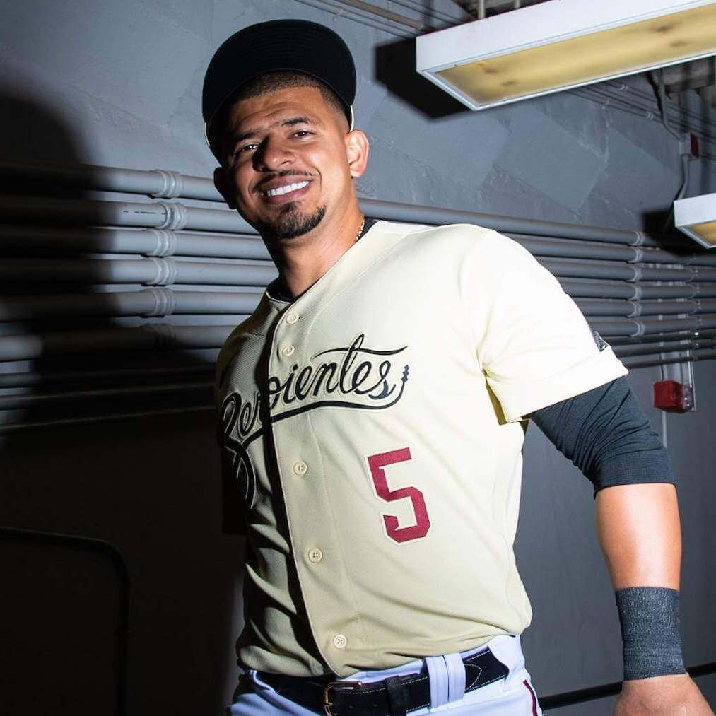
Now then. Last evening the Arizona Diamondbacks, playing as Las Serpientes (yes, in Spanish, serpiente is feminine), debuted their “City Connect” uniforms jerseys and caps. In case you missed it, earlier this week Paul had his review of the merch, er, “uniforms,” and he and Chris Creamer discussed these in pretty deep detail on their latest podcast (which I recommend giving a listen to if you haven’t already). So, I shant rehash too much of the details. Suffice it to say, I was expecting the worst but was somewhat pleasantly surprised at how the unis ended up looking on the field.
Among the many videos the D-backs released, this one gives a very good look at all the details of the uniform cap and jersey, and let’s start here:
Las Serpientes have arrived. 🐍 pic.twitter.com/Rr0jViPVnm
— Arizona Diamondbacks (@Dbacks) June 19, 2021
One of Paul’s biggest complaints, and legitimately so, was that during the unveiling of these jerseys & caps, no player was ever shown wearing team pants (lending more and more to the retail-driven nature of these uniforms), but we knew they were going to be white. Notice how little of the pants were actually shown in the video above (I mean, no one’s going to buy team pants, so why bother). And I’ll be honest — I really thought “Sonoran Sand” (I’m Calling It Tan™), which is the color of the jersey and the cap crown, was going to pair very poorly with white pants. You be the judge, but I don’t hate it.
Not awful, right? A couple things to note from those two photos: (1) clearly the uniform looks much better with high-cuffed pants (although those look like solid black socks, not the “special” socks shown in the video above). (2) The D-backs, like the Cubs, did not create a special helmet to wear with their CC unis. The prior three teams to sport CC uniforms all did (Red Sox, Marlins and White Sox). The D-backs, a/k/a “Serpientes” also became the third team (out of five) to wear normal uniform pants with their caps & jerseys.
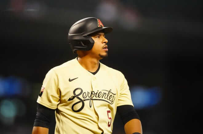
I didn’t mind the team keeping their existing “A” logo and placing it on the tan caps (both the “A” and the brim are black, and that logo is repeated on the left sleeve), and as Paul noted, this uniform is heavy on black elements, with a bit of brick red too. While I’d have preferred the flag patch on the right sleeve to have been rendered in that actual state colors of the flag, I didn’t mind the black/red representation.
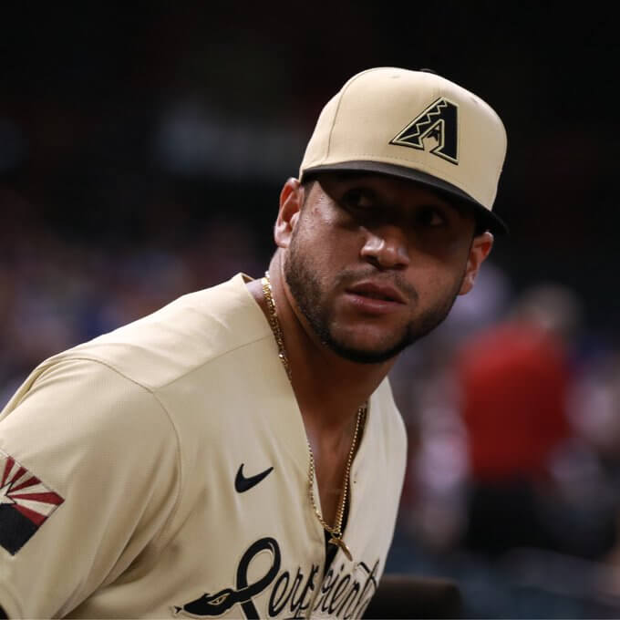
I also have no problem with the team using black script for “Serpientes” — it’s so narrow (and dare we say…serpentine) that I’m not sure it would be particularly readable in any other color — it was hard enough to read at distance in black. I’d have preferred the number on front to be in black as well (it was red) — NOBs were rendered in red.
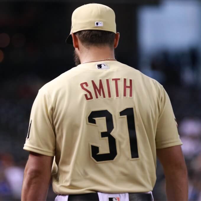
While that looks fine in a still photo — take a quick look at this video and see if you think the red is kind of washed out. I think in this instance a thicker (and darker) NOB would have been better. Another observation Paul had was that the numbers were not a custom font, but the team’s current number font. I’m not a big fan of the font, but I have no problem with them keeping it.
Looking strong in Sonoran Sand. #Serpientes pic.twitter.com/5wWGBqah32
— Arizona Diamondbacks (@Dbacks) June 19, 2021
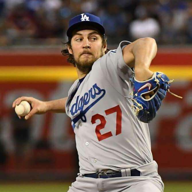
Paul pointed this out — although I would have noticed it regardless — but it’s kind of ironic that the D-backs were playing the Dodgers…a team whose script wordmark above a red number has been their calling card since before they moved to Los Angeles…and they wore a very similar jersey. The similarities were definitely noticeable (but not so bad as to look like a total ripoff):
All in all: let’s call a spade a spade. I’m not particularly fond of this “uniform” in large part because it’s not a uniform — it’s a new cap and jersey (I haven’t checked, but if the CC prices are the same for these, it’s $60 for the cap and I think $425 for the jersey). And while one cannot deny all these CC uniforms have been created to sell both those items, at least the two Chicago teams had a matching set of new pants. Arizona neither created a special helmet (as did Boston, Miami and CWS) nor special pants (CWS & CHC). So this one feels like even more of a merchandise grab than the others, if that’s even possible.
As far as a special CC uni goes? I’d actually rank this right in the middle (for me, my favorite has been the White Sox, followed by Boston and the Cubs, with the Marlins in dead last — it’s not as good as Boston and it’s probably about as good as the Cubs). I was surprised that it didn’t look nearly as bad as I thought it would — the tan, red and black actually worked well together. But I think I would have looked much better with tan pants, especially if everyone wore high cuffs. Maybe they were afraid they’d look too much like the old Padres sand uniform (which was largely reviled, but I rather liked). I think this might have even looked good with black pants, so long as they could pull it off as well as the Bumblebee Pirates (I’d love to see that tan jersey mocked up with black pants and tan socks).
You can see more photos here.
What did you guys think? And where would you rank these among the five CC uniforms we’ve seen so far? Was it as bad as you thought it would be or did it surprise you?


Guess The Game…
from the scoreboard
Today’s scoreboard comes from Ed Truck.
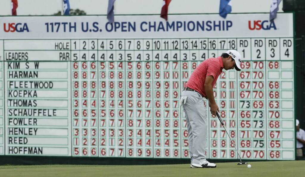
The premise of the game (GTGFTS) is simple: I’ll post a scoreboard and you guys simply identify the game depicted. In the past, I don’t know if I’ve ever completely stumped you (some are easier than others).
Here’s the Scoreboard. In the comments below, try to identify the game (date & location, as well as final score). If anything noteworthy occurred during the game, please add that in (and if you were AT the game, well bonus points for you!):
Please continue sending these in! You’re welcome to send me any scoreboard photos (with answers please), and I’ll keep running them.


The “BEST OF” Kreindler’s Korner
Hey guys & gals. You’ve enjoyed Kreindler’s Korner for several years now, mostly on the weekends, on Uni Watch, but with the recent coronavirus outbreak, Graig’s time is just too precious and he needs to tend to other things besides coming up with a new writeup each weekend.
So, going forward, for as long as the COVID-19 situation is bad in New York, I’m going to run a few “Best of’s” until Graig returns.
Here’s today’s offering:
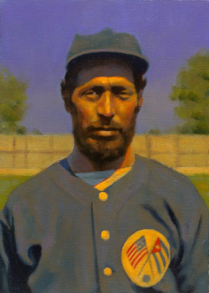
Title: “Jimmy Claxton, 1932” (color study)
Subject: Jimmy Claxton, 1932
Medium: Oil on linen mounted to board
Size: 5” x 7”Jimmy Claxton owns the distinction of being the first African-American to appear in professional baseball during the 20th century. Growing up in Tacoma, WA (though born in British Columbia), his family had been classified as white, black and mulatto by various census-takers – his background consisted of black, Native American, Irish, English and French ancestry.
In 1916, as a teenage pitcher in Oakland, California, he came to the attention of Herb McFarland, secretary for the Oakland Oaks, a club in the Pacific Coast League. He was introduced to the club as part of an Oklahoma Native American tribe, and was summarily offered a contract. By late May of 1916, Jimmy had broken into professional ball when he pitched in two games of a doubleheader – allowing three runs, four hits and four walks in two and a third innings. Within a week of that performance, a friend of his revealed that he had both Native American and African American ancestry, and Claxton was released by manager Rowdy Elliott on June 3rd as a result. He hadn’t even been with the Oaks for a week.
He went on to pitch for semi-pro clubs up and down the western coast in the 1920s as well as cities in the Midwest, such as Good Thunder, MN and Eureka, SD. He found himself with the Cuban House of David (later the Cuban Stars) in 1932 before eventually barnstorming again with clubs like the Nebraska Indians and Chicago Union Giants. He continued to throw into his 50s for the South Tacoma Pines of the Valley League, and then finally called it a career after throwing in a few frames during an old-timer’s game at age 63 in 1956.
Here Jimmy is pictured with the Cuban House of David in 1932. This is one of 200+ such paintings of mine that were on display at the Negro Leagues Baseball Museum in the spring of 2020.
Thanks, Graig! You can (and should!) follow Graig on Twitter.


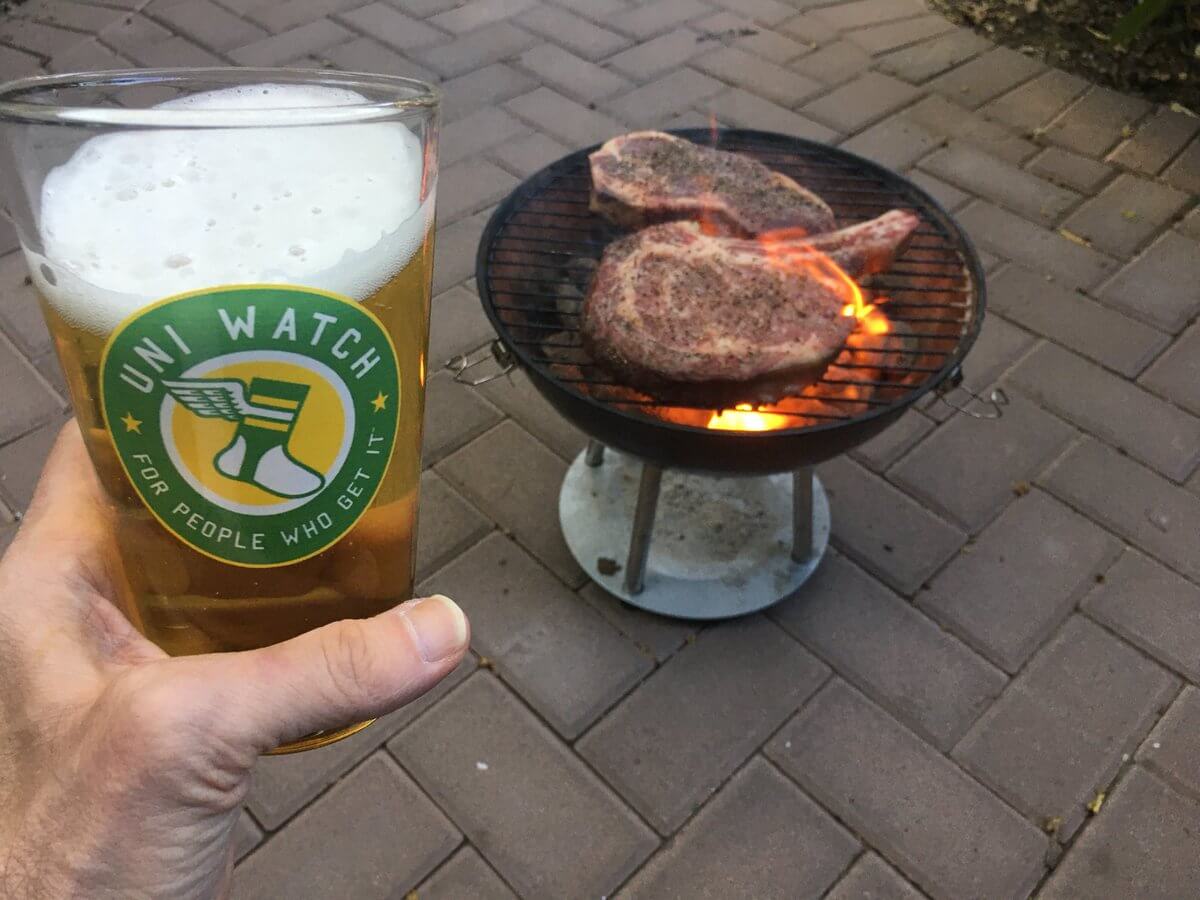
And now a few words from Paul: Hi there, and happy Juneteenth! In case you missed it this week, Uni Watch pint glasses are now available, and reader Bob Andrews has come up with a good idea for them, as follows:
I ordered a couple of the pint glasses yesterday. Maybe once enough of them are sold and distributed, you could schedule a “Post-Pandemic Porch Cocktails” event — everyone raising a (Uni Watch) glass to the “new normal,” whatever that means, and posting a pic.
I have to say, I love that idea! So here’s what we’re gonna do:
• I hereby declare that Thursday, July 8, will be Uni Watch Post-Pandemic Porch Cocktails Day.
• On that date, I encourage all Uni Watch readers to take some sort of photo of themselves enjoying a beverage on their porch (or stoop, or deck, or terrace, or sidewalk, or wherever). The photo can be like the one at the top of this section, or it can be a more traditional selfie that shows your face as well as your libation, but it should definitely include a view of your glass. Maybe I’ll even livestream the proceedings from the Uni Watch HQ porch.
• If you want to order a Uni Watch pint glass for the occasion (or a Uni Watch koozie, for that matter), that would be great! But feel free to use any glass you like, Uni Watch or otherwise. The idea here is to celebrate our comm-uni-ty and the return to some semblance of normalcy, not to move merchandise.
• When we get closer to the date, I’ll let you know where you can email or post your PPPC photo. Not sure yet if I’ll set up a Facebook page or something like that, or if I’ll just have you email the pics to me. But we have a few weeks to get that sorted out.
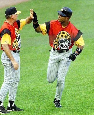
Meanwhile: The Unified podcast is back! For this month’s episode (part of our slower summer schedule), Chris and I talked about MLB’s infamous 1999 “Turn Ahead the Clock” promotion. Remember, the uniforms for that program were supposed to represent the year 2021 — the future is now!
Plus we also assessed the MLB CC uniforms and had our weekly monthly reader-submitted question.
As always, you can listen to us on Apple, Google, Stitcher, TuneIn, and Spotify, or just use the player below:
The show notes for this episode, which include photos of many of the things we discussed, are here. Those photos (and some additional ones) also appear in the video version of the episode, which you can see here:
Okay, now back to Phil!


The Ticker
By Anthony Emerson

Baseball News: ESPN has ranked the five City Connect unis that have been released thus far (from Nicklaus Wallmeyer). … Marlins OF Starling Marte appeared to be wearing his Pirates compression sleeve during last night’s game (from @JohnnyMaz7). … Yankees third base coach Phil Nevin, coaching his first home game at third in over a month, wore the road matte finish helmet (from @_RF30). … NPB’s Hanshin Tigers wore blue-accented caps and put down blue bases in honor of healthcare workers (from Jeremy Brahm). … The Montgomery Biscuits, Double-A affiliates of the Rays, will become the Montgomery Kimchi for Korean Heritage Night on July 16th (from Richard Grossman). … The Sylvan Lake Gulls of the Western Canadian Baseball League have unveiled their unis (from Wade Heidt). … Arizona is putting its College World Series patch on the chest of their jerseys because of a lack of space on the sleeves (from Rocky De La Rosa).

NFL News: The Calgary Stampeders have unveiled a truly beautiful new uniform to honor (honour?) the team’s 75th anniversary. The unis will be worn for six of the team’s home games (from multiple readers). … The Falcons gave graduates of the rookie development program baseball jerseys (from @gabecanes10).

Hockey News: The NWHL’s Metropolitan Riveters have a new logo (from our own Jamie Rathjen).
.
.

College/High School Hoops News: Iowa men unveiled uni numbers yesterday (thanks, Jamie).
.
.

Soccer News: The Chicago Fire have unveiled another new crest, after the last one was widely criticized. Fire fans, what say you? (from multiple readers). … The Chilean national team covered the Nike logos on their jerseys with Chilean flags due to a contract dispute between the Federación de Fútbol de Chile and the sportswear giants (from multiple readers, but special thanks to Tim Lewis for the article detailing the dispute). … FC St. Pauli of the 2. Bundesliga have unveiled their new home, away and keeper kits, one of which is a tie-dye design (from Kary Klismet). … J. League side Júbilo Iwata has unveiled their new summer kit. Jeremy Brahm writes: [Júbilo] are using a libellula angelina butterfly [design] that is local to Iwata and can only move forward. It is also critically endangered.” … Also from Jeremy, Yokohama FC have unveiled their summer kit as well. … Really interesting new home kit design for Cambridge United. It sort of reminds me of kente cloth (from Ed Żelaski). … Also from Ed, Hull City have unveiled their new home shirt. … One more from Ed: Port Vale have also unveiled their new home kit.

Grab Bag: Thursday was National Mascot Day apparently, so Kary Klismet sent in the following mascot-related pieces: The history of Oregon’s duck mascot, the “quirkiest” mascots in California, a ranking of the SEC’s costumed mascots, and a Washington Post piece on the history of mascots. … Also from Kary, the Boston PD has new patches and dress uniforms.


Uni Tweet of the Day
It’s gotta be a Yellow sol jersey, right? Or the Eric Dickerson-era throwbacks?
Rams are expected to have 2021 uniform release mid July,or two weeks before training camp.
Obviously the big question is what will the colors be.I am guessing if the jersey is sol or white,lots of fans will be happy.If not well…….. pic.twitter.com/MI7xDogfrz
— lalaramsgear (@Horns2016) June 18, 2021


And finally…

Everyone have a great Saturday. Catch you tomorrow with the annual Father’s Day “Dads in Uniform” special!
Peace,
PH
Those “Sonoran Sand” uniforms looked a lot more yellow on the field than I was envisioning, but I kind of like them.
Even with zero attachment to the Diamondbacks I ordered a cap since the colors were unique and I have nothing like it in my collection. It arrived yesterday. Your thought was my first one as well when I looked here this morning, the ‘sand’ looks a lot more ‘yellow’ in those pics than on my cap.
The last two pics (the close-ups) are much closer to the actual color. It’s a beautiful cap btw.
I thought this might happen. It’s too bad they don’t look nice and faded/unsaturated all the time, because the yellow that comes out in some of those pics is just sickly and unattractive but the light tan apparent in other pics is quite nice. I still feel these needed to be tan top and bottom and maybe some sleeve trim to break up the tan party.
As for Sonoran sand? I was in Sonora when these dropped and it’s not Sonoran sand. It’s beach sand maybe. But not Sonoran dessert sand.
Overall I think it had potential to be a fantastic jersey but failure to finish the design hurts it a lot. Strange from the DBacks who never seem to skimp on uni elements, for better or worse.
The Fire coming up with a “better” crest than the current one is such a low bar, that it deserves no credit whatsoever. The real question you have to ask is whether this is a good crest for the Fire.
It’s not.
The Fire was one of the teams that got it right at the outset, with the navy Florian Cross that made no doubt that it was a Florian Cross. Worn on a contrasting red uniform, it was excellent. It was apparently too obvious to the team to go back to what worked, despite the overwhelming fan feedback requesting just that.
Instead, we get a minimalization of the elements that made the logo work, with two fatal flaws. The elements are rounded off, so that you perceive the logo as a circle; the Florian Cross is camouflaged. Add to this the relegation of navy blue to an accent color, replaced by light blue.
So now you have, instead of a distinct logo, one that evokes the Cubs and Red Stars.
I suspect people will applaude it, because it isn’t the current one. But that’s damning with praise so faint, it’s invisible.
Very well said and summed up my feelings nicely. It’s better than the current one because almost anything would be better than that debacle. But it is not as good as the original crest. If it ain’t broke, don’t fix it. Sometimes you have to resist the urge to change for change’s sake.
Great analysis, especially the note about the temptation teams seemingly have to change for change’s sake. I feel like this especially a plague in MLS lately with what happened with the Crew last month. They had just rebranded a few years ago – what’s the purpose of a total overall? Did the new owners feel THAT much of a need to put their own stamp on things? To me, it reeks of insecurity, this constant fear that a brand is quickly outdated if you’re not constantly updating it.
“…this is especially”
“overhaul”
…proofreading.
My ranking of the City Connect, best to worst:
1) White Sox
2) Marlins
3) D-Backs (1-3 being very close)
4) Cubs
5) Red Sox
My ranking:
They’re all equally not good. This is Nike being Nike because they can. My only hope is that they set the price so high that it will discourage people from buying the merchandise and the program will go away. Honestly, $60 for a hat? I stopped buying hats when they went above $30. And if I had $425 and a urge to spend, I could buy a quality pair of dress shoes or a nice suit. I have a larger Jersey collection than a 45-year old should have but I am not dropping almost $500 on a special occasion jersey, and that will hold true when they get around to Nikefying the Phillies.
CORRECTION: based my $60 hat on PH’s intel. But even at $40, I am passing.
This is Nike being Nike because they can.
That’s why I’m not going to bother with ranking every single CC look.
Having said that, I will put las Serppientes (Respect The Placket!) down with Boston as my cellar dwellers.
The SanDiegO sand unis were way better than this.
Phil, where are you seeing caps for $60? I got my Marlins Sugar Kings cap at the ballpark and it was the regular price.
You know what? Somehow I must have ended up on the link website — where the caps are indeed $60. I’m guessing that doesn’t equate to 60 USD. My bad. But still, $40+ (USD) is a bit steep…
A little off on the jersey price, too. Not $425: yours for the low, low price of $435!
link
But not yours yet, because they’re so popular they’re sold out.
A$ 60 is about 29 US dollars. It probably gets up to 60 because of importing costs, even if coming from China or Indonesia.
I tip my hat to the Calgary Stampeders for keeping that jersey under wraps with no leaks for over a year. The first tease was given just before the pandemic took over in 2020.
With them wearing the red and white at home so much this upcoming season, hoping this will be the foot in the door for a future redesign of their regular uniforms. Maybe a design back in just the red and white with the black trim gone finally.
Interesting to note 2020 was supposed the be the 75th anniversary. This anniversary logo has changed now. I guess it would be considered as 75 seasons. CFL did not play in 2020 due to the pandemic.
How the logo originally looked with years 1945 and 2020 at the top:
link
How it looks now with Est. 1945 at the top:
link
Maybe a design back in just the red and white with the black trim gone finally.
I almost said I’d settle for going back to grey trim like the early 80s, but yeah…just red and white would be fantastic.
Oh man, do I ever love that Stamps uni! Absolutely gorgeous!
Note that there were no shots with a helmet. Apparently, there is a helmet in the works. We need to wait and see what that is. Bo Levi Mitchell was filmed throwing footballs in March at McMahon with an alternate Stamps helmet never seen on the field but it had black on it. It can’t be what will be worn with this one would think.
This is a retro-style uniform and not a true throwback, so I would be for the primary horse logo just in white on the red helmet and white masks. Better option than trying to create the 1948 helmet for example.
I loved the D-Backs CC uni — the tan cap was a nice touch. I don’t have any problem with the white pants and it doesn’t feel like any more of a merch dump to me. I see white/gray pants as the natural state of baseball uniforms, so I’m not surprised or disappointed when a team doesn’t go with something else. In fact, I’m pleased. I think this (like most baseball uniforms) looks much better with white pants.
Agreed. The comment that “it’s not a uniform” because the uniform pants and jersey are not the same color doesn’t make any sense.
The Falcons rookie baseball jerseys are way too heavy on the left side of the chest. It looks like everything is sliding off the side.
That D Backs uni looks like a bottle of Coors Banquet.
The D-Backs CC jersey & cap are fine. Middling C grade from me. But they’re also by far the best the team has worn since ditching the purple. If I were a D-Backs fan, I’d loooove the CC jersey and cap. Just as I’m sure I’ll adore the Twins CC jersey when it comes around due to the team’s regular uniforms being such a mess of inconsistent, dreary dreck.
Agree that the tan looks more yellow, and looks better with the white pants. Still thinking this will look bad with the gray road pants. I’m completely shocked by the cost of the jersey. The hat is also too expensive, but not to the ridiculous amount as the jersey. I like to wear light colored hats to play golf, and I would have purchased one of these if it was about half that cost.
The Diamondbacks and the Dodgers both have red numbers on the front. Ironic or coincidental?
Coincidental they both have them. Ironic the Dodgers were the D-bax opponents.
Just another crummy Nike CC effort.
The Cubs and Marlins from last night had to be one of the worst looking baseball games in a while. You had the Cubs wearing something that was not their color in a team name that nobody recognizes versus the Marlins in their black jerseys with the lettering and numbering that you can’t read. How about we just go with a home and in a way uniform.
GTGFTS: (A give away with score board easily legible)
Brian Harman on 18th hole end of 3rd round of US Open on June 17, 2017 Erin Hills, WI. 1st US Open ever in Wisconsin. Brooks Keopka, winner over Harman and Matsuyama, tied for lowest score related to par.
re: Diamondback
I actually like the colors – the white pants are fine too, they would go match well with tan stirrups with stripes – thin black, thin white, wide red, thin white, thin black.
Throw in some red or black sanitaries and red cleats.
Outline the NOB in black and the numbers in red (while keeping the existing inner tan border).
Maybe go with a white crown on the hat to match the white pants (cuffed mid-calf)
I think that would look pretty sweet.
“Hi there, and happy Juneteenth! In case you missed it this week, Uni Watch pint glasses are now available,”
How does that jive with all the “Cash Grab” talk that litters these pages?
Thanks
JACFIT
Jeremy Brahm writes: [Júbilo] are using a libellula angelina butterfly [design] that is local to Iwata and can only move forward. It is also critically endangered.”
That looks more like a dragonfly than a butterfly.
I think you guys gave Hershiser an extra 100 wins… it must have been his 200th win prior to the Mercury Mets game…