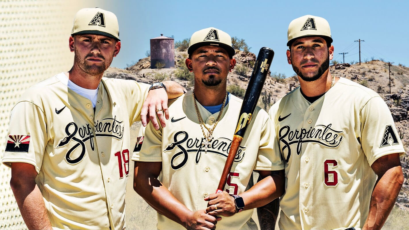
Click to enlarge
The Diamondbacks yesterday became the latest MLB team to release a City Connect alternate uniform (or, as I’ll explain in a minute), most of the uniform. As you can see above, it features a sand-colored jersey with a black “Serpientes” script and a red front number. The team’s primary logo, rendered in black, is on the left sleeve, and a modified version of the Arizona state flag is on the other sleeve. The cap matches the jersey’s sand color and has a black brim and black logo.
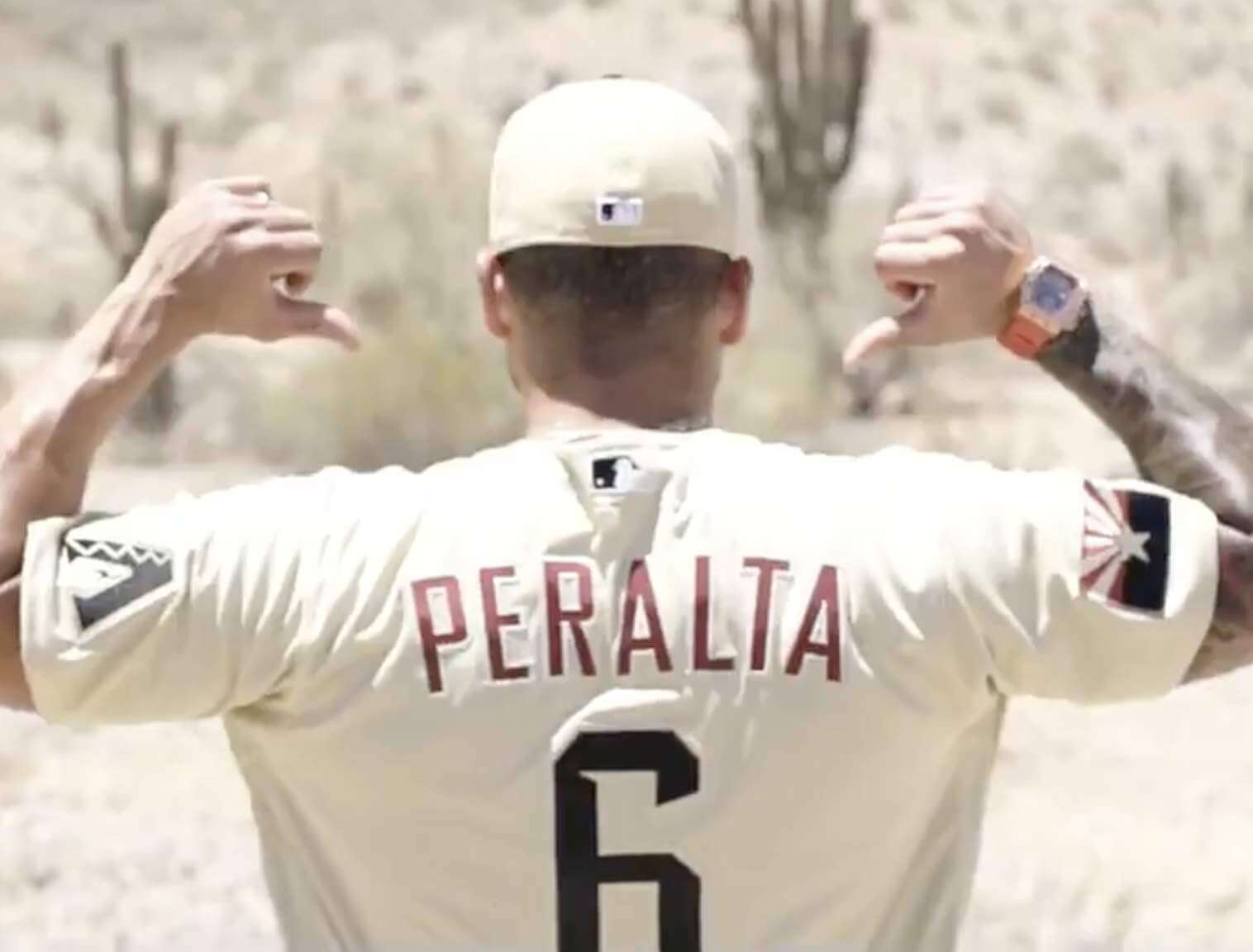
Here’s a look at the back:
Some thoughts:
• I love the idea of calling the team the Serpientes. So much better than their “Los D-backs” alternate (which is now being retired). Good move!
• I love the design of the script — very, very nice — but I hate that it’s done in black. For that matter, I hate the use of black throughout the uniform. Seems like such an unimaginative and reductive choice, especially given all the options presented by the Southwest’s distinctive color palette. Moreover, the sand color reminds me of the team’s original cream uniforms, so my mind’s eye keeps wanting the script, the cap brim, and the cap logo to be purple and/or teal.
• Similarly, changing to the state flag to include black seems like a really misguided move. Here’s a comparison of the actual Arizona flag and the black-centric sleeve patch:
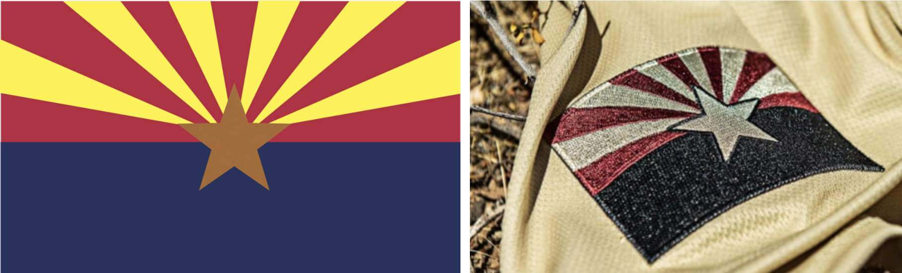
Has there ever been another instance of a team in any sport changing a flag’s colors in this way? I can’t think of one.
• The front number bugs me on two levels: First, the modern font (which is the team’s standard number font) doesn’t feel like a good match for the classic-looking script. And second, the use of a red number beneath a classy-looking script insignia seems inescapably Dodgers-esque.
• On the plus side: Let’s give them some credit for resisting the urge to bring back the snakeskin pattern!
———
So those are my thoughts about the jersey and cap. By this point you’re probably thinking, “What about the pants?” But it turns out that they are no matching pants — when this jersey and cap make their on-field debut this Friday, the D-backs will wear them with their standard white home pants. Sand over white — ewwww. And that’s not all. SportsLogos.net is reporting that the D-backs may also wear this uniform on the road, with their grey road pants.
Can you imagine how sand over grey will look? Well, imagining is all we can do for now, because the team hasn’t released any photos showing the full uniform. Instead, all of the promotional photos and videos show the jersey and cap being worn with jeans and shorts. In other words, they’re treating this like a merch dump instead of a uniform unveiling. Which is a shame, because the Serpientes concept is a good one and the script design is excellent (even if I don’t care for the use of black).
This uniform is slated to be worn seven times this season. You can see those seven dates here.
Five teams have now released CC alternates this season: the Red Sox, Marlins, White Sox, Cubs, and D-backs. Next up: the Giants (in July) and Dodgers (August). That will wrap up the CC program for this season.
As a side note, ESPN’s article about these uniforms included a very interesting quote from D-backs CEO Derrick Hall, as follows:
We’ve been bold at times, maybe too bold, had too many options in the past, and we simplified. We were one of the first teams to completely abandon our original colors and we were purple and teal, and for years, we had MLB asking us to consider changing our colors. We already had the Rockies with the purple. The purple never really matched up, and on TV, it looked more blue. The purple and teal was somewhat outdated.
There was no red in our division, and they put on an entire presentation for us where baseball was showing us that we should be the color red because of the Sedona Mountains and the sky and we said, no, thank you, but the more we thought about it, it made sense. We’re such a young franchise, and you can do that.
Hall is wrong, of course, about the D-backs being one of the first teams to change their colors (earlier examples include the Phillies, Pirates, Dodgers, A’s, Astros, and Padres, among others). But the real news here is that the D-backs changed their colors in 2007 because MLB wanted them to. I wasn’t aware of that!
(My thanks to Tim Donovan for alerting me to Hall’s quote.)
Click to enlarge
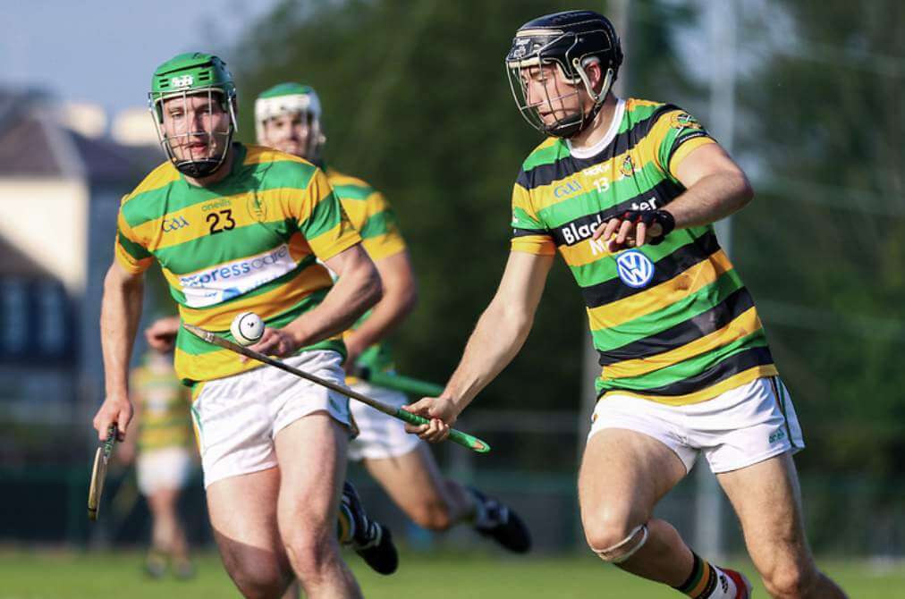
Who needs a clash kit? The photo above is from an Irish hurling match between Blackrock (green and yellow) and Glen Rovers (green, yellow, and black). A change kit would probably have been useful, but the lack of one resulted in probably the most chromatically pleasing sporting event I’ve ever seen. Tasty!
Lots of additional photos here.
(Big thanks to Reid Nimmers for this one.)
Click to enlarge
Cap reminder: In case you missed it on Friday, Ebbets Field Flannels no longer has access to the green wool fabric we’ve been using for our Uni Watch caps. They sent me samples of two potential replacement fabrics, but both of those were much darker than the fabric we’ve been using and didn’t feel right to me. So I won’t be getting any more caps from EFF, at least for now.
That means the caps we currently have on hand will be the final inventory of this product. They’ve been selling briskly over the past few days, leaving us with the following quantities (I’m updating this list in real time as orders come in):
7: 1 cap
7-1/8: 1
7-1/4: 6
7-3/8: 4
7-1/2: 1
7-5/8: Sold out
7-3/4: 6
7-7/8: 6
8: 3
Adjustable: Sold out
Once they’re gone, they’re gone! So if you want one (or more than one), get your order in now.
I haven’t yet decided if I’ll seek out a new cap supplier or if I’ll just get out of the cap biz. Either way, I won’t make that decision until we’ve sold out of the EFF caps, so get ’em while you can and then we’ll decide about whether there’ll be a new variety of Uni Watch headwear.
And now a few words from Phil: Phil here. Sunday is Father’s Day, and I’ll once again be posting photos of Uni Watch readers’ “Dads in Uniform,” an annual tradition that began in 2013. This is always a very special day on the site, and I’d love for as many readers as possible to participate — especially those of you who haven’t done so before. A few of you have reached out to me saying “I’ve run out of photos of my Dad,” so if you want to resubmit a photo that we’ve used before, please feel free to do so!
To take part in this annual tradition, select one photo of your father (or grandfather or uncle) in uniform (it can be sports, military, work — as long as it’s a uniform) along with a short description of 100 words or fewer. Then email your description along with the photo — again, only one, please — to me by by this Thursday, June 17, midnight Eastern. I’ll run all of the submissions this Sunday. Thanks!
The Ticker
By Jamie Rathjen

Baseball News: Mets C Tomás Nido was wearing OF Michael Conforto’s batting gloves yesterday (from @stevenwoj). … Nationals C Alex Avila is apparently one of those players who has his jersey sewn shut. “That horizontal line under his second button makes it look like that to me,” says Max Weintraub. … Tigers players came to yesterday’s game wearing NBA and U.S. men’s basketball team jerseys (thanks, Brinke). … Tennessee baseball IF Liam Spence had his sleeve patch coming off yesterday (from Timmy Donahue). … Reader Jerome Peirick sent us this picture of a 1941 Missouri amateur team that wore orange jerseys and dark-colored pants.

Football News: Rams CB Jalen Ramsey joined the ranks of new single-digit wearers yesterday by switching to No. 5 (from Timmy Donahue and our own Brinke Guthrie). … Reader Mike Cline, of the Helmet Addict Twitter account, had a combo Bills/Miami (Fla.) helmet cake, intended for his and his wife’s aborted wedding reception, made for the anniversary instead. … The Athletic has a good piece on why renaming the Washington Football Team is so challenging (from Nicklaus Wallmeyer).

Hockey News: Reader Jonathan Karberg has a T-shirt with a soccer-style Blues logo that he says the team gave away at the event in 2018 where they revealed their current third jersey — which then did not feature that logo.

Basketball News: The WNBA’s Minnesota Lynx are to retire No. 32 and 33 for Rebekkah Brunson and Seimone Augustus, respectively, next season (from Kary Klismet). … Cross-posted from the baseball section: Tigers players came to yesterday’s game wearing NBA and U.S. men’s basketball team jerseys (thanks, Brinke).

Soccer News: Multiple current and former teammates of Denmark midfielder Christian Eriksen supported him through their goal celebrations after his medical emergency on Saturday, as did Austria right-back Stefan Lainer. … Austria and North Macedonia both wore second kits in their Euro 2020 game yesterday, which happened three times in 2016 — the Portugal/Wales semifinal and two of Croatia’s group stage matches. … One more item from Canada’s friendly on Friday mentioned here yesterday: Captain Christine Sinclair’s armband was the colors of the transgender pride flag. … Germany’s women’s team are to wear the men’s black shirts in a friendly on Tuesday. … Guatemala’s and Venezuela’s teams have new shirts. … The U.S. teams had new warm-up shirts for their games last week. Pictures of the alleged new second shirt that first appeared a few months ago have also resurfaced (from Kary Klismet). … New second shirt for Scottish League One’s Dumbarton. … Aston Villa/England winger Jack Grealish famously wears his socks very low. He recently said it’s because he once had a pair that shrunk (from Rich Fuller). … The NWSL’s OL Reign are playing at the Sounders’ and Seahawks’ stadium for the first time Aug. 29 — before they moved to Tacoma, Wash., they played at Seattle’s city high school football stadium.

Grab Bag: The Australian Football League’s Greater Western Sydney have a new orange clash guernsey worn for the second time yesterday. … Australian teams sometimes wear black armbands in memory of players’ family members, and Super Netball’s West Coast Fever did so for reserve team shooter Donelle Wallam’s grandmother. … Division II’s Wingate has a new sports logo (from Kary Klismet). … Nike has been granted a patent for the Air Jordan 1 silhouette.
Seems like the Diamondbacks should be forced to call them “State Connect” uniforms since they refuse to acknowledge their city even when given an obvious opportunity like this.
It bothers me on the AZ unis that they removed color from the state flag patch. That sucker would POP so well with the standard navy/gold instead of the black/sand.
Good point. Will add a note about that.
I don’t like the number font either but given the uniform atrocities this team has committed over the years, I think it’s pretty good otherwise. White pants definitely the way to go; sand over sand looks washed out, and too much like pajamas or a cricket uniform.
I would have more interest in MLB’s “City Connect” uniforms if they referred to them as the “Shameless Attempt to Sell Alternate Jerseys” line.
North Texas changes the Texas flag to green and light green (they call it the UNT Battle Flag), but I can’t recall the Mean Green ever using it on a uniform.
link
link
Well, there you go. My search was too narrow. Didn’t think to look at uniforms for club sports!
I know it’s a stretch, but my sons played on the team.
The Columbus Crew had the state of Ohio flag rendered in team colors a few years back. Of course their new “logo” is supposed to resemble the state Burgee but that disaster is a story for another day.
link
Does the Carolina Hurricanes black flag shoulder patch of NC count?
Definitely. I should have thought of that!
I always flip seeing “black flag” in another context.
The Carolina Hurricanes have a blacked out North Carolina state flag on the black alternate jerseys.
Huh. They’re actually wearing these in games against the Dodgers. I would have thought they’d try not to make that direct comparison.
Archie Bradley and the rest of the Phillies donned NBA jerseys as well on their west coast trip…
link
No tan (sand) pants? Will have to see it on the field, but this has disaster written all over it. I had high hopes after both Chicago teams added actual pants to their CC softball tops, but now a regression.
Seeing these Arizona uniforms is a terrible way to start the week.
Two thoughts: I really hate the hats, because the “A” logo really mismatches the nice script. Would’ve loved to see that “S” mimicked somewhere on the hat.
And that story about MLB and their colors is so disheartening on so many levels…like, they really needed another team in primarily red?
Got me thinking about the strange color palette of the (real) Arizona flag. Red, yellow, blue and copper would make a unique and probably pretty interesting color palette for a MLB team.
I came here to say the same about the hats. I really wish that they would have made hats to the match the script. Even if they did a script A to match the script on the jerseys would have been better. The script on the jersey with their current logo on the hat looks like two completely different identities.
Going to disagree. The Dodgers’ monogram is 2 block letters and their team name is in script across the jersey. Ditto the Cardinals; so these are 2 teams perennially at the top of the best-dressed list. And the Royals do this. And the Twins. And the Mets, to a slightly different degree. And the Rangers, some of the time. And the Giants did. The cap monogram should represent the city/state. This works, in my opinion.
Probably the reason they didn’t show pants is that the sand over white or gray is going to look horrible. I thought at some point, maybe when they first switched to red, that the road uniforms used sand, though a darker shade, instead of gray for their road uniforms. And the first thing I thought when seeing the red numbers under the script was the Dodgers.
The fact that MLB went to that level of trouble to create yet another red team is baffling and infuriating
I don’t like the name Serpientes as it translates to Snakes. A Diamondback is an specific kind of snake that is called “Serpiente de Cascabel”.
Obviously, that’s too long for a uniform, but given that it will be used 7 times, I think they should have gone for it.
A direct comparison would be if the Grizzlies made a Spanish uniform saying “Osos” (which translates to Bears).
“Bell ringing Snake”: is indeed the textbook translation of Serpiente de Cascabel or Rattlesnake and I agree with Mr. Jalife’s assessment. In execution it appears the jersey was created by committee who picked the second worst bland centric wording available. The worst being adding “Los” to team names as if that was going to sell to an hispanic Market. It pleases me to read these honest appraisals of what should be obvious aesthetic decisions about Uni Designs.
As for the D-Backs (ugh), with a little more discovery (like researching some hispanic colloquialisms) they might have stumbled upon a word used throughout the hemisphere for a “Big Damn Mean Snake” and that word is Culebra.
When the Wisconsin Timber Rattlers (Class A) have the Hispanic heritage month jerseys, they use Cascabeles de Wisconsin.
link
Excellente!
“Vibora de cascabel” (“bell viper”) is the correct Spanish term (or at least the one used by Spanish-speaking herpetologists), and it applies to all rattlesnakes, not just the two species that we call “diamond-backs”. Since one of those species is the Eastern Diamond-backed Rattlesnake (Crotalus adamanteus), which lives nowhere near Arizona, I think it can be assumed that the team’s name is a reference to the Western Diamond-backed Rattlesnake (Crotalus atrox).
Excessive details aside, the point is that “vibora de cascabel” is still a much broader term than the English name “Diamondbacks”.
It feels incorrect and against the purpose of a flag to take a state’s approved design and apply your own company’s choice of colors to it. I wonder what Roman Mars thinks.
I understood that reference!
Do we have any Uni Watch readers in the Phoenix/Phoenix area? If so, I would be interested to hear your thoughts on the use of “Serpientes” on the front of the jersey. I’m curious how ingrained the Spanish language is to that area as it pertains to something like a baseball uniform. Are fans excited/acceptant/disappointed when the name of their team is in Spanish, not English? And are fans okay with a translation of the team name that is neither exact nor a common nickname?
Originally from Phoenix (relocated last year). Showed the jersey to my (native Spanish speaking) wife. She looked at it and said.. “eh..”.
The “Los Suns” and “Los DBacks” alts are mostly looked on as misguided but humorous attempts at bridging the gap.
I obviously do not speak for all of a 3M person metro area, but I do not think there is any use of the term “Serpientes” to refer to the DBacks.
As a Diamondbacks fan since ’95, and a native Phoenician, nothing about these jerseys resonates with me. At all.
Born and raised in Phoenix. Lifelong Diamondbacks fan.
I think using Serpientes for a one-off uniform is cool. I think Cascabeles would be more fitting. Regardless, I’m just happy that the lazily executed “Los Dbacks” uniform is gone. I’ve always wanted the team to have a proper translation on a jersey than just slapping “Los” on there.
I’m not Hispanic but I have a lot of love and respect for Hispanic culture and the Spanish language so I think it’s cool to have a specialty uniform that celebrates that. But I wouldn’t want this branding to take over the team identity. I’m a fan of the Diamondbacks not the Serpientes.
As far as how integrated the Spanish language is in the Phoenix area and the baseball culture, I would say that it’s not any more integrated here than maybe Los Angeles or San Diego. But my perspective is obviously skewed in that I’m not Hispanic and my view of baseball culture in the Phoenix metro is limited to playing adult rec league softball and watching the Diamondbacks on tv when they’re bearable to watch (which is not very often this year).
My biggest gripe with the team name is the incessant use of the name “Dbacks” over “Diamondbacks” in every medium. The team is the Diamondbacks not the Dbacks, I just wish we could get the full name back on the jerseys. I get that the name is long but I don’t care how they get it done, just do it. It’s one character shorter than “San Francisco” (if you count the space) and the Giants get it on their uniform.
There were pinstriped “Diamondbacks” jerseys during the expansion year. I don’t see why the Snakes can’t wear a color-corrected version of that, put the Block “A” on the sleeve, and ditch the snakehead mark.
I really like the “Serpentes” script, and I think the base color looks great as well…
But it’s otherwise disappointing. I think it would have looked better with a red script and no number in front.
The fact they don’t have pants to go with the jersey just indicates this is about selling shirts, not actually looking good on the field.
Arizona native. Serpientes is fine. More peeved about the snip about MLB convincing the team to go to Red. From a quick skim, here are how many teams use red.
MLB: 6 primary, 8 secondary
NBA: 7 primary, 3 secondary
NFL: 7 primary, 3 secondary
NHL: 8 primary, 5 secondary
They should have dropped the Teal and picked up Orange.
A few people have pointed out that the Carolina Hurricanes use a recolored flag patch, but I’m surprised nobody’s mentioned that the Arizona Coyotes use a recolored AZ state flag in their alternate logo. (In the same colors as the DBacks here!) The AHL’s Texas Stars do the same thing with the TX flag.
I don’t have a problem with recolored flags. True-colored ones mucked up the Calgary Flames sweater (though it wasn’t their biggest problem.) The design is the better part of good vexillography.
Agree with this 100%. Design is more important than strict literalism. The Hurricanes provide another example of this in their ridiculous-looking (but technically correct!) two-flag alternate logo, which looks terrible on the front of a hockey jersey, primarily because it’s too linear and vertical.
No matching pants? Way to step on the rake, D-Backs/Nike.
I kind of think the uniform will look better with white pants, although I’m not sure about the gray ones. But as Paul noted, who can be sure since they didn’t bother with the whole uniform?
Perhaps you could have the Uni Watch caps done in gold, with the same patch and a dark green squatchee.
South Carolina uses a Garnet SC state flag on their baseball uniforms vs the navy blue the flag is traditionally rendered in.
The Serpientes script font is excellent. I would have much rather seen the “S” as the cap logo than the current “A”. I also think the block “A” patch distracts from the flow of the script on the jersey. Tighten those up and mix up the colors (I would have preferred the original purple and teal with the cream base” and that’s top 2 in the City Series with Miami as a far and away 1.
Don’t understand how the D-Backs can be serious about wearing these jerseys without matching sand pants. It will just look really off if they wear white or grey pants with this jersey and hat.
MLB should call them CITY (Cash Is The Yen) Connect uniforms, Yen meaning a strong want, craving, desire or hunger.
Also, who is Jack Grealish kidding? He wears his socks low to show off his calves. Frankly, I can’t blame him, they are pretty nice.
Cash is the Yearning?
Should’ve had serpents on the front.
Seeing that uniform clash made me think about the 1990 Freedom Bowl between Oregon and Colorado State. Oregon wore yellow-green-yellow and CSU wore green-gold-green.
Hey Paul-
Just noticed something. 5/27 Double Header NYY/TOR
Blue Jays wore powder and royal in first + second game. Has a team worn two separate colored alts in both halves of a double header before? Couldnt find anything, feel like many alts are specific to Home/Away, making it difficult to omit a white/grey
Teams I can even think of who even could: BAL (orange/black), COL (black/purple), TEX (red/royal/powder), KC (royal/powder), MIN (powder/navy/red), ARI (black/red), SEA (teal/navy), HOU (orange/navy), MIA (black/teal), TB (navy/teal)
Curious your thoughts
Great question. No idea! But an intriguing potential research topic.
Mariners at Orioles 4/15/21 wore teal and blue.
link
Even more unique about the mariners on the 15th and 16th of April was that they wore the teal Jackie Robinson 42 jerseys twice. Once in the double header, where they wore teal 42s in the 1st game and blue regular uniforms in the 2nd game in Baltimore, and then wore the teal 42s the next night in Seattle against the Asterisks.
I gotta say, they couldn’t have used a better dessert background? Or at least a good photoshop job? It seems they picked the first desert-looking area in the city and said “here, here’s a good background, we can pretend the electric poles are cacti!”
Anybody watch Ole Miss play Arizona last night? From a uniform standpoint, I thought it was the best looking college baseball game I have seen all year.
That Irish hurling uni clash reminds me of the 1990 Freedom Bowl when Oregon wore yellow-green-yellow and Colorado State wore green-gold-green.
Looking at some other photos it looks like the d backs uniform might be a stronger gold color (some of the photos make it look cream) and may look good with white pants and passable with gray.
FWIW, the Marlins changed their colors after the Diamondbacks did.
Ah, you’re right, of course. My bad! Will remove from text.
The Mariners are another example of a team changing their colors (ironically enough to the teal the MLB apparently dislikes). Bring back the yellow and blue!
Since we know Uni Watch is pop culture friendly, RIP Frank Bonner, whose suits as Herb Tarleck on WKRP might warrant a future column by Paul.