By Phil Hecken, with Kyle Evans & CJ Fleck
Follow @PhilHecken
Good Sunday Morning, Uni Watchers! Pleased to let you know that after a harrowing day yesterday, I am finally back on-line and good to go. I hope everyone is doing well and staying safe and sound.
Once again, I’m re-joined by UW soccer aficionados Kyle Evans and CJ Fleck, who will be giving you a preview of the kits of the Euro 2020 (yes, it was supposed to be played last year, but fell victim to COVID-19, like so many sporting events). If you’re not familiar with this tournament, Wiki has a good synopsis. If you missed yesterday’s Part I, please click here. Now lets welcome back Kyle & CJ with Part II. Enjoy!
Euro 2020 Kit Preview, Part II
by Kyle Evans & CJ Flect
Thanks Phil! We’re glad to be back to showcase the kits for Euro 2020, which kicked off Friday with the match between Italy and Turkey. And yes despite being 2021 the tournament is still going with 2020 in the name as it was postponed last summer. As previously scheduled, the tournament is being held all over Europe as opposed to one or two host countries to celebrate the 60th birthday of the event, with the finals (semifinals and championship) being held at Wembley Stadium in London. The other basics: there’s 24 teams (for the second time), the event runs June 11 – July 11, and Portugal are the defending champions.
In terms of the kits, the most obvious difference in international competition is the lack of advertising. The postponement has also affected the kits as some that were originally released 1-2 years ago with the intention of being worn for the Euros have been replaced with even newer releases.
With no further ado, here’s what you’ll be seeing on pitches across Europe for the next month!
P.S. Let’s give a Uni Watch shoutout to CJ who’s getting married next weekend!
Group D
Croatia
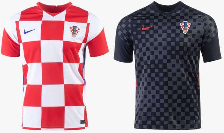
Primary: classic red and white checkerboard design
Secondary: black and grey checkerboard pattern
Kyle: Absolutely love the classic Croatian look.
CJ: Can’t go wrong, but of course we need a color contrasting branding so we don’t forget who made them! I also would say the secondary is a bit garish.
Czech Republic
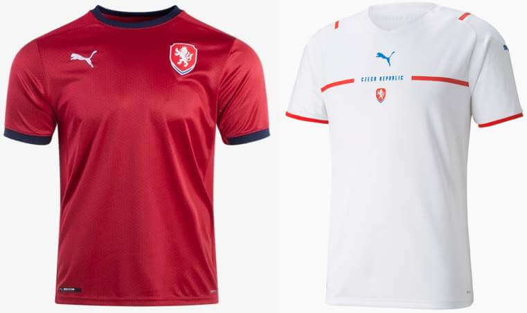
Primary: dark red with black accents
Secondary: new Puma template, white with team name breaking a red horizontal stripe
Kyle: Nothing spectacular to see here, and you’ve seen the white one already.
CJ: Those are, in fact, kits.
England
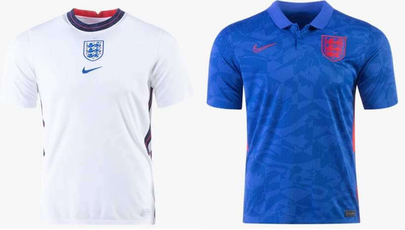
Primary: white with navy accents
Secondary: blue with neon red accents and graphic print sublimated design
Kyle: Solid white, although I prefer the maker’s mark and crest split across the chest rather than centered and stacked. And oof to that blue jersey, let’s hope we only see it once (as a clash to Croatia).
CJ: Agree with Kyle on the stacked/split idea. I have a sneaking suspicion the blue will live on in historical kit lore for the English; watch out for that Croatia game.
Scotland
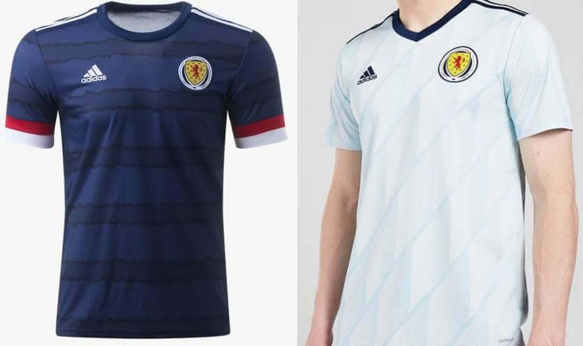
Primary: navy with darker navy horizontal stripes and red/white sleeve cuff stripes
Secondary: sky blue diagonal gradient graphic pattern and navy accents
Kyle: The navy design is really nice and I’ll leave it at that.
CJ: Could be better, could be much worse. Kyle is right.
Group E
Poland
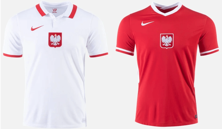
Primary: white with red accents, white/red collar, national team crest centered
Secondary: colors inverted from primary but without a collar
Kyle: Classy and moving the crest front and center allows it to be larger than if it was in the traditional heart location.
CJ: That primary is lovely, and the secondary isn’t bad either.
Slovakia
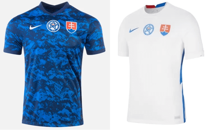
Primary: blue and navy graphic design “based on country’s mountains”
Secondary: white with blue accents
Kyle: Tell me you don’t see fish in that graphical pattern.
CJ: These are certainly something. What that is, I don’t know.
Spain
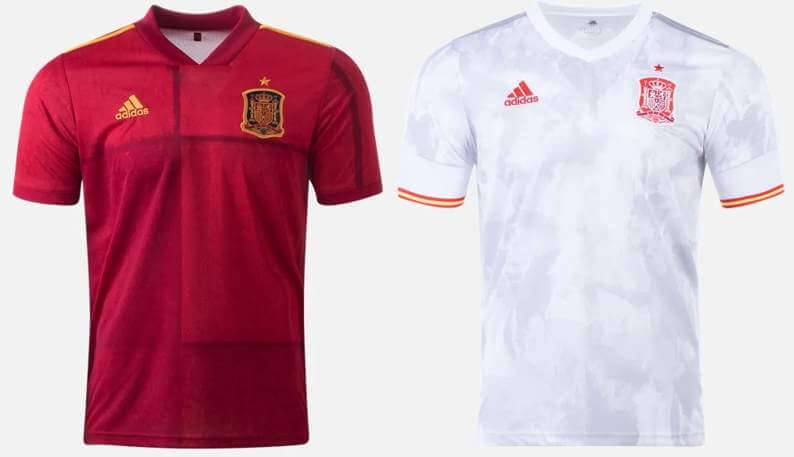
Primary: checkered with different shades of red
Secondary: white and light grey graphic pattern, red/yellow/red sleeve cuff stripes
Kyle: Spain generally looks great, but not as much this time around. A lot to be desired here.
CJ: The off-center checker is driving me crazy.
Sweden
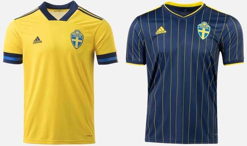
Primary: yellow with navy/blue/navy sleeve cuff stripes
Secondary: navy with yellow pinstripes
Kyle: These both look great and I have to say that I absolutely love the yellow pinstripes on navy.
CJ: Pinstripes? Pinstripes! An instant classic.
Group F
France
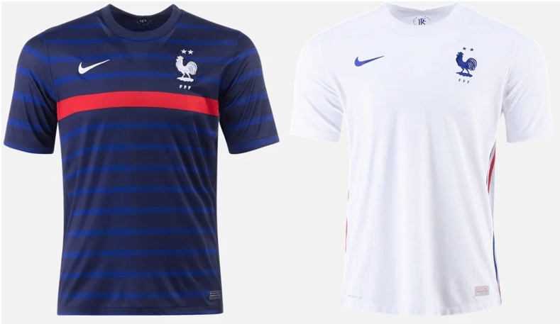
Primary: blue and navy horizontal stripes with single red horizontal stripe across chest
Secondary: white with red and blue side stripes
Kyle: Magnifique! The defending World Cup champions certainly dress like it.
CJ: I’m not sold on the red stripe, but it’s not a bad look in general.
Germany
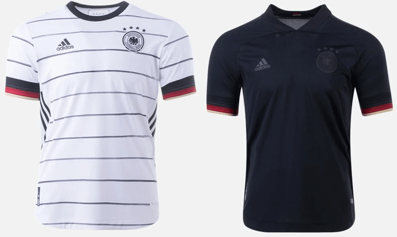
Primary: white with thin black horizontal stripes and black/red/yellow sleeve cuff stripes
Secondary: all-black (including maker’s mark and crest) with black/red/yellow sleeve cuff stripes
Kyle: The white and the flag-based sleeve cuffs are beautiful.
CJ: Flag cuffs are a great touch for the usually simplistic Germans. A non-green secondary is a letdown.
Hungary
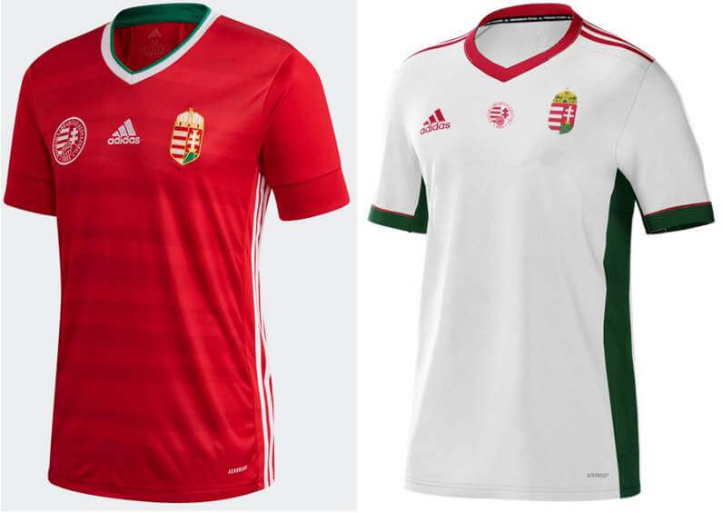
Primary: red and dark red horizontal stripes inspired by the “waves of the Danube River”
Secondary: white with green side panels and sleeve cuffs
Kyle: They’re just ok for me.
CJ: I actually like the use of colors in the secondary, but I think that’s just me.
Portugal
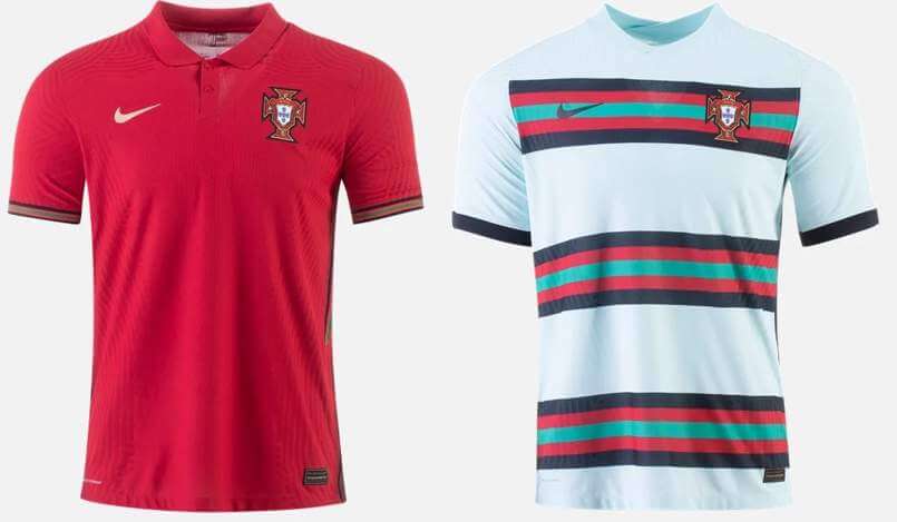
Primary: dark red with black/red/green stripes on sides and sleeve cuffs
Secondary: light teal with three sets of black/red/teal/red/black horizontal stripes
Kyle: The defending European champions aren’t messing around with their jerseys, a nice mix of a classic look and a new unique one.
CJ: That secondary is wild, but you can’t blame them for going back to teal after winning with that color in 2016.
Thanks guys! Great job on both parts. The lads will be back soon for a look at your Men’s and Women’s Olympic kits. See ya then.


Cubs Debut “Wrigleyville” City Connect Unis
Yesterday evening, as expected, the Chicago Cubs debuted their “Wrigleyville” City Connect uniforms, and by dint of fate, played in what I believe to be the first ever mono-navy vs. mono-powder blue matchup in MLB history. We knew the Cubs would be in the navy unis, and St. Louis always wears their powder blue roadies on Saturday, so we got a color-vs-color matchup that hasn’t ever happened before. Has it?
Anyway, if you’re unsure as to why the Cubs were wearing these solid navy uniforms, Paul had a nice preview of them earlier this week.
It was either a really good or a really bad looking game depending on your perspective. I loved it.
The Cubs CC uniform had “Wrigleyville” splashed (in marquee curvature) across the chest to give a shout out to “Chicago’s 77 distinct community areas” or some such nonsense.
Or, as Cubs Chairman Tom Ricketts says,
Lakeview is the neighborhood, but Wrigleyville is kind of the aura. Anyone who’s sitting at a bar anywhere in the world, watching baseball, watching the Cubs, is in Wrigleyville. So, that’s kind of the way we look at it.
Well there you go.
There weren’t any real uni surprises (but there was one big uni disappointment, which I’ll get to below), and there appeared to be an equal mix of guys showing sock (cuffing appears to be a somewhat lost art) or going pajama style. Obviously, hosiery is critical here as this uni goes downhill real fast when full length pants are worn.
All in all it looked about as good as one expected it would, with one exception: the Cubs were the first team to wear a CC uni and not create a custom helmet. They just went with their regular ROYAL blue lids, which created a less-than-satisfying visual. Navy and powder go together very well. However, royal pairs well with neither powder nor navy blue, so the whole time the Cubs were on offense their unis looked a bit disjointed.
As far as the combined unis? I wouldn’t want to see this matchup every day, but as our first ever (I believe) matchup between mono-navy vs. mono-powder, I could definitely see it again.
And here’s how the unis looked in action:
.@yungjoc650 has homered in three straight games!#CubTogether pic.twitter.com/lP3JEg9UmK
— Chicago Cubs (@Cubs) June 13, 2021
You can see more photos here.


Guess The Game…
from the scoreboard
Today’s scoreboard comes from Nicklaus Wallmeyer.
The premise of the game (GTGFTS) is simple: I’ll post a scoreboard and you guys simply identify the game depicted. In the past, I don’t know if I’ve ever completely stumped you (some are easier than others).
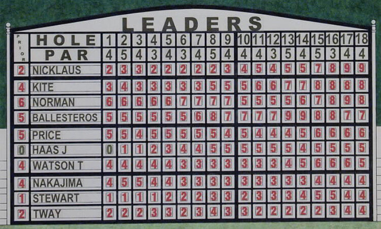
Here’s the Scoreboard. In the comments below, try to identify the game (date & location, as well as final score). If anything noteworthy occurred during the game, please add that in (and if you were AT the game, well bonus points for you!):
Please continue sending these in! You’re welcome to send me any scoreboard photos (with answers please), and I’ll keep running them.


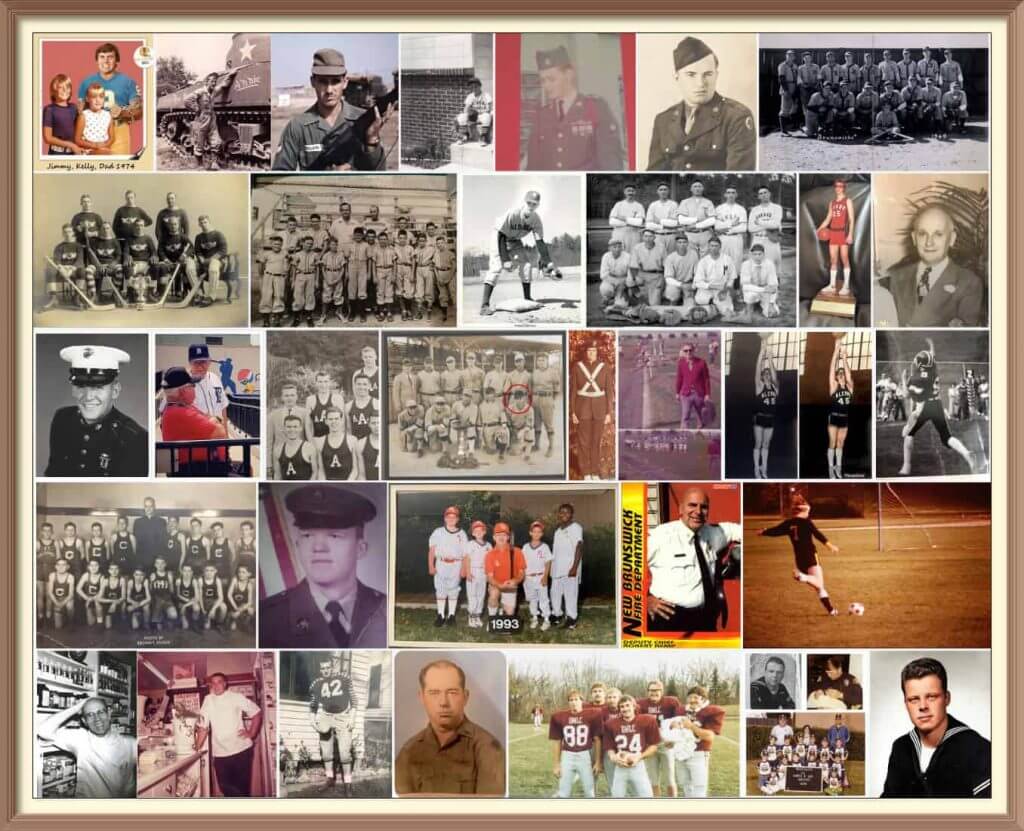
Calling All Sons (and Grandsons & Nephews)!
This coming Sunday is Father’s Day, and I’ll once again be posting photos of Uni Watch readers’ “Dads In Uniform,” a tradition that began in 2013 (and has continued every year since then). This is always a very special day, and I’d love for as many readers as possible to participate — especially those of you who haven’t done so before. A few of you have reached out to me saying “I’ve run out of photos of my Dad” (from years’ past), so if you want to resubmit a photo used before, please do so!
To take part in this annual tradition, select one photo of your father (or grandfather or uncle) in uniform (it can be sports, military, work — as long as it’s a uniform) along with a short description of 100 words or less. Then email the photo — again, only one, please — and text to phil.hecken@gmail.com with the subject line “Uni Watch Father’s Day 2021” by this Thursday, June 17, midnight Eastern. I’ll run all of the submissions this coming Sunday. Thanks!


Click to enlarge
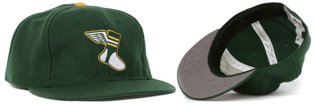
Important Uni Watch cap news: Paul here. In case you missed it on Friday, I recently got in touch with Ebbets Field Flannels to order some new Uni Watch cap inventory. But they told me that they no longer had access to the green wool fabric we’d been using for our caps. They sent me samples of two potential replacement fabrics, but both of those were much darker than the fabric we’ve been using and didn’t feel right to me. So I won’t be getting any more caps from EFF, at least for now.
That means the caps we currently have on hand will be the final inventory of this product. Adjustables are sold out but we currently have small quantities of all fitted sizes from 7 through 8. If you want one (or more than one), get your order in now — once they’re gone, they’re gone!
I haven’t yet decided if I’ll to seek out a new cap supplier or if I’ll just get out of the cap biz. Either way, I won’t make that decision until we’ve sold out of the EFF caps, so get ’em while you can and then we’ll decide about whether there’ll be a new chapter of Uni Watch headwear.
Now back to Phil!


The Ticker
By Anthony Emerson and Phil

Baseball News: Did you know reliever Dan Wheeler was part of all three uniform eras for the Rays? … The Atlantic League’s West Virginia Power were to wear jerseys with rainbow elements during Thursday night’s Pride night game, but the game was rained out (from Josh, who didn’t give his last name). … The Arizona Diamondbacks and Nike are apparently foreshadowing the unveiling of the team’s City Connect uniforms today (expect Paul to have full coverage tomorrow). Astute Uni Watch reader Myles Gallagher noticed that the image they’re using to promote it shows a gopher snake, not a diamondback (from Kary Klismet). … Also from Kary, “I just came across this photo of an awesome collection of 7-11 Slurpee cups featuring early ’70s-era MLB stars on Facebook.” … Sean McSean says, “Weird that Gameday on the MLB app is accurate enough to know the 7 Line Army is filling centerfield with orange shirts, but inaccurate enough to have the Padres in the wrong uniforms.” They wore their brown pins yesterday. … Last night the Frisco RoughRiders went both the camopander AND S&S route (from Timmy Donahue). … Here’s what Cubs chairman Tom Ricketts had to say about the Cubs Wrigleyville unis. … Not sure whose it is, but someone on the Mariners had a rainbow dyed glove (from Mike L.).

NFL News: Packers players wore generic jerseys with no uni numbers or sleeve stripes for picture day (from Garrett Van Auken).
.
.
College/High School Football News: The University of Central Arkansas will have a very, ahem, interesting new field for the 2021 season (from James Gilbert). … Iowa State changing to the “Jack Trice Stripes” for their front bumper next season (from J.A. Scott). … Did you ever think you’d need a ranking of Notre Dame’s alternate uniforms? Me neither, but yet here we are.

Hockey News: The Athletic has come out with a ranking of each NHL team’s best and worst alternate uniforms (from Kary Klismet). … Also from Kary: New logo for the San Diego Jr. Gulls youth hockey team (which appears to be nothing more than a slightly tweaked version of the logo of the team’s namesake, the San Diego Gulls of the American Hockey League). … Also posted in the soccer section: Bruins C David Krejčí, who is a free agent at the end of the season, wore a Revolution jersey during his post-elimination press conference, a seeming indication that he wishes to stick around in New England. … When will the Kraken release their uniforms? According to this article, the team is trying to finalize prototypes for players to put on at the expansion draft. But it involves overseas manufacturing, so COVID-19 delays are a factor.

Pro Basketball News: Here’s an in-depth look at the WNBA’s new basketball (from Kary Klismet). … The grammar is awful, and the opening graf may also have the longest run-on sentence I’ve read in some time, but this writer is a uni-watcher (even if he doesn’t know it). Sure he needs a proofer, what with a gem like this, “Full discloser – I have no fashion sense unless it comes to sports,” but he still GetsIt™.

Soccer News: Museum of Jerseys has a new piece with Football Kit Geek, the guy who uni-tracks the Premier League and EFL, wrapping up the PL season. It has stats on the number and frequency of combos, most successful and least successful kits, among other quirks (thanks, Jamie). … Canada’s women’s team wore rainbow numbers during yesterday’s match, and wore orange wristbands in memory of the hundreds of indigenous children discovered in a mass grave at a Catholic residential school in Kamloops, British Columbia (from multiple readers and our own Jamie Rathjen). … New home and away kits for Portuguese giants Benfica (from @mikeDfromCT). … The recently-relegated German club Schalke 04 is returning to Adidas after a handful of seasons with Umbro (from Nate Rathjen). … EFL Championship side Huddersfield Town is has unveiled their home kit (from Ed Żelaski). … Also from, Ed: Newly-promoted Ukrainian Premier League side Metalist-1925 have added both the Tryzub — the national symbol of Ukraine — and the slogans “Glory to Ukraine” and “Glory to the Heroes” to their new kits for the 2021-22 season, apparently in protest of UEFA’s demands to remove the political slogans from the Ukrainian national team’s kits. … Sticking with the Ukrainian Kit Saga, US Embassy staff in Kyiv wore the new kits with the “objectionable” iconography to show support for the Ukrainian national team ahead of Euro 2020 — but mostly to needle Russia (from Chris Aversano). … Peru has unveiled their new kits ahead of Copa America 2021 (from Germán Cabrejo). … Also posted in the soccer section: Bruins C David Krejčí, who is a free agent at the end of the season, wore a Revolution jersey during his post-elimination press conference, a seeming indication that he wishes to stick around in New England. … There’s a new jersey collaboration between the Rolling Stones and Umbro; the collection includes England, Scotland and Wales football shirts featuring each Stones’ band member’s name on the back (from Gary Moore). … Check out these circa 1981 MISL logos, from Missle magazine (from John Skrtic). … How cool is it that the Swiss use Helvetica? The Helvetica font (typeface) was developed by Swiss designer Max Miedinger in 1957 (from Jeremy Brahm).

Grab Bag: Ever wonder how stadium seats are restored? Reddit’s “DamnThatsInteresting” sub has the answer (from Keith Semineiro). … Australian rugby league team New South Wales Blues were mocked on social media for how tightly their new Puma jerseys fit during a recent match against Queensland (from Kary Klismet). … Andretti Autosport IndyCars will have rainbow liveries for June’s races (from Jordan Pawlikowsky). … A new video detailing the history of the United States Army’s uniforms has gone viral on YouTube (from Kary Klismet). … Whoops! We don’t often see (or feature) road signs, but this one’s a doozy. Submitter Brandon Weir asks, “Who on earth approved this sign?” … Louisville found a way to spell the word “Official” wrong on the welcome materials they gave for their Official Visits this weekend (from Mark Johnson). … French Open finalist Novak Djokovic wore the jersey of NBA MVP and fellow Serbian Nikola Jokic while preparing for his French Open semifinal.


Uni Tweet of the Day
Giancarlo was not impressed. Wait for it.
🎶 Start spreading the news… 🎶 pic.twitter.com/j9hDaEJGGS
— Phillies Nation (@PhilliesNation) June 12, 2021


And finally… big thanks to CJ and Kyle for their Euro2020 kit previews. Looking forward to their forthcoming Olympic previews.
Hope everyone had a good Saturday and a has better Sunday. Hope you guys will again join in the Uni Watch Father’s Day submissions (either for the first time or again). That’s always a special post.
Finally got wifi routed at the summer place (although it took the installer almost 6 hours as the provider needed to install all new fiber optic lines — or something like that — that sort of thing is above my paygrade). But all’s good to go!
So now, I leave you with this…

Peace,
PH
One thing the White Sox and Cubs “City Connect” uniforms are getting right — light-colored undersleeves under the dark jerseys. One of the things “softball tops” usually get wrong (and a reason why they look so bad to my eye) is that they usually duplicate the color of the undersleeves. I love the dark-blue and black monochrome looks the Sox and Cubs are using in their “City Connect” configurations, and a plus of that look is that it virtually requires the contrasting undersleeve.
Agreed that the Cubs’ royal-blue batting helmets clash, though I didn’t notice it watching a quick highlights package. And while I agree navy blue and royal blue don’t go well together, I’d cast a dissenting vote on royal blue and powder blue — the 1970s/80s Brewers, Royals and Expos are examples of teams that I thought really looked good with that combination.
Royal blue and powder blue can look great together. Other examples. 1970s to 90s Toronto Blue Jays, WHA Houston Aeros, NASL Vancouver Whitecaps.
Add the Toronto Argonauts to your list. How could you forget them?
Argos are navy and powder.
Add the Toronto Argonauts to your list. How could you forget them? (Or are we looking at other shades of blue)
Nether the Cubs nor Sox “City Connect Clown Costumes” get anything right. I can’t believe so many Uni Watchers like those garish ensembles. It seems like it wasn’t that long ago that MLB had come to its senses and almost all teams wore white at home and gray on the road again, as God intended. Now it seems teams are regressing back to the tackiness of the 70’s and 80’s.
And get off my lawn!
I will agree with you that these are totally unnecessary and never should’ve made it onto the field.
But they do look good.
So I have one foot on and one off your lawn. ;)
Jim, one thing I’ve definitely learned from reading UW is how subjective the visual appeal of uniforms can be.
I’ll see a newly released design the daily blog entry and think “man, that’s going to be blasted in the comments” only to find that a lot of people here like it. Then I’ll see something new that I find pretty cool but the comments will be mostly negative. For example, I really like the new LA Rams look but I think I’m the only one.
I like what the Rams wore vs the Jets last season.
link
Otherwise, I liked the mismatched 2019 look better.
link
Yeah, the Rams should always wear the yellow pants.
“Now it seems teams are regressing back to the tackiness of the 70’s and 80’s.”
The all-navy uniforms worn by Chicago in the ’80s were link.
The ones they wore link were even more not-tacky.
I say bring those back and wear them on the road all the time.
I’m not sure the White Sox are wearing white under sleeves as part of that uniform. It was first worn on a very warm day, so the number of players wearing long under sleeves was almost zero. Several players do wear compression sleeves (which might be considered personal equipment as opposed to a uniform article), and those are white.
Looking at the White Sox today, wearing standard gray in Detroit. First two men up wore single white compression sleeves. First base coach Daryl Boston wearing black undersleeves.
Ironically, one of the more unsightly baby blue & royal uniforms were the 1977 Chicago Cubs road suits; could’ve used white trim and the fat blue sansabelt was a swing and a miss.
1986 Masters. Knew it on sight.
GTGFTS – 1986 Masters. Jack Nicklaus’ last victory in a major.
Looks like a recreation of the final round of the ’86 Masters, as the leaderboard appeared to be painted on. Secondly, it featured Arial font lettering, which though existed then, was uncommon in signage in 1986.
Central Arkansas has actually had the purple/gray turf for football since 2011.
Making sure this was pointed out. Here’s an article on their site about it. link
Link for “Packers players wore generic jerseys with no uni numbers or sleeve stripes for picture day” links to rainbow baseball glove.
Thanks. Should be fixed now. My bad.
Scotland’s secondary kit top is essentially a bleached out Ajax secondary from this past year
It is too bad we missed out on the St. Louis Cardinals in powder blue vs the Cubs in their usual white uniforms.
Kyle: Tell me you don’t see fish in that graphical pattern.
I don’t. I see dolphins, though…
Actually, depending on where you look on the jersey, or whether or not you squint, you can see all kinds of things. Reminds me of the Peanuts comic where the kids are looking at clouds picturing all manner of grand things, when Charlie Brown adds, “I was going to say a duckie or a bunny but I changed my mind.”
My Slovak half is a bit discombobulated, but my Polish half is pleased. And I’ll even give props to The Wife’s Germany and Hungary.
I would love to see Croatia’s primary vs Sweden’s secondary.
Croatia’s kits are all kinds of awesome.
I can’t get the MISL link to work…
Should be working (I re-recoded it just in case).
Working now.
Was never a fan of that Phoenix Inferno logo. All the others were fantastic!
Philadelphia Fever and Buffalo Stallions insignias are all-time greats.
Watching the French Open with the sound off (listening to English cricket at the same time).
The men’s final started out as a white over red vs white over purple matchup, but after the second set, Novak Djokovic reversed his colors and is now wearing red over white. Makes for a very nice contrasting match.
I usually watch more Wimbledon than the other majors, so I need to ask the UW community: are mid-match wardrobe changes common in tennis? And does anyone know if Djokovic did this because he was down two sets to none?
Cubs’ CC jersey reminds me of the Charlotte Hornets’ alternate purple jerseys from the 1990s.
I really don’t like the city connect uniforms at all. Just another Nike gimmick lazily designed, with the creators I’m sure pounding themselves on their backs for hitting a home run, when in reality it is no more than a bloop popup to the catcher. I did like the rainbow colored baseball glove, that was wonderful.
Strong start to the Sunset Series-nice photo, Phil!
I wish Germany’s primary didn’t have those makers’ mark side panels(same goes for Hungary)…and those sleeve cuffs could use a bit more yellow to look more like their flag.
The Packers have done their team headshots in numbers-less uniforms for many years now. I understand that it’s easier at photo-shoot time, but it looks ridiculous, especially on the scoreboard at Lambeau because they don’t crop the images just below the collar, which would mostly take care of the issue. I could fake the player numbers on these photos in less than an hour. Please, someone take care of this in-house, or I’d be glad to tackle it.