By Phil Hecken, with Kyle Evans & CJ Fleck
Follow @PhilHecken
Greetings and a good Saturday morning, Uni Watchers. Today’s a bit of an odd post, as I had to pre-load it yesterday morning, so I apologize in advance if there is no breaking uni-news covered in today’s post (more on that at the end).
Today, I’m re-joined by UW soccer aficionados Kyle Evans and CJ Fleck, who will be giving you a preview of the kits of the Euro 2020 (yes, it was supposed to be played last year, but fell victim to COVID-19, like so many sporting events). If you’re not familiar with this tournament, Wiki has a good synopsis. But I don’t want to step on Kyle & CJ’s introduction, so I’m just going to turn it over to the lads now. Enjoy!
Euro 2020 Kit Preview, Part I
by Kyle Evans & CJ Flect
Thanks Phil! We’re glad to be back to showcase the kits for Euro 2020, which kicked off yesterday with the match between Italy and Turkey. And yes despite being 2021 the tournament is still going with 2020 in the name as it was postponed last summer. As previously scheduled, the tournament is being held all over Europe as opposed to one or two host countries to celebrate the 60th birthday of the event, with the finals (semifinals and championship) being held at Wembley Stadium in London. The other basics: there’s 24 teams (for the second time), the event runs June 11 – July 11, and Portugal are the defending champions.
In terms of the kits, the most obvious difference in international competition is the lack of advertising. The postponement has also affected the kits as some that were originally released 1-2 years ago with the intention of being worn for the Euros have been replaced with even newer releases.
With no further ado, here’s what you’ll be seeing on pitches across Europe for the next month!
P.S. Let’s give a Uni Watch shoutout to CJ who’s getting married next weekend!
Group A
Italy
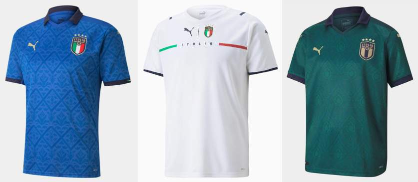
Primary: blue with sublimated “Renaissance” design
Secondary: new Puma template, white with team name between single thin green and red stripes
Third: dark green with sublimated “Renaissance” design
Kyle: Love the classic blue and I think these patterns qualify as a good use of sublimation in the design! Extra love for the collars as well.
CJ: I’m not sure I’m a fan of the “Renaissance” bit, but it could be worse. I’m sure it will be hard to see on the field. Collar is good.
Switzerland
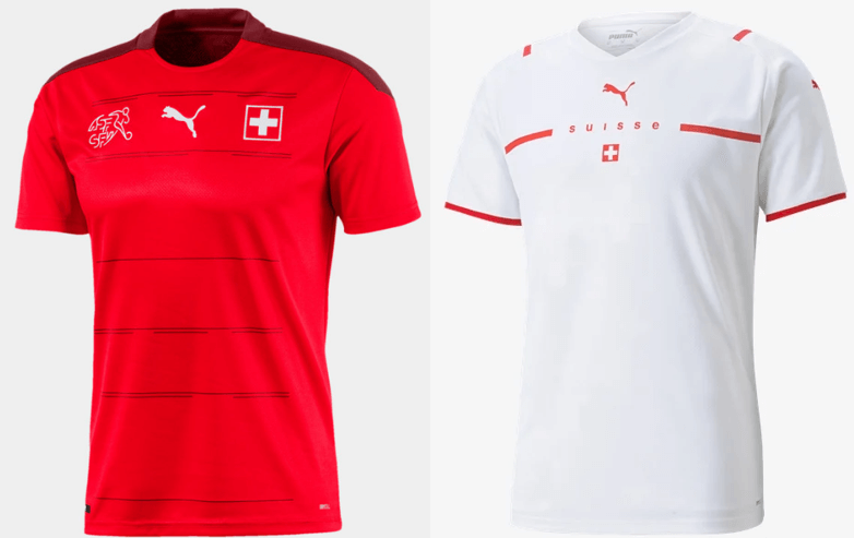
Primary: red with thin dark horizontal stripes
Secondary: new Puma template, white with team name breaking a red horizontal stripe
Kyle: The Swiss have looked better, but these will do. The white is fine on its own but doesn’t stand out when other countries share the same template.
CJ: A wonderful reminder of the international teams template issue. Why does branding get just as big as the team indicators here?
Turkey
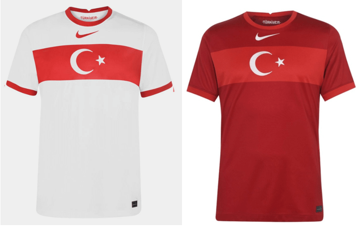
Primary: white with red horizontal stripe containing white crescent and star from flag
Secondary: dark red with matching flag design
Kyle: I love the use of the country flag which makes the centered maker’s mark feel even more off-putting.
CJ: Just like the Swiss, it feels like the branding is the real delineator of which team is which. I do like the flag usage.
Wales
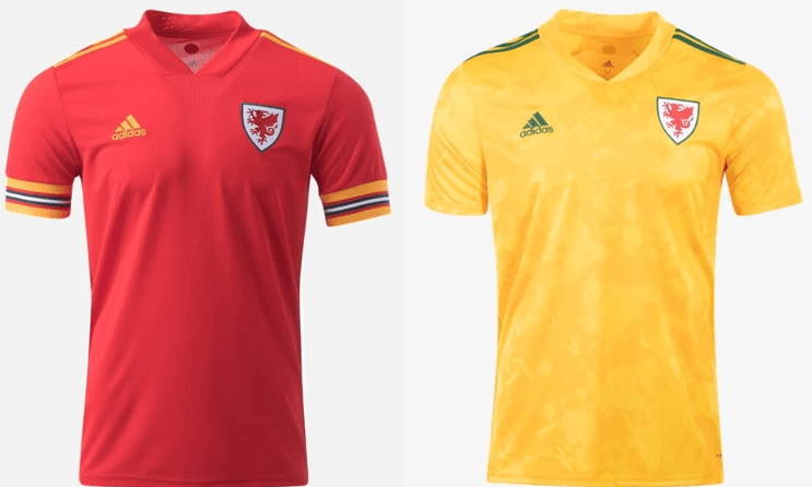
Primary: red with yellow/red/black/white striped sleeve cuffs
Secondary: yellow with green accents and sublimated pattern
Kyle: These are lovely and I don’t think we see enough cuff striping like this!
CJ: Give me more cuffs! Fantastic look.
Group B
Belgium
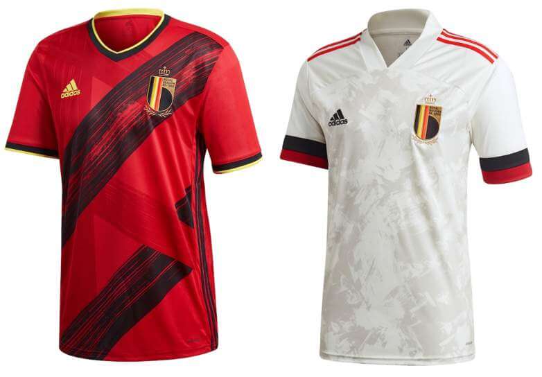
Primary: red with black and red “brushstrokes” that form a letter B
Secondary: white with black/red sleeve cuff stripes
Kyle: Wow. The red is simply stunning and Belgium might deserve the top ranking not only for their play, but for their look as well.
CJ: Kyle might be going a bit far, but these are very good and eye-catching in a way that isn’t offensive.
Denmark
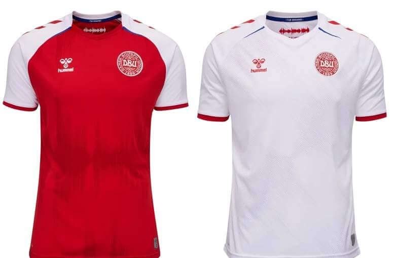
Primary: red with white shoulder stripe
Secondary: White with red accents
Kyle: Fairly standard but a solid set of jerseys.
CJ: Yup, it’s Denmark.
Finland
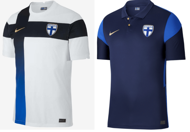
Primary: white with navy/blue gradient cross
Secondary: navy with blue shoulder stripe
Kyle: I will always love flag-based designs, although the gradient takes a bit away from that and the secondary looks like a golf shirt to me.
CJ: That secondary might as well be coaching gear. Strange dichotomy here. Minus points for the gradient, too.
Russia
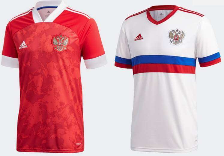
Primary: red with white sleeve cuff stripe (note: sleeves were originally blue/white but the team refused to wear them due to the similarity to the Serbian flag)
Secondary: white with blue/red horizontal stripe and sleeve cuff stripes
Kyle: Sublimated “blotches” aside these are great, especially the white.
CJ: Agree with Kyle here, though the primary could be a little better perhaps.
Group C
Austria
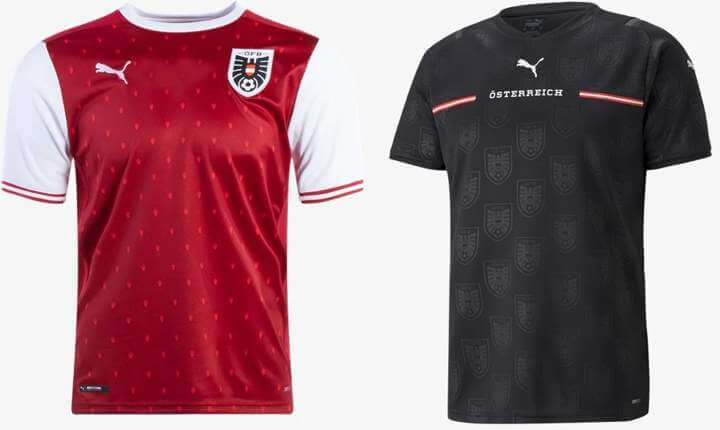
Primary: dark red with white sleeves and a “Vienna art” inspired pattern
Secondary: new Puma template, black with sublimated team crest pattern and name breaking a red horizontal stripe
Kyle: Yes to the primary and no thank you to the black and sublimation crest pattern.
CJ: Art isn’t a bad inspiration, but that secondary is just too much for me.
Netherlands
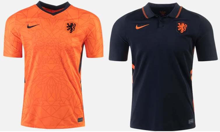
Primary: orange with geometric lion pattern and black accents
Secondary: black with orange accents and a collar
Kyle: Beautiful designs for the Dutch and a collar appeal to CJ!
CJ: That collar needs some contrast, though! Not too bad overall.
North Macedonia
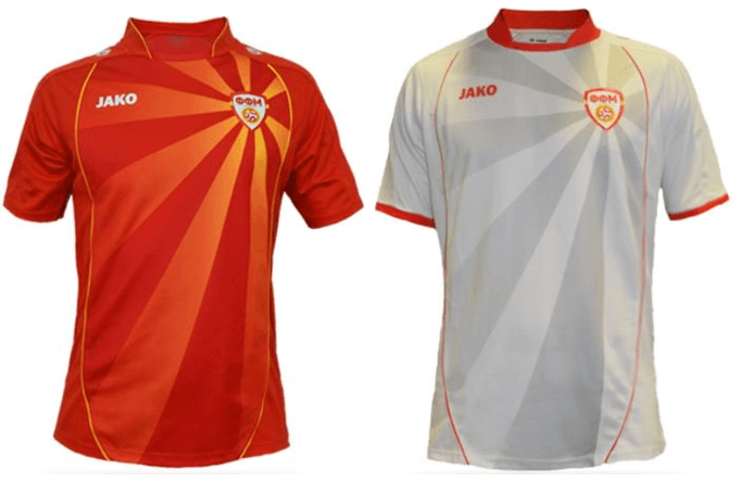
Three new jerseys were recently unveiled and the primary was met with extreme backslash due to the color and immediately pulled. The primary will be the kit worn since 2016 and the other kits may or may not be the new ones.
Primary: red with yellow sun pattern (based on country flag)
Secondary: white with gray sun pattern
Kyle: A PR disaster (to say the least) with the new reveal, but just based on design the old kits do a nice job incorporating the flag.
CJ: Gradient could be worse but I suppose I shouldn’t complain about flag usage.
Ukraine***
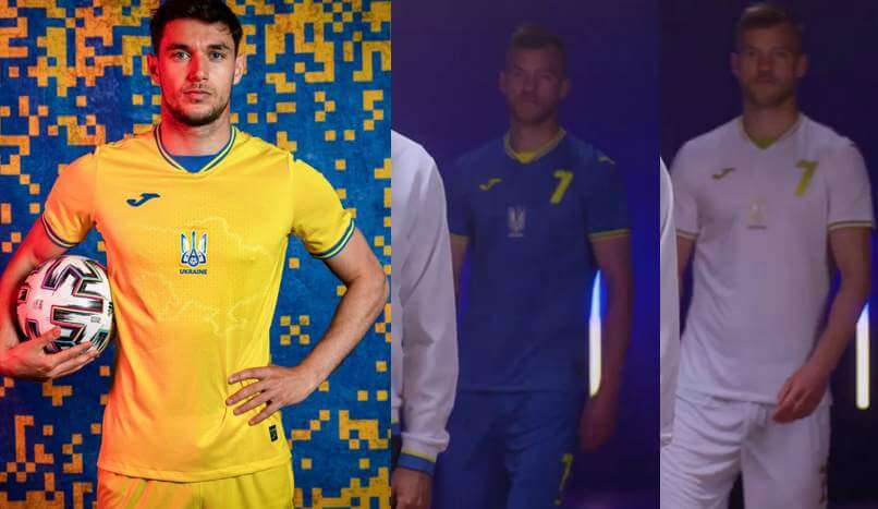
Recently revealed and covered here on the site, Ukraine’s new jerseys caused political controversy over the inclusion of Crimea in the sublimated country borders and nationalistic phrases on the back and inside of the jerseys.
*** (Just before press time, but after Kyle & CJ sent in their preview, UEFA demanded changes to Ukraine’s kit tops, so these jerseys will be altered in time for the Euro — PH)
Primary: yellow with blue accents
Secondary: blue with yellow accents
Third: white with gold accents
Kyle: The kits look nice, but the political statement is what truly stands out here.
CJ: Visually simple, politically complex.
Thanks guys! We’ll be back with the second part of this tomorrow, when we look at the remaining kits.


Guess The Game…
from the scoreboard
Today’s scoreboard comes from Deborah Shoshlefski.
The premise of the game (GTGFTS) is simple: I’ll post a scoreboard and you guys simply identify the game depicted. In the past, I don’t know if I’ve ever completely stumped you (some are easier than others).
Here’s the Scoreboard. In the comments below, try to identify the game (date & location, as well as final score). If anything noteworthy occurred during the game, please add that in (and if you were AT the game, well bonus points for you!):
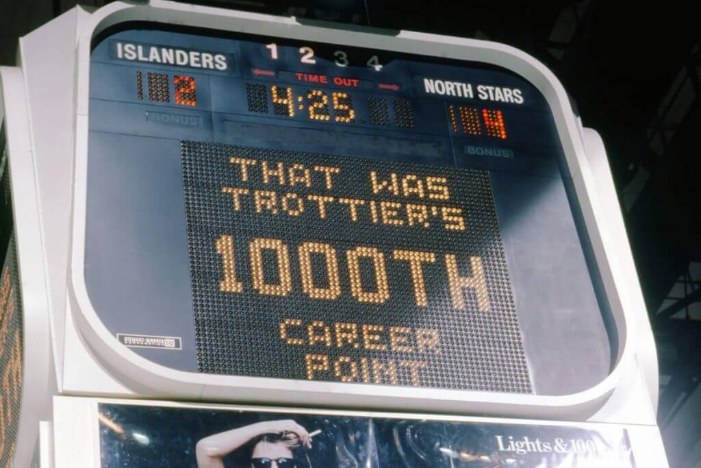
Please continue sending these in! You’re welcome to send me any scoreboard photos (with answers please), and I’ll keep running them.
Click to enlarge
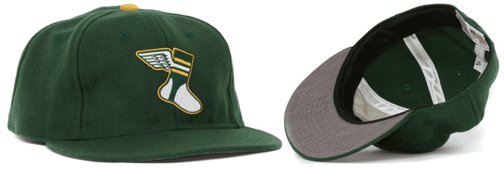
Important Uni Watch cap news: Paul here. In case you missed it on Friday, I recently got in touch with Ebbets Field Flannels to order some new Uni Watch cap inventory. But they told me that they no longer had access to the green wool fabric we’d been using for our caps. They sent me samples of two potential replacement fabrics, but both of those were much darker than the fabric we’ve been using and didn’t feel right to me. So I won’t be getting any more caps from EFF, at least for now.
That means the caps we currently have on hand will be the final inventory of this product. Adjustables are sold out but we currently have small quantities of all fitted sizes from 7 through 8. If you want one (or more than one), get your order in now — once they’re gone, they’re gone!
I haven’t yet decided if I’ll to seek out a new cap supplier or if I’ll just get out of the cap biz. Either way, I won’t make that decision until we’ve sold out of the EFF caps, so get ’em while you can and then we’ll decide about whether there’ll be a new chapter of Uni Watch headwear.
Now back to Phil!
Uni Tweet of the Day
That must be one hell of a good luck bat…
Did @KPILLAR4 really go yard TWICE last night using the bat from when he got drilled in the face?? #LGM pic.twitter.com/gq66eNa0gv
— We Gotta Believe Podcast (@GottaBelievePod) June 10, 2021
And finally… that’s all for today — sorry there’s no ticker, but as explained above, I needed to pre-load this Friday morning. Why? That’s because I’m finally opening up the family summer place today — technically, I left yesterday, but due to some scheduling problems, the cable/interwebs guy won’t arrive until sometime this morning (or early afternoon), so while physically there yesterday, I had no access to any tv or internet yesterday (and hopefully there will be no problems today). Assuming all goes well, I’ll be back with a full post tomorrow (and also hopefully the first sunset photo of the year). Sorry about this — I try not to have “interrupted” weekend posts, but with no Internet until today, it is what it is.
Everyone have a good Saturday and I fully expect to be back with you guys tomorrow!
Peace,
PH
Scoreboard – Jan 29 1985, Minnesota at NYI, Tied 4-4. Trottier’s 1000th point.
As great as it would be, Pillar said it wasn’t blood on the bat, just pine tar.
link
Just as an FYI-
The third kits won’t be used at the Euros. UEFA only allowed each country to register 2 kits.
And the Puma template for their countries looks ridiculous.
“lack of advertising”
The kit manufacturers are the advertisers, especially the huge Nike swoosh and the Puma template.
Kyle: These are lovely and I don’t think we see enough cuff striping like this!
CJ: Give me more cuffs! Fantastic look.
Jim: Nice KC Chiefs vibe from that Wales primary…I’d wear that!
Baseball needs to bring back sleeve cuffs, too.
Belgium might deserve the top ranking not only for their play, but for their look as well.
I usually give them high uni marks, but this year…I’m not feeling it. Not bad, not great.
This is a nice matchup against Russia today, though.
Just for clarity, the talking heads at UEFA said that Ukraine’s jerseys would have to remove the phrase “Glory to the heroes,” which originates from military use in the country and has become a national salute. The map with Crimea was allowed…
Yikes. So if Canada invaded Alaska and their military occupied it, USA should just remove Alaska from their maps? Same thing what happened to Ukraine.
Great point
Regarding Swiss Euro secondary kit, is it unusual to for it to read “Suisse” ? What about the German-speakers (“Schweiz”) or Italian-speakers (“Svizzera”) ?
“Helvetia” would have been the most language-neutral.
Switzerland always seems to be labelled as “Suisse” in any international competition (Olympics, FIFA, curling, whatever), as long as I can remember. It probably comes from the Olympics, where English and French are the officially used languages. The country abbreviation SUI obviously comes from the French and it probably just stuck for everything.
Really burying the lede with Austria’s secondary kits, imo.
link