For all photos, click to enlarge
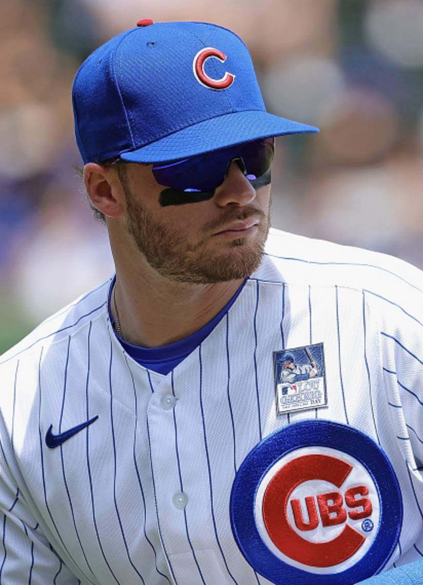
Yesterday was Lou Gehrig Day across Major League Baseball. We’d known for a while that all teams would be wearing a jersey patch to honor Gehrig and raise awareness of ALS. But it was never clear, at least to me, if the patch would worn on the sleeve or on the chest. As you can see above, it turned out to be the latter.
The photo above shows how the patch looked on a pinstriped white home jersey with a lot of white space and a color scheme that matched the patch’s colors. But how did the patch look on a home jersey with a script, or a road grey jersey, or on one of the best jerseys in all of baseball, or a jersey with colors other than red and blue, or on a powder blue jersey, or a navy jersey, or a jersey with an insanely upward-angled script, or a jersey with shamefully misappropriated Native American iconography?
Here are the answers to all of those questions:

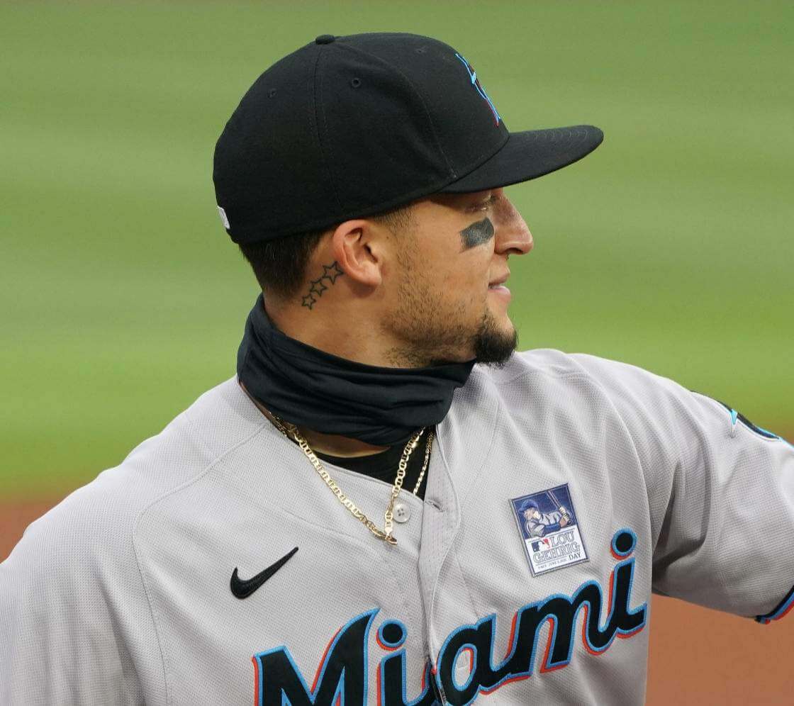


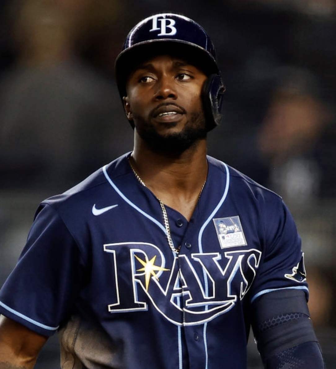
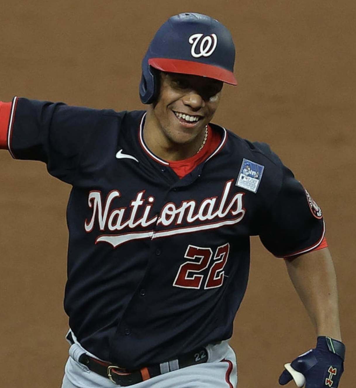
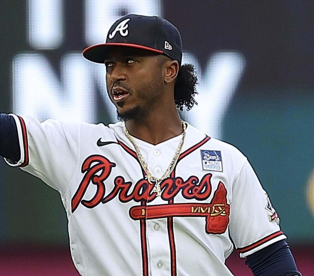
Generally speaking, I think it looked pretty bad. As we’ve discussed before, square and rectangular patches are clunky to begin with, all the more so when they’re positioned on the chest instead of the sleeve. Moreover, the patch’s busy design and outline font made it impossible to read during game action (and even in some of these still photos).
MLB knew all of that, of course. So why did they create an over-designed patch and put it on the chest instead of the sleeve? This is just a hunch, but I think what we’re seeing here is another case of the tail wagging the dog. Just as some uniforms are created mostly due to merchandising considerations, I think this patch was probably geared to appeal to people who bid on game-used jerseys. It was designed and positioned to look good displayed on someone’s wall, not on the field. (I’m pretty sure the auction proceeds for yesterday’s gear will be going toward ALS research, so I’m not accusing MLB of profiteering here. Just saying that the design may have been driven more by off-field considerations than on-field considerations.)
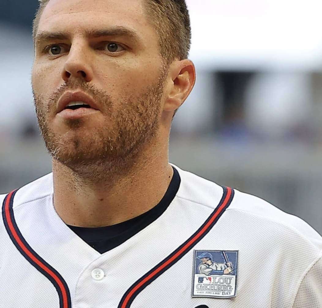
You’d think the patches would have been sewn on, but it looks like they were just ironed on. Atlanta first baseman Freddie Freeman’s patch was already starting to peel off in the first inning:
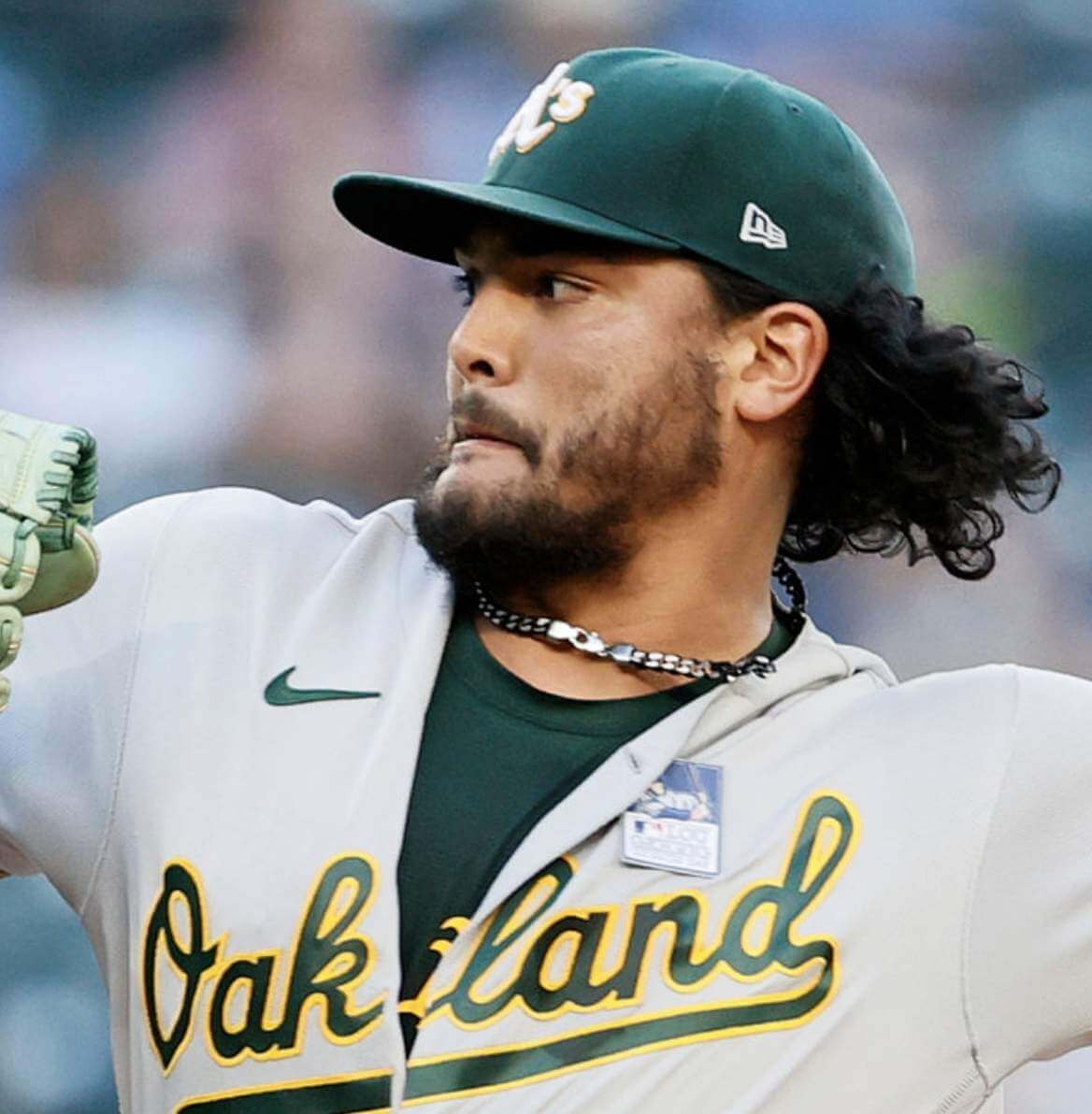
A’s starter Sean Manaea had trouble with his patch as well. It was already looking loose in the first inning:
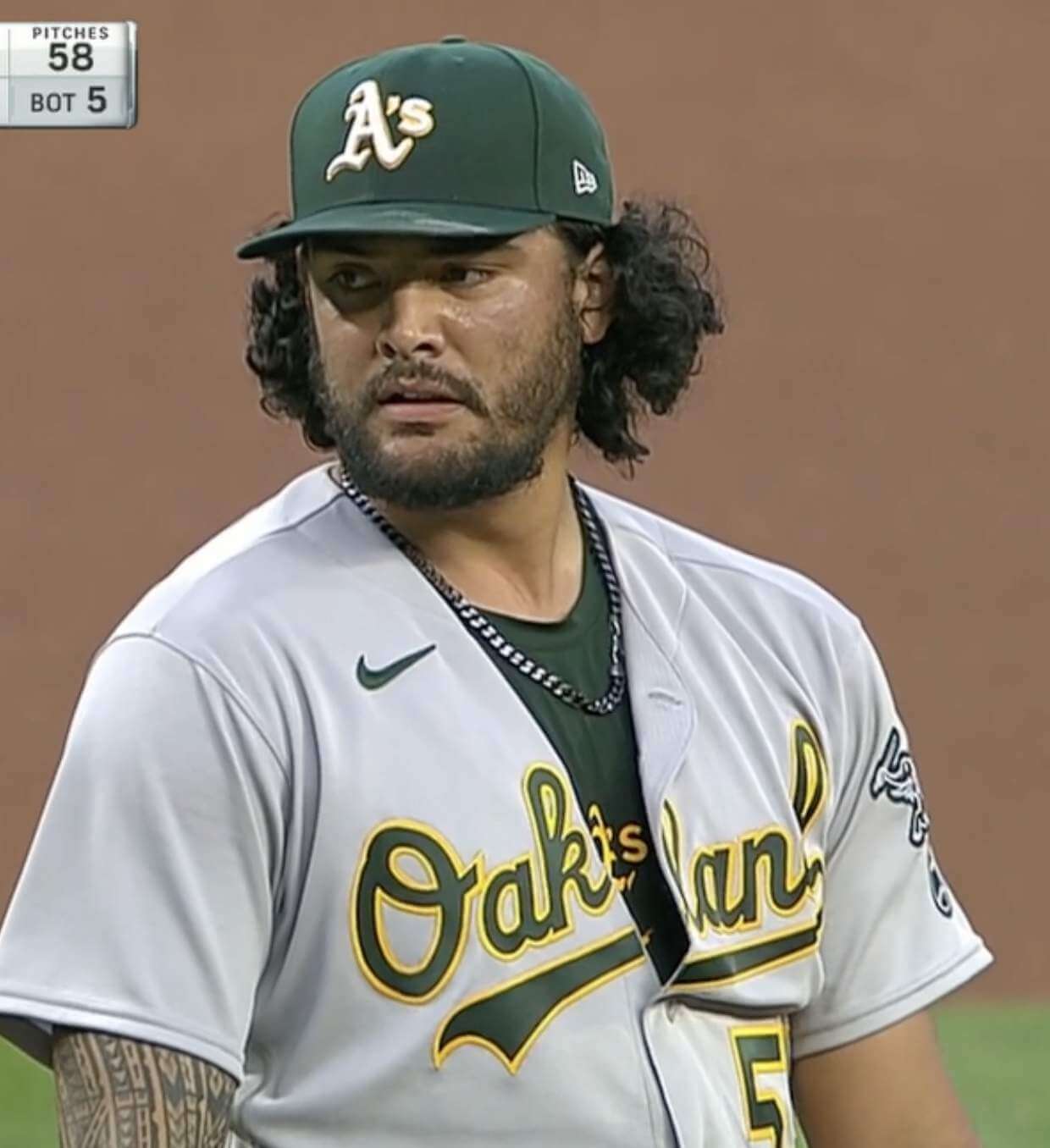
By the fifth inning, his patch was gone. Manaea ended up pitching a complete game, so he went four innings with the patch and five without:
Some additional notes from yesterday’s games:
• Some players wore big elbow pads (hey, just like Gehrig used to wear!) emblazoned with Gehrig’s face:
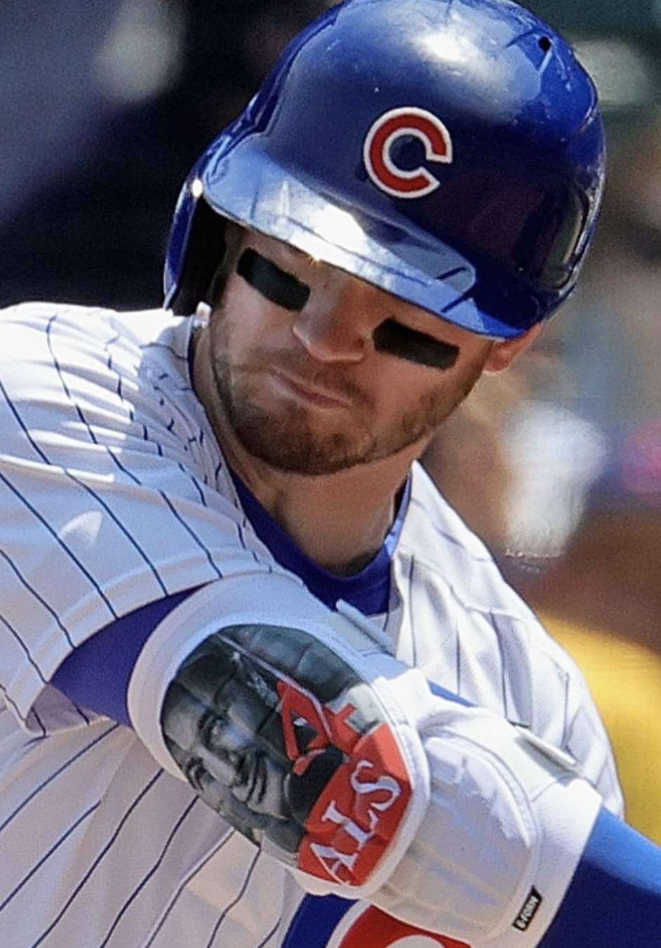
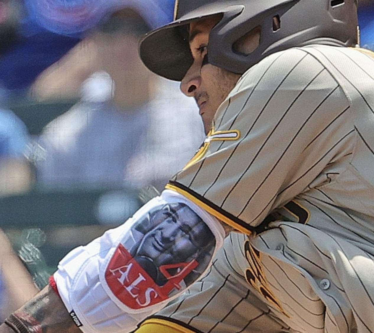
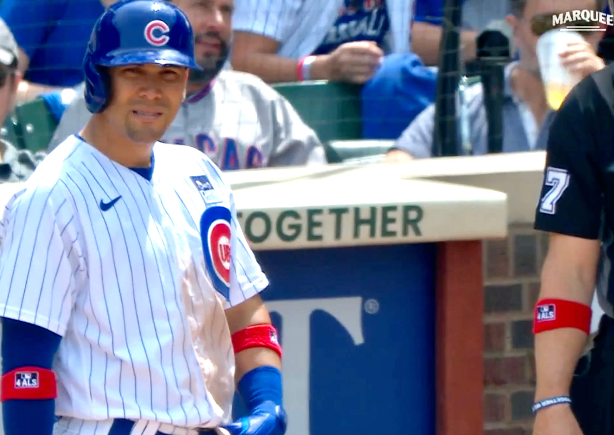
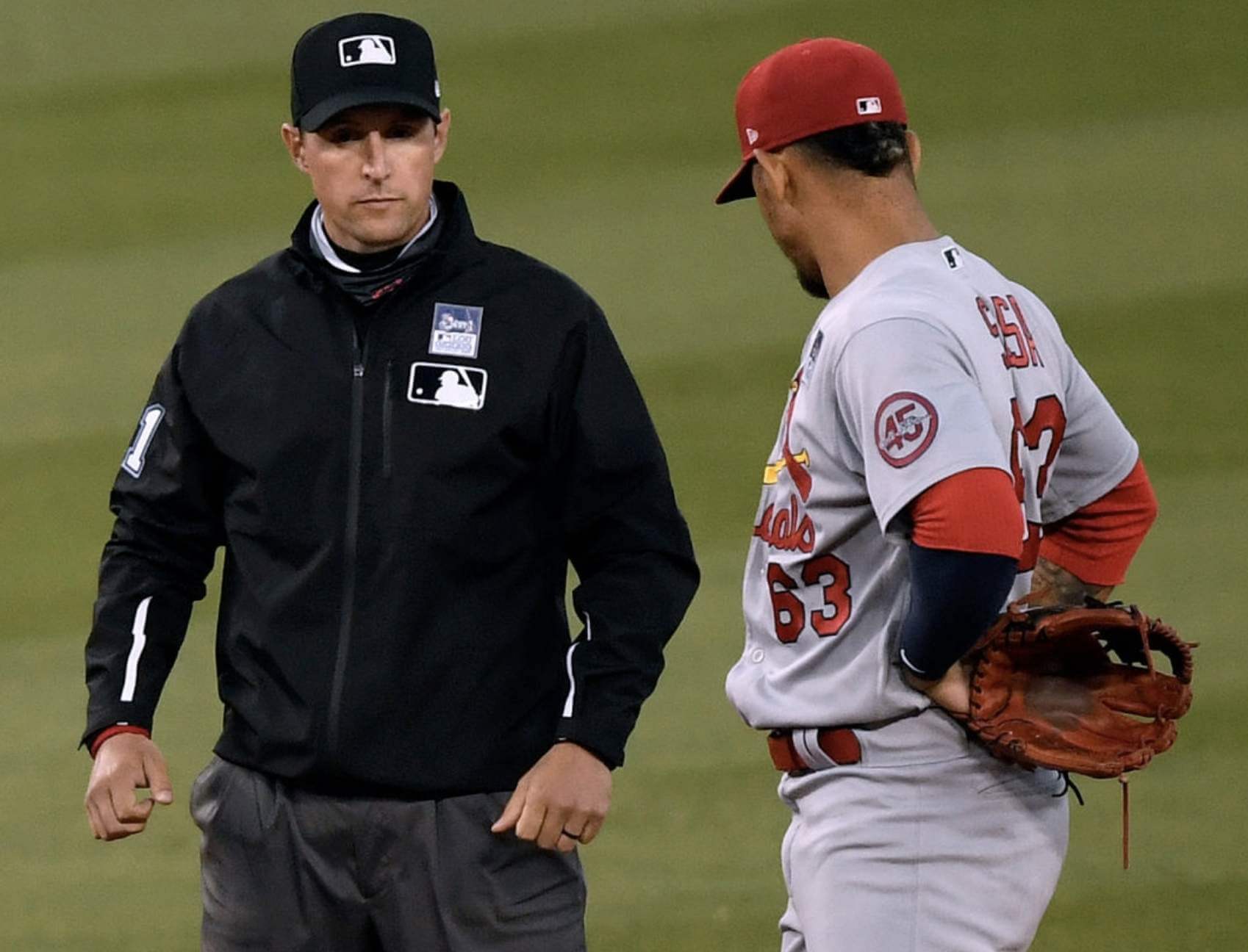
• Some players wore red “4 ALS” wristbands. The umpires wore these as well, and they also wore the jersey patches:
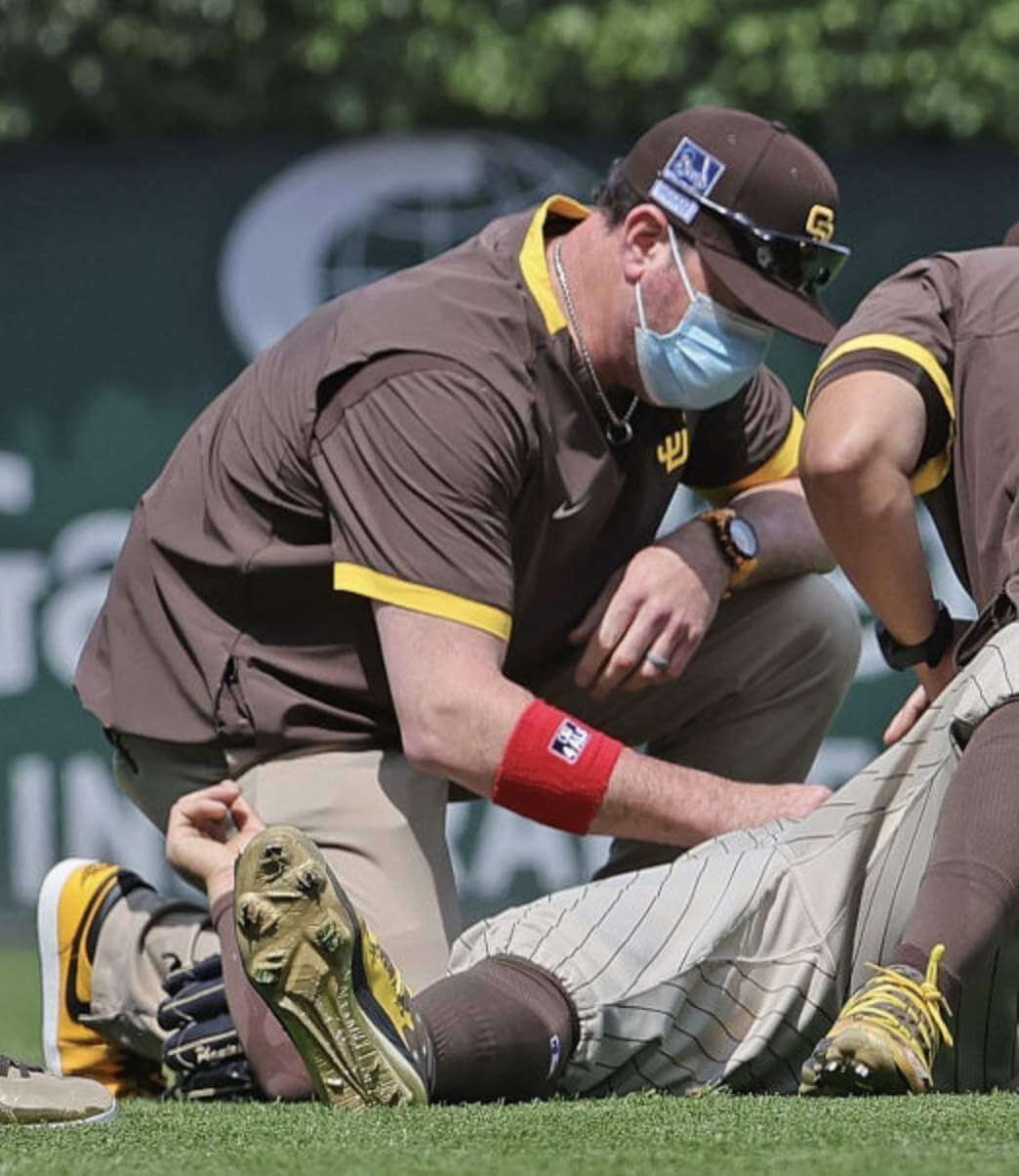
• There were no cap patches yesterday — at least for the players. But a Padres trainer apparently had one of the jersey patches applied to his cap (and also wore one of the wristbands):
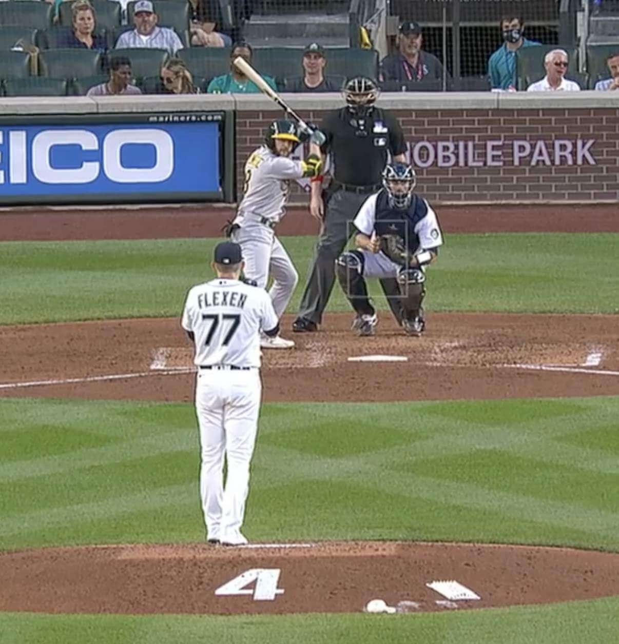
• At least one team — the Mariners — put Gehrig’s number on the back of the mound. Oddly, they didn’t use their own number font or the font that Gehrig wore. Instead, they used a seemingly random stencil font:
Teams that didn’t play yesterday will wear the patch today. Since the patch includes the date “June 2,” that means they’ll be wearing the wrong date on their chest. Sigh.
Click to enlarge
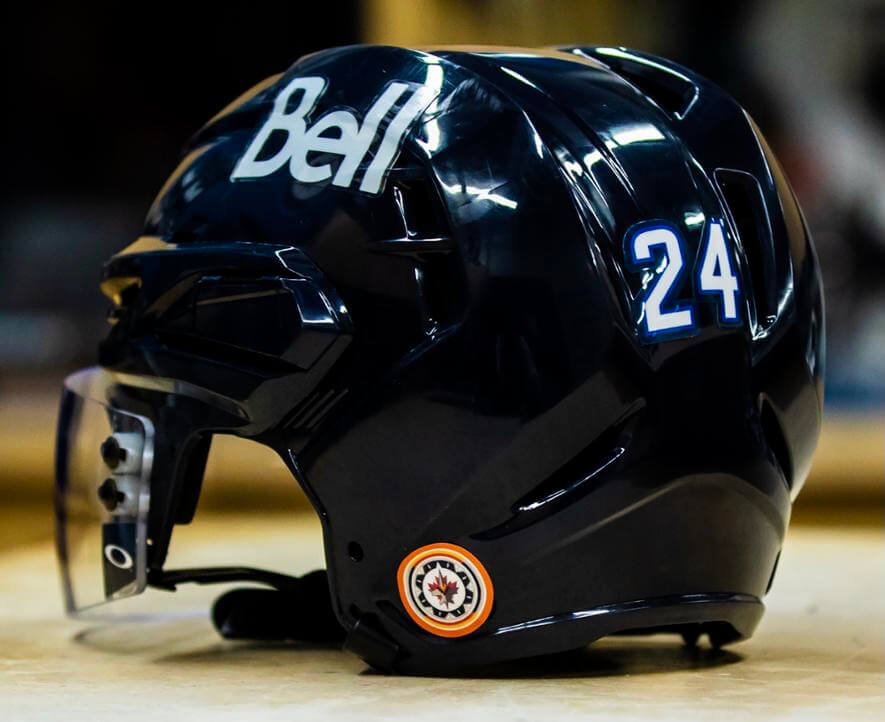
Meanwhile, over on the ice: Last week a mass grave containing the remains of 215 Indigenous children was discovered in western Canada. In response, the Jets announced yesterday that they’re adding a new helmet decal featuring an orange-bordered version of their Indigenous logo. Orange is the color symbolizing the lasting impacts of residential schools among Indigenous peoples.
With the Jets beginning a new postseason series against the Canadiens last night, the Habs showed support by adding an orange-bordered helmet logo of their own, as seen here on the backplate of goalie Carey Price’s mask:
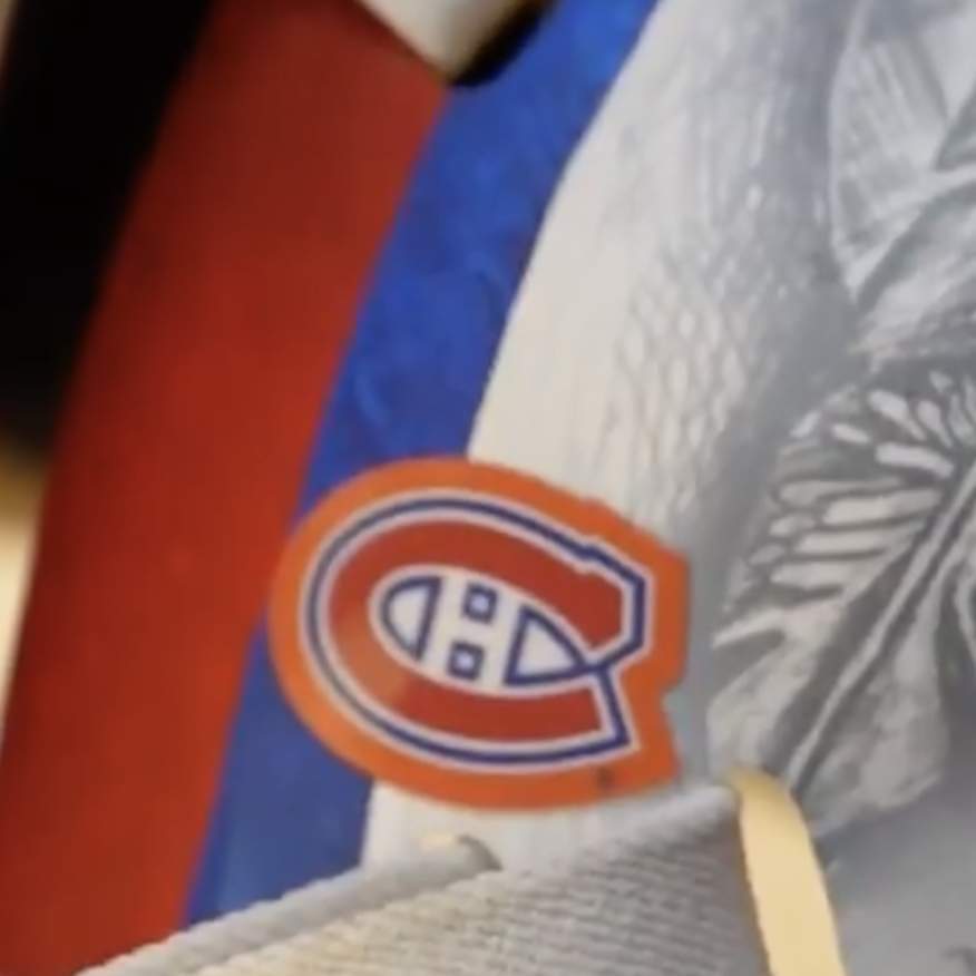
The Jets said they’ll be wearing their decal for the rest of the Stanley Cup playoffs. It’s not yet clear, at least to me, how long the Montreal decal will be worn.
(My thanks to Moe Khan for bringing this one to my attention.)
Click to enlarge
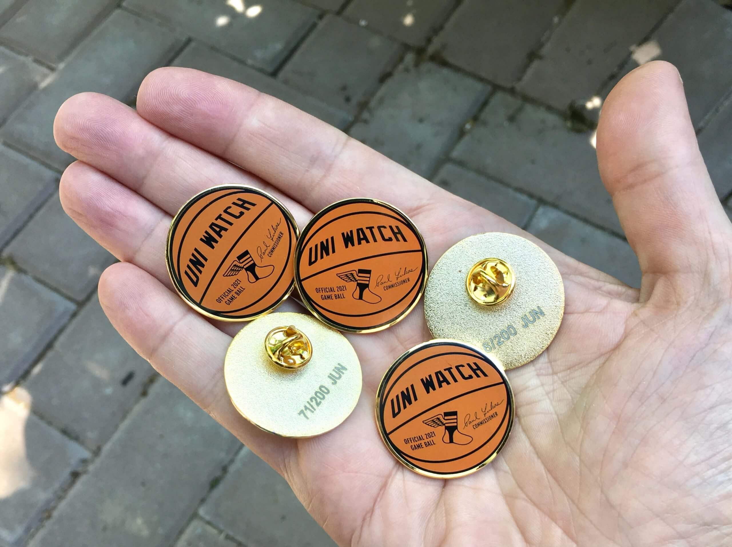
June pin reminder: In case you missed it on Tuesday, our June pin is now available. With the NBA playoffs in full swing, we’ve decided to go with a basketball theme this month. Our “Official Uni Watch Basketball” pin — similar to the baseball pin that we did in April of last year — comes with my signature and is also the first pin we’ve ever done that doesn’t include green!
This pin is available in a numbered edition of 200. As of this morning, there were about 80 remaining. You can order yours here while supplies last. My thanks, as always, for your consideration of our products.
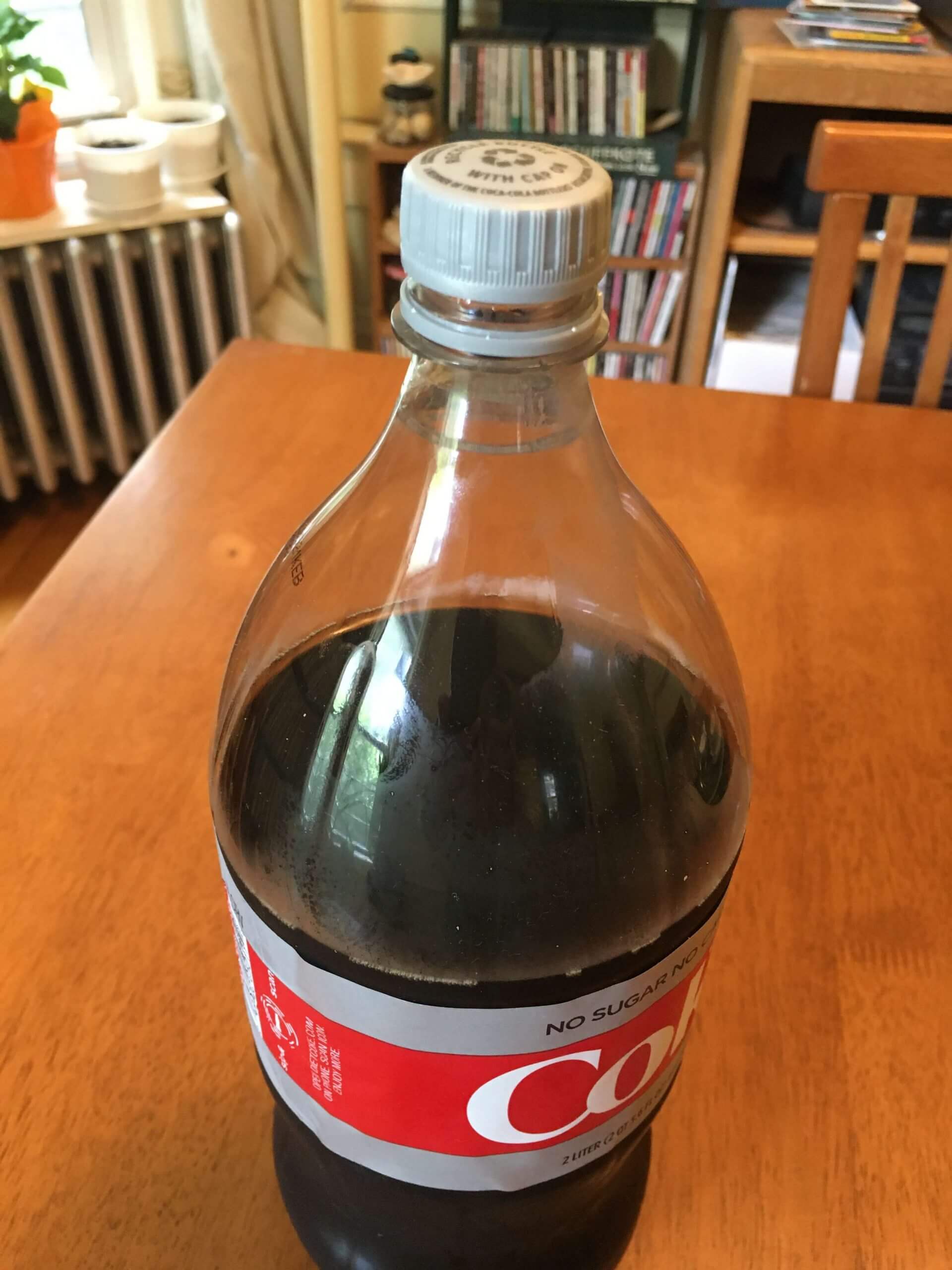
Inconspicuous consumption: We’re all familiar with the tamper-evident caps on plastic soda bottles. When you unscrew the cap for the first time, there’s a bit of resistance and then the little breakaway band gives way.
I recently noticed that the caps on my Diet Coke bottles started offering much less resistance before the breakaway band released. Almost no resistance, in fact — I’d just unscrew the cap and the band would release, almost like it hadn’t been attached to the cap to begin with. The first time this happened, I thought, “Hey, has this bottle been opened before?!” But then I realized that it was the same for every cap. Mary says it’s the same for her seltzer bottles.
Has anyone else noticed this on their beverage bottles?
The interesting thing about this, aside from the apparent adjustment to the cap design (they’ve presumably reduced the number of contact points between the cap and the band and/or reduced the strength of those points), is how strongly I had internalized the sensation of the cap offering that momentary bit of resistance, and how odd it now seems when that resistance is missing. I’m sure there are countless other subtle physical experiences that we internalize without realizing it. Classically inconspicuous.
The Ticker
By Paul

Baseball News: July is National Hot Dog Month, so the Portland Sea Dogs will become the Maine Red Snappers for their game on July 24 (from MattyG2k10). … Here’s a behind-the-scenes account of the development of the White Sox’s new “Southside” uniform. … Yesterday’s Ticker had an infographic showing all the College World Series jerseys; today we have a version with the caps. … Following up on an item from yesterday’s Ticker, Diamondbacks broadcaster Bob Brenly has apologized to Mets P Marcus Stroman and will seek sensitivity training after cracking a joke about Stroman’s do-rag during Tuesday night’s game. … The Jersey Shore BlueClaws will wear Pride Night uniforms tomorrow (from John Cerone). … Reds 1B Joey Votto is on a rehab assignment with the Louisville Bats. Here’s how he looks in their uniform (from Coach_KT).

NFL News: The Jaguars chipping in to help provide new football uniforms for a bunch of Duval County, Fla., schools that have changed their names due to their original names being connected to the Confederacy or other problematic situations (from Timmy Donahue).
College Football News: New turf in the works for Charleston Southern (from @willchitty4). … Lamar University is moving from the Southland conference to the WAC and has updated its turf with its new conference logo (from Kary Klismet).

Hockey News: New logo for the SPHL’s Peoria Rivermen.

Basketball News: A new French book looks at 150 iconic NBA jersey designs. … Here’s a feature on the Suns’ original Gorilla mascot, who debuted in 1980 (from Kary Klismet). … Also from Kary: This story explains how the University of Idaho’s new basketball arena will be built from mass timber derived from the school’s own research forest to create an environmentally sustainable design. … The Pistons will have a new jersey advertiser next season (from Clark Williams).

Soccer News: “Here’s something I missed from last season,” says our own Jamie Rathjen. “Members of Watford’s women’s team chose numbers based on ‘personal significance’ related to Black history or BLM. As a result, there were relatively a lot of high numbers (which I’d define as 30 or over for soccer), as some seemed to be references to years.” … Also from Jamie: “Last weekend at the women’s DFB-Pokal (German Cup) final, there were rainbow federation logos on the officials’ shirts and the corner flags. The winning club, VfL Wolfsburg, routinely has its captains wear rainbow armbands.” … New home kit for Stoke City and new away shirt for Celtic (both from Ed Zelaski). … Gross: Kids’ travel soccer teams in Arlington, Va., will now wear the Amazon logo on their jerseys. … The FIFA 2021 video game has added throwback kits from MLS’s 1996 inaugural season (from Kary Klismet). … Fan reaction to North Macedonia’s new kit was so intensely negative that the team wore its old design in a friendly against Slovenia on Tuesday. … New home kit for third tier English side Crewe Alexandra (Ed Zelaski again).

Grab Bag: A Burger King customer allegedly complained that an employee’s uniform was distracting her husband. … The U.S. Army is investigating an officer who engaged in partisan political activities while in uniform. … Meanwhile, a U.S. Air Force airman substituted the Gadsden flag for the American flag on his uniform without authorization. … The logo for the newly merged entertainment firm Warner Bros. Discovery has been widely ridiculed online. … New French Open sneakers for Serena Williams (thanks, Brinke). … New athletics logo for Saint Mary’s University in Halifax (from Wade Heidt). … Western Michigan University is defending its decision to cut down on the use of its bronco logo (from John Chapman). … The latest ESPN Daily podcast is about the Mascot Hall of Fame (from Andrew Cosentino).
Typo… “off-fiend considerations”
Thanks. Fixed.
I’ve noticed that on Dasani water bottles and the first time I threw out the water as I thought it was already opened and tampered with but I’ve purchased many since and noticed the same thing.
Those Pride Night jerseys are for the Jersey Shore BlueClaws, not Southern Maryland, which are the Blue Crabs.
Thanks, Keith. Fixed.
Still not quite right. It should read “Jersey Shore BlueClaws”, not “Blue Crabs”.
Gah! *Now* fixed.
Given that most framed collectors jerseys I have seen have the sleeves folded in such a manner that they are clearly visible, (and also typically show the back with the number/name) I am thinking that was not the motive for the location of this patch.
It seems to me this is preparing everyone for ads to intrude on that space (if you don’t already consider the Nike mark an ad).
Anything on the front of a baseball jersey looks so clunky and out of place, be it a memorial or ad. If they throw ads there it will make the NBA’s billboards look quaint in comparison.
The correct terminology is Athletic Trainer, not Trainer.
I haven’t noticed anything with bottle caps, but maybe it’s just Coke and Coke-affiliated products?
Nope. As noted, Mary’s seltzer bottles (which are not Coke-affiliated) have the same phenomenon.
Maybe those are from a bottling plant/facility that also bottles Coke products? There can be some strange soft-drink owned/operated/bottled scenarios…
The most noteworthy thing in the Lou Gehrig section is that in the year 2021 a pitcher actually threw a complete game!
Maybe they’ll have a patch for that, too.
Manaea ended up pitching a complete game
(using the same voice Linus did when he found out they still make wooden Christmas trees)
Gee, they still pitch complete games?
Some players wore red “4 ALS” wristbands.
I’m personally against ALS, not 4 it…
I know what they meant, but they could have done a little more work on this idea.
New turf in the works for Charleston Southern
Nice to see they threw a bone to the people on the other side of the field and put one of the Big South logos “upside down.”
I’d like to propose a UW contest: design a field (or hoops court) that looks good no matter where you sit in the stadium, yet still looks good on TV.
Lamar University is moving from the Southland conference to the WAC and has updated its turf with its new conference logo
No link to this item.
Lamar story:
link
The Phoenix Suns used to have a court with a giant ambigram logo. The one example I can think of.
Seattle Center Coliseum (before the mid 90s), Nebraska and Ohio State football in the 80s are other examples off the top of my head.
And “SUnS” spells Suns from either side, since the capitalized N is really a lower-case n that they use.
I loved in the early days of the Big 12 how they had XII on one side of the field for the new conference and IIX on the other side to honor the legacy of the Big 8.
Such a classy use of Roman numerals.
Paul, please do something on Coach K’s pending retirement. To me, one of his legacies will be BLACK-mailing every other Duke team into wearing BFBS.
With regard to the Lou Gehrig Day patches, as I was watching baseball (Red Sox primarily) last night I could not “unsee” the patch as a “Hello My Name Is” sticker that one might wear at a networking conference or convention given its position on the chest, the classic rectangle shape, and the finer details being lost when viewing from a distance.
If I don’t hear the “pop” on a jar of some kind of food when I twist it open, I worry about it until I’m done eating it.
Not trying to play gotcha and not a fan of Amazon’s increasing presence in Arlington/Alexandria with HQ2, but isn’t this more a case of them actually sponsoring these youth teams instead of just advertising?
Right. I’m not sure why this is “gross”, it seems like a mutually beneficial arrangement between Amazon and the Arlington soccer team. A quick Google search reveals that membership dues for such teams can run as high as $6,000 per year so I’d imagine if such costs can be absorbed by a sponsorship instead of passed on to parents it greatly expands the opportunities for kids to play.
I can only guess that the main objection is that the sponsorship is being done by a huge company that is already well-known and not a local mom-and-pop hardware store. But I’m sure Amazon is going to be able to offer more money than almost anybody else, so who can blame the soccer organization?
Amazon could donate money to sponsor youth sports team in Northern Virginia and not splash its logo all over the backs of the jerseys. They could still get a big fat tax deduction for it and probably still get plenty of publicity for it – and opportunities to feature their logo in other ways that make it quite obvious that they sponsored these teams. So yes, the Amazon logo on the kids’ uniforms is advertising, and yes, it’s gross.
Fair enough. I guess it can be gross advertising no matter what, but gives me pause since there is a long history of organizations sponsoring youth teams/leagues and getting their names on the uniforms as a result. Probably just a case of being used to it given the precedent. I never liked sponsors/advertisers on the uniforms I wore.
It feels qualitatively different when when local businesses sponsor youth league teams, even when that includes putting their logos on the teams’ uniforms. In that instance, a company that’s situated in the community is declaring itself a partner with local activities and organization that help enrich that community, and does so using means that are more affordable and readily available to it than more prominent forms of advertising available to big corporations.
Maybe that distinction is insignificant to some. And I’m not saying it’s a perfect solution, either. But I’m more forgiving of it when it operates as a social transaction within the confines of that community than when a large multinational corporation uses its financial might to turn kids’ uniforms into billboards. I wouldn’t complain if youth leagues don’t take the advertising dollars, though. My t-ball team featured ads from a couple of local businesses on the back of our t-shirts, but the Pony League team I played for when I was older had full uniforms (pullover jerseys, sansabelt pants, stirrups and everything) that were ad-free). I always liked the ad-free unis better.
the University of Idaho’s new basketball arena will be built from mass timber derived from the school’s own research forest to create an environmentally sustainable design.
Sounds nice in theory. Wouldn’t it be more sustainable for them (and their football team) to continue sharing the glorious Kibbie Dome?
link
In a world where companies shrink their label printing to microscopic levels to save on ink and reduce the number of contact points on a bottle cap to save on plastic, I find it hard to justify sports teams of any level (in this case, not a very high level) to insist on having their own individual facilities. It’s nice to share!
“Sounds nice in theory. Wouldn’t it be more sustainable for them (and their football team) to continue sharing the glorious Kibbie Dome?”
Reasonable question! I’ve never been there, but I have been to its downstate twin, Holt Arena, in Pocatello:
link
It seems to me that giant Quonset huts would be hard to beat in terms of practicality, functionality, and energy efficiency, but I’m not an environmental engineer – or any kind of engineer, for that matter – so what do I know?
You have to admit, though, Idaho’s new arena will look pretty cool:
link
As much as I like the Kibbie Dome, the new arena probably wins a beauty contest.
Personally the pop bottle thing I think might be also partially with a material change for the smaller lids and the brands more planet friendly branding “x% post consumer waste!”
My favorite thing about the smaller caps that use less material is the “choking hazard” warning that now adorns the label on some of those beverages.
Nick Pivetta’s patch was also having issues – my first though was they must have used scotch tape to put these patches on, they look like they’re all falling off.
Honest question: I may be having a slow-brained morning, but what “racist undertones” were perceived in the comments made about the do-rag? The quote was, “Pretty sure that’s the same do-rag that Tom Seaver used to wear when he pitched for the Mets”. I didn’t see the game or hear the comment, so I’m not entirely sure what the comment was intended to mean (like, was it a really old looking do-rag, or was he sarcastically suggesting Tom Seaver would not wear one?) so I’m not grasping why folks are questioning the comment. Is it simply a white announcer commenting on the looks of a non-white player?
(like, was it a really old looking do-rag, or was he sarcastically suggesting Tom Seaver would not wear one?)
The latter.
Is it simply a white announcer commenting on the looks of a non-white player?
It’s a White announcer commenting on an aspect of Black culture and “humorously” comparing it, unfavorably, to a the look of a White icon.
I’ve interviewed Bob Brenly and really enjoyed interacting with him. Do I think he’s a racist? No. Do I think that he, like many of us (including myself), may have internalized certain biases and predispositions that reflect a certain assumed racial and cultural hierarchy? Yes.
Thanks Paul. I was just confused. The story about it didn’t spell that out. I suppose that’s a personal bias in and of itself: I kept reading the quote and simply wasn’t grasping how it was taken, etc.
I’m still a bit confused on the offense.
Reminds me of an incident on the TV Reality Show “Survivor.” Lots of contestants wear their team colored buffs on their heads and one time a white contestant commented on a black contestant wearing their buff like a do-rag. The black guy sat the white guy down and explained how he was offended by his remark and how his lack of understanding on the cultural and historical significance made it a hurtful remark.
I wasn’t sure what he meant but I decided that as an ignorant white guy that I should just never use the word “do-rag.” It’s been a good rule of thumb in my life to not use any words that I don’t fully understand. Bob Brenly hopefully learned the same lesson.
I’ve noticed the same thing with a lot of single use plastic bottles. They are much easier to open and looks like they have reduced the number of points by 50% or more. I’ve also noticed a lot of the caps have recently changed from having an additional soft plastic insert inside the cap to being made out of entirely one material. I assume this is being done to make the caps recyclable and reduce plastic waste.
Was the “hey, just like Gehrig used to wear!” comment meant to echo to Stroman du-rag comment?
And is Barry Bonds offended by it?
The Lou Gehrig patch looks like a baseball trading card. I wonder if MLB will sell this card separately?
What is sticking out of the top of Votto’s socks? I don’t think its leggings as it seems to be in front of hist pants. And it’s rolling the top of his socks over. Just curious.
Looks to me like he’s wearing leggings and the maker’s marks from the leggings are poking out from his socks.
Correction on the Jets orange-trimmed logo. Its not their primary logo, its their Indigenous logo that’s trimmed in orange on their helmet
link
Thanks, Mike. Fixed.
Hot take:
Those “red snapper” frankfurters are a shocking and uncomfortable shade of red. I don’t think I want to eat something with that much red food coloring.
Some interesting stuff about those MLS throwbacks in FIFA:
1) they all carry Nike makers mark which is super odd considering the Adidas partnership with the league
2) The sleeve patches are the old mls logo and overall really true to the originals
3) In line with point 2- some, for example metrostars, have a glossy/reflective look like the unis of old which hasnt been seen in other unis in the game.
Paul, something you briefly touched on with the bottle cap was the sense of security that resistance gives you, so that you know you are the first to open that bottle. The sense of security is probably worth more to the consumer than saving a tiny bit of plastic.
A similar story (which touches on security and familiarity with products) I have which I’ve thought about posting is this.
A few years ago I was up in NY staying with family and the next leg of the trip involved renting a car. We rented through Hertz and went the morning of the reservation to pick up the car at a sort of off the beaten path hotel. We get there, and although there are Hertz signs and parking spaces, we are told there is no Hertz there.
A few phone calls and we find out the branch has been split and we make our way to another branch to get car. Except the other branch is in what appears to be an auto repair garage. It was just starting to seem shady. We found the office around back to rent, it was a sort of run down room with a few desks, and a Hertz sign on the wall. But Hertz had recently changed their logo slightly, and I wasn’t familiar with the change and the whole situation was really feeling “off”. I no longer had that sense of security I was getting a real rental car, much like that feeling of security like “was I the first one to open this bottle.”
We ended up with a perfectly fine vehicle and all was well, but there just this small sense of doubt it creates. And it makes me ask the question if logo changes are needed to be as often as they are.
Surprised at the rather curt entry for the Peoria Rivermen logo item, considering they’re bringing back and updating the Captain mascot from the IHL and ECHL Rivermen days. Aside from the colors, notable changes are that he’s holding the stick over his left shoulder (the original stick-holding logo from 1993 had his arms crossed, and the stick, while in his left hand, going over his right shoulder), and he’s no longer chomping on a puck. He also has an anchor on the front of his hat instead of an R.
Hockey ticker – Peoria is in the SPHL. The logo is a microwaved version of their old ECHL logo.
My bad. Fixed.
a jersey with shameful Native American iconography
Hi Paul,
You are clearly referring to the Braves’ use of the tomahawk here. The wording implies that the iconography itself is shameful and I am wondering if that was your intent. I know, as a long time reader, you feel the *inappropriate misappropriation* of the iconography is shameful. Any use of Chief Wahoo for example I believe is shameful. Native Americans used tomahawks as tools, weapons and for ceremonies and I would not see such an object as shameful in and of itself. Maybe I am being a bit nit picky on the wording, but we do nit pick on details here.
Thanks, Steve. Wording now adjusted!
Re: the Padres “trainer” – the proper term for these healthcare professionals is “Athletic Trainer”. Thanks!
Watching the White Sox game tonight, I noticed a few of the Chicago players had a yellow Sox logo on their batting helmets instead of white. Has this been discussed before or is it something new? Granted, I don’t watch much Sox baseball. And sorry but no screen caps.
I think it’s just pine tar, which gives a pale-yellow look to the white logo.