By Phil Hecken
Follow @PhilHecken
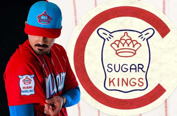
As expected — and for the first of many times (including the next two days) — the Miami Marlins last evening wore their “Havana Sugar Kings” fauxback uniforms. As you can see from the splash photo, the jersey is mighty red. If you’re not aware of the story behind these uniforms, Paul did a nice job describing them back on Tuesday, and our pal Chris Creamer did a nice history of the team Miami is saluting. There’s also a good video history of that club here:
I put together this piece on the Sugar Kings https://t.co/Str3jvP6pv
— Cuba Dugout: Phil Selig (@CubaDugout) May 22, 2021
When I first saw the unis unveiled, and read Paul’s piece on Tuesday, I actually found myself disagreeing with his assessment. My first hope would actually have been for the Marlins to do what we’ll call the “Miami Vice” treatment — pink and aqua, with lots of flash — similar to the designs worn by the Miami Heat. Instead, they went with a very loose interpretation of a short-lived, Cuban-based, minor league affiliate of the Reds. Not exactly a city connection, other than the fact that Miami has a large Cuban population to this day. I totally get where they’re going, but the city connection seems tenuous at best. I would have preferred they celebrated the vibrant colors of their famed nightlife than a recreation of a MiLB uni for another team.
Paul also feels this is a “natural fit” for the team, and avoids Nike’s clichéd “tourism-bureau thing,” but I actually think this goes to the other extreme. I don’t think it’s such a natural fit, and instead bends over backwards to fit a round peg into a square hole. That’s not to say he’s wrong; this is just my own opinion. Perhaps a neon fuchsia and aqua uni would also be clichéd, but wouldn’t that be a better city connection?
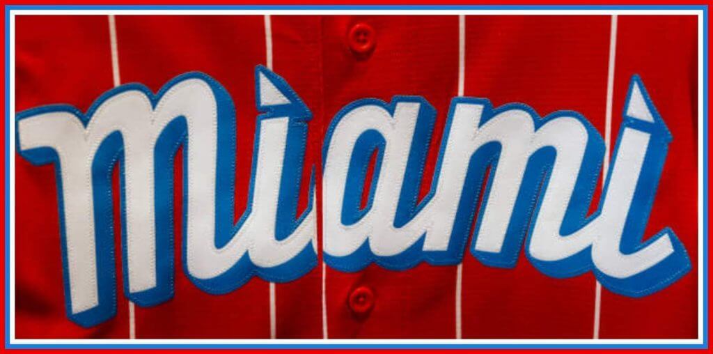
Anyway, when I first saw the unis — or rather, the jersey and cap (since Nike seems intent upon making the City Connect “uniforms” a very saleable cap and jersey, to be coupled with a pair of white pants) — I didn’t love them. While not exactly a copy of what they did for Boston, both teams were given a powder blue cap (the Marlins cap does have a red bill, while Boston’s was solid), with a contrasting color jersey, white pants, and powder blue socks. Some colors pair well with powder blue, but in my opinion, red isn’t one of them (I may be in the minority here). Also, the red jersey contains white stripes, but not classic ones: these STOP at the shoulder and don’t extend to the arms. To me, it’s just not a particularly good looking base for a jersey.
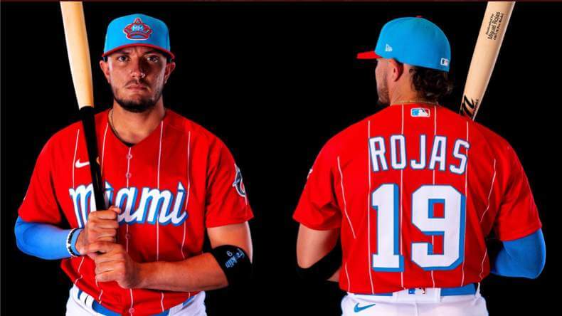
While the stripes are fairly faint, this caused the designers to need to add some extra weight in the form of block shadow to both the front “Miami” wordmark as well as to the rear uni numbers. I don’t hate the look, but I wish at the very least the “Miami” could have been solid white (or simply outlined in blue). I do love the sleeve patch which mimics the original Sugar Kings:
Those were my complaints. But I wanted to see how the unis looked on the field before passing final judgment, and I have to say, they do look better than I had feared (and yes, I watched all 12 excruciating innings last night). But not all that much. I would have greatly preferred a matching pair of red pants (c’mon, it’s a uniform, not a merch-grab softball jersey). Still, it does work with the white pants. We saw the mockups/photos showing players with powder blue sleeves, and I wondered if every player who wore sleeves would play along. As it turns out there were at least three different colored sleeves I saw (powder, black, white).
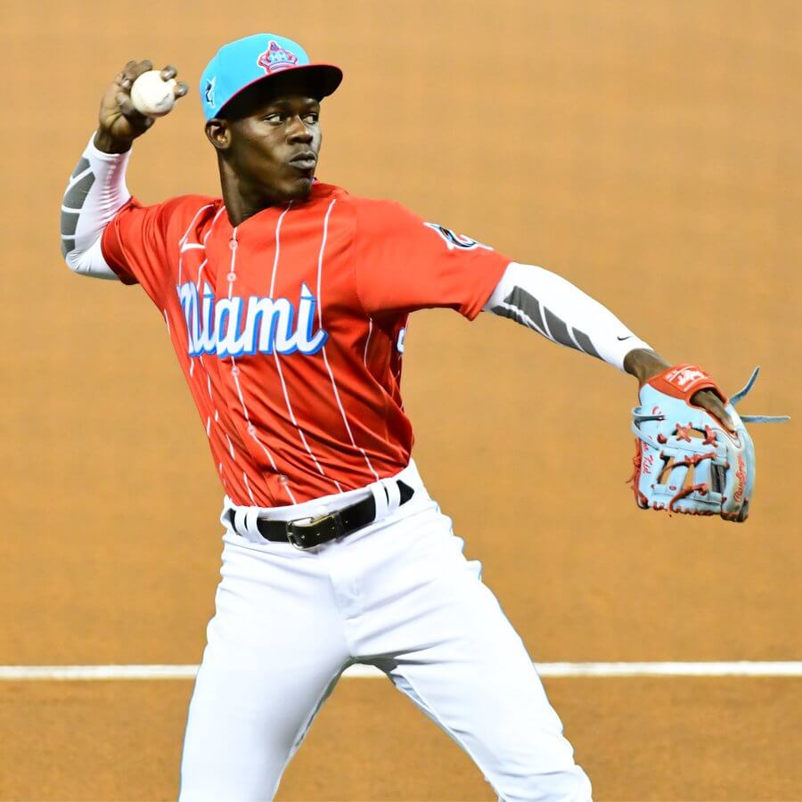
In addition we had at least one player wearing a red compression sleeve. I didn’t necessarily mind the different looks, but it made the whole thing appear much less “uniform.”
As you can see above, some players (and coaches) went high-cuffed, and I thought the custom socks worked well, even if they seemed a slightly different shade of light blue than the other elements. Likewise, I was hoping to see light blue belts (as were shown in the press photos), but I only saw black, which introduced yet another color into the palette.
One thing I did like was how the team went the extra mile on the helmets and catchers’ gear. Custom powder blue helmets with some neat red striping was nice, and at least that added to the continuity of color.
As I said above, after seeing them on the field, I liked them more than I previously did, but they’re certainly not as special as they could have been. Had the Sugar Kings been somehow more directly tied to Miami (yes, I know they couldn’t have been a minor league affiliate of the Marlins, who didn’t exist in the 1950’s-60), I definitely would have felt a much stronger “city connect(ion).” I also would have preferred the neon pink/blue as to me, that’s a greater representation of Miami. I also think I’m in the minority on this one, as I did a quick Twitter poll (if the results don’t show, just click your preference and you’ll see the tallies), and obviously I must not be the greatest judge of taste in uniforms.
Quick Poll — Marlins "City Connect" (Havana Sugar Kings fauxback) unis
— Phil Hecken (@PhilHecken) May 22, 2021
I hope I’m wrong, but I get the feeling now that every “City Connect” uniform is going to be a very marketable cap and jersey, paired with white pants. This isn’t always a bad look, but it also feels like Nike only wants to work on the parts of the uni that will sell. In the past, the Marlins have had some nice MiLB throwbacks, so I would have preferred they go this route, but it is what it is.
We’ll soon see what’s in store for a bunch more teams in rapid succession, as the next “City Connect” jerseys/caps will be worn by the White Sox (starting June 5), the Cubs (June 12), and Diamondbacks (June 18), followed by the Giants (July 9) and finally the Dodgers (sometime in August).
What did you guys think of Miami’s uniforms jerseys and caps?


Guess The Game…
from the scoreboard
Today’s scoreboard comes from SABR Bio Project.
The premise of the game (GTGFTS) is simple: I’ll post a scoreboard and you guys simply identify the game depicted. In the past, I don’t know if I’ve ever completely stumped you (some are easier than others).
Here’s the Scoreboard. In the comments below, try to identify the game (date & location, as well as final score). If anything noteworthy occurred during the game, please add that in (and if you were AT the game, well bonus points for you!):
Please continue sending these in! You’re welcome to send me any scoreboard photos (with answers please), and I’ll keep running them.

Uni Concepts & Tweaks
Time for more Uni Tweaks from the UW readership.
I hope you guys like this feature and will want to continue to submit your concepts and tweaks to me. If you do, Shoot me an E-mail (Phil (dot) Hecken (at) gmail (dot) com).
Today’s concept comes from Dan Bodurtha:
The following were originally sent to Paul, but since I’m the “concepts” guy, he forwarded them to me as well. He writes…
Hello,
I’m adding to my Minnesota pride! Let’s bring back the Duluth
EskimosInuits throwbacks. Although the NFL probably wouldn’t use this name in it’s marketing, it’s still fun to see these great uniforms come back to life! While only in the NFL for a single year (previously the Duluth Kelleys), “they were one of the first NFL teams to use a logo”. So, the Duluth Eskimos were the logo pioneers of the NFL! Once the NFL eases up on the one shell rule, it would be fun to see the Vikes rock these on the gridiron.Thanks,
Dan Bodurtha
And here is his concept:
OK readers (and concepters). If you have some tweaks or concepts, shoot ’em my way with a brief description of your creation and I’ll run ’em here.
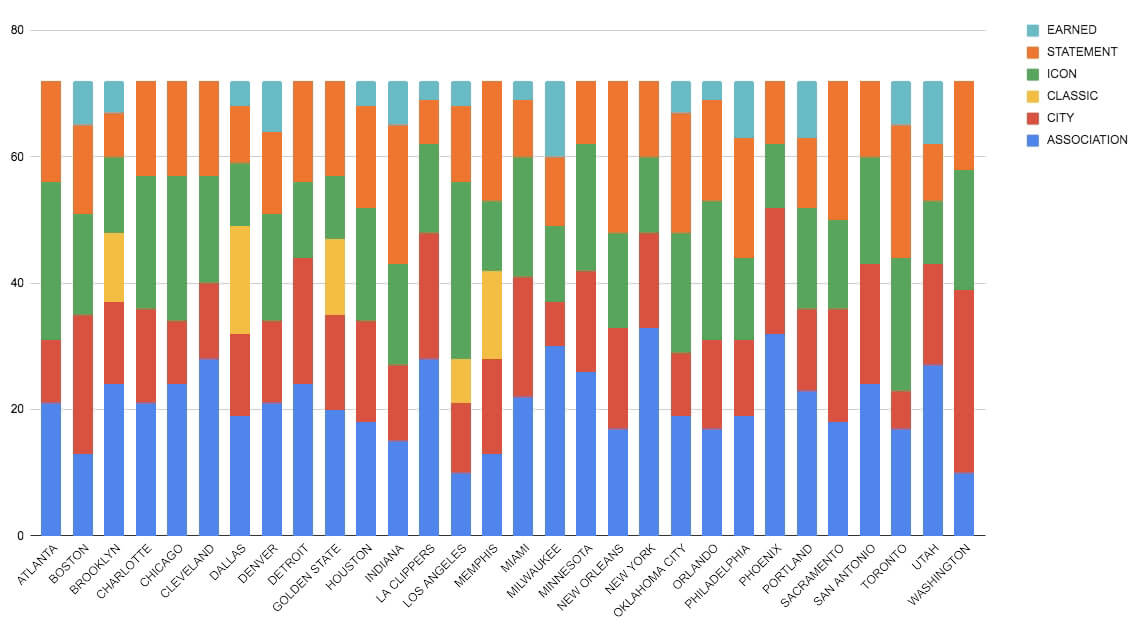
Click to enlarge
NBA Power Rankings reminder: Paul here. In case you missed it on Friday, the bar graph above shows how often each NBA team wore each of its uniforms during the 2020-21 regular season (all data from LockerVision). I used that breakdown as the basis for a new set of NBA uni rankings. Instead of ranking each team’s full uni set, I decided to do rankings based on the most-worn uni for each team, which brought some interesting trends and info to light. You can check it out here.
Now back to Phil with the rest of today’s content!
The Ticker
By Anthony Emerson

Baseball News: It appears Brewers IF Kolten Wong was wearing University of Michigan batting gloves last night. They can’t be holdovers from his college days, as he went to Hawai’i (from Kyle Baker). … The San Francisco Chronicle‘s A’s podcast had an interview with longtime A’s clubhouse manager Steve Vucinich. It’s a fun interview altogether, but the uni-centric stuff comes in at the 16 minute mark (from Terry Mark). … Uni Watch got a shoutout in the most recent Sports Illustrated For Kids, in a blurb about about the MLB logo (from Nicklaus Wallmeyer). … The Greenville Drive, High A affiliates of the Red Sox, are celebrating their 15th anniversary with a sleeve patch (from Christopher Keese). … The Bradenton Marauders, Low A affiliates of the Pirates, wore their Copa de la Diversión design, rebranding themselves as the Bradenton Barbanegras (from Wayne Koehler). … ESPN has an article about how MLB umpires are stepping up their shoe game (from Mike Styczen and our own Brinke Guthrie).

Pro Football News: Panthers wideout DJ Moore will switch from No. 12 to No. 2 (from James Gilbert and our own Brinke Guthrie). … Here’s a color-vs-color matchup in football I think Paul could get behind. Those are the IFL’s Green Bay Blizzard in green and Tucson Sugar Skulls in yellow (from Adam Lucas).

Hockey News: The Rangers are polling fans about adding an ad patch to one of their sleeves.
.
.


NBA/College Hoops News: The Bucks have a new uniform advertiser (from multiple readers). … Louisiana Tech is letting fans vote on their new court design (from James Poisso).

Soccer News: Barça’s new home and third kits have leaked (from Kary Klismet). … Also from Kary: Inter Milan’s away kits have also leaked. … The following are all from Ed Żelaski: Everton have a really nice new away kit (also from Germán Cabrejo). … Borussia Dortmund have unveiled their new home kit. … Wolverhampton Wanderers are moving to Castore from Adidas, becoming the first Premier League side to be outfitted by the six-year-old English company (from). … Ligue 1 side Olympique Lyonnais have unveiled their new home kit (also from Ben Hagen). … New Sounders DF Abdoulaye Cissoko will wear No. 92, as a nod to the postal code of his native Les Ulis, France (from @mightyfarley).

Grab Bag: University of Richmond athletics is moving from Nike to Adidas (from Tom Turner). … Also from Tom: Paul van Doren, the man behind iconic Vans skateboarding shoes, has died at 90 (NYT link). … New indigenous design for the AFL’s Melbourne FC (thanks, Jamie). … Staying in Australia, Port Adelaide FC has responded to the controversy surrounding the plagiarized design of their indigenous guernsey. They acknowledged the design came from artist Elle Campbell, who has given her permission for the design to be worn (from J.R. Rogers). … Here’s a brief article about how driver apparel in motorsport has evolved over the years (from Kary Klismet). … During an episode of Anderson Cooper: Full Circle, actor John Stamos corrected Cooper after the latter called sports uniforms “sports costumes” (thanks, Phil).
Uni Tweet of the Day
He’s 100% right.
Still the only Nets uniform that I am willing to fucking recognize as legitimate. pic.twitter.com/XWccgQTtXj
— Super 70s Sports (@Super70sSports) May 19, 2021
And finally… that’s it for today. Hope everyone is staying well and healthy, and that you all had a good week. I’ll be back tomorrow with what should be a very special column (from a well-known personality) on a uni mystery solved, so be sure to check back then. You guys have a good Saturday and I’ll see ya tomorrow.
Peace,
PH
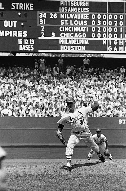
GTGFTS: May 17, 1964. Game 1 of a double dip with the braves and the cards
May 17th, 1964. 1st game of a DH. Cards won 7-3
Nice 60’s 10-games version of Sportsman’s Park scoreboard. St. Louis (not “Cardinals” or “Browns”) were usually the bottom games on 8-game version of the board, instead of in the middle in 64. It’s so similar to Wrigley’s sb, and by 64 they’d painted a red line around the Cardinals game. The Cubs were basically doing that also.
After 61-62 they used the extra space at the bottom of the board to cut out windows for a fifth game in each league. That space had been use for info about upcoming games. That beautiful hand-operated scoreboard only lasted two more seasons.
Your twitter poll is going to get hammered. My baseball slack channel was full of people wanting to buy the cap and loving on the uni.
The poll got hammered as soon as I posted it. I fully admit my opinion of this uni doesn’t jibe with the majority, and I’m fine with that. As far as people liking the jersey & cap and wanting to buy it, then Nike has succeeded. And I think that was their intent: to sell caps and jerseys. Whether or not they produced a good looking uniform is probably irrelevant. If their goal was to move merch (shocking, I know), then it appears this was a successful launch. But popularity (of anything) doesn’t necessarily equate to good design (or content).
Twitter is not the real world. Period. In fact, if Twitter loves something, then I would immediately believe that something is atrocious.
COTD
A red jersey-red pants combo is the trademark of the Cuban national team. Methinks that may not work for a lot of people in Miami.
Liking the Marlins faux backs for the most part. I hear you about the pink and blue but with the Heat working that combo so well with their Vice series (well, except for Vice-Versa) I think other teams in Miami would like to forge their own color path. As a first generation American of Cuban parents, the city connection feels right on (and the feeling was instant unlike the last couple of Marlins’ logos). I would have been more impressed if they had chosen one of the Cuban League teams with la Habana Leones being the most obvious choice but these, and especially the sugar bag logo, are nice. As for the uni details, I agree that the pinstripes stopping abruptly doesn’t look right. It feels like they couldn’t figure out how to make the stripes line up across the seams and said forget it. As for the caps, I wish they had left off the Marlin on the side. Let these be what they are without reminding us they are also the Marlins. I haven’t seen the caps in person but I do wonder if a seam ripper would be able to improve both sides.
Powder blue and red is generally a tough combo to make work. One high school near us has had those colors for years. It’s distinctive if nothing else.
I think that it’s a balance issue…you have to have just the ‘right’ amounts of each.
My alma mater is a Columbia Blue/Sheridan Red school, and they Get It, using blue as the base and red for accent.
I don’t care for the Marlins fauxbacks since it’s much too red-heavy; however, those helmets are splendid!
The Houston Oilers for the most part executed the combo well over their existence (hmmm, I wonder which year Jim Vilk would consider their ‘best’).
I came here exactly for this reason…to point out that the Oilers nailed light blue and red in all of their versions…even in the accursed white-bucket era!
I can’t believe I forgot the Oilers. One of my old favorites.
And I thought of a second school near us that uses the same colors, more in line with what the Oilers did. Fair points.
I was at the game in Miami! Go Mets! (Saw deGrom in Jupiter on Thursday. Been a good trip!)
The uniforms looked fantastic, so much better than the black jerseys you can’t read. Very popular with the fans. I bet more people were wearing City Connection caps, shirts and jerseys than regular designs, I bought a cap. All the scoreboard graphics were using the new look.
Great job by Nike and Fish.
Phil — Great work!
Your points are well reasoned and your take on the Marlins’ new uni’s are fair. I disagree with almost all of it.
The thing that carries the day for me is that the uniforms have a baseball connection. It resonates with me much more than the Miami Vice style. I know that style is based on Miami architecture and style and not an 80’s tv show, but it has been overused so much I cannot separate them.
As a White Sox fan, I really hope Nike does something similar. There is so much history and tradition to celebrate. I do not have high hopes. I am expecting them to be dressed like Mrs. O’Leary’s cow.
Thanks,
Jim
Your points are well reasoned and your take on the Marlins’ new uni’s are fair. I disagree with almost all of it.
I love this, fellow Jim.
As I mentioned above, I have no problem with light blue and red. In fact I love it.
My two problems are
1) You couldn’t have tweaked the “a” 1/16 of a dang inch to the right in order to Respect The Placket? That was just lazy.
2) If the Sugar Kings were a Reds affiliate, why wear these against the Mets? Wear them when you play the Reds??
Otherwise (well, lose the swoosh, but otherwise…) they looked 1,000,000 times better than what they currently wear. Keep these if you’re not going back to the inaugural unis.
Lose the swoosh, and along with it the current uniforms.
It would have told a better story if they did this in conjunction with the Reds.
Is “Respect The Placket” going to be a thing?
PS- I preferred the orange/black Marlins’ unis, but the Giants and Orioles already have dibs on those colors. The original Marlins uni is the direction they should go.
Is “Respect The Placket” going to be a thing?
I tried to make it a thing back in my Twitter days. For anyone who wants to pick up the torch, make sure to include #RespectThePlacket in your teeets.
I know they’re flying a flag at the ballpark for the 101st anniversary of the Negro Leagues, but who knows? Perhaps the White Sox version will be a tribute to the Chicago American Giants.
I wish I had access to that Rangers fan survey and vote a trillion times AGAINST the stupid and gross idea of an ad patch. Why do these greedy organizations that we love so much continue to cause us so much aggravation with this stuff !!!
Not a fan of the merch grab City costumes. Marlins look sooo much better in throwbacks.
The City Connect program is awful. The bright colors and designs that look nothing like the teams they are supposed to represent is as bad as the minor league Copa program. Sure people will buy the junk, because that’s what people do.
Link for the Port Adelaide FC is a duplicate for the driver appare.
When I was playing high school basketball back in the 70s, we thought the NY Nets “Doctor J” uniforms were the ultimate. IMHO, that uniform runs a close second to the San Francisco Warriors “The City” uniforms as the best in basketball history.
This is correct.
Am I the only one who thinks the Marlins uniforms look like a Hawaiian Punch company softball team?
Maybe these are the Havana Punch unis?
Also, the DJ Moore link leads to the Rangers poll.
Phil, as a Miami naive and lifelong resident, your position that a team from Havana has no connection to Miami is a little wild to me. Miami doesn’t just have “a large Cuban population to this day.” It has an ENORMOUS Cuban population. These jerseys are more Miami than even the Heat’s vice set – which stems from a cocaine-fueled image of Miami from 30 years ago – and I say that as someone who loves the vice set.
you know, i was watching the cubs game last night and it seemed like the undershirts a lot of the players were wearing were a slightly bit lighter shade of blue than the blue tops they were wearing, and it seemed odd. usually the two match, and it was a noticeably different shade for a couple of players.
now that you mentioned the first two city uniforms that we have seen are a light blue, i wonder if the cubs are getting the same color scheme and were giving their new undergarments a test drive.
I liked the Marlins’ jerseys and caps even if I wish they hadn’t had NOBs, which are already too big on the Marlins’ regular uniforms and really get in the way if your number font has shadows.
When my Cubs have these uniforms I hope they go for the traditional NNOB look, and I hope they use powder blue and do something related to the city flag, which isn’t that far from the Cubs’ normal colors. The Cubs have had various shades of blue over the decades and could really do something with a very light shade.
The thing I liked about the Sugar Kings uniform is that it had “life.” They looked unique on the field and there was a back story to it. It was a very enjoyable look.
I’ll say it: the Marlins have NEVER had a great look. The initial Marlins wordmark looked too sloppy. They went from a teal-with-black-trim to a heavy dominance of black, which was a turn-off.
We definitely need a Design-the-Marlins contest.
I like the Marlins/Sugar Kings jerseys and caps. The cap logo is unique, and the red and powder blue color combo is great – underrated I think. It doesn’t get used enough. My favorite example is the soccer, er, football, team in Catania (Sicily). Bonus points for the simple drop-shadow numbers which seem to have fallen out of favor in sports in recent years.
Actually, I like the sleeve patch better than the cap patch.
I like that Eski…err, Duluth Football Team concept, even with the white facemask(in this case, I’d prefer olde-timey gray or maybe black).
Shoulder yokes are an under-used design element.
Nice work, Dan!
PS-this should remain on the drawing board…I’m totally against the Vikings ever wearing these since they have zero connection, other than shared geography, to the Duluth franchise. YMMV.
Thanks, Chris!
“New Sounders DF Abdoulaye Cissoko will wear No. 92, as a nod to the postal code of his native Les Ulis, France.”
He started his career in Les Ulis but he’s actually a native of Sèvres (zip code beginning with 92).
Les Ulis’ postal code begins with 91, so that wouldn’t make sense that he chose 92 for that city.