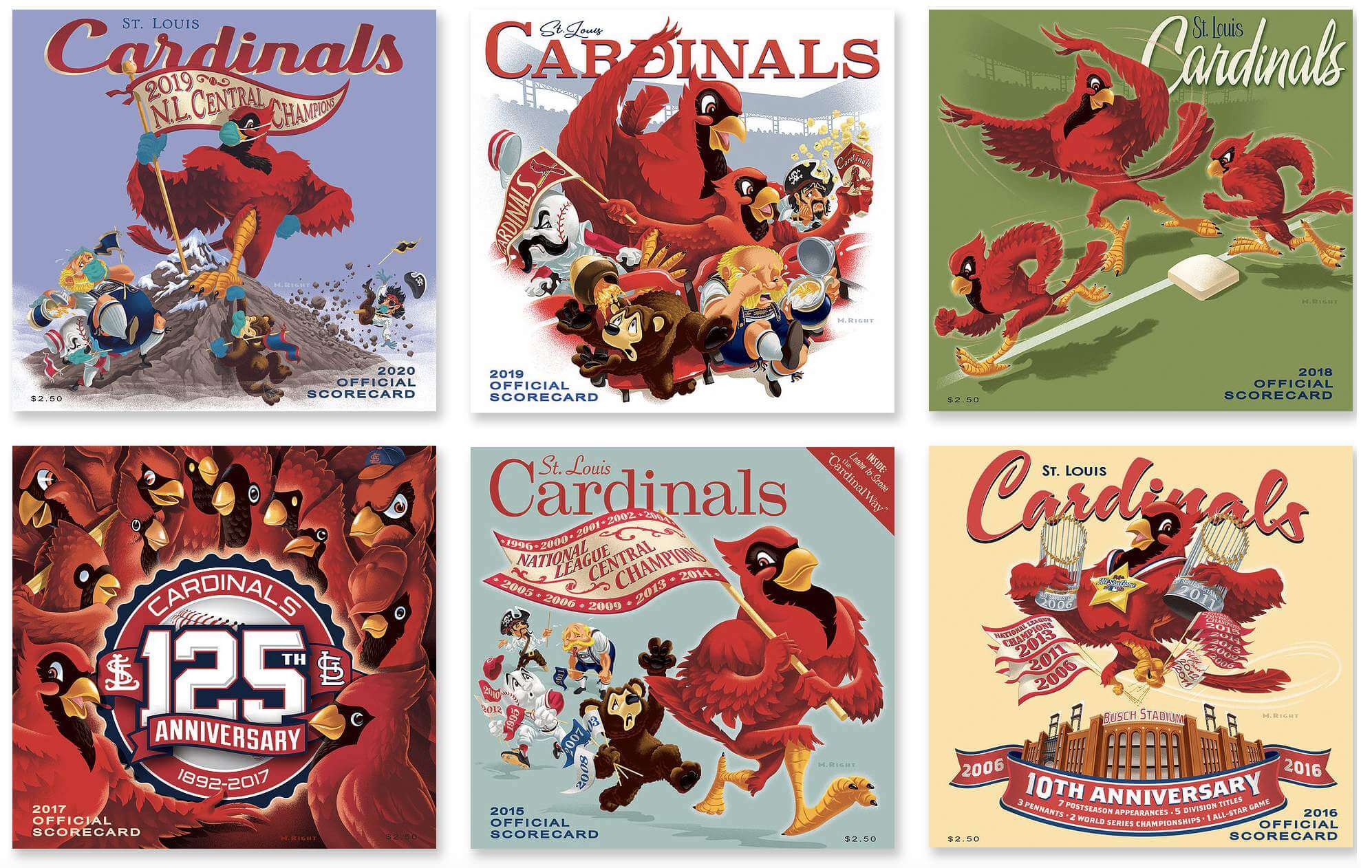
For all images, click to enlarge
The St. Louis Cardinals have had MLB’s best scorecard cover artwork since 2003, when an illustrator named Mike Right took over the gig. His cover illos look simultaneously retro and contemporary, with a playful edge that hearkens back to old-school sports artwork.
I’ve been a huge fan of Right’s artwork for years but for some reason had never gotten in touch with him to request an interview. I recently rectified that omission by having a good chat with him. Here’s an edited transcript of our conversation.
Uni Watch: Let’s start with some basics about you. How old are you, where do you live, and do you make a living exclusively as a freelance illustrator?

Mike Right [shown at right]: Yes, I am a freelance illustrator. I’m 56. And I live in St. Louis. From St. Louis. Fifth-generation St. Louis.
UW: What sorts of illustration clients do you typically have other than the Cardinals?
MR: Anheuser-Busch, Ralston-Purina, among others. SeaWorld — I do a lot of map work for SeaWorld. Mostly commercial work.
UW: How would you describe your illustration style, and who would you say are your biggest influences?
MR: Just colorful, retro. You know, 1940s retro advertising art. The old baseball artists, like Otis Shepard, who did Cubs programs for years. And Willard Mullin — I love his stuff.
UW: You’ve been doing the the Cardinals’ scorecard covers since 2003, is that right?
MR: Yes.
UW: How did you first connect with the team, and what had their scorecard cover artwork looked like prior to you coming on board?
MR: They were mostly using photography. In the late ’90s, it was a lot of McGwire photos, and then a lot of shots of Tony La Russa, various players.
So in the early 2000s, I worked at an ad agency, and one of our clients that season was the Cardinals, for their game-day magazine. I had drawn a big, muscular, retro-looking Cardinal standing on a baseball, just because I always liked that style. And then I got to know the person in charge of publications for the Cardinals, and I presented him with this idea. And he was a big fan of the old scorecards for the Cardinals from the ’50s, so he liked what I showed him and he said, “Okay, we’ll try it for next season.” That was for 2003, and I guess it got a good reaction, because they had me do it again the next year. And we’ve been doing it ever since except for 2007. After we won the World Series in 2006, they put a photograph of the World Series trophy on the cover because it had changed since the last time we won it.
UW: Your big, muscular cardinal guy — does he have a name?
MR: No, I’ve never given him a name. That’s interesting.
UW: Walk me through the process of getting a cover design approved for something like this. Like, how far in advance do you have to start working on it? How long does it typically take take you, how many people have to sign off on it, and so on?
MR: We usually start in late February, and it’s due by late March. First I sit down with Steve Zesch. He’s the team’s head of publications. So we have a lunch meeting and we talk about concepts. I may do a few thumbnails right there on the spot, just to see if that’s the right direction we want to go, and then I’ll go home and come up with a sketch and get approval. And I think he runs it by [team owner] Bill DeWitt to make sure that ownership’s okay with it
Once the sketch is approved, I scan it. Then I go to the computer and I draw over it in vector, and then I go into Photoshop and add the colors and the texture and the nice little details.
UW: So up until the point where you scan it, up to that point you’ve been working by hand, not digitally.
MR: Yes. I have a video where you can see the transition from the pencil sketches to the finished scorecard covers.
UW: Do you handle the typography as well as the illustration?
MR: Yes. It’s been fun to do that. And there’s a difference from year to year — sometimes “St. Louis” will be script, other years “Cardinals” will be script, and so on. So it’s something new every year.
UW: Some years, obviously, the theme for the cover art suggests itself, like if the team has won the division or the pennant. Aside from those times when it seems like something topical is called for, does the team tell you what what approach to take, or do they leave it up to you?
MR: It depends on whether there’s something coming up for that season, or something to celebrate from the season before. If not, then you try to find storylines. Like one year, our third base coach came back, Jose Oquendo, who was very popular. So we showed a third base coach.
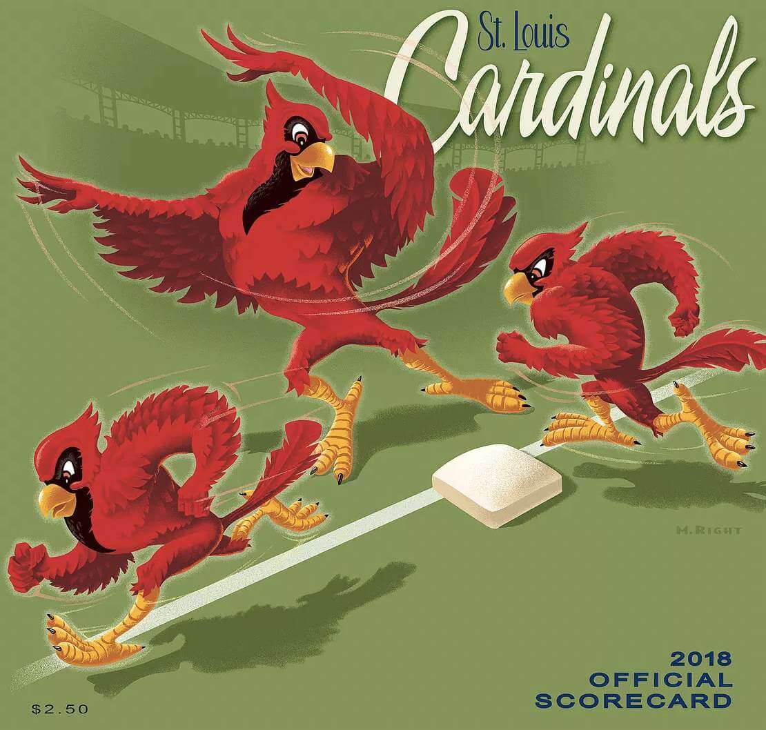
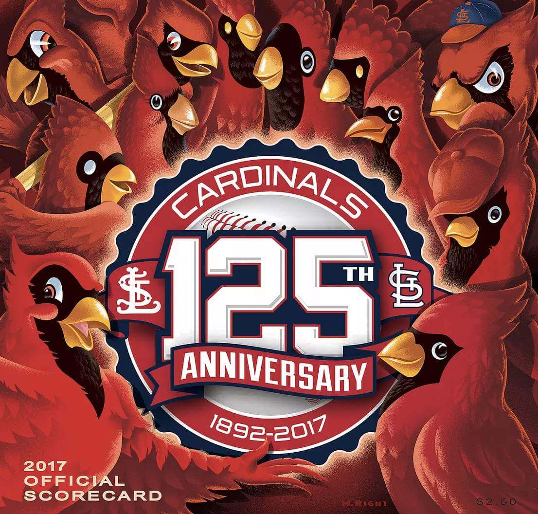
We try to keep it topical like that. This year we had [third baseman] Nolan Arenado joining the team, so the artwork showed the cardinal as a third baseman.
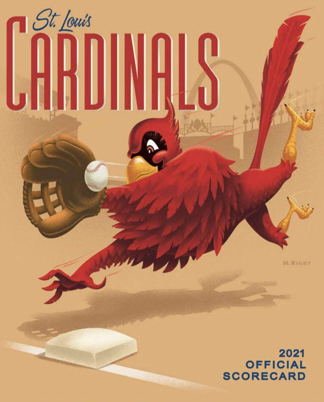
UW: In 2017, you had to incorporate the the team’s 125th-anniversary logo, which kind of dominates the space.
MR: For that one, I showed all the different birds the team has had over the years. I thought, “We’ll have all the birds and maybe we’ll have them gathered around a 125th-birthday cake or whatever.” And they said, “Well, we have this new logo for this season. So why don’t we just use that [instead of the cake]?” And that was fine. So I put all the birds from the different eras around the logo.
UW: Once the design gets approved, is it used for the entire year? Like, do they have just one scorecard cover design for the entire season?
MR: Yes.
UW: Obviously, there were no scorecards for 2020 because there were no fans at the stadium. Did you already have a design ready to go, just in case?
MR: Yes. I got a lot of emails over the winter, I guess from people who collect the scorecards, asking what happened to it. It was never printed. A lost edition there.
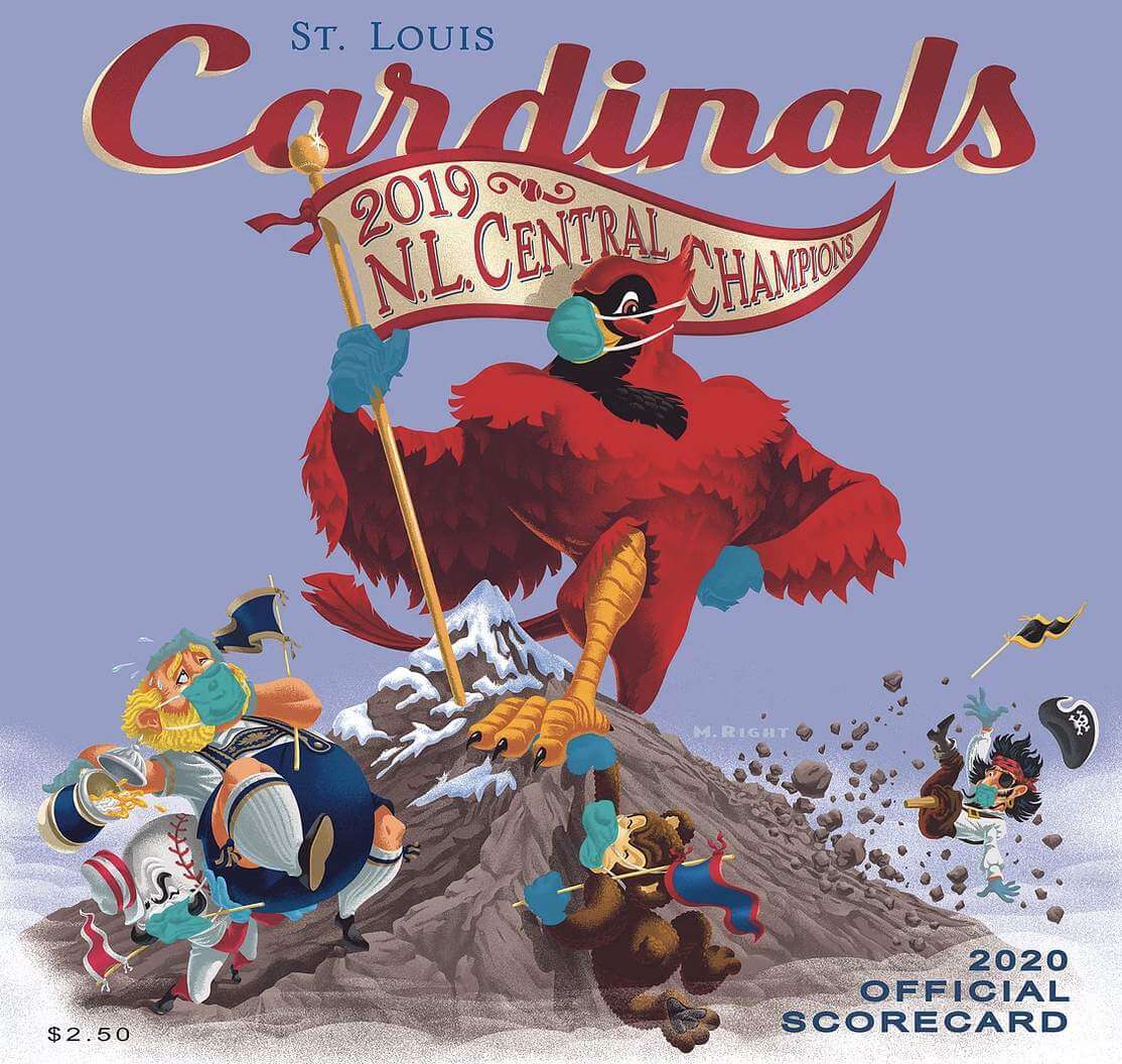
UW: Do you go to a lot of games yourself, and is it a thrill to see so many iterations of your work?
MR: Yeah, yeah. When you see people carrying them and buying them, or there’s a line of people waiting to buy them — that’s great.
UW: Have you done any other illustration work for the Cardinals, like yearbooks or season tickets?
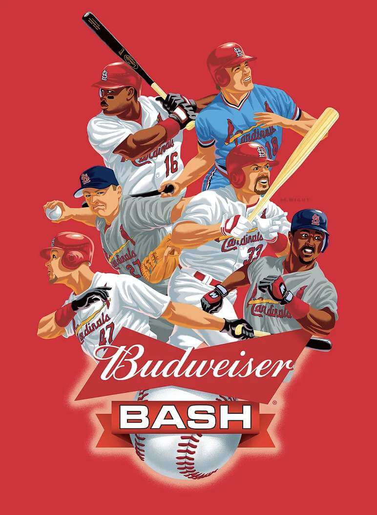
MR: I do a lot of promotional work for them, a lot of their T-shirts. Budweiser has a program with the Cardinals where once a month, they’ll have a player come in and he’ll sign autographs or whatever. It’s called a Bud Fest, or a Bud Bash, or something like that. So I do a big banner with all six players that’ll be appearing that year. That’s fun.
UW: Are you aware of any other illustrators who have maintained a steady gig with one team in the modern era, like you have with the Cardinals? I can think of some earlier examples — like, Willard Mullin, who you mentioned earlier, did the progression of Mets yearbook covers in the 1960s, and of course Otis Shepard did all those Cubs program covers for years — but I can’t think of anyone in the modern era except for you.
MR: No, me neither.
UW: You mentioned Bill DeWitt earlier. Have you ever met or dealt with him personally? I’ve interviewed him a few times, and my impression is that he is much more attuned to things like artwork, uniforms and his team’s visual presentation than other team owners.
MR: No, I haven’t dealt with him directly. But you know, I feel the same way about it, that he is really involved in that. He loves the heritage, he loves the tradition behind it.
UW: Mike, I think that’s it from my end. Anything else you want me to know?
MR: I guess the only other thing is that my favorite covers to do are the ones that show the other teams’ mascots, because it’s so much fun to put them in little situations. Like, I one year got a little controversial, the one where the Cardinal is marching along with a big pennant because we’d won the division so many times, and then the other teams’ mascots are wishing or grabbing and they’ve got their three little pennants. And then there’s the Pirate at the end, and he’s just got an empty stick — no pennant!
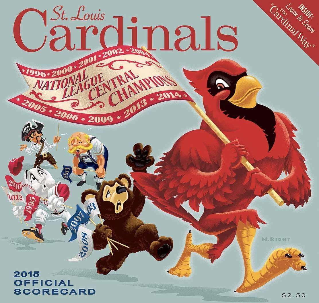
So that was a fun one. But you know, there was a little animosity there, people saying the Cardinals are always being so boastful and bragging all the time.
———
And there you have it. But wait — there’s more! After we spoke, Mike showed me this amazing illustration he made for the 1977 MLB All-Star Game — when he was 12 years old! Check this out:
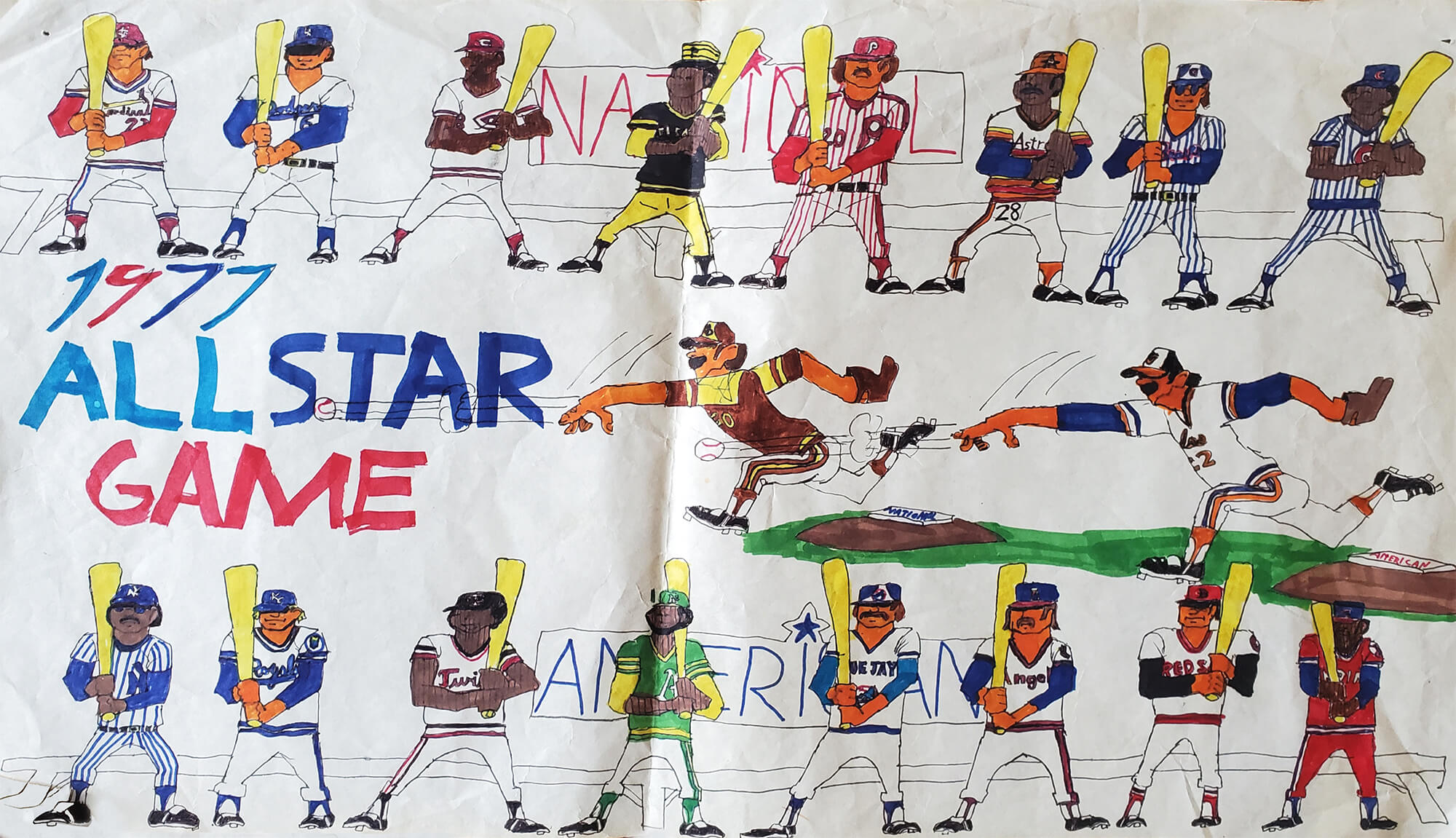
He hadn’t seen this piece in many years, until his mother recently gave it to him. “I thought of you when I saw the uniform detail I gave the drawing as a 12-year-old,” he says. “Apparently I didn’t have enough room to fit all 26 teams, so some didn’t make the cut. My plan now is to frame it. And then the next time my buddies come over for pool or poker, I’ll offer a prize for the first one who can name all the players.”
I should add here that Mike was an absolute peach of a guy to talk with — humble, understated, all those good things. Please join me in thanking him for sharing his story with Uni Watch. You can see more of his wonderful artwork on his website.

Membership update: Membership card designer Scott M.X. Turner has begun working his way through the nearly 30 orders received on Purple Amnesty Day. One of those orders was from Keith Adelsberger, who wanted the “MO” portion of the Ravens’ Mo Gaba-themed end zone design from last season — an ingenious request.
Keith’s card is part of a new wave of purple designs that have been added to the membership card gallery. We should have all of the Purp Walk orders designed by this time next week, if not sooner.
Ordering a membership card is a good way to support Uni Watch (which, frankly, could use your support these days). And remember, a Uni Watch membership card entitles you to a 15% discount on any of the merchandise in the Uni Watch, Uni Rock, and Naming Wrongs shops, plus the discount also applies to our Uni Watch Classic Cap. (If you’re an existing member and would like to have the discount code, email me and I’ll hook you up.)
As always, you can sign up for your own custom-designed card here, you can see all the cards we’ve designed so far here (now more than 3,100 of them!), and you can see how we produce the cards here.
The Ticker
By Lloyd Alaban

Baseball News: Twins P Alex Colome wore the wrong cap last night (from Mark Lackinger). … The Royals’ scoreboard is still using the Brewers’ old logo (from @TheSmokingPun). … Bats that MLB players were using may have varied widely in quality (from Tom Turner). … Giants P Tyler Rogers wears white cleats to distract batters (from multiple readers).

Football News: Ravens LB Patrick Queen will wear No. 6 (from Marcus Hall). … The Bengals are working out in a mix of new and old practice jerseys (from multiple readers).

Hockey News: The Capitals will continue wearing their “Coach” helmet decals throughout the postseason in memory of Tim Oshie, a former coach and father of player T.J. Oshie (from our own Phil Hecken). … The Canucks wore pregame jerseys with first responders’ names last night (from Wade Heidt). … Avalanche C Nathan MacKinnon didn’t wear the team’s 25th-anniversary patch on Monday (from Grant Beery).

Basketball News: Warriors PG Steph Curry’s personal wordmark has the three-point line integrated into each letter (from @Eloquocious). … New York Mayor Bill de Blasio wore Nets gear to a press conference. Congressman Jamaal Bowman’s office Photoshopped him into Knicks gear (from our own Anthony Emerson).

Soccer News: Bayern Munich will add a fifth star above its crest in recognition of its 30th Bundesliga title (from Alex Dewitt). … New shirt for Ecuador (from German Cabrero). … Tottenham Hotspur, which was planning to debut next season’s home kit today, will wear this season’s kit instead (from our own Jamie Rathjen). … Sixth-tier English side York City will now be outfitted by Puma (from Ed Zelaski).

Grab Bag: Yale has a new logo for the 50th anniversary of its women’s athletics teams (from our own Jamie Rathjen). … New kit maker for Volleyball Australia (from Jeremy Brahm). … Walt Disney World has released its 50th-anniversary nametags (from @PorterPints). … Stanford is reversing its earlier decision to eliminate 11 varsity sports.
“Retro” and “colorful” are two of my favorite design elements. Those are amazing!
Agreed. Great stuff today!
The Mo Gaba membership card looks great! Thanks so much!!
Man I wish I would have been creative enough to think of that design. It looks awesome and honors a truly great kid and fan.
Wow, great stuff today Paul! Those St. Louis Cardinals covers are amazing, Mike Right is a brilliant artist!
Wow, the Mo Gabe card is fantastic. Great job Keith!!! (& Scott!)
*GABA
“Mike Right [shown at right]”
…nicely done.
Oh my god, I’m in love with that ’77 All Star drawing! Incredible visual style.
And a rare appearance by the Cleveland Saturday Night Special Blood Clot uni!
Great interview with Mike – also enjoyed the link to the Willard Mullin piece from 2013.
How can I get invited to one of his poker games!
Cardinals fans have been really fortunate to have an ownership group that cares so much about things like uniform and scorecard design. And that 2015 scorecard is fantastic, though I feel a little bad for the pirate.
Great interview, Paul! Mike’s work is wonderful.
As a Cubs fan, I am contractually obligated to state upfront my disdain for the Satanic Red Fowl. Having said that, I loved your interview with Mike Right. His artwork is fantastic and I loved hearing the little details that he uses to inspire the design, and how the process works. The Cardinals should think about publishing the unused 2020 scorecard cover as a limited edition poster — sounds like there’s a good amount of interest among collectors of Mike’s artwork, and probably others as well.
Disappointed but not surprised 12 year-old Mike omitted the Cubs from his 77 ASG poster. Everyone disdained the 70s Cubs.
Hang on, just spied one at the upper right….Manny Trillo?
Every one of those scorecard covers is an artistic masterpiece.
But I would like to point out that the 2015 cover demonstrates one of the huge problems with the expanded playoffs.
That cover lists 2001 as one of the years that the Cardinals were the NL Central champions. But in fact they did not win the division that year! The Houston Astros were the NL Central champs, and the Cardinals were the NL wild card team.
The teams finished tied atop the division with a 93-69 mark. In all previous occasions in which teams had tied for first place, a playoff had been held. It had always been a one-game playoff in the American League; in the National League it had been a best-of-three series until 1969, when the tiebreaking format was changed to a one-game playoff.
But in this case, no tiebreaker was held, as both the Astros and the Cardinals were going on to the postseason anyway.
Even worse, both teams claimed to be the divisional champions, and both teams hung banners to that effect — the Astros legitimately. And clearly the Cardinals were still boasting that phantom divisional championship fourteen years later. Presumably they still are.
I suppose that the advent of the second wild card and the play-in game now makes it clear which teams are the wild card teams. But it is a travesty for a great historic team such as the Cardinals to perpetrate such a fraud as falsely claiming to be the 2001 NL Central champions.
The Cardinals have plenty of actual championships to be proud of. They don’t need to invent any fake ones.
I meant my comment about the 2001 Cardinals as a general response, not as a response to the comment under which it is nested. But Uni Watch does not play nice with mobile phones.
You typed that huge comment ON YOUR PHONE?
Hehe! I’m afraid so.
the Astros legitimately
Not used to those last two words being together….
A follow-up to correct Ferdinand Cesarano’s post:
The National League formally and officially declared the Cardinals CO-CHAMPIONS of the Central Division in 2001. The NL-issued “Championship Award” proclamation hangs in the club’s offices (along with all other championship proclamations issued to the club by the National League throughout the franchise’s history).
The 2001 “Championship Award” displays the final regular-season league standings and NL playoff-round results, with this declaration:
“By virtue of having the highest percentage of games won in the National League Central Division, the lesser record vs. co-Champions Houston Astros and better record of all second place teams, the St. Louis Cardinals are hereby declared the 2001 Wild Card Champions and Central Division co-Champions of the National League of Professional Baseball Clubs.”
Thanks for the interview with Mike Right! I have the 2012 scorecard (celebrating the 2011 World Series win) framed on my wall.
Really fun interview with Mike Right! Great job with this, Paul!
Mike’s artwork is spectacular. Every team should be so lucky to have such a talent designing scorecard covers and other artwork fo them. I also love the childhood artwork Mike shared. It’s cool to know he Got ItTM as a kid, too.
I already miss the porch pictures!
Cheers Paul!
Great interview, Paul. I love Mike Right’s beautiful scorecards! They are absolutely gorgeous pieces of art.
“Tottenham Hotspur, which was planning to debut next season’s home kit today, will wear this season’s kit instead”
As someone not particularly interested in soccer, I’m hoping those who are can answer this: Why would a team wear next season’s unis this year?
I’m guessing that wearing them now has something to do with fans purchasing merchandise, but what if you wear them and fans think they look like ass? Now you have an entire off-season of people complaining about them AND not buying them. Also, I’m surprised that next season’s kits are so far down the apparel pipeline that a manufacturer has them ready to go this season.
Supporters will already know what next season’s kits look like. Wearing them for the last home game of the season is not unusual and you’re probably right on that it gets the merchandise train rolling earlier.
Spurs home whites next year are REALLY plain. Almost no embellishment like the current kit’s blue shoulders, blue/neon side stripe, wonky sublimated pattern on the rest.
My favorite bird in some gorgeous artwork, fantastic stuff.
Stanford is reversing its earlier decision to eliminate 11 varsity sports.
Best news I’ve read in a while. And it affects more than the field Hockey team, who we’ve been reading about for some time.
You have interviewed Bill DeWitt III. His dad, Bill DeWitt Jr. is the owner.
Sorry if repost, but found these logos from every NBA team, each featuring one of their most famous players. I thought it was neat.
link
Great post today. My hometown does not have a very good reputation, so it’s nice to get a bit of a lift. Thanks to Mike and Paul.
Recently went to a game at the new ballpark in “Atlanta,” which was a great experience, despite being a long drive from the city with no decent transportation options. The one thing I couldn’t get over was the fact that they didn’t sell a scorecard! I asked our usher where I could buy a scorecard, and she directed me to guest services. At guest services, they handed me a print-out of a generic scoresheet (only enough to keep score of one team), and a yellow golf pencil. How am I supposed to keep score in the stands with a flimsy sheet of paper? I’m far from an old man, but I definitely think every MLB team should sell a scorecard – and if they’re lucky, they’ll have art as good as that featured in today’s piece.
Was there no scorecard due to COVID precautions? Some teams are absurdly telling their fans to download a scorecard and/ or program to their smartphones, which just isn’t the same thing.
The Braves were, at the time, one of two teams in MLB with no capacity restrictions, so I’d doubt it was a COVID precaution. They were also handing out these half-size game programs. If it was in fact a COVID precaution, they’ve got their priorities in the wrong place.
I love his art so much, even when he makes fun of my Pirates. I think the Nolan Arenado tribute this year is just so perfectly drawn and thoughtful. This is the second day in a row where you’ve highlighted How teams can use Real baseball stories to sell merchandise. What a concept! Embracing a visual style that embraces tradition, but still looks modern.
The Braves were, at the time, one of two teams in MLB with no capacity restrictions, so I’d doubt it was a COVID precaution. They were also handing out these half-size game programs. If it was in fact a COVID precaution, they’ve got their priorities in the wrong place.
Loved the Mike Right interview! What a cool gig and sounds like a heckuva guy. And artist, obviously.
As a born and bred St. Louisan (and therefore a die hard Cardinal fan), former college mascot at Mizzou, baseball scorekeeping aficionado (who has a collection of STL scorecards going back 15-20 years) and lover of all things heritage and historic regarding team ID, I absolutely adored this interview. Thanks!
As a born and bred St. Louisan (and therefore a die hard Cardinal fan), former college mascot at Mizzou, baseball scorekeeping aficionado (who has a collection of STL scorecards going back 15-20 years) and lover of all things heritage and historic regarding team ID, I absolutely adored this interview. Thanks!
That guy is a wonderful illustrator, but he is totally devoid of personality, lol. No matter; I love those, even though I hate the Cardinals. Awesome work.