By Phil Hecken
Follow @PhilHecken
Good Sunday morning, Uni Watchers, and Happy Mother’s Day. Or, to paraphrase the late, great Ralph Kiner, it’s Mother’s Day today, so to all you mothers out there, happy birthday! Hope everyone had a good Saturday.
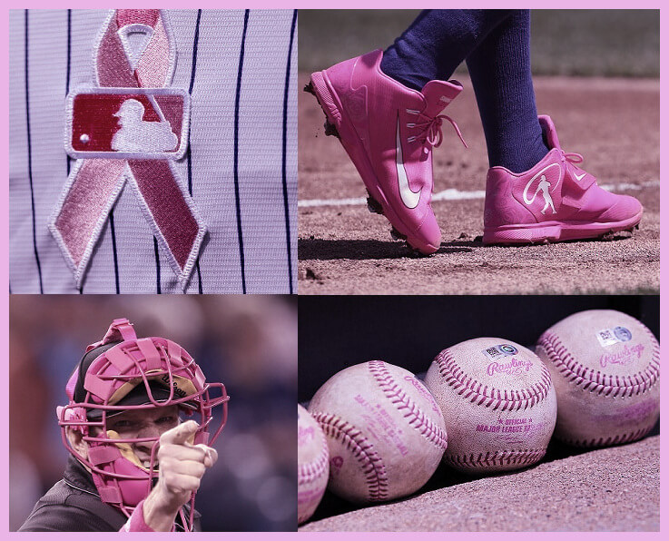
Around the diamond today, we’ll see the unmistakable presence of pink, mostly in the form of player and umpire accoutrements, and it seems like MLB has been pinkening this day for decades. Indeed, we’ve had pink elements in the game since 2006, so for many of you, you may not even remember a Mother’s Day baseball game where there wasn’t a pink ribbon on a jersey or a pink bat in a slugger’s hands. Even though baseball has been played on Mother’s Day for a century-plus, it’s only in the past decade and a half where the pink-themed presence has made itself felt.
The gist of all this, of course, is “Breast Cancer Awareness (BCA),” and its origins actually date to 2001, when baseball first began holding BCA events, and in 2005, they began turning things up by allowing fans to donate money for BCA by pledging a certain dollar amount for every strikeout (called the “Strikeout Challenge”) that took place in the week leading up to Mother’s Day. But if you attended a ballgame in any year prior to 2006, there was nary a sign of pink.
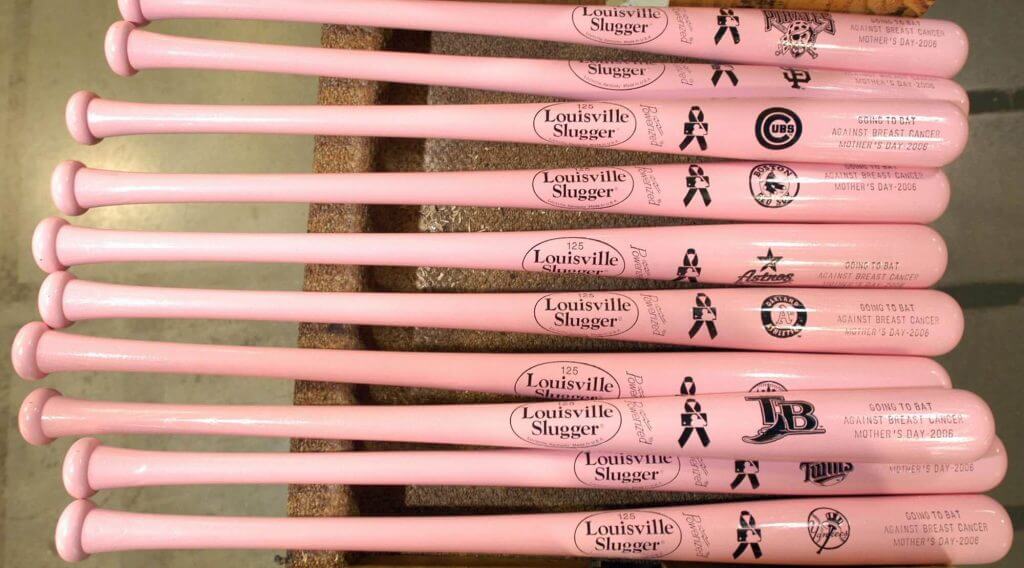
That all changed in 2006. That year, baseball began partnering with a certain breast cancer foundation, and began allowing the temporary use of the specially dyed bats in the color pink (at the time, MLB rules restricted players to using black, brown, red, or white bats). Believe it or not, the pink bat “inspiration” actually comes from hockey, which debuted pink sticks during the weekend of March 17th of that same year. Not coincidentally, both the sticks and bats were produced by the same company.
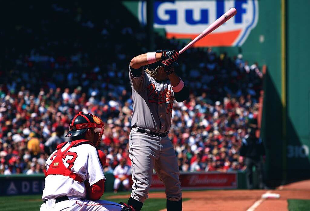
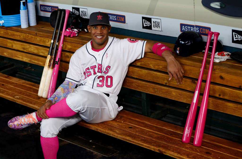
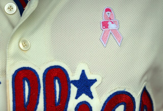
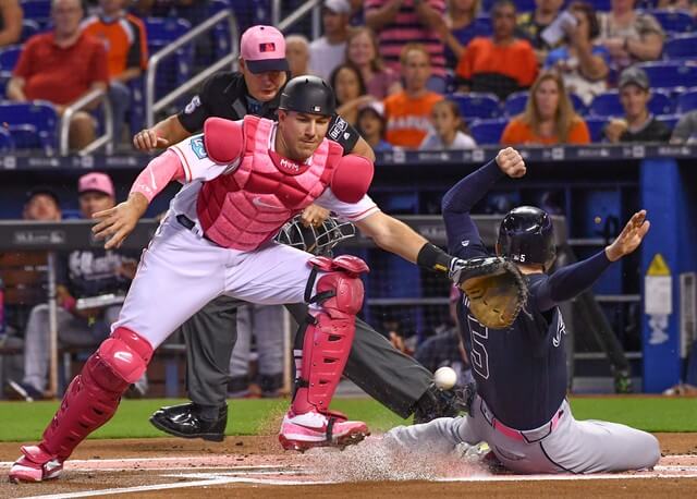
It wasn’t just the bats that were pink in 2006 either. Players were also given special dispensation to wear pink wristbands, pink necklaces, pink bracelets, pink gloves, and pink cleats (not everyone did, of course, but this is when the on-field pinkening began). Perhaps even more importantly, this is the year MLB introduced the now ubiquitous “pink ribbon” logo which began appearing on player jerseys.
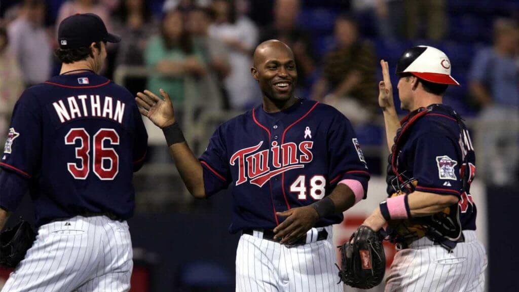
Things continued apace for several years with players sporting pink ribbons on their jerseys, and swinging pink bats — and of course, the other accoutrements — without any changes. While we grew used to seeing a lot of pink on the field, baseball began looking onto additional ways to add pink (and generate more revenue, ostensibly for BCA). In 2013, things really began to pinken up…
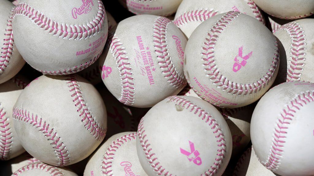
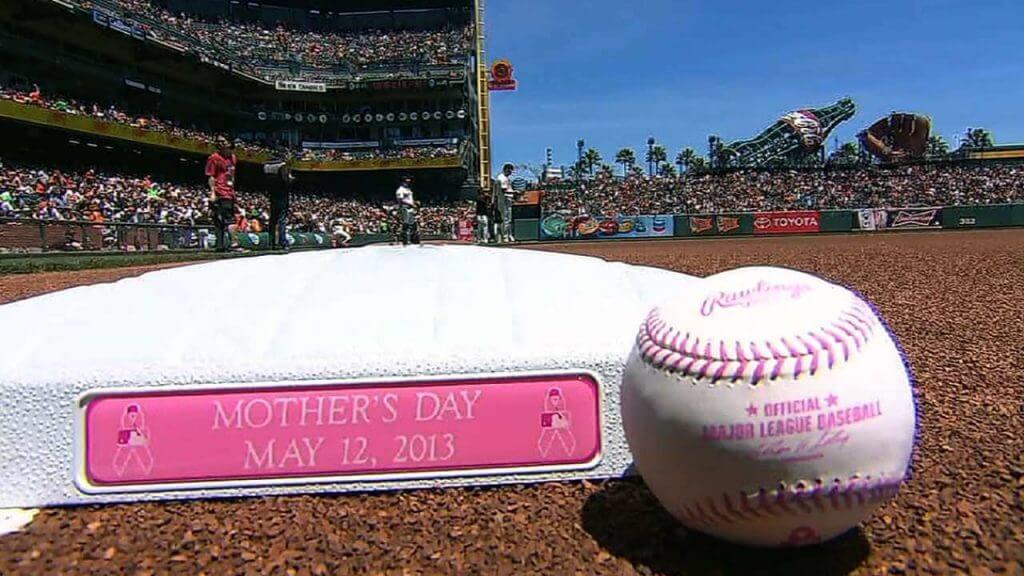
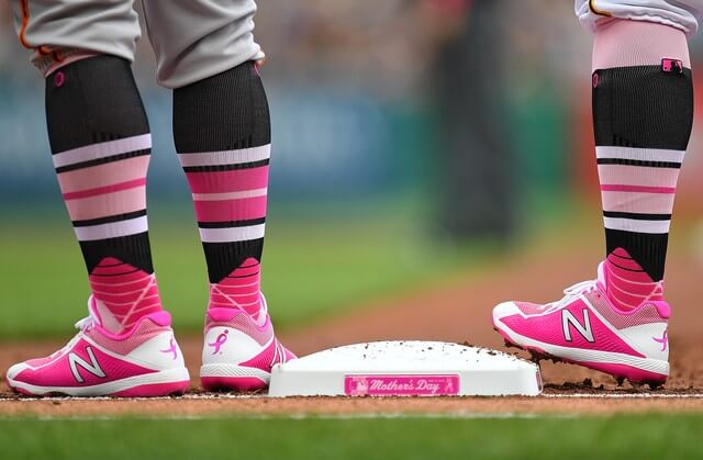
Starting in 2013, MLB approved baseballs featuring pink stitches which would have the MLB pink ribbon stamped onto them. In addition, pink plaques were placed on bases, and more equipment (masks, shin guards, chest protectors, etc.) were permitted in pink.
Still, except for the pink ribbon on the jersey, the uniforms remained pink-free. This would all change in 2014 — but not on a league-wide basis. On May 10, 2014 (the afternoon before Mother’s Day), the Chicago White Sox wore pink caps against the Arizona Diamondbacks.
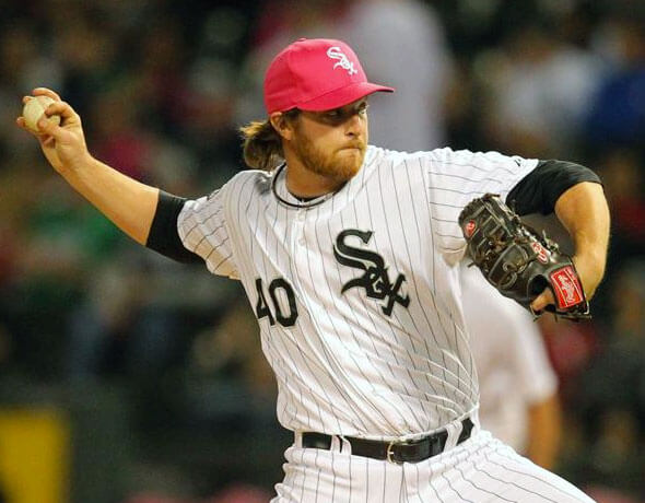
According to our pal Chris Creamer, “It was part of a Chicago White Sox “Pink Out” promotion for breast cancer awareness, the event was held jointly between the White Sox and the Chicago chapter of the Susan G. Komen Foundation — a charity in support of breast cancer education. As far as we can tell, is the first time in the modern Major League era, that a team has worn a pink cap in a MLB game.”
At first, this appeared to be just a one-off — no other teams wore pink caps in 2014, and teams merely sported the pink ribbon the following year (albeit with all the other pink affectations still omnipresent).
But MLB must have seen some of the marketing potential in the ChiSox headwear, as 2016 marked yet another watershed year for pink in MLB.
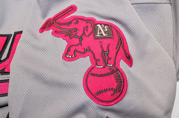
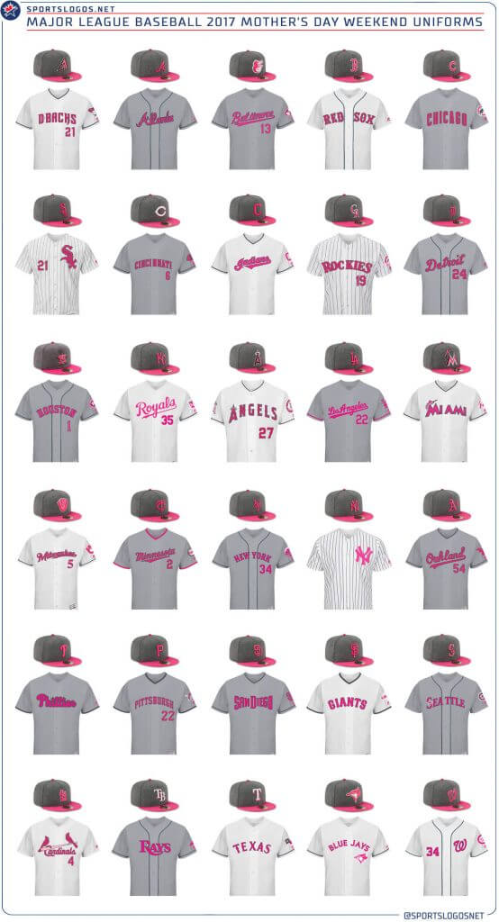
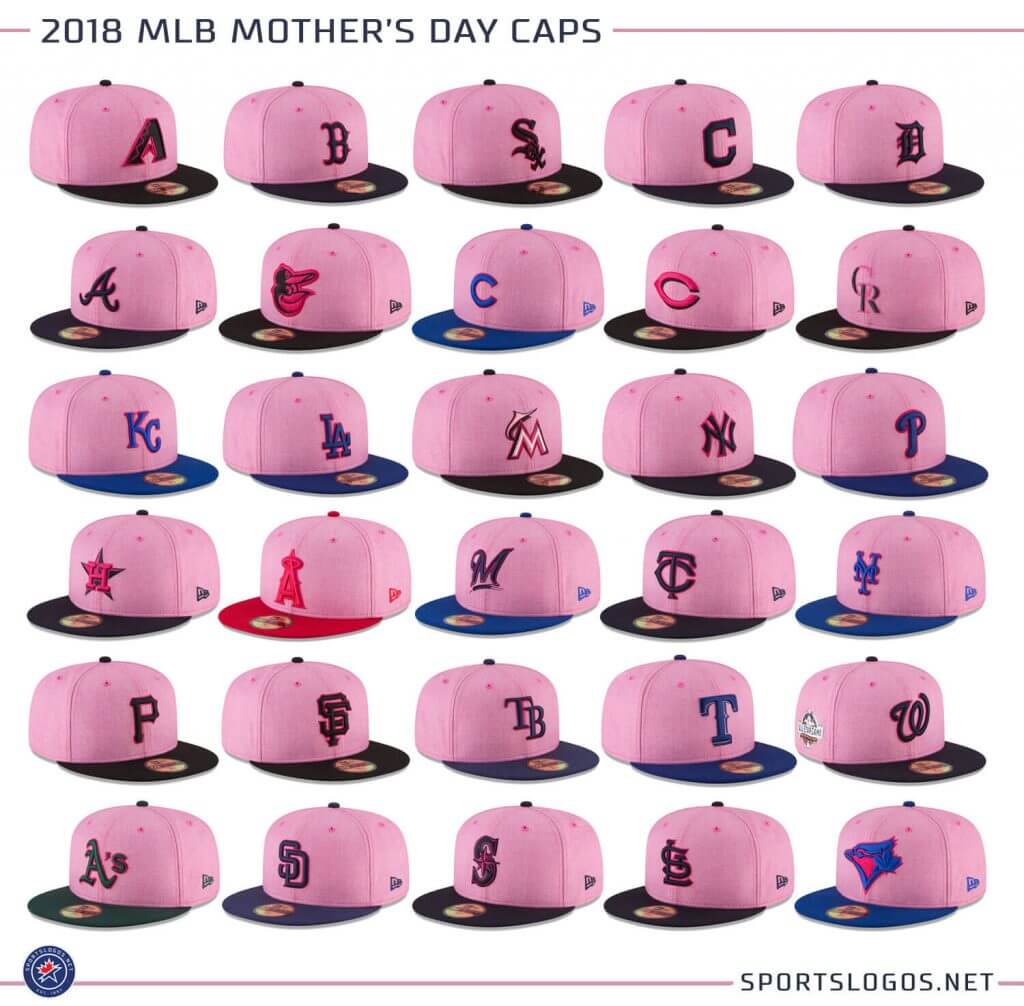
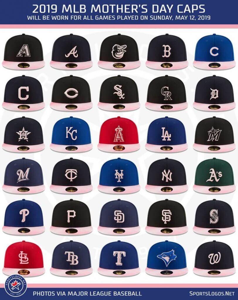
That year, not only did teams (on a league-wide basis) add pink to their caps, they also added pink to the uniforms themselves. All 30 teams “participated” (as if they had a choice), and instead of simply celebrating Mother’s Day on, ya know, actual Mother’s Day, teams wore the pink-tinged unis and caps on both Saturday and Sunday of what was being called “Mother’s Day Weekend.” Remember these?
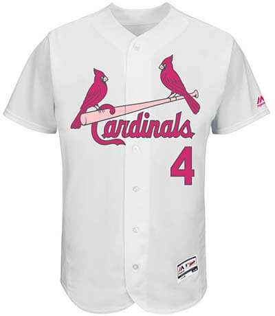
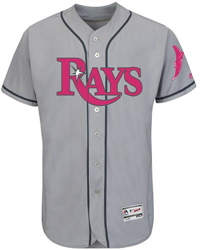
Not only did teams sport anthracite caps with pink logos, their uniforms replaced the scripts/wordmarks with pink lettering. Patches were also “pinked out.” (Well, except for a certain, now ‘retired’ patch.)
Here’s a look at the full set of caps/unis (thanks to Chris Creamer for his excellent graphics):
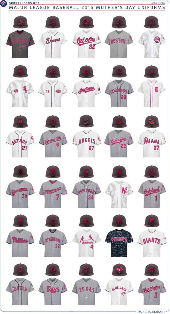
Interestingly, in 2016, Arizona went with a darker (anthracite) uniform, and the Padres, who wore camo on Sundays, adapted their camo uniform to fit with the Mother’s Day vibe. I don’t want to say it was pink overload, but well…
MLB liked it so much they did it again in 2017 — teams got the same uniform treatment from the previous year, but new caps were worn — this time with a pink brim.
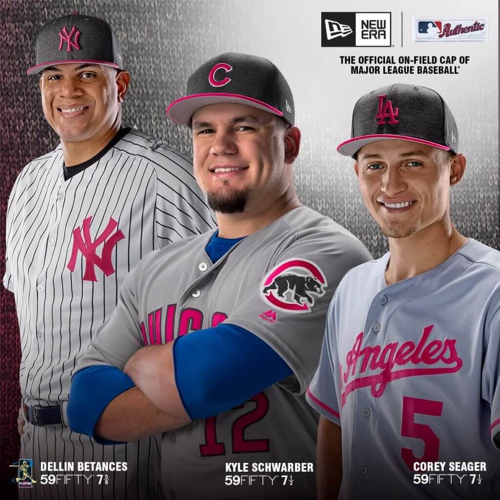
Also new for 2017 were socks supplied by Stance — which created an even more jarring pink-toned effect to an already very pink-affected uni.
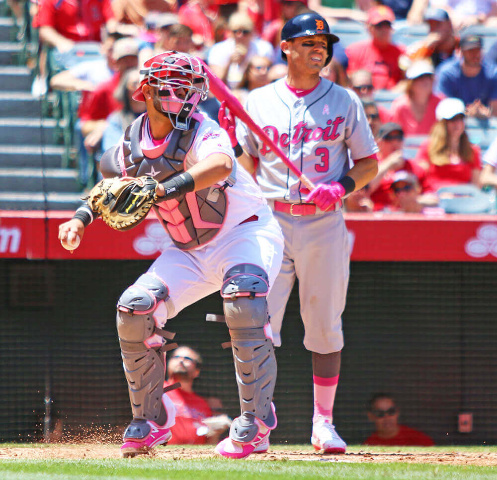
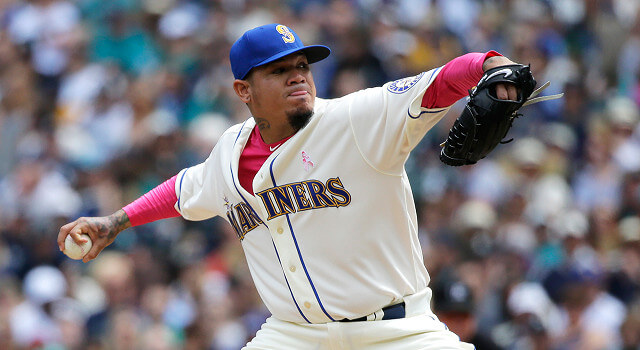
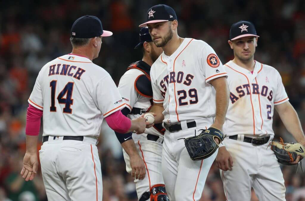
Not wanting to find out the pink equivalent to Spinal Tap’s black question, MLB began to put the brakes on the pinkening for 2018. They dropped the whole “weekend” wearing of specialty uniforms, and dropped the pink-lettered jerseys entirely. However, they made the entire crown of the caps pink, with normal-colored brims, and logos accented in pink.
Teams wore their normal uniforms, with the pink ribbon on the chest.
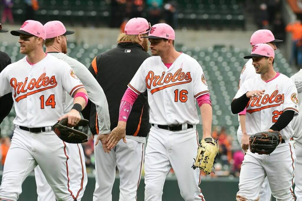
While the unis returned to “normal,” the pink elements were still in full force, but of course, with teams in regular unis, the effect was even more strident.
2019 saw a further reduction of pink — with cap brims being rendered in a toned-down shade, and logos also rendered in the muted color.
You might even say in a Goldilocks sense, these uniforms struck an (almost) “just right” balance.
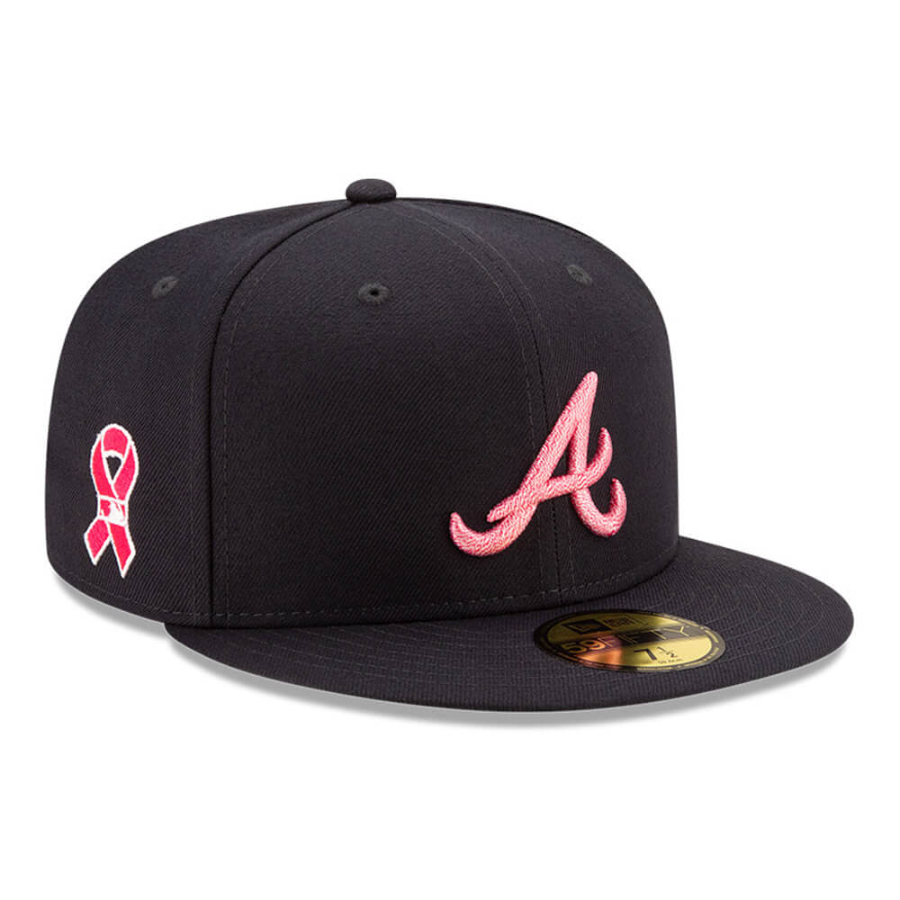
The pandemic took Mother’s Day baseball from us last year (when Nike began their uni contract) — and it struck before MLB would have unveiled their 2020 Mother’s Day caps, so we don’t know what they would have worn, but it’s likely they just rolled over their 2020 stuff to this year. And this year there will again be caps-only with pink. These are the least pinkified since 2016, with only the team logo rendered in pink.
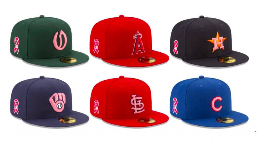
Here’s a closeup:
So there is a chance we’ll see even less pink than we have in years. There’ll still be plenty of pink on the diamond today though, it just won’t be on the unis (at all) or caps (that much).
So if you’re watching baseball today and you’re a mom, Happy Birthday!


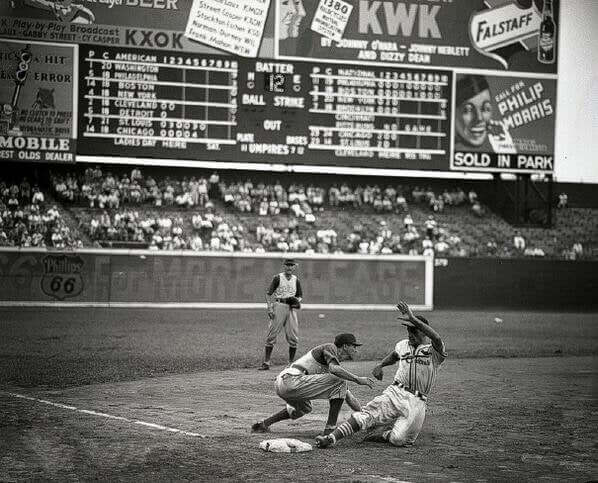
Guess The Game…
from the scoreboard
Today’s scoreboard comes from David Wallace.
The premise of the game (GTGFTS) is simple: I’ll post a scoreboard and you guys simply identify the game depicted. In the past, I don’t know if I’ve ever completely stumped you (some are easier than others).
Here’s the Scoreboard. In the comments below, try to identify the game (date & location, as well as final score). If anything noteworthy occurred during the game, please add that in (and if you were AT the game, well bonus points for you!):
Please continue sending these in! You’re welcome to send me any scoreboard photos (with answers please), and I’ll keep running them.

Uni Concepts & Tweaks
Time for more Uni Tweaks from the UW readership.
I hope you guys like this feature and will want to continue to submit your concepts and tweaks to me. If you do, Shoot me an E-mail (Phil (dot) Hecken (at) gmail (dot) com).
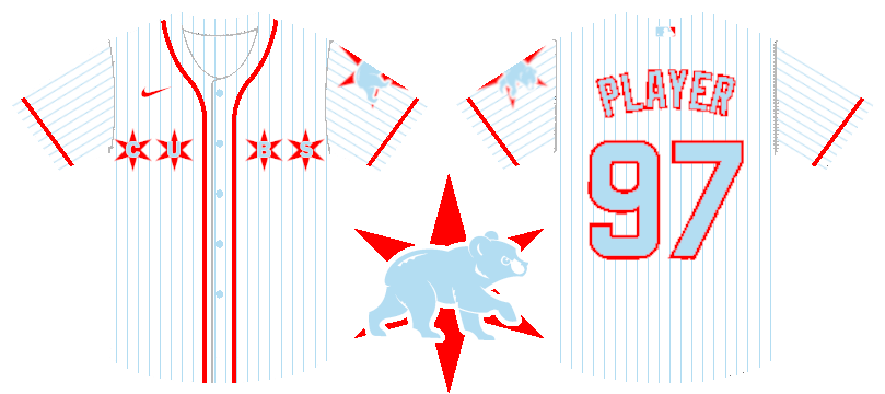
Today’s concept comes from Ian Lee:
He writes…
Hi Phil!
When I read Chris Creamer’s article on the Red Sox new uniforms, I was a little disheartened. Not just because of the atrocious Red Sox uniforms that were being covered, but because the story also mentioned that the Cubs–one of my favorite teams–would be among the teams also “getting” to have their identity defecated upon by Nike. Luckily, quarantine gave me a lot of free time to think about ways that this new CityConnect uniform could look, and I think that I came up with something that most Cubs fans would be happy with.
It features many aspects of the city flag including the colors and the correct stars, and knowing Chicagoans and that flag, this will be one of the rare hits of the CityConnect series if the MLB decides to go this route.
Thanks,
Ian Lee
And here is his concept:
OK readers (and concepters). If you have some tweaks or concepts, shoot ’em my way with a brief description of your creation and I’ll run ’em here.
Uni Watch News Ticker
By Phil

Baseball News: Here’s an interesting story about the history of Yale’s baseball stadium and how it was recently renamed “George H.W. Bush ’48 Field” in honor of the team’s most famous alumnus (from Kary Klismet). … Thank God it happened in baseball, because there’s no way this matchup between Mizzou and Tennessee (with strikingly similar colors) would ever be allowed in pretty much any other sport (from Timmy Donahue). … Interesting powder blue Phillies helmet shown here, used for holding soft serve (from Kevin McGuire). I don’t believe the Phillies have ever worn such a beast as an official helmet. … Arkansas wore digital camo hats yesterday at home against Georgia (from Timmy Donahue). … The Softbank Hawks have already worn their Mother’s Day unis (from Graveyard Baseball). … Matt Lesser writes, “Interesting picture of Dave Concepcion in 1976 – never seen him with what appears to be a captain’s C on the sleeve” — and of course, Paul had it covered back in 2017. … Jacksonville Jumbo Shrimp went with Jaxpos fauxbacks last night (from Matt Straus). I can see Bill Hetrick bidding on one of those. … HOLY SHIT check out this Montreal Expos-themed guitar (from Jeff Wilk). … The Cincinnati Reds’ Wade Miley has something on the underbrim of his cap, but Alex Hider isn’t sure what.

NFL News: New Miami Dolphin Jalen Waddle will keep the number he’s worn since high school, No. 17. … Reader Kurt Rozek asks, “This is a mid-70s pic of the annual College All-Star game versus the defending Super Bowl Champion Pittsburgh Steelers. I noticed that there are no numbers on the front of Terry Bradshaw’s helmet. Is that something that they didn’t do at the time or was it just a preseason thing?” … The Jets picked Zach Wilson with the number 2 pick of the first round, and he “unofficially” wore #2 at Jets minicamp (he wore #11 and #1 at BYU).


NBA/College Hoops News: If you had a spare $1.38 million lying around, you probably just bought yourself a UNC Michael Jordan jersey. … Duke has already announced jersey numbers for the 2021-22 season. … Real Madrid basketball has joined forces with Star Wars for a new hoops line. … Check out this outstandingly gorgeous Milwaukee Bucks alarm clock which Scotty Rogers almost bought for $1 at a thrift store. Those were apparently giveaways during the Bucks’ 50th season. … The New York Liberty have switched mascots as their marketing of Brooklyn move accelerates (from Timmy Donahue).

Soccer News: Chelsea’s Antonio Rudiger wore safety mask after breaking a bone in his face in the first leg of the UEFA Champions League match against Real Madrid on April 27 (from Max Weintraub). … Also from Max, this is a fun story from last year compiling a starting lineup of Chelsea players who wore masks. … England’s national team has unveiled a new version of its famous “Three Lions” logo that includes a male lion, a lioness, and a cub to promote greater diversity and inclusivity in the sport (from Kary Klismet). … The first details about Wolfsburg’s new 2021-22 home kit have been leaked ahead of its launch later this month (h/t to Comrade Robert Marshall). … Speaking of leaks, here’s a whole bunch of major Euro soccer club kits which have been leaked.

Grab Bag: The opening ceremonies for this year’s Giro D’Italia saw several cycling teams unveil new uniforms for the race (from Kary Klismet). … Also from Kary: Uniforms have been unveiled for Disneyland cast members who work in the amusement park’s new Avengers Campus attraction. … Art of Scorebug asks, “Is this HORSE but SKATE because skateboarding?” If you read the replies, this is apparently not new. … Several Syracuse lacrosse players demonstrated support for @Join1Love while suspended teammate Chase Scanlan faces a domestic violence-related charge (from Timmy Donahue).
Uni Tweet of the Day
Seems like about four or five of these are unnecessary…
Here are the Seattle Mariners! pic.twitter.com/XddRYMXJXY
— Jay Jackson (@DiamondUniforms) May 8, 2021
And finally… that’s it for this weekend. Everyone have a great Mother’s Day — hopefully most of you will be able to visit your Moms today, because social distancing rules have loosened enough and you (and she) are vaccinated. We’re not quite back to something resembling normality, but we’re definitely getting close!
You guys have a good week and I’ll catch you back here next Saturday!
Peace,
PH
GTGFTS: 8/12/41 Cardinals 8, Cubs 7. The other St. Louis-Chicago game would be called for darkness after 14 innings.
The Steelers don’t put the helmet numbers on until the regular season. The College All-Star game would have been their first pre-season game so no helmet numbers yet.
This practice has been highlighted in this blog before. I’m sure a search would find it.
The Wade Miley link goes to the NY Liberty article.
Should be fixed now.
Pink stitches on a baseball? I’d missed that one.
On a different note… the college football championship (yes there’s still Division I football going on in the FCS division) — it’s going to be an all Under Armor matchup. Blue and yellow of the Jackrabbits versus Bearkat orange. One week from today!
When do the M’s wear a pale blue jersey?
I want the job of the Mizzou higher-up who came up with that lazy cap logo.
Pale Blue was worn in Spring Training. They had planned to wear the blue cap with the green bill with the Navy tops. That lasted all of one series.
I’d like to see Zach Wilson wear #2 with the Jets.
1. I’ve always been suspicious of guys who wear #1; always strikes me as an unhealthy ego thing, based on guys I’ve played with and coached over the years.
2. No Jets QB has ever worn it,* and no Jets QB since Joe Namath has worn a number that includes the digit 2.
3. The #1 doesn’t look good in the Jets’ current numeral font; it looks more like a stripe than a number. Same for #11.
[* – Technically, rookie fourth-stringer Ed Chlebek wore it in two games in 1963, completing two of four pass attempts for five yards.]
I’ve always been suspicious of guys who wear #1; always strikes me as an unhealthy ego thing
Agreed. You gotta have stones to request that number, and you better have the talent to justify it.
If I were an owner or coach, I would either retire the number or just make it unavailable. Or, I’d say, “you want to wear the number 1? Come back to me next season and we’ll see if you earned it.”
The number on Miley’s cap is, I believe, a sticker. Here’s a better view on a game-worn cap from Amir Garrett from 2019:
link
Jacksonville Jumbo Shrimp went with Jaxpos fauxbacks last night (from Matt Straus). I can see Bill Hetrick bidding on one of those.
Idea great, execution poor. I have t-shirts more substantial than that.
HOLY SHIT check out this Montreal Expos-themed guitar (from Jeff Wilk)
Just the item for my VOIVOD tribute band.
It’s been a full Mother’s Day of activities, so I’m late in getting a chance to check in. But I wanted to make sure to give you a shout out, Phil, on the outstanding work today! That was a great – and comprehensive – recounting of the visual history of Mother’s Day in MLB. I may not like all the pink gimmickry, but it makes for a fascinating read.
And I love the Kiner reference! A good reminder that, with all the great characters in the history of baseball, Yogi Berra isn’t the only one who could utter some great Yogi-isms.
Thanks, Kary!
That photo of Concepcion is not from 1976. He was named the Reds captain in 1984 and remained so until he retired in 1988.
You’re right that the photo is not from 1976. But Concepción was actually named captain in 1983, not ’84:
link
I believe the photo is from 1985. That was the first year Reds players were allowed to wear black cleats with a red shoe brand logo.
The next season the Reds switched to red cleats.
While the ivory-set they wear on Sundays is quite nice, the Mariners are long overdue for a full uni-makeover IMO. Question is: will they go in the direction of a look that’s lasting or screw around chasing trendy and dreadful uni-BS?
Knowing Seattle as I do (I lived there for a time), I have my doubts…