By Phil Hecken, with Quinn Zielonko
Follow @PhilHecken
Good Saturday Morning, Uni Watchers! I hope all are doing well and you all had a good week.
A couple months ago, I began running series of “ColorTown” concepts from Quinn Zielonko — back in March, Quinn showed off his first 10 (of 40) — if you missed that (which also sets this post up), you can click here. Today Quinn is back with the second 15 in the series (for a total of 25); since he’s actually creating these as we speak, we’ll likely have the final 15 in another month or two. But there’s a ton of great stuff to get to today, so I’ll turn it over to Quinn right now.
Z89Design ColorTown Concepts
by Quinn Zielonko
The #ColorTown series seen here is actually an expansion of my main 160 jersey series. After completing that in December, I felt like I wanted to round out each team’s set with a less traditional look, so I set two rules:
1. The primary color must be different than any used in my main series. (A big challenge!)
2. Each jersey must incorporate some design element that references the team’s locale.
The inspiration for #ColorTown is a combination between the NFL’s Color Rush series and the NBA’s City Jersey series. The NHL has kind of done Color Rush already with the Reverse Retros, but I’d love to see the City idea at some point too. This aims to combine both! Like my main series, this features all 32 NHL Teams (including Seattle) + 7 Defunct NHL Teams (includes all cities that had an NHL team, but no longer do) + the Houston Aeros, to make an even 40 teams. Here are the first 10:
Toronto Maple Leafs
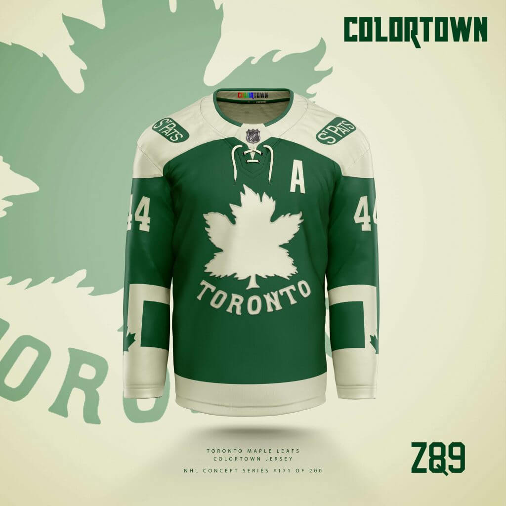
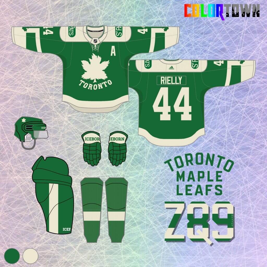
11. Toronto Maple Leafs – For the Leafs, I went with a St. Pats-themed look, but in green instead of white. The Leafs actually wore green for the first year under that moniker, and the logo is from that same season. Toronto’s city flag works nicely as the “Town” element here, creating some unique stripes.
Florida Panthers
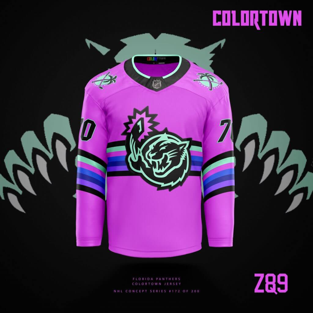
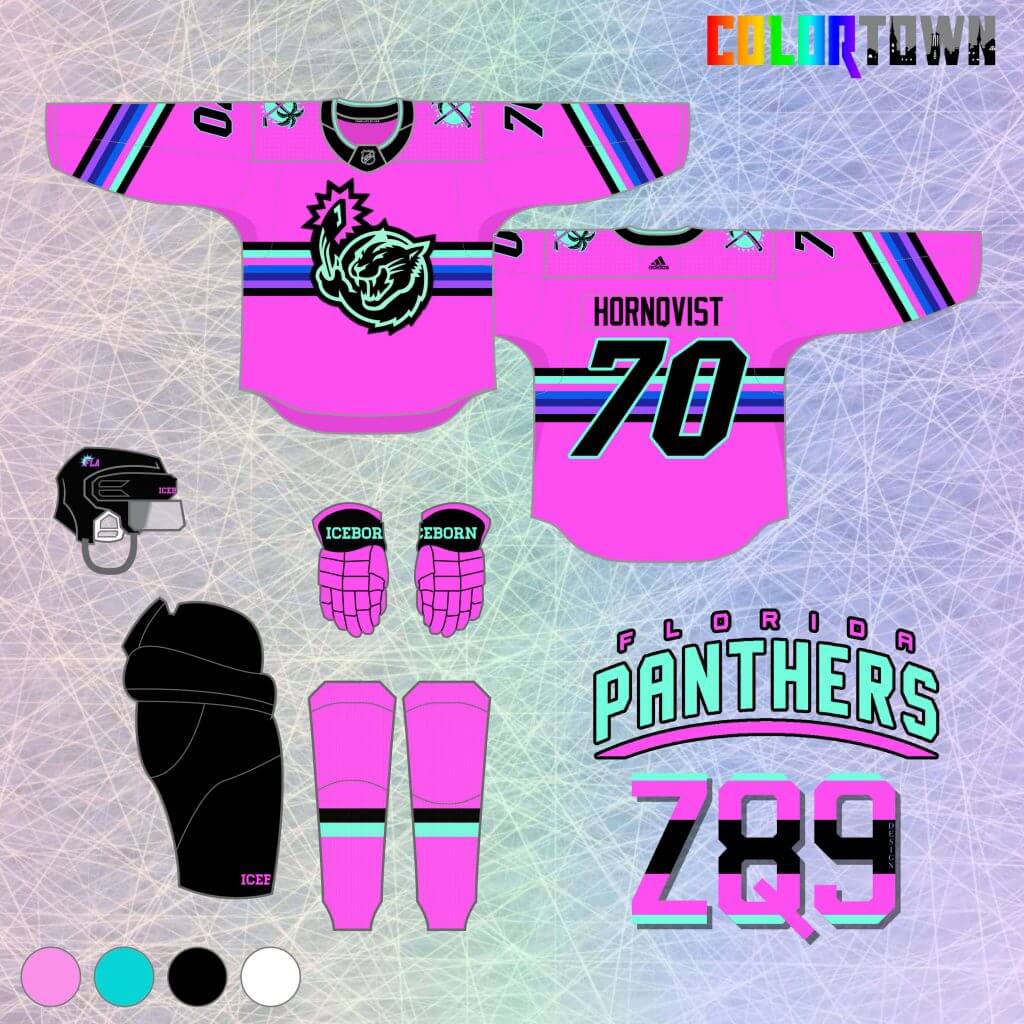
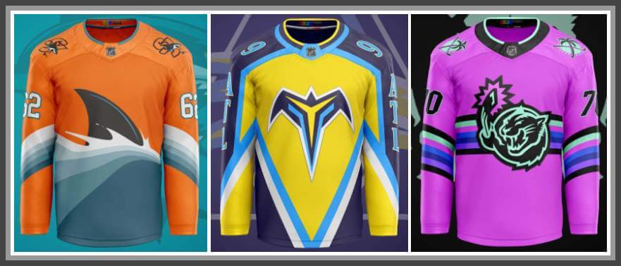
12. The “Miami Vice” theme is a little overwrought at this point, but I tried to put a cool spin on it for the Panthers jersey in this series. I expanded the color gamut a bit from the typical neon pink, blue and black to set it apart from say, what the Heat do in the NBA. This was also a cool opportunity to use a prototype logo that never actually made it to the NHL. Plus, for a series called “ColorTown”, how could I pass up an opportunity to use hot pink?
San Jose Sharks
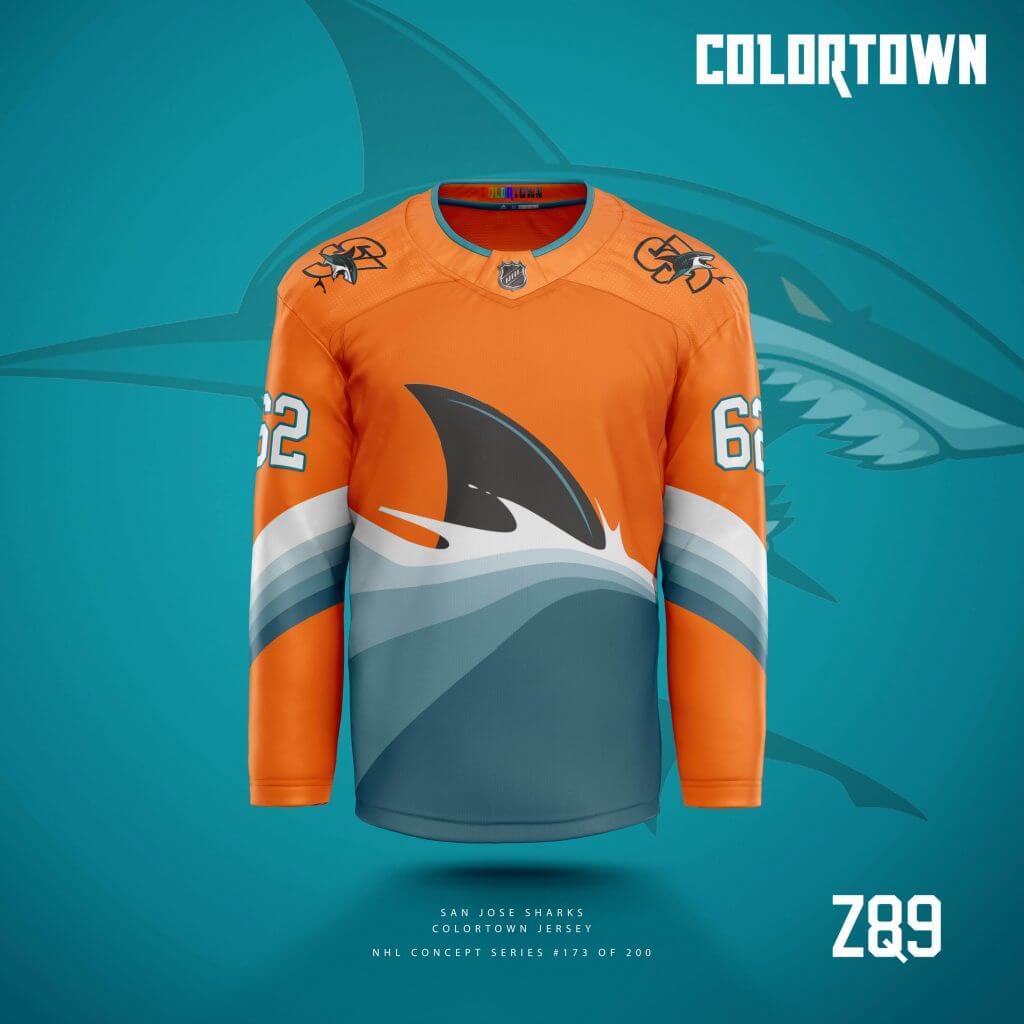
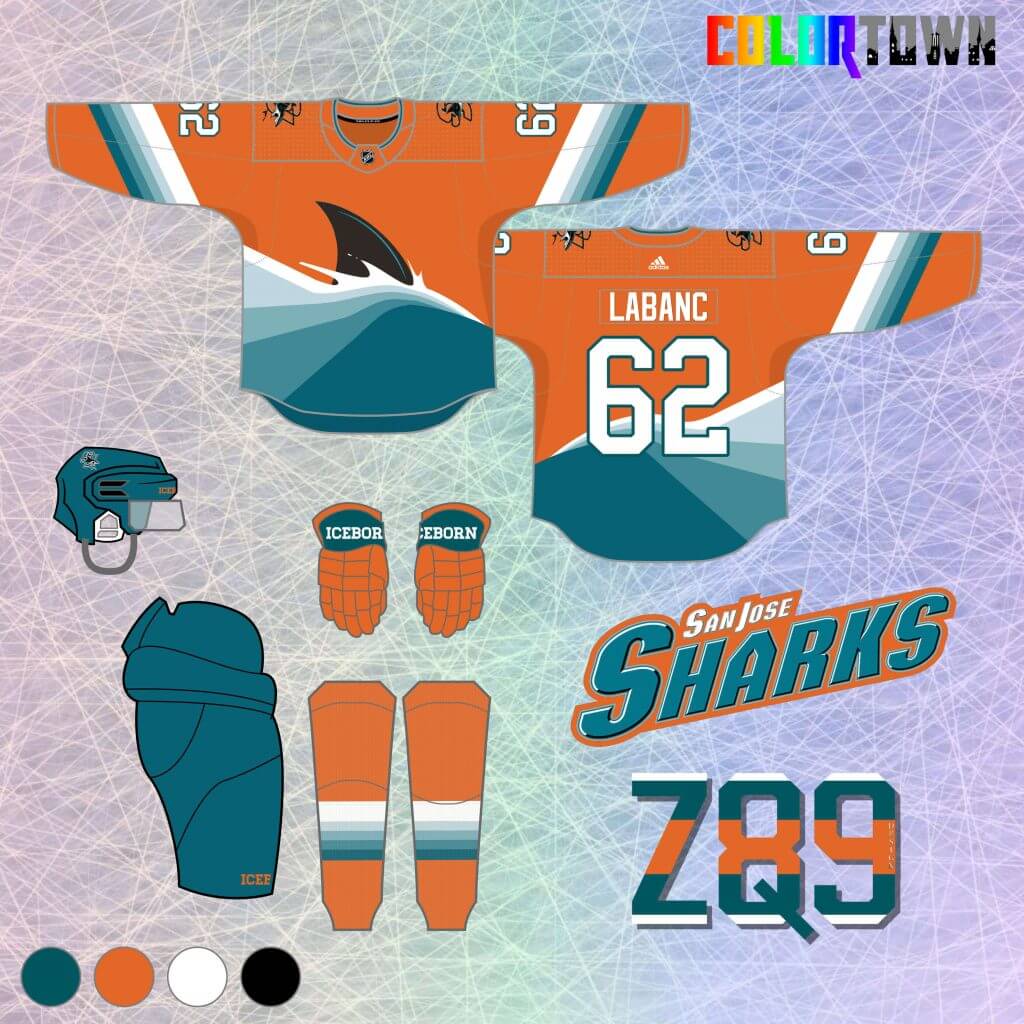
13. These Sharks jerseys are admittedly ridiculous, but considering I envision ColorTown sweaters as a “once or twice a year” kind of thing, I go a little wild every once and a while. I always like the Sharks alternate logos that played with the not-quite-gradient colors of an ocean wave. I expanded that to a primary feature of this jersey, while an intimidating fin pokes above the waves. I prefer gray to orange for the Sharks historically, but I think it works well here as a sort of sunset backdrop.
Winnipeg Jets
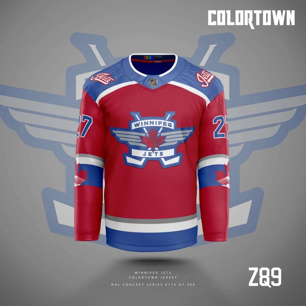
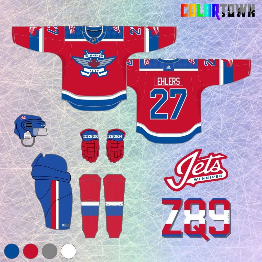
14. Returning to a bit more of a traditional look, the Jets are up next. Red comes to the forefront here, and I feature some underused alternate logos. The “Town” element is the white silhouette of the Esplanade Riel bridge in the arm stripes, which features prominently in the downtown Winnipeg skyline.
Chicago
[In keeping with UW policy, because this concept uses Native American iconography, we will not display the image here. However, you can click the link below to see the concept — PH]
15. Chicago’s city flag colors take over here, featuring the alternate logo as primary. However, I wanted to still keep a hint of the original logo colors in the scheme, so they’re present in some very thin, almost easy to miss stripes on the arm. This is a great color scheme that would look great on the Hawks if they ever decided to go a little outside the box.
Philadelphia Flyers
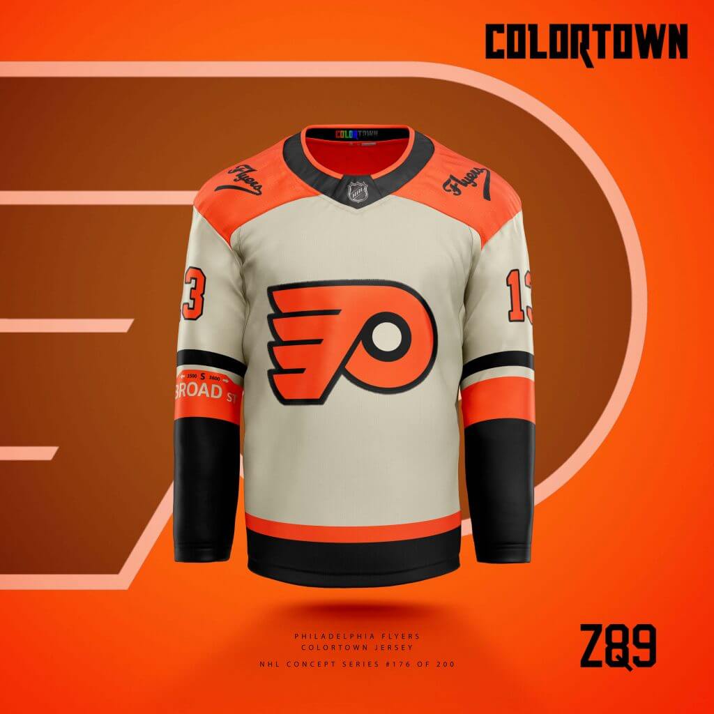
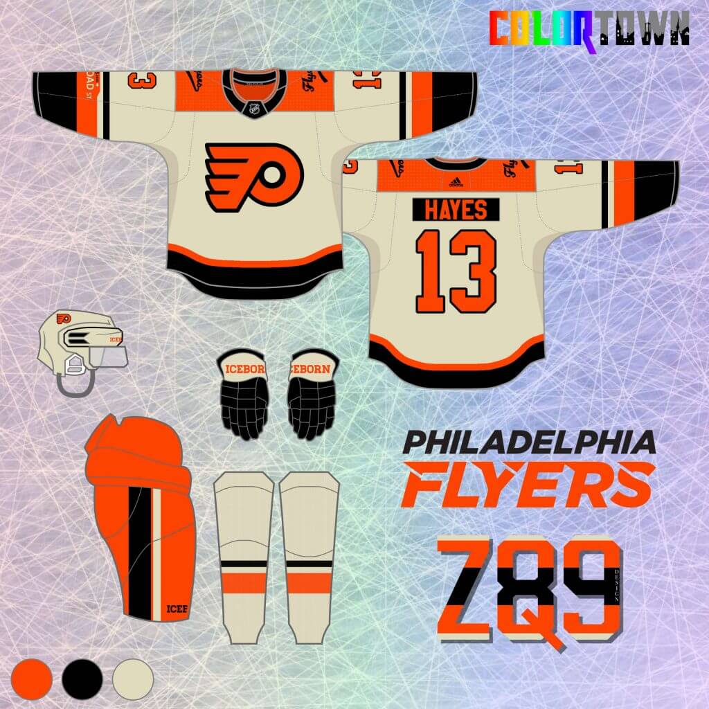
16. The Flyers concept here features one of my favorite “Town” design elements, the road sign for Broad Street. It’s a subtle bump on the right arm, but it’s a cool homage to not only the location, but the team’s historic 70’s Cup winners. I used a vintage white color to go along with the historic theme, and I flipped the colors around on the primary mark to differentiate this from other Flyers alternate jerseys.
Anaheim (Mighty) Ducks
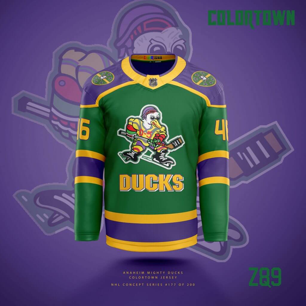
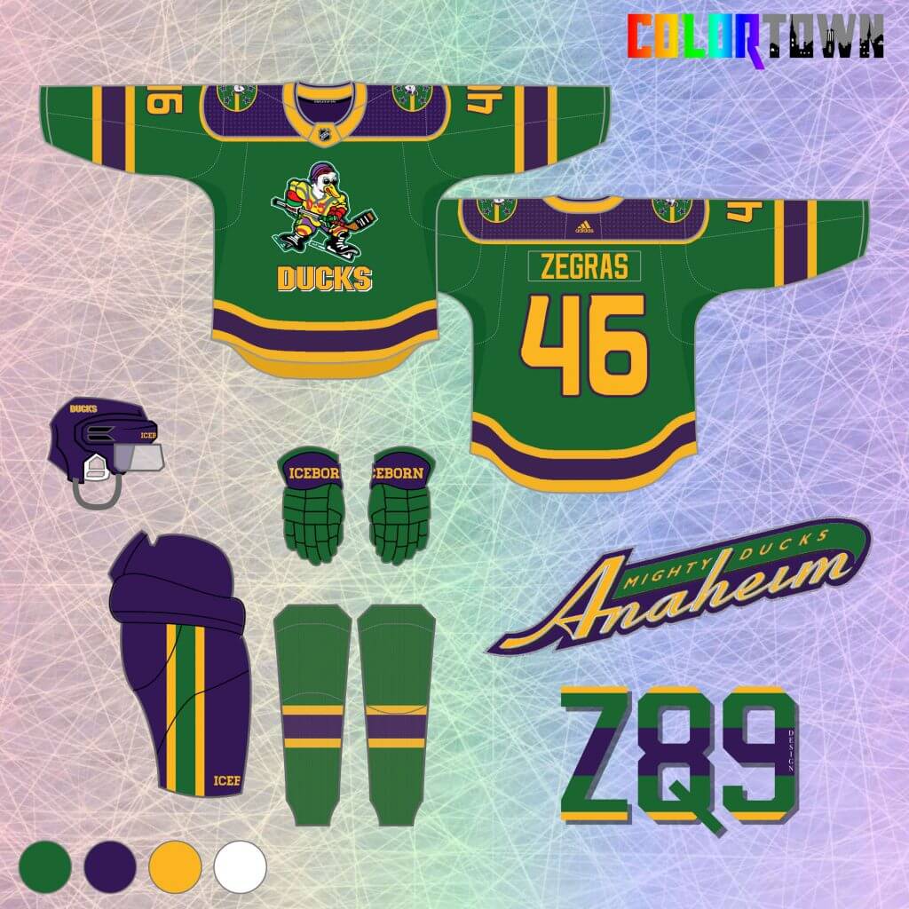
17. Quack, quack, quack! I couldn’t help but bring back the original Mighty Ducks movie jerseys. An Anaheim flag-themed shoulder patch brings in the “Town” element here. This take on these jerseys presents some bolder stripes and increased purple throughout compared to the originals. A modern update on a classic.
Dallas Stars
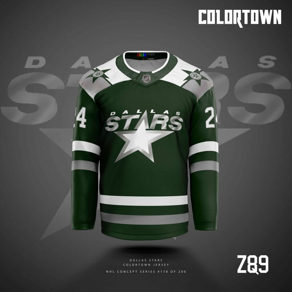
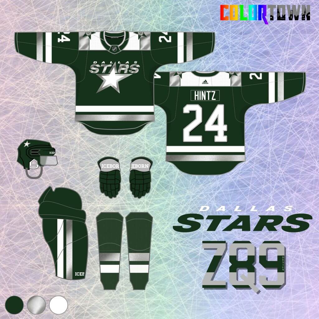
18. For Dallas, I went with a dark green color. Unlike their Reverse Retro’s, contrast is actually present here ;-)… The silver really pops against the green background, while Dallas’ entire city flag is featured on the shoulders, albeit in Stars colors.
LA Kings
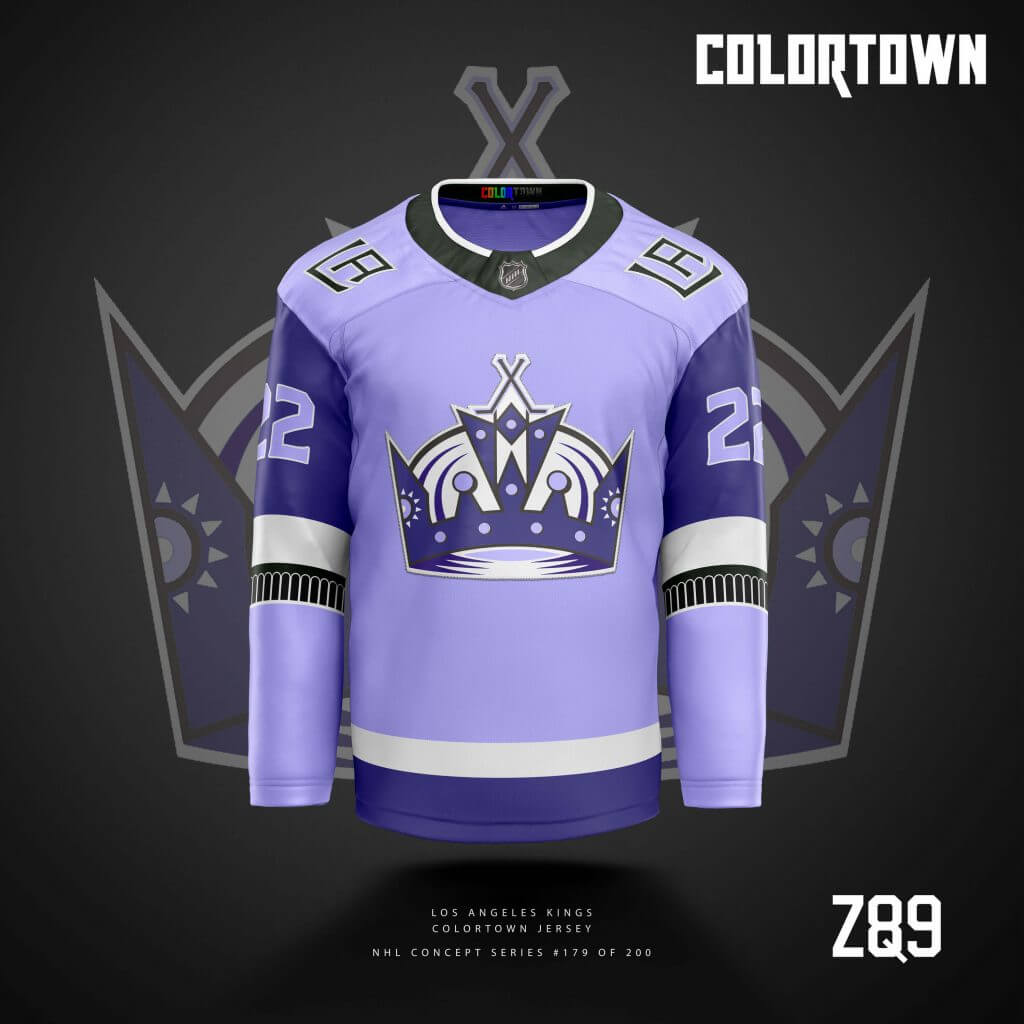
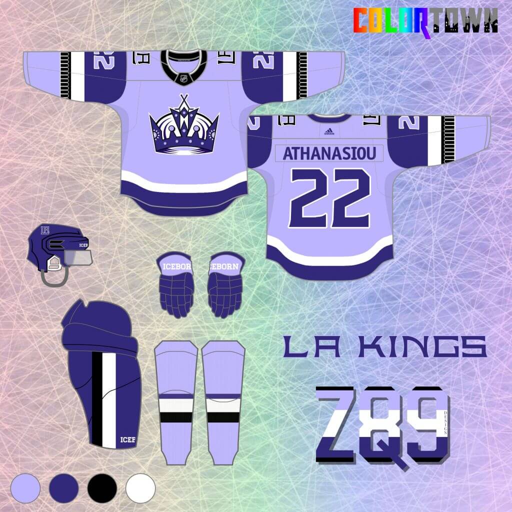
19. Lavender? Yep. Purple is criminally underutilized in the NHL, so I’m giving you two in one. The lighter shade especially is rarely used in sports, period, so this outlandish concept series is its time to shine. I think it actually plays off of the forum blue and black pretty nicely and would look sharp on the ice. The “Town” element here is in the arm stripes, as I used a repeating arch pattern, invoking memories of the old LA Forum.
Montreal Canadiens
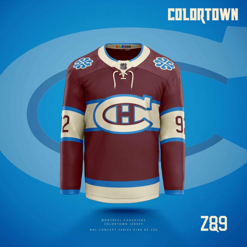
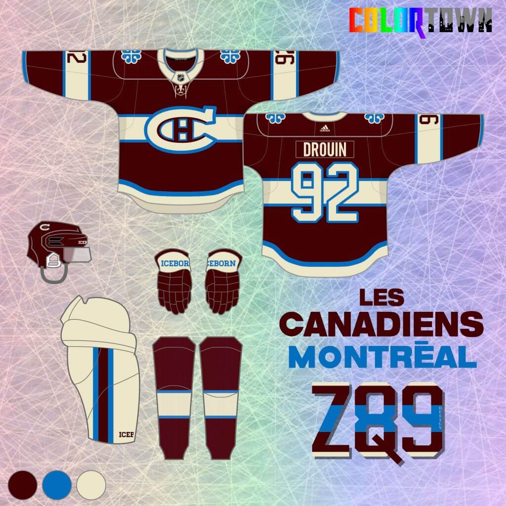
20. The Habs are always a challenge… how to go classic, yet create something original? Well, maroon never looks bad on a hockey sweater, and it’s also a great historic reference to the long defunct Montreal Maroons. I picked out the Habs 2016 winter classic logo, along with the brighter-than-normal blue that came with it, which pops nicely against the maroon and vintage white colors.
Houston Aeros
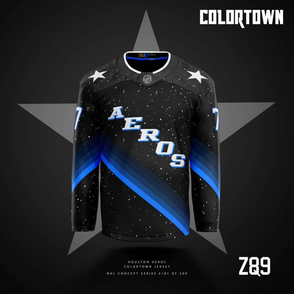
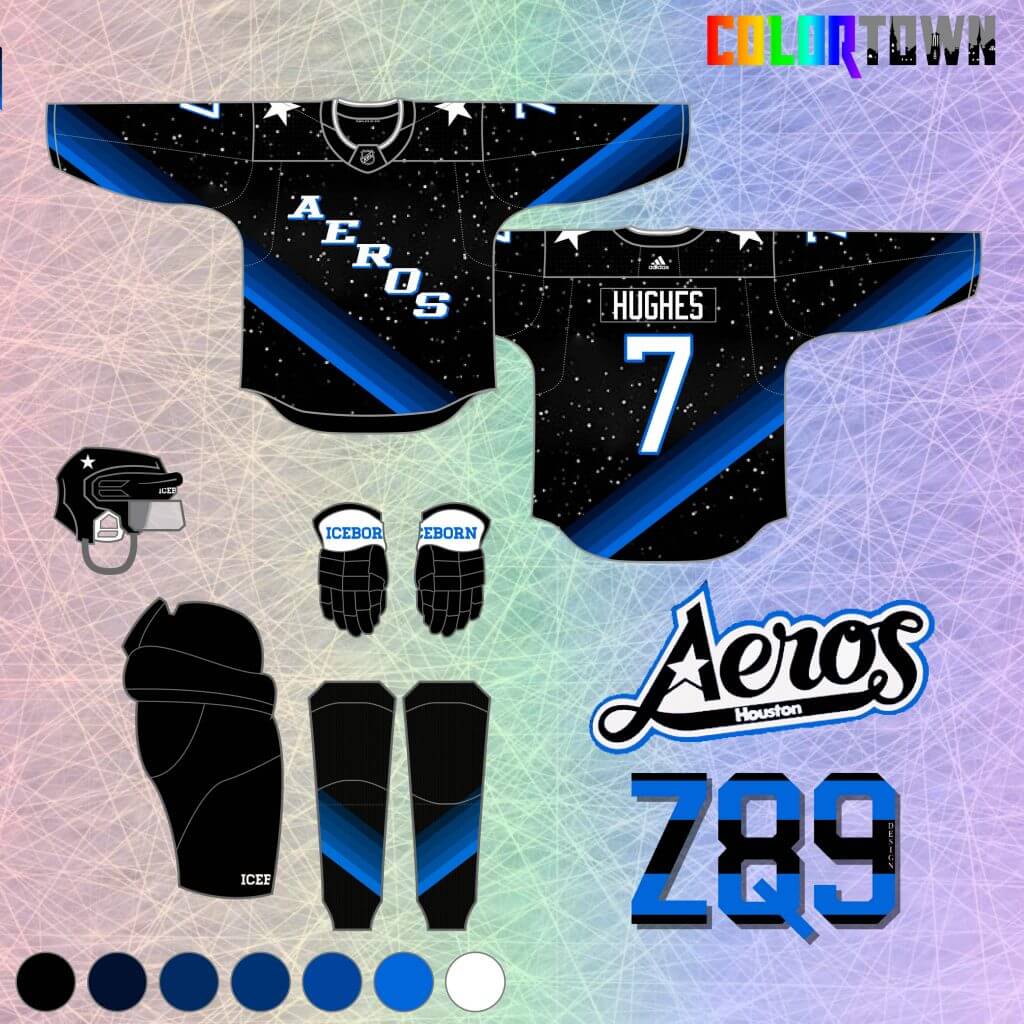
21. In my design version of the NHL, the Houston Aeros are the 40th team. For this concept, I took the aerospace theme and went interstellar. A starscape adds character to an otherwise boring black background, while several shades of blue abstractly convey motion, layers of the atmosphere below and whatever else you might imagine! It’s also a rather obvious reference to NASA’s illustrious history in Houston.
Ottawa Senators
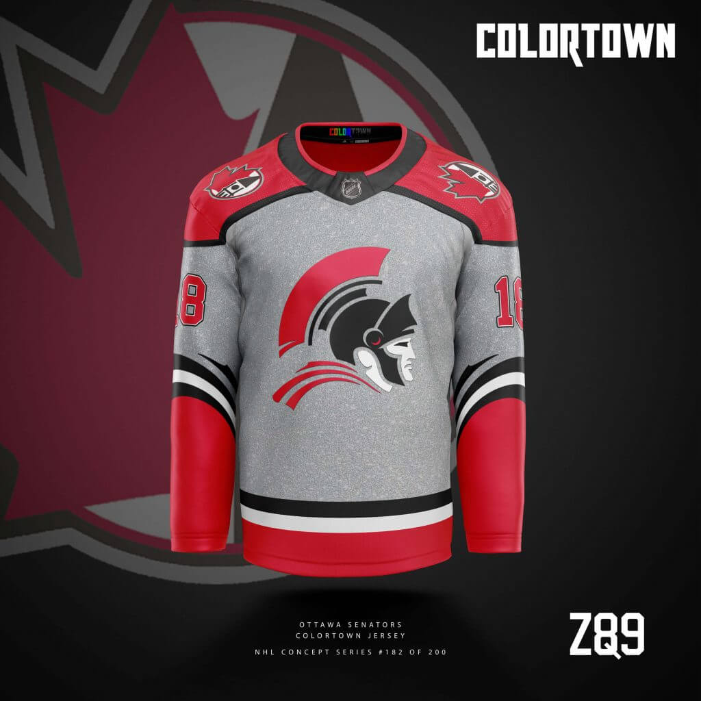
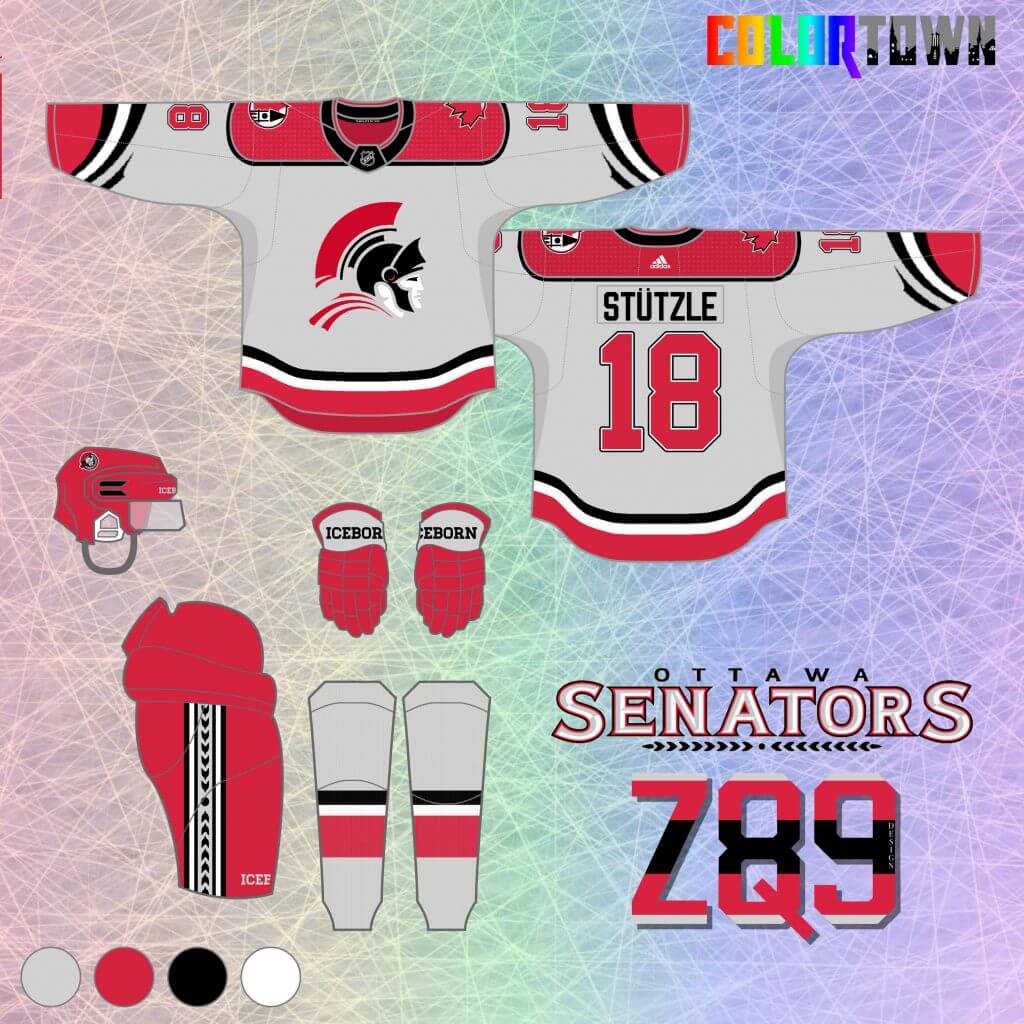
22. A silver Sens concept is up next! I always like the silver accents on their now-retired “O” alternate jersey, so it’s front and center here, along with a sparkly texture that you now see on Vegas’ real-life alternates. The logo is a “deconstructed” version of the unused 2D crest that succeeded the original, while the arm stripes feature elements of Ottawa’s flag to round out the “Town” theme.
Atlanta Thrashers
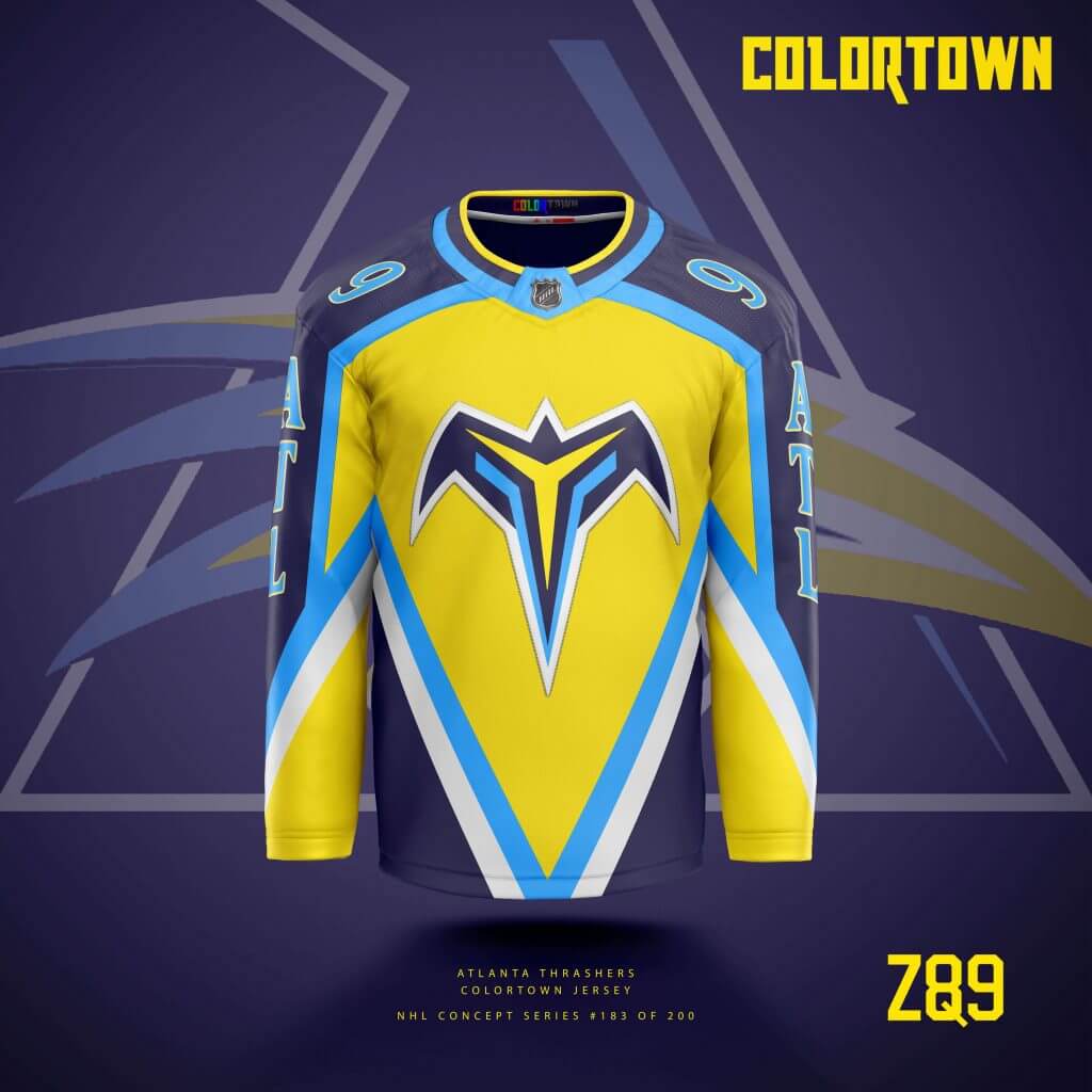
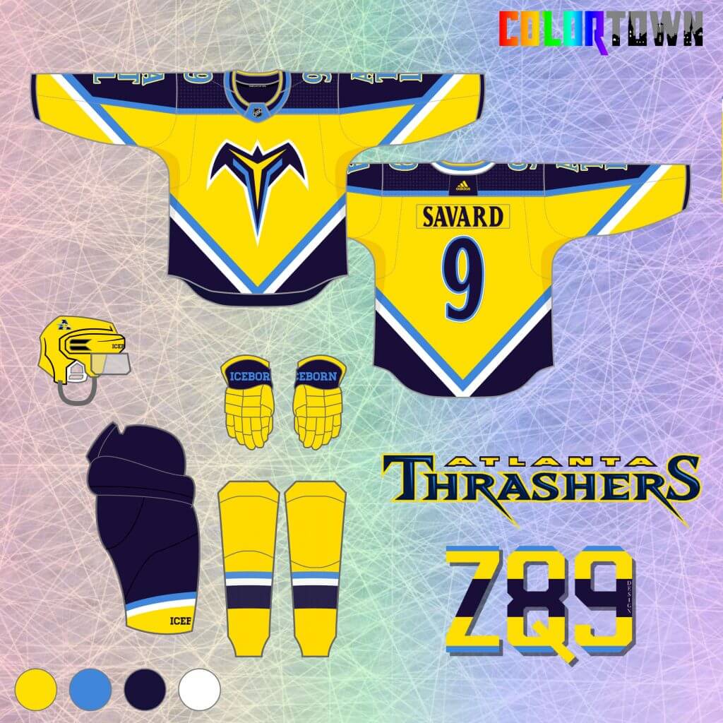
23. Another defunct team, the Atlanta Thrashers are next. Who doesn’t love some powder blue, yellow and navy? Blue and yellow are also in Atlanta’s city flag. I always thought the team’s color scheme was a little over-complicated and muddled, so this simplifies it and goes bold.
Washington Capitals
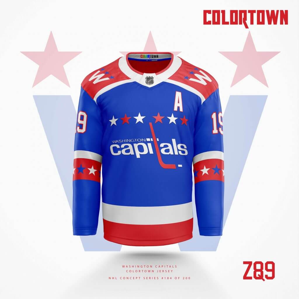
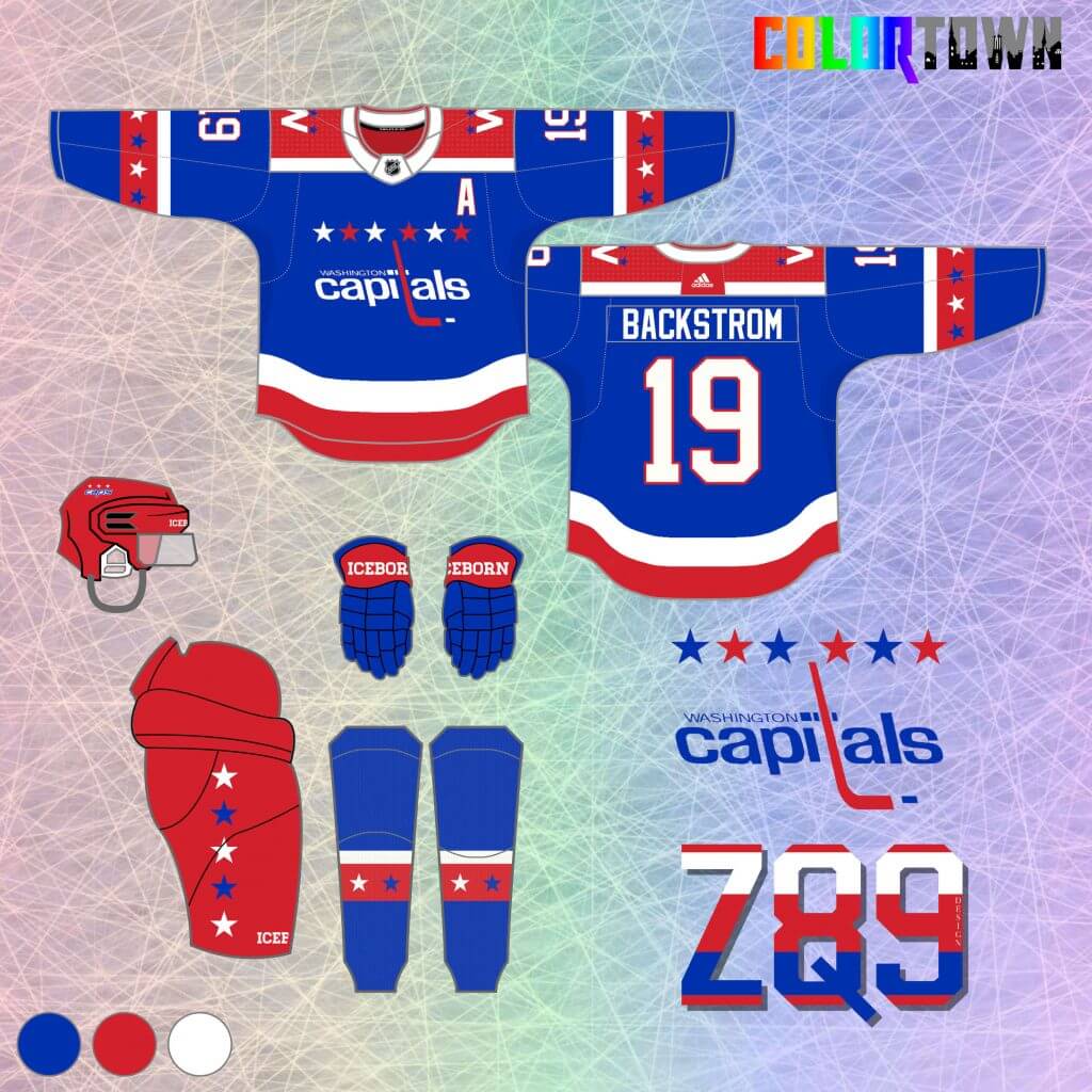
24. The Capitals concept has a bit of a Reverse Retro vibe, bringing in elements of the team’s original jersey. I went with royal blue, but made every effort to make sure it didn’t look like a Rangers jersey… hopefully I pulled it off. The “Town” element here plays mostly off of the Nation’s Capital idea, featuring exactly 50 stars from head to toe. If DC becomes a state, I’ll figure out how to squeeze in a 51st somewhere!
Quebec Nordiques
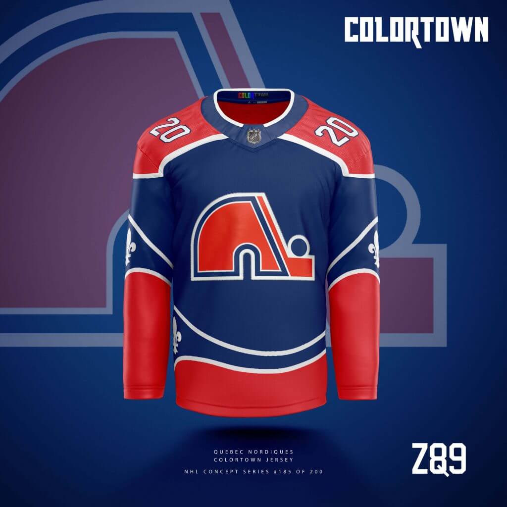
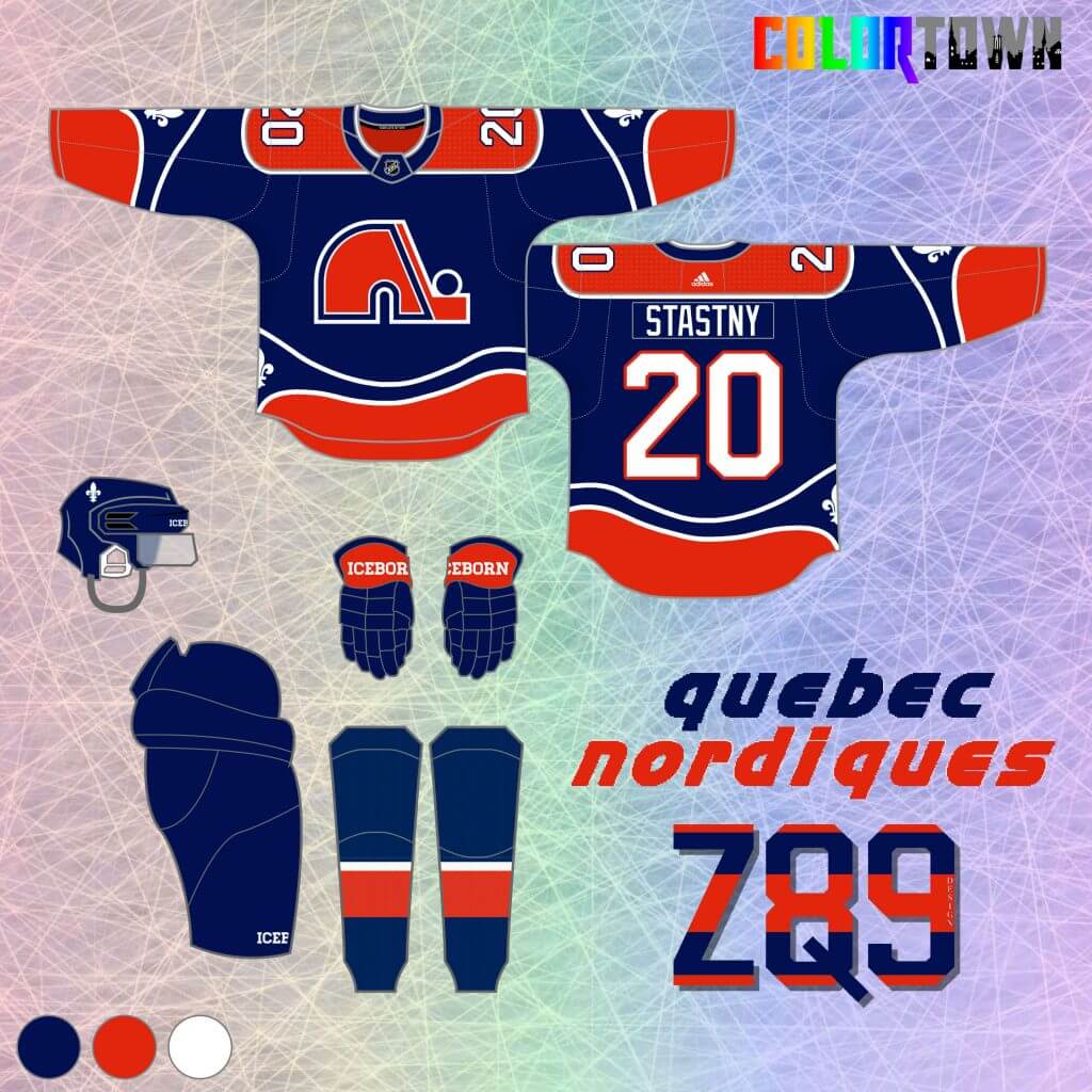
25. Last up today are the Quebec Nordiques. This is one of my favorite “Town” ideas. The name “Quebec” originates from an Algonquin word that translates in English to “where the river narrows.” I applied that description to the stripes in this jersey. A fleur-de-lis, emblematic of Quebec, sits on the arms and waist at the point where the stripes start to narrow, just like the city itself. Navy blue is used to mimic the color of a river and still fit with the team’s original color scheme.
Thanks, Quinn! Those second set of ColorTown unis span the gamut from modern classic to bodaciously bold! And everything in between. Looking forward to your final 15 ColorTown concepts (whenever you complete the set).
Readers? What say you?


The “BEST OF” Kreindler’s Korner
Hey guys & gals. You’ve enjoyed Kreindler’s Korner for several years now, mostly on the weekends, on Uni Watch, but with the recent coronavirus outbreak, Graig’s time is just too precious and he needs to tend to other things besides coming up with a new writeup each weekend.
So, going forward, for as long as the COVID-19 situation is bad in New York, I’m going to run a few “Best of’s” until Graig returns.
Here’s today’s offering:
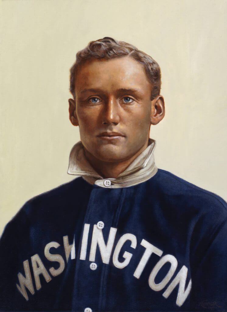
Title: “Barney”
Subject: Walter Johnson, 1907
Medium: Oil on linen
Size: 16″ x 22″As I’ve mentioned in previous posts, I’ve always been fascinated with the T-206 baseball cards. For those of you new to the game, it’s a card set that was dispersed by means of cigarette and loose tobacco packs, circulating between 1909 and 1911. Consisting of 524 cards through 16 different brands that were owned by the American Tobacco Company, the set is best known for including a card of Honus Wagner, which to this day is widely considered the Holy Grail of the card collecting industry. Yes, that one. The rarity (and story behind that rarity) of the card accounts for its desirability, which was a hot item among early collectors of the set merely a decade or two after its release. The most expensive example to ever sell fetched almost three million dollars, still the most ever paid for a baseball card.
So, the hope was always that someday I’d be able to have some sort of gallery show depicting the paintings I had done that were inspired by the lithographs on the card set (which came from the lens of the Swedish-born Carl Horner, a photographer who was based out of Boston, MA). Though still not anywhere near achieving that goal, I still try to paint at least one or two of these portraits a year.
This past one allowed me the opportunity to paint the great Walter Johnson. The biggest challenge in the creation of the painting came from his jersey, which in the card, is very different from what appears in the original photo – which required a good amount of research to get historically accurate. And as I was going for with the other paintings in this set, I went after a more true realism than what was seen on those cards. It was my goal to try and mimic what Horner probably saw in his viewfinder when he himself took these portraits: polished faces of tough men in their clean uniforms, lit by a northern skylight and backed by a simple muslin curtain, seemingly gazing into the ether.
In this case, we have a 19-year-old kid at the beginning of a career that would see him become perhaps the greatest pitcher of all time.
Thanks, Graig! You can (and should!) follow Graig on Twitter.


Guess The Game…
from the scoreboard
Today’s scoreboard comes from Bill Moss.
The premise of the game (GTGFTS) is simple: I’ll post a scoreboard and you guys simply identify the game depicted. In the past, I don’t know if I’ve ever completely stumped you (some are easier than others).
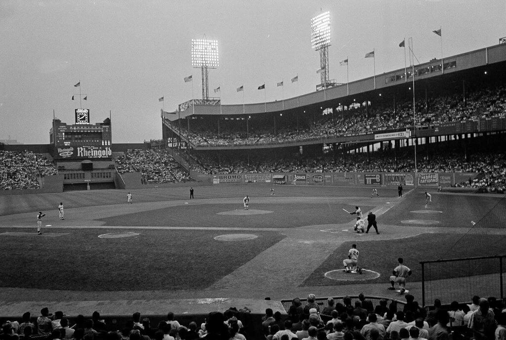
Here’s the Scoreboard. In the comments below, try to identify the game (date & location, as well as final score). If anything noteworthy occurred during the game, please add that in (and if you were AT the game, well bonus points for you!):
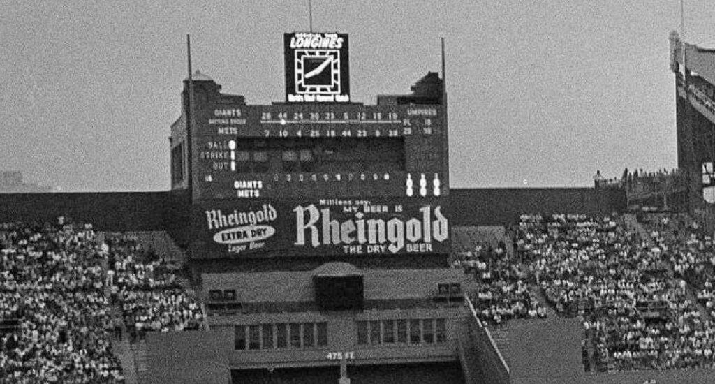
Here’s a zoom shot, in case you can’t read the above photo:
Please continue sending these in! You’re welcome to send me any scoreboard photos (with answers please), and I’ll keep running them.


Click to enlarge
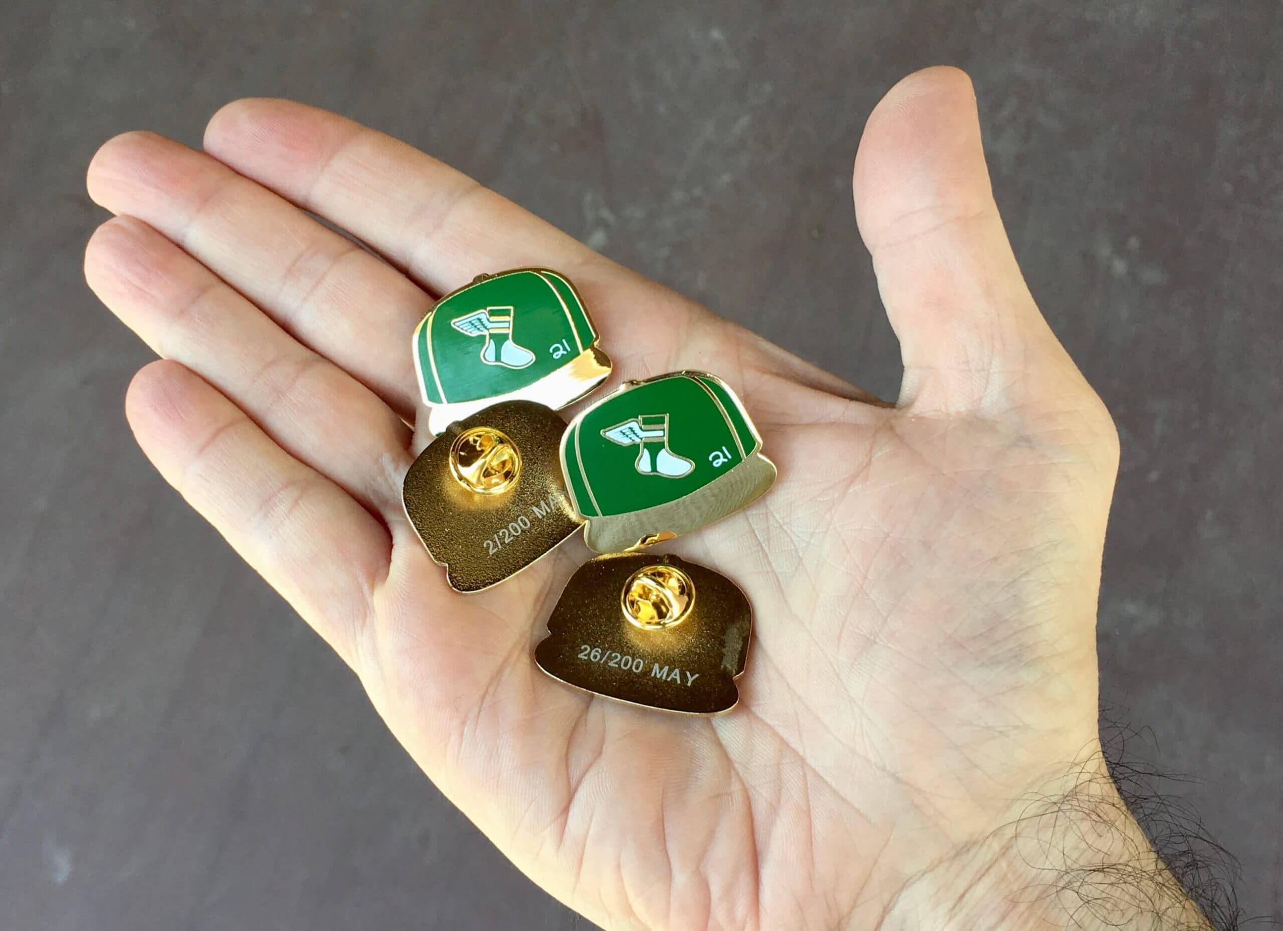
ITEM! New Pin Club launch: Paul here. Now that the calendar has turned to May, it’s time for our latest Uni Watch Pin Club launch. This month we’re keeping it simple and classic with a Uni Watch baseball cap pin, which you can order here.
A few notes:
• This the first Pin Club pin that doesn’t include the words “Uni Watch.” We thought it was better to let the design speak for itself.
• The little white “21” stands for the year, obviously, and is meant to mimic the little cap inscriptions that MLB players sometimes use as a shout-out to injured or fallen teammates.
• Numbered edition of 200 pins.
Again, the cap is available here. Enjoy!
Now back to Phil with the rest of today’s content.


The Ticker
By Anthony Emerson

Baseball News: With Roberto Alomar being banned from baseball due to serious sexual assault allegations yesterday, the Blue Jays have announced that they are taking his banner down at SkyDome and removing his name from the Level of Excellence (from multiple readers). … The Yankees’ Field of Dreams Game cap has been revealed (from @Turtleman12347). … Blue Jays IF Santiago Espinal wore his BP cap in-game last night (from multiple readers). … If you’ve ever wondered why Yankees OF Clint Frazier wears No. 77, here’s your answer (from William F. Yurasko). … Dodgers rookie P Edwin Uceta became the first player in team history to wear No. 92. This leaves only fifteen numbers that remain unworn (from Dave Sikula).

NFL News: The WFT had a rather odd helmet graphic during an interview with their new draft pick Jamin Davis (from @realrosebud). … Bucs RB Leonard Fournette is switching to No. 7, his college number (from Wayne Koehler). … Bengals first-round pick WR Ja’marr Chase will wear No. 1, becoming the first wearer in team history (thanks, Phil). … Eagles first-round pick DeVonta Smith will keep his number from college, 6 (from Timmy Donahue and Sam McKinley). … For a further run-down of NFL draftees’ uni numbers, see this article (thanks, Phil). … Falcons first-round pick TE Kyle Pitts will wear No. 8. Welcome to the new NFL (from our own Brinke Guthrie). … Also posted in the hockey section: the Golden Knights prepared an alternate sweater for Raiders first round pick Alex Leatherwood (from Moe Khan). … TSN tried their best to photoshop Aaron Rodgers into a Broncos jersey, I guess (from Chris Larsen). … Vikings first round pick Christian Darrisaw will wear No. 71 (from Luke Larson).

Hockey News: When President Obama addressed the nation after Navy SEALS had killed Osama bin Laden, one of the cameramen at the White House was wearing an Alex Ovechkin jersey. The Tweet (probably correctly) assumes the cameraman was brought in directly from that night’s Caps playoff game (from Ryan Ramirez and Matthew Algeo). … Cross-posted from the NFL section: the Golden Knights prepared an alternate sweater for Raiders first round pick Alex Leatherwood (from Moe Khan). … Also posted in the NBA section: the ECHL’s Orlando Solar Bears have some pretty amazing Orlando Magic throwback-inspired sweaters on tap (from Kevin Tucker).

NBA News: New costumed mascot for the Mavericks (from Kary Klismet). … Cross-posted from the hockey section: the ECHL’s Orlando Solar Bears have some pretty amazing Orlando Magic throwback-inspired sweaters on tap (from Kevin Tucker).

Soccer News: Liverpool’s 2021-22 kits have leaked to FootyHeadlines (from Kary Klismet). … Also from Kary: New kits for Oakland Roots in the USL Championship. … Speaking of the USL Championship, Miami FC has unveiled their new kits as well (from Ed Żelaski). … Also from Ed: Charleston Battery, another USL Championship team, unveiled their home kit. … Benfica’s new away shirt has been leaked. … Spurs will wear the logo of the Indochina Starfish Foundation – a nonprofit providing education to underprivileged children in Cambodia — in a match against Sheffield United tomorrow (thanks, Phil).

Grab Bag: This article in Slate makes the argument that the German gymnastics team’s new unitards are revolutionary in women’s gymnastics (from Phillip Tutor). … Creating Amtrak’s paint took an amazing amount of thought and planning, according to a story in Atlas Obscura (from Wolfie Browender). … Miami (OH) Field Hockey posed with a “Save Stanford Field Hockey” banner before their game against the Cardinal, as Stanford is planning on dropping the sport at the conclusion of this season. Stanford players have been crossing out the school’s name on their unis (from Adam St. Bear and our own Jamie Rathjen). … Female Muslim police officers in Newark, N.J., will now be able to wear a hijab with their uniform (from Timmy Donahue).


Uni Tweet of the Day
Definitely got a Bo Jackson Tecmo Bowl vibe here…
first look at jaylen waddle in a dolphins uniform. pic.twitter.com/LXXB4oinmk
— josh houtz (@houtz) April 30, 2021


And finally… that’s going to do it for this fine first Saturday in May. Big thanks (again) to Quinn for his ColorTown NHL concepts! Looking forward to the final set down the road.
Everyone enjoy the Derby (or whatever sports and/or uniforms you may be watching), and I’ll catch you guys again tomorrow.
Peace,
PH
Friday June 1, 1962. Giants at Mets. Willie Mays’s first game back at the Polo Grounds since 1957. The radio broadcast of the game is available on You Tube. The Mets treated this game like opening day as both teams were introduce before the game by lining up on the field. Hear the game at this site link.
GTGFTS
Willie McCovey is about to go yard against Roger Craig in the first inning of the Giants first game at the Polo Grounds as the visiting team 6/1/62.
The handwritten “21” tribute on the May pin elevates the design to a whole new level.
We all have our OCD moments. One of mine is when people make a squiggly 2 instead of a flat-bottomed 2. However, the pin is still a good design.
Bucs RB Leonard Fournette is switching to No. 7, his college number
He was one of the first people I thought of when the change was announced.
Bengals first-round pick WR Ja’marr Chase will wear No. 1, becoming the first wearer in team history
That boggles my mind. And I’m not a fan of players wearing No. 1, but still.. I thought for sure they would have had someone with that number by now.
Falcons first-round pick TE Kyle Pitts will wear No. 8. Welcome to the new NFL
Which is a bit like the very old NFL, and I’m on board with that! Actually, I’ve never noticed a single-digit tight end before. I like.
Thumbs up to the Sharks, Aeros, Caps, Senators, and Nordiques. Thumbs down to the Jets, whose insignias are the worst in the NHL. Quinn should have used the WHA iconography, or that of the team which became the Coyotes.
Double thumbs up for the Sharks and Nordiques. I’d wear those.
Love seeing the Blackhawks sweater with a link on the site per policy which I completely respect… then scrolling down and seeing a sweater with the giant head of a Roman general.
GTGFTS
I absolutely loved this small amount of sleuthing work necessary to find the answer. And I learned an awful lot about the Polo Grounds and what an awesome scoreboard!