By Phil Hecken
Follow @PhilHecken
Good morning, Uni Watchers. As always, I hope everyone is staying healthy and doing well otherwise.
As I’m sure you’ve heard by now, we had some major MLB news yesterday, when MLB announced it was moving the 2021 All-Star Game and 2021 draft out of Atlanta, in response to a new Georgia voting law. MLB Commissioner Rob Manfred stated, “Over the last week, we have engaged in thoughtful conversations with Clubs, former and current players, the Players Association, and The Players Alliance, among others, to listen to their views. I have decided that the best way to demonstrate our values as a sport is by relocating this year’s All-Star Game and MLB Draft.” Additionally, Major League Baseball “fundamentally supports voting rights for all Americans and opposes restrictions to the ballot box.”
While MLB’s decision may seem hasty, it was not the first business to object to the new law and around two dozen companies have issued public statements criticizing Georgia’s new voting restrictions. So far, MLB’s decision to move the ASG and draft may have the most immediate impact. Atlanta immediately reacted to the decision with this statement:
The Braves statement regarding the moving of the MLB All-Star Game: pic.twitter.com/0Iapm3eIre
— Atlanta Braves (@Braves) April 2, 2021
I’m sure many of you have (strong) opinions about this decision, and that’s perfectly fine, but for today, we’re going to center the discussion on how this affects the Atlanta uniforms, which will obviously be going under some alterations in light of the loss of the ASG. Let’s keep the comments to the unis, please.
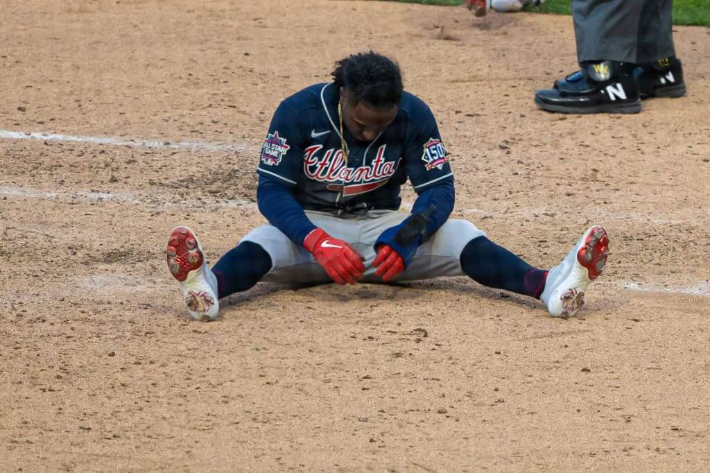
As you can see, the team began the season on Thursday with two sleeve patches: the right sleeve contained the All Star Game patch, while the left sleeve features the 150th Anniversary patch. With the loss of this year’s All Star Game, obviously that patch will be removed at some point. As Paul noted in his 2021 MLB Uniform Preview, “A serious patch-o-rama situation is looming in Atlanta,” leaving the team with little room to memorialize Henry Aaron and Phil Niekro on their sleeves, as most teams do. To begin the season, the team decided to honor those two legends by subtly adding their uni numbers to the back of their cap:
This season, we tip our caps #For44 and #ForKnucksie 💙❤️ pic.twitter.com/CIAqoqh3jH
— Atlanta Braves (@Braves) March 31, 2021
With the likely upcoming ASG patch removal, that will free up space on the sleeve if the team chooses to memorialize Knucksie and the Hammer in the more traditional manner. Of course, the team could keep the cap memorials and add sleeve patches — or not.
As of Friday night, when I wrote this, Atlanta hadn’t made any official announcements of any uniform alterations. The team had an off-day yesterday, and will resume their series with the Phillies today, when we may get our first indications of how they will handle the situation.
Allow me to, as Paul often does, try to anticipate your questions.
The game against the Phillies starts at 4:00 pm. Would that be enough time to remove the ASG patch?
Of course. The question is whether or not they will want to before the game. The team wore their blue alternates on Thursday. Depending on whether they wear their regular gray road jerseys or the blue tops again, there aren’t that many jerseys with patches that would need to be removed. They might also just leave the patches in place.
If they’re not removed today, what about for their next series?
Again, time isn’t (or shouldn’t be) a problem, at least in terms of removing the ASG patch. Whether or not the team decides to add player memorial patches to the sleeve is another matter.
Does the team have to remove the ASG patch?
I don’t think they are required to, but it would seem very odd to keep it there. Of course, the team could decide to leave the patch in place as a form of protest. As you can see from their statement (above), the team seemed somewhat blindsided by MLB’s decision.
What about the cap? Doesn’t the cap have the ASG patch too?
Yes. On the right side of the cap they have a smaller, similar patch. I would think these will also be removed.
What about all the retail jerseys and caps? Will those have the patches removed?
That’s not really UW’s biggest concern, since this don’t involve the on-field product, but it’s a fair question. Obviously there are jerseys/caps bearing the patches already on sale. If the team removes them from their caps/unis, I would imagine the retail product would follow a similar protocol. It’s hard to imagine they’d recall any stock already shipped out, but any new items may not have the patches. One could probably safely say the caps/jerseys already in circulation will become “collectible.”
What about the ASG jerseys and caps? Don’t the host teams usually have specially designed (and host-themed) gear?
Fortunately, the ASG itself won’t be affected. Players wear their normal home and road unis for the game. But the Home Run Derby and assorted other events do have special jerseys and caps. MLB hasn’t unveiled those yet, so it remains to be seen what will happen with those. They could design new ASG gear for the new host city/team (which has not yet been announced) or they could wear whatever Atlanta-themed jerseys/caps were already in the pipeline. A similar situation existed in the NBA this year when teams wore the Indiana Pacers-inspired uniforms, despite the game being moved from Indianapolis to (somewhat ironically) Atlanta.
Isn’t this unprecedented? Can MLB just up and move the game like this and with the game only a few months away?
It’s rare, but not unprecedented, to move a game out of a state in response to State law. In 1991, the NFL moved the Super Bowl from Arizona after voters in that state failed to make Martin Luther King Jr. Day a paid holiday. That Super Bowl would have been played in 1993. Also, in 2016, the NBA moved its 2017 All Star Game from Charlotte “because of the league’s objection to the state’s House Bill 2, which limits anti-discrimination protections for lesbian, gay, bisexual and transgender people in the state.” In both instances, those states reversed their decisions and were awarded future Super Bowls and All Star Games. While both moves were done with a longer lead-time than the current situation, the efforts sparked change at the State level which rectified the leagues’ objections.
Atlanta and Philly resume their series today. We’ll see what, if any, uni-modifications have been done at that time. If the team keeps the patches on the jersey and cap, that doesn’t mean they will remain there for the remainder of the season, so we’ll keep following this story as it develops. If they’re gone, then the jersey with ASG patch will be a one-game wonder.
Once again, you may have strong opinions on the situation — but PLEASE keep the comments today to the uni aspect. Thanks!


Uni Concepts & Tweaks
Time for more Uni Tweaks from the UW readership.
I hope you guys like this feature and will want to continue to submit your concepts and tweaks to me. If you do, Shoot me an E-mail (Phil (dot) Hecken (at) gmail (dot) com).
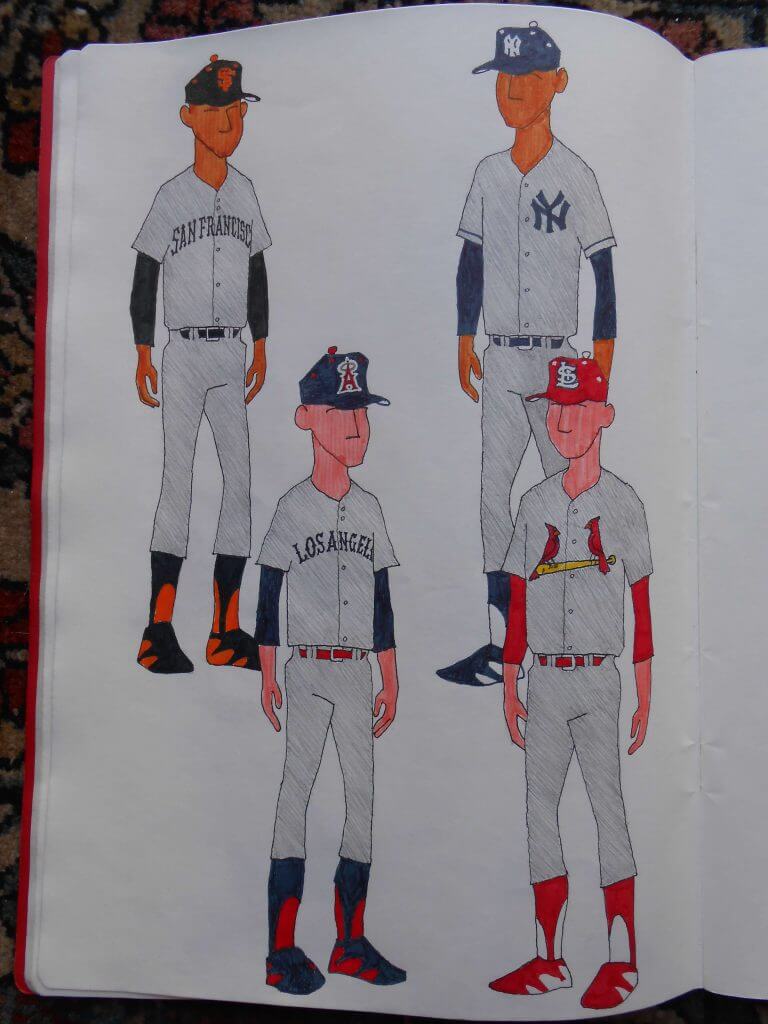
Today’s concepts come from Walter Helfer, who has some proposals for MLB “City” Uniforms.
He writes…
Dear Phil,
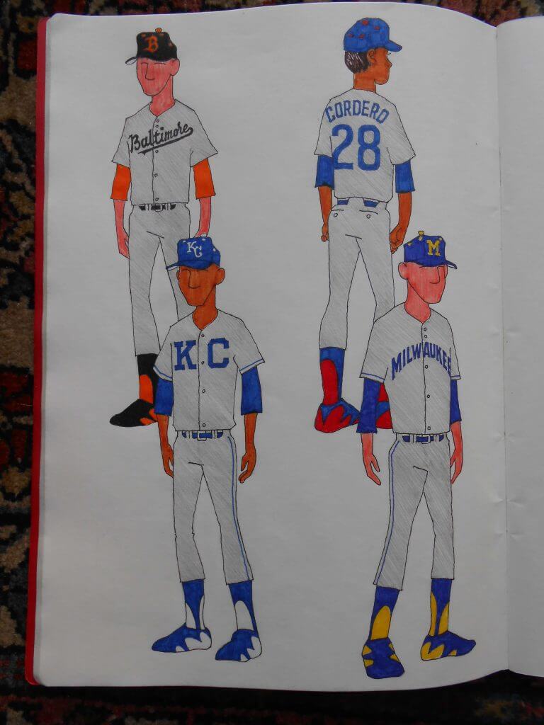
Attached please find two pages of proposals for baseball “City Uniforms”. The purpose of this undertaking was to strip the grey road uniforms down and find beauty in plainness. No two-color numbers, no sleeve patches, sparing use of piping. In all cases, I made an effort to plumb a team’s history for graphics. For the Cardinals, I addressed the expectation fans could be disappointed to see a jersey with no birds on the bat, so they get ONLY the birds & bat. Sock treatment is based on a Uni Watch discussion from a few years back. Hats have contrasting eyelets and squatchees just because I love playing with hats. Perhaps a plainer cap is called for, but I simply felt creative.
All the Best,
-Walter
And here are his designs:
Thanks Walt!
OK readers (and concepters). If you have some tweaks or concepts, shoot ’em my way with a brief description of your creation and I’ll run ’em here.


Guess The Game…
from the scoreboard
Today’s scoreboard comes from Jimmer Vilk.
The premise of the game (GTGFTS) is simple: I’ll post a scoreboard and you guys simply identify the game depicted. In the past, I don’t know if I’ve ever completely stumped you (some are easier than others).
Here’s the Scoreboard. In the comments below, try to identify the game (date & location, as well as final score). If anything noteworthy occurred during the game, please add that in (and if you were AT the game, well bonus points for you!):
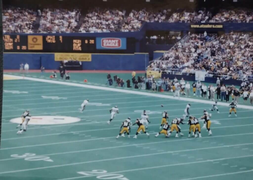
Please continue sending these in! You’re welcome to send me any scoreboard photos (with answers please), and I’ll keep running them.


And now a few words from Paul
Hi there. Happy Easter weekend! A few things to let you know about:
1. In case you missed it on Thursday, the new episode of Unified features an interview with Dodgers design director Ross Yoshida for this week’s episode of Unified — our first guest! You might think he doesn’t have a lot to do, since the Dodgers’ visual identity is so traditional and static, but he’s designed lots of the team’s sleeve patches, fixed their iconic script after it somehow got altered, and a lot more. This is the first installment of a two-part interview with him, which we think you’ll really enjoy.
As always, you can listen to us on Apple, Google, Stitcher, TuneIn, and Spotify, or just use the player below:
The show notes from this episode, which include photos of many of the things we discussed, are here. Those photos (and some additional ones) also appear in the video version of the episode, which you can see here:
Please consider supporting this episode’s advertisers, Oxford Pennant (get 20% off any order with checkout code UNIFIED), Ebbets Field Flannels (10% off, except on NFL items, with checkout code UNIFIED), and Tokens & Icons (free shipping by checking the “For Office Use Only” box and then entering the checkout code UNIFIED).
2. In case you missed it on Thursday, our April pin has a golf/Masters theme:
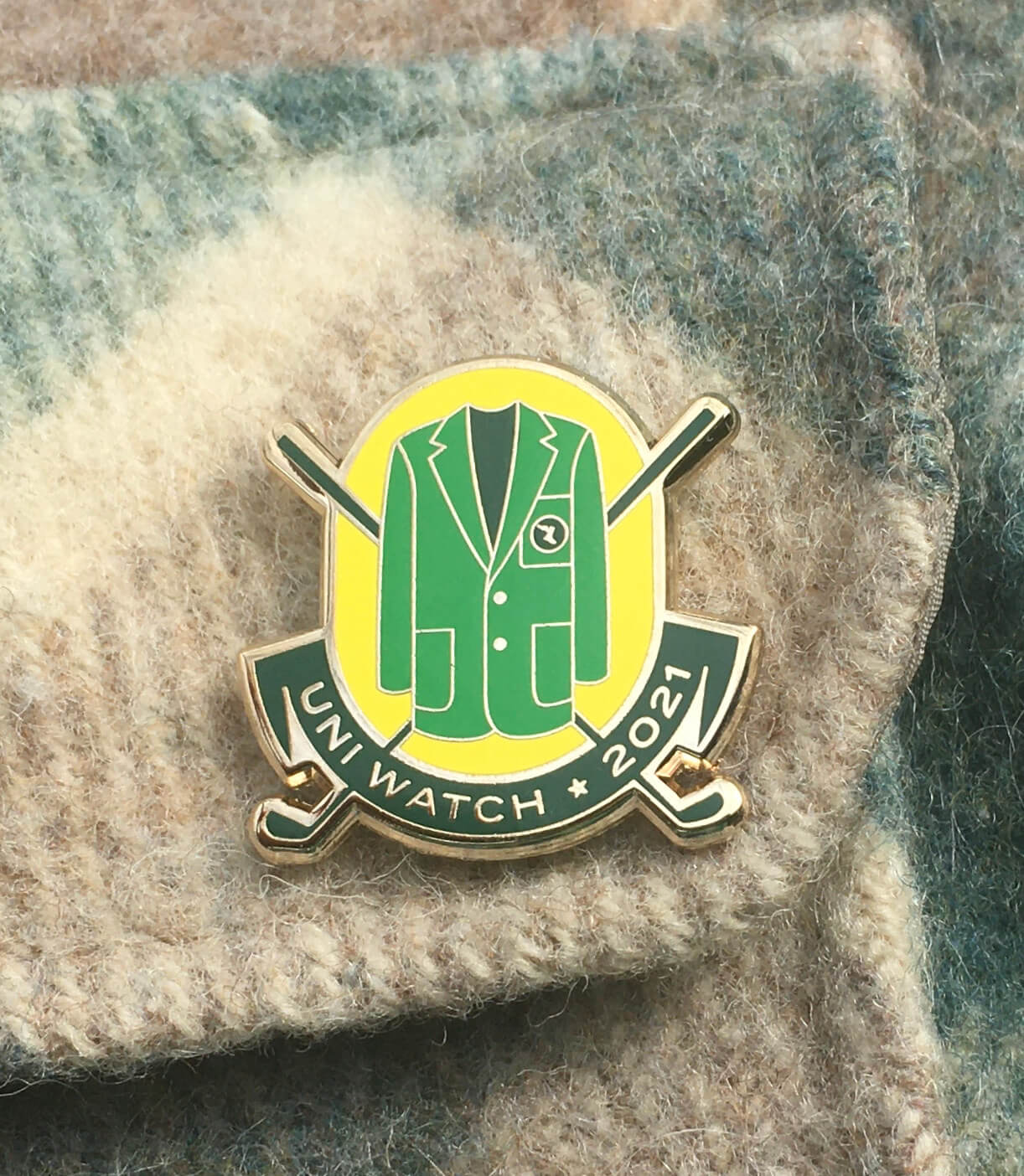
It’s a numbered edition of 200, with each pin individually numbered on the back, and more than half have already been sold. It’s available here, and we’re donating all the profits from this one to Fair Fight. You can learn more about why we’ve chosen to do that here.
3. Todd and I are down to the last few of our museum-quality “Rain Check” prints, produced in a numbered edition of 150 and signed by each of us at a Brooklyn diner back in 2018. As I recently mentioned, we thought we had sold out but recently found a stash we had set aside and then forgotten about. If you want one, they’re available on Todd’s website until we run out, which will probably happen this weekend. Update: Now sold out!
That’s it. Now back to Phil.


The Ticker
By Anthony Emerson

Baseball News: Cubs IF Eric Sogard wore faux-stirrup high socks on Opening Day (from Pablito Soto). … There are a ton of players in MLB this season wearing No. 0, maybe the most ever. … The Tigers’ computer-generated batters in the MLB At-Bat app are still wearing the team’s old jerseys (from Gary Hunter). … Boston Mayor Kim Janey wore No. 21 as she dealt the first pitch at Fenway yesterday. 21 has been unofficially retired for the Red Sox since Roger Clemens left the team in 1996. I have no idea what the 21 was referencing (from Lance Harris). … The Somerset Patriots, the new Double-A affiliates of the Yankees, unveiled their new uniforms on Thursday (from Kary Klismet). … Kabuki actor Ukon Onoe II threw out the first pitch of the Hanshin Tigers’ season, marking a rare occasion of full stage makeup on the field (from @inisbeags). … Marcus Stroman is yet another Met who can’t wait to wear a black jersey. … Trevor Bauer was still wearing his old Reds red glove in his Dodgers debut. He mentions not having the correct Dodgers glove yet (from Jakob Fox). Also from Jakob, Bauer wore a jacket while on base and the MLB logo sharpied over. “I’ve noticed other managers jackets have this on the logo too,” he adds. … Dodgers hurler David Price has begun the season with his squatchee still in place (from uɐʎɹ sı ǝɯɐu ʎɯ).

NFL News: Eagles announcer that QB Jalen Hurts has switched from No. 2 to No. 1, among a host of other number announcements (from multiple readers). … According to this piece, at one point in 2020, the Chiefs ran out of usable uni numbers, which explains their new rule proposal loosening positional number restrictions (thanks, Phil). … One blog has listed 10 better names for the Bills’ stadium than the new corporate one they just announced (from Kary Klismet).
College/High School Football News: Florida State has unveiled plans to update Doak Campbell Stadium (from Kary Klismet).
.

NBA News: Here’s an article grading the NBA’s “earned edition” unis (thanks, Phil). … Joe Ingles honored World Autism Awareness Day with custom sneakers featuring his son Jacob (from Timmy Donahue).

Soccer News: Paul, shield your eyes — English second division side Barnsley donned purple socks and warmup shirts to support a local charity (from our own Jamie Rathjen). … Also from Jamie, Museum of Jerseys has a new post covering Manchester United’s 1994-95 jersey, which included a sublimated design of the team’s stadium, Old Trafford. The design was removed for Champions League matches though, as it also included an Umbro logo, and UEFA has stricter rules on the number of maker’s marks a jersey can have than the Premier League did at that time.

Grab Bag: John F. Kennedy was the first president to go almost exclusively hatless in public — leading to these great letters from hat companies begging him to wear a hat more often (from Matthew Algeo). … Miami of Ohio’s new field hockey unis includes a design element inspired by the Miami Tribe (from Mike Brueseke). … Sonic released a line of 46 individually designed T-shirts — one for each state with a Sonic restaurant (from John Cerone). … The Brazilian men’s volleyball team Sada Cruzeiro “signing Wallace first with infinity and then his number 8” (from Jeremy Brahm).


And finally… that’s all for today. Everyone have a good Saturday — enjoy the Tourney, baseball (well, except for Mets and Nats fans), hockey, hoops or whatever it may be you’re watching or doing today. I’ll catch you back here tomorrow.
Peace,
PH
The game is Steelers vs I think Jaguars hard to tell who the road team is could also be Denver.
Another reason Denver needs to go back to orange road pants…they should never be confused with Jacksonville, even in an out of focus photo.
Presented without comment, for informational purposes only, and as a community service so that when we go somewhere else to talk about it, we’ll have some information handy:
link
link
link
TL/DR
And once again, presented without comment. The Washington Post’s summary about claims presented about the law.
link
While disappointed we won’t have a the ASG in My hometown, I am at least pleased we won’t have to watch the Braves with an extra 7 patches for the entire year. The two ASG, 150, NE hat logo, Nike logo, and memorial numbers added up to be quite a bit… I liked the idea of the memorial numbers on the back of the hat, unique way to do it.
Also, Jalen Hurts is going from 2 to 1, the text is reversed.
Text now adjusted. Thanks
Steelers vs Broncos, AFCCG 1998. Broncos won 24-21
Can’t be a conference championship with that many games on the scoreboard.
And it’s a sad reflection on Denver’s late 90s look that they get confused with Jacksonville from the
cheapless expensive seats…Maybe Mayor Janey wore 21 because it is 2021?
The Red Sox also had a doctor throw out a first pitch, and he also wore #21.
As for the ASG itself, the Dodgers lost last year’s event to covid, so if the game is relocated to LA, MLB could reuse last year’s planned graphics and uniform elements with the minor change of year digit.
MLB has already said that this year’s new venue, whatever it turns out to be, will not be LA. They’re sticking with the plan for LA to get *next year’s* ASG.
Hurts changing from No. 2 to No. 1.
It doesn’t seem like the Braves were blindsided as much as they seem bothered by the loss of ASG revenue because of the law that was passed in the state where they do business. Any thinking person in their management team would have seen this coming, given the precedents set in the recent past (NC, AZ). But they were also powerless to stop it, and it is going to hit them in the wallet. (I am not going any further into right or wrong, but this is the business side to hosting the ASG, and the uni-related stuff that goes with it.) I would think that once the law is changed or repealed, the Braves would get their ASG shortly thereafter. I would also assume that the NCAA and other leagues will follow suit with future bowls, Super Bowls, ASGs and Final Fours for the time being.
They weren’t powerless to stop it. They are one of the most visible corporations in Georgia, with significant lobbying power. They are also made up of people who vote. You vote on representatives to the government to serve your interests. Don’t like it? Vote differently. If you voted for those that passed it, reflect on your own actions. As a corp, use that voice and money.
also to throw a tidbit to the last part of your comment, filmed productions are already having their various unions come out against Georgia and pushing to have productions moved. There’s also the World Cup venue selection coming up in the 4th quarter of this year. Atlanta is slated to get a semifinal and hold group stage matches; now they may be removed from hosting completely. Worldwide, everyone will know why.
“I have no idea what the 21 was referencing.”
I agree with Obbs that’s it almost certainly the year.
GTGFTS: Jaguars at Steelers 10/3/99. I get bonus points for having been there, but probably lose a couple for not remembering that Jacksonville’s last four points were on safeties.
I’ll take the deduction also. Probably tried to block out the dark ages of the late 90s!
I forgot about the safeties too…
What I do remember is being disappointed that I couldn’t see the full arc of the punts because I was in the last row underneath the concrete. And there were a lot of punts that day.
Game is October 3, 1999 – Jacksonville @ Pittsburgh. As the scoreboard indicates, Buffalo played at Miami the following evening on MNF.
Scoreboard is 10/3/99 week 4 Steelers vs. Jaguars. 17-7 Jags leading to a 6-10 season in Pittsburgh. And I was there.
Maybe they can remove the MLB logo from all uniforms as an act of protest.
Agreed
I suppose they could, but assuming that the MLB logo is required by league rules the team would probably be subject to further discipline from the league, no?
I tend to think that the Braves will consider it good PR not to do anything in the way of publicly protesting the decision, at least uni-wise.
Great illustrations, Walter Helfer! Refreshing to see something not Photoshopped to within an inch of its life.
“I am a horse-drawn man until my dying day.”
I especially dig the Cardinals concept of just the birds and the bat.
Might be an optical allusion, but Eric Sogard‘s stirups look real since the left one appears twisted by the shoe.
C’mon now. 2021. You were kidding, right?
No the game is December 7; 1997. Broncos at Steelers
No it isn’t.
10/3/99 vs. Jacksonville.
Phil, do I get bonus points for being there even though I was exempt from playing?
Hmmm. You may get bonus points for having (possibly) the most GTGFTS comments in a day…
Oooo…I just realized, I believe I was at the game Art guessed as well. Bonus bonus points for me!
I only went to three Steelers games at 3 Rivers. If anyone can guess the third I’ll give them all my bonus points.
As for the Miami OH uniforms, I thought the logo for Armstrong Cleaners was clever with the use of a hanger to make the A.
Any bets/hearsay where the All-Star game will be played this year? Tampa Bay has never hosted, correct? And I believe the Cubs have the longest drought as hosts. Either way, it’ll be interesting to see the quick turnaround on this.
John F. Kennedy was the first president to go almost exclusively hatless in public — leading to these great letters from hat companies begging him to wear a hat more often (from Matthew Algeo).
Oddly, President #45 was the Chief Executive most commonly seen wearing a hat since Eisenhower.
Although not strictly uni-related, why is there an apostrophe after the word “its” in the Braves’ official statement?
I also think using the “its” instead of “the” here is an interesting word choice, as if the Braves are choosing to disassociate themselves with the event. It imply’s that this is solely MLB’s All-Star game and that the clubs themselves don’t have any ownership in it. Maybe as an act of protest they won’t let their players participate?
Apostrophe: Just your basic illiteracy.
“Its”: I think you’re reading too much into it.
“imply’s”?
Damn it
It’s (see what I did there?) proper journalistic style to refer to a team or unit as “its” instead of “their,” or “it” instead of “them,” which admittedly sounds weird, but it’s been that way for a long time. For instance, a newspaper following the AP Style wouldn’t refer to the Braves’ schedule as “their schedule” but “its schedule.”
Looking at Sogard’s left sock, it almost seems like the stirrup is twisted. Is that a shadow or were those actual stirrups? Separately I have never seen that stripe pattern before on a Cubs stirrup/sock. Only plain.
21 may or may not be a reference to the current Year of Our Lord.
I like Walter Walter’s concepts. I especially like his template: the guy wearing the uniform looks like a ballplayer.
He reminds me of Elroy Face.
Thanks, Cort. My primary influence were the mannequins drawn by Marc Okkonen, and over time it got more elongated perhaps to cram in details I didn’t want to overlook. And I realized I needed a pose to show what’s on the back as well.
Maybe I should call him “Elroy Face-Off”.
link
Apropos of nothing: Teams called the “Redhawks” can be nicknamed the “Buzzards”, for variety’s sake. Just sayin’.
I’d prefer “Buzzards” to “Redhawks” for teams changing from Native American-themed names. Just because I find all these teams continuing to use “Red” in their names – “Redhawks,” “Red Storm,” “RedWolves,” etc. – to be desperately clinging to the past and sorely lacking in imagination. Plus, they just sound stupid. I guess this was also apropos of nothing, but there you have it!
Love the concepts Walter. Especially the Orioles as I am a fan. I have a hat like that from the Cooperstown Ballcap Co. but don’t think they ever wore it on the field. I’ve seen a picture of a flocked batting helmet from the 50s matching that design (but couldn’t find it today when I looked). Where did you get the inspiration for it?
I saw Buck Showalter wearing a hat similar to it at a postgame presser. It is close to the old batting helmet “B” but there are some differences. I wanted to remain true to the “City” concept where possible, but their 1963 “Block B” is more evocative of Boston: this has a little panache.
Really like the Walter Helfer art work. Nice to see the Angels actually have the name of the city on their uniform. I also like them having more navy than red like the past. Only improvement I’d include is a red bill on their hat like they used to have. Also maybe go back to the original hat logo of “LA” instead of “A”. Better yet, change the team’s name to “Southern California” instead of Los Angeles. They aren’t in the city or county of LA, and there are plenty of examples of other professional teams named after a region and not a city or state.
It would be nicer to see the state name on the jersey, because as you pointed out, they have the wrong city.
#ImStillCallingThemTheCaliforniaAngels
I spoke to a marketing person with the Angels a few years ago suggesting the Southern California name when they had that awkward period of being the “Los Angeles Angels of Anaheim”. He said the reason they were the California Angels when they first moved to Orange County from Los Angeles was that they were the only team in the American League in California. This was before the A’s moved to Oakland. That no longer is the case, and representing the entire state just doesn’t seem right, especially when there is such a distinction between Northern and Southern California. He also said that they wanted to market to the entire Southern California area, and the owner knew it was more profitable to do so. The problem is that Anaheim isn’t a major city that people associate with, even those living in other Orange County cities. However the majority of fans in Orange County don’t like the team being called Los Angeles. So there are good reasons why the team isn’t called Anaheim, California, and Los Angeles. Growing up in Long Beach, which is in Los Angeles County, whenever someone from another part of the country asked me where I was from, I usually said “Southern California”.
I’d be OK with calling them Southern California.
It was because of the Angels that I undertook this project because I was sick of seeing them hem and haw about their place modifier. “California” fits on the front of the jersey better, but “Los Angeles” got the nod because the team is ID’d with an “LAA” bug in the crawl at the bottom of the screen.
I live in a metropolitan area where “New York” graces two NFL teams that play in East Rutherford, NJ. So I’m comfortable with the fact the L. A. Rams used to play in the very stadium the Angels call home.
At the risk of slighting the city of Anaheim, we don’t have the Arlington Rangers or the Cumberland Braves. I associate Anaheim with the Disney-fication of professional sports, about which I have mixed feelings.
The “Southern California Angels” is a new concept to me, and I don’t look forward to fitting that on the front of a jersey.
I like your reasoning. Growing up in Long Beach, in LA County but on the border of Orange County, I was fine with being part of the greater Los Angeles area. In fact I was a fan of both the Dodgers and Angels. However the OC people are pretty militant about being associated with LA. And yes “Southern California” is pretty long, but it could also be called “Southern Cal”. Also they could use some form of “SC” initials on both the hat and jersey,
I really look forward to having some new uniforms to design!
Those are some nice looking uniforms, Walter!
Love the template, too.
I kinda/sorta prefer to see the Brewers and Royals in powder blue roadies, but your designs for both are really good.
Powder blue would have been a nice visual change for several teams that used to wear it, but I ran into an obstacle: The Chicago Cubs. I hope it’s obvious the player named “Cordero” is a Northsider, going by the number font.
When the Cubs wore pastel blue in the ’70s, I couldn’t get over how drab it looked owing to the one-color royal blue graphics and the fat blue Sansabelt. (How much nicer it would have looked had they used red+blue trim).
With the exception of the Royals, pastel blue needs that extra accent to show the tailors really did their homework. And the Royals look appealing with the white graphics on the blue background, but I didn’t want my two “outlier” teams to both hail from Missouri! I hope you understand.
Let me join the chorus of voices showing appreciation for Walter’s uni concepts. I love them for their simplicity and symmetry. And I love the hand-drawn element to them. A lost art in the digital age.
Thanks BvK. And I would like to thank Paul, Phil, and the entire Uni-Watch community for their continued support! Straight from the pencil sharpener to your eager retinas!
You’re most welcome, Walt. Keep ’em coming!
Just turned on the Phillies-Braves game, the Braves are wearing their gray jerseys, and the ASG patches are gone.
It’s actually just covered up (I initially thought it was removed too). You can see it link.
The Braves have removed the ASG patches from their uniforms and hats.
I take Phil’s admonition to be brief as gospel, so my opening descriptions of my concepts/tweaks tend to be on the terse side. But, as Kevin learned on The Office, brevity for brevity’s sake can be a hindrance. An important feature of my “City Edition” uniforms is to continue using the bespoke fonts and numbers of the existing road uniforms (Angels, Phillies, Red Sox), just lacking the extra trim so the forms themselves can be appreciated.
All you got were eight teams, but here are how a few of the other squads fared: The Mets have the Tuscan “New York” across the grey jersey, in royal blue, with all piping and the front number removed. Tampa Bay uses the Rays’ bespoke lettering, in dark blue, in a radial arch across the grey jersey; the split comes between the “M” and the “P”. The Dodgers obey the spirit of the “City” concept and were the example I followed for the remaining MLB teams. Just subtract the red number and the patches. Colorado has a purple base layer, and the lettering across the front is liberated from its silver and black trim. Minnesota has a “T” and “C”, not unlike the Royals’ “K.C.”, but the baseline rests on a shallow arch, so the letters are a bit out of parallel. The Diamondbacks have a brick red base layer, and “Arizona” is radially arched across the jersey in a Trajan typeface. Sanitaries are sand-colored. “Philadelphia” is a messy word to cram onto a uniform (even though it’s technically the same length as San Francisco, a city name I love to play with); what I ultimately decided was to put the capital “P” on the players’ left breast, and balanced it with the number on the right. Evocative of the Phillies’ Seventies uniforms. Miami already plays the “City” rules but I wanted some of the pixie dust of the World Series Champs (another city spoiled by early success) so I rendered a “Miami” script resembling the “Marlins” lettering of the expansion years. Cleveland, Oakland, and Texas all have vertically arched full-block lettering across the jersey. The White Sox use the Fancy Block of their “leisure suit” years. The Red Sox employ the “Bos. Ton.” block letters of their 1979 road uniforms. Toronto provided an interesting challenge, as their best caps possess no reference to the city. Whipping up a “T.O.” monogram out of thin air is problematic since it bears no reference to the team’s formative years. So, I went with the hat of their World Series appearances, and made a grey jersey with the “Toronto” lettering of their expansion year, and instead of the bird logo on the bottom left, I used a solid version of their player numbers. For the Mariners, I used the Serif Gothic “Seattle” of their expansion year, only in navy. I think I’m more attached to that lettering than their fans, so I could easily revert to a one-color version of their current Latin Block. All of these details exist as sketches in various sketchbooks, not completed players. Whew!
Yeah, that admonition is link.
Thank.
Kevin, are you saying “see the world” or “Sea World”?
See world. Oceans. Fish. Jump. China.
Brevity may be the soul of wit, but run-on paragraphs are a chore to read. Break it up and give your reader some mercy.
My bad. I have a reputation for abusing soap boxes!
Love the designs of those Sonic t-shirts. My favorite is Alaska: “Yeah, we have a Sonic here”
I’m glad MLBers are into 0 as a uniform number choice. I remember seeing it on NPB players years back and wondering why no one did it here (Curtis Leskanic’s 00 notwithstanding). I remember thinking that it would be a great choice for a “team-first” type of player. It’s also the only single numeral not retired by any team, so it works as a humble brag and yet also signifier of importance.
okkkk