Click to enlarge
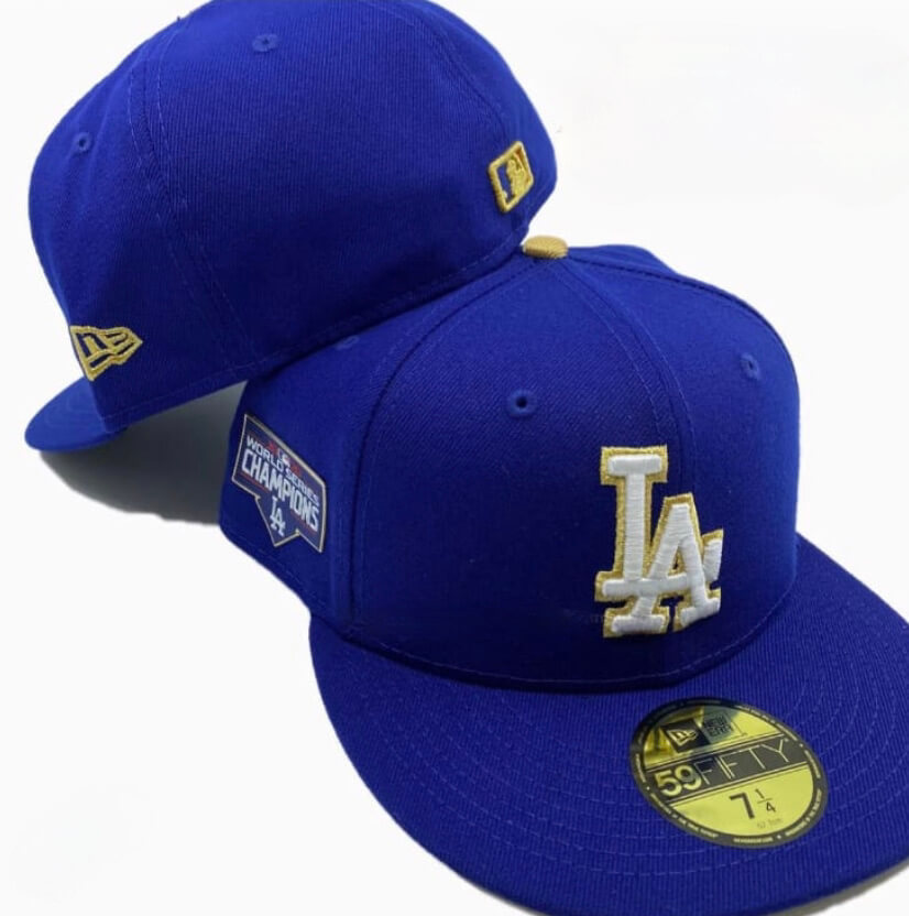
Ever since the Dodgers won last year’s World Series, I’ve been wondering if they would wear a gold-trimmed uniform to open the 2021 season. The last team not to do so was, perhaps predictably, the Yankees, who won the 2009 Series but skipped the gold treatment in 2010. And if there’s such a thing as a National League version of the Yankees, it’s probably the Dodgers, so I was wondering if they might opt to go gold-free this year. Defending Series champs usually haven’t unveiled their gold-trimmed uniforms until shortly before Opening Day, so I figured the Dodgers wouldn’t let us know their plans until next week.
But we got our answer yesterday, as the California shop the Locker Room of Downey shared the photo shown above. I have confirmed that it is indeed legitimate and that the Dodgers will be wearing gold uniforms. No sign of the jersey so far.
The Dodgers will open their season next Thursday afternoon — that’s a week from today — in Colorado. Their home opener is April 9, so that’s presumably when the gold design will be worn.
ITEM! New podcast episode: The latest episode of Unified is about a very hot-button topic in the uni-verse: the NFL’s one-helmet or one-shell rule. Will it be lifted for the coming season, as has been hinted at? If so, what sorts of throwback helmets might reappear? Moreover, what sorts of alternate helmets (like, say, a neon-green Seahawks helmet) might suddenly appear? We discuss all of that, along with the latest uni-related news of the past week, our weekly listener-submitted question, and more.
As always, you can listen to us on Apple, Google, Stitcher, TuneIn, and Spotify, or just use the player below:
The show notes from this episode, which include photos of many of the things we discussed, are here. Those photos (and some additional ones) also appear in the video version of the episode:
Please consider supporting this episode’s advertisers, Oxford Pennant (get 20% off any order with checkout code UNIFIED), Ebbets Field Flannels (10% off, except on NFL items, with checkout code UNIFIED), and Homefield Apparel (15% off with checkout code UNIFIED).
Enjoy the episode, and thanks for listening.
More Padres/UA prototypes: Hot on the heels of that Padres/Under Armour prototype jersey that recently emerged, we now have three more. Two of them have that same visual ventilation storytelling diamond mesh pattern that the earlier jersey had, while the pinstriped one does not (which makes sense). Interesting!
Update: As several commenters have pointed out, the pinstriped version actually does have the mesh. It’s just harder to see. My bad!
(Big thanks to Eric Abneri for this one.)
Click to enlarge
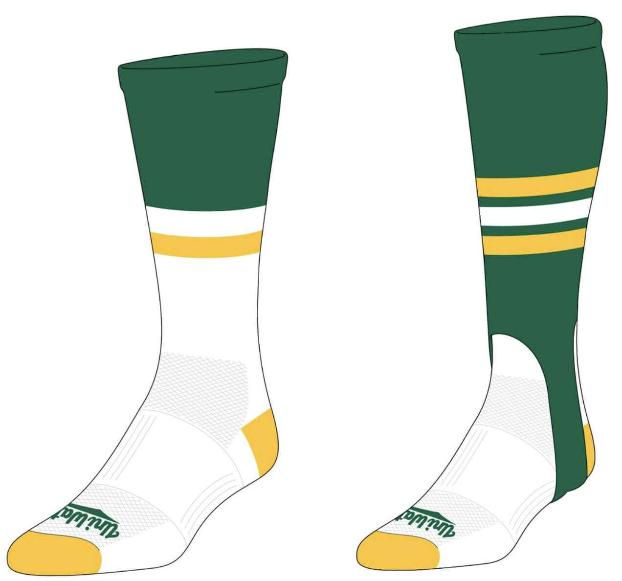
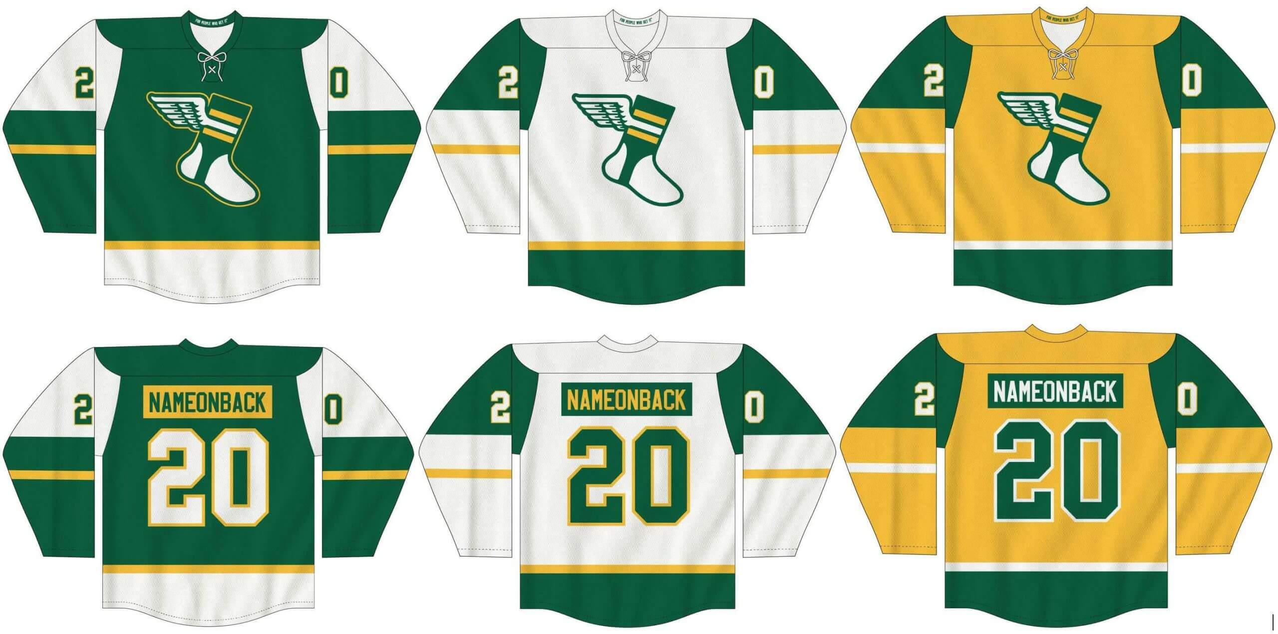
The usual merch reminders: As you probably know by now, we have a new line of Uni Watch hockey jerseys (customizable with your choice of number and NOB, of course), as well as new Uni Watch socks and stirrups. In order to get in on these items, you must place your pre-order by March 31 (that’s next Wednesday). You can do that here. We expect the finished product to ship out by the end of April.
Meanwhile: Todd Radom and I had recently found a small stash of our limited-edition 2018 “Rain Check” print that we had set aside for promo purposes and then forgotten about. These are all signed by both Todd and myself:
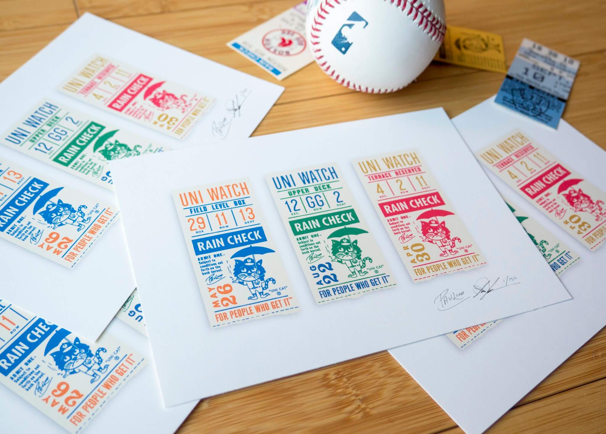
These are available while supplies last on Todd’s website.
My thanks, as always, for your consideration.
The Ticker
By Alex Hider

Baseball News: Mets SS Francisco Lindor appeared to be wearing teammate Michael Conforto’s belt during yesterday’s game (from Jeff Frandsen). … Yesterday marked the 20th anniversary of the day when Diamondbacks P Randy Johnson annihilated a bird with a fastball during a spring training game. He apparently leaned into the infamous moment — his photography website uses a dead bird as its logo (from @PhillyPartTwo). … Here’s an unfortunate article making a case for MLB uniform ads, comparing them to the revenue generated by soccer (from Phil). … This blog surveyed fans and determined that White Sox fans drink the most while watching their team, followed closely by Braves and Reds fans (from Jason Hillyer). … The newest team in the All-American Amateur Baseball Association is the Carolina Disco Turkeys, who also unveiled a groovy peacock logo yesterday (thanks to all who shared). … New jerseys for New Jersey — that is, the New Jersey Jackals of the Frontier League (from @BallparkHunter). … The U. of Minnesota has published a uniform history page on its website (from Mike Menner and Phil). … UCF infielder Andrew Brait wore a batting helmet with a full facemask and no team logo during last night’s game (from Timmy Donahue). … Vanderbilt has unveiled the uni combos they will wear for their upcoming series against Missouri (from Phil). … Ron Henske notes the design template on this social media graphic shared by the Democratic Party of Wisconsin resembles the 1982 Topps set.

Football News: The Chargers’ 2021 Draft Cap has apparently leaked. Ditto for the 49ers’ cap. … The Athletic (hard paywall) reports that the Saints are close to selling the naming rights to the Superdome to Caesars, the hotel and casino chain. Should that happen, it would be one of the most high-profile gambling ad deals ever in the U.S. (from @TonyLoyal1). … A Rams blog thinks the team’s next alternate uniform could be BFBS (from Phil). … European League of Football, a new football league launching this summer, has unveiled an MLB/NBA-style logo (from Brandon Keys). … High school football in California just kicked off an abbreviated season, and powerhouse Mater Dei made a slight change to their typically old-school uni set, going with sleeve numbers for 2021 in lieu of the the school sleeve logo (from Kyle Mackie). … Scott High School in West Virginia has new uniforms, a set that poaches an old Southern Miss logo that was discontinued for being too similar to Iowa’s Tigerhawk logo (from Kary Klismet). … Some new uni number assignments for the Jags (thanks, Brinke).

Hockey News: Stars G Jake Oettinger has a new set of pads and gloves to go with the team’s black alternates (from Wade Heidt). … Coyotes G Antti Raanta also has a new pad set (from @GoalieGearNerd). … To celebrate the upcoming the release of a new Mighty Ducks TV series, the Anaheim Ducks all wore the sweaters from the franchise’s first film prior to last night’s game (from Phil). … Chicago paid tribute to RW Patrick Kane prior to his 1,000th career game on Tuesday by having the entire team dress in his No. 88 sweater — complete with an assistant captaincy patch! (From Wade Heidt.) … Noah Sidel sends along a photo of the 1968-69 WHL champion Vancouver Canucks — forerunners of the NHL’s Canucks — and their very cool uni set, which featured a team name and number on front!

Basketball News: An Indy-area TV station has a video package about the laundry volunteers washing the team uniforms at the men’s NCAA tournament (from John Goodrich). … On Monday, a sports anchor in Louisiana resorted to creating his own March Madness “highlights” in MS Paint due to restrictions that prevented his station from showing the real highlights (from Paul Deaver). … While NCAA men’s tournament games are taking place on NCAA-branded courts, some at the NCAA women’s tournament bubble in San Antonio are being played on generic arena floors, raising more questions about the inequity of the facilities at the men’s and women’s tournaments (from @fdm3mnl). … Jefferson Boswell sends along this photo of his grandfather and the 1951 American Fork High School (Utah) Cavemen. Love the unis with the “AF” insignia. … Some new uni numbers for the Nets and Kings.

Soccer News: A new Sounders alternate jersey has apparently leaked on the team’s website. The design would seem to mimic a tease they tweeted earlier this week (from Phil and Dean Hinther). … The Columbus Crew will open their new stadium on July 3 (also from Phil). … A New England Revolution blog has laid out all the arguments for and against a new team logo (from Kary Klismet). … Norway’s men’s team wore warm-up shirts before their 2022 World Cup qualifier today, protesting tournament host Qatar’s human rights record. Norway is set to decide in June whether to boycott the tournament (from our own Jamie Rathjen). … Also from Jamie: In a separate men’s World Cup qualifier, Belgium and Wales both wore second kits, despite no real need for them to do so.

Grab Bag: Torchbearers for the upcoming Summer Olympics will wear shirts made out of recycled plastic (from Phil). … A newspaper in Ireland has a feature about a local man’s enormous jersey and memorabilia collection, which covers multiple sports (from Kenneth Traisman). … The next three submissions are from Kary Klismet: Texas A&M-Corpus Christi is retiring its “Izzy the Islander” mascot following complaints that it is derogatory toward Pacific Islander culture. … Vassar College’s men’s volleyball team has new uniforms. … Belarus’s Olympic Committee has unveiled its national team uniforms for the Tokyo Olympics. … Wrestling aesthetician Ross Bendik ranked the top podium warm-ups from last weekend’s NCAA Division I Wrestling Championships. … This piece recounts the history of the Annie’s Homegrown bunny logo and its signature purple packaging (from Scott Rogers).

Our latest raffle winners are Adam Hornstine and Phillip Sanchez, each of whom has won a Uni Watch membership card. Congrats to them, and big thanks to Steve Heller for sponsoring this one.
Meanwhile: I’m told that NBA leaker Igor Coelho, who I interviewed back in November, is recovering from Covid. As you may recall, he lives in Brazil, which has been hit particularly hard by the pandemic. Igor, if you’re reading this, hope you’re feeling better soon. — Paul
Regarding the comment on the podcast that the Indians couldn’t get away with using the name “Buckeyes”, I don’t see why not. There are plenty of pro and college sports teams which use the same name (such as Hawks, Bears, and Bruins) and I’ve never heard of a challenge from either side.
Haven’t listened to the podcast yet so I don’t have full context. Meanwhile, I am a lawyer but not yours or anybody’s here. But why wouldn’t Cleveland Buckeyes work? On a purely trademark legal level, yeah I’m not sure what would be strictly wrong in theory. But in practice, since it’s the same state, maybe there is already an official The Ohio State alumni chapter called the Cleveland Buckeyes, or else there is some other particular source of confusion.
Beyond legal, I would advise the Cleveland pro team not to pick the name Buckeyes. Not every Cleveland fan likes Ohio State! Good luck having a successful “University Night” when you’re trying to court Ohio Bobcats, Oberlin Obies, and Akron Zips to the … Buckeyes game. Then not just PR, but confusion over your own diluted brand. Buckeye scandal. Which one?
We didn’t mean that they can’t do it for legal reasons. We meant that Buckeyes is so singularly associated with OSU that it just wouldn’t work for another team. It wouldn’t *feel* right.
Or at least that’s what *I* meant. I probably shouldn’t speak for Chris!
The state of Ohio has a really cool nickname (“The Buckeye State”) as do many others (“The Tarheel/Sooner/Wolverine/Hawkeye/Hoosier/Badger/Gopher/Cornhusker/Volunteer/Beaver State”). In such circumstances, the nickname seems to be ceded to the sports department of the pre-eminent university of that state, and is regarded as their intellectual property. If Ohio has other, lesser-known nicknames, the baseball team from Cleveland would do well to consider them.
Disco Turkeys????
This ranks up there with Sod Poodles, Yard Goats, Mighty Ducks, and Cement Makers (Cruz Azul soccer team from Mexico) for Worst Nickname Ever.
Mind you, the colors are really cool.
It’s a pretty egregious cash-grab. I won’t fault any minor league team for trying to balance the books after last year, but the Disco Turkeys are barely a team. They are owned/generated out of thin air by the Winston-Salem Dash as a way to keep the stadium in use while the Dash are on the road. Practically speaking, they don’t really belong to a league—they’ll mostly be playing a handful of exhibition games against Coastal Plain League teams.
But caps will sell. More power to the Dash for capitalizing on social media and a bunch of articles along the lines of “if you thought the Sod Poodles were wacky, meet the Disco Turkeys!” It’s an arms race at this point and you have to wonder what’s next.
I like disco, and even I think it’s a dumb name.
Re: Cruz Azul, they are known as the “Cement Makers” but not in any kind of official capacity. It is an unofficial nickname more akin to Halos, G-men, Habs, Bolts, etc.
If you look really closely, you see the diamond mesh pattern on the pinstriped Padres jersey as well. It’s just a lot more subtle.
Great picture of the forerunners to the NHL Vancouver Canucks. I was intrigued by the picture being compliments of the Gruen Watch Company of Canada and wondered whatever became of that Company.
It actually seems to have primarily disappeared (sold) in 1953. I assume the Canadian offshoot somehow survived to at least 1968. I found one website that appears to be dedicated to their watches. Interesting designed watch at the top of site.
link
According to the wikipedia and other sources, the company was broken up and sold in 1958, but the brand continued under broken up ownership into the 1970s.
link
link
I feel like you can see the diamond ventilation pattern on the pinstripes if you look closely. The pins just obscure it a little.
Belgium and Wales both in their change strips isn’t a big deal here.
Both wear red for their primary strip, so the visitor (Wales) would have to change. And, since their change strip is yellow/green, the red/green color blindness issue may have been a concern, so UEFA likely mandated both wear their change strip.
In theory, the point of change kits is that only the visiting team must change to adapt to the home team’s dibs on colors in their primary kit. Which means it’s classically stupid for both teams to wear the change. In practice, the tail wags the dog, and FIFA and related actors would like to see all shirts get worn enough to justify merchandise sales…hence double change game action
The numbers on one shirt being apparently the same (for somebody red/green color blind) as the body of the other shirt is not going to make them difficult to tell apart. Is it difficult if one team has white shirts and the other has non-white shirts with white numbers? Of course not.
If I had to guess, I would say Belgium changed because that shirt was just released and you’ll sometimes see second shirts worn at home for that reason, whereas Wales changed for a game they would normally change for.
Was it ever discussed WHY the Crew are building a new soccer-specific stadium? Their current stadium (“Historic Crew Stadium”) is barely 20 years old! That’s a faster cycle than Turner Field or whatever became of The Ballpark in Arlington. In addition to the lack of need, the cost overruns are massive – the initial budget was $230M and it is now projected at $314M.
The former owner was going to move them to Austin if he didn’t get a new stadium, but he ended up selling them and the new owners still built the stadium.
Thanks.
Am I crazy or does that Dodger hat look more like the lighter shade of blue the Cubs and Royals use, and not the darker shade the Dodgers use and Cubs used to use?
Is it just me, or does that Eueopean Football league logo look very Odell Beckham inspired? Not exactly Jerry West/NBA stuff, but it certainly resembles Beckham making his famous one handed catch.
Some real San Diego Giants vibes on Gwynn’s middle jersey.
Exactly! My first thought on seeing the top row of pictures was, why did somebody make a Tony Gwynn replica jersey in Yankees home, Giants road & Yankees road?
I really love that Sounders shirt. Definitely reminds me of some of the original MLS designs. And (don’t kill me here) the stripes on the shoulders actually have a nice contrast with the blue. If I wasn’t a Sporting KC fan, I’d wear that.
All this discussion about the inequity between the men’s and women’s facilities fails to mention that the men’s tournament brings in a lot more revenue than the women’s. And the revenue inequity is reflective of the popularity of each.
It’s a real self-fulfilling prophecy then, yeah? Men’s sports, historically elevated above women’s, makes more money so more more money is spent on it so it makes more money so more money is spent on it…
You see the problem with that I hope.
Also, the NCAA claims that student-athletics is not a business, but an amateur endeavor. So revenue doesn’t matter when judging the fairness or justice of resources allocated to men’s versus women’s teams. These are students, engaged in a purely academic-enriching extracurricular activity whose sole purposes are improving their collegiate experiences as learners and building character as citizens and future leaders. Or so the NCAA officially says. Revenue has nothing to do with any of that.
Now, if we were talking about professional minor league teams developing talent and feeding players to top-level pro leagues, this would be a very different conversation. But it’s not; this is amateur extracurricular competition, no different from varsity debate or mathlympics or glee clubs.
Independent league nitpicking again. The former Can Am League has actually merged with the Frontier League (link) so the Jackals will be wearing those sharp unis in the Can AM Division of the Frontier League.
Fixed.
Non-uni-related side note about the ticker entry on the Norway soccer team: while they may vote to boycott the tournament, they’re not guaranteed to even qualify as they’re projected to finish 2nd or 3rd in their qualifying group. Only the top team in each group qualifies, while the #2 goes to a playoff. Netherlands and Turkey are their main competition for those spots.
Will be interesting to see if their vote will be influenced by their progress in the qualifiers by June.
What are the odds that someone named Jefferson sent in something about American Fork High School! I’m currently a Junior there!
Got a chuckle out of that New Jersey new jersey. Looks so generic in an ironic sort of way.
Curious as to why Corpus Christi was using a Pacific islander mascot. I’ve never been there but knowing geography I’m pretty sure they’re located on the Gulf of Mexico. Couldn’t they have picked something with more local flavor?
I’m looking forward to seeing the Dodgers fully gold-trimmed uniforms. I really like the cap and love when WS winners do this. A subtle touch and better than a giant ugly patch.
Patrick, you should see some of the baseball uniforms worn by The College of New Jersey (formerly known as Trenton State). The roadies used to look just like the Yankees, and the same with the home pinstripes. They now have switched over to just a block TCNJ on the front.
link
I disagree with the assertion that the Anaheim Ducks wore the “District 5” jerseys to celebrate the release of the Disney+ series. The team has neither said anything of the sort, nor is there any reason to cross promote as the team has not been owned by Disney for 15 years.
Rather, the Ducks team was visiting Minnesota where the first movie took place. THAT is the connection.
The real, notable Uni-Watch fact that should have been pointed out was that the “District 5” jerseys were made by Adidas using their NHL template. This is the first time any D-5 jersey has been made by a major manufacture which could indicate that the jersey could appear in the future perhaps as a real game jersey.
Good info, Chuck — thanks!
Is that middle Padres jersey supposed to look exactly like the Giants?
European League of Football silhouette has a strong resemblance to Marshawn Lynch’s infamous nestea’s plunges.
The sports in MS paint ticker find was great.
Impressive MS paint skills, not only the players but the court is solid also. I am not sure how he draws such steady & straight lines. He must have a stylus?