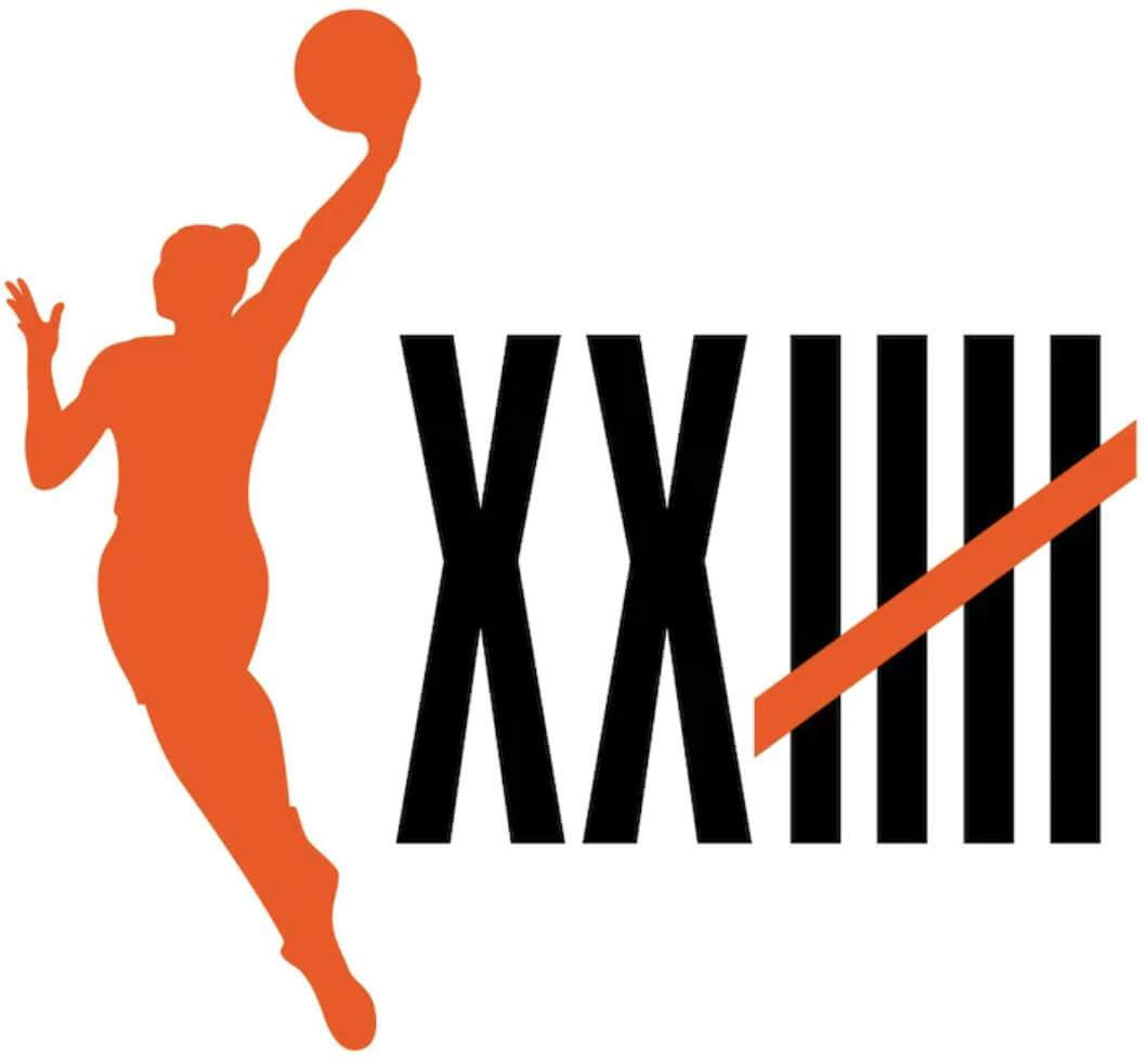
The WNBA yesterday announced a series of measures to celebrate the league’s upcoming 25th season, which will begin later this year (the schedule hasn’t yet been released). The program’s primary visual initiative is a new logo, shown at right, which will appear on jerseys, courts, and game balls.
Some thoughts:
• As is always the case, I wish they’d waited one more year and celebrated their 25th anniversary, instead of their 25th season. (Interestingly, we are currently in the midst of the NBA’s 75th season, but they’re waiting until the 2021-22 season to celebrate their 75th anniversary.)
• I’m fairly certain this is the first time I’ve ever seen Roman numerals and tally marks combined in a logo (or, probably, anywhere else).
• Most importantly: I hate seeing tally marks with the five-tally diagonal stroke going downhill from right to left! I much prefer to see them going from left to right:
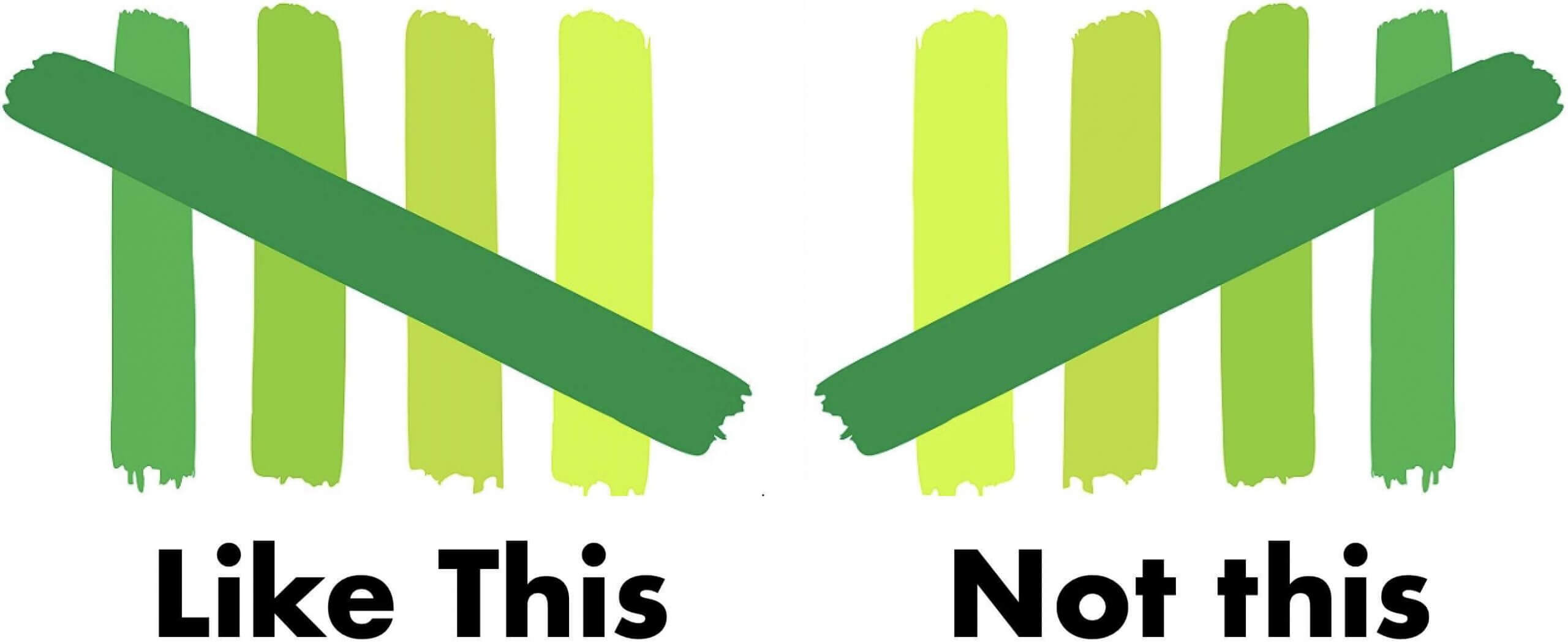
I’ve always done it the way that’s shown on the left. I realize some people do it the other way, but that way has always looked wrong to me. By the same token, I assume that people who do it that way probably think my way looks wrong. And that’s the problem with using something like tally marks for a logo: No matter which option you choose, there’s a decent chance that a sizable portion of your audience is going to think it looks wrong, which means you’ve failed before you’ve even started.
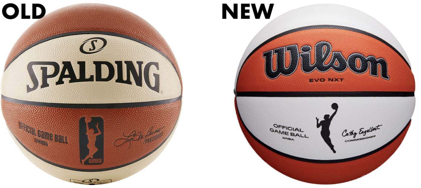
The WNBA will also have a new basketball this season, as they’re switching from Spalding balls to Wilson (the NBA will be making that same manufacturer change for 2021-22):
The league says the 25th-season celebration will also include “new uniforms” but has not yet provided any additional information about that.
Click to enlarge
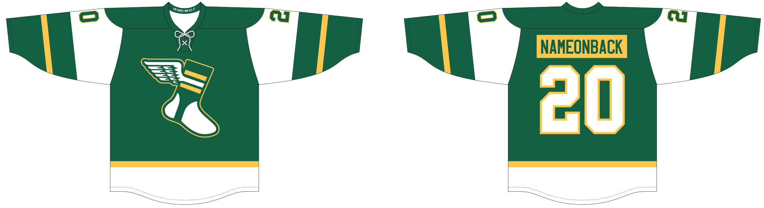
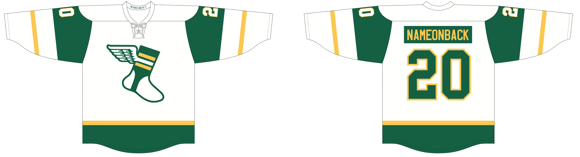
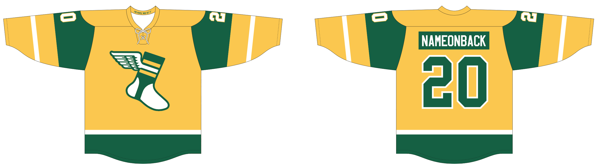
ITEM! New Uni Watch hockey jerseys, socks, and stirrups: As you may recall, I’ve previously teamed up with Adelph Wear — the sportswear brand run run by longtime Uni Watch reader Nathan Haas — to produce a series of Uni Watch hockey jerseys featuring Rangers-style diagonal lettering running across the front. The response to those was great (thank you!), but many of you said you’d prefer a more traditional design with a standard crest on the front. As you can see above, we’ve responded to those requests with a new line of jerseys, each featuring the winged stirrup front and center.
As was the case with the previous jerseys, these are available in your choice of “fan cut” or a roomier “game cut” (for fitting over pads), and you can customize them with your choice of number and NOB. I thought it would be fun to do contrasting NOBs, like the Flyers’, so that’s the style we’ve opted for.
These jerseys are available here, and you can save 5% if you order any two different designs (but not two of the same design, sorry).
But wait — there’s more! We’re also offering Uni Watch Crew Socks (the design is based on the new white hockey jersey) and Uni Watch Stirrups (click to enlarge):
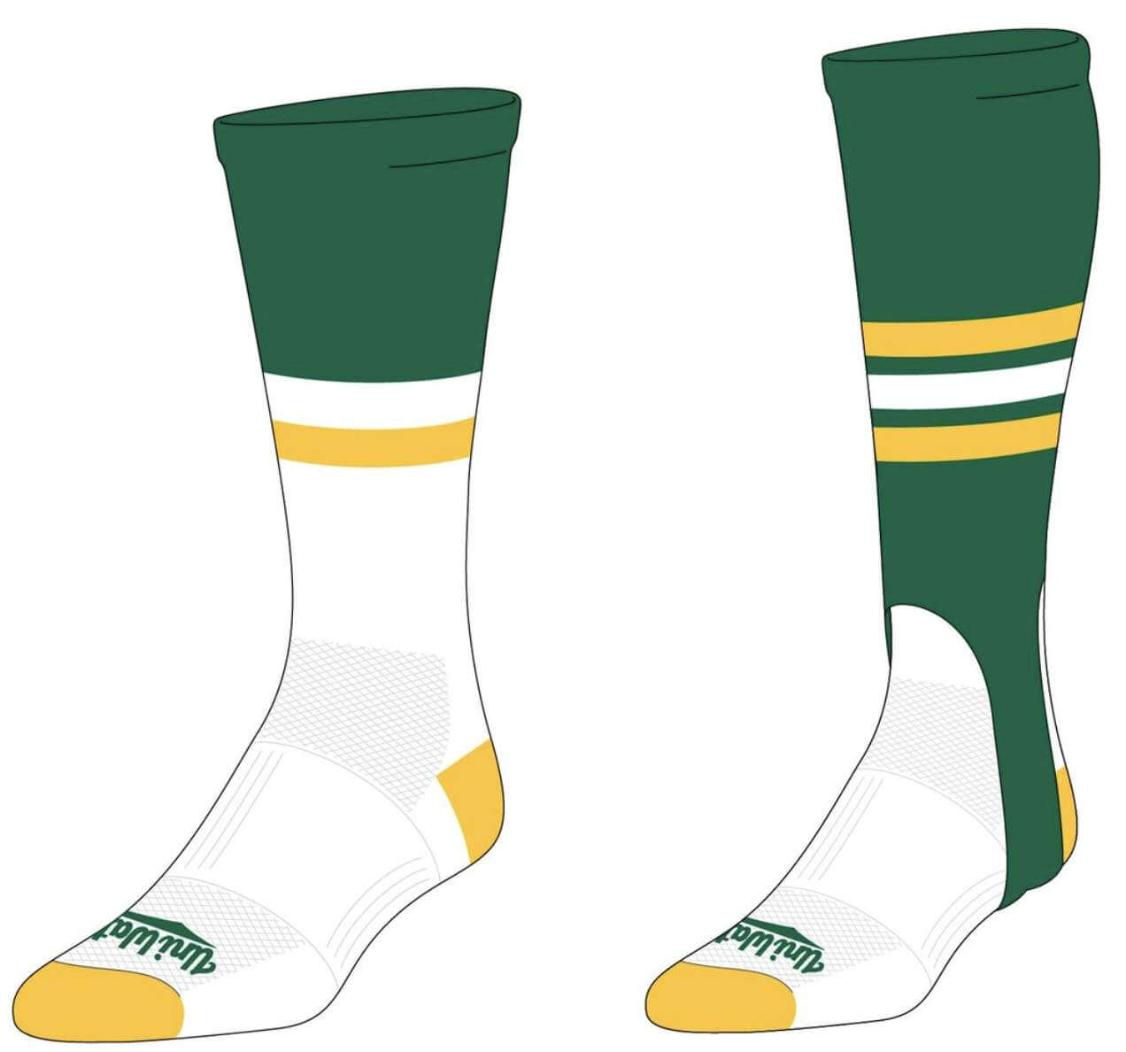
We’re taking pre-orders on these jerseys, socks, and stirrups from now through the end of the month, with the finished product shipping out around the end of April. You can place your orders here.
Click to enlarge
Collctor’s Corner
By Brinke Guthrie
Follow @brinkeguthrie
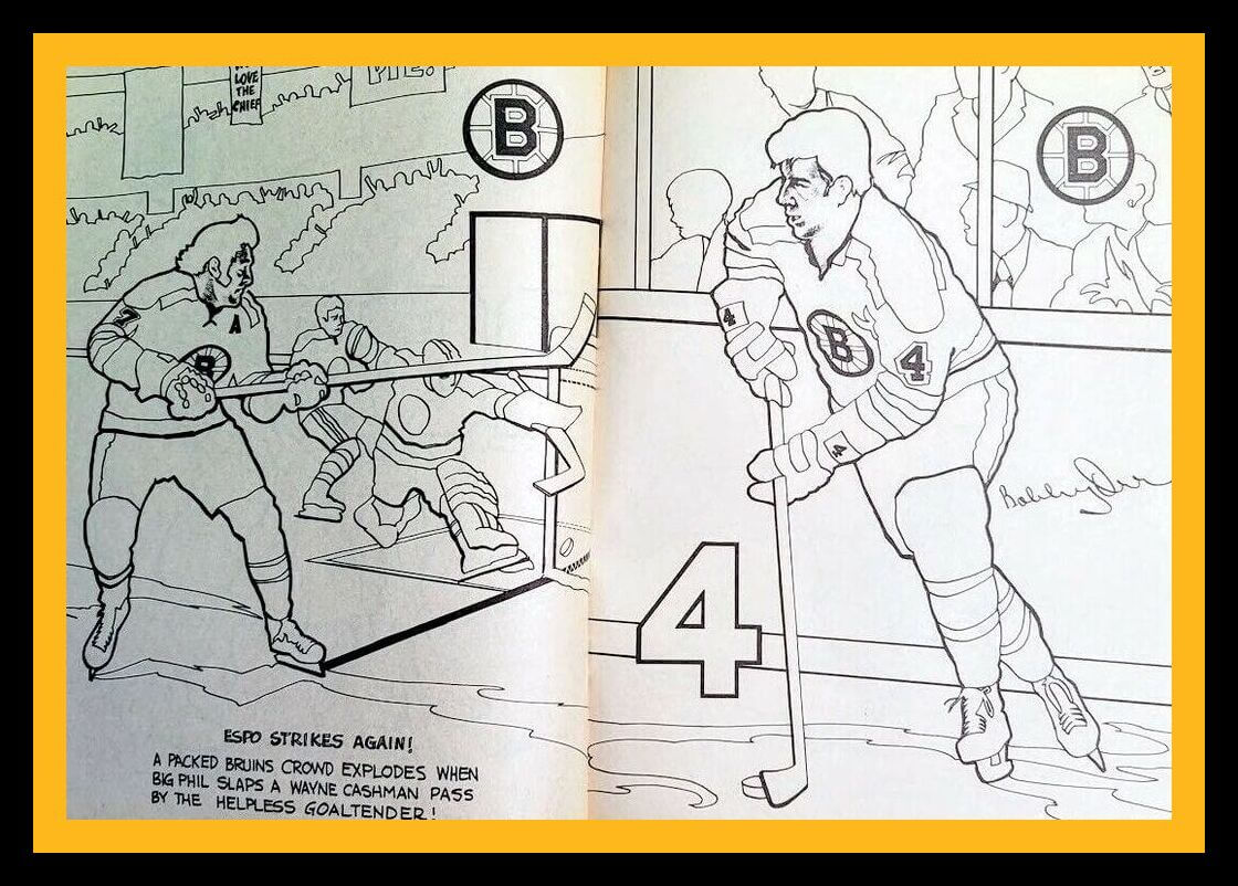
Leading off this week with a terrific Boston Bruins coloring book. “A Full 32 Pages of Hockey Fun!” The book includes “Color-By-Number Pop Posters” and “Full-Length Pictures Of All Your Favorites!” They got Espo’s hair right, too.
Now for the rest of the week:
• I had this 1967 book, Bart Starr. Got it from Scholastic Book Services. Every month, just fill out the form, hand it to your teacher along with a couple of bucks, and a box with your name on it arrives at your school a week or two later. Our old-school version of Amazon! (Also: Here’s the photo the book’s cover art was based on.)
• Getcha red-hots hee-yeh! This 1930s Pittsburgh Pirates program features not-so-subtle ads on the front cover.
• Nice logos shown on this 1970s NFL drinking glass.
• The classic mid- to late-1960s NFL single-bar helmet rendition is shown on this set of Minnesota Vikings stickers, a Kraft promo item.
• In 1983, Steve Garvey of the San Diego Padres peered up at you from your McDonald’s tray on this tray liner. “Make Every Hit Count for Ronald McDonald House”!
• Take a look at this 1961 Topps baseball stamp album. Rather generic box art, but it does come with 160 stamps “neatly affixed.” (And the “Property of _________” space is still available for someone’s name to be entered!)
• Yankees fans proudly wore this “Beat Dem Bums” button while watching their Bombers beat the Brooklyn Dodgers in the 1947 World Series.
• Complex artwork on this 1968 Detroit Lions poster.
• “Look Kids!” A bag of 10 MLB American League adhesive-backed pennants. Just 49 cents! I’m sure mom loved peeling those off your jacket after she overlooked them and ran it through the washer/dryer.
• Here’s a set of five 1960s Louisville Slugger mini-bats for the A’s, Twins, White Sox, Yankees, and Tigers, in a shadowbox-style frame.
• And from reader Niel Scobie, check out this cool 1920s New York Americans jacket!
Got an item to include on Collector’s Corner? Tweet submissions to @brinkeguthrie.
The Ticker
By Alex Hider

Baseball News: Cubs 3B Kris Bryant was wearing nifty striped socks the other day (from Bryan Redemske). … Neal Dorfman caught that the Orioles advertised a new batting practice cap with an orange brim on their Instagram story on Sunday. However, the link the post sent viewers to a page with only all-black caps. Could a new design be coming? … One of the proposed new identities for the Cleveland MLB team is “Municipals.” Now a Cleveland brewery is releasing a Municipals-branded beer (from @manyweirddays). … The Tulsa Drillers, the Dodgers’ Double-A affiliate, are adding a patch to mark the centennial of the Tulsa Race Massacre. Interesting that the patch has the word “Riot” crossed out and replaced by “Massacre” — has any other commemorative patch design ever featured a cross-out? (From Phil and Dan Bewley.) … Speaking of the Drillers, they’ve commissioned a mural of Jackie Robinson on Tulsa’s Black Wall Street (from W. Ryan Wilbanks and Sam McKinley). … Wichita’s new minor league stadium, completed last year, will finally host its first event on April 10 — a college game between Wichita State and Houston (from @PhillyPartTwo).

Pro Football News: Eagles S Jalen Mills, known for his team-colored green hair, has reportedly agreed to a deal with the Patriots. Will he change his hair to red or blue in New England? (From Sam McKinley.) … Speaking of the Patriots, the @PatsTimeMachine Twitter feed tweets Pats news as it happened in 2001 — and uses period-appropriate graphics when announcing transactions (from our own Anthony Emerson). … LT Donald Penn signed a one-day contract with Las Vegas so he could retire as a Raider yesterday, and he signed the contract wearing a custom T-shirt with his face on the team logo (from @DarthTaffeta). … Drew Brees announced he was joining NBC as an analyst yesterday and sat for an interview with Hoda Kotb, who wore a Brees Saints jersey (from Brinke). … When the Hawaiians debuted in the WFL in 1974, they originally wanted to call their shade of gold “Kona Gold” — until they found out that that’s a strain of marijuana (from Phillip Tutor). … An Instagram post by Calgary Stampeders QB Bo Levi Mitchell may give some new insight into a potential new helmet design for the team. The helmet Mitchell is wearing has center stripes — which would be a change — and has the team’s 75th-anniversary logo on one side. That logo was slated to be used last season — which didn’t happen. Wade Heidt notes that the logo could easily be amended to represent 75 seasons instead. … U.S. customs officials in Kansas City have confiscated half a million dollars’ worth of counterfeit merchandise, including bogus Patrick Mahomes jerseys.

Hockey News: New mask for Canucks G Thatcher Demko (from Wade Heidt). … Also from Wade: Terry Smith, the man who created the Sharks’ logo, has designed a pregame jersey promoting racial equality that the team will wear Saturday. … The Hockey Writers blog has ranked all 20 logos of the teams in the Ontario Hockey League and the top five Bruins uniforms of all time (from Kary Klismet). … Panthers D Keith Yandle recently played his 1,000th game, so the team gave him a commemorative golf cart with logos of the other two teams he’s played for, the Rangers and Coyotes. However, they used Arizona’s throwback logo — which Yandle never wore during his time in Arizona (from Cole Posluns). … Here’s a look inside UBS Arena, the soon-to-be completed home of the Islanders (from Andreas Papadopoulos). … Also from Andreas: How do you get Canadians to wear Covid masks? Make hockey jokes! That’s what Prime Minister Justin Trudeau did yesterday when he put a surgical mask on an old Ken Dryden goalie mask. … Some of you may have seen this old Sporting News cover featuring Bobby Hull with a football-style facemask, but it’s always worth seeing again (from Patrick Cooleybeck). … Mariucci Arena, the home of the Minnesota Golden Gophers, has new signage to celebrate the team’s 100th season (from Ray Wroblewski). … Timmy Steffes recently found out a friend’s grandfather played with the Canadiens in the 1950s, and sent along a photo of his jacket. Very reminiscent of the jacket Todd Morss recently DIY’d himself, no?

Basketball News: Nike will be outfitting the most teams — 48 — in the upcoming NCAA Tournament. Adidas and Under Armour are outfitting 10 teams apiece. … More on the tourney: ESPN has a guide to every tourney team’s colors and mascot (from Kary Klismet). … The Indianapolis Children’s Museum outfitted its enormous dinosaur sculptures with masks, basketballs and whistles in honor of March Madness. But Derek Linn says most refs use Fox 40 Classic whistles these days, while the dinosaurs were outfitted with pea whistles that “went out of style” years ago. … Check out the warm-ups for 1976 North Miami Beach High School (Florida) boy’s basketball team. “They always reminded me of the Harlem Globetrotters,” says Francisco Monteagudo, who served as the team’s manager.

Soccer News: The Swedish women’s team KIF Örebro has a new crest and changed its colors to red and “dark grey” instead of red and blue (from our own Jamie Rathjen). … FC St. Pauli wore an anti-racism message in place of their jersey ad yesterday (from Ed Żelaski). … It’s not often you see a midfield logo on a soccer pitch, but Charlotte FC currently currently has one at their future home, Bank of America Stadium (from James Gilbert).

Grab Bag: This is a rundown of all the recent logo updates of major car manufacturers (from Kary Klismet). … Here’s a website called Scoreboard Pressure, which “celebrates the variety of scoreboards and sports grounds across Australia.” The same people behind that site also have an Instagram account devoted to abandoned Australian cricket pitches (from Naomie Hatherley). … Police in Weymouth, Mass., are selling patches in support of a local boy who’s battling cancer (from Timmy Donahue). … The Philadelphia Fire Department celebrated its 150th anniversary yesterday with a commemorative logo (from @Bilder_CEM). … The Calgary Curling Bubble hosted the Brier last week and is hosting the Canadian Mixed Doubles Curling Championship this week — which required a new ice design (from Wade Heidt). … PTI’s Tony Kornheiser decorated his office to celebrate St. Paddy’s Day but mixed some four-leaf clovers in with the shamrock decorations (from Jeff Pollock). … The Supreme Court of Canada has unveiled a new coat of arms, flag and badge (from Andreas Papadopoulos). … Here’s the fire suit Brad Keselowski will wear at the Folds of Honor QuikTrip 500 on Sunday (from Jakob Fox).

Our latest raffle winner is UK reader Ben Humphries, who’s won himself a Uni Watch membership card. Congrats to him, and thanks to Jacob Olson for sponsoring this one. We’ll have another raffle (not for a membership card!) tomorrow. — Paul
I only recently learned about tally marks around the world and found this fascinating.
link
Tally marks. Whether the five goes northwest to southeast or else southwest to northeast, I plead indifference and I don’t think I could personally care less. But without having read any WNBA corporate speak and just going on intuition, I bet the league wanted to “go up, not down.” The NHL did the same thing, changing its shield logo after the lockout to signify a new direction of optimism and new heights for the future.
NBA celebrating 75 years next year seems so odd and wrong. The NBA was a merger of the NBL and BAA in 1949. The BAA started in 46, but barely survived financially. They were saved by the NBL. But the NBA seems to recognize the founding of the BAA in 46 as its starting point. 1949 is when the NBA officially began.
I suspect that the “merged” league kept the BAA’s organizational structure. I’d compare it to the NFL-AAFC merger, the NBA-ABA merger, and the NHL-WHA merger, in that these weren’t a “merger of equals”, a true unification of two leagues, but rather one league absorbing teams from another league that was essentially ceasing operations. In all of these cases, there were even some teams that were cast off from the terminating league and forced to fold.
It’s not often you see a midfield logo on a soccer pitch
That’s because they’re not allowed under the Laws of the Game, so I’d be surprised if it’s there when the season starts. However, the NCAA doesn’t 100% follow the laws and does allow their logo, school/conference logos, and even ads.
+100.
One untold story about the start of Major League Soccer in 1986 was that the groundskeepers of the inaugural match put an MLS logo on the pitch. Subtle, and tasteful, and somewhere around the midfield stripe. But the FIFA representatives sent word down from the pressbox that the logo was to be removed. It was.
*1996
If you watch link, you can still see it faintly.
Midfield logos were commonplace in the old MISL.
link
link
And in today’s indoor league, the MASL, you can find really big logos (and sometimes different colored turf).
link
link
Are the tally marks a “leftie/rightie” thing? I’m left handed and make them the logo way (except nowhere near that exaggerated of an angle) because it is more natural.
I too am left-handed, and I do it the other way!
I write right-handed but do almost everything else left-handed, and I too draw the five hash top right to bottom left. Visually, it doesn’t bother me to see it either way, or even the rare straight across, but I would struggle to mark it any other way myself. I mean, it would be physically difficult. The five, especially when it immediately follows marking the four, is just such a natural motion to me to continue the downward motion of the four hash, lift the pen, circle back up to the top corner, and lower the pen back down to the paper to add the five hash. For me, it would be like trying to make a check mark by starting on the top right and drawing the long leg first.
I’m right-handed and I do it the logo way as well – top right to bottom left specifically. RS Roger’s explanation is perfect. It would seem awkward to draw it any other way (top left to bottom right, bottom left to top right, or bottom right to top left)
I was sure it was a leftie-rightie thing until I saw your responses. To my eye the “logo” way looks more correct, but I personally like doing tallies so the strikethrough is perpendicular to the tallies.
I’m a right-hander, but it mainly depends on where I’m making the tally marks. If it’s off to the right of me, then it’s usually a downward (L-R) stroke. But if it’s to the left of me, then it’s usually an upward stroke.
Don’t see this as a lefty vs righty thing. For the logo it is a graphic design matter. The design of the tally mark is intended to draw your eye toward the player silhouette.
Lefty here. My tally marks are like the logo (upper right to lower left).
Ergonomically, upper left to lower right is an easier manipulation of the wrist, fingers and marker for a left-hander. It is the same for a lefty making checkmarks with the longer side to the left. However, many left-handers make their tallies and checkmarks the other way because they were taught that way by right-handers. There’s nothing wrong with it. People very often continue to do things the way they were taught to do. That’s one reason many left-handers bat right-handed.
If you want make a poll of it, my 5th tally mark goes up to the right. Or horizontal more often than not. But never down to the right. I had never thought about it until this morning. While we’re at it, the longer, diagonal mark on a check mark is on the right of the vertical mark. And for those who don’t make their 1s as a single vertical stroke, the diagonal stroke coming off the vertical is on the left of the vertical. (That I have to specify this should tell you I have seen others do it the wrong way.)
If anyone is interested, that Municipals beer is to go along with a fan based design push to rebrand the team. There’s a website link with some pretty well thought out designs. They also have an Ebbets field flannels cap of the new design that you can purchase.
I’m not head over heels in love with the name, but they present a very good case and I prefer it to all the other options. Well, I like Blues about the same.
I could get used to the name quickly and probably grow to like it a lot. Go Munis!
Bonus: when Paul comments on their uniforms he can title it Muni Watch!
I don’t follow the appeal for this name. (And yes, I looked at the link.) The old Municipal stadium was my favorite place in the word growing up as a kid. The stadium was publicly funded. Hence the very boring and could-apply-to-anywhere “municipal” tag to the stadium name.
You’re basically naming the team the Cleveland “Local Governments”. Or the “Cleveland Clevelands”. There’s nothing unique to “municipal” to Cleveland.
We can do better. Hard “no” for me.
I was curious if “Municipal” could be used as a noun, presumably to mean somebody that lives in a city or town.
But according to Merriam-Webster, the only time the word is defined as a noun is this: “a security issued by a state or local government or by an authority set up by such a government —usually used in plural”
So I guess the Cleveland Municipals logo would be…a certificate?
I love “Municipals” as a team name and the link it creates to Cleveland’s sports history. I agree with their site that “Municipals” SOUNDS like Cleveland.
That’s the attraction for me. When I think of Cleveland, I think of an aesthetic and culture more in line with the practiced plainness of the Browns than the oftentimes flashiness of the Cavs. Simple, straightforward, sturdy, enduring. That’s Cleveland to me, and the Munis speaks to that.
Though I must admit that I’m much more of a Toledo or Columbus fan, as Ohio municipalities go, so I’m nowhere near an audience that the Cleveland baseball team needs to satisfy.
Seeing the WNBA ball with a Wilson logo just seems off. I’ve always associated basketballs with Spalding. When I think of the design of a basketball I automatically think of the Spalding logo on it. I know pretty much every sporting goods manufacturer makes basketballs, I think it must be just the logo creep over the years from watching NBA games. Probably didn’t help as a kid always insisting on getting “official NBA” Spalding balls. That same logo creep also is associated with Rawlings and baseball, Wilson and Football. Just interesting seeing how logo creep influences your decisions.
Of course the dinosaurs would be using out-of-date whistles — they’re dinosaurs!
Good one!
Bring Back Pea Whistles. Do we really need something that can be heard a mile away? Why not just turn down the excessive noise from the PA system?
The roman numerals on the WNBA logo evoke Title IX to me. No clue if that was part of their goal, but that was the first thing I thought of when I saw it. And if that was the intent, it is probably the explanation for the tally rather than going XXV.
That was the first thought for me as well. I started “looking” for how they’d worked Title IX into it. But it isn’t clever; just weird.
To me the logo looks like the league is 24 years old, but they want us to disregard four of those years.
I think PM Trudeau May have stumbled onto a great idea… has anyone designed Covid masks that look like classic goalie masks?
Nothing wrong with the Prime Minister retweeting the image, but it’s originally from Dryden himself.
link
I tend to alternate my crosses when I use tally marks. Downhill left to right to mark the “first 5,” then right to left to mark the “second 5,” and so on. It helps me to keep track of the running tally, and is more pleasing aesthetically, in my humble opinion.
When I look at the numbers on the back of the Sharks’ “Unite” special warmup jersey, it reminds me a lot of the back of the white Flying Skate jersey for the Canucks.
link
Anyone else think those Sharks warm up jerseys are pretty sharp?
The Metropolitans was shortened to the Mets, but the Nationals wasn’t “officially” shortened to the Nats. Would the Municipals be shortened to the Munis??
And then their uniforms would be the Munis’ unis!
Serendipitous :-)
The ice hockey team in the District of Columbia is officially the Capitals, but during the ownership of Ted Leonsis, the team has adopted the handle “Washington Caps” for its web presence and social media. It’s befuddling, since “Washington Caps” was the name of a short-lived ABA team.
So I guess there’s still (sorta kinda) a “Washington Bullets.”
Based on the logo shown on the beer can… I am thinking they could go by ‘pals? In this design the swoop under the s only comes back as far as the p.
Could we get a ‘cuse style contraction. Side note is it a contraction when eliminate 1/2 the word?
I like the Pal’s as well
I’d be down with “Munis” (as far as nicknames of nicknames goes, which I am not in favor of in general).
I live in San Francisco, part of our public transportation system is called MUNI.
Lee
Good Morning Paul,
I really like the new hockey jersey design. Would you ever consider making a version available with actual sewn-on numbers, logo, NOB, etc.? I know those would naturally be more costly to make, but considering what I (and many others) fork over for Fanatics replicas and Adidas authentic NHL jerseys, I definitely think they’d sell. I guess the question would be what the break-even number of jerseys sold would be to make it worth your while.
Will consider!
I think the WNBA, by using Roman instead of Arabic numerals, is referencing that women have XX chromosomes. The different color on the tally mark is eliminating a barrier. This is a lot less tortured than most logo explanations.
I seem to remember somewhere that the WNBA is going to outfit each of its teams with three uniforms — a white and two color uniforms, something you can do because no current WNBA team is one-color like the Maple Leafs, Celtics, or Red Wings.
That’s not a bad interpretation, except for the fact that in modern times, a woman can have XY chromosomes…
That jacket found by Timmy Steffes is absolutely one of the ones I based that jacket on. There is a very good chance that I’ll be making a wool copy of that next winter. What a magnificent find!
I feel like Uni Watch selling the Uni Watch stirrup is burying the lede!
What? No 2-in-1’s?
;)
No-kidding. My order is already in.
I think it is interesting that you describe the logo’s tally marks as “downhill right to left”. I just think of them going uphill, left to right, since that is the direction I make the mark.
It’s driving me crazy that I actually can’t think of which way I make my tally marks. Neither way seems overtly right or wrong.
I go up. It’s positive.
One of the great joys of my childhood was ordering from Scholastic. Such exquisite torture seeing the box up on the teacher’s desk, knowing your book was inside, but not getting it until the end of the day.
You got that right! And they were so inexpensive; 50 cents each or something. Ten books, five bucks, nooo problem.
Agreed. Used to love bringing home the catalog (i.e. “newsprint leaflet”) Always tons of sports related biographies, stars of each leagues books, trinkets, stickers, etc.
I remember getting a NFL helmet poster of all things from scholastic. A classic 2 bar rendering of each helmet in all their 80s glory. Went perfectly above my bed as it matched my supercool NFL logo bedsheets
YES!! I remember this, too! But Brinke, you said every month … as I recall, we got to order books maybe twice a year. I guess it was even more special that way. I remember reading a Scholastic book on Louis Braille, and of course, several sport-related books.
As I recall, I got a lot of Marmaduke books. And I had the entire PPK library- but those weren’t Scholastic. In any case, it was a bonanza whenever that box showed up!
poster? I MUST SEE IT.
Sorry I no longer have the poster, but I did google “scholastic NFL helmet poster” & I was able to find a few images. The listings said 1978, 1984 & 1988. I am slightly confused, as I am certain I had Bengals w/ stripes, but pretty sure buffalo was white. Did not see this combo in my search. My poster must have been from a year in the gaps between the versions I found.
My ever growing sports book collection started with the Scholastic Book Club back in 1970. I loved the annual Football, Baseball and Hockey Stars books along with several of the biographies. I still have all of the copies that I bought.
Whistles are a fascinating topic in and of themselves; I can’t tell you how many times I’ve been in conversations with fellow rugby referees about which whistle is the best (plastic v. metal, 58/558 v. 58.5 but ALWAYS Acme Thunderer), and how to get the whistle to speak its own language on the pitch. Then you get into wrist straps, and on and on…
Andy Buck- feel free to weigh in :-)
Acme Thunderer, made of nickel. There is no other option for rugby.
And wrist lanyards are the way to go.
I always use an “ascending” crossbar for the fifth tick (sorry Paul). It’s more natural as lefty (I draw or find right to left). Wonder if this is a common motivation for which direction to draw it.
I’m lefty as well, but I don’t do it that way!
Am I the only one who makes tally marks straight across??? Should I make an appointment to speak with someone?
When put on the spot, I can’t even tell you if I move the pen left to right or right to left on the 5th tally.
You monster! You probably eat Kit Kat bars the wrong way too ;-)
On the new hockey jerseys… they’re nice, kind of a mix of the Penguins’ classic design and the original North Stars unis from c.1967-75… but what if someone doesn’t want a contrasting nameplate?
Let me see if we can do a standard one — stand by.
I’m only seeing New England Whalers from the WHA. Tasty! But yeah, no, I’m personally not a fan of contrasting nameplates.
Put a skate blade on that winged foot, ala the Denver Spurs!
I notice the silhouettes of players depicted on the Spaulding and Wilson WNBA balls are different. Any significance to that? I’m curious.
Indeed – the image on the current ball isn’t just a player silhouette, it’s the WNBA’s own logo.
Liking the new Uni Watch hockey jerseys. No five-year waiting period for a jersey redesign! NFL take note :)
Baseball’s Evansville Otters (Frontier League) have a new logo and tweaked color scheme. The release on the website (link) doesn’t get too high-concept about what everything is supposed to represent.
Hey Paul, are there any plans to release more of the (forgive me if this is the wrong name) Stripe Right socks that were the truncated NFL team socks? I remember you had people vote on the designs and only released a couple but I was curious if more or the other options would ever come out. Thanks!
I would love to do more, but American Trench — our partner on that project — decided not to do them anymore. Dang.
Maybe there could be a UNIFIED patch available to go on the jersey sleeve?
For my money, the best ‘correct’ execution of a tally mark goes to Myrna Loy:
link
Not liking the new Brad Keselowski firesuit…another deviation from the “macro-brew” blue and white classic associated with the #2 Penske entry.
“Nice logos shown on this 1970s NFL drinking glass.”
The presence of a striped Bengals helmet means it’s more likely an ‘80s item.
Surprised no one commented on the Tulsa Drillers patch. The cross-out is a strong statement.
At the time of the incident, the African-Americn population was said to be “rioting” and that was the narrative for 90 years. It has only been recently that it has been accepted as what it was, a massacre of the relatively affluent, thriving black population of Tulsa and their property.
Agreed.
the tally mark logo is stupid, fine. but the idea that the tally marks are in the wrong direction is infuriating. even if there is a tally use rule, who cares, it goes up and forward in the direction of reading.
you are left handed correct? i’m going to guess, like most writing, people are going to do what is quickest and most comfortable, hence your incorrect and foolish way of keeping track of sausages as they come off the line. the very idea that there is a right and wrong way to tally is ridiculous, and this world has enough of lunacy.
tally marks on a patch=dumb,the direction of the tally marks being a problem=dumber.
you know love, but i had to vent that.