OH COME ON https://t.co/dfoZ04pOc8 pic.twitter.com/CkVOzuV7bE
— Taylor Pate (@taylorlpate) March 3, 2021
About skatey-eight jillion people yesterday sent me the tweet shown above — clearly a classic of its type. My favorite thing about it (aside from the “OH COME ON,” which is a brilliantly efficient bit of performance art) is how you can see the different angles of the vertical arching on the two transposed letters, which makes the typo particularly egregious. Like, it’d be one thing to misspell the team name if the letters were straight, or even radially arched — any absent-minded (or non-English-speaking) sewer could make those mistakes. But with vertical arching, the letters basically tell you where they belong — it’s like pieces of a puzzle — and they still got it wrong! Obviously, it’s just a retail jersey, but still.
This immediately reminded me of the (in)famous Wayne “Gretkzy” NOB typo from 1997, which also involved vertically arched lettering. Again, you can see how the angles of the letterforms should have been a dead giveaway that something wasn’t right:
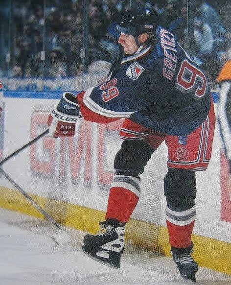
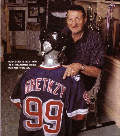
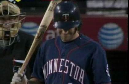
Off the top of my head, I can think of only one other uniform typo involving vertically arched lettering (although I’m sure there have been others), and that was Adam Everett of the Twins in 2008. Once again, you can see how the gravity of the misspelling is amplified by the improper angles of the letters:
(My thanks to everyone sent that tweet my way yesterday.)
ITEM! New podcast episode: For the the latest episode of Unified, Chris and I discuss the mess that the NBA uniform scene has become, and possible ways to fix it. Plus we talk about NBA All-Star uniforms, the potential uniform implications of J.J. Watt signing with the Arizona Cardinals, whether all the teams in a given city should wear the same colors, and more.
You can listen to this episode, and subscribe to future ones, on Apple, Google, Stitcher, TuneIn, and Spotify, or just use the player below:
The show notes from this episode, which include photos of most of the things we discussed, are here. Those photos also appear in the video version of this episode, which you can watch here:
Please consider supporting this episode’s advertisers, Streaker Sports (20% off with checkout code UNIFIED) and Homefield Apparel (15% off with checkout code UNIFIED).
Enjoy the episode, and thanks for all the enthusiasm and positive feedback on this project.
Click to enlarge
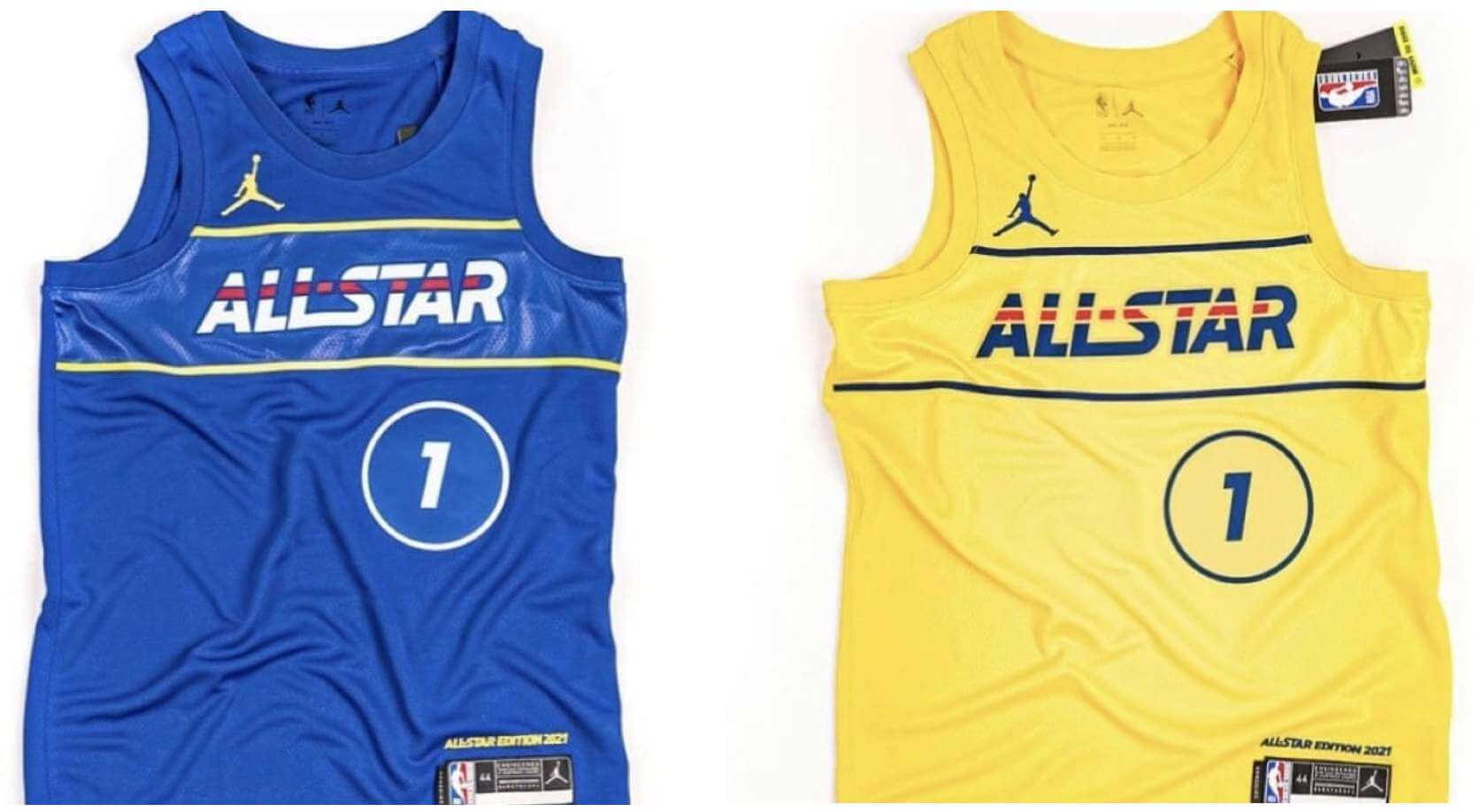
NBA All-Star leak: The latest scoop from Brazilian NBA leakmeister @camisasdanba is that the league is apparently sticking with Pacers-themed uniforms for this Sunday’s All-Star Game in Atlanta. The game was originally schedule for February in Indy, then scrapped due to the pandemic, and then revived for March 7 in Atlanta.
While the Pacers-centric designs aren’t bad, I’m disappointed that they’re going this route. This would have been a perfect opportunity to let the players wear their regular team uniforms — one side in white, the other in color — as was the case from 1997-2002 (which was something Chris and I discussed in the new podcast episode):

The game tips off on Sunday at 8pm Eastern.
Click to enlarge
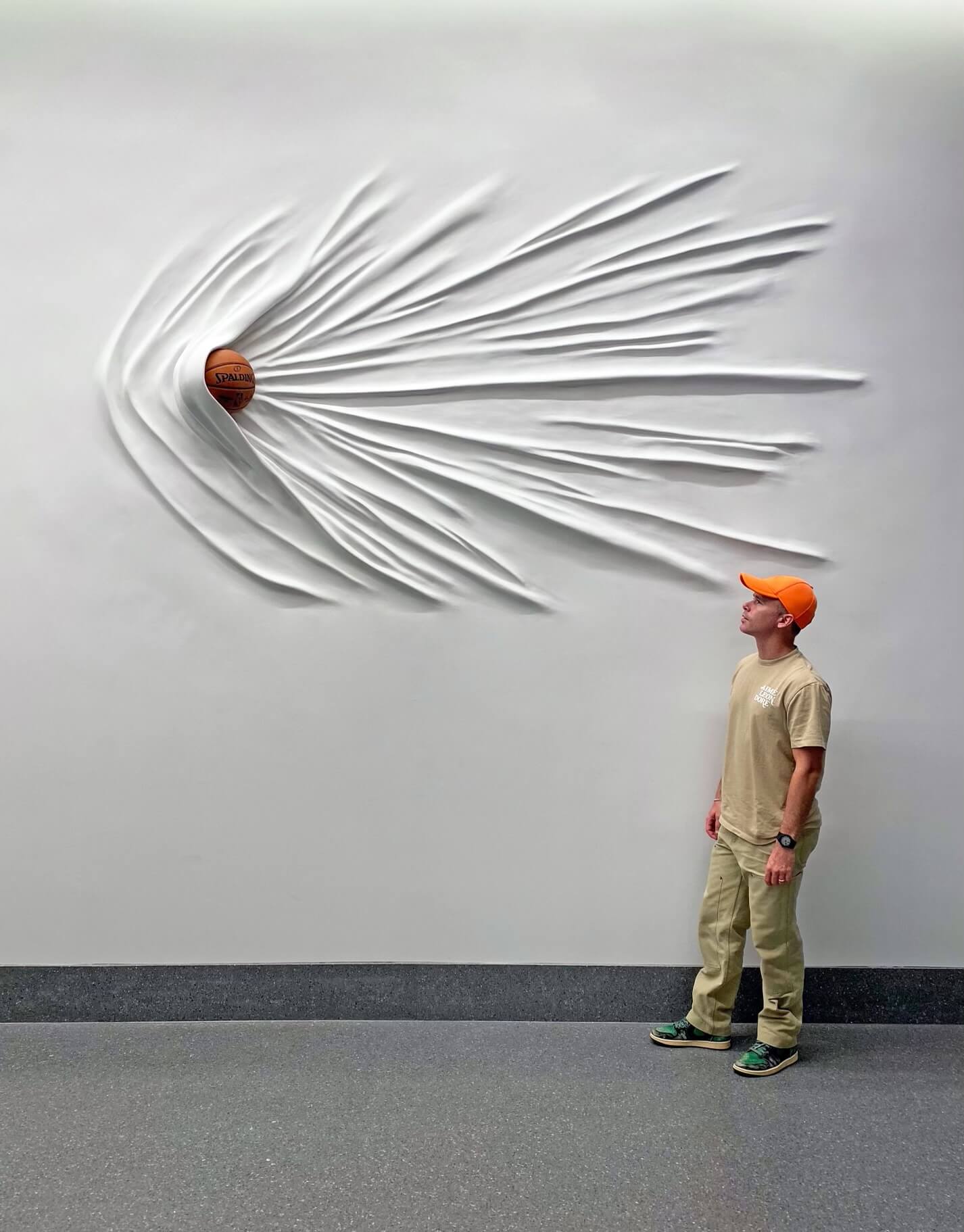
InsideHook reminder: In case you missed it on Wednesday, my latest piece for InsideHook is about how streetwear designers and other non-sports cultural figures (including contemporary artist Daniel Arsham, shown above) are changing the NBA’s approach to marketing and branding. It was a really interesting piece to report, and I think it gives a good glimpse of where the NBA (and maybe the sports industry in general) is heading. You can check it out here.
Click to enlarge
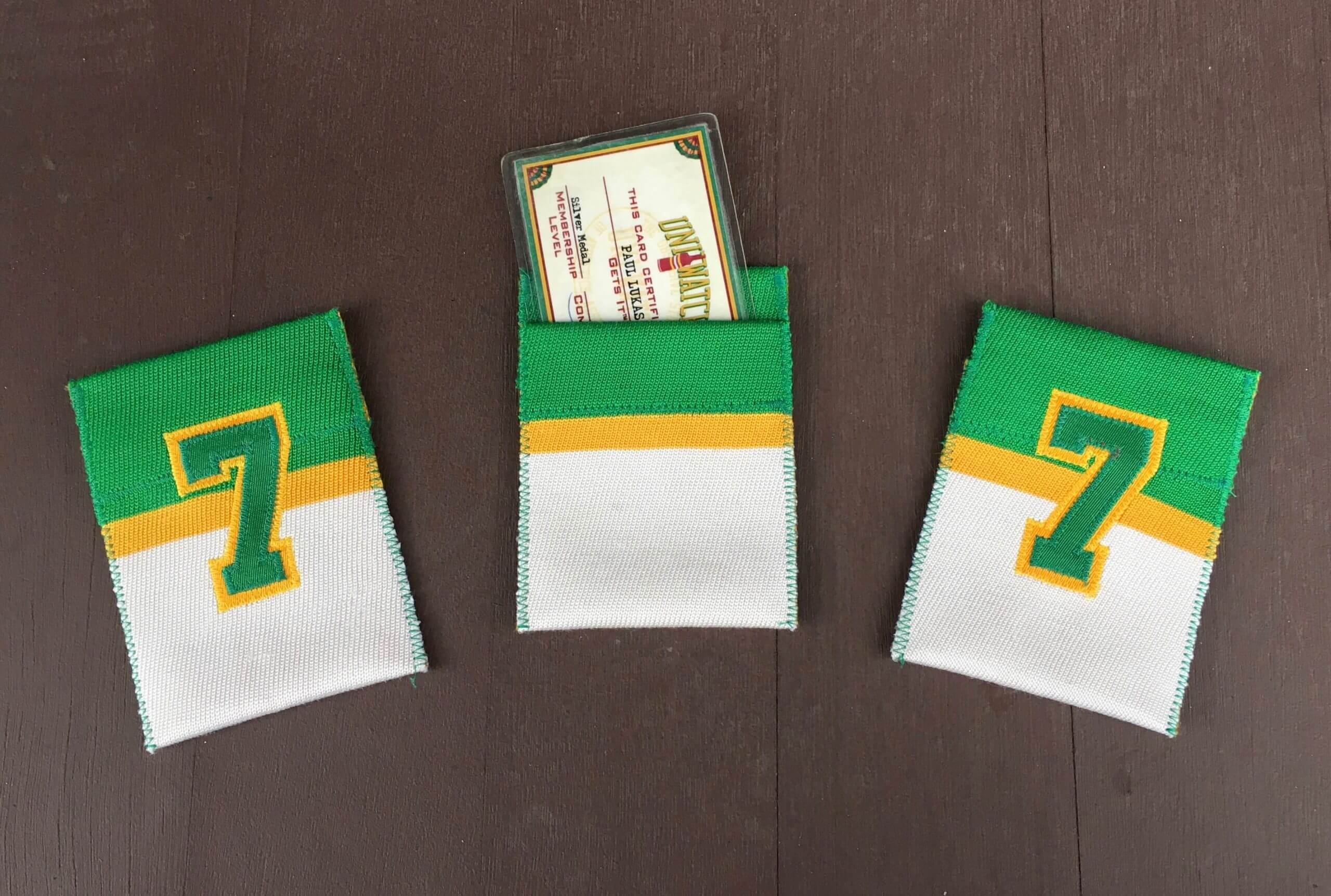
Membership drive reminder: As I’ve mentioned over the past few days, we’re currently in the midst of a membership drive. I will pick three people at random from everyone who orders a membership card this week, and those three people’s cards will come with one of these beautiful card pockets hand-sewn by DIYer extraordinaire Wafflebored.
And to sweeten the deal, reader Chris Hickey has decided to support the membership drive by purchasing three Uni Watch winged stirrup magnets, so the three winners of the card pockets will each get a magnet to boot!
Also: About a year ago, as a gesture of pandemic solidarity, I lowered the membership price to $20. After this week, the price will go back to $25. So signing up this week is a good move — you’ll get in at the discounted price and will also get a shot at one of the card pockets and magnets. You know what to do.
Click to enlarge
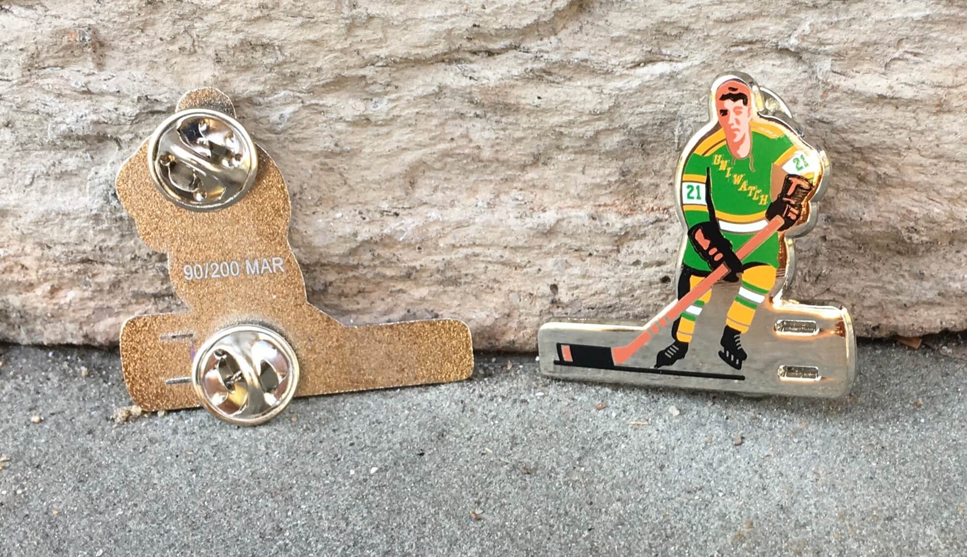
Pin Club reminder: Our new Uni Watch Pin Club design — a shout-out to classic table hockey players — continues to sell well. As of this morning, there are only 33 of them remaining. Available here while supplies last.
Click to enlarge, if you dare
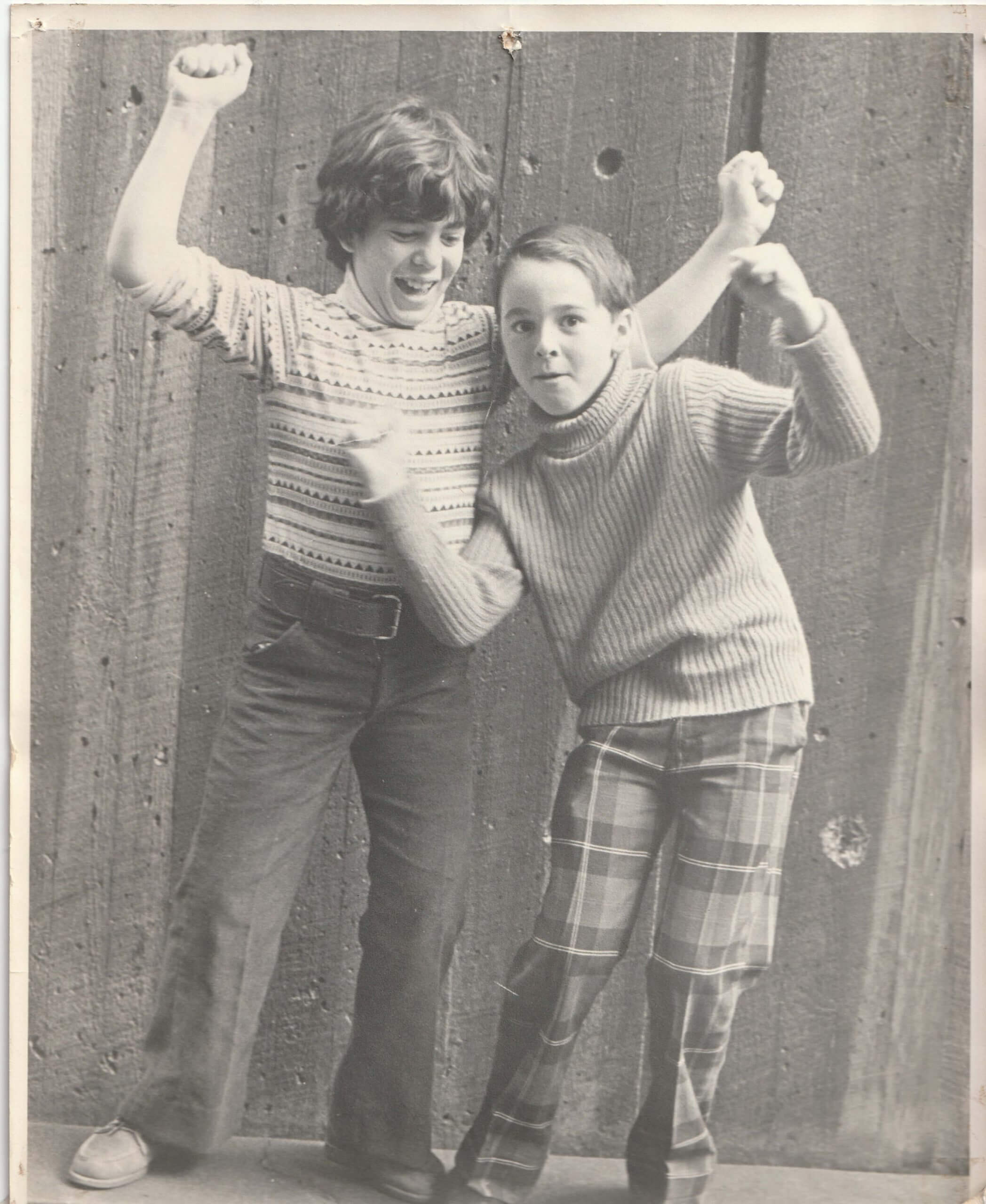
Thank god for black-and-white film: My childhood friend Pete was going through some old stuff recently and found this photo of us from a 1974 trip to Manhattan with my parents, when we were 10 years old. I don’t recall why we were pumping our fists, but I’m assuming it was to celebrate how hip our outfits were. Do we look like something out of the Sears catalog or what?
The photo was taken by my father. He would often take pics of me and my friends, make prints in his basement darkroom, and then give the prints to my friends the next time they came over to our house. So there may be lots of people out there who have embarrassing childhood photos of me like this one.
The Ticker
By Paul

’Skins Watch: The school board in Wakefield, Mass., held a public meeting last Thursday to discuss the future of the local high school’s “Warriors” team name and Native-themed logo. … A Cleveland TV station interviewed some local Native Americans to get their thoughts on Chief Wahoo and the “Indians” team name (from @spiders_six).

Baseball News: Starting this season, June 2 will be Lou Gehrig Day across MLB. Key passage from that article: “[U]niformed personnel will wear a jersey patch celebrating Gehrig, and a ‘4-ALS’ logo — commemorating his No. 4 — will be displayed around stadiums.” MLB players also wore a Gehrig/ALS patch on July 4, 2009 — the 70th anniversary of Gehrig’s “luckiest man” speech — and a different patch five years after that. … The Green Bay Booyah are letting fans submit photos of their dogs and will feature the photos on their upcoming “Bark in the Park” jerseys (from Brian Kerhin). … MLB is selling team-themed sandals with built-in bottle openers (from Michael Ortman). … Following up on yesterday’s piece on NOB hyphens, I’ve been waiting to get a clear look at the hyphen that the Reds are using for INF Dee Strange-Gordon. While the overall NOB is absurdly clunky, the hyphen itself isn’t bad at all. … New uniforms for Troy and D2 D’Youville College (both from Timmy Donahue). … Good, well-reported story on retro MLB uniforms, including the Astros’ tequila sunrise, the Brewers’ ball-in-glove, the Blue Jays’ split lettering, the Mets’ BFBS, and more (thanks to all who shared). … Dodgers prospect Zach Reks was missing part of the underscore on his chest insignia last night. Not sure I’ve ever seen that particular glitch before (thanks to all who shared). … Central Arkansas softball has added a memorial batting helmet decal for Kevin Shock, husband of longtime associate athletic director Natalie Shock (from Chris Mycoskie). … Reggaeton artist Daddy Yankee is wearing a Pirates pillbox cap on the cover of his latest single (from Mike Chamernik).

NFL News: In a welcome and long-overdue move, the Washington Football Team is scrapping its cheerleader squad and replacing them with a co-ed dance team. Here’s hoping other teams do the same.

Hockey News: Islanders G Cory Schneider’s nephew died in a house fire last week. Both the Isles and Devils — one of Schneider’s former teams — put red-taped sticks outside their locker rooms as a memorial tribute (from Wade Heidt). … Check out this collection of Kings pocket schedules (from Eli Langbaum). … The Kraken have raised more than $150,000 to help save the U. of Alaska-Anchorage hockey program, which is worth saving for their excellent green/yellow uniforms, among other reasons (from John Muir). … Here’s a ranking of OHL jerseys (from Ted Arnold). … Gotta like these food-based tees for the Sabres and Flyers. The Buffalo design is particularly good (from Taylor Crabtree). … Intriguing-looking game last night in Vegas, as the ЯR Wild faced the gold-alt Golden Knights (thanks to all who shared).

Basketball News: Pretty funny video of Shaq having trouble putting on his jacket in the studio (from Justin Hicks). … Florida State wore their turquoise N7 alternates last night (from Gabe Cornwall).

Soccer News: Lots of soccer teams removed the animals from their crests yesterday for World Wildlife Day, including Premier League teams, MLS’s Philadelphia Union, and the NWSL’s OL Reign (thanks, Jamie). … You know things have gotten out of hand when Welsh side Swansea City has an official turmeric supplier (fro Ed Zelaski). … Here’s one writer’s picks for the “most iconic” kits in USMNT and USWNT history.

Grab Bag: New F1 livery for Aston Martin — the car maker’s first F1 entry in 61 years (from Russell Flynn). … The historic aviation history/preservation organization once known as the Confederate Air Force had already changed its name to the Commemorative Air Force. Now the group’s Georgia chapter has changed its name from “Dixie Wing” to “Airbase Georgia” (from Scott Rogers). … U.S. Air Force maintainers are now permitted to wear shorts. … New logo for Google Fonts. … Amazon has revised an app icon because people thought the original version looked like Hitler’s mustache. … The makers of the Firefox browser had to clear up some confusion about the browser’s logo due to a misleading meme that spread across social media. … This is pretty awesome: Back in the 1970s, the local Channel 2 station in Boston had a promotional vehicle shaped like a giant “2” (from Jason Tierney). … I love the pattern of the colored seats in this Indian cricket stadium (nice find by James Siddall).

Other vertically arched team name typos? Well we have the ANGEES as worn by one #9 batter, which is not a transposition, just a wrong letter. The Ryan Zimmerman and Adam Dunn NATINALS had a missing letter and that has an arch on the bottom. Funny how the missing letter is the middle letter to preserve the arch! That’s all I’ve got!
Aaron Harang of the Reds started a game with the first I missing so his jersey read CNCINNATI
Those UAA sweaters are excellent.
WILL SOMEBODY PLEASE COLORIZE THE PAUL AND PETE PHOTO IMMEDIATELY?!! Thank you.
Paul’s vintage picture sent me down a rabbit hole about the direction belts should be threaded. I’ve only noticed belts going one direction, but maybe there’s a lefty vs. righty situation that I was never aware of. Either way, I’d wear either of those outfits today.
Perhaps Paul’s Dad reversed the negative??
It’s a lefty/righty thing. I always have my belt oriented that way. Wearing one like that right now, in fact.
I could tell the photo was NOT reversed because the pants fly covers open right.
I am so thankful the Premier teams removed animals from their logos, much like Temple removed owls from their logos.
Here’s hoping other teams do the same.
Honest question…Why?
The Premier League teams removed the animals from their logos for one day, so not at all like Temple who seems to have made that move a permanent one.
Premier league teams are using it to bring attention to endangered animals, I get it, nice gesture for a day.
Does permanently removing an animal from a crest/logo have an impact on whether or not it is hunted or endangered? Not sure I’d see a correlation.
Don’t keep us in suspense! Are all mascots bad?
I remember that 1 game when Joe Carter played for the Torotno Blue Jays.
link
Without hearing the podcast yet, my opinion on the all teams with the same color question is a resounding no. I grew up near Pittsburgh. I’m good with the Penguins and Pirates. I loathe the team founded to launder the Rooney family’s liquor money during Prohibtion. The only thing I will wear from any Pittsburgh team is a cap because it is obvious it doesn’t support the football team. Any other colors and I could buy something. The high school where I currently live also wears black and mustard yellow (NOT “gold”). Before my wife passed away and we were considering adopting I told her that we would have to move when the kid got to school age – their colors were the only reason. Don’t punish fans of the rest of the city’s teams.
That ORCKETS jersey has to be a poorly made knock-off.
When Taylor Pate said he waited 2 months for the jersey to arrive, it was a red-flag that it was shipped directly from knock-off manufacturer in China.
You’d think an official jersey outfitter would have some better quality control.
It was from a knockoff site. When the Rockets said they were sending him a jersey, they reminded him to purchase from officially licensed sellers.
One word:
NATINALS.
If we don’t need cheerleading squads, we don’t need dance teams either, whatever they are or what function they perform.
I agree.
I really don’t understand why objectifying both men and women instead of just women is a “welcome and long-overdue move”, but maybe that is just me.
Actually, dance in and of itself is not objectifying.
The welcome and long-overdue move was the dissolution of the group of de facto sex workers (not that I think there’s anything wrong with sex work per se, but I see no reason for an NFL team to be engaged in that practice).
Replacing them with a coed dance squad that will presumably not be comprised of de facto sex workers seems like an upgrade. I agree that simply having no cheer/dance squad at all would also be an upgrade. I don’t really care which of those solutions is chosen — I’m just happy that the team is no longer in the business of employing de facto sex workers.
Paul has a point here. Many NFL teams have used their cheer squads as little more than eye candy and/or promotional pinups. They appear at some team functions, promotional events around town, and for swimsuit calendars.
And completely underpaying them, mind you.
Understand and agree!
We’ve already had co-ed cheerleaders in the NFL.
link
The ORCKETS jersey came from a Chinese counterfeiter. No tears for him.
Wow, that 1998 NBA All-Star Game photo is a real uni moment in time. Kobe in the Showtime jersey (complete with awkward S), Malone in the purple mountain jersey, Penny in the original Magic pins, the odd sight of Shawn Kemp in a Cavs jersey (and the blue splash, no less), Diekembe in the full-hawk jersey bringing up the rear with Shaq, the Sonics player below the hoop (either Gary Payton or Vin Baker, but probably Payton) with the star on the opposite side from everyone else (since the NBA logo on those jerseys was on the other side). And then you have MJ, in what would be his last ASG as a Bull.
Just an outstanding shot.
Yes, yes, a million times yes. I could frame that and put it on my wall.
Confirmed it’s a Chinese knockoff: link
Not only does he get a new jersey from the Rockets, but he gets a lot of pub and a lead item on this site. Maybe instead of comparing this to other jersey flubs, the crux of the piece should’ve been how this is a cautionary tale about buying fakes. If a jersey price is too good to be true, it usually is.
Oops. Replied to the wrong post. :(
Another team to remove an animal in their logo for World Wildlife Day: Forward Madison of USL League One. link
Are the All Star Jerseys confirmed? The leak could be the template they were planning on using because that’s a real jersey.
@Camisadanba’s leaks have *all* proven to be accurate, so I’d say this one is presumptively legit (although I did hedge a bit by saying “apparently” in today’s text).
In any case, we’ll find out soon enough.
How I wish Chris Creamer would embrace my “Torontosaurus” nickname for the Raptors.
I may be wrong, but haven’t the Seattle Seahawks gotten rid of their cheerleaders and did a dance group? Im pretty sure it was coed as well
Back in the 1970s, the local Channel 2 station in Boston had a promotional vehicle shaped like a giant “2”
– Or, viewed from the other side, a giant backwards “2”
Massachusetts has a thing for the so-called “art car.”
link
“Click to enlarge, if you dare” — a masterstroke.
TWSS.
“NFL News: In a welcome and long-overdue move, the Washington Football Team is scrapping its cheerleader squad and replacing them with a co-ed dance team. Here’s hoping other teams do the same.”
I get why you said that, but do you believe that the move is welcomed by the current WFT cheerleaders who will no longer get to cheer at games?
Oh, I can imagine there are lots of people who won’t welcome it, perhaps including but not limited to the current de facto sex workers. But it’s still the right move overall, and thus *I* welcome it.
If the current de facto sex workers want to find other sex work, there are many avenues open to them. If they want to dance, they can try out for the new dance squad like anyone else.
When the Braves stopped employing Chief Knockahoma, that was also the right move. The fallacy that any and all employment is an inherently positive thing, regardless of circumstance, is just that — a fallacy.
I guess I’m the only dinosaur around who enjoys cheerleaders. Particularly my team – The Dallas Cowboy Cheerleaders are iconic and if this new landscape forces them to go away, I’ll miss them.
I enjoy uniform discussions, the history of uniforms and news of changes. But I’m probably on the wrong site. The political correctness on steroids is too much. I’ll duck and cover now.
Don’t be such a triggered snowflake! If you enjoy your favorite sports teams employing de facto sex workers, that’s certainly a legitimate position for you to have. Nobody said you’re not allowed to think that, and nobody has called you a dinosaur (well, except yourself).
But some of us feel differently about this issue than you do, and that’s a perfectly valid position as well.
Paul, you’re saying just because it’s a job doesn’t make it an inherently good thing, but that’s only predicated on the belief that they’re “sex workers.” How? They dance and cheer. They aren’t nude. They know what the job entails, and still sign up. Nobody is forcing them. A lot women and (men) like to train and dance. So people should lose their jobs that most of them probably enjoy, because you think it’s wrong. I mean what about high school cheerleaders? Is that wrong too?
I never claimed anyone was forcing them. That’s a straw man argument.
They’re obviously de facto sex workers, based on their clothing, poses, the all-female composition of the squad, etc. (If you think someone has to be naked in order to be a sex worker, you’ve apparently never heard of phone sex.) Nothing wrong with being a sex worker — I’ve known several of them myself. I just don’t think it’s something an NFL team should be engaged in. That’s all. If you feel NFL teams should be in the business of employing de facto sex workers, we’ll have to agree to disagree on that point.
And no, they’re not out of work because I think it’s wrong; they’re out of work because the team chose to disband the cheerleading squad. (The team is also hiring a new coed dance squad, if employment numbers are truly what’s troubling you.)
You know things have gotten out of hand when Welsh side Swansea City has an official tumeric supplier
*turmeric
Enjoying the podcast as I type. Thanks to the sponsors! Checking them out as well.
Typo fixed!
If I had any level of artistic competence, I would be hard at work making an “ORCKETS” logo that is
-Part late-90’s Houston Rockets logo
-Part Vancouver Canucks jumping orca whale logo
11,000 Internet Points to whomever can create such a masterpiece.
I suppose this doesn’t count, because they aren’t the team’s official cheerleaders… but the Packers use cheerleaders from UW-Green Bay and St. Norbert College (local Catholic school where training camp is based), and the UWGB squad is co-ed.
Is an Orcket a name for a baby Orca? Could be a promo night for the Canucks AHL farm club…
It looks like you guys are trying to recreate one of these paintings …
link
link
I like some of the Keane knock-offs even better than the originals.
There isn’t much whimsy in a Keane.
The Orioles cartoon bird seems like an obvious omission from the MLB.com article about uniforms of the past. After taking a hiatus from 1989-2011, they reverted the cartoon bird in 2012.
Yes, I do not like the gold helmet for the Golden Knights.
If they have to wear the gold helmet, they should do this just with the gold uniform and not the grey uniforms. Its gimmicky nature is better suited for an alternate uniform and one that already pushes the boundaries. It would look “better” with the gold uniform I guess. They seem reluctant to try this for some reason as seen again last night.
It seems like if Major League Baseball really wanted to honor Lou Gehrig they would have all players wear 4 that day.
The notion that there is only one way to “really want to honor” someone seems a bit silly, no? Surely there are multiple ways to honor someone without invoking the Jackie standard.
Knights/Wild was in Vegas Last night, Thankfully they spared us the Gold helmets.
I looked it up at the time and I swear I thought it said it was in Minnesota!
Will fix.
A nice summary of other historic jersey fails from some guy named Lukas back in 2007 at ESPN. Wonder who that dude is?
link
Did you see LeBron’s tweet with the Space Jam uniforms? I can’t make it out for sure but it looks like the Tune Squad jerseys have a sponsor
RE: the ranking of OHL jerseys – since I’m not ‘logged in’ there, I’ll say it here. His claim that the Hamilton Bulldogs had relocated from Belleville, where they played as the Bulls, is true. He went on to say that they kept the red/white/blue colors they wore in Belleville for one season; that is FALSE. The Bulls wore yellow, red, and black for their entire run in the league.
The original Bulldog team in Hamilton were members of the AHL, and the top farm team for the Canadiens; they wore the same rouge, blanc, et bleu as the parent club. When the Habs relocated the franchise to St. John’s, the Bulls franchise moved in, retaining both the Bulldogs name and colors for one season.