Allow me to re-introduce myself. #SFGiants pic.twitter.com/sI7hIdxGc3
— SFGiants (@SFGiants) February 23, 2021
We’ve known for several months now that the Giants would be wearing NOBs on their home jerseys in 2021 — the first time they’ve done so since moving into their current ballpark in 2000. Yesterday they gave us our first peek at how that will look by posting a promotional video on their social media channels (see above).
Ordinarily, this would merit a Ticker mention or, at most, a sub-lede. But as I watched the video yesterday afternoon, I was struck by something: The radial arching on the NOBs shown in the video is bad. Like, really bad.
Some quick background: The idea behind radial arching is that the base of the letters should form a curve, like this (for this and all photos that follow, you can click to enlarge):
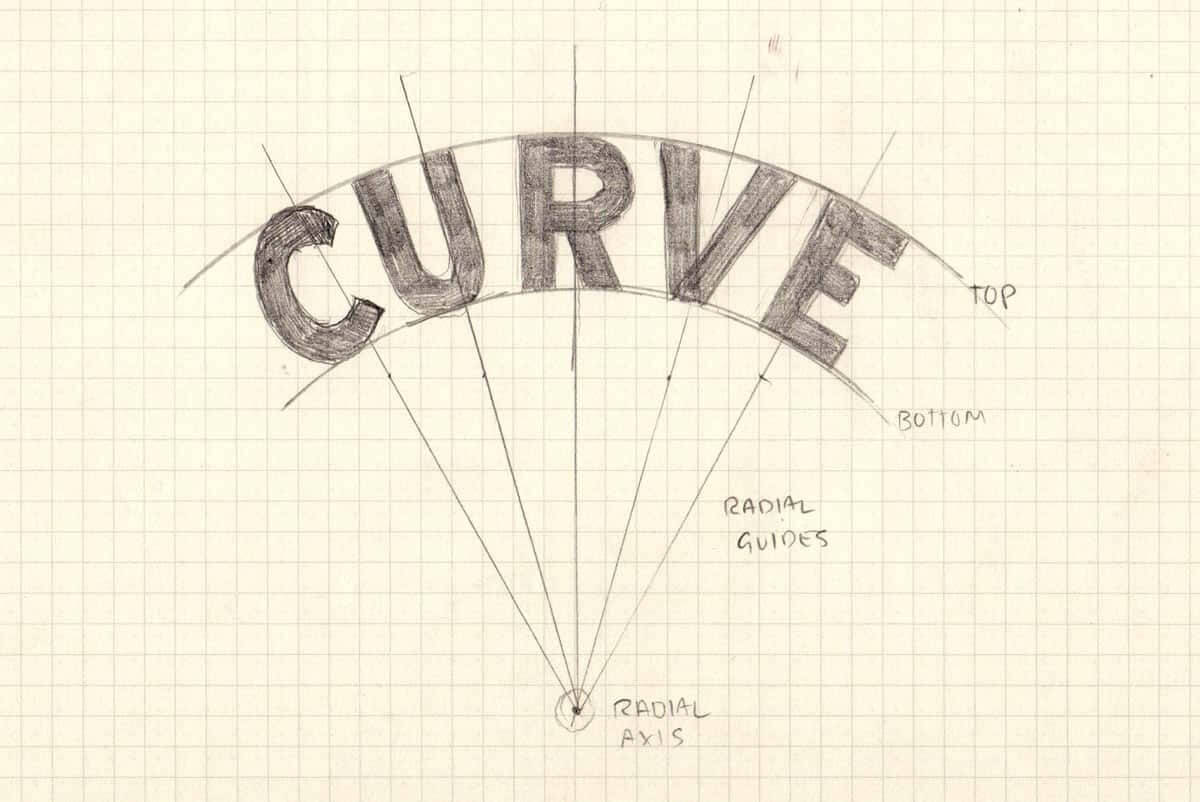
Sporting goods shops and professional stitchers often achieve that curvature by using a template, like so:
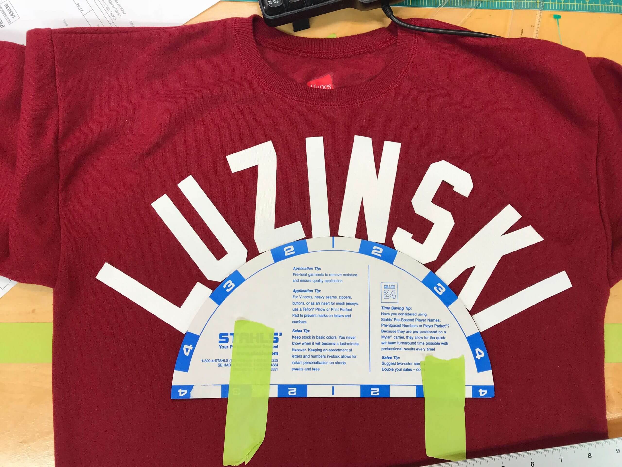
Simple enough, right? Here are some video clips showing this type of template in use:
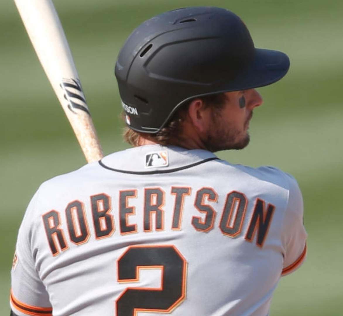
I don’t know if the NOBs in the Giants’ video were sewn on by Nike or by someone connected to the team. Either way, it’s fairly obvious that they didn’t use a template like the ones in those videos, or any other method that might achieve a pleasing radial arch. Check out, for example, what they did to poor Buster Posey’s name:
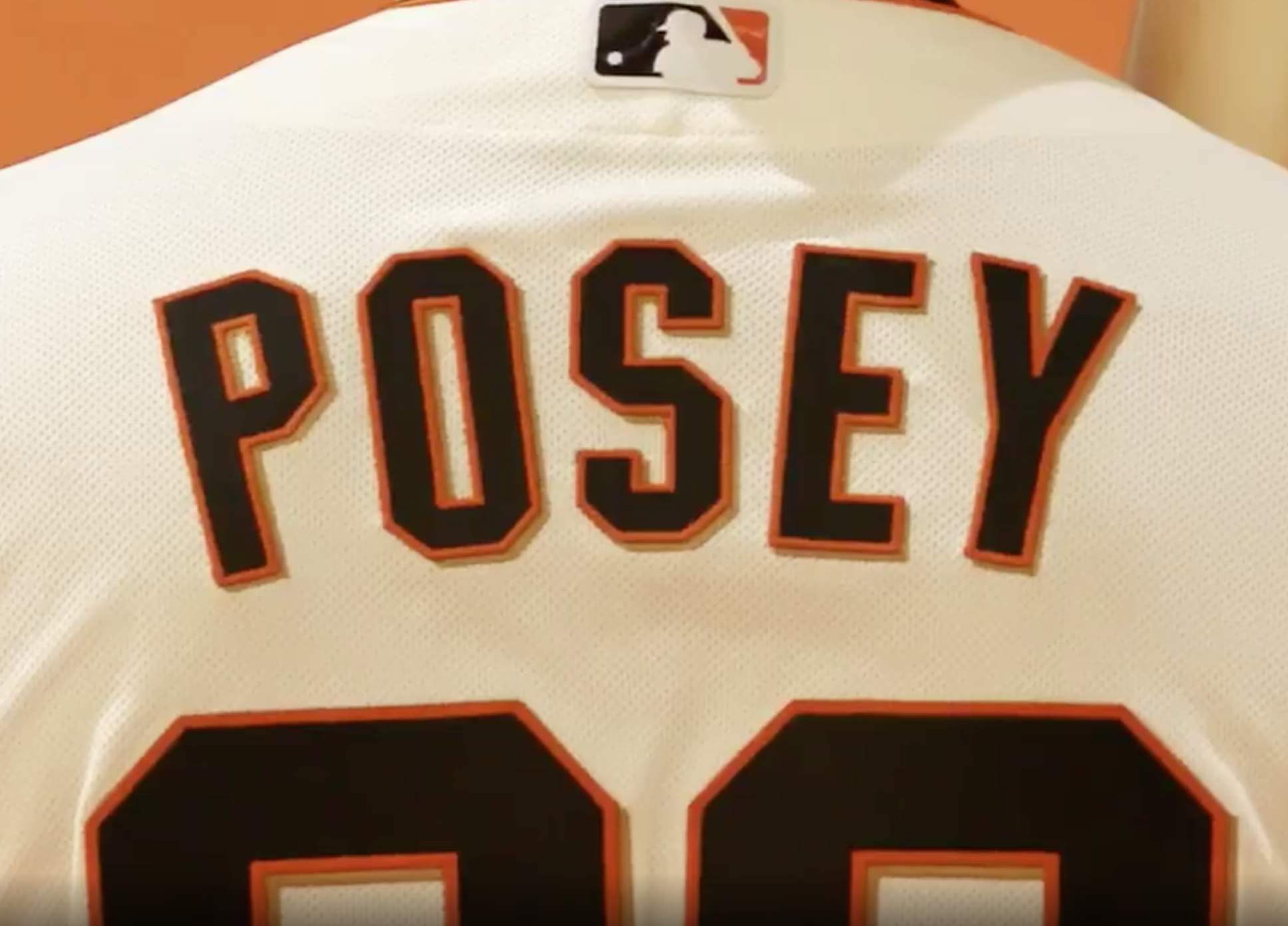
Ugh — what a disaster. The “P” is much higher than the “O,” the “Y” is higher than the “E,” the letters are more flared than arched, and the whole thing feels clunky. It would be easy to make various jokes here (“Hey, of course they don’t know how to do NOBs, they’re way out of practice!”), but the Giants have had NOBs on their road uniforms all along, so it’s not as though this is something new for them.
And that’s just the tip of the iceberg. There are 16 NOBs crammed into that Giants video besides Posey’s. Most of them fly by too quickly to get a good look at them, but some screen shots reveal that most of them are astonishingly shoddy.
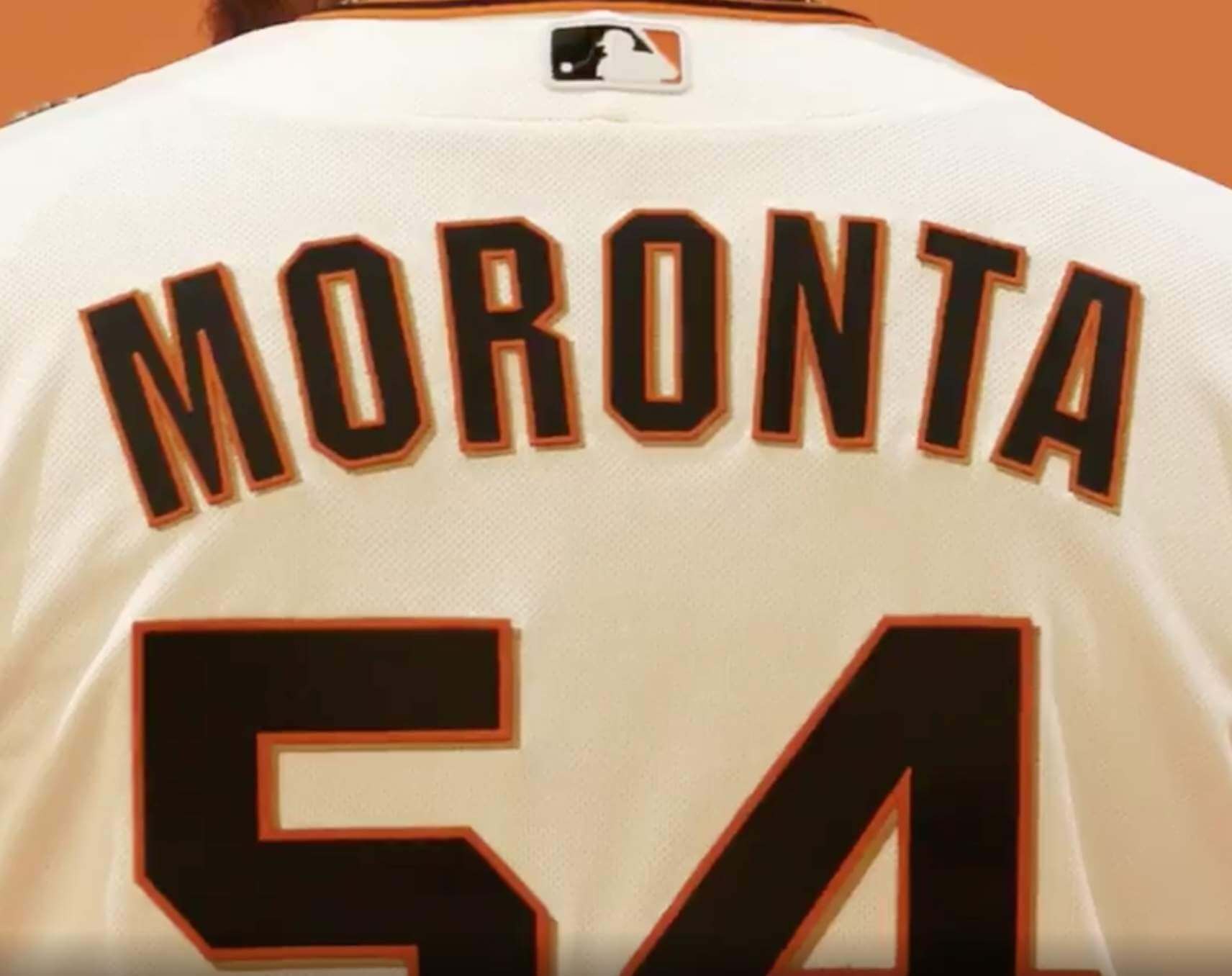
Just to be fair, let’s start with one that’s actually pretty good:
That’s not bad, right? Nice curvature, decent treatment of a lengthy, challenging name.
Here’s another one that’s pretty decent, or at least acceptable:
Unfortunately, it’s mostly downhill from there. Consider, for example, this one, for second baseman Donavan Solano:
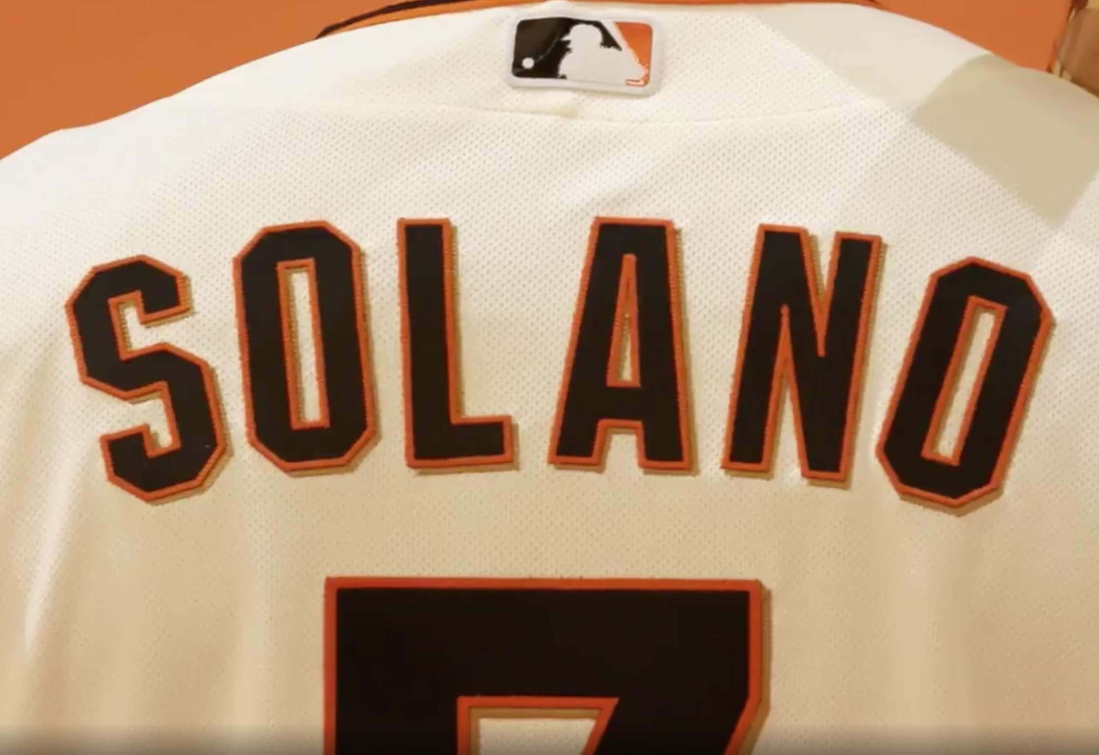
Yikes! Just try to draw a consistent curve along the bottoms of those letters. What a mess!
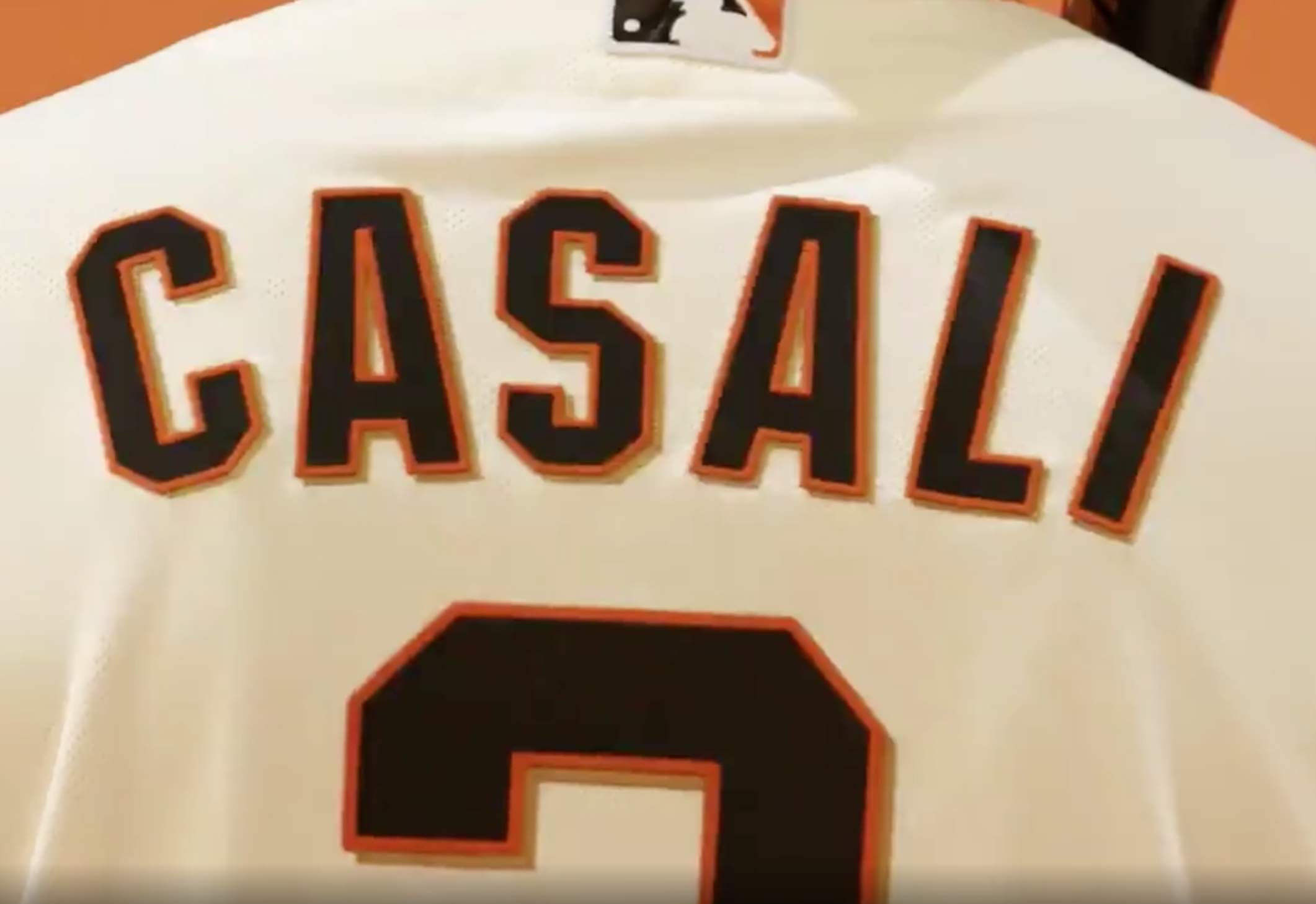
And if you think that’s bad (which you most assuredly do!), check out this one, for catcher Curt Casali:
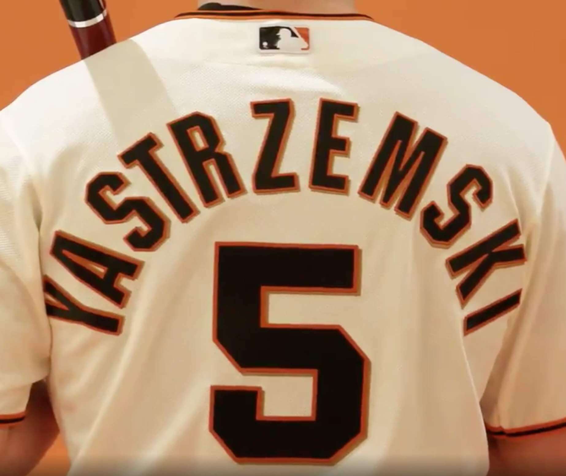
You’d think a four-letter name would be simple enough. But you’d be wrong, at least judging by the NOB for pitcher Logan Webb:
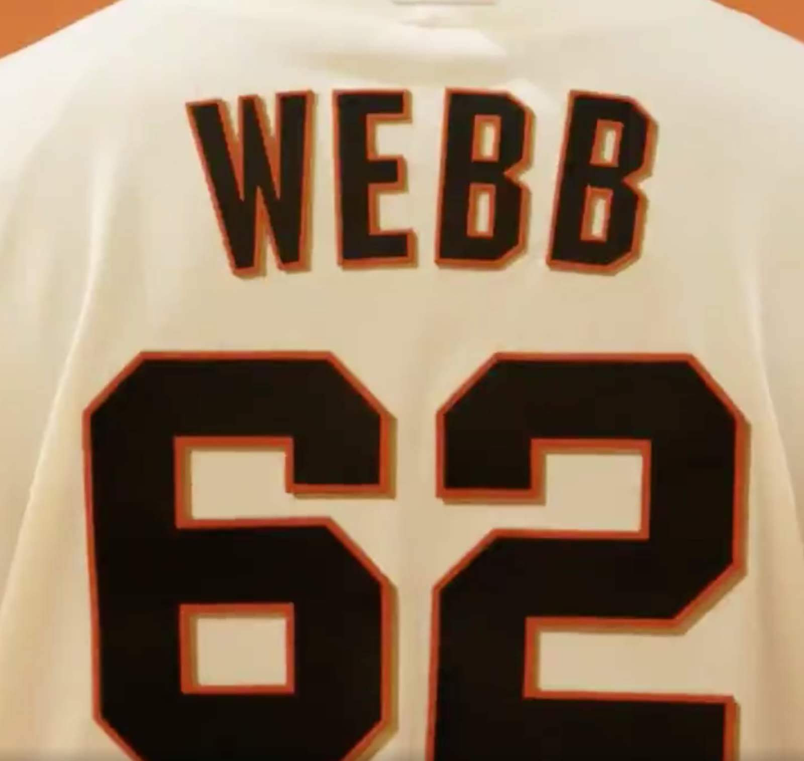
Look at that second “B” — are you fucking kidding me?
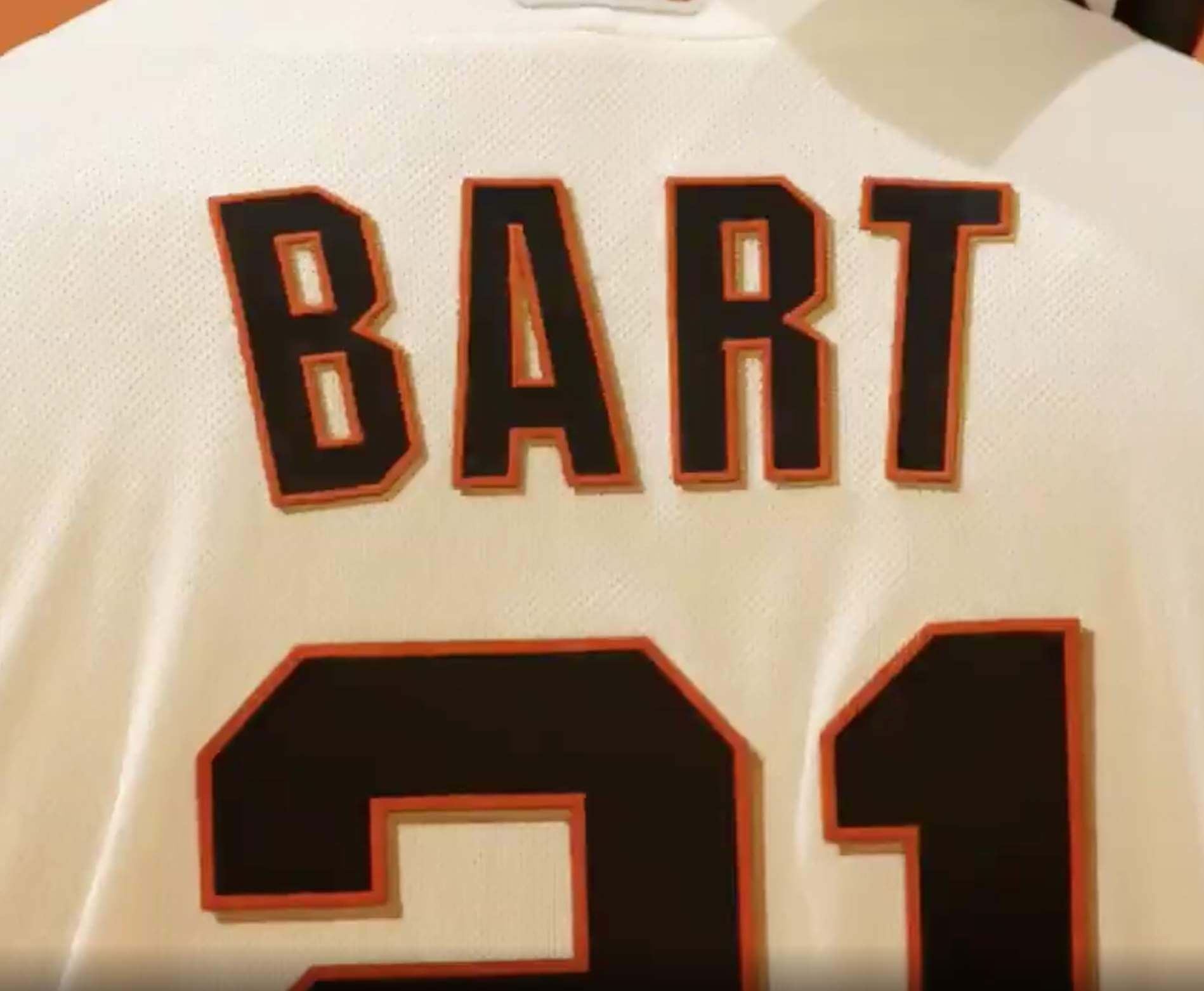
You might also think that “Bart” would be a simple name for a San Francisco team, since it’s also the name of the city’s mass transit system. But again, you’d be wrong:
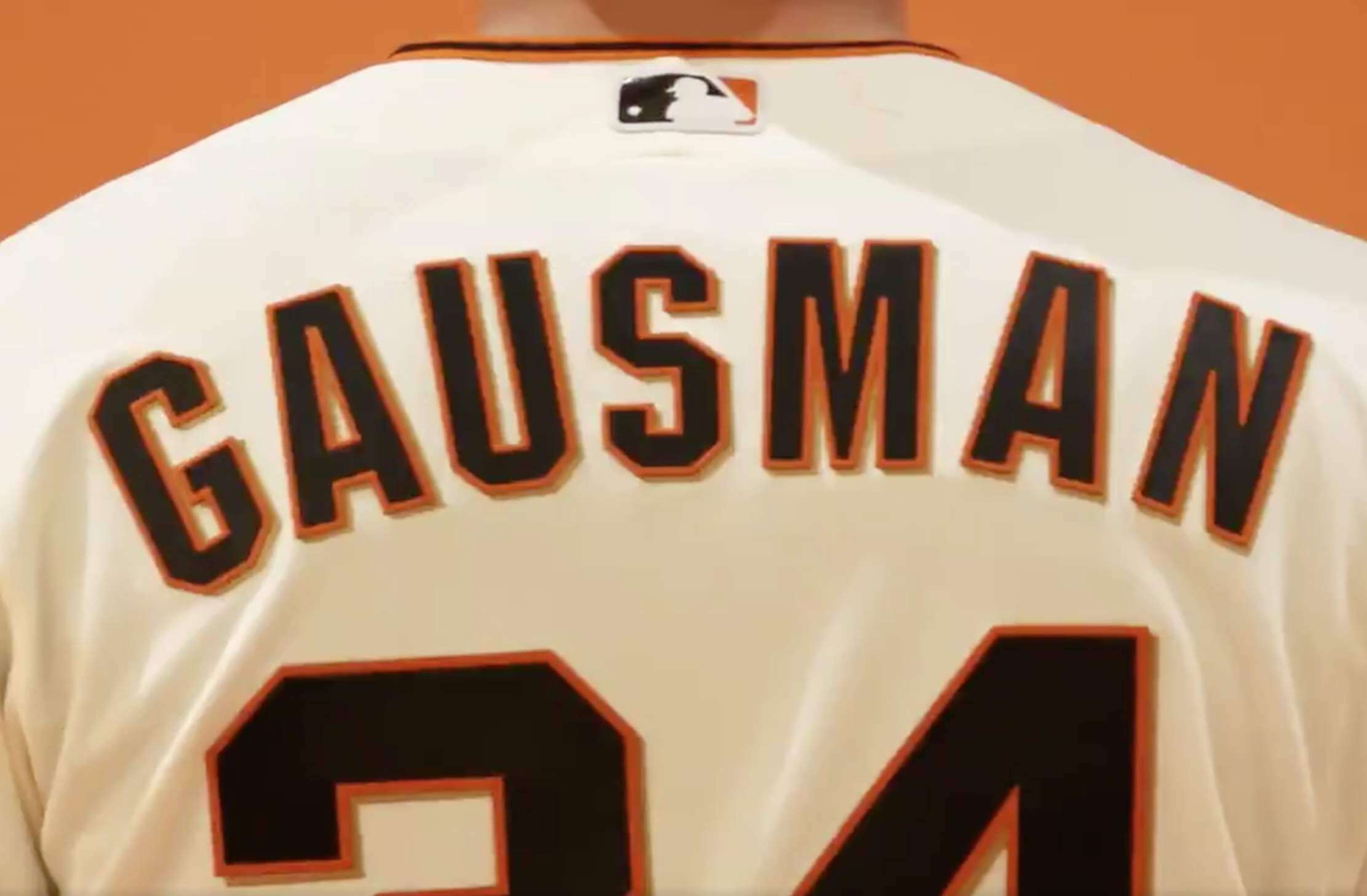
Kevin Gausman’s treatment starts out promisingly, but then it goes off the rails at the end:
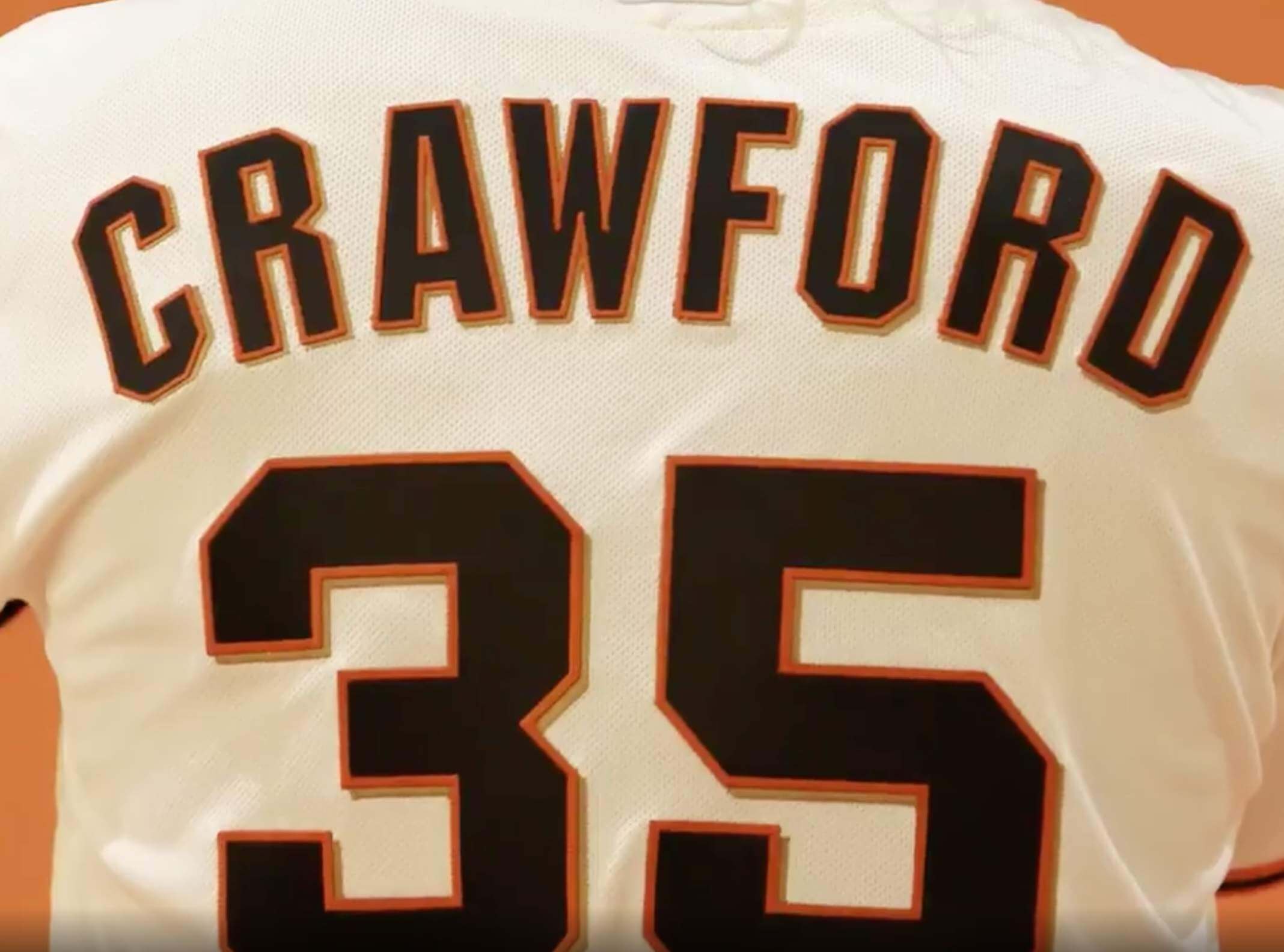
Similarly, Brandon Crawford’s is okay, or at least okay-ish, until the final letter ruins everything:
———
And so on. I don’t mean to pick on the Giants (a team I generally like, and whose uniforms I’ve long admired). I’m just puzzled by how an MLB team could go public with such slipshod work. And it’s not as though the NOBs are just a background element here — they’re the whole
point of the video!
I wasn’t aware of this being a chronic Giants issue until now. Has the problem been hiding in plain sight all along and we all just missed it? In an attempt to answer that question, I looked up some photos from a September 2020 road game. While the curvature isn’t as steep as I might prefer, the letters generally look fine:
So the problem appears to have been unique to yesterday’s video, not a larger systemic issue.
I was going to conclude by saying something like, “The Giants should know as well as anyone that it’s not that hard to get a pleasing radial arch — all they have to do is look at the front of the jersey.” But the video concludes with a front-view shot that’s almost as bad as the NOBs:
Ay yi yi — look at that “N”!
Well, it’s still spring training. Let’s hope the Giants whip their lettering game into shape in time for Opening Day.
(My thanks to Bill Henderson for the template photo, and to Bryan Redemske, Andy Davis, and @ayyyynick for the template videos.)
Click to enlarge
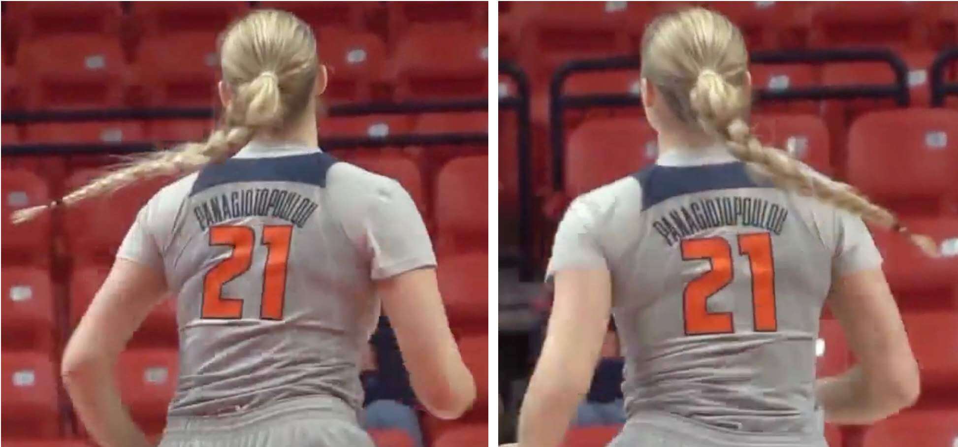
Speaking of NOBs: Meet Nancy Panagiotopoulou, a forward on the Illinois women’s basketball team. As you can probably guess from her surname, she’s from Greece. And as you can see, they’ve gone with some seriously compressed typography (and some very nice radial arching!) for her 15-letter NOB.
But wait! It could’ve been even worse — or better, depending on your point of view — because her full name is actually Nancy Panagiotopoulou Andritsopoulou! But they’ve omitted the “Andritsopoulou” from of her jersey. (Perhaps someone familiar with Greek naming protocols could tell us more about this..?)
Wondering how to pronounce “Panagiotopoulou”? Watch this video.
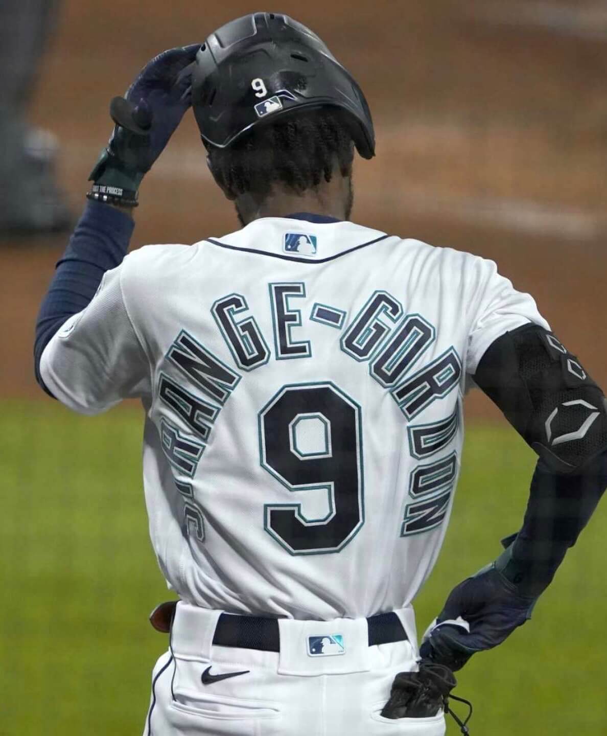
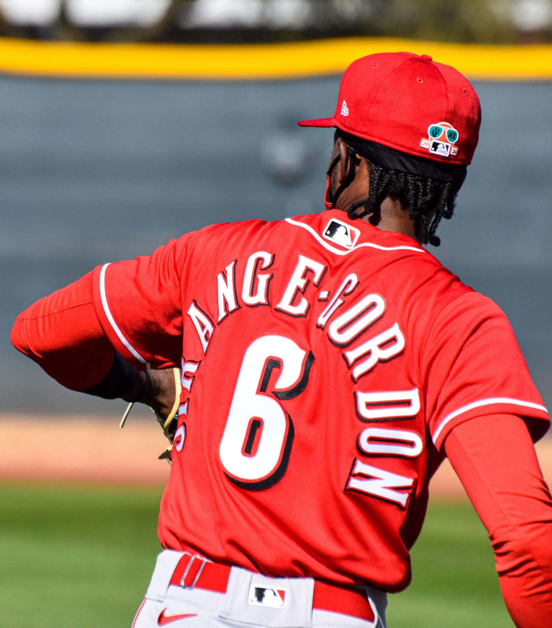
Still more NOB news: As you may recall, Mariners infielder Dee Gordon announced last September that he was changing his NOB to Strange-Gordon, in honor of his late mother. (His legal surname has always been “Strange-Gordon,” but he initially decided to go with “Gordon” as his professional name after a minor league P.A. announcer botched his name.) The 14-letter NOB, plus the hyphen, plus-plus the Mariners’ three-color NOB lettering, plus-plus-plus Strange-Gordon’s slender frame, combined to create one of history’s all-time clunkiest-looking NOB treatments:
The good news is that Strange-Gordon became a free agent after the 2020 season, so we won’t have to see that Mariners treatment of his NOB anymore. The bad news is that he signed with the Reds, whose NOB lettering isn’t much better than Seattle’s:
Maybe the Mariners and Reds could learn something from Illinois, eh?
(My thanks to Josh Claywell, Mike Nessen, and Jason Scherer for their contributions to this section.)
This was mentioned to me this morning, but Vandy showed Kumar Rocker throwing a slider and a cutter yesterday. In the video below the second pitch is identified as a “cutter” at 91 mph. The first is an 84 mph slider. Another interesting wrinkle to yesterday’s starts. pic.twitter.com/AFcQ4bm62g
— Ralph Lifshitz (@ProspectJesus) February 23, 2021
Finally, something that isn’t about NOBs: Check out the video clip above, which shows Vanderbilt wearing mono-black a few days ago. Since the backstop is also black, pitcher Kumar Rocker and his catcher were hard to discern. It all gives new meaning to the term “camouflage uniform.”
A similar situation unfolded yesterday for Texas State, which also went mono-black against a dark backdrop. There’s presumably a batter in there somewhere:
B2 | Get runners in scoring position on a balk#EatEmUp #ComebackStrong pic.twitter.com/IYe3XlkwbV
— TxStateBaseball (@TxStateBaseball) February 23, 2021
(My thanks to Trevor Lytle and Colton McWilliams for these two items.)
Click to enlarge
The remove-ment expands to knitwear As you can see above, Uni Watch reader Brian Pidgeon really likes Stargell stars. What he does not like, however, is the annoying New Era maker’s mark, especially the one on his new Stargell-style knit winter hat. But he knew just what to do:
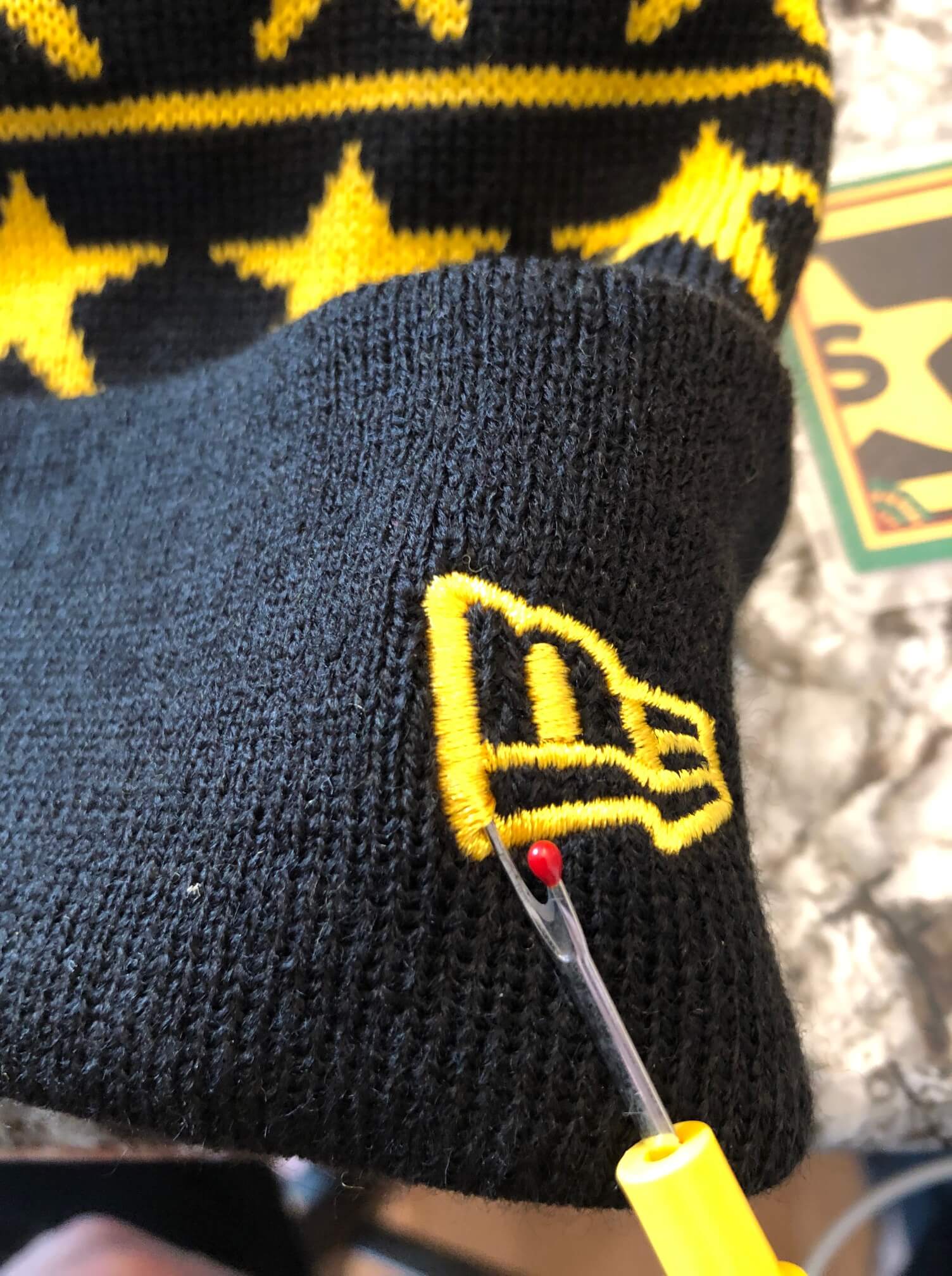
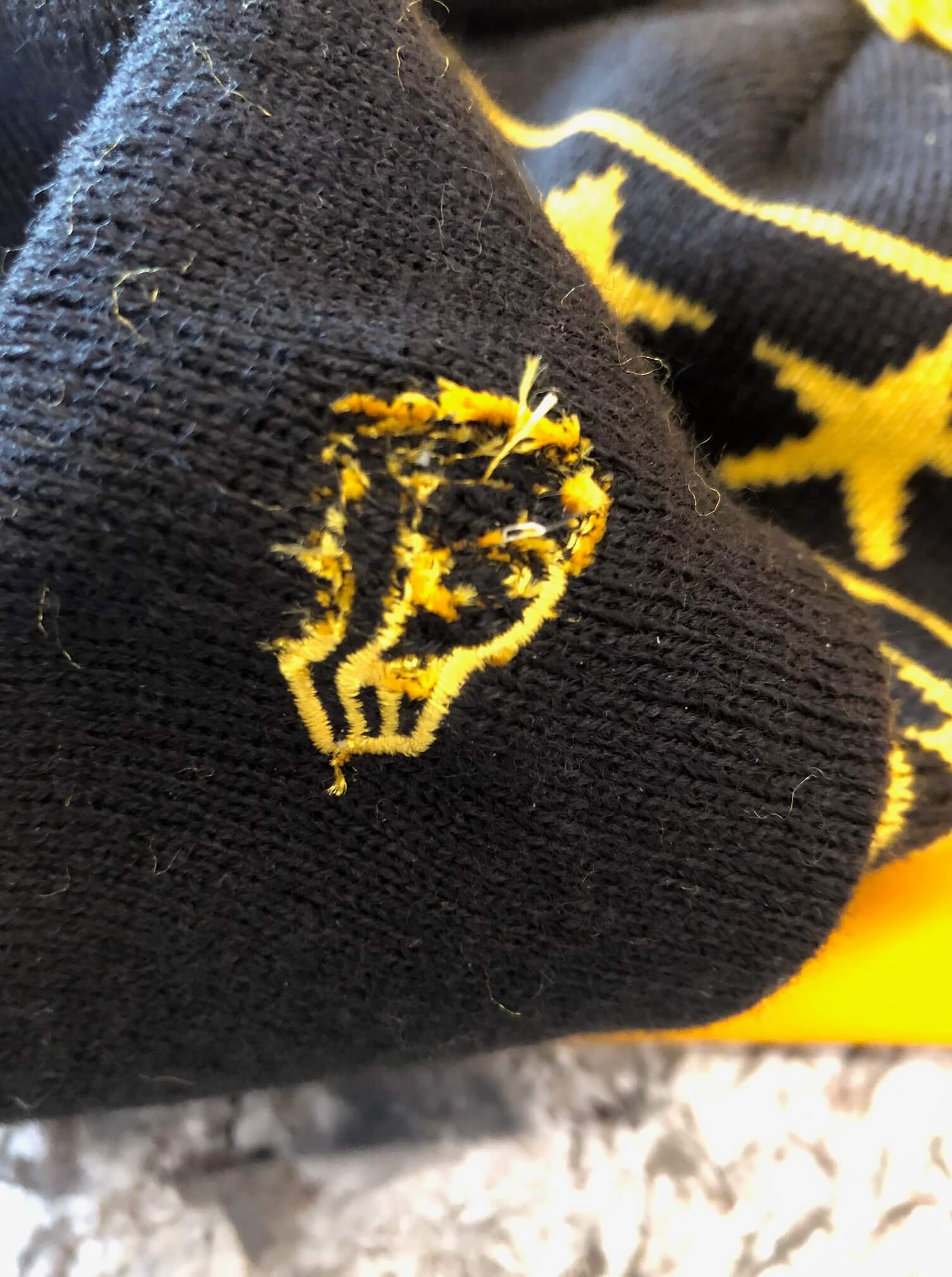
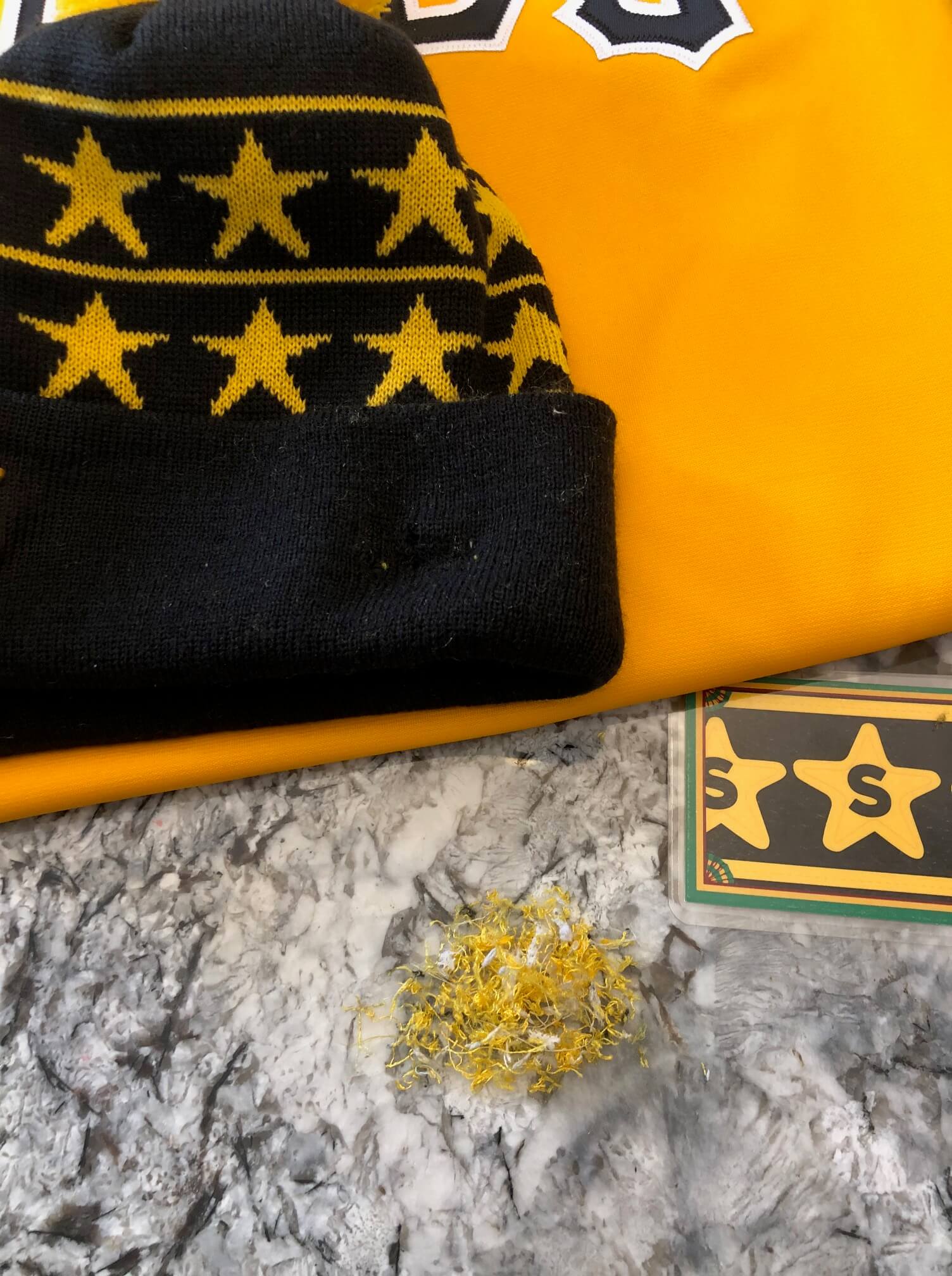
“It’s the first time I’ve tried it on a knit hat,” says Brian. “The fabric is tough to work with without getting snags, and I ended up with a few holes. But since it’s dark fabric, you can’t really see it even when I put it on. Even with the holes, it looks much better now!”
Nicely done, Brian. Congrats on breaking this new ground in the remove-ment. #NoEra
The Ticker
By Lloyd Alaban

Baseball News: Mets P Taijuan Walker confirmed that he’s wearing No. 99, instead of his preferred double-zero, because the Mets’ mascot, Mr. Met, wears No. 00 (from multiple readers). … Some cap inconsistencies in Cubs camp (from Phillip Tutor). … Phillies RF Bryce Harper showed up to practice yesterday in very Philadelphia-themed attire. His shirt says “Clearwooder,” a reference — in a Philly accent — to the city of Clearwater, Fla., where the Phils spend spring training. His toque says “Jawn,” which is a placeholder word for anyone or anything in Philly slang (from @PhillyPartTwo). … Blue Jays SS Bo Bichette wore custom cleats with “BO FLOW” on them for practice yesterday (from Ryan, who didn’t give his last name). … Twins DH/RF Nelson Cruz wore teammate Miguel Sanó’s pants at practice yesterday. Sanó is much taller and bigger than Cruz, which made for some entertaining photos (from @bivlo). … A priest in St. Paul, Minn., is auctioning off his baseball card collection — valued at an estimated $25,000 — for charity (from Anthony Nuccio).

Football News: UNC freshmen have received their uni numbers (from James Gilbert). … @PaperStadiums’s latest creation is a model of Notre Dame Stadium, complete with Touchdown Jesus (from our own Brinke Guthrie). … Mark Whipple made smartphone wallpapers showing every helmet Pitt has ever worn (from Sebastian Smelko).

Hockey News: With the debut of the Capitals’ ЯR uniforms last night, F Alex Ovechkin has now worn 10 different Caps uniforms in his career (from Casey, who didn’t give his last name). … Lightning G Andrei Vasilevskiy’s new mask changes colors based on the temperature (from John Muir). … This is very cool: A Hurricanes fan is keeping track of the team’s record by knitting a scarf with different colors based on different game outcomes (from @Benji_91).

Basketball News: Although next month’s NBA All-Star Game is taking place in Atlanta, rather than in Indiana as was originally planned, the league is still selling Pacers-themed All-Star merch, presumably because there wasn’t enough time to get new merch in the retail pipeline (from Alex Ladd). … Syracuse women’s is going mono-pink on Sunday (from Jakob Fox). … Color vs. color for St. John’s and Villanova men’s last night (from James Ballow). … K-State wore their mismatched purple/lavender throwbacks last night.

Soccer News: Everton cleared an initial hurdle of government approval to build a new stadium over the next few years. Here are some renderings. Their current home, Goodison Park, has one of the last surviving stands designed by Archibald Leitch, who worked on several English and Scottish stadiums in the early 1900s (from our own Jamie Rathjen). … Also from Jamie: The Portland Thorns and Timbers have a new ad deal. … Speaking of the Timbers, here’s a detailed look at their new kit (from @ThatRodneyGuy). … The logo for Chicago House AC of the National Independent Soccer Association has been revealed (from multiple readers). … Broadcaster beIN Sports is taking legal action against Turkish side Fenerbahçe after the club wore shirts that disparaged the network. Here’s a closer look at the shirts (from Greg Franklin).

Grab Bag: Here’s a piece on religious headwear and sports (from @mikeobs). … The New England Black Wolves of the National Lacrosse League are relocating to Albany, N.Y. (from Wade Heidt). … Also from Wade: Calgary’s curling bubble has a logo. … The Ottawa police chief has banned officers from wearing “thin blue line” and other patches (from Timmy Donahue). … Here are the newest AFL Women’s Indigenous designs: This picture shows all eight Victorian teams. The two on the far left (Western Bulldogs and North Melbourne) and the far right (St. Kilda and Richmond) are new, the four in the center have already been revealed. Separately, here’s Gold Coast (from our own Jamie Rathjen).
Would MLB allow Alyssa Nakken a snapback, like the NFL relaxed the rules for Sarah Thomas? I know Thomas had bun under her hat initially, so not exactly the same.
My first thought looking at Strange-Gordon’s Seattle NOB is that even if you were only using one of the hyphenated names it would barely fit on the back given the size of the font. It appears even a relatively average, 7 letter name would struggle to fit without significant curvature.
My first thought was how funny some fans are going to find that their shortstop is someone called “Strange Gordon”.
Dee Strange-Gordon is Exhibit A on why NOBs shouldn’t exist at all, particularly for teams that have exotic three-layer numbers.
How about a dual-layer NOB for hyphenated names?
STRANGE
-GORDON
I agree: but how about –
STRANGE-
GORDON
Let’s not put it to a vote! lol
Yeah, I typed that originally as the hyphen should go there, but putting it on the second line balances it!
STRANGE
–
GORDON
DEE
Speaking of the Capitals and the RR uniforms, there were 2 NHL games last night that were RR vs. RR.
Penguins at Capitals:
link
Oilers at Canucks:
link
Looking at the lettering on the back of those Giants’ jerseys, I can’t help but think how much better they would look with nameplates instead of direct sewing the letters.
Paul I’m kind-of surprised you haven’t mentioned in your Ticker about the Cherokee Tribe asking Jeep to rename the Cherokee & Grand Cherokee, seeing you always run Indigenous Watch. (I won’t use your actual name since it is still using thr name that needed to be retired by Washington.) I know its not uni-related or even sports-related, but it is related to this blog.
link
As far as a new name? I could see Jeep reviving the Liberty name, which is what they used on the Cherokee in North America from 2002-2013. (They kept the Cherokee name overseas during this time.) As for the Grand Cherokee? That one isn’t as cut-and-dry, though I could see them rename it “Laredo”, which has long been the base model for the Grand Cherokee and before that the popular 1984-2001 “XJ” Cherokee. Thoughts?
’Skins Watch runs once a week, almost always on Thursdays. So that’s when it’ll be covered.
On a related note, didn’t you see I called it Indigenous Watch? By calling it the other name you’re perpetuating the old nickname for Washington and effectively condoning its use. It needs renamed, maybe not to Indigenous Watch, but to something besides what you’re calling it now.
BTW my stepdad is half Blackfoot Indian.
Yes, I saw what you called it. But I’ll continue to call it what I call it.
My best to you and your stepdad.
Jeep has some good model names that have gone in and out of circulation; Commando, Wagoneer, Laredo, Rubicon. There are a few I’d like to see permanently retired (Patriot, Liberty, Grand Commander). Nouns of abstract concepts, such as Valor, Joy, Charity, Grief, and Justice, are horsey when applied to objects. Stick to things you can mentally picture, like a Mountaineer or El Paso.
Jeep is already planning to revive the Wagoneer later this year with its new Ram 1500-based full-size SUV. And yes, fans want a woodie version, which Jeep has said no to.
link
They also use the Grand Commander name in China for a crossover that has long been rumored to be coming here as Chrysler as it wouldn’t fit Jeep’s image here.
link
As for the other names, Laredo seems the most logical. Rubicon is too associated with their off-road specific trims, especially on the Wrangler. I could also see Jeep going really throwback and bringing back the Willys or Overland names–Jeep was originally owned by Willys-Overland and the names have been used on Jeep trim level in recent years.
Believe it or not, Jeep actually considered reviving Commanche when they were developing the Gladiator. They (wisely) chose to bring back the Gladiator name instead.
I’m a vintage car buff with opinions about model and brand names. “Trailhawk” is one of the better identifiers they’ve issued. “Jeepster” suggests a two-wheel drive model. “Compass” and “Latitude” are splendid choices, somewhat evocative of Land Rover. “Patriot” has turned into a fraught word, one I worry people won’t want to be associated with for years. I was thinking of cities in the Southwest (which is really more of a Hyundai thing) and came across “Pueblo”; Joseph, does that pass your test, or is it misappropriation?
As a Vanderbilt alum and fan, I’ll tell you that many fans of the VandyBoys are no more enamored of the all-black with gold pinstripes than the uni-watch community would be. Vanderbilt has, um, many uniform combinations, and occasionally, someone will sound the alert on the message boards to warn everyone that Vandy will be wearing the “gangster pajamas” today.
The Ottawa police chief has banned officers from wearing “thin blue line” and other patches (from Timmy Donahue).
Good. Nobody said Blue Lives don’t matter. And the last time I checked, nobody was born with blue skin. The police always had my respect; it’s depressing to see how hard the PBAs and Policemen’s Unions have tried to lose it.
More importantly, no unofficial or non-sanctioned patch — for any cause or sentiment, whether noble or insipid — belongs on a municipal uniform. That seems like the larger issue at work here.
That’s true, but the fact that it’s a divisive symbol is just as big an issue here.
Thin blue line is a reference dating back to the 1950’s to speak about Police. Its origins go back to the Thin Red Line of a British infantry regiment in the Crimean War.
The thin blue line and the use of the term Blue Lives Matter are two different things.
Read what the RCMP had to say on the matter and how citizens feel about it. It’s clearly a controversial symbol, regardless of the fact that the idea has been around since the 50s. In addition, the “thin blue line” and the “Blue Lives Matter” idea have meshed into one, overall symbol as of late.
Hear hear.
For what it’s worth: The Bengals website published a Vision Statement which included a mention of the forthcoming new uniforms….
“…I hope you’re excited for a clean look.”
1981 helmet, 1975 jersey?
I have a game used Yankees road jersey that also has a slightly askew arch: the “R” and “K” are a tad lower than they would be if a physical arch were placed under the lettering. Wondering if the issues with arching are a Majestic/Nike issue.
Re: arching on NOBs, I first noticed several years ago how Majestic seems to use a subtler arch compared to Russell and other predecessors, I first noticed this when watching a Mets game in the mid 2000s. The subtle NOB arching is really apparent on the Dodgers jerseys, where some of the names look almost straight. I got very accustomed to a very radially arched name on the back of a baseball jersey so seeing that change is probably one of those moments I realized I was a uni-watcher.
Also I feel like Majestic/Nike should use discretion to use narrower letters for longer names but I assume they deemed it impractical to make a special batch of narrow letters just for one person.
Sorry, but if you have a game-used NY Yankees road jersey with a name on the back, I’m afraid you’ve been duped. The Yankees have never had names on the back of game jerseys.
The Moronta jersey is listed as acceptable, but the name slants upwards as you go left to right! At first I thought it might have been the angle or the way he was standing, but look at how much higher the A is above the 4 than the M is above the 5
I’m going to guess the person behind that “Mark Whipple” Twitter persona, the one who created those Pitt helmet history lock screens, isn’t actually Pitt OC Mark Whipple. Something about the #BigDickWhip in the bio and the “I’m not very good at calling plays, but it doesn’t matter” pinned tweet suggests it might be a parody account.
Another item for a future ‘Skins Watch: Marion, IA high school is officially changing their mascot from “Indians” to “Mavricks”. link
The complete list of AFLW Indigenous Round jerseys, with details of each teams designs:
link
As a Giants fan, I’m saddened that we are going back to NOB home unis, but embarrassed by those screen shots!
I’m saddened by the NOBs too. I hope they’re at least retaining NNOB on their orange or black alternates.
I seem to remember the team asking season ticket holders many times if they wanted NOBs, and each time the people polled didn’t want them. It feels to me like ownership just kept holding votes until the people voted the way the executives wanted them to vote.
The skill involved is called “kerning” and it is a method of spacing of letters of differing widths and base sizes.