By Phil Hecken, with Jim Vilk
Follow @PhilHecken
Good Sunday morning, Uni Watch gang. Hope everyone had a good Saturday and you’re all still staying safe and well. Today’s my mom’s 87th Birthday, so I won’t be around too much on the boards, or online in general. I’ll be spending most of the day with mom, taking her out for a nice early dinner and generally celebrating her multi-decadal trip(s) around the sun. We’ll probably end the day with a cake and playing her favorite board game, Clue, which she got me when I was but a wee lad, and which she saved all these years.
Like many of you, I very much enjoy when the very creative UWers share their DIY projects with us. What’s even better is when you have DIYers who inspire others with their craft, and that’s the genesis for today’s main article. Back in August, Paul pinch-hit for me one day, and featured the art of paper football, and my pal Jim Vilk was so taken by it — he (like many of us) had been playing paper football for years, but loved the new techniques explored in that piece. So that got Jimmer to thinking…and I’ll let him take it from here:
by Jim Vilk
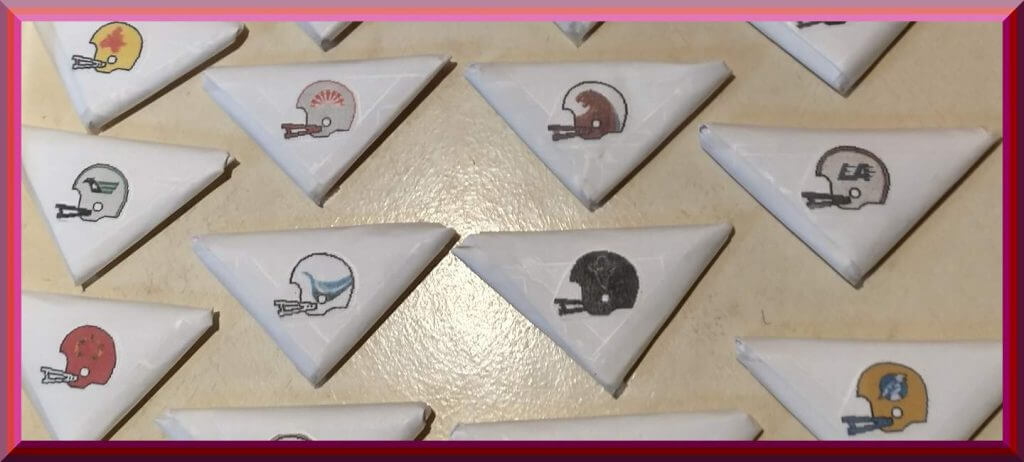
After seeing Kevin Cerafoss’ DIY NFL paper footballs last August, I said to myself, “Why didn’t I think of that as a kid?” Then I said, “And why didn’t I think of it again when I was a bigger kid and the USFL was playing?” Making up for lost time, I’ve been thinking about it ever since. I started folding paper but I kept thinking. Why just make footballs for existing or past teams? Why not make up your own teams and start a paper football league? The wheels were turning when I remembered…oh yeah…I’m not exactly an artist. I did come up with a list of team names, then I put it off to the side as I kept making footballs. I’ll get back to it in time but first I went online and looked for USFL helmets. Thanks to usflsite.com, I got them.
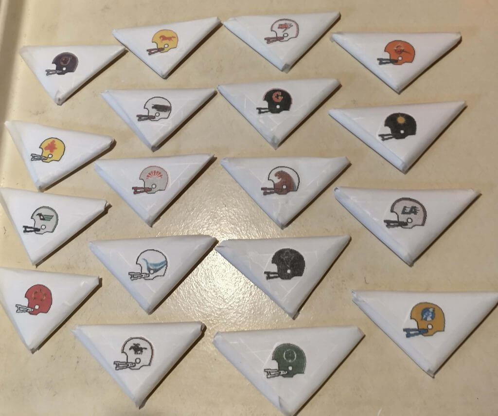
Then I started thinking of CFL helmets from the 80s. Lo and behold, FromEquestria2LA on DeviantArt had those.
Hoping to find them in single-bar facemasks, but the double-bar is my third favorite, so I was pleased anyway.
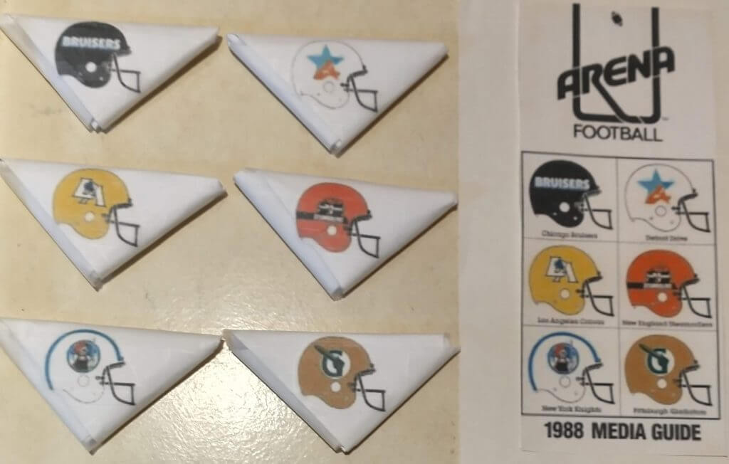
At this point I was in a football-making frenzy, and while looking for more helmets I came across the cover for the 1988 Arena Football League season (probably the best looking year, in my opinion). And they had my second-favorite facemask!
I was going to stop there when I found worldleagueofamericanfootball.com who shared a graphic with the inaugural WLAF helmets. Always loved those brown lids from the San Antonio Riders.
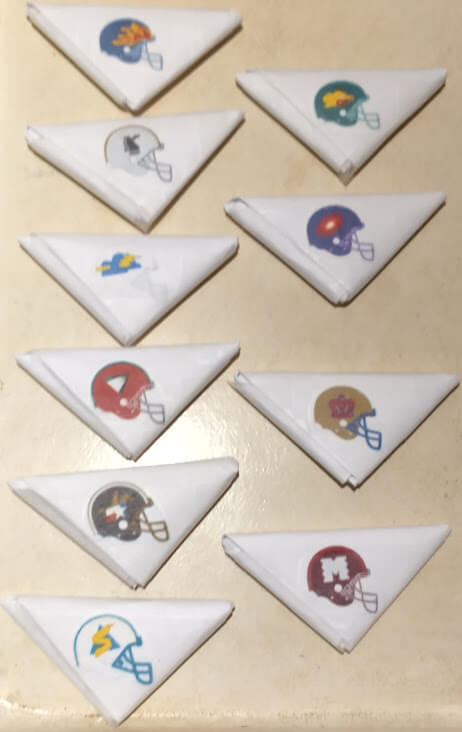
Finally (for the pros, that is), I went to the Gridiron Uniform Database to find The Best Looking NFL Helmet Ever.
I also loved the old AFC/NFC helmets from the 70s Pro Bowls, so I made a variety of those.
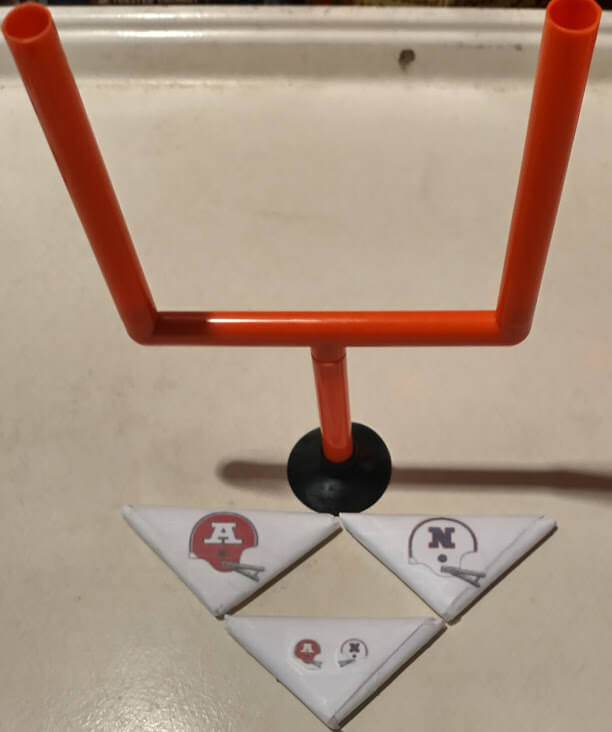
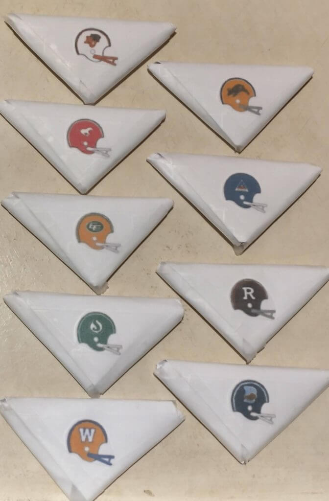
Now it really seemed like a good place to stop. I couldn’t completely ignore the college game, especially the one I like the most now, the Army/Navy game. Thanks to the Helmet Project, I was able to make a ball for my favorite matchup, the 1971 game,
along with 1993
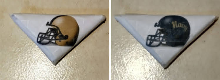
and 2019.
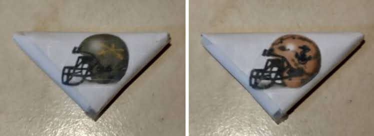
To finish, I added the Air Force Academy so I could play for a paper version of the Commander In Chief’s trophy. I chose an early 70s Air Force/Army matchup
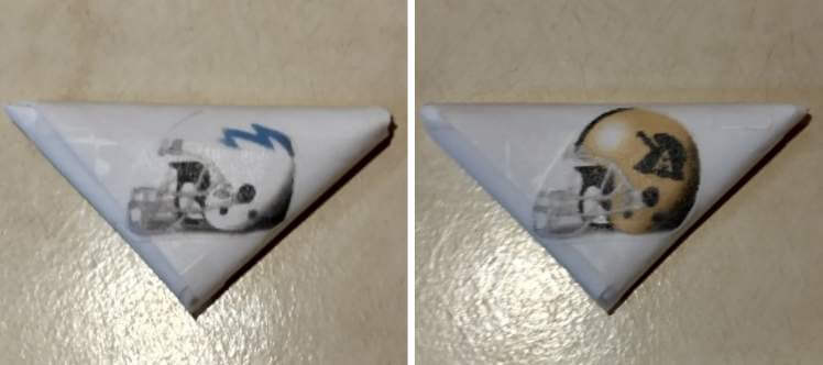
and made an 80s Air Force/Navy ball.
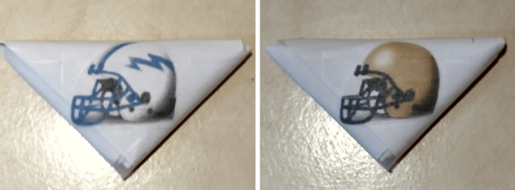
Did I say I was finished? Yes, for now. I have to make fields, and I have a different idea for more footballs. That will have to wait for another time, though.

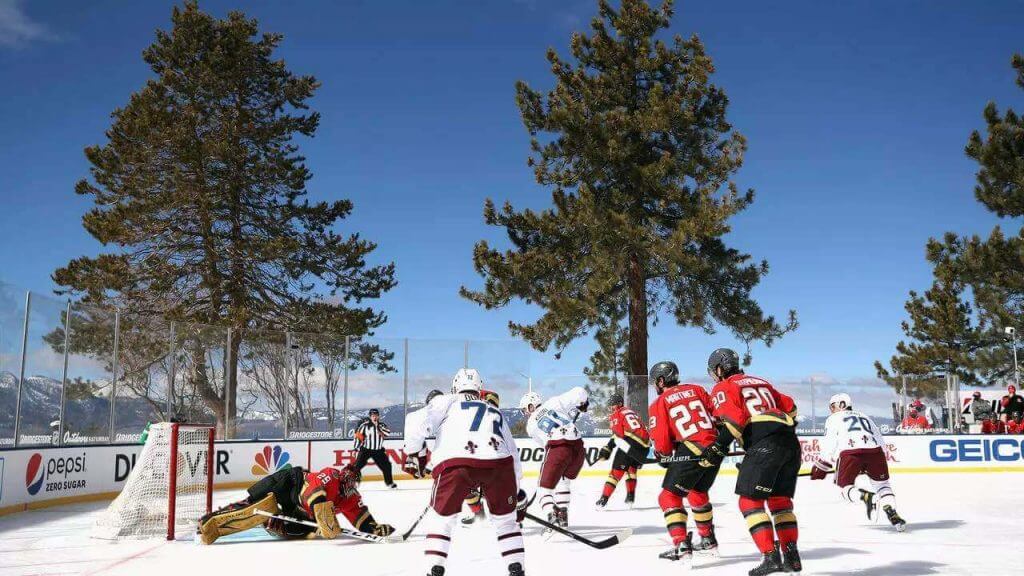
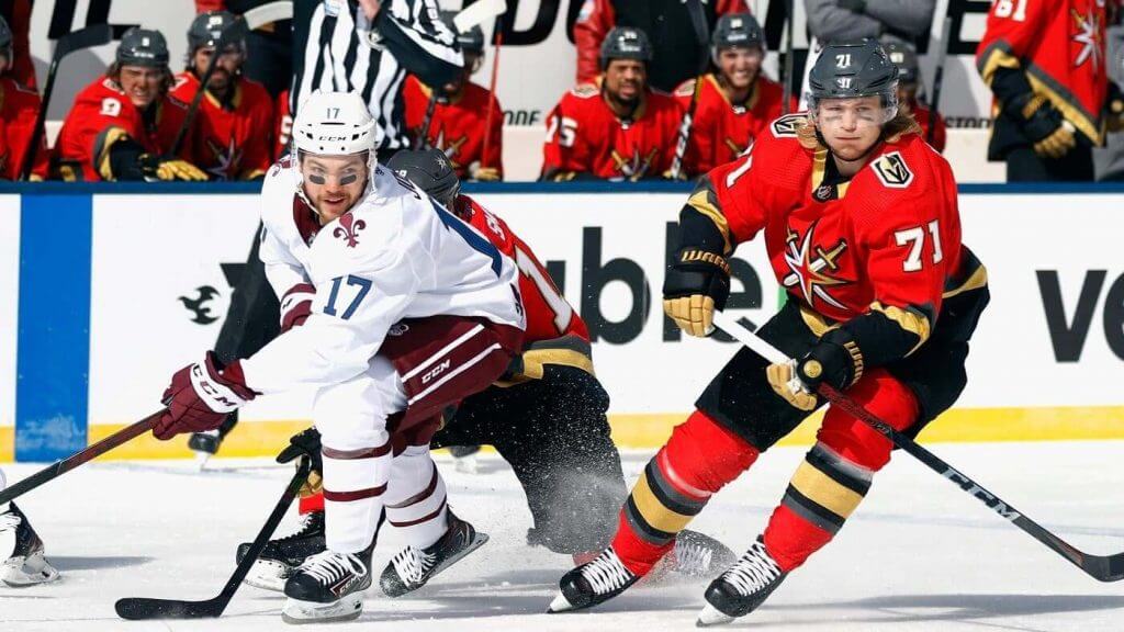
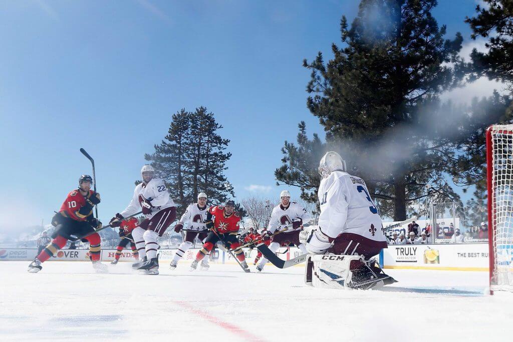
There was an absolutely gorgeous (in all ways — but one) looking outdoor hockey game yesterday between the Colorado Avalanche and Vegas Golden Knights, and both teams were outfitted in their “Reverse Retro” (RR) uniforms. The unis were crisp, and the views were spectacular. The Knights wore their red RR unis (which they had debuted before), but the Avs broke out their Quebec Fauxdique RR’s, and the two made for a spectacular match up.
The bright sun and the pine trees surrounding the rink made for an almost surreal setting.
The Avalanche were given Quebec Nordique uniforms, which were rendered in Av’s colors of burgundy and blue, and they were real…and they spectacular:
The bright sun and lack of a stadium (to cast shadows) showed how fantastic outdoor hockey can look.
The bright sun cast shadows just so on the ice, making for a beautiful palette upon which to play.
I mentioned above how the game was perfect in every way but one. Unfortunately, that was a pretty big one. The bright sun and temperatures hovering around freezing led to poor ice conditions that had players and officials repeatedly falling because of holes on the ice. After the first period, there was an extended delay while crews worked on the ice, trying to get it into playing shape. They finally decided to suspend the game, only to restart at 9:00 Pacific time, or midnight in the east. This was to allow for the ice to cure for better playing conditions. That’s a real shame — I’m betting a good number of readers (and myself) weren’t able to see the full game due to the lateness of the hour.
In an unusual (?) move, it appeared neither team wore ads on their helmets, making it even better!
Regrettably (but understandably), the dasher boards, which had been “clean” in the days leading up to the game, were plastered with ads. But that didn’t majorly detract from the otherwise splendiferous game.
I LOVE LOVE LOVED the Avs/Diques unis. I mean, how gotdamn gorgeous are these?
This is surely one of the better RR uniforms.
Unfortunately (again), the resumed, night-time game wasn’t nearly as pleasing to the eye.
You can see LOTS of additional photos here. You can read more about the poor ice conditions that led to the longest intermission in NHL history.
Today, the Boston Bruins and Philadelphia Flyers will play the second of two games at Lake Tahoe. That game, originally scheduled to be played at 3:00 pm Eastern, was first rescheduled for 2:00 pm, and then to 7:30 pm Eastern (4:30 PT), to try to avoid a repeat of the conditions that caused the poor ice in yesterday’s first period. It’s a shame that one will start nearer to sunset (5:45 pm, Lake Tahoe time), and will mostly be played after the sun has set, but it’s also completely understandable. Let’s hope it’s close to as visually appealing as yesterday’s Vegas/Colorado game was.

from the scoreboard
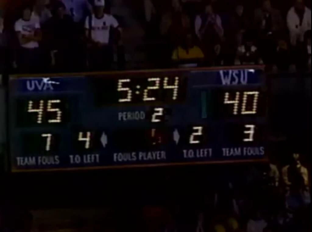
Today’s scoreboard comes from our own Jamie Rathjen.
The premise of the game (GTGFTS) is simple: I’ll post a scoreboard and you guys simply identify the game depicted. In the past, I don’t know if I’ve ever completely stumped you (some are easier than others).
Here’s the Scoreboard. In the comments below, try to identify the game (date & location, as well as final score). If anything noteworthy occurred during the game, please add that in (and if you were AT the game, well bonus points for you!):
Please continue sending these in! You’re welcome to send me any scoreboard photos (with answers please), and I’ll keep running them.
Hey guys & gals. You’ve enjoyed Kreindler’s Korner for several years now, mostly on the weekends, on Uni Watch, but with the recent coronavirus outbreak, Graig’s time is just too precious and he needs to tend to other things besides coming up with a new writeup each weekend.
So, going forward, for as long as the COVID-19 situation is bad in New York, I’m going to run a few “Best of’s” until Graig returns.
Here’s today’s offering:
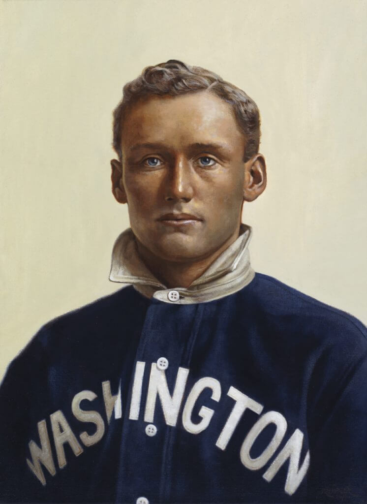
Title: “Barney”
Subject: Walter Johnson, 1907
Medium: Oil on linen
Size: 16″ x 22″As I’ve mentioned in previous posts, I’ve always been fascinated with the T-206 baseball cards. For those of you new to the game, it’s a card set that was dispersed by means of cigarette and loose tobacco packs, circulating between 1909 and 1911. Consisting of 524 cards through 16 different brands that were owned by the American Tobacco Company, the set is best known for including a card of Honus Wagner, which to this day is widely considered the Holy Grail of the card collecting industry. Yes, that one. The rarity (and story behind that rarity) of the card accounts for its desirability, which was a hot item among early collectors of the set merely a decade or two after its release. The most expensive example to ever sell fetched almost three million dollars, still the most ever paid for a baseball card.
So, the hope was always that someday I’d be able to have some sort of gallery show depicting the paintings I had done that were inspired by the lithographs on the card set (which came from the lens of the Swedish-born Carl Horner, a photographer who was based out of Boston, MA). Though still not anywhere near achieving that goal, I still try to paint at least one or two of these portraits a year.
This past one allowed me the opportunity to paint the great Walter Johnson. The biggest challenge in the creation of the painting came from his jersey, which in the card, is very different from what appears in the original photo – which required a good amount of research to get historically accurate. And as I was going for with the other paintings in this set, I went after a more true realism than what was seen on those cards. It was my goal to try and mimic what Horner probably saw in his viewfinder when he himself took these portraits: polished faces of tough men in their clean uniforms, lit by a northern skylight and backed by a simple muslin curtain, seemingly gazing into the ether.
In this case, we have a 19-year-old kid at the beginning of a career that would see him become perhaps the greatest pitcher of all time.

Uni Concepts & Tweaks
Time for more Uni Tweaks from the UW readership.
I hope you guys like this feature and will want to continue to submit your concepts and tweaks to me. If you do, Shoot me an E-mail (Phil (dot) Hecken (at) gmail (dot) com).
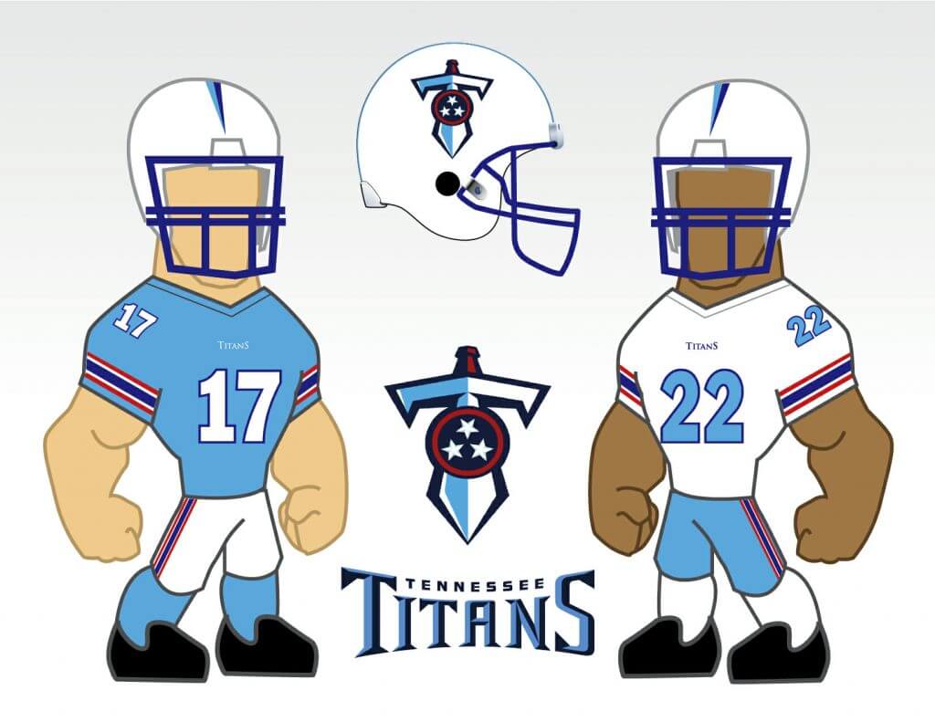
Concept for the Titans incorporating some aspects of the Oilers unis.
Thanks,
Mike Cahalan
OK readers (and concepters). If you have some tweaks or concepts, shoot ’em my way with a brief description of your creation and I’ll run ’em here.
You can listen to this episode, and subscribe to future installments, on Apple, Google, Stitcher, TuneIn, and Spotify, or just use the player below:
Photos of things we discussed in this episode are available on the Unified website, and those photos also appear in the video version of the episode:
By Phil

Baseball News: Reader Rob Bobich was wondering if anyone knows the years the Los Angeles Dodgers wore these gray roadies with thin soutache stripes. Unfortunately Dressed to the Nines isn’t conclusive, so I checked the Henderson guide. Turns out this was a one year wonder worn only in 1971. … Speaking of the Dodgers, when they planned their move to Los Angeles in the late ’50s, they initially considered playing in an expanded Wrigley Field (the longtime home of the Pacific Coast League’s Los Angeles Angels, that is) while they awaited the construction of Dodger Stadium. Plenty more background information about the Dodgers’ flirtation with playing at Wrigley Field can be found here. And for more great photos of the old stadium and its original PCL inhabitants (which make it clear where the Dodgers got the idea for their interlocking “LA” logo) check out this link (great work by Kary Klismet). … Due both to the uncertainty caused by the pandemic, and the ‘symmetry’ of his #22, the Giants will retire Will Clark’s #22 in 2022 (thanks, Brinke). … New Mets P Taijuan Walker asking fans if he should wear 00 or 99. Marcus Stroman already wears 0 for the Mets, so if Walker goes with 00, Mets could have zero and double-zero in the same starting rotation. (And no, there’s no rule against it.) Thanks Paul. … Tweeter The Trojan Wall seems to think there are a few similar styles for adidas-outfitted college teams. … Black vs black jerseys in yesterday’s TX Southern vs Houston game (from Reid Cure). … Looks like the Tar Heels gave out a #1 jersey for the new UNC baseball coach’s first win (from James Gilbert).


NFL/College/Football News: Got an extra four grand laying around? If so, you can be the proud owner of Tom Brady’s Super Bowl helmet. And it’s signed by the GOAT himself. … Check out these wacky field covers for Tudor electric football. Submitter Jimmer Vilk notes, “‘Merica…And camo…And some other really weird fields. Hope this doesn’t give some schools ideas for their real fields.” … If you’ve been looking for a comprehensive visual guide to Rose Bowl ticket stubs and event staff and press ribbons through the years, the excellent Fields of Friendly Strife blog has you covered! And while you’re at it, check out their latest entry tracking college football history through equipment catalogs (from Kary Klismet). … Jim Perricotti drove by this sign twice yesterday in Revere, Mass. He stresses, “(picture is NOT from today)…appropriation from USFL Boston Breakers.” … The great Blaise D’Sylva has completed his helmet history of the Ivy League.

Hockey News: In celebration of Black History Month, Nick Suzuki wore special Willie O’Ree-themed skates during warmups on Saturday (from Mike Engle). If you’re not familiar with O’Ree, he is the first Black player in the National Hockey League. … The Vancouver Canucks wore their Reverse Retro unis on Friday, and jinxed themselves by promising to give away a jersey for every goal scored (The Athletic link). They lost 2-0. Also, I’d not heard the new RR’s referred to as “Sprite can” jerseys before. … A new hockey arena has been approved for Connecticut’s Sacred Heart University, and here’s what it will look like (from Kary Klismet). … I agree with the author of this article in that the Carolina Hurricanes/Whalers unis looked good on ice, but they should have been worn against a “dark” jersey, not a white one. … Yesterday, in honor of his 1,000th game, Sidney Crosby’s teammates, all wearing his No. 87 jersey, knelt down and did his routine of retying his skates alongside of him (from Mike Chamernik). Here’s a bit more on that. And more pics (from Wade Heidt). … The coaches also got into the Crosby tributes (from Jerry Wolper). … Here’s a list of all the teams against which Crosby has played (fromAnakin Forrest). … Will Scheibler writes, “Found some interesting jersey history of a Finnish team — Kräpät Oulu or Oulun Kärpät. While Wikipedia is far from authoritative here is some basic team information in English.” He adds, “on Finnish umlauts. Apropos of little, here’s an Ermine video.” … Here’s another new mask option created for Flames G Jacob Markstrom (from Wade Heidt).

NBA News: Check out this mismatched number font on Maurice Cheeks 12/25/78 vs. Knicks. Submitter Steven Dodell says, “Looks like he had a rounded zero from the prior year.”

College Hoops News: Despite not getting to play for a national championship last year because of the pandemic, Division III Hope College has presented its women’s team with rings for its undefeated season (from Kary Klismet). … Palestra Back asks, “Anyone know what this black thing sticking out of every Duke player’s shorts is?” Paul notes it’s a tracking device. … Syracuse women did the pink for breast cancer thing yesterday (from Jakob Fox). … Villanova wore 1971 throwbacks yesterday (from James Gilbert).

Soccer News: Recently renamed MLS side CF Montréal have unveiled their new jerseys (from Kary Klismet). … Here are the final results in 2021 J-League mascot election, Nagoya’s Grampus-kun 3rd, Marinosuke of Yokohama F.Marinos 2nd, and ViVi-kun of V-Varen Nagasaki taking the title. The head are mandarin ducks, which are in the team logo & prefectural bird (from Jeremy Brahm).

Grab Bag: From (formerly) frozen-in Craig Ward: “During our power blackouts here in Texas, I grabbed one of my C&H (Calvin & Hobbes) books to pass the time. I came across a few strips that immediately turned my mind to Uni-Watch.” … “I bought a cap from my favorite Australian Football League team several years ago,” says Max Weintraub. “And I never noticed this label: “earns cash for your team. Everybody wins!”. Like… teams need my cash?!” … New helmet designs for F1 drivers Lando Norris and Daniel Ricciardo have been unveiled (from Kary Klismet). … Also from Kary: The Bren Esports team has unveiled its new uniforms. … ICYMI: Russia’s team name, flag and national anthem were banned from this year’s Tokyo Olympics and the 2022 Winter Games in Beijing, so the country’s team and athletes will be officially branded as “ROC,” the International Olympic Committee said Friday. … The New Zealand cricket team has unveiled a new ‘retro’ jersey for its upcoming Australia series. … Speaking of cricket, Craig King notes, “colour on colour is normal in cricket, but this is blue on blue in the Pakistan Super League between Karachi Kings (with red) vs Quetta Gladiators (with gold) makes it a little confusing from a distance.” … The Fairfield CT Police Department have unveiled a new patch for their uniforms (from Timmy Donahue).
As I mentioned in the open, today’s my mom’s 87th birthday, so I’ll be spending most of the day with her (hopefully I can catch some/most of the Lake Tahoe game later in the evening — for once I’m grateful the NFL moved the start time back, even if it means it might not be aesthetically pleasing as yesterday’s first period was). I think I’ll let her win at Clue.
Everyone have a good week and stay safe, and I’ll catch you guys back here next Saturday.
Peace,
PH
The Brady signed helmet isn’t his helmet. It’s just a Buccaneers helmet with a Super Bowl logo that is signed by him. Not game used or worn by Brady. Those prices are all just to get the items mentioned signed. His game used helmet would be at least $40k in price.
Happy birthday Mom!
Love the paper footballs. So much detail!
The Sixers were font-mismatched for years, through the mid-80s. Some 2s had a diagonal stroke, others were horizontal. People didn’t pay attention like we who Get It (TM) do.
Mo Cheeks’ rookie year was the year after Philadelphia played Portland in the NBA Finals. It also coincided with the final season of the Sixers in their flag-inspired uniforms, and Cheeks’ sophomore year was played in Philly’s new red duds. But for some reason, Cheeks’ jerseys were lettered up with the University Gothic font the rest of the team had forsaken for Varsity Block. I remember it like it was yesterday!
I think Mitchell & Ness (in the years when they were an actual sporting good store rather than a specialist in throwbacks) lettered the Sixers’ jerseys.
There weren’t ads on the helmets because they’re a local advertising thing and this was a “league event”. Basically, NHL restricted the teams from having their in-town advertisers displayed anywhere.
GTGFTS: March 19, 1983. NCAA West Region 2nd Round in Boise. UVA 54, Wazzu 49
Fun to read about about Jim finding the helmets from the different leagues but not clear on how the flawless helmet renderings made it onto the paper footballs. Jim said he was no artist but but the the footballs looked great.
Every time Paul disparages a new alternative football league, I think, “Here come a gaggle of new helmets the hobbyists can put into their DIY projects.” Glass half empty/glass half full.
I’m guessing he had some sort of template set up on the computer where he could paste the helmet image into one of the triangles and align it accordingly that when he printed and folded, the helmet would be properly centered.
Yeah, no offense to my buddy Jim, but there’s no way those are hand drawn. Has to be something like that.
No offense taken…
Y’all are far too kind. I didn’t go into detail because it was extremely simple. Cut out the helmet, glue it onto an already folded ball then seal the whole thing in “invisible” tape. The only real work was making sure the USFL helmets were the same size, because they were printed individually. Same with the service academy helmets.
The next project will feature some hand-drawn balls. Still working on the fields because those will be a bit more labor intensive.
Growing up in Southern California I had no idea that the Angels played in Wrigley Field (Los Angeles) their first year in 1960. I was only 2 at the time, so understandable, but I always thought they first played at Chavez Ravine, Dodger Stadium. And it’s absolutely amazing that they only had 4 months to hire a GM, renovate Wrigley, draft players, and everything else needed to form a team, including designing and manufacturing uniforms.
There are similar stories about the founding of the Seattle Pilots in 1969. The plan had been for AL expansion in the early 1970s which would have included Seattle, but when the Athletics moved out of KC there was great pressure from Missouri’s congressional party to get MLB back in KC immediately. Thus, the Royals and Pilots started in 1969.
Here`s a link that has historical team photos of Oulun Kärpät (scroll down to bottom).
link
On one player (top, third from right) for the 1960-1961 team, in the arrow shape that contains the arm number you can also see an ‘A’ – assuming for alternate captain.
The delay of game was actually caused by the advertising on the ice. The majority of the ice had fine conditions, but the black painted ads caused the ice to heat up unevenly in the sun. Might actually be the first known case of corporate greed actually making a difference on the outcome of the game.
And if those ads weren’t there, the event logo in the center face-off circle still would have rendered the ice unplayable. The ice over the blue lines might have deteriorated as well, given enough time.
Villanova wore 1971 throwbacks yesterday (from James Gilbert).
Villanova with gold-trimmed uniforms? Who knew? Throwback uniforms are like little history lessons.
Jim Perricotti drove by this sign twice yesterday in Revere, Mass. He stresses, “(picture is NOT from today)…appropriation from USFL Boston Breakers.”
USFL Emblems are like found money. Nobody is going to chase after you looking for compensation. That’s why USFL footage is often used on television screens in the background for movies and TV shows.
I remember reading that they still pay for the USFL footage, but it’s FAR cheaper than paying the other league. The company that made the USFL highlight films still have the rights to the images.
The team logos, on the other hand, should be fair game. I think.
Today’s concept come from Mike Cahalan, with a fun graphic to make the Titans look a bit more like the Oilers:
Tennessee’s sword insignia is so much better than the flaming thumbtack.
Great project today Jim! Love that BC Lions one!
Happy birthday to your mom, Phil! Here’s hoping it’s a great day, with many more to come in the future!
Cool project, Jim! I’d play paper football with that!
Great project Jim! Love to see the helmets from USFL and Arena Football in there. Of course, especially the CFL ones which would be from really early 1980s. No later than 1981 from the looks of it. Go Riders! (Green Riders that is).
I’m surprised nobody has posted anything about Saturday night’s NBA game between Miami and Los Angeles. The yellow, pink, and Carolina blue on the court made it look like there were a bunch of Easter eggs playing basketball.
Thanks for the mention, but it’s one R, two T’s. P-E-R-I-C-O-T-T-I.
LI Phil, in the library, with a candlestick. Anyway, I liked the history of LA Wrigley Field. That mock-up of it fully enclosed looks a lot like Tiger Stadium in Detroit. Gorgeous! Also, I miss the USFL. They had a great thing going and proved that fans loved football year-round. Nowadays the NFL is almost a 12 month operation. There’s hardly any time on the calendar without any football news.
I’m guessing that’s the scoreboard from the NCAA basketball playoff game between Virginia and Washington State in Boise, Idaho on March 19, 1983. UVa won, 54-49.
Nice work, Jim!
I