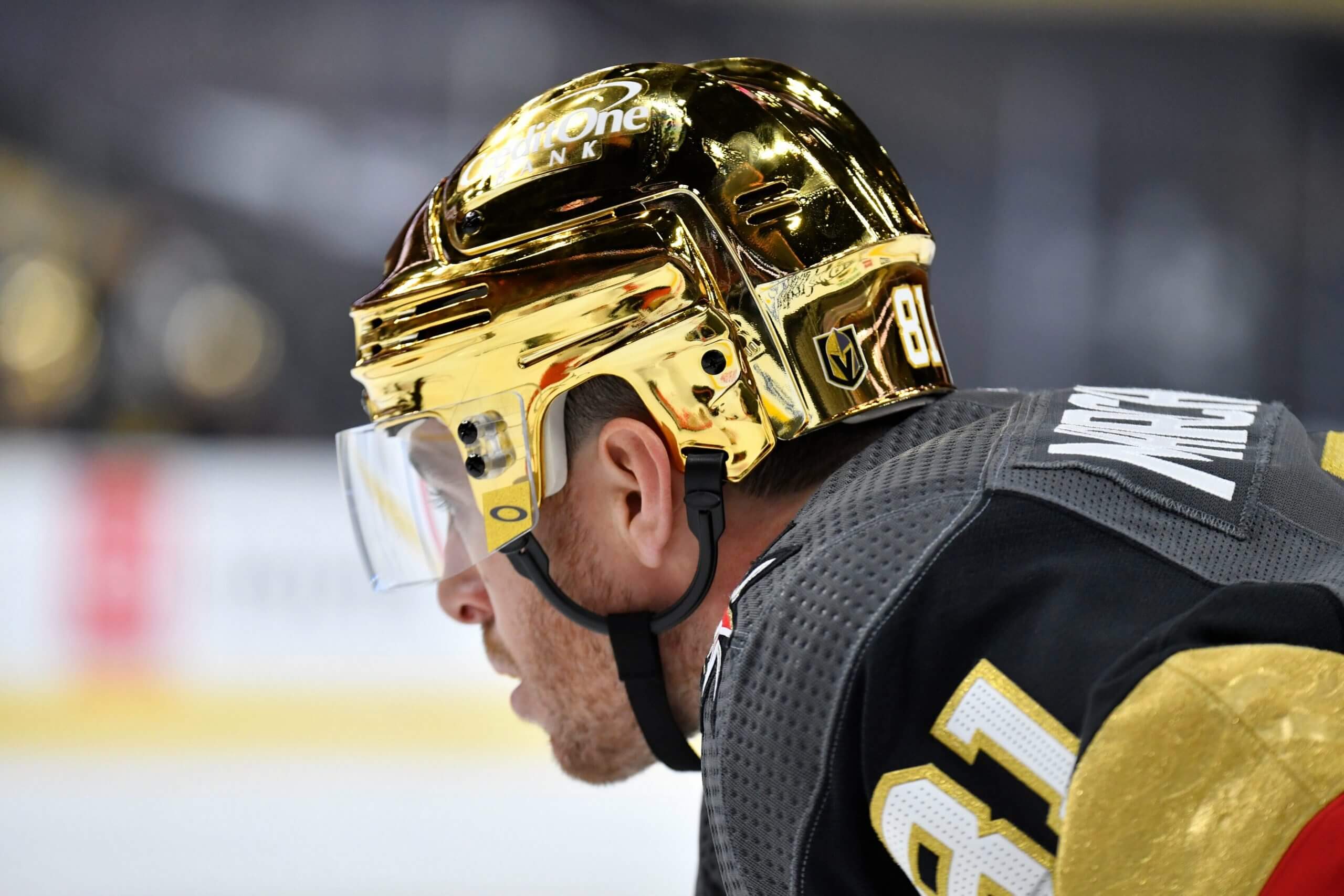
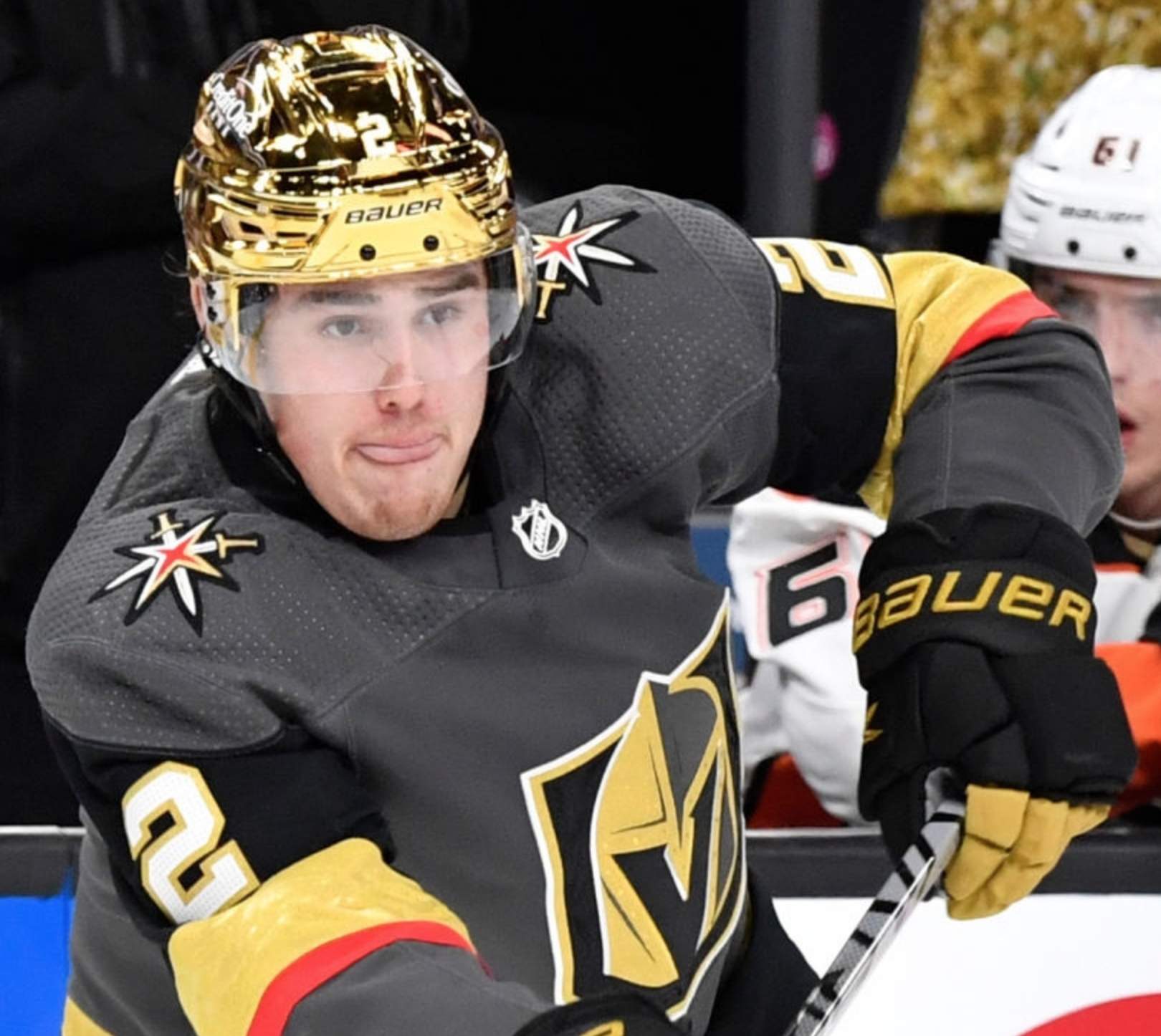
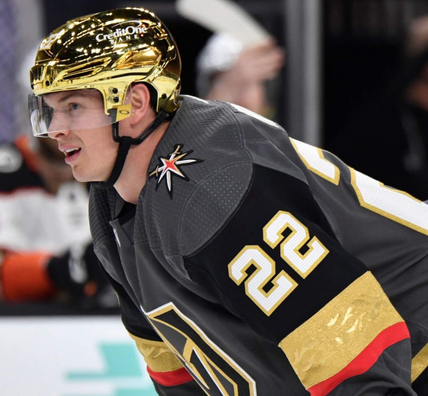
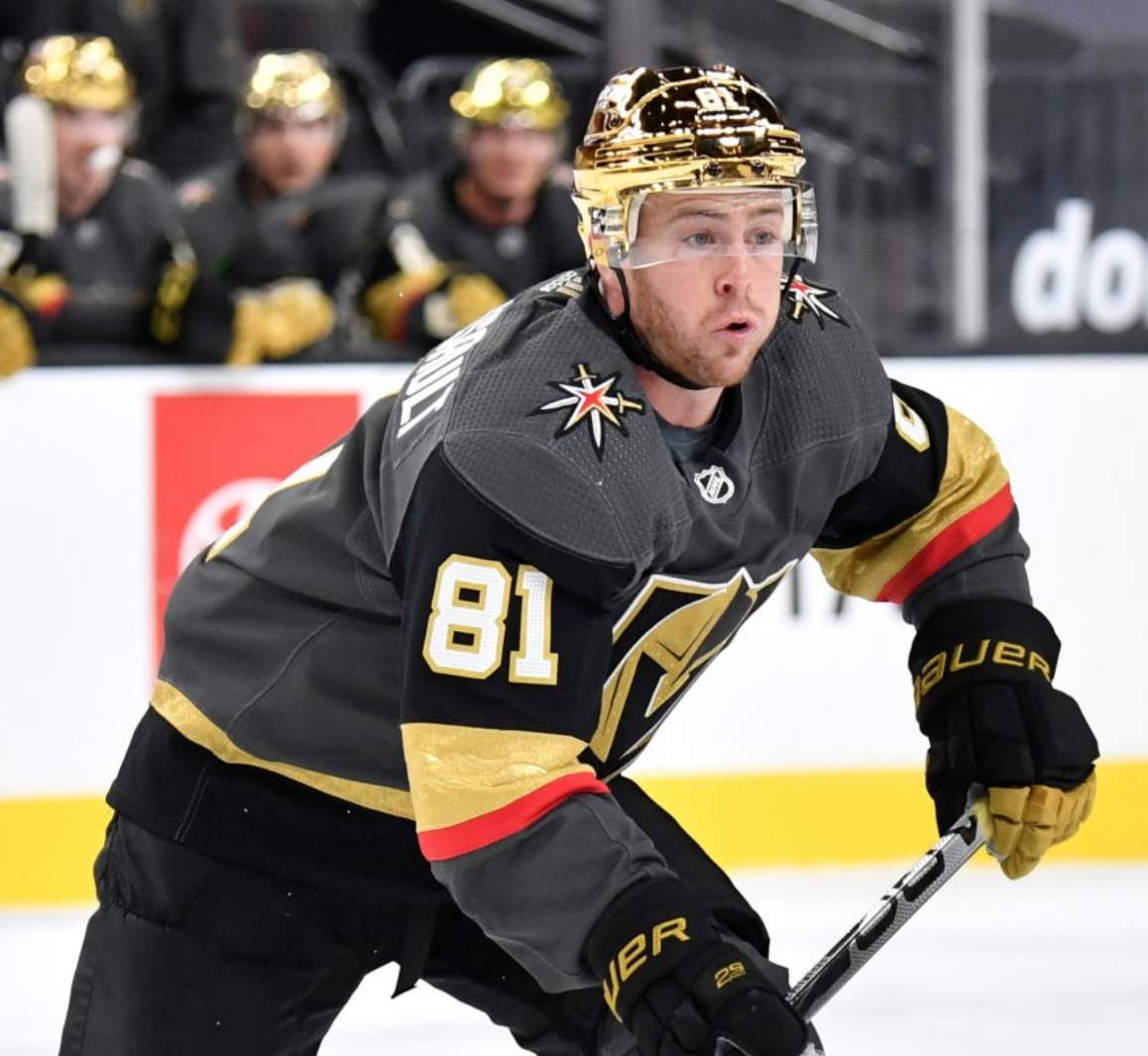
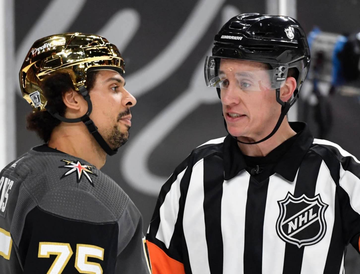
Surprise development last night in Las Vegas, as the Golden Knights came out in metallic gold helmets — a move that, to my knowledge, was not announced in advance.
There’s some precedent for metallic NHL helmets. A year ago (almost to the day!), the Kings wore silver buckets for their Stadium Series game against the Avalanche. The Golden Knights’ AHL affiliate, the Henderson Silver Knights, have also worn silver lids this season. But while the silver lids often looked tarnished or dirty depending on how the light hit them, Vegas’s gold helmets really popped last night, creating a visual effect that was a bit like Notre Dame’s gold football helmets (for all photos, you can click to enlarge):
There are lots of additional photos here, and here are some video highlights so you can see how the helmets looked in action (if the embed below doesn’t work for you, look here):
This was a fun idea, and I wish I could totally get behind it, but I don’t love the way it turned out. The helmets don’t match the shade of gold used on the team’s uniforms. Moreover, they don’t match the feel of the uniforms, because the Golden Knights’ unis (which I generally like) are based on muted colors — the dark grey, the Vegas gold. The bright, shiny lids feel like a stylistic mismatch, at least to me.
The helmets weren’t the only uni-notable aspect of that game. The Golden Knights also wore Chinese New Year pregame jerseys, complete with Chinese-lettered NOBs:
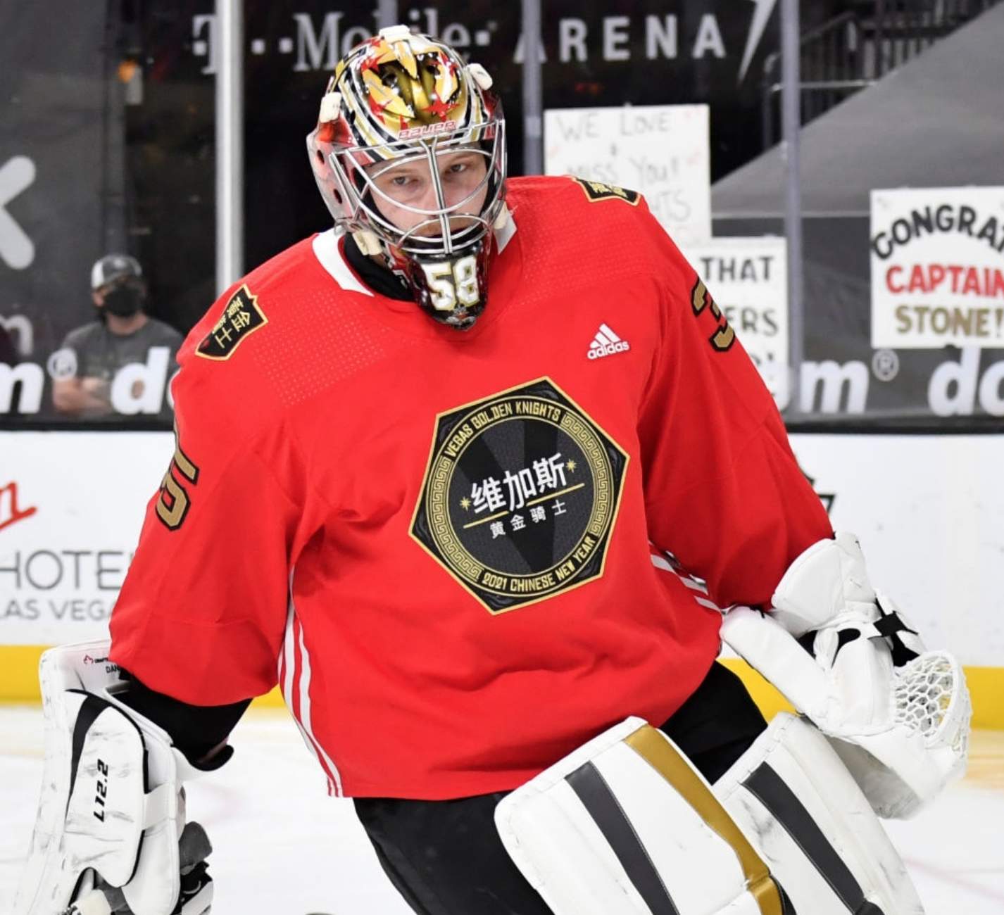
Click to enlarge
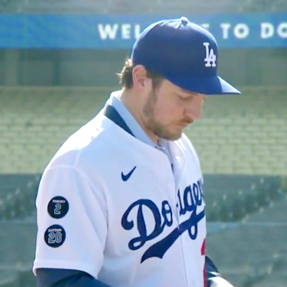
In memoriam: The Dodgers introduced newly acquired pitcher Trevor Bauer yesterday, and in so doing also revealed their new memorial patches for Tommy Lasorda and Don Sutton.
Interestingly, Lasorda’s patch features his first name while Sutton’s has his surname. I understand the thinking behind using the more intimate, familiar name for Lasorda, but it’s still a bit odd to see the two identically styled patches positioned next to each other with differing name protocols.
The patch design matches the one that the Dodgers used for their Don Newcombe patch in 2019. That one had “Newk,” so the Dodgers have now used three different name formats for this patch series — nickname, first name, and surname (click to enlarge):
You can see some other memorial patches from Dodgers history here.
It’ll be interesting to see if the Dodgers wear a World Series championship patch on Opening Day (or even all season long, as the Nats did last season). They already have the “LA” patch on the other sleeve, so between that and the two memorial patches, there wouldn’t seem to be much room for a championship patch. And what happens if, as is likely, they once again make the postseason, which normally entails yet another patch?
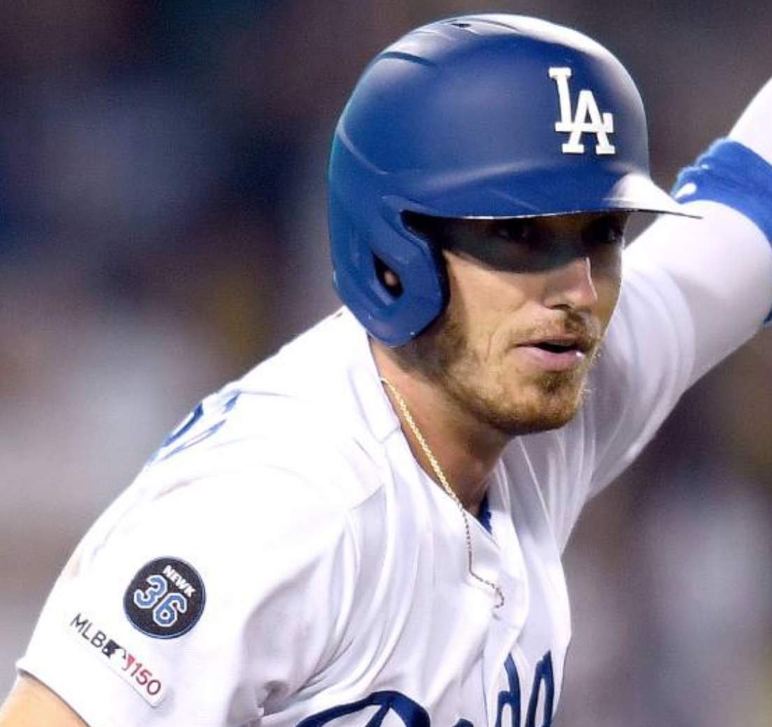
One other note: Prior to signing with the Dodgers, Bauer was with three other MLB teams and wore a different uni number ending in 7 for each of them — No. 17 with the Diamondbacks, No. 47 with Cleveland, and No. 27 with the Reds. I was hoping he’d go with yet another 7-ending number in L.A. — 37 and 57 are both unclaimed on the current roster — but he’s going with 27 again, the same number he wore last year in Cincinnati (click to enlarge):
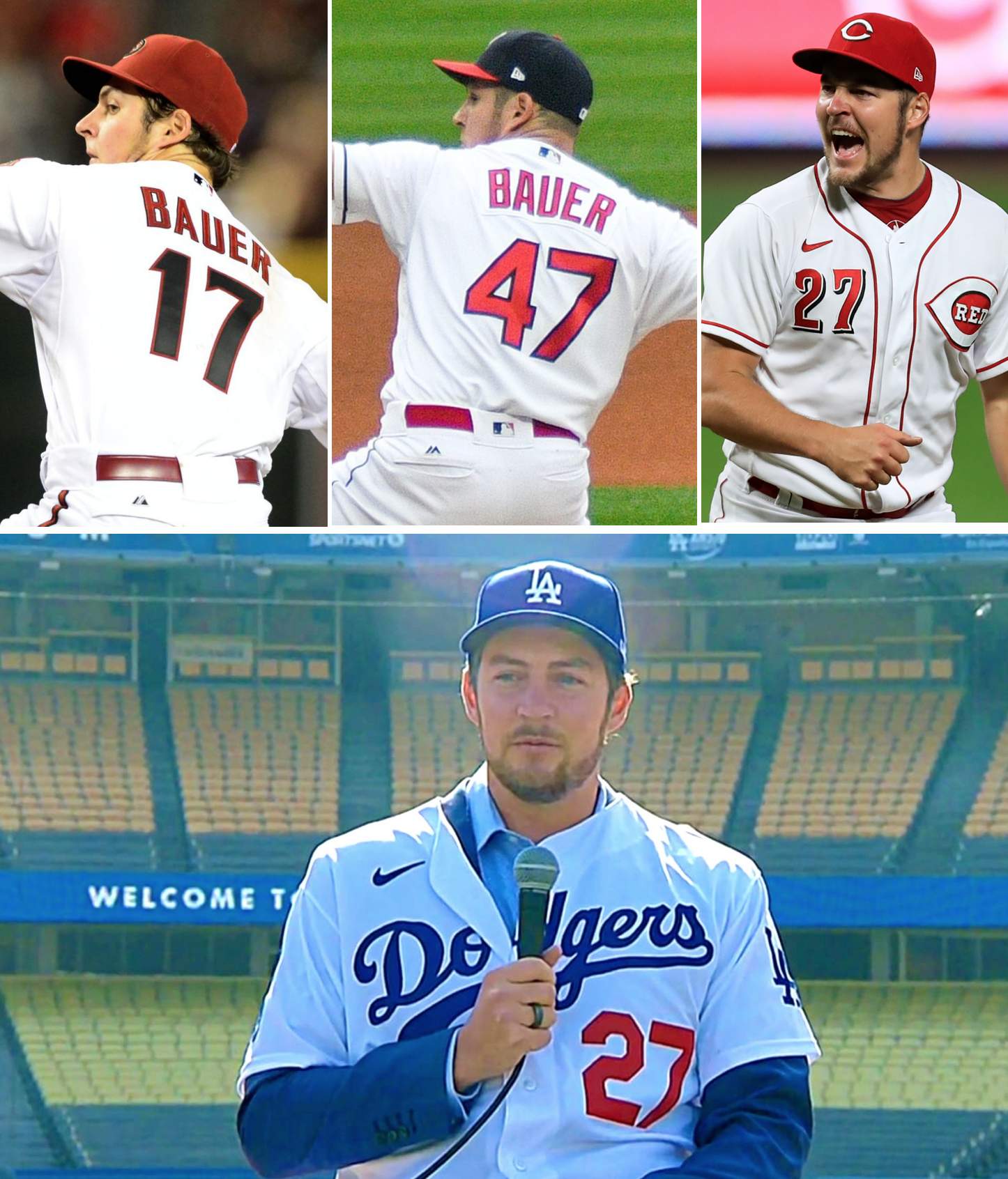
It’s funny how the mere sight of Bauer wearing a No. 27 Dodgers jersey immediately makes me think of Kevin Brown, even though Brown last played for the Dodgers nearly two decades ago. It’s weird how certain things get ingrained in our minds.
(My thanks to Jakob Fox, who brought the new Lasorda and Sutton patches to my attention.)
Podcast reminder: The second episode of Unified, my new podcast collaboration with SportsLogos.net founder Chris Creamer, is now available. This episode begins with a quick Super Bowl recap and then segues into a discussion of the Browns’ new 75th-anniversary logo, which evolves into a deeeeep discussion about the do’s and don’ts of anniversary patches. You can listen to it, and subscribe to future installments, on Apple, Google, Stitcher, TuneIn, and Spotify, or just use the player below:
The show notes, which include photos of most of the patches and other things we discussed, are available here.
You can also check out the video version of the episode here:
Thanks for listening!
Click to enlarge
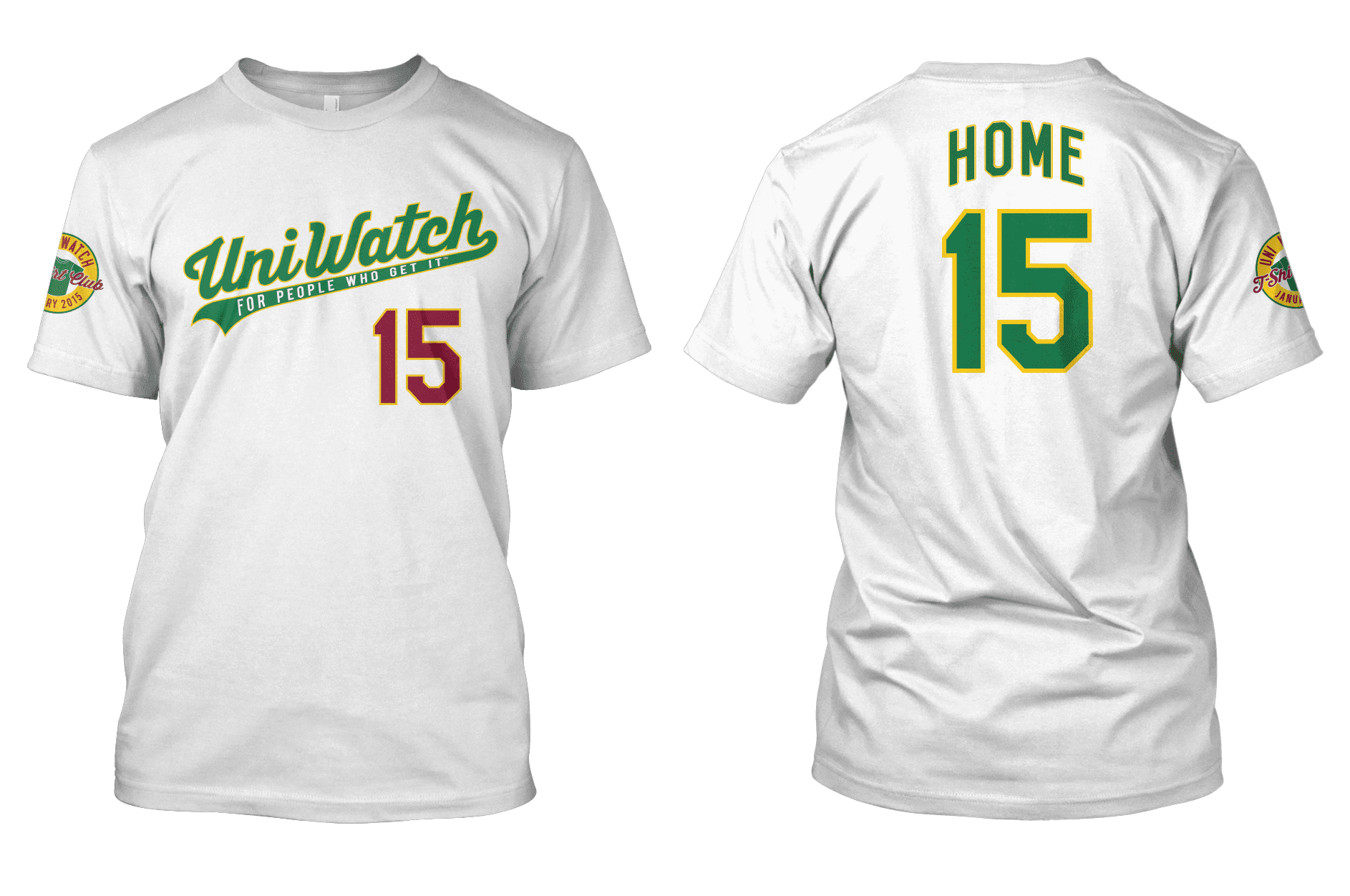
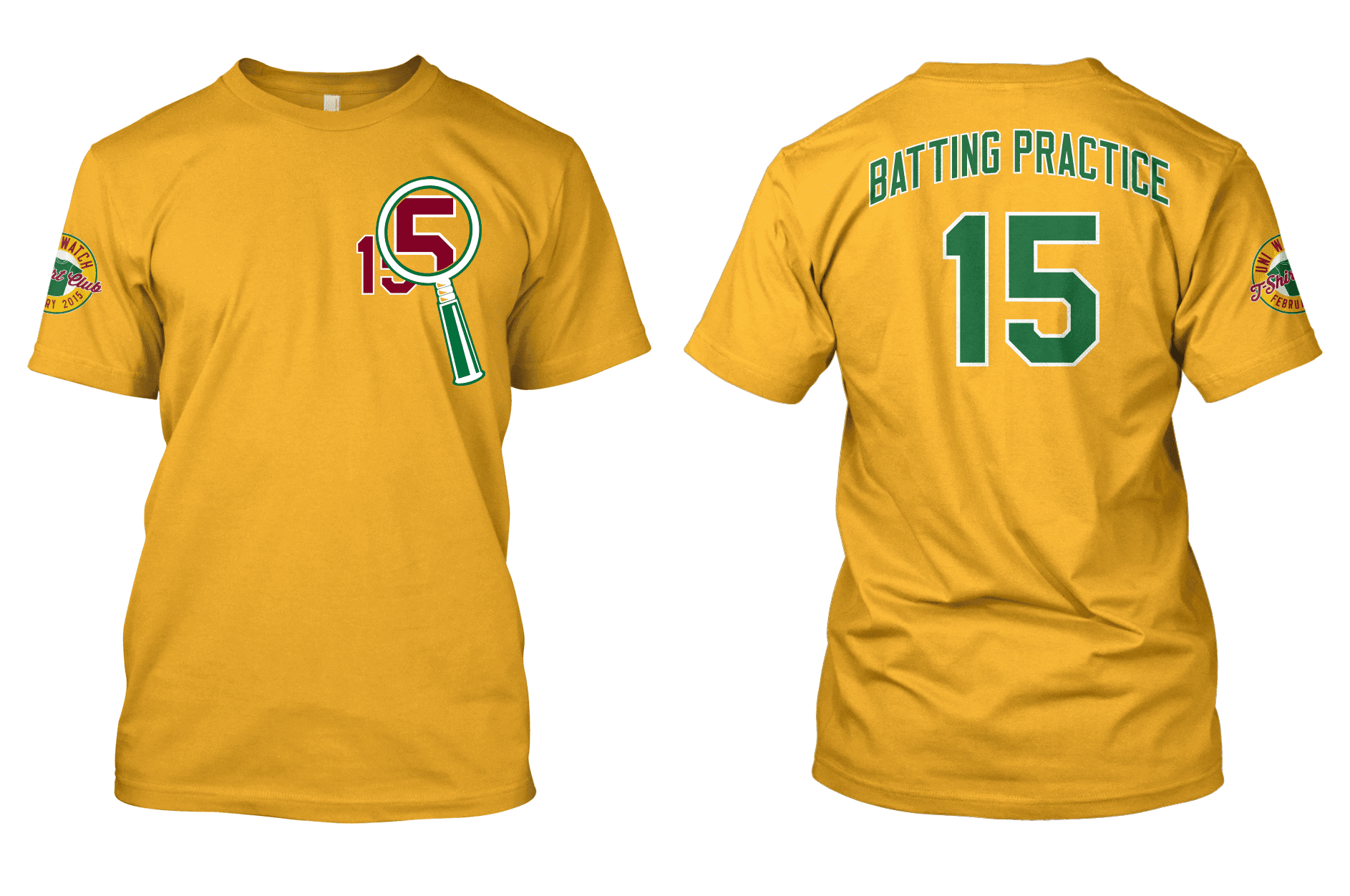
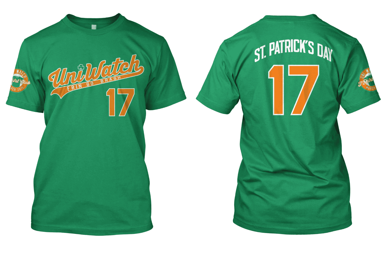
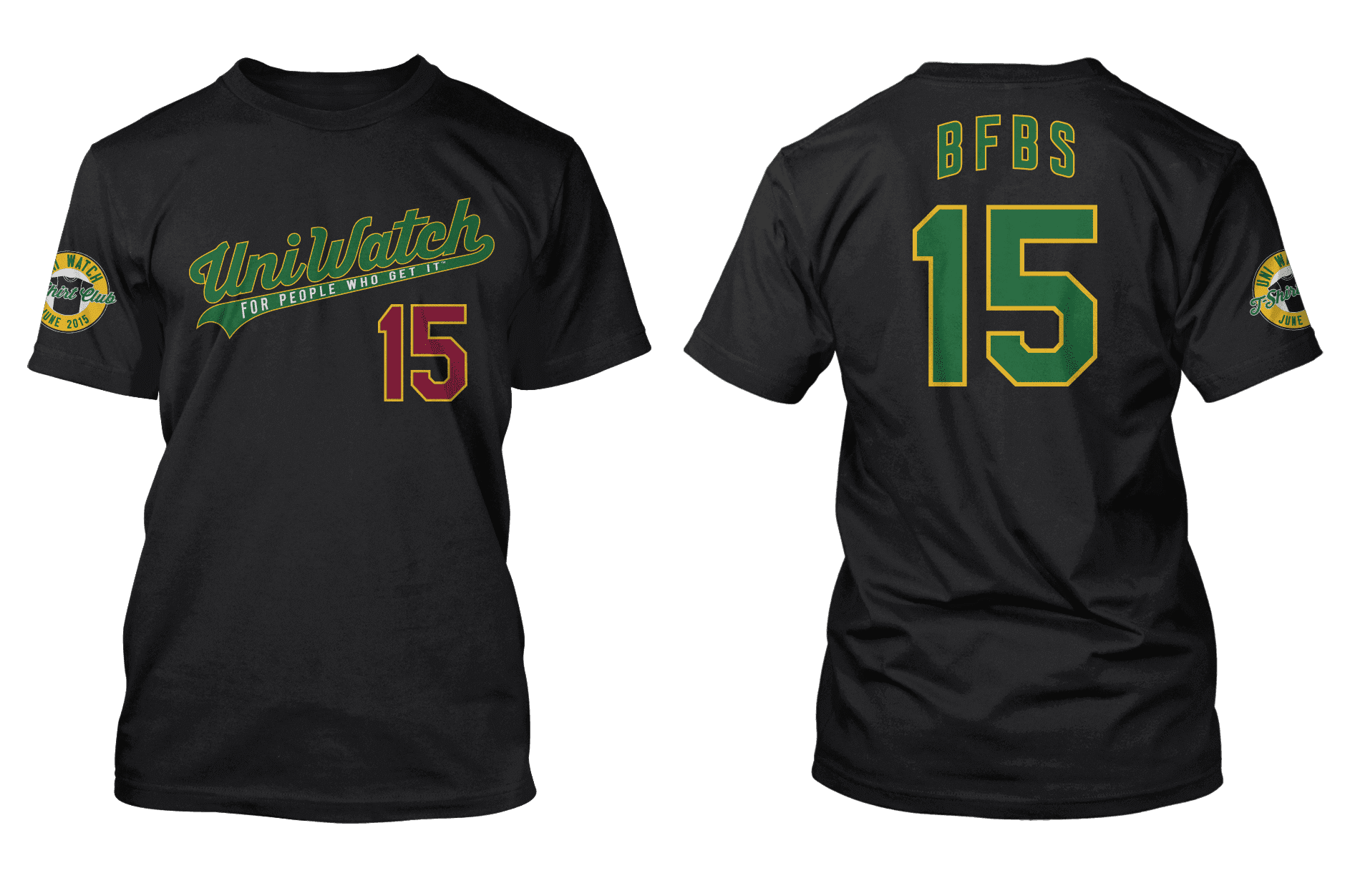
ITEM! New raffle: Remember the Uni Watch T-Shirt Club from 2015? Reader Morgan Doninger has four of those shirts — the designs shown above — in size Large. All four have been worn once or twice at most (and, in the case of the case of the BFBS shirt, not at all), and Morgan assures me that they’re like new. He’s generously offered to let me raffle them off, so that’s what we’re going to do today.
This will be a one-day raffle, with each of the four shirts going to a separate winner. To enter, send an email with your address and your preferred shirt (or multiple shirts in order of preference) to the raffle in-box by 8pm Eastern tonight. One entry per person. I’ll announce the four winners on Monday. Big thanks to Morgan for making this one possible!
Click to enlarge
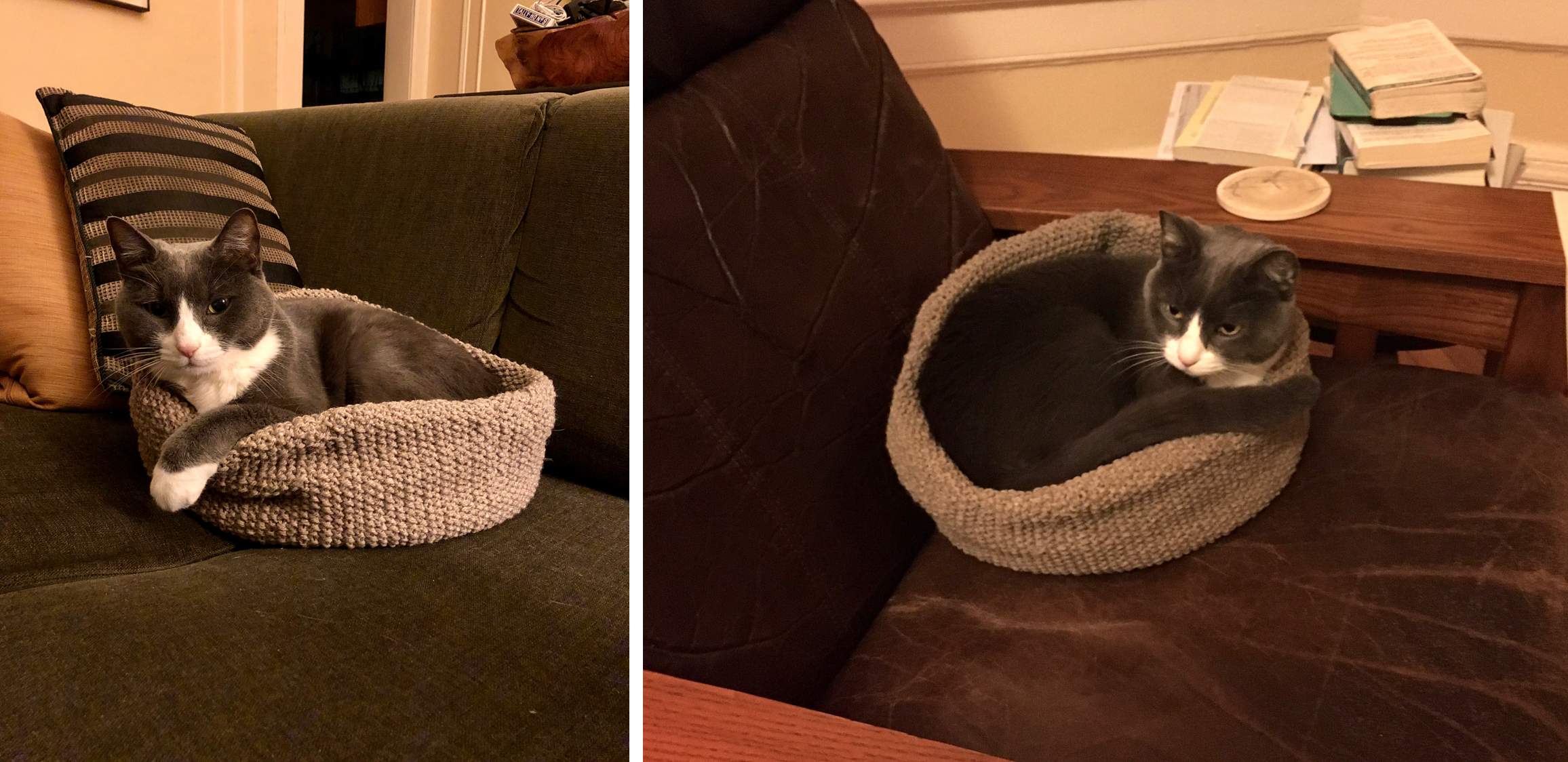
Awwww: The Tugboat Captain recently knitted a swell little cat bed for Uni Watch girl mascot President Caitlin. She was a little hesitant at first, but now she’s warming up to it. It’s perfectly Caitlin-sized!
The Ticker
By Anthony Emerson

Baseball News: Here’s a good look at the back patches for this year’s spring training caps. … Niko Goutakolis notes that Mr. Met still wears a Majestic jersey and that his cap doesn’t have the New Era logo creep. … New Red Sox OF Franchy Cordero, who was acquired on Wednesday in a three-team trade, will wear No. 19. … New unis for Mizzou softball (from Bill Hippe). … Renderings have been revealed of UCLA’s planned improvements to Jackie Robinson Stadium (from Kary Klismet). … Also from Kary: Plans have been approved to revitalize historic Hinchliffe Stadium, one of the last Negro Leagues ballparks still standing. Paul wrote about Hinchliffe for ESPN back in 2010. … It appears members of the Kansas City chapter of the neo-fascist group the Proud Boys have co-opted the Royals’ logo for their challenge coins. … Also posted in the NFL section: The demolition of Jack Murphy Stadium has begun (from James Gilbert).

NFL News: It appears the Bucs brought both of their Lombardi Trophies to their victory parade — as you can see, Matt Joyce (former Rays player) is holding a Lombardi Trophy engraved with “Super Bowl XXXVII” in the left photo while Tom Brady is holding an as-yet unengraved trophy on the right. The Patriots typically brought all of their Lombardis to their victory parades (good spot by Wayne Edward Koehler). … It appears Paul Brown Stadium in Cincinnati will be adding a Ring of Honor around the stadium (from Kary Klismet). … Cross-posted from the baseball section: The demolition of Jack Murphy Stadium has begun (from James Gilbert).

Hockey News: The NHL and the Bruins have postponed the retirement of Willie O’Ree’s No. 22 to next year, so fans can be in attendance and so the retirement can take place on the exact anniversary of his debut. The number’s already been taken out of circulation, with C Craig Smith switching from 22 to 12 before this season (from multiple readers). … Players for the WHL’s Red Deer Rebels will be living at the team’s arena this season — literally (from multiple readers). … Habs organist Diane Bibaud has her own sweater. She’s number, uh, treble clef in your program (from Moe Khan). … New flag desecration unis for the South Carolina Stingrays of the ECHL.

Hoops News: As a Mainer, I can’t help but be embarrassed that I never heard of Maine’s Continental Basketball Association team, the Lumberjacks, who played in Bangor from 1978 to 1983 and wore Sonics-derived uniforms. … Budweiser is teaming up with a number of NBA teams to release a series of cans featuring retro NBA logos (from Jason Hillyer). … With electric vehicles poised to replace gas-powered engines, Physicist Neil deGrasse Tyson wonders if the Detroit Pistons may need to change their name, perhaps to the Batteries (from Russell G. Flynn). … From reader Brett Alan: “Northwestern G Boo Buie wore his teammate Ty Berry’s jersey — including Berry’s NOB — in Wednesday night’s game against Indiana. Berry missed the game due to the death of his father.”

Soccer News: Red Bull Salzburg’s new American midfielder Brenden Aaronson is wearing a kit with “Rauch” as the primary advertiser, instead of Red Bull worn by his teammates. Odd. I did some brief Googling and couldn’t find any explanation for why he wears a different ad, but did discover Aaronson has been wearing it for his entire (one-month) tenure with the club. Red Bull Salzburg also had Rauch as its primary advertiser in the past (from Hunter Gringas). … NWSL side North Carolina Courage have unveiled their new home kit (from James Gilbert). … New crest for Sprata Praha (from Ed Żelaski).

Grab Bag: Valparaiso University is retiring its “Crusaders” team name and logo (from multiple readers). … Turner County (Ga.) High has voted to retire its “Rebels” identity (from Kary Klismet). … Here are more new kits from the Netball Superleague (thanks, Jamie). … Also from Jamie: Temple field hockey has new kits. … Darren Rovell noted that the the Trump campaign’s MAGA caps look mighty similar to the caps worn by Buster Douglas and his crew when he upset Mike Tyson in 1990. Trump attended that fight with Don King. … San Antonio College, which discontinued use of its “Rangers” name last year, is having a contest to choose a new identity (from Kary Klismet). … Also from Kary: Waste Management is introducing new employee uniforms made out of recycled material.

That’s it for this week. Stay safe, enjoy Phil’s weekend content, maybe check out our podcast if you haven’t already, and remember, it’s now less than a week until pitchers and catchers. — Paul
For the ticker item about one player wearing a different advertisement than all the others, this is because in the Austrian Bundesliga, teams are permitted have one player wear a different ad than the rest of their players. For some teams it is their star player, for some teams it rotates. I know RB used to have their youngest starting player wear the Rauch shirt and they would make a big deal about it.
For the Brandon Aaronson Red Bull jersey:
link
Brendan Aaronson is wearing a link that Salzburg have been doing for a few years — only five players wore it last season, so it’s possible that he has worn it a few times but not for every single game since he joined. They auction them off for charity.
I almost don’t even care how they look – they’re so reflective, the shine almost obscures the sponsor logo, which makes them by default the best looking sponsored helmets in the league
Put me in the group who prefer a metallic-paint look over the chrome look when it comes to athletic helmets.
C3PO
Saw “In memorium” under a large photo of Trevor Bauer bowing his head and thought Bauer himself had died.
Those gold helmets look almost Tron-like under the arena lights.
I don’t know who the guy is in the Brady trophy pic, nor do I have any idea what his shirt means. ???
Heck, I don’t even know what Brady’s shirt means!
Pretty sure the guy next to TB12 is Alex Guerrero, his personal trainer. I imagine the t-shirt is noting TB12 has won 7 Super Bowls.
I think TB12’s t-shirt translates to “Tom Brady X Tampa Bay, Season 1, 2020 – Let’s F@#$*@G GO!”
I will compliment the Golden Knights for keeping the gold helmets a surprise. Heard no hints about this. That is where the compliments end.
Don’t like the gold helmet. Their dark grey helmets are fantastic. The shiny gold helmet looks minor league and does not belong on a team on the big NHL stage. They should have stopped and gained control of themselves after allowing the AHL team to have the shiny silver helmets.
Just as an additional point about Notre Dame helmets. ND hockey teams also wear gold helmets, which–for my money–look at least as good as the football helmets.
link
Yes, Vegas would have a better look if they copied the ND pucksters. Metallic but not mirror-reflective. A nice match to the gold jerseys.
Re: Budweiser… Topps teased a co-promotion with the beer brand during this weeks video launch of their 2021 baseball product. That seems a bit out of character, but let’s see.
link
Gives “chrome dome” a whole new meaning
While I inherently don’t like the gold helmets very much, I love the fact that unless you see a close-up at the exact right angle, the helmet ads are virtually invisible. Therefore, these are my new favorite helmets.
It’s also very sad that on a site that celebrates aesthetics I’ve had to take a stance that non-matching camouflage is more visually appealing than a perfectly color-matched combo. When critics prefer illegibility and obscurity over excellence, the genre has gone in a VERY wrong direction. #NoMoreAds
Two suggestions re: Golden Knights’ gold helmets.
First, I think the helmet would work better if “flecked” or “matted” to match the gold on their sleeves. The sheen is jarring.
Second, I would propose that the helmets would work better with their white and gold jerseys (possibly red). In my view, they don’t work with the grey jerseys.
Are you talking about a similar look to glitter paper?
link
Yes. I think that would match the gold trim on their uniforms.
It’s Vegas. So the helmet’s aren’t too shiny, it’s just that the rest of the uniform isn’t shiny enough.
Don Sutton’s nickname was “Black and Decker” because of the belief he doctored baseballs. Can’t see the Dodgers putting that on a patch.
I think there is something unique about debuting a new uniform element as a surprise. The first thing I thought of was the Ravens casually wearing mustard color pants for one game back in 2015 with no announcement. Definitely would like to see how these would pair with the white and gold jersey, but I agree that it looked pretty jarring paired with a muted color such as gray. Also am curious to see if they keep losing in these lids (Granted this was the 1st game, and they only lost 1-0) if they will have a similar fate as the Phillies all blue caps in 1994.
Like Paul, Vegas’ new helmets to invoke a bit of a Notre Dame feel to me. Not so much football, but hockey, seeing as the Notre Dame hockey team has been wearing metallic gold helmets for several years now:
link
Vegas’ might be a littler “chromier,” but they obviously have a similar feel. Are Vegas’ helmets derivative? Maybe, but I don’t think Notre Dame has a corner on the market for gold hockey helmets. I wasn’t a huge fan of Vegas’ name choice when it was first announced, but I’ve grown to appreciate it more and now think they should fully embrace it with their visual program.
One correction: In regards to the VGK pregame jerseys, the words are in Chinese. Mandarin is a dialect of Chinese, which is all auditory. Mandarin speakers write words in Chinese the same way as someone from Hong Kong, who speak the Cantonese dialect.
Thanks, Sam. I referred to it as Mandarin because that’s how it was listed in an article on the team’s own website — so I guess they got it wrong too..?
Thanks for schooling me. I’ll make the fix!
Yup, looks like VGK got it wrong too.
Thanks for the fix!
Personally I like the Gold helmets of the Golden Knights. I like the way the lid represents the team brand. They’re not the Charcoal Grey Knights, White Knights or Red Knights. Golden Knights.
I can’t believe the t-shirt club was six years ago. Time flies.
Re: Golden Helmets
Star Wars in the NHL…oi
They forgot the glow in the dark light saber hockey sticks!
LED’s on the skates too…?
They already had to can the the ‘smart’analytics hockey pucks because they worked like crap as hockey pucks…
Betty just doesn’t Gett it!
LED skates? Damn, dude. Don’t give Bauer any ideas!
Light saber hockey sticks? Yes, please.
Just wanted to jump in and mention I didn’t like the podcast yesterday……I LOVED IT. Haha. It’s fantastic and I am really looking forward to this being in my rotation of podcasts each week (or however often you release a new one).
Great job!
Thank you!
I don’t mind Vegas trying something different with the gold helmets but I think they should be less chrome and more of an old gold like the Saints helmets.
Looks like Braves jersey will have 150 patch and ASG patch. Assuming as well a 44 Hank Aaron Patch.
link
They’ll also need a memorial patch for Phil Niekro and possibly for Don Sutton.
In 1993, the Indians were prepared to play their final year at Cleveland Stadium and commemorate the fact with a patch on their right sleeve. But Tim Crews and Steve Olin were tragically killed in a boating accident during spring training, and a tribute patch to both players supplanted the stadium badge. The only place it appeared was on the outfield wall. The Braves face the same sort of economization of flash, if they don’t want their uniforms to look like some kind of roadside memorial.
Looks like Cleveland has changed the logo in the logo from “Indians” to “Cleveland” on the BP/Spring Training caps
link
Yes, that was in yesterday’s Ticker.
Kind of a mascot bloodbath in the Grab Bag Section. I’m not going to indulge the “slippery slope” argument (Ban the Ravens! Ravens are big scary birds!) but I *am* going to speculate that, at some point, the detractors of a touchy team name (say, the Rangers of the Texas or New York variety) are going to meet an effective brick wall of fans accusing their opponents of overreaching. In fact, didn’t we meet this line in the sand with the San Francisco 49ers?
Also, if names like the Crusaders and Rebels are now going to be on the outs, what will be the hot, new team identity? My money is on “Guardians”, which has been mentioned in correlation with the Cleveland baseball team, and also has been chosen as the vocational name of members of The Space Force.
RE: SC Stingrays, is it still considered flag-desecration when the uniform is a near copy of an historic uniform, in this case Team USA’s 1976 Canada Cup uniform? The Stingray numbers are a desecration, however.
RE: Las Vegas Knights
A gold helmet also is typically worn by the leading point-getter in Finland’s top hockey league, and maybe other leagues.
I recently read that Lunar New Year is becoming more widely used than Chinese New Year, to acknowledge other countries that are also celebrating at this time.
A gold helmet also is typically worn by the leading point-getter in Finland’s top hockey league, and maybe other leagues.
Great point — I totally blanked on that but should have included it!
I recently read that Lunar New Year is becoming more widely used than Chinese New Year, to acknowledge other countries that are also celebrating at this time.
Yeah, I was actually pretty surprised that the Golden Knights’ warm-up jerseys said “Chinese” rather than “Lunar.”
I love everything about Vegas’ new helmets (well, except the advertising decals, of course). Although I generally have liked their uniforms up to this point, I’ve always thought that a team called the Golden Knights should wear more, you know, gold! So I find the helmets a welcome addition – and an upgrade – to the team’s visual identity.
As for the highly reflective, chrome-like finish on the helmets, I think it’s perfect for a team called the Golden Knights. Because what is going to make a golden knight “golden” other than the color of his metallic armor?
I think the shade of gold on the helmets is a reasonable complement to the gold fabric on the uniforms, which does have a bit of a flecked metallic sheen. And the new helmets provide some nice balance and contrast to the more muted, darker tones that otherwise predominate the team’s visual program. Overall, a job well done!
The podcast was amazing.
Let me tell you what I loved about it: as you guys kept talking, I kept getting ideas in my head about details and arcane points, thinking “I should tweet this other point at them” and then a minute later one or the other of you would cover it.
Case in point: the NHL and its lost season. Well done.
Here’s one thing I don’t think you covered: anniversaries for teams that changed leagues.
Former AFL and AAFC teams count their entire history. The Browns were founded in 1946, spent four years in the AAFC and three years “missing”. They’re glossing over the whole thing and calling 2021 their 75th anniversary.
Ditto the former ABA teams, as far as I can tell.
link
The former WHA teams seem to count from when they joined the NHL. Even the Edmonton Oilers, the only WHA team with no “complications”, counts from 1979.
link
The old Jets celebrated their tenth anniversary in 1982 but apparently at some point they stopped counting the WHA years
link
The Oilers, Canes, Avalanche should be coming up on their 50th anniversary. If the Jets count the same way as the Browns, they would be too.
Good point! Glad you enjoyed, Mike.
I too enjoyed the recent podcast. Like the Browns, the CFL’s Montreal Alouettes have one of those complicated anniversaries. They are celebrating the 75th anniversary this year.
link
Definitely not 75 seasons. Is it even the same team? Sure, they were founded in 1946, but were called the Concordes from 1982-85. Called the Alouettes again in 1986. Folded just prior to the 1987 season. The Alouettes did not return to the field again until 1996. The 1996 team was the relocated Baltimore Stallions with non-import players gathered through an expansion team-style draft.
Its more complicated than that even.
The 1982 Concordes was an expansion franchise – the league revoked the old Alouettes franchise because of Nelson Skalbania’s fuckery, and granted a new expansion franchise to Charles Bronfman. Which was the reason for the new name.
It was a similar thing to the 1983 St. Louis Blues. The league terminated the franchise in 1983 because Ralston wasn’t intending to operate it. And granted a new franchise to Harry Ornest.
link
For anniversary purposes, I genuinely don’t care. Its the Alouette’s 75th anniversary, its the Browns 75th anniversary, the Blues are 54 years old and not 38. I don’t care about the discontinuities. It only matters if you’re going to be inconsistent by insisting that a team’s anniversary isn’t “legitimate”.
That Skalbania was a snake oil salesman. His purchasing the BC Lions in 1996 with smoke and mirrors an interesting story itself.
Skalbania needs a 30 for 30. Racers, Oilers, Lions, Alouettes, probably a couple I’m forgetting.
As a Calgary guy I can’t be too critical – he bought the Flames and brought them here.
I don’t love chrome gold helmets, but think they can work in the right situation. They work for ND football for example, and I really wish that is the direction the Jaguars would go. For hockey, they seem fitting for the glitz of Las Vegas. However, I think the reason that style works well for a football helmet and not hockey is the shape of the helmets. In football there are fewer sharper angles in the helmet, whereas in the hockey there are lots of, what I might call layers, to the helmet shape. With the reflectiveness of the chrome they sort of breaks up shine of it, as compared to a more round, one layer football helmet.
In lieu of a World Series patch, perhaps the Dodgers can wear gold trim around the wordmark. Would be subtle and keep the patch clutter to a minimum. If only I had photoshop skills…
If it worked for the Royals, it will certainly work for the Dodgers.
Hey I was just wondering if you guys have seen the Celtics rebrand i sent your way?
Gold helmets are ballin. Surprised anyone would think otherwise tbh