By Phil Hecken, with Timmy Brulia
Follow @PhilHecken
Good Saturday morning, Uni Watchers! I hope everyone is doing well and staying safe.
It’s the day before the big game, and as I’ve done for the past half-decade-plus, I’m joined by Timmy Brulia, one of the head honchos over at the incredible Gridiron Uniform Database, and who will be bringing us the uniform histories of the two combatants in SB LV (Supe 55). There’s a LOT to cover today, so let’s just delve right in, shall we? With the Kansas City Chiefs the designated “road” team, we’ll start with them, and finish up tomorrow with the designated “home” team, the Tampa Bay Buccaneers. And don’t forget — the KC Chiefs didn’t begin their life in either Kansas City nor with the name Chiefs! (Tim writes the history, but I supply the links — so if there’s anything amiss with those, blame me, not him!) Here’s Timmy:
Kansas City Chiefs Uniform History
By Timmy Brulia
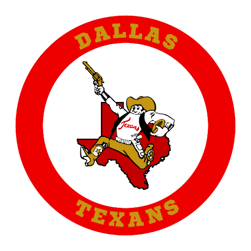
1960: The Dallas Texans take the field as one of the eight original American Football League teams. The helmets are red with a white map of the state of Texas on the sides. with a very thin black outline and a yellow star where Dallas is located. The Texans sport white jerseys with red numbers trimmed in yellow on the front and back and tv numbers in the same fashion on the sleeves. The home jerseys are red with white numbers edged in yellow on front and back, with TV numbers in white on yellow on the sleeves. The pants are white with a very thin red/yellow/red stripe pattern on the sides. Socks are white with red/yellow/red stripes (worn with white jerseys) and red with white/yellow/white stripes (worn with red jerseys). Starting with the 11/18 game at Boston, the Texans add names on the backs (NOB) of their jerseys. Red names on the white jerseys and white NOBs on the red jerseys.
1962: The Texans wear the red socks with both sets of uniforms.
1963: With dismal attendance in Dallas, the Texans relocate to Kansas City and are renamed the Kansas City Chiefs. Out of necessity the Chiefs revise their helmets, keeping the same red color but changing the emblem from the Texas state outline to a white arrowhead, with the point facing forward and a red “KC” inside the arrowhead. The arrowhead and KC have thin black outlines. The rest of the uniform remains as is, with the pant stripes thickening ever so slightly.
1966: The NOBs are now serifed. The sock stripes are separated by a razor thin strip of red.
1967: NOBs return to the sans-serif format.
1968: For the first tine, stripes are added to the sleeves. The white jerseys have a red/yellow/red combo on the sleeve edge, while the red jerseys feature a white/yellow/white pattern. Red pants are introduced to the mix with side stripes of white/very thin red/yellow/very thin red/white. White socks are reintroduced for the first time since 1961 to be worn with the white jersey/red and pants set and have the same red/yellow/red stripes as worn in ’61.
1969: The thin red separation of stripes on the red socks are deleted. The Chiefs wear special red jerseys for Super Bowl IV. NOBs are serifed and a special 10th season AFL patch is worn on the left shoulder for the game.
1971: The Chiefs join in on the anti-black cleat craze. The team wears white cleats with the white jerseys and red cleats with the red jerseys.
1972: White socks are worn with both sets of uniforms.
1973: The red socks return and are worn with the red jersey.
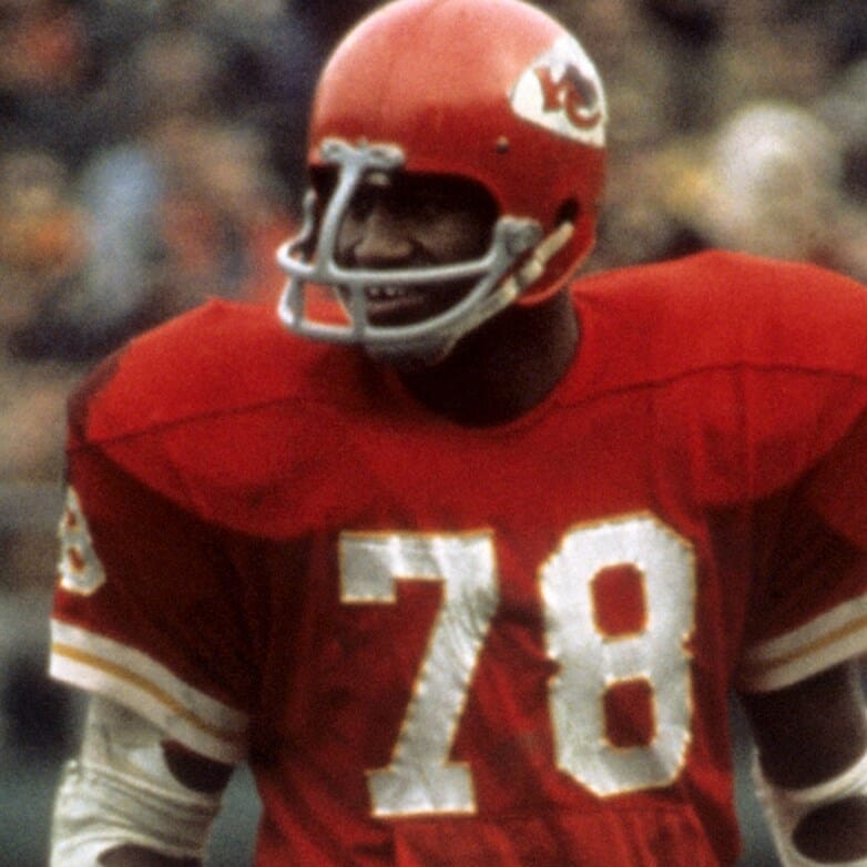
1974: The helmet logo is reduced in size a tad and the face masks are changed from gray to white.
1976: Red cleats are worn exclusively.
1977: Socks stripe patterns are changed. For the white socks, stripes are thin red/yellow/thin red/yellow/thin red. On the red socks the stripes are thin yellow/white/thin yellow/white/thin yellow. White cleats are worn full-time.
1978: The socks revert back to the three stripe pattern, with the inner yellow stripe being a lot thicker than before on both sets.
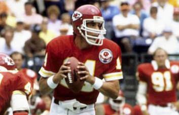
1983: A memorial patch for deceased running back Joe Delaney was worn on the right breast of both jerseys for the season. The helmet logo shrinks a little more.
1984: A patch celebrating the Chiefs’ silver anniversary was worn on the left breast of both jerseys for the season.
1989: The red pants are ditched and the white pants are worn with both jerseys.
1992: A memorial patch for Director of Player Personnel Whitey Dovell is worn on the left breast of both jerseys.
1994: Two commemorative patches are worn on the jerseys. The league wide NFL 75th season patch is worn on the left breast and the Chiefs’ 35th season patch is worn on the right breast. As with all other NFL teams, the Chiefs wear throwback jerseys for a few games. These throwbacks are based on the 1963-1967 seasons, with stripeless sleeves and the old style red socks worn with both sets.
1999: The Chiefs’ 40th season is commemorated with a patch on the right breast of both jerseys.
2000: To the delight of many, the red pants are revived, with the same stripe pattern as worn before, with the inner yellow stripe slimmed down.
2002: The Chiefs wear a commemorative 45th season patch for just one game, 10/27 at home against the Raiders.
2006: KC wears three uni combos this season, the normal red over white, and wearing white over red and white over white.
2007: After the passing of AFL founder and team founder Lamar Hunt late in 2006, the Chiefs wearing a permanent patch honoring Hunt. The patch is basically the old AFL insignia with LH on the football in the football in the logo. The all white combo worn for several games in 2006 is dropped.
2008: The league wide Gene Upshaw memorial patch worn for Week 1 is worn on the right breast of the red jersey.
2009: The Chiefs wear a 50th season patch on the right breast of both regular jerseys. The all white combination is worn for the last two weeks of the season. As part of the 50th Anniversary of the founding of the American Football League, the Chiefs break out togs worn by the Chiefs when they were the 1962 Dallas Texans, with a special AFL Anniversary patch for three games. The highlight was when the “Texans” in red at home played the Dallas Cowboys, who wore 1962 blue throwbacks of their own on 10/11.
2010: The red/white, white/red and white/white combos are again worn.
2011: A 9.11.01 ribbon patch is worn on the right breast of the red jersey for the 9/11 game.
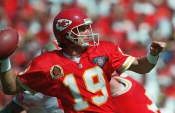
2012: The jersey see a change – a subtle change – on the jerseys. The TV numbers bump up from the sleeves to the shoulders and the sleeve stripes, previously on the sleeve edge, are now off-set from the edge. A league-wide patch for the Pro Football Hall of Fame’s 50th Anniversary is worn on the right breast of the white jersey for Weeks 14 and 15. The same three uni combos are worn.
2013: The usual three combos are worn…PLUS the combo that almost no one thought would never be worn, the red over red! The all red look (with white striped socks) was worn for the first time on Week 2 against the Cowboys.
2014: The all whites take a breather. White/red, red/white and the all reds (with red striped socks) make another showing, this time for Week 4 at home vs. the Patriots.
2015: KC wears four combos this season: white/white/red socks, white/red/white, red/white/red and red/red/red.
2016: The Chiefs, noted for their rather conservative taste as other teams fell prey to the mix and match era of the 2010s, go full throttle with six uniform combinations this season. White jerseys are worn with white pants and white socks, white pants and red socks, red pants and white socks. Red jerseys are worn with white pants and red socks, red pants and red socks and for the Thursday night Color Rush against the Raiders for Week 14, red pants and red socks without the usual white sanitary socks.
2017: Four uni combos take the field: white/red/white, red/white/red, red/red/red (with white sannies), red/red/red (without sannies).
2018: These were the four combos worn: white/red/white, white/white/red, red/white/red and red/red/red.
2019: Three combos were worn: white/red/white, red/white/red and red/red/red. For Week 9 the Chiefs switched out their white face masks for gray.
2020: These three combos were worn: white/red/white, red/white/red and red/red/red.
Thanks, Timmy! Fantastic stuff, as always. We’ll be back tomorrow with the uni history of the TB Bucs, and you most definitely won’t want to miss that one!


Guess The Game…
from the scoreboard
Today’s scoreboard comes from Pete North.
The premise of the game (GTGFTS) is simple: I’ll post a scoreboard and you guys simply identify the game depicted. In the past, I don’t know if I’ve ever completely stumped you (some are easier than others).
Here’s the Scoreboard. In the comments below, try to identify the game (date & location, as well as final score). If anything noteworthy occurred during the game, please add that in (and if you were AT the game, well bonus points for you!):
Please continue sending these in! You’re welcome to send me any scoreboard photos (with answers please), and I’ll keep running them.
The Many Numbers of Earl Monroe
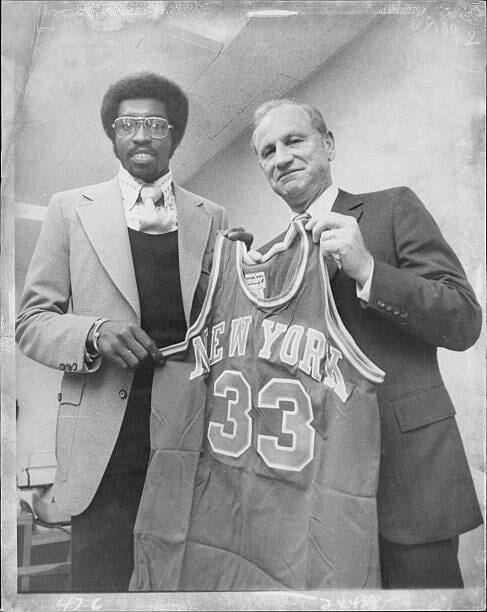
Got an e-mail this past week from reader Dave Holland, who found himself in a bit of an Alice in Wonderland situation concerning the many different uniform numbers for the great Earl “The Pearl” Monroe. I’ll let him take it from here:
Hi Phil-
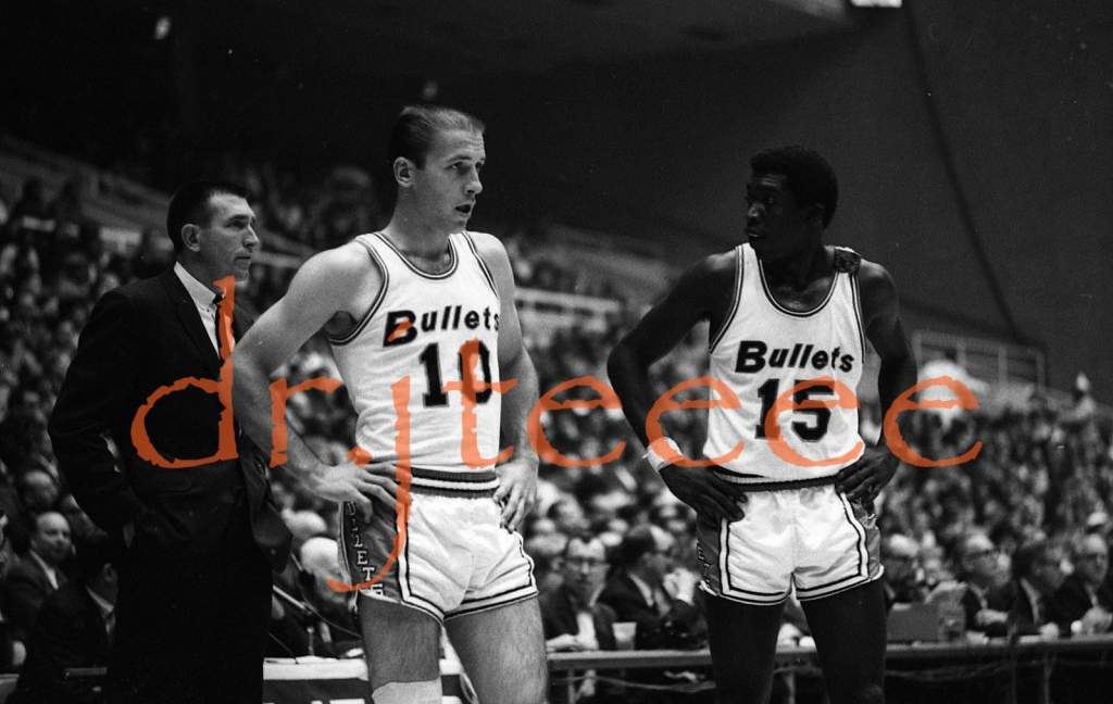
In my youth, I was a big fan of the Baltimore Bullets.
I was on eBay recently and, for the first time, I saw a picture of Earl Monroe in those wild looking 1971-73 uniforms.
I believe it’s from a Topps sessions before the 1971-72 season. He was traded to the Knicks after only 3 games that year.
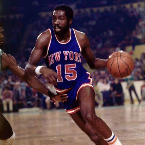
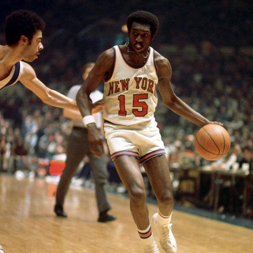
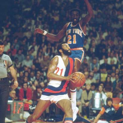
This sent me down a rabbit hole, where I found he wore at least 6 different numbers with the Bullets and the Knicks.
I attached several for you:
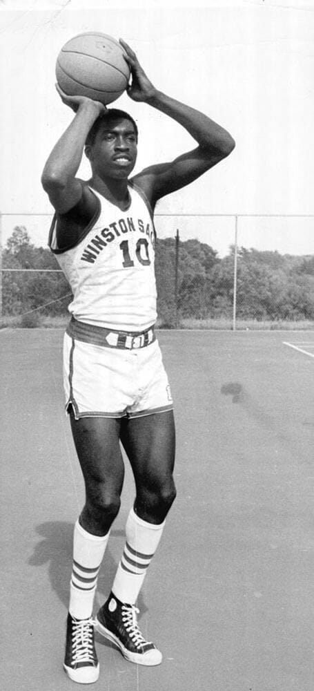
+ + + + + #10 at Winston-Salem College with the belt. (nice Chucks)
#15 Rookie year 1967-68. I had no idea he wore that number (sorry about the water mark)
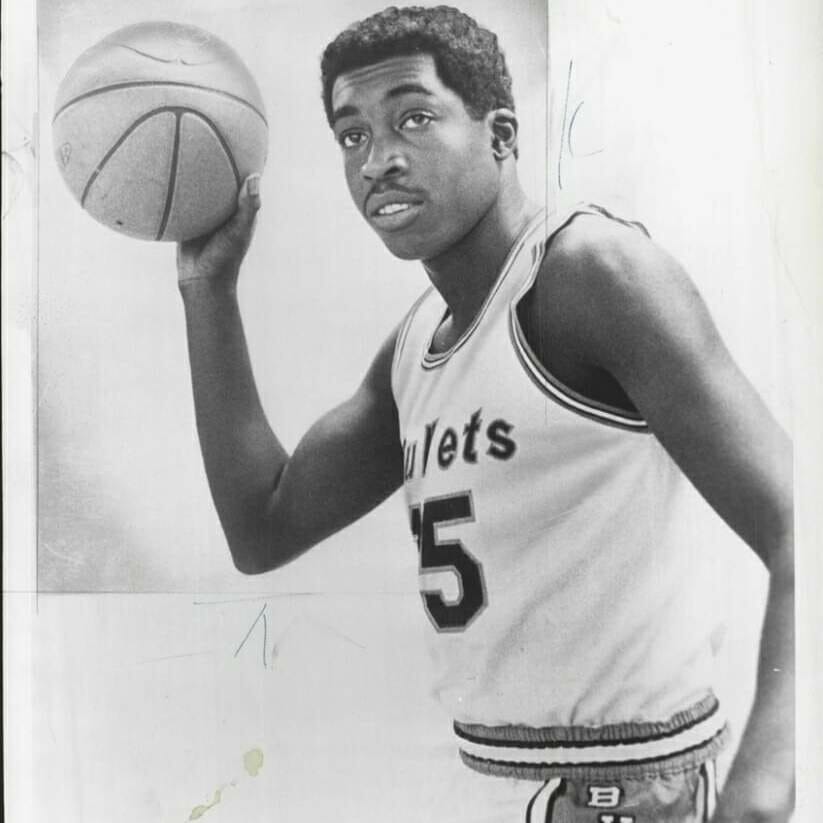
1967-68 team picture. He’s standing behind coach Gene Shue. Since numbers 10 and 33 are worn by others in the front row, I assume he’s wearing 15.
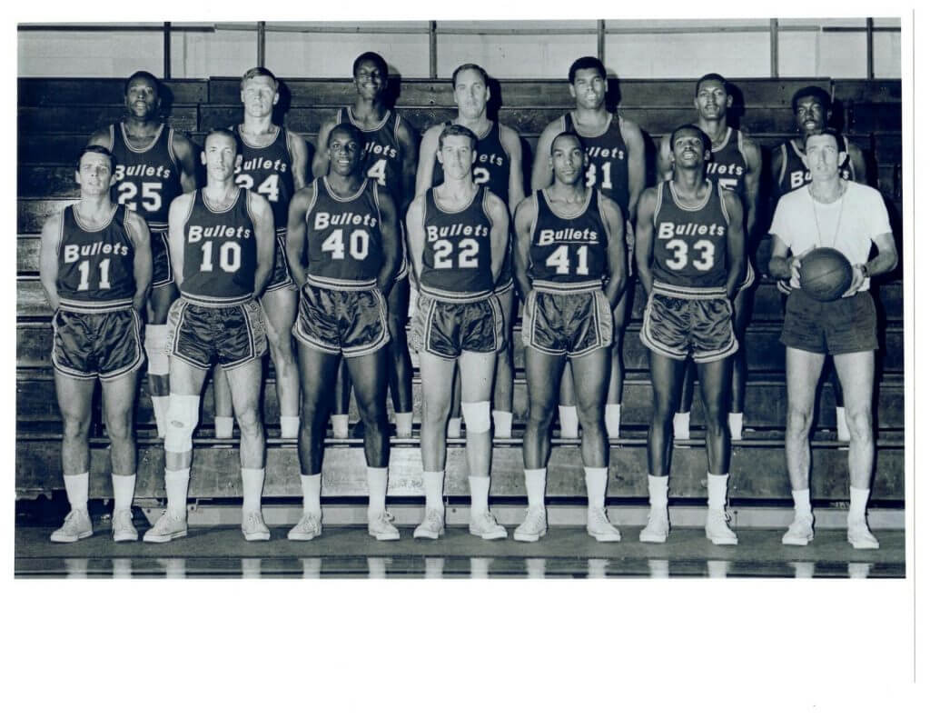
I was aware he wore #33 in his rookie year. Apparently, not for the entire season.

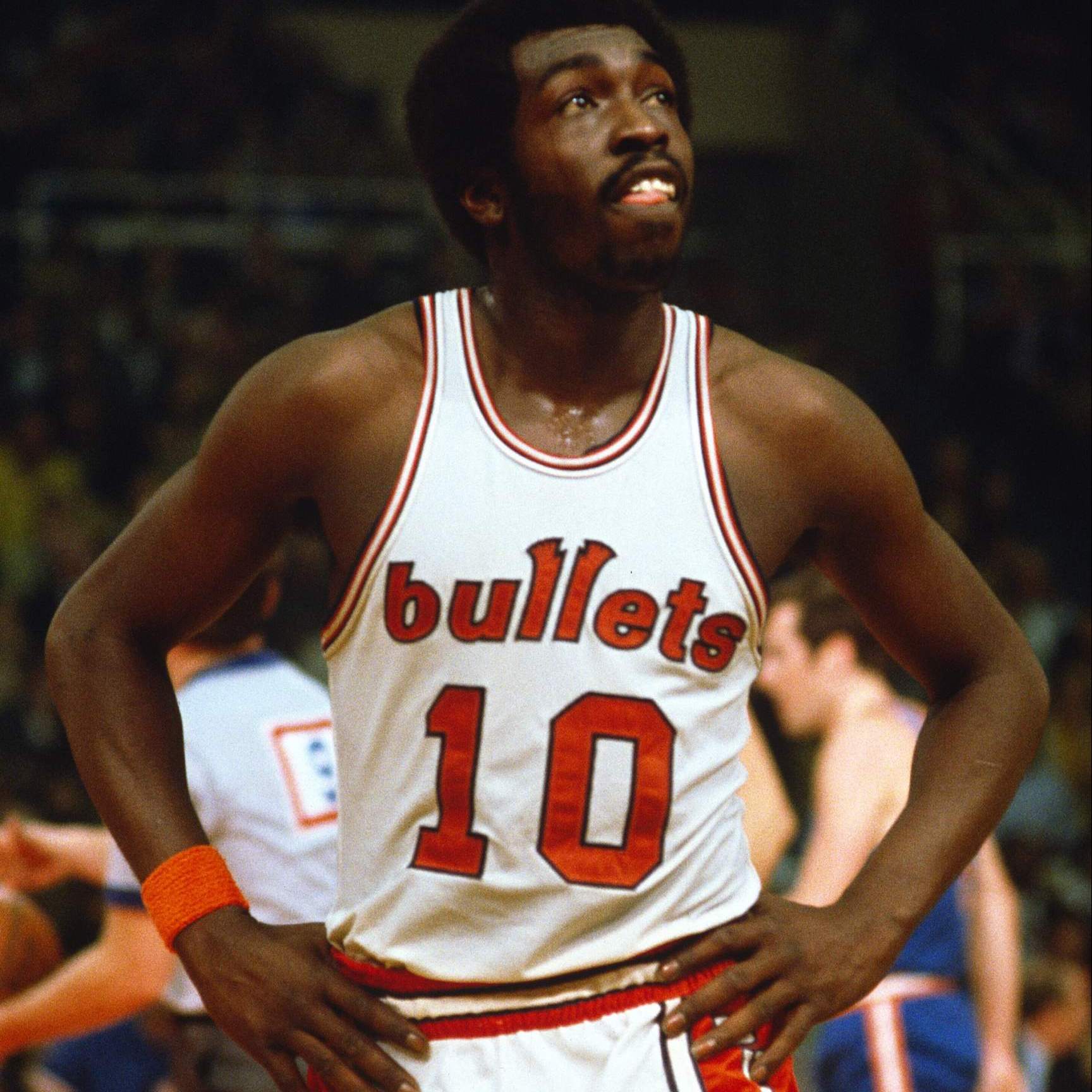
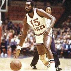
He wore #10 from 1968-71, which was retired by the Bullets/Wizards franchise. (those dark blue jerseys look black in some of the pictures)

I was told by a collector that he wore #14 a couple of times in 1968-69 because his regular jersey was lost during a road trip.
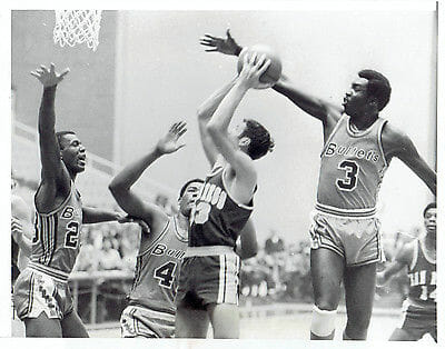
Don’t know why he’s wearing #3 at home. ( I assume it’s from 1968-69 because of Wes Unseld’s short hair and the B is upper case. They didn’t wear a white jersey that season)
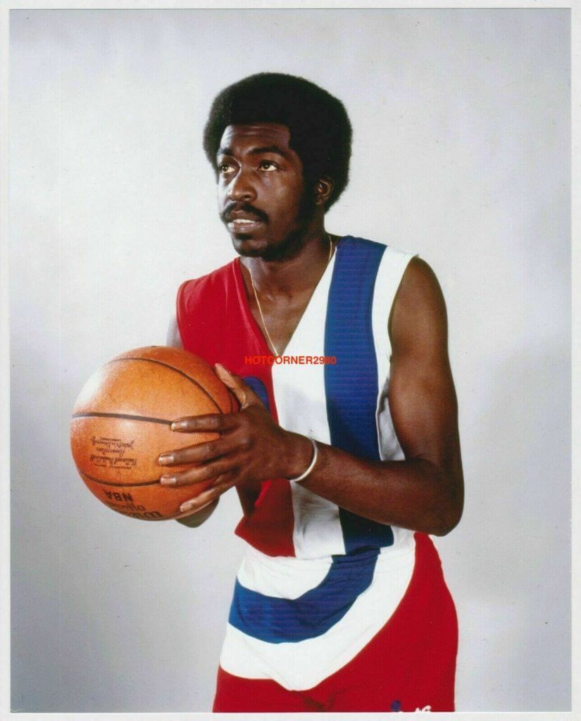
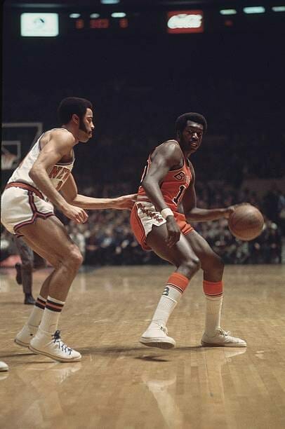
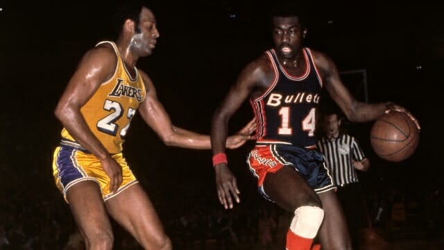
The aforementioned 1971-72 shot.

#33 in the photo with Red Holtzman when he was traded to the Knicks. (broke my heart) Don’t think he ever wore that in a game.
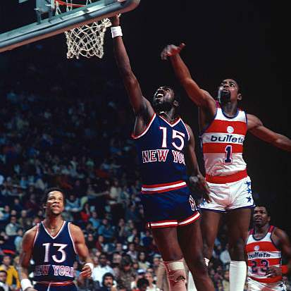
#15 retired by the Knicks.
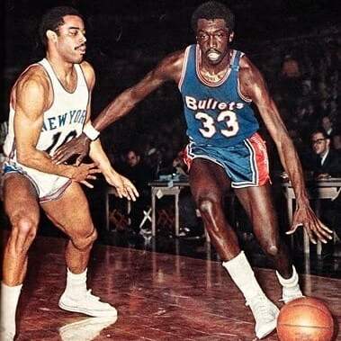
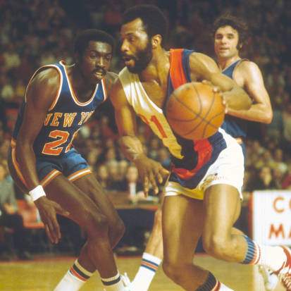
#21 against Archie Clark of the Bullets. Another lost jersey situation?
1979-80.
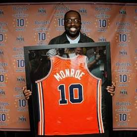
Picture 12 is from a Uni Watch entry by Mike Chamernik in March 2017.
In Pictures 3 and 6, he appears to be wearing a black mourning band.
Picture 8 shows those great B socks they wore from 1968 until 1970.
Hopefully these might be useful to you and/or Paul. I think I have the years right, but please feel free to make any corrections.
Uni Watch has been a welcome respite while I’ve been quarantined for almost a year. Thanks for that.
Cheers,
Dave Holland
Thanks, Dave!

Uni Concepts & Tweaks
Time for more Uni Tweaks from the UW readership.
I hope you guys like this feature and will want to continue to submit your concepts and tweaks to me. If you do, Shoot me an E-mail (Phil (dot) Hecken (at) gmail (dot) com).
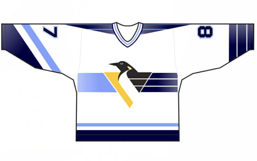
Today’s set of concepts come from Lukas Johnson, who has a tweak for the new Penguins “Reverse Retro” jersey:
He writes,
Hello Phil,
It’s been a while since I contributed anything that ended up featured on Uniwatch (ESPN Page 2 days) but have always enjoyed the site in its various incarnations. Anyway, a long time buddy of mine and I were disappointed in the Pens’ reverse retro design. I suggested it would have been a lot better to embrace the ridiculous robo-penguin gradient design from the 90’s. I figured, why not pull in the old shades of blue too and came up with the attached design. Enjoy!
Thank you,
Lukas Johnson
Thanks Lukas!
OK readers (and concepters). If you have some tweaks or concepts, shoot ’em my way with a brief description of your creation and I’ll run ’em here.
And now a few words from Paul Hi there. In case you missed it over the past couple of days, I’ve partnered with SportsLogos.net founder Chris Creamer to create a new podcast, called Unified. You can listen to the first episode, and subscribe to future installments, on Apple, Google, Stitcher, TuneIn, and Spotify, or just use the player below:
You can also check out the video version of the episode, which is on Chris’s YouTube channel:
You can also check out the show notes on the podcast’s new website, plus you can follow us on Twitter.
We should have the second episode next week, probably on Thursday.
Meanwhile, with this being Super Bowl weekend, don’t forget that the Uni Watch Pin Club’s February design has a SB theme, with the year 2021 rendered in Roman numerals:
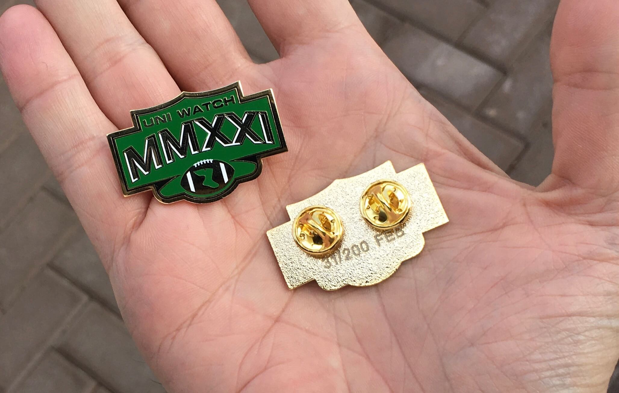
This is a numbered edition of 200 pins. They’re available here while supplies last.
Okay, that’s enough from me. Now back to Phil!
The Ticker
By Anthony Emerson

Baseball News: New Dodgers P Trevor Bauer announced his signing in a YouTube video, and included a shot of a Mets jersey. On Thursday some reports indicated that Bauer would sign with the Mets (from Josh Berger). … I think we’ve posted this before, but just in case: the Padres’ swinging friar logo wasn’t always swinging — the team occasionally used versions of him throwing, fielding and sliding (from @ItsDis). … MLB Pipeline posted a graphic of Pirates No. 1 prospect Nick Gonzales, and the photo of Gonzales they used showed him wearing a wrist band that reads “Get Shit Done.” Billy Ripken eat your heart out (from Michael Viola). … The independent Appalachian League has unveiled the logo and names of their newest expansion teams, the Pulaski River Turtles and Kingsport Axmen (from multiple readers). … The Savannah Bananas of the independent Coastal Plain League are holding a design-a-hat contest (from Chris Mitchel). … Indiana is going with red pinstripes this year (from @btownmoose).

NFL News: Chiefs S Tyrann Mathieu has a team-issued pullover with a captain’s patch. Do other teams do this? (from Cork Gaines). … Yesterday’s episode of Good Morning America had a very wrong helmet for the Bucs on their graphics package. They’ve never worn silver helmets! (from Beau Parsons).
College/High School Football News: The Tournament of Roses is suing the city of Pasadena, Ca., which owns the Rose Bowl, for licensing the “Rose Bowl” name to AT&T Stadium in Arlington, Tx. (from Kary Klismet).

Hockey News: Lightning G Andrei Vasilevsky appeared to have his pants stripe backwards during last night’s game. … Flames G David Rittich has some truly amazing ЯR pads (from Wade Heidt). … Flyers LW James van Riemsdyk’s ad decal became ripped during last night’s game against the Bruins (from Mark Morgan). … During last night’s game against the Canucks, Leafs RW William Nylander lost his stick during a zone entry, and after picking it up, attempted to use the wrong end of it to play the puck (from Mike Chamernik). … Quizno’s poked a little fun at the Hurricanes for similar logos last night (from Taylor Hood).

NBA News: New uniforms for the G League’s “Ignite” developmental team (from Kary Klismet). … A Bulls fan wore a pretty obviously fake Michael Jordan jersey to last night’s Bulls/Magic game, leading to some roasting from the announcers.

Grab Bag: The esports competition Overwatch League has cancelled its merchandise deal with Fanatics, and will allow teams to source their own merchandise (from John Cerone). … Wanna feel old? The developers of the Tomb Raider video game series are celebrating the franchise’s 25th anniversary, and have unveiled a logo marking the occasion (also from John Cerone). … The Charleston Post and Courier ran a piece critiquing The Citadel for having stringent uniform requirements for cadets on campus but having not so uniform sports uniforms (from Matthew Gladwell).
And finally… big (yuge) thanks to Timmy Brulia for that tremendous research on the uni history of the KC Chiefs (and Dallas Texans). If you enjoyed this (and I know you did), you’re going to really enjoy the uni history of the Tampa Bay Buccaneers (and all of their Bucco Bruce/creamsicle glory!), which we’ll have for you on Supe Sunday. Thanks also to Dave Holland for the deep dive into the Pearl’s uni/number machinations. Great rabbit hole stuff!
That’ll do it for today. Everyone have a great Saturday (or at least as good a Saturday as can be had) and I’ll be back with some more really really good stuff tomorrow. Till then…
Peace,
PH
The 2 nearest Quizno’s near me are on highway rest stops. Who knew?
Quiznos – the official restaurant of QAnon.
Good Lord, they still have Quizno’s?? I guess a Google search is in order.
I live in New Rochelle; the nearest one is in Newburgh. Hard pass.
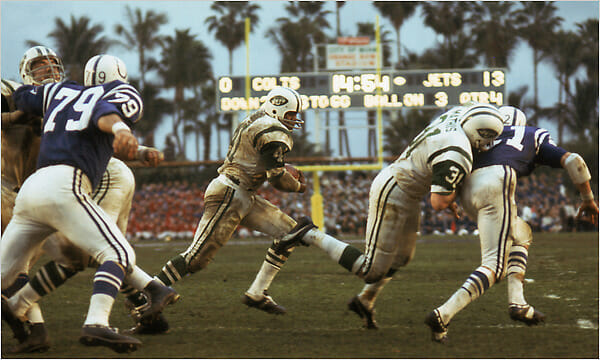
That was too easy. Scoreboard is from the Orange Bowl during Super Bowl III. And like Joe Willie Namath said, “I guarantee it”!! When I was part of Maryland Football we played U of Miami there in 1984. Down 31-0 at halftime, Frank Reich (now head coach of the Colts) led what at the time was the greatest comeback in NCAA history and we won 42-40. The Orange Bowl was an iconic venue. Now it is the home of Marlins Park. UGH.
” The Orange Bowl was an iconic venue.”
Indeed. I grew up a Big 8 fan. At that time, the Orange Bowl – the game not the stadium – was contractually affiliated with The Big 8. Once a year, I got to see a team, in whom I was at least somewhat invested, play a college football game at night! A night game I tells ya! This alone made the stadium an extraordinary place.
Passed by the site last week. It’s a shame for sure that they couldn’t have maintained the old place.
The Earl Monroe deep dive was really great. Uni-Watch readers (myself included at times) really know how to dig in. Nice that we have this space to share!
I didn’t realize he hung on long enough to wear the Best Knicks Unis Ever (the ’79-’80 version).
Thanks for sharing this deep dive!
I don’t think I ever saw that uniform on anything other than those Topps basketball cards! Great stuff!
I guess you are entitled to your opinion. In my opinion, these are right up the with the Best Unis Ever in ANY sport:
link
WOW! I thought I was the only person who liked those dark blue+brick red uniforms. Certainly one of the Top Three numeral fonts in NBA history. The detail in the player names was unique.
I have very few hard fast rules when it comes to unis, but here’s one: KC should always wear red pants with white jerseys.
Bring back the big helmet logo. I don’t like that they keep shrinking it.
Love the ‘5 tool friar’. The Padres are missing an opportunity by not using him more.
I’ve messed around with variations of the gradient Robopen design, including using blues, though I’ve never posted them anywhere. But it’s good to see someone else have the same idea.
Lukas Johnson, you get an I’d Wear That from me, if that means anything. Good work.
I always look forward to the UW uniform histories of the teams playing in the Super Bowl, even if I’m not all that interested in the game- great work Timmy and Phil!
I like that GUD renders the ‘74-‘82 Chiefs helmets with Dungard face masks.
Thanks for the KC uni write-up. I’ve come to realize I don’t like them in all white for some unknown reason. Was the Texas outline helmet the first time a state has been outlined on a helmet? I’m glad they’ve barely changed since day one. It really is a great uniform.
I’m not understanding what was wrong about the Bulls fan. Looked like fashion merchandise to me.
I hope someone uses a hammock in that Savannah cap contest.
The Bulls uniform wasn’t spot-on, but I’ve seen worse. The vertical arching was actually nicely detailed.
I don’t think you can go by that picture of the old Texans helmet- it appears to be an oil painting of a photo. I also think that might be a glue residue around the decal, not an outline anyway.
There was a time in the early to mid 1970s when the Chiefs’ jersey numbers were smaller than was usually the case for NFL teams.
as seen in that 1974 photo above.
Leon Spinks…a champion of champions.
The Dallas Texans logo on their helmet appears to have been outlined in a thin dark red color, not black, when viewed on closeup.