By Phil Hecken
Follow @PhilHecken
Good Sunday Morning, everyone — hope everyone had a good Saturday, and you’re still staying safe.
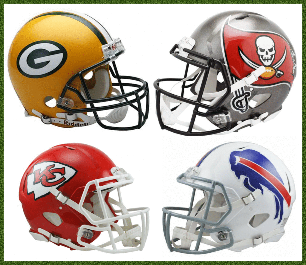
While the Supe gets all the headlines (and rightfully so, as it determines the NFL Champion), my favorite pro football weekend is always the NFC and AFC Championship games. It’s largely free of the hype, the pomp and circumstance — even in a COVID world, there will still be SB pomp — and all about the final step to reaching the big game. Two huge games on one Sunday afternoon. And this year we should have two great looking Conference Championships, and, if the Packers and Chiefs (today’s home teams and favorites) win, a rematch of Super Bowl I, with those teams wearing almost identical uniforms to the ones they wore 55 years ago. To wit:
Yes, I made that graphic a couple weeks ago, hoping we’d get to see a Pack/Chiefs rematch (and I still do). We’re still a ways away from that (last year both the Pack and Chiefs played in the NFC and AFC championships, but only the Chiefs made it to the Supe), but that was then. The Packers were also not the home team or favorites. This year, they are the favorites and NFC #1 seed, as are the Chiefs over in the AFC.
For those of you who are weekend readers, you know I tried to predict the playoff winners by “better uni” — and after a dreadful Wild Card weekend where I went 1-4-1, I correctly picked every game last weekend (4-0). Let’s do this one more time, for all the marbles…
NFC CHAMPIONSHIP
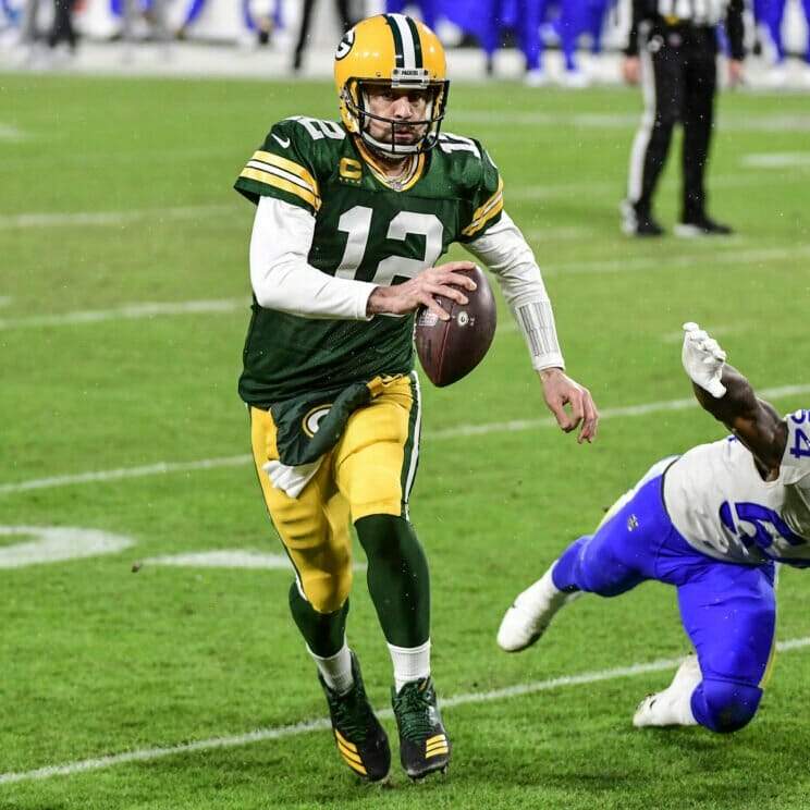
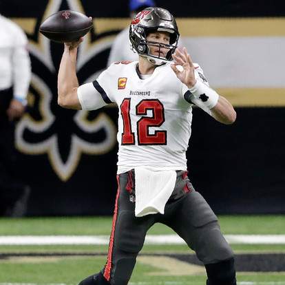
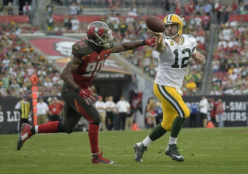
Green Bay Packers vs. Tampa Bay Buccaneers
3:05 pm; FOX
Packers are 3.5 point favorites
As I said last weekend, the Packers’ home green and gold uniforms are my favorite in the NFL, so no matter who they are playing or what they wear, I’d take the Pack. And against the Bucs — who are going pewter/white/pewter again this week — it’s no contest. Now, earlier this season, the Packers played the Bucs (in Tampa) and both teams wore the the same uniform combos they’ll wear today. The “better uni” was not triumphant back then, with the Bucs trouncing the Pack 38-10. I’m hoping the uni gods get it correct today.
Both games (Pack/Bucs and Chiefs/Bills) will feature uni-symmetry, of a sort: in the first game, both teams’ helmets match their pants, while in the second game, both teams will feature same color helmets and jerseys. With very few exceptions, I like it when team uniforms match either pants or jerseys with helmets. When both teams match either pants (Pack/Bucs) or jerseys (Bills/Chiefs) in the same matchup, I like it even more.
I’m taking the Pack, in what could be a cold, windy and possibly inclement (snow/sleet) weather game.
The Pick: Packers -3.5
AFC CHAMPIONSHIP
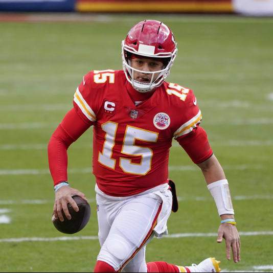
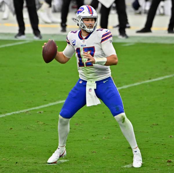
Kansas City Chiefs vs. Buffalo Bills
6:40 pm; CBS
Chiefs are a 2.5 point favorite
Unlike the first game, this is a much tougher call. “Better uni” is obviously mostly one’s opinion, and while the Chiefs red/red/white is an all time classic, that doesn’t mean it has always resonated with me. If it were the Chiefs in road unis (red/white/red), I’d be much more inclined to pick them. Conversely, I much prefer the Bills in their home (white/blue/white) unis to their white/white/blue roads. The one saving grace for the Bills is they are choosing to wear white socks, which looks a bazillion times better than when they wear blue socks, giving them the leotard effect. Don’t get me wrong — both uniforms we’ll see today are still great — it just could look even better. It’s not quite a coin flip, but I’m giving the slight uni-edge to the Chiefs.
The Pick: Chiefs -2.5
Historically, these teams have played each other a number of times (in fact, until realignment moved the Bucs to the NFC South, we would see the “Battle of the Bays” twice a season for a few decades), and the Chiefs and Bills entered the AFL together in 1960. Thanks to the fantastic Gridiron Uniform Database, we can see all the uni matchups over the years between the Packers & Buccaneers and Chiefs & Bills. There have been some good looking and some not-so-good looking games between the teams. Here’s (IMO) the best and worst of each:
WORST PACK/BUCS MATCHUP
Fortunately, the Bucs only once wore their red/pewter alarm clock uniforms against the Pack, and that was without doubt, the worst looking matchup between the two teams. As far as best…
BEST PACK/BUCS MATCHUP
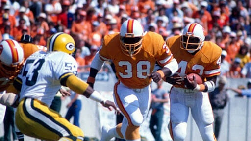
There are any number of games you could select, back when the Bucs wore their creamsicle uniforms. I picked one where the Bucs wore their orange home jerseys (many times at home they wore white jerseys), as it is a great color palate special. Even though I prefer the Pack in green jerseys, their gold/white/gold vs. the white/orange/white of the Bucs was dee-vine! Here’s hoping the “one shell rule” is abolished so we can see the Bucs back in those colors again.
WORST CHIEFS/BILLS MATCHUP
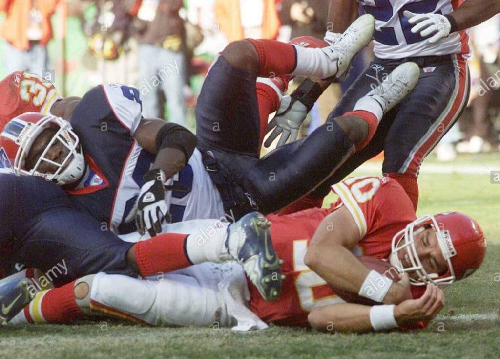
Ugh. The Bills actually wore that wretched uniform set from 2002 through 2010. And while their mono-blue combo was probably their worst, when they went white/blue (with a red helmet), it was pretty awful. People forget how bad those old Bills uniforms were, with their red/navy yokes, royal numbers and giant red side panels, but they were pretty awful. Once they came to their senses in 2011, wearing their current fauxbacks, they instantly became a top 10 uniform team again.
BEST CHIEFS/BILLS MATCHUP
There are probably a number to choose from, but any time the Bills go white/blue/white against the Chiefs in red/white/red, we have a fantastic looking matchup.
So there you have it: two games today (the best pro football Sunday there is), and both will be good looking games, which from a Uni Watching perspective, is really all that matters. And if the uni gods have their say, we’ll see the Pack & Chiefs emerge victorious, setting up a Supe rematch 55 years in the making.


Uni Concepts & Tweaks
Time for more Uni Tweaks from the UW readership.
I hope you guys like this feature and will want to continue to submit your concepts and tweaks to me. If you do, Shoot me an E-mail (Phil (dot) Hecken (at) gmail (dot) com).
Today’s set of concepts come from Adam Ross, who has a Detroit Pistons rebrand. This was originally sent to Paul, who offered it to me for the “Tweaks” section.
He writes,
HI hope you and your family have stayed safe and sound during this crazy year. It’s been awhile since I wrote you (via different email), but one thing hasn’t changed: my desire to rebrand the Detroit Pistons. I started this project the 3rd of January [of 2020] after I got laid off on NYE morning in a text (smh)…many, many hours later, it’s finished.
Collaborated with @eastthirdstudio; he forged the logo/colors, I focused on the jerseys. Would love your thoughts and criticisms.
• City Edition
• Icon
• Association
• Statement (red)
• Statement II (navy)
• EarnedCheers, and a Happy Holidays to you and yours!
Adam Ross
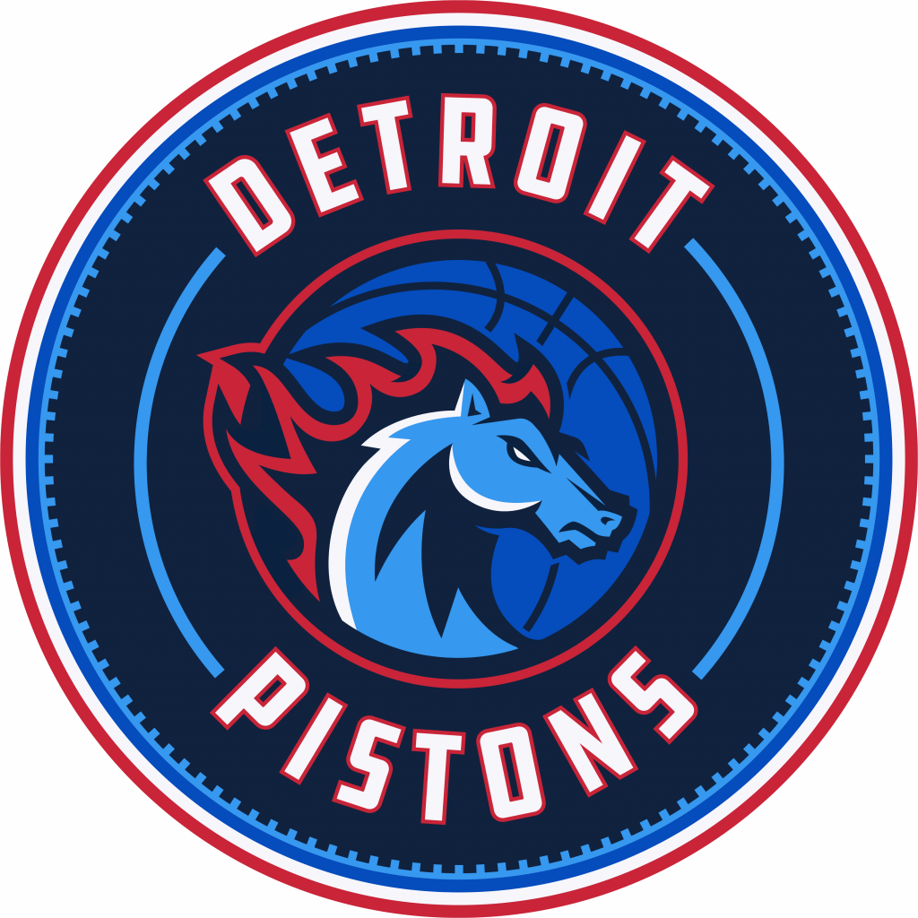
LOGO:
ICON:
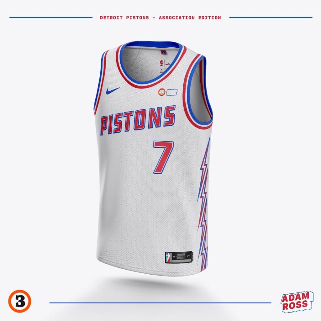
ASSOCIATION:
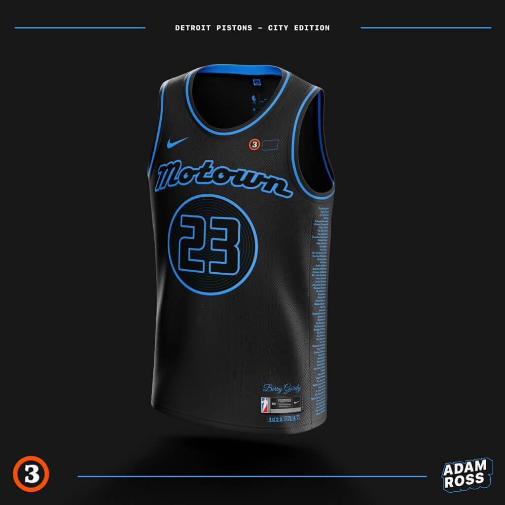
CITY:
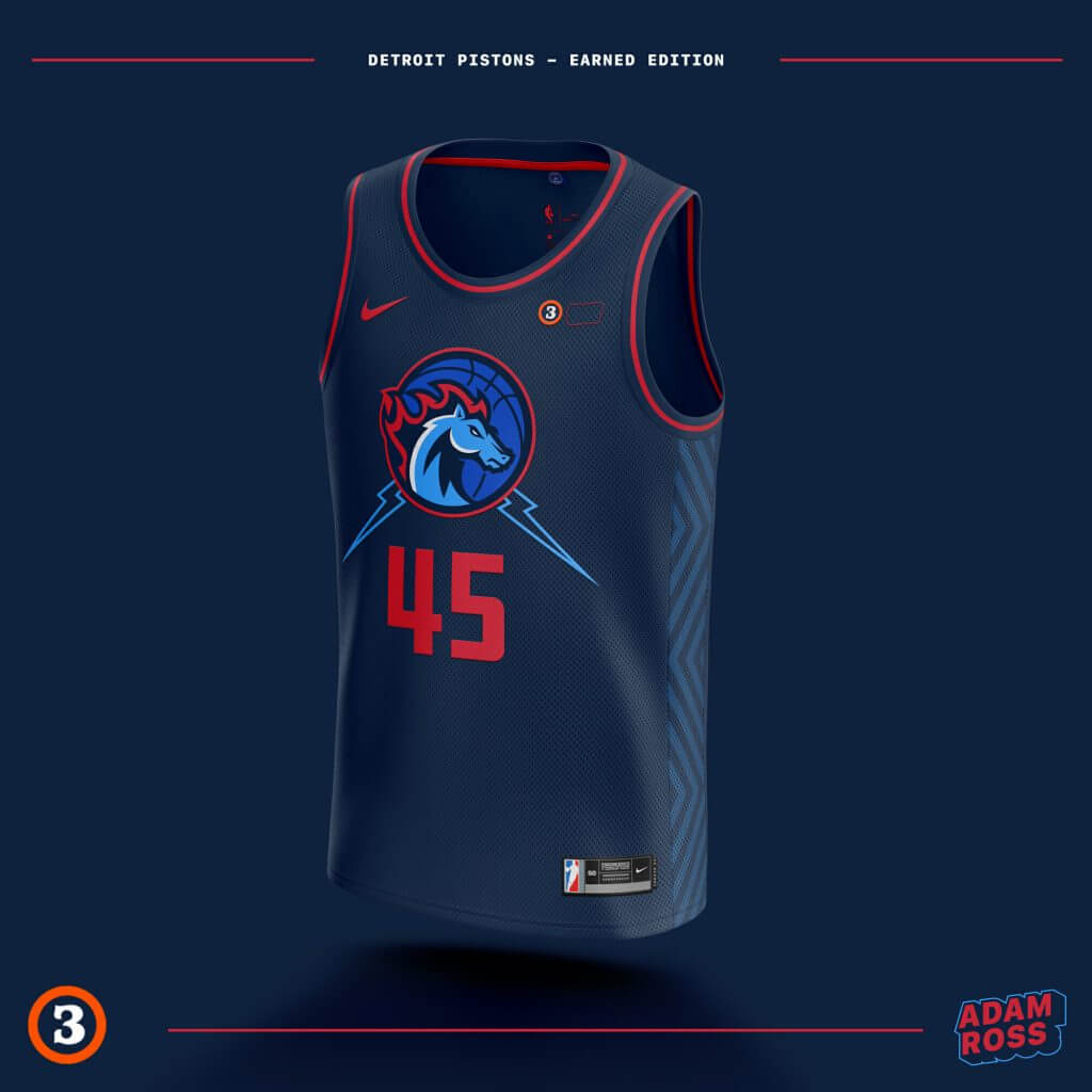
EARNED:
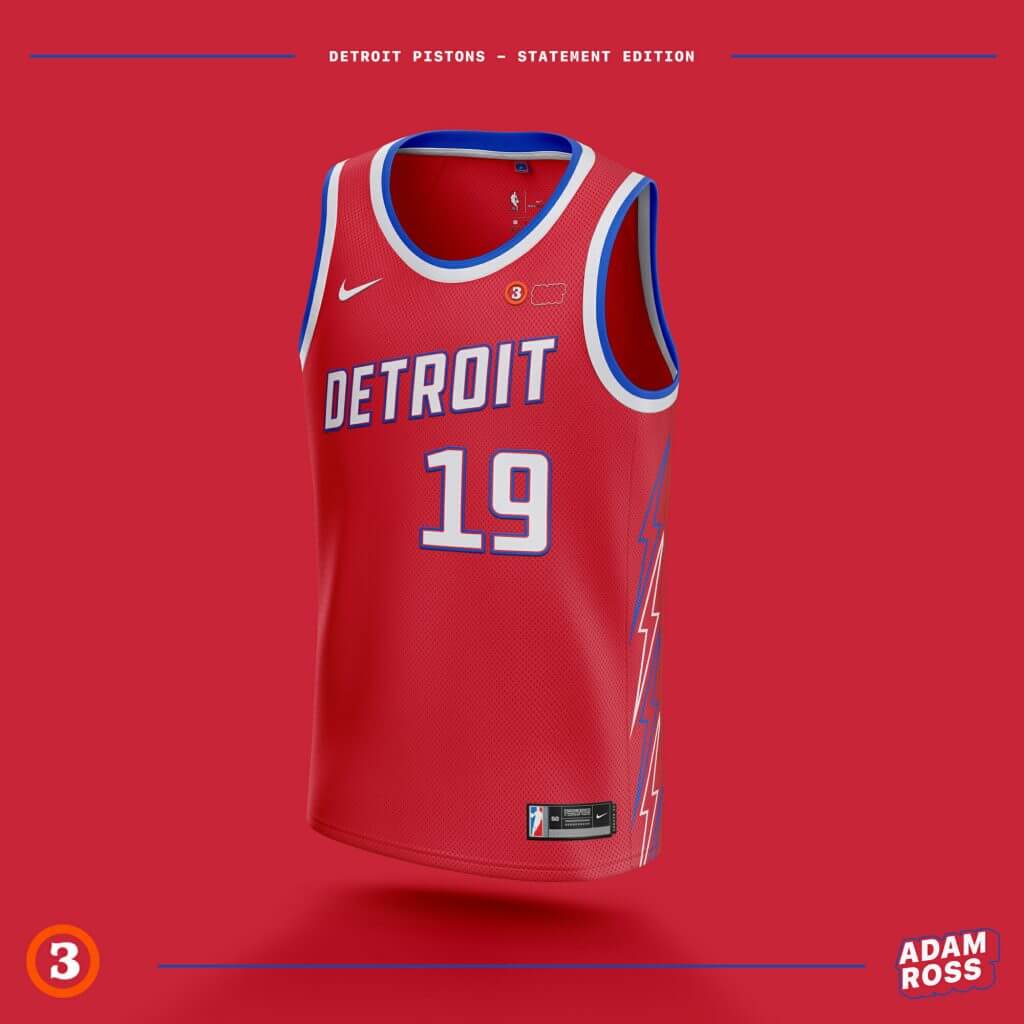
STATEMENT (red):
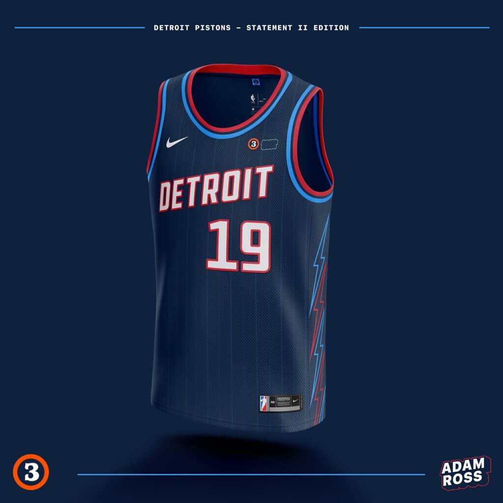
STATEMENT (blue):
Thanks Adam!
OK readers (and concepters). If you have some tweaks or concepts, shoot ’em my way with a brief description of your creation and I’ll run ’em here.

Guess The Game…
from the scoreboard
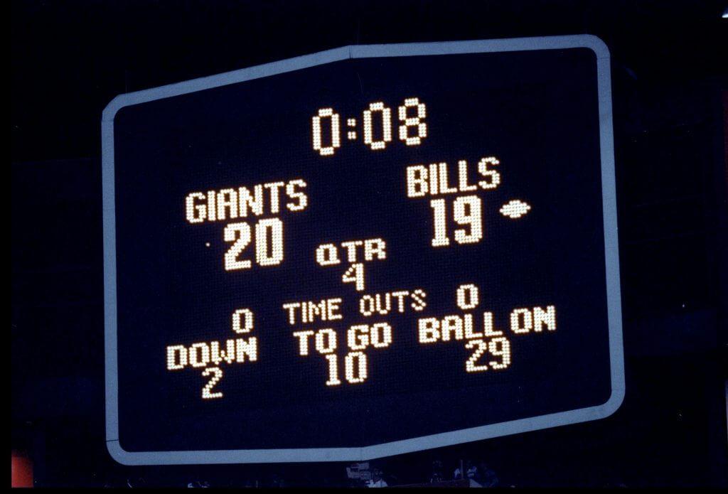
Today’s scoreboard comes from Not Scott Norwood.
The premise of the game (GTGFTS) is simple: I’ll post a scoreboard and you guys simply identify the game depicted. In the past, I don’t know if I’ve ever completely stumped you (some are easier than others).
Here’s the Scoreboard. In the comments below, try to identify the game (date & location, as well as final score). If anything noteworthy occurred during the game, please add that in (and if you were AT the game, well bonus points for you!):
Please continue sending these in! You’re welcome to send me any scoreboard photos (with answers please), and I’ll keep running them.
Click to enlarge
Magnets back in stock: Paul here. I’ve procured another small supply of winged stirrup magnets (but not the round ones, sorry). They measure about 3″ x 3″, and they’re thin and flexible, so they’ll conform to curved surfaces as well as flat ones.
I have a very limited supply of these. They’re available here.
Too Good For The Ticker
Got the following note and pics from Scott Wilkinson, and it’s simply too good for the ticker:
Hey fellas,
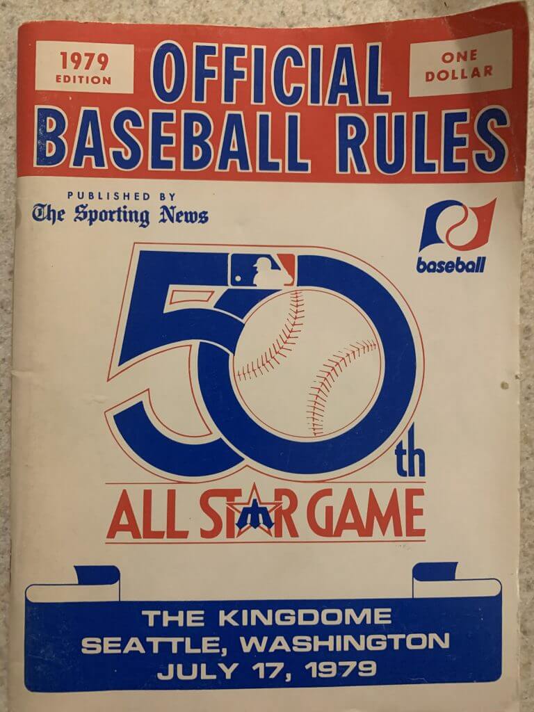
I’m not sure if you’re interested but I came across this awesome (in my opinion) baseball find. My dad passed away and left some great sports items for me. This is the 1979 “Official Baseball Rules” book.
A couple of things that struck me:
1) I see the MLB official logo in the ASG logo. I’ve never seen that “baseball” logo, though. I’m sure you guys as aficionados are familiar with this logo but some backstory would be cool.
2) I love the way they placed the Mariners “M” in the star of the 50th all star game logo. The early days of creativity like this?
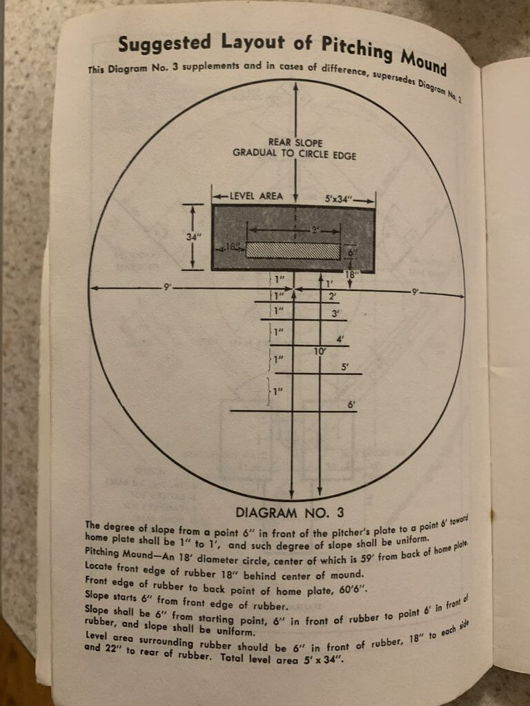
I’ve also included some pics from the inside. I like the Kuhn commissioner pic but my favorite is the recommended dimensions of the dirt for the pitchers mound!
Maybe you can use this.
Thanks for all you do and I love reading Uni Watch every day!!
Scott Wilkinson
Thanks Scott. And those photos? Check these out:

OK, now on to the ticker!
Uni Watch News Ticker
By Phil

Baseball News: The Atlanta Braves have resisted a name change for many years, but Henry Aaron’s death has renewed calls for a change to ‘the Hammers’ (Washington Post link). From David Goodfriend. … The Cleveland baseball team has been granted an extension of time to file an opposition with the Trademark Trial and Appeal Board for applications for Cleveland Guardians, Cleveland Warriors, Cleveland Natives, and Cleveland Foresters.

Football News: For the NFC Championship game today, Leonard Fournette of the Tampa Bay Buccaneers have the name “Jordan Davis” written on the back of his helmet to bring awareness to Jordan’s story. … Anyone ever hear of the Tonawanda Kardex? They were a real team and are currently a real Retro Bowl team in the RBA, managed by one of the true OGs of the community, SKOL! (from OC Ospreys). … Could royal blue helmets be in BYU’s future?

Hockey News: “A couple of pieces of information I found from Goalie Gear Nerd which I would like to pass along for the Ticker,” writes Wade Heidt. “Canadiens G Carey Price has a second new mask. He has been wearing it here at practice in Vancouver as the Canadiens have been in town for a series.” Also, The Devils just acquired Aaron Dell from the Maple Leafs. Check out his new Devils pads. … Also from Wade, the Dallas Stars raise 2020 Western Conference Championship banner. “There was a delayed start to the season for the Stars due to COVID issues but they have now hit the ice. Here is the 2020 Western Conference Championship banner they raised to the rafters on Friday night.” … It’s not quite approaching NBA ridiculousness, but this season the St. Louis Blues will have five different uniforms at their disposal. … I loves me some color vs. color in hockey, but this green vs sky blue in the NWHL last night wasn’t necessarily the best combo (from L.J. Sparvero). … Last night Corey Perry made his Montreal Canadiens debut. He wore 94, as the number 10 he wore in Anaheim & Dallas is retired in Montreal for Guy Lafleur. Perry also briefly wore 61 in Anaheim to begin his career (from James Beattie).


NBA/College/Basketball News: The Ole Miss men’s basketball program celebrated the 20th anniversary of their run to the NCAA Sweet 16 in 2001 by wearing throwback uniforms during Saturday’s game against Texas A&M. … Check out this big dunk in a high school game (presumably), which brings down the entire basket support, which was suspended from the ceiling (from Mike Chamernik). … Also from Mike, here’s a new one (to me anyway): Glare from the sun delayed an afternoon game between Providence and Villanova. … One more from Mike: 76ers C Dwight Howard suffered a major tear to his shorts while jostling with Pistons F Josh Jackson for a rebound during last night’s game. … The Score has deemed the Toronto Raptors throwback uni the “NBA’s Finest”. … Security “hilariously” stopped Bam Adebayo from swapping jerseys with Kyrie Irving after last night’s Heat vs. Nets game.

Soccer News: The backlash against the rebranding of Montreal’s Major League Soccer franchise continues. And now, it seems, the club has caused a rift with one of its most-devoted base of supporters (from Wade Heidt. … Yan Dhanda of Swansea City was wearing a mask in an FA Cup match vs. Nottingham Forest. Here’s a bit more on that (From Terry Mark). … Looks like a new shirt for Kawasaki Frontale (from Ed Żelaski). … Here’s the Yokohama F.Marinos 2021 look (from Jeremy Brahm). … There’s a new centennial badge for Raków Częstochowa (from Ed Żelaski). … More from Ed: a closer look at the Tokyo Verdy 2021 kit, and the Oita Trinita 2021 shirts.

Grab Bag: The Bryan (TX) Police Department has designed new badges to honor its 150th year of service to community. The commemorative badges display the seal of the State of Texas w/ an eagle & American Flag (from Timmy Donahue). … Here’s how Tokyo Verdy will look across all of its teams in 2021 (from Jeremy Brahm). … An official at University of Sioux Falls says Sen. Marco Rubio got ahold of their hat/T-shirt due to a laundry mixup at the Senate gym. Rubio has appeared publicly several times wearing USF Cougars gear (from our own Alex Hider). … “I was making dinner for my family this evening and noticed the packing for Trader Joe’s garlic naan had an aesthetically pleasure Uni Watch colored stripe pattern,” writes Edwin (aka “Squatchee on Top”). “I had to pass it along to UWHQ.”
And finally… that’s it for me this weekend. Everyone enjoy the conference championships today (Go Pack & Chiefs!), or whatever other sports or non-sports you may wish to watch or partake in (if you partake, make sure to be safe!).
Catch you guys back here next weekend. Everyone have a good week!
Peace,
PH
I might be wrong, but the Bucs helmet in the header looks like a mash-up. The logo (I think) is the ridiculously oversized one they wore with the alarm clock uni set. It looks way bigger than what they wore on the field this year. But the facemask is black. The alarm clock set had a chrome facemask.
Superbowl XXV. Tampa Bay. Final Score same after Bills missed last second FG.
Scoreboard is from Super Bowl 25
Scoreboard is from SuperBowl XXV, and yes, I was there, having won tickets from Wilson sporting goods.
The official Baseball Rules book was interesting. Bowie Kuhn minus his glasses and with some hair that was not usually in evidence. Looks like an actor’s head shot.
I don’t know the history of the little wavy-flag “baseball” logo but hopefully someone here does. I seem to remember them using it on trophies back in the 70s/80s.
The logo used to be on the outfield wall at Three Rivers Stadium during the late 70s.
GTGFTS….Super Bowl XXV. Scott Norwood is wide right by 3 inches.
I never know these!
Thanks for the Pistons rebrand designs, they all incorporate some level of historical attributes (except of course the all black). The 90’s horse is and always has been a disconnect for me, can do without that. Thanks for leaving out the teal!
I can’t stand the Pistons, but I’d dislike them a little less if they wore these. Nice work.
The soccer team is called Swansea City, nicknamed Swans. The Swans Official moniker as stated in the soccer section must be the team or persons IG or internet address.
They’re having a good season, on track for promotion back to the Premier League.
Thanks. Fixed.
Super Bowl 25 was also the setting for one of the most famous national anthem’s ever, sung by Whitney Houston. The air war for Desert Storm had begun and I was on active duty in the Air Force at the time so this was a very memorable time for me.
Thank you for your service, Greg!
Was thinking about the St. Louis Blues and their 5 jerseys. You can call them the Blues indeed. They have 3 blue jerseys that are all differing shades of blue. If you count the navy trim on the primary uniforms, the Blues are wearing 4 different shades of blue this year.
The scoreboard is from the infamous Scott Norwood missed field goal in Super Bowl 25 in Tampa Stadium (big Sombrero). And that was the final score due to the missed FG.
Pistons redesign looks really good. Not sure about the Motown jersey but everything else is fantastic
Shame there’s no shorts, though.
The best looking Bucs/Pack game? Dec. 1, 1985.
link
I generally prefer solid white as opposed to a team with a white helmet using non-white pants. Something about pants being darker than then helmets just makes the uniforms seem off balance. Perhaps it is because in football the helmet and jersey are greater in the uniform hierarchy than the pants, so a team wearing darker pants (especially white helmet, white jersey, color pants) draws your eyes to the pants in a strange way.
Also why I think white jersey and white pants work regardless of the helmet color, while matching dark jersey and dark pants look awful if the helmet color is lighter. Further a true full (non white) mono (helmet, jersey, and pants) looks bad, but better than a non-white mono that has a contrasting helmet.
Actually, I normally don’t like head to toe white in a snow game. But the orange numbers and striping really popped that day.
With white helmeted teams, I don’t have a consistent preference.
Colts? Head to toe white (but I have to say I didn’t dislike the blue pants).
Nebraska? Red pants on the road. Always.
Bills? Blue pants (but I don’t dislike the white pants).
Dolphins? Head to toe.
Chargers? Gold pants. Always.
The Atlanta Braves have resisted a name change for many years, but Henry Aaron’s death has renewed calls for a change to ‘the Hammers’
Yes. That’s a MUCH better idea than retiring his number league-wide. And you easily could swap out a tomahawk with a hammer on the jersey.
Cleveland Guardians, Cleveland Warriors, Cleveland Natives, and Cleveland Foresters.
No, no, no and no. They’d be better off with Cleveland Baseball Team.
I think “Guardians” is popular because they get to keep the last five letters of “Indians”. Rolls off the tongue well, in spite of lacking a definitive visual.
Can’t believe “Warriors” and “Natives” are even being considered.
First I’ve heard of “Hammers”. I like it.
“Guardians” may also be popular due to the Guardians of Traffic, large Art Deco statues carved into the Lorain-Carnegie bridge.
Oh, for Pete’s sake: The Cleveland Cowboys. It’s been staring us in the face all along!
I’d agree that the white/blue/white vs red/white/red Bills vs Chiefs matchup is ideal and beautiful from a uniform perspective. Good symmetry in design and also great color contrast. That said, I’ve always believed the Bills signature look is with a red helmet. That was their look during their dominant (though always just short) run in the 1990s, plus it is distinct. As nice as the white helmets may be, when I see a white/blue/white team I always think Colts.
In reviewing the Tampa v. Green Bay matchups, I recall their 1989 Week 1 game at Lambeau. If I remember correctly, the Pack chose white to force Tampa into their orange jerseys with the belief it would confound Bucs quarterback Vinny Testaverde with his alleged colorblindness. Turns out Testaverde was not colorblind, he just threw a lot of interceptions. Tampa had the last day as they won the game. Testaverde did not throw an interception that day.It was the first time since 1946 that the Packers wore white at Green Bay. Funny enough they wore white again the next week at home, but this time they won, beating New Orleans.
”Tampa had the last DAY as they won the game.”
Did you mean LAUGH?
The best Buffalo Bills uniform has to be pre-1974, before they changed the helmet logo to a buffalo with a ridiculous racing stripe on its side.
One could argue that it makes no sense for a team called the Bills to have a buffalo (or is it a bison?) on their helmet at all. They are, after all, not the Buffalo Buffaloes.
Every team from Buffalo uses the bison as a mascot. It’s almost an article of faith, and occurs no matter what the teams’ names are.
Kansas City beat Buffalo 31-7 in the 1966 AFL Championship Game to get to Super Bowl 1. The only team that’s missing today from that seasons’ Final Four is the Cowboys.
My sister was born with a club foot so I find the efforts of the Montreal Impact to rebrand themselves tin-eared and hilarious.
Finally, I get the valuable bonus points for having been at a “Guess the Scoreboard” game! (My father had Bucs season tickets and got the opportunity to buy tickets to Super Bowl XXV via a lottery.) The hologram on the ticket didn’t show up at all in this scan: link
There’s no need for a team to have 6 different jerseys. I’ll work towards 3 max. Light colored, dark colored and some type of throwback.
Super Bowl 25, in Tampa. Just before Norwood’s miss. Bonus- I was there!!
Unbelievable security, due to Desert Storm – couldn’t even take a camera into the stadium!
The Blues now join the LA Kings and San Jose Sharks who both will wear 5 uniforms this season. Kings have home, road, silver (Saturdays), RR, and “heritage” (Chevy logo) while the Sharks have home, road, alternate black, RR, and 30th anniversary.
For each of the 3, one of the alternate uniforms an upgrade to their primary home uniform. Sharks 30th anniversary. Blues heritage uniform. King RR (put them back in purple and yellow fulltime anytime). Plus King heritage white jersey better than regular whites.
I dun’know, if you are giving that underrated Bills road uniform two and the hook, it covers easily against an over rated home team from Kansas City. Call your corner uniform entrepreneur, I’m sensing an outright win for a bills road look in the bowl.
Yeah, I had some problems with that one. Like I said it was close. Once the Pack blew it, I regretted not taking da Bills. The KC pick was really contingent upon GB covering.
The surviving members of Super Bowl 4 can open the champagne bottle…for at least another year they’re still hold the title of Best Looking Super Bowl matchup.
*they
You are under-rating SB XLI:
link
A Top Ten matchup. Not quite Top Five though.
What tool thought Atlanta Hammers would be a good name for the Braves?
You would think someone would have developed a “wrap” to go over a helmet to change the colors by now.
Or maybe they could paint the helmets for a game, then change it back?
Nice joke. Maybe this guy might like it: link
Or M.C. Hammer.