Click to enlarge
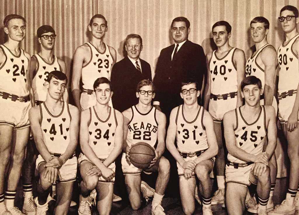
Derek Perras, who tweets as @retro_70s, has been posting some great high school basketball photos lately, including this fantastic photo of the 1967-68 Sacred Heart team from Syracuse, N.Y. Love those heart-trimmed jerseys!
You say you want to see that uni in color? Here you go:
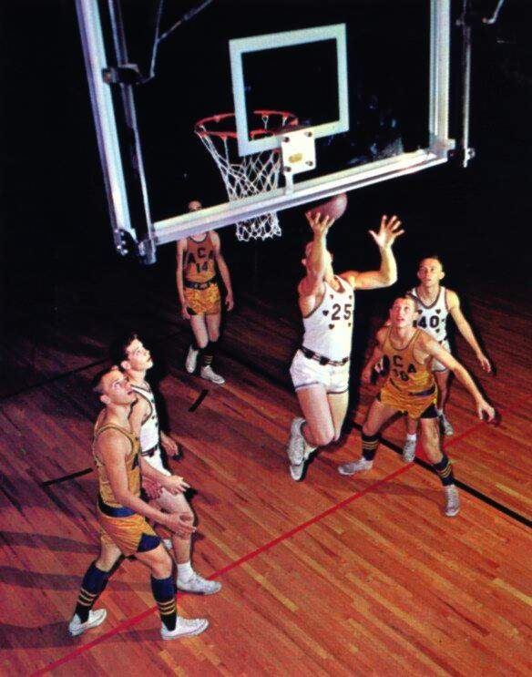
Note that the opposing team is wearing stirrups, but without the usual white crew socks over them!
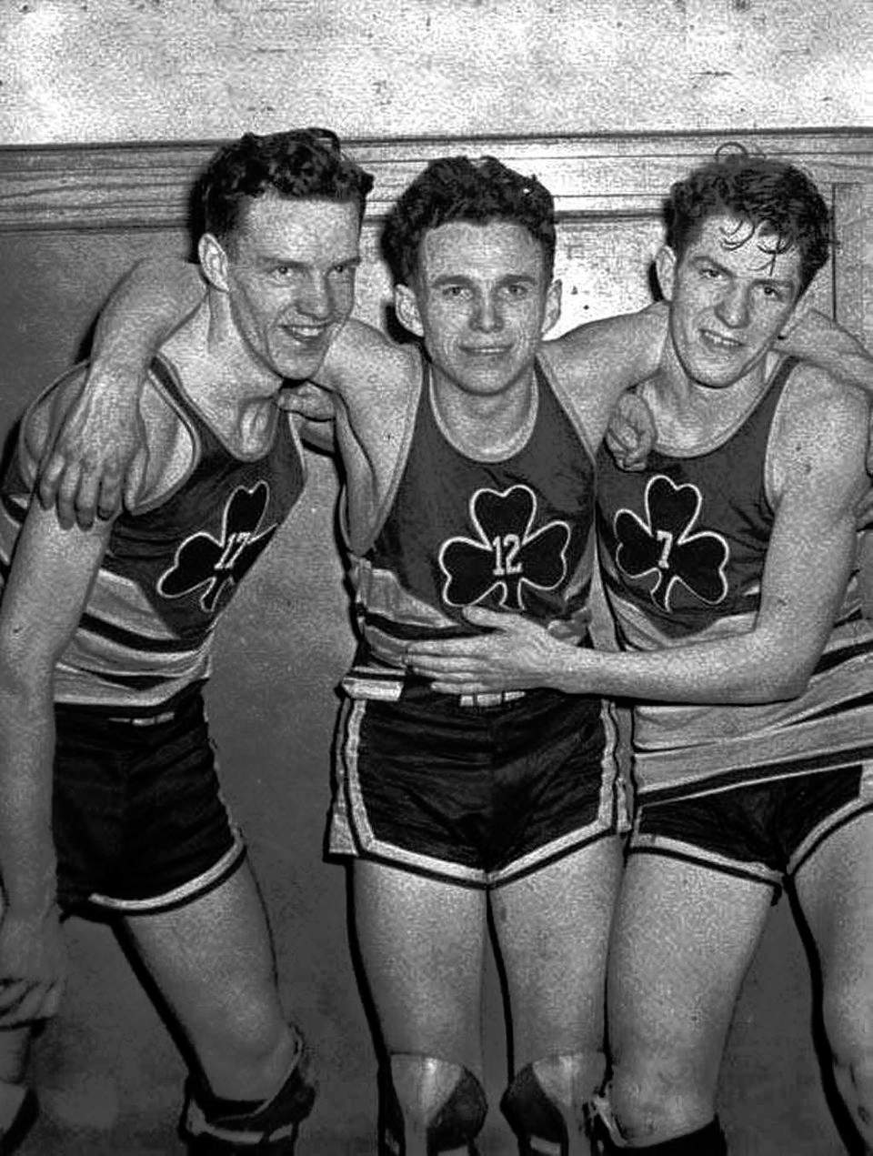
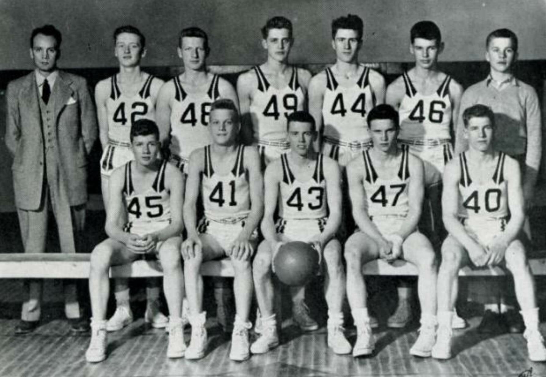
One of Sacred Heart’s main rivals was St. Patrick’s, who wore this fantastic uniform in 1942 (click to enlarge):
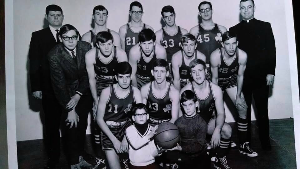
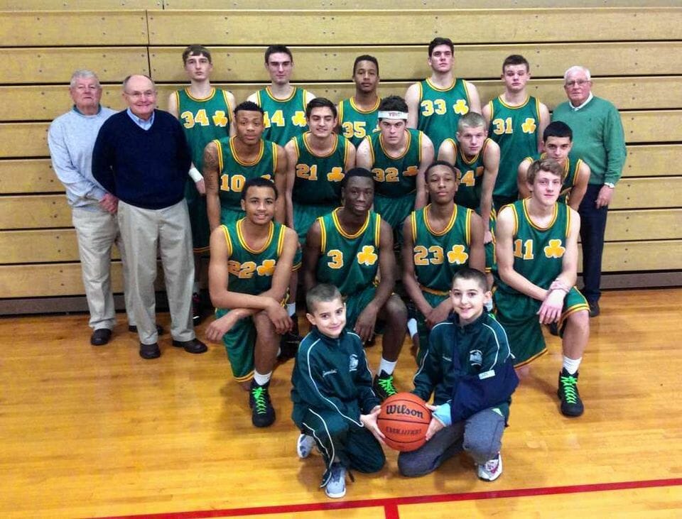
Here’s another St. Patrick’s uni, this time from the 1960s (click to enlarge):
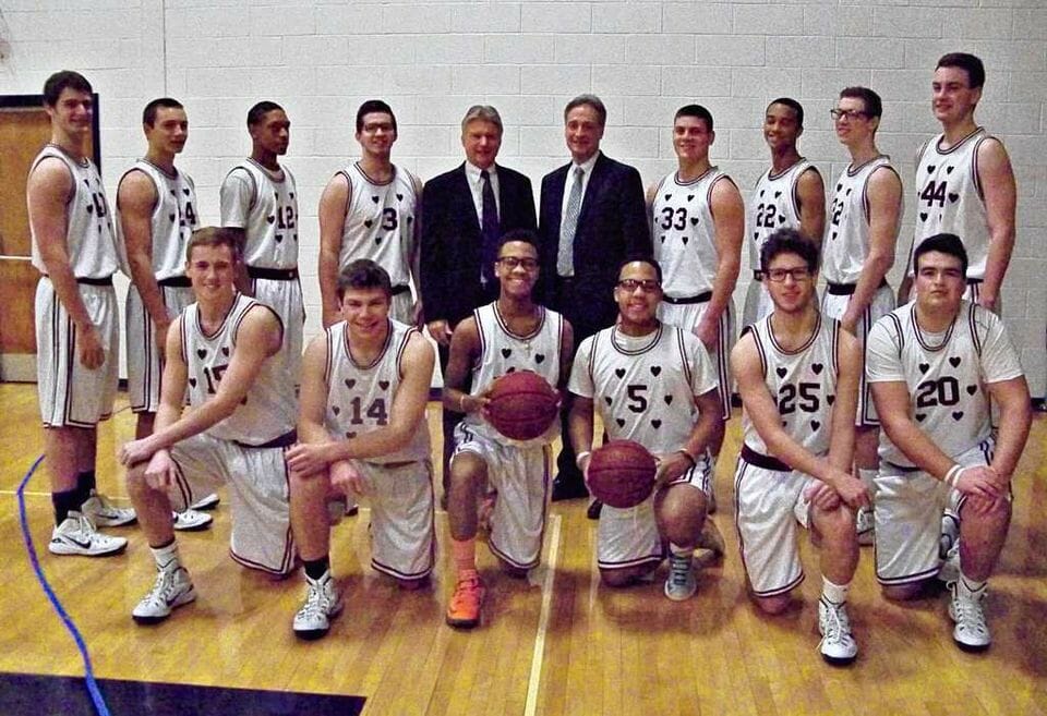
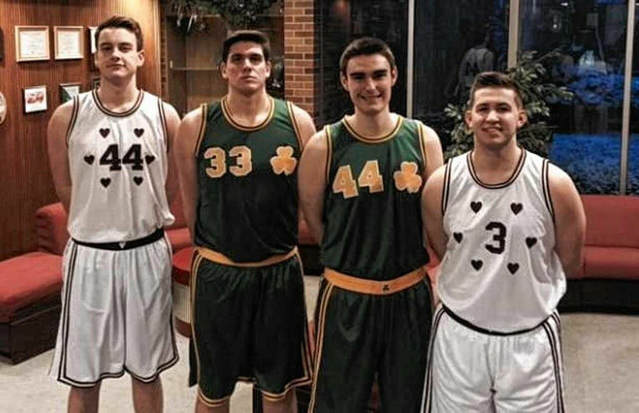
Now here’s the payoff: In 2015, two Syracuse schools — Christian Brothers Academy and Bishop Ludden — played each other while wearing Sacred Heart and St. Patrick’s throwbacks (click to enlarge):
Shifting gears, here’s a really interesting uniform worn by the 1942 Luverne High School squad in Minnesota:
I don’t think I’ve ever seen anything quite like those shoulder straps. It looks like they have neckties draped over their shoulders! Also: All of the uni numbers are in the 40s.
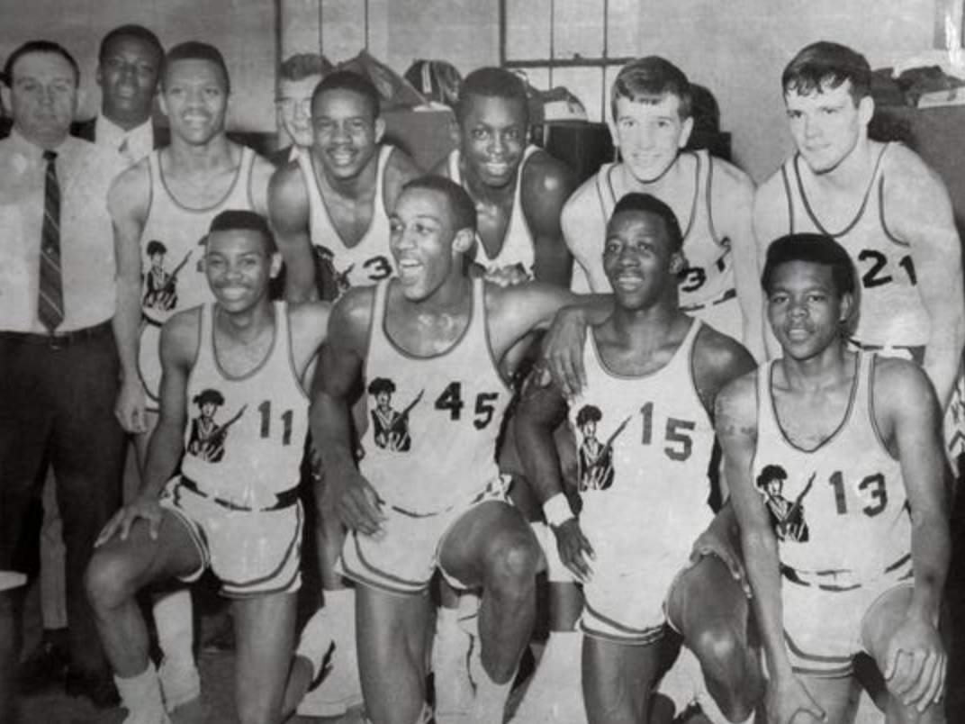
You want more? Sure you do! Here’s a great shot of the 1968 George Washington High School Continentals, from Indianapolis. That’s future NBAer George McGinnis wearing No. 45:
Derek has also been posting even older stuff, like this (dig the suit-clad ref!):

As you’d expect from an account called @retro_70s, there’s also a lot of 1970s stuff (and ’80s, too), but it’s the old photos I’ve really been going to school on. I encourage you to follow Derek’s Twitter account, and I’m sure we’ll be featuring more of his finds here on Uni Watch.

Glass ceiling about to be shattered: As you may be aware, an American woman is about to make history by reaching an exalted position that no other woman has previously attained. She won’t be quite at the tip-top position, but she’ll be close — and that will have to do, at least for now (although a woman’s ascension to the top spot is long overdue and will hopefully happen soon).
I am referring to, of course, yesterday’s news that NFL official Sarah Thomas will be part of the officiating crew for next month’s Super Bowl, where she’ll serve as the down judge. And thanks to a cap change that she made this season, that also means she’ll be the first Super Bowl official to be sporting a ponytail:
NFL line judge Sarah Thomas used to have to tuck her hair under her cap (left). This year she's wearing a snap-back cap, so her ponytail can stick out (right). (h/t Matthew Wolfram) pic.twitter.com/3fEvicX4Z8
— Paul Lukas (@UniWatch) October 18, 2020
Congrats to her, and here’s hoping she serves as an inspiration to lots of girls and women.
For people who Get It @UniWatch pic.twitter.com/EbwMmkxWb8
— Tom Pope (@twpope) January 20, 2021
Addition by subtraction: Over the past year or so, lots of people have asked me if a seam ripper can be used to remove the maker’s mark from an MLB jersey, just like on an MLB cap. And for a year I’ve been saying, “It should work, but I haven’t seen anyone who’s actually done it, so I can’t say for sure.”
But now, thanks to reader Tom Pope (see above), I can finally say, “Yes, it works!” Nice job, buddy.
I asked Tom if he had any pointers or advice to offer, and he said he simply followed the procedure spelled out in this Reddit post from four months ago (which I hadn’t been aware of, or else I would’ve mentioned it here sooner!).
Okay, people — you know what to do.
Too good for the Ticker: When you think of Lawrence Taylor playing for the Giants, you think of him wearing No. 56. But did you know he wore No. 98 — his college number — for preseason games of his rookie year, 1981? It’s true! And you can see a rare example of it in the video embedded above.
(Big thanks to Robert Gaudelli for this one.)
The Ticker
By Lloyd Alaban

Baseball News: Reader Ryan Keberly found this koozie logo mistake between the Tigers’ and Detroit Lions’ logos at a Detroit-area Kroger. … New uniforms for Virginia (from our own Jamie Rathjen). … Motocross racer Chase Sexton wore an Astros tequila sunrise-inspired uniform for a race in Houston last night (from John Flory).

Football News: The Lions now have ads on birthday announcements. Gross (from multiple readers). … Cross-listed from the baseball section: Reader Ryan Keberly found this koozie logo mistake between the Lions’ and the Detroit Tigers’ logos at a Detroit-area Kroger. … We know about the NFL’s “My Cause My Cleats” program, where players pick a charity that’s important to them and represent that organization on their cleats. Did you know that the Cowboys’ cheerleaders do something similar with their boots? (From Chris Cruz.) … Here’s a uniform history for the Winnipeg Blue Bombers of the CFL (from Wade Heidt).

Hockey News: The NHL is pausing its use of tracking pucks due to performance issues. … Here is the Capitals’ Reverse Retro uniform schedule (from multiple readers). … Although the Avalanche changed their road uniform’s black pants and gloves to blue, they kept the black numbers and NOBs, which now stand out as mismatched from the rest of the uniform (from several readers).

Basketball News: Here’s a look at the Jazz’s yellow-jersey curse. … Purdue and Ohio State men’s went grey vs. black last night.

Soccer News: The NWSL’s Racing Louisville is hosting a new four-team tournament, the International Women’s Cup, in August. It already has its own logo (from our own Jamie Rathjen). … FC Lviv is asking fans to vote on its new crest.

Grab Bag: Cross-listed from the baseball section: Motocross racer Chase Sexton wore an Astros tequila sunrise-inspired uniform for a race in Houston last night (from John Flory). … A Washington sports fan collects memorabilia from the city’s worst sports moments (from Chris Wautel and Nate Rathjen).

I remember when the Avs first moved out of Quebec. I didn’t like their uniforms because 1) they weren’t the Nordiques; 2) the “A” on the crest (monograms usually represent the city/state, not the nickname) and the unnecessary use of black (helmet, breezers, NOBs) in a look that didn’t need it (though I did like the vertically arched NOBs and the introduction of maroon, which is vastly underused in North American pro sports). The move to more blue and less black was good, but seeing that clip from last night makes the black NOBs look that much more out of place.
Avs should have made the switch to blue numbers/names on back for the white jerseys.
If the Avs wanted to drop the black, I think they would have been better served if the did a uniform redesign. Just replacing the equipment colour and keeping the same uniforms has not worked as well as a new uniform design may have.
We have seen this design or variations of it with the black equipment for 25 years, so it looks weird with the replacement blue equipment. Also, we still have a problem with black in the uniform that does not seem to match well with the rest of the look.
This would have worked but a redesign would have been fine by me. They’ve never “looked right” IMO.
Plus, they should have go with maroon pants and gloves with the white unis.
I think of the black as just another quirk, something that will gain traction the longer it is used.
Of course, what I *really* want is for the Avs to wear old Rockies’ uniforms, if the Devils would let them.
Avs need to switch to their Rockies-inspired throwbacks immediately.
In one of the prior posts on a previous day, someone mentioned how jarring they thought the Avs’ move away from black pants and helmets was. At the time, looking at the photos, I thought, “yeah, whatever”. However, I saw them on the tube recently and was surprised how jarring the change looked indeed! Put simply, it just didn’t look like the Avs anymore. Not sure I would say good or bad, just very different. I guess I’m used to the black components of the uniform and associate the look with their Cup-winning teams, even though the black didn’t really make all that much sense with their official colors. Funny how minds work.
Hit “POST” too soon!
Those high school hoops uniforms are sublime. As a child of the ’80s and ’90s, what we had was nothing compared to the earlier days. And I was out of high school right about the time the Fab Five and Michael Jordan ended short shorts.
About the fan who collects memorabilia from Washington’s worst sports moments. He must have some Washington Generals basketball gear right? :)
Or the Federals…
I mean, they were so bad, in 1984 the Pittsburgh Maulers went 3-15. Two of their three wins came at the expense of the (also 3-15) Feds.
1984 Federals may have lost a lot but they had great uniforms. Silver helmet/green jersey/silver pants a good-looking and underused football uniform combo.
The Federals’ uniforms would make better Eagles’ suits than the current Eagles’ uniforms.
Agree with both of you!
He refers to a 2012 postseason Drew Storen game-worn jersey as his “white whale,” so I figure there’s a decent chance he’s a UW reader.
I sometimes wonder what became of the “Short Stinks” banners.
No collection would be complete without some trinket from the NFL Championship Game of 1940 (fun UW fact: that 73-0 game marked the last time an NFLer…Bears RB Dick Plasman…played without a helmet) or a NATINALS jersey.
As a professional archivist I love the attention accounts like retro_70s receive, the reason I do what I do is to make materials accessible to the public. However, it’s erasing labor when photos are posted from online digital archives without attribution/a link. Sadly, in the financial climate we live in clicks matter for funding and it’s not like the images are scanned and metadata created for free. It also truly boggles my mind that folks can post an image they know is great, but not both posting the link to dozens of other similar images. I mean, if you think your audience would enjoy one, why not share a link to others like it? I’ll leave it to others to try and figure out that psychology.
My suggestion would be Uni-Watch not post material that does not have attribution.
The Atlanta History Center has a wonderful Digital Library with a lot of great old athletics photos, that would probably like the recognition it deserves.
Granny shot
Original image: link
Collection it is from: link
* The AHC has added watermarks, though plenty of unwatermarked copies are floating around. I also find watermarks distasteful/tacky, though apparently quite necessary.
The best praise I could possibly give for Sarah Thomas is that I have hardly ever noticed her in a game this year (as should be the case with all officials). And when I do it is usually far into the game when I suddenly notice one official is noticeably smaller than the others.
Kudos to her for scoring top marks among officials this year and getting the Superbowl assignment.
If I recall correctly they no long pick the team of officials with the best score, but pick individually creating an “all star” team of officials for the Superbowl? That is assuming they still have groups of officials assigned together for most games to begin with.
just hope Sarah Thomas doesn’t get tricked in the Super Bowl like she did when the Browns faced WFT a few years ago
link
Good for Sarah Thomas! Always cool to see women making strides in pro sports.
I do wonder about her hat a bit. NFL Refs will use their hat to mark a WR being out of bounds before a catch (or sometimes as a backup penalty flag if they go through all of their laundry.) I wonder if she has quick release or something so she can throw it if she needs to? Probably not a huge deal since she’s a Down Judge and that’s usually more of a Field Judge/Side Judge thing, but it could come up.
Some hats have a different style with the hole higher/larger for pony tails. I wonder if they made a different one for Sarah Thomas. I like that she was rocking the pony tail this year so young girls can easily see that there is a woman out there. Good catch on the throwing hat thing, maybe her’s has just a small bit of Velcro for quick release.
Love that Sarah Thomas was selected to officiate the Super Bowl. The thing I’ve noticed from watching her interactions during games I’ve observed on TV is that she seems to have the respect of players and coaches, not an easy feat for anyone at that level. Something that may be lost on the casual observer is the name of the position she will be working. For years that position was known as the Head Linesman, owing to the fact that particular official works with the chain crew, or, “linesmen.” In 2017 the NFL renamed the position to Down Judge in order to give the position a gender neutral term with Sarah Thomas on staff. I also think it gives the positions more symmetry, since the other positions outside of referee and umpire are all “judges:” Line, Field, Side, Back and in some college conferences a Center Judge. While college football, which has many women officiating, changed the Head Linesman position to “Head Line Judge.” Nice to see this progress.
Pretty soon advertiser announcements will be sponsored, by a different advertiser
“Cadillac: The Rolls-Royce of Cars.”
Was that a callout to MAD Magazine?
You, sir, win the hand-painted butter dish!
The first person who figured out you can poke a ponytail out through the back of an adjustable cap really should get a Nobel Prize for something. I will never not love that look.
The Luverne uniforms are interesting in that it was not common to use any numeral larger than 5 on a HS basketball uniform in those days. Officials used one hand to signal the identity of a player committing a foul to the official scorer, so only zeroes through fives were used for jersey numbers.
My High School used another relatively common practice (I was a team manager for the Basketball team). We had a set of even numbered jerseys for home games, and set of odd numbered jerseys for road games that would only use the numerals 0-5.
So you wore 10/11, 12/13 or 14/15 (up to 54/55) depending upon home or road. So you had 15 options of paired numbers…
Re: The motocross Rainbow Guts jersey.
That’s awesome. I also like what the team did with the pants. I do not recall anyone else wearing Tequila Sunrise pants; only the Milwaukee Bucks warmup uniforms during their “Irish Spring” era of the late 70s.
Every other team I’ve seen wearing UltraStripe — baseball, softball, rugby, hockey — were all about plain pants/shorts.
The next glass ceiling in the NFL would be for them to make her a Referee.