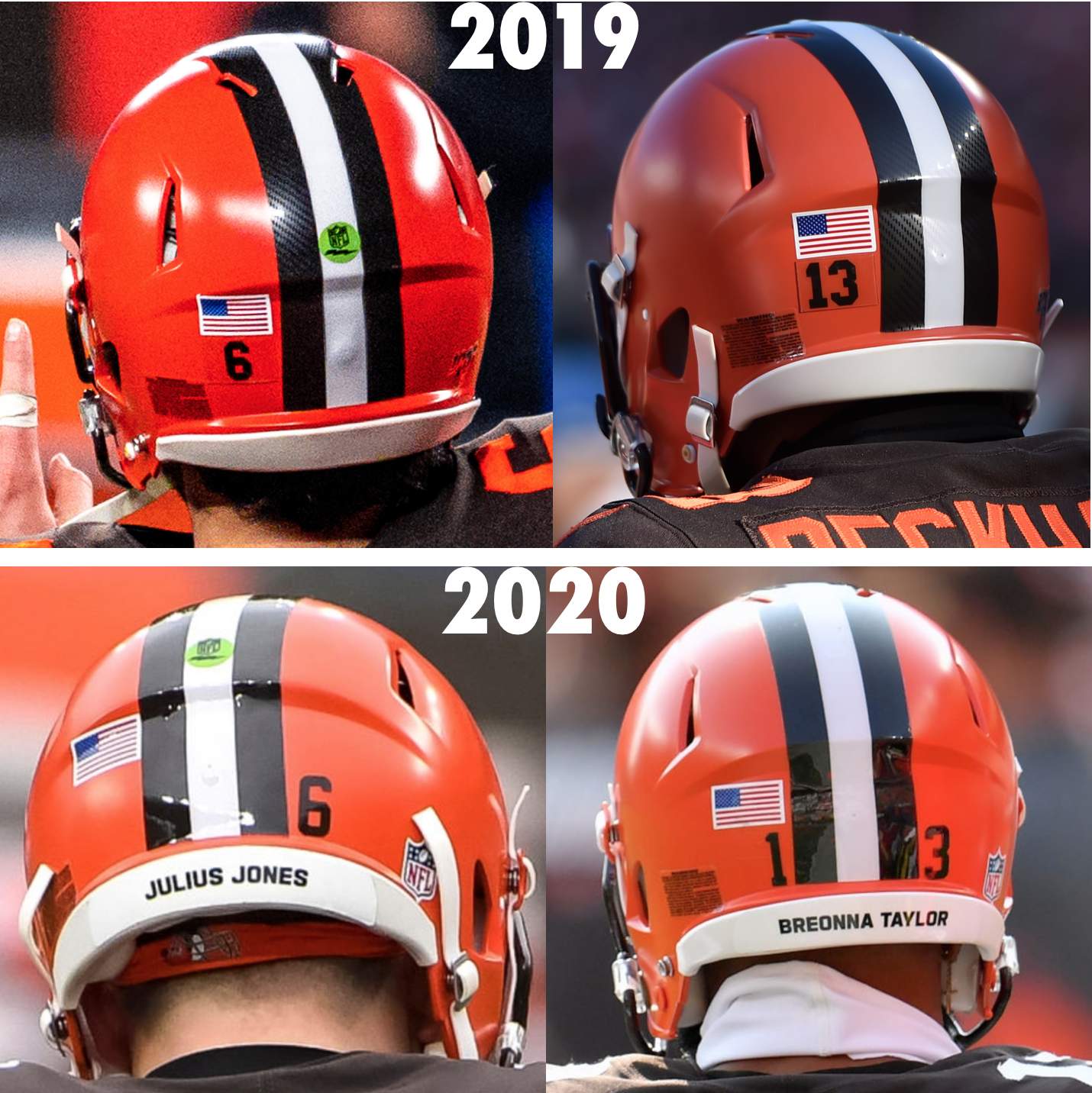
If you look at the photos above, you can see that the Browns’ 2020 uniform makeover included an unheralded change that I don’t think we’ve discussed before: Prior to the redesign, they put all of their rear helmet uni numbers, whether single-digit or double-digit, to the left of the stripe; after the redesign, they put single-digit numbers to the right of the stripe and had double-digit numbers centered on both sides.
Helmet numbers tend not to be shown in official style guides and are often handled via unofficial protocols established by a team’s equipment staff. They’re also the latest detail to come under the gaze of Uni Watch reader Omar Jalife. A little over a year ago, he provided a comprehensive breakdown of front and rear helmet bumper styles. Now he’s done the same for helmet numbers.
Before we get to Omar’s data, here are a few shorthand terms to keep in mind: He’s used “SD” and “DD” to refer to single- and double-digit numbers, respectively, and then he’s used simple directional terms to describe where a team positions its SD and DD numbers. Using the Browns photos shown above as an example, in 2019 they were SD Left and DD Left (i.e., they put all of their numbers to the left side of the helmet), but now they’re SD Right and DD Centered.
With that in mind, Omar’s survey of the NFL’s rear-helmet numbers breaks down like so (note that this is only for primary helmets, not throwback or Color Rash helmets):
SD Right, DD Centered* (12 teams): Bengals, Browns, Cardinals, Colts, Dolphins, Eagles, Jaguars, Panthers, Patriots, Raiders, Ravens, and Saints.
SD Centered, DD Centered* (5): Falcons, Giants,** Jets, Lions, and Steelers.**
SD Left, DD Left (1): Packers.***
SD Right, DD Right (1): Broncos.
No rear numbers (13): Bears, Bills, Buccaneers, Chargers,† Cowboys,‡ 49ers, Kansas City, Rams, Seahawks, Texans, Titans, Vikings, and Washington.†
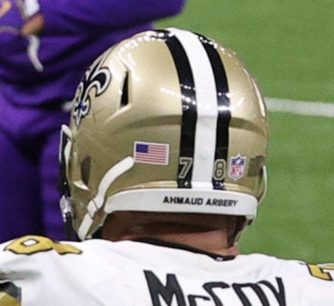
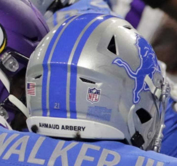
*Omar says: “For teams whose helmets include center striping, the DD Centered numbers are usually positioned outside the stripes [like the current Browns format]. But some teams, like the Saints, put the numbers on the outer stripes, and the Lions use a small decal in the middle of the center stripe.”
**It’s worth noting that the Giants and Steelers also have numbers on the front of their helmets. They use the same format on the front as on the back, with SD and DD both being centered.
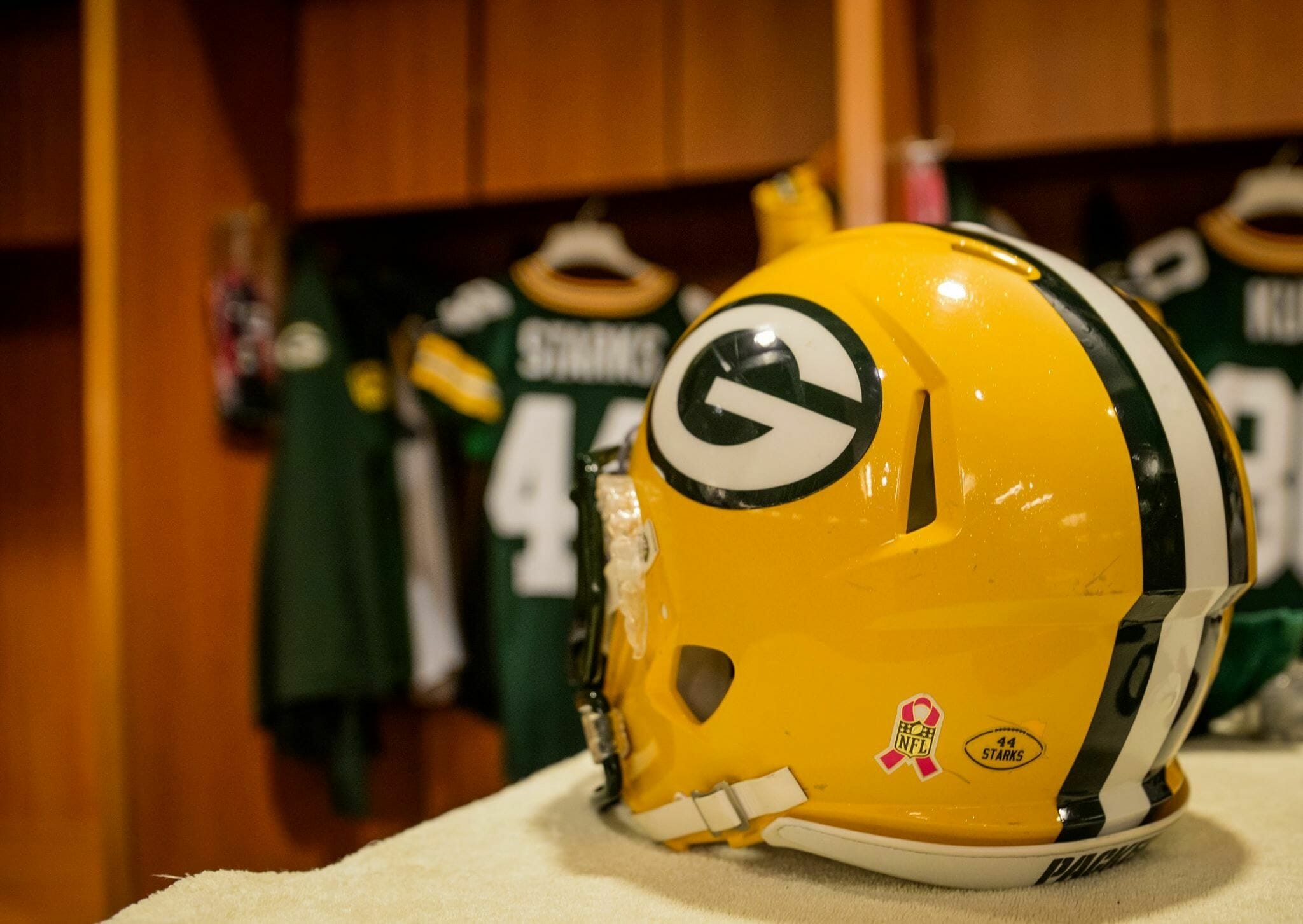
***The Packers’ rear number decals also include the players’ surnames:
†Although the Chargers and Washington don’t have rear helmet numbers, they do have large TV numbers on the sides of their helmets, so rear numbers would be redundant.
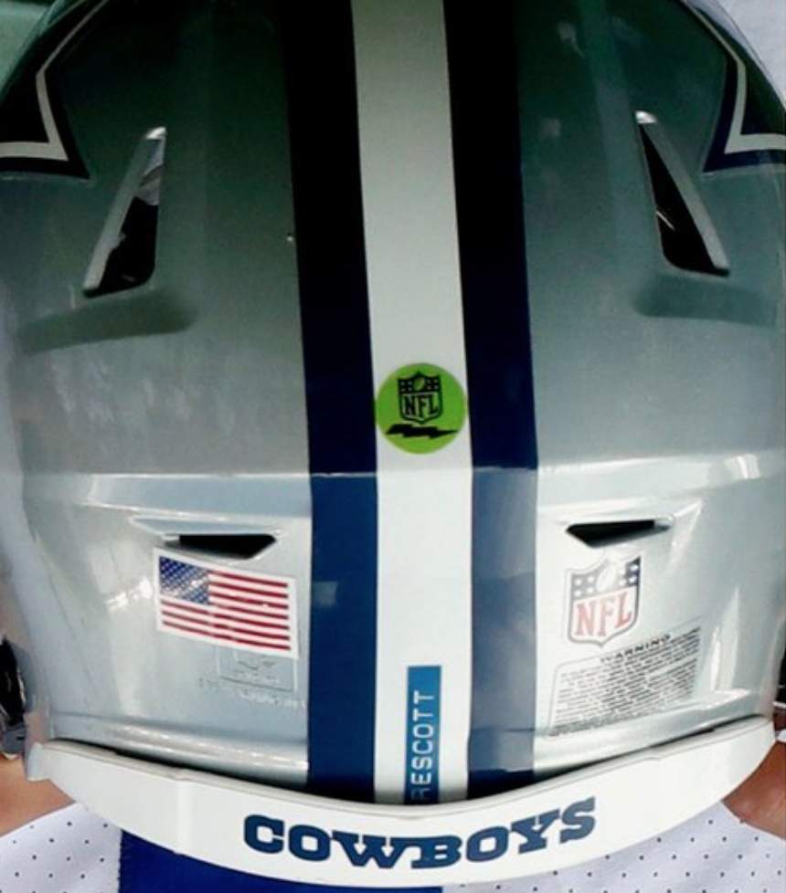
‡Although the Cowboys don’t have helmet numbers, they famously keep track of their helmets via the use of Dymo tape labels:
———
Those numbers are summarized in this handy table, which includes SD and DD photo links for each team:
NFL Rear-Helmet Number Positions
| Team | One Digit | Two Digits |
|---|---|---|
| Arizona Cardinals | Right | Centered |
| Atlanta Falcons | Centered | Centered |
| Baltimore Ravens | Right | Centered |
| Buffalo Bills | None | None |
| Carolina Panthers | Right | Centered |
| Chicago Bears | None | None |
| Cincinnati Bengals | Right | Centered |
| Cleveland Browns | Right | Centered |
| Dallas Cowboys | None | None |
| Denver Broncos | Right | Right |
| Detroit Lions | Centered | Centered |
| Green Bay Packers | Left | Left |
| Houston Texans | None | None |
| Indianapolis Colts | Right | Centered |
| Jacksonville Jaguars | Right | Centered |
| Kansas City | None | None |
| Las Vegas Raiders | Right | Centered |
| Los Angeles Chargers | None | None |
| Los Angeles Rams | None | None |
| Miami Dolphins | Right | Centered |
| Minnesota Vikings | None | None |
| New England Patriots | Right | Centered |
| New Orleans Saints | Right | Centered |
| New York Giants | Centered | Centered |
| New York Jets | Centered | Centered |
| Philadelphia Eagles | Right | Centered |
| Pittsburgh Steelers | Centered | Centered |
| San Francisco 49ers | None | None |
| Seattle Seahawks | None | None |
| Tampa Bay Buccaneers | None | None |
| Tennessee Titans | None | None |
| Washington Football Team | None | None |
A few quick thoughts:
• I’m surprised to learn that there are so many NFL teams that don’t use rear helmet numbers. Seems like it would be hard for everyone to know whose helmet is whose!
• I hadn’t been aware of that itsy-bitsy Lions number decal. So teeny-tiny!
• Personally, I prefer it when the SD numbers are centered, not off to the right. But I can see arguments for both approaches. (Thank god the Giants and Steelers both center their SD numbers, because their front numbers get so much close-up TV exposure. If Ben Roethlisberger’s front No. 7 had been off to the side for all these years, instead of being centered, it would’ve driven me nuts!)
• I’ve never liked the Broncos’ and Packers’ format of putting all numbers off to one side. That’s definitely my least favorite approach to helmet numbers.
How do you folks feel about all of this? Any other helmet-numerical issues we’re overlooking?
(Big thanks to Omar Jalife, who deserves all the credit for today’s entry, and thanks also to webmaster John Ekdahl for table-formatting assistance.)
Collector’s Corner
By Brinke Guthrie
Follow @brinkeguthrie
I distinctly remember when I first Got It™. It was a confluence of factors in the early 1970s: my Viking Sears pajamas and Chiefs pennant, inspired by Super Bowl IV; the Chiquita Banana NFL stickers I collected; the NFL Action ’72 album from Sunoco; the hours playing NFL Strategy and reading the Punt, Pass and Kick books; and all the Gatorade I guzzled just for the NFL caps.
And then there was This Week in Pro Football.
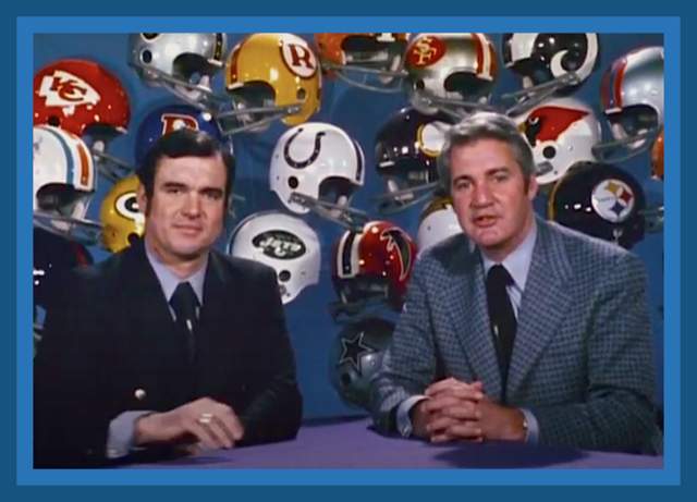
As I recall, it ran on Saturdays with all sorts of NFL highlights and “insider” info. But what grabbed me was the set, with those glossy helmets hanging behind hosts Tom Brookshier and Pat Summerall. So naturally, I got all geeked up to find this This Week In Pro Football 14-DVD set from the 1970 season. Now let’s take a trip back to 1970 and Week One of the NFL’s 50th season with Tommy and Pat as your genial hosts;
Those were the days. Now for the rest of this week’s picks:
• NHL star Phil Esposito endorsed this Protecteur de Bouche (mouthguard), even though he isn’t wearing one in the photo.
• If you were at the game when Hammerin’ Hank hit his 700th home run on July 21, 1973, you got this certificate. (Suitable for framing!)
• Some really good likenesses of Mets pitchers Jerry Koosman and the late Tom Seaver on these 1976 promo cups from Amoco, although they’re wearing the Dreaded Blank Caps.
• Dan Marino had the Danny Bar chocolate bar as part of his endorsement portfolio. Here’s one of the wrappers sporting some fine artwork. Normally things like this might not have team logos and such, but Marino snagged an NFL license.
• Here’s a 1969 Topps Montreal Expos stamp album. No team logos or colors, so this must have been created on the fly: “We gotta get this out the door fast, and all we got is their name!”
• This 1960s San Francisco Giants appetizer serving set was a “VIP gift” to team employees.
• Proof they’ll put a logo on anything: “Collector’s Edition” Yankee Hankies from the late 1990s.
• Logos for all then-current NFL teams adorn this late-1970s clear glass pitcher.
• Pittsburgh Pirates Hall of Famer Roberto Clemente died in a plane accident on New Year’s Eve 1972 while delivering earthquake relief supplies. This memorial record album was released the following year.
• Look at all of the MLB team logos in this lot of 47 different 1970s team pocket schedules. The seller is also including a book on the Tokyo Giants.
Click to enlarge
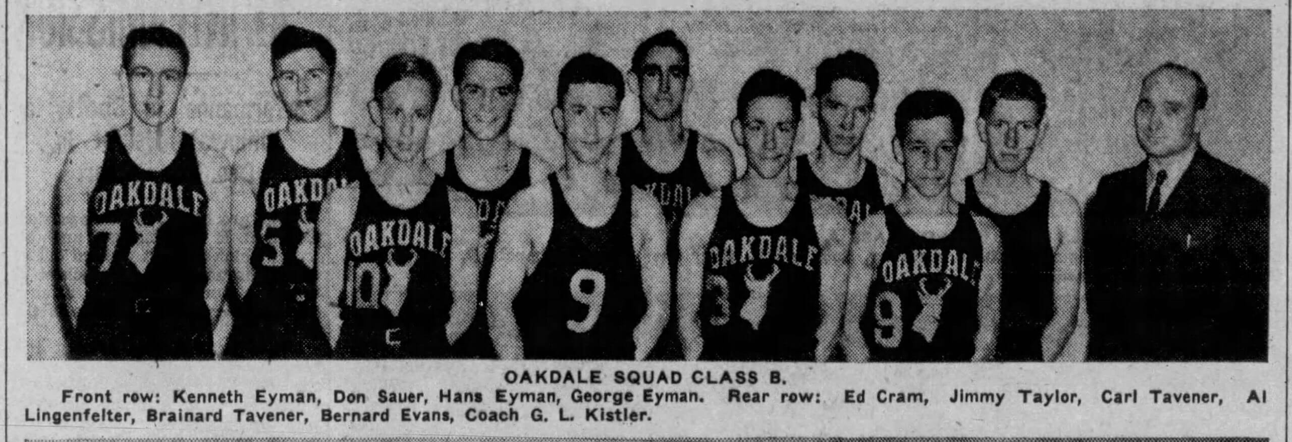
Too good for the Ticker: Oh man, I really love these uniforms for the 1939 Oakdale Antelopes high school team from Nebraska. Not sure I’ve ever seen uni numbers off to the side quite like that! Too bad the guy in the center didn’t have a matching jersey.
(Big thanks to @SuitUpVarsity for tweeting the photo, and to Joel Ferebee for bringing it to my attention.)
The Ticker
By Alex Hider

Baseball News: The Tri-Cities Chili Peppers, a team in the new collegiate wood-bat Coastal Plain League, have unveiled their uniforms (from Kary Klismet and Jeff Milby). … Ryan Keberly’s dad saved this awesome 1960 paper placemat that commemorates the Pirates’ World Series win from that year. … Águilas Cibaeñas of the Dominican League wore a black/grey two-toned jersey in Game Seven of the championship series last night — and Sunday’s matchup against Gigantes del Cibao was black-on-black (from Jorge Cruz). … This article about rapper/activist Chuck D includes a bunch of his excellent baseball illustrations (from our own Scott M.X. Turner).

NFL News: Yesterday, a Boston-area TV station used an old photo of Bucs coach Bruce Arians in a Cardinals shirt (from Mike Wice). … Keith Weidemoyer notes that this shot from Ace Ventura: Pet Detective shows the Eagles wearing two different uniforms in what is supposed to be the same game. One monitor shows them in the then-modern 1992 uniforms, but other monitors show them in early-1980s uniforms.
College Football News: New uniforms for the Southern Illinois Salukis. They and the rest of the Missouri Valley Conference will play an eight-game slate beginning in February (from Kary Klismet and Dave Sikula). … Brad Eenhuis sends along this great late-1930s photo of the Arizona State Sun Devils.

Hockey News: The Islanders played their final home opener at Nassau Coliseum last night and commemorated their farewell season in the arena with their center ice logo but referred to it as “Nassau Live Center” — even though the name of the building has not changed. Nassau Live Center is the name of the building’s new leaseholder, and a rep for the group said the wording will soon be changed to read “Nassau Live at Nassau Veterans Memorial Coliseum” (from @John Muir). … University of Nebraska Omaha G Isaiah Saville has been wearing a Martin Luther King Jr. mask this season (from @kingsfan231). … Panthers LW Anthony Duclair is wearing custom skates with social justice messaging (from Tim Shriver). … One of the best NOB mash-ups I’ve seen in a while popped on on the bench for the SPHL’s Knoxville Ice Bears recently. Now I’m hungry. Mmmm (from Ryan Cooper). … The Stars have released their uniform schedule for this season (from Mike Klug).

NBA News: Hawks PG Trae Young was wearing what appears to be a wrist brace last night (from @TyOrtega). … Pistons F Jerami Grant wore a retro Grant Hill jersey prior to the team’s road game against the Heat last night (from @_jacobmjones). … “It’s not just us in the uni-verse who are annoyed by the NBA’s constantly changing aesthetics,” says Mike Chamernik . As proof, he notes that a thread asking why NBA jerseys have gotten “uglier” was topping r/NBA on Reddit yesterday. … The only way to make the Magic’s 1990s pinstriped unis better is when Shaq wore them with matching pinstriped knee pads (from George O’Dea). … When the Nets wore their tie-dye New Jersey throwbacks the other day, a ref got in the throwback spirit — or maybe just forgot that the game was taking place in Brooklyn — by announcing a foul charged to “New Jersey” (from Stephen Santangelo).

College and High School Hoops News: Florida State wore their home whites on the road last night in a matchup with Louisville, which wore black at home (from @VictoryCB). … Citadel F Hayden Brown rolled his shorts up so high last night that it exposed his thigh pads. This is apparently a routine thing for him, as you can see in the slideshow at the top of this page (from Jason Collins). … The Wapello school board in Iowa has voted to update the district’s uniform policy after the high school purchased basketball uniforms that did not match the school’s royal blue and gold color scheme. The district will now allow teams to wear other colors as long as team colors are incorporated in the numbers and lettering (from Kary Klismet).

Soccer News: Sunday’s match between Liverpool and Manchester United caused problems for hundreds of colorblind fans (from Sam Herbison and Wayne Krantz). … The new third kits for Mexican club team Club America have reportedly leaked. The rest of these are from Kary Klismet: Inter Milan’s new logo may come with a potential name change. … The Colorado Rapids of MLS will reportedly wear green on the road this season. … New stadium in the works for Indy Eleven of the USL Championship. … New uniforms for Vietnam’s national teams.

Grab Bag: This video reviews some of the new pro cycling team uniforms for the 2021 season (from David Barndollar). … This Golf Magazine column — which coincidentally has a section titled “Uni Watch” —addresses the sponsorship fallout for Justin Thomas, who was dropped by Ralph Lauren after he was caught uttering a homophobic slur on a hot mic during a round last week (from Geoff Poole). … Warner Bros. studios has updated its logo to a more modern, flat design (from Kary Klismet). … Vice President-elect Kamala Harris discussed her love for Chuck Taylors during an appearance on CBS on Sunday morning. The relevant passage occurs near the end of the article. (from Chris Ashworth). … England’s men’s rugby union team will debut a 150th-anniversary shirt next month (from our own Jamie Rathjen).

LOVE the focus on helmet numbers! The Colts’ massive numbers have always been a favorite of mine!
The helmet history website has a pretty comprehensive breakdown of all the changes for each team
link
During camp and preseason the Steelers do not have numbers on their helmets. When I noticed this omission about 15 years ago, I was out of my mind thinking they changed their helmets and contacted the organization. They assured me the numbers would be on the helmets during the regular season. Imagine my embarrassment.
Yes, that’s one of the uni-verse’s great preseason rituals, much like the Red Wings using a different NOB style.
While I can’t speak as to how other no number teams keep helmets straight, the Chiefs include each players number in yellow on the chin strap.
The Chargers also have numbered chinstraps. They and the Chiefs are the only two teams to do so.
The Chargers also display their numbers pretty prominently on the sides of the helmet. :-)
Is it a thing that the SIU-Carbondale promo for the new uniforms includes a photo with an untucked base layer? I kind of figured that, until now, that particular look was a fashion statement, not a protocol.
I can’t believe I’ve never noticed that the Browns cut their center stripes not only for the SpeedFlex hexagon, but for the vent holes on the Riddell Speed helmets as well!
I’ve never seen any other teams do this, has anyone else noticed it before?
Yep, right on the Green Bay helmet pictured below it. But I’ve seen many pro and college teams do this.
While not a “coder,” I do write a good bit of computer code for my profession. As such, I work in fixed-width fonts a lot, and appreciate the “single-digit right” format, since this is the only way to satisfactorily align numbers in a plain-text editor.
Thanks for letting me nerd out.
That’s such a great still shot of Tom & Pat with the helmet collage in 1970. I’m sure it’s just the lighting, but the 49ers helmet looks silver (which I know SF wore in the 50’s).
Which lead me to wonder why no current NFL went with Red & Silver a’la Ohio State? It’s such a great color combo.
Totally agree re the Red & Silver comment. One of the things I really liked about the old USFL was there were several teams with a combination like that (Chicago, Tampa, Memphis). I also really like the combination of maroon or a really deep red-ish color with silver (USFL’s Michigan Panthers sort of and Jacksonville Bulls). I feel the same way about a blue/silver combo. Although I hate the Cowboys with a passion, their uniform combination when wearing blue jerseys is great! I also like Carolina’s look when they wear the blue jerseys with silver pants. Continuing the USFL theme, I always loved the Boston/NO/Portland Breakers’ combo.
Tampa Bay is pretty close to red and silver. I think that’s why Tom Brady wanted to go there – to finally be able to wear the right colors and to be able to say Go Bucs!
I loved the rear number post. This is the little details that Uniwatch finds that makes the site so much fun!
Speaking of small details…would it be wrong for me to point out that it’s “Uni Watch” or “Uni-Watch”, but not “Uniwatch”? LOL
I became a UNI-fan in the early 70’s too. Mine was with NFL Helmet vinyl stickers. Anybody remember those?
You mean from Hallmark? Absolutely.
Judging by the on-screen bug, it was NBC 10 Boston that had the botch with Bruce Arians.
Funny thing about it? Its owned by the network. NBC infamously created an NBC O&O for the Boston market out of thin air a few years back while existing NBC affiliate WHDH went independent.
I remember in the early 90s, several teams had small helmet numbers on the left side of the back of their helmets. I think the Browns and Giants were two of them. They may have moved if over there after the flag and then NFL shield were added on the right.
I’m a Browns fan and watched every game this year. I didn’t catch the helmet numbers changed until Sunday, their 18th game of the season. Do I need to turn in my Uni Watch Membership Card?
The Chiquita banana NFL helmet stickers even made it up here to Canada. I still have the set I collected back in 1970. I always loved oddball collectibles like that. Still do.
I came across a framed set of those stickers on eBay many years ago- wish I had bid on them.
Question about the helmets: some of them have a slot that looks like the kind of thing you would use a quarter or a large screwdriver to turn. It’s most noticeable in photos for both the Falcons’ and the Panthers’ double digit numbers. Anybody know what that’s for?
That is used to hold the inflation port for the helmet padding in place. It does screw on to the valve on the padding, hence the reason it looks that way.
“Now let’s take a trip back to 1970 and Week One of the NFL’s 50th season…”
At 22:45 of that video, Pat and Brookie point out some of the post-merger changes, including NOB and the balls used for night-games(which I never had heard of).
best part of that video is the black shirt inside of a red leisure suit jacket being worn by Brookshier.
Not only were the Antelopes unable to give #9 (in the center) a matching jersey, they couldn’t give him his own number, there is another #9 (Bernard Trainor, third in from the right) with the full jersey treatment, and the guy next to him appears to have nothing on his jersey.
“Antelope.” Dreadful, tinny word.:)
I love Chuck D’s baseball art. I’d buy a print of this: link
I’d love to see the same thing done for the NHL, especially since different helmet manufacturers have different designs and force numbers up/down.
See photos 2 and 4 here:
link
Thanks Paul for running with my ideas. It is extremely fun to look at this kind of topics.
Kudos to John for the table formatting.
that “this week in pro football” film really brings home the fact that the NFL has not changed its musical tastes in 50 years. (or more)
the background music playing during the film is the same music they play during the ad breaks in the NFL game pass live broadcasts before they figured out how to sell those separately from the broadcast ad slots.
Never liked that the Bills helmet stripe mimicked the red streak in the logo, with it becoming wider from front to back. But that would be the perfect spot to put a centered number, with the strip width being able to accommodate 2 digits.
Also, noticed the set on NFL Network that has the Bills helmet underneath the Cowboys Helmet in the background… the Bills helmet is missing the center stripe entirely. (I kind of like that look)
Between the LA Rams disasterpiece uniforms and the new Warner Bros. logo, I am getting really tired of seeing the invocation of the Golden Ratio.
What is the point of purchasing a certificate proclaiming “you were there” for Hank Aaron’s 700th home run ? If somebody sees you with the certificate are you going to falsely claim you actually were there ?
News flash: People buy/sell/trade old ticket stubs, too, even for events they didn’t attend.
It’s a piece of memorabilia, like anything else.
They should put the old Coliseum logo on the ice somewhere as a commemorative. I remember they once had it on one side inside the center ice circle, with the Islanders logo on the other side.
I too had a set of those Sears NFL pajamas, circa 1979, Minnesota Vikings. Seems odd since I’ve lived in Michigan my whole life but even back then I loved purple. I think those PJs were polyester and were itchy as all get out. I’m sure my mom still has a photo that I can be embarrassed of.
I also have the glass NFL pitcher along with a set of 4 matching glasses. Among other things, I have almost the entire set of Mobil NFL drinking glasses. Thrift store finds!
That wouldn’t be a ’70s pitcher; it has the 1980 Cincinnati Bengals’ helmet.
As I read the Chuck D article, I learned HOFer Don Sutton had passed away. History always has the last word, doesn’t it?
I disagree re: Roethlisberger. His #7 centered on the stripe is the single most annoying uniform quirk in the league. The seven is slightly wider than the stripe, so it the point on the right hangs off the stripe. It has been that way his whole career. I deeply hate it.
HI all, long time listener, first time “caller”. :) Anyway, I must belong here because its driving me crazy that the “Clear glass pitcher with 1970 team helmets” has the Bengals striped helmets. 1981 is when those came out, correct? Be safe all.