By Phil Hecken, with Joseph Gerard
Follow @PhilHecken
Hey guys — got a non-sport uni lede for you today, and it comes from reader Joseph Gerard. Joe reached out to me around Christmastime with the following…
Hey Phil, Merry Christmas and hope things are well. I know this isn’t sports uni-related, but it is uniform-related in some capacity and somehow has gotten more attention in recent years so I present you the “uniforms” of local TV stations.
It’s a neat little dive into “uniforms” (more logos than unis), but it’s both entertaining and educational. So please enjoy…
The “Uniforms” of Local TV Stations
by Joseph Gerard
There are various reasons why TV station groups are “uniform”. In some cases its for a consistent “look”, while in most cases its simply a case of cost cutting and just easier to swap out a logo for a particular local station. So without further ado, here are the “uniforms” of local TV stations.
The practice of having uniform TV stations date back for nearly as long as television itself. Crosley Broadcasting–the namesake of the Reds’ Crosley Field–owned Cincinnati powerhouse radio station WLW, and when TV stations went on the air it was only natural to have the “WLW” callsign in each of its TV properties. The fourth letter would be based on the station’s location, leading to WLWA (Atlanta), WLWC (Columbus, Ohio), WLWD (Dayton), WLWI (Indianapolis), and the flagship, WLWT (Cincinnati). After Crosley exited broadcasting in the 1970s and sold off its broadcasting properties, most of the TV stations changed their callsigns. Today only WLWT retains its callsign despite having been under separate ownership from WLW for decades.
In terms of a consistent “look”, one of the earliest, naturally, came from one of the major networks: ABC. As all of ABC’s owned-and-operated (O&O) stations in the 1960s were broadcasting on channel 7–something that was reportedly by design when these stations signed on in the late 1940s–ABC developed the now-famous “Circle 7 logo”. The logo was designed to be interchangeable with ABC’s logo and was eventually, over time, used with ABC affiliates broadcasting on channel 7 (notably WJLA-TV in Washington, D.C. & former ABC O&O WXYZ-TV in Detroit, who was allowed the keep the once-proprietarily logo after ABC sold the station off to current owner E.W. Scripps) and eventually TV stations broadcasting on channel 7 but affiliated with other networks.

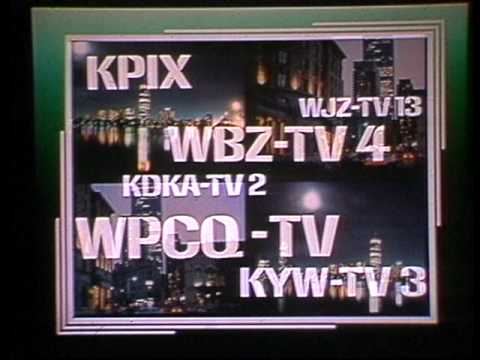
Around the same time ABC developed the “Circle 7 logo”, Group W, the broadcasting arm of Westinghouse Electric, began using the distinctive Group W font on its radio & TV stations. The font, which was mimicked in more recent times as the freeware “Anklepants”, was used not just for station logos but also Group W’s logo and even some of the news graphics. The font remains in use today by KPIX in San Francisco and WJZ-TV in Baltimore, as well as radio station WINS in New York, but was largely retired in the early 2000s.
By that point, Westinghouse had bought CBS, adopted the CBS name, shed its non-broadcasting assets, and had its first re-merger with Viacom. Replacing the Group W font–as well as standardization of legacy CBS O&O stations pre-Westinghouse–was the so-called “CBS Mandate”, that required all of the CBS O&O’s to adopt standardized graphics and music (in the latter case, “CBS Enforcer” by WBBM-TV in Chicago), with most of them also adopting the on-air branding of “CBS [channel number]” (e.g. CBS 2, CBS 4, etc…), with callsigns only used for FCC-mandated station identification.
At one point, only WCCO-TV in Minneapolis, KDKA-TV in Pittsburgh, and WJZ-TV didn’t adopt this branding, with viewers in Pittsburgh actually protesting KDKA-TV (a station with strong branding under its callsign) possibly rebranding as “CBS 2”. Eventually two legacy Group W stations–KPIX and WBZ-TV in Boston–reverted to using their callsign for branding, but most CBS O&O’s today continue to use “CBS [channel number]”, and all use CBS’s standardized graphics & theme music, which has been licensed to WGCL-TV in Atlanta and WDJT-TV in Milwaukee for use.
Today, three of the “Big Four” networks have some form of standardized logos & news graphics, with some Fox affiliates even using a variation of the “boxkite” logo used by Fox O&O’s and Fox News. Ironically, ABC is in the only one that doesn’t: stations it acquired from its 1986 merger with Capital Cities (which led to the aforementioned sale of WXYZ-TV due to FCC ownership regulations) were allowed to keep their Capital Cities-era logos, and none of them use a standardized news graphics or music. Notably, it allowed WPVI-TV in Philadelphia to continue its decades-long use of its “Move Closer to Your World” theme, which we will explain more in a moment and is very well tied to Philadelphia sports.
Owners of large station groups with multiple network affiliations also use standardized graphics. Two of the largest, Nexstar Media and Gray Television, don’t, though each Nexstar newscast ends with a distinct Nexstar copyright. Cox Media and Meredith also don’t use standardized graphics and music. Sinclair Broadcast Group, Tegna, E.W. Scripps, and Hearst all use standardized graphics and music. Sinclair even goes as far as to incorporate the American flag on its on-screen bug. (There might be reasons behind that one.)
Tegna perhaps has gotten the most criticism, with its graphics and theme music, known as “C Clarity”, being too “upbeat” for an American newscast. In fact, upon Tegna’s acquisition of WNEP-TV in Scranton, Pennsylvania last year, a Change.org petition went up asking Tegna NOT to adopt its “C Clarity” package for WNEP-TV, which like WPVI-TV long used “Move Closer to Your World” as its theme. Tegna later reached a compromise: the station did adopt its standardized news graphics, but was allowed to keep “Move Closer to Your World” as its theme instead of “C Clarity”.
So yeah, what we think might be unique to our area watching the local news, it is in fact standardized much like uniforms in the sports world.
Thanks Joseph! I’ll be honest in that I haven’t watched my “local” news in many years (mostly because of Internets), but this was pretty fascinating, and thanks for sharing. Readers? Any thoughts?

The “BEST OF” Kreindler’s Korner
Hey guys & gals. You’ve enjoyed Kreindler’s Korner for several years now, mostly on the weekends, on Uni Watch, but with the recent coronavirus outbreak, Graig’s time is just too precious and he needs to tend to other things besides coming up with a new writeup each weekend.
So, going forward, for as long as the COVID-19 situation is bad in New York, I’m going to run a few “Best of’s” until Graig returns.
Here’s today’s offering:
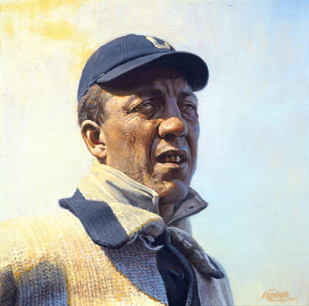
Title: “Better Days Behind”
Subject: Addie Joss, 1910
Medium: Oil on linen
Size: 16″ x 16″To this day, Addie Joss remains one of the more interesting “what if” stories in baseball. One of – if not THE – top pitcher in the American League during the first decade of the 20th century, we’ll never know what the full arc of his career could have been as the sport approached the era of Babe Ruth. Joss passed away suddenly in April of 1911 from tubercular meningitis.
Images of the man aren’t necessarily super hard to come by. But being from the early 1900s, when sports photography was still relatively in its infancy, there weren’t a ton of photographs of the man that have survived to current day. Playing in Cleveland for the entirety of his career might not have helped matters, as even then, places like New York, Boston and Philadelphia were much greater hubs of media coverage. However, occasionally I’ve come across one or two that have stopped me in my tracks.
This portrait of Joss is one of them. It has ALWAYS haunted me. For one, that gaze is just incredible. Sure, both eyes aren’t necessarily facing the same direction, and perhaps he might not have been the most attractive ballplayer you’d ever seen, but if nothing else, his face certainly had a lot of character. More importantly for me though, the moment I saw it, I was drawn to that beautiful light: what it was doing to his sweater, his upturned collar, those wonderful wrinkles in his ruddy face. And then seeing some of the sky color reflecting back into his cheeks and nose, even catching a little bit of those teeth…man…that’s what painting is all about for me. It was one of those images that I was able to see a finished painting of in my mind, which even to this day is a rare thing.
Thanks, Graig! You can (and should!) follow Graig on Twitter.

Guess The Game…
from the scoreboard
Today’s scoreboard comes from Tucker Peterson.
The premise of the game (GTGFTS) is simple: I’ll post a scoreboard and you guys simply identify the game depicted. In the past, I don’t know if I’ve ever completely stumped you (some are easier than others).
Here’s the Scoreboard. In the comments below, try to identify the game (date & location, as well as final score). If anything noteworthy occurred during the game, please add that in (and if you were AT the game, well bonus points for you!):
Please continue sending these in! You’re welcome to send me any scoreboard photos (with answers please), and I’ll keep running them.

Uni Concepts & Tweaks
Time for more Uni Tweaks from the UW readership.
I hope you guys like this feature and will want to continue to submit your concepts and tweaks to me. If you do, Shoot me an E-mail (Phil (dot) Hecken (at) gmail (dot) com).
Today’s set of concepts come from Jack Herbert, another aspiring uni designer. Did I mention Jack is thirteen years old?
He writes,
Hi Phil, thanks for putting how to send concepts into uniwatch and doing the uniwatch blog.
My name is Jack Herbert and I am 13 years old. I like to redesign sports jerseys, and I started a project on redesigning the entire NBA with some new logos, but most of them are just tweaked. I have finished a few of them, the Hawks, Celtics, Nets, Hornets, Cavs, Bulls, and Mavericks. I will send you the Hawks design right now. Shoot me an email if you want some more. Anyways, I gave the Hawks the old Pac-Man logo from the Dominique Wilkins era and kept the same colors only adding black trim to the uniforms. The black alternate has red letters/numbers with yellow trim. The throwback is the gradient with the big hawk on the front from the Mutombo years. I tweaked the city edition and changed MLK on the front to ATL, and added more gold.
Thank you
-Jack Herbert
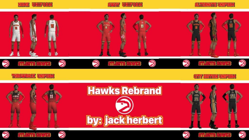
Thanks Jack! Hopefully we’ll see some more of your concepts down the line.
OK readers (and concepters). If you have some tweaks or concepts, shoot ’em my way with a brief description of your creation and I’ll run ’em here.
Uni Watch News Ticker
By Phil

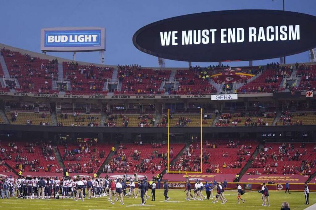
Baseball News: The Milwaukee Brewers’ Christian Yelich is a Green Bay Packers fan, and he’s had his baseball uniform photoshopped into a “Packers” baseball uni (I’m pretty sure we’ve seen that photo before). From Ray Barrington. … Former MLB pitcher Fergie Jenkins recently received a COVID-19 vaccination and he was wearing a personalized name and number mask and Canadian baseball t-shirt (from Brandon Wheatkings). … New Era has brought back the old Kintetsu Buffaloes three color, multi-panel hats. Submitter Jeremy Brahm says, “One oddity of the old hats is that they did not have eyelets in the blue front panel. The model shown does.” … Here’s the logo to commemorate the 25th year of Alabama’s softball program (from Griffin Smith). … I’m 99.99% sure this Texas Rangers jersey isn’t orange (and they did have a red top in 1984), but it’s fun to dream, no? (From CirclinTheBases).

![]()
NFL/College Football News: As we noted last weekend, and Paul reiterated on Monday, LA Rams QB Jared Goff wore a navy blue handwarmer, which contrasts with the Rams royal pants (and numbers and helmet); he wore it again yesterday — but other Rams teammates have royal handwarmers (good spot by Casey Mizzone). … Also from yesterday’s game, GB Packers Center Ryan Linsley’s helmet stripe is truncated, “which is bizzare because the packers are very meticulous with their unis,” says submitter Eric Starke). … You’ve heard of Buffalo Wings, but what about Bills Pizza? (from Timmy Donahue). … Also from Timmy, Green Bay’s Za’Darius Smith wore last season’s NFL 100 gloves in yesterday’s victory over the Rams. … The great Blaise D’Sylva brings us the complete helmet history through pictures of yesterday’s 4 playoff teams, which includes back of helmet number variations. Link in tweet takes you to ALL helmet histories. … The Montreal Alouettes are displaying a simple 75th anniversary logo on their social media. Wade Heidt adds, “Not sure if this will be a patch that shows up on uniforms or final version. It is 75 years since the inception of the Als, not 75 years of them playing football.” … Check out this great image from the archives of Kenan Stadium, the home of Tar Heel Football and “Football in a Forest.” This shot from 2004 just happens to include No. 60 Arthur Smith, the new coach of the Atlanta Falcons (from James Gilbert). … Oklahoma signee Billy Bowman wore OU gloves in Friday night’s Texas Class 5A-I championship game. His Denton Ryan team won big over Cedar Park (from Chris Mycoskie). … Ever wonder what a Buffalo Bills-themed Darth Vader helmet would look like with Zubaz stripes? Wonder no more (from Mr. Michael). … You get a visor! And you get a visor! And you get a visor! (from Mike Chamernik). … Looks like the Ravens playcaller is wearing a golf glove in last night’s game (from Matt Dunn).

Hockey News: Philadelphia Flyers goalie Carter Hart has a new mask. Here’s a few good looks at it (from Wade Heidt). … Also from Wade: Coyotes Goalie prospect Ivan Prosvetov has a new mask which pays tribute to former NHL netminder Gerry Cheevers and his famous mask. … Reader Matthew Wolfram brings us this from the LA Times: LA Kings helmet advertiser is California Hope, a state-funded agency that raises awareness for mental health. “So the Kings are taking a page out of the Jazz playbook,” he notes. … Last (k)night, the Vegas Golden Knights debuted their gold 3rd jerseys. … The LA Kings have revealed their uni schedule (what they call the “jersey” schedule).

NBA/Basketball News: Earlier this week, the Rockets traded James Harden to the Brooklyn Nets, and as is now common, he was photoshopped into a Nets uni. Submitter D. Hempel thinks this photoshop (seen on Deadspin) was “one of the worst” ever. … Speaking of James Harden — he’ll continue to wear #13 with the Nets, but it came at a price. … ICYMI: Pope Francis received an Atlanta Hawks MLK jersey which he autographed. Here’s good video. Submitter Mike Chamernik adds, “Had to sneak in that Nike mention, though.” … Here’s an article on the story behind the Lakers championship rings. Submitter Matthew Wolfram notes it’s “Pretty comprehensive.” … Tweeter James Gilbert asked “Can any of your readers explain this logo?” which prompted Scotty Panciera to reply with the history of Air Jordan releases.

Soccer News: HOLY CRAPAMO! Basaksehir played Sivasspor while it was snowing in Istanbul yesterday. Sivasspor were playing in white. How many players can you spot? (I don’t know that answer). From Winter Maije (and also Wade Heidt).

Grab Bag: As a curler, I’m particularly in love with this 1989 retro commercial (from Lee Wilds). It’s not a curling game, and there are a bunch of different colored stones — but clearly those are curling rocks. Anyone remember this or know more about the “game”?
And finally… a big thanks to Joseph Gerard for his look at the uniformity amongst local TV affiliates, and nice uni tweak job by 13 year old Jack! Well done fellas.
Did a little better yesterday (2-0) picking the NFL playoff games by better uni (although still a lowly 3-4-1 overall); hopefully today I can get on the plus side of the ledger. Enjoy those games (Chiefs/Browns early and Saints/Bucs late) today, plus any footy, hoops or puck that tickles your fancy.
Everyone have a safe and sane (hopefully) week, and I’ll catch you guys back here next weekend.
Peace,
PH
Packers center Ryan Linsley? It’s Corey Linsley. He’s an All Pro, gentlemen. Show some respect. :-)
Go Pack Go!!
I spotted 5 players from the futbol game. Lol
Love the local news “uniformity” article. I remember traveling as a kid and being shocked that other cities “ripped off” the WPVI-6 (Philadelphia) Action News broadcast, from the theme (“Move Closer to the World”) and graphics and format.
Re: the Hawks concept – maybe it is the low-resolution format but the primary purpose of a uniform is team and player identification. You can’t make out the player number on 3 of the 4 concepts. If it isn’t clear to the viewer, it doesn’t work.
Do you think I should make the numbers bigger or just more space between them?
I would see how increasing the spacing does. Keep in mind that font and stroke thickness matter, especially when modern designs often include outlines, double outlines and shadows. It looks like you used Trae Young as your model, and the number 11 is the simplest number with the fewest strokes; it becomes a challenge with certain font to differentiate a 5 from a 6 or an 8 from a 5 or a 0. I like the concepts you did, and with some clearer definition, I think you have something.
I posted it in the wrong section, so here it is:
I’m watching Sheffield United-Tottenham Hotspur on NBCSN right now, and Tottenham is wearing a new sleeve sponsor! Time for Mr. Yuk!
Guess the Game from the Scoreboard is from opening night this season.
Seems more of a Logo article than a uniform article.
“Uniform” logos. (Logo uniformity!)
That picture of Ned Yost reminds me how out-of-place the fat blue stripe on the pants leg looked. It didn’t match any other element of the uniform.
Always loved the WPTV-Channel 5 logo in West Palm Beach, FL. It was stylized to look like the Florida Panhandle.
ABC’s owned-and-operated Channel 7s used to have exactly the same “Circle 7” logo, but after they added the actual ABC logo to the “Circle 7,” each station’s version wound up looking slightly different. (Most obviously, KABC and KGO have the ABC logo lower left, but WABC and WLS have the ABC logo at center-left, although each pair are slightly different from each other.)
Toward the end of Media General’s existence as a TV station group owner, most of their stations had a standardized logo treatment with a yellow crescent shape to the right of the channel number, like this: link The crescent seems to have gone away under the current ownership of those stations, a company called Nexstar.
Love the article on TV logos; link is in that group that’s used Circle 7 since the early 60s.
One last time to say how horrible the Rams unis are!! Didn’t get a single element right.
One last time to say how horrible the Rams unis are!! They did not get a single element right.
One last time to say how horrible the Rams unis are!! Ugh!! They did not get a single element right.
A real classic aspect of local news uniformity is the Frank Gari “Hello” campaign. WEAU here in Eau Claire had a “Hello Wisconsin” campaign from 1988 well into the 1990s, one of many varities across the country (and Canada):
Yes! I was just going to write about this. I grew up in the NYC media market so I don’t think there was a “Hello New York,” and even if there was, my parents didn’t really watch the news that often, so I likely wouldn’t have heard it. A few years ago (wow, apparently almost 7 years ago already) I was listening to the newest episode of “This American Life” and my jaw dropped when I heard about this campaign. It’s still my all-time favorite TAL segment:
link
Great stuff today. I always liked that Westinghouse font…better than most of the Nike jersey fonts!
I used to spend my summers in SW Pennsylvania, and I noticed the Pitsburgh ABC affiliate would do the same news promos
link
as the Cleveland channel.
link
I had some of those sliders. I don’t remember anything about the rules, I treated them like mini curling stones since I was a curling fan (in the 80s I used to watch it on Canadian stations on the giant old-style satellite dish). I only had two colors, blue and orange, three of each I think. They slid because of a ball bearing on the bottom.
The scoreboard is in Arrowhead Stadium, and it is from the game on September 10, 2020, the opening night of the NFL season, when the Chiefs played the Texans.
I found some info on Sliders on BoardGameGeek.com, including lots of pictures. The complete rule set was on the back of the packaging (link). Basically, it looks like a way for kids to play a miniature tabletop version of curling without having to have a set up a rink
Yep remember the standardization that started more or less in the late 1960s and bloomed in the 1970s, specifically 1976 when NBC came out with its “N” logo, replacing the peacock and stylized NBC logo, called the “snake”. NBC at the time owned three tv stations on channel 4 in NY, LA, and DC, a channel 5 in Chicago and a channel 3 in Cleveland. All used same logos and typefaces in their graphics, to program into their new Chyron titling computers, and so on. Here’s a link to an internal NBC publication link