Click to enlarge
Good morning! Greetings from Uni Watch HQ, where all three inhabitants continue to be safe and well (although one inhabitant may have to go to the vet if she keeps sneezing). Hope things are good at your home as well.
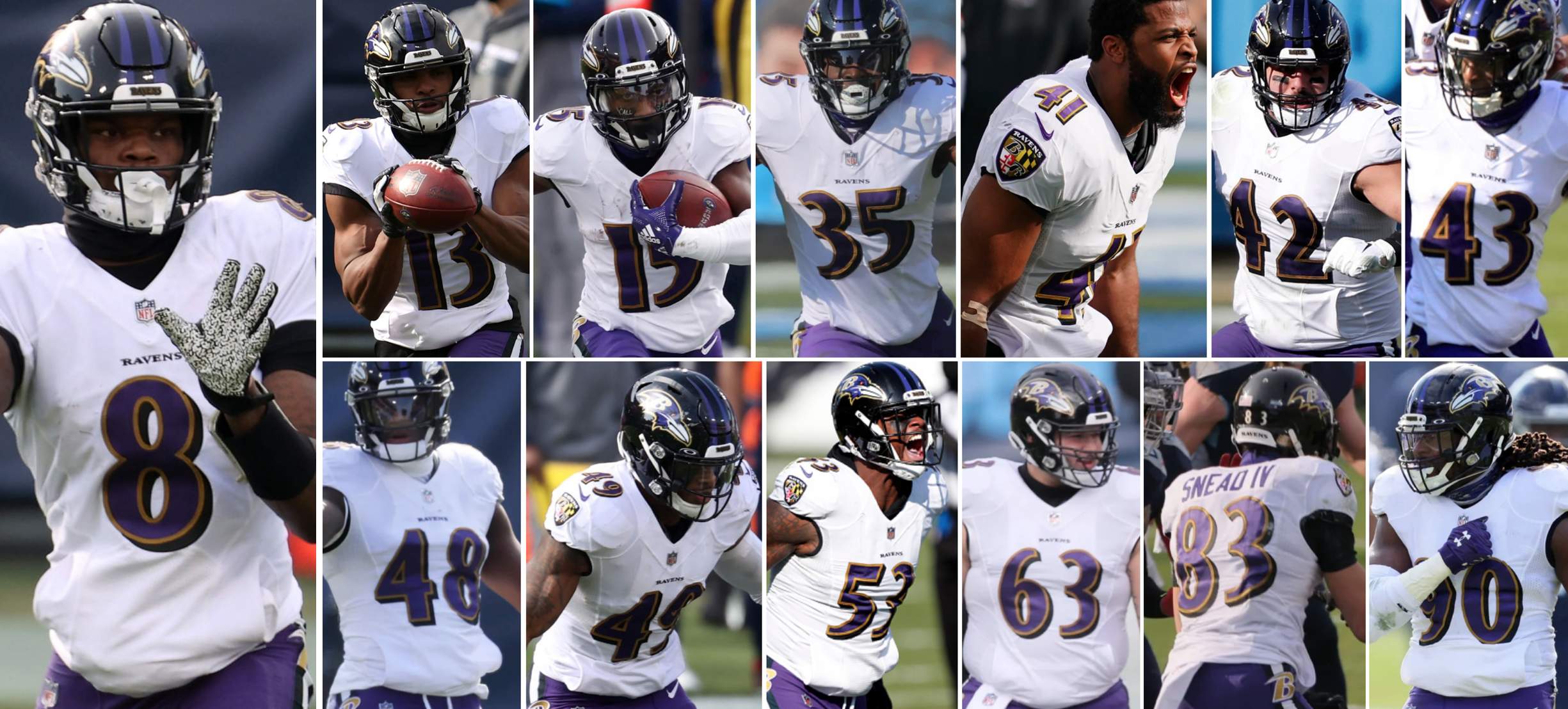
As the 2019 NFL season moved into the cold-weather months, I mentioned a few times that the Ravens were leading the league in sewn-in jersey pockets. The same thing has been true this winter — I counted 13 Baltimore players wearing pocket-equipped jerseys during yesterday’s Wild Card playoff game (and there were probably more that I missed). They’re shown in uni-numerical order above.
Looking ahead, the Ravens’ next playoff game will be this Saturday night in Buffalo, so there’s some major pocket potential there. I’ll be contacting the team today to ask if I can speak to their equipment manager about the pocket — it’s an interesting quirk!
In other news from yesterday’s playoff games:
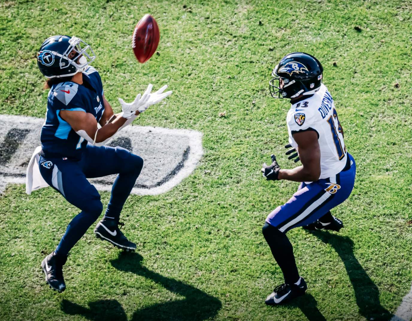
• In that Ravens game, the Titans went mono-navy:
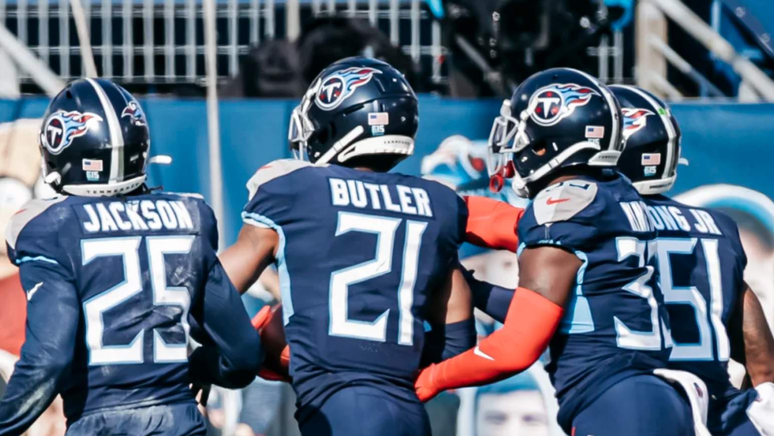
• Titans cornerback Malcolm Butler was missing the center stripe on his helmet:
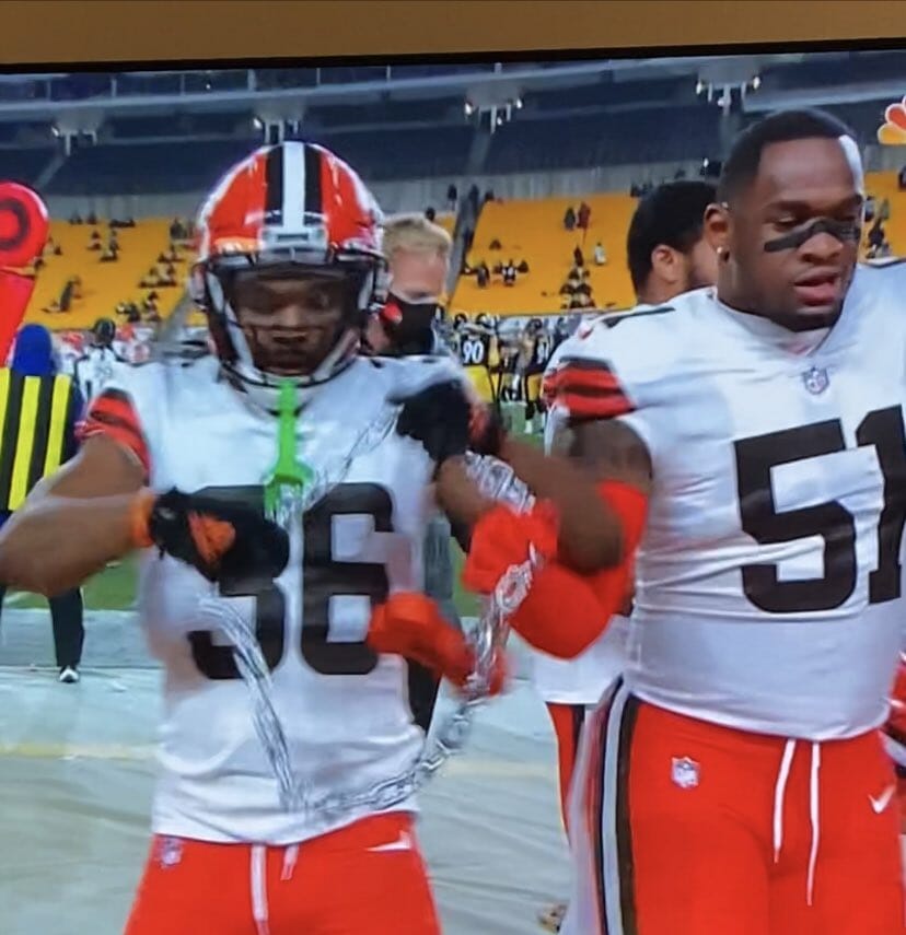
• As we’ve seen with several other teams over the years, the Browns didn’t wear captaincy patches during the regular season but have added them for the postseason:
• The maker’s mark on Browns defensive back M.J. Stewart Jr.’s pants was backwards:
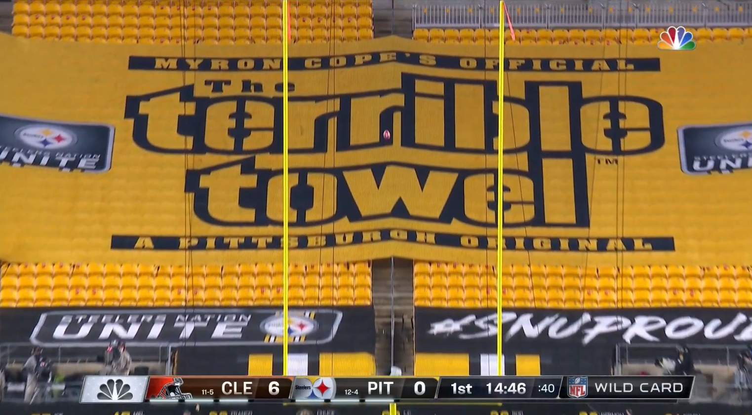
• The Steelers put a gigantic Terrible Towel Tarp over the seats behind one of their end zones:
• And following up on an item that Phil had in yesterday’s Ticker: In Saturday’s Rams/Seahawks game, Rams quarterback Jared Goff was wearing a strap-on hand-warmer pouch that was navy, but with the team’s current logo:
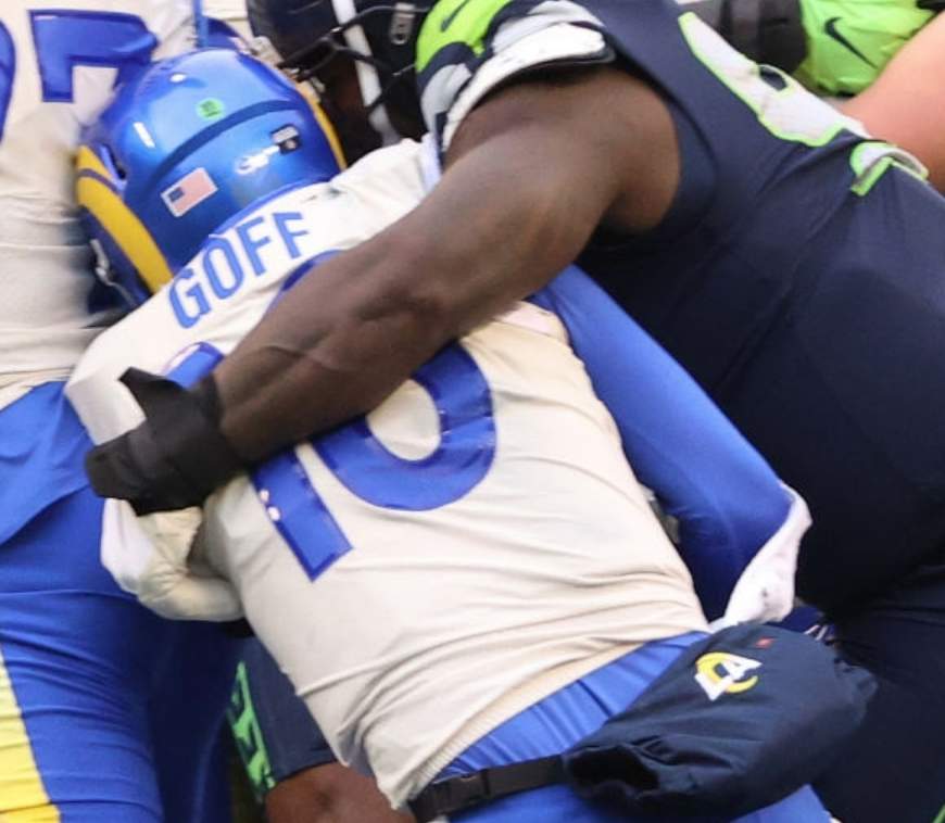
Navy isn’t a current Rams color, so it’s odd that they’d have a navy accessory.
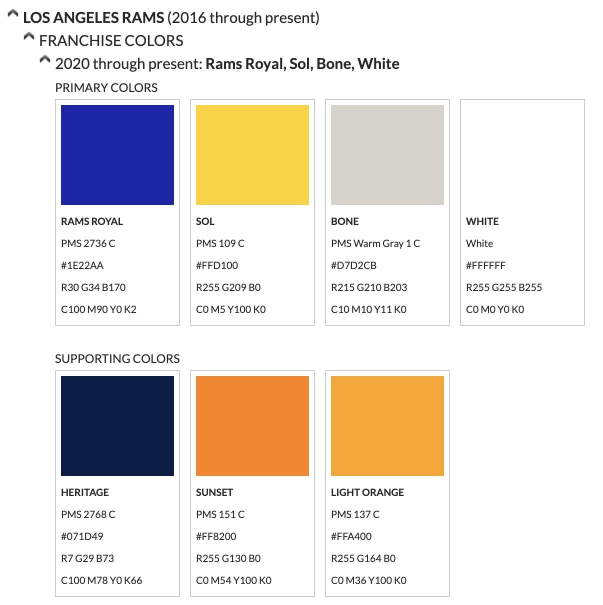
Update: Mea culpa — turns out that navy is a current Rams color:
(Thanks to @thedandee, @AAcoolG, Mike Chamernik, Andrew DeFrank, and our own Alex Hider for their contributions.)
ITEM! Native imagery discussion: I’ll be one of the panelists tonight on Conversations in Color, a weekly Wisconsin radio program about race. We’ll be discussing the use of Native American iconography by sports teams. The segment will air tonight from 8:30-10pm Eastern, and a livestreaming link (which I think will include video, not just audio) will be available on the show’s Facebook page. Feel free to check it out.
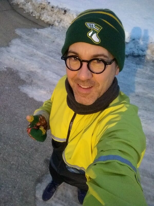
Toque-y doke: Who was that wearing a Uni Watch toque while out for a morning run the other day in chilly Ontario? None other than the great Sean Kane, known to our comm-uni-ty as the guy who paints museum-quality artwork on baseball gloves. Honored to have you repping Uni Watch, Sean!
If you want a hat like Sean’s, you can get one here.


ITEM! Another membership raffle: The winner of last Friday’s raffle is Derek Hempel, who’s won himself a Uni Watch membership card (and has requested a 1990s Milwaukee Admirals theme). Derek has also generously paid it forward by purchasing another membership for me to raffle off, so that’s what we’re going to do today.
This will be a one-day raffle. To enter, send an email to the raffle in-box by 8pm Eastern tonight. I’ll announce the winner tomorrow. Big thanks to Derek for sponsoring this one!
The Ticker
By Jamie Rathjen

Baseball News:The Dodgers are already memorializing former manager Tommy Lasorda by painting his No. 2 on the pitcher’s mound and in center field and putting a large red No. 2 by their retired numbers display (from Kary Klismet). … The blog Threads of Our Game, which documents pre-1900 uniforms, successfully identified a four-day period during which a photo of four 1897 Boston Beaneaters players could have been taken, using only two of the players’ temporary lacks of facial hair and details from their uniforms.

Football News: Several readers were watching the Nickelodeon broadcast of the Saints/Bears game, which sounds like it was delightfully silly, as it should be. … Nickelodeon’s halftime show featured Minecraft-style highlights, but Bears LB Manti Te’o just had “Random” in normal case as his NOB (from Mike Chamernik). … Reader Brad Phillips has two Cowboys items from the 1983 NFC championship game: DE Harvey Martin had two rivets, or screws, or something on the side of his helmet, while RB Tony Dorsett had paint coming off his helmet. … A Colorado high school near the New Mexico border started a six-man football team a few years ago, but their field is so hard and dirty because of the climate that opponents don’t want to play on it. They’re now trying to raise money for an artificial field (from Tyler Maun).

Hockey News: Items from NHL intrasquad games include that the Red Wings don’t have their preseason NOBs (from Mike Chamernik), the Blackhawks had blank boards (from Eric Lovejoy), and the Canadiens had several things going on (from James Beattie). … The NWHL’s Toronto Six, who are starting life in the league’s bubble in Lake Placid, N.Y., have an inaugural-season logo.

Basketball News: Nebraska’s men’s team debuted throwbacks yesterday (from John Muir). … Loyola (Chicago)’s men’s team debuted black alternates (from Phil Santos). … Virginia Tech’s men’s team wore grey at home (from Andrew Cosentino). … South Carolina women’s coach Dawn Staley wore the now-famous orange WNBA hoodie, which gained stature when NBA players and other celebrities wore it in the summer, during her game yesterday (from Christian Dashiell).

Soccer News: The first six items are from the third round of the FA Cup: The SB Nation Tottenham Hotspur blog, Cartilage Free Captain, raised enough money to be the shorts ad for Spurs’ eighth-tier opponents Marine. … Tottenham center-back Joe Rodon also ripped his baselayer sleeve (from James Beattie). … Meanwhile, Marine got a set of extra Spurs shirts as a souvenir because as in other sports no shirt-swapping is allowed (also from @mrmichael21) … Covid-affected Derby County had to use a squad entirely of academy players against sixth-tier Chorley and numbered them using the traditional 1-11 for starters and 12 upwards for subsitutes, instead of the high numbers Aston Villa used in the same situation on Friday. … You may have seen the new sleeve patch already, but the colors are reversed for the holders, currently Arsenal. … Morecambe’s shirt ad for FA Cup games this season was donated to charity (from Ted Kerwin). … The Scottish Cup doesn’t have a title advertiser anymore, so it has a new logo this season. … English women’s team London City Lionesses spontaneously got a new kit a few weeks ago, in the middle of their season, with the previous one just having been released in August.

Grab Bag: Australia’s men’s Test cricket team wore pink numbers, NOBs, and accents for a match ending today. … English rugby union club Saracens have a new shirt and stadium ad (from Adam Ingle). … Virginia’s men’s lacrosse team switched to Warrior as its helmet provider. … The PGA announced that the 2022 PGA Championship, which was slated to be played at Trump National Golf Club in New Jersey and would have been the first major championship to be played at a Trump property, will not be played there after all.

Click to enlarge

What Paul did last night: Yesterday was a sad milestone, as we convened at porch o’clock for the 300th consecutive day. It seems fairly obvious that we will have at least 100 more, maybe even 200, before we can achieve our stated goal of once again sitting safely at the bar at one of our favorite watering holes. Sigh.
After cocktail hour, I made a rare trip to Manhattan to go ice skating with some friends. I think Uni Watch readers will appreciate the sweater I wore, which has strong echoes of the Canucks’ old Flying V design (that’s my friend Michael standing next to me):
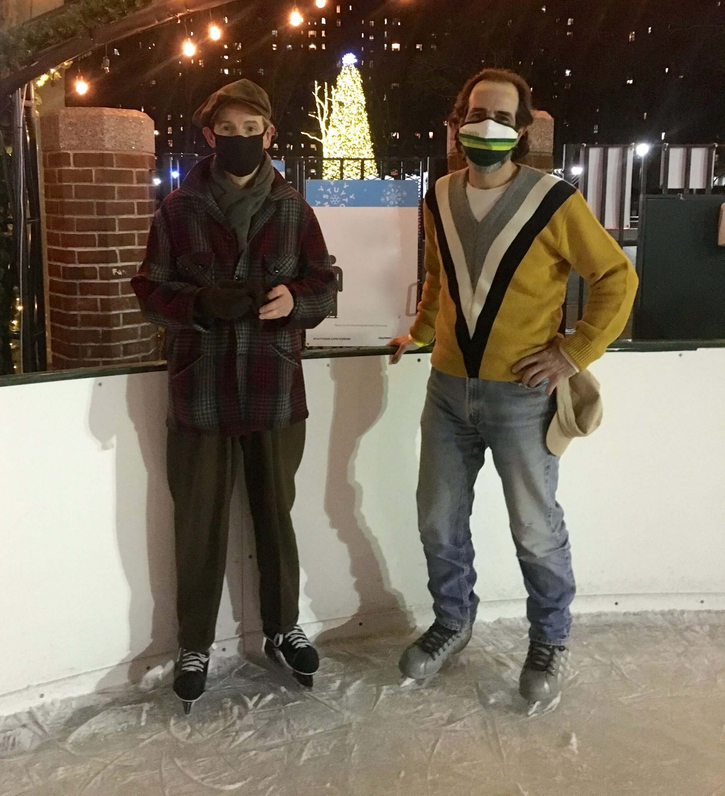
You may be asking yourself, “Can Paul actually skate?” And the answer is “Yes, he can.” The house I grew up in was just a few hundred yards from a pond, and I had access to lots of sizes of hand-me-down skates because of my two older brothers, so I played lots of pond hockey and am generally pretty comfortable on the ice:
Tomorrow: The annual Uni Watch NHL Season Preview.
I have a feeling that my Rams will be screwing around with colors that aren’t currently theirs for years. I just have a feeling this isn’t the only time we’ll see the (now) old Navy show up.
Re: Australian cricket team’s pink numbers
Legendary pace bowler Glenn McGrath lost his first wife to breast cancer around a decade ago. Every summer since, the test match in Sydney has been the Pink Test, a major fundraiser for a breast cancer charity.
Names and numbers on test shirts only came in 18 months ago, and last summer they only wore the pink printing on day 3 (the big fundraising day), but they did it throughout the game this time.
Did anyone else notice the weird ‘towel'(?) that Tennessee WR AJ Brown had tucked into the back of his pants? It was about half as wide and twice as long as any towel I’ve ever seen a player wear.
Good call. Here’s a photo (I’ll see if I can find a better one):
link
On a side note, Tennessee now has the worst looking number fonts in the league (since Tampa Bay corrected their alarm clock abominations).
Atlanta would like a word with you!
The Rams dishwasher jerseys are also on the line.
D’oh! ‘Dishwater’, not ‘dishwasher’. Stupid autocorrect.
The Titans are slightly better than the Vikings (well…any player whose number is greater than 9).
Nice sweater, and you almost replicated the California Golden Seals skates of the early 70’s …..OK – they’re not white, but not too far off.
Those were the standard rental skates that were available. (I recently discovered that my own longtime skates no longer fit. Have to get new ones!)
Yes those are rivets on the side of Harvey Martin’s helmet. It’s a Kelley helmet; those had a padd d suspension that looked like a # attached to the helmet by 2 rivets on each side, 2 on the front (also visible in the photo) and 2 in the back. These were also clear shells so they were decalled and painted on the inside.
Was I the only one who got a kick out of Nickelodeon’s coverage?
Not only was it fun to watch (maybe a bit too over-the-top, but fun), Nate Burleson was a great commentator. I just wish they hadn’t put it counter to Nantz and Romo. I would have watched that broadcast over Collinsworth, for sure.
the next round of broadcast contracts are going to be a sea change on how event rights are sold. With not only OTA & cable channels, but streaming-exclusive outlets, it already seems that each bidding entity has their portfolio of options in play. New and different ways of consumption are in our future.
Also, “Nickelodeon’s halftime show featured Minecraft-style highlights, but Bears LB Manti Te’o just had “Random” in normal case as his NOB” had me thinking, they should’ve had him disappear, even if for a moment. The kids wouldn’t get it, but we’d be howling
Regarding the South Carolina women’s basketball coach, isn’t it extremely odd for a college coach to wear a logo from a professional league during a game?
That sure sounds like a massive NCAA violation. I would think all hell would break loose if Nick Saban wore an NFL sweatshirt during a game.
Just going to say it. I now officially LIKE the Rams’ unis. No, I don’t love the mono-blue or mono-dishwater, but the other color combos work pretty well. I look forward to seeing them each week. I cannot say that for the new Pats or Falcons uniforms. Would kinda say it for the Browns, but the Browns just went back to being the Browns, which is good of course.
To each their own. I was watching the game on my relatively large-screen tv, and the dishwater jerseys looked really bad, particularly up against the blue numbers, pants and helmet. In fact, instead of an off-white/cream color, they looked almost brown-ish/pink-is on tv. With the dishwater pants it looks a little less awful. I think some of it is the dull dishwater color up against the really bright blue and yellow. Although I still hate the design, white would look 1,000 times better.
My wife, who only pays attention to uniforms because of my uni-centricity, even said, without prompting, “what’s with those terrible looking jerseys with the stupid white part on the sleeve? They look like they are from some other team’s uniform?”
I’ve come around to agreeing re the Rams. The navy handwarmer was the only ugly thing in that pic for me. Sure, the mono bone is a pretty bad look, but it’s no worse than most mono football uniforms and it’s better than some in the NFL. When used with contrasting blue pants or jersey, I find that I rather like the Rams’ bone elements.
I view the Rams’ mono bone as their white uniform. While mono bone “might” be no worse than most color mono uniforms, it is way worse than most teams’ all white uniforms.
I think this can be simply attributed to the color scheme and ram horn (even this version) being such a great look for a football uniform. From a distance that can easily overshadow all of the awful elements in the new design.
How simple and great it would have been if they just recolored the St Louis era design with this blue and yellow. And they could have even continued to cash in with their classic throwback as an alternate jersey.
I’d make the bone jerseys yellow; simple! It might run afoul of NFL rules, but I thought the off-white uniforms would, too.
I am a competent (and pretty fast, if I may say so) ice skater myself, but all my childhood skating experiences involved inline skates. (Not a lot of ice available in southern New Mexico.) So the one thing I’ve never figured out is how to stop. I look like a pro out on the ice rink until I do an inline spin stop and give myself away.
The Ravens continue to have success wearing purple pants this season. After yesterday’s game they are 6-0 wearing purple pants: 5-0 with the white jersey and 1-0 wearing the purple jersey.
Speaking of the Rams’ jersey, the patch on the left shoulder that says “Los Angeles Rams” is not a great look. Reminds me of the stickers one gets at an event “Hello, My Name is…..”.
Agree it is so bad. Also, the name tag is white so it helps make the bone jersey look extra dingy.
Boston Beaneaters…that name seriously needs to make a comeback!
The Titans just don’t look right for a number of reasons. Yes, the number font is bad, but for a team still owned by the Adams family, there’s not enough Columbia blue. Navy should be a secondary color at best.
I’d expect the Beaneaters to be really good baserunners. Just sayin’.
Tennessee really ought to have three silver+white faceted stars on the sides of their helmets, meeting point-to-point.
The blog Threads of Our Game, which documents pre-1900 uniforms, successfully identified a four-day period during which a photo of four 1897 Boston Beaneaters players could have been taken, using only two of the players’ temporary lacks of facial hair and details from their uniforms.
I absolutely LOVE this community.
Me too.
HOCKEY IS (almost) BACK! I’m looking forward to the preview tomorrow.
Was that V sweater a thrift store find?
Vintage shop, not thrift (I think I paid something like $30 for it), circa 2009.
It’s a beauty!
DId anyone noticed (probably everyone) that Mayfield’s helmet neck bumper said Julius Jones while other players wore Cleveland (which he has been doing throughout the season), but does that makes him the first one to do something different than blank, team name, team city, team logo in the helmet, during the playoffs?
Something very interesting I’ve noticed in the NFL is that the two shoulder stripes on Colts defensive linemen Denico Autry & DeForest Buckner (and possibly other players) taper to a point and connect on the back of their white jersey. I first noticed this way back in week 5 when they visited the Browns, and it was there again on Saturday against the Bills. But it doesn’t appear that they connect to each other on the home blue jerseys.
The Titans jerseys really highlight a football uni pet peeve of mine: The sleeve design. The league has evolved to a place where almost every player has their sleeves tailored to their specific needs or desires, which, outside of the kicker and QB usually means cropping them down to cap sleeves that do little more than cover their shoulder pads. The tailoring concept itself doesn’t bother me, but the inconsistent execution really does. For one thing, sleeve stripes, which are a classic football look are pretty much all off kilter at best, and often poorly cropped. Between turning the sleeve itself up at an angle, arching the hem, and at all costs preserving a certain amount of visual space for the Nike swoosh, more traditional designs tend to look really bad. But when Nike tries some nonsense like the Seahawks dart/feather stripes that go from hem to collar, or the similar browns stripes (from the previous unis) that traveled all the way to the chest or, in particular, the Titans shoulder yokes that go from neckline to hem, the tailoring usually ends up flawless. I suppose this is a function of Nike not wanting to look foolish for one of their more oddball design choices, but i imagine the tailoring is done by team staff as opposed to Nike tailors, so what gives? Is it really so much harder to make a striped sleeve look decent (seems like it would be far more difficult to match the angles and widths on the Titans or Seahawks designs), is Nike stepping in for teams with their weird sleeve designs?
“and at all costs preserving a certain amount of visual space for the Nike swoosh”
If you look at many of the Nike designed teams, not only are they sure to make design work around and almost draw your eye to the swoosh, they make sure it is in a brightly contrasting color. There is no doubt they design the uniforms with the swoosh in mind now.
Re Rams’ “supporting colors”, have they ever used Sunset (orange) or light orange? Navy was their “blue” previously of course, but I don’t recall them using any shade of orange for anything? What am I forgetting?
link
The Rams have so many colors that they might as well just have all of them.
“Just use a blue and a gold-ish color. Any one will do.”
Goes along with their plan of going the Oregon route with their annual jerseys, too, I suppose. Fitting for a team that doesn’t really want to be associated with a location and/or fans of any permanence, and that is kind of a testament to the NFL’s constant pursuit of dollar signs.
Not even a St. Louis guy. Don’t even like St. Louis; they make Budweiser and I live in Milwaukee, where the far-superior MillerCoors product is produced. But yeah, the Rams kind of embody my NFL cynicism. I’m hoping my not-for-profit Packers pound them this weekend.
What a missed opportunity by the NWHL’s Toronto team: the inaugural season patch design could have called the squad the Original Six!
As a Browns fan I was already hyped to 11 for the game last night, but to see white over orange vs black over gold…fantastic.
one note–NBC always using the Browns’ pre-season uniforms from 2018 (with no helmet stripe) in their SNF graphics. Again last night for Mayfield. I kind of like the look personally, but its association with the Hue Jackson era has ruined it a bit.
Ahh, the sound of skate blades cutting in to the ice,.. priceless.
Nice cross-overs Paul…Now I may have missed it, but over the years, I don’t ever recall seeing a picture of you without a hat. You looked good!
Thanks, Shawn! (Good thing we were going counter-clockwise — I can’t cross over the other way.)
Have you ever been to a skating rink where they go clockwise?
A couple of times. It was disorienting!
I can’t find a photo of it right now, but in Saturday night’s WFT-Buccaneers game, Tom Brady was wearing a jersey with a sown-in pocket PLUS a strap-on hand warmer pouch. Can’t say I’ve ever seen him or anyone else doing that before.
link
Was last night the first time the Browns went white over Orange?
Here, you can look that up yourself (along with lots of other cool stuff) on the Gridiron Uniform Database!
link
Interesting to note that on the colour V colour page of GUD, The Rams dishwater uniform is shown as a colour V colour this year.
Question for Paul (or anyone else, I guess)-
What’s the source/database for that Rams’ colors screenshot?
link
Toque is definitely a wardrobe upgrade on all fronts…if only it helped me run faster! Love it :-)