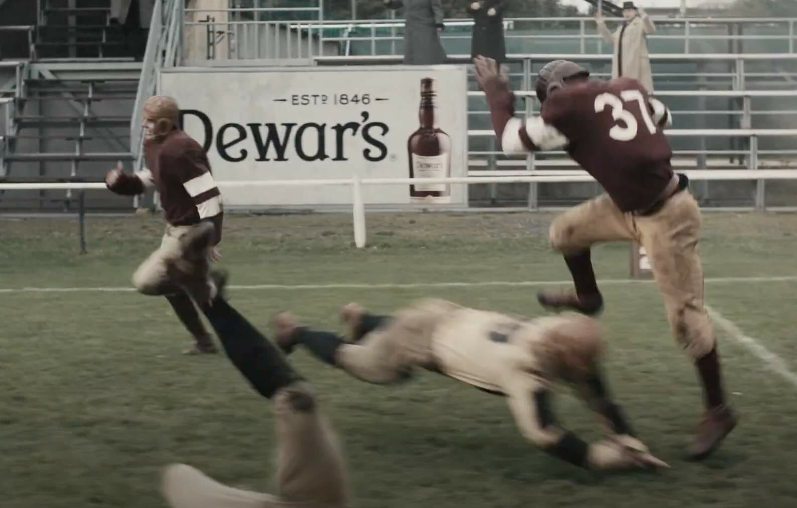
A few nights ago, the Tugboat Captain and I were watching reruns of The Office when a commercial for Dewar’s Scotch came on. It featured some really good-looking leatherhead-era football uniforms, and also some nice soccer kits from that same time period. Naturally, I perked right up.
Before I go any further, go ahead and watch the ad, which is embedded above. It’s only 30 seconds long and should be eye candy for any Uni Watch reader — lots of really great period details.
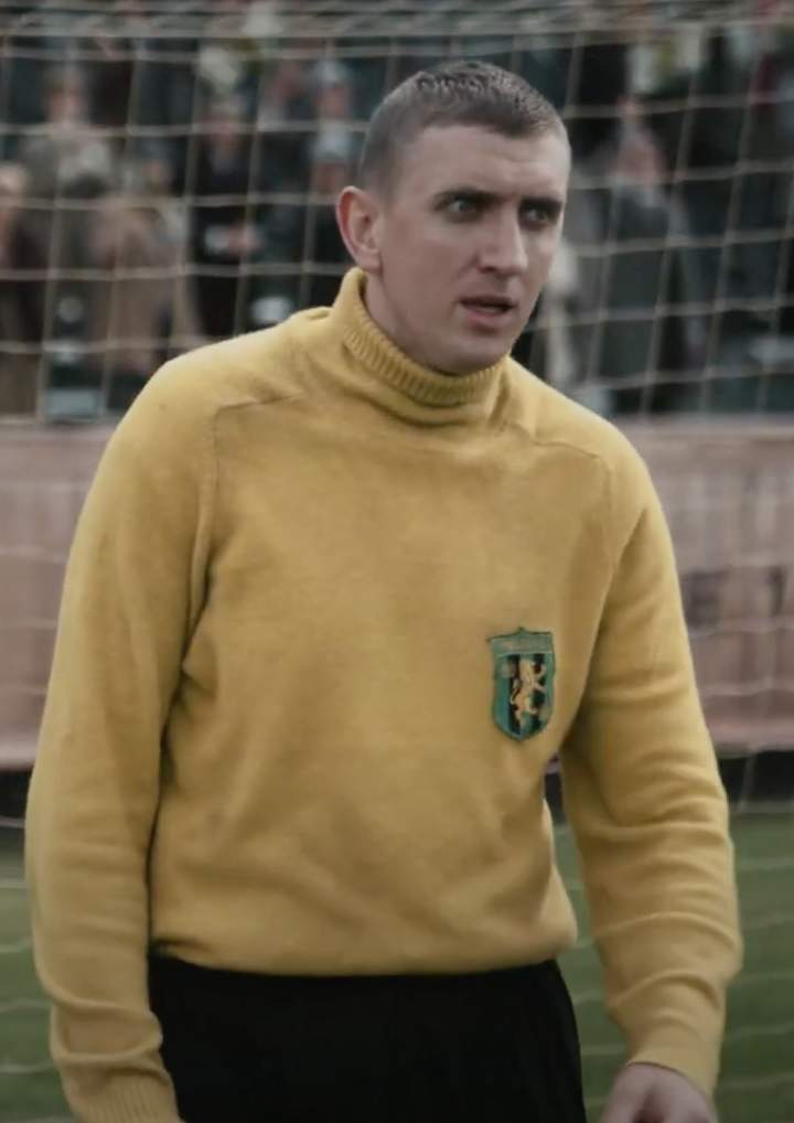
The premise of the ad is that it’s 1919 and the guy in the suit is a scout for a Scottish soccer team. He notices that one of the football players has good hands, so he recruits him to be a soccer goalie back in Scotland (by tossing him a bottle of Dewar’s — just like in real life!).
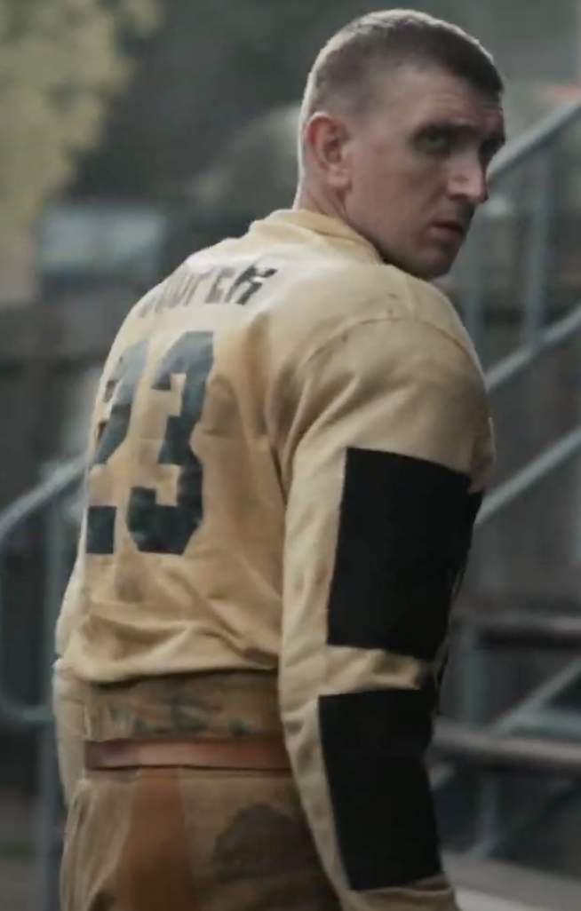
Just one problem: The player being recruited has his name — “Cooper” — on the back of his jersey:
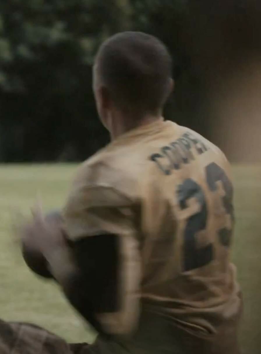
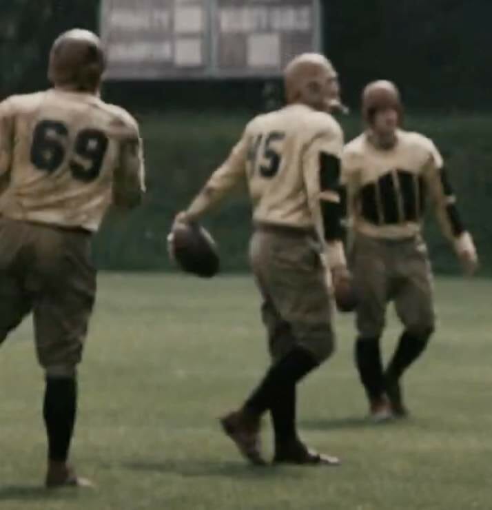
As we were watching the ad, I said to the Captain, “Whoa — that’s wrong.” At first I thought Cooper’s whole team had NOBs, but then I found the ad on YouTube and discovered that his teammates’ jerseys were actually name-free:
And then at the end of the ad, where Cooper has been repurposed into a soccer goalie, he again has his name on his back:
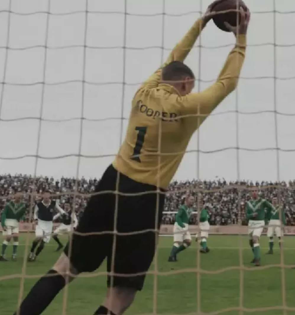
Of course, NOBs didn’t yet exist in football or soccer (or any other sport) in 1919. In fact, it would be another four decades before their advent. But apparently someone involved in the production didn’t think it was visually obvious that the football player and the soccer goalie were the same guy, so they added his name to both his football jersey and his soccer shirt, just to make the narrative idiot-proof.
Or at least that was my assumption. I wanted to know more (about the uniforms in general, not just about Cooper’s NOB), so I did a bit of googling and learned that the commercial was directed by a guy named Tim Godsall. I sent him an email and he wrote back right away — and said he’s a Uni Watch fan! He spoke to me a few days ago from his home in Toronto. Here’s how it went:
Uni Watch: When I got in touch with you, you mentioned that you were already familiar with Uni Watch. So you’re a big sports fan and a big uniform fan..?
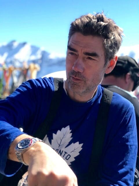
Tim Godsall [shown at right; click to enlarge]: I am a sports fan, especially for my Toronto teams, and definitely a little overly obsessive on the the uniform aspects. Definitely love the the NHL’s Original Six, and I get stressed out when I hear that the Maple Leafs, or or any of the Original Six, are going to tweak their uniforms. I don’t like those new collars they have. It seems like when they have their contracts with whoever the new supplier is. They just can’t resist putting their stamp on it.
UW: Yes, that’s literally what it’s about. It’s about saying, “You know, just in case you couldn’t tell, this is our template. This is, you know, not just a Canadiens jersey — it’s an Adidas Canadiens jersey.” I find that as annoying as you do.
TG: And then the Blue Jays — they’re pretty good now, with their kind of new neo-retro version of their custom typeface…
UW: Yeah, that’s a really good example of an updated classic.
TG: Sadly, though, I just don’t trust them to stick with it. Because, you know, they had some abominable troughs in their uniform history. It’s not like being a Yankees fan or a Red Sox fan or a Dodgers fan, where it’s sacred and you know it’s not going to be messed with. It’s sort of a roll of the dice about whatever the current regime decides they’re gonna put out there.
UW: Oh my god, you’re totally one of us — this is a classic Uni Watch discussion! And that’s why it’s so great that you ended up directing that Dewar’s ad. So for a commercial like that, how does a director like yourself end up being brought on? Like, does the agency get in touch with you, or do you get in touch with them, or what?
TG: No, they get in touch with you. They [the ad agency] sort of conjure their idea, and they get it bought by the client, and then they go out and and decide who they want to talk to about possibly making it. Or they send it out as a script to the people that they’re interested in talking to, or who are represented by various different production companies. And then the production company sends it on to the director, the director reads it, and then they say, “I like this, let’s talk to them.”
And then they talk to several interested directors, and all of those directors usually have to write a treatment, or they outline the various components to show their vision on how to take the script and bring it to life. And then the production companies put that in with a bid on how much it would cost to make it with, you know, that person and that company. And then the advertising agency sort of sifts through the treatments. And then the bid comes in, and they decide who they want to recommend to their client, and then the client signs off and money starts flowing, and you start scouting locations and finding actors — and in this case, designing uniforms.
UW: So that’s what happened in this case — there were other directors who you were up against, who submitted their treatments?
TG: Yeah, I can’t remember who they were. But usually there’s a pool of 20 or 25. directors in various countries who work out of some of the big U.S. agencies and who I end up kind of bidding against on a regular basis. I spoke to them at first, I think, in May. And it took a while, given the sort of strangeness of 2020, to kind of pull out of the station. I think we shot in August, in Prague.
UW: So this whole thing with the American football scene and then the Scottish soccer scene at the end — it was all shot in Prague?
TG: Yeah. The American football part was shot at a small-scale soccer stadium, just outside of Prague. And then we shot the Edinburgh soccer scene at a bigger-scale soccer stadium, also just outside of Prague.
UW: Why was Prague chosen?
TG: Prague is a good production center. They’ve got great film crews and resources, and easy access to equipment. And they also are, you know, price-competitive. You couldn’t afford to shoot that job in the U.S., like in L.A. or something like that — it would be too expensive.
UW: How long was the shoot? Like, for something like this, how long does it take to produce and what sort of budget does it have?
TG: It was a couple of days, and I actually don’t know the budget. I don’t wade into that too much. Basically, I know when there’s enough or not enough.
UW: Are we talking hundreds of thousands? Over a million?
TG: Probably not a million, but a few hundred thousand.
UW: And you went to Prague, in the middle of the pandemic?
TG: No — I directed it remotely, from Toronto.
UW [incredulous]: You can direct a commercial remotely?!
TG: I set up two computers and also have an open phone line to the set. One computer has an app called QTake on it, which shows me the images on the camera in a live feed, exactly as it would be on set. The other has a Zoom chat open with the producer, cinematographer, and assistant director, so we can talk and interact in real time. I talk to the actors via cell phone in between takes. And occasionally I go over to a different Zoom room to talk with the agency and client.
It all sounds complicated, but it actually works very efficiently — if you’re working with people who are great at what they do.
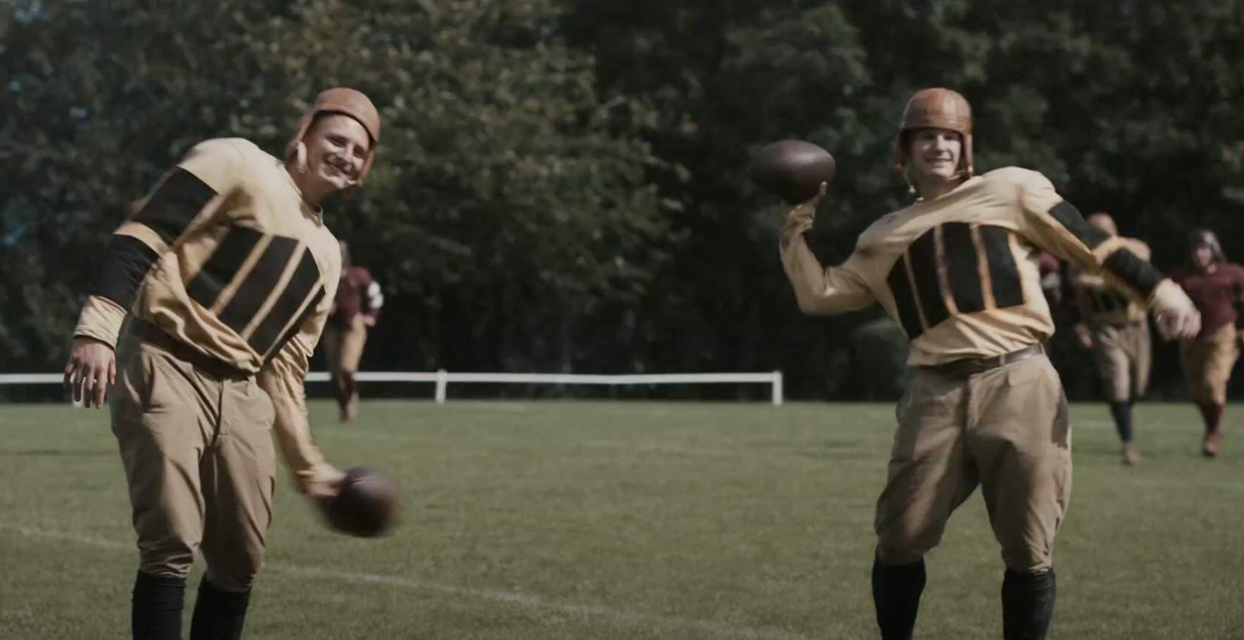
UW: The old-timey football uniforms that are shown throughout the ad look so good. What sort of research went into those, and how did the wardrobe people produce them? And since you’re a uniform guy, what sort of input did you have?
TG: I have a kind of fetish against the kind of generic Blue Team vs. Red Team uniforms that often pop up in advertising. For legal reasons, you can’t use real uniforms, so you have to fake it. And then vintage uniforms pose a different problem, because you don’t want it to feel inauthentic. Some people, like you, might view it with far more scrutiny, but I think anyone watching can feel if it seems authentic, so that was important to me. The producer, Ben Roberts, was London-based and very detail-oriented, so we were on the same page in terms of making sure that the uniforms felt right. He got a guy called Oscar Charpentier, who was the costume designer and handled the wardrobe.
So we did several rounds of research, just throwing things back and forth on emails that showed, you know, legitimate photos of period football teams and soccer teams. And then, oddly enough, there’s a store in West London that Ben went to called Cassie Mercantile, and they actually sell real vintage kind of jerseys and cleats and stuff like that. But they didn’t have enough volume for us to outfit full teams, but it was good reference for the real deal.
So then Oscar designed a bunch of uniforms, and we picked the the uniforms for both the sports.
UW: Meaning he came up with mock-ups or sketches..?
TG: Yeah, exactly. And again, we couldn’t show real teams, so they’re kind of a mash-up of different things, with inspirations pulled from various vintage shots.
UW: The football pants, they looked like genuine canvas pants from that era. Were they real canvas? And what fabric was used for the jerseys?
TG: I think Oscar was serious about making sure that all the materials were period-correct, or they wouldn’t look right otherwise. And yeah, he stuck to materials and technology that would have been the norm at that time. And you know, we got vintage cleats for the for the close-ups of kicking. Even the referees were period-correct. I was just watching it now, and there’s something satisfying about it, just the attention to detail.
UW: What about the leatherhead helmets? Where did those come from?
TG: Those were shipped over from the U.S. We were going to get them from — what’s the name of that George Clooney movie?
UW: Leatherheads.
TG: Right. I think we either looked into getting them the helmets from that movie, or maybe we did get them..? One way or another, they were shipped in from the U.S. for sure.
UW: Considering that you were all such sticklers for details, here’s something I found puzzling: The main guy, Cooper, has his name on the back of his jersey. His teammates don’t, but he does. And then he has his name on his soccer shirt as well. And of course no player in any sport would have had his name on his jersey in 1919. And then I realized, “Oh, that’s because they want to make the ad idiot-proof, so everyone can see that it’s the same guy.” Is that right?
TG: Yes, exactly. The client was worried that some people might not track that he was brought from the States to Scotland, so they were fairly insistent that his name appear on his jersey. The ad agency and I were definitely of the view that it wasn’t necessary, and that it would be slightly odd to have only one person with his name on the uniform, and that it was also not period-correct. But they [the client] were unyielding on that particular point.
UW: So did you have to take that jersey aside and get it lettered up? Or was it done digitally in post?
TG: No, the decision was made before we shot, so the name was on there all along. I think the idea was that we would shoot it and then if the agency could convince them that it was unnecessary, then we were going to delete it in post.
UW: Interesting! Did you consider putting names on all the players’ jerseys, or at least the ones on Cooper’s team, just to make it consistent?
TG: I think there was a brief conversation about it. But the agency was relatively confident they’d be able to convince them once they showed a rough cut to some people — like, it was so clear that it’s the same guy, you know, you’ve got his face, you’ve got the way that it’s edited to sort of guide the viewer to understand that this is the same guy. So again, the agency thought it would get deleted in post, and it would be much harder to delete all the names, so we just did the one.
UW: And did that kill you a little bit inside? Because it wasn’t period-appropriate?
TG: Yeah, I mean, there’s always a lot of things like that in any production. They feel like they’re big and consequential at the time. But when I watch it now, I think it’s a bit odd, but it’s not a big deal. I’ve marinated in it long enough that it’s just one of those “It is what it is” situations. But yeah, it was just to make it sort of, as you say, idiot-proof.
UW: What about the name “Cooper”? Was it understood from the beginning that his name was Cooper, even before it was decided to put his name on the jersey? Or once it was decided to put his name there, did you then have to decide what his name would actually be?
TG: The latter. The way it usually works, if you need to have a name included in the ad, they’ll use the name of someone on the production team, or someone at the agency, or someone from the client, to sign off on it. So there was someone connected to the commercial whose name was Cooper, and he authorized us to use his name.
The reason they do it that way is, let’s say by some weird coincidence there was a guy who played college football in 1919, and his name was Cooper and he was relatively well-known at the time, and then his family sees the ad and says, “Hey, this is an unauthorized use.” But since we have a real guy named Cooper who authorized us to use his name, we’re covered.
UW: What happens to the uniforms that were used in the ad? Do actors get to keep them? If not, what happens to them?
TG: I would imagine Dewar’s has them somewhere, in case they want to do a follow-up ad in six months or whatever. They’d have them stored somewhere, since they paid for them.
UW: The soccer scene at the end obviously doesn’t have as much screen time as the football scene — it’s just a few seconds — but it still looks like it was a lot of work. You said before that it was shot in a big stadium, which you had to fill with a lot of people — or were those people mostly digital?
TG: Bit of a combo. We had probably 200 extras. And then we did what’s called tiling, where you just move them around in this sort of closer and medium shot to see if you have to move them around and shuffle them a bit. And then in the very wide shot, they just put in CG [computer-generated] crowd. But when you’re shooting it, you see a relatively sparsely attended match with everybody clustered in one place.
UW: Who were the actors? Did you have real athletes?
TG: The guy who played Cooper was from London. For the soccer scene, we used real soccer players from from Prague. Actually, the trickier thing was finding people in Prague who played American football! They have a league, essentially a European league of American football, and there’s a bunch of American expats who play over there, so we got a real football team to do the football scene. The guy running at the opening of the commercial is an American guy who plays for a pro team in Prague. We found him first, and then through him we asked if the rest of the team wanted to do it, and they said sure. So we had real football players.
UW: One thing I was struck by is that the guy carrying the ball in the beginning of the ad is Black, and there’s also a Black guy on the sidelines who’s part of the scout’s entourage and who later reappears next to the scout in the stands at the soccer stadium. Was that a conscious, deliberate choice to use Black actors? Would it have been period-appropriate to have a Black player playing alongside Whites in 1919?
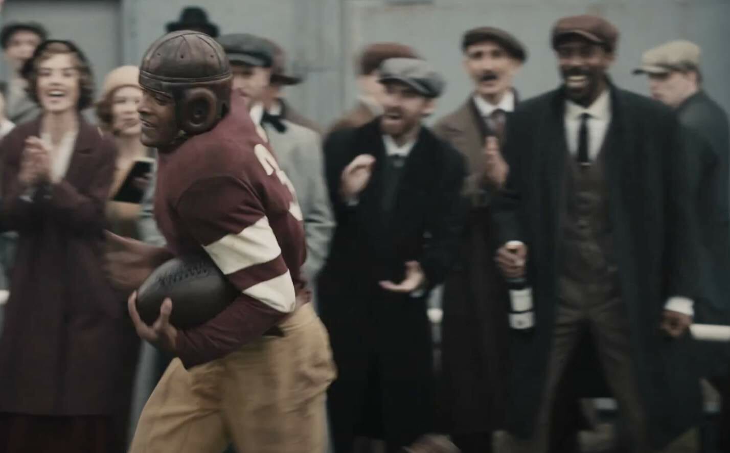
TG: That would have been a period-cheat, for sure, but it’s part of the diversity initiative that comes along with any big ad campaign.
UW: There’s that bit where the scout throws the bottle of Dewar’s at Cooper. How many times did you have to shoot that to get it just right? Did he ever drop it and the bottle broke or anything like that?
TG: No, he was very coordinated. In fact, at the casting process in London, all the actors who auditioned [for the role of Cooper] had to essentially do the performance bits. But they also had to show that they were coordinated. Toward the end of each audition, the casting director would just throw a tennis ball without warning and see if they would catch it. And he caught it in his mouth, and then he was like “You tried to trick me, eh?” In all honesty, he just caught every single one — he was very coordinated.
UW: Wow. So he really did fit the role — he had good hands, just like a real soccer goalie.
TG: He did. With actors auditioning, they’ll obviously claim any skill necessary to book the job, but he really was very coordinated. And turns out, he was great.
———
So interesting! Hard to fathom how any of it relates even vaguely to selling whisky, but that’s another story. Big thanks to Tim for sharing his time and expertise with our comm-uni-ty. The best stories to work on are the ones I learn from, and I learned so much from this one!
After speaking with Tim, I also contacted the costumer he mentioned, Oscar Charpentier. No response so far, but I’ll do a follow-up piece if I hear back from him.
Click to enlarge
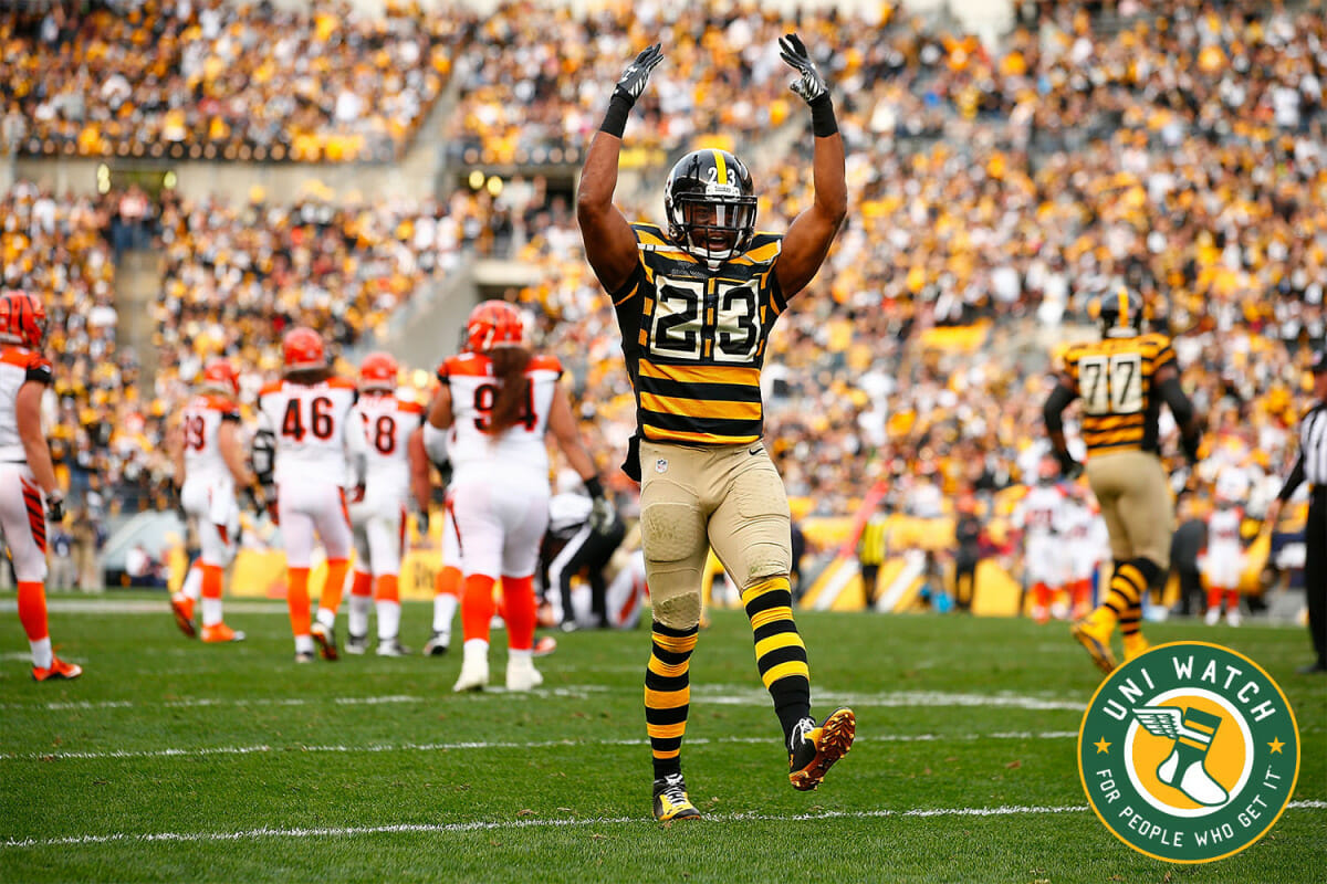
So bad it’s good: My last piece of the year for InsideHook is a look at uniforms that are “so bad, they’re good” (including the Steelers’ bumblebee throwbacks, shown above). You can check it out here.
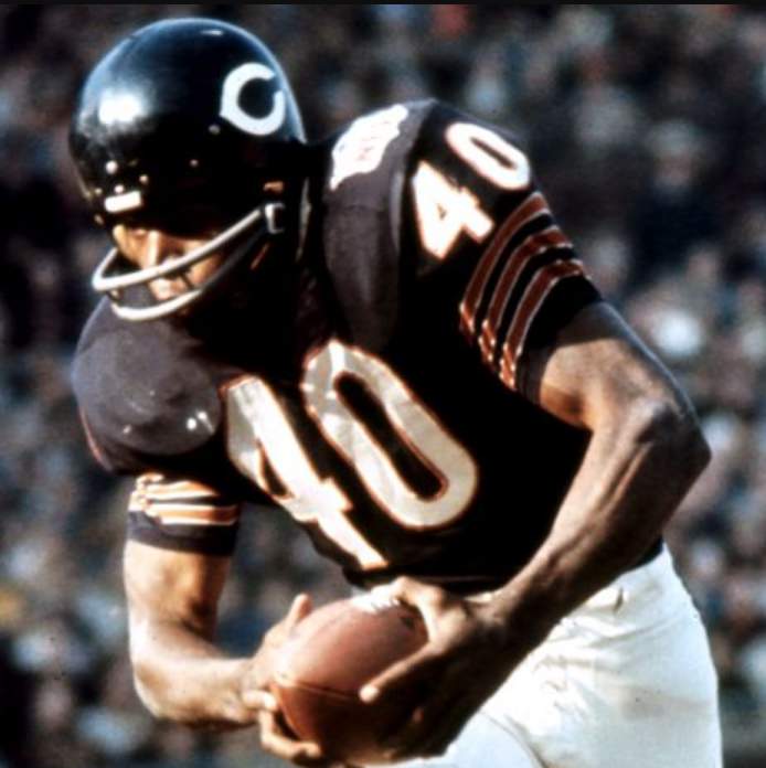
Sayers update: NFL great Gale Sayers died on Sept. 23 — more than three months ago. The Bears, for reasons known only to themselves (I’ve asked, but no response), opted not to add a memorial jersey patch or helmet decal for him — not for the first game after his death, not for the first home game after his death, not at all. Very strange.
Now there’s a new development: Larry Mayer, who writes about the team for Bears.com, tweeted yesterday that the team will honor Sayers at this Sunday’s regular season finale “with a stenciled circle on the field that features his last name and No. 40 jersey number.”
As far as I can tell, the Bears themselves have not yet announced this on-field tribute on their social media channels or on their website. The only reason we know about it is because of the tweet from Mayer.
I understand that this has been an unusual year in many respects. But in my 20-plus years of covering the uni-verse, the Bears’ handling of Sayers’s death is one of the strangest things I’ve ever witnessed. You’d think that adding some sort of uniform memorial for a Hall of Famer — one who seems to have been held in near-unanimous high regard — would be a no-brainer. Adding an on-field memorial more than three months after the fact just makes the whole thing even stranger.
To be clear: I’m not saying they’re wrong to have handled it this way; I’m just saying it’s very, very surprising, given the way things usually work. Then again, the Packers haven’t uni-memorialized Hall of Famers Paul Hornung or Herb Adderley, both of whom died this season. Just another bit of strangeness for this supremely strange year.
(My thanks to Jack Silverstein for bringing Mayer’s tweet to my attention.)
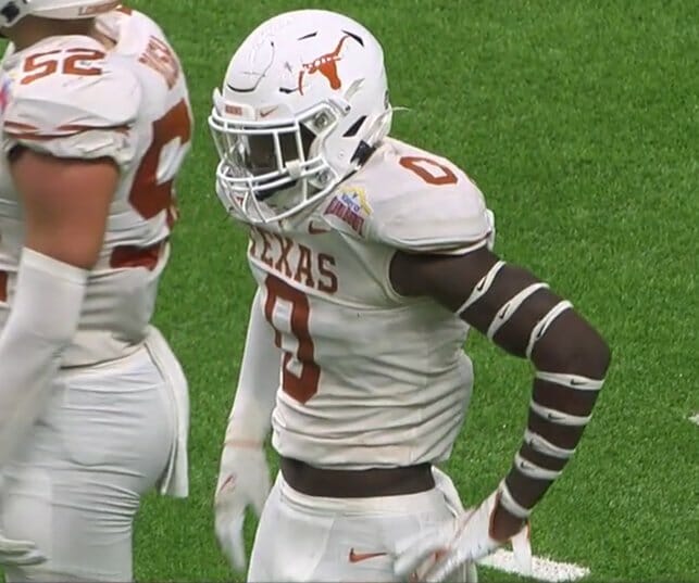
A very dry left hand: Longhorns linebacker Demarvion Overshown got a little carried away with the logo creep in last night’s Alamo Bowl. He’s worn those before, but not to the same extent. Bonus points for the broken horn on his helmet logo!
(Thanks to all who shared, and to Cork Gaines for the screen shot I ended up using.)
Click to enlarge
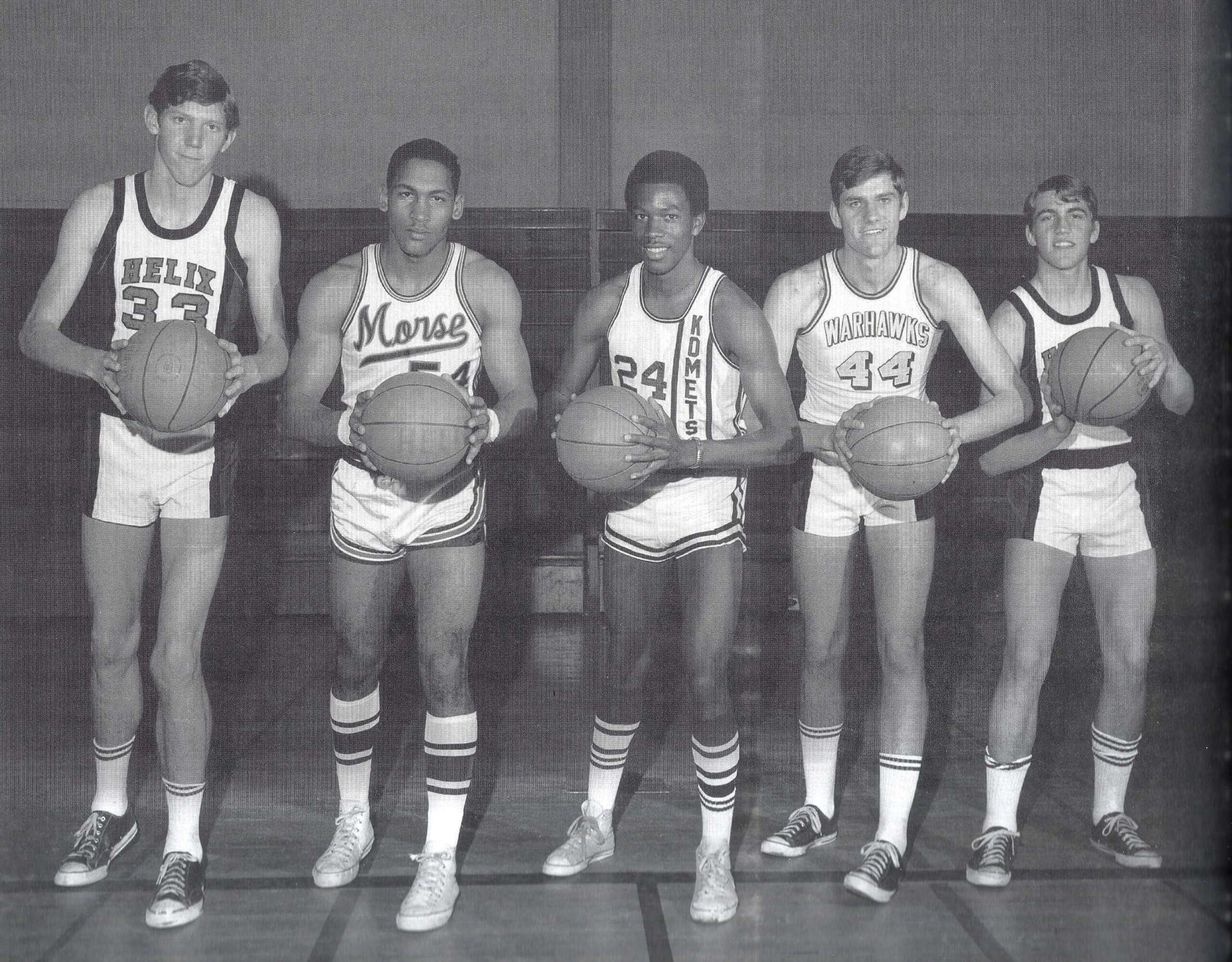
Too good for the Ticker: Oh man, so much uni goodness in one photo! This shot shows the 1969 San Diego all-city high school basketball team. So many different great uni stylings! Too bad the guy at far-right is holding the ball in a way that obscures his jersey, but I’m pretty sure he’s wearing the same uni as the guy at far-left, so we’re not really missing anything.
Speaking of the guy at far-left: That’s a 17-year-old Bill Walton!
Anyone want to take a shot at colorizing this?
(Big thanks to longtime reader/pal Richard Craig for this one.)

Membership update: Eight new designs have been added to the membership card gallery. That includes Timothy Young Jr.’s card, which as you can see was done in a Milwaukee Bucks “Irish Rainbow” motif.
Remember: If you made a New Year’s resolution back in January to finally sign up for a membership card in 2020 but never got around to it, you’re almost out of time! If you want to finally make good on that — or, for that matter, if you want to get a jump on your New Year’s resolution for 2021 — you can sign up here. (Footnote: Remember how I reduced the membership fee from $25 to $20 at the start of the pandemic? It will be going back to $25 soon, or at least soon-ish, so this would also be a good time to take advantage of the discounted price while you still can.)
Ordering a membership card is a good way to support Uni Watch (which, frankly, could use your support these days). And remember, a Uni Watch membership card entitles you to a 15% discount on any of the merchandise in the Uni Watch, Uni Rock, and Naming Wrongs shops, and also on the Uni Watch Toque and the Uni Watch Classic Cap. (If you’re an existing member and would like to have the discount code, email me and I’ll hook you up.)

Recommended reading: Have you ever eaten bucatini (little tubes of pasta, sort of like spaghetti but with a hole in the center)? I haven’t, but apparently some people are really into it, and for some reason there’s been a shortage of it this year. New York magazine writer Rachel Handler has written an article about “the great bucatini shortage of 2020,” and it’s completely hilarious. In addition to being a great piece of writing, it also gives some insights into the challenges of being a reporter obsessively covering an esoteric topic that most people don’t care about (something I can definitely relate to). This one gets Uni Watch’s highest recommendation — check it out here.
The Ticker
By Lloyd Alaban

Baseball News: Mets P Marcus Stroman is apparently outfitting the Cape Cod League’s Orleans Firebirds under his HDMH (“height doesn’t measure heart”) label (from Mike Chamernik).

Football News: Here’s what the Gator Bowl patch will look like on Kentucky’s uniforms. … The Cheez-It Bowl had cheese wheel “fans” placed in the stands (from @artofscorebug). … Also from that game: Miami WR Marshall Few, who normally wears No. 27, wore a No. 0 NNOB jersey. Probably a blood jersey, but we don’t know for sure — anyone..? (From Timmy Donahue.) … Oklahoma State won the Cheez-It Bowl, so players dumped Cheez-Its on head coach Mike Gundy. Anyone know if this is a mandatory marketing thing from Cheez-It? (From Mike Chamernik.) … The side judge at last night’s Alamo Bowl wore an “R” on the back of his shirt instead of the usual “S” (from Brad Patterson). … ESPN showed an image of Ohio State QB Justin Fields in his old Georgia uniform (from multiple readers). … Yesterday’s episode of The Jim Rome Show showed Browns QB Baker Mayfield in an outdated team uniform (from Beau Parsons). … New Fiesta Bowl luggage tags for Oregon (from Jorge Cruz).

Hockey News: The Sharks posted an explainer of their throwback sweater on Twitter. The best/worst part is definitely the explanation for the stripes. … Czech goalie Lukáš Pařík wears No. 1 with the national team at IIHF World Juniors but is using his Spokane Chiefs helmet with his club No. 33 on it (from LJ Sparvero). … Nice-looking pads for Golden Knights G prospect Logan Thompson (from Wade Heidt).

Basketball News: Gross: The 76ers and Thunder are the latest NBA teams to put new ads along the baselines of their courts (from Aaron Pinto). … Ole Miss men’s and Alabama men’s had a confusingly-colored score bug last night, so ESPN decided to switch the colors on the bug after the first TV timeout (from Griffin Smith).

Soccer News: Leeds F Ezgjan Alioski got blood on his shirt yesterday and had to change into a new NNOB shirt (from @leaaves). … SC Braga likes to give opposing sides historically-related gifts. … The seats at Adana Stadium in Turkey are done in two colors to represent the stadium’s two tenants (from James Gilbert).

Grab Bag: Abu Dhabi Police unveiled new uniforms. The new set of uniforms include three different suits: One each for administrative and field roles, and a third for ceremonies (from Timmy Donahue). … Also from Timmy: The U.S. Army is overhauling its hair and grooming regulations. … New logo for the town of Hazel Park, Mich. … The man who designed several famous UK TV channel logos has died. … Adidas is looking to sell Reebok, and hip-hop mogul Percy “Master P” Miller is among the leading suitors. … There’s been a bit of controversy over the guidelines for creating a new logo for the Indiana National Guard.
Click to enlarge

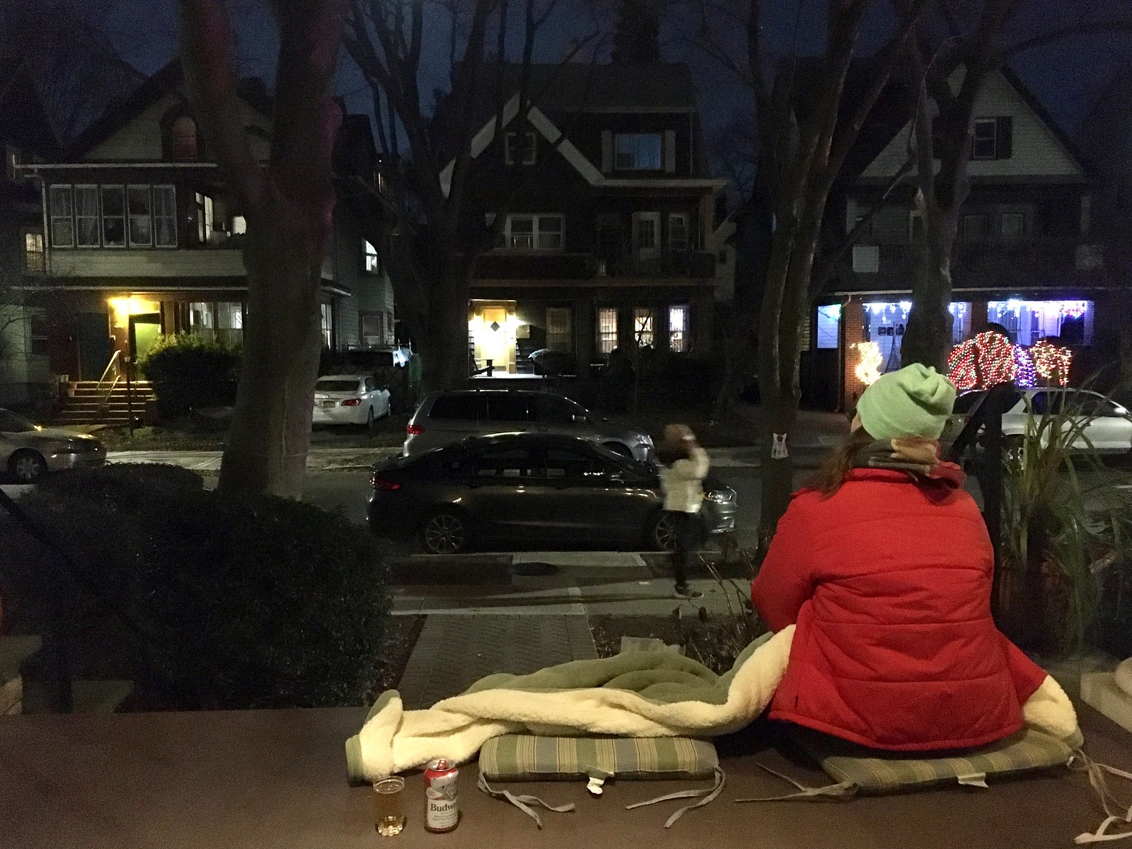
What Paul did last night: It’s been getting chilly out on the porch, so for Christmas I got us an electric blanket — the first one I’ve ever owned — to help get us through our nightly cocktail sessions. We’re only using it when the temperature is in the mid-30s or below, which so far has only happened twice — including last night.
As always, you can see the full set of daily Pandemic Porch Cocktails™ photos — now nearly 290 of them — here.
Kudos to you Paul for never missing a night of Pandemic Porch Cocktails! Takes dedication that I don’t have. :)
When you get to 365 it’ll be kinda special…
Besides football not having NOBs in 1919, soccer didn’t even really have numbers, much less NOBs. Like, numbers had been introduced but weren’t close to universal yet.
The soccer teams to me look like recolored versions of two Scottish teams — Airdrieonians for Cooper’s team and Hibernian for the other one, so that’s a good detail for those who can appreciate it.
Paul, thanks so much for recommending the bucatini article–what a wonderful read to go along with my morning coffee! I agree that it deserves one’s highest recommendation, and I have shared it with friends already.
Glad you enjoyed, Rob! Too good not to share, right?
Paul, thank you for the Kentucky membership card. I chose No. 0 as a reminder of how to live 1 Corinthians 13:2 – ” If I have the gift of prophecy and understand all mysteries and all knowledge, and if I have all faith so that I can move mountains but do not have love, I am nothing.”
RE: Dewar’s – I kept thinking, “They named the guy Cooper because a cooper is a barrel maker. It makes sense.” I was surprised this didn’t come up in the interview.
Good point! In fact, I even visited a distillery’s cooperage during my 2010 visit to Scotland: link
But like Tim said, the name was chosen semi-randomly because it belonged to someone on the crew. That was one of the most interesting details to learn in this interview!
Here’s how smart I am.
I always thought “cooper” was also known as a person who kept and trained messenger pigeons or flying birds.
Typo: “And then the Blue Jays — they’re pretty god now, with their kind of new neo-retro version of their custom typeface…”
Fascinating interview. There was a lot there about the commercial-making process that I wasn’t expecting.
Hi Paul – typo in the Sayers section: the Bears’ handling of Sayers’s death if one of the strangest things I’ve ever witnessed.
Thanks! Got it.
The only players/coaches who have been memorialized this season that I could find were Bobby Mitchell, Fred Dean and Don Shula. Some others that have not are Willie Wood, Sam Wyche, Tom Dempsey, Chris Doleman and so far, Kevin Greene.
Also: Willie Davis (Packers, helmet decal) and Larry Wilson (Cardinals, jersey patch).
“Of course, NOBs didn’t yet exist in football or soccer (or any other sport) in 1919. In fact, it would be another four decades before their advent.”
There is one outlier in hockey that predates this. NHL’s New York Americans with NOBs in 1926-27. Lasted one season then the NOBs did go away for decades.
link
Asking not telling, but by the 1920’s weren’t guys like Fritz Pollard and Duke Slater playing alongside white players? I know that’s after this ad was set, but I don’t know if pre-NFL leagues were segregated.
I’m sure that Miami’s Marshall Few wore the number 0 jersey on that play because Brian Balom, who also wears #27, was also in on the same play.
As you know, with many college teams having over 100 players, jersey numbers are often duplicated, and teams can be penalized for having more thah one player wearing the same number on the field at the same time.
That may also be the first time a player wearing “0” scored a point for Miami, I need to check some resources.
If you look at #37 running the ball, it’s clear he is wearing modern football shoulder pads. He appears to have a back plate attachment that nearly all skill position players wear, but those did not become prominent until the early 2000s. Since we now know he is a real football player, he likely used his own pads.
Honest question: What would you say the difference between soon and soon-ish is? I feel like soon is vague enough to already mean soon-ish.
It means I’m hedging to keep my options open!
Regarding NOBs, the research I did for “How Football Became Football” showed there were isolated basketball teams with NOBs dating to 1916, but the first football teams to do so were AFL teams in 1960, and Maryland at the college level in 1961. The NFL did not have them until the league merged
There were basketball teams with numbers and NOBs in 1916? Over a decade before baseball teams even had numbers?
I gotta ask: which sport first used numbers, and when?
The state champion-Cleveland Rayls had names on their backs in 1916.
The first sport that had numbers on the uniforms was rugby, originating in New Zealand in 1897. The first American football game in which players wore numbers was the Iowa State-Drake game in 1905.
Paul,
Just wanted to say thank you. Great content today. I appreciate your willingness to reach out to folks you’ve never met. Things you don’t think too much about when you’re not a journalist. Great insight. What a whirlwind to get a commercial made.
Thanks, Jason. I have to say, it’s *very* gratifying to see how people are responding to today’s post. It’s one of my favorite Uni Watch entries in quite some time, and it means a lot to see that you folks are enjoying it as well!
Great entry today Paul! I was curious about that commercial once it started airing. Really enjoyed hearing the all the first-hand information from the director. Had to know he “got it” based on how well that commercial was done.
The San Diego area teams and colors include: Helix Highlanders (green and black), Morse Tigers (navy blue and antique gold), Kearney Komets (maroon and black), Madison Warhawks (red and outdated color, likely gold)
Oh my God that noodle article is hysterical! Coffee-out-the-nose-moments (there are many): “The conversation halted as dramatically as if we’d just seen someone stabbed to death with a bucatini noodle inside one of the little Zoom windows.” and “I instantly decided that as a serious journalist, it was my duty to figure out what the literal fuck was going on.” I also chuckled out loud at the writer referring to “the established noodle industry” as “Big Pasta”. Thanks Paul!
“Big Pasta” was my favorite detail (among many serious contenders!).
I’ll also chime in to say what a great interview this is. Really interesting stuff!
This was a really fun post! I enjoyed it!
I gotta say, the film making techniques and narrative were MUCH more effective in showing it was the same character becoming the goalie than the NOB, which honestly I didn’t notice.
Regarding Master P being a suitor for Reebok.
Master P could have a field day in the urbanwear market. He had his own version of the Astros “tequila sunrise” jersey back in the 2000s.
link
The InsideHook piece is up:
link
As a Vancouver resident, proud to see our city represented well in the “So Bad It’s Good” category.
-Canucks near the top of the list for the Flying V. As it should be!
-Grizzlies getting notable mention.
-Even Norwegian curling team getting the attention at Vancouver Olympics.
Other notable “So Bad It’s Good” in the city from less prominent leagues:
Vancouver VooDoo of Roller Hockey International. One look and enough said:
link
The unusual basketball uniform design of the WBL’s Vancouver Nighthawks:
link
link
We’re stylin’ on the West Coast!
I have noticed a growing trend in the last decade while watching sports. When showing a graphic with a player in uniform or when showing a highlight package, they almost ALWAYS will show a player in an alternate uniform. I am willing to bet whoever put together the graphic of Justin Fields in a Georgia uniform mistook it for an Ohio State alternate.
I’ve noticed this as well. Sometimes they even use a uniform that was a one-off throwback — very odd!
Love that straight away Tim is bashing those God-awful Adidas collars. Awesome interview!
Absolutely loved today’s post, Paul! What a fascinating dive into the world of TV commercial production and how it intersected with the uni-verse on this occasion. And a great interview with Tim Godsall. Glad to know he’s “one of us!”
A Uni Watch classic today, Paul. Great interview.
Thanks, Jim. Great to hear from you — hope you’re staying safe and sane!
I don’t have the tools to try to colorize that SD All-City hoops squad, but I can identify the schools, for what its worth. Walton (and his apparent teammate at the end) went to Helix High, who had green as their primary color. It’s possible that black was in the mix as an accent color in the trim. The next guy is from Morse High, who had Navy and gold (historically, kind of a mustard version) as their colors. The next guy went to Kearny High (alma mater of Alan Trammell), and their simple colors were Burgundy and White. The fourth school represented is Madison High . .the Warhawks historically used powder blue and Navy as their colors.
Fascinating piece today. I love these immediate interviews, and I often try to put myself in the shoes of the interviewee. It must be so cool to have someone so interesting be interested in talking to you. I picture each of them logging off/hanging up with a big ol’ cheshire grin.
I say the with the utmost sincerity, without an ounce of lemming. Although I always say, “If life gives you lemmings… make lemmingade.
I can’t speak for Tim, but *I* definitely had a big smile on my face when the interview was over. And I’ve been almost giddy about getting to publish the piece — I really enjoyed this one so much!
Great stuff with your latest Inside Hook piece today, too, Paul! There seems to be no end to the supply of uniforms that could qualify under the “so bad it’s good” category, but it’s hard to argue with the ones you included on the list. And I think you absolutely nailed the top spot. The Astro’s Tequila Sunrise uniform is the undisputed champion of “so bad it’s good!” As a reader who remembers you expressing a certain amount of disdain for that uniform dating as far back as your ESPN Page 2 days, it’s been interesting to see the evolution of your opinion on them.
Another “blue collar” reference in the article about the new logo for Hazel Park. The logo is denim blue to represent its “blue collar roots”. Egad!
Re: the Cheez-It dump, I figure the company had to provide a bucketful for the team to use. Same thing with the fries at the Potato Bowl a few weeks ago. I don’t think any player would sit there emptying boxes of Cheez-It’s into a sports drink bucket. I’m really hoping a reader can fill us in on the details. My guess: pre- planned thing, company made it mandatory.
In the Alamo Bowl, the side judge who began the game had to leave with an injury. The alternate official, who was a referee, went in to the side judge spot. Fortunately he had a black hat or it would have been confusing to have two white hats on the field at once.
Paul, you’re a cat guy and you just got your first electric blanket?!
Lay that thing on a chair or couch, plug it in, and wait for the purring action to begin. We put ours out on the couch starting in the fall or so and the cat is suddenly our best friend for the next few months.
Great interview. I agree with a couple of things that were brought up in the interview. The issue of uniform suppliers trying to put their stamp on a classic uniform is an interesting one. It is interesting how the team has a change in ownership and they want to change the team’s look and put their stamp on the team. I was kid in the seventies and eighties and a lot of the teams had I felt brighter colors and as we went into the nineties, you had a lot more darker colors and teams trying to incorporate black in the uniforms, because somehow the belief that wearing black made you tougher and more intimidating. I am happier to see that teams are slowly coming back to those brighter colors. I know my favorite team, the Seattle Mariners, have brought back the royal blue and bright yellow look for their Sunday alternates and I feel like they should go back to those colors as their primary look. But, I understand that their current colors have a lot of winning history with those colors and a lot of fans like those colors as well.
The other thing in the interview that I appreciate from the director is the attention to detail of using actors who play the sport they are depicting. It is very distracting to watch an uncoordinated individual, who clearly has never played the sport or played it seriously, before.
Thank you for Uniwatch and Happy New Year to you and your family.
Paul, I just wanted to be the latest to compliment you on a truly entertaining and informative column! This was Hall-of-Fame-level content (if such a Hall existed). *chef’s kiss*
Thanks for all you do, and here’s to a great 2021 (hopefully) for everyone connected with the Uni-verse!
Paul – The piece was wonderful in and of itself. After reading your intro, describing the commercial and the NOB and seeing that you actually interviewed the director, I got that feeling you get when you know a curiousity is about to be fulfilled. (But, no–I didn’t skip ahead to find out, since I wanted to read the interview in context.)
But it’s more than that. It happens every time something like this comes up and you’re able to reach out to someone involved. But it’s more than THAT. You reach out and learn that the person is a Uni-Watch fan. For reasons I can’t explain, it’s just so fulfilling.
I know George Costanza didn’t want his worlds to collide, but I love when THESE worlds collide.
Thanks, Gregg. Really appreciate the thoughtful feedback! As I’ve said in a few other comment threads, it means a lot to me to see how people are enjoying today’s post, because I really enjoyed it myself!
Ha! Your adventures on the porch has reminded me of the two postal workers who bet each other who could wear their shorts the longest during the winter months. Have you established a protocol yet for when you are closing down the porch?
Have you established a protocol yet for when you are closing down the porch?
We plan to keep doing it until we can safely and comfortably have a drink while sitting at the bar at one of our favorite local watering holes. Until then, we will maintain the daily ritual of convening outside at porch o’clock, no matter the weather!
Great stuff! I’m surprised Dewars and the ad firm went through all the trouble of filming old timey football and soccer scenes, in Prague, with a director working remotely, during a pandemic. I might’ve just opted for a simpler concept. But they got most of the details right! The NOB thing is understandable.
I too was shocked that directors could work over the phone/computer.
The part about why they picked the name Cooper was really interesting. The legal team really does prepare for every scenario.
If you didn’t like the dumping of the Cheez-its on the coach at the end of the Cheez-it Bowl, I doubt you’re going to like the end of the Duke Mayo bowl
Peach Bowl Friday will be color vs color.
UGA going red/black/silver
Cincinnati going black/red/red
link
link
Fantastic entry today. Just fantastic.
Thank you, Rodney!
The Sharks link posted in the Ticker takes us to an explanation of their new Graphic Design look on social media, not their new jersey. I’m not sure if they did post an explanation on the new jersey or not, but that’s not the correct link if so.
Great story Paul. Funny that they thought the average viewer wouldn’t get this story without the NOB.