For all images, click to enlarge
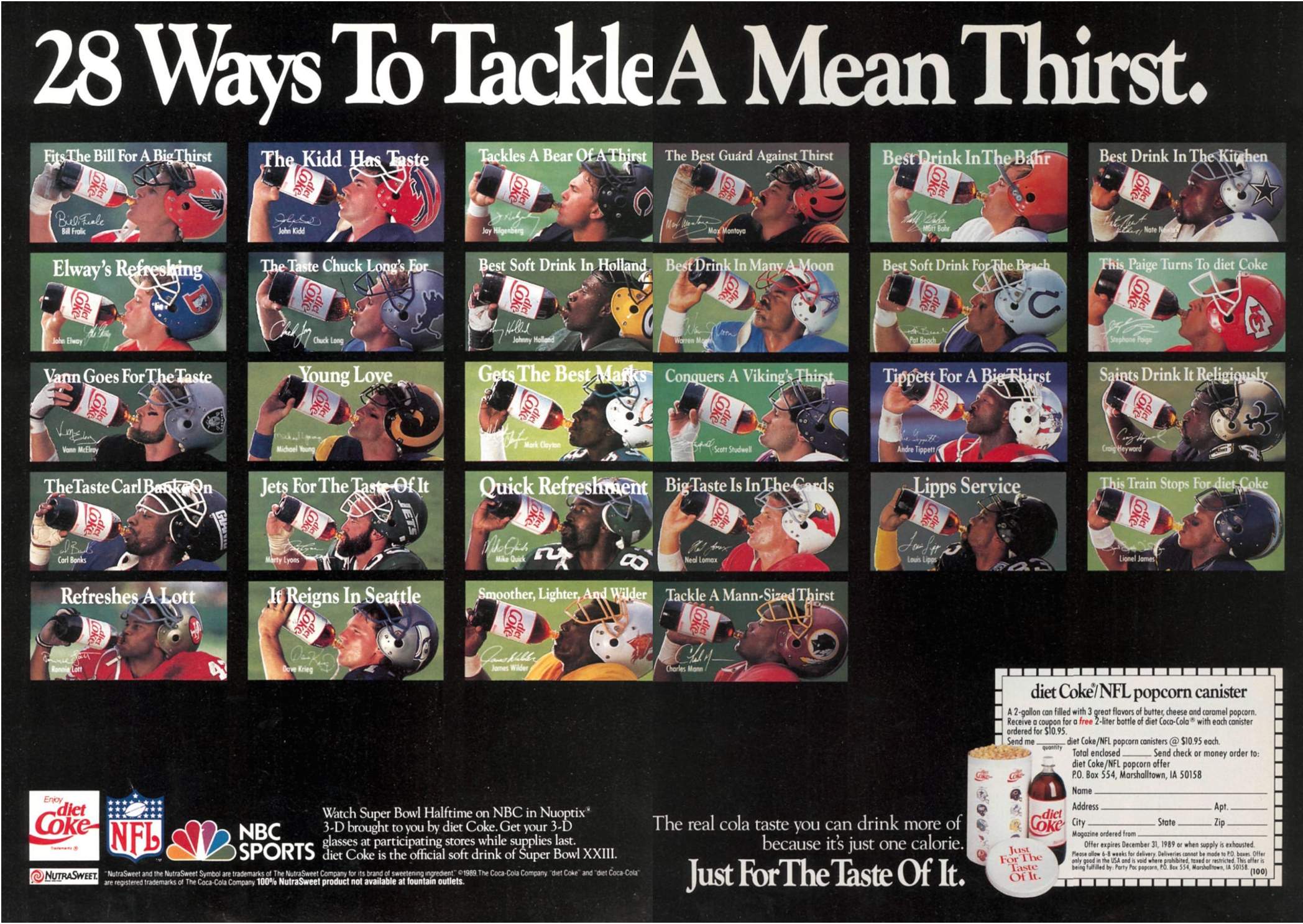
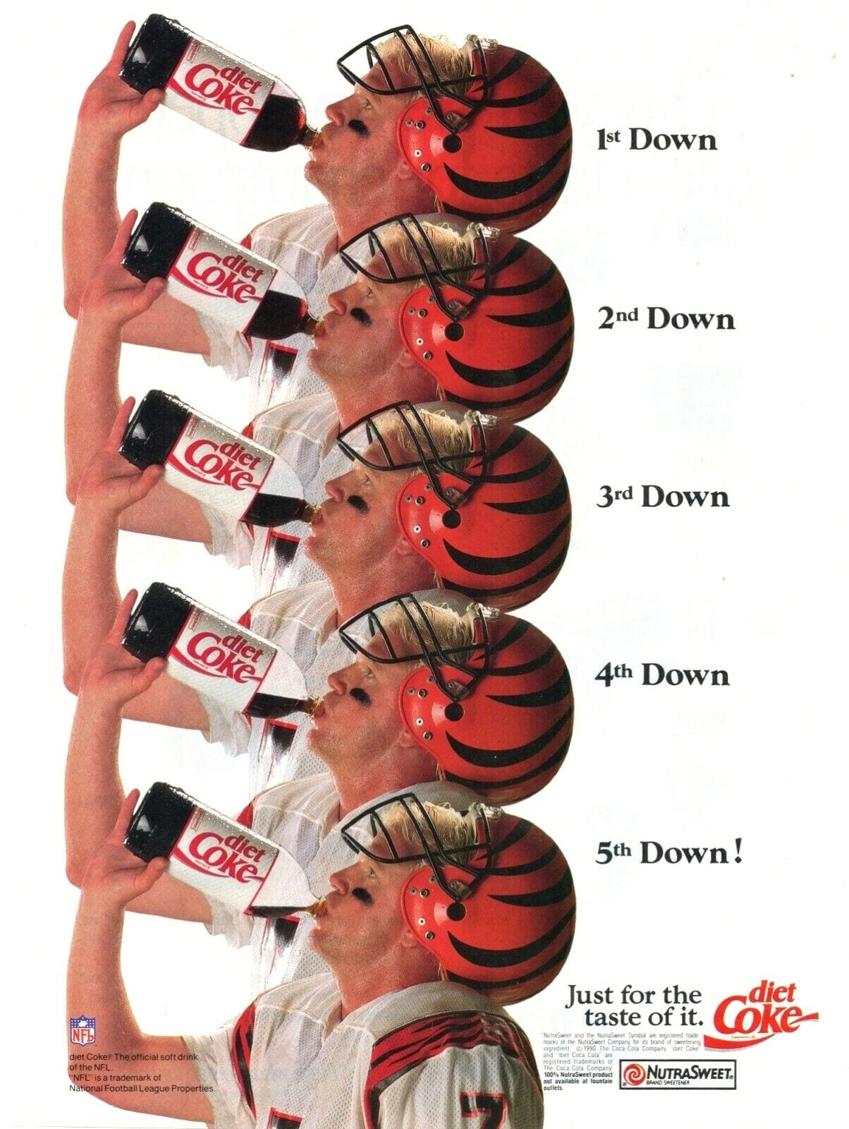
Ticker-submission maven Kary Klismet recently pointed me toward a tweet that featured the late-1980s two-page Diet Coke ad shown above. “It opened up a floodgate of memories for me and is too good not to share,” he said.
As you can see, the two-page spread features 28 individual ads — one for each NFL team at the time — so let’s call it a meta-ad. Looking at the fine print, the meta-ad carries a 1989 copyright date and is promoting Super Bowl XXIII, which took place on Jan. 22, 1989, so I’m figuring that the 28 individual ads ran during the 1988 NFL season, and then the meta-ad ran in January of ’89, shortly before the Super Bowl.
I was already a Diet Coke drinker (and, of course, was also an NFL fan and was uni-aware) around that time, so you’d think I’d remember this ad campaign. But for whatever reason, I have no recollection of it — the meta-ad did not open a floodgate of memories for me like it did for Kary. It did, however, send me down a fun rabbit hole, because there’s a lot to process here. For example:
• It’s fun to see Browns kicker Matt Bahr’s single-bar facemask, which looks so odd from our 2020 vantage point and really stands out from all the other facemasks in the campaign. (As an aside, it’s also interesting that they chose Bahr to be in the campaign in the first place, since kickers are usually the also-rans of NFL advertising.) (Update: Several readers have pointed out that Bahr’s facemask in the ad is grey, even though the Browns had white masks at the time. That was apparently standard for him — he had a grey mask while his teammates wore white.)
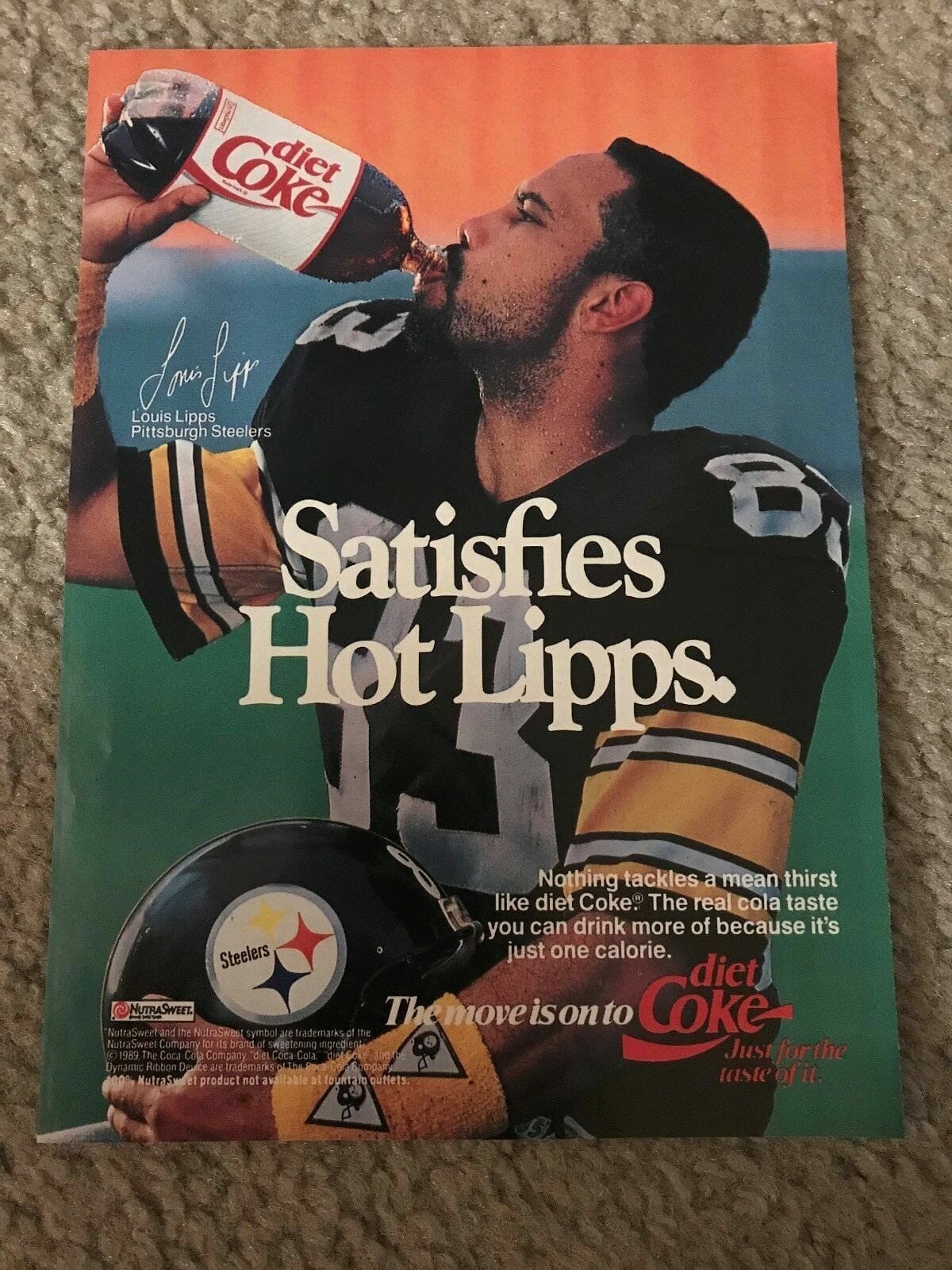
• NFL helmets are usually shown facing rightward. But due to the orientation of the type on the soda bottle’s label, they were pretty much forced to have the players facing to the left. That in turn forced them to show the blank side of Steelers wideout Louis Lipps’s helmet, because the Steelers logo appears only on the right side. But they also shot a vertical version of the ad in which they had Lipps holding his helmet instead of wearing it, and in that one they showed the logo-emblazoned side of his helmet:
• Every single player held the soda bottle with his right hand — except for Seahawks quarterback Dave Krieg, who for some reason held it with his left hand. And he was a right-handed thrower!
• For the headline of each ad, instead of going with title case (i.e., capitalizing every word except short prepositions, conjunctions, and articles), they capitalized every single word — except for the word “diet” in Chiefs wideout Stephone Paige’s headline. That’s because Diet Coke was officially known at the time as diet Coke, with a lowercase “d” (as you can also see in the additional copy down at the bottom of the meta-ad). The Coke website explains why:
For many years, the brand name was written and marketed as diet Coke — with a lowercase “d” — to reinforce the positioning of the product. Coke’s trademark lawyers wouldn’t allow the uppercase “D.”
Their reasoning: Diet with an uppercase “D” was a noun, and the use of a noun changed the name of the trademark. Use of the lowercase “d” was an adjective and, therefore, did not alter the legal basis of the trademark.
That article doesn’t mention when they eventually switched to an uppercase “D” (or how they convinced the legal department to go along with it). Anyone..?
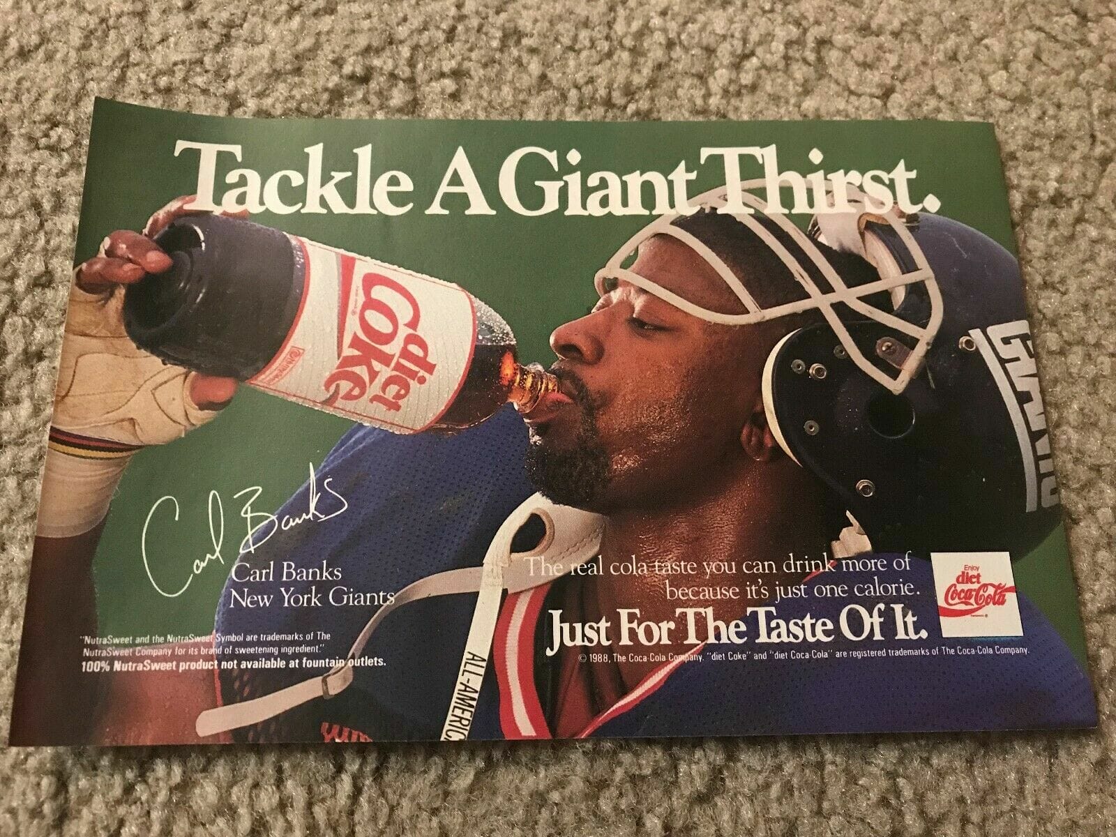
• They made essentially the same groan-worthy headline pun for Giants linebacker Carl Banks (“The Taste Carl Banks On”) and Lions quarterback Chuck Long (“The Taste Chuck Long’s For”), but they were inconsistent about the punctuation, improperly adding an apostrophe to Long’s headline. (Update: Several readers have pointed out that the apostrophe would be appropriate if you read it as “The Taste Chuck Long Is For,” which hadn’t occurred to me. Fair enough!)
• Interestingly, they also had a version of the Banks ad with a completely different headline (also, note the “All-American” inscription on his chinstrap):
• In addition to changing some of the headlines and the photos, they apparently swapped out some of the players, as seen in this 28-ad poster:
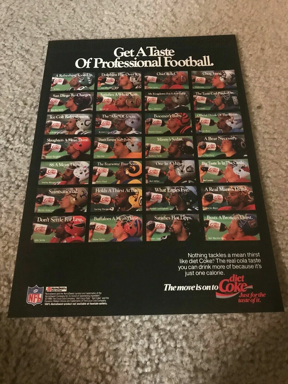
That poster, like the meta-ad, has a 1989 copyright date. But as I’ve already explained, the meta-ad is almost certainly from January of that year, so maybe the poster is from later in the year, by which time they’d changed some of the players. (Also of note: The meta-ad shows the players’ signatures, while the poster does not.)
• The campaign extended at least into 1990. By that time they were riffing on the pose of the player drinking from the bottle, as seen here:
———
That’s a pretty good rabbit hole, right? If it’s triggering that nostalgia response for you like it did for Kary, some of the vintage ads are available on eBay.
(Big thanks to Kary Klismet for getting me started on this one.)
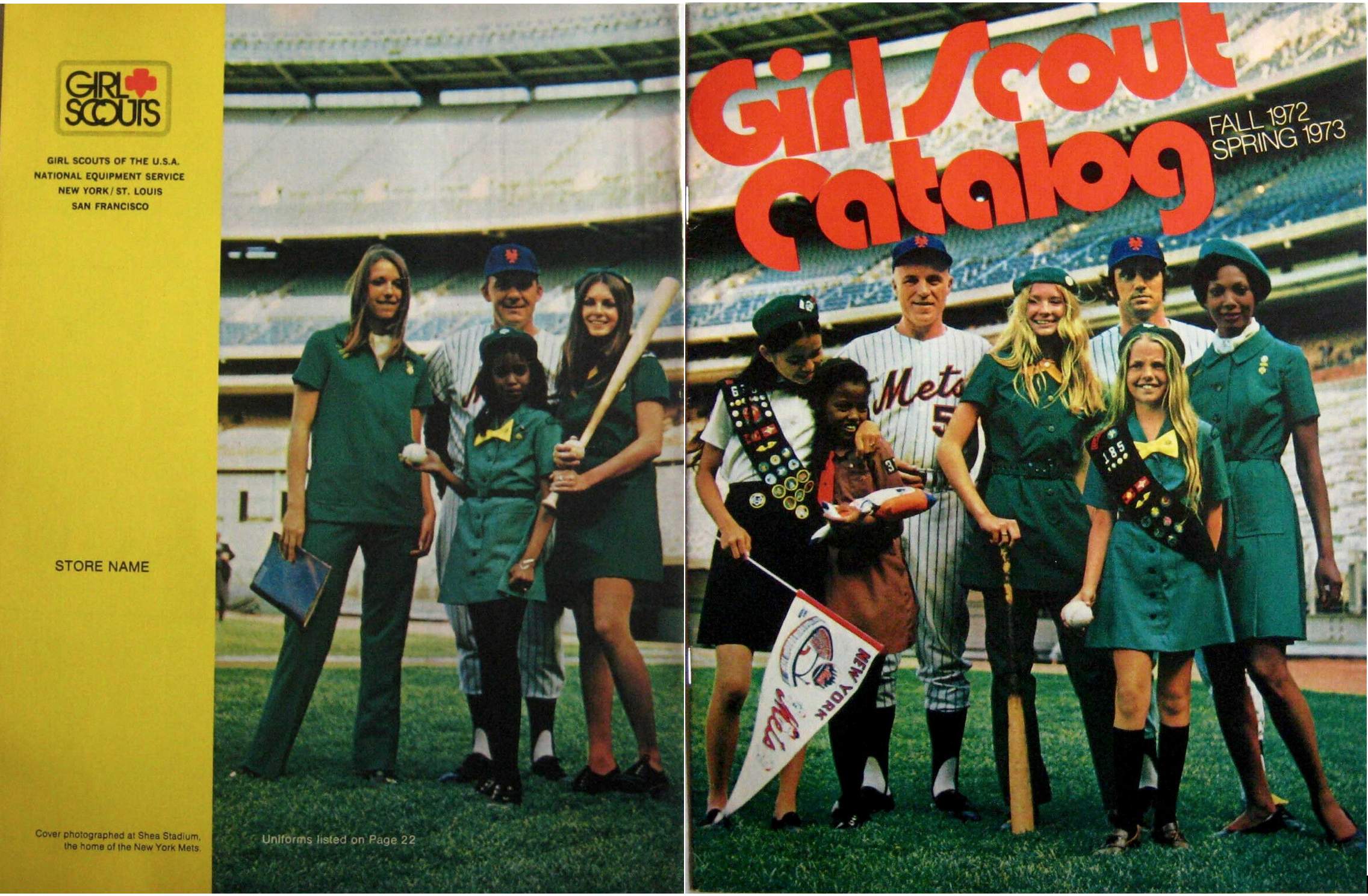
Click to enlarge
Too good for the Ticker (baseball edition): I’m not sure why the Girl Scouts thought it made sense to shoot their Fall 1972 catalog cover photo at Shea Stadium, but it sure makes for a great assortment of uniforms. Spectacular lettering, too!
As for the three Mets, I’m fairly certain that’s pitching coach Rube Walker on the left, third base coach Ed Yost in the center, and I think third baseman Jim Fregosi (famously traded even-up for Nolan Ryan) on the right.
Also: See that pennant that the one girl is holding? I had that exact pennant pinned to the wall of my bedroom from 1971 through at least ’76, and probably later than that.
Want to own this catalog? There’s one available on eBay.
(Big thanks to @retro_70s for this one.)
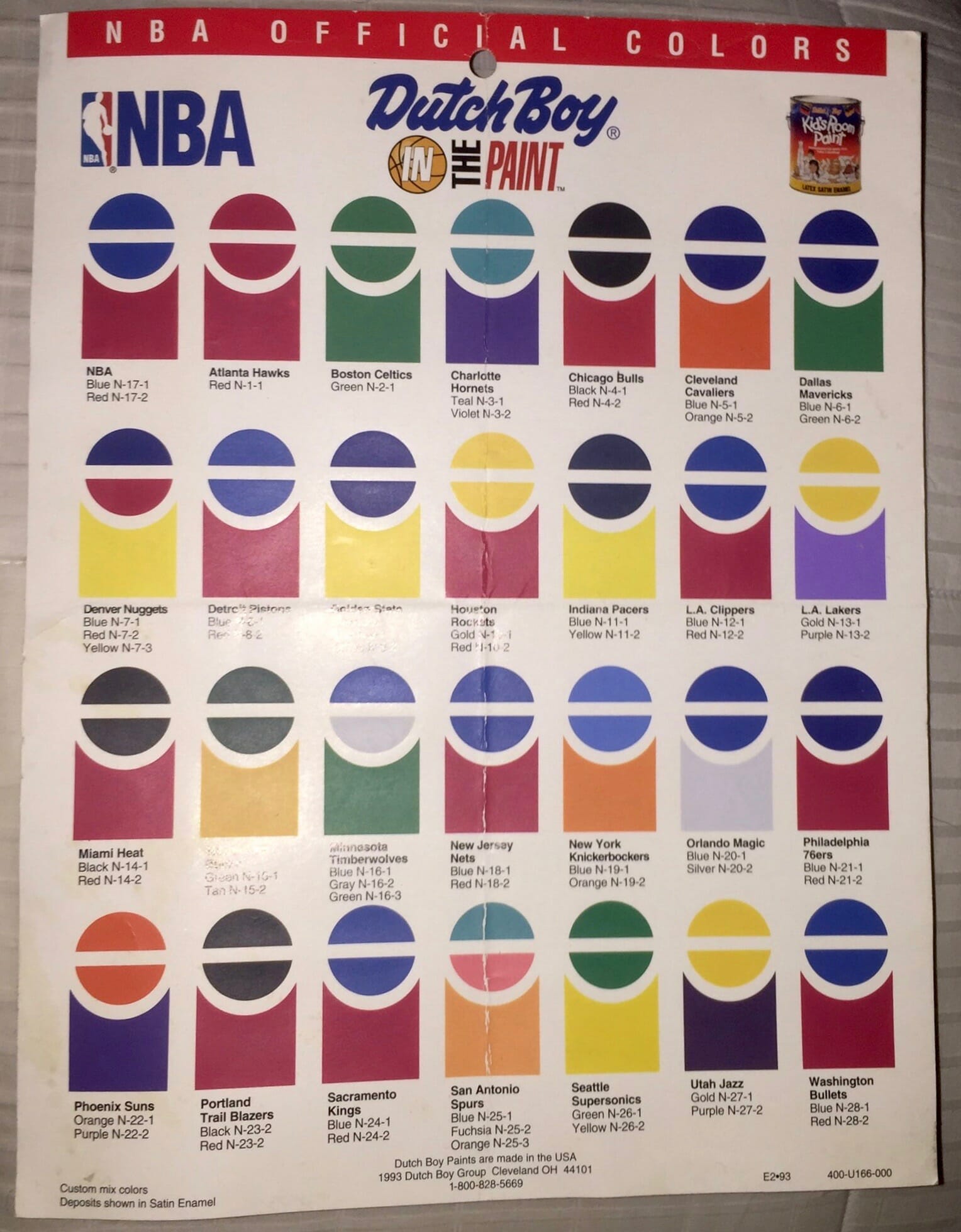
Click to enlarge
Too good for the Ticker (basketball edition): Oh man, how great is this Dutch Boy paint guide, showing all the NBA team colors from 1993? Pushes all my uniform and catalog buttons. Look at those Spurs fiesta colors! Love it.
(Satin-finish thanks to @JohnnyDestiny11 for this one.)
The Ticker
By Paul

’Skins Watch: The Mechanicville (N.Y.) school district has decided to keep calling its teams the Red Raiders but will retire the Native-themed imagery used in association with it (from Kary Klismet). … Also from Kary: North Brookfield High School in Massachusetts is retiring its “Indians” team name and related imagery. … Yet another from Kary, and also from Robert Brashear: Shady Side Academy, a prep school in Pittsburgh, has announced “Bulldogs” as its new team name after retiring “Indians” earlier this year. Key passage from that article: “Despite the increased pushback against Native American imagery in sports, ‘Indians’ remains the most commonly used nickname among the more than 120 member schools in the Western Pennsylvania Interscholastic Athletic League,” with five schools using it. Still lots of work to be done. … There’s a lot of debate about high schools using Native iconography in Colorado (from @westhoff7300ft).

Working Class Wannabes™: Illinois athletics director Josh Whitman says the school’s newly hired football coach, Bret Bielema, has a “blue collar work ethic and genuine, authentic manner [that] will allow him to form strong connections to his players” (from A. Miller). … Arizona women’s hoops coach Adia Barnes says fellow Pac-12 team Colorado is “kind of hard-nosed blue collar team.” … CMU football coach Jim McElwain says one of his new recruits is “an old-school, blue-collar offensive lineman who takes a ton of pride in his job.” Bingo! … Virginia football coach Bronco Mendenhall says one of his new recruits is “a scholar who is blue-collar and white-collar at the same time,” whatever that means. … An article about the Owensboro High School football team in Kentucky begins by stating, “The offensive and defensive lines of a football team are the definition of blue-collar.” … An article about Nebraska football player Collin Miller, who recently decided to retire after suffering a spinal injury, says Miller “was a true blue-collar player.” … New Kentucky football offensive line coach Eric Wolford says, “Kentucky is blue collar, they are tough, they have pride, they have attitude, and they have discipline.” He echoed that sentiment at his introductory press conference, where he said, “I’ve had a chance to play [against Kentucky] the last four years and I can tell you it’s a blue collar, tough, disciplined football team.” … An article about West Virginia’s newest round of recruits says offensive lineman Tomas Rimac “is a tough, hard-nosed, blue-collar offensive lineman.” … Following Saturday’s game, USC football coach Clay Helton said, “The thing I love about our football team is no matter what the situation, they come to work every day. They’re blue collar.” … Baltimore Ravens RB Patrick Ricard says his alma mater, the University of Maine, was a “blue-collar school,” which doesn’t make even a bit of sense. … Northwestern football coach Pat Fitzgerald says that his team needs to be “the most sound, fundamental, blue-collar football team that there is in the country” in order to win. He also says, “We play with a blue collar mentality and we’re gonna fight for every inch on the field.” … An article about a new football recruit at Springfield College says he chose Springfield “because the program’s family-oriented, blue-collar ethos” reminded him of his high school. … An article about the NHL says the Columbus Blue Jackets “play good, blue-collar hockey.” … An article about a new Ohio State football recruit says he’s “precisely the kind of blue-collar kind of player [head coach] Ryan Day and his staff were looking to add.” … An article about Alabama football says that “the Tide and [head coach] Nick Saban are able to become more blue collar — and less Star Wars — when they have to get crucial yards.”

Baseball News: While researching something else, I came across this great late-’70s shot of future MLB skipper Bruce Bochy wearing glasses and an Astros tequila sunrise uni. … Here’s something I didn’t know: When the Dodgers moved from Brooklyn to L.A., they briefly considered playing at the Rose Bowl, which would have been configured like this (from Kary Klismet).

NFL News: Fans are having fun Photoshopping presumptive top NFL draft pick Trevor Lawrence into various NFL uniforms. … The Titans will wear white over navy for Sunday night’s game against the Packers. … Washington QB Dwayne Haskins has been wearing a captain’s “C” this season, but he won’t be wearing it any longer because he’s been stripped of his captaincy after being photographed without a mask his girlfriend’s birthday party.
College Football News: From “Roll Tide” to “Gator Bait,” lots of schools are discovering that their fight songs and cheers have problematic histories (from Timmy Donahue). … Iowa State will once again go BFBS in the Fiesta Bowl (from Chad Lehman). … Memphis and FAU faced off last night in the Montgomery Bowl but didn’t have bowl patches on their jerseys. … No bowl patches for BYU or UCF in the Boca Raton Bowl either (from @couls_kunz).

Hockey News: This season’s NHL Stadium Series game, originally scheduled for Feb. 20 in Raleigh, N.C., has been postponed. … In addition to helmet ads, the NHL is planning lots of new ways to impose advertising in front of your eyeballs, including virtual ads on the ice, expanded ad signs around the bench, “edge wrap” ads on the glass, and tarp ads covering empty seating. … At the World Junior Championships, the Bauer logos on the gear the Swedish and Czech goalies has been covered up due to an intellectual property issue.

NBA News: The Celtics added a Tommy Heinsohn memorial band for last night’s season opener, and also lowered eight of the championship banners that figured prominently in Heinsohn’s legacy (from Matt Rashford). … Here’s a piece on NBA players who’ve had their numbers retired by more than one team. … Here’s a look at the City uniform history for each NBA team. … Here’s a really good story about what happened when a 14-year-old fan wrote to his favorite NBA and WNBA players in the Orlando bubble and asked them for autographs (from my old ESPN boss John Banks). … Here’s a look at the Lakers’ championship rings (from Mike Chamernik). … Here’s a really fun project to redesign every NBA team. Cool stuff! (From @digitasdesigns, who’s also one of the designers on the project.) … Following up on a Ticker item from yesterday, the Bulls have plastered some new ads around their court perimeter. … Looks like the Raptors will also have ads along the baseline, although they haven’t been put down yet (from Kary Klismet). … Bucks coach Mike Budenholzer was wearing a team-branded mask upside-down last night. … Pro wrestling ref Aubrey Edwards wore a vintage Sonics jersey last night (from @SteveinLC). … The Pistons have hired rapper Big Sean to be their “director of innovation.” His “Don Life” logo will appear on their practice jerseys.

College Hoops News: Boise State debuted new orange throwbacks last night. … Here’s an interesting contractual provision: If the NCAA imposes sanctions on Louisville, the school’s arena-name advertiser will get to reduce its payments for the naming rights by as much as 30% (from Timmy Donahue). … Creighton players wore “Equality” below their uni numbers for last night’s game against Xavier. Additional info here.

Soccer News: New third shirt for Ghanaian side Asante Kotoko (from Trevor Williams). … Two VfL Wolfsburg goalkeepers have been assigned outfield shirts ahead of a German Cup match with SV Sandhausen, due to a lack of outfield players to fill out their bench (from @leaaves). … German side Werder Bremen wore their Christmas tree shirt last night (from Mark Dziak). … Interesting article about a rare, highly collectible 1997 Fiorentina shirt that supposedly had Super Mario on it, but no one can actually remember it being used (from Steve Kriske). … Crystal Palace’s women’s team wore Christmas-themed outfits yesterday for their final training session before the holidays. “I’ve seen that before for Halloween, but not for Christmas,” says our own Jamie Rathjen. … Sanfrecce Hiroshima FC of Japan’s J-League has unveiled a video and renderings of its proposed new stadium (from Kary Klismet). … New kits for Japanese side Yamaga Matsumoto (from Jeremy Brahm).

Grab Bag: The Reno County sheriff’s office in Kansas has new uniform colors. … A Georgia company that makes nurses’ uniforms has done well during the pandemic (WaPo link). … The PGA Tour is marking the 40th anniversary of its logo. … Here’s a podcast episode about why athletes want to trademark everything (thanks, Brinke). … Even as Under Armour looks to opt out of apparel contracts with UCLA and Cal, its agreement with Utah appears to be stable (from Kary Klismet). … In an attempt to get around gender stereotypes, a Japanese high school is renaming its boys’ and girls’ school uniforms as “Type I” and “Type II.” … Why do Baltimore and DC look different from space? Because they use different kinds of street lights (from William Yurasko). … New uniforms for the U.S. Nordic skiing team (from Kary Klismet).

My best wishes to everyone for a safe and healthy Christmas Eve. I’ll see you back here tomorrow with some holiday thoughts and the winners of the year-end raffle. Peace. — Paul
“they were inconsistent about the punctuation, improperly adding an apostrophe to Long’s headline.”
I think they were going for “The Taste Chuck Long Is For,” hence the apostrophe. Read out loud it’s supposed to sound like ‘Longs For.’
Corny, but not inappropriate.
That hadn’t occurred to me! That wording/construction seems more awkward, at least to me, but I guess that must explain it!
If you look closely, you’ll notice that kicker Matt Bahr’s facemask is grey. The Browns had white facemasks at the time. I’m not sure why there was a difference.
Wishing the uni-verse a safe and happy holiday season!
I was going to point that out too; I think there were several kickers and punters still wearing single- or double-bar facemasks at the time, whose masks were grey instead of whatever color the rest of the team wore. link leaps to mind.
Some quick photo research confirms that Bahr did indeed wear grey while his teammates wore white:
link
I’ve added this to the main text.
Great catch!
FWIW, I think the reason that Bahr’s facemask was grey during the era when the rest of his Browns teammates all had white facemasks has to do with the materials used to make the single-bar facemask. While newer facemasks of that era (and today) seem to hold color well, those single-bar facemasks always frequently chipped and flecked when painted. Here are a couple of examples:
link
link.jpg?id=973ae485-86eb-4e9a-b6a0-a0eb5b52ceed&size=zoom&side=back
Whether it was at Barr’s initiation or the team equipment managers’, my suspicion is they just decided to dispense with painting the facemask as a way to deal with the chipping problem.
Kicker Gary Anderson, one of the last single-bar facemask wearers in the NFL, appears to have taken a similar approach late in his career with the Tennessee Titans:
link
While the rest of the team had navy blue facemasks in this era:
link
…Anderson went with the grey single-bar.
Looks like they misspelled Neal (sic) Lomax’s name in the ad but fixed it for the poster.
First item in the Grab Bag: This is Reno County, Kansas, not Nevada.
Fixed.
In the “5th Down” poster it looks like the bottle is draining with each down near the player. However the didn’t edit that at the bottom of the bottles. Still looks full.
I think what you’re seeing at the bottom of the bottle is not dark soda but a black “base holder” (I just made that term up), which used to be a common component of 2-liter bottles. You can see it more clearly in this ad:
link
In the DC area, 2 litre bottles had the black baseholder, so when I’d be visiting family in Jersey, the molded one seemed exotic.
Very true. But I’ll argue on a technicality:
There is a small gap between the label and the base holder. The Carl Banks poster shows this most clearly. So a small, yet ever lengthening, white strip should have been visible through the series.
I would certainly absolve the graphic designer of the minor detail. I do remember the base.
Glad they engineered that extraneous plastic out of the design. I am old enough to remember the glass (gallon?) bottles as well. Funny how the 2-liter bottle is about the only non-scientific item that was actually converted from the ‘70s “Go Metric” campaign. Really, more sad than funny.
Thanks for supplying me with a distraction from a myriad of Christmas Eve chores and tasks that I should be focused on.
I remember those! When we made 2L bottle ecosystems in elementary school we had to run the bottles under hot water to loosen the glue on the black base and the label. The bottle underneath the base was rounded and not flat, hence the need for the base.
They eventually wised up and just changed the molded shape of the bottom of the bottle. A trip down memory lane indeed!
Same thing! I drink a lot of diet Coke and had not thought of that black baseholder piece for ages until today. (And, like Brannock device, it must have a name, right?)
Very interesting that some of the ads are the baseholder bottle and others are the one-piece.
Not sure what the base was called, but Wiki has this to say about it:
“Most modern-day two-liter bottles are one piece of PET (polyethylene terephthalate) with a base that is molded with a radial corrugation to provide strength for the bottom and the ability to stand upright. Most early two-liters had a separate opaque base glued to the hemispherical bottom of the clear PET flask. This base had a coaxial corrugation and drain holes. It was abolished in the 1990s, in part due to difficulties recycling the two separate plastics.”
Came here to say that the vertical Louis Lipps poster appears to be from a later ad campaign, not only because he’s wearing a full beard in the vertical ad but also because the bottle in one is more modern, due to the lack of what you have dubbed a “base holder”
Dave Krieg separated his right shoulder early in the 1988 season, putting him out for two months.
It’s likely they shot his ad sometime during that injured period, which forced him to use his left hand.
Ah, now *that* is a fascinating detail — thanks!!
Excellent presentation @digitasdesigns!!! And fantastic ideas as well. Simple and effective.
“stripped of his captaincy”
I see what you did there…
I remember the later Sterling Sharpe version of that diet Coke ad, but not the Johnny Holland. Hmm.
“Heads again”
Roughly 10 years ago, I saw Charles Mann in Tysons mall and was kind of disappointed he had a coffee in his hand.
He also did a United Way ad where he was shown doing an mock ad for “Wow” cola.
None of my co-workers knew who Charles Mann was though.
I still have that same Dutch Boy in the Paint sheet! I always thought it was so cool. I also had an NFL version from a few years later, but I’ve lost that one.
I mentioned it on the tweet, but the Blazers paint colors have a typo, following the logic of the other teams Black should be N-23-1
Surprising that Wilt Chamberlain didn’t have his number retired by the Sixers, where he won a championship. He would be the first to have 4 teams retire his number. Also surprising that Orlando didn’t retire Shaq’s number, where he won Rookie of the Year and also led the team to the finals.
According to the 76ers’ Media Guide, Wilt’s number 13 is retired.
In the horizontal Louis Lipps picture, with the blank side of his Steelers helmet facing the camera, his jersey has the “AJR” patch that the Steelers wore during the 1988 season in honor of owner Art Rooney. It’s missing in the vertical version!
The kicker being the Browns’ representative in this ad is just about the most Browns thing I can imagine…
Nothing wrong with having someone who puts the foot in football representing your team.
#KickersArePeopleToo
Ha! Touche, sir…
Oh, that is Jim Fregossi on the Girl Scout magazine. It is a face that still haunts me almost 50 years later.
So with Iowa State planning to wear black jerseys for their bowl game, it would be their 6th game this season wearing them, fully half of their 12 games this season. For a team that has colors of red and gold/yellow, they only wore red jerseys twice, and white 4 times.
Baseball at the Rose Bowl would have presented more equitable dimensions than the Coliseum eventually did. I guess they didn’t want to perform the surgery necessary to have a 300-foot distance to each foul pole.
Little gems like this are why I keep coming back to this site!
They also could have put an inner fence at some point to reduce the 460′ to centerfield.
Oh, I wouldn’t want that. For balance you need that cavernous CF to offset the close foul poles.
And also to encourage more triples and inside-the-park HRs, the most exciting plays in baseball!
They took a different tack when using the London (nee Olympic) Stadium for two Yankees-Red Sox games in 2019. The field was laid out “crosswise,” perpendicular to the Rose Bowl orientation, with home plate, the pitcher’s mound and dead center field all located on what would be the halfway line of a soccer pitch. The dimensions were 330 feet down the lines and a short 385 feet to center (but with a 16-foot wall added).
My seats were located down the third base line and the view reminded me somewhat of the multi-purpose Shea Stadium, where the seats behind the bases (except in the lowest deck) were far from the field.
As terrible a swap as Ryan-for-Fergosi was, it suffers the added indignity of not having been an “even-up” trade – the Mets agreed to throw in three prospects as well: Frank Estrada, Don Rose and Leroy Stanton. Pretty sure Whitey Herzog once remarked that the deal was so bad, he wouldn’t have made it even if it were just those three guys for Fergosi.
Correct! Indeed, Stanton had more WAR as an Angel than Fregosi did as a Met.
My first take on the NBA court poster was that it represented the colors used on the court. As a former Knick fan, I immediately noticed the color scheme shown for them was definitely used on the court, but I thought later than 1993. This is confirmed by the NBA court database, which I believe is very accurate. That color scheme first appeared in 1995.
link
I have since noticed that the poster is not really supposed to reflect the court designs – using those graphics was just a clever way to show team colors. The weird thing is that it predicted 2 years ahead of time the future colors of the Madison Square Garden court, which was a fairly radical departure from what they used for 30 years.
My mind might be playing tricks on me, but I recall the Boomer Esiason “Fifth Down” diet Coke ad running in an issue of SI which featured a story about the famous “Fifth Down Game” in which Colorado beat Missouri because the refs mistakenly gave them an extra down on the final drive.
Fun stuff today, Paul! Thanks for expanding on that idea and running with it!
I find the mental gymnastics involved in the plays on words of some these ads to be fascinating. If the verbiage for the Chuck Long requires some solving, the one featuring John Elway feels like a 1,000-piece jigsaw puzzle!. Obviously it’s a play on words meant to evoke the phrase “always refreshing,” but the inclusion of the apostrophe-s in Elway’s last name makes for some pretty stilted language.
Is it supposed to be a possessive (e.g., the “refreshing that belongs to Elway”)? Well, that doesn’t make much sense! That means we should probably read it as a contraction (“Elway is refreshing”). So then is “refreshing” an adjective? Not likely, because that would attribute the qualities of the ad’s subject (the soft drink) to Elway rather than the product.
I guess we should read “refreshing” as a verb (e.g., “Elway is refreshing himself” by drinking Diet Coke). So to make the play on words work, the meaning of the word “refreshing” flips between the original phrase and the term it is meant to conjure in the reader’s mind. That’s a lot of work to put the reader through for a single pun!
Or you could read it as a pun on “always refreshing” and be done with it.
…which kind of defeats the purpose of a blog like this, doesn’t it? ;-)
FDJ showing off their new jerseys (very similar to their old ones) on the road.
link
I don’t think it ever got brought up in Tour de France previews, but FDJ do one of the coolest things in the sport- a few years back, they decided to go purist with their national champions jerseys and remove the sponsorship from them- you can see the French champion, Arnaud Demare, front and center in there, but my favorite is the wonderfully named Sebastien Reichenbach, who looks resplendent in his Swiss championship jersey.
link
I’m sure it was so that the players’ fingers wouldn’t overlap the Coke wordmark, and I’m guessing those bottles were mere prop bottles not filled with actual soda, but holding the bottle from the very bottom is a weird way to drink, especially the 2-liter bottles (looking particularly at Vann McElroy). Spill City.
I totally forgot about the plastic cups on the bottoms of the large bottles. Thanks to those who pointed it out.
I recall this campaign as the first in carbonated soft drinks to casually feature 2-liter bottles (other than ads announcing their existence). You usually see single-serve packaging being enjoyed because it’s more profitable.
When a quote finally arises where the coach rips his stupid players for having less grey matter than a common blue-collar
bricklayer, I think we uni-watchers ought to throw a parade.
“That article doesn’t mention when they eventually switched to an uppercase ‘D’ (or how they convinced the legal department to go along with it). Anyone..?”
I’m just speculating, but here are my guesses. (1) The decision to use the lowercase “d” was originally a business-driven branding decision by Coca-Cola, which their lawyers then internally enforced because of the language in the trademark application that was approved; and (2) during the original application process, the lawyers thought that “diet,” which is a word that might likely be considered “generic” or “descriptive” under trademark law, would the trademark harder to obtain it were being claimed as part of the mark.
I looked up the Diet Coke trademark applications on the USPTO website. Unfortunately, the website doesn’t allowing linking to URLs in the trademark database, but here’s what I found:
The trademark for “diet Coke” (with the lowercase “d”) was filed in 1982 and approved in 1983. The application included language that said, “No claim is made to the exclusive right to use the word ‘Diet’, apart from the mark as shown.” This enforces the ideas that Coca-Cola (1) valued the primacy of the “Coke” brand and considered the “diet” version secondary to it, and (2) didn’t want the use of the word “diet” to complicate the trademark application process by claiming it as essential to the mark.
Once the mark was approved, Coca-Cola’s lawyers like insisted on its use by the strict terms of that approval, which included the lowercase “d” in “diet.” To try to use a capital “D” could have been seen as claiming a trademark on something outside the scope of the federally recognized mark.
As to why Coca-Cola eventually decided to capitalize the “D” in Diet Coke, part of the answer may lie in the article that Paul linked to in the story above:
link
The relevant portion says:
By the end of 1983, Diet Coke was the No. 1 diet soft drink in the U.S. and the top soft drink brand among women. At the end of 1984, Diet Coke displaced 7UP as the No. 3 soft drink in the U.S. behind Coca-Cola and Pepsi – a position it held until the end of 2010 when it overtook Pepsi. At the end of the ‘80s, Advertising Age named Diet Coke Brand of the Decade.
So by the late ’80s, Diet Coke was a major brand unto itself, not just a secondary product under the Coke brand. My guess is that to take advantage of this brand recognition Coca-Cola decided to formailze the brand by making the “diet” part of the product’s proper name, not a descriptive adjective of the product.
Coca-Cola did indeed apply for a new trademark on “Diet Coke” (with a capital “D”) in 1994 and it was approved in 1995. Interestingly enough, the application included the same disclaimer about not claiming exclusive rights over the word “Diet” apart the mark itself. But, as before, it serves to speed along the approval process by ensuring that the company is not trying to claim trademark protection on a generic word by itself.
Two guesses coming at the same time. :)
I just didn’t do any research since I’m on the USPTO website a little too much!
If I had to make a guess on Diet Coke, it would probably be around the Clinton administration.
(Anyone want to do the leg work on this?)
Here’s my guess why: Before President Bubba, a trademark that had fame could have extra protection on a state-by-state basis. In 1995, President Clinton signed the federal Trademark Dilution Act, allowing famous trademarks to get extra protection (meaning a similar mark could harm the value of a trademark, in one example, or a similar mark could harm or tarnish a famous trademark, even if the goods or services were not similar).
So, at that point, “diet” no longer describes “Coke” as a separate product, but you could easily make an argument that “Diet Coke” is a new mark and a new product with the requisite amount of fame.
Also, Coca-Cola now files all variations of trademarks that are used in order to have a bigger portfolio due to the value of the mark itself. I’m not sure when that philosophy would have changed, but it wasn’t the case in the 80s.
Great insights! It looks like our guesses, coming from slight different angles, are nonetheless complementary and not contradictory of one another.
Indeed, the Diet Cokes new trademark application did come in the middle of Clinton’s first term. Good call on that!
Re the Lakers’ championship rings, here are some more (and larger) images of the rings:
link
And this story has some interesting details about the rushed design process because of the short layoff between the end of the 2019-20 and beginning of the 2020-21 season due to the pandemic and how the jeweler was able to get the rings finalized in just over a month:
link
I fondly remember that campaign and the cheesy rap tune that was part of it
…it’s the drink of the Moon/it’s playing Al’s Toon/if moves Louis’ lips/it shakes Eric’s hips
One thing I noticed on the two meta-ads: the vertical one includes 2-liters that don’t have the black piece on the bottom.