By Phil Hecken, with Jimmer Vilk
Follow @PhilHecken
Howdy UW readers, I hope one and all are doing well — or at least as well as can be, given that this is still 2020. It’s been a rough year for everyone (some more than others), but as we approach the final couple weeks of this year from hell, let’s all hope the new year brings better things for everyone. I myself am in the throes of grad school finals, so this post will be a bit shorter than my usual Phil-fest — but good things come in small packages, as you’ll see below…
♫ It’s Beginning To Look A Lot Like Vilkmas…♫
Readers of Uni Watch know that our own Jimmer Vilk is a very generous hombre; in the past he has gifted some of his most prized possessions to our readership (including shipping!). He began this wonderful tradition (based roughly on Paul’s annual reader appreciation raffle, which you can read about below) back in 2015, and I’m pleased to AGAIN offer Jimmer’s generosity to the Uni Watch readership. Some years, including this one, we’ve actually had more than one Vilkmas (Jim offered up a bunch of his stuff back during the pandemic’s first months). If you’re not familiar with Vilkmas, it is the most wonderful time of the year. Jim’s annual gifting works very much like Paul’s raffle (and the deets follow, so be sure to read all the way through). On that note…
Take it away, Mr. Vilk!
Merry Vilkmas 2020
By Jimmer Vilk
Been some kind of year, huh? Well, it’s almost over, so there’s a reason to be of good cheer. Let’s get right to the festivities and start giving stuff away, shall we? [Click on any photos below to enlarge — PH]
Item #1
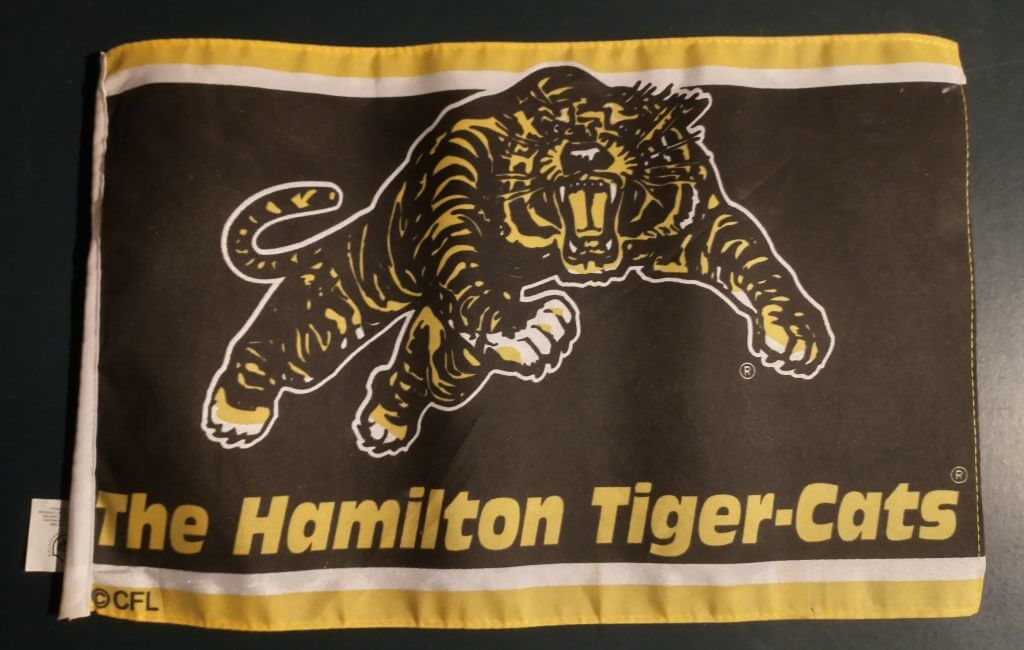
Lately, I’ve had to restrict my mailing things to the continental US, and that’s still the case this time…*EXCEPT*… for our first item. I’m going to send one lucky Canadian this Hamilton Tiger-Cats mini flag. It measures 11″ by 17″ (my tape measure doesn’t do metric), which is just a little smaller than our next item…
Item #2
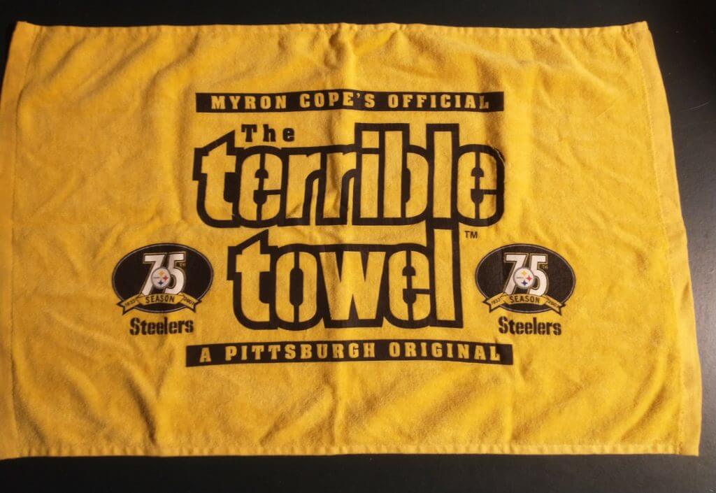
…a Steelers Terrible Towel from the 75th anniversary season of 2007.
Item #3
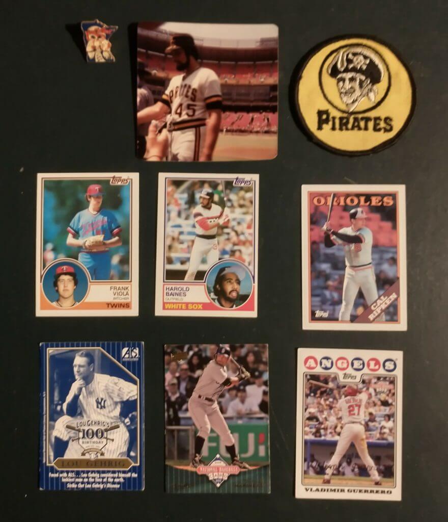
Next we have a baseball giveaway, with a Twins lapel pin, a photo of Pirates pitcher John Candelaria I took at Photo Day in 1980, a Pirates patch from the 70s and some assorted baseball cards.
Item #4
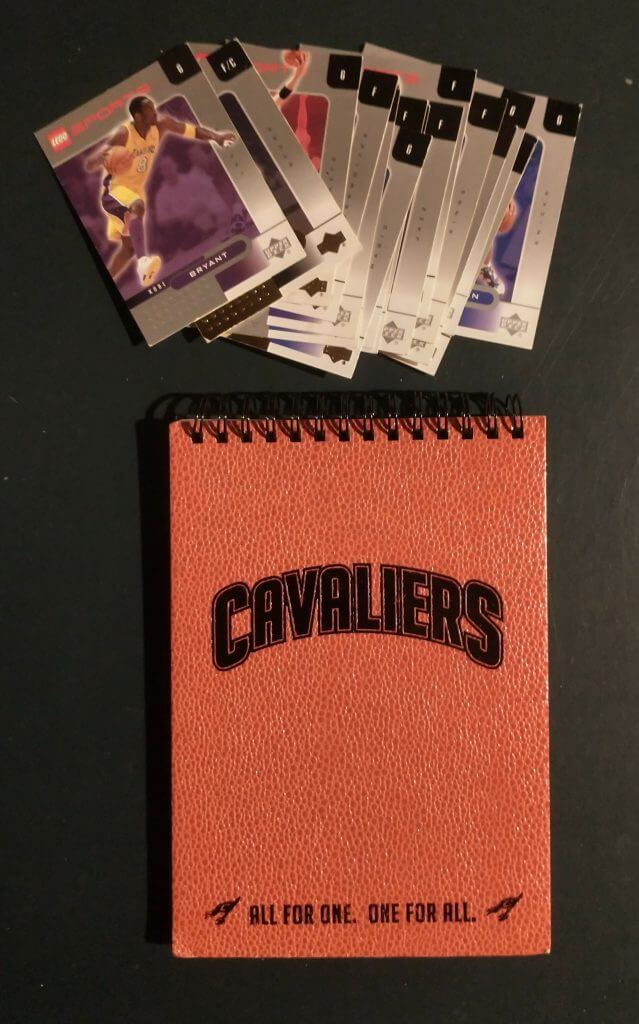
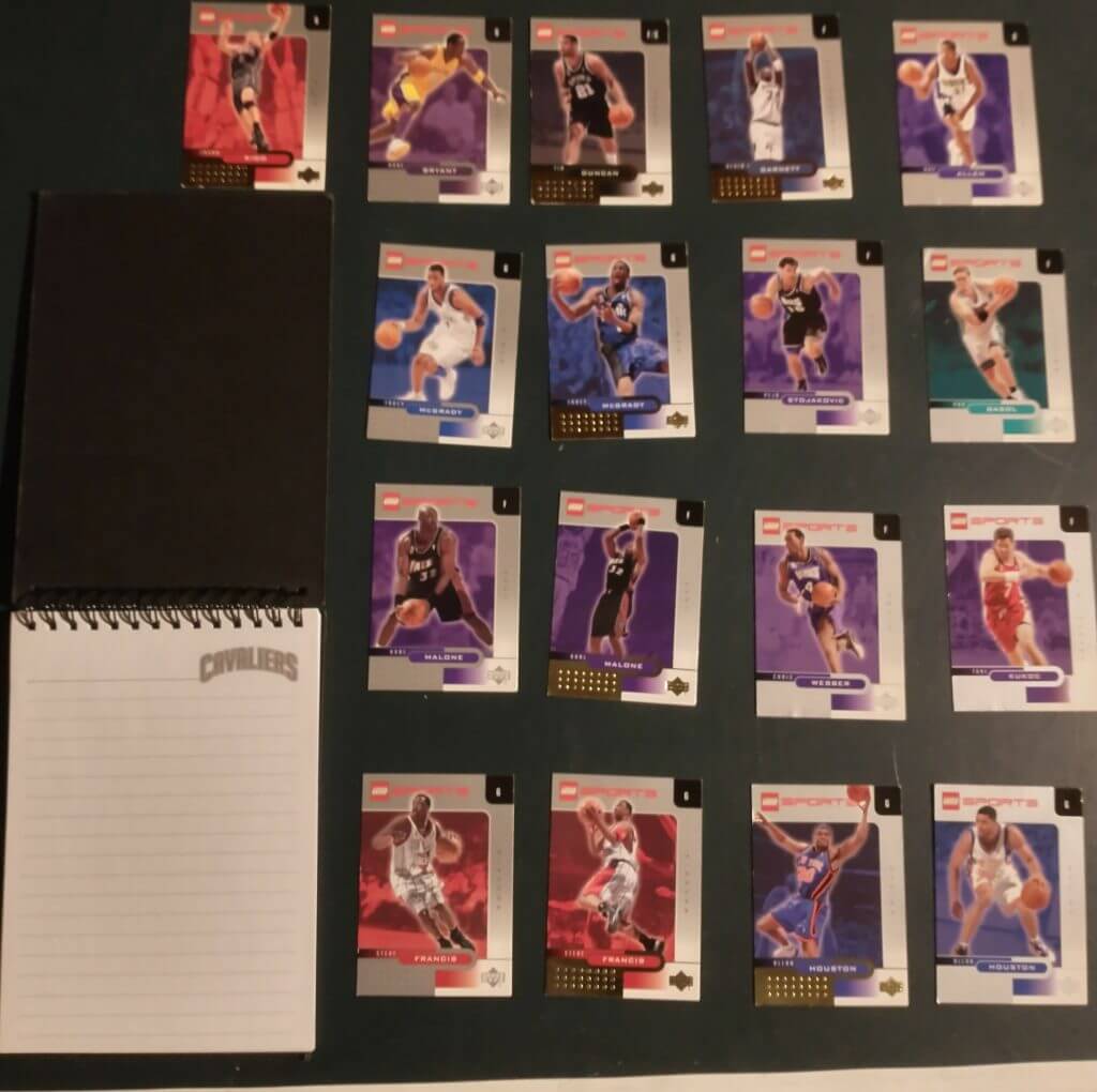
The last two giveaways are basketball-related. Here is a Cleveland Cavaliers note pad, along with a set of 17 Lego NBA trading cards.
Item #5
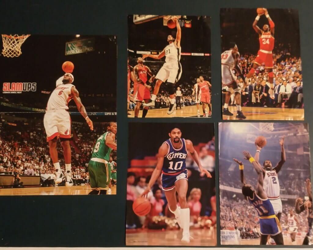
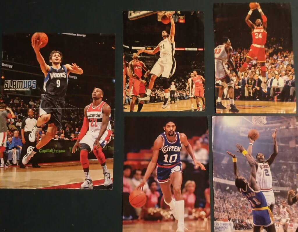
Finally, there’s a reverseable poster from Slam Magazine (LeBron James on one side, Ricky Rubio on the other), with three full-page photos from Slam (Tim Duncan, Hakeem Olajuwon and Norm Nixon) and a photo of Moses Malone from Sport Magazine.
Before Phil gives you the details, let me wish all of you a very happy and peaceful season. This year has had its share of problems, but hopefully we can all wind it up on a good note. OK, Mr. Hecken, back to you.
Thanks, Jimmer! Your generosity never ceases to amaze.
OK, this is very similar to Paul’s once-yearly raffle so here is how you enter:
1) Send an email to Phil.Hecken@gmail.com and put in the SUBJECT “Vilkmas 2020”
2) In the BODY of the email, please indicate (a) your name and shipping address and (b) your top 3 prize choices, in order of preference, by description. If you’re only interested in, say, one or two items, then just list your top one or two choices; if you want all 5, you can do that too, but I don’t really expect anyone to go that far. Jim will do his best to accommodate all the winners’ choices.
3) *** NEW THIS YEAR: Normally we limit this raffle to readers with USA addresses (since Jimmer foots the shipping costs), but as mentioned in the first item, he’d like that to ideally go to a Canadian reader. So, if you live in Canada and would like Item #1, please indicate that (this applies only to the first item).
4) One email per person. Entry deadline is this TUESDAY (December 22), 8:00 pm Eastern. The winners will be announced next weekend (on Boxing Day/Kwanzaa).
OK? OK!
And please, everyone please give Jimmer a nice round of thanks in the comments below. Thanks, Jimmer — you’re still the best.


Guess The Game…
from the scoreboard
Today’s scoreboard comes from Steven Dodell.
The premise of the game (GTGFTS) is simple: I’ll post a scoreboard and you guys simply identify the game depicted. In the past, I don’t know if I’ve ever completely stumped you (some are easier than others).
Here’s the Scoreboard. In the comments below, try to identify the game (date & location, as well as final score). If anything noteworthy occurred during the game, please add that in (and if you were AT the game, well bonus points for you!):
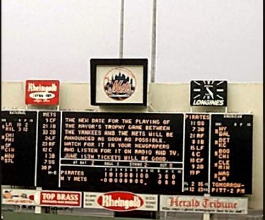
Please continue sending these in! You’re welcome to send me any scoreboard photos (with answers please), and I’ll keep running them.


“Ducky Color of the Year”
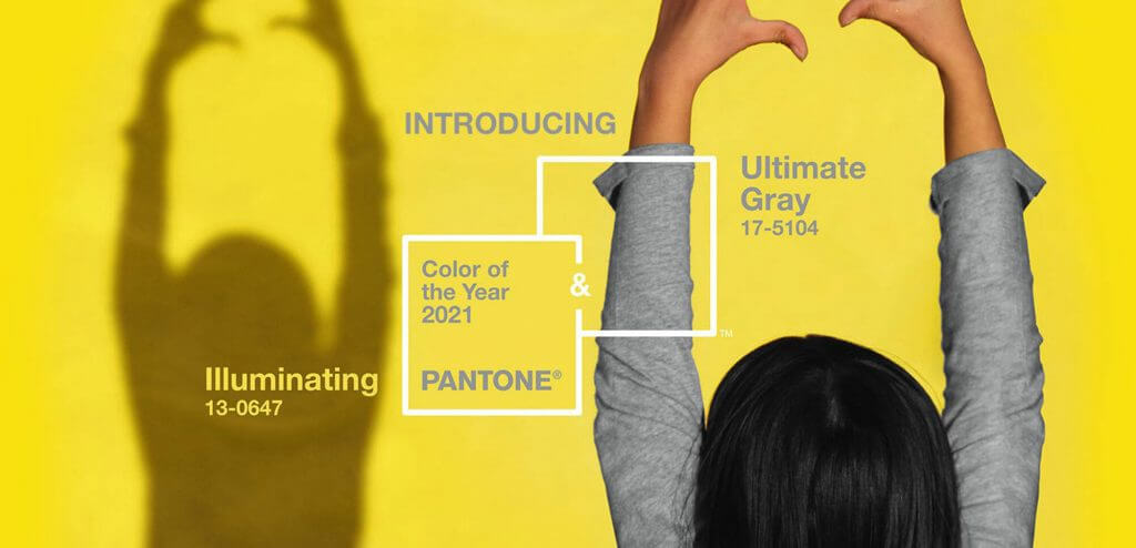
My Duck Tracker and PAC-12 Tracker, Dennis Bolt has been unusually prolific these days with Oregon Ducks uni news and views, and this week was no exception. Dennis’ most recent blog entry begins as follows:
Pantone, the arbiter of color every year, has come out with its 2021 color(s) and they look a bit familiar to Duck fans. Like in 2016 when they predicted “greenery” to be the 2017 color, this year’s color prediction looks a lot like many of Oregon’s uniform combos the last few years.
2021 will be the year of “Ultimate Gray” and “Illuminating.” I personally think yellow and gray look great together (but maybe stay away from just gray please)
In his e-mail to me about his latest blog, Dennis mentioned “the (Oregon Ducks) yellow/gray combo has always been a fave of mine!”
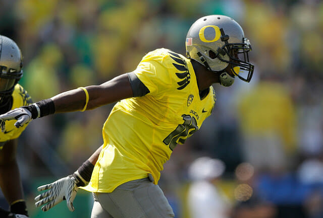
He also noted how the 2021 Colors of the Year “Pantone gray/yellow … matches nicely with Ducks uniforms.” While Dennis and I sometimes discuss the Ducks unis in personal correspondence, I had no idea he liked the gray/yellow combo. What is funny about this is UW reader (and some time contributer) Jason Bernard and I both admitted candidly to each other how well this combination seems to go together — even if gray isn’t a school color — when his alma mater broke out that combination many years ago:
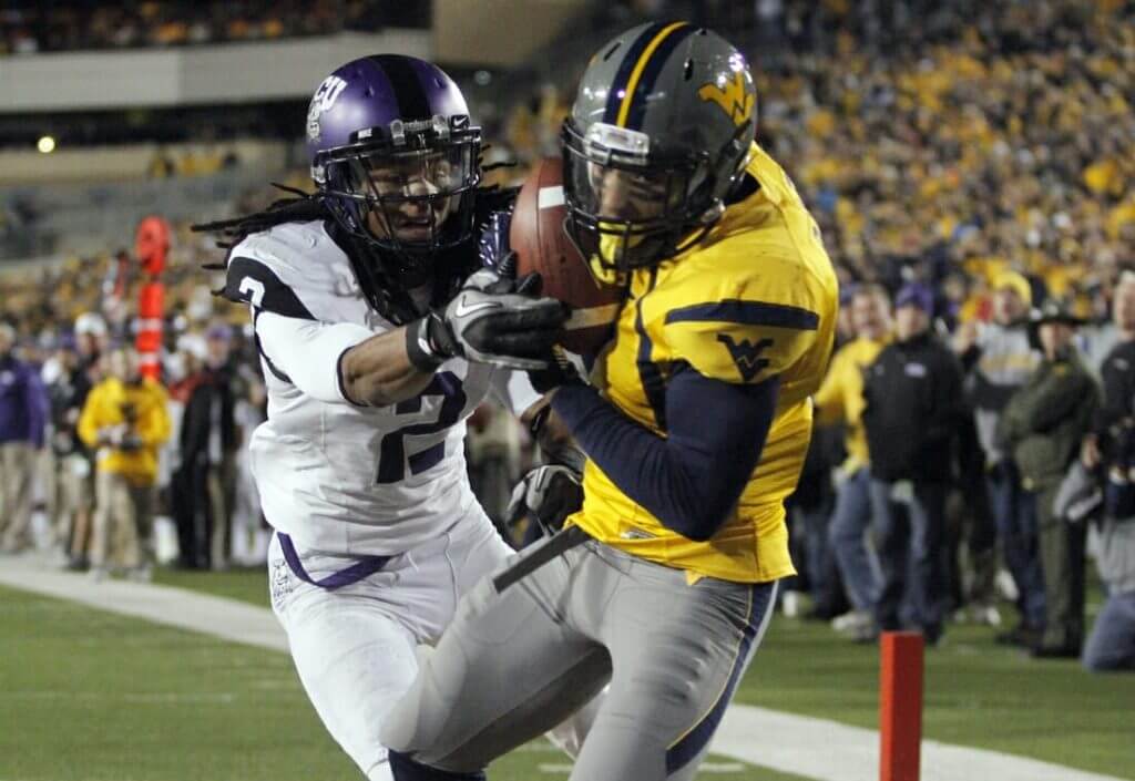
It wasn’t a one-time thing either . We’ve spoken occasionally over the years how good this combo looked. I’m now wondering how many of you UW readers out there also think gray/yellow is a pretty sharp combination (c’mon, you can admit it!). I’m also surprised how rarely such a combination is used in sports. I’m sure there are a couple other examples, but in college football, at least of recent vintage, one of the only other such examples of using this color combo is Mizzou:
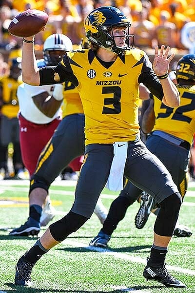
However, in their case, the gray is considerably darker (and I’m pretty sure that helmet is black, not dark gray). Are their other NCAAFB teams to have worn a gray/yellow/gray combo?
Now, obviously, unless a school uses gray as a school color (or opts to go GFGS), AND yellow (or athletic gold), you’re not going to see such a combo on the field. But I happen to agree with both Dennis and Jason in that gray/yellow or gray/gold really is a nice color combo for a uni.
Now that Pantone has declared their color(s) of the year to be gray and yellow, will we see this combo used more often (either by any of the aforementioned teams or by a new squad). As you know I hate alternates (and BFBS/GFGS) so I’m not necessarily advocating for this, but when a uni looks good (at least to my eyes), I’m much less critical. And I happen to think those Ducks/Eers/Tigers unis were pretty good looking, even if at least one element wasn’t a school color.
For Dennis’ thoughts on the Ducks wearing this combo in the past and the future, please read his blog piece.
I’d also be interested in knowing what readers think about using gray/yellow (or athletic gold) as a color combo (for football). If new pro team were to enter the league, or another NCAAFB team were to consider such a combo, would you think it might “work” on the field? Interestingly, the Oakland A’s have gone gold/gray and I’m not a fan. But I think it looks good, at least when it’s a gray helmet/gold jersey/gray pants look. Gray isn’t really a great color for a uni, IMO, and like Paul, I tend to think it looks best when confined to a baseball jersey/pants combo (I don’t like gray at ALL for hockey/hoops). But when the color is combined with yellow jerseys on a football uni, at least to my eye, I dig it.
Interestingly enough, it was just announced yesterday the LA Rams will be going gray dishwater over yellow sol against the Jets — and I don’t like that. For some reason, I like the combo when it’s gray/yellow/gray, but I don’t like it when reversed. Of course the Rams helmet isn’t gray either, so that may have something to do with it.
Love to hear your guys’ thoughts!



Raffle reminder: Paul here. In case you missed it on Friday, our annual Uni Watch Year-End Raffle, in which I give away all the freebies I’ve received over the course of the year, is now under way. Full details here.
Now back to Phil — over to you, buddy.


The Ticker
By Anthony Emerson

Baseball News: History Nebraska tweeted out a picture of some amazing 1907 baseball sweaters. But what’s even cooler is the team name — the Lincoln Tree Planters, named after Arbor Day! (from Matthew Hayden).

NFL News: In 1968, Jets RB Mark Smolinski’s nameplate went over his jersey striping (from Christopher Hickey). … The Browns are going white-brown-white tomorrow against the Giants. … The Rams are going with their “bone” jersey and “sol” pants — AKA off-white and yellow — for tomorrow’s game against the Jets.
College/High School Football News: The Rainbow Warriors are looking for a new home as Aloha Stadium has been shut down due to major structural issues (from Kenneth Traisman). … Vanderbilt K Sarah Fuller’s uniform is going to the College Football Hall of Fame (thanks, Phil). … Similar to the Smolinski piece in the NFL section, Ball State CB Amechi Uzodinma II’s nameplate extends over his jersey stripes.

Hockey News: Former NHL enforcer Kevin “Killer” Kaminski used to put tiny cuts in his helmet to bloody the knuckles of those he fought (from Brandon Weir). … New roads for Elmira College (from Kary Klismet). … Gorgeous color-vs-color matchup when Quinnipiac and Bowling Green met last night (from @Mr__Jeremy).

NBA News: The Spurs have announced the games where they’ll wear their “fiesta” alternates.
.

Soccer News: Serie C side Palermo will wear some amazing 1900 throwbacks in honor of their 120th anniversary. The kits will be worn only on December 23 against Bari. … With their win in the MLS Cup a little while ago, the Columbus Crew get to adorn their badge with a second Cup winner’s star, but they’ve chosen to stack it on top of their first star, which the international football community regards as “odd.” … Egyptian side Al Ahly have unveiled their 2020-21 kits (from @texastrevor).

Grab Bag: Here’s a good story about how Dale Earnhardt Jr. had an unauthorized skull-and-crossbones sticker on the dashboard of his car following the death of his father, and how Dale Jr.’s primary advertiser Budweiser tried and failed to get it removed (from Kary Klismet). … Speaking of, NASCAR is still considering moving car numbers towards the back wheel to give more room to the cars’ advertisements (from Gregory Smith).


And finally… that’ll do it for today. Big thanks to the one and only Jim Vilk for once again sharing his generosity with the UW readership. So, you’ve got Paul’s raffle AND Vilkmas back to back this year (not something we planned, it’s just how the calendar worked out). And I think we call use a little extra something nice as we close out the worst year in the history of ever (or damn close to it). Please give Jimmer a big thanks down in the comments below. Good luck in this (and Paul’s) raffles!
I’ll be back tomorrow with the SMUW crew, as we still have lots of College Football (and unis) going on!
Peace,
PH
GTGFTS: 6/24/64 The Mets scored one in the bottom of the bottom of the ninth, but lost 3-1.
One “the bottom of” would suffice.
GTGFTS: June 24, 1964. PIT 3, NYM 1. Mets first year at Shea. Also the first year the Mets were to host the revived Mayor’s Trophy game since the Mets were born and the Giants and Dodgers headed west. In typical Mets fashion, their first host was rained out.
Sarah Fuller kicked for Vanderbilt, not Purdue.
And my wife and I painted our dining and living rooms gray and yellow 4 years ago. I guess we are trendsetters!
As the screen name suggests, proud alumnus. Just off on the P5 black/gold school with no geographical identifier in the school name.
Though things are looking up on the football front with the hiring of Clark Lea!
I have you beat. I painted my kitchen and dining room yellow way back in 2004. I’ve also been driving a yellow car for 7 years. No gray on either of those though.
Jimmer (aka Father Vilkmas), thank you once again for your kind generousity. That Twins lapel pin is a gem and easily one of my favourite logos of all time. Two people of different origins coming together in peace. Love the Canadian flavour this year and Ti-Cats fans are sure to smile when they see that flag.
Re: the Columbus Crew — it’s not so much their choice as MLS’ new system for recognizing the current champions (they went from a big gold star above the cresr to a smaller star plus a sleeve patch). The second star will move to its traditional (horizontally adjacent to the first star) in 2022, after either a new champ is crowned or the Crew repeat.
Thanks Jimmer! We appreciate you!!
Best gold/gray combo ever – 1971 Pirates: link
YES!
No love for the San Diego Fleet?
link
Thanks Jimmer – I still wear my Cavs hat from a couple years back.
Thanks Paul – and the Uni-Watch community, too!!
btw Typo: “And I think we can all use a little extra something…”
The Browns are going white-brown-white? I thought that meant they were wearing white helmets as we usually associate this syntax as helmet-jersey-pants. I had to look at the link to see they will be wearing white socks.
SAME
I forgot to mention…two oddities in the Frank Viola card that’s in the baseball giveaway: 1) he’s not wearing his usual mustache, and 2) he appears to be wearing 51 instead of 16. Guess I should have figured this out before, but I just discovered that’s his rookie card.
Gray and yellow? I’d wear that.
Merry Vilkmas, everyone!
That Vola card is a beaut! Thanks for another Vilkmas, Jim!
And yes, yellow and gray should absolutely be a more common team color scheme. Though it seems to me a color combo that would work better for hockey, football, and soccer than for baseball or basketball,
“Viola.” I spent so many attempts undoing autocorrect turning it into “Voila” that I didn’t notice the disappearing I.
I could see yellow and gray for basketball too. And for some reason I’m seeing it in a mismatched uni like the mid-aughts Wizards alts.
Could have easily re-named today’s “Grab Bag”…“NASCAR News”.
If the ‘door’ numbers are going to slide toward the rear to free up sellable sheet metal space, are they even necessary, given all the advances in communication and scoring?
Just do away with them (I’m not a proponent of this)-keep roof ad-free and keep the numbers for the spotters and the die casts.
I think Paul, and like-minded Uni Watchers, will enjoy this: a deep dive on how the stitching on baseballs is depicted in the designs on baseball cards.
Part 1: link
Part 2: link
Sarah Fuller is on Vanderbilt, not Purdue.
oops! Just saw that MJ already posted this comment. Sorry!