For all photos, click to enlarge
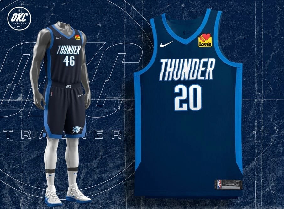
Major scoop last night from Justin Peabody, who runs the Thunder-centric @OKCTracker Twitter account. He says he was poking around yesterday on the NBA’s LockerVision site, which lists all of the game-by-game uniform matchups, and somehow cracked the code to unlock this season’s Earned uniforms (including the Thunder’s, shown above). Peabody’s Twitter reporting has always been extremely reputable, and another source of mine was able to confirm the legitimacy of one of the Earned leaks, so I’m fairly certain all of these are the real deal.
First, a quick refresher course: The Earned uniforms debuted in the 2018-19 season as some extra retail slop a bonus uniform for teams that made the playoffs the previous season (essentially a participation trophy, considering that more than half of the league’s 30 teams qualify for the postseason each year). Then they scrapped the Earned program last season, but they’re reviving it this season.
We got a hint about this season’s Earned program two weeks ago from Heat executive Michael McCullough, who told The Miami Herald:
The Earned Edition campaign really kind of flows from Nike. They talk to the teams about what the possibilities are. This year’s Earned uniform, what they wanted every team to do … is really kind of take one of your existing team colors and play with that, basically. Make it hyper this or really play up this aspect of your team colors.
With that in mind, here are the Earned uniforms for the 16 teams that made it to the playoffs last season, plus some v-e-r-y preliminary assessments:
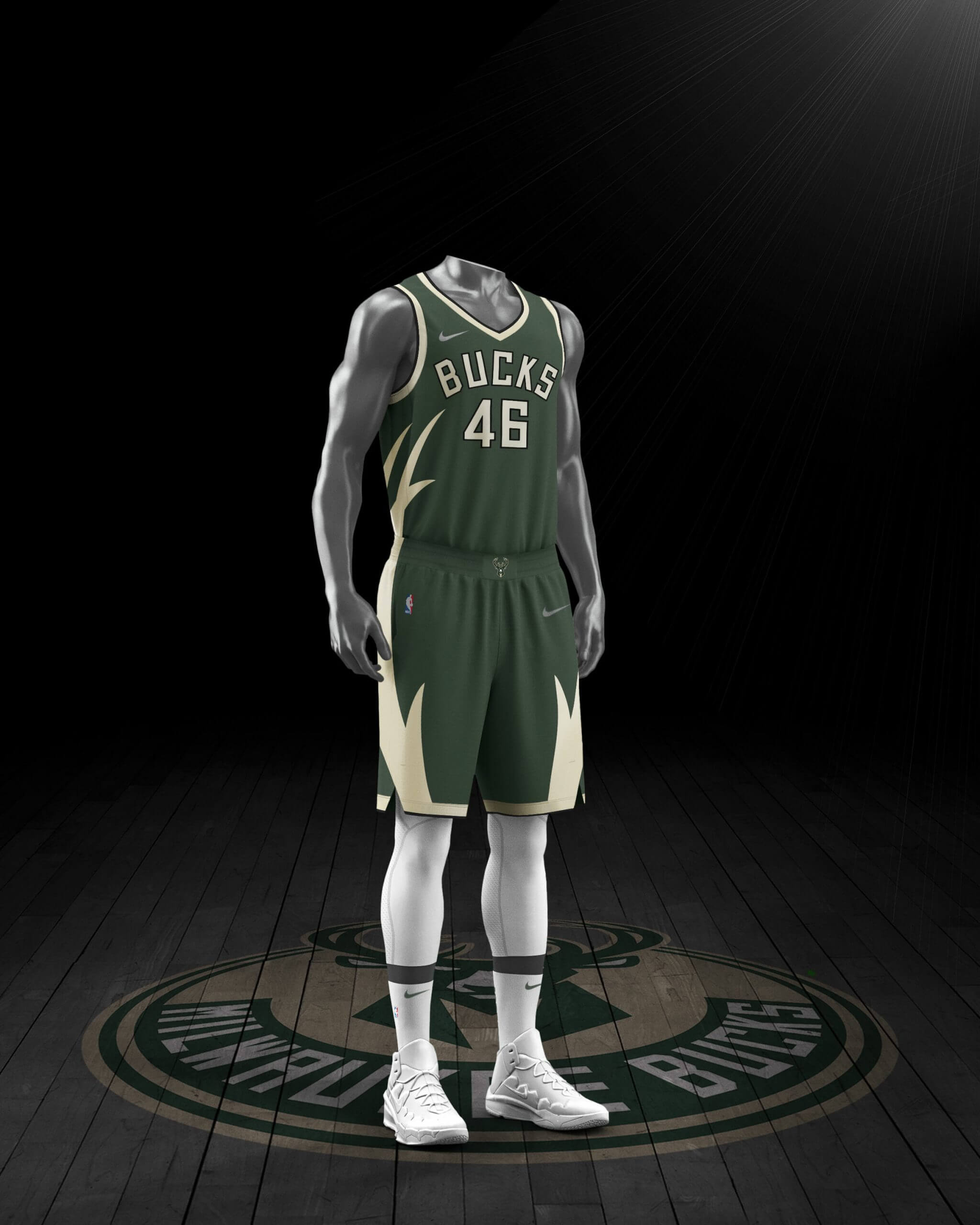
Bucks
Love the colors, not a fan of the antlers, but maybe they’ll look better on the court than in the mock-up.
———
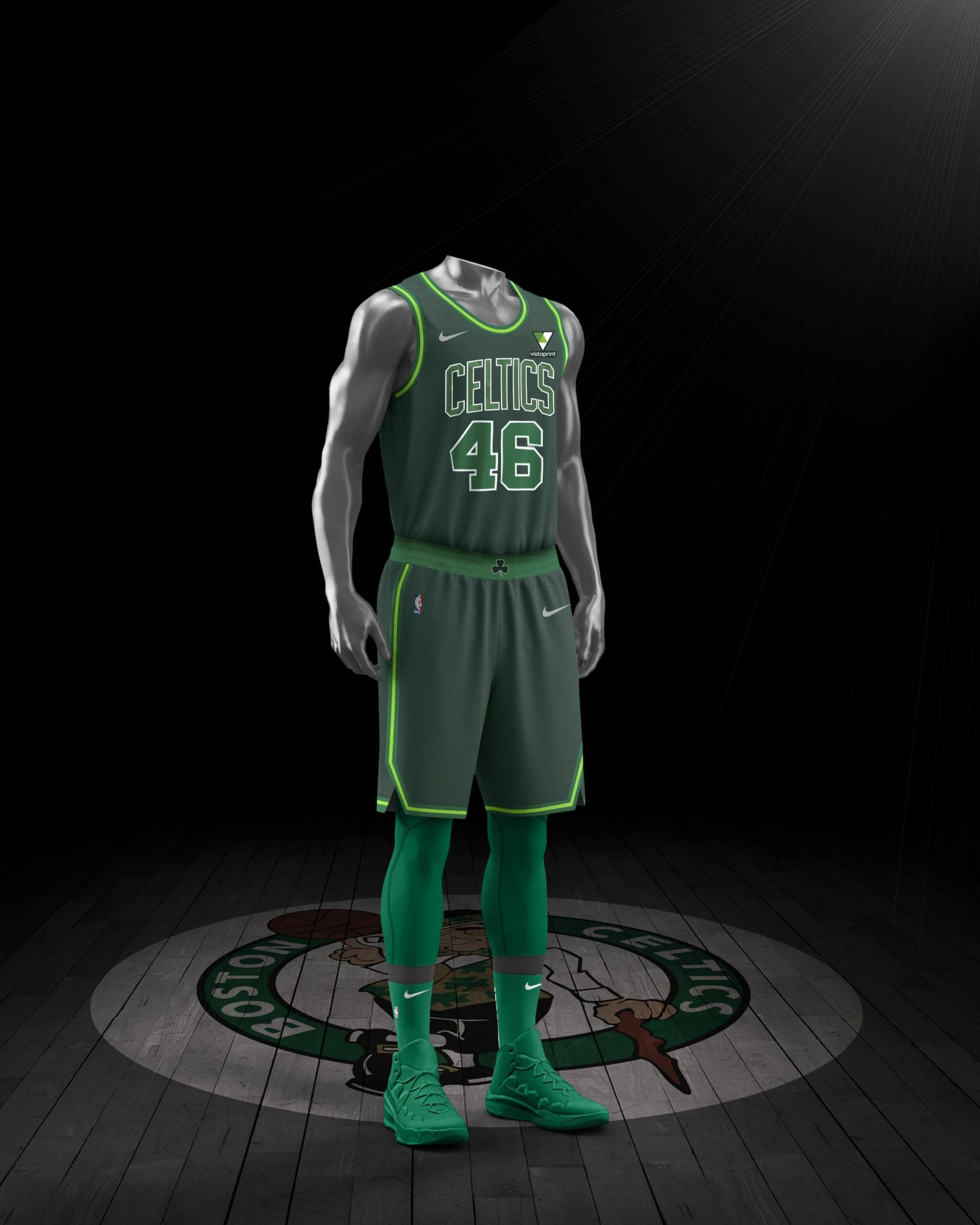
Celtics
Green has been my very favorite color ever for my entire life, so I feel extremely qualified to say what I’m about to say: That’s way too much green.
———
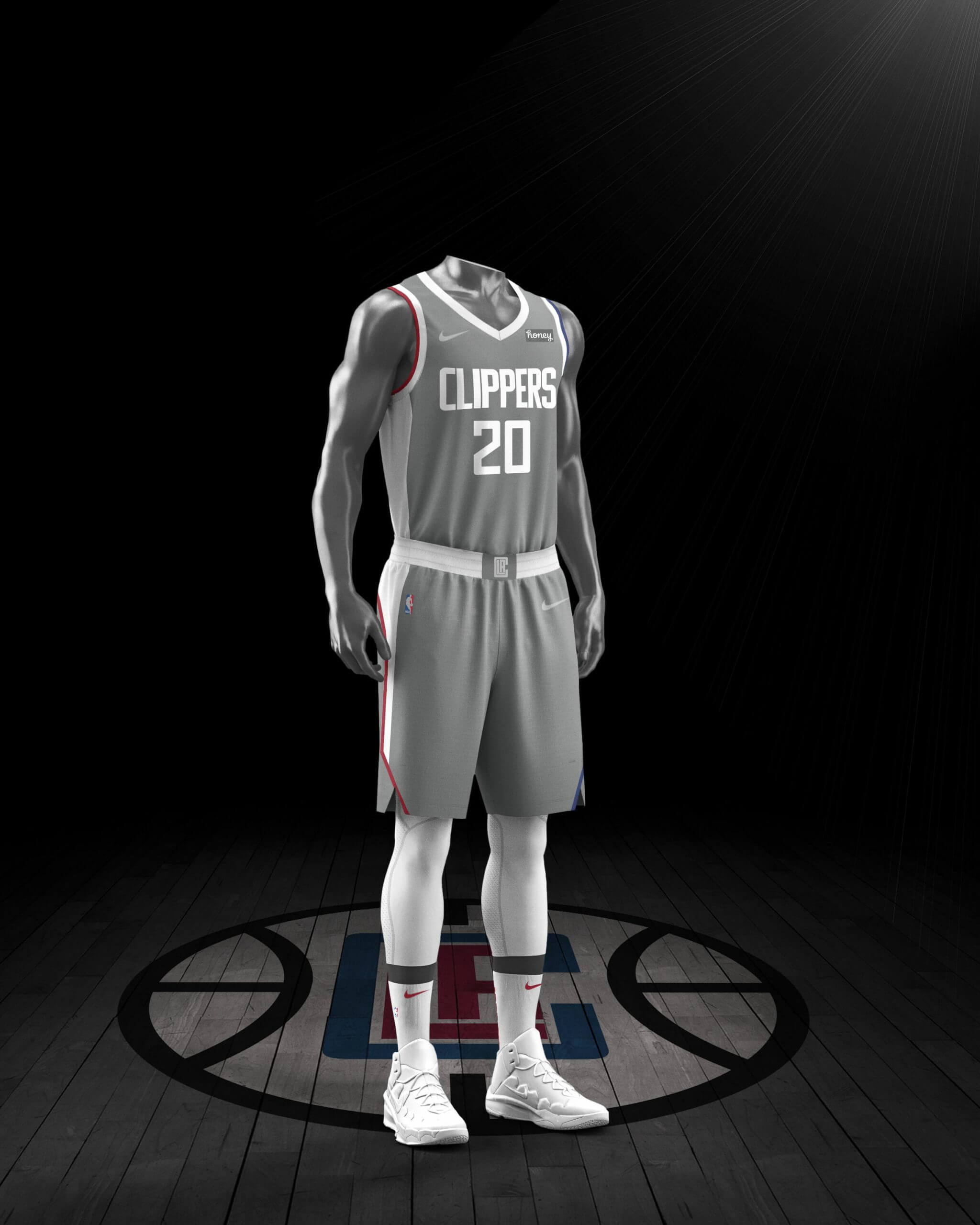
Clippers
I will never understand why any non-baseball team would want to wear grey. I will also never understand most of the uniform choices made by this team.
———
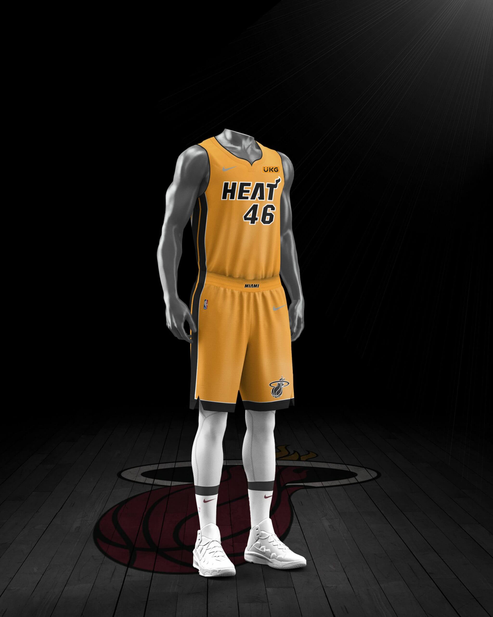
Heat
It’s almost startling to see the Heat come out with a non-Vice uniform. I dig that base color — looking forward to seeing this one on the court.
———
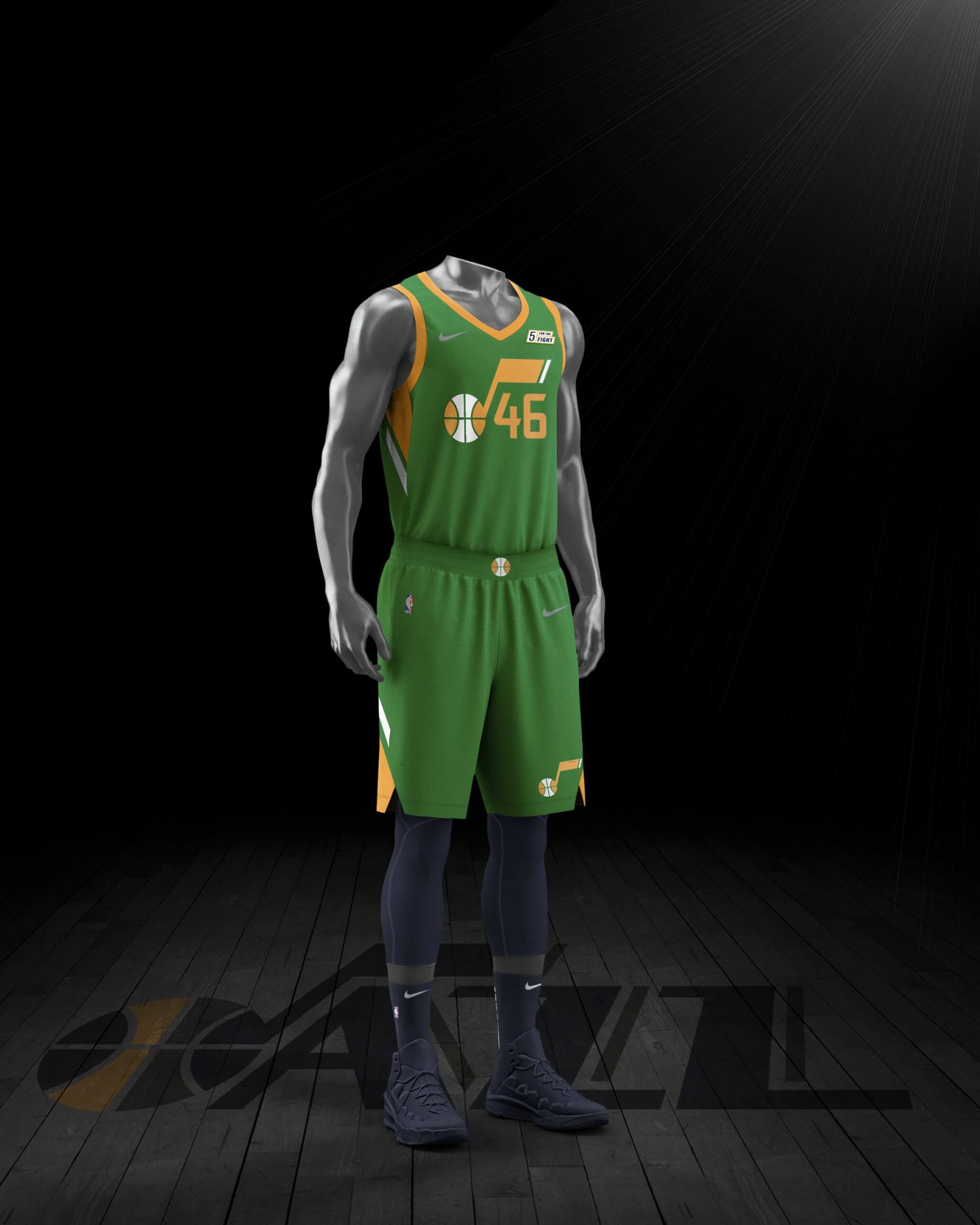
Jazz
Oo-la-la! Have I mentioned that my favorite color is green? Love it!
———
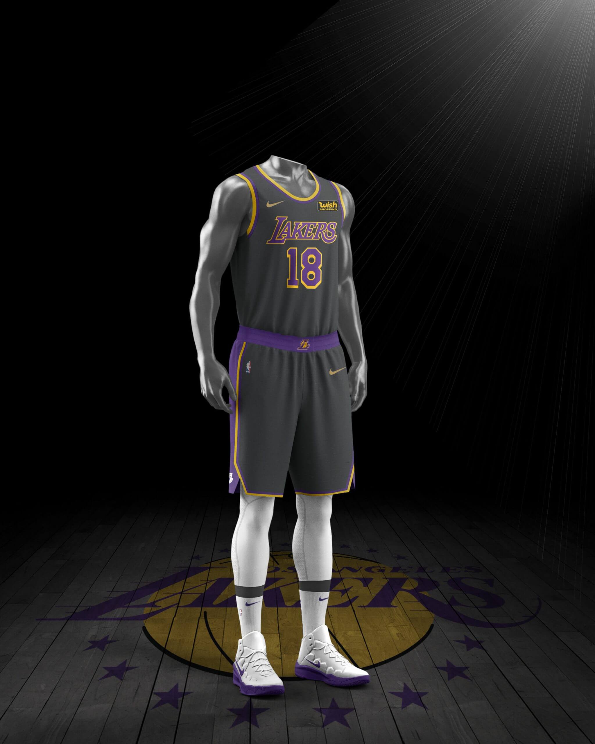
Lakers
Nothing special, nothing awful — just another BFBS Lakers uniform. Yawn.
———
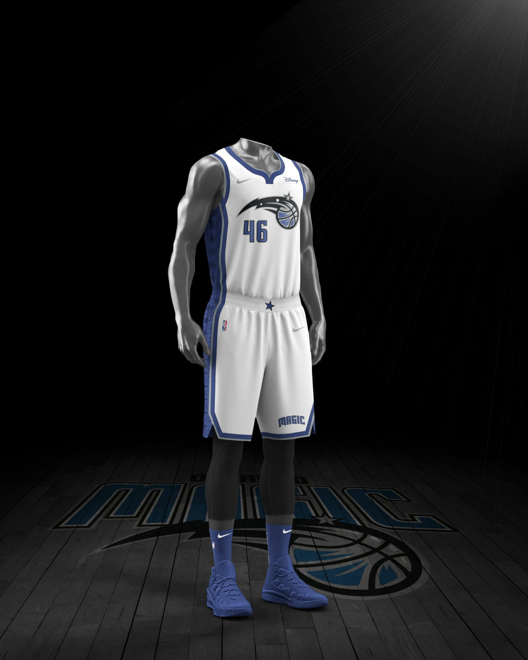
Magic
The rare white Earned uni. I’m fine with the chest mark, but the off-center uni number doesn’t work.
———
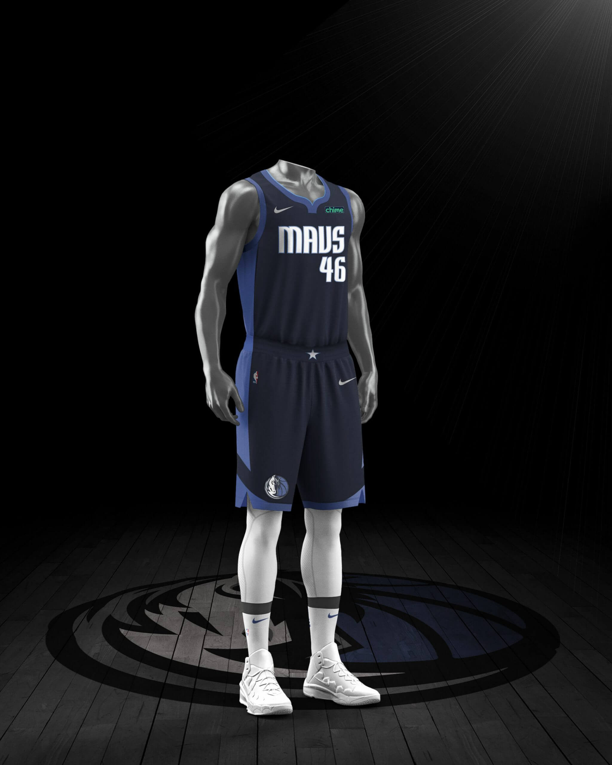
Mavericks
Shouldn’t they wear this, like, all the time?
———
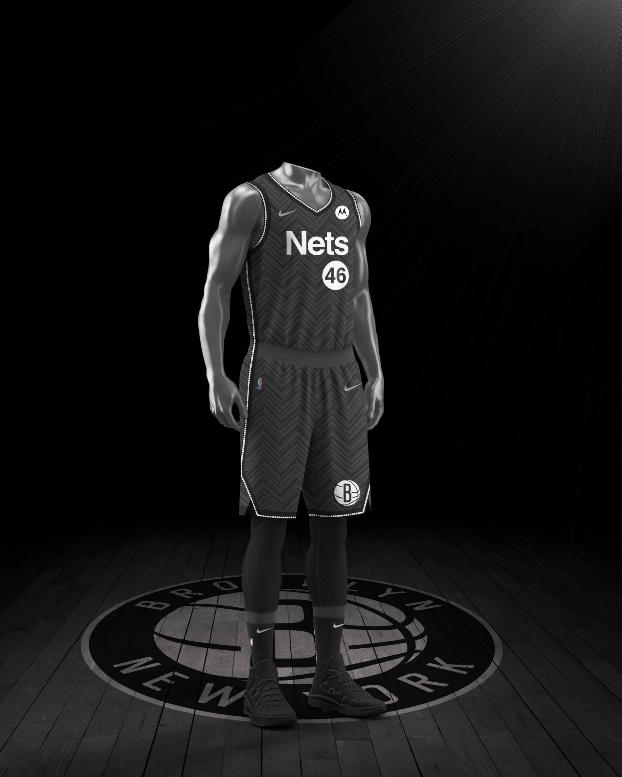
Nets
The typography appears to be based on the New Jersey Nets’ logo from the 1980s, or maybe New York subway signage. Either way, I like it, at least in theory, although the herringbone fabric pattern (based on the team’s court design) will probably be annoying in real life.
———
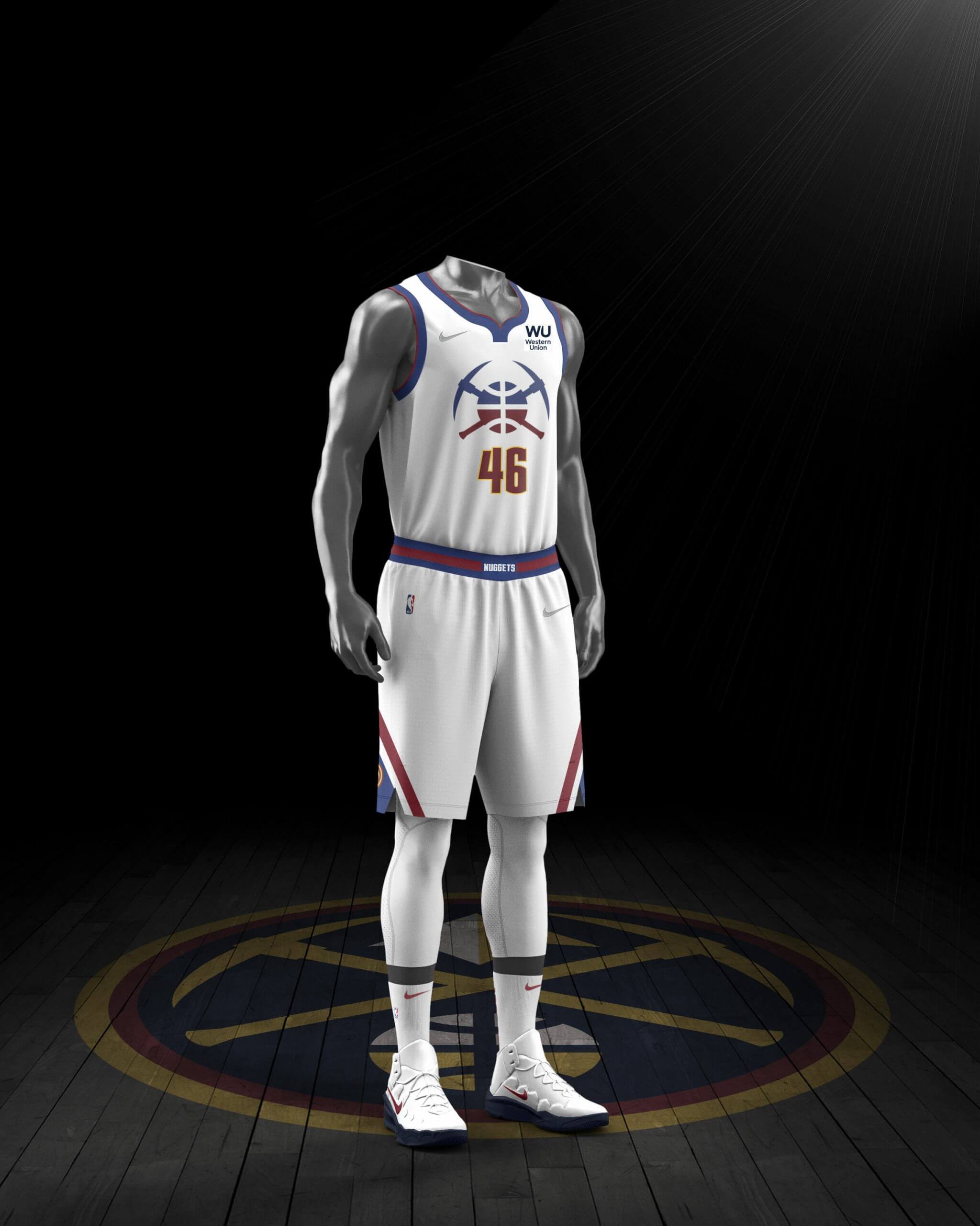
Nuggets
I like this one too, although I’d probably like it even more if the chest graphics were all blue, instead of gradating from blue to red.
———
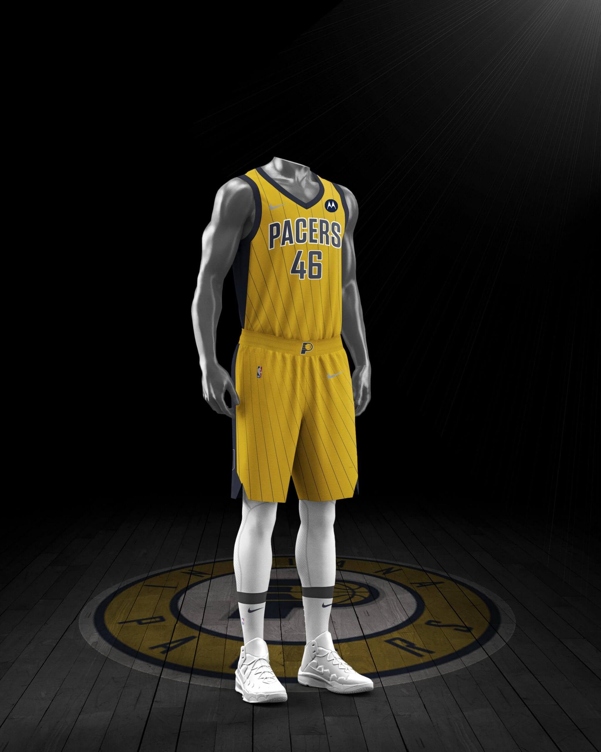
Pacers
There are now so many uniforms floating around that my first reaction upon seeing this one was, “Wait, don’t they already wear this?” It’s basically a color-reversed version of their new City alternate. Not bad, but unremarkable.
———
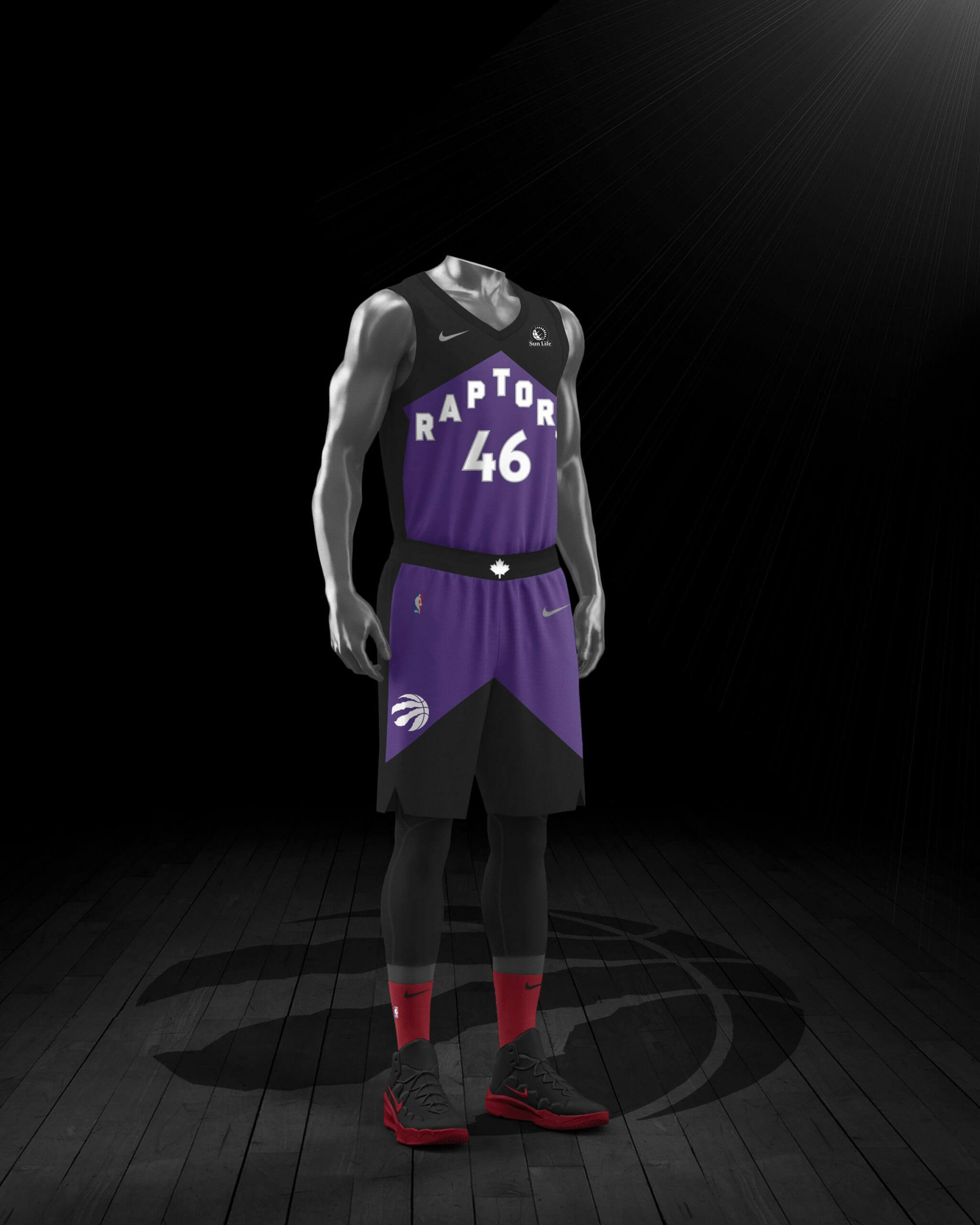
Raptors
I’ll admit it: I like the purple arrow effect. That sentence will self-destruct shortly and then I’ll deny that I ever wrote it.
———
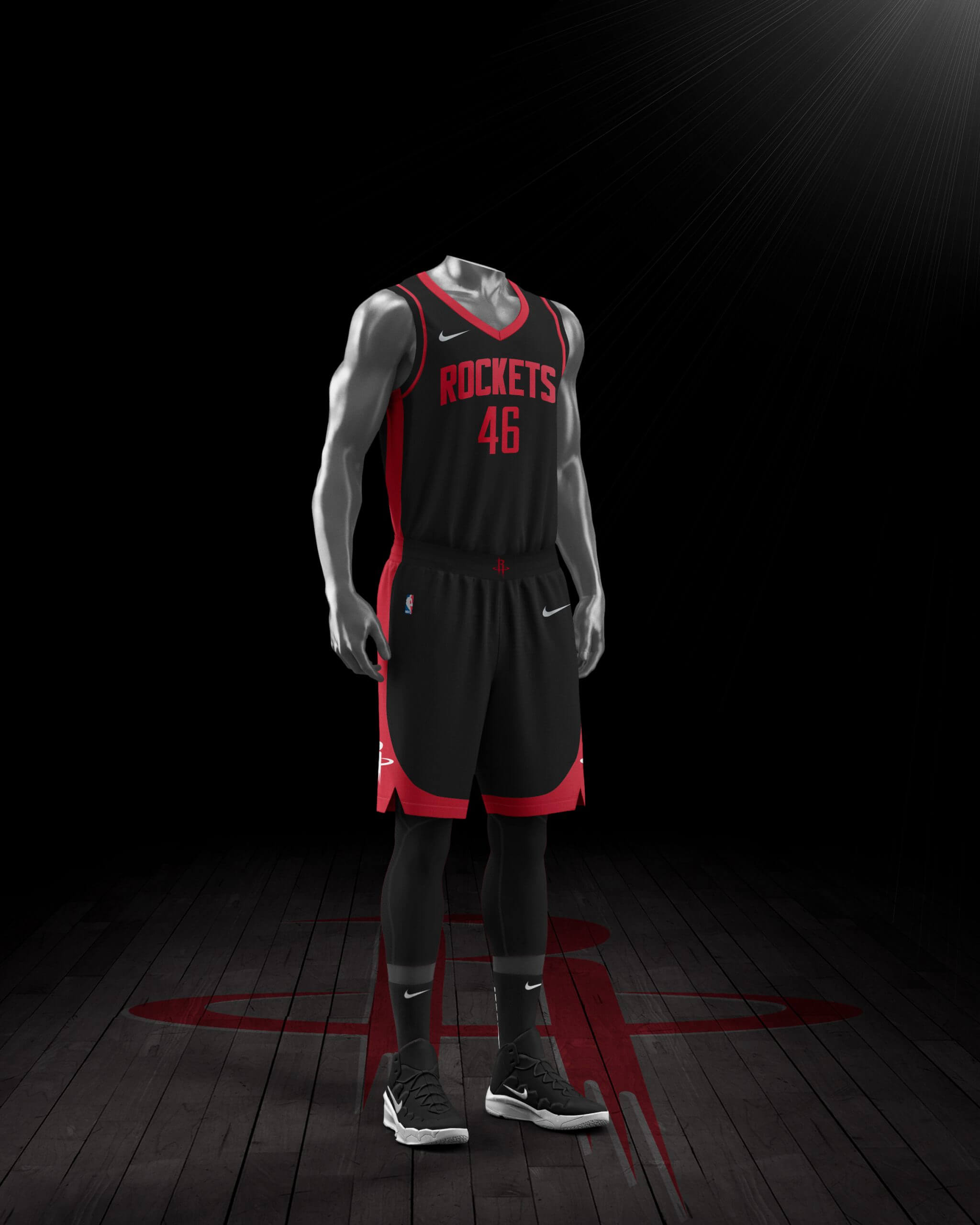
Rockets
Zzzzzzzzzzzz…..
———
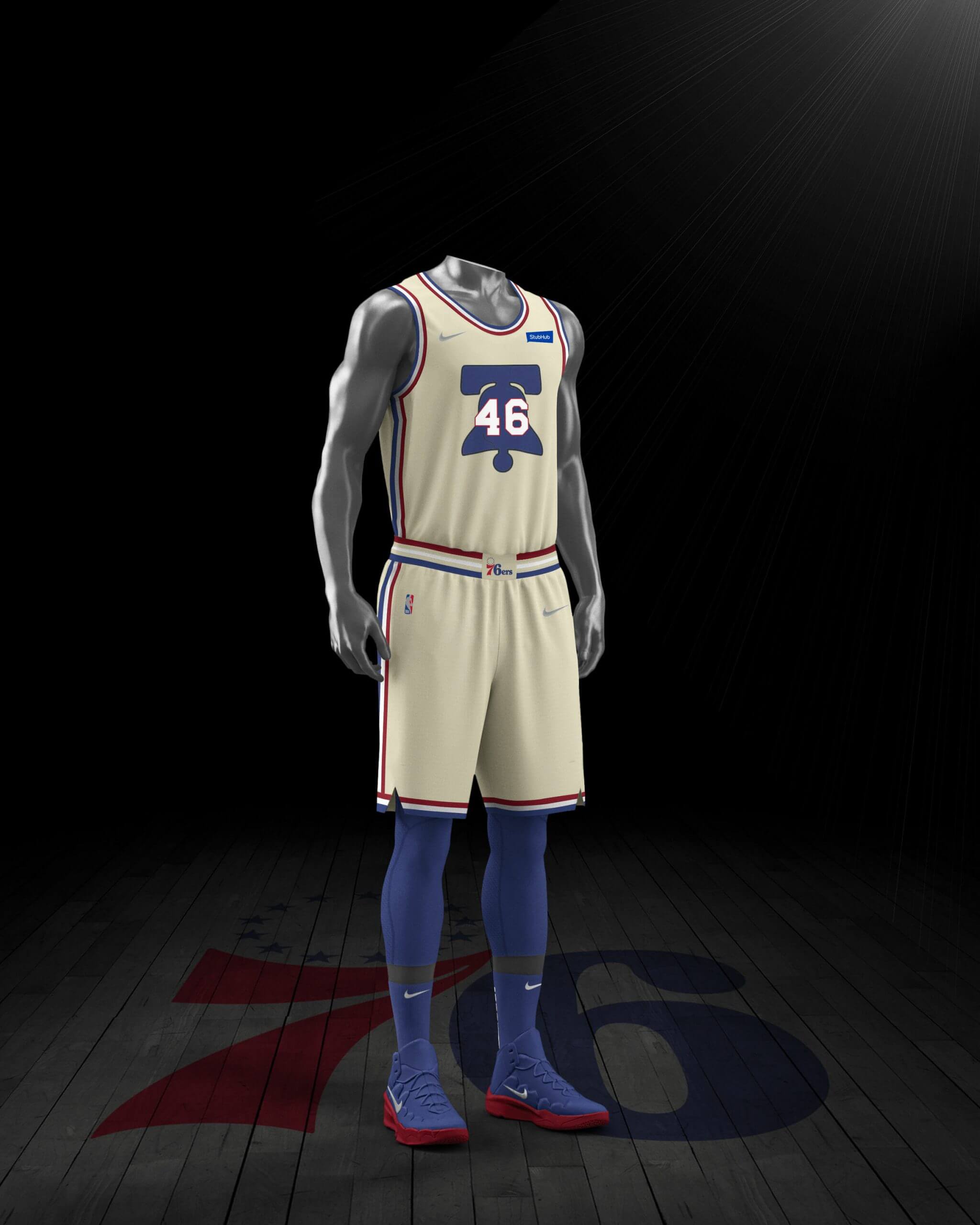
76ers
I like this quite a bit, as long as the base color is a light cream like their 2017-18 City design (as opposed to the sort of curdled color in the mock-up).
———
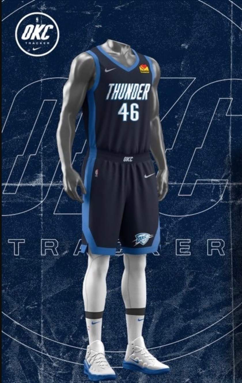
Thunder
Is it just me, or might this actually be their best uniform? Eh, it’s probably just me.
———
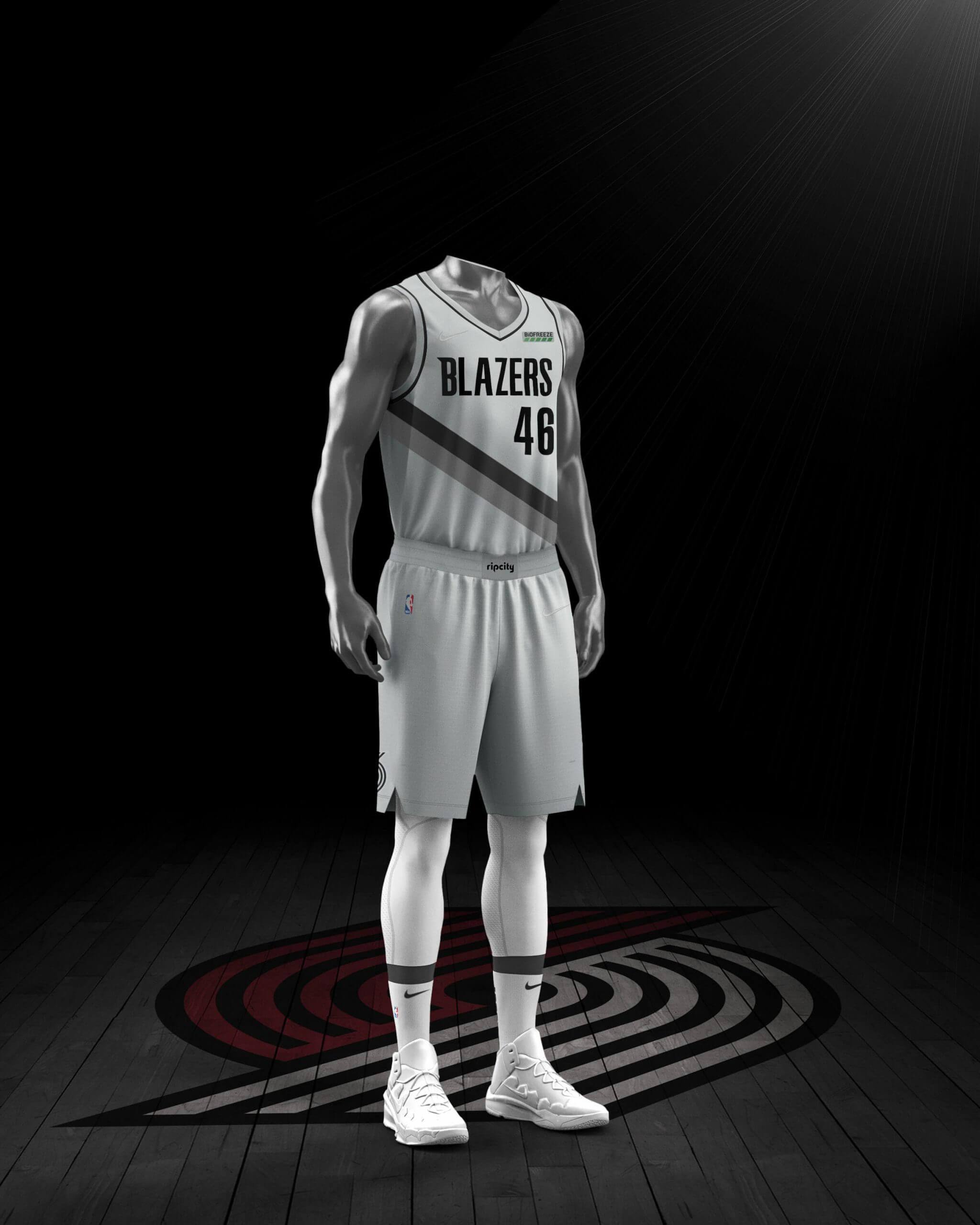
Trail Blazers
What will they call this color — silver? Steel? Fog? Factory? Sorry, guys, it’s still grey, and it still looks like shit.
———
So those are the designs for the 16 teams that made the playoffs. Interestingly, Peabody was also able to find apparent Earned designs for two teams that made it to the Orlando bubble but did not advance to the playoffs — the Spurs and Suns:
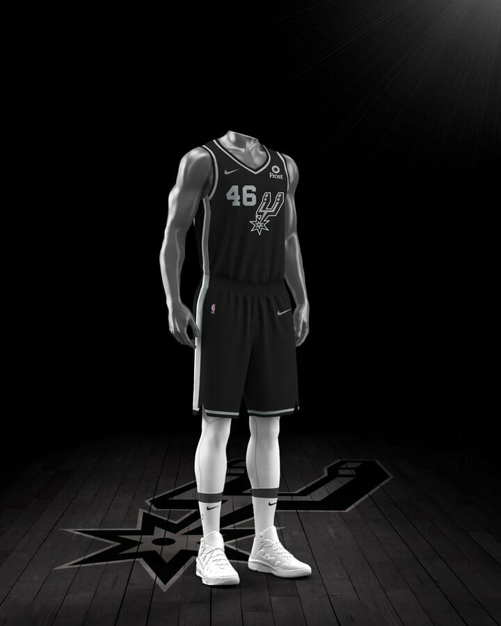
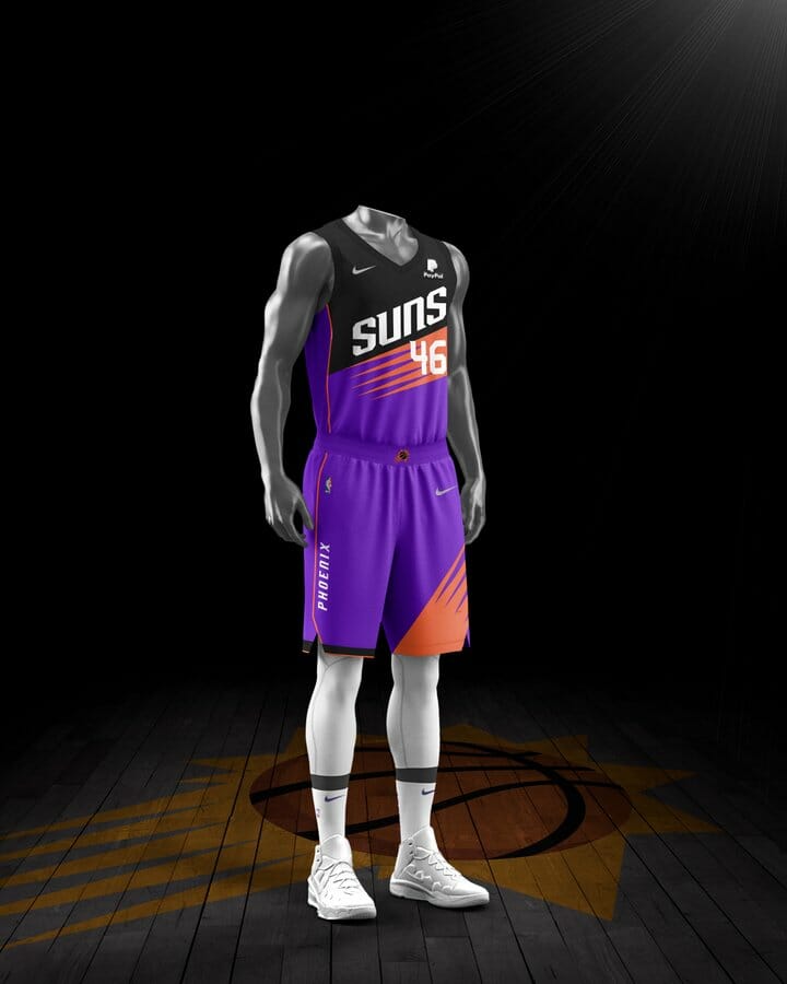
“Not sure if those were uploaded in error or if those teams will be rewarded for getting to the bubble,” says Peabody. “Haven’t been able to find any for the other non-playoff bubble teams, though.”
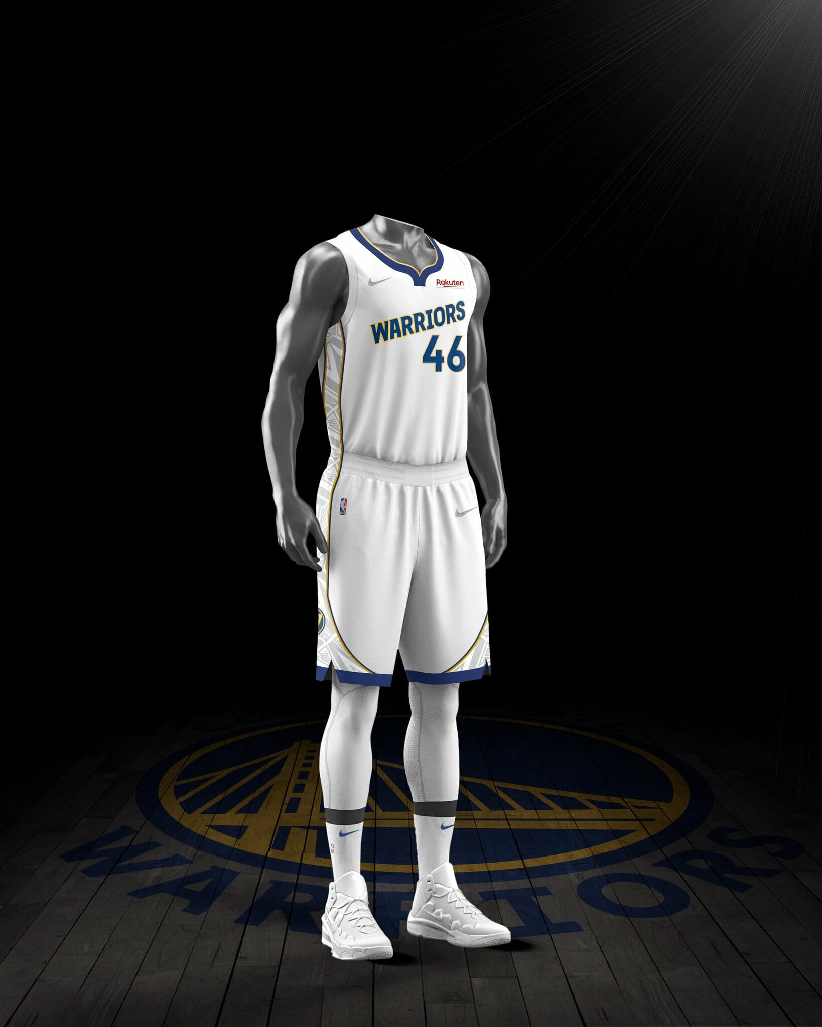
Update, 9:30am Wednesday: Twitter-er Casey Vitelli says he found one additional Earned design for a non-playoff team — the Warriors:
Overall: While the “Earned” concept is somewhere between laughable and contemptible, and while there’s certainly no need for any of these uniforms to exist, a decent number of them nonetheless justify their existence. Taken as a whole, they’re better than I expected.
And here’s a little detail I didn’t notice at first, until Peabody brought it to my attention: The maker’s marks on all of these uniforms appear to be silver — except on the Lakers’ uniform, where they’re gold, presumably because the Lakers are the reigning champs. This is apparently Nike’s latest attempt to create a uni-based caste system: first class (gold maker’s mark), business class (silver), and steerage (no uni at all). Gross.
It’s not yet clear when these uniforms will be officially revealed, much less when they’ll start to be worn. Stay tuned.
Click to enlarge
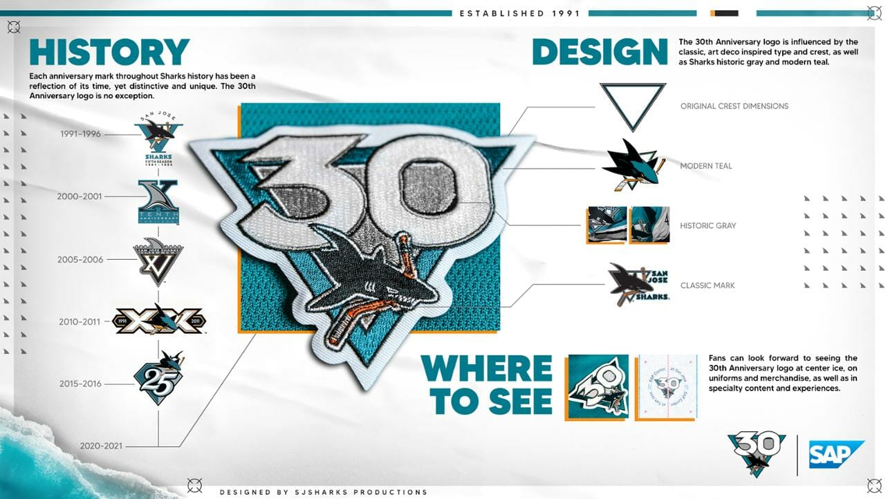
Meanwhile, over on the ice: The Sharks kicked off their 30th-season celebration yesterday, beginning with a new “anniversary” logo (actually an ordinal logo) that will appear both as a jersey patch and at center ice. The logo announcement included the graphic shown above, which I’m fairly certain is the most detailed presentation I’ve ever seen for an anniversary or ordinal mark.
There’s a slight bullshit quotient (instead of “Original Crest Dimensions,” I think they meant proportions — in other words, um, a triangle), but not too bad. I like how they showed their progression of previous patches, and they definitely get bonus points for showing an actual embroidered patch instead of just the digital version.
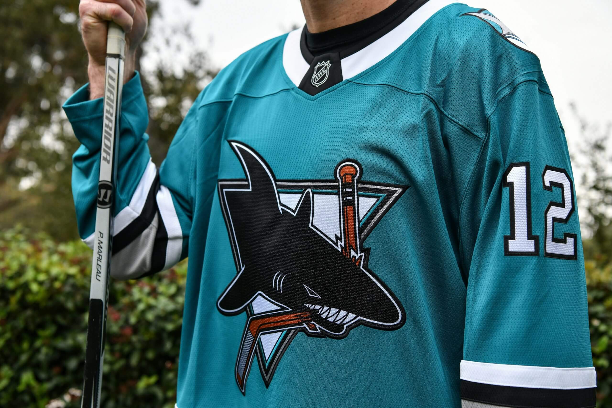
In addition, the Sharks will have a retro uniform this season (not quite a true throwback):
There’s more info on all of this here.
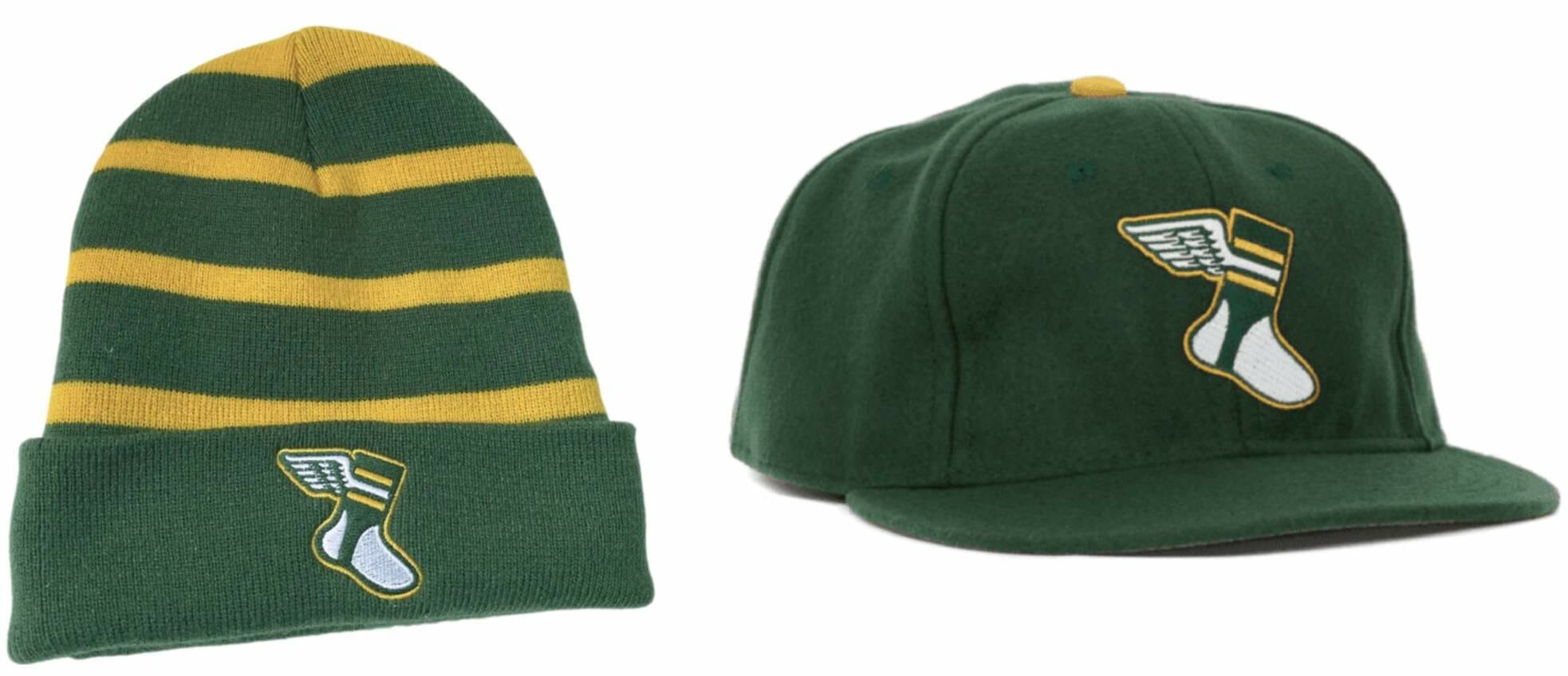
Headstrong: Need some headwear to keep your noggin toasty warm as the winter storms roll in? Uni Watch has you covered, literally, with two different options — our striped toque and our classic ballcap (made in the USA, all fitted sizes available along with adjustable/strapback). Go on, use your head!
The Ticker
By Lloyd Alaban

Baseball News: New uniforms for Liberty High School in California (from Kary Klismet).

NFL News: Have the Broncos slightly tweaked their throwback “D” logo? Looks like negative space within the “D” has been changed from navy to white (from multiple readers). … Nickelodeon will be simulcasting CBS’s NFL Wild Card game next month. … Pro and college receivers have been getting in their reps during the pandemic with the help of a new robotic quarterback.
College Football News: The Texas 1A-4A championships at AT&T Stadium Wednesday through Friday will be played on a Big 12 Championship-marked field instead of a Cowboys-marked one (from Chris Mycoskie). … Mizzou head coach Eliah Drinkwitz wore a Coca-Cola-themed hoodie with his name on it for a recent press conference. He’s apparently a big Diet Coke fan (from Matt Dunn).

Hockey News: New mask for Devils G Corey Crawford (from Mike Chamernik). … New mask for Blues G Joel Hofer. … Here are the mask and pads that Coyotes G Antti Raanta will wear this season (from @OlegKvasha). … New sweaters for the Lehigh Valley Phantoms, affiliate of the Flyers (from Robert Caplette). … The Knoxville Ice Bears gave a sneak peek of their new sweaters (from Chris Mayor). … Boston University is adding two memorial patches — one for former coach Jack Kelley and one for former player Travis Roy (from Nick Bove and Brandon Weir).

Basketball News: New court for Bellarmine (from Kary Klismet). … Etienne Catalan has the latest NBA uni number assignments on his Twitter feed.

Soccer News: Montreal Impact DF Luis Binks ripped off his CONCACAF Champions League sleeve patch before a corner kick last night (from Moe Khan). … New kits for Mexican side Toluca (from multiple readers). … During this weekend’s Scottish Cup final, every player will wear No. 26 on their shorts in memory of Marius Žaliūkas, a former center-back who won the Scottish Cup with Hearts in 2012 and passed away recently (from our own Jamie Rathjen). … Also from Jamie: New shirt ad for English club Lewes, for both its women’s and men’s teams. … New uniforms for Incheon United of Korea’s K League (from Kary Klismet). … Also from Kary: Swiss Super League team Lausanne-Sport has a new stadium. … One more form Kary: Here are a few photos of Luxumbourg’s nearly-completed new national stadium. … New 125th-anniversary shirt for Eintracht Braunschweig (from Ed Zelaski). … New shirts for Shimizu S-Pulse (from Jeremy Brahm and Ed Zelaski). … Here’s a visual history of Germany’s 1991 green jersey (from David Petroff).

Grab Bag: New logo for Whittier Elementary School in West Valley, Utah (from Kary Klismet). … New uniforms for Italy’s Carabinieri (from Timmy Donahue). … Also from Timmy: Space Force service members will receive a lapel pin and badge to affix on their Air Force dress uniforms, to help distinguish themselves from airmen.

I’m shocked the NBA didn’t go all out and give every team an “earned” jersey with marketing jargon about how they got there.
Give it time — these uniforms haven’t been officially unveiled yet.
“I’ll admit it: I like the purple arrow effect. That sentence will self-destruct shortly and then I’ll deny that I ever wrote it”
That def made me chuckle. As a fan of the color purple, I will remember this forever, lol.
I think the Clippers Earned uni is fantastic. My favorite of the bunch.
Didn’t mean to post this as a reply to the above post..
Is it a big purple arrow, or one big purple chevron?
Sorry if i missed it, will there be a reader appreciation post this year?
Not that i am looking to get something (i dont win) but i always find it interesting the stuff you get mailed.
The year-end raffle will be published around the same time it always is: about a week before Christmas.
At this point I just scroll past NBA uniform news. It is just merchandise now, constantly rotating each year. It is something to be sold to fans, not something that you are going to see your team wearing on the court for years.
I guess I should be happy that of the big 4 this happened in the NBA first, as I’ve slowly tuned them out as the style of play has changed so much in the last 20 years years. Can only hope the NFL, MLB, and NHL don’t start to embrace this nonsense. All of us in the comm-uni-ity can attest to teams attracting fans through their uniforms/brand, and that is basically impossible if you don’t have a consistent design for years, let alone game to game.
I tuned out when they started changing out floors to match whatever uniform they’re wearing. That’s just a little too precious for me.
You just KNOW some folks will have a burr up their butt about “Oklahoma” in the end zone during the Texas finals. I can already see someone telling the teams not to celebrate when they score on that end of the field.
Honestly, the whole thing seems like a massive recruiting violation to have NCAA markings on a field being used by recruitable athletes. I am surprised they are allowing it.
I think many states use college facilities for the HS championships, right? In Wisconsin, the WIAA uses college facilities for basketball, softball, swimming, track, football, cross country, golf, etc. I never thought about it as an NCAA violation. Don’t others do this?
Alabama definitely does, including alternating playing the football championships at Alabama and Auburn’s stadiums.
I think Texas high schools still play by NCAA football rules and field markings (as opposed to NFHS used by the 49 other states), so it’s easier for them to use the already-lined NCAA field than mark up the NFL one.
I know these are just mockups and the concept in general of uni ads is horrible (as was discussed at-length again yesterday), but I have to say I didn’t notice them for most of the mockups…until I got (back) to the Thunder. I’m surprised you picked to lead with that at the top of the article, that red/yellow patch on their navy/blue uniform is particularly brutal.
I led with the Thunder image as a way of giving a shout-out to Peabody for cracking the code on these.
As for the ads in the mockups, I think they’re less noticeable because they’re on the side of the jersey that’s facing away from the viewer.
And as was mentioned the other day, the tendency is/will be to get used to the ads, even if you don’t like them.
Those Bucks and Sixers uniforms are … pretty awesome. I can’t remember the last time I had such a positive reaction to an NBA uniform – aesthetically, the whole league has been in the dumps for so long now. Some of this year’s City unis have also been OK, so maybe this is a hint that the NBA is turning a corner?
I also like the Thunder’s earned uni, but by not having any orange it looks too much like the Mavs.
The OKC earned uniform is the Mavs uniform? Ok.
I think the gold maker’s mark on the Laker’s jersey might be due to the fact that they won the title last season, but I could be wrong. Similar type thing like in baseball when they outline the opening day jersey in gold after winning the World Series. Not entirely sure it represents a potential caste system as mentioned above, at least I hope not.
Yes, that seems obvious. Sorry if I didn’t make that more explicitly clear (which I’ll do now).
That Celtics uniform would look really good on the Bucks.
I miss multiple shades of green.
Ticker correction: The Knoxville Ice Bears are not a Predators affiliate. The SPHL has no NHL affiliation. Only the Milwaukee Admirals (AHL) and Florida Everblades (ECHL) have Predators ties.
Thanks. Fixed!
Are those Space Force pins also communicators?
“2 to beam up.”
I think it is worth noting, the herringbone pattern on the Brooklyn Nets earned uniform matches the hardwood pattern on their court. Also the typeface used on the jersey is not only the same font used by the NYC subway, but also used on the baselines of the court as well.
Thanks for that info!
Ticker: New Blues Goalie Mask links to the Ice Bears peek image.
Fixed. Here’s the proper URL so you don’t have to scroll back up:
link
The Bucks, Jazz and 76ers unis look phenomenal to me. I’m guessing with the lack of fans attending games in the upcoming season, the amount of “novelty” uniforms will be going up, not down. Probably true for all sports, actually…
Hockey has already announced about 2 extra jerseys per team and there were rumors they would have the divisions sponsored. Ugh.
Advertised, not sponsored.
;)
So many of these Earned uni’s are just awful; the grey Clippers and Blazers look like ghost icon’s that you can’t click through!
Why does Boston mess with their classic uni, ever? It’s like the NY pin stripes; don’t mess with a great look.
My faves are Nets, Jazz, Heat.
As a native Brooklynite, “one who gets it”, and a subway nerd. the Nets uniform clicks the boxes – only wish they could change the subway “bullet” (player number) to a color of a subway line that serves the Barclays Center, which could be Red (IRT Eastern Parkway), Orange (IND Brighton) or Yellow (IND Fourth Avenue) or even Blue (for the LIRR).
A little dash of color would really make that jersey snap. Yes!
Dear NBA designers,
Stop it already. Just stop. It’s all overkill.
Sincerely,
Chris
It’s only a matter of time until teams have 82 different uniforms.
Frighteningly plausible. -C.
Could the tweak to the Broncos throwback logo be a harbinger to new uniforms with that as the primary logo? Here’s hoping.
New Broncos logo? I hope so. But white background inside the D? I hope not.
I don’t know how to feel now that elementary schools have logos.
Why 46?
Year of the league’s founding.
Mizzou coach Elia Drinkwitz has ‘drink’ in his name and is rocking a Coca-Cola. I see this as a marketing bonanza.
I don’t associate the Liberty Bell with the 76ers(it ‘belongs’ to the Phillies) but that uniform is nice, though I wish the silhouette was crisper/less rounded and the number size was smaller so it better fits inside.
The Lehigh Valley AHLers should stop using “Electric(Company-Sponsored?)Blue” and just switch back to “Philadelphia Phantoms Purple”.
I don’t think the Phillies can own the Liberty Bell, any more than the Rangers can own the Statue of Liberty or the Sounders can own the Space Needle. Local icons are open to all local teams, and especially when the 76ers name has a greater connection to the Revolution than “Phillie”.
I’m kind of surprised to see that they didn’t have a Bell logo until the 2010s; I guess I thought link was a 76ers logo when I was a kid. I swear I saw that on t-shirts back in the day.
I like Diet Coke too, but I can’t imagine wearing a personalized sweatshirt for it.
Anybody else think “Lakers” when they first scrolled to the Heat uniform?
Me!
YES! I definitely did. I also looked at it longest because I couldn’t (and still can’t) figure out if it’s a dark yellow or a light orange.
Best of the bunch is definitely the Jazz.
My two teenagers are big fans of the NBA so it gets a lot of tv time in this house. I consider myself a fairly knowledgeable sports fan yet it cracks me up how I can walk into a room, look at the tv, and need significant time to figure out which team is which. Its flippin’ awful. If I owned a team I would put my foot down and say–these are our uniforms and Ill decide when we wear what. Its a travesty.
The history of the Major Leagues just added a lot of great logos and uniforms.
link
Paul, since you brought up not hating the Raptors purple uniform, I wonder if you think the Raptors should go back to being a purple team. I tend not to be a purple fan in my wardrobe, but I do like purple as a team color, as it’s a nice visual break from all the teams that are some version of red and white, blue and white, red, white and blue, or red and black.
It’s one of the reasons I like my Uni-Watch hat so much–the green and yellow is such a great and underused combination.
Paul, since you brought up not hating the Raptors purple uniform, I wonder if you think the Raptors should go back to being a purple team.
Now, let’s not get carried away….
Seriously: I never know what to make of the Raptors. They’ve changed their look (including their colors) so many times, it all feels like a big mess. It’s not that all of their looks have been bad — it’s that they never seem to stick with anything.
I suppose I understand the thinking behind the move to red in an effort to align more with the Canadian flag…I guess. I just don’t like how, even with endless uniform combinations, all teams still kind of look the same.
I dunno… the Brooklyn Nets uniform could use more white circles on the left side.
I love the San Jose Sharks heritage uniform. Would be great if they went with the striping on the pants like the original uniform but not getting my hopes up.
I am so for the Sharks going back to their original uniforms compared to their current look. Even if they put the current version of the primary logo on the old uniform. Current uniform is rather bland with lack of waist striping.
I’m a Celtics fan, and I love all of the green in that uni.
The Blazers will probably call that shade of grey “Pacific Northwest Sky Grey.”
It sucks that you’ll have to do math to know what a Jazz player’s uniform number actually is. What is the square root of 46, anyway?
6.782329983125268
Thanks. Ha ha. But I can see why they wouldn’t be able to practically put that on a uniform. ;-)
Paul, was wondering why you do not like the Magic’s off centered number (you like the Nets’ and Mav’s unis with off centered numbers). I happen to agree with you and I think it might be because the number is on the left. Just wanted to hear your take.
Yes, because it’s on the “wrong” side. Not that there’s anything *really* wrong with it, but it’s visually jarring compared to most off-center front numbers.
Oh boy that Nets earned uniform is wonderful. Tops!
The ones for Sixers, Bucks, and Jazz are excellent designs and should also look great on the court. Sleek.
Grey. The color of the decade. Sigh.
Sad to see the NBA going the way of NCAA football with 5 million different uni combos. All this does is strip them of any identity. The whole gray debacle is just the rotten cherry on top.
A few of the NBA uniforms look like they’re trying for that “black and white” TV effect. So is the Heat uniform Tennessee orange, or school bus yellow?