By Phil Hecken & The SMUW Crew
Follow @PhilHecken
There was a big day of NCAA Football yesterday, with several really good looking games, (including an epic snow game AND color palette special), but to me, nothing beats the granddaddy of the uni matchups, the traditional USC vs. UCLA color-vs-color tilt. Even in this god-forsaken, COVID-19-ridden, terrible, awful, horrible year, at least we still have this game to let us know that, for about three hours a college football season, all is right in the uni-world.
Not everyone likes a color vs. color game, and not every color vs. color game is good. But this matchup, made possible over a decade ago when the NCAA permitted color vs. color matchups (they had occurred in days of yore, and even as recently as a few decades ago) again, has always been one of the best.
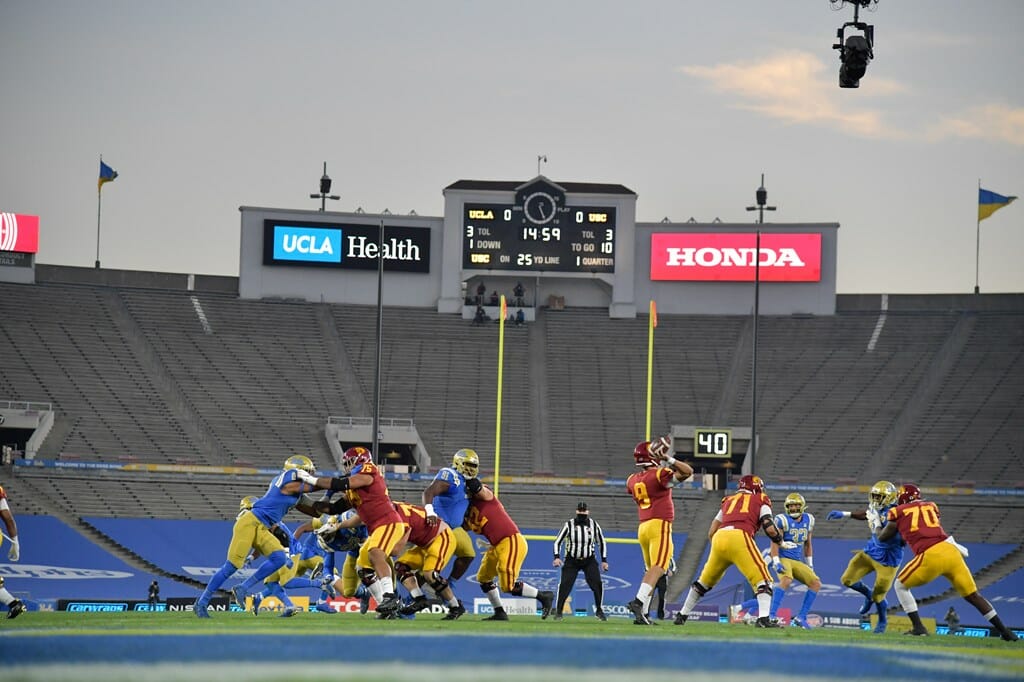
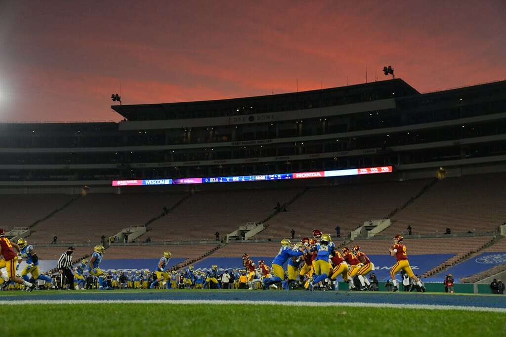
Yesterday’s game was made more awesome by being an exciting and close game (USC won it in the final minute), but sadly, COVID restrictions meant both an empty stadium and in place of fans, ads encircled the field.
The normally gorgeous SoCal sunset that provides such a beautiful backdrop to this game (and the Rose Bowl on New Year’s Day), looked almost apocalyptic when contrasted with the empty and ad-laden seats.
On a day when several big (“THE Game”, the “Oaken Bucket”) games were canceled, at least this one was able to be played, even against the backdrop of the COVID nightmare. Having USC/UCLA AND Army/Navy on the same day will (hopefully) never happen again, but at least we got these two in.
Now, here’s TJ, who’ll have a real nice Army/Navy wrap, plus the rest of your…
Sunday Morning Uni Watch
by Terry Duroncelet, Jr.
A moment of silence for THE vs. OF.
From Friday:
• Apparently in the State of Arizona, contrast DOESN’T matter. Who thought this was a good idea?
From Saturday:
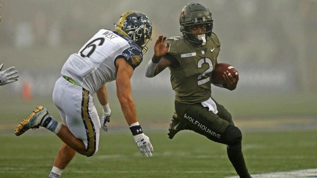
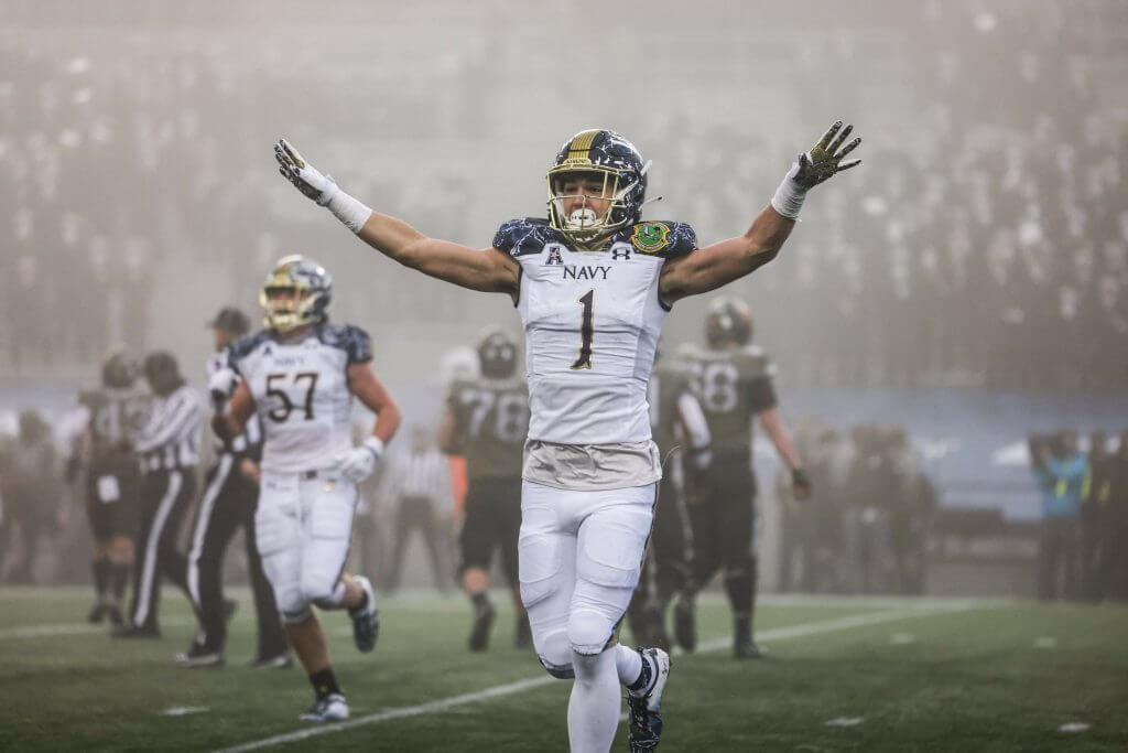
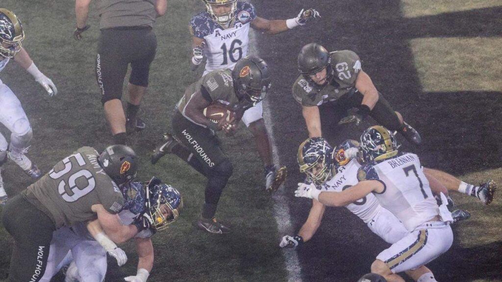
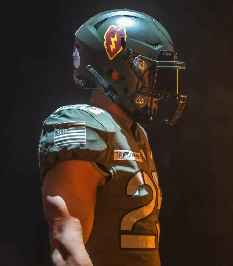
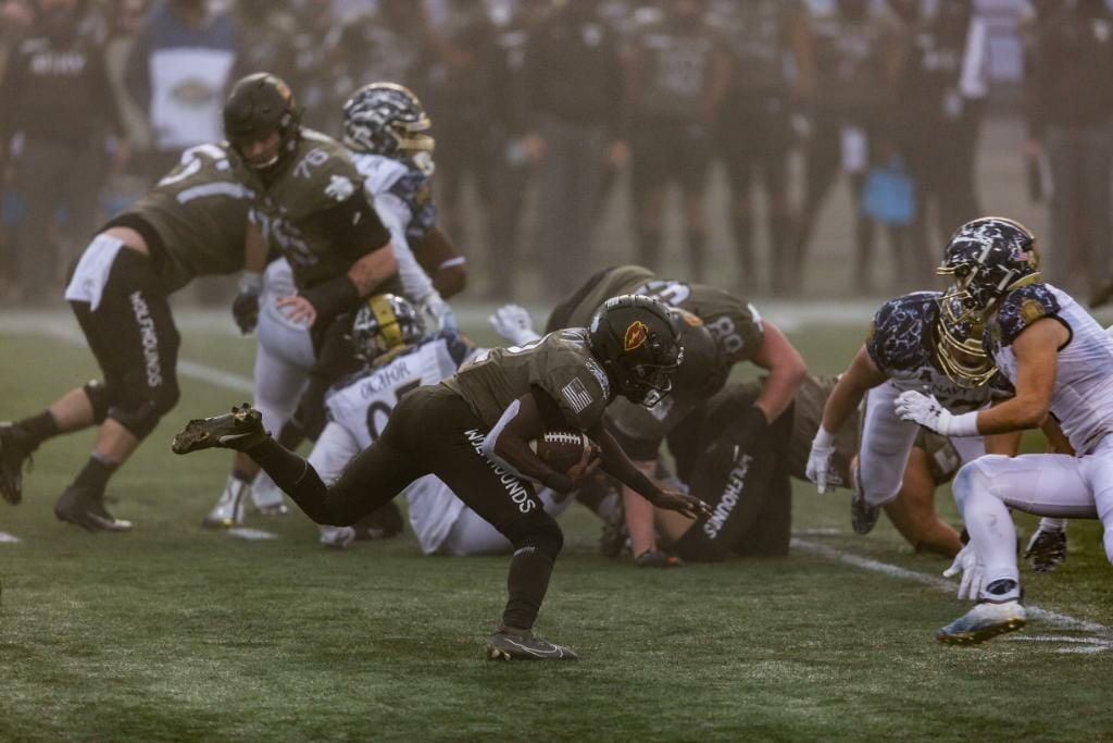
• I normally go into stasis during the Army/Navy game, but this season’s special circumstances had other plans, so here I am talking about the Midshipmen vs. the Wolfhounds Black Knights. As one would expect, this uniform matchup was a nice amalgamation of pure aesthetic fun, and a lore-rich history lesson. An always-welcome disruptor to how other schools choose to pander.
Navy always goes above-and-beyond with damn-near every white-based uni they’ve worn in the last few years (although 2012 will always be my favorite):
And how about the gameday weather? Beavs/Ducks 2020 Part 2: Electric Boogaloo, anyone?
However, there was one… surprising element that confuses me, as well as others: if you notice on the right shoulder cap of Army, the U.S. flag is shown with the star field facing the back-left:
*Technically*, if we’re adhering to current Flag Code, it should be facing the front-right, as said by Zach Schaefer: “According to Army Regulation 670-1: “The American flag patch is to be worn, right or left shoulder, so that the star field faces forward, or to the flag’s own right. When worn in this manner, the flag is facing to the observer’s right, and gives the effect of the flag flying in the breeze as the wearer moves forward.”
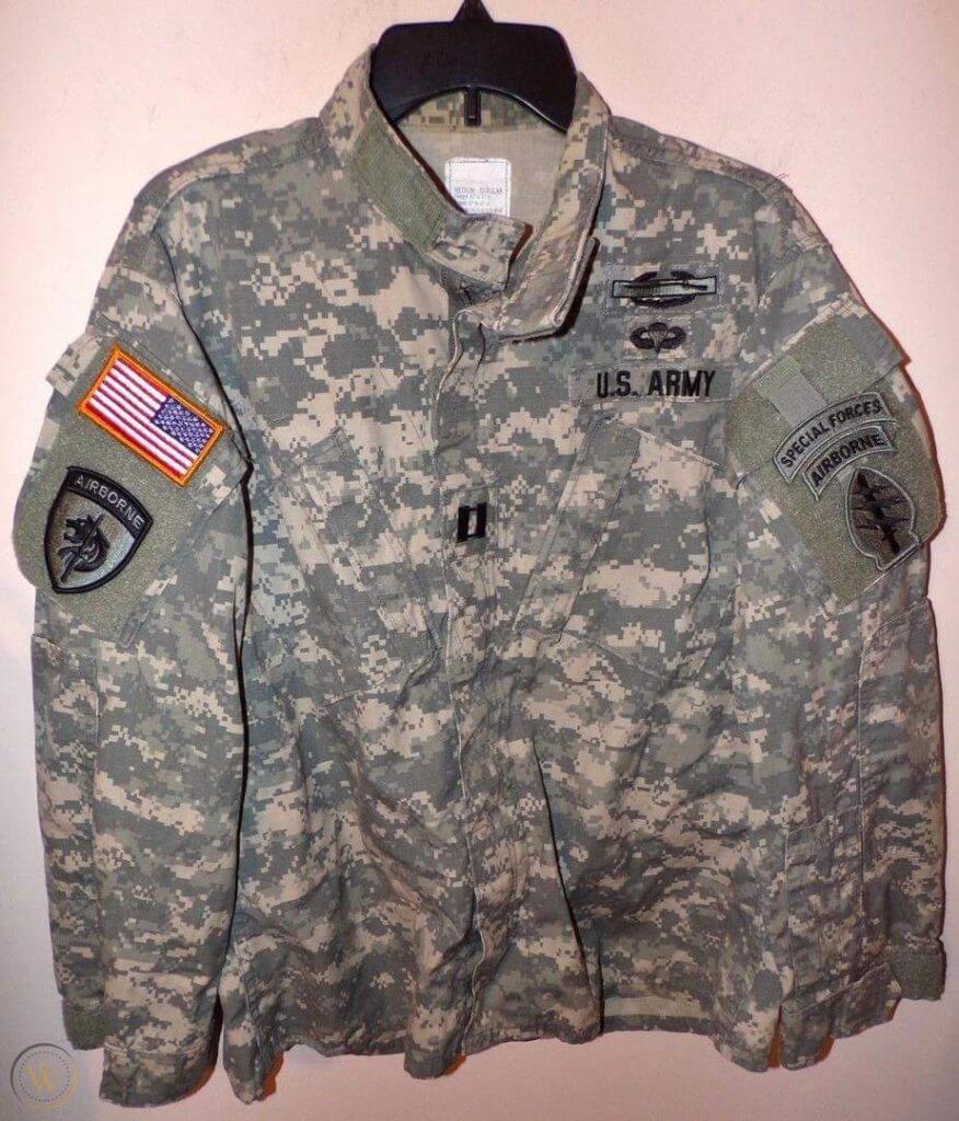
With that being said, I don’t know if this was intentional and part of how the 27th wore their ACU’s back in 1950, so I’m not going to rush in and call this a gaffe without all of the facts. Regardless of the flag orientation, the game was a nice touch of normalcy to an otherwise tumultuous year (my brain went extra-smooth trying to spell and read that word), even though Navy unfortunately ended up laying a goose egg (dad served in the Marines, so I’m biased). And so ends my first (and probably only) 2 cents on TOGIT*** [***’cause… ya know… 2020]. Phil did an amazing job (as always) of breaking down both uniforms yesterday, and if you missed his piece (or need/want a refresher), take a look here. And now, back to your regularly-scheduled chatterboxing.
• Contrast Matters: The Flavor is Immaculate Edition. More of this, PLEASE. And the OKST helmets were PERFECT.
• Michigan State wore Gruff Sparty on their helmets against Penn State.
• Northwestern wore their fantastic gothic unis against Illinois.
• In what I’m calling the Pac 10+ Bowl, Colorado faced off against Utah, the two very schools responsible for the number change within the *former* Pac 10. There was contrast-galore, and perfect football weather to boot! The first thing that came to mind when I tuned in was the Buffs’ days in the Big XII playing against Nebraska (and funny enough, they met up last year).
• Maryland wore throwback uniforms against Rutgers.
• We all know that letting your emotions get the better of you can make you throw a fit, but apparently, they can make you throw a shoe, as well. (and before you ask: yes, that penalty-induced first down proved to be fatal for Florida) H/T to Mike Chamernik.
• Even though NO TEAM that doesn’t have black in their school colors has any business wearing black… I don’t completely hate what Miami wore. I mean, I DO hate it, but it’s not the worst I’ve seen.
• Speaking of Floridan teams in black garb, Florida State decided to go completely feral against Duke. It’s like they woke up late to work, didn’t wash their clothes last night, and had to slap something together in 5 seconds.
• Louisville got into the Xmas spirit by wearing all-red (with white helmet decals) against Wake Forest.
• Vanderbilt wore their sweet ‘Vandy’ skyline helmets against Tennessee.
• Toledo wore throwbacks against Central Michigan.
• Contrast has never Mattered more than in this game. This is peak Mountain West content. Also, it’s always nice seeing Boise State in the Sooner Killer combo, especially when the color yield is as fruitful as this.
Thanks, TJ! OK, now on to the rest of your SMUW…

5 & 1 — Guest Pickers Edition #2
Last weekend we had our first set of 5 & 1 guest pickers (Douggie Keklak and Harrison Hamm), and this weekend we have our the second two (Gretchen Atwood and Eric Bangeman). Please let them know how they did in the comments section below.
Depending on how things go, one or more of these four may return for the Conference Championships and/or Bowl games, so please be kind but constructive in your thoughts on their picks. Remember, this is largely a matter of opinion (I frequently didn’t agree with other 5 & 1 pickers, but they probably wouldn’t necessarily agree with my picks either — plus you guys don’t want to see Alabama/SEC teams and the Ducks every week!)
First up today is Eric Bangeman, with his 5 & 1:
5 & 1 by Eric Bangeman
In a normal year, this week’s 5&1 would probably consist of Army-Navy plus a handful of FCS or Division II playoff teams. After all, the second Saturday of December isn’t usually prime college football territory. But this is not a normal year. Army-Navy was played at West Point instead of Philadelphia and everything below FBS is idle this fall. So welcome to your Week Oh-My-God-Will-2020-Just-Be-Over-Already 5&1.
Honorable mention: Coastal Carolina vs. Troy, Northern Illinois vs Eastern Michigan, North Texas vs. UTEP
5. Army-Navy
Even though the game’s most storied rivalry did not have the D1-FBS stage to itself, the nation’s oldest service academies still managed to stand out with their uniforms. Phil covered the unis in detail yesterday, so I won’t recap here. Army’s 27th Infantry Regiment-inspired getup exceeded expectations and Navy looked… unique (and good)… in their marbled helmets. Throw in some foggy conditions and you’ve got yourself visuals that line up with the tradition.
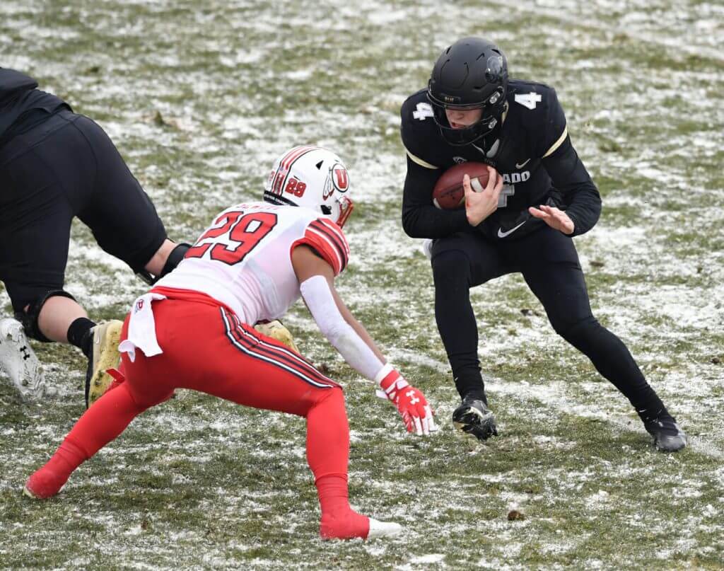
4. Utah vs. Colorado
In a different week, this one coulda been a contender for the top spot, but CU’s sartorial choices prevented that. Had they matched their black jerseys with gold helmets and pants, this would have been the finest-looking game of the week. Instead they went mono-black, while the Utes went red-white-red. Even with the suboptimal uni choice by the Buffs, the sight of the two teams playing on a snow-dappled Folsom Field was beautiful to behold.
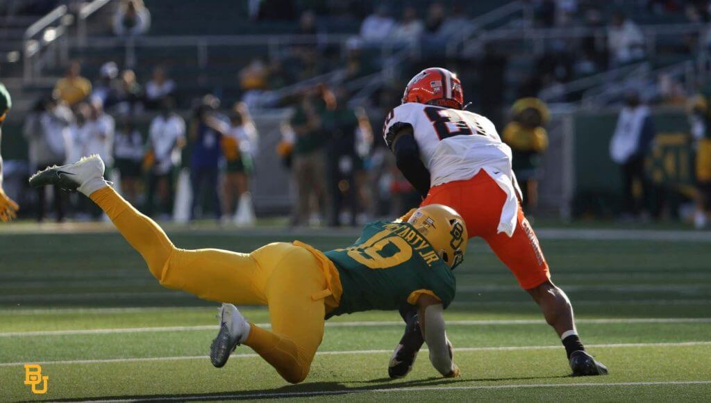
3. Oklahoma State vs. Baylor
A couple of weeks ago, Baylor looked like they were angling for a stadium naming right’s deal with French’s Mustard. Not so this week, as the Bears came to play in their finest-looking duds. Yellow on top, yellow on bottom, and green in between is a winning look. Unlike most teams with a multitude of uni options, Oklahoma State almost always manages to come correct. Orange helmets with the old-school “Cowboys” in cursive paired with white jerseys and orange pants. When you look this good, we can overlook the TNOP.
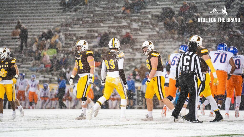
2. Boise State vs. Wyoming
Given Boise State’s panoply of uniform options, it’s refreshing to see the Broncos come out in something traditional looking. In this case, that’s blue lids, white jerseys, and orange pants. With the disappearance of real sleeves on modern football uniforms, the diagonal blue and orange jersey stripes are a welcome flash of color. Wyoming’s underrated white-brown-yellow getup—that helmet is one of the best in all of football—provided a great contrast to Boise State. The fact that the game was played on a snowy mountain evening would have made it a top pick on just about any other week…

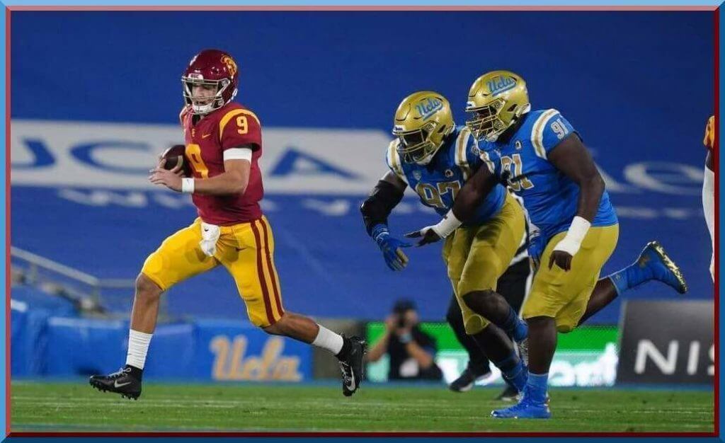
1. USC vs. UCLA
… but not this tone. This pick is a no-brainer. Ever since the NCAA showed a rare flash of good sense in 2009, allowing visiting teams to wear jerseys of any contrasting color instead of white, the annual USC-UCLA tilt has ranked high on the list of great-looking matchups. Since dropping Adidas in favor of Under Armour, UCLA has had true UCLA stripes (hopefully Nike/Jordan knows how to make them). USC’s cardinal and yellow (technically USC gold) is one of the all-time classic college football unis. This matchup looked much the same 50 years ago. A small bit of stability in an utterly insane year.
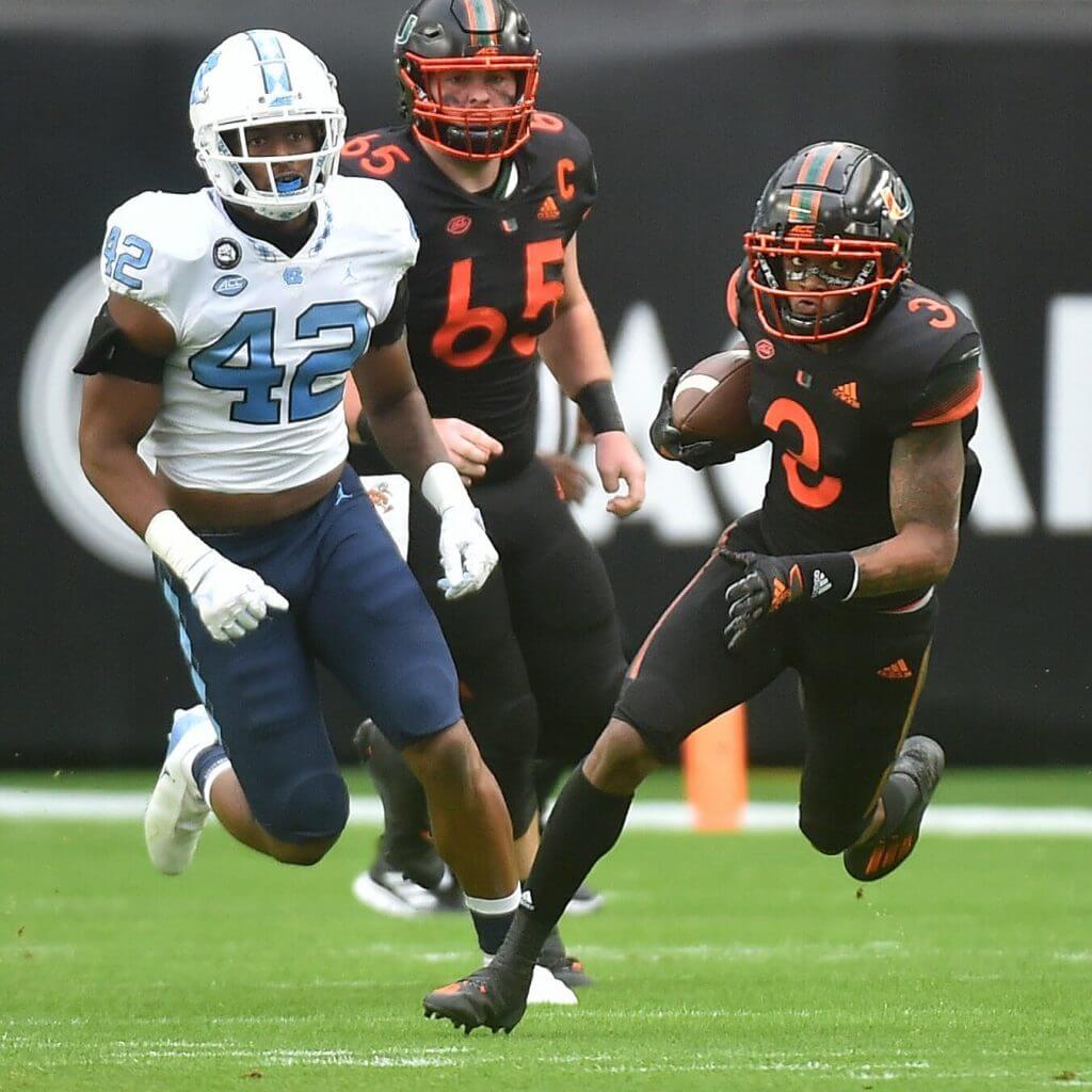
&1 North Carolina vs. Miami
BFBS is bad enough, but when you take a school like Miami, which has such a well-defined and easily recognized look, it’s just plain wrong. I could maybe see Oregon State wearing those black and orange jerseys, and the sleeves are a mess. It’s always a shame when the Tar Heels make their predominant color anything other than Carolina blue. This one could have looked so much better.
Thanks, Eric. Next up is Gretchen Atwood
5 & 1 by Gretchen Atwood
Two weeks ago it was Indiana’s camo PJs and last week it was a swath of GFGS so I was curious what this week would bring. It became clear midday that the 5&1 was going to be difficult because many matchups were between teams who looked bad-to-hideous (Florida State) but where their opponents looked decent, or even good (Duke).
But a few stood out, more for creating a visually interesting combo than for each uni itself being really good. Let’s get into those.
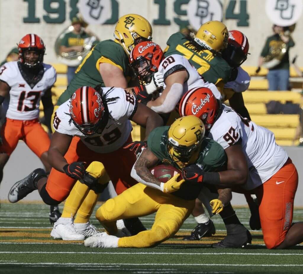
#5 OSU vs Baylor
I still am not sure if I like this combo or not. It definitely had contrast and both schools, who have been known for some of the more garish options in the past years, went with more more traditional uniforms in this one. I especially like OSU’s orange lids with the script “Cowboys” on it. Normally I hate the thick contrasting necks but with both teams sporting them, they looked better.
Points off for looking like Oregon State vs Oregon and for the hideous notched jersey fonts (Though even those kinda complement each other)
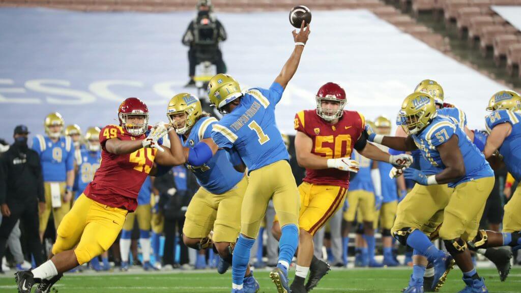
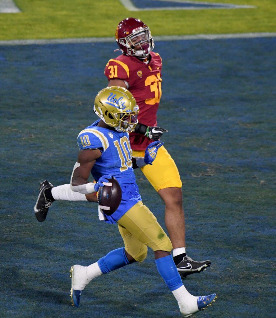
#4 USC vs UCLA
I do love this matchup, especially the helmet contrast and striping contrast. Them both wearing (obviously slightly differently colored) gold pants make it not top 3 for me, though.
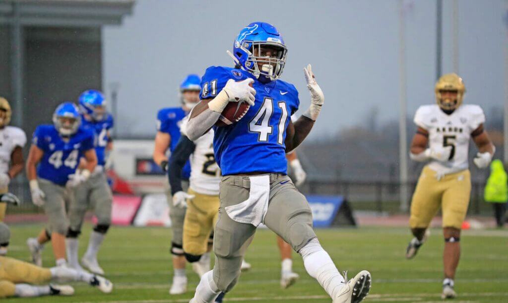
#3 Akron vs Buffalo
Buffalo’s bright blue jersey and helmets contrasted nicely with the white and gold of Akron. But the gray pants were a problem. Few teams can pull that off well, and when teams do they usually go lighter or darker than the mid-tone gray the Bulls were sporting.
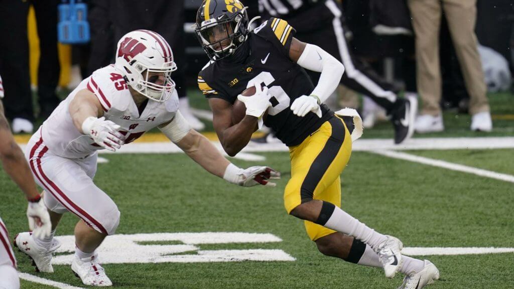
#2 Wisconsin vs Iowa
Nice contrast of color and pattern in this one. Light and dark, different but equally effective shoulder, pant, and helmet stripes on each.
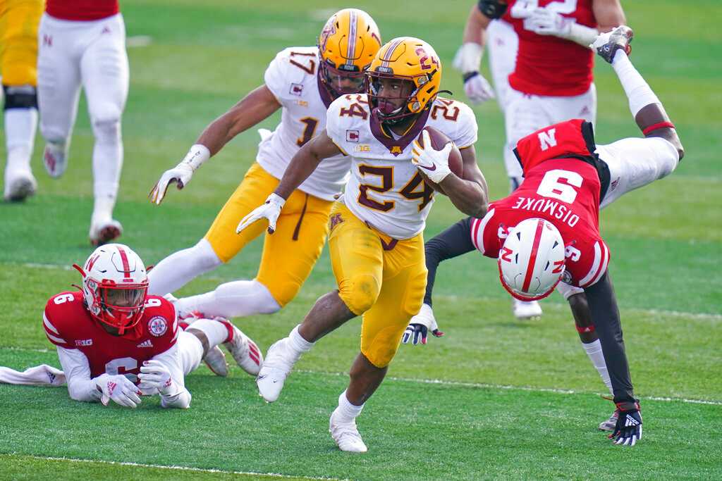
#1 Minnesota vs Nebraska
I liked this one way more than I expected too. The color contrast was nice and I like the simplicity of the classic plain N on the Nebraska helmet and the outlined M on the Golden Gophers’ lids.
&1
This was the hardest to choose. There was the battle of ridiculous jersey fonts in the Land of Lincoln, with Northwestern looking more like a Hogwarts football team and Illinois doing their best to make dark blue and orange look bad together. Then there was the battle of bad shoulder stripes with Boise State and Wyoming. Individually they both looked pretty good but this was definitely a case of the whole being less than the sum of its parts.
But you really can’t beat the hideousness of Miami’s all-black unis matched up with the dark and light blue combo of UNC where the argyle pattern is emphasized. Woof!
And thank you Gretchen! OK, readers — please thank Eric & Gretchen for their efforts and let them know what you think of their selections!
NCAA Uni Tracking
Uni Watch will again track the uniform combinations worn by the “Power 5” conferences. All of the 2019 trackers are back!
We’ve got Rex Henry (tracking the ACC), Dennis Bolt (tracking the PAC-12), Kyle Acker (tracking the Big XII), and Ethan Dimitroff (tracking the B1G AND the SEC). Rex, Dennis, and Kyle and are all returning from 2015, and Ethan is back after joining the NCAA Uni Tracking a couple seasons ago. Ethan continues his dual role of tracking both the B1G and the SEC.
We started the year off with three conferences (SEC, B1G, PAC-12) not playing at all, but now all five of the Power 5 have returned to play.
Here are the Uni Trackers for the Power 5 Conferences (I’ve left all the previous tracker info in their usual slots, even if the conferences aren’t playing. In case you want to click on any of the links):
Rex is up first today (ACC):
ACC
More Here.
Follow Rex on Twitter here.
And now, here’s Dennis with the PAC-12:
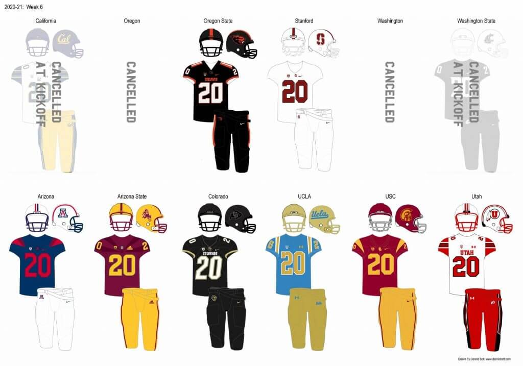
PAC-12
More here.
Follow Dennis on Twitter here.
And here is Ethan, with the SEC:
SEC
And be sure to check out Ethan’s WVU Mountaineer Tracker.
Follow Ethan on Twitter here.
And here is Kyle with the Big XII:
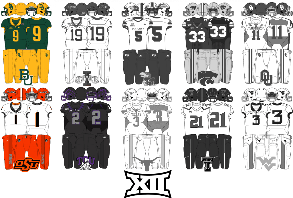
Big XII
Follow Kyle on Twitter here.
And here’s Ethan with the B1G:
B1G
Ducks NON-Tracking
When the PAC-12 finally got underway in November, hopes were high that the Oregon Ducks might repeat as winners of the Conference, and possibly even squeak into a playoff spot. After starting 3-0, this seemed like a distinct possibility. But two losses later (to OSU in the Civil War rivalry game, and to Cal) left them reeling, hoping for a shot at a title game chance with a win over Washington yesterday. The only problem is, the game was canceled due to COVID, and it looks like Washington will now face USC for the PAC-12 Championship next Friday. Had the teams played, a UO victory might have given the Ducks that shot. It remains to be seen if UW will even be able to field a team, but that pretty much is 2020 in a nutshell.
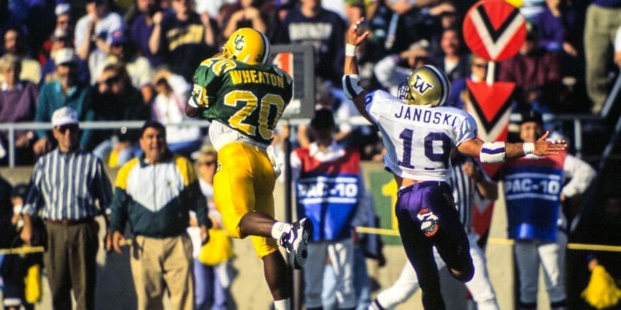
Since there was no game yesterday, Duck Tracker Dennis Bolt (who’s been prolific lately!) decided to look back at his favorite UO-UW uniform moments of the last 30 years. Check out his blog post here! It’s another nice short read, and I think you’ll all enjoy it.
Uni Watch News Ticker
By Phil

Baseball News: Sad news yesterday, as Charley Pride passed away from COVID-19. So why is this in the Baseball section? Ignacio Salazar writes, “Country Legend Charley Pride passed away today in Dallas, TX. Today, I learned he played in the Negro Leagues and the minors.” … SNY used an old Majestic jersey to announce the New York Mets’ signing of catcher James McCann’s (from Josh Claywell). Just makes you hate the MOTB on the front of jerseys even more now. … Yomiuri Giants unveiled the 2021 jersey Friday. The jersey supplier changed in Mizuno from Under Armour. And the cap supplier changed in New Era (from BigDaddy45).

NFL News: So whose is the original logo? Jason Ricles writes, “Was out to eat yesterday where a retired navy pilot ran the place. He of course had a bunch of logos related to the military. I spotted this interesting one of the Navy Helicopter Anti- Submarine Light (HSL)-60 jaguars logo. They are located in Jacksonville but if I am not mistaken looks like they just straight up used the Jaguars logo. However if the Jaguars came after them I think that would not be such a good look.” Anyone know whether the Navy or Jax had it first? … But do real cardinals have yellow feet???: Jason Mastin writes, “I was watching some highlights with my 16 year old son a few days back and “Hail Murray” happened to be in the rotation…he said to me, “I didn’t notice it before, but Kyler Murray is actually dressed like a Cardinal; like a real Cardinal. Look at his cleats.” … We laughed and agreed it’s the best the team could look with that poor a uniform set.” … The Buffalo Bills will break out their color rash red uniforms tonight against the Stillers. … Meanwhile, the Saints will be wearing white jerseys and pants against the Iggles. … Big merch mishap here (from Jingle All the Way = Best Christmas Movie-Declarer). … Whoa: “Cincinnati Enquirer columnist calls for selling advertising on NFL helmets in 1972″ (from James Gilbert). … Timmy Donahue tweets, “The thing I find most interesting about this post is the bins on the wall which hold the team’s Captaincy patches separated by color and number of stars. Even the camo ones have their own bins.” He adds, “Looks like red ‘C’ is on color rush uniforms and red background regular white jersey.”
College Football News: Here’s a pretty funny, tongue-in-cheek, article about Navy’s uniforms and how they have a tradition of “dicking [the Marine Corps] over” whenever possible, as set out in a naval administrative message released in 1923 (LOL). From D. Hempel. … Initial Help? “Spotted at the Oregon Health & Science University hospital,” says Lincoln Dirks. ““MDSU” might mean Medical Department State University?” Lincoln notes these are “Early UO Uniforms.” … Scroll down a bit in this article to the section that says “Huskies Dark Matter” — clearly the reader Gets It™!

Hockey News: Check out this podcast where the speaker goes on an epic rant against ads on NHL uniforms. I’m not sure if he’s a Uni Watcher or not, but he most certainly has our proclivities. … Tweeter Rob Caplette isn’t sure if there was an announcement on these, but check out the Wilkes-Barre/Scranton Penguins alternate sweaters. … Vancouver Canucks goalie Braden Holtby is apologizing after the artwork on his new custom-painted mask was criticized for appropriating First Nations art (from Ted Arnold).

NBA News: GOAT Magic Johnson wore #15 for the 1992 Dream Team, but was that his original number? Emily Perez writes, “Wondering if Magic Johnson is wearing a #10 or #16 jersey on the left judging by the corner of the number.” Here’s a different look — sure doesn’t look like a 15. … Finerific spotted this blood jersey(?): “So here’s a 12/11/87 picture of Kareem’s skyhook over Parish. Look in the foreground. That’s James Worthy wearing 00 and NNOB. Looked up the game and found highlights.” Anyone know the story behind this?

College Hoops News: Reader and frequent ticker contributor Kary Klismet writes, “As whimsical in some ways as this t-shirt commemorating Louisville’s 1986 national championship is, what with its Wild West shootout motif and all, there’s no way it would get made today. It’s not so much the cowboy Cardinal with the smoking six shooter as it is, you know, the bullet-riddled corpses of the ‘slain’ opponents.”

Soccer News: Looks like a throwback shirt coming to celebrate Widzew’s 110th anniversary (from Ed Żelaski).
.
.

Grab Bag: Charles Leclerc has paid tribute to outgoing Ferrari F1 teammate Sebastian Vettel with a special helmet livery for this weekend’s season-ending Abu Dhabi GP. … The new Springboks jersey for the Lions 2021 series has been released.
And finally… that’s all for today. Big thanks to the entire SMUW crew and to guest pickers Eric & Gretchen. Please let them know how you liked their picks in the comments below.
Peace,
PH
The AR 670-1 was updated in 2003 to reflect the flag code, and made mandatory on the right sleeve in 2005. Prior to that time, flags were not always worn on the uniform and when they were it was in the fashion seen on the uniform yesterday. This was the same on the 2016 82nd Airborne uniforms worn by Army. It is era appropriate.
Slight correction: The Army’s regulation was updated in 2003 to overrule the Flag Code, not to reflect it. The Army’s flag rule directly violates two clauses of the Flag Code: 1) The Union should always be displayed on the left; 2) When worn on the body, the flag should be worn on the left side of the body.
The U is the latest victim of sartorial justice. Dressed all in black, for their own funeral. Stick with green, white and orange, ’Canes. Colorado could’ve done it right with the gold helmets and pants.
I would say the Eagles will be the next victim of sartorial justice by going all-black today against the Saints (and a double punishment is necessary for the Saints being forced to go Stormtrooper, but I guess they could choose gold pants), but they’re gonna get trounced no matter what they wear. (Full disclosure: lifelong Iggles fan.)
I think you were after apocalyptic = resembling the end of the world; momentous or catastrophic. Rather than apocryphal.
Magic Johnson Olympic jersey can’t be a 16, most likely a 10. Legal jersey numbers for the Olympics are 1-15.
No, legal numbers are 4-15.
link
As I pointed out below, legal FIBA numbers were 4-15 at the time and up until 2014, when any one and two-digit number can be used, including zero and double-zero.
I still can’t find any photos that show any number other than 15. There is this photo from September 21, 1991 but it shows his number 15 jersey. There was also an earlier photoshoot in February 8, 1991 but the second number is always obscured.
link
I love that for the first 5 years the Army started wearing the flag everyone asked, “why are they wearing it backwards?” Now everyone is a uniform and flag expert, except that 670-1 is a regulation that only applies to current uniforms. The West Point history department assisted in the design of Army’s football uniform, and if the Army wore the flag on a uni during WW2 or Korea (which didn’t happen often) it wasn’t permanently affixed but was worn as a brassard with snaps in the current configuration. Relax everybody, the USMA knew what they were doing.
Totally agree. Everyone is an expert.
This was even mentioned yesterday in the comments explicitly and should have been added as a footnote.
Then again, what do you expect from watching uniforms so closely, you get the date wrong ;^)
Typo?
1. USC vs. UCLA
… but not this “TIME.”
Also, Magic probably didn’t wear 16 because the Olympics allowed only numbers 4 through 15, though I am not sure if that’s still the case. It possible that he had initially chosen to wear number 10, but then when they added Clyde Drexler (who ended up wearing #10) to the team, Magic switched to #15.
link
From Wikipedia:
link
Starting in 2014, under FIBA rules, national federations could also allow any numbers with a maximum of 2 digits for their own competitions; this rule also applied in transnational club competitions, most notably the EuroLeague. At present, players are allowed any numbers from 1 to 99, additionally 0 and 00.
The flag is proper and era appropriate. The blue into battle flag was not adopted until 2003 and not made mandatory until 2005. Prior to that time flags were not standard and when worn were the same as on Army’s uniforms. This is the same conversation that took place in 2016 when Army wore the 82nd Airborne uniforms with the old version of the flag. This youtube video is the best explanation I can find. Apologies for how terrible the animation is:
link
Re. James Worthy’s #00 jersey – this was in yesterday’s ticker, his regular jersey was lost in transit.
The reason for James Worthy’s 00 jersey was explained in the replies to that tweet: lost in transit.
link
“The normally gorgeous SoCal sunset that provides such a beautiful backdrop to this game (and the Rose Bowl on New Year’s Day), looked almost apocryphal when contrasted with the empty and ad-laden seats.”
Forgive me, but that’s a weird use of “apocryphal” there.
Its apocryphal because there was nobody there in the stands to see it, so its mostly second and third hand stories growing about the legend of the sunset.
Nice effort with the 5&1’s, Gretchen and Eric!
The page for the Baby Pens alts isn’t working(?).
RIP Charley Pride…here’s a clip of him wearing a re-purposed uniform while with the Texas Rangers during a spring training game in ’74:
link
How did the Arizona vs asu matchup not make the +1 for no one what a horrible uni matchup that was
Arizona State looked fantastic. UofA looked about as good as they played. Only saving Grace was the fauxback Desert Swarm helmet. But I agree the navy and maroon are too dark for color vs color.
I remember this from my childhood; Magic wore number 10 on the Olympic team
Kobe wore 10; Magic wore 15.
link
The guest pickers did well again!
Not that I completely agreed with them…after all, Boise/WYO was my hands down number one, yes, even on the same day as USC/UCLA. The snow really helped push that game over the top.
NEVER thought I’d see my alma mater in anyone’s top five, but for a team that’s looked pretty bad the last decade, Akron managed to cobble together a decent uni for a change.
Sartorial justice, Miami…sarorial justice.
RIP, Charley Pride. Hopefully you’re kissing an angel good morning.
Great job guest pickers! That Oklahoma St/Baylor game was a visual delight only underrated by the beautiful spectacle of USC-UCLA!
Is there a term for a uniform that we think is a nice look IF it was in a team’s official color palette? For instance, BYU wore BFBS yesterday. I love the BYU scheme and don’t think it needs any help. But that uniform was really nice IF they were your colors. Make sense??
Side note: I think neither Miami nor Florida St from yesterday fit this bill!!!
I know uniforms are subjective, but what the heck is Gretchen Atwood thinking? Not only was the USC UCLA game the best looking game yesterday, it’s the best looking football game ever. The only question is if it was better when UCLA wore baby blue in the past, or now with their “True Blue” that resembles the Chargers great color. Even though I’m older and was at many of these earlier games, I’m going to side with this current blue since it’s more vibrant while still having the proper contrast to make this color vs color matchup the greatest of all time.
Here is a higher resolution version of that Magic Johnson photo that shows he is definitely not wearing #15 in it.
link.jpg?id=49516720-3b32-4b9d-a171-25c083a6629e&size=zoom
Upon further review it turns out he was wearing #10 for that photo. That jersey was later auctioned off:
link
Thanks! I was looking for videos of that SI photoshoot because of the two photos with him holding the large Olympic ring but it did not occur to me to look for it in auctions! Case closed!
Interesting we didn’t see a manufacturers mark on the UCLA uniform yesterday.
They had UA on their pants but the logo wws covered on their jerseys with this patch:
link
How can *anyone* like those horrible Northwestern unis? Especially since, like three lines down you say “Even though NO TEAM that doesn’t have black in their school colors has any business wearing black…”
Black has been an official Northwestern school color since the mid-1990s when Gary Barnett took over as coach and introduced black uniforms. Since then, most teams at the school have incorporated black into their unis.
Nice job with the 5&1, Gretchen. That Akron-Buffalo game caught my eye as well.
Am I the only one who sees the current Met script as seen in the McCann photo as oafish looking? Here is what the original script looked like:
link
The sad part is that these seemingly minor changes, which to my critical eye wind up screwing it up, were probably not done with any real artistic design consideration. Probably just sloppy iterations over the years.
I agree that the UNC Miami game could have been better, but I wouldn’t call it bad!
You know you’re old when you fondly remember Gruff Sparty but you don’t remember he never appeared on the helmet until yesterday.
“NO TEAM that doesn’t have black in their school colors has any business wearing black.”
I’m sorry, but this is silly. You’re basically saying, all the team needs to do is make an announcement officially adding black to their color scheme and suddenly all their ugly black uniforms will look good. That’s not the way aesthetics works. Let’s judge unis based on what they actually LOOK like, rather than whether they match some official guideline in a style manual somewhere, shall we?
I would argue that ALL achromatic colors are foisted on uniforms for imperfect reasons. The exception is a team with a monochromatic color scheme (Celtics, Colts, Red Wings, et al) which needs white to render graphics. For instance, grey is not an official color of the Dodgers or Cardinals. I don’t find BFBS as troubling as most of the readers of this site.
My favorite part of the Yomiuri Giants uni unveiling was the contrasting squatchee and eyelets of the cap of the visiting grey uniform. I would love to see a few MLB teams with the same treatment. The White Sox would particularly benefit from this kind of hat.
Re: military units that use pro sports teams logos, I know there are A couple of USMC squadrons that use NFL logos-there’s a VIkings squadron, a Panthers, and a Vikings one as well. Additionally, NYT is reporting Cleveland will drop its Indians name:
link
Any idea where I can buy one of those New Era Yomiuri Giants hats?
I bought one a few years back at the Tokyo Dome ;)
Honestly it was a better looking cap then. There was an orange edge to the front of the bill. Never seen anything like that in North America
link
The Hanshin Tigers (the team anyone with humanity would support, not the Giants) had a contrasting bill edge in the early 2000s, seen here: link
I really wish they would bring back the white-with-pinstripes home hats that they wore until 1999: link
Sounds about right. I don’t support the Giants but it was my first time at a game in Japan and it felt right. Our firm’s office is in Akasaka and I’m more naturally aligned with the Swallows.
I also picked up a Fighters hat at some point for my son. Similar bill edge, except with metallic gold that matched the gold in their logo.
link
Cleveland to drop “Indians” nickname: link
WYO/Boise quite possibly best looking football game I’ve ever seen. Unique, pops, contrast, no gimmicks, beautiful. I’ll even excuse “Broncos” on BSU’s legs.
Malone and Barkley are also wearing different numbers. Malone wore #11 for the Dream Team (Larry Bird was #7) and Barkley wore #14 (Stockton was #12).