By Phil Hecken
Follow @PhilHecken
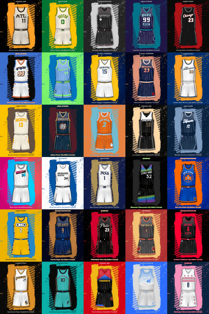
A few weeks back, just as we were getting our first look at some leaks of the new “City” alternate uniforms the NBA was trotting out for its teams, designer Mike Joseph (whom I have featured on UW several times before) mentioned to me in a DM, “There’s a big group of us designers doing a NBA City Edition series since Nike sucks at it. We’re going to do a draft and everyone is going to redo a team our way. We’d love to save them all up for UW if you want to run it.” I was intrigued and wondering how a “project” like this would come off (and I agreed with him that many, if not all, of the Nike designs were less than good). Well, several weeks later, and in the middle of the NBA’s unveiling of the 2020-21 alternates, Mike and a big group of designers have now finished their project to create a better alternate than Nike. Whether these are or aren’t is of course up to each individual viewer’s taste, but the effort and the “storytelling” is something. There’s a LOT to get to today — not just the uni concepts, but a bit of a bio on each designer — so I’ll turn this over to Mike now who’ll take it from here.
The “City Edition Redesigns Project”
by Mike Joseph
The City Reconstruction Project came about when designer Seth Reese (@ninety4feet) tagged a bunch of us in this tweet suggesting that the NBA could, shall we say, use a little help with some of the City Edition designs that had been leaking at the time. For the most part fan reactions to many of the designs had ranged from disappointment to disgust and everything in between.
As huge NBA fans and even bigger sports uniform enthusiasts, most of us spend all of our free time either glued to social media waiting for the next uniform to be released or on our computers tinkering away at designs of our own with aspirations of someday getting a call (or tweet? email? something?) from Nike, Adidas or another company that might let us bring one of our ideas to the big stage. So, when Seth’s now infamous tweet notification came through, we assembled like the Avengers and quickly formed a group chat to start bringing his idea to life. [Note: not everyone tagged in the original tweet was able to participate and some others not tagged were immediately added, so we started with a group of 10 and kept our group intact all the way through, which we’re very proud of.]
What you see below is the result of a few weeks of intense work over late nights, back and forth critiques, hilarious jokes, unselfish sharing of knowledge, humble acceptance of feedback and a collaborative spirit unlike anything I’ve ever been a part of. For some it was truly therapy during this strange time we’re all living through, when life’s normal ups and downs are somehow magnified under the lens of COVID-19. We’re all really proud of the uniforms, as each one is truly beautiful in its own way and represents each designer’s vision of the team and city it represents, but I’m most proud of this group of designers (some as young as 16!!!) and how we all came together to form a little family when some of us really needed it. We hope you enjoy what we created, but even if you don’t, we enjoyed the hell out of creating it together. – Mike Joseph (@sansfordandsuns/@unimockups)
• We did a draft to determine the teams for each designer, them some trades were made since some of us didn’t want our favorite teams and some did – we had a trade deadline and everything
• We used the UniMockups template for this – available here
[We’ll be breaking the designs down by designer, and at the beginning of each artist’s section, there is a brief bio — PH]
Name: Tore
Handle: @Eikthyrne
Link to Portfolio/Site: https://twitter.com/Eikthyrne
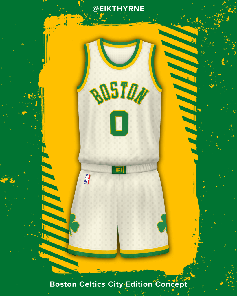
Boston Celtics
Culture, heritage and a tradition of winning since 1946, this city edition is in deference to the Celtics legends of old and the late great Tom Heinsohn. A uniform with a retro and classic look, retaining design elements of Celtics past and future.
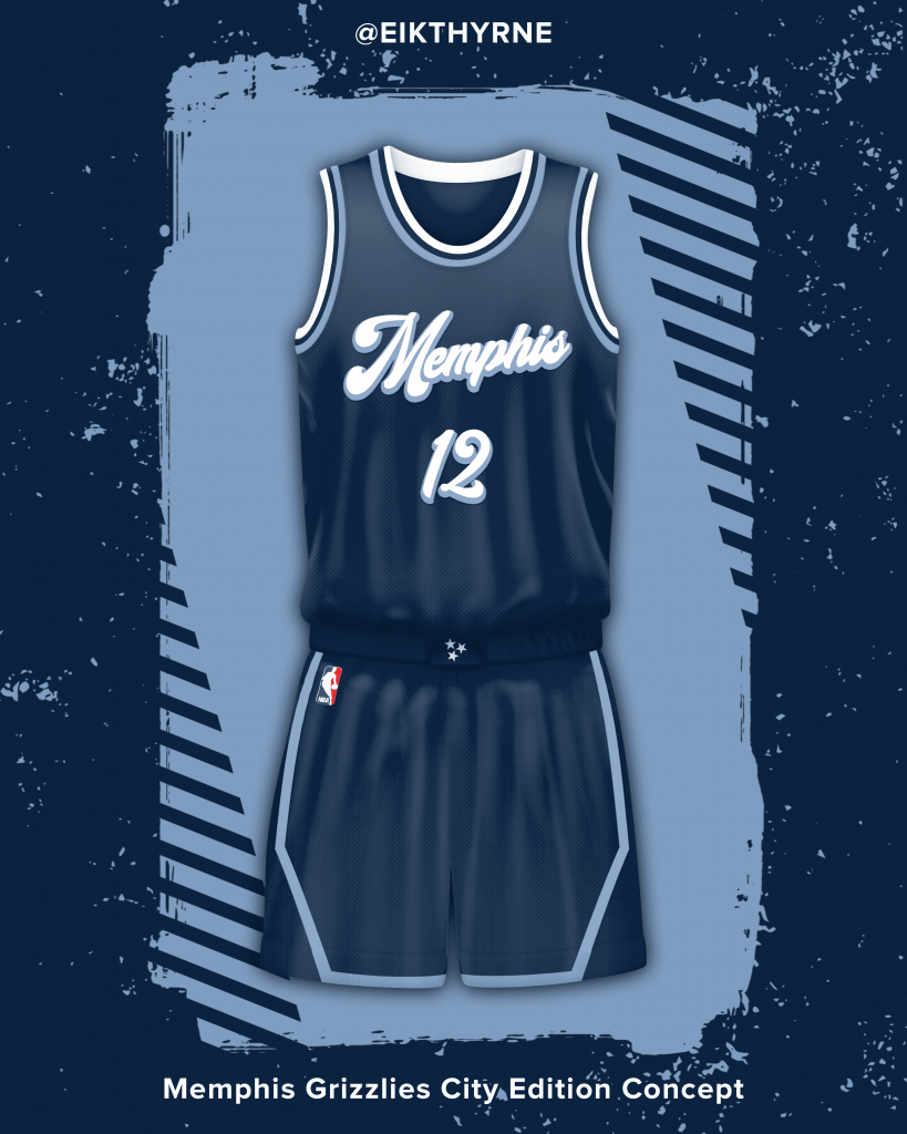
Memphis Grizzlies
Beale Street is one of the most iconic streets in the US and famous around the world. The uniform is a melting pot of former Memphis teams, just like Beale Street is a melting pot of delta blues, rock n roll, R&B and gospel music. Wordmark is a homage to the Memphis Sounds and the piping influenced by the Memphis Tams. Navy, beale street blue and white inspired by the streets’ nightlife palette.
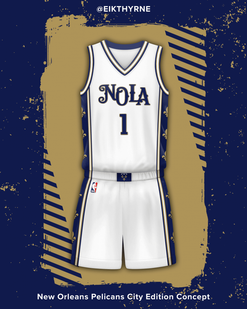
New Orleans Pelicans
New Orleans is named in honor of the Duke of Orleans, Philippe the second. The Duke came from the House of Orleans, sometimes called the House of Bourbon-Orleans. The coat of arms served as inspiration for the uniform.
Name: Seth Reese
Handle: @ninety4feet
Link to Portfolio/Site: https://www.behance.net/sethreese
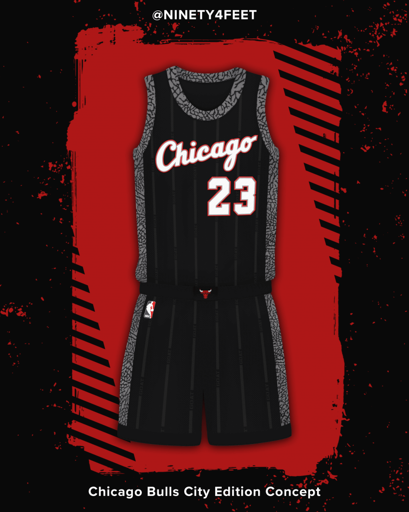
Chicago Bulls
It only seems right to have a Jordan inspired Bulls city jersey, right? Jordan brand’s infamous cement pattern is used as the trim throughout the uniform. Combined with the Chicago script from Jordan’s rookie year, this jersey properly pays tribute to Chicago’s greatest citizen.
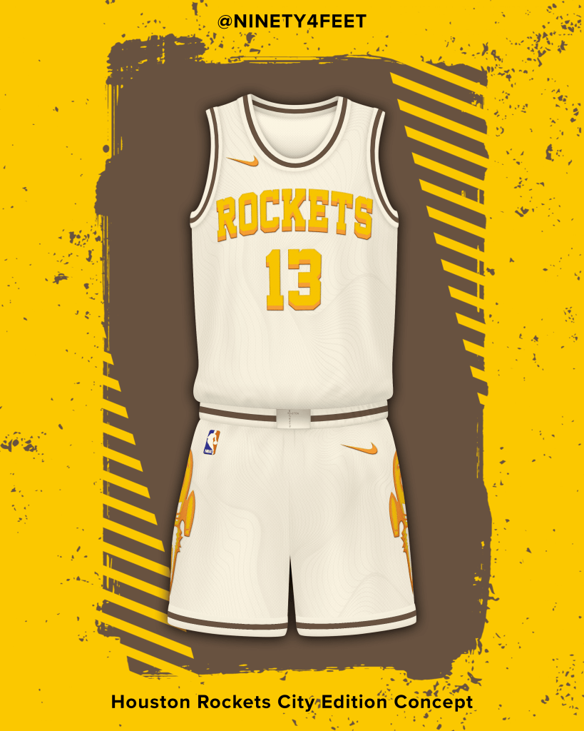
Houston Rockets
Inspired by Houston-native Travis Scott’s Air Max 270 Cactus Trails, this new Rockets city jersey combines elements from the beautiful shoe and a twist on past Rockets identities.
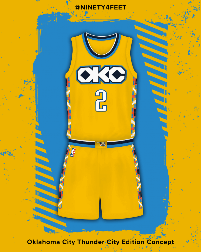
Oklahoma City Thunder
A refresh of the Thunder’s 2018/19 city jersey w/ a Chickasaw Nation pattern on the trim. A new way to honor Oklahoma’s Native American population and impact on the state.
Name: Joseph
Handle: @design_NBA
Link to Portfolio/Site: just google djossuppah art, lol
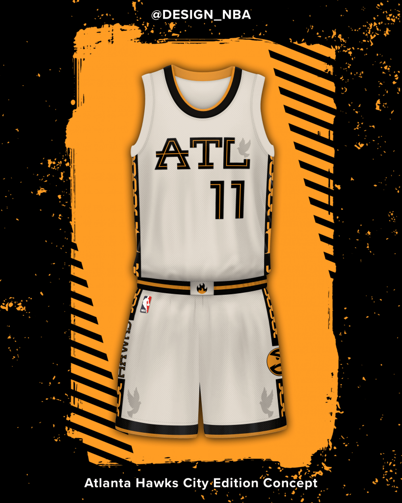
Atlanta Hawks
Inspired by the rap group Migos, using their extroverted personalities as the base of the design.
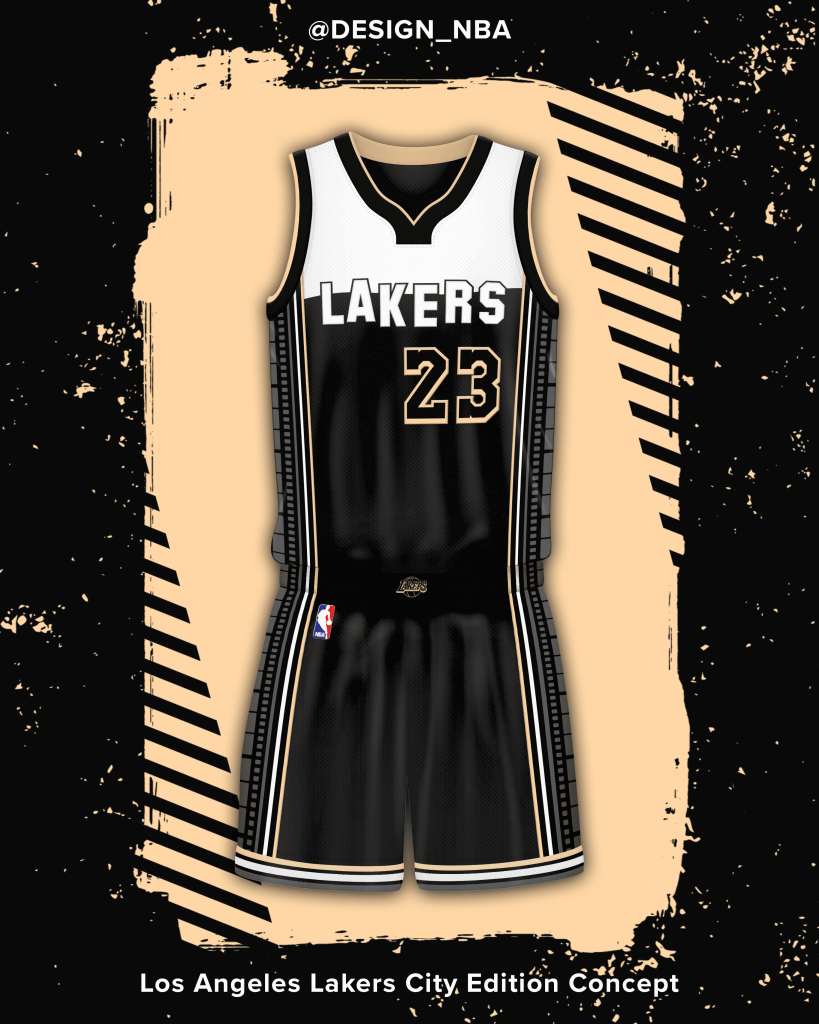
Los Angeles Lakers
Inspired by Hollywood and its history with the arts, particularly film. The color palette unintentionally, has a 50’s look to it, which was the brief era that featured one of my favorite actors, James Dean.
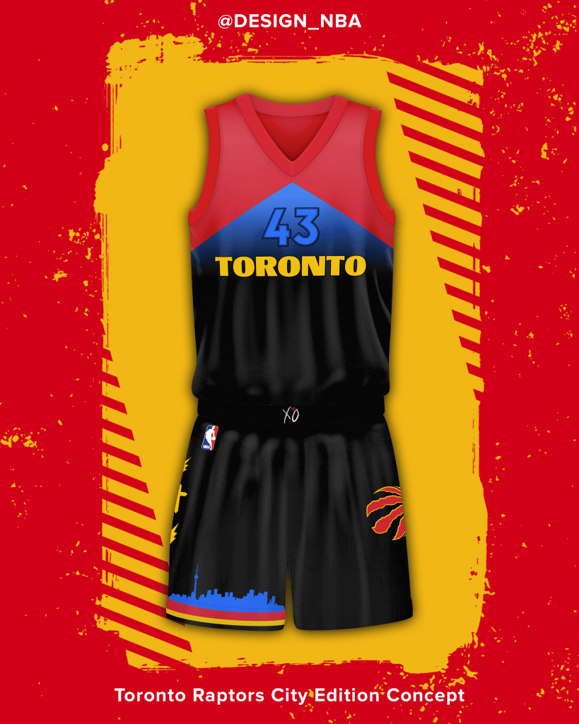
Toronto Raptors
Inspired by The Weeknd, with the goal of being used in a lore type series for Toronto based talent. The design itself is based on his popular album, Star Boy.
Name: Nick Mueller
Handle: @MLR_Studios
Link to Portfolio/Site: https://www.instagram.com/
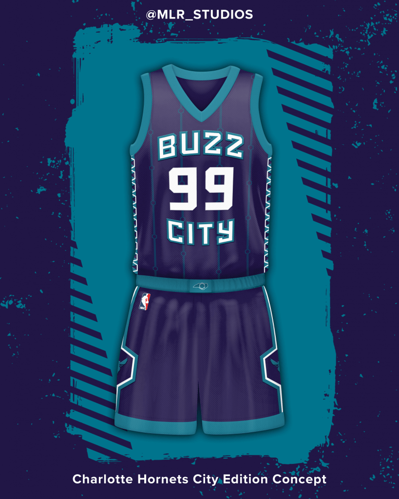
Charlotte Hornets
Inspired by their pinstripes and other design elements that they use. The wordmark is inspired by the University of North Carolina Tar Heels’ basketball uniforms. Side paneling as well.
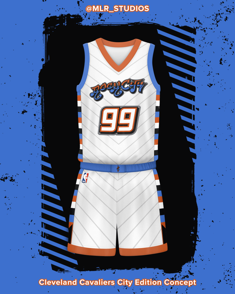
Cleveland Cavaliers
The Cavaliers hosted the 1997 NBA All Star Game, and the Cavs have rumored to use Graffiti towards their new City Edition. The color scheme is from that All Star Game, and I made a wordmark that is graffiti.
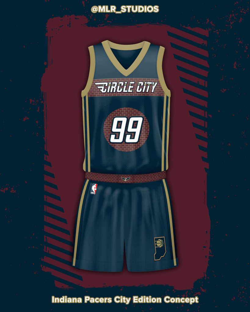
Indiana Pacers
Indianapolis is home to the Indy 500 and is the Racing Capital of the World. A great little element from the Stadium is the Checkered finish line made from Brick. The Pacers had that, but never used it, and I wanted to give them that, as it stays in line with their previous City Edition uniforms, all inspired by racing.
Name: JazzUniTracker®
Handle: @JazzUniTracker
Link to Portfolio/Site: https://twitter.com/JazzUniTracker
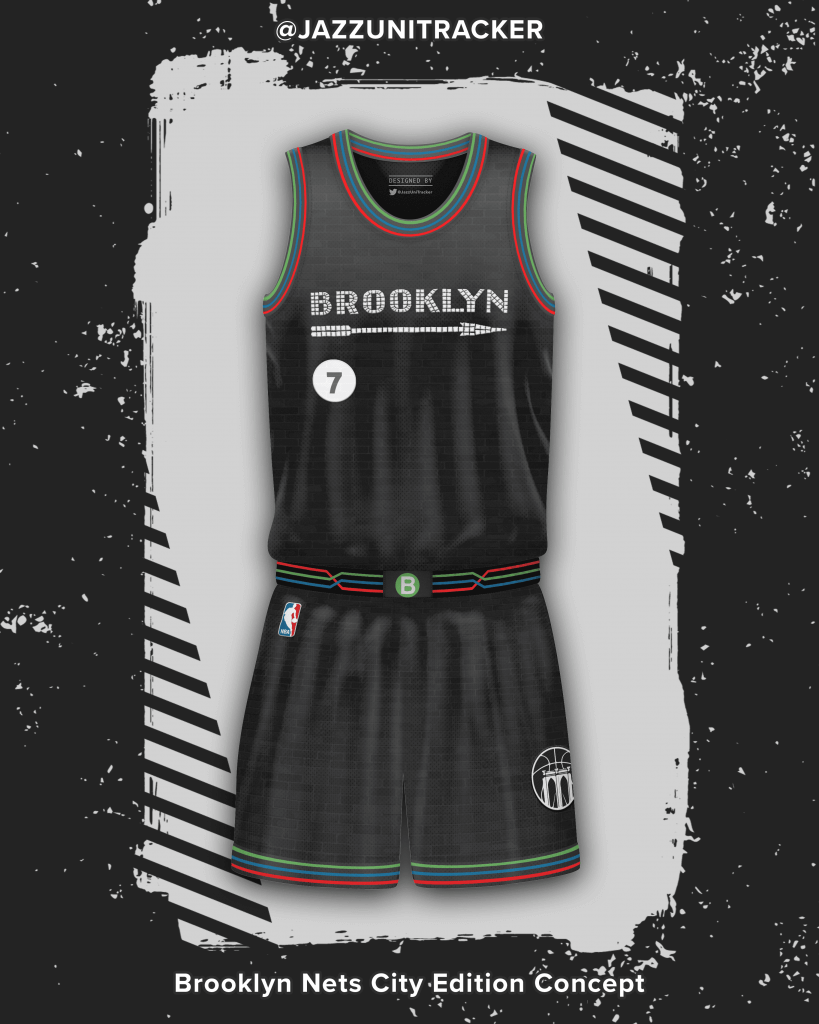
Brooklyn Nets
The Brooklyn Nets City Edition concept is inspired by the iconic Brooklyn, New York subway system. The Brooklyn wordmark across the chest is taken from subway signage made from mosaic tiles. The trim represents the many subway lines intertwined as one system to connect New Yorkers to each other.
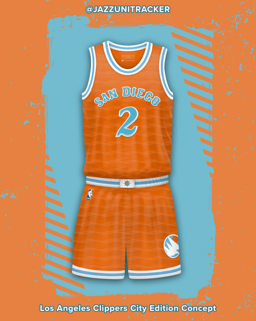
Los Angeles Clippers
The Los Angeles Clippers City Edition concept honors the team’s brief stint in San Diego from 1978-84, the jersey represents the beautiful Pacific Ocean waves and sunsets frequently seen along the coast, both highlighted through the jersey’s color scheme and pattern. Additionally, the wordmark across the chest is taken from the famous “Old Town” district, complete with subtle sand texturing within.
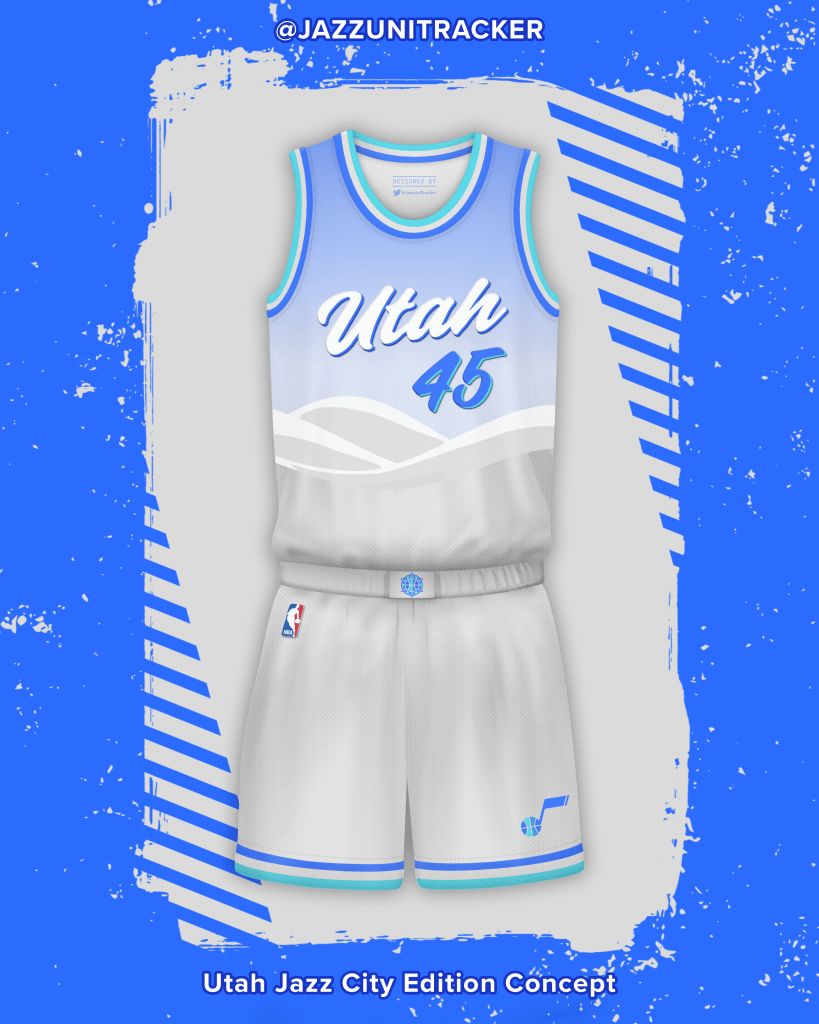
Utah Jazz
The Utah Jazz City Edition concept celebrates the “Greatest Snow on Earth”, found in the Wasatch Mountain Range nearby Salt Lake City. Complete with the Utah wordmark taken from the curved tracks left by skiers in fresh snow, the blue to white gradient pattern on the chest represents the clear blue skies seen above the beautiful powdered slopes.
Name: Casey Vitelli
Handle: @caseyvitelli
Link to Portfolio/Site: https://caseyvitelli.myportfolio.com/
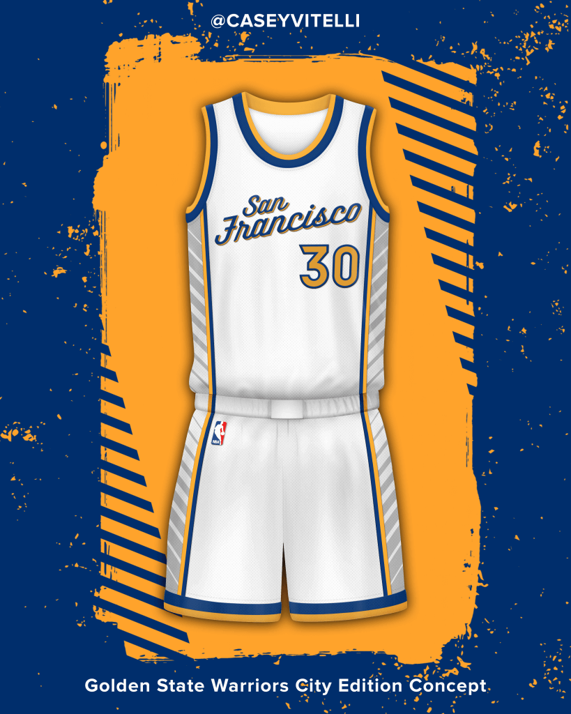
Golden State Warriors
Inspired by the waters of the ‘San Francisco Bay’. The wordmark is an extension of the fonts used for ‘The’ in ‘The Town’ and ‘The Bay’ logos. ‘San Francisco lays across the chest to represent their current location and California beginnings, 1962.
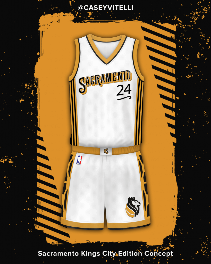
Sacramento Kings
Inspired by Old Sacramento, which was founded between 1849 to 1855. The jersey contains the ‘Tower Bridge’, which is a vertical lift bridge across the Sacramento River, linking West Sacramento in Yolo County to the west, with the capital of California, Sacramento, in Sacramento County to the east. The bridge started construction in 1934.
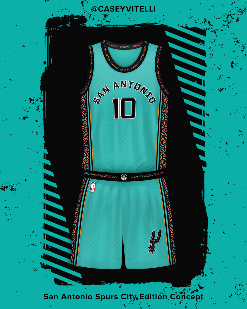
San Antonio Spurs
Fans have been wanting a ‘Fiesta’ design for years, and we delivered. Moving away from our standard Black/white/silver combo, we added a more colorful approach to this design. Inspired by the logo, used from 1989-2002.
Name: SansfordAndSuns
Handle: @SansfordAndSuns
Link to Portfolio/Site: https://www.unimockups.com/
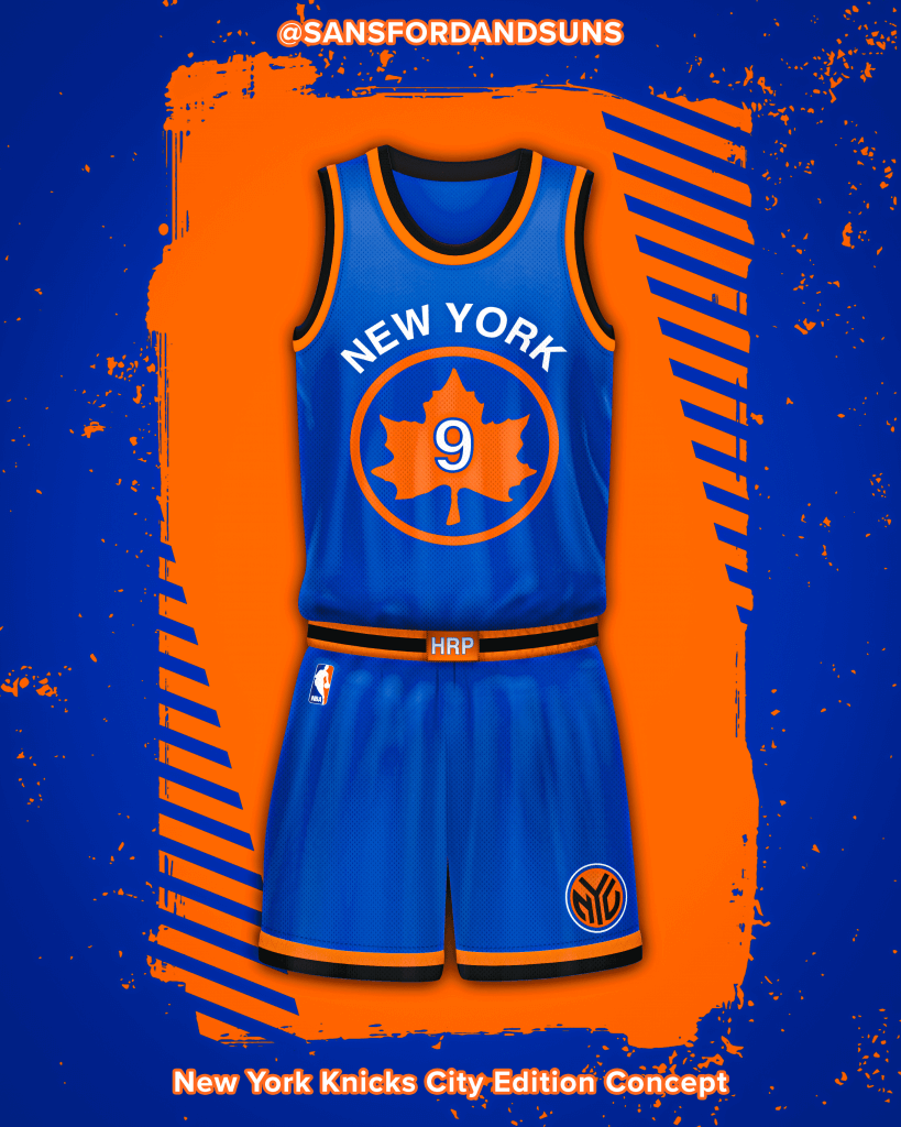
New York Knicks
I always think of Rucker Park when I think of NY basketball, so when I got the Knicks that was my first thought. I decided to pull the NYC Parks logo into the design and lean into my favorite Knicks uniforms from the 90s with a clean and classic look with a modified NYC logo on the shorts.
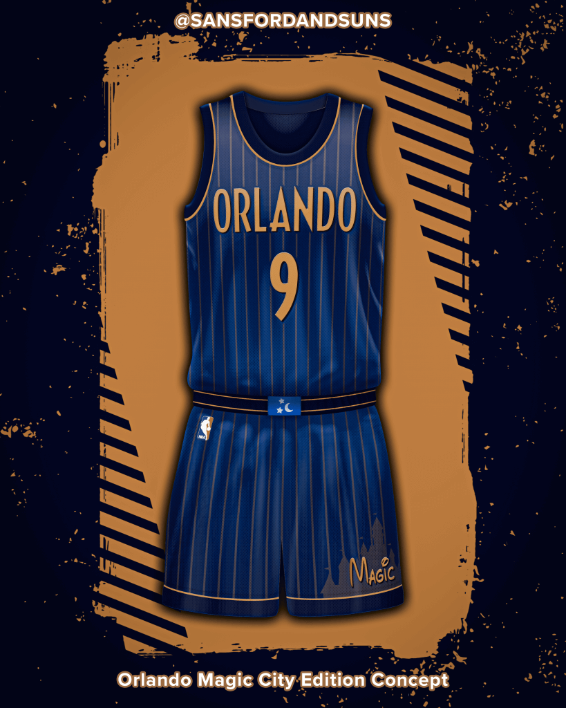
Orlando Magic
The Orlando/Disney connection may be cliche, but they are the Magic for a reason and I wanted to pull from one of the most magical Disney films, Fantasia. The design is inspired by the Fantasia movie poster from the 90s update with the gold wordmark and the stars and moon from Mickey’s wizard hat are on the waistband tag.
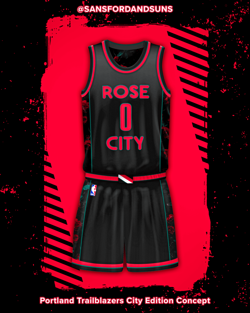
Portland Trail Blazers
Portland has several nicknames, one of the most common being The Rose City. I used signage from the International Rose Test Garden as inspiration for the wordmark and sublimated a rose bush pattern on the side panels, with some added green in the trim to go with the green leaves. The classic swash graces the waistband tag.
Name: Bryan
Handle: @icniivad
Link to Portfolio/Site: https://www.behance.net/daviinci
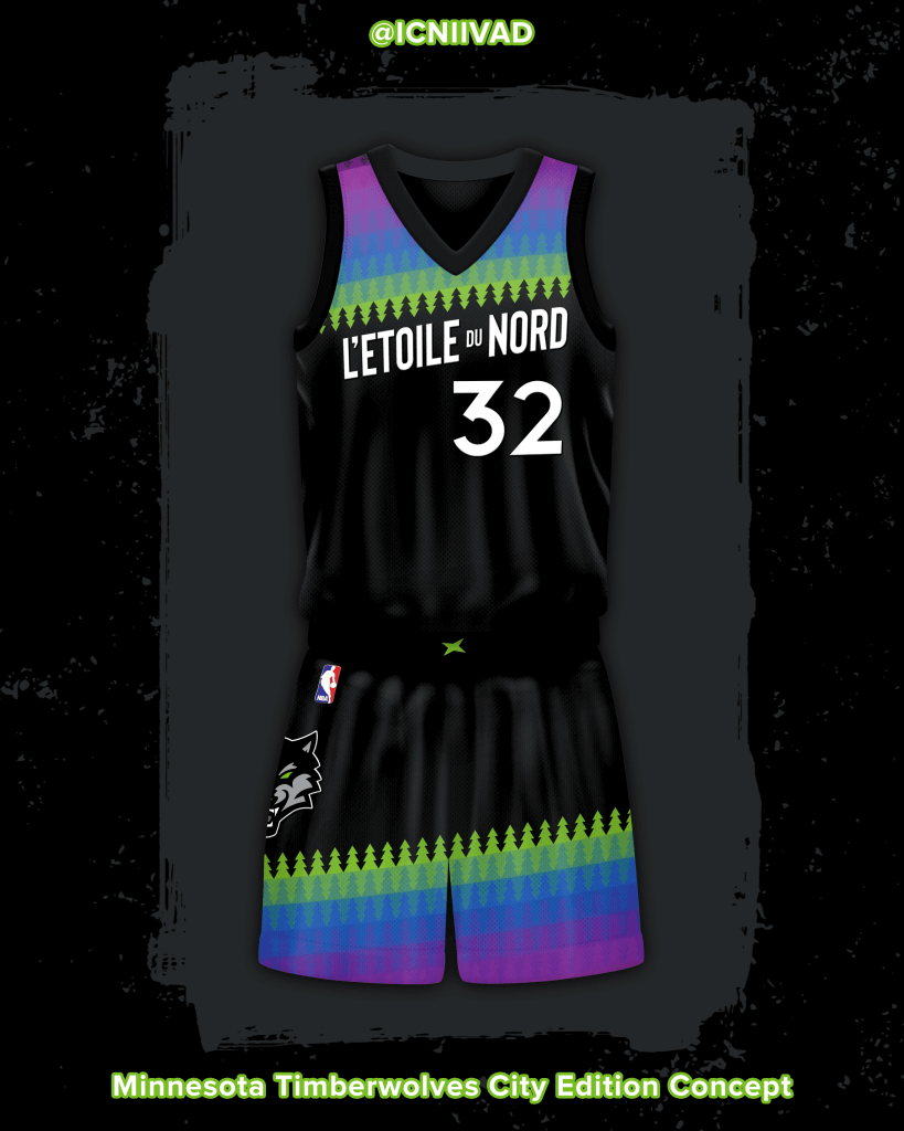
Minnesota Timberwolves
The Timberwolves City Edition uniform concept embraces Minnesota’s state motto – L’Etoile du Nord, French for “The Star of the North” – while focusing on the magnificent colors of the Northern Lights. The beloved tree pattern returns to create a vibrant gradient, and underutilized brand marks such as the North Star and front-facing wolf logos are incorporated on the shorts to complete the look.
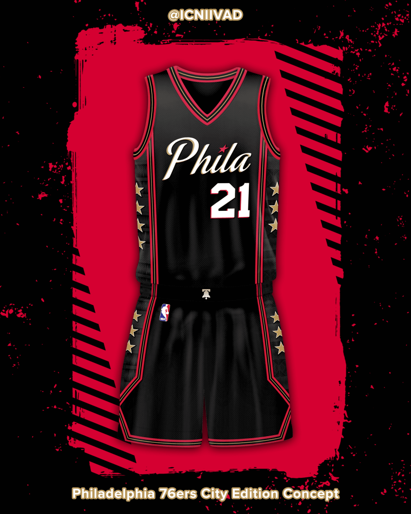
Philadelphia 76ers
The Sixers City Edition uniform concept features design elements honoring the legendary Allen Iverson while incorporating the team identity “The Answer” made iconic during the late ‘90s and early ‘00s. The shorts trim pays homage to his signature crossover, while the Liberty Bell on the belt buckle symbolizes his unparalleled durability and fortitude. The side paneling contains the Kente pattern from Georgetown University – Iverson’s alma mater – in tribute to the late Coach John Thompson II, the man with whom Iverson credits for saving his life prior to entering the NBA.
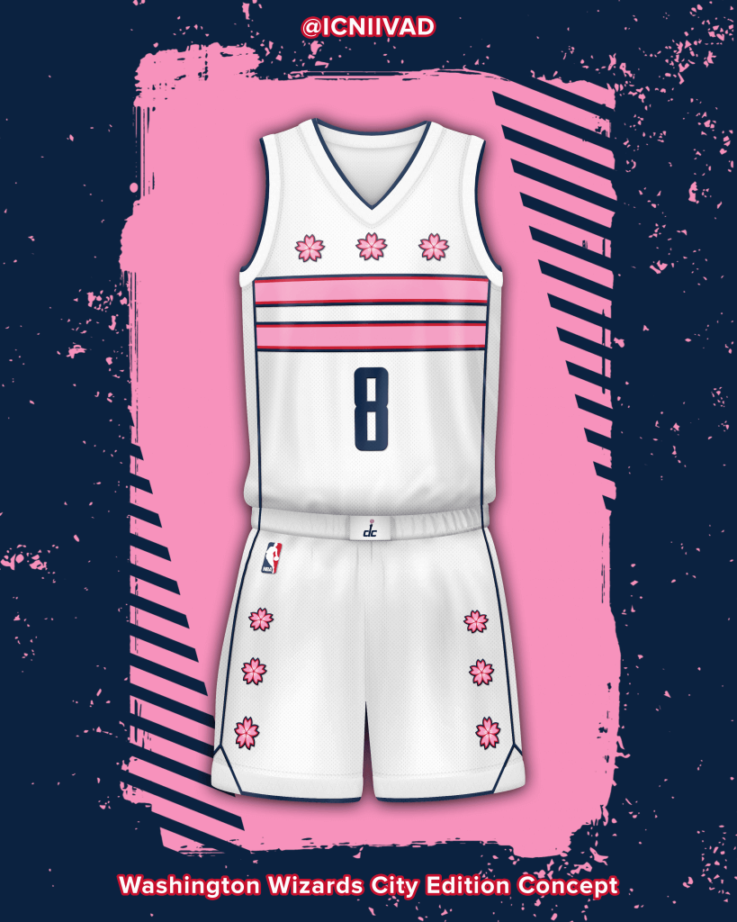
Washington Wizards
The Wizards City Edition concept uniform celebrates the annual Cherry Blossom Festival, Washington D.C.’s weekslong cultural festival commemorating the gift of approximately 3,000 cherry trees from the Mayor of Tokyo to the United States in 1912. The District of Columbia’s iconic flag – which has been flipped to include cherry blossoms – takes the place of a traditional wordmark, while the paneling and shorts designs take cues from the look of the team formerly known as the Bullets during the late ‘60s and early ‘70s.
Name: Lance Hinesman
Handle: @Lance_Hinesman
Link to Portfolio/Site: https://www.behance.net/lhinesman
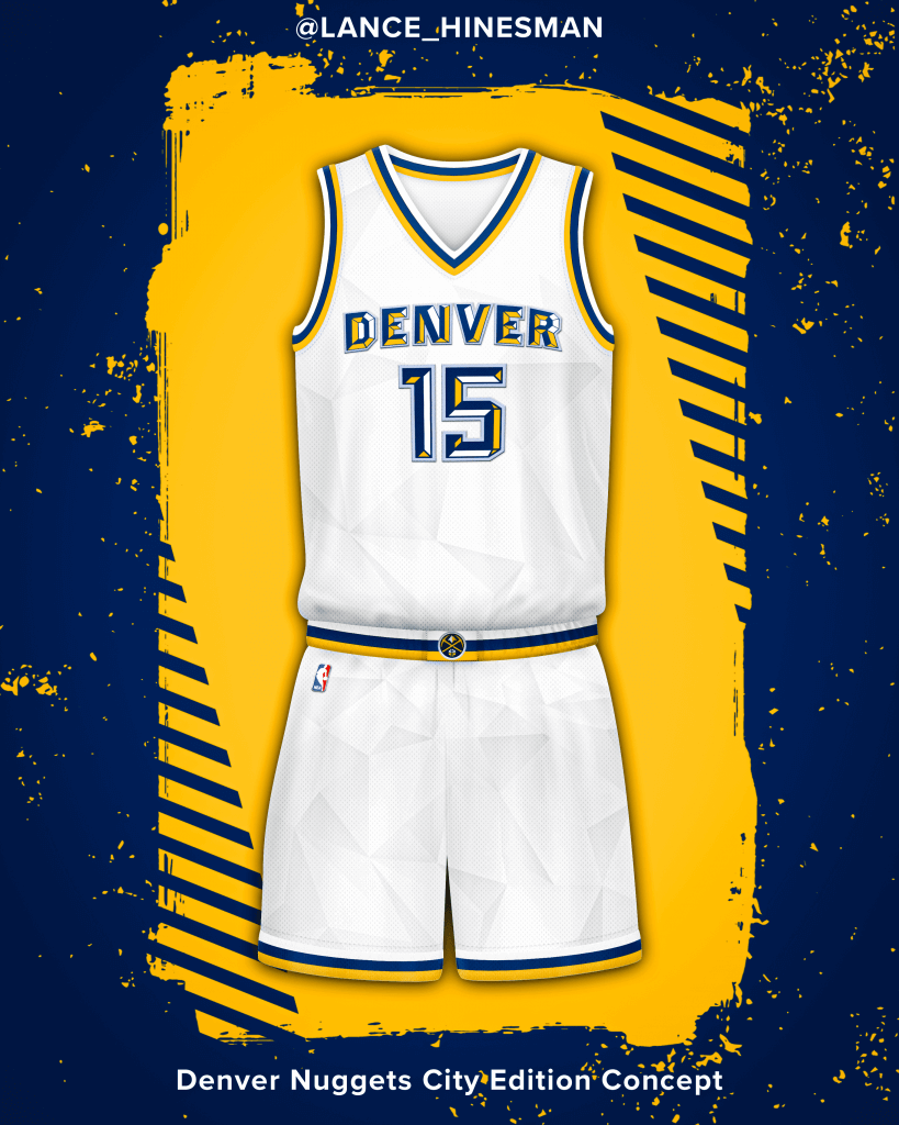
Denver Nuggets
This Nuggets jersey is inspired by a mural located in Denver. The mural is the source of the wordmark and pattern that covers the jersey.
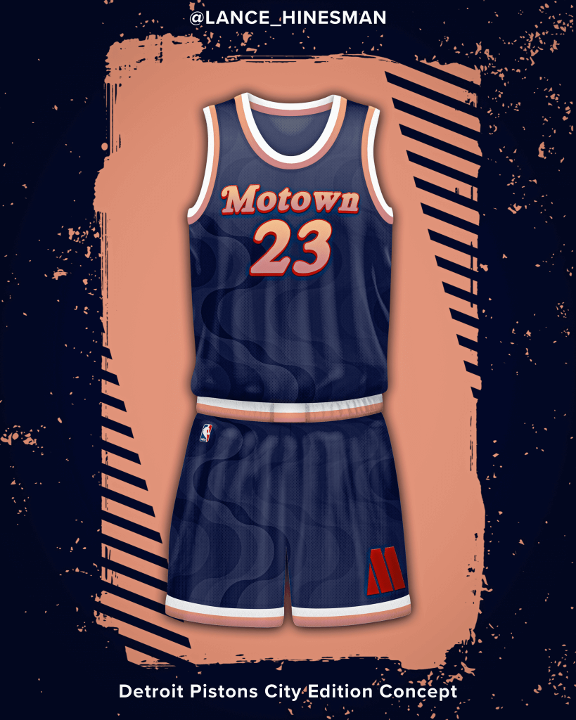
Detroit Pistons
The Pistons concept is an ode to Motown and creates a retro feel for the city jersey. The jersey itself features a pattern and wordmark straight from Motown albums covers and tickets with a brand new color scheme.
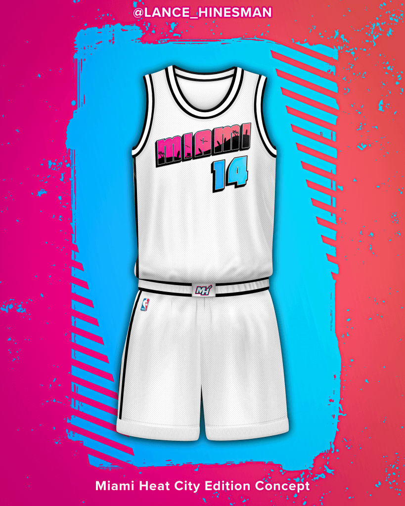
Miami Heat
As a heat fan, it’s hard to let go of the vice theme just yet, but if I was going to keep the vice, I had to switch it up. The heat jersey has a brand new wordmark in a postcard font with a beach scene within its letters. The wordmark and number also have bright pink and teal gradients to add a nice splash of color.
Name: Ryan Meils
Handle: @ryaninsix
Link to Portfolio/Site: https://www.behance.net/ryanmeils
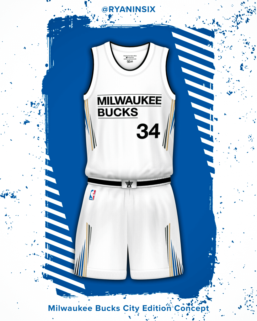
Milwaukee Bucks
Inspired by the Milwaukee Art Museum, the Calatrava, something anyone from Milwaukee could recognize. The wordmark replicates the museum logo and the side panels include a design of the museum’s wings in the cream city rainbow colorway.
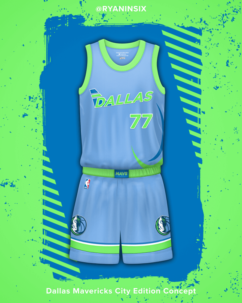
Dallas Mavericks
Inspired by Dallas aviation. Dallas/Fort Worth International Airport is one of the biggest in the country coming in at 27 square miles. Dallas is also home to the headquarters of Southwest and American Airlines.
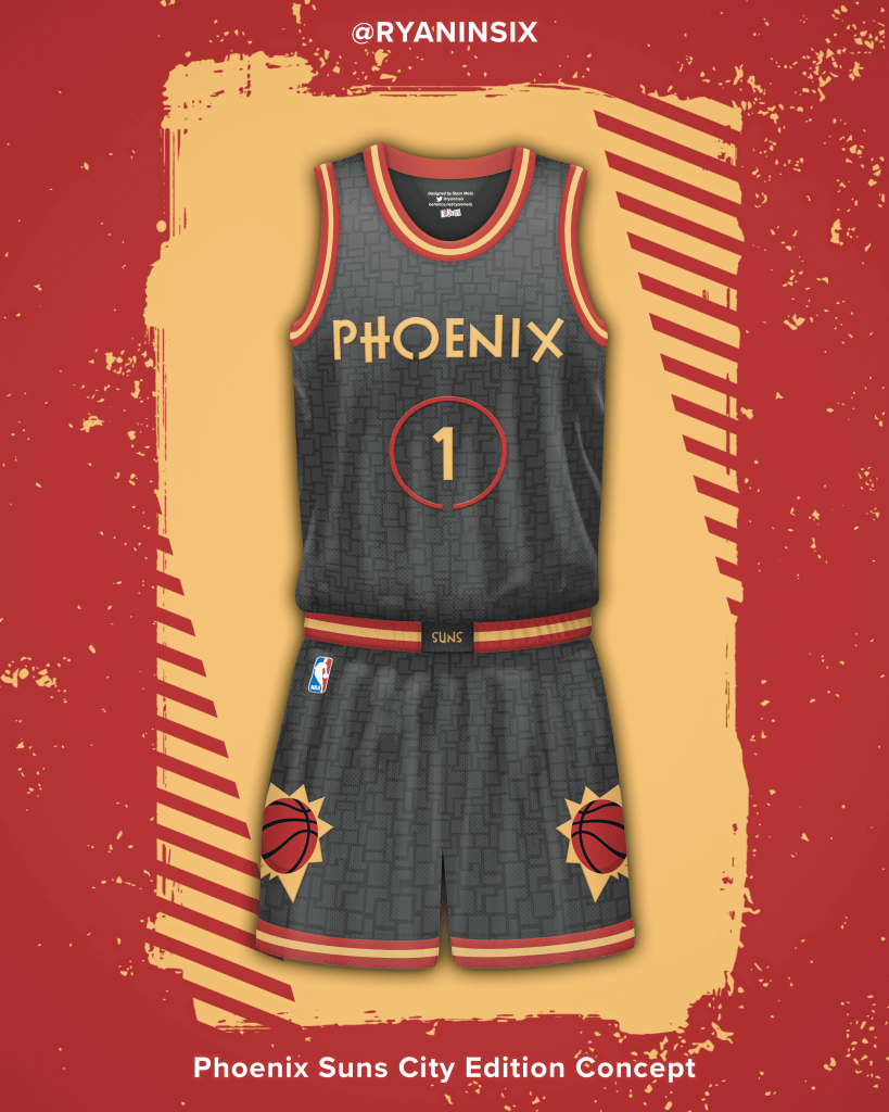
Phoenix Suns
Inspired by Frank Lloyd Wright, who built multiple buildings in the Phoenix area. The red and gold colors used have a southwestern feel and are pulled straight from Frank’s palette, he also designed the font used. The jersey is complete with a geometric pattern to mimic Frank’s architectural style.
Wow! And there you have it — all 30 NBA teams with redesigned “City” uniforms (and complete with “inspirations”). Great effort fellas! Clearly a LOT of work has gone into this (possibly more than has gone into the “real” City jerseys).
What say you readers? How’d they do???


Celtics, Pistons Make It Official
The Boston Celtics and Detroit Pistons officially unveiled their new City alternate uniforms yesterday, although both had earlier been leaked, so it’s simply a confirmation of what we basically already knew.
Have we ever said most of these alternates are completely unnecessary and simply a merch grab? Both of these certainly fall into that category.
First up the Celtics:
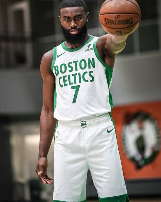
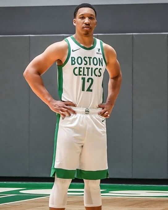
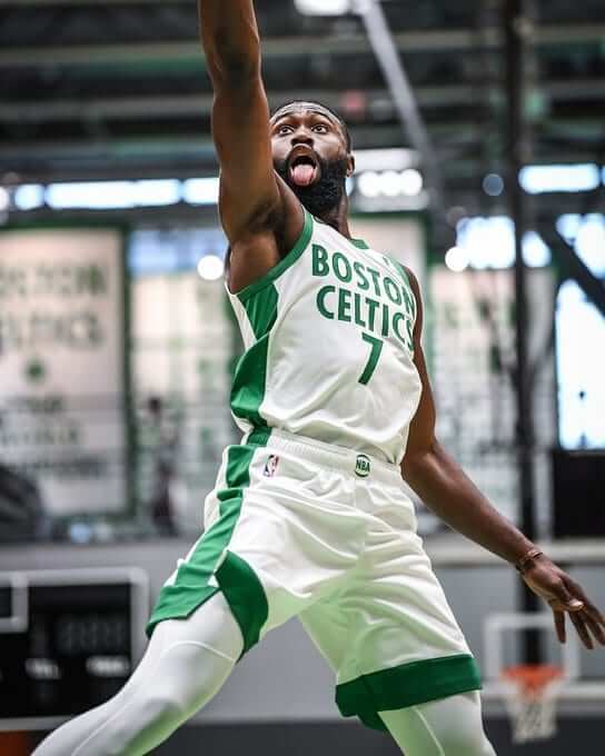
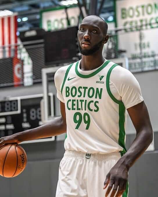
In a vacuum, this isn’t a bad uniform (save for the overly thick side panels and shorts hems), but it is, like most third fourth fifth(?) uniforms, completely unnecessary. And in what counts for the “inspiration” behind these — if you hadn’t already figured it out — are the banners than hang inside Boston Garden TD Garden arena:
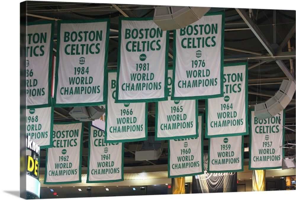
If you look at the thickness of the border on those banners (especially in comparison to the size of the “BOSTON CELTICS” font), you can see that’s the “inspiration” for the thicker uni stripes.
Of course, no unveil would be complete with out a hype video (don’t blink or you’ll miss the subliminal shoutout to their advertiser):
The thing about traditions is — some are meant to be . @Vistaprint ☘️ #TheBanner pic.twitter.com/IOF0Iiaz61
— Boston Celtics (@celtics) November 20, 2020
The Detroit Pistons likewise unveiled their new alternate uniforms yesterday. Theirs are blue (another “Motor City” tilt), and in what it believed to be a pro sports first, boast a comma as seen in this circular read of ‘Motor City Detroit, Michigan’ across the chest:
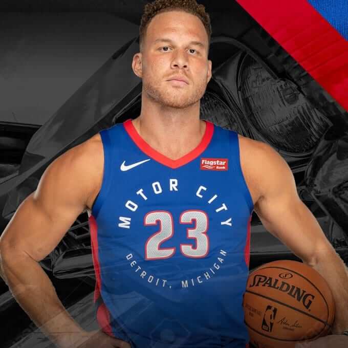
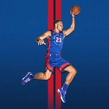
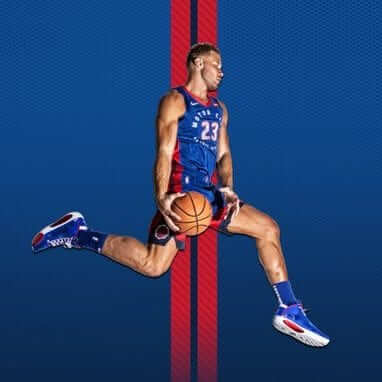
Like the Celtics new uniform, this one also features very thick side panel/short stripes:
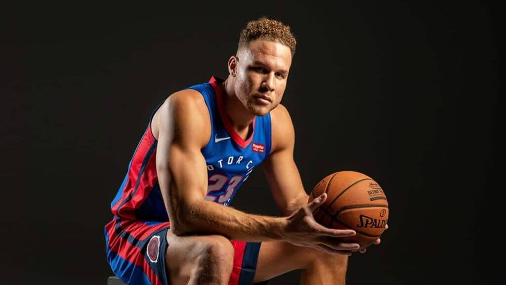
The hype video seeks to play up the automotive aspect of the uniforms (you’ll see they compare the stripes to classic auto trim) and includes a visual reference to Woodward Avenue (“Detroit’s Main Street”) as a logo on the waistband of the shorts:
Our city. Motor City. pic.twitter.com/pSkKQQ26KB
— Detroit Pistons (@DetroitPistons) November 20, 2020
Neither uniform is terrible (though both are unnecessary) but at the very least, both of these unis are in team colors and you could quickly glance at a tv or phone screen and recognize either team at a distance, which is a plus.
What do you guys think?


OHANA!
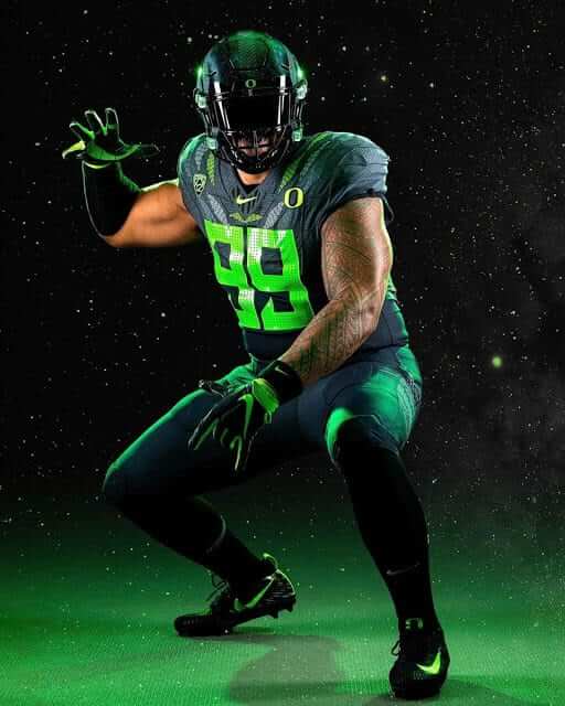
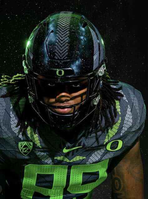
The Oregon Ducks are squaring off against UCLA today, and (surprise!) will be sporting a new uniform. My Duck Tracker, Dennis Bolt, has put up a short blog post on this uniform over on the Oregon Duck Tracker website, which reads like so…
Week 3: November 21, 2020 “Ohana”
The Ducks pulled out their first “themed” uniform of the season. It’s an homage to almost-black, neon green, and Polynesia. It’s the first special uniform since September 2017, when they had an anti-cancer one-off uniform. This is also the first mono-black set since week 3 of 2018. Loyal readers might remember the 2016 season (4-8), when each week revealed uniforms that were wildly different and usually came with a “story.” This has the feel of those days, but albeit more subtle and, honestly, merchandized by Nike stores.
To read a bit more about this uni (and see some more graphics/photos), click here.
Thanks Dennis!


Guess The Game…
from the scoreboard
Today’s scoreboard comes from Charlie Fogg.
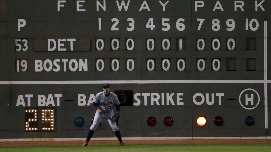
The premise of the game (GTGFTS) is simple: I’ll post a scoreboard and you guys simply identify the game depicted. In the past, I don’t know if I’ve ever completely stumped you (some are easier than others).
Here’s the Scoreboard. In the comments below, try to identify the game (date & location, as well as final score). If anything noteworthy occurred during the game, please add that in (and if you were AT the game, well bonus points for you!):
Please continue sending these in! You’re welcome to send me any scoreboard photos (with answers please), and I’ll keep running them.


The “BEST OF” Kreindler’s Korner
Hey guys & gals. You’ve enjoyed Kreindler’s Korner for several years now, mostly on the weekends, on Uni Watch, but with the recent coronavirus outbreak, Graig’s time is just too precious and he needs to tend to other things besides coming up with a new writeup each weekend.
So, going forward, for as long as the COVID-19 situation is bad in New York, I’m going to run a few “Best of’s” until Graig returns.
Here’s today’s offering:
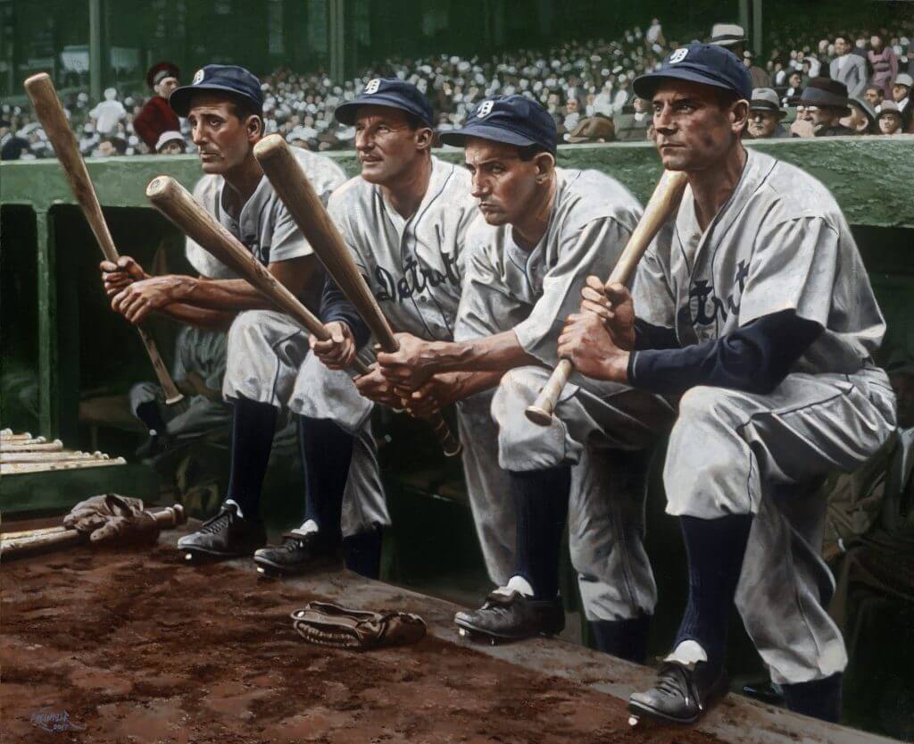
Title: “Thick Air”
Subject: Hank Greenberg, Goose Goslin, Charlie Gehringer and Pete Fox, 1934
Medium: Oil on linen
Size: 35″ x 29″It’s hard to find an image that says ‘baseball’ more than this one. You’ve got three Hall of Famers and one of the era’s great outfielders, all peering out of the dugout at Yankee Stadium, posing for cameramen before a game. In the distance, you can see stands filled with spectators, ushers and vendors. In the foreground, dirt with spike marks, as well as baseball bats and fielding gloves. It’s just all there: Four men from a bygone era in baggy uniforms and the tools of their trade, all with the look of people smack in the middle of the Great Depression.
It was certainly important to me to get the look of the players just right. At that point in 1934, Hank Greenberg was still in the early stages of a brilliant career. Goose Goslin, though nearing the end of his rope, was having a productive season, his first in Detroit. Charlie Gehringer continued to perform consistently and brilliantly. Pete Fox, still a youngster, made the most of his speed offensively on the basepaths and defensively in centerfield.
And yet, for me, this painting was just as much about creating an illusion of a hot and hazy summer day as it was depicting these Tiger greats. I wanted the viewer to look at the scene and feel the steam coming off of the field and into the stands. Also how uncomfortable and heavy those wool uniforms were. I feel like a lot of it was accomplished by control of values along the players’ skin – how light could illuminate sweaty flesh. Little color accents augmented that feeling of the haze and thick air between the players and the fans. Certainly edge control had a lot to do with it as well.
Really, this is how I think about all of my paintings. Yes, a rendering of Hank Greenberg has to look like Hank Greenberg, but I want to show people that there’s more to it than that. Show them that Hank Greenberg was a real person and actually inhabited our world – a world that was not in black and white. I feel like the ability – and responsibility – to do that is what’s most important to me.
Thanks, Graig! You can (and should!) follow Graig on Twitter.


Click to enlarge
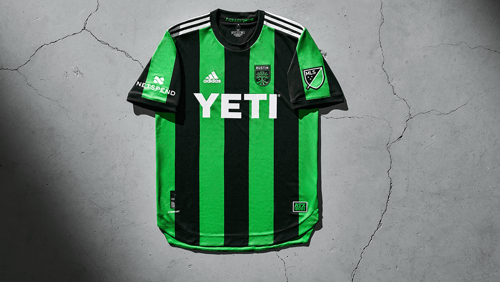
And now a few words from Paul: Hi there. In case you missed it on Friday, I’m currently raffling off one of Austin FC’s new inaugural jerseys. USA addresses only (sorry). To enter, send an email with your name, mailing address, and shirt size, to the raffle address by 8pm Eastern on Sunday. One entry per person. I’ll announce the winner on Monday. Good luck!
While we’re at it:

• Teespring is currently offering free shipping on orders totaling over $50. That means you can mix and match items from the Uni Watch, Uni Rock, and Naming Wrongs shops and save some coin on on the freight. Use the checkout code FREEOVER50 to get in on the deal.
• Uni Watch Trading Cards are now available at a reduced price.
That’s it from me! Now back to Phil.


The Ticker
By Anthony Emerson

Baseball News: The Expos had a pretty cool uniform drawn up for their 20th anniversary. Imagine if they actually wore those in 1989! (from Moe Khan). … The logos have been revealed for two new Expedition League teams: the Canyon City Spuds and the Mining City Tommyknockers (from Kary Klismet).

NFL News: The Iggles are bringing back the green pants when they visit Cleveland tomorrow (from Sam McKinley). … Here’s a neat story about the nixed plans for a Patriots stadium in Hartford, Ct., before Robert Kraft decided to keep the team in Foxborough (from Kary Klismet).
College/High School Football News: Minnesota’s SJSOB — that’s social justice statement on back — for last night’s game against Purdue was “End Racism.” The team also changed the “M” helmet decal to black and added a “HERE” helmet decal — HERE standing for ‘Help End Racism through Education’ (from Erick Kriewaldt). … Here’s our first look at UCLA’s social justice patch (from Kary Klismet). … Both Virginia Tech and Pitt evidently have to wear face coverings on the field for today’s game (from Andrew Cosentino). … Kentucky is going blue-white-blue against Alabama. … Mizzou is going yellow-white-yellow. (from @theREALbgott). … Black-black-yellow for Southern Miss against UTSA. … Florida is going mono-white, with a new helmet stripe (from @johnnyd381).

Hockey News: Here’s one blog’s list of the worst third jerseys in NHL history (from Kary Klismet).
.
.

NBA News: Igor Coelho — AKA Camisas da NBA — has done it again, getting his hands on the Timberwolves City Edition (from Dan Bodurtha). … With the Raptors announcing that they’ll play their home games in Tampa as long as the Canadian government keeps its current COVID restrictions in place, lots of people had takes on what the Tampa Bay Raptors should look like. … In addition to a new City Edition uni, the Celtics also have a new ad patch. Apparently, the ad patch was created and designed to evoke the Celtics’ famous warm-up jackets worn during the 1980s, with the contrasting nameplates. I think the marketing bullshit has gone too far. … The Clippers also have a new ad patch. … The Hawks photoshopped C Dewayne Dedmon into the team’s new uniform for a Twitter post thanking him after trading him to the Pistons. Dedmon never wore that uniform in a game (from Daniel Cardwell). … Uni number guru Etienne Catalan has another full slate of number changes around the NBA available on his Twitter account.

College/High School Hoops News: Some gorgeous new throwbacks for Boston College men. … Weber State men have a new road uni that is a major, major downgrade. … Army men have new home unis, complete with SLOB — school location on back (from Justin Rocke and Ian Curtis).

Soccer News: Liverpool keeper Alisson Becker will wear a replica of Ray Clemence’s 1981 European Cup Final jersey during warmups Sunday against Leicester. Clemence died last Sunday at the age of 72 (thanks, Jamie). … Argentine side Vélez Sarsfield have unveiled their new away kit (from Ed Żelaski).

Grab Bag: While Joe Werner‘s father-in-law was removing flooring in his 150-year-old farmhouse, he discovered some newspaper comics from 1937! … Rugby United New York of the MLR have unveiled their new kits and a new secondary logo (from Kary Klismet). … The Lieutenant Governor of Pennsylvania has been banned from flying flags other than the US flag, the state flag, or the POW/MIA flag from the balcony below his office at the state Capitol building. Pennsylvania Lieutenant Governor John Fetterman had previously displayed the LGBTQ+ and trans pride flags and is currently displaying a marijuana leaf flag from the balcony — his wife, Gisele, uses medical marijuana due to chronic back pain and Fetterman is an advocate for legalization (from Timmy Donahue). … Is it crazy that I want to live in the Yellowstone National Park employee gym? (from James Gilbert). … The Lanka Premier League, a new Twenty20 cricket league in Sri Lanka, has unveiled the logos for its five teams heading into its inaugural season (from Kary Klismet).


And finally… that’s all for today. Big thanks to Mike Joseph and his nine cohorts for their redesigns of the NBA alternate unis! What a project — make sure to let them know what you think in the comments below.
Everyone stay healthy and safe, and I’ll catch you back here with the Sunday Morning Uni Watch Crew tomorrow.
Peace,
PH
Those NBA unis are art, while Nike simply sells merchandise. One is pleasing to the eye, while the other simply takes your money and runs.
The difference could not be more obvious. Great job to all those involved in the project.
Well put. It’s art versus merchandise, like some of the US mint coins, past and present. For example, Laura Gardin Fraser’s superior George Washington quarter design was preferred by many but John Flanagan’s design was chosen instead, likely due to sexism or politics.
link
One thing is for sure, these concepts came from the heart and made with love and thoughtfulness. My favorites are: Boston, LA Clippers, San Antonio and Philadelphia. While I didn’t personally like the Iverson era design, this one is the best cpncept I’ve seen based on that design. Kudos.
Those Boston City uniforms look like someone’s hastily thrown-together Halloween costume idea. “Get it? I’m a banner from the Garden!”
These, much like the authenticates, gave a WNBA/unisex feel to them.
Scoreboard is 2013 ALCS game 1. Tigers beat Red Sox 1-0.
I was there. Extra points!!!
Thanks so much for the support, Marc! It was such an honor working with this group. We hoped to make people feel like we cared just a little more, and your reaction proves that we did for at least one person.
The Bucks redesign is awful. Barely above the Wizards cherry blossom monstrosity.
Lol ymmv. See below.
It was announced last night that PITT and VA Tech do not have to wear masks while on the field.
It wasn’t announced so much as someone actually read the regulation as far as Paragraph 3. I guess getting that far into a regulation was too difficult for some knee-jerkers.
The Wizards cherry blossom uniform is not only beautiful, but is the essence of what the City uniforms are supposed to be.
Those were easily my favorites of the batch. Blending the cherry blossom with the city flag was genius.
Most of the concepts and inspiration were really good except for the ones about rappers.
Interesting take. Did your opinion of hip hop affect your judgement? I ask this on kind terms. Seriously curious. Thanks
Were the Expos uniforms designed for on-field use, or for a special event to commemorate the best players in the franchise’s first 20 years? Gary Carter wasn’t even with the Expos in 1989.
You are correct. Page 1640 of Bill Henderson’s current book confirms that those Expos jerseys were from an exhibition game celebrating the team’s best players.
Great job on the redesigns. The worst of them are good and some of them are excellent. Kudos
The Sixers and Philadelphia deserve better representation.
Other than that, nice work!
Going to agree. Any uniform for a Philadelphia basketball team that includes some representation of Georgetown is a poorly informed insult to the Villanova fan base.
Tom, the selectively positive memory some folks have for Iverson and his relationship with Philadelphia and the 76ers is a real head-scratcher.
The one person who is too often overlooked when it comes to contributions to Philadelphia basketball and the betterment of countless players on and off the court is Sonny Hill.
So the Atlanta Hawks redesign uses the outline of a dove? Fitting . . . I guess?
If you’re gonna use an airport theme for the Mavericks, you ought to have DFW on it. It’s not just in Dallas and if you say Southwest is located in Dallas, you ought to mention American Airlines is located in Fort Worth.
The Lakers jersey looks like it has a bra over top of it.
Strange that only the Rockets uniform is the only one with a swoosh (in fact two of them) – but they’re backwards.
That’s on purpose (Mike voluntarily stripped all the nike/Jordan logos off the unis) but left the upside down/backwards swoosh on that one because of the Travis Scott connection. Mike can probably elaborate more on that.
Thanks, I missed that connection and it jumped out at me as being unusual for UW!
While I think the NBA uniform program is a tad bit out of control, is this REALLY a merch grab? Are there sales figures out there for CURRENT NBA replicas? I know the retro ones sell hot on ebay and other secondary markets but are people REALLY buying CURRENT NBA jerseys? At least comparative to the 90s? I’ve been to my fair share of NHL and NBA games over the past five years and I don’t know, I feel the jersey is FAR more a part of the fans in hockey than in basketball anymore. I’m sure there is trickle down sales like t-shirt jerseys, etc, but still. Would be interested in some of your thoughts.
Pertaining to the topic of Polynesian inspired NCAA Football uni designs, (and I’m not sure if it has already been noted on the site, I could have overlooked it) I recently saw that BYU has released ita own Polynesian themed uni.
I am stunned by all the hate directed at the 76ers design. It’s absolutely stunning and if I were team president Chris Heck, I would drop that dopey “Rowhouse” design in exchange for this one in a heartbeat.
All those Tampa Bay Raptors concepts and no one even went with “We The South”?