Click to enlarge
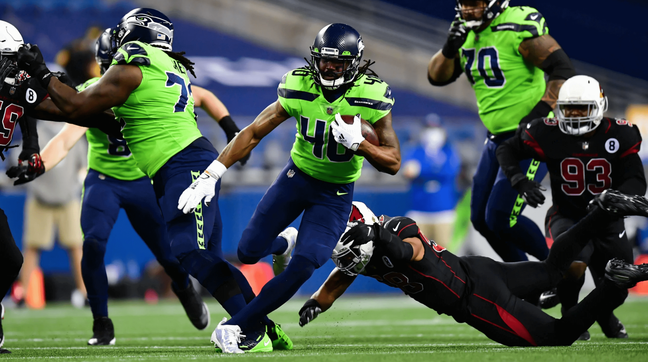
Quite the spectacle last night in Seattle, as the neon-clad Seahawks hosted the Magic 8-Balls mono-BFBS Cardinals (lots of additional photos here), creating one of the more entertainingly awful uniform matchups in recent memory.
Seattle and Arizona are in the same division, so they play each other twice a year. Last night’s game was their second meeting of this season — the previous one came four weeks earlier. Check out what they wore for that one:
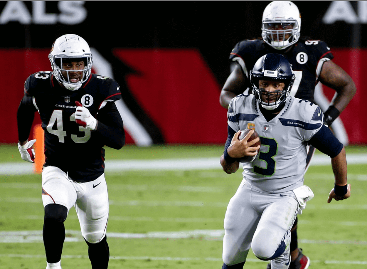
First, note that the Cardinals have now managed to wear two different BFBS jerseys — the “normal” version with white numbers and the Color Rash version with red numbers — against the same opponent in the same season. (Did you even realize they had two different BFBS jerseys?) And second, these two teams have now pulled off the bizarre trick of wearing four different jerseys when facing each other in the same season, none of which are their primary jerseys. This is the world that Nike hath wrought.
And just for an extra dollop of silliness, the Seahawks announced prior to last night’s game that their stadium has a new advertised name, wheeee!
But wait, it could be worse — in fact, it was worse in 2017, when the two teams went BFBS bodysuit vs. neon bodysuit:
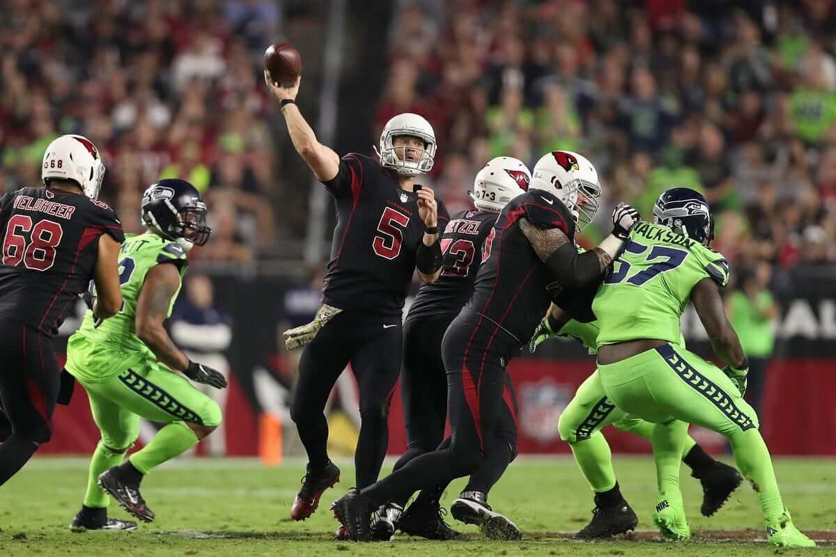
It’s easy to make fun of Seattle’s highlighter design, but the Cardinals are the real ongoing travesty here. Their uni set has been a disaster for a decade and a half. The embarrassing side panels, the bizarre pants piping, the nonsensical pair of the old-school, grey-facemasked helmet with the new-school jersey and pants — such a mess! There’s no other NFL team more drastically in need of a redesign. Come on, Bidwills, do the right thing already!
Finally, if you want to remember how good these two teams used to look when facing each other, there’s a nice gallery here.
Click to enlarge
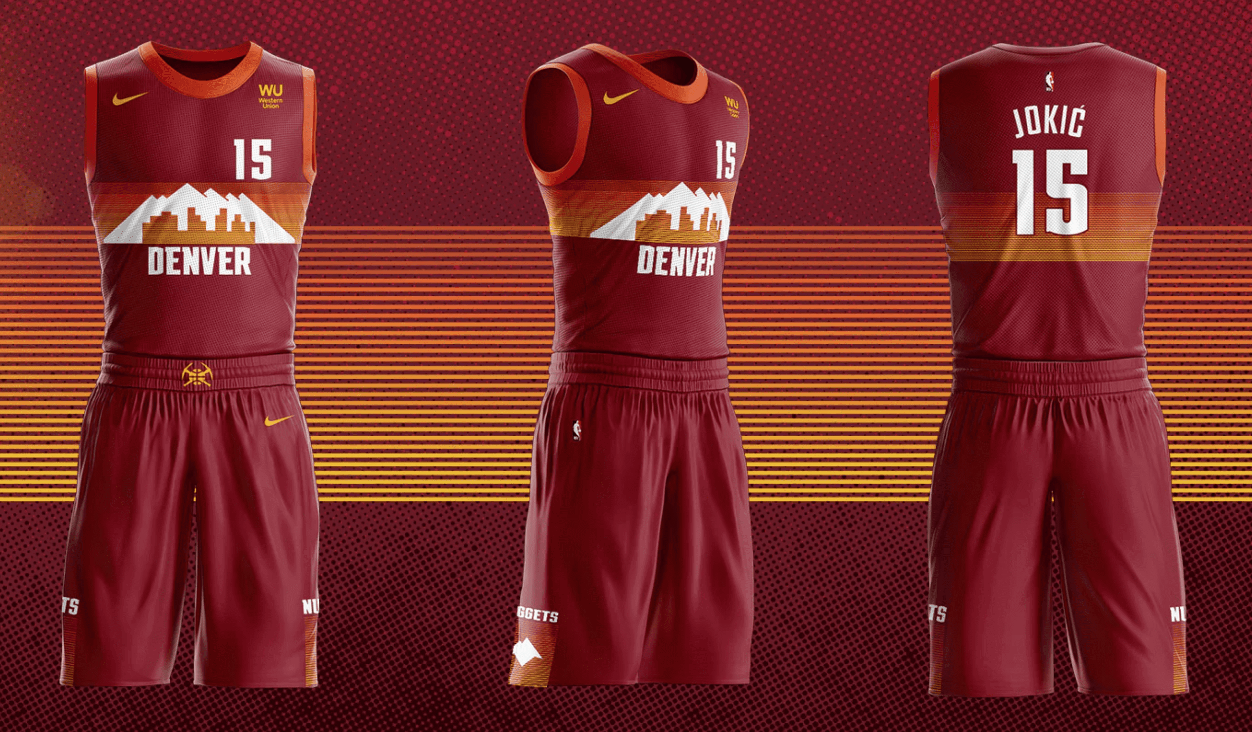
NBA update: Holy tequila sunrise, Batman! The Nuggets unveiled their latest skyline alternate yesterday, and this one seems particularly ill-conceived. Why? Well, for starters:
• Color-wise, it doesn’t feel at all Nuggets-y.
• Speaking of the colors, it feels a lot like the Jazz’s “red rock” design.
• Considering all the problems this year with Colorado wildfires, do you really want a uniform that looks like the city and mountains are ablaze?
Like most of the City alternates, this one fails the most basic test, which is that it has no compelling reason to exist (although it’s amusing to see the team try to suggest otherwise). What a waste of space.
Click to enlarge
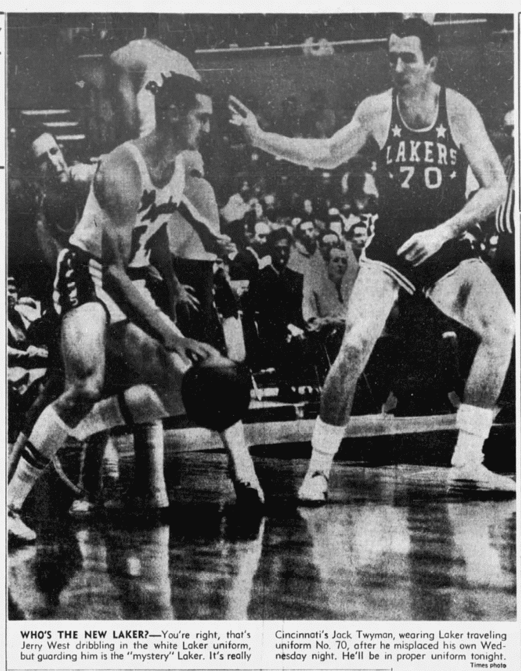
Lakers vs. Lakers: The photo shown above ran in The Los Angeles Times on Nov. 20, 1964 — exactly 56 years ago today!
As noted in the caption, that’s Lakers great Jerry West on the left, while the player on the right is Jack Twyman of the Cincinnati Royals (forerunner of today’s Sacramento Kings), who had to wear an old Minneapolis Lakers road uni — which the Lakers apparently had on hand at their arena, despite having moved from Minneapolis four years earlier — because his own uniform was misplaced.
This is similar to the famous 1978 Sports Illustrated cover shot showing Spurs guard Mike Gale in a Bullets uniform (more info on that here), but I’d never seen this one until Todd Radom sent it to me yesterday. Thanks, Todd!
New day, new drip. pic.twitter.com/Lvc74QgJgh
— Atlanta Falcons (@AtlantaFalcons) April 8, 2020
Hipster dripster: Back in April, when the Falcons unveiled their new uniforms, they referred to it as a “new drip” — not just on Twitter (as shown above), but also on their website. Lots of media outlets dutifully parroted the “new drip” lingo.
I confess that this was my first encounter with the term “new drip.” Yes, I realize I was very late to that party. As a geeky, middle-aged White guy with approximately zero affinity for hip hop, I was unaware that a “new drip” referred to a cool new outfit, or that the Atlanta-based rapper Soulja Boy had released the song “New Drip,” or that there were countless other “drip”-themed rap songs (although I soon learned all of those things, because I was curious about the use of the term in connection with the Falcons’ uniform unveiling and tried to educate myself on what it was all about).
After that, I started noticing the uses of “new drip” in various contexts (it was more prevalent than I had realized, and not just in the uni-verse!). But I did not start saying or writing the term “new drip” myself, because I figure there’s nothing lamer than a square, middle-aged White guy adopting Black street terminology.
Yesterday, however, an ever squarer, even older White guy provided me with an opening. And so now, finally, I can say it loud, say it proud, just like the cool kids. Check it out, people — new drip:
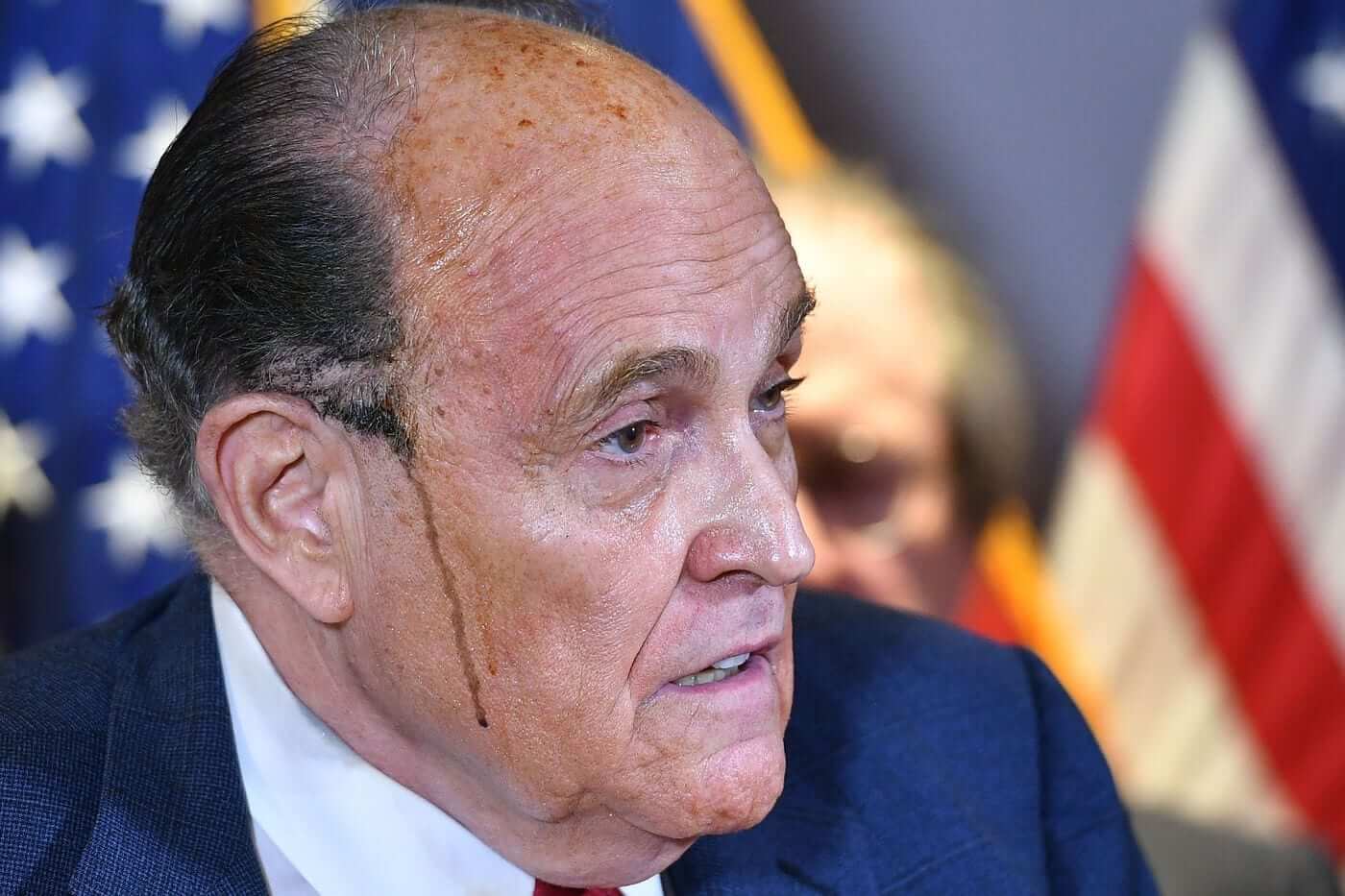
(Footnote: About 10 minutes after I finished writing this section, someone tweeted this at me. Really!)
Click to enlarge
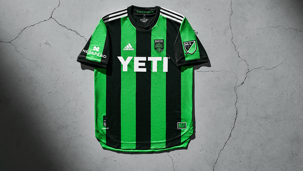
ITEM! Austin FC shirt raffle: MLS’s latest team, Austin FC, unveiled their inaugural shirt earlier this week, and now a lucky Uni Watch reader will get to win one of those shirts!
This will be a three-day raffle. USA mailing addresses only. To enter, send an email with your name, mailing address, and shirt size, to the raffle address by 8pm Eastern on Sunday. One entry per person. I’ll announce the winner on Monday. Good luck!

Membership update: Eight new designs have been added to the membership card gallery, including Chris Pedersen’s (shown at right), which is based on the old Edmonton Mercurys. What a gorgeous sweater that was! Great design choice by Chris.
Ordering a membership card is a good way to support Uni Watch (which, frankly, could use your support these days). And remember, as a gesture of comm-uni-ty solidarity, the price of a membership has been reduced from $25 to $20 until further notice, plus a Uni Watch membership card entitles you to a 15% discount on any of the merchandise in the Uni Watch, Uni Rock, and Naming Wrongs shops. (If you’re an existing member and would like to have the discount code, email me and I’ll hook you up.)
As always, you can sign up for your own custom-designed card here, you can see all the cards we’ve designed so far here (now more than 3,000 of them!), and you can see how we produce the cards here.
The Ticker
By Anthony Emerson

Baseball News: The Australian Baseball League’s Brisbane Bandits announced a link with the Brewers on Wednesday, but used the old Brewers ball-in-glove logo, rather than the updated one, in their announcement (great spot by Chad Lehman).

NFL News: Washington will be wearing throwbacks on Sunday. “Perhaps conveniently [they] did not show the sleeves,” says our own Jamie Rathjen, referring to the Indian head patch that has previously been part of that throwback design. The patch will presumably not be used this time around. … Fox’s comic-book-style graphics gave Russell Wilson an off-center Nike logo during last night’s game (from Brad Boyd).
College/High School Football News: RB Jalen Holston will get Beamer’s No. 25 jersey for Virginia Tech, who are going maroon-white-maroon (from Andrew Cosentino). … Oregon will wear Polynesian-themed uniforms tomorrow against UCLA (from multiple readers). … Virginia is going blue-blue-white tomorrow (thanks, Jamie). … Utah is going BFBS but adding social justice statements in place of traditional NOBs (from Cody Pullan). … Appalachian State is going mono-white with a flag-desecration helmet logo (from Sean Welsch and Matt Rashford). … San Jose State is going mono-white tomorrow (from Timmy Donahue). …”Interested in a comprehensive compilation of Mississippi high school football helmet designs? This blog has you covered,” says Kary Klismet.

Hockey News: Here’s a Flyers uni retrospective (from Kary Klismet). … The OHL’s Erie Otters have unveiled their 25th-anniversary logo and an alternate sweater commemorating the anniversary (from Wade Heidt). … Also from Wade: The QMJHL’s Tigres de Victoriaville did the pink thing on Wednesday night. … LIU men have unveiled a very nice new sweater (from multiple readers). … New sweaters for Minnesota men, plus a 100th-anniversary patch on both the sweater and the pants! Is this the first time we’ve seen an anniversary patch or other commemorative logo on hockey pants? (From Nick Hannula.)

NBA News: Anthony Edwards was the first overall pick in Wednesday night’s draft, so it makes sense that he’ll wear No. 1 for the Timberwolves. Etienne Catalan had that news, and check his Twitter account for all your NBA uni number needs.

College/High School Hoops News: New unis for Idaho men and women (from Kary Klismet). … New unis for Wisconsin-Green Bay men (from Eric Fischer). … Wyoming men have posted new a new uni teaser (from Darryl Knight). … Kentucky has added ugly splotches showing Rupp Arena’s new corporate-backed name to their floor. New version on top, old on bottom. … Also from Kary: New floor for Lydon Institute in Vermont.

Soccer News: Colombia’s kits on Tuesday were a mashup of three different kits — 2018’s shorts, 2016’s socks and the current blue shirts (thanks, Jamie). … Also from Jamie, new kits for Australia’s Perth Glory. … Hertha Berlin will wear a commemorative shirt honoring the club’s supporters this weekend (from Ed Zelaski). … SC Freiburg will also wear a commemorative shirt this weekend to honor the club’s supporter group. … Also from Kary: The Cagliari City Council has approved a new stadium for Serie A’s Cagliari Calcio.

Grab Bag: The NLL has revealed the logo and name of their new Fort Worth team, called Panther City Lacrosse Club (from Jose Herrera). … British Columbia’s The Province newspaper is holding a contest to determine which B.C. sports uniform is its readers’ favorite (from Wade Heidt). … Great holiday gift idea: this tabletop curling game! (from Mike Williams). … Kary Klismet sends along this Twitter account for college logos from all levels. … Also from Kary: A few weeks ago we Ticker-linked an item that seemed to indicate the Australian Football League’s Sydney Swans were soft-launching a new logo. Yesterday, the Swans formally unveiled it. … The Southern Conference has unveiled its 100th-anniversary logo (from Brandon Keys and Timmy Donahue). … This is so cool: Graphic design titan Paul Rand was commissioned to redesign the Ford logo in 1966, though his redesign was ultimately rejected.

Click to enlarge

What Paul did last night: There’s this guy who often walks by with a baby stroller during our porch sessions. Since it gets dark so early these days, he recently put little lights on the stroller, and it looks so completely awesome. I’ve been hoping to photograph him for a while now, but he often seems to go by when I’m distracted, or in the middle of a conversation with Mary, or whatever.
But as I was setting up for last night’s photo, there he was! The photo doesn’t really capture how great the lights look in person, but I’m glad I finally documented Brooklyn’s coolest baby stroller.
As always, you can see the full set of daily Pandemic Porch Cocktails™ photos — now nearly 250 of them — here.
Next Monday, in addition to our usual NFL roundup, I’ll have my annual College Hoops Season Preview. Until then, stay safe, mask up, and enjoy Phil’s weekend content. I’ll see you back here on Monday morning. — Paul
I thought the all black Cardinals look last night, matched with the egg shell helmet, made the lid look like an astronaut helmet from a low-budget 1960’s sci fi movie
You know, they could maybe get away with it, or at least come closer, if they had a metallic-red facemask or something like that. But the helmet is such a woeful mismatch for all of their other uniform components (and most of the components aren’t any good either).
My wife asked me if I was watching college football
Watching the game, I was actually surprised by how much I think Seattle’s navy-highlighter-navy combo works. Honestly not bad IMO.
Cardinals, on the other hand… utter disaster.
The neon jerseys are bad, but for me the neon jerseys look even worse when paired with the contrasting navy pants. (If you are going neon costume, just go all in).
I used to think that the Seahawks mono gray was a bad look because I thought it was too close to white. But seeing the photo of the Seahawks in mono gray, I realize it looks so much better than the Rams dishwater version.
I agree with your comparison here. I was going to say something similar after Paul’s item about the LAR/SEA game. I think the SEA’s works better because they match it with generally darker colors, with just a hint of the highlighter green. I believe their grey also matches the logo on their helmet. It works for them.
The Rams pair the color with the most electric of colors, even white in the gradient numbers. It isn’t part of the color scheme anywhere else. To me, it just looks out of place on LAR’s uniform.
I like it too, but I do think it’s fair to wonder if the Nike-fication of uniforms has burned into our brain that the Seahawks look good just because we’ve gotten used to it over the years. Plus they’ve been good the entire time they’ve worn this set so we’ve seen them featured in primetime and playoff games for a decade.
I agree.
They don’t look any better, we’ve just become inured to them.
So the 1964 Lakers wore script “Los Angeles” at home and “LAKERS” on the road? That’s different.
Nope, they wore “Los Angeles” on both home and road. That’s what makes that picture so notable – Twyman’s wearing a Minneapolis Lakers uniform! It was more than 4 years since the Lakers relocated so those unis must have been in storage for a good while.
I’m guessing it was Frank Selvy’s old uni, as he was the last player to wear #70, before switching to #11 for the first LA season.
Good call, Matt. I’ve adjusted the text to clarify the situation.
Fair enough; I believed the caption.
That neon gimmick is certainly garish but the Cardinals are 100% atrocious each week. I would rate Cincinnati as the 1B team in need of an overhaul but as old of a franchise as the Cardinals are, get it together.
The only Uni-que aspect I’ve seen to the Cards in this uniform era was last week when Kyler Murray wore yellow socks and yellow cleats with their blood clot look. His getup actually mimicked a Cardinal. Subtle. Cool. I don’t know that I’d like to see the whole team dressing like giant red birds each week; should still look like a football uniform. I like to think Murray made the most of it. He’s gone on record wishing they’d go back to the Plummer/Tillman era look.
Rudy’s on a train to nowhere (Supertramp)
Re: the Mississippi helmet database.
Sad to see so much Native American imagery in the high schools. Even sadder, one school with the nickhame “Confederates.”
I do like the colorways of the two or three helmets which borrowed from the Cincinnati Bengals.
LOTS of “borrowing” from everyone from West Virginia Universi to the New York Hitmen of the XFL.
And about three or four examples of different logos on the left and right sides of helmets.
Ricko1 had made a general reference to this in the comments section last night and it made me realize something.
The Cardinals’ Color Rash black. Jersey and pants look really similar to the original Ottawa Redblacks uniforms from 2014 and 2015. Cards starting wearing this Color Rash uni in 2017.
Some shots of those Redblacks unis from about a half-decade ago. Playing a rare CFL colour vs. colour game when they visited Vancouver:
link
link
I mean if I HAD to pick, I like last night’s look for the Cardinals better than their previous look vs Sea. I like mono-black for them better than black-over-white, and there’s barely any red at all on their ‘standard’ BFBS so at least their color rash has red in it. Their gray facemask hasn’t made sense to me pretty much since I’ve been alive; a red mask would be SO easy, and would’ve gone so well with their previous set from the early 00’s in addition to making way more sense with their current dumpster fires.
In general, gray facemasks don’t make sense unless the team also has gray/silver in their color scheme. The 49ers are red and gold, yet have a gray facemask? Why?
I concur.
Cardinals rash uni is definitely their best. They and the Broncos are probably the two teams who need a redesign the most. Even the new Falcons uniforms are light years better than both of those, ATL, gradient, and all.
Personally I love the Seahawks neon over blue look. I wish they could do something different with the socks but neon socks with the blue pants may look weirder than the blue leotard look. When I visited Seattle their color scheme made alot more sense to me for some reason, lol.
Those Oregon uniforms are the craziest thing that I have ever seen them wear, but unlike some other gimmicks, if you don’t read into it too much and just look at the uniform, this actually works for me. It obviously looks crazy, but in a good way.
This may well have been covered on Uni Watch previously, but what is the greatest single game uniform match-up of all time in each sport? I’m thinking of the NFL specifically, because last night’s match-up and the Detroit-Atlanta pairing from earlier this season have to be two of the worst in the history of the league.
In identifying the best, is it as simple as going back to a Bears-Packers game from the ’60s or thereabouts? There are still good-looking games, but I can’t think of anything in the last ten years that would come close to the Bears-Packers in the ’60s, Raiders-Chargers in the ’60s, etc. I guess Raiders-Chargers still looks pretty damn sharp today as do the Steelers vs. the Browns (with their new uniforms).
Maybe best to stick to the current season, going to all time I think slips into the predictable. But if it’s limited to the current season, then other factors can come more easily into play, such as stadium esthetics, overall lighting etc. For example I would probably pick Detroit vs. Atlanta as the top all-woof game so far because that game had worse stadium esthetics than last night’s game, but it’s a close call
I tend to agree with this, but adding additional factors create a lot of variables that aren’t necessarily a bad thing, but make the potential answers a lot less clear-cut. For example, does Packers/Bears at Lambeau in the snow from the 60s look better than today’s because the uniform tailoring is ostensibly better/more appealing? Or is Packers/Bears at Lambeau in the snow today look better because it can be consumed in HD? Once you factor in additional teams that have actually changed their uniforms in a significant manner (which the Packers and Bears basically have not), gotten a new stadium (which the Packers have not) with different lighting factored in, it becomes a much more difficult conversation haha
Detroit/Atlanta earlier this year was absolutely 100% worse than last night’s game. I’d even venture to say that the previous Sea/AZ matchup earlier this year was worse than last night’s.
Cowboys vs. Steelers, Super Bowl XXX. Perfection.
I’d have to say the recent Chargers in powder blue jerseys/gold pants vs. Dolphins in their white throwbacks was the most gorgeous games I’ve seen in recent memory.
I also love the Cowboys in navy vs. Washington in white tops and burgundy pants.
The pretty game last night was played by college guys. I thought Tulane – Tulsa looked great. Too bad the final scoreboard didn’t look as good.
Amen! Amazing though that the Green Wave is having a down year with 5 wins. They did not win 5 the three years I was there.
I’m actually in shock that after all they had to go through, the Washington Football Team is actually going ahead with wearing a “throwback” uniform. Why? They’re suppose to be distancing themselves from the R-word as much as possible at least I thought that was why they changed the name so abruptly. Wearing a “throwback” uni just reminds everybody of the R-word. Are they trying to sell new merch? Why would a fan want to buy that throwback? Just shocked.
Uh, no. Washington NFL Football is enduring 2020 (and beyond) in purgatory to atone for the use of their Indian-inspired nickname. If I were a Washington fan, I would be apoplectic about the hasty and generic changes foisted on them. A “W” from a typewriter would be an improvement over the cheap insignia tossed at them. The only thing missing is the “Kick Me Hard” signs taped to the backs of their uniforms. A throwback uniform (albeit one shorn of its logos) at least offers the tonic of a potential highlight of the season.
Just throwback to the yellow pants.
Did Cardinals become first visiting team ever to wear a dark jersey in Seattle – after 45 years? That’s historic!
Wow — I think you’re right! According to the GUD, the Seahawks have never worn white at home in their history, and their previous Color Rash games at home have all featured the visiting team wearing white.
Great call, Kurt!
That’s a really great membership card design.
Completely agree, great choice for a jersey back.
The Virginia Tech Nuggets look really good!
Paul, the problem here seems to be that teams no longer have to make any actual design decisions. Off the top of my head, it appears to have started with NCAA football, with all of the different color helmets. Sure we had BFBS before that, but we hit a point, I think with the helmet colors, where design decisions didn’t need to be made. It’s as if the designer showed up with all of the possible color options, and the teams were like “We’ll take all of them!”
So instead of deciding which color helmet, or jersey, works the best for a particular team in a particular time, they just decide to do all of it. That’s where we are at with all of these one-off uniforms. They don’t need to fit a particular style and do not even need to keep the team colors, as long as they have a story to tell. Sadly, it coincides with the increased player movement era. Without consistent players or laundry to root for, what do you have?
I imagine it’s like being a Kentucky basketball fan in the one and done era.
I remember making a similar comment some time back when looking at baseball uniform reveals (can’t remember if it was college or minor league), where a team unveils multiple uniforms that include every possible style and look like pinstripes, white, gray, solid color softball tops in each of the team colors, camo, with and without headspoon piping, script name on front, wordmark name on front, logo on front, number on front, etc. Every cap color combination, with primary logo, secondary logo, and monogram on it. Just pick a look or three and stick with it!
Are the Cardinals technically BFBS? Black has been a trim color since the 1960s.
Dear Bidwill family,
Please,Please go back to the PAT TILMAN uniforms,
yeah we sucked with those but at least we looked good.
Wear those and you will be the best looking team out of Arizona.
What does Oregon have to do with Polynesian culture? Seems like a tacky attempt to attract more Polynesian recruits. How would it go over if there were many excellent Native American football players like there are with Polynesian players, and a school adopted Native American themed uniforms? Or put in any other culture or race?
Agree 100%.
as the game kicked off last night…..my first thought was:
Paul is going to hate this!! ROFL!
Coulda been worse though….’Hawks could have worn their dishwater pants….?
Makes you long for the Jim Zorn era uni eh Seattle??
Very sad to see that stadium empty too!
And one last thought….the only name for that stadium is the “Hawks Nest”… you’re welcome Seattle…$2M pls.
Like many other readers, I don’t mind the Seahawks Neon over Navy Blue at all. The cardinals uniform last night was better than the previous game’s unis by far. But a red face mask would have made things AT LEAST (somewhat?) tolerable
The image of that Nuggets jersey looks like an image that needs the tint adjusted.
I looked up history of uniforms for the Arizona Cardinals and they really have never had any good looking uniforms other than their 1935 set.
The set with the flag patch has got to be the worst. Flags of State/Province on sport uniforms are a terrible match (Calgary Flames)
Better case scenarios, a flag is either incorporated into a logo well and the colors work anyway (Columbus Blue Jackets, Colorado hockey Rockies), or a flag is incorporated into a logo and the colors are changed from flag to logo (Colorado Avalanche–they use that flag C in maroon and navy), or a flag is incorporated into a logo with the original flag logos but the logo still works (Baltimore Ravens’ sleeve patch).
But I actually agree with you…just the flag as a logo looks like “one more bumper sticker.” The Arizona flag looked OK for the Cardinals, but maybe I just think that flag is relatively nice, and red and blue are in common. But between the Calgary Flames and the Carolina Hurricanes’ use of a black-out North Carolina flag on the black jerseys, I’m not sure which of those is worse.
It’s rather amazing that a red and white team named the Cardinals can’t get their uniforms right. Can there be an easier visual palette to work with in all of sports?
FWIW, I actually think their standard red over white they have now would look fine if they just cleaned up all the weird piping and panels.
link
“FWIW, I actually think their standard red over white they have now would look fine if they just cleaned up all the weird piping and panels.”
I hear what you’re saying. Eliminating the piping is key. The uniforms could be so much better based on the timeless color scheme and the iconic helmet logo. But I’m not sure removing the piping alone can salvage this uniform set that has combinations like this:
link
For those that thought last nights uni matchup was bad – wait till MNF
I thought the Vikings/Seahawks game a few weeks back was the bottom of the barrel. I was wrong. I could not make myself watch what I knew would be a good game because of the uniforms. It was that hard on my eyes.
Not in today’s notes, but the other thing that happened yesterday is the Seahawks home stadium was rebranded. No longer called Century Link Field (Locals referred to it as “The Clink”) , but now Lumen Field. Fourth name for the field in its 18 year history:
Seahawks Stadium (2002–2004)
Qwest Field (2004–2011)
CenturyLink Field (2011–2020)
Lumen Field (2020 -)
The naming rights deal with CenturyLink (rebranded as Lumen in September) runs through 2033.
link
Actually, it’s mentioned in the fourth paragraph of today’s lede.
A few thoughts on the Nuggets’ new “City Edition” uniforms from a Denver fan:
I find it odd that the team points to the link as the inspiration for this uniform by referring to the primary color choice as “Flatirons Red.” The Flatirons form the backdrop link, not Denver. In fact, they’re so thoroughly associated with Boulder that they’re featured link.
Denver and Boulder are about 30 miles apart and are in the same media market, but anyone who lives in the area (and most who have visited) will tell you that the two cities have distinct cultures and identities. Maybe this would work if they called the uniform a “Regional Edition” or “State Edition,” but “City Edition”? Nope!
If the Nuggets really wanted to highlight the link that make up much of the Front Range, a better choice would have been link, which is owned and operated by the City and County of Denver and is one of the most famous music venues in the world. I suppose they shied away from the term “red rocks” since it was used by the Utah Jazz to describe their City Edition alternates. But if you’re already going to tread that ground by choosing a similar color scheme, what’s the harm in using the same nomenclature?
Despite the comparison many have made between the Nuggets’ new uniforms and the Jazz’s alternates, the color scheme reminds me more of the cardinal and gold worn by Iowa State – perhaps because I’m an alum. At least one Nuggets player – former Cyclone Monte Morris – should link in them.
That said, while I fully support that color scheme for my alma mater, it doesn’t feel right for the Nuggets. I know red is part of their link, but the Nuggets have always felt like link to me.
Whoops! Wrong link for Red Rocks Amphitheatre. Should have been this:
link
“ This is the world that Nike hath wrought.”
I know Nike is the favorite scapegoat for this site for alternate uniform proliferation (not that they bear no blame), but it’s worth pointing out that both Arizona’s black and Seattle’s lime alternates were first introduced by Reebok (09/10). Realistically, all of the major brands are responsible, I just find it a bit lazy to force rips on Nike specifically for these things. IMO adidas’ approach to soccer is more reprehensible than anything Nike does.
Actually, Arizona’s mono-black and Seattle’s mono-neon looks are both the result of the Nike’s Color Rash program and have nothing to do with Reebok.
Sorry if I wasn’t clear – I’m speaking to the fact that Reebok first introduced “a” black top to Arizona, and “a” green top to Seattle. Prior to those moves in 2009/2010, neither team ever had an alternate top in their uniform set.
So Nike may have updated each look, but Reebok opened the proverbial Pandora’s Box. I think that carries more of the weight for the current day looks (especially considering Nike’s takes on each alternate are much stronger designs, definitively so on Seattle’s side and Arizona is still handicapped by their garbage Reebok base design).
Scoreboard from 10/11/2013. Tigers won ALCS Game 1 at Fenway by a score of 1-0.