Click to enlarge
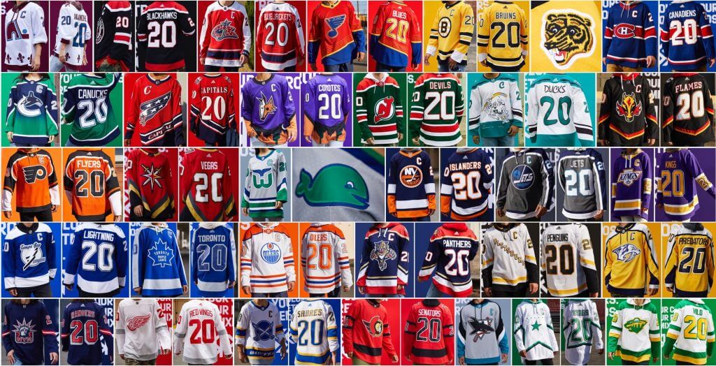
As you’re surely aware by now, the NHL yesterday unveiled its “Reverse Retro” program, which attempts to reimagine a chapter from each team’s visual history in a new color scheme. Today we’re going to take a team-by-team look at all 31 designs.
Before we get to that, it’s worth mentioning that Reverse Retro (let’s call it RR for short) bears a strong resemblance to some of the experimental concept projects that fan-designers like to play around with, like the non-matching NFL helmet logo project that was featured on the site last Friday or the various concept programs that Phil often features on the weekends. In other words, it’s a fun idea that works really, really well in some cases … and not so well in others. As we see with so many fan-designed projects, attempting to force-fit an entire league into a certain template or concept doesn’t always work.
That’s fine when we’re just kicking around experimental ideas. But for something that’s actually going to appear on the ice, every design should have a good reason for existing. I don’t think anyone could credibly claim that the NHL has achieved that standard with RR — too many of the designs feel like the result of someone saying, “Well, we have to do something for this team, so here it is.”
That said, a bunch of the designs really are sensational. It would be great if the league could do a program like this just for the teams where it makes sense, instead of trying to shoehorn everyone into the same protocol, but that isn’t the way these initiatives work. Too bad.
A few notes about the team-by-team breakdown that follows:
• I was provided with photos of the jerseys, but not the rest of the uniform — grrrr.
• For all photos, you can click to enlarge.
• For each team, I’ve copy/pasted the Adidas promotional text that explains the jersey’s design inspiration. That text appears indented and in italics, and it should at least give you an idea of the intent behind each jersey.
ATLANTIC DIVISION
Boston Bruins
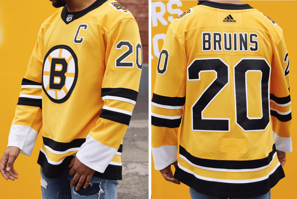
Inspiration: 1988 and 1999, when the Bruins played in the Stanley Cup Final)
Reverse Retro treatment of the classic white uniform worn at home at the Boston Garden for 15 years. The shoulder patch features a fan-favorite bear crest to complement the traditional spoked-B. Bruins greats Ray Bourque and Cam Neely both donned the ’90s version of these threads.
Paul says: Feels more like a “normal” design than a RR design, but whatever — this is clearly the best jersey in the entire RR program. Make it permanent!
———
Buffalo Sabres
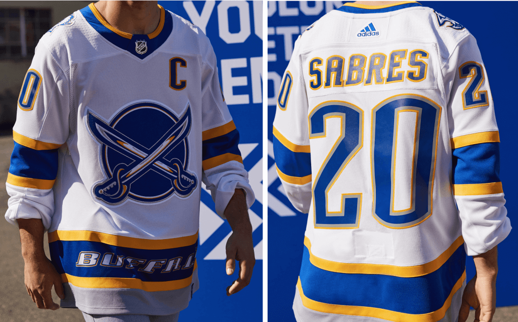
On Nov. 22, 2000, the Sabres unveiled the team’s first-ever alternate jersey against the Philadelphia Flyers. The jersey paid tribute to the team’s original sweater, while also incorporating colors and elements from the 1996 design. The organization chose from more than 50 different concepts and developed an homage to the original blue and gold crest — featuring the traditional circle and crossed-Sabres logo — adorned on a red-based jersey, trimmed in the team’s black and silver of the 1990s. The word “BUFFALO” appeared on the lower trim to signify the team’s proud attachment to its hometown.
This former alternate jersey was worn by the Sabres for six seasons. This jersey returns in the updated royal and gold colors to sit alongside the new home and away jerseys introduced this year. Hall of Fame goalie Dominik Hasek wore the red version of this sweater.
Paul says: Never liked anything about this design — the crest feels AHL-ish and the lettering across the bottom is embarrassing. The new color scheme is a bit less distasteful than the garish original, but the overall design is still a stinker. (Here’s an article about how this design was created.)
———
Detroit Red Wings
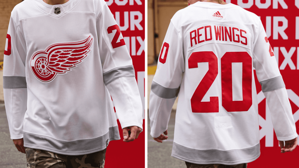
Inspiration: 1998, the year Detroit won their 9th Stanley Cup Championship and second in a row.
Worn by 1998 team captain and current General Manager Steve Yzerman. The gray of this Reverse Retro jersey is inspired by the silver from the Red Wings’ NHL Centennial Classic jersey.
Paul says: Weak attempt to shoehorn this team into the RR program. Comes off as a watered-down version of their primary white design, with the grey highlights added as an afterthought. At least they kept the vertically arched NOBs.
———
Florida Panthers
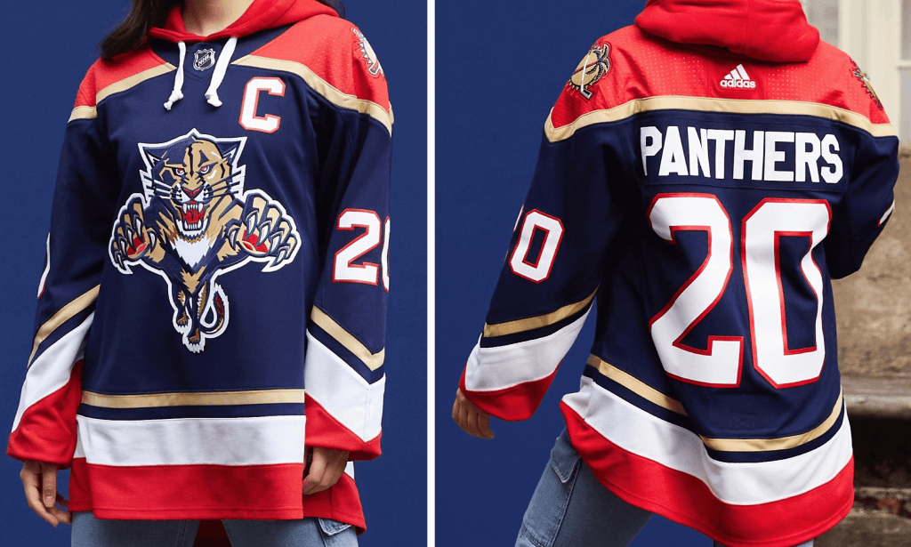
Inspiration: 1996, when the Panthers made the Stanley Cup Final in only their third season.
The team’s crest is featured front and center, while palm tree graphics on the shoulders and pointed sleeve stripes add considerable design details that nod to the South Florida region.
Paul says: Nice jersey. If it looks familiar, it’s because it’s more or less a throwback to their 1998-2007 navy design.
———
Montreal Canadiens
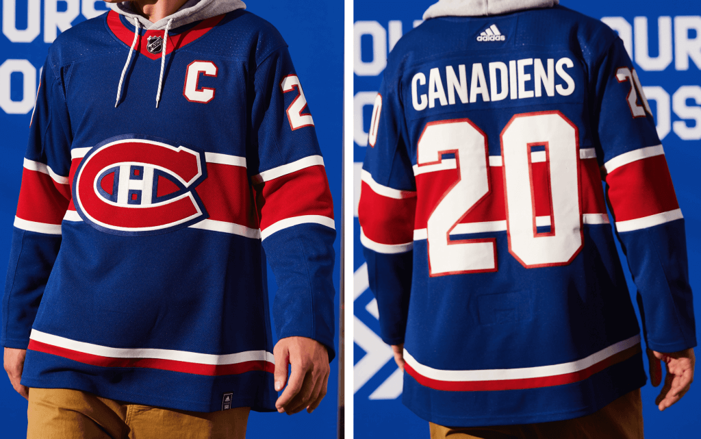
Inspiration: 1976, when Montreal captured its 19th Stanley Cup Championship.
The 1976-77 team is widely regarded as one of the greatest teams of all-time, still holding the record for the most points scored by any NHL team in a season. This Reverse Retro jersey honors that team, which was full of future Hall of Famers Bob Gainey, Rejean Houle, Guy Lafleur, Larry Robinson, Steve Shutt, Mario Tremblay, and Peter Mahovlich.
Paul says: Traditionalists may hate the idea of the Habs wearing anything other than red, but I kinda love this. Always liked the blue Phillies cap, and this works the same way — red and royal blue invert quite nicely.
———
Ottawa Senators
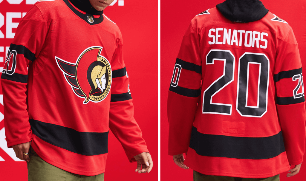
Inspiration: 1992, the Senators’ inaugural season.
The classic first-year jersey will be worn in red for the first time in this Reverse Retro jersey to complement the team’s recent rebranding.
Paul says: If third jerseys had existed in 1992, the Sens would clearly have added this red design to their inaugural white and black set. It will essentially fill that role with their new retro primary set, so it integrates well into the team’s current look. The only problem from my perspective is that I’ve never been in love with that look. Meh.
———
Tampa Bay Lightning
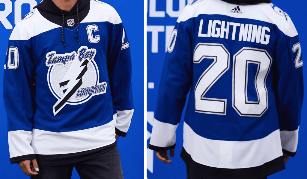
Inspiration: 2004, when the Lightning won the Stanley Cup Championship.
Vincent Lecavalier and Martin St. Louis celebrated the Lightning’s 2004 Stanley Cup Championship with this royal Reverse Retro version of the jersey worn when they hoisted the Stanley Cup for the first time. Captain Dave Andreychuk captured his first championship after 22 seasons in the NHL.
Paul says: It’s sort of amazing that they never wore a blue version of this design (I actually had to double-check to make sure). A fun variation.
———
Toronto Maple Leafs
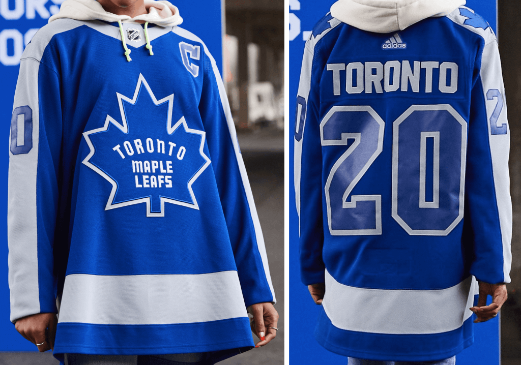
The Reverse Retro [design] combines the distinct crest and the shoulder stripes that started to appear in the late ’60s and early ’70s. Names like Keon, Bower, Ellis, and Horton graced the sweaters of this memorable era in Toronto Maple Leafs history. A remix of the club’s storied history with its present and future.
Paul says: They’re in the same boat as the Red Wings: When your color scheme is just one color plus white, there’s nothing to “reverse” off of, so you end up trying to explain, ideally with a straight face, that you’ve created something that (a) fits into the RR program and (b) has some plausible reason to exist, even if neither is the case. Lame-o.
———
METROPOLITAN DIVISION
Carolina Hurricanes
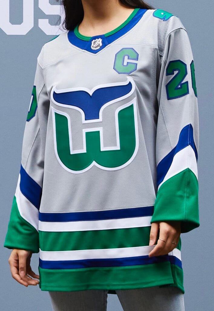
Inspiration: 1979, the franchise’s inaugural season as the Hartford Whalers.
Gray is the only color shared by both the Hurricanes and Whalers — a fitting color for this Reverse Retro jersey that connects Connecticut to North Carolina. The vintage Whale logo is featured as shoulder patches.
Paul says: Like everyone else, I love that Whalers crest, love Pucky, and so on. But the grey treatment looks so drab. Pfeh.
———
Columbus Blue Jackets
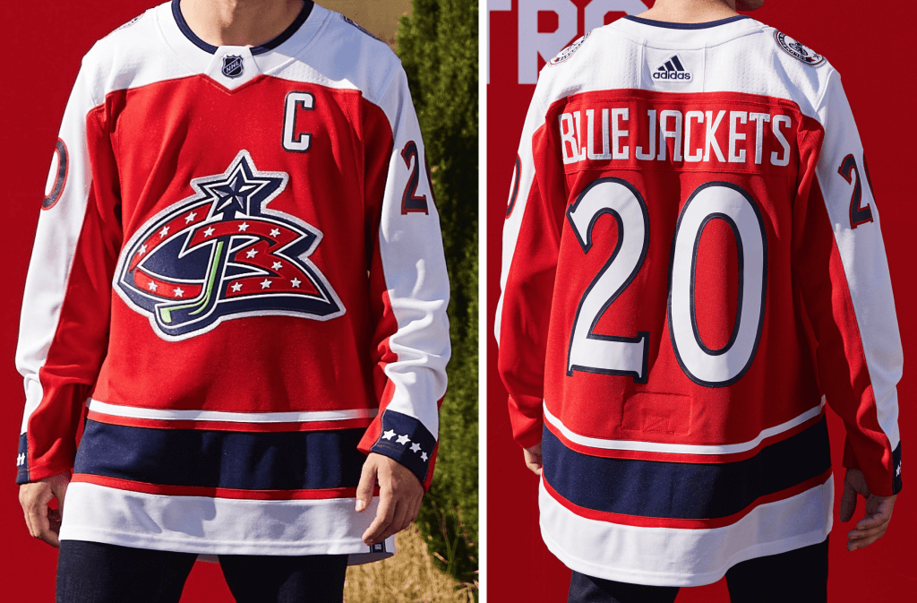
Inspiration: 2000, the Blue Jackets’ inaugural season.
Red, White & Blue, the colors represented on the state flag of Ohio, have served as the Blue Jackets’ primary colors since the club’s inception. This Reverse Retro jersey, however, marks the team’s first primarily red jersey and features the original CBJ crest worn from 2000-07.
Paul says: From a distance, or at a quick glance, this red, star-spangled jersey feels like a bad Capitals design. But nope, it’s a bad Blue Jackets design, complete with that miserable inaugural crest, which didn’t look good in the original color configuration and looks no better here.
———
New Jersey Devils
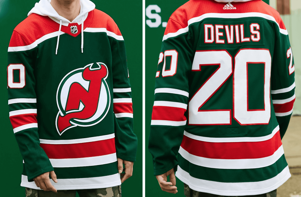
Inspiration: 1982, the Devils’ inaugural season.
While green has been part of the Devils’ color palette throughout the history of the franchise — to represent the Garden State and the Pine Barrens of New Jersey — this is the first time the Devils will wear a primarily green jersey.
Red represents the mythical Jersey Devil that was spotted and lived in those Pine Barrens.
Paul says: I’m probably biased because green is my favorite color, but I think this color-flipped version of the Devils’ original red/green design totally works. Nicely done!
———
New York Islanders
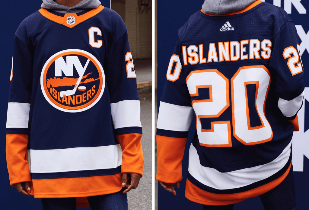
Inspiration: 1980, the beginning of the Islanders’ dynasty with four straight Stanley Cup Championships from 1980-83.
This Reverse Retro jersey pays homage to the Islanders’ home white jersey from 1980, reimagined in navy blue, a past color worn by the Islanders franchise. Legends who won Cups in this jersey include Mike Bossy, Bobby Nystrom, Clark Gillies, and Bryan Trottier.
Paul says: Your basic classic Isles design in navy instead of the usual royal. Looks great, but let’s not pretend that it’s actually anything new. Why not do a fisherman treatment instead?
———
New York Rangers
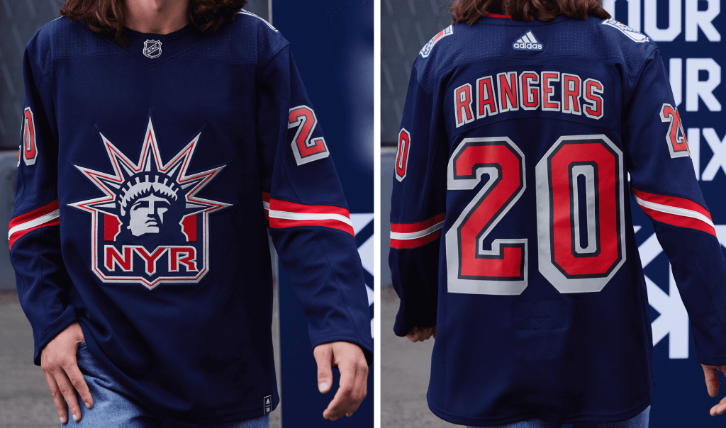
This Reverse Retro jersey marks the return of “Lady Liberty,” 24 years after her first appearance. This Rangers remix is updated with several bold details that still honor the original look, including a silver color, drop-shadow numbers, and the team’s recognizable Statue of Liberty crest. Rangers legends Wayne Gretzky, Brian Leetch, Mike Richter, Mark Messier, and Adam Graves were icons in this sweater.
Paul says: I know a lot of Rangers fans love the Liberty design, but I’ve never much cared for it. This new version is a downgrade from the original, because the white outlining on the NOB and number has been scrapped, so the typography really lacks pop. Disappointing.
———
Philadelphia Flyers
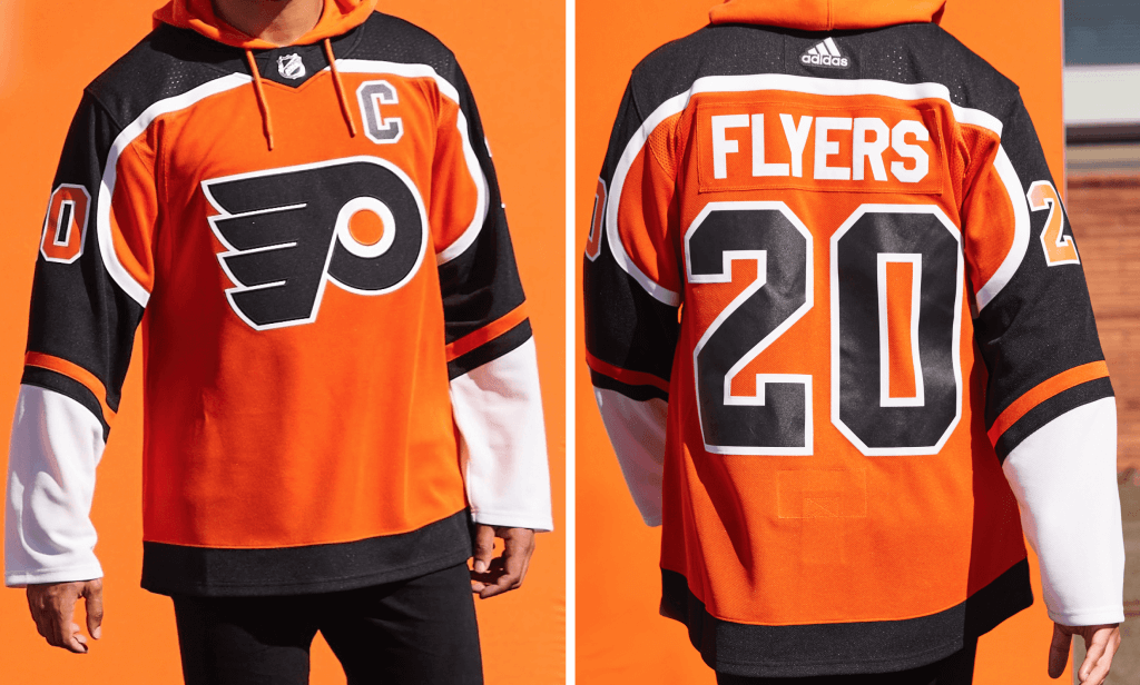
The Philadelphia Flyers Reverse Retro jersey celebrates the ’95 season that featured the dominating line of Eric Lindros, John LeClair and Mikael Renberg, a division title, and Lindros being named the league’s MVP.
Paul says: That yoke/sleeve shape looked better in the original white than in the reimagined black. And let’s face it, contrasting nameplates have now become part of the Flyers’ DNA — they should always use those.
———
Pittsburgh Penguins
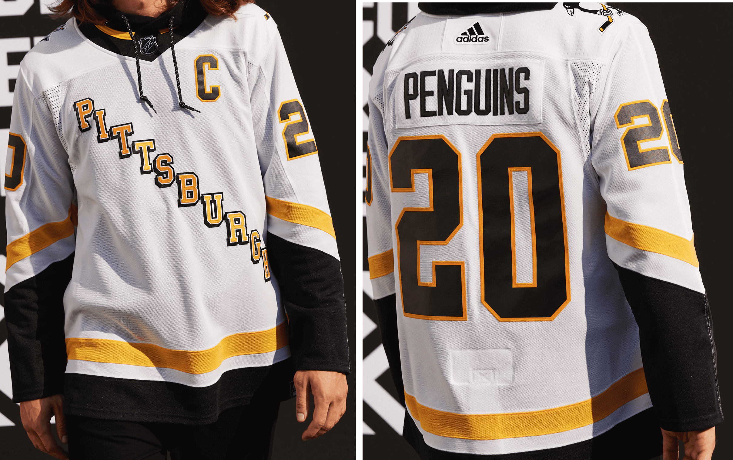
Inspiration: 1997, the last season before Mario Lemieux’s first retirement.
Mario Lemieux captured his sixth scoring title in 1997, wearing this jersey. The growing popularity of the team, and the superstars who wore it, made the Penguins jersey a fashion statement and cultural juggernaut, with notable appearances in music videos and other mediums.
Paul says: When viewed in a vacuum, this isn’t a bad-looking design. But doing a white version of this black jersey, which was itself a riff on the original Pens jersey, which in turn was a riff on the Rangers’ jerseys is like doing a photocopy of a copy of a copy of a copy — too many generations removed from the original to feel crisp or inspired.
———
Washington Capitals
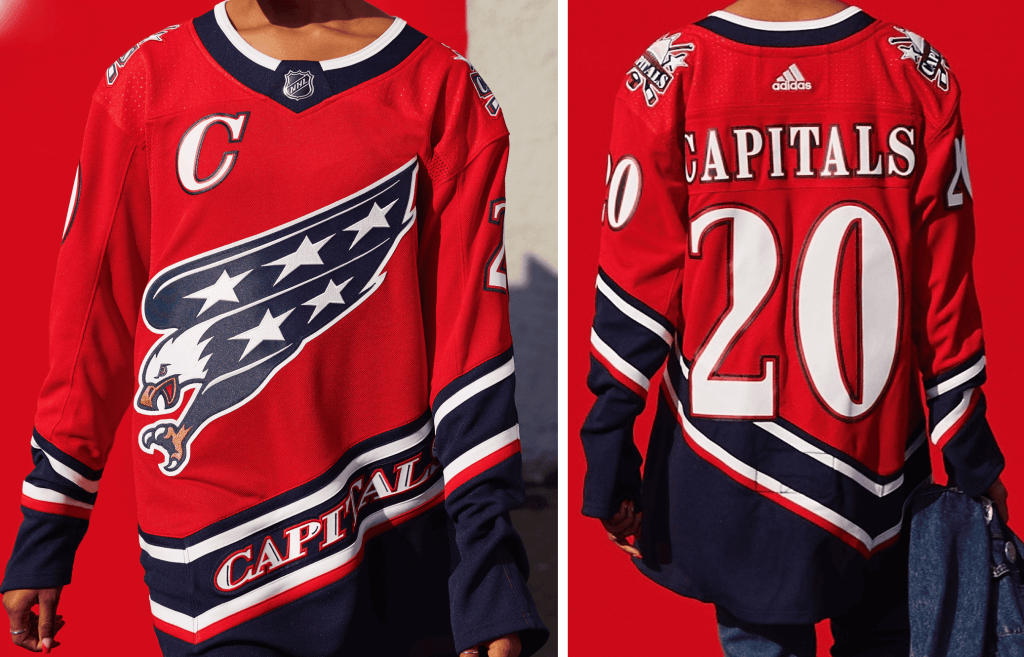
Reimagined in the patriotic colors of the flag, this iconic Reverse Retro look will remind fans of the 1997-98 Capitals team, comprised of great players Peter Bondra, Olie Kolzig and Calle Johansson. Originally part of a Capitals rebrand that included switching to a lighter shade of blue, this patriotic sweater will finally be made in current Capitals red, white and blue — perfect for Caps fans who like to Rock the Red.
Paul says: Never liked the screaming eagle, never like seeing a team name on the lower part of the jersey. Looks even worse in this garish red treatment than it did in the original color scheme.
———
CENTRAL DIVISION
Chicago Blackhawks
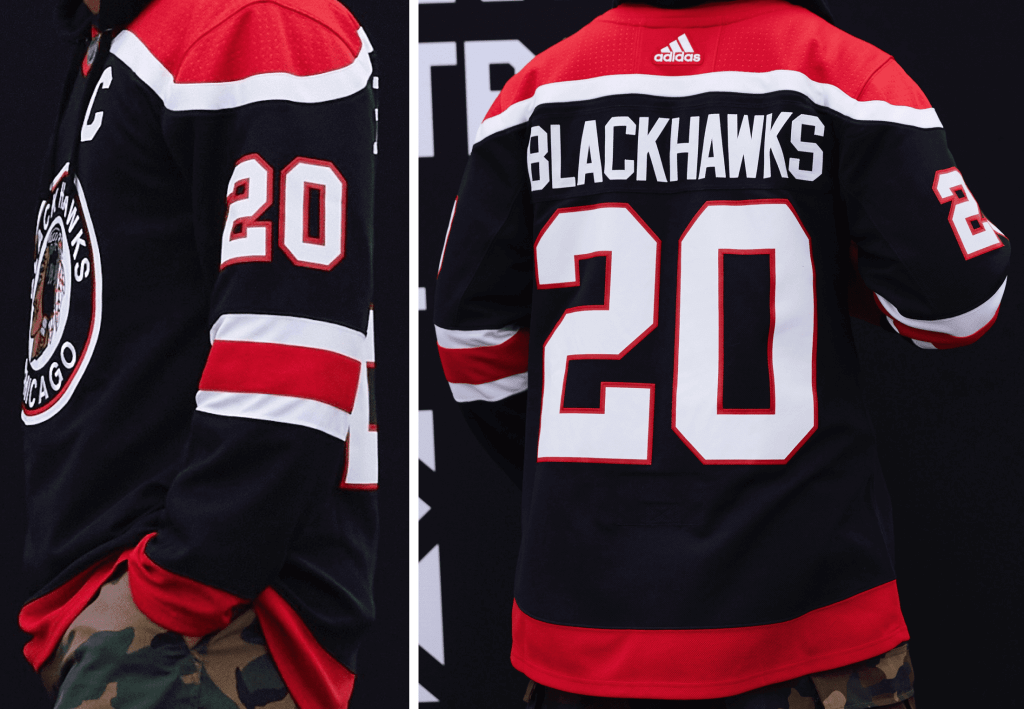
The Blackhawks Reverse Retro edition is a take on the secondary white jersey to the barber pole-striped style worn from 1937-1955. It has never been used in this colorway.
Paul says: So this is interesting: Adidas didn’t provide a full-frontal view for this one in the package of advance materials they sent me last week. I figured that was just an oversight (press materials sometimes have little glitches like that), so I asked my Adidas rep, who said he’d see if anything could be done. Never heard back after that. Fast-forward to yesterday, when the official unveiling took place and all 31 teams tweeted little promo videos of their RR jerseys. The Blackhawks’ video provides only the briefest glimpse of the front jersey view:
Crafted for the Windy City.
Introducing the #Blackhawks adidas #ReverseRetro jersey. Hitting the ice in 2021. pic.twitter.com/RQiNU5MkIL
— Chicago Blackhawks (@NHLBlackhawks) November 16, 2020
So there was no front view in the press kit and barely any front view in the promo video. That can’t just be a coincidence — seems like folks at Adidas and/or the league and/or the team are getting uncomfortable with the Native American mascot logo. Good.
———
Colorado Avalanche
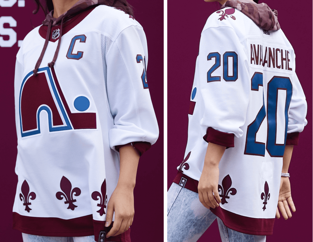
Inspiration: 1979, the inaugural NHL season of the franchise known as the Quebec Nordiques.
Features the famous Nordiques igloo logo. Rather than stripes, the hem features a unique graphic design of multiple fleur-de-lis — a nod to Quebec’s French culture. The Nordiques prided themselves as being among the most-Northern Teams and now this jersey will be worn by the team playing in the highest elevation. One of the few Reverse Retro jerseys in snowy white, a nod to the Northern Nordiques and the frosty elevation Avalanche. Worn by Hall of Famers Michel Goulet, Peter Forsberg and Joe Sakic.
Paul says: Although I’d prefer the original color scheme, anything that gets the old Nordiques logo back in circulation is A-OK with me! (My former ESPN colleague Greg Wyshynski has a good article about how this design came about.)
Also: I know some people don’t like it when a relocated franchise uses a logo from its previous city. Speaking as a Brooklynite, it’s never bothered me when the Dodgers have worn Brooklyn throwbacks, or when any other team does something similar. Throwbacks are, among other things, history lessons, and the Nordiques are part of the Avalanche’s history. But I understand why it ruffles some people’s feathers, and I think reasonable people can disagree on that point.
———
Dallas Stars
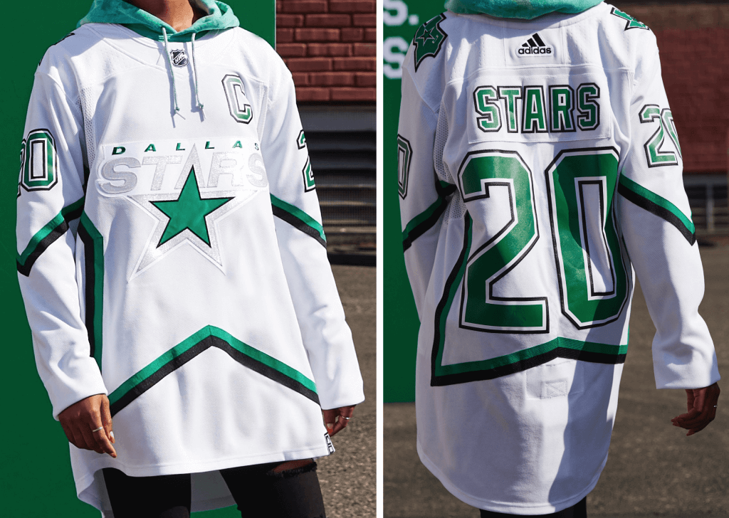
Inspiration: 1999, the year the Stars won the Stanley Cup Championship.
The stars at night are big and bright indeed! Dallas wore the original road green version of this big star jersey design in Buffalo for their iconic 1999 Stanley Cup victory, but it was never as bright as this icy all-white version. This Reverse Retro jersey brings the current Stars colors to this fan favorite that conjures up special memories of that 1999 victory.
Paul says: No matter how much you describe something as “icy,” silver on white doesn’t work. Next!
Update: This white jersey will apparently be worn with white pants and socks:
The Stars will be wearing white pants and gloves with the Reverse Retro. pic.twitter.com/cs5XNtHtME
— Matthew DeFranks (@MDeFranks) November 16, 2020
———
Minnesota Wild
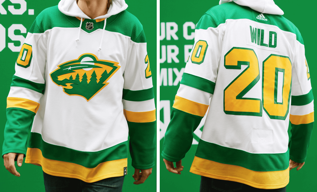
Inspiration: 1978 — unique combination of the North Stars’ 1978 jersey with the current Minnesota Wild crest.
This Reverse Retro jersey is the first time the beloved North Stars’ green and gold colorway has been worn by the Minnesota Wild, complete with era-specific drop-shadow numbers. Legends in the North Stars organization, including Mike Modano, wore these colors while playing in the Twin Cities.
Paul says: Pure genius here — it all works, and the old North Stars-style numerals really tie it all together. First-rate!
———
Nashville Predators
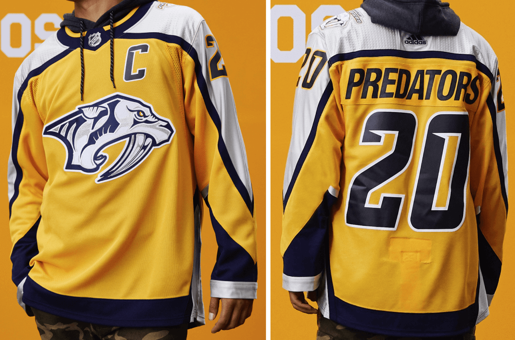
This remix revisits 1998, the Predators’ first season in the NHL. The speed nicks in the numbers, striping pattern, and crest pay homage to the original jersey, while a textured silver sleeve fabric brings a fresh twist to the design.
Paul says: Mighty similar to the team’s current home jersey. Another example of a jersey that isn’t necessarily bad but has no compelling reason to exist.
———
St. Louis Blues
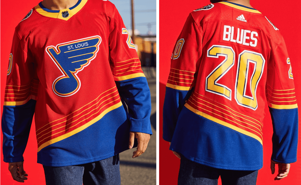
The Blues blast out the nostalgia again in this red Reverse Retro version of this classic 1995 jersey. Some of the greatest Blues sported the original uniform, such as Hall of Famers Wayne Gretzky, Grant Fuhr, Brett Hull, Al MacInnis and Chris Pronger.
Paul says: Tell you a little secret: I always loved the original white and blue versions of this template. So in theory I’m cool with this one, but in practice it makes no sense to have a red jersey for a team called the Blues! Come on, people — think!
Also: It would’ve been so much cooler if they’d found a way to revive the old trumpet-themed prototype design instead. A missed opportunity.
———
Winnipeg Jets
Inspiration: 1979, the Jets’ first year in the NHL.
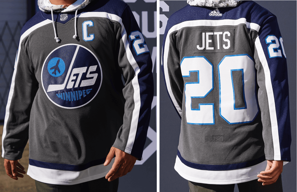
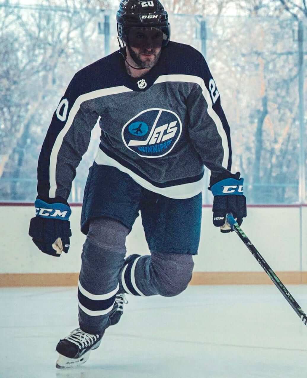
This Reverse Retro jersey combines the classic style with the team’s current colorway. A throwback to 1979, honoring the Jets’ first year in the league. This remixed design integrates the iconic heritage plane crest with the bold “Winnipeg” lettering. Remastered in fighter grey, this jersey takes the classic heritage look that the 1980s-era Jets wore, including legend Dale Hawerchuk, and gives it a modern twist.
Paul says: I’m surprised by how much I like this. The two shades of blue and the white both work really well against the charcoal base color. A sleeper hit!
Also, to their credit, the Jets posted a photo of the entire uniform, which confirms my initial thought that his design works surprisingly well:
PACIFIC DIVISION
Anaheim Ducks
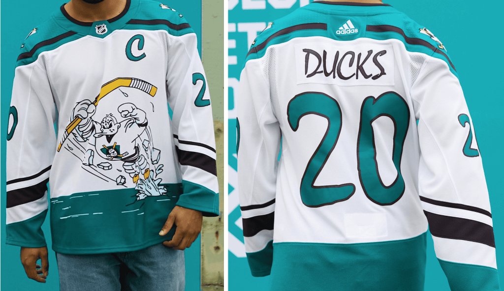
Inspriation: 1995, the Ducks’ third year and first third jersey.
Fans often refer to this jersey as “Wild Wing,” as it features the team’s mascot, Wild Wing, breaking through an ice hem stripe.
The lettering was unique to that one jersey which has not been used on an authentic jersey since. The original version continues to be one of the team’s most requested by fans at retail. It is the only Mighty Ducks jersey to feature sublimated artwork and the only jersey to feature the team’s mascot.
Paul says: Wild Wing in white — what’s not to like? A natural for the RR program. Well done.
———
Arizona Coyotes
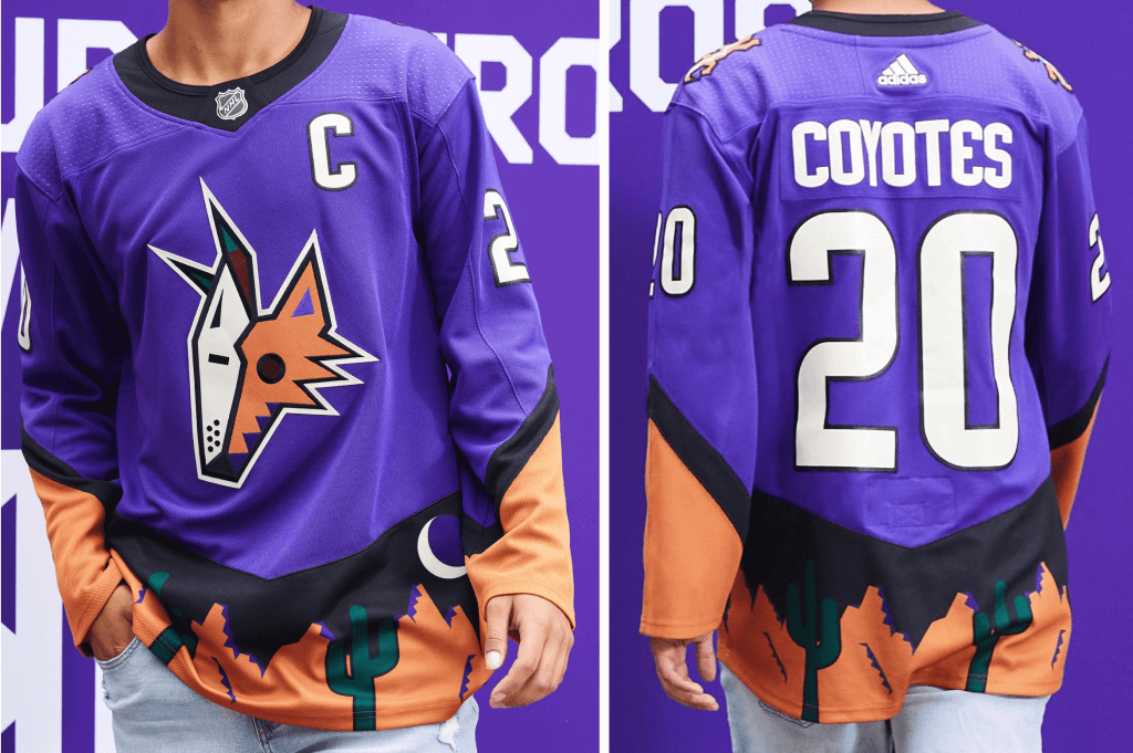
Inspiration: 1999, the Coyotes’ third year and first third jersey.
Instead of traditional striping at the hem and cuff, this Reverse Retro jersey features a graphic depiction of the desert. A unique treatment as the Coyotes brought hockey to the desert and this jersey brought the desert into the hockey rink. This jersey features hem artwork that incorporates the Coyotes’ crescent moon logo as part of the landscape and a unique lizard shoulder patch.
Paul says: Nope, nope, nope. I can deal with green accented by purple, but not the other way around. No can do.
———
Calgary Flames
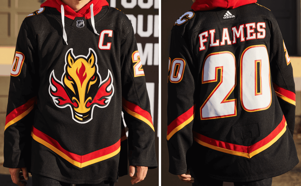
Inspiration: 1998, the Calgary Flames’ first third jersey and first time a Flames jersey did not feature the iconic “Flaming C” as the front crest.
Originally celebrated Calgary’s Western culture. The original version of this Reverse Retro jersey became the team’s home jersey from 2000-2003.
Paul says: Forgive me if I’m missing something, but what exactly is the color-swapped aspect of this one? It’s nearly a straight throwback. All retro, no reverse.
———
Edmonton Oilers
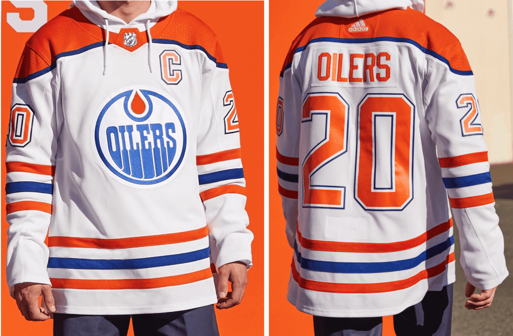
Inspiration: 1979, the Oilers’ inaugural season in the NHL.
The debut jersey of The Great One, Wayne Gretzky. The first time the Oilers have ever worn an orange yoke on a white jersey. This Reverse Retro jersey features the vintage colors worn in 1979 and previous classic Oilers jerseys.
Paul says: As mentioned in the press notes, they’ve swapped the usual blue yoke for orange. Ditto for the NOB and number colors, plus they’ve also inverted the sequence of the sleeve and belly stripes. All of which is fine, but maybe they should’ve gone all the way and inverted the crest colors as well, no?
———
Los Angeles Kings
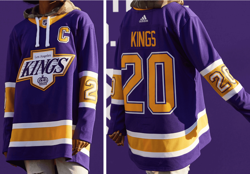
Inspiration: 1989, the year that Wayne Gretzky became the NHL’s all-time leading scorer.
This Reverse Retro Jersey features the team’s beloved crest, an homage to the ’90s era of LA Kings hockey. The throwback look is combined with the founding LA Kings Forum Blue and Gold colors, a tribute to the team’s original uniforms in the ’60s and ’70s while also highlighting a favorite color combination of Los Angeles sports fans.
Paul says: That crest will never look good in any color combo, but it really falls flat against the bold purple and yellow. More importantly, why didn’t they do something with the Burger King design?! Come on, people, that should’ve been a lay-up!
———
San Jose Sharks
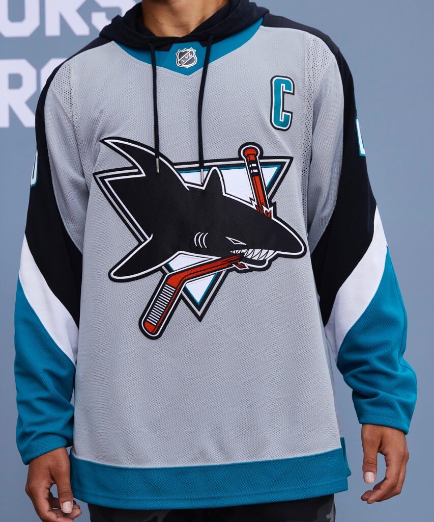
The Sharks’ first third jersey circles around to take another bite in this Reverse Retro jersey. Sharks’ recognizable crest, combined with sleeve numbers and point accents, brings back classic vibes from the team’s 1998 season.
Paul says: I don’t usually care for grey uniforms, but this one works for me — not bad! (Sorry, they didn’t provide a rear view of this one.)
———
Vancouver Canucks
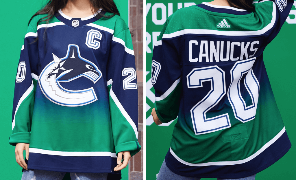
Originally red, this colorful jersey marked the beginning of an exciting new Canucks era in 2001 — and now does again in 2020 — in the team’s iconic Pacific Northwest colorway.
Paul says: Reimagining the original design’s blue-to-red gradient in the team’s current colors is amusing (and an improvement!), but this team has soooooo many interesting chapters in its design history — the stick-in-rink logo, the flying V, the neon skate — so it’s disappointing that they decided to riff on the orca instead of one of those other themes.
———
Vegas Golden Knights
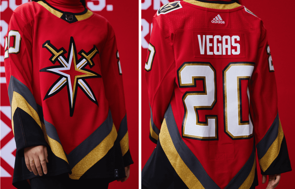
Inspiration: 1995 — pays homage to Las Vegas Hockey history.
Inspired by the pioneers of hockey in the desert, the Golden Knights Reverse Retro jersey pays homage to the teams and players that paved the way in Vegas while breaking new ground for the Knights.
The red color and stripe pattern derived from the past pro hockey franchises within the Las Vegas area and their players. … This will be the first time Vegas wears completely new stripes, not just recolored versions of their existing striping. It will be the first time they wear a red jersey and it will be the first time their beloved secondary mark appears as a jersey crest. It is a tribute to the pioneers of the past in a sparkling new sweater for the future. A combination that can only be seen in Vegas!
Paul says: I get that they don’t have a history to draw upon, but this feels like a minor league jersey.
———
So that’s my take. I imagine some of these will look a bit better or a bit worse once we get to see the pants, socks, and helmet colors. Here’s hoping that happens soon.
It’s not yet clear to me how often the RR uniforms will be worn for the upcoming season, or how long they’ll remain in the teams’ wardrobes. Like, will they become long-term fixtures? Will they turn over every year or two, like the NBA’s City and Statement alternates? To my knowledge, that info has not yet been been posted, so stay tuned.
(My thanks to Joey Slattery for the full-uni Jets image, and to Adidas for their assistance.)
Click to enlarge
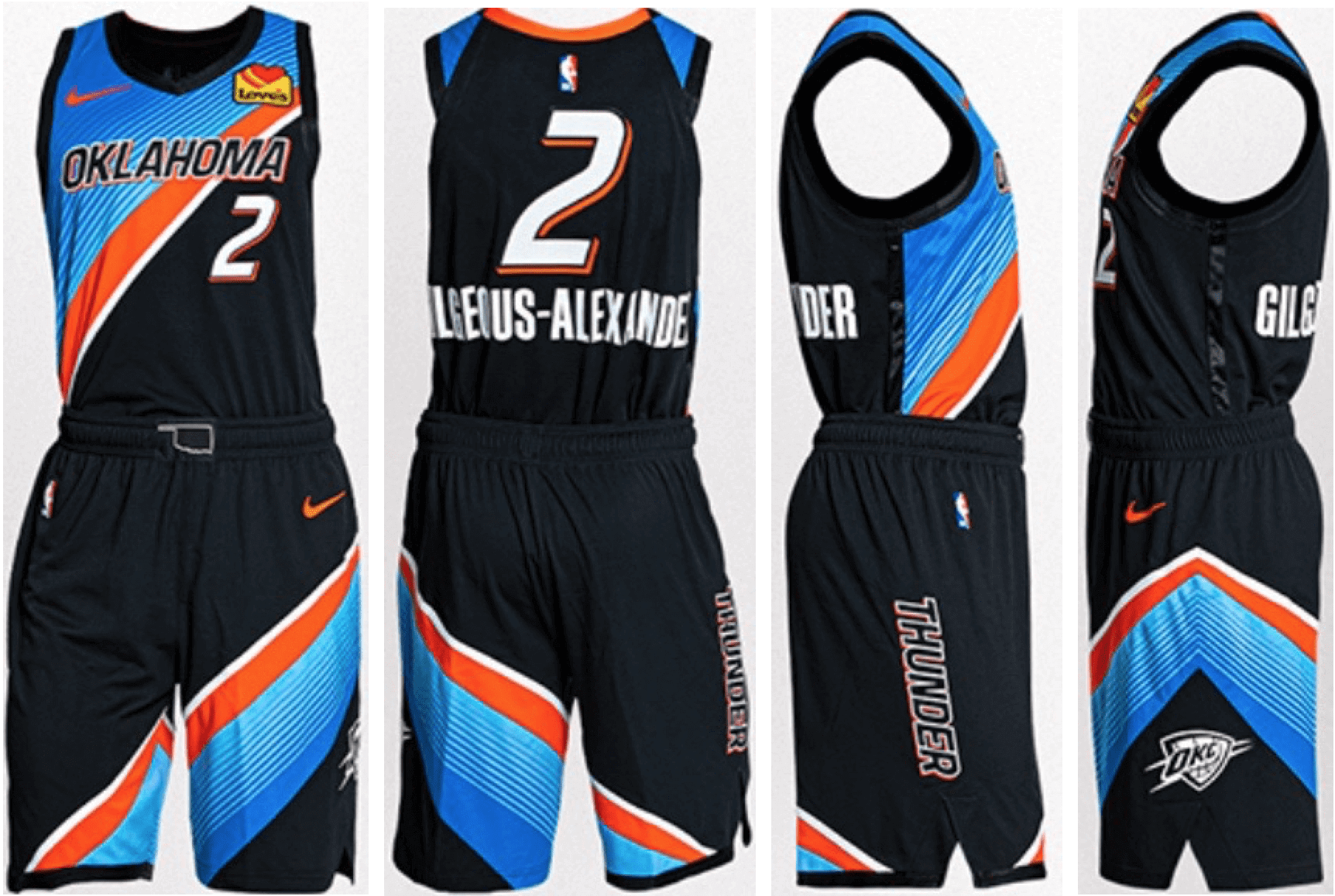
NBA update: The Thunder yesterday became the latest NBA team to unveil a new City alternate (additional photos/info here). Something about this one feels very NASCAR to me — like, I could envision that diagonal-themed design working as a car livery.
Meanwhile: Ace NBA leaker Igor Coelho (who I interviewed earlier this month) has now leaked the Celtics’ City alternate, which is based on the team’s championship banners:
🚨 VAZOU!
Este é o novo uniforme City Edition do BOSTON CELTICS.
Cores tradicionais e um layout com referências importantes para a franquia!
Ele se propõe a reproduzir os banners que representam os títulos dos Celtics e homenageou Red Auerbach com uma frase na barra da camisa. pic.twitter.com/A274MZqpNs
— Camisas da NBA (@camisasdanba) November 16, 2020
And while we’re at it, Igor also has a leak of the Heat’s new (and absurd) Miami Vice-themed alternate:
🚨 VAZOU!
Estas são as primeiras imagens da nova camisa City Edition do MIAMI HEAT.
Mais uma versão de um dos uniformes preferidos do público! Nesta, o rosa e o azul foram misturados para criar um efeito gradiente em toda a camisa.
O que vocês acharam? pic.twitter.com/JNfHunWBkA
— Camisas da NBA (@camisasdanba) November 15, 2020
Click to enlarge
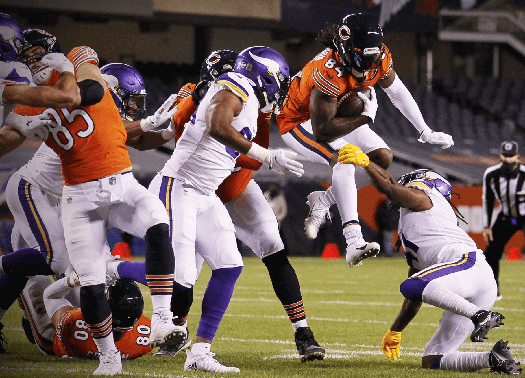
Rare sight: Last night’s Vikings/Bears game was uni-notable on two levels. First, the Bears wore their orange alternate jerseys for the second and final time this season. And second, the Vikings went mono-white for the first time since their 2015 season opener. In fact, according to the Gridiron Uniform Database, that 2015 game (which you may have blotted out of your mind because it also featured the 49ers going BFBS) was, somewhat incredibly, the only previous instance of the Vikings wearing white over white since introducing their current uni set in 2013. All of their other white-jerseyed games since then have featured the purple pants. Who’da thunk?
Click to enlarge
Collector’s Corner:
By Brinke Guthrie
Follow @brinkeguthrie
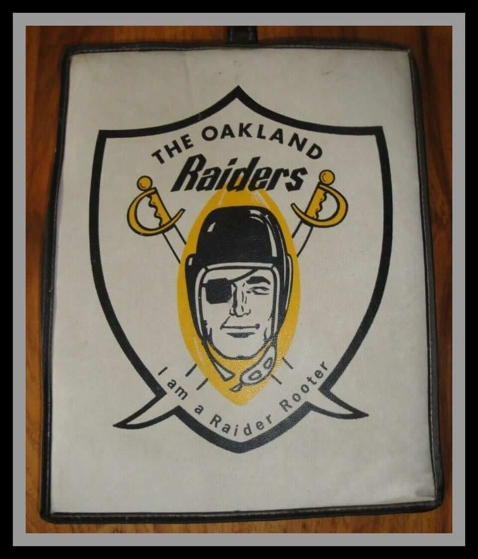
Just bid, baby. Here we have a 1960 Oakland Rayduhz seat cushion, so you too can be a “Raider Rooter.” (As opposed to, say, a “Roto Rooter.”) Note their original logo included the yellow.
Now for the rest of this week’s picks:
• Got a few products this week that were endorsed by the pros! Let’s start off with this 1986 Dodgers toothbrush and toothbrush holder, endorsed by Dave Winfield (who never played for the Dodgers, but whatever). The brush is shaped like a Louisville Slugger baseball bat.
• The late great Lou Brock of the St. Louis Baseball Cardinals came up with what has to be a unique item in the history of athlete endorsements: Ladies and gents, the Brockabrella.
• Niners great Joe Montana put his (replica) signature on this Nerf-like foam football from Bay Area department store chain Mervyn’s California.
• From the 1960s: Bobby Hull says, “Keep your skates razor sharp with the Bobby Hull Skate Sharpener!
• Take it from Mickey Mantle: The Dynasonic car alarm is total protection for your car and its contents! It’s “The Deluxe Electronic Protect-O-Matic Synchro Multi-Phase Auto Alarm System.” I have no idea what that means.
• The late Thurman Munson endorsed this regulation baseball-size Wiffle Ball.
• Okay, moving on from the endorsement scene, take a look at these 1940s Wilson high-top basketball shoes. A far cry from today’s sleek high-tech Nikes, right? (Notice the Wilson logo — still the same after all these years.)
• Check out this great-looking 1950s Montreal Canadiens “wool jersey.”
• The always-crazed-looking Pat Patriot graced the side of this “All-Star Sports Bag.”
• Be a part of the Monday Night Football crew with this ESPN/MNF cap.
• With cold weather here, check out this page of MLB blankets made by Biederlack. I have one of their blankets from 1982 and it’s excellent quality!
• And from reader Will Scheibler, check out this late-1990s NBA sleeping bag! Okay, so the jerseys shown on the sleeping bag aren’t exactly the same ones that the teams wore, but it’s still pretty great!
Got an item to include on Collector’s Corner? Tweet submissions to @brinkeguthrie
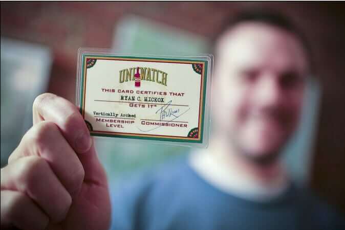

ITEM! Yet another membership raffle: Reader Chris Pedersen has generously purchased two Uni Watch memberships for me to raffle off, so that’s what we’re going to do today.
This will be a one-day raffle. No entry restrictions. To enter, send an email to the raffle address by 8pm Eastern tonight. One entry per person. I’ll announce the two winners tomorrow. Big thanks to Chris for doing this!
Meanwhile, the two winners of yesterday’s membership raffle are Jonah Reyes and Steve Cecil. Congrats to them, and big thanks to reader David Staples for sponsoring that one.
By Alex Hider

Baseball News: Mo Gaba was a young man from the Baltimore area who had several bouts with cancer. He also became a local celebrity by often calling into local sports radio talk shows. Gaba died in June, and the Orioles are planning to honor him with his own talking bobblehead next season (from Matt Rashfordb). … An Astros fan turned a chicken coop into a replica of the Astrodome (from Timmy Donahue).

Pro Football News: Vikings WR Adam Thielen wore Alex Trebek tribute cleats during pregame activities last night (thanks to all who shared). … According to the The Green Bay Press-Gazette, the Packers will not be adding memorial decals for former RB Paul Hornung and former CB Herb Adderley. Though both were Hall of Famers, the team typically wears memorial decals to honor Hall of Famers whose numbers have been retired by the team — though they are bending those rules to honor Hall-of-Famer Willie Davis with a No. 87 memorial this season (from Jeff Ash). … The Panthers Uniform Tracker has been updated. … “Can’t unsee it” find by David Pasquini, who notes that if look hard enough, you can make out a guy on a bicycle within the facemask of the Browns’ logo. … The Toronto Argonauts have a new logo — an updated version of their classic boat/football logo (thanks to all who shared).
College Football News: Louisville will be wearing throwbacks on Saturday (from ACC Tracker). … Eastern Kentucky and Western Carolina are facing off this weekend in a game dubbed the “Opportunity Bowl,” which is being played in honor of Dr. Sheila Pressley, a WCU grad and EKU faculty member who died in January. Teams will wear a patch with the game’s logo (from Robert Sampson). … FIU punter Tommy Heatherly has been wearing striped leg sleeves — leg warmers? — in recent games (from David E.).

Hockey News: Republicans in the Florida House of Reprentatives celebrated winning the majority in the chamber with a commemorative hockey sweater featuring an elephant crest (from @NoelBlahab). … One of the caddies at The Masters wore a Stars shirt under his jumpsuit over the weekend (from Trevor Williams).

Basketball News: The Suns traded resident cowboy and SF Kelly Oubre to acquire PG Chris Paul yesterday, meaning Oubre will never wear the team’s new city uniforms on the court despite modeling them in promotional materials (from Rocky De La Rosa). … Speaking of the Suns, their arena is currently without a name after Talking Stick Resort chose not to extend its naming rights deal (from Adam Vitcavage).

Soccer News: Austin FC, which will begin play in MLS in 2021, is slated to unveil their new uniforms tomorrow (from David Wiechmann). … A caddy at The Masters this weekend was wearing a Leeds United shirt under his jumper (from @texastrevor).

Grab Bag: This New York Times piece explores the wearable tech pieces that pro and college sports teams are employing to try and prevent the spread of Covid-19 (from Tom Turner). … Apparel company Mitchell & Ness is working with Sports Illustrated on a line of T-shirts based on the magazine’s classic cover designs (also from Tom Turner). … This feature explores the work of James Niehues — the artist known for his hand-painted ski slope maps (from Michael Sullivan). … The rest of these are from Kary Klismet: The Supercars Championship, an Australian touring car racing circuit, has a new logo … Ralph Lauren has signed a deal to become the exclusive outfitter for the Australian Open. … The Cowichan Valley School District in British Columbia has a new logo designed by a Native American artist and featuring symbolism significant to the local Cowichan Tribes.

Is there a reason all the ticker items are “centered” instead of flush to the left?
(Seen on mobile device)
I am 75% disliking most of RR jerseys as most of the look like practice jerseys (like NYR especially.
Coding error. Will fix!
Believe you meant “ESPN colleague” and not “ESPN college.”
When it works, this NHL experiment really works and when it doesn’t (CBJ I’m looking at you), it really misses the mark. Love the Winnipeg and Montreal sweaters and hope they stick around.
As for the Chicago Blackhawks, if you’re too ashamed to show the front of your sweater featuring your longtime logo, maybe it’s time you change it. This is coming from a die hard Cleveland Indians fan too.
Damn auto-correct. Fixed!
You see the logo prominently enough on the team-controlled social media platforms, in both the current and throwback designs.
The team isn’t embarrassed about the logo (see their social media). It’s adidas.
Since the Wild play in St. Paul, they should have gone with the blue, while and yellow of the WHA Minnesota Fighting Saints that used to play in St. Paul back in the 70’s. That smirking kid with the broken halo was, and still is, one of the best logos ever
Amen.
Version of the Logo still in use. Junior A AJHL Spruce Grove Saints used it.
link
That is an awesome idea. I still like the Wild RR North Stars cross over. A Fighting Saints Wild uniform would be nice. Do the St. Paul Saint baseball team own the rights to the Fighting Saints logo and merch now? I have a Fighting Saints cap, but I had to buy it through the baseball team’s website. Also, I have seen some Fighting Saints gear at Goldy’s Locker Room at the mega mall.
The old Dubuque USHL team used the skating saint logo, and the College of St. Scholastica in Duluth (d3) still does
Bring back the clear rink boards while you’re at it.
“ [I]t’s never bothered me when the Dodgers have worn Brooklyn throwbacks, or when any other team does something similar.”
The fact that the Dodgers are still the Dodgers definitely helps such as it does for the San Francisco Giants or Arizona Cardinals. But I can see how a fan from Hartford or Quebec may feel a little upset when they experience ownership moving their team and burying the old name and colors only to trot them out every now and again to sell merchandise.
It does feel a little bit like a slap in the face.
And FWIW, I don’t particularly love it when the Dodgers try to market themselves using the city they abandoned.
Yeah, if the Ravens ever tried to wear brown and orange, I’d be grabbing my torch and my pitchfork. I think any Ravens fan of sound mind would understand, and I think that organization probably knows better.
Of course, those are two separate franchises, so nobody in the Ravens’ offices would even try to do that. ;)
As a Wild fan I really wish we would have been able to use the North Stars logo, but unfortunately Dallas kept the name when they moved. While I love that the Wild are able to use the colors for the RR uniform, it just doesn’t feel right without the logo too.
I think Dallas really whiffed on the opportunity to change their name when they moved from MN. If MLB can have both the Red Sox and White Sox, and if the NFL can have both the Broncos and the Colts (and the Raiders and Buccaneers), why can’t the NHL have the North Stars…and the Lone Stars?
The “Lone Stars”? The Spaceballs movie ruined any chance of that. Plus, hockey is a team game, and the “Lone Stars” might appear to promote selfish play. Might as well just call them the “Lone Rangers”.
“Well, there’s three of you. You’re not exactly lone. Shouldn’t you be the Three Rangers?”
I have always thought a North Stars/Lone Stars comprise was ideal, also. I guess I get the criticism that ‘Lone’ in the team name implies singular, but technically, isn’t the North Star (Polaris) singular as well? It doesn’t hurt that I think “Wild” is one of these hands-down worst team names in U.S. sports, while North Stars was near perfect.
NO. Stop with the lone stars already. No Stars fan wants that. It sounds corny.
Now if Minnesota wanted to be the North Stars, I wouldn’t have a problem with it, but we are the Stars. The CFL used to have 2 Rough Riders. Why not have two stars? MLB has two sox. The SEC has several Tigers.
The North Stars’ logo was the first hockey logo I really loved when I was a kid. Agree it would have been better to leave it for the next Minnesota team to use.
One *Literally* needs to add only one stroke to the “N & arrow w/star* to make it a “W & arrow w/star”… and there’s your new Wild logo.
As a native Atlanta, I’m a bit torn. On the one hand, seeing Calgary or Winnipeg wearing a throwback to the Atlanta days might well inspire a bit of a tragic twinge. On the other hand, is it any better that those teams’ Atlanta days, and the years that Atlanta had an NHL team, go now & forever unacknowledged on the rink? Somehow that feels almost worse, in a way.
Long story short, I’m not sure there’s any way that losing a team can be salved or tiptoed around for the fans. Or that the departed team can ever adequately make nice with the city it left.
*Atlantan, blast it.
Paul, I now see that you addressed this very issue later in the column. This will indeed be a place that two reasonable people can agree to disagree. I think that, when a team moves, the identity should stay with the city. I’m not going to go as far as saying that the SF Giants or LA Dodgers should change their names at this point, but I don’t like that they every took the names with them in the first place.
As a diehard Cleveland Rams fan, I completely agree with you. ;)
I’d say it gets more complicated in cases like the Athletics, Braves, Browns, etc. Those teams left precisely BECAUSE their cities couldn’t profitably support two clubs, and it was a foregone conclusion that those teams’ identities would never again be seen or used in their old cities. So, rather than erase them, it seems perfectly sound to give those identities a new lease on life elsewhere.
This is the strongest evidence yet I’ve seen that the Hawks are leaning towards maybe, eventually, possibly thinking about (having the league force them into) changing their logo.
Good.
Never going to happen. And you know that that is?
Good.
I LOVE the Chicago Blackhawks crest. LoveLoveLove it. A work of art. THAT BEING SAID, I realize it is not 1979 any more. Just like kids don’t play with cap pistols, and you can’t build a model of the General Lee. Accept that an emphasis on humanity and fairness has swept like a wave over our way of life. And be grateful we got to see these things in our youth.
Well said.
Kids can (and should) continue to do all these things.
I think the Maple Leafs get a pass, if only because that version of the leaf is link. Putting that beauty back on the ice is a good thing.
I agree about that logo. The 1967-70 uniform set is my favourite Leaf’s look. But I hate that they paired it with their 1970-92 jersey design, my least favourite look of theirs.
No love for the Cleveland Barons (Stars…who could have allowed Columbus to use the logo in some capacity) or Seals…(again, Stars).
Pretty sure the Stars don’t own any rights to the Seals/Barons franchise identity, given that they never really recognized them as part of their history.
The “merger” was basically the Gunds buying the North Stars, the team getting some of the Barons’ players, and the team only switched divisions so the league wouldn’t have two five-team divisions and one three-team division. The Seals/Barons franchise effectively ended with that transaction. Anyway, it would most likely be up to the NHL.
As for the Seals, I’d argue a much stronger case for the Sharks to be the team to pay homage, as the Gunds were the linking factor between the two franchises (being part owners with Mel Swig in the Golden Seals’ final seasons in Oakland, and being the original owners of the Sharks, having sold the North Stars to acquire the new franchise).
A look at the process for the Sabres:
link
The Whalers jersey seems like it will look better once they put it through the wash.
Wayne Gretzky is an all-time great Oiler. I can even live with the Kings. But the Rangers? Not so much. And the Blues? Absolutely not.
Thanks for that Sabres article, Jerry — I’ll add that to the text.
Great write up Paul! For the most part I think this RR program was well executed, especially in comparison to what the NBA has been doing. Only a few stinkers in the group for me (Jets, Leafs, Blues), a couple uninspired efforts (Islanders and Redwings), but a lot of good. As a Rangers fan I’m very happy to see the Liberties back, though fan reaction seems to be mixed to this particular iteration. Hopefully they don’t follow in the NBAs footsteps make this an annual program.
Re: the flames design, the only really color swap is shoulder logo being white vs red and the changing of red stripes to black. Not a big shift but love the flaming horse logo!
Interesting how the promo pictures are all people in street clothes, but they’re full-sized jerseys with the huge tails. I’ve been assuming that they want to sell these as fashion pieces (the retro/80s-90s/so-bad-its-good thing is hot) but I didn’t think about the potential clash between that goal and selling “real” sweaters.
As a very-long-time Bruins fan, I like the yellow jersey as the team wore yellow in the late 1950s and early 1960s when I started following them. Putting it on my Christmas wish list!
I hope the Avalanche and Carolina play a game in these jerseys, throwing back to a Quebec Nordiques vs New England Whalers WHA matchup.
“…throwing back to a Quebec Nordiques vs New England Whalers WHA matchup.”
Sorry, but as great-looking as that may be(I love the fact that the Avalanche have chosen to remove the Nordiques logo from their vault to once again be showcased in a game), it won’t be a ‘true’ WHA matchup since the Whalers didn’t use the HW logo until they joined the NHL.
Re: Mitchell & Ness and Sports Illustrated tshirts, looks like it’s NFL-only at this point. Hopefully they expand to baseball, link.
I thought for sure with the beauty of covers to choose from and a company so dedicated to celebrating the aesthetics of sports history, Mitchell & Ness, these would be gorgeous. They are not. They are dreadful. Look like something you’d get made at the mall.
Somebody’s going to have to help me out with that Browns logo/guy on bike thing from the Ticker. I’m not seeing it.
I was hoping someone else would ask.
Ditto.
Here, try this instead:
link
Got it. Thanks.
Still don’t see it. This seems like trying to map an image of Orion onto the constellation. Do you know if anyone has traced out what you’re talking about?
Somebody help me out with the “guy on a bicycle” in the Browns logo. That guy can’t “unsee” it….I can’t SEE it!
Here, try this instead:
link
More notable in that image is that the down and distance is shown as “0th and 4”!
I’m sure it’s just a typo, but the Bruins Stanley Cup appearances from that era were 1988 and 1990, not 1999.
Great write up on the RR uniforms…regarding the Flames jersey, the old uniform had red on the bottom of the jersey and ends of the sleeves. That’s been swapped to black.
I feel like the presentation of the Blackhawks jersey could use an article on its own. Did they think no one would notice that the angle completely obscures the logo, and is different from all the other jerseys? Have they heard of the Streisand Effect? Do you think it’ll hit the ice?
Also, one quibble for the grab bag: Cowichan Valley is in B.C., not Washington.
I posted a brief Twitter thread about the Reverse Retro designs, but my conclusions are basically the same as yours. The Bruins, Ducks and Wild all hit it out of the park, but four of the Original Six are in the bottom 10, and three in the bottom five, because they simply don’t work and feel needlessly shoehorned into this promotion. Reminds me of when the NFL was forcing everyone into Color Rush.
link
I might be the only person in the world who hates the Wild Wing design. I absolutely love the Wild’s RR though, great job with that one! I think the Penguins missed a chance to bring back a powdered blue jersey too. That diagonal PITTSBURGH would have looked terrific in white with dark blue outline and those slanted stripes.
Most Pgh fans have divorced themselves from the recent usage of light blue/navy because of their perceived bad luck; not only was their record not great in them, but a good amount of key players seemed to suffer pretty significant injuries in games while wearing either the powder or navy alts. I don’t mind the concept of a white version of the original 90s blacks, but the Penguin logo on the shoulder NEEDS NEEDS NEEDS the triangle behind him. Most fans hate the version of him without it on their current alts, and the extra splash of yellow is very much needed on a white background in this case.
No, the Wild Wing design was hated for years.
I remember players, bloggers, and fans universally hating that design and font and that (along with other errors from that era from the NHL…i.e. Burger King).
I have no idea why an adult would have any connection to this design and absurd look.
Because the kids who fell in love with it the first time are now adults haha. I’m one of them. I don’t like Wild Wing better than their original teal/eggplant look, but as far as bringing WW back…I get it. Never underestimate the power of nostalgia.
RE: Anaheim jerseys.
In the original teal design the duck was flying out of the white ice that simulated a bottom stripe, with blocks of white ice debris. In the color swapped version he is flying out of a teal sea, yet there is still white ice block debris.
Feels like they color swapped the jersey without actually paying attention to what the graphics on the jersey were. Should have color swapped the blocks and the action trail coming out of the water to also be teal.
Yeah. I kinda thought the same thing at first but then it occurred to me. He’s bursting through the ice of a frozen pond and the white background is an overcast sky.
link
Actually, the white background would probably be the snow on the un-shoveled portion of the pond.
So yeah, this recolored version works for me.
For me, the biggest miss in the recolouring of the Anaheim jersey was keeping Wild Wing in pretty much all-white on a white background. As a kid in the 90s, I loved that jersey, but always felt as though it was light on the eggplant. On the original I felt that Wild Wing should have been wearing an eggplant jersey and eggplant pads, but realised as I got older it would have lost any ‘pop’ – this white version would have been the perfect opportunity to rectify that.
A few things:
Ok, I’m not a huge hockey fan (although I do watch it from time to time and I appreciate the sport). Is there a reason many of the models wore sweatshirts under the jerseys?? Is it a “hockey thing”?? Or am I just reading too much into it??
OKC’s jersey is definitely giving me NASCAR vibes. But it did make me do research on NASCAR in Oklahoma (I’m not a huge fan of NASCAR either, but i’ve seen a race or two in my lifetime). So I’m actually liking many of the City alternatives, even though they may look nothing like what the team would usually wear. It causes me to do some research about the city to see the connection of the uni design to the city.
Authentic hockey jerseys are big to fit over pads so it’s common for fans to use it as the top layer, especially since the sport is played in winter and arenas are kept chilly.
I was thinking about the chilly arena aspect of it. I saw the Caps play live maybe 10/15 years ago and yup it was chilly in the arena. Makes sense to me
I looked at about a half-dozen of these jerseys before I realized that the hoodie laces WEREN’T part of the designs! Kinda bad presentation on their part.
The Dallas Stars will reportedly be wearing all-white uniforms for the Reverse Retro games.
link
Thanks, Wally — hadn’t seen that. Will add it to today’s post!
Oh No! I’m never a fan of white pants. Would have looked better if they chose green pants.
I don’t understand why the Leafs sweater has a lower case “n” in Toronto. It makes it look like it is a typo.
That’s the nature of the font, which is Futura Display.
I’m a Jets fan but that uniform is just about the most ridiculous thing I’ve ever seen in the Jets’ vestiary. The charcoal base colour and the apparent texture of the uniform reminds me of pajamas or one of those Comfys with a false-coloured logo slapped on the front.
Vestiary!!
I think it’s worth noting with the RR jerseys that Adidas has opened the doors to less conservative templates. It’s nice to see the sleeves on the Leafs and Jets make a return.
I think the Jets missed an opportunity throw back to the Thrashers jersey with the mismatched sleeves with ATLANTA on the sleeve. Could have done that style with WINNIPEG on the sleeve.
Top 5- Avs, Kings, Wild, Jets, Bruins
Detroit was a mess- Id like to see them do something standalone with either the wing or the wheel.
Toronto was OK, but they ought to do something based on the old center ice logo from Maple Leaf Garden in the 60s and 70s
I think the Devils should be in the top 5. Colors are great and it has a nice retro look to it.
Logo is too low on the Devils jersey. It needs to be a few inches higher.
The Stars took an awesome jersey design – one we never thought we’d see on a modern template – and managed to make it suck. I mean, WOW that just looks way too bright. And I’m with Paul – the silver-on-white makes half the old logo disappear.
And the Red Wings… Extremely disappointed in my hometown team. Granted, there weren’t a LOT of possibilities… but, maybe a red version of the 2009 Winter Classic jersey? A white version of the 2014 jersey? A red version of the 1927-28 throwback they wore in the 1991-92 season? Or just go with red stripes instead of gray and say you’re paying homage to the late, great, Production Line, and maybe make the jersey a silver base if you really, really, REALLY need that “reverse” crap.
Dallas Stars is the former star quarterback in high school, now 100 pounds overweight at the reunion but insisting on wearing his letter jacket. The star collapsed around the back!
granted im not much of a hockey person (yet) and I don’t fully understand a team’s history, but the Devils uniform looks like a reverse candy cane. Struggling to understand the concept of Devils=Candy Cane
Well, the original retro jersey is known as “The Christmas Tree Jersey”, so your thoughts are no surprise. It doesn’t change the fact that the colors go great with each other.
Devils uniforms were originally red with green and white when the franchise moved to New Jersey in the early 80’s:
link
If you want a connection, I’ll give it a go ;)
Devils -> Satan -> Santa -> Christmas -> Candy Cane
Reverse Retro!
Let’s get my homer-ism out of the way, the Canadiens jersey could have been so much worse, and it’s not bad!
Some of my favorites: Bruins (I like yellow and it’s a crisp look), Canucks (crazy idea, but kind of fun!), Capitals (this is probably the most natural candidate), Sabres (it was a fun early 2000 jersey, and I like it in the traditional colors), Sharks (love that template!)
Some tweak candidates: Golden Knights (I would have made the jersey black, keeping red within just one stripe to be consistent with the other jerseys), Lightning (this is not bad, but I would have taken the modern logos on the old black templates with white shoulder yoke), Kings (give me double layer numbers instead of triple, and then either turn the sleeve numbers purple in the yellow sleeve band, or take the sleeve numbers out of the yellow band, then it’s perfect), Maple Leafs (same color number as jersey with only an outline should be forbidden), Senators (give me white numbers and call it a day)
Some bonfire candidates: Blackhawks (in 20 years, this will look like a Wal Mart exclusive…like it vaguely looks like other Blackhawks jerseys but still somehow dumbed down), Blue Jackets (your name is blue, so don’t wear red), Blues (same but it looks even worse), Red Wings (what the fuck is this, a consolation prize for playing a Centennial Classic?)
My most pleasant surprises: Predators (I loved that font, welcome back, and also the white shoulders make the jersey “less yellow” but still keeps the Predators as the yellow team they say they are), Devils (never thought they’d do that, but it rocks!), Coyotes (same…I’m from Louisiana so I can’t and don’t hate purple like Paul does)
My biggest underwhelms: Rangers (maybe it will look better with the red breezes in action), Flames (the originals had more red which is key…these could be new flying skate Canucks templates if I didn’t know better), Islanders (I said my piece yesterday), Jets (I wish this could be light blue with navy arms, and that the script wordmark jersey could be gray instead of this one)
I don’t think I’m saying anything new, but the RR jerseys are a total grab bag of “this should be their regular jersey” (devils, habs…), “isn’t this their regular jersey?” (Bruins, panthers…), and “what were they thinking?” (Ducks, stars…). Lots more teams in each of those categories but I won’t run on. The wild stand out as the jersey that looks different and good at the same time.
The Habs sweater is a throwback to ’76 according to the jersey tag but the ’76 sweater had the TV numbers inside the sleeve stripe but this one doesn’t. Not sure why they made that choice. The numbers in the stripe is one of the biggest differences between the ’76 sweater and the current one.
It reminds me of the Habs calling their then-current white jersey a 1971 throwback, when a) they still had lace-up collars in 1971 and the Edge jersey was a white Reebok V-neck trimmed in blue, and b) the 1971 unis used thick blue block numbers outlined in red, while the Edge unis had the number font used since the 1980s, but with white between the blue and red (introduced in 1997 along with the rounded-letter NOB font). And, of course, these blue jerseys use the same modern fonts (just the two-color version with the slightly thicker white numbers as used on the red jerseys).
My biggest comment is there’s too much grey in the throwbacks. I get that now 4 years after the wide use of neon yellows/greens, we’re now using different shades of grey in much the same way.
Watch any home improvement show…they’ll tell you grey is the current color you should use. Which to me is lazy.
As I grew up in LA, I always loved the Forum Blue and Gold unis of the Kings/Lakers (used to listen to them on the radio and be fascniated how the announcer said “Rogatien Vachon”, his full name, when he made a spectacular save). I agree the Kings logo of the 90’s set on the beautiful Forum blue and gold is a cop out.
I think it’s absurd and insulting for teams to use iconography from cities they’ve abandoned, but that aside, it strikes me odd how inconsistent the league, adidas, and teams were in using “franchise” vs. “location” in creating these designs. So Winnipeg (rightfully imho) ignores Atlanta because the team had nothing to do with Winnipeg while playing in Atlanta, but Colorado reverts to Quebec instead of pulling something from the Colorado Rockies for their reverse retro. It’s not like they would even need to get the rights to the Rockies logo from the Devils (assuming they kept the Scouts/Rockies trademarks or whatever), they could just do their current logo on a reversed Rockies template like the Wild did with the North Stars. Seems like (surprise! But not really) getting those old logos that they feel they could sell the most merch with was the primary motivator for these.
Teams don’t need to get the rights from other teams when in the same North American leagues. They’re set up to do that automatically.
Not sure what you mean by teams ‘set up to do that automatically’ but the Avalanche would absolutely need to get the rights to any team marks that New Jersey kept and renewed from the Colorado Rockies. They wouldn’t have to if they went the approach that the Wild went- I’m assuming the Wild didn’t use the North Stars logo because Dallas held on to it post-move.
I having trouble understanding this statement – can you clarify/provide an example?
I don’t have any real strong feelings about teams using old identities (like the Hurricanes/Whalers), but there’s something offputting about the Nordiques. I think it’s how hyper regional the name and logos are. The name is obviously French, the fleur-de-lis logo has strong French connotations, and even the main igloo logo is pure 70’s Canadian design aesthetic.
Gotta admit, it looks REAL good in those colors, though.
“The name is obviously French…”
Isn’t avalanche a French word as well?
; )
Late 18th century: from French, alteration of the Alpine dialect word lavanche (of unknown origin), influenced by avaler ‘descend’; compare with Italian valanga .
Lee
I have many thoughts on the RR’s but a new one I just had is the NJ Devils’ crest sits too low
Noticed that too. Gonna feel and look really awkward for a person of average build to walk around with a salad plate at belt level.
My rankings no one cares about:
Anaheim: F
Arizona: F
Calgary: C
Edmonton: A
Los Angeles: B
San Jose: D
Vancouver: B
Vegas: C
Carolina: B
Columbus: D
New Jersey: B
Islanders: D
Rangers: A
Philadelphia: B
Pittsburgh: B
Washington: B
Chicago: B
Colorado: A
Dallas: D
Minnesota: A
Nashville: C
St. Louis: F
Winnipeg: C
Boston: B
Buffalo: D
Detroit: F
Florida: B
Montreal: A
Ottawa: D
Tampa: B
Getting hit by a bus: B
Toronto: F
GPA 2.26 – seems fair
Ha! I hadn’t even thought of doing an average. Cheers, Neeko.
This was literally done on a snap-judgement basis. But I think that is a fair average!
I love that Bruins sweater. Not only because gold is such a bold, lively color, but because it features the best version of the “spoke” logo link.
I just don’t understand the impulse to clutter a great design with more and more pointless and ugly outlines. The classic RR logo is so much more legible without them, link or distance.
Totally agree. The 70s/80s version of the logo worn by Orr/Espo/Bourque etc is without question the best.
I’m inclined to like any team that reverses the colors of its insignia from home sweater to away sweater.
The Vegas RR is a homage to the Las Vegas Thunder, the IHL team that played there in the 90s. So the minor league feel is what they were going for.
Well, sort of. The crest is the Golden Knights’ secondary logo — *that’s* what feels minor league to me.
“Throwbacks are, among other things, history lessons, and the Nordiques are part of the Avalanche’s history. But I understand why it ruffles some people’s feathers, and I think reasonable people can disagree on that point.”
Interestingly enough, there’s long been a contingent of Avalanche fans who wear retro Quebec Nordiques sweaters to the team’s games. From conversations I’ve had and articles I’ve read, it’s meant as an acknowledgment of the team’s history and a sign of respect for the city the team left behind. I’m not sure how well the Nordiques’ old fan base would take the gesture, but from the Colorado fans’ side, it’s well-intentioned.
I have a friend from Quebec. I’ve learned never to speak to her about hockey.
The Islanders and Red Wings are such bores. Would it kill you to have an imagination?
I like the red Blue Jackets jersey, even though that’s an oxymoron. Their regular uniforms have never interested me, while this one looks straight out of the AHL or OHL, early 1990s, which is to say, the kinds of jerseys I like to collect.
Blue Canadiens jersey might be my favorite of the bunch.
Orange-yoke white Oilers jerseys last seen on cardboard hockey cards from the 1970s, very cool. Keeping the blue font on the logo is a nice offset to all the orange on the rest of the jersey.
White Gretzky-era Kings logo on the old purple jersey was a surprise that I like. Hard to believe they had not done that idea before, now that I think about it.
Red Capitals jersey. If they had not gone to bronze and black and kept their original colors when switching to the new logo in the 1990s, this might still be their regular jersey. It is not as cool as the classic 1970s-1980s look, but is miles better than what they are wearing now.
Grey Jets jersey – I kinda like it.
The rest: definitely “meh”. For the record, my favorite teams are the Rangers and Red Wings, and both teams’ best alternate jerseys have, far and away, been the TBTC jerseys from 1991-92. I do think the original Liberty jerseys were cool but, yes, this one falls flat with the grey, and the lack of red on the sleeves.
Bruins yellow looks off/too muted to me. I’m not feeling it.
Maple Leafs could’ve added a second shade of blue instead of boring grey.
This RR thing is fun to look at and read up on the comments everyone is sharing but 90% of these jerseys look like something you could find at a bargain store for $14, hard to imagine these jersey prices may be up towards $250!
“but this team has soooooo many interesting chapters in its design history — the stick-in-rink logo, the flying V, the neon skate”
I am Vancouver-based so will comment about the Canucks. Other than the looks Paul pointed out, they could also look back to the WHL days when full-bodied Johnny Canuck adorned the jersey front.
The design could be worse, but I cannot lie. I am disappointed in the Canucks’ decision.
They should have picked a different year. 2001 alternate gradient jersey was one of the worst and forgettable jerseys in team history.
Did not want to see the team in navy blue for this. Had hopes up for finally a full green jersey trimmed in royal blue.
RR allows you to go out on a limb more and is the perfect opportunity to consider putting full-bodied Johnny Canuck on the jersey from back in the old WHL days instead of wearing their usual logo on the front.
I think it would have been cool for them to do a mostly green version based on the 1996 salmon coloured jersey. Green in place of red (salmon), blue in place of black, and white in place of the yellow from that jersey. That also would have lent itself to a green, white and blue version of the flying skate logo.
Granted I’m a Flames fan, but I think the flying skate logo was Vancouver’s best.
31 new RReasons to strongly dislike the NHL…..
they did Lost Wages…so where’s the Seattle throwback?….ROFL
really, a total waste of the time & bandwidth necessary to download all the images..
Waste of bandwidth? You on dial up, bro?
Agreed that the Canucks could have gone with a more interesting design, but I do enjoy the way the green gradient creates a northern lights look.
Cowichan Valley School District is in Canada and
the abbreviation for Washington state is WA.
Fixed.
Why does it “makes no sense to have a red jersey for a team called the Blues”, but no mention of the Columbus Blue Jackets wearing red?
Yeah, that doesn’t make much sense either.
Or the Golden Knights wearing red? I know, they already have a gold alternate.
As a long-time fan of the Whalers and especially the Nordiques, it does warm my heart to see those logos appear in the NHL again, albeit under less then desirable circumstances. From what I’ve seen this appears to be tasteful, so hopefully it won’t go the route similar to when the Nationals wore Expos road uniforms recently.
I’m for BFBS on alternate Red Wings and Maple Leafs sweaters simply because white is foisted on every team for imperfect reasons: Why not black?
Blue and orange should have been inverted on the Islanders’ crest. Orange and white should have been swapped on the Oilers’.
Interesting points about the throwbacks from teams that moved. I’m fortunate that I haven’t had to deal with a beloved team of mine moving but I appreciate history. I totally get why fans in Hartford and Quebec feel the salt in the wound. But I wonder how many fans in Raleigh and Denver embrace that part of history
I have a post earlier in the comments section that addresses this very point, at least from the standpoint of the Avalanche fans. Local fans remember that the region previously lost an NHL franchise when the old Colorado Rockies moved to New Jersey to become the Devils. I think there was some ambivalence among the fans when the Nordiques relocated to Denver – not least of which was the ownership’s link, but also because a collective sense of empathy for what the Quebec fans were going through. (I know I felt that way, at least.) However, I think the general consensus was that if the team was going to move, fans in Colorado would rather be the beneficiary of the relocation rather than not have a team at all. Maybe the fans who wear Nordiques jersey are trying to demonstrate some sense of appreciation for the team’s former identity, knowing what it was like to lose a previous team themselves.
Remember, the Rockies used to be the Kansas City Scouts. So why didn’t the Devils honor that part of their history?