For all photos, click to enlarge
Good morning, and greetings from Uni Watch HQ, where all three inhabitants continue to be safe and healthy (and where one inhabitant no longer has fleas, I’m happy to report).
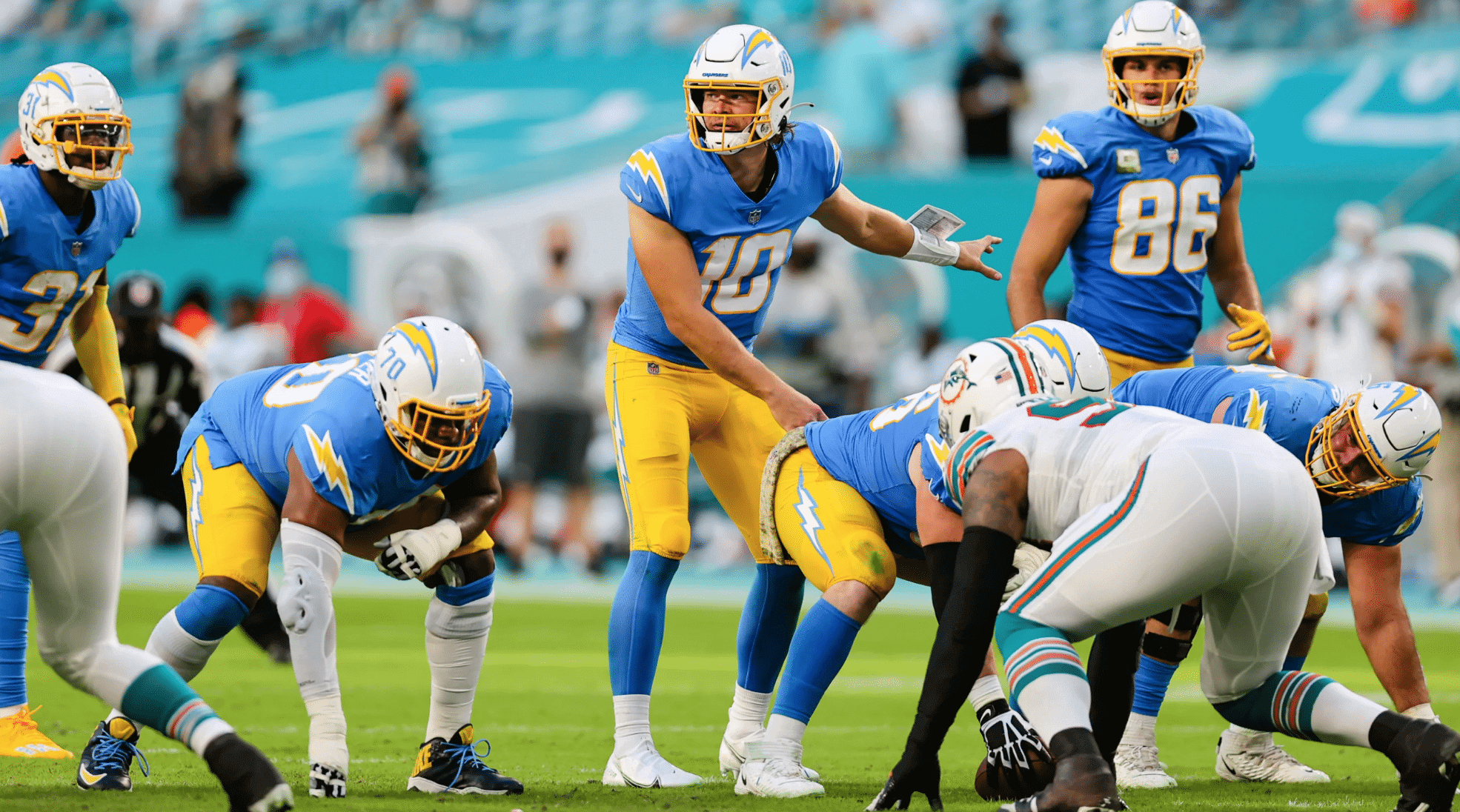
Now then: A feast for the eyes yesterday in Miami, as the Chargers (finally!) wore their powder blue jerseys over their yellow pants for the first time this season, while the Dolphins wore their white throwbacks at home. Here’s some footage showing how it looked in action:
Already know @mikegesicki getting hype for his boy Durham 🤩
📺 @NFLonCBS pic.twitter.com/9lqWG4o7lZ
— Miami Dolphins (@MiamiDolphins) November 15, 2020
Nuh uh ❌ @Iamxavienhoward
📺 @NFLonCBS pic.twitter.com/BWMSifbp6e
— Miami Dolphins (@MiamiDolphins) November 15, 2020
What a treat! Lots of additional photos here, here, and here.
In other news from around the league yesterday:
• The Packers, having already failed for several weeks to add a uniform memorial for Herb Adderley, also opted not to add one for Paul Hornung, who died last week. Very strange.
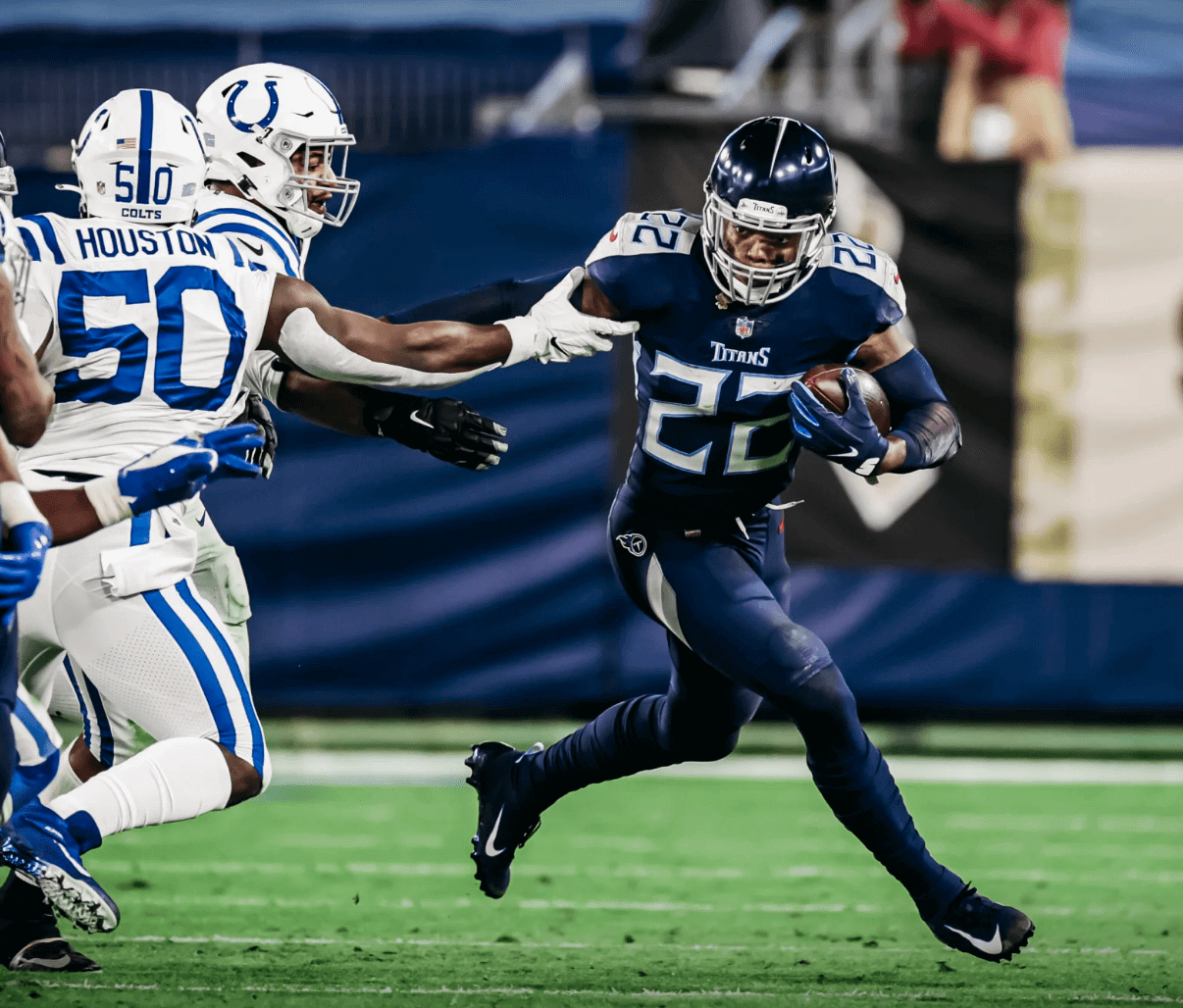
• The Titans went mono-navy:
• The Rams went blue-over-dishwater for the first time, and it looked so fucking stupid:
For fuck’s sake, get a set of white pants already, or just stick with the yellow pants. This look is beyond idiotic.
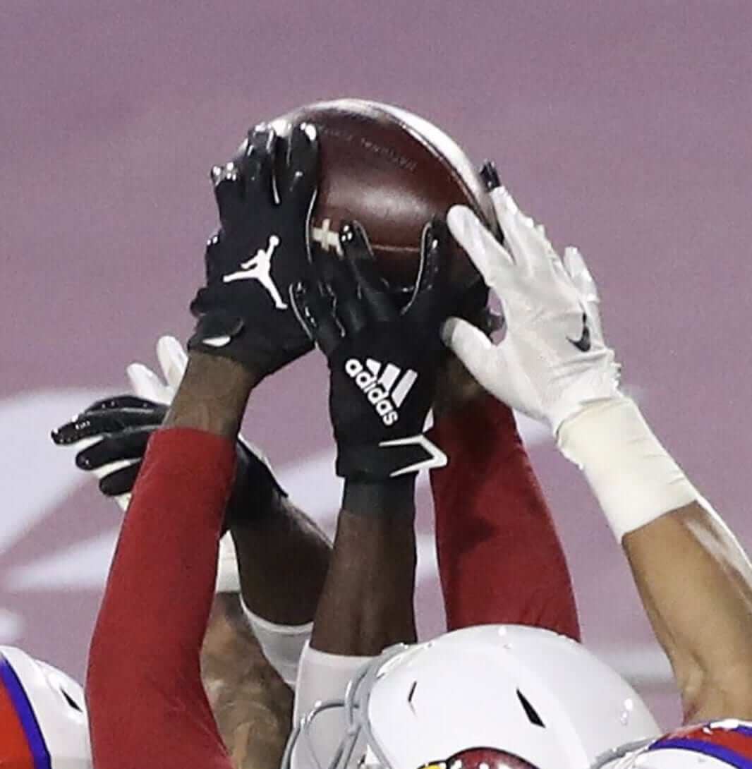
• The Cardinals went blood-clot:
Considering how that game turned out, they may never wear anything else!
• Speaking of, that game-winning Hail Mary play by the Cardinals featured gloves with at least three different makers’ marks trying to catch the ball:
• Saints linebacker Demario Davis’s captaincy patch came partially loose and was flapping about as he celebrated a sack:
You can run, but you can’t hide from @demario__davis❌#NFLRedWolves x #WolvesUp
— Arkansas State Football (@AStateFB) November 15, 2020
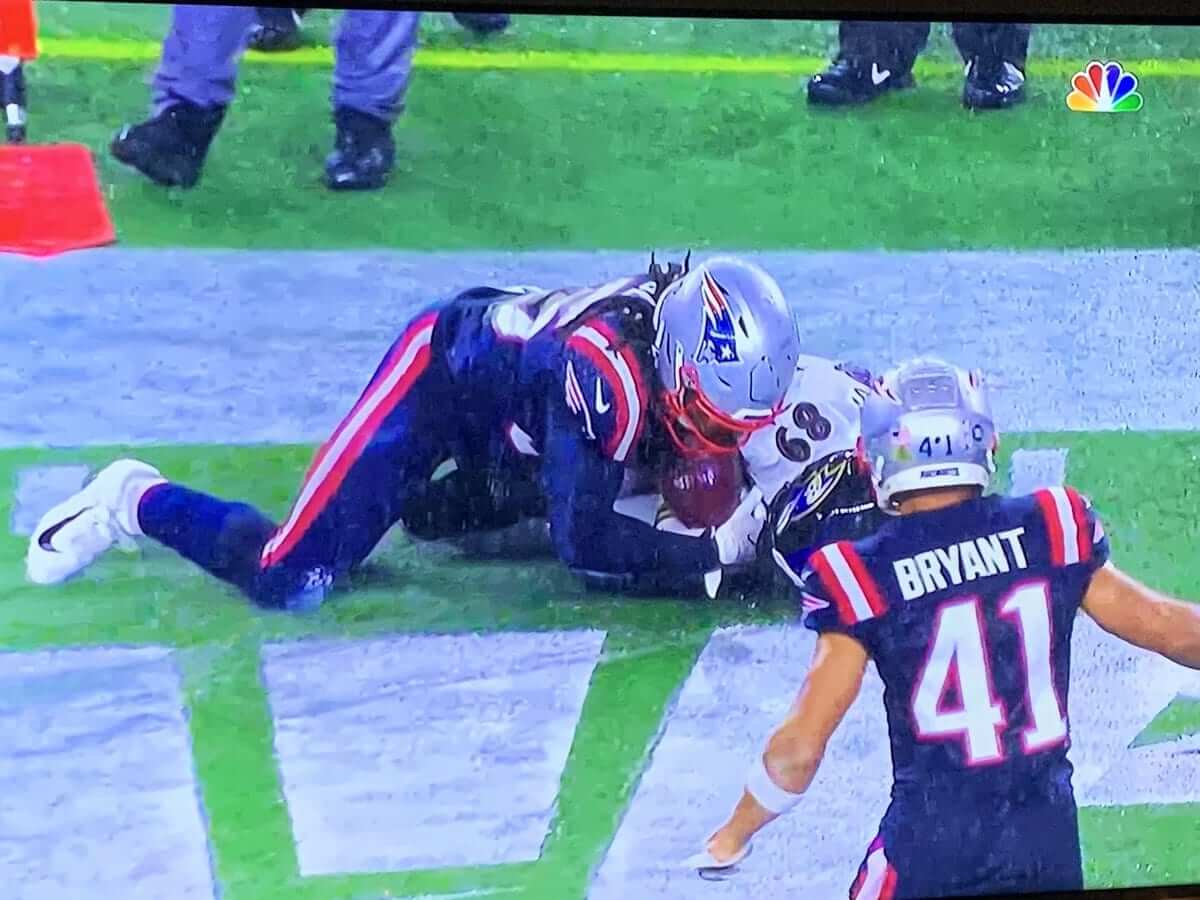
• Here we are in mid-November and the Patriots still — still! — have players wearing last year’s number and/or NOB fonts. Center David Andrews had the wrong font for both his number and NOB:
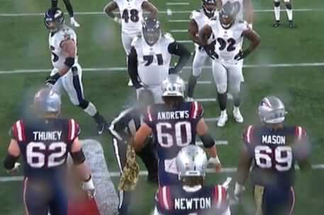
And defensive back Miles Bryant — who wasn’t even on the team last year! — had the proper NOB font but last year’s number font:
• In that same game, Patriots defensive lineman Carl Davis had his sideline mask dangling from his chinstrap during at least one play in the second quarter:
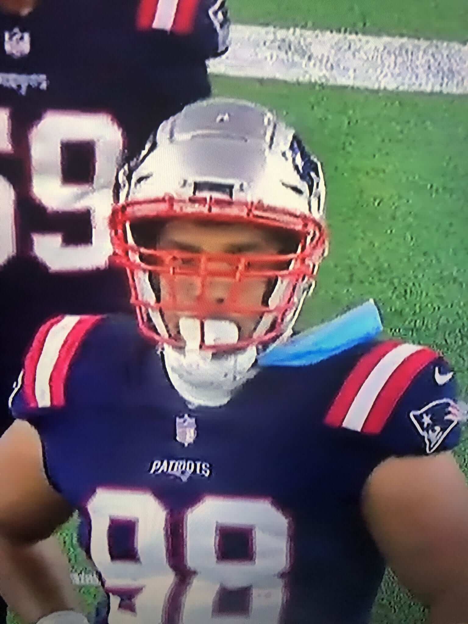
He did not do that for the entire game, however.
• Speaking of the Pats, here’s a video of their midfield logo being removed after last night’s game:
📹 Wanna see a sped-up video of the crew at @GilletteStadium erase the #Patriots logo at midfield to get ready for the #NERevs soccer game this week? #WBZ pic.twitter.com/AVIwznRoJs
— Joe Giza (@JoeGiza) November 16, 2020
• The aforementioned Dolphins were the only team that wore white at home.
(My thanks to Ryan Bowman, Joe Giza, Thomas Roddy, Steve Tilders, Cody Zimmerman, @WTHelmets, and our own Brinke Guthrie for their contributions.)
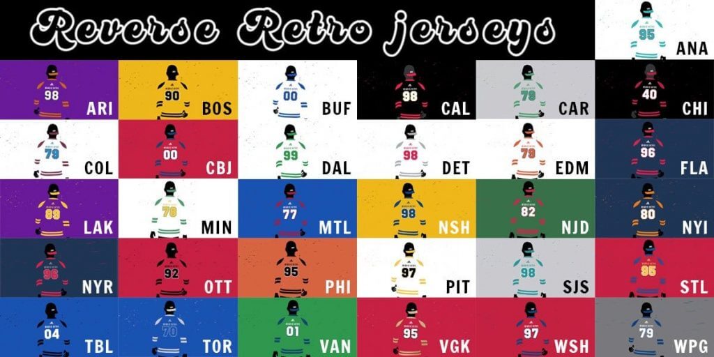
Happy NHL Reverse Retro Day: After a few weeks of teases, NHL teams will officially unveil their Reverse Retro jersey designs this morning. I’ll add a link here when everything goes public, and I’ll have full coverage of all 31 designs tomorrow.
Update: You can now see all 31 RR jerseys here.
Click to enlarge
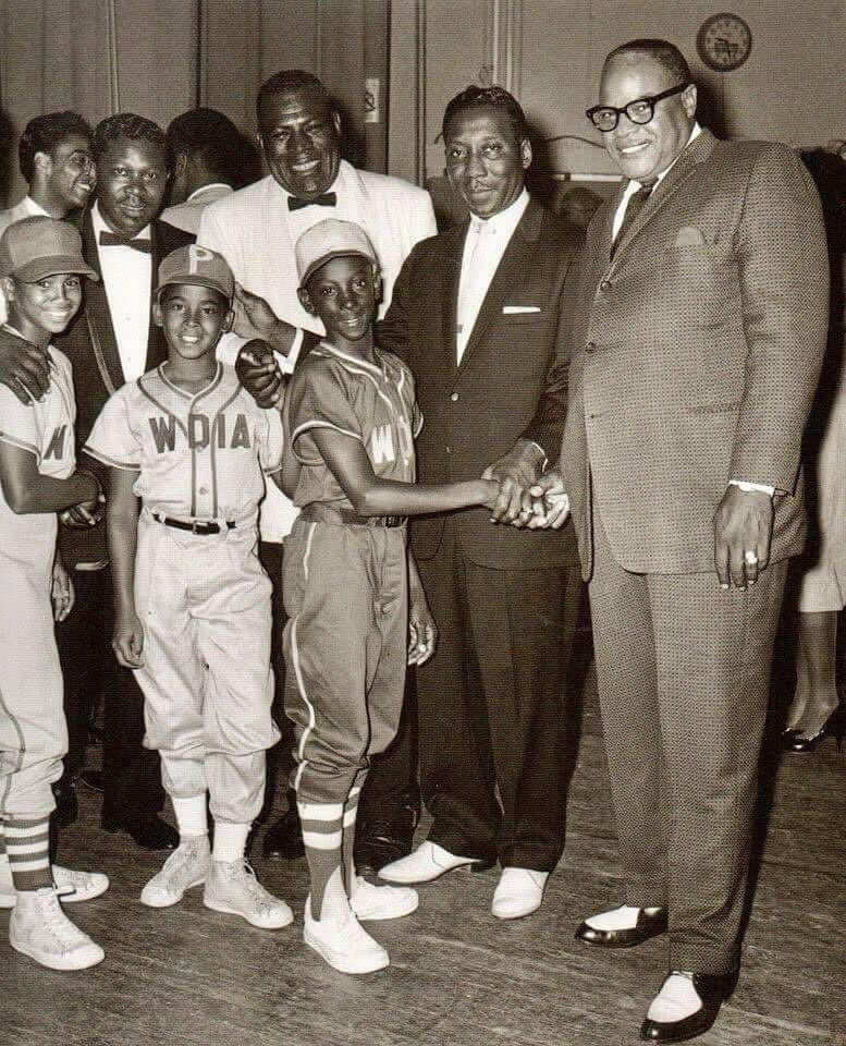
Too good for the Ticker: Two of my Very Favorite Things — mid-century Delta blues and baseball uniforms — come together in this amazing 1950s photo, which shows (from left) B.B. King, Howlin’ Wolf, Muddy Waters, and Ivory Joe Hunter with members of the WDIA-sponsored Little League team. WDIA, based in Memphis, was America’s first all-black-programmed radio station, and the four bluesmen in the photo were all in heavy rotation at the time. Amazing shot!
(Super-duper thanks to @TheBigJamesG for this one.)


ITEM! Another membership raffle: Reader David Staples has generously purchased two Uni Watch memberships for me to raffle off, so that’s what we’re going to do today.
This will be a one-day raffle. No entry restrictions. To enter, send an email to the raffle address by 8pm Eastern tonight. One entry per person. I’ll announce the two winners tomorrow. Big thanks to David for doing this!
Click to enlarge
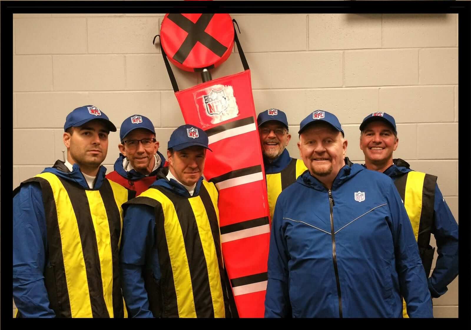
A death in the Uni Watch family: Back in the fall of 2016, a guy named Tom Quinn got in touch with me. He said he was the head of the New York Giants’ game-day chain crew (he’s second from the right in the photo shown above) and thought it would be fun to have me write about him.
I don’t often get people approaching me and saying, “Hey, I think I’m a story!” But I agreed that it was a fun idea, so I got in touch with the Giants and asked if I could spend a game shadowing Quinn on the sidelines. They basically said, “There’s too many moving parts to get the NFL to approve that for this season. Maybe next year.” So I tried again in 2017 and was told the same thing. And then I tried yet again in 2018 and was finally told, “The NFL won’t allow a reporter on the sidelines like that. But you can interview Quinn about his job if you want.” So that December I drove to the Giants’ stadium in New Jersey, finally met Quinn in person after two years of emails and phone calls, and spent an afternoon interviewing him, which resulted in an ESPN piece that turned out really well.
Along the way, Tom Quinn and I became friends. He turned out to be, somewhat improbably, a big indie-rock fan (I’m gonna go out on a limb and say there probably isn’t any other NFL chain crew member who’s seriously into the New Zealand band the Chills), so we talked a lot about music, and he had a day job doing deliveries for a butcher, so we also talked a lot about meat. In the summer of 2019, Mary and I attended a big party at his New Jersey home, where we met his wife and kids. Great people all around — it was a really fun day.
In recent years, Tom developed interstitial lung disease, although it didn’t seem to be inhibiting him that much during my interactions with him. As the start of this year’s NFL season approached, I asked him if he’d be running the chain crew as usual in 2020. He responded, “My breathing problem has gotten much worse. Now on oxygen. Giants don’t know yet but I am out, maybe for good.”
I learned over the weekend that Tom passed away on Nov. 11. He would have turned 63 this week — way, way too young. He was a really good guy and good friend. He’ll be missed. R.I.P.
The Ticker
By Jamie Rathjen

Baseball News: Former Reds C Johnny Bench had some memorabilia from his career auctioned off, including from his World Series wins and his 1970 National League MVP award (from Jason Hillyer).

Football News: This year’s Fiesta Bowl has a 50th-anniversary logo (from Josh Miller). … Reader Jon Solomonson found some NFL memorabilia at a Florida antiques store, including a recent autographed Pro Bowl helmet and a series of autographed Dolphins helmets. … This 1962 news article goes over some changes made to Nebraska’s uniforms that year. But elsewhere in the article there’s an interesting historical footnote — it mentions then-coach Bob Devaney moving the Nebraska bench to Memorial Stadium’s east sideline. This weekend’s Nebraska/Penn State game was apparently, according to an AP recap, the first time since 1962 that Nebraska moved back to the west sideline, with no reason given (from Brian Hansen).

Hockey News: The QMJHL’s Moncton Wildcats wore pink jerseys on Saturday (from Wade Heidt). … The next two are also from Wade: A Canucks blog picked the best player to wear each jersey number for the team. … Sabres goalie Linus Ullmark has new pads. … In 1981, Rangers winger Don Maloney scored a hat trick and later wore one of the hats thrown on the ice for an interview (from Steven Schapansky). … Tim Hortons is fundraising for Hockey Canada’s initiative to get girls and women into the sport with an ice hockey-playing Barbie doll (from Mike Chamernik).

Basketball News: A girls’ youth team named the Nuggets is having some fun with their NOBs (from Jason Criss).

Soccer News: German 2. Bundesliga club St. Pauli is to begin to manufacture its kits in-house, because no company meets its standards for sustainability and fair trade (from Ed Żelaski). … England’s men’s team wore black armbands on short notice for an away game in memory of former goalie Ray Clemence, who passed away yesterday, which makes me wonder if they always carry some armbands around, just in case. … Wales’s men’s team created a set of red clash shorts in 2016 by reusing the ones from their previous kit and changing the color of the Adidas stripes. … Something not seen that often outside of the U.S. is a pro team sharing a stadium with another team in a different sport when the seasons for both overlap. The English club Coventry United shares with rugby union’s Coventry R.F.C., and the pitch is still lined for both sports even though only Coventry United’s teams have been permitted to play since the pandemic started.

Grab Bag: The Montréal news site La Presse had some of its writers each pick a best-looking uniform (from @DanBert3). … England’s and Scotland’s men’s rugby union teams wore poppies as armbands and sleeve patches, respectively, this weekend. England’s women’s team did not, but wore paper poppies on their warmup jackets. … A Japanese publisher has a very ingenious dog with an exclamation mark for a nose as a mascot (from Jeremy Brahm). … The city of Alexandria, Va., how has its own official sock (from William Yurasko).

Click to enlarge

What Paul did last night: Slightly chaotic scene on the porch yesterday, as two friends and their four-year-old came over, which led to much scattering of crayons, coloring books, a scooter, and so on. We also had to rearrange the usual seating arrangement, which among other things resulted in the first Pandemic Porch Cocktails™ photo not to include the Tugboat Captain. Oh, and there was also a dachshund, which was fun!
As always, you can see the full set of daily Pandemic Porch Cocktails™ photos — now more than of them — here.
Please join me in wishing the happiest of birthdays to “Collector’s Corner” columnist Brinke Guthrie — a good friend and an even better guy. Enjoy your special day, big fella! — Paul
Nebraska probably finally got tired of looking int the sun from the east sideline. During the 2nd half on 11 AM kickoff games, looking west can be brutal during CST.
Good point. After looking at its orientation on Google maps and some photos, I was thinking it’s probably a lot warmer on the east side during a cold Nebraska afternoon in November. Might be a reason for the original switch.
Ive sat on the east side many times for those early games. Not fun staring into the sun. Was really bad when the old press box, which was not as tall, was there.
I kind of liked the Rams look yesterday. I don’t think I’m alone. Go ahead, beat me up.
It looked fine.
I’m also kind of digging the Patriots’ shambolic, mix-and-match fonts and numbers. It’s a nostalgic kick for me, recalling a time when branding and image wasn’t so strictly controlled. Look at any photo of the early 70s Dolphins, for example. Little idiosyncrasies everywhere.
Completely agree with the Pats, I’ve shared this analogy before but sort of similar to when the Bengals in the early 70’s, they had a slightly different striping pattern on their jersey, depending on whether they were wearing short or long sleeves.
For a second, based on the graphic, I thought the NHL was releasing their reverse color jerseys – Christmas Advent Calandar style – one per day over the month of December.
I don’t really get the hate for the Rams’ cream pants. I’m not about to call it “bone” or whatever, but it’s fine.
That gradient on the numbers, however…
It’s not terrible, but it does look mismatched in the same vein as what they were wearing the last couple years. Its weird that they finally have new uniforms, but still rolled out a set that looks unfinished.
Agreed on Rams unis. The white-ish pants look better than the mono-blue look (which isn’t saying much, but still..)
Agree – paul is just being a sourpuss about it for no goddam reason. Is it their best look? no. is it as terrible as he makes it out to be? also no. just annoying at this point.
Steve, it’s fine to disagree with me. But it’s not so fine to impugn my motives or suggest I’m not arguing in good faith. Why would you do that?
I happen to think, honestly and sincerely, that it’s a terrible look — simple. Your mileage may vary and all that.
It’s an awful look. Begins with the “horn” on the helmet, the “Los Angeles Rams” patch on the jersey (so I guess we know what team we’re watching) to the dishwater grey pants.
I go back to the beautiful Navy Blue and White Rams and remember all the consternation in the early 70’s when they went back to Yellow and Blue. Both of those looks are head and shoulders above ANYTHING the Rams have worn since.
That uni combo just doesn’t look right. The dishrag pants with their blue jerseys is not a good look for them to begin with. Also, why go to all the trouble of introducing the new, brighter blue and yellow, then add in the dingy, dishrag color? I’m a Rams fan since the Eric Dickerson days. Bring back that era’s perfect uni, and call it a day.
I thought the Rams’ pants looked fine when the sunshine hit them. But once they were in the shadows, the pants looked terrible.
Colts/Titans game was not played yesterday, as is noted just prior to the comments on the game
The Patriots center is David Andrews, not Rob. No idea where that came from.
Happy birthday, Brinke!
TY!
I like the Rams’ bone uni!
“Froggy went a-courtin’ and he did ride–Ram Bone!”
That Chargers-Dolphins game was the best looking game of the season so far.
Chargers vs. Dolphins were great highlights to watch. Looked great.
It does appear to my eyes that the Dolphins are wearing their throwback, darker shade of aqua (which I prefer) with the throwbacks compared to the shade they wear on their current uniforms? Maybe I just want to believe it but it looks like a different shade than the current.
Though there are lots of unattractive mix-and-match in today’s NFL, did not think we would see the Rams wear the bone pants with the blue jerseys. Did not think it was possible they would go there as it matches horribly. Then again, the Rams have spent the last couple of seasons wearing really mismatched uniform combos so this is right up their alley.
Totally agree. A real AFL game!
*David* Andrews, Paul.
Happy birthday Brinke!
Rest in peace Tom. I’ve revisited that interview a few times, he sounded like he was a great guy and your memories of him confirmed that Paul.
So sorry to hear of Tom’s passing, and the loss to Paul and all of Tom’s friends and family.
The Rams blue over bone look isn’t great. But it’s still better looking than literally every other team that went mono this weekend, including the Dolphins. Mono-white is the least bad leotard look for a football team, but least-bad is still ugly AF. When the Cardinals aren’t the worst-looking team doing a thing, then nobody should be doing that thing.
That really isn’t a Pro Bowl helmet.
It is more of a promo Pro Bowl one.
It’s not like it was worn or that helmet was used or even a replica.
That is what I hate about auto hounds, slap a crappy sticker on anything and it’s “authentic”
The Packers are actually three helmet tribute decals behind for their Hall of Famers. They’re also curiously inconsistent. Willie Davis — No. 87 — is on the helmets now. He died in April. But not Willie Wood, who died before Davis in February, and now Herb Adderley, who died last month, and Paul Hornung, who died last week.
Why am I not in the picture Paul? …Tuuuuuug
I’m pretty sure that the current shade of aqua is lighter than the throwback aqua. It does look great (as do the throwbacks) and there is well-deserved momentum for returning to the throwback look. Hope they can do it but I think they are still in the waiting period for another season or two because of small small (read: worthless) tweaks to their current set and the NFL’s 5-season rule on changing uniforms.
Unfortunately, far too many England legends have passed away recently, including Nobby Stiles just a few weeks ago, so the kit manager more than likely reused the armbands.
I didn’t see it mentioned, and forgot to bring it up last week, but Scotland wore poppies on armbands for the Serbia match last week.
link
The Browns went brown over white yesterday for just the 3rd time this season and my God was it glorious.
link
I know its essentially just a revival of their old design but boy it’s such a great uniform.
All 31 NHL Reverse Retro jerseys can be seen here:
link
5 teams with colors in their names. The one with “black” in its name has a black jersey. The one with “red” in its name has a predominantly white jersey. The other three all have predominantly red jerseys. “How can you tell that you’re watching the Blue Jackets? They’re the ones wearing red coats.”
That said, a few of these are fantastic. But mostly, it’s a league with a recent history of excellent special-event uniforms dressing down to NBA standards.
Am I the only one who doesn’t like the Avs ripping out Nordiques throwbacks?
The Avalanche should be applauded; they acknowledge the franchise’s real history rather than going the Wild and former Atlanta Thrashers route of misappropriation.
Nope, you’re not the only one.
I don’t like the Hurricanes trading on Hartford’s look, either.
I think I agree with both of these! My gut instinct is uncomfortable with the Avalanche as Nordiques, so I’m concurring with Anthony on that part. But my head says that in theory I should agree with ChrisH. So maybe it’s an execution thing. The fleurs de lis are so Quebec that it doesn’t make sense anymore while the team is based in Colorado.
I don’t have Photoshop, but what if it looked like this instead?:
1) Two colors allowed on the white jersey: Avalanche maroon, and Quebec light blue.
2) Main logo could be the traditional A logo, or the Bigfoot foot if you really want something different.
3) Shoulder patch is whatever you didn’t use in #2 above, or else the flag-C logo.
4) Along the hem, instead of three fleurs de lis on the bottom, you can have three of the mountain peak logos.
That way you’re working in the boundaries of a Nordiques jersey (hey, franchise history), but you’re not really using any Nordiques logos because it’s a Colorado Avalanche jersey.
No, I agree with you. I think this was an opportunity to do a retro-style jersey using the teams’ current logos and it’s almost too much that they used the Nordiques logo and the fleur-de-lis with the reverse colors.
I don’t object to either the Avs or Wild approaches. Colorado’s franchise really did used to play in Quebec as the Nordiques; that’s worth celebrating and honoring. Minnesota really does have deep and important NHL history before the Wild; that’s worth celebrating and honoring. Tradition and history aren’t scarce resources; the Wild wearing kelly and yellow doesn’t “use up” supplies of dye to prevent the Stars from doing the same. If – or to be hopeful, when – there’s NHL hockey again in Quebec City, I hope that team will wear Nordiques throwbacks from time to time.
Really interesting how some teams interpreted “Reverse Retro” as “Let’s take an old throwback, and flip its colors,” and some did “Let’s take an old throwback that is in colors we don’t do anymore, and recolor it using the current colors.”
I don’t want to bomb the comments with all my thoughts before Paul can have his planned first words on his site. But to say one thing up top, I’ll say this:
I feel so sorry for Uni Watchers who are New York Islanders fans, and Lou Lamoriello is a Uni Watch antichrist.
Now you might be wondering, what’s the difference between Lou Lamoriello and George Steinbrenner? Just my opinion, but there is “just enough” of a difference. Place and time. Steinbrenner was THE OWNER since the 70’s. Nobody in a higher paygrade than Steinbrenner, and since merchandising in the 70’s wasn’t what it is today, there was something kind of pure and special about George Steinbrenner keeping the Yankees looking like the Yankees. I still can’t believe Derek Jeter got his number retired on pinked out Mother’s Day.
ON THE OTHER HAND, Lou Lamoriello was never an owner, and he’s on his third organization now. It’s one thing to assert “this is who we are and we’re not changing” when you’re the owner or if you’ve been there since Day One (yes yes I know, the Devils are a twice-moved team, but for all practical purposes everything before 1982 is ancient pre-history for the Devils), but for the life of me I don’t know why Lamoriello is acting like the mayor in Footloose when the Barclays Center pre-dates his own employment under his current employer.
I guess Vancouver couldn’t make up their mind between green and blue so they had to do an idiotic green/blue fade? SMH.
I have to disagree, I love the look of the Canucks jersey (and I’m usually indifferent to gradient/fade looks).
Compared to the debacle that is the NBA alts, I was pleasantly surprised by this NHL set. A few clunkers, a few mehs, but more really nice-looking ones than I expected. I’m curious what Paul and others think.
Based on an initial review, the interesting ones to me are:
1. The Jets – I don’t normally like grey, but it appears to work well here
2. Bruins – as was discussed last week
3. Minnesota – interesting – looks like it could have been better, but still something to look forward to seeing
4. Flyers – could be just lighting – seems to have scaled back the brightness of the orange – which would be a plus
I watched the Blood Clot Cardinals vs. the Bills. I thought it was one of the better visual contrasting games yesterday.
However, nothing tops the Chargers/Dolphins yesterday. Simply sublime.
The Devils Reverse Retro is the best-looking one, but most of them are pretty sharp.
Whoops, didn’t mean to put this comment here.
Brinke, happy birthday. Hope you have a splendid day!
TY!I appreciate that!
From one birthday boy to another today, Happy birthday Brinke!
And Happy BD to you too!
Happy Birthday Brinke! Thanks for all your work over the years, you consistently make this site even better.
Very nice of you to say, thanks!
Happy Birthday, Brinke!
Enjoy!
Big winner of the Reverse Retro unveiling: The Minnesota Wild. I’m nuts for it. I suspect Minnesota residents will go equally nuts.
Big loser of the Reverse Retro unveiling: the Oilers and Islanders. Complete waste of an alternate offering haha
Also like: Blackhawks, Canadiens, Coyotes, Flames, Rangers, and even the Canucks
Don’t like: Blues, Jets, Red Wings, Stars
I’ve been waiting for a Knights jersey with the alt Star logo front and center, and have been hoping beyond hope that they color they’d pick in their palette to feature it WASN’T red. I desperately wish they’d flipped the logos of their two unveilings this year; star on the front and V helmet on the shoulders on the GOLD jersey, standard setup with the V helmet on the front for this red offering. Very sad.
Objectively, I think the Devils jersey is the best one. Agree with you about the Oilers and Islanders.
As a diehard Blues fan who just recovered from the epileptic seizure that this flaming dumpster fire of a jersey caused, I’m now looking for a sharp stick to poke my eyes out with. This may be the single ugliest thing I’ve ever laid eyes on, and that includes Stan Kroenke and his hairpiece.
Happy birthday, Brinke! Thanks for all you do to make the Uni-verse a better place! I can’t imagine it without you! To commemorate the occasion, here’s a 1968 Topps Cincinnati Bengals logo patch card for your visual enjoyment:
link
Condolences, Paul, on the loss of your friend, and to Tom’s family as well. I fondly remember your chain gang piece you did on ESPN. Tom was an interesting interview subject. He definitely struck me as someone who Got It(TM). RIP.
Dang – The Wild went the Uni Watch hockey jersey route!
Might be the only one, thought the Dolphins NOB’s a little too large, but maybe that is how it was in the day.
“In this bout between some fightin’ Catholics…”
Really?
Phil (and Paul), please stop and take a long, long look at that phrase and consider the appropriateness of that comment.
Religion is very important to many people, and a comment like that should not be acceptable under any circumstances, especially in a forum like yours.
Consider everything that Uni Watch has stood for over the past months and years.
Uni Watch is better than that.
I assume you’re commenting on yesterday’s post… but the ND-BC rivalry is known as “The Holy War”, so this might be a bit of an overreaction.
Why? They are Catholic schools going up against each other. Catholics named their own school the fighting Irish. And religion shouldn’t be sacrosanct as a concept – I have dearly held religious beliefs, but poking fun of Catholics (or Jews, mormons, whatever) as a group isn’t off-limits in my opinion.
And, resume for resume’s sake, I work for the Catholic Church.
After reviewing Terry Duroncelet Jr’s post, I’m more troubled by his description of the terrorist hijacking of Flight 175 and the deliberate impact into/destruction of WTC South Tower as “the September 11th plane crash”.
Moving on.
The link are updating their boat logo and making it their primary logo once again.
aka Football with Sails logo as I have heard it called and I have called it before.
They wore this logo in the last half of 2019. Not surprised they are making a jump to the updated version full time.
The 1980s uniform for the Argos when they wore the boat logo was one of their best. This uni made an appearance as a throwback in 2013:
link
Regardless of the Boat logo or Shield logo, as long as the Argos go blue over white as their home primary look rather than mono-blue I would be happy.
Look how hard the NHL/Blackhawks are trying to avoid showing their logo on their RR jersey.
The promo video on their Twitter does it’s best to hide it.
link
Their picture in the Flickr gallery you linked shows their jersey from the side when everyone else gets a full frontal.
link
They’ve clearly lightened up the skin tone on the RR jersey from what was there on the 1949 Barber pole jersey.
link
I didn’t notice that at first in the offical unveiling photo. If they’re so embarrassed by it, change it.
Sorry about your friend, Paul. RIP Mr. Quinn.
that MN Wild jersey is FANTASTIC.
i have to really look at all of them, but at first blush
i’m very pro MN, LAK, and Detroit.
The Winnipeg Jets’ use of a dark shade of grey to perfectly mimic the colour of the now-tarnishing Avco Cup in the HHOF is brilliant. Reverse retro trophies.
So much uniform news today (not just hockey too). So much to look at and hard to know where to start. I should have taken today off work.
Overall, retro reverse has been good. Of course, some of them are out there but that was the idea for this project. I look forward to seeing the full uniforms with helmets, pants, gloves, socks.
Highlights for me are Kings, Devils, Wild, and Lightning. Kings’ sleeve stripe would have been better if it was higher up on the arm. Sleeve numbers seem too low. Fix that and make this the new Kings permanent uni.
When the Chargers wear that set, it really brings home that the cross-town Rams uniforms stink-on-ice, not just the Bone Pants, but in all the combinations.
Damn if the Chargers-Dolphins game yesterday wasn’t the best looking matchup in the past 5 years! LAC in those gold pants and MIAMI in those clean, classic white throwbacks was a thing of beauty.
Two great looking uniforms with interesting colors, but still prefer games played in bright sunshine on a cool crisp day to really make the colors pop.
EZ’s ranking of the Reverse Retro Jerseys:
TAKE MY MONEY NOW
—————–
Avalanche
Hurricanes/Whalers
Devils
Kings
Wild
SOMETHING GOOD
————–
Coyotes
Jets
Panthers
CLEARANCE RACK SPECIALS
———————–
Rangers
Flyers
Blackhawks
Senators
Canadiens
Bruins
Flames
Islanders
Sharks
Lightning
Maple Leafs
Oilers
Red Wings
REFUND PLEASE
————-
Penguins
Stars
Canucks
Capitals
Predators
ABOMINATIONS (aka: You could not pay me enough to wear it.)
————
Sabres
Golden Knights
Blue Jackets
Blues
Ducks
Blue Jackets one in abominations? It isn’t that bad.
Watching that Patriots game I thought to myself “In a league run by billionaires with access to the finest technology on Earth, they can’t figure out how to keep a video camera lens dry in a rainy football game.”
You can see what I mean in that first Patriots/Ravens game photo above (with the NOB fonts issues).
I am glad the Penguins keep the proper Steeler number and NOB fonts alive, while the Steelers look downgraded. Whent he Steelers tired to use it on throwbacks last year, they screwed it up.
Looks like the Red Wings and Islanders weren’t paying attention in class, threw something together at the last second. Neither team has a ton of different sweaters to work with, but sheesh… E for effort.
That girls’ youth team missed a golden opportunity to call themselves the Nugettes