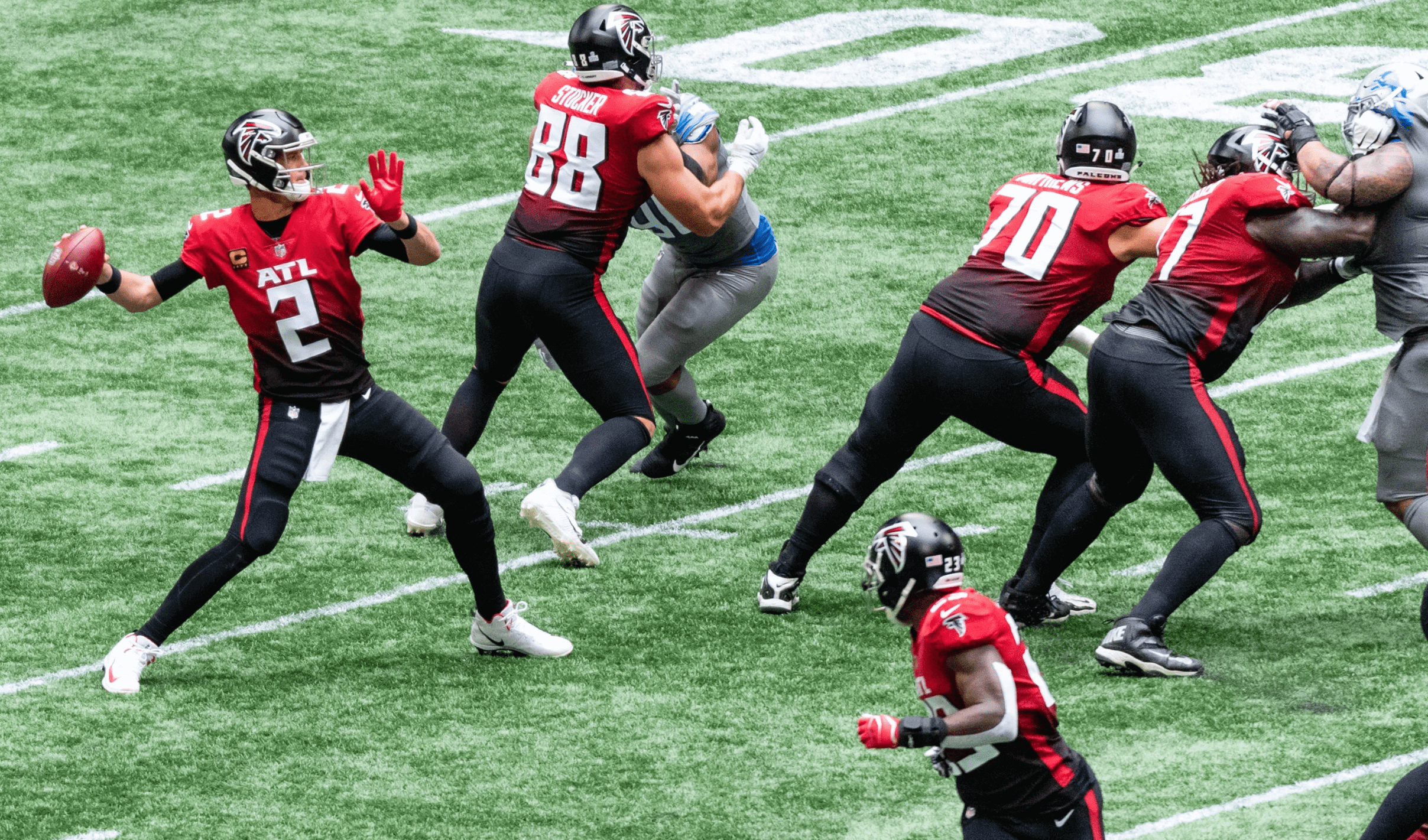
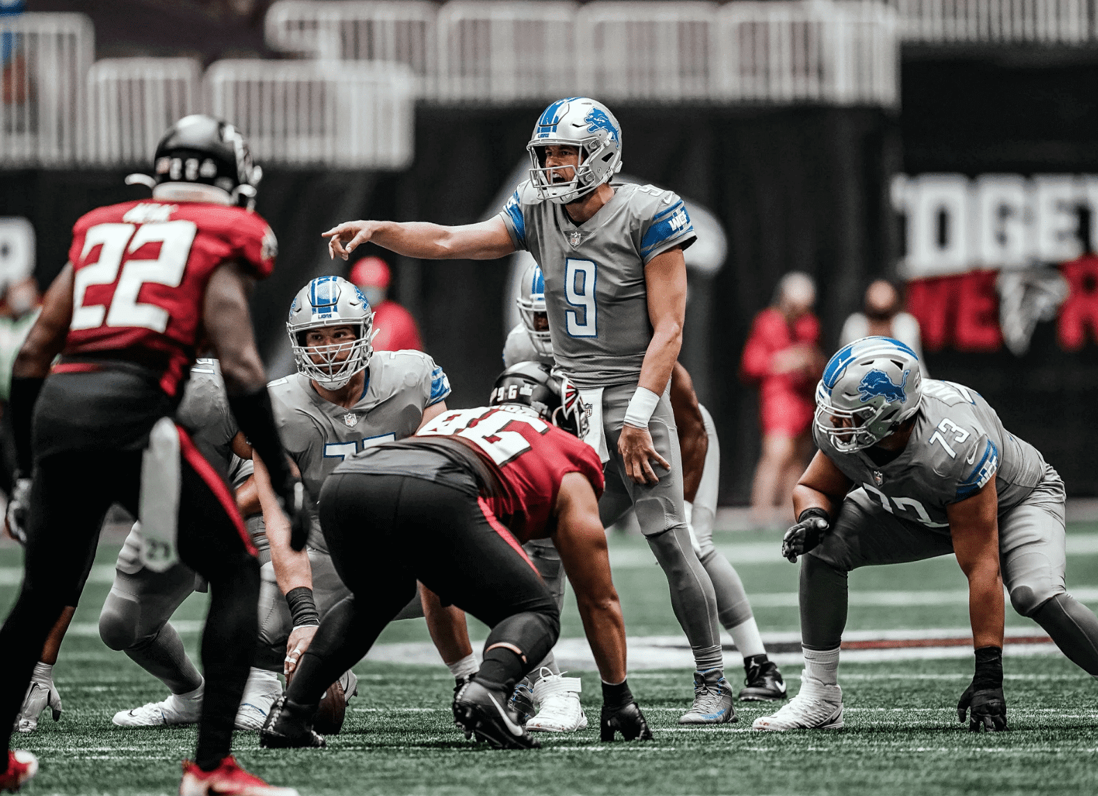
We’ve known since early September that yesterday would be the one day of the year that the Falcons wore their dreadful gradient uniforms. What we didn’t know is that their opponents, the Lions, would counter by wearing their equally dreadful mono-greys. Toss in the awful lighting and shiny carpet inside Atlanta’s domed stadium and you have one of the worst-looking XFL NFL games in years, or maybe ever.
How bad was it? This bad (for most of the rest of today’s photos, you can click to enlarge):
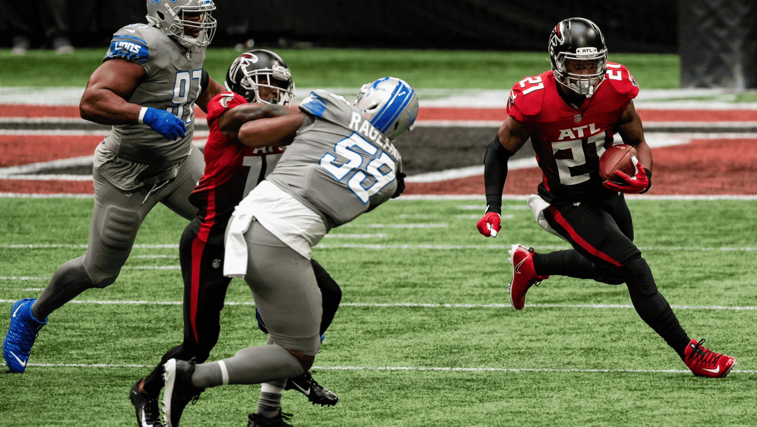
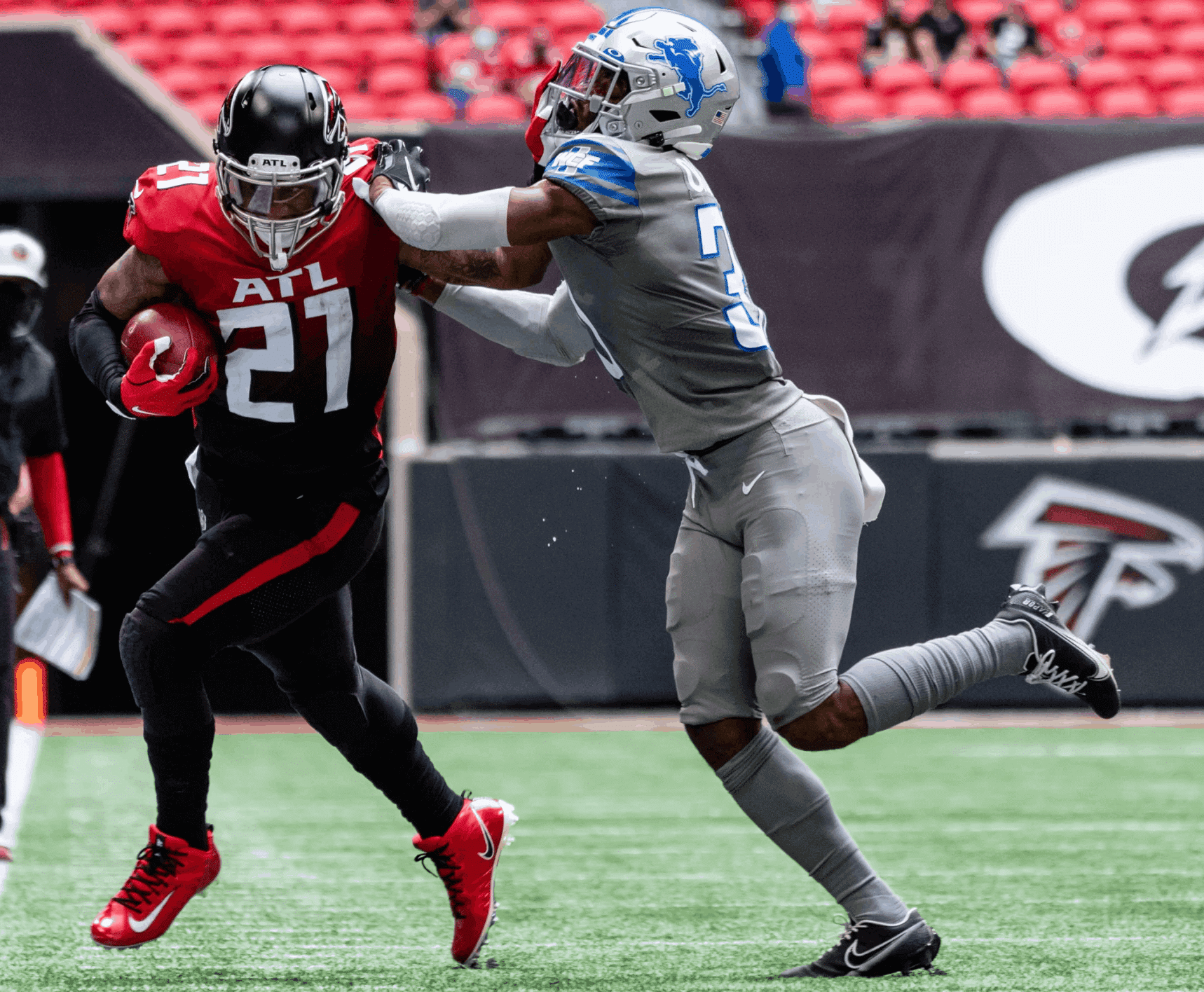
It seems fitting that this game between two awful and awful-looking teams was decided by a runner who didn’t know enough to fall down and instead scored a game-losing touchdown. If you’re a glutton for punishment, there are lots of additional photos here, here, and here.
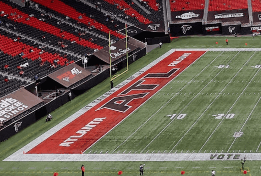
The Falcons also used gradient-patterned end zones, although the gradation was more subtle than the one on their jerseys:
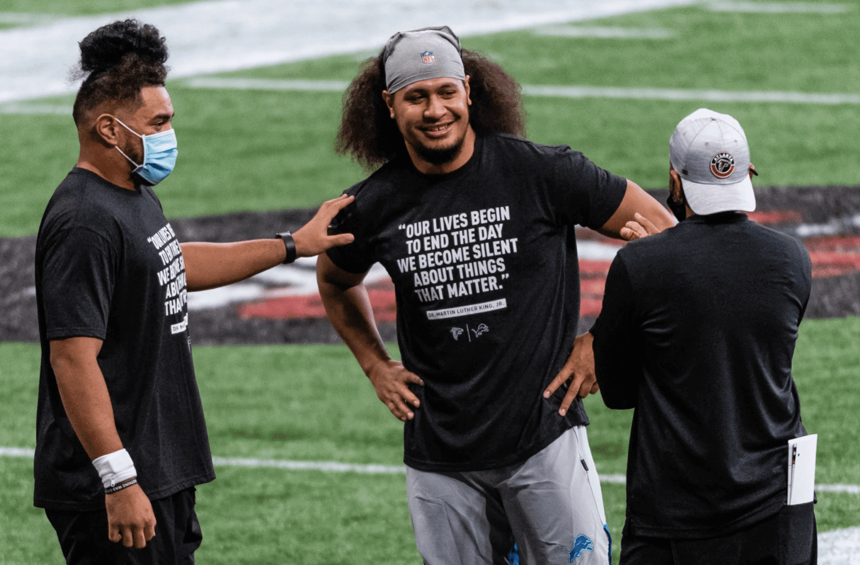
In yet another tidbit from that game, the Falcons named Martin Luther King Jr. as an honorary captain, and players from both teams wore T-shirts with a quote from him during pregame activities:
Finally, we should also note that this was a color-vs.-color game.
In other news from around the league yesterday:
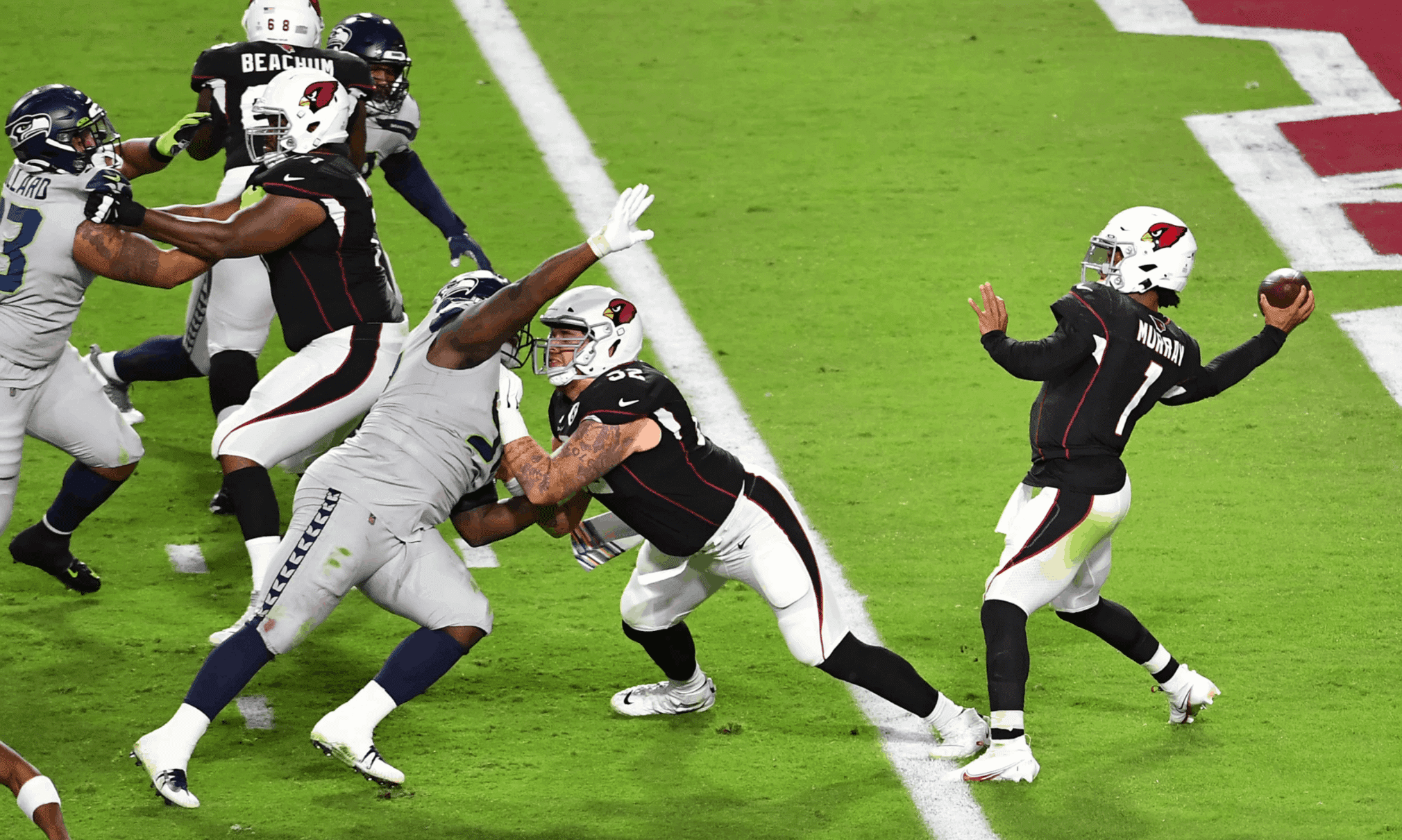
• Another brutal-looking game (also with neither team wearing white) took place in Arizona, where the Cardinals wore their BFBS alts and the Seahawks went mono-grey:
This continues a trend of teams wearing their “special” uniforms for nationally televised Sunday- and Monday-night games. The problem, of course, is that the “special” unis are often their worst unis.
• Another note from that game: The Cardinals’ memorial patch for Larry Wilson has been black with a white numeral on the team’s red and white jerseys. But the black patch’s circular outline wouldn’t be evident on the BFBS jersey, so, as you can see in that last photo, they used a white patch, which created an “8 ball” effect.
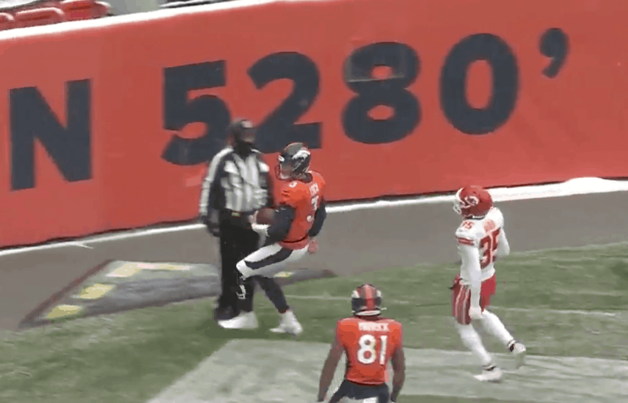
• The first snow game of the season took place in Denver. Always nice to see a field with snow and players sliding around:
.@Alexander_CB45 forces the fumble, Bryce Callahan recovers!
📺: CBS pic.twitter.com/jeWSHQt27H
— Denver Broncos (@Broncos) October 25, 2020
• In that same game, Kansas City wideout Tyreek Hill wore a base-layer shirt with last season’s NFL centennial logo on the right sleeve and yellow bands on both sleeves:
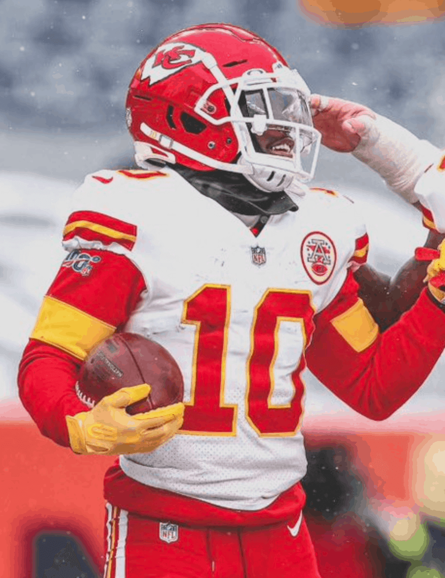
Turns out that’s a retail hoodie from last season that Hill apparently modified by removing the hood!
• Also from that game: I’m assuming this isn’t new, but the Broncos are using the wrong “feet” notation for the elevation sign in their stadium. It should be a prime mark, but instead they have an apostrophe:
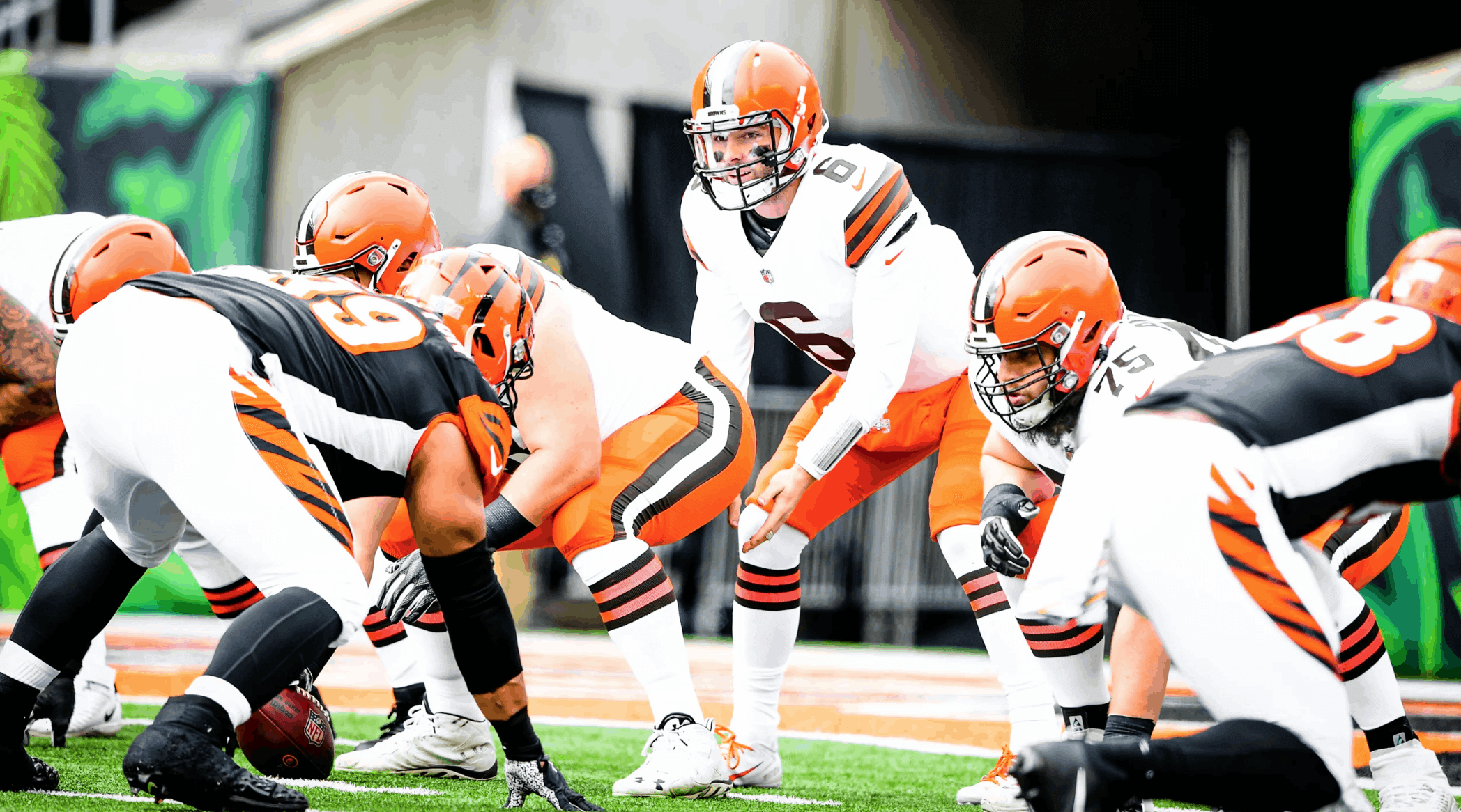
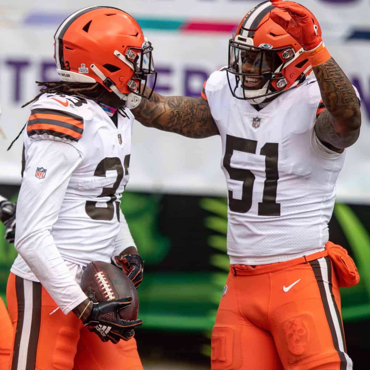
• The Browns went white-over-orange for the first time with their new uni set, and holy moly did it look magnificent (lots of additional photos here and here):
• Players have been wearing Tredcals, which are those thigh pads with raised uni numbers or team logos, for a few years now. But in that Browns game, linebacker Mack Wilson wore one with a skull:
At first I thought that was a Halloween thing, but then I checked and found that he’s been wearing it for several weeks. Anyone know more?
Update: It apparently refers to this:
It’s a mentality.. #Nobody$afe❌ #Dirty3o™️ pic.twitter.com/4dYECF8Upk
— Mack Wilson (@5mackwilson1) November 27, 2018
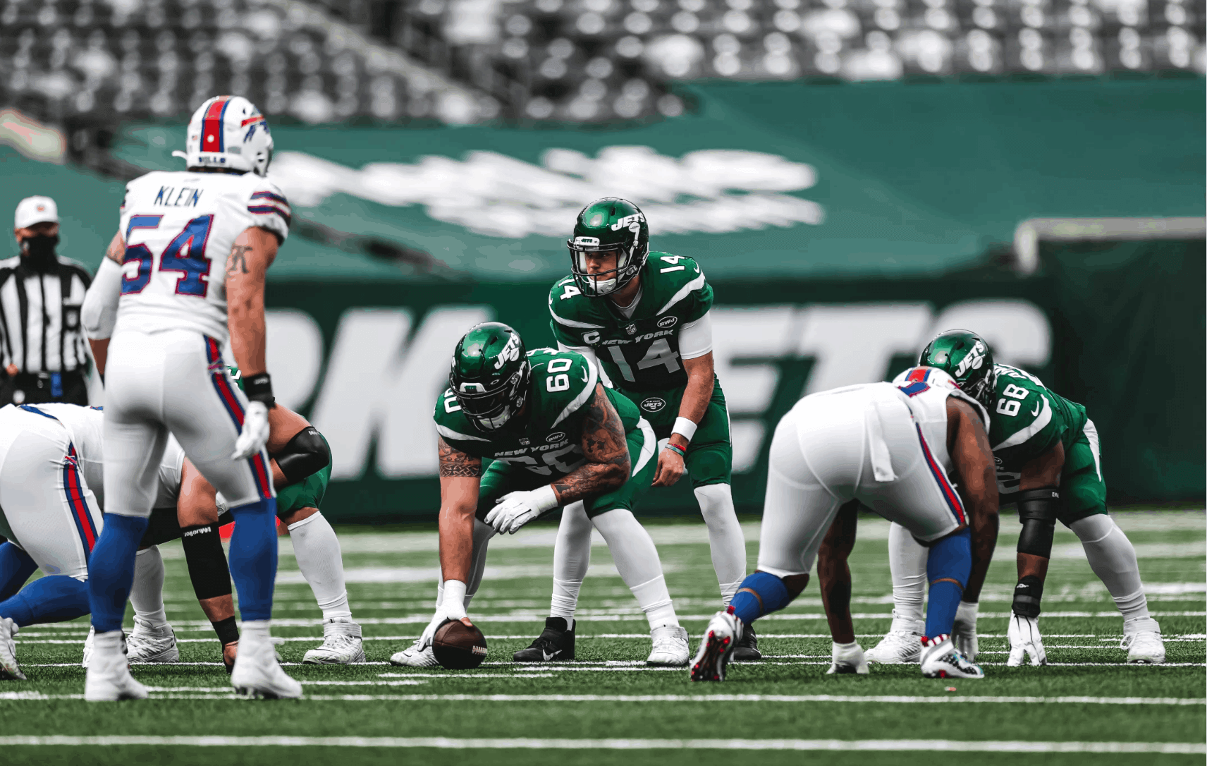
• The Jets went mono-green:
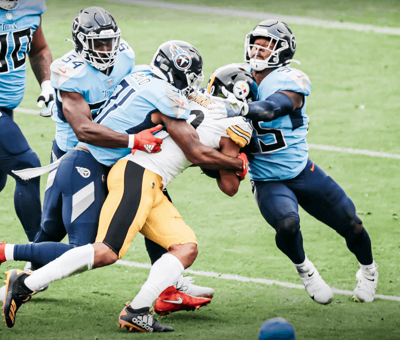
• The Titans wore their light-blue alternates:
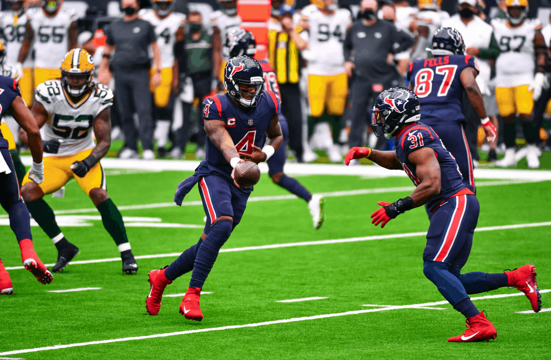
• The Texans went mono-navy:
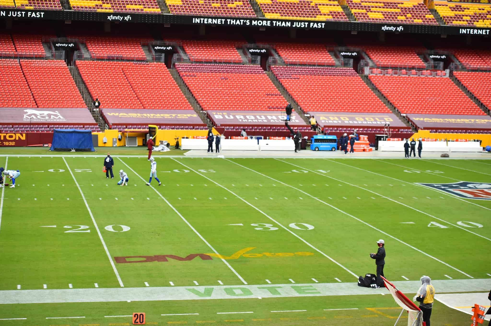
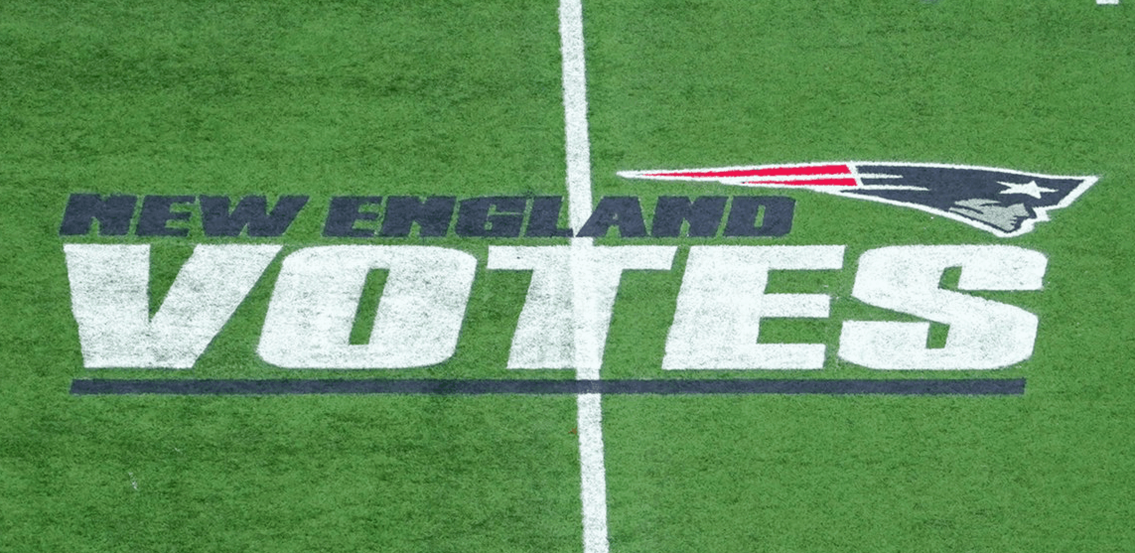
• Some of the fields had “Vote” printed on the white sidelines at the 25-yard lines (much like the “End Racism” messages on the end lines). In addition, some teams had pro-voting messages on the field of play, as seen in these photos from Atlanta, Washington, and New England:
The Eagles had their own pro-voting graphic on the field on Thursday, as did at least two teams last week — the Jags and Vikings.
• Not a single home team wore white.
(My thanks to all contributors, including Timmy Donahue, Darren Doyle, Giles Ferrell, Scott Gurrola, Moe Khan, Matt Kuhn, Bain McCullough, Garrett Thomas, Mark Weber, @JaguarsUniforms, @PlusSFC, @NWKC816, @GridironEnlight, @tonsoffun57, and @JSelga23.)
World Series update: Yesterday was Sunday and the Rays were the designated home team for Game Five of the World Series, so they wore their standard Sunday home uni combo: baby blue jerseys with throwback caps.
That means the Rays have now worn four different jerseys in the first five games of the Series: navy (Games One and Four), grey (Game Two), white (Game Three), and baby blue (Game Five).
I’m assuming that other teams have worn four different jerseys in a single Fall Classic, because there are plenty of teams that have two separate softball tops in addition to their home whites and road greys. But has any team ever done it in the first five games?
I posted that query last night on Twitter, where longtime Uni Watch pal/ally Tyler Kepner came up with a recent example: In the first five games of the 2015 Series, the Mets wore blue road alternate (Game One), grey (Game Two), white pinstripes (Games Three and Four), and blue home alternate (Game Five). I of all people should have known that!
But two of the Mets’ four jerseys were blue. So we could go deeper and ask if a team has ever worn four different jersey colors in the first five games of a Series, as the Rays have now done. Anyone..?
The Ticker
By Jamie Rathjen

Baseball News: A bunch of baseball uniforms from Hollywood movies — including Gary Cooper’s Lou Gehrig uniform from Pride of the Yankees, Charlie Sheen’s Cleveland uniform from Major League, John Goodman’s Babe Ruth uniform from The Babe, and AAGPBL uniforms from A League of Their Own — are being auctioned (from Will Shoken).
College Football News: A Pitt player was wearing a Terrible Towel on Saturday (from @DeadstockDan). … Miami (Fla.) revealed new black alternates yesterday (from multiple readers). … Washington also has new alternates (also from multiple readers). … Louisville revealed throwbacks to be worn Nov. 20 (from M. Brinston Berry). … Temple’s equipment manager talked about how the school’s switch to Nike affected the football team and their new uniforms (from multiple readers). … Ohio State OL Wyatt Davis was wearing a jacket with two swooshes, instead of the usual one, for an interview before their game on Saturday (from Tyler Ness). … Back in the 1980s, Virginia’s yard-marker numerals were blue — and Indiana’s were red! (From James Gilbert and John M.) … ABC broadcaster Sean McDonough was not pleased by Pitt’s GFGS uniforms on Saturday (from Doug Keklak and Pitt alum Chris Weber).

Hockey News: The Junior A Saskatchewan Junior Hockey League’s Weyburn Red Wings and Estevan Bruins played a home-and-home preseason series. In both games, Weyburn wore red practice jerseys and Estevan wore gold (from Wade Heidt). … A Redditor made concepts for every NHL team (from Mike Chamernik).

Basketball News: A balloon sculpture of Bucks PF D.J. Wilson is a Bucks/Michigan uniform mashup (from @mikeobs).

Soccer News: Scottish Premiership teams wore the “Show Racism the Red Card” patch this weekend, and Aberdeen also wore black armbands yesterday in memory of former manager Ebbe Skovdahl. … Elsewhere in Scotland, Dunfermline Athletic seem to give their women’s team hand-me-downs from the men’s team, because not only are those kits from 2018-19, they also still have the men’s Scottish Championship sleeve patch. … I have no idea if Leicester City striker Jamie Vardy’s shinpads always troll his opponents, because shinpads aren’t something you actually see very often, but those are in character for him (from Charles George).

Grab Bag: Lewis Hamilton set the Formula One wins record at yesterday’s Portuguese Grand Prix, and here is what his car looked like for all 92 of them (from Jeremy Brahm). … Also from Jeremy: Here’s a video showing how F1 trophies are made. … We had a Ticker item a few days ago about one of Australia’s Twenty20 cricket teams, the Sydney Thunder, adding a piece of Aboriginal artwork to their sleeves. It’s now apparently to be worn by all Women’s Big Bash League teams, and instead of kneeling, each game is to feature an Aboriginal barefoot circle ceremony. … Women’s college teams wearing pink or pink accents included Duke and Louisville field hockey and Georgia Tech volleyball. … Add to the annals of interesting NASCAR trophies a mounted dirty sock (from @indywestie). … A few days ago, The New York Times ran a piece on the history of some superheroes’ costumes (from John Nelson). … You need to see an Orange County (Fla.) police dog wearing a uniform. Sorry, I don’t make the rules (from Timmy Donahue).
As I’ve said before, I don’t absolutely hate the Falcons’ gradient unis. BUT. Paired against the Lions’ mono grey AND that awful turf (or lighting that made the turf look awful), it was the worst looking game I have ever witnessed. Thanks for pointing out the end zones had a gradient too. Something looked off with them, did not realize it was intentional. yuck.
I was thinking what you and Paul have said. That game was hard to watch. The uniforms were awful, all gradients and dishwater grays. But the turf and the lighting didn’t do the game any favors.
Sadly, the Seahawks/Cards game gave it a run for its money in terms of visual awfulness.
I strongly dislike the Falcons gradient uniform as an idea, but in practice, it was far from the ugliest uniform on the field yesterday. For me, the Falcons gradient proves a rule: Any multicolor jersey/pants uniform looks better than any monochrome jersey/pants uniform. The best mono gridiron uniform is uglier than the worst two-color gridiron uniform.
If the Falcons can arrange it so that they always play a mono team when they wear the gradient, they’ll look OK by comparison.
The Falcons look high school or arena league…and that Lions look is, well, as the I-Man used to say, “dreadful.”
And why does the Atlanta turf look like that?
I (along with the majority of Uni Watch) hated the Falcons gradients when they were announced. They were gaudy, gross, didn’t pair with anything, and looked more like an XFL uniform. And yes, the Mercedes-Benz takeout box of a stadium produces the worst looking football on TV, the turf was gross looking, and the Lions were wearing the worst gray uniforms we’ve ever seen… however, do I dare say that the Falcons unis (not the Lions, those are awful and you can’t change my mind) were so bad that they’re good? Something about it matches the vibe that Atlanta is putting off this year, and I am all for it. Julio and Matt Ryan deserve better, but that franchise is cursed. Those uniforms exemplify it perfectly
That Falcons-Lions abomination had to be the worst (non throwback or color rash) matchup in league history! It’s hard to out-ugly Atlanta, but the Lions made a strong case.
Agreed. Worst ever.
Having been to the MB Dome for a nationally televised game I have to say I don’t understand how such an expensive and ornate facility can have the worst light balancing in the league on TV.
I object to calling Atlanta’s stadium a Dome. The Roof was open for this game, so Lions vs Falcons was an outdoor game just like KC at Denver. Just Like! I call on you and Uni-Watch to retract your calumnies. Next are you going to say my Chevy Lumina’s sunroof doesn’t make it a convertible? It is no different than the open-top Alfa Romeo crossing the SF Bay Bridge in the Graduate.
The Jets didn’t just go mono green, they wore white socks.
No leotard effect.
In fact they’ve worn solid white socks with every time they’ve worn green pants this season.
So far this season, they’ve kept the knicker look for every game.
For Uni Watch purposes, “mono” means (and has always meant) same-colored jerseys and pants.
But yes, it’s nice that they’re avoiding the leotard effect.
The only silver lining with yesterday’s Falcons/Lions game, that was the second appearance of the Lions dirty laundry look, which reduces the chances of the Thanksgiving day appearance.
As to the worst looking stadium, I still go with New Orleans as the worst looking stadium for a game, although it’s close
As to the worst looking stadium, I still go with New Orleans as the worst looking stadium for a game, although it’s close.
Agreed — neck and neck.
I have to say, I find it very heartening that so many Uni Watch readers care about stadium lighting, turf glare, etc.! Definitely an aspect of athletics aesthetics that doesn’t get as much attention as it should.
On the topic of turf, did anyone notice at PetCo the small square shaped dirt patch that was noticeably lighter than the rest of the infield dirt on each of the 1st base and 3rd base side in foul territory just where the infield dirt meets the outfield grass. Is this like a ‘fungo circle’ type concept for umpires? I noticed (and it bugged) me throughout the AL playoffs. Anyone?
I care. I like the quirk the Steelers and Pitt have at Heinz Field with the south end zone having plain diagonal lines. Now if the Steelers could only keep it after Pitt’s season ends instead of painting “Steelers”…
Right, but that’s field *design* — I fully expect people to care about that. But I’m talking about how that design looks in terms of lighting, reflection, etc. — not quite the same thing (although both are important, obviously).
I’d throw Indy during a day game with the roof open in with some of the most unwatchable stadium “lighting” situations (in this case, natural lighting). The shadows are so bad.
Does anyone know enough about turf and lighting to explain why the turf in NO and ATL look so bad while the turf in LA and LV look so good and green? They’re all new (re-modled) stadiums.
LV uses real grass
Oh as a kid, I always made note of arena lighting and other conditions. My favorite place to play hockey was West Point’s Tate Rink – far and away the best lighting, and ice conditions, and arena temperature (I didn’t even need to wear long johns there, it was just warm enough). Rye Playland was my second favorite (and I have skated at MSG and Nassau Coliseum).
On TV, it always intrigued me how the Vancouver Canucks’ old arena appeared on TV – the home team’s uniforms were super bright white, and the ice and arena were darkened – very high contrast!
Mercedes must be thrilled to have their name splashed on both domes… *eye roll*
The Saints’ TV aesthetic is bad. The current Falcons is bad.
The old Georgia dome was worse.
But the old Rams dome in StL will always be at the top of my list for unwatchable lighting presentation. I will sit an watch almost any NFL game that’s on if I have nothing else going on. I quite literally would get up and go do something else if the only option for a game to watch was in StL, the exception being for the playoffs.
Here is the pennant the Bills displayed after their win over the Jets. link
There were some fantastic concepts from that Redditor! I’d love to see that Jets sweater out on the ice.
Actually the Texans wore their color rash all navy with the red numbers and pants stripes with white outlines, not their “standard” all navy with white numbers and pants stripes with red outlines.
Ahhhh thank you. I immediately noticed something off about those particular pant stripes on the Texans, and perhaps thought they were new? Good info.
Atlanta/Detroit = Horrible. Or as the French would say, Horrible.
Falcons ATL red gradients
Lions in all grey
Seahawks in all grey
Cardinals in black
Texans in mono blue
Saints in mono black
Titans in light blue over navy (so much better when they wear white pants) Looked especially against white and yellow.
Eagles in all black
Whatever mess the Rams wear tonight
Quite possibly the worst looking week in the NFL in a long time if not ever.
Don’t forget Pats in mono-navy!
The only saving grace was the Browns in white over orange with a lot of they players wearing their stripes the correct way.
Surprised you didn’t focus on the Louisville throwback uniforms. With the majority of players wearing tights rather than socks now, they incorporated sock stripes in to their tights, much like they attempted do do with sleeves a few years back with multiple teams.
I think this would be a great way for teams to get stripes back in their designs.
The Gridiron Uniform Database indicates the Rams will wear blue jerseys and yellow pants. Bears in standard away uniforms of white jerseys and navy blue pants. We will see how it turns out.
Patrick, you saved me from having to say exactly that. Thanks, bud!
Agree with all except the Titans. I dig their powder over navy, might be their best possible combo except for white over navy. The switch to their current uniforms with the navy helmet was a pretty lateral move compared to their old duds with the white helmet, but I at least appreciate that the navy pants are getting so much use so they’ll match the helmet (leotard effect notwithstanding).
The Falcons look like they were dipped into and pulled out of a tar pit.
Falcons Lions was easily the WORST uniform matchup (outside of any 2015-2019 Browns Bengals matchups) I have ever seen. My goodness Nike should lose their contract with the NFL after that.
Excellent observations regarding the lighting and shiny turf in the Falcons-Lions game. Absolutely agree 100%. Worst-looking game I can recall.
Grey jerseys never work in football. Awesome for pants since they work with white and any solid color, but that’s it. Seattle, Detroit, and a million college football teams prove this every time.
From looking at Lions helmets (can no longer tell from Atlanta’s matte helmets) that the roof was open – although the sun angles this time of year such that sunlight is in the stands (near side on TV presentation), by December it will be straight in the press box.
I actually like the Atlanta black and white uniform combos so far, and helmets actually nice with chrome facemarks. But gradients awful.
As for the ‘vote’ messages, NFL should just do away with transparency, it is a campaign – ‘Vote’ (Against Trump)
As for the ‘vote’ messages, NFL should just do away with transparency, it is a campaign – ‘Vote’ (Against Trump)
Actually, the message is self-evidently non-partisan. Please don’t post things that are (a) inflammatory and/or (b) demonstrably untrue. Thanks.
I was at B-Dubs watching the Steelers-Titans heart attack when on both sides of the TV screen with the game was a stark contrast in unis.
On one side, you had a beautiful game between the Cleveland Bengals and the Cincinnati Browns–probably one time when the Bengals actually looked good in their standard home uniforms. (I’m all for designating their orange alts their primary uniforms–tigers are orange–and replacing their standard black jersey with their Browns-“inspired” throwbacks with “BENGALS” on the helmets. Maybe designate their Color Rush as their standard away uniform, too.) On the other side? The mess in Atlanta.
I honestly don’t understand the hate that Seahawks get from their grey unis. I think it is a nice alternate, and maybe even reflects their city in the right way. Seattle is a costal city and usually cloudy (for anyone who has ever been there you know what I mean) and the uniforms match perfectly.
And the Falcons gradient unis, *gag*
Agreed. I’ll take the Seahawks in their Grey alternates over their Mono-Highlighter look any day.
same. But I also don’t mind the color rush jerseys, but I know that that is an acquired taste and I am a bit of a homer. I respect the hate that the Hawks get for the color rush
Came here to say pretty much the same thing about the Seahawks’ greys. Saw your name and did a double take because I knew hadn’t typed it out yet.
Anyway, we might part ways here, because I actually thought the contrast of SEA and ARI was kind of nice too. I don’t care for the Cards’ unis generally, let alone the black, but they really seemed to pop against the Hawks’ grey. The white was crisp and the black was sharp. And both teams had socks on that contrasted their pants color! Overall, I thought it was a pretty decent looking game.
On SNF, Al Michaels talked about the 8 on the jersey and made a statement about it not being an “8 Ball”.
The Seahawks can do what they want. However, the grief the Seahawks would receive from me about the grey uniform is it seems excessive and unnecessary. The uniform looks so similar to their white ones.
Just a note on the movie auction mentioned in Baseball News. If anyone has any interest whatsoever in movies or tv they should check out the catalog. It is mind blowing – essentially you name the movie and they have stuff – a gold ticket for Willy Wonka’s Factory, Star Wars, Star Trek, MASH, Saturday Night Fever, 300, on and on. Well worth your time.
It wasn’t four different jersey colors, but the Rangers wore 4 different uni combos in the first 4 games of the 2011 World Series. Blue jersey, blue hat, grey pants (game 1), Grey jersey and pants, blue hat (game 2), White jersey and pants, blue hat (game 3), and white jersey and pants, red hat (game 4). I imagine if they hadn’t been playing the Cardinals we may have seen the Red jersey as well.
Good one!
From the auction link: “New Era brand 59/50 red, white and blue wool hat with Indians embroidered logo on front, and MLB logo on back”
Major League was released in 1989. IIRC the MLB logo did not appear on the back of caps until 1992.
The auction/site appear legitimate, so what gives?
Maybe from Major League 2 (1994)?
Must be…the road jerseys used for the original film did not say ‘Cleveland’ and didn’t have ‘racing stripes’:
link
Major League was filmed in 1988, and the Indians’ uniforms for the film (authentic or reproduction) were based on what the MLB team wore that season; the Indians’ actual uniforms were altered in 1989 and those were worn until 1993 (when production began for the sequel?):
link
Maybe the Jets don’t have the most hideous jerseys, but to me they are the ones where I just say “why do these exist as football uniforms?”
Joe Namath doesn’t look right wearing one of those.
@Joe…that’s how we all felt about his time as the Rams QB
RE: the auction.
The baseball uniforms? Meh.
But a Sleestak head? More than one Oscar statuette? And those belted suit jackets from Gene Kelly and Charlie Chaplin are sublime!
I see no reason for a Sleestak head and a baseball uniform to be mutually exclusive. I can think of numerous occasions where I would wear them together!
The Falcons gradient uniforms weren’t as bad as I was expecting, but that’s not saying they were good either. Between the pants and the ATL on the front it is still not a good look for them. The top actually looked decent but it’s the other stuff that ruined it. I just don’t understand why they refuse to bring back the red helmet and some gray or silver pants. Those looked sharp. Why mess with a good thing? I guess that’s the problem you have when you are a billionaire owner.
The Lions uni-gray jerseys need to be burned. For a team that inspired the Raiders silver and black they have made some poor choices in recent years. All-gray. The BFBS alternate. The Honolulu blue pants work on the road. As do the gray pants. All-gray is another story. Yikes. Keep it simple it works.
“For a team that inspired the Raiders silver and black they have made some poor choices in recent years.”
The Lions/Bills uniform connection is pretty well documented (I think), but I’ve never heard or read that the Lions’ look was something the Raiders were “inspired” by.
Al Davis liked the black jerseys worn by Army and he thought it made players look larger.
link
How silver was added to the mix I do not know.
“It seems fitting that this game between two awful and awful-looking teams was decided by a runner who didn’t know enough to fall down ”
The personal knock on a player seems unnecessary, esp. Gurley who’s career highlight reel includes him purposefully stopping short agains the Packers while he was on the Rams.
Yea, it’s a small off-hand comment, but it’s not needed.
It’s less of a knock on Gurley (who I didn’t identify by name) than on the overall pathetic nature of every aspect of this particular game, from the uniforms to the team records to that one play. It all fits!
Not gonna lie. I don’t hate those Falcons uniforms despite them seemingly like a really terrible idea when announced.
While watching the Cardinals last night I had an idea that their alternates should be brown like the color of a female Cardinal.
link
Maybe better not to give Nike any ideas.
Hi,
The notion that Todd Gurley cost his team the game is pure drivel.
The man scored a go-ahead touchdown. Defence, or the lack thereof cost them the game. Not to mention that they are the most poorly coached team in the NFL!
I feel genuinely bad for the Falcons. I mean they were … like … for a moment … SUPER BOWL CHAMPS. It’s on them, but also so unbelievable what happened in that game. Since then, they have never been close, and it all feels so incredibly sad.
There are more than a few snakebit teams in the NFL, but the misadventures of the Falcons throughout their history are particularly bitter. How hard it must be to root for this team!
The Pirates and Orioles in 1979 also wore several different uniform combinations. But alas, each team only wore three different colored jerseys, with the Bucs in black, yellow and white, and the O’s in orange, white and gray.
Those falcons jerseys actually looked good imo.
Plz don’t crucify me.
I’m with RS Rogers on the Rams unis – maybe they’re not as good as their classic unis but they don’t deserve the hate they’re getting – especially this blue over sol (yellow) look. Just change the away look.
Considering the Cardinals were named AFTER THE COLOR OF THEIR JERSEYS back in their original home in Chicago…they shouldn’t ever be wearing black. Gross! (Wow, I sound like an old man.)