By Phil Hecken
Follow @PhilHecken
Back in August, as you’ll all remember, I had the pleasure/honor of doing most of the weekday postings, and at the time, I’d called for reader submissions as I thought I might be short of content. As it turned out, I actually received more than I could get to, but I promised at the end of the month I’d get to those guest entries I didn’t have space/time to run. Today is one of those days.
Reader Brad Eenhuis shot me this at the time: “Not sure if you’ll find this interesting or not, but thought I’d share with you my recent DIY project. It’s part of a much bigger project involving collecting (jerseys, helmets, anything KHS related), researching (football & basketball games back to 1962), documenting (games articles & photos)but trying to stay focused on this one thing if I can.”
Here then, is that post. Enjoy!
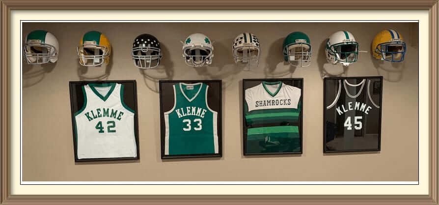
Framing A Jersey For People Who Don’t Like Spending Money On Framing Jerseys
By Brad Eenhuis
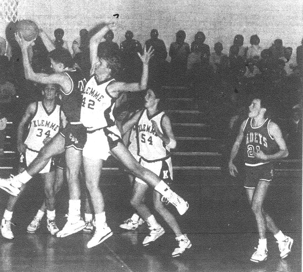
I collect old uniforms and such from my, now defunct, hometown high school (Klemme High). Sometimes I wear the jersey but mostly they sit in the closet. Wanting to display them someway, I looked into framing them. Having it professionally done can cost $100+. I have A LOT of jerseys, so that’s not really feasible. So I’m always looking for ways to do things on the cheap. My plan started out was to find frames at a thrift store and mount them in those. Wanting to keep the look consistent, it was REALLY hard finding identical frames.
Recently I was out of state and visited a thrift store and stumbled across some ugly prints in ugly gold frames for $6 a piece! They were smaller than what I had envisioned so I took some t-shirts over to them to size them up. I thought they MIGHT work and for $24 it was worth the gamble. Side note:, while I was in line to pay and elderly gentlemen stopped me to look at them commenting on how “beautiful” the prints were. I didn’t have the heart to tell him, they would end up in the garbage.
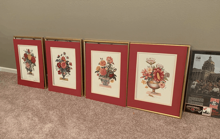
Got them home and took them apart. Painted the frames. Trying to use what I already had in house, I neded up with flat black. I had two partial cans. JUST enough to get them covered. Would have preferred gloss black, but I always try to use what I already have if possible.
Needing some backing material, I searched high and low thru the house and found some old black curtains that we forgot we even had. Cut them up to fit.
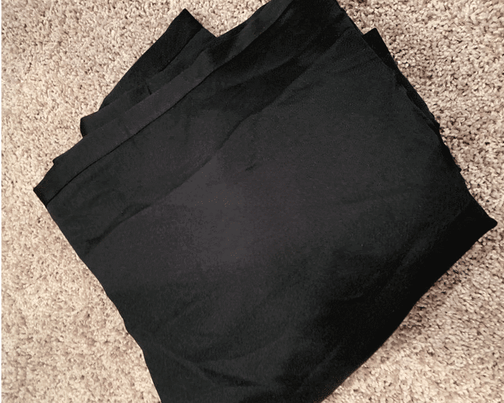
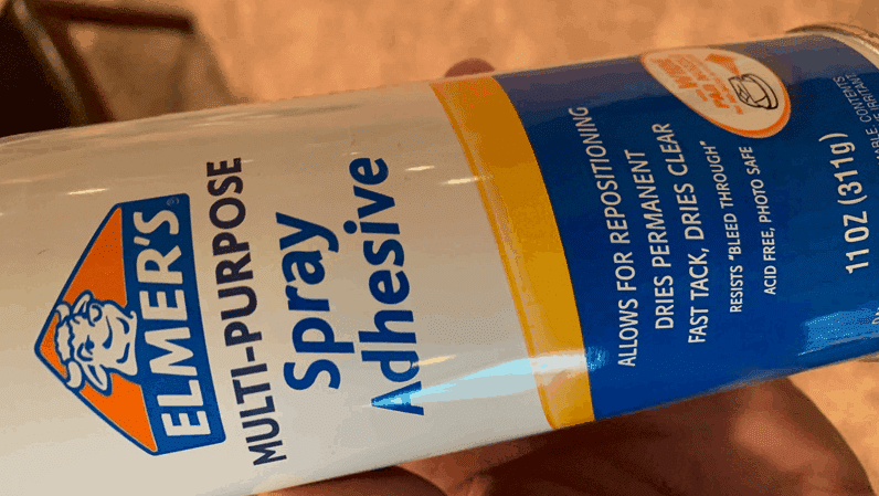
Using this adhesive I had already, glued them to the backing cards.
Set the jersey in the frame, cleaned the glass, and put them back together.
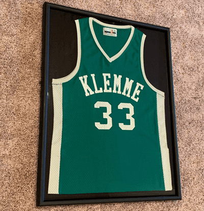
The finished product. Total cost was $26 as I broke the last piece of glass and had to run to the hardware store and get a new piece cut to the tune of $2.16.
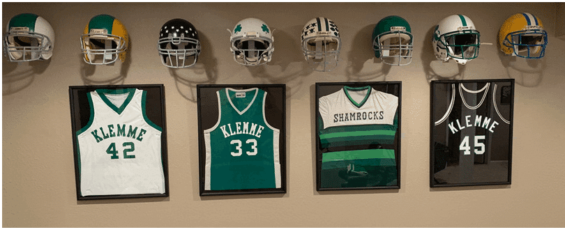
Jersey notes. All jerseys are the real deal except the #45.
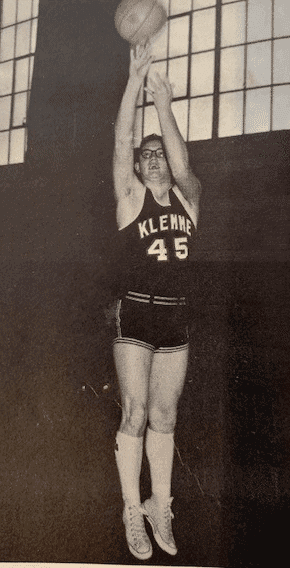
• #45 in black is a recreation of my Dad’s jersey in high school back in 1962. I wanted one like the photo so I made one myself. Turned out great!
• The tequila sunrise is my oldest brothers from his FR in high school.
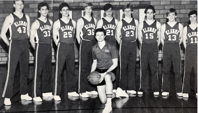
• #33 in green is my other brothers jersey from his senior year. They had JUST gotten those jerseys that same year so he was the first to wear #33.
• #42 has no significance to our family, but Is the style the I wore 6 years later from my previous brother. MY buddy wore this particular one.
Off topic, but the helmets are part of the bigger project. I wanted to recreate every version of helmet KHS used over the 20 seasons they had football(1962-1981). I did them all out of modern day helmets as that was the easiest way. Also note, I’m aware the designs weren’t anything difficult. Basically a stripe change with no side logo. That’s the reason I faced them forward, so you could see the striping or the award decals.
Notes:
• Actually the first 6 (left to right) are the only Klemme helmets they used.
• The shamrock on the front helmet is actually a jr hi helmet I found in some ohotos from 1971. Not high school but I liked so much I went ahead and did one.
• The solid green is the last year 1981.
• The one JUST to the right is my own ‘what if’ version if Klemme stillhad football.
• Gold helmet on the end was a different high school that I attended after KHS consolidated with another school.
Here’s a picture of my Dad (James) in the jersey I tried to recreate. 1962-63
My middle brother, Bruce in his #33(second from the right). 1984-85
My good friend, Corey, in the #42.
Thanks Brad! Great way to repurpose old frames. For those of you who remember, every summer (except for this past one — thanks, COVID!) I enter my photographs into a sale at one of the art galleries out on eastern Long Island, all of which need frames. I usually purchase inexpensive ones at Michael’s or some other art store, but I have occasionally done what you did with the frames for your jerseys — buy one (or more) with some prints I don’t want to reframe up my photos! Anyone else here repurpose old frames for jerseys or other sports-related memorabilia? Love to hear some of your stories.

MLB Playoff Uni Tracking
We made it to the World Series, and over the past several weekends Alex Rocklein has been tracking the jerseys of all the teams involved in the MLB Post Season. Here’s the full Wild Card round jersey matchups (click to enlarge):
Perhaps predictably, the Rays returned to their favored navy blue jerseys for Game 1 of the World Series, but lost in them (their fourth straight loss when wearing dark blue), so they changed it up and wore gray for the first time this post season in Game 2 (which they won). Before last night’s game, I told Alex “I bet they wear white tonight” and sure enough, the Rays sported their home whites for Game 3. Prior to last evening, they were 1-0 in the whites. Alex sent me his tracking before last night’s game ended, so there is no score reflected in the graphic below:
The Dodgers won the game 6-2, after taking a lead in the first inning and never looking back. So will the Rays return to white jerseys tonight? Back to navy? Powder? Alex (jokingly?) suggested they might even throwback to the 98 Rays (which I don’t believe they wore during the abbreviated 2020 season). I mean, if they were to do that, they might as well fauxback to 78 right? Guess we’ll find out tonight.
Alex will continue to add to this graphic through the end of the World Series’.

Guess The Game…
from the scoreboard
Today’s scoreboard comes from Gary Chanko.
The premise of the game (GTGFTS) is simple: I’ll post a scoreboard and you guys simply identify the game depicted. In the past, I don’t know if I’ve ever completely stumped you (some are easier than others).
Here’s the Scoreboard. In the comments below, try to identify the game (date & location, as well as final score). If anything noteworthy occurred during the game, please add that in (and if you were AT the game, well bonus points for you!):
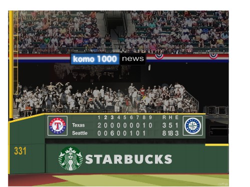
Please continue sending these in! You’re welcome to send me any scoreboard photos (with answers please), and I’ll keep running them.
The “BEST OF” Kreindler’s Korner
Hey guys & gals. You’ve enjoyed Kreindler’s Korner for several years now, mostly on the weekends, on Uni Watch, but with the recent coronavirus outbreak, Graig’s time is just too precious and he needs to tend to other things besides coming up with a new writeup each weekend.
So, going forward, for as long as the COVID-19 situation is bad in New York, I’m going to run a few “Best of’s” until Graig returns.
Here’s today’s offering:
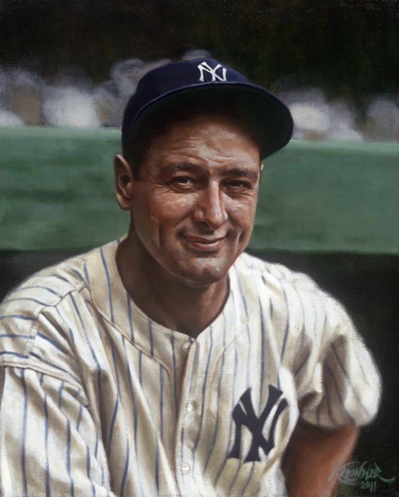
Title: “The Most Valuable Player”
Subject: Lou Gehrig, 1936
Medium: Oil on linen
Size: 16” x 20”Perhaps best remembered for how he left the game, Lou Gehrig is by far and away one of the best players to ever pick up a bat. Numbers aside, the implicit confidence – as sportswriter Stanley Frank put it – that he brought to the Yankees was what made him their most valuable asset. And, those pinstripes and interlocking NY never looked better on a player. In fact, the home New York Yankees jersey as we know it today made its appearance on the regular starting in 1936. Though it would go through subtle transformations throughout the late 1930s, 1940s and into the 1950s (size of the abbreviation, width of pinstripes, flared serifs, etc), the general winning combo remained the same: A deep navy NY and blue pinstripes. And for as long as Lou Gehrig was in the lineup and his jersey contained those elements, the Yankees won.
Thanks, Graig! You can (and should!) follow Graig on Twitter.
B1G rankings/preview reminder: Paul here. In case you missed it on Friday, I marked the belated beginning of the Big Ten football season by ranking the conference’s uniforms, plus I provided updates on all the uniform and patch/decal changes for the new season. You can check it out here.
One bit of breaking news not included in that piece, because it was announced yesterday evening, is that Minnesota is adding two rear-helmet decals — one for longtime local sportswriter Sid Hartman, who died on Sunday (more on that here), and one with a “HERE” logo, which stands for Helping to End Racism through Education (more on that initiative here):
New additions to our lids. pic.twitter.com/SS2geTkGlq
— Minnesota Football (@GopherFootball) October 23, 2020
That’s it from me. Now onto the ticker!
The Ticker
By Anthony Emerson

Baseball News: You ever wonder just how Justin Turner got that pine tar stain on his back? This article gives you your answer (from Kary Klismet). … Whoever did Billy Crystal’s uni number in this 1997 Conan O’Brien sketch set at Old Yankee Stadium needs to be fired (from Jaime Gallindo). … Something called Stadium Talk has ranked all 30 MLB caps by “cultural relevance,” however one manages to figure that out (from @walbergLines).

Pro Football News: A plane in Buffalo drew a Bills logo in the sky with its flight path (from multiple readers). … This image is a real good comparison of how different the Bengals look whether it was Reebok making their unis, or Nike. Both are awful, but in different ways (from @WilySnowPena). … It is so weird seeing Broadway Joe in anything but the classic Jets jersey — especially when it’s the Jets’ current monstrosities (from Ryan Maquiñana). … The first unis for the Calgary Stampeders were donated by the US Army, according to the 1:40 mark of this video (from Leo Strawn Jr.). … The Bears are auctioning ‘special’ practice jerseys to raise money for cancer research (thanks, Brinke).
College/High School Football News: Minnesota WR Rashod Bateman is wear No. 0 this year as a protest statement, saying “Changing my number to zero is to show zero tolerance for racism.” (from Chris Haar). … Here’s something new: when college teams become bowl eligible, the NCAA will allow the team to add a decal to their helmet indicating so. Depending on what the decal is and how large it is, this could either be a disaster or ultimately no big deal (from James Gilbert). … New logo for the Armed Forces Bowl (from Ignacio Salazar). … South Carolina is going white-black-white today (from Greg Phillips). … Kentucky is going mono-white today. … UNLV is also going mono-white today (from Mark Wallington). … UCF’s sideline sweatshirts come complete with a uni number patch. … Southern Miss is going black-white-white at Liberty. … I don’t even know how to describe the unis USF debuted last night. Chrome-neon-green helmets with graphite jerseys and pants? There was also little breathing room between the NOB and back number (from Jorge Cruz). … The following are all from Phil: Nebraska will wear helmet sticker honoring George Flippin, NU’s first Black athlete. … Fresno State is going mono-red. … Maryland players will not wear NOBs this season, replacing them with social justice statements.

Hockey News: Senators C Tim Stützle, the third overall pick in this year’s NHL Draft, is wearing No. 18. More importantly, however, he’s dropping the umlaut on his NOB, and instead going with the alternate spelling of his surname, Stuetzel. In German, a vowel with an umlaut indicates that the pronunciation should be as if there was an ‘e’ following the vowel. Stützle’s situation is similar to former NHLer Mikkel Bødker, who is Danish and played in the NHL with his NOB as “Boedker“. In Danish, the crossed-o similarly represents an absent ‘e’. Linguistics is fascinating (from Josh Coles). … Wade Heidt thinks that the SJHL’s Flin Flon Bombers showed up in their practice jerseys, and I can’t really blame him. … BostonHockeyNow asks if the Bruins’ infamous “Pooh Bear” unis could make a comeback. As a Bruins fan, let me say this: only as a one-off with the team’s tongue planted firmly in its cheek (thanks, Phil).

Soccer News: Google had a very nice nod to Pelé yesterday, his 80th birthday (from John Flory). … Two notes on Salvadoran side Municipal Limeño courtesy of Bridger Deschamps — their crest is cute as hell, and check out how unobtrusive they try to be with their kit ads. … Romanian side Dinamo București have unveiled a green away kit (from Ed Żelaski). … Celtic’s cup font features NOBs with only the first letter capitalized and the rest in lowercase, a look rarely seen in soccer, let alone sports. Only German side FC Schalke 04 regularly wears a similar style (from @SDubs35).

Grab Bag: Here’s a good piece about how UT’s spirit song, ‘The Eyes of Texas,’ has become a flashpoint among athletes, students and administrators in the ongoing struggle for racial and social justice (from Kary Klismet). … Georgia is really knocking it out of the park with sports-themed “I voted” stickers, first with the Hawks-themed one, now with the Georgia Tech-themed one given away at the McCamish Pavilion (from @mikeinajar).
And finally… that’s all for today — thanks to Brad for the framing bit and Alex for the World Series uni tracking!
Everyone have a good Saturday and I’ll catch you back here with SMUW tomorrow. We should have a really B1G shoe for you!
Ah yes, the little-known trick for keeping your DIY project costs down: Just have the majority of the materials already in your house!
Jokes aside, finished product looks nice. Good work!
Great job on the frames! I’ll be borrowing some of those techniques myself.
Very cool. As soon as I saw the graphic and the word, Klemme, I recognized it! I grew up in Mason City, just 30 miles away. I spent a few years in high school working at the Globe Gazette in the sports dept, mostly taking calls from high school coaches with scores to be published the next day. I got to know all the little schools around.
I had the same thought! Wow! Klemme, Iowa! Good friends of mine went to school there and their dad was a principal at the high school for a period of time. Small world!
Hi guys. As long as we’re having a north Iowa reunion – grew up in Rockwell but attended Mason City Newman. The uni-verse is a small world.
I’m a Newman alum too. Class of ‘89.
I just visited Mason City a couple of weeks ago. Seemed like a nice little town. I collect hats/jerseys from towns I visit, and I would love to find something from the Mason City Bats. The story of that team is awesome!
Class of ’85.
On Stützle:
Umlauts represent a fronting of the vowel, it’s not necessarily just that an “e” is added to the a/o/u sound.
In Danish, ø is a separate letter, as in when sorting in alphabetical order it comes at the end when the German umlauts usually don’t — my German dictionary disregards umlauts when sorting. In writing ø doesn’t represent anything else like the umlauts do, but it’s okay to write it “oe.”
You’re right. But it has evolved into a convention for people with German names if the umlaut is not going to be used, they add an E afterward. To a German speaker, it identifies that the first vowel is meant to be pronounced without the umlaut to guide them. It does not explain why the end of his name changed Its spelling.
Guess the game from the scoreboard: Friday, October 1, 2004. Ichiro sets the new single season hit record with 262 hits. He also finished the season with a career high .373 average.
It’s funny how poorly digital technology has aged. The 2004 crowd is so washed out and gray, they look like well-posed cutouts by today’s standards. I couldn’t figure out which 2020 game features 3 M’s errors.
This image is actually a graphic illustration and not a digital photo. The “crowd” is a vectorized photo and intentionally low res.
The image is actually a graphic illustration and not a digital photo. The “crowd” portion is a vectorized scan of a photo with reduced detail.
Scoreboard is Oct 1, 2004. Don’t see anything hugely impactful…Ichiro 3 hits to get up to .373.
Earlier this year bought a white cracked old plastic sign with Detroit Tigers in their old calligraphic font with a tiger up to bat (might have been the one I see described as ‘swinging kitty’ or something similar) at a local antique store. Sign has slightly raised border before the edges; one corner was missing and a large crack along one side barely held together with scotch tape on the back. Can’t remember the price but it was less than $10.
Replaced the scotch tape holding the large crack on the one side with some better tape (used at work for quick repairs on books) and bought a frame at a thrift store for $4. Left the matting in the frame and removed the picture and replaced with the sign aligned as best I could. Gave it to my uncle who is a Detroit Tigers fan.
Brad, love your project and display. My favorite part was that you made one of your dad’s jersey and displayed it.
It is a terrific tribute!
Klemme High School sounds sort of familiar…was Brad’s dad featured in one of Phil’s awesome Father’s Day posts a while back?
A “bowl eligible” decal? That’s sort of like giving out a gold star to a 6 year-old. “I didn’t know they gave out ninth-place ribbons.”
Also, that article about MLB caps is a year old. It discusses the Brewers BiG cap as their alternate. I couldn’t read past that.
Only partway thru the MLB caps’ page-turner and pretty sure I disagree with the emphasis on how good the team has been over, apparently, design.
But, I guess if I were that serious about it, I’d get my own blog !!
My apologies if this has been mentioned here before but I was watching the Houston at Navy game and was wondering why they had the 27-yard line painted on the field. This article explains it:link
Proofreading in College football section:
“UCF’s sideline sweatshirts come complete with a uni number patch.”
UCF should be USF.
I know I’m really late with this but I’m just reading it now!
I was thinking/hoping Brad would respond to the guy in line by giving him the prints!