Click to enlarge
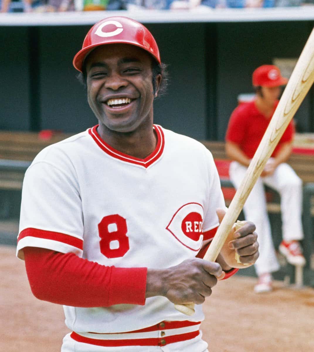
Baseball Hall of Famer and two-time National League MVP Joe Morgan died yesterday at the age of 77. I was lucky enough to grow up watching him play during his prime in the 1970s — he was the real deal.
Although Morgan is usually associated with the Reds, he played for several other teams during his 22-year career — and wore an unusually high number of top-echelon MLB uniforms. Let’s take a look at some of them:
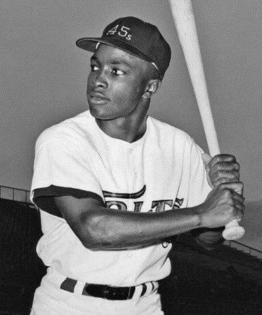
Houston Colt .45s, 1963-64
Morgan signed with Houston and played a total of 18 games for them in 1963 and ’64, when the franchise was still known as the Colt .45s. As such, he got to wear the team’s famous “smoking gun” jersey. The photo shown above is the best shot I could find of him in this uniform, although you can also see him in this group shot (click to enlarge):
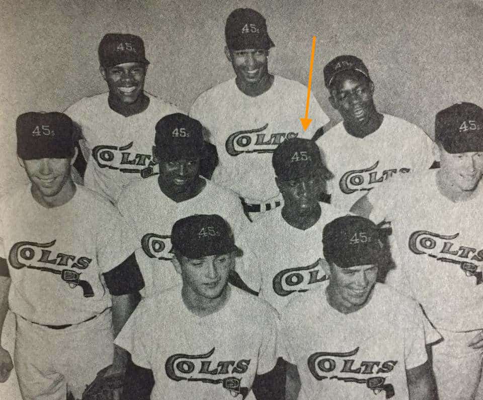
(That last shot was for a gimmick promotion that the Colts ran during their last homestand of the 1963 season: They fielded an all-rookie lineup!)
In 1965, the Colt .45s became the Astros, which leads us to Morgan’s next notable uniform…
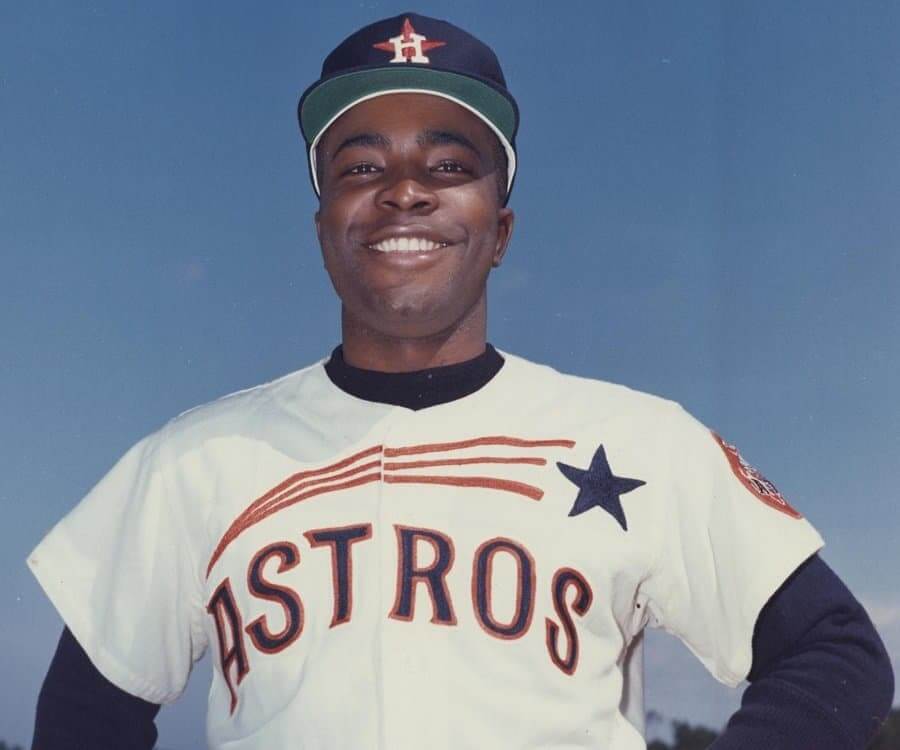
Houston Astros, 1965-71
Morgan became an everyday player in 1965, just in time to wear the inaugural version of the Astros’ awesome “shooting star” uniforms. If you look closely at the photo shown above (which you can click to enlarge), you can see that the jersey’s lettering and graphics were all chain-stitched — magnificent!
Here’s an action photo:
Morgan also wore the 1971 version of this uniform, which had orange lettering, but I couldn’t find a photo of him wearing that design. Anyone..?
Cincinnati Reds, 1972-79
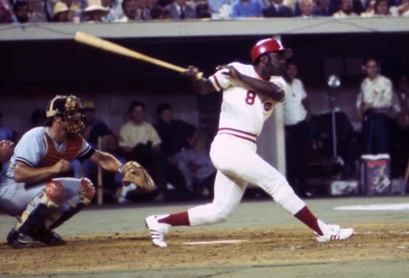
Morgan spent eight seasons with the Big Red Machine, whose uniforms remained unchanged during his time there. Although the Reds were famously fussy about their players’ look — low-cut stirrups, plain black shoes, beardlessness were all mandatory — Morgan, like several other Cincy players at the time, pushed the boundaries a bit at All-Star Games. The photo shown above is from the 1974 ASG, where he wore white shoes; three years later, he wore red:
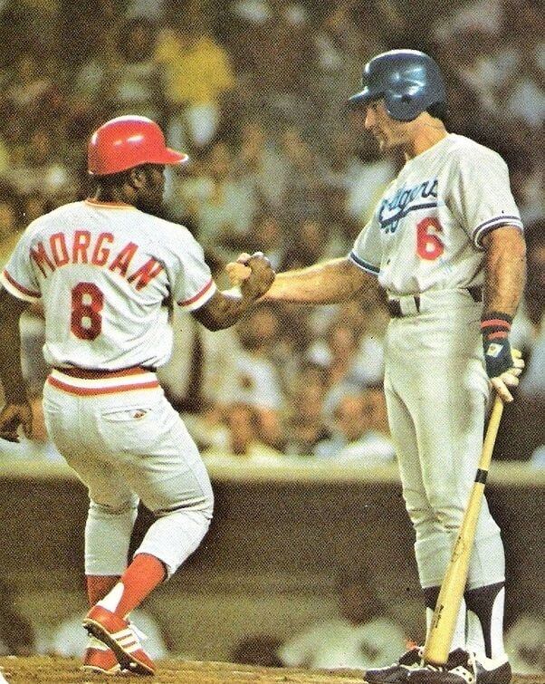
A Red wearing red shoes may not look so outlandish today. But at the time, it was unheard of!
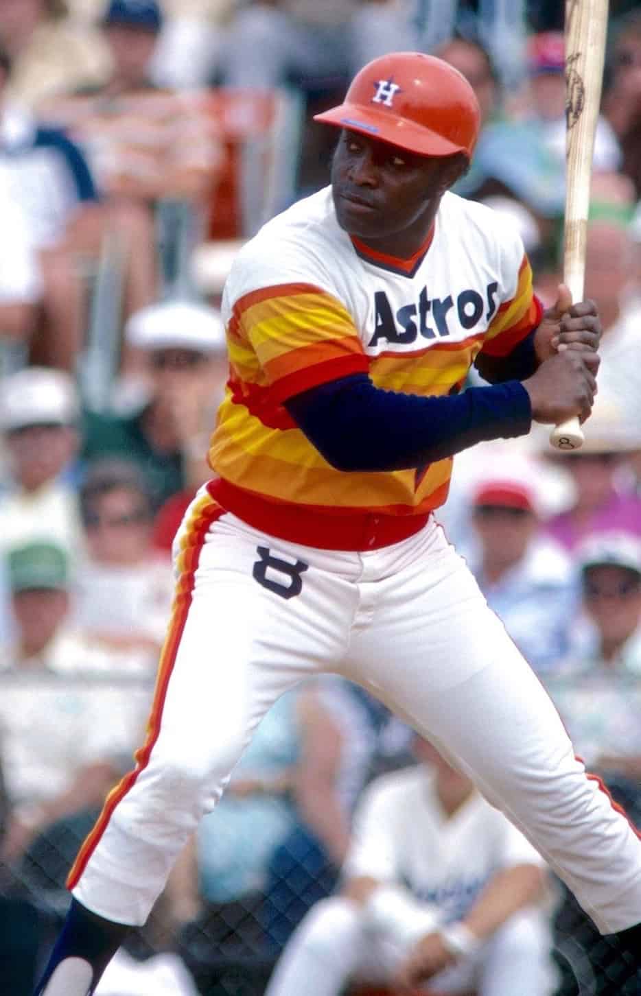
Houston Astros, 1980
Morgan had a return stint with the Astros in 1980, allowing him to fill in the tequila sunrise box on his uniform bingo card. Hmmm — is he the only player to wear all three of the iconic Houston designs (smoking gun, shooting star, tequila sunrise)?
Update: Reader/commenter Rich Loup says Houston pitcher Larry Dierker also wore all three of those.
San Francisco Giants, 1981-82
Embed from Getty Images
After his one-year return trip to Houston, Morgan moved on to the Giants, where he wore one of my favorite (and, to my mind, underrated) uniform sets. Dig how suave he looked in that Giants script! And of course he also got to wear the team’s orange and black jerseys:
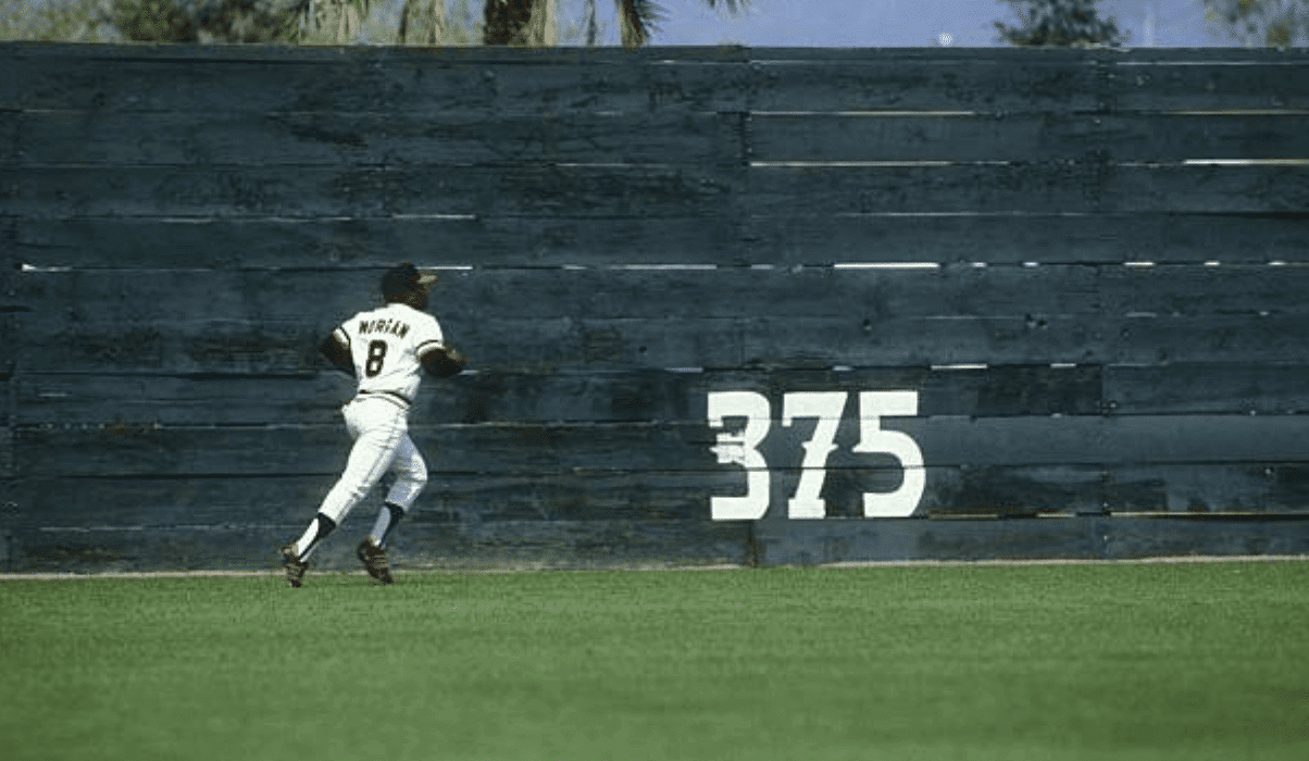
As an aside: While looking for Giants pics of Morgan, I found this shot of him running sprints during spring training in 1982. Look at that fence!
Philadelphia Phillies, 1983
Morgan reunited with former Reds teammates Pete Rose and Tony Perez on the 1983 Phillies. This move, in addition to punching his ticket to another World Series, allowed him to wear powder blues for the first time in his career:
One thing that’s clear in these Phillies and Giants photos is that Morgan enjoyed the freedom to wear high-rise stirrups once he was no longer subject to the the Reds’ dress-code strictures.
Oakland A’s, 1984
Embed from Getty Images
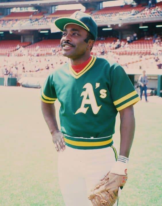
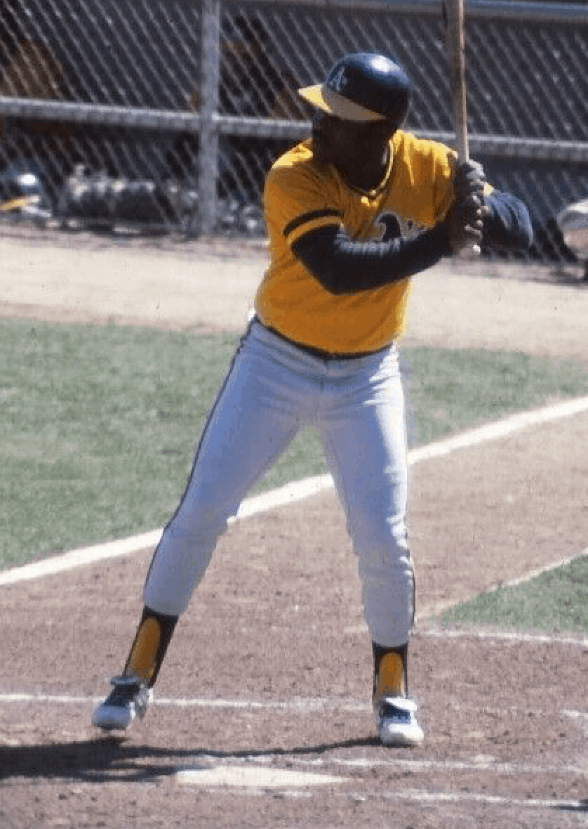
The final stop in Morgan’s career was in Oakland, where he got to wear the bright A’s colors. Obviously, the photo shown above just shows workout gear, but I like the pose and the look on his face. Here are some more conventional uniform pics:
These next two show Morgan wearing BP jerseys (at least one of them is clearly from spring training), but they still look great:
And that’s a wrap. Quite a uniform odyssey!
Finally, no assessment of Morgan’s visual history would be complete without a mention of his signature elbow flap, a timing mechanism that I’ve never seen on any other ballplayer:
Nowadays, some coach would probably try to make a player stop doing that, right? Glad that didn’t happen to Morgan.
I interviewed Morgan once, in 2008, for an ESPN story about Pirates outfielder Dave Parker’s assorted masks. (Morgan felt that the masks made Parker more reckless — and therefore more dangerous to a small-ish middle infielder — when running the bases.) This was around the time that Morgan was routinely being ridiculed online for being a lousy broadcaster on Sunday Night Baseball, so maybe that had made him a bit grumpy, or maybe I just caught him on a bad day. Either way, it was, frankly, an uncomfortable interview — he was very guarded.
But Morgan clearly had his more freewheeling, humorous side. In Jim Bouton’s seminal book Ball Four, he describes how Astros outfielder Norm Miller pretended to be a broadcaster interviewing Morgan in the Houston dugout after Morgan struck out during a game on Sept. 1, 1969, and how Morgan played along:
“Joe, Joe Morgan, may I have a word with you?”
“Sure, Norm, how’s it going?”
“Fine, Joe, fine. We wanted to ask you about that pitch you missed. What was it?”
“Norm, that was a motherfucking curve.”
“Can you tell our listeners, Joe, what’s the difference between a regular curve and a motherfucking curve?”
“Well, Norm, your regular curve has a lot of spin on it and you can recognize it real early. It breaks down a little bit, and out. Now, your motherfucker, that’s different. It comes in harder, looks like a fastball. Then all of a sudden it rolls off the top of the table and before you know it, it’s motherfucking strike three.”
“Thank you very much, Joe Morgan.”
As a 12-year-old, I couldn’t stop laughing at that. I still like it today. R.I.P., Joe.
BALL HAWK 👐@NasirAdderley | #BoltUp pic.twitter.com/fSKGStYT57
— Los Angeles Chargers (@Chargers) October 13, 2020
Who dat looks like crap? Quite the study in contrasts in last night’s Chargers/Saints game, with the Bolts looking super-sharp in their new yellow pants, gorgeously accented by the blue socks, while the Saints looked dreary in mono-black. It was like one team was playing in Technicolor while the other was stuck in black-and-white. (You can see lots of additional photos here.)
For the life of me, I can’t understand why the Saints keep wearing their black bodysuits at home. They look good, and then some, when they pair the black jerseys with the gold pants — why move away from that? Such a mistake.
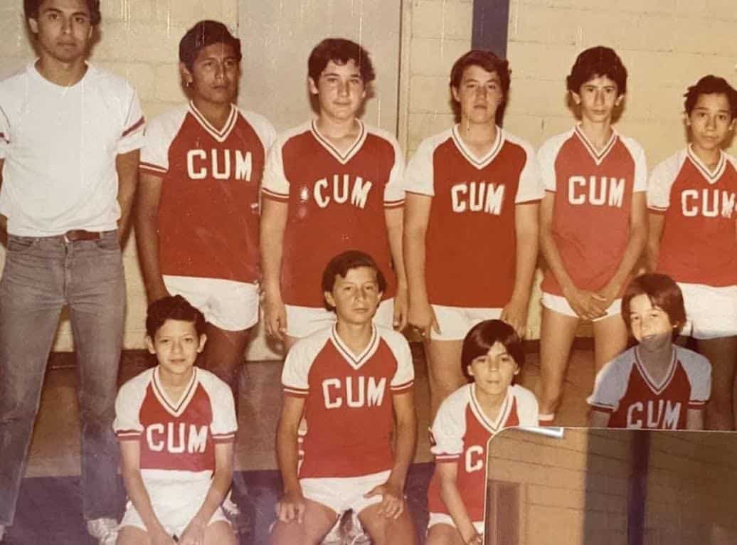
Click to enlarge
Too good for the Ticker: Here’s a simple test: If the first thing you notice when you look at this 1980s photo is “Some have straight lettering and some have arched,” or “At least one guy has a different font than the others,” or “Hey, those two guys in the top row don’t have any sleeve striping,” then congratulations — you just earned your Uni Watch diploma.
(My thanks to Jimmy Lonetti for this one.)
Collector’s Corner
By Brinke Guthrie
Follow @brinkeguthrie
We’re getting in the Halloween spirit on this week’s edition of Collector’s Corner, starting with this story from my youth: One Halloween around 1966, I was carrying my plastic pumpkin full of candy down a long, downhill road in our winding Louisville subdivision. I paused for a sec, standing by a sewer grate. It was right about here, but I don’t see the grate anymore. Anyway, the strap broke, the pumpkin fell, all the candy went down the sewer, and I came home empty-handed. Is that a Charlie Brown moment or what?
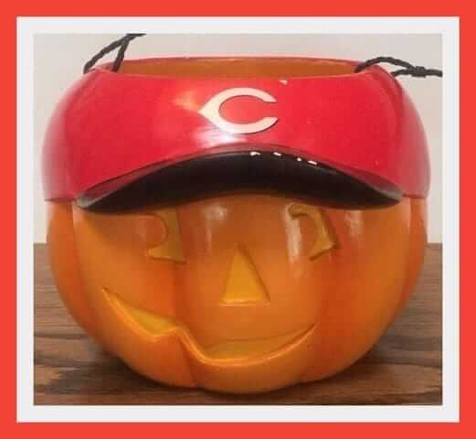
Hopefully, the strap is more secure on this Cincinnati Reds Jack-O-Lantern bucket. Just the thing to hold your trick-or-treating goodies — assuming door-to-door trick-or-treating actually takes place this year, that is.
Here are the rest of this week’s picks:
• One more Reds-related item, this 1966 Spring Training Auxiliary Roster. What’s an “Auxiliary Roster,” anyway? A separate booklet just for the scrubs and minor leaguers?
• Came across this vintage January 1972 issue of Life magazine with Roger Staubach and Tom Landry on the cover, and I thought, “Oh, I’ve seen that photo before.”
• Going back over a century for this item — a 1910s pillowcase adorned with baseball player tobacco inserts, including Ty Cobb.
• Phil Rizzuto, the “famous short-stop of the New York Yankees,” recorded this 78-rpm record in the 1950s for the Good Luck Clover Newspaperboy Contest. It seems that Good Luck was a brand of margarine. Includes “Hints on How to Win,” and “What to Say to Your Customers.”
• One more record: This time it’s “Keep the Ball Rollin’” by Jay and the Techniques, a song for the 1981 Philadelphia Eagles.
• How to Throw Curves and Other Pitching Secrets is the title of this 1930s Babe Ruth booklet, sponsored by Quaker Oats. (“Tastes good, and they’re good for you!”)
• This 1969 Philadelphia Phillies scorecard is signed by Steve Carlton and Mike Torrez.
• Staying with the Summer of ’69, here’s a Seattle Pilots coffee mug.
• This eBay auction is for a vintage 10″ tall New York Rangers bobblehead bank of unknown vintage.
• Here we have an auction for various 1971 Chicago Cubs memorabilia items, including a WGN sticker and an ad that says, “Win With a Sticker, Stick With a Winner.” Give that copy writer a bonus!
But wait! There’s more…
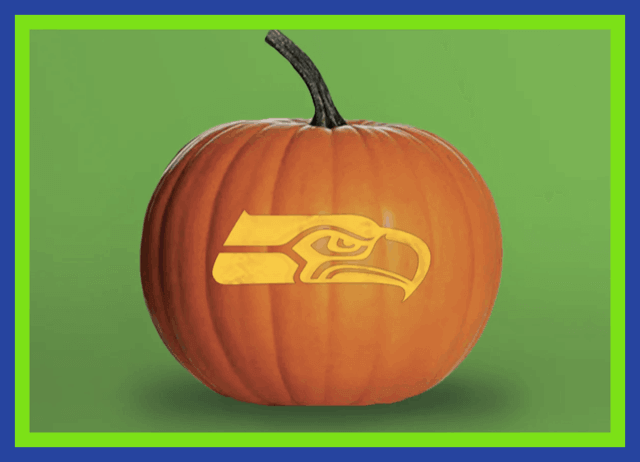
With Halloween now 18 days away, you still have time to visit your local pumpkin patch, where you can grab a pumpkin to emblazon with your favorite team’s logo! Don’t know where to find the right stencil for your team? Don’t worry — Collector’s Corner has you covered with this list of links to pro team logo stencils!
Don’t see your team listed there? Try dropping the team’s logo into this handy-dandy stencil maker! That’s what we did to create these stencils of the Uni Watch winged stirrup and circular logo.
If you make a uni-themed pumpkin (whether with a team logo or a Uni Watch logo), be sure to send photos to Paul!
ITEM! New Halloween-themed Color Remix caps, tees: With Halloween on the horizon, designer Bryan Molloy and I thought we should add some black and orange to the Uni Watch Color Remix series. Let’s start with the caps (click to enlarge):
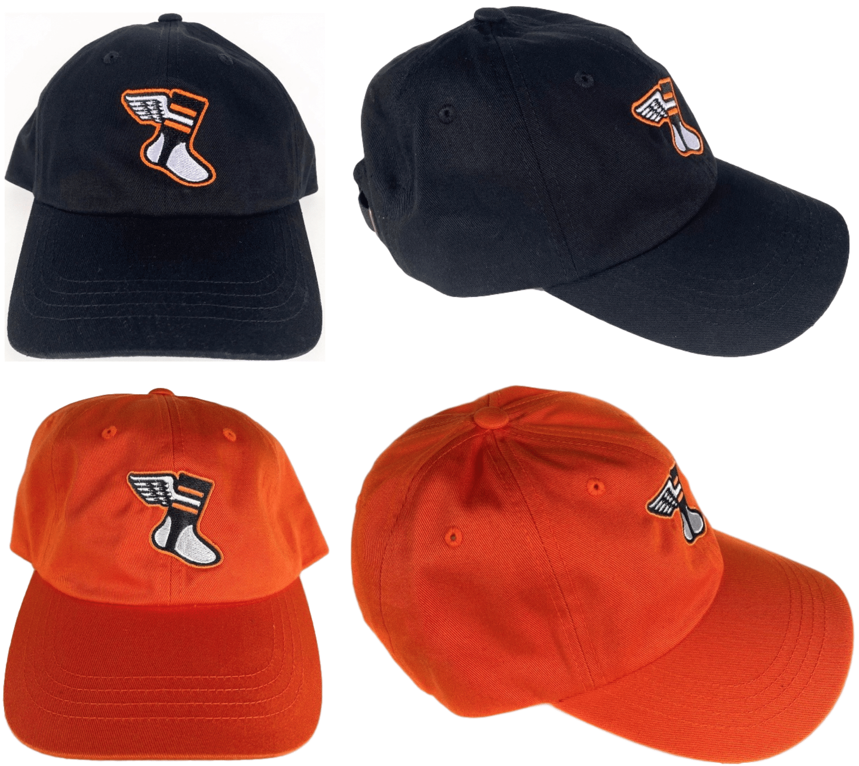
These will be available for a limited time here.
In addition, we have corresponding T-shirts:
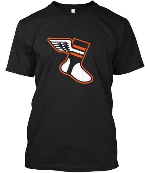
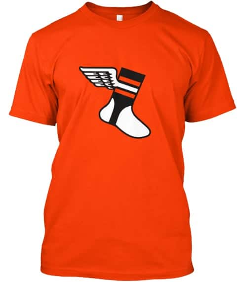
Here’s where you can order the black and orange versions. They will remain in the Uni Watch Shop for the foreseeable future.
Finally, this is the last week for ordering the first round of Color Remix caps, so move fast if you want any of those. Thanks!
Meanwhile, as long as we’re talking merch: In case you missed it yesterday, Uni Watch Koozies are now available in a new design:
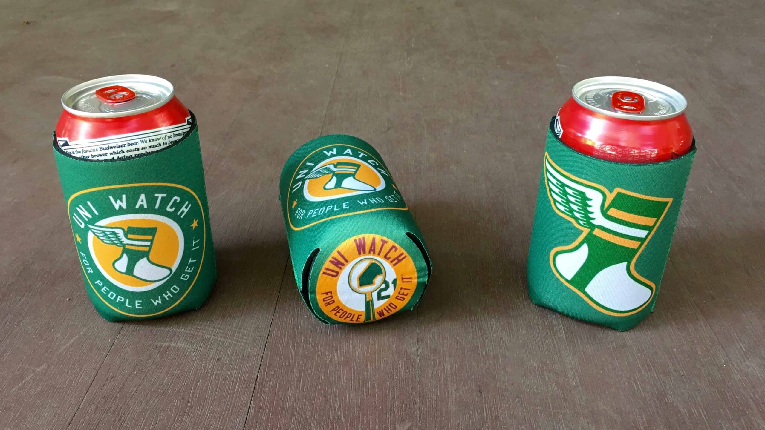
Plus you can save on shipping if you combine a koozie order with some of our other products. Full details here.

Teespring sale reminder: In case you missed it yesterday, Teespring is running another one of its periodic sales. Until midnight tonight you can get 10% off your order by using the checkout code HARVEST10. That means you’ll save some coin and Uni Watch will still get its full share of the earnings — a win-win!
This offer applies to the everything in the Uni Watch, Uni Rock, and Naming Wrongs shops.
My thanks, as always, for your consideration.
The Ticker
By Alex Hider

Baseball News: For anyone into bat knob decals, the Astros had you covered yesterday with this photo they shared on social media (from @SteveinLC). … Speaking of the Astros, manager Dusty Baker was wearing his mask upside-down yesterday (from @jsweezy87). … During that game, which was played in San Diego, a phantom Padres logo was still visible behind home plate (from Austin John). … Rays OF Randy Arozarena wore the wrong cap for at least part of Sunday’s game (from Jonathan Coffey). … Fromer umpire John Hirschbeck lost his son in 2014 lost his son to a rare neurological disease called ALD. Hirschbeck’s son was an avid memorabilia collector, and after going through the collection with a friend, the pair realized they can use the collection to raise money to fight the disease (via The Athletic, hard paywall) (from Tim Dunn). … After Andrew Taylor’s father died of ALS in 2017, Andrew organized a charity softball tournament to raise money for the Joe Martin ALS Foundation in Charlotte. Here are the shirts and masks he’s designed for this year’s event. … Pretty funny moment in this video from the 1967 World Series — third base ump Augie Donatelli steals the cap right off 2B Julian Javier’s head as the team celebrates! Here’s more on the theft (From BSmile and Jason Halpin). … Each year, a group of Pirates fans gathers at the last remaining piece of Forbes Field to relisten to the radio broadcast of Game Seven of the 1960 World Series. With the pandemic limiting social gatherings, the Pirates have invited some of those fans to PNC Park this year to give them a bit more space (from Mike Rosenberg).

Football News: In 1988, the Bengals wore a small sleeve patch to mark Cincinnati’s bicentennial for one preseason game —the Hall of Fame Game against the Rams (from John Thrift). … BYU will be wearing gray facemasks this weekend against North Alabama (from @donky_fromshrek and @brandongutie). … Tennessee Coach Jeremy Pruitt said earlier this year he wanted the Vols to wear black uniforms this season to fundraise for local organizations fighting for racial equality. However, Nike’s apparel contract will prevent them from doing that this season (thanks to all who shared). … Waukesha North High School in Wisconsin uses an upside-down University of Miami “U” as a logo (from David Petroff). … Here’s more on the University of Maine’s extremely rare apparel contract with New Balance (from James Gilbert).

Hockey News: The Rangers signed rookie LW Alexis Lafrenière yesterday, and a graphic they shared on social media showed Lafrenière in a sweater with a smaller NOB font that included an accent mark. Better yet, the sweater didn’t have a maker’s mark! (!) (from Matthew Brooks and Brandon Wheatkings). … The Newfoundland Growlers, an ECHL affiliate of the Maple Leafs, have a new Leafs-inspired alternate (from Mike Lucia). … Notre Dame G Nick Sanford has a new pad set that features the golden dome on the school’s “Main Building” (from Anthony Nuccio and Warren Junium).

Basketball News: Anyone voting at State Farm Arena in Atlanta — home of the Hawks — will get a special basketball-themed “I Voted” sticker (from David Petroff). … New “Dallas” alternates for SMU (from Chris Mycoskie). … Huntingburg High School in Indiana had a pretty awesome number font back in the 1950s (from @BallparkHunter).

Grab Bag: Atherton High School in Louisville, Ky., says it will retire its “Rebel” mascot, and the county’s school system is asking other schools to review their mascots as well (from Josh Claywell). … Luis Fernando is back with another NASCAR/football jersey crossover for driver Austin Dillon. … eBay will soon launch a sneaker authentication program.

Tomorrow: The Uni Watch 2020 Press Pin.
Don’t know why it bothers me, but that Cubs “Win with a Sticker, Stick with a Winner” bumper sticker is at least 10 years newer than the 1971 items listed.
Ebay listings only exist to punish me for knowing things.
The Morgan MLB review was great. The Durham Bulls also shared a picture of him yesterday:
link
Nice!
Morgan windbreaker photo – a favorite feature, super-close-to-the-field broadcast booth in Tiger Stadium
Is that a Dymo label on the brim of Joe Morgan’s orange Astros helmet?
Sure looks like it.
That picture from the ’74 ASG is beautiful. What a swing.
Always liked seeing guys like Morgan, Concepcion, and the like wear white or red cleats. The Reds had a strict all-black shoe rule- no white trim could show- so no one had shoe deals. But the ASG was fair game.
The Alexis Lafrenière link wasn’t working for me.
Working fine for me, and the coding looks right. Here’s the link again:
link
Got it – thanks! And it would awesome if the NHL embraced the MLB movement started by the Latino players to add the diacritics. Russian names in Cyrillic is a bridge too far perhaps, but accents and diereses for those who need them!
“Came across this vintage January 1972 issue of Life magazine with Roger Staubach and Tom Landry on the cover, and I thought, “Oh, I’ve seen that photo before.” ”
While both are profiles of Staubach, they aren’t the same.
No question the LIFE cover is where the NFL 72 artist got his inspiration. LIFE from Jan of 72, Sunoco thing came out Aug or so of 72. The only thing the artist left out was the chin strap.
Put it this way, it’s not a “trace over” like we often see. The mask spaces are a but different, rivets, mouth.
certainly similar of course.
2 things in the picture of Joe Morgan in the Phillies’ powder blues:
1. The cap and jersey logos didn’t match – the cap logo had a baseball in the negative space of the P, but the jerseys couldn’t. IIRC, there is a rule saying that you cannot have a depiction of a baseball on the jersey, as it might confuse the hitters trying to pick the ball up from the pitcher.
2. The helmet logo was sometimes applied with a wicked rightward slant that the jersey and caps never had with their logo.
Never heard of that rule – interesting! The Phillies added the ‘stitches’ to their jersey sometime in 1987/88 so I guess the rule was lifted? Are there any other examples of this type of change around that time period?
The ‘stitches’ were present when the Phillies rolled out the new uniforms for 1970. Originally, the P and the numbers were chain-stitched and the jerseys (including the gray roadies) were button-ups, then a few years later they moved to zip-ups, road blues and patch P’s…and the ‘stitches’ were gone.
In these ’74 team pics, you can see a few players wearing old ball-in-P button jerseys:
link
link
1971 Astros road jersey:
link
Here’s Joe Morgan’s 1972 Topps card with a not-so-great angle of the orange uniform.
link
link
Larry Dierker wore Colt .45s (made his MLB debut on his 18th birthday in 1964 and struck out Willie Mays in that game), shooting star and rainbows. But Morgan probably has him beat with a fourth uniform: the rainbow sleeves, which did not debut until mid-May 1980 (unofficially, I pinned it down to New York) as their road uniforms (they wore the rainbows on the road the first month-plus of the season).
I say unofficially because I went down a rabbit hole researching this a couple of years ago to back up my memory of the Astros breaking out the new uniforms in the middle of the 1980 season (I was 9 at the time). And I am pretty sure this is correct.
Great info, Rich. Thanks!
Of course, Dierker managed the Astros from 1997-2001 so he topped Morgan by adding the open star navy of 1997-99 and the red and black of 2000-2012.
The burning question… are there any photos of either of them wearing two-in-one stirrup socks?
Two things:
1) I only did a quick and dirty google search, but if there’s no audio of the curveball discussion, what a bummer. That would rank up there with the Lee Elia rant and The Manager’s Corner with Earl Weaver.
2) Granted Paul is the Dean and has the final say, but for the “Too Good for the Ticker” section, I propose that anybody who passes that test immediately qualifies for not just a diploma, but a Doctorate in UniWatch Studies. Holy smokes is that a perfect example of “that did not age well.”
The “curveball discussion” between Miller and Morgan wasn’t an actual interview, it was a mock interview between teammates in the dugout during a game, with Miller playing the interviewer role. Search google all you want, you’re not going to find audio.
Great review of a man who I got to know through Sunday Night Baseball. I often tuned him to listen to his insight despite having only a mild interest in baseball. What a colorful uni history!
Wow! Thank you for the baseball history lesson! I never heard of the Houston Colt 45s until I read this post and clearly have never seen their unis before. My how times have changed. Its been about 22 years since the Bullets became the Wizards so its probably safe to say gun related sports names will not be making a comeback (at least on the professional level). How low is the probability that the 45s throwback unis makes it to the field again??
They wore them as throwbacks April 10 and 20, 2012, as part of the club’s 50th anniversary celebration. The jerseys didn’t include the gun, though; MLB didn’t want a firearm depicted on the uniform.
When the throwbacks were revealed they did not include the gun, but that was remedied when the Astros took the field:
link
Hear hear on the Saints and the mono-black and mono-whites. Don’t know why they hardly use the gold pants anymore. I’m kinda glad I grabbed a pair when the league moved from Reebok to Nike – they were selling them cheap in the team gift shop!
The only mono-look I like for the Saints is the Color Rash version – at least that one has pant stripes, and the gold numbers outlined in black pop more than the reverse they normally wear.
I gotta say, I’m surprised at how much I first liked the Saints now-standard white-on-white look, I think I even prefer it to the color rush version. Iunno if I like it better than white-over-gold, but it’s a billion times better than white-over-black, which is what their regular road look was for so many years before introducing the white pants.
If they did black-over-gold 6 homes games a year, black-over-black the other 2 games a year, white-over-gold 4 road games a year, white-over-white the other 4 games a year…I wouldn’t hate it.
They can re-introduce the Color Rush when they figure out how to match the golds in it with the helmet’s gold.
Every time I see the Colt .45s uniform I think of my team I was on as a kid that was sponsored by gun manufacturer Weatherby. We were called the “Weatherby Rifles”. Really wish I saved the uniform, or at least have a good picture.
Loved today’s Joe Morgan rundown and revisiting some nice old uniforms. I was a little thrown by the phrase “all three of the iconic Houston designs” as the 90’s navy/gold sticks in my mind just as much as the 80’s stripes, whereas I sometimes forget the shooting star even existed. Probably a generational thing, I’m sure.
“…no assessment of Morgan’s visual history would be complete without a mention of his signature elbow flap, a timing mechanism that I’ve never seen on any other ballplayer”
Since the motion was suggested to Morgan by Houston team mate (and fellow left handed hitter) Nellie Fox, I wonder if there’s possibly footage out there of Fox taking his own advice.
No batting gloves for Morgan at the plate…but he wore one on his glove hand in the field. Long live quirks. -C.
Great point!
In which case, to be didactic, it’s not a batting glove but a “fielding glove liner glove.” ;-)
It’s kind of bizarre that BYU is going with the gray Gifford Nielsen-era face mask, but is keeping the chrome blue helmet stickers and stripe and the “Y” with curved serifs, as opposed to straight serifs like in Nielsen’s day. It kind of feels like a half-assed attempt at a throwback.
I agree! I was going to make the same observation. Glad I’m not the only one who noticed that and feels like a missed opportunity on BYU’s part.
The first thing I noticed about those youth team shirts was the varying cuts of the contrasting raglan sleeves. Some slope at a straight diagonal, while others curve along the contours of the shoulders. Does that qualify me for my Uni Watch diploma??
Thanks for the Joe Morgan tribute, interesting to note, even in his last year with the A’s, where it may appear he was “hanging on too long” – he had a .356 OBP – which was probably not recognized much back then, but was likely significantly above league average.
Saints uniform is a plain lazy ass look IMO, the equivalent of wearing track pants on a big date
If you’re interested in learning more about the Augie Donatelli cap theft, this story from the St. Louis Post-Dispatch provides an interesting coda to the incident, detailing a meeting decades later between Julian Javier and Donatelli where they talk about the cap:
link
I’m fairly certain the lack of gold pants usage has to do with Nike not having the material for proper gold pants. Once Nike took over, the pants lost their shine, even if the golds were more consistent across the uniform. I think the team is no longer happy with the lack of shine in the gold pants, as evidenced by wearing them.
Pants under Reebok:
link
Pants under Nike:
link
Since they changed their shade of gold, they’ve only worn the pants 7 times over 53 games, including only twice in the last 37. They’ve gone 3-4 in those games, 37-9 in other colors so maybe win % factors in their decisions as well or makes it easier to choose a different pant color.
I say all this as someone who prefers the gold pants by a wide margin. But I hypothesize it’s an issue with Nike’s coloring the pants.
I love those photos of Morgan wearing a red t-shirt under his green A’s BP shirt. There’s something perfectly mismatched and out of place about it.
Fairfield Area Rapid Transit also fielded a softball team.
link
Thank God they’re now “Fairfield And Suisun Transit” serving two cities!
Does anyone know what CUM stands for on those shirts? I would also love to know how long that lasted before someone figured out why everyone was laughing at them.
Another Morganism was that Joe wore 12 in his rookie season, followed by 35 in his second season before settling on 18 during his first tenure with the Astros. He chose 8 when he got to the Reds in 1972, and continued to wear 8 on each team the remainder of his career.
Per baseball reference, #18 was available with the Reds (nobody on the Reds wore #18 between 1970 and 1993). Maybe he decided on 8 when he moved to the Reds because 18 was most famously associated with Ted (The Big Klu) Kluszewski?
Wow. Morgan had a long career for a middle infielder. And I’d put his uniform resume up against anyone. He definitely covered the entire spectrum from the Ultra-conservative Big Red Machine duds…That’s my favorite 70’s look for it’s melding together of old school (low strirrups, black cleats, home whites & road grays) and new school (sand knit pullovers, sansabelt pants)…to the Astros Tequila Sunrise which was my second favorite 70’s look. As a BRM fan, I had completely forgotten that he joined the hated Phillies (with the best powder blues, loved the zip up jerseys) along with Rose and Perez. He followed that up with a great career in broadcasting. I never understood the hatred he got as a broadcaster.
At first I was: “Man, Joe looks great in that uniform” and then I came around to: “I think Joe would look great in ANY uniform”. Classy looking ballplayer and knew how to pose for the camera.
Great player and I liked him as an announcer.
BTW, that motherf***ing pitcher? Steve Carlton.
Saints fan here. It can’t be said enough… the mono black is terrible.
Another Saints fan: I’d be okay with them wearing black pants if they were the ones of Archie Manning’s tenure (with the gold/white/gold stripe), and that means white socks, too!
Not sure if it was covered earlier in the year? But, when the Giants switched to white pants at home, they were still wearing their grey pants if they had to wear blue jerseys on the road. Such was not the case in Dallas this weekend. Wonder if this is a permanent change, or just a one time deal?
Giants haven’t worn blue-over-grey on the road since 2018. They wore the white pants in Dallas last year, just like this past Sunday.
Gotcha. Shows how much I have paid attention. :)
So nice to see the difference in the age old dispute of the question “is it yellow or is it gold?” Last night’s game proved that yellow and gold are not the same shade.
Loved the uni retrospective on Morgan; it works especially well for him since he played for a few different teams.
Nice note on wearing powder blue for the first time when he joined the Phillies. I also believe his tenure in Philadelphia was the only time he wore pinstripes in his career.
So the Braves navy blue tops last night had silver piping instead of the usual white…is this special for the post season? (they were the “road” team last night so I don’t know if this was maybe to match the grey pants).
The Saints’ black pants wouldn’t irritate me so much if they were the 1999 version, with the thick gold stripe. Something to break up the monotony of the monotone unis!
This ^^, x1000. Why does literally everyone Get It™ except the Saints?
BYU is playing Houston this weekend, not North Alabama.
I broke the news of Joe Morgan’s death today to my father and he said two things. The first was Morgan is one of the best players at his position in baseball history; on a more humorous note, the second item was that he and his friends would spend time every day trying to imitate his swing (my dad is in his early 50s).
Another baseball great gone sooner than expected. RIP.