By Phil Hecken
Follow @PhilHecken
What’s up everyone? Hope everyone had a good week and you’re all staying safe.
A couple weekends ago, I did an interview with Bowen Hobbs, who also graced us with two divisions of NFL concepts (the whole shebang — logos, alternate logos, uniforms, helmets, etc. etc.). It was a tremendous undertaking and if you missed that, please click here.
I’m back again today with Bowen as he brings us three more divisions (AFC South, AFC West, and NFC East). There’s a lot to get to, so I’ll turn it over to Bowen right now.
NFL Redesigns, Volume II
By Bowen Hobbs
Hi everybody! It’s Bowen Hobbs back with a collection of redesign concepts I developed for the NFL. Each team has a team signature (primary logo + team name), primary icon/logo, secondary logo, “coaches cap” logo (minimal typographic logo), a custom font, and four uniforms (home, away, alternate, and throwback). As with my other series, one of my goals was to make each redesign feel like the team without using any of their current symbols, except on throwback uniforms. I also changed the one-shell rule to a two-shell guideline to allow for more accurate throwback designs.
AFC South
Houston Texans
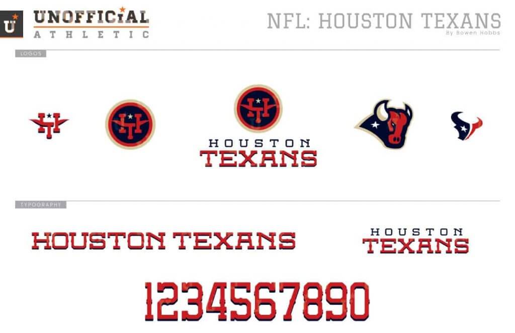
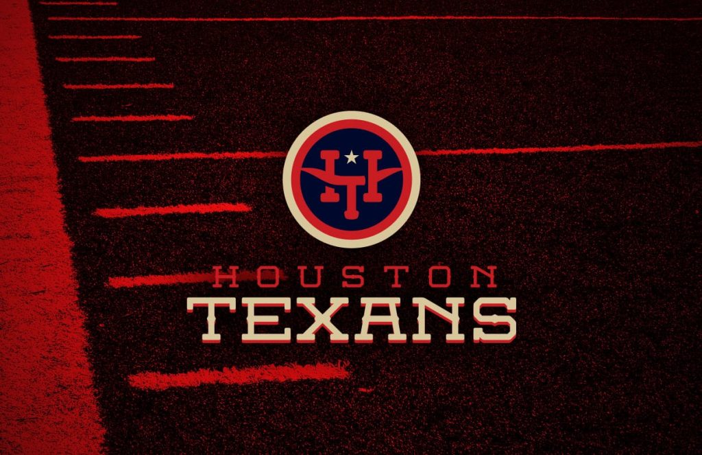

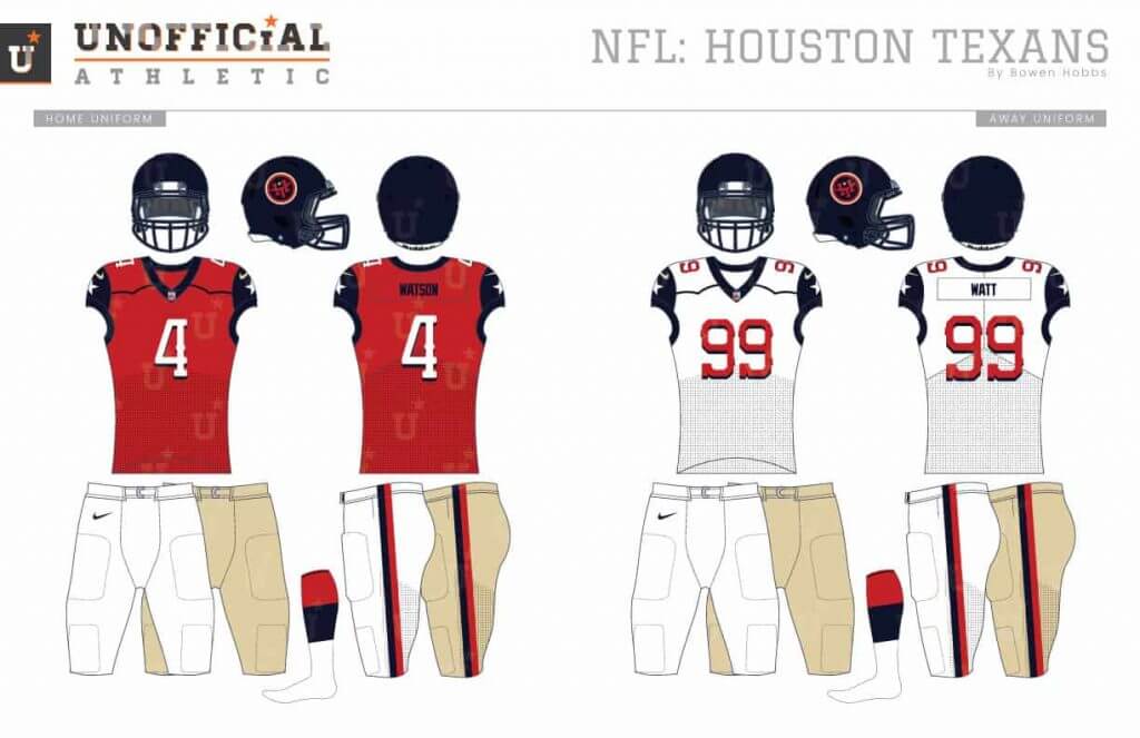
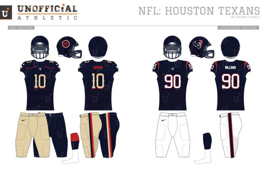
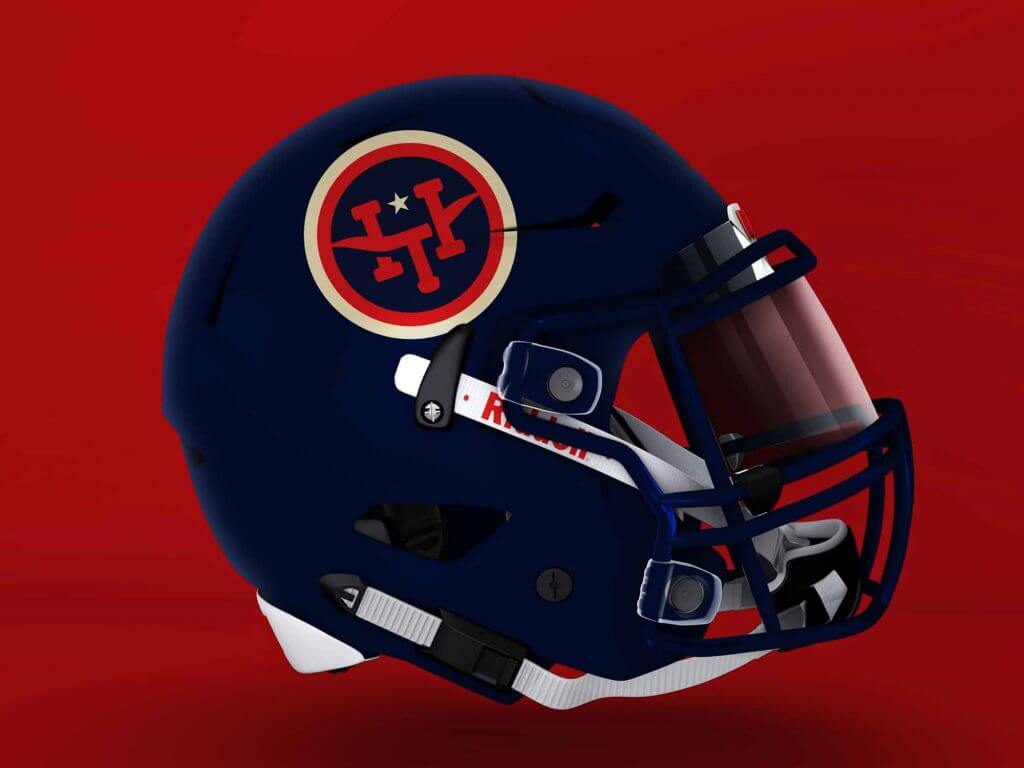
My Texans redesign starts with a typographic primary logo that resembles cattle brands and features a longhorn that doubles as the T. The barbed typeface also follows the ranching theme, while the secondary mark updated the current bull logo. The uniforms also follow suit with western trim along the collarbones and an option for khaki-colored pants.
Indianapolis Colts
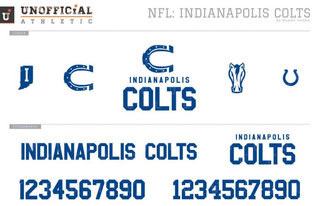
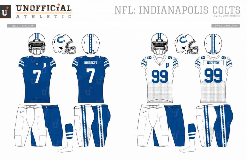
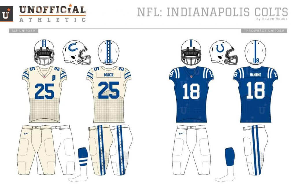
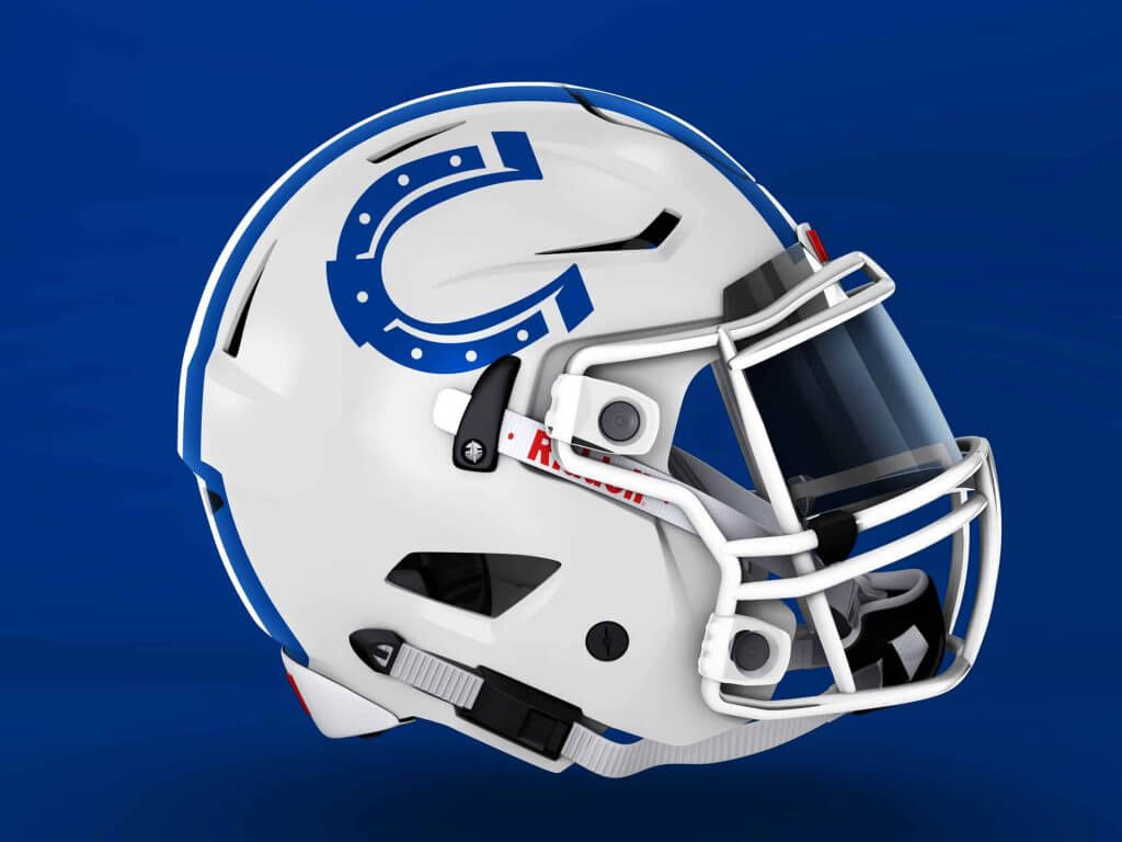
Branding-wise, the Colts are one of the most consistent teams in the NFL, occasionally making small tweaks instead of wholesale changes. I modernized the horseshoe and rotated it to make a C. I wanted to keep them pretty traditional, which is why the lettering is a no-frills block font. The main change on the uniforms is the use of a new consistent dotted striping applied across all elements, as well as a cream-colored alternate uniform.
Jacksonville Jaguars
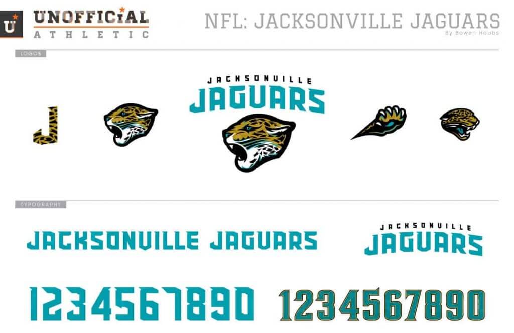

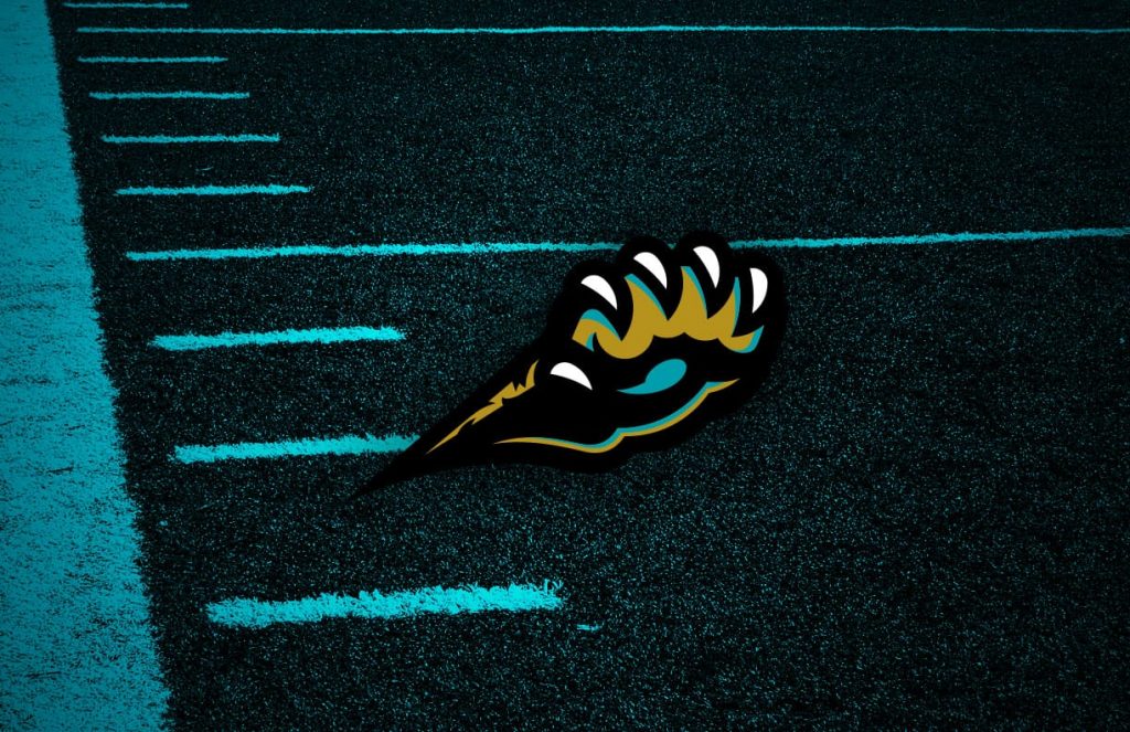
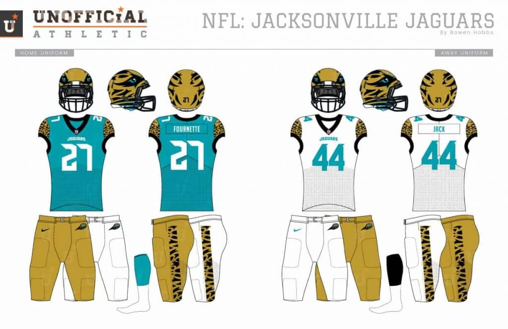
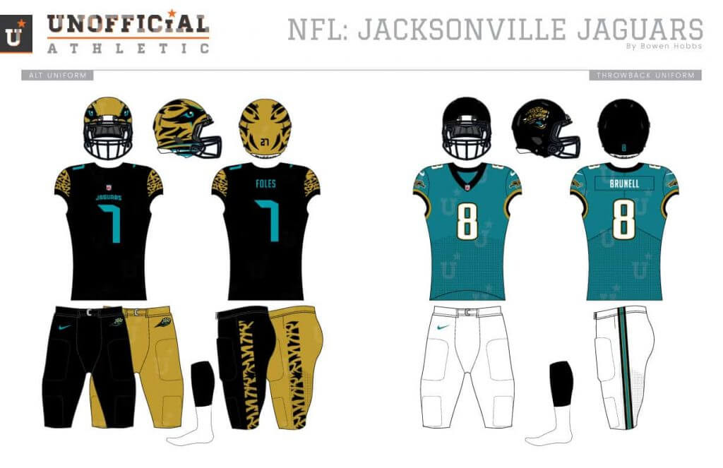
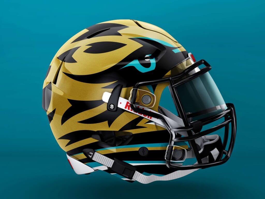
By contrast, the Jaguars are not a traditional team. I started my Jaguars redesign by re-rendering the jaguar head logo to add more teal into the primary mark. That new style with teal shading is also applied to the secondary paw mark. The uniforms are very modern with a helmet designed to look like a jaguar head, and jaguar print cap sleeves and pant stripes.
Tennessee Titans
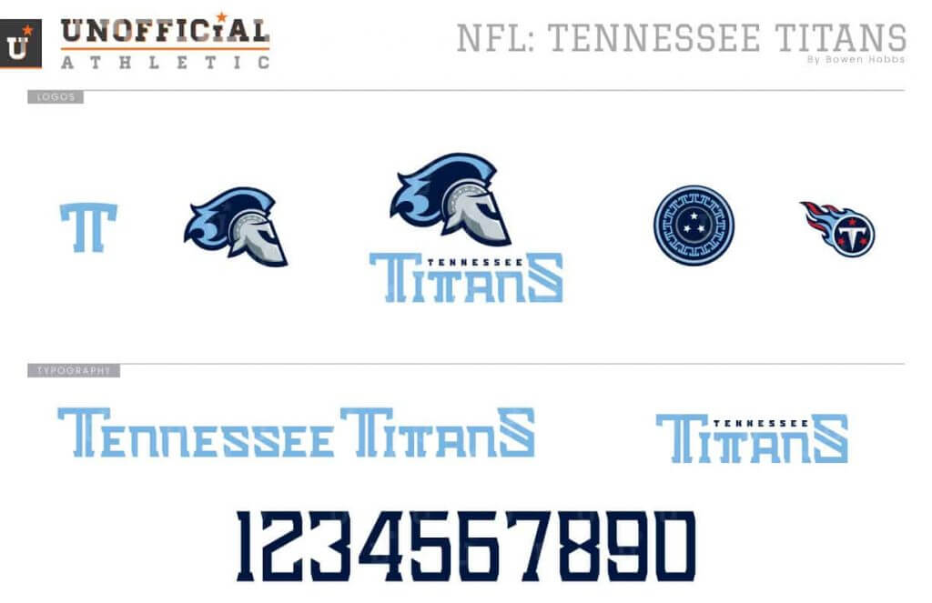
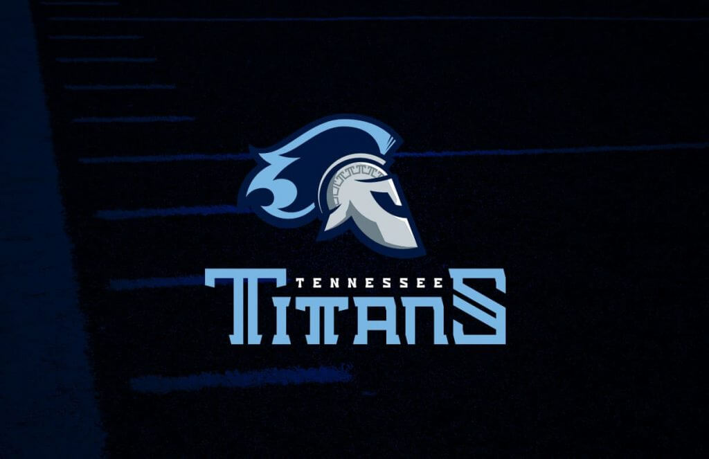
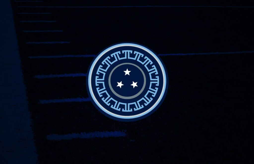
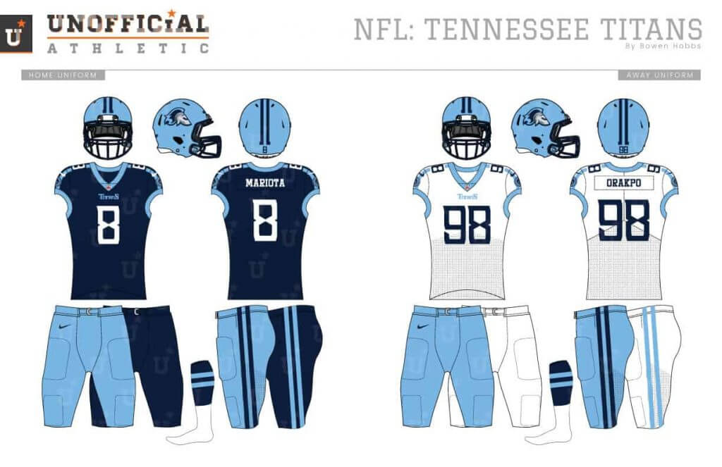
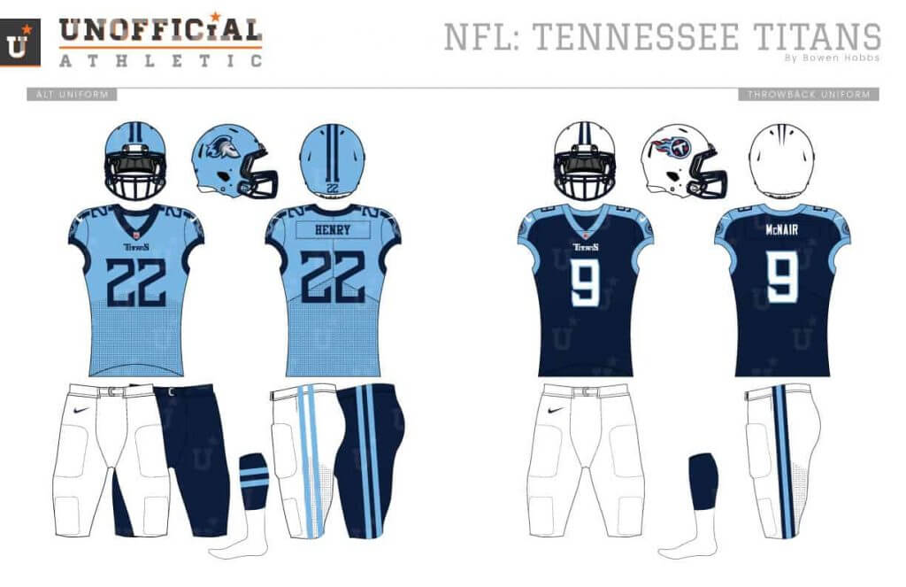
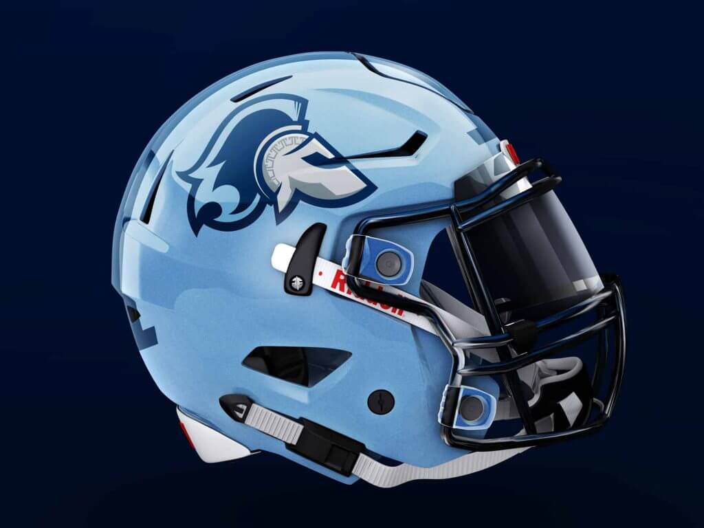
Since becoming the Titans, Tennessee has consistently had some of the worst uniforms in the league. While the inclusion of red is supposed to represent the state of Tennessee flag, it seems unnecessary, so I removed it to focus on the two blues. The primary logo replaces the flaming thumbtack with a centurion-style helmet, while the secondary is a three-starred shield. The typeface has certain double strokes which are consistent with the uniform striping across the shoulder and down the pant legs.
AFC West
Denver Broncos
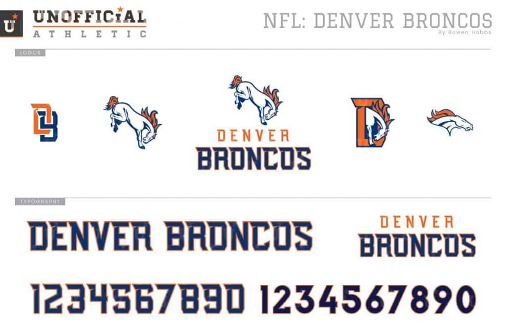
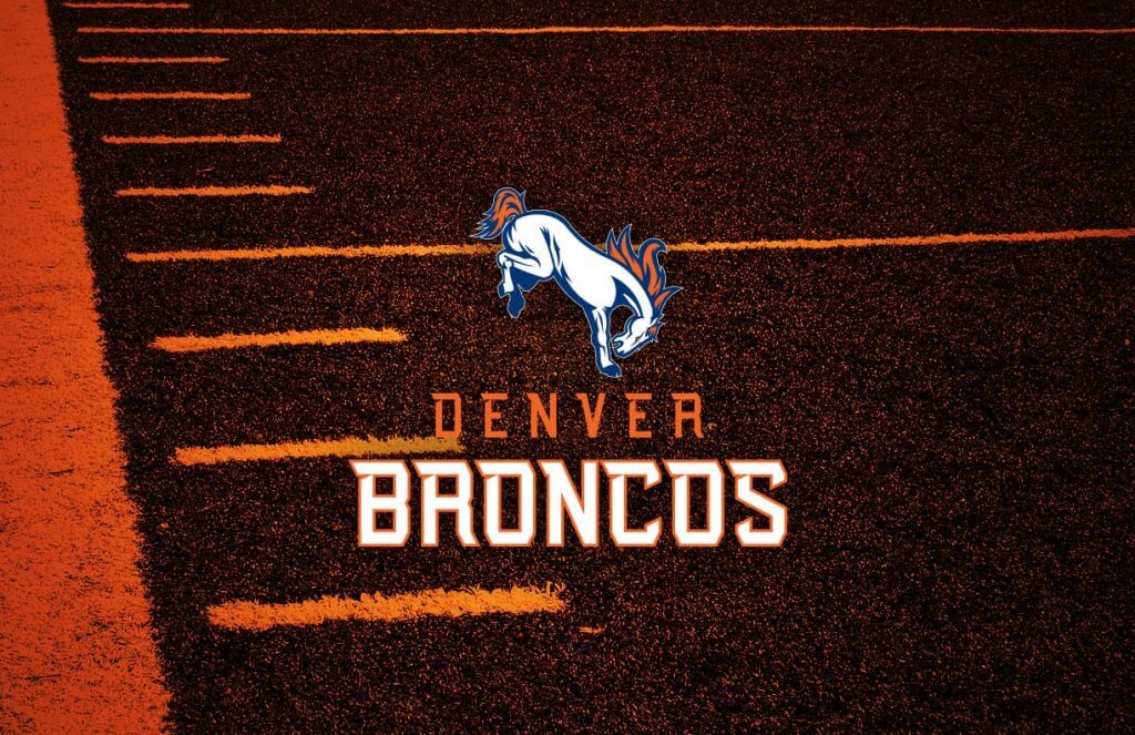
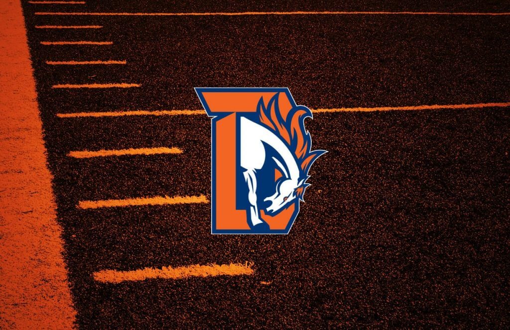
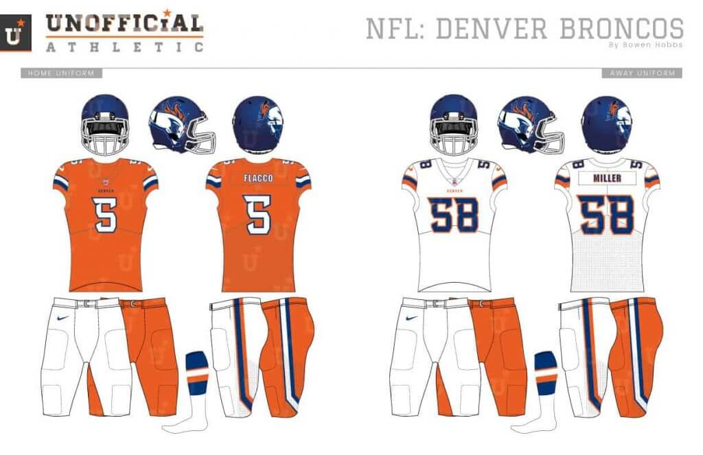
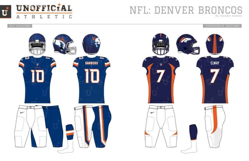
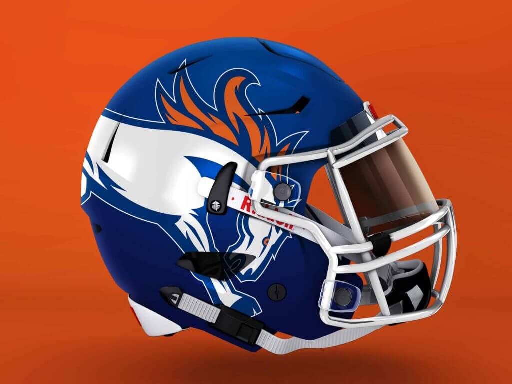
While the Broncos new logo has stood the test of time, their uniforms look more dated by the game. My Broncos redesign changes the bronco head logo to a bucking bronco. The new typeface blends modern notches with a block font. The satin blue helmets opt for an asymmetrical design with an oversized bronco on the right side and the player number on the left side. The uniforms feature a bent striping pattern on the sleeves and plants.
Kansas City Chiefs
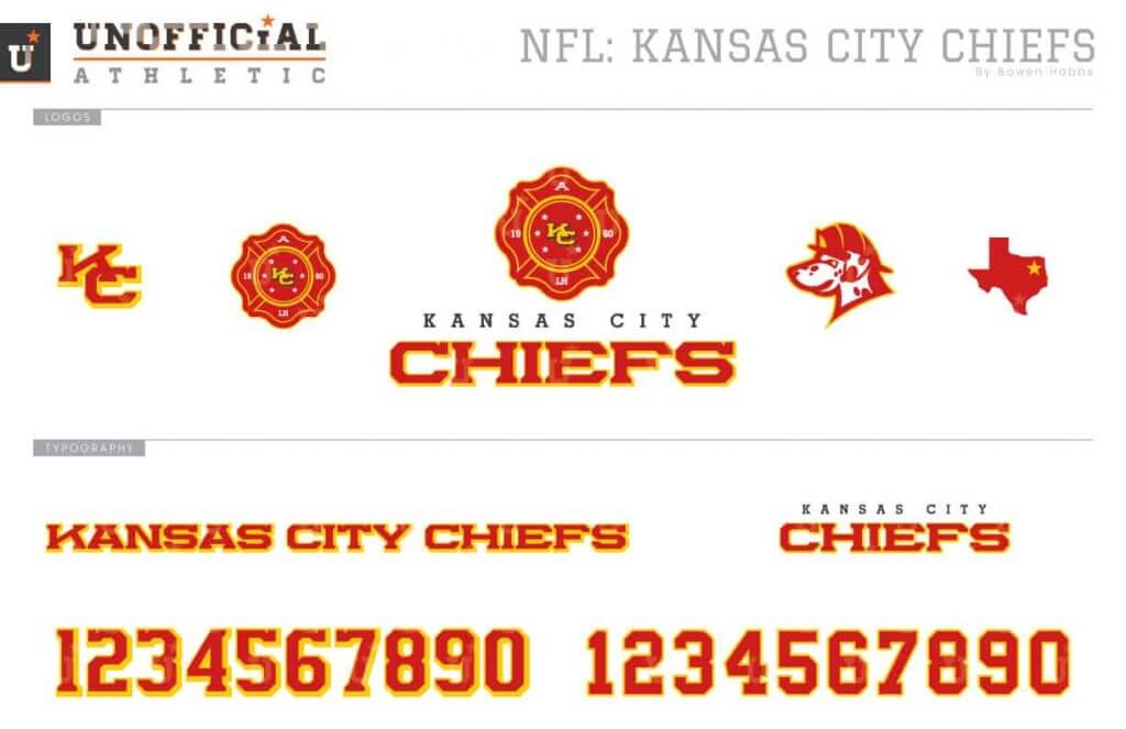
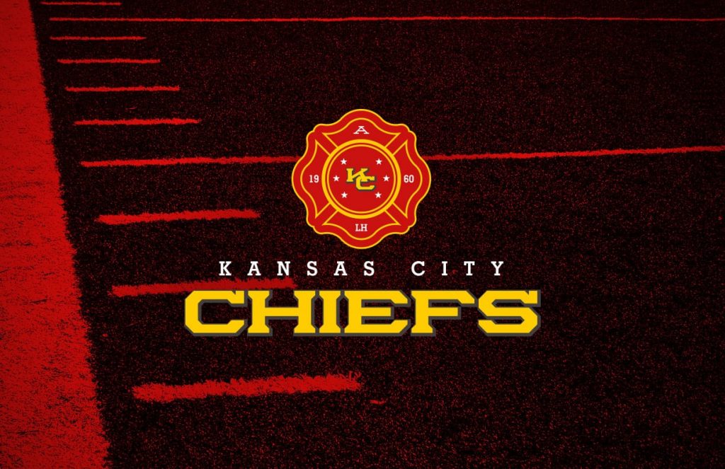
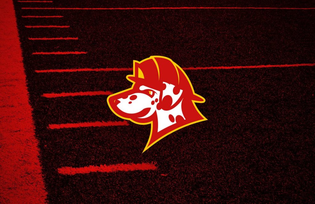
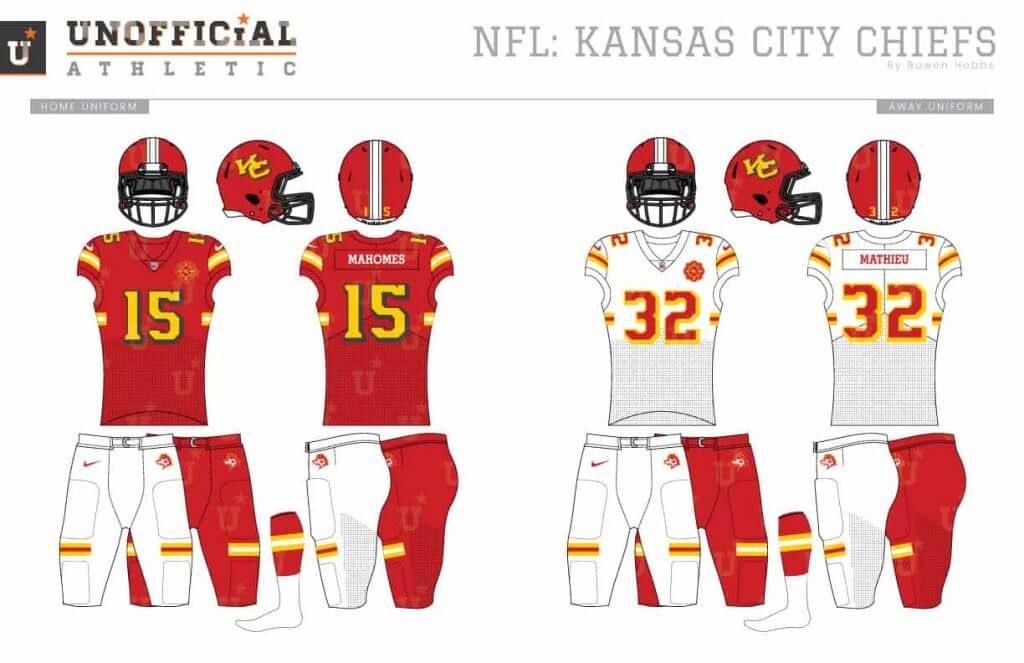
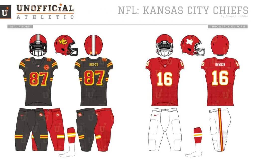
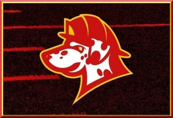
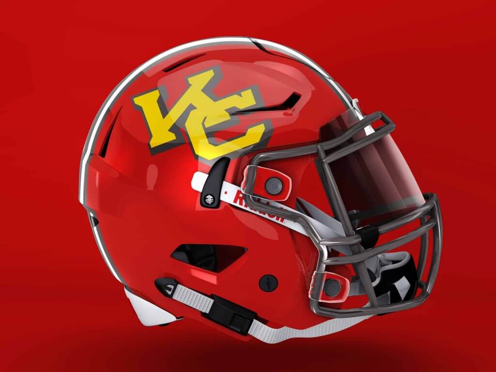
My Chiefs concept asks the same question as my Atlanta Braves concept: Could the name Chiefs still be usable if the Native imagery was substituted for a firefighting motif? To that end, the primary logo in my Chiefs redesign shows a Maltese Cross with a block KC at the center. The new typeface was developed to blend elements of athletic block with lettering from the KCFD’s trucks. The uniforms also blend firefighter design elements with the Chiefs’ history, applying the team’s striping to match the protective gear firefighters wear.
Las Vegas Raiders


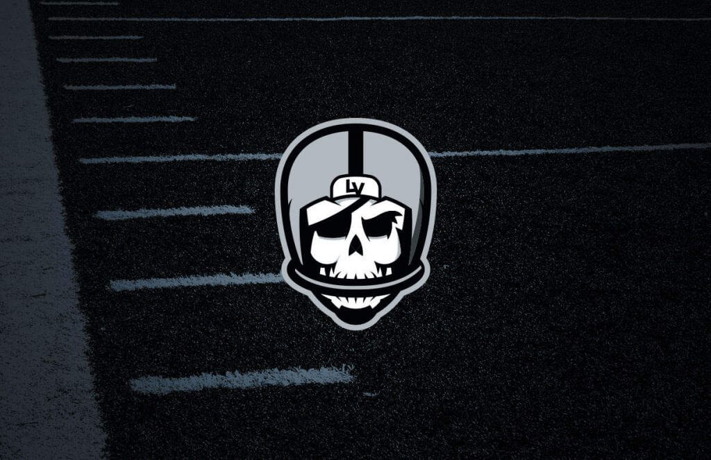
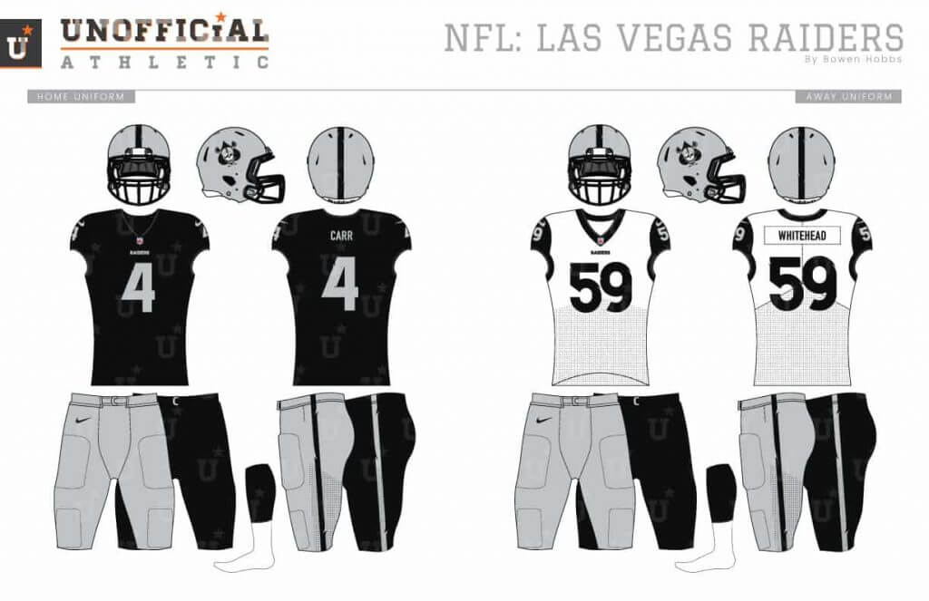
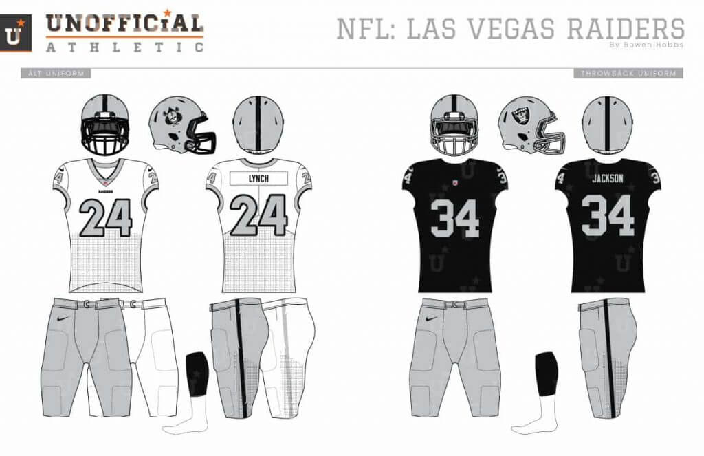
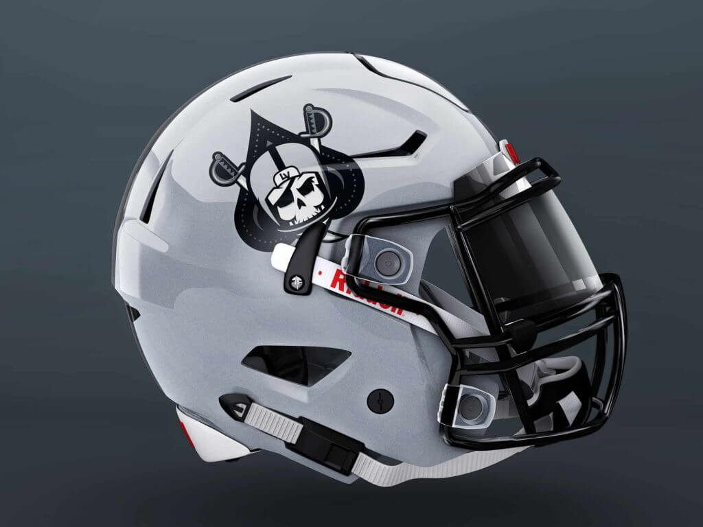
My goal with the Raiders was to update their image for their new home in Nevada. My primary logo design replaces the shield with a spade shape, while the raider is now a skeleton version of himself. The new typeface uses modern lines with tattered accents. The home uniforms are mostly the same, but with a few ever-so-slight modernizations, while the aways also add black cap sleeves. The alternates are also white, but with classic silver numbers.
Los Angeles Chargers
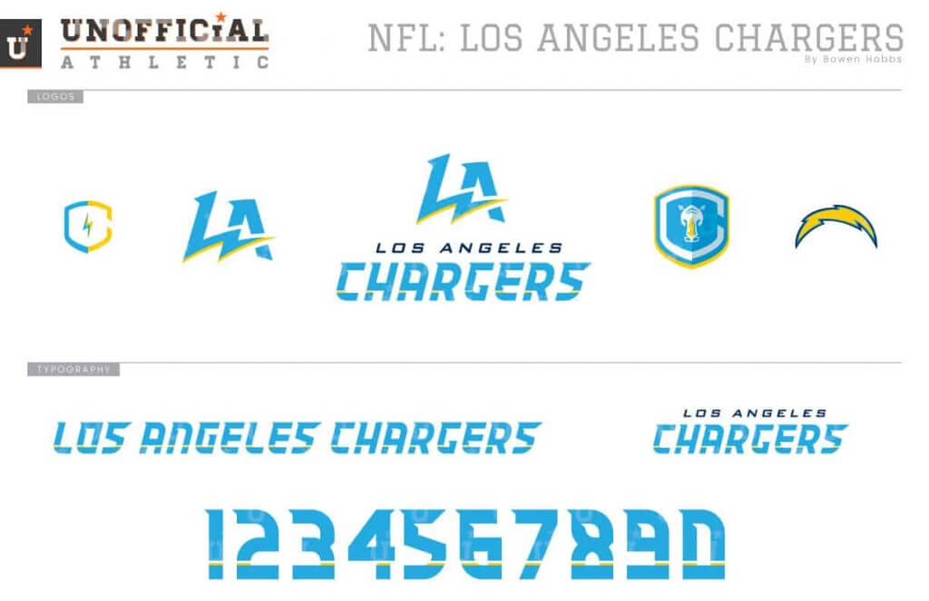
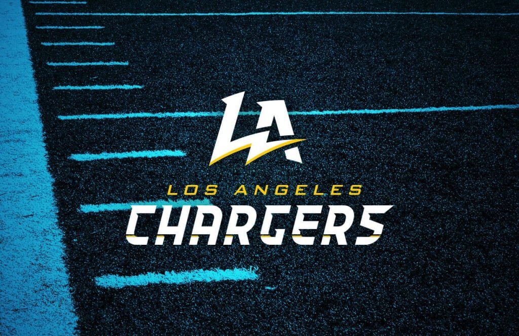
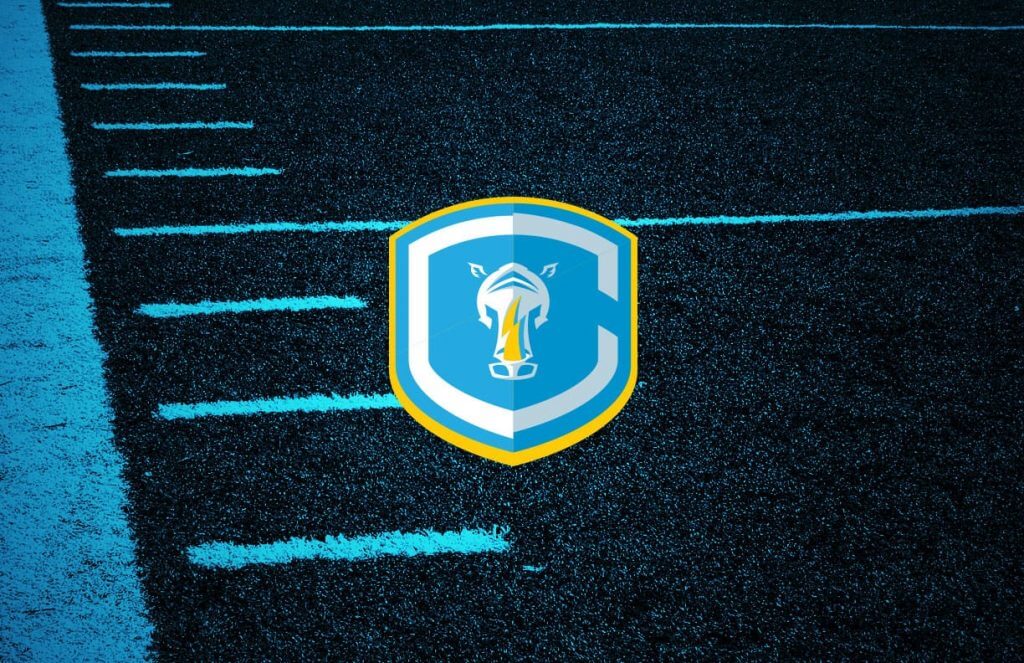


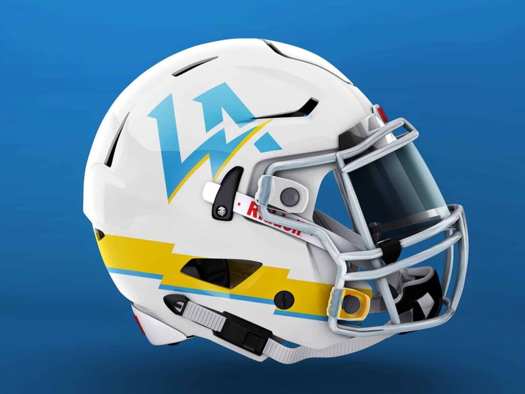
My Chargers concept dives into the team’s relocation to Los Angeles. The primary logo is an LA mark with a bolt striking through the letterforms. The secondary logo places a rhino with a lightning bolt horn inside a C-shield. The new font is italicized to convey speed. The new uniforms opt for a new placement of the jersey bolts along the collarbone. The bolts on the pants come up from the knee.
NFC East
Dallas Cowboys
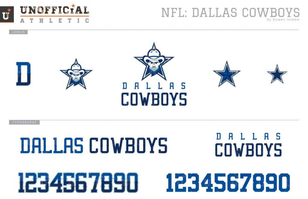
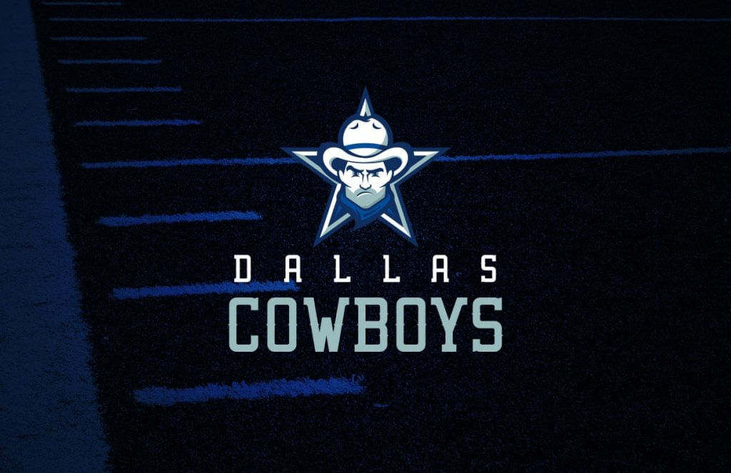
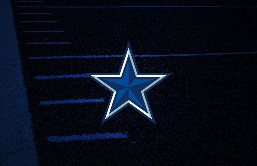
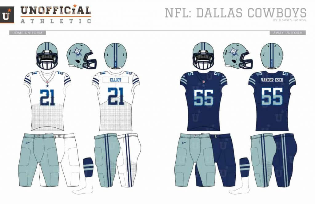
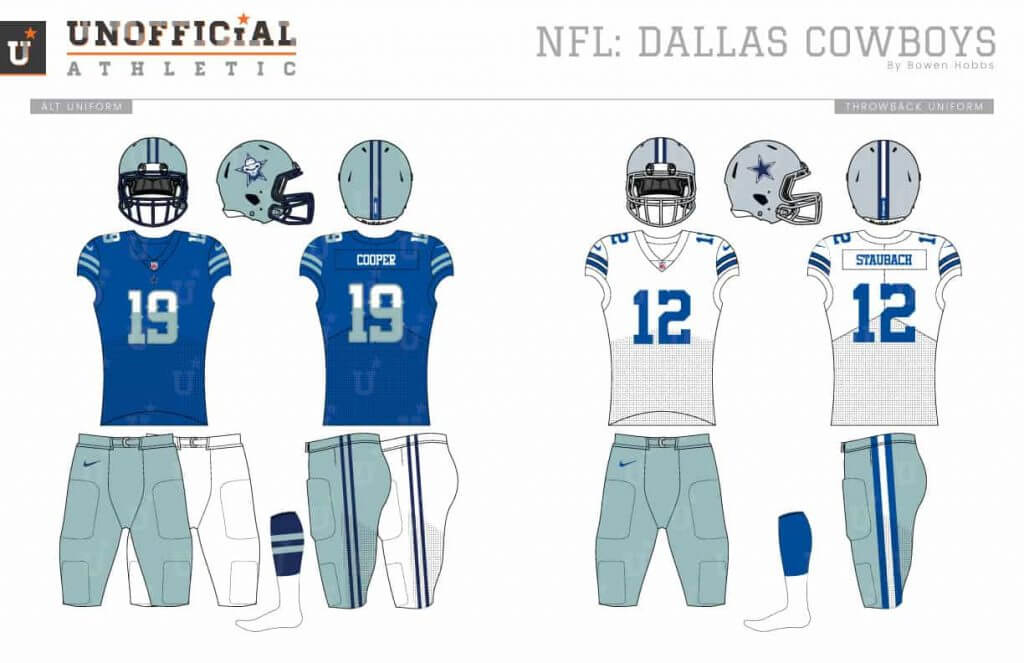
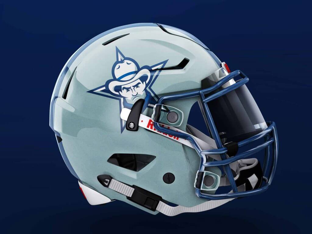
The Cowboys’ star logo is iconic, even if their uniforms are a conglomeration of disparate elements. My Cowboys redesign adds a mascot and a bevel to the star logo, making use of their two different blues. I also removed the non-greenish silver, the black from their sleeve stripes and the grey from the facemasks. The new font uses a uniform stroke weight with western accents and a two-tone application that balances their storied history with their place as one of the league’s glamour franchises. A two-stripe pattern is used consistently throughout the uniforms.
New York Giants

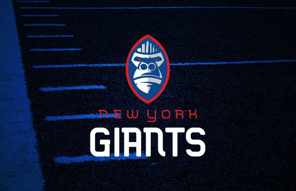
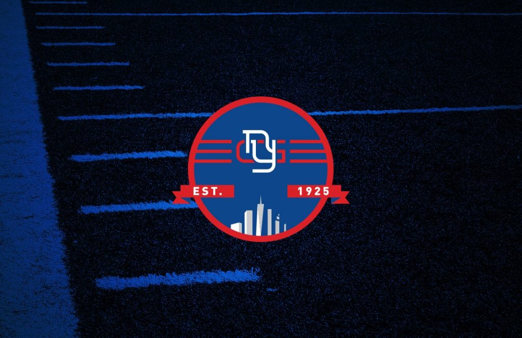
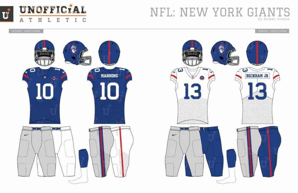
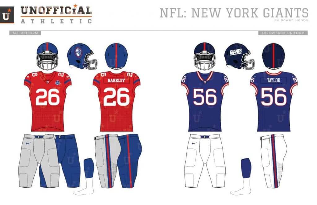
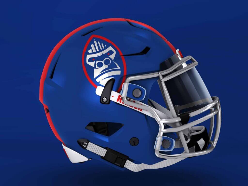
My Giants redesign starts by giving the team a King Kong mascot. Kong is placed inside a football to make the primary logo. A badge celebrating the team’s founding stands in as the secondary mark. The font is a modern and strong slab serif. I’ve always been bugged by the GIants having two completely unrelated jerseys for home and away. My redesign aims to fix that, using a single stripe on the sleeves and the pants (except for the grey pants where the single red stripe is outlined in blue).
Philadelphia Eagles
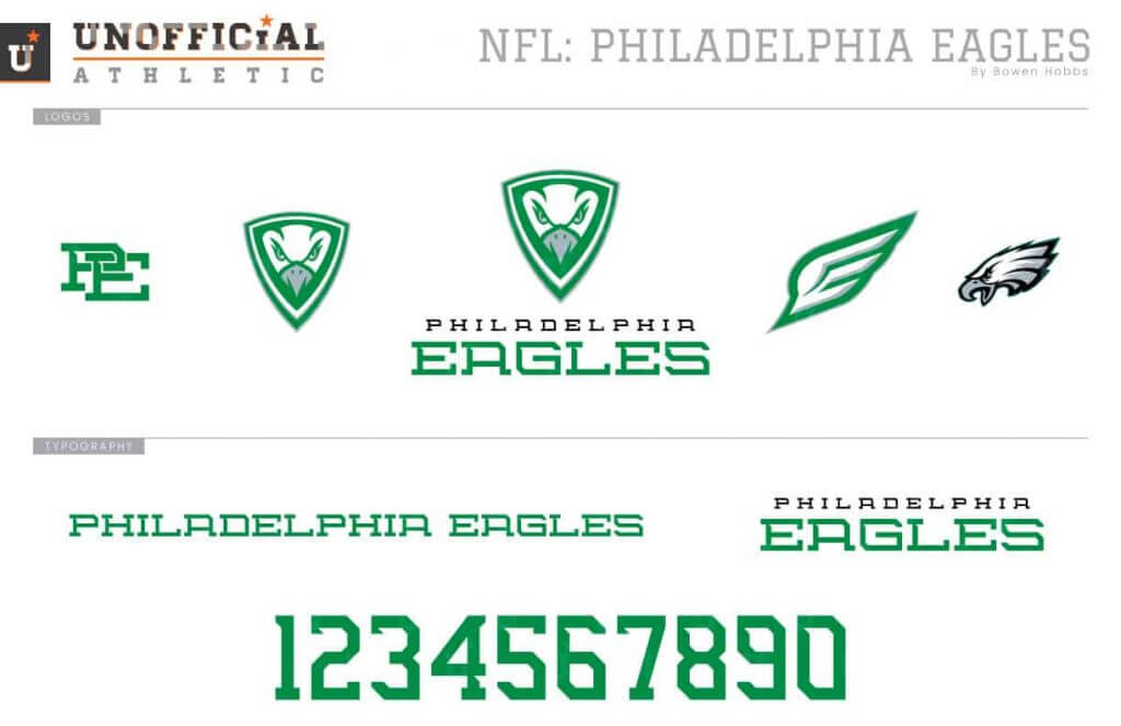
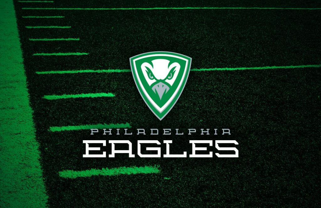
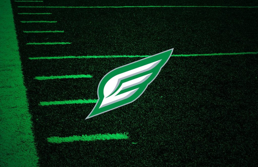
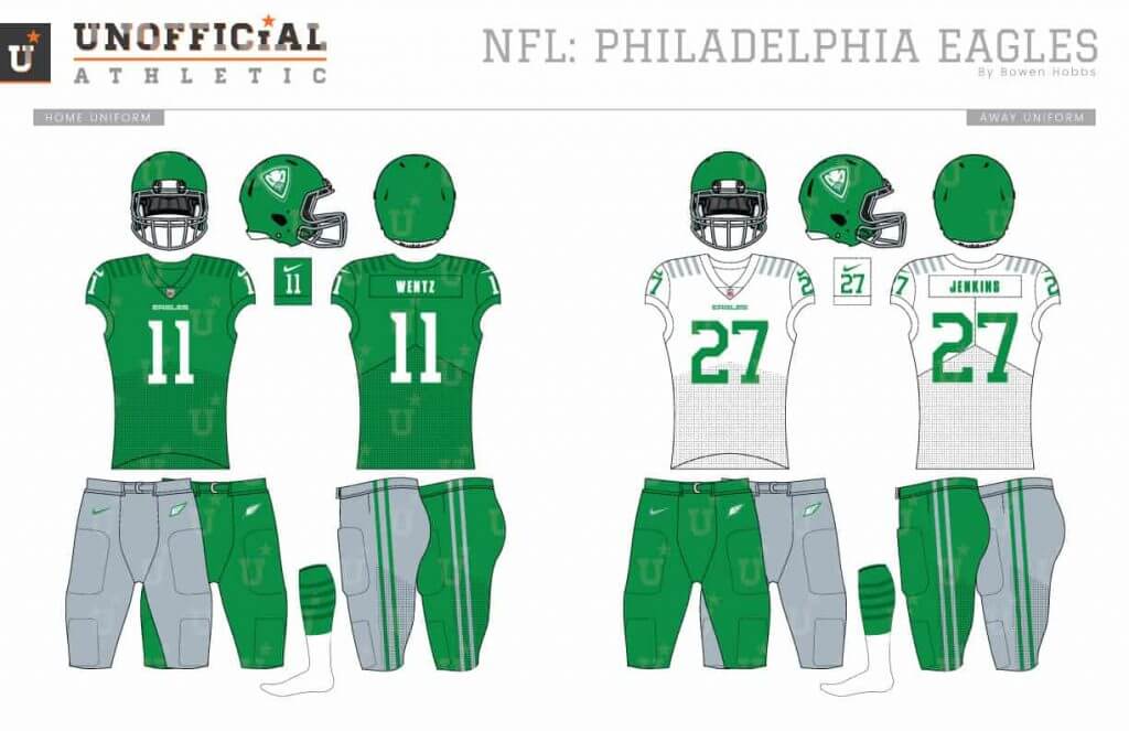
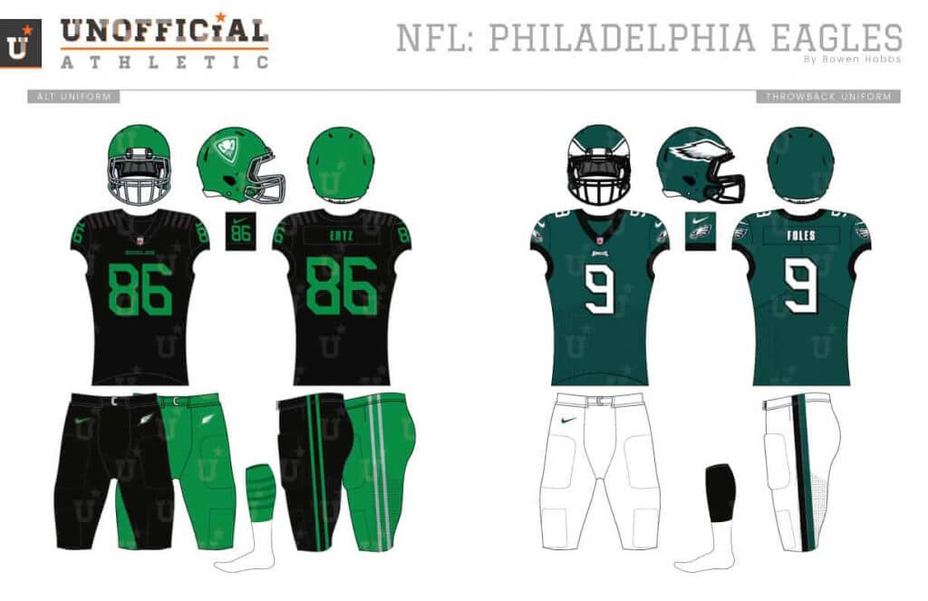
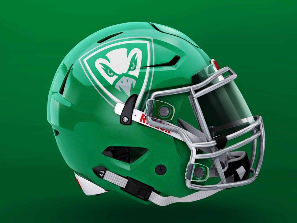
The Eagles updated logo from 1993 still looks great today, but he midnight green doesn’t. My first step was returning the team to kelly green and silver, only using the black as an alternate uniform. My Eagles concept starts with an eagle-head shield as the primary logo and an E-wing mark as the secondary mark. The typeface is a block serif with angular accents. The uniforms feature sublimated accents across the shoulder yoke and numbers on the sleeves.
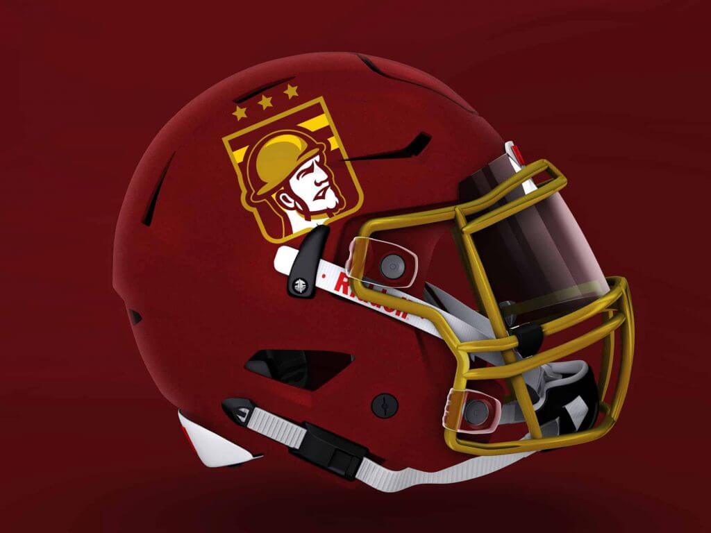
Washington Football Team
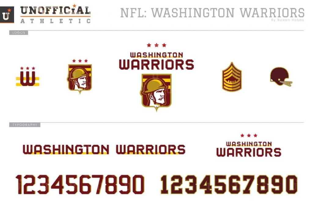
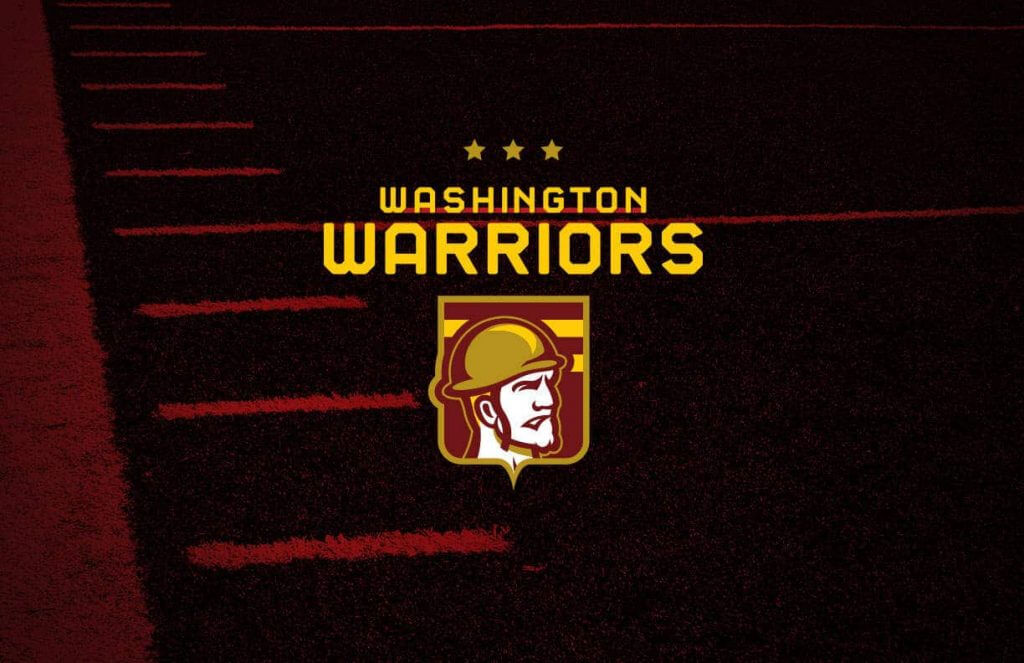
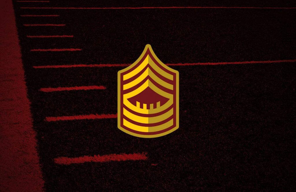
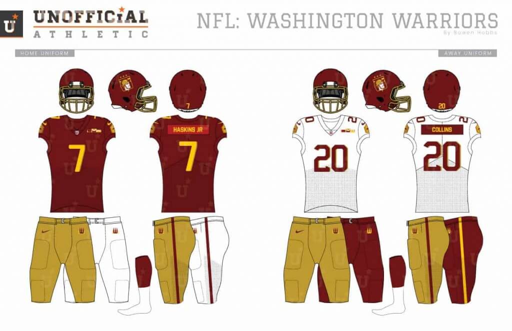
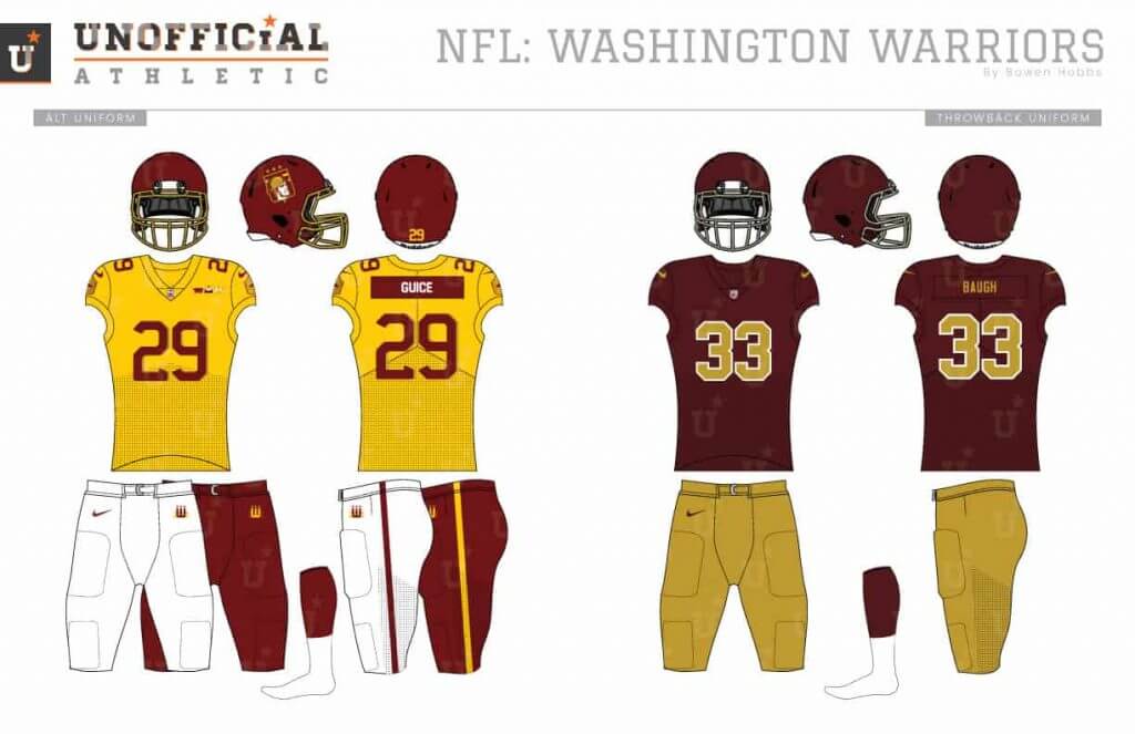
For Washington, I went with the Warriors name and a WWII theme. The primary logo places a doughboy inside a striped shield. The secondary mark is a football rank patch worn on the sleeve. The font is inspired by military pins of the era. The uniforms feature a number of military-inspired details such as contrasting nameplate and award patches on the left chest. The throwback uniforms take the current throwbacks and strip them of all logos.
Thanks, Bowen! If you missed the original post, please note that one of Bowen’s goals with the redesigns is just that — every team gets a new treatment (even if every team, as he readily acknowledges, doesn’t need it). So when judging his designs, please bear that in mind.
Love to hear what you guys think of these in the comments below!


MLB Playoff Uni Tracking
Now that the first round (a/k/a the “Wild Card” round) AND Division Series of Major League Baseball Playoffs has concluded, Alex Rocklein is now back with more playoff uni tracking! As you are probably aware, Alex has been tracking (and graphically representing) the MLB playoffs, by jersey, for the past several years.
Since the format changed to include EIGHT wild card series, Alex needed to redesign his tracking, last weekend we saw the full Wild Card round jersey matchups (click to enlarge):
And here is the updated tracking with the Division Series in both leagues added in.
Alex will continue to add to this graphic through the League Championship and World Series’.


Curling in the Age of COVID
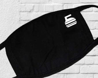
Got an e-mail from my buddy Mike Styczen this week who asked me if my curling club had started up. In fact, our first game is next Saturday night. We chatted a bit about Curling during the pandemic. Turns out, Mike’s league has already started and he asked if I a few words for the blog on curling in the pandemic, along with a couple of photos of pandemic-related changes to the ice surface. I know there are a few curlers amongst the UW readership, so after this article, I’d love to hear what your club is doing. Anyhoo. Here’s a few words on the state of the sheets during the coronavirus age.
Curling during Covid
by Mike Styczen
The onset of COVID, lockdowns, and the suspension of sports activities struck just as the 2019-2020 club curling season was wrapping up. My club (Garrison in Calgary) shut down after our playoffs were over and our year-end bonspiel were finished, so it didn’t affect us until this fall.
The club restarted league play last week, and to help ensure player and spectator safety there have been a few changes to gameplay, and a few aesthetic changes to the rink itself. There are new club rules to encourage distancing – we can’t arrive too early, we can’t congregate in the viewing area, we can’t change clothes at the rink. All the tables and chairs in the viewing area have been removed. No spectators. Sanitizer everywhere. The bar is open, with about half the tables removed.
Some of the on-ice changes include:
● Everyone must be physically distanced from one another at all times.
● Each lead is required to sanitize all of their teams rocks at the start of the game.
● Only one sweeper is allowed on each rock. Everybody else is required to stand to the side. As far as play goes, this is the biggest change – its WAY harder to carry an underthrown rock or keep a rock straight when you’re out there by yourself. The margin of error while throwing is way smaller. On the other hand, if you’re switching off sweeping duties, sweeping three rocks instead of six each end makes for a much less strenuous evening. On top of that – the one sweeper has a designated starting spot – he or she can’t start next to the thrower, their starting spot is past the hog line.
● There’s no sweeping the opponents rocks once they cross the tee line. This is also a big change – if you’re a skip who’s used to jumping in at the tee line to sweep a rock through the house, you just have to stand there and hope.
● One person (the third of the team that loses the toss) handles the scoreboard the entire game, one person (the third of the team that wins the toss) handles measurements if any are required..
There’s a few new features on the ice that make the sheets look just a little bit different. Behind every hack, there’s a reminder to curlers to stay physically distant (one broom’s length).
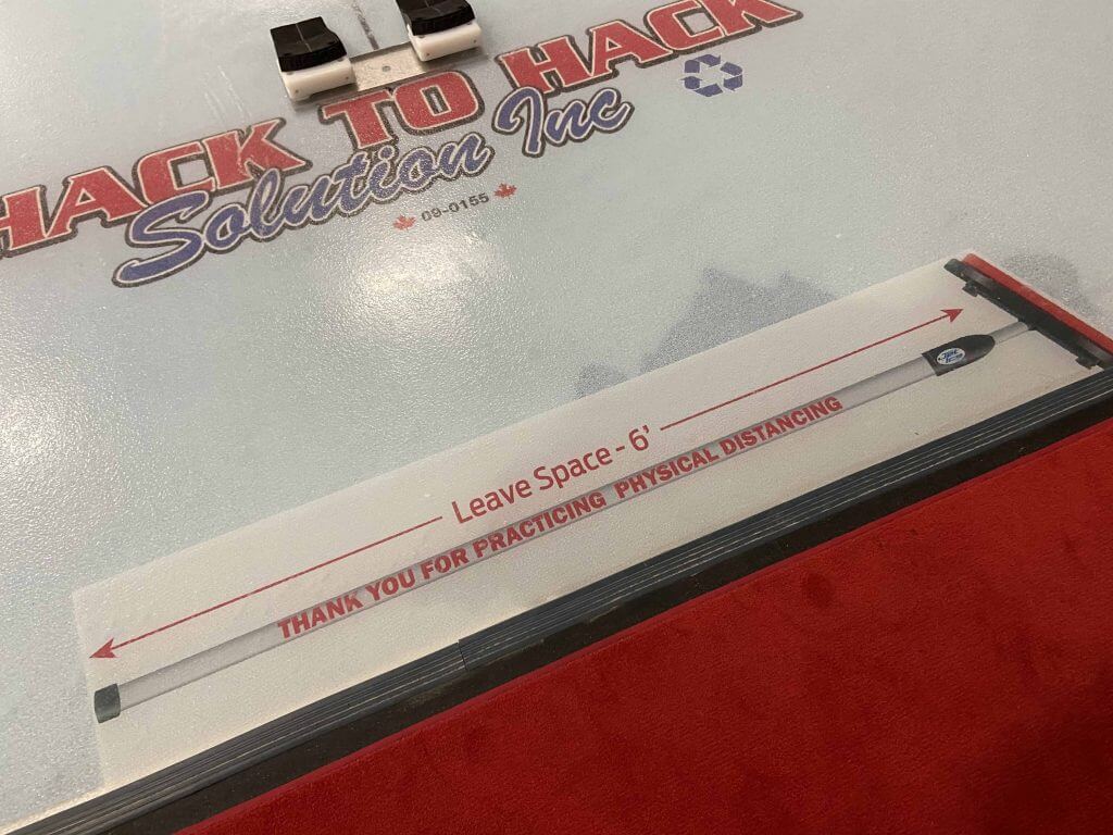
As mentioned above, instead of starting near the hack, the one sweeper has a designated starting spot just past the hog line. There’s one spot on each side of the sheet (depending on whether the sweeper prefers the left or right side).

And finally, the non-throwing team has a designated zone to stand near the centre of the sheet to minimize interaction with the throwing team. The zone is on one side only so that its not back-to-back with the adjacent sheet.
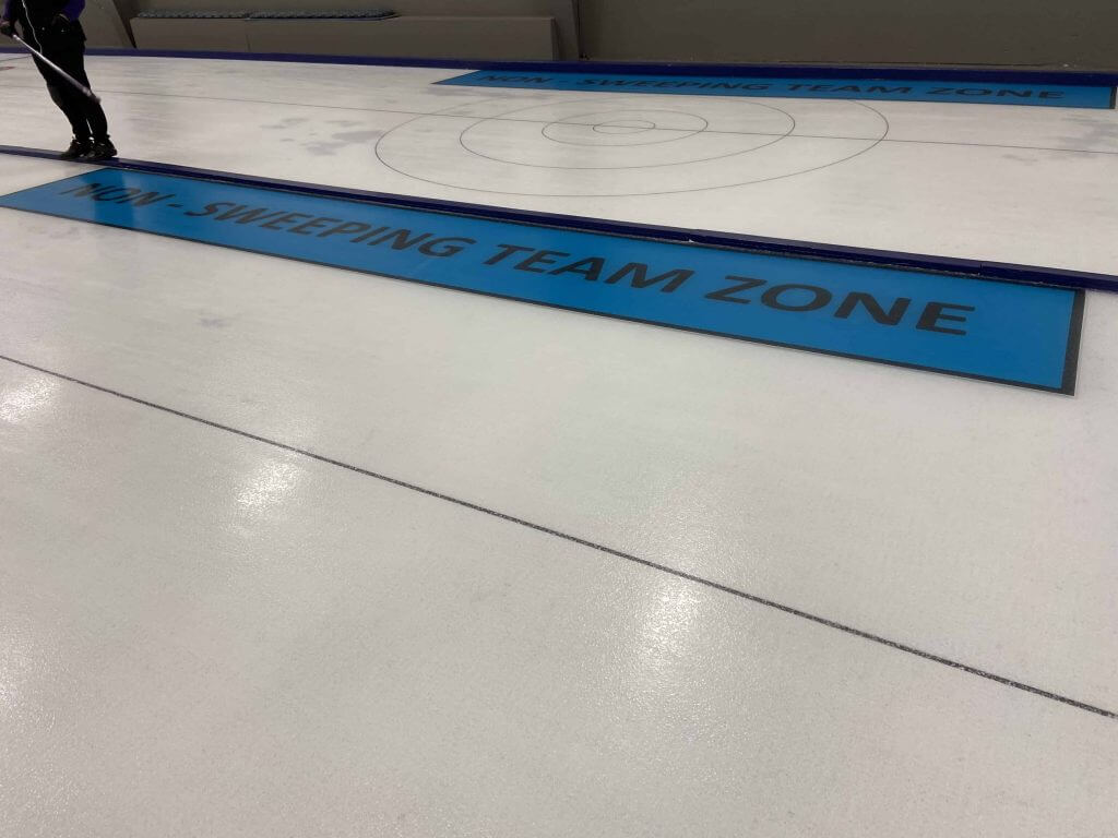
It’s been fun to be back on the ice – it’s nice to be doing something in public again, even if the rule changes take a bit of getting used to. Our skip had a rough game this week – standing at the back of the house with his broom and not being allowed to sweep a rock that’s drifting through the house was really frustrating for a veteran curler.
Thanks, Mike! I know what I’m facing soon (our club’s rules are very similar), but it was nice to have the first hand experience/explainer. Of course, Mike curls in a club whereas my Long Island CC plays in an arena (on a hockey rink). So some of the conventions will be slightly different (like, we can’t paint stuff on the ice for positioning — we have painted houses and barely visible hog lines, and that’s all the arena will allow us). Interesting, if you take a peek at Mike’s rules, most of them are similar or identical, but we are required to wear masks at all times, including while on the sheets. And I’m happy for that.
OK, any curlers have any stories or similar experiences (or if you do curl, was your fall season canceled?). Say hi in the comments.


Guess The Game…
from the scoreboard
Today’s scoreboard comes from Mojo Hand.
The premise of the game (GTGFTS) is simple: I’ll post a scoreboard and you guys simply identify the game depicted. In the past, I don’t know if I’ve ever completely stumped you (some are easier than others).
Here’s the Scoreboard. In the comments below, try to identify the game (date & location, as well as final score). If anything noteworthy occurred during the game, please add that in (and if you were AT the game, well bonus points for you!):
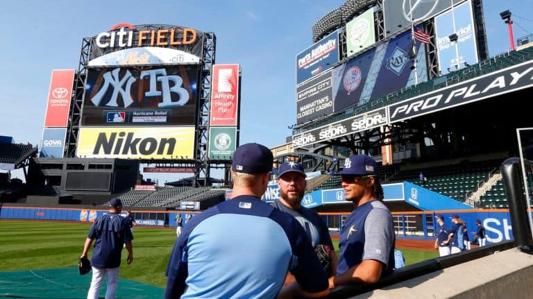
Please continue sending these in! You’re welcome to send me any scoreboard photos (with answers please), and I’ll keep running them.


Too Good For The Ticker!
Short one here from Scott Wilkinson, but it’s just TGFTT!
I’m not sure if Scott knows Uni Watch’s relationship with the great Jerry Reuss (both Paul and I have interviewed him multiple times and he occasionally still contributes here), but he noticed that Jerry most definitely has a doppleganger:
Too many ironies to ignore
Hey Phil,
I was looking through my old baseball cards the other day and came across this gem. A pitcher by the name of Jerry Reuss played for the White Sox back in ‘88. I’m enamored by the Sox uniforms. I’m also loving the fact that he’s swinging a bat although he plays for an American League team. Probably the best part of it all is his uncanny resemblance to the crosstown rival Cubs’ most notable pitcher (from Rookie of the Year), Chet “the Rocket” Steadman! Check it out!

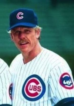
-Scott Wilkinson (@ObieMassillon)
Heh. Great spot Scott!
OK, now…on to the ticker.


The Ticker
By Anthony Emerson

Baseball News: The Yankees added Whitey Ford’s uniform number to their uniforms last night. “Numbers don’t look proportional and like they normally do, but probably limited what they could do in the bubble,” says Michael Romero. … The Godard (N.M.) High Rockies have their own take on the tequila sunrise (from @NFL_Journal). Adam Stiles notes that in the ’80s, Seton Hall had similar unis.

NFL News: YardBarker has listed every NFL team’s best and worst looks throughout their entire history. Most Uni Watch readers will agree with most of the selections (from Kary Klismet). … In their brief history in Santa Clara, the 49ers have had three different midfield logo sizes. … The Browns are going with their brown jerseys and orange pants tomorrow (from @Believeland1994).
College/High School Football News: Pitt’s blue pants will get their debut today, as the Panthers go gold-blue-blue (from @MrBudziszewski). … Vinnie Donati notes that Washington practice unis have two different number fonts. “16 matches the game unis, 8 looks similar to the Nike numbers,” he says. … Kentucky’s going mono-blue today. … The following are all from Phil: Contrary to earlier reports, Florida’s now going orange-white-white. … Ole Miss is going blue-blue-white against Alabama. … Mizzou is going white-black-white against LSU. … Liberty is going mono-navy against UL Monroe.

Hockey News: As Henrik Lundqvist departs New York for Washington, he also gets a new number: 35, which he wore during his Sweden playing days (from @1nepC).
.

Grab Bag: After a fly landed on Vice President Mike Pence’s head during the Vice Presidential debate, the Joe Biden/Kamala Harris campaign briefly sold a campaign-branded fly swatter. I say briefly because it sold out within hours (from John Cerone). … Also from John, new logo for Valero gas stations.


And finally… big thanks to Bowen, Alex and Mike for their sections today. Bowen will of course be back again for the third and final installment of his NFL designs, coming soon!
This is my last weekend at the family summer place (closing up on Tuesday), so only a few sunsets left for me for this year. Yesterday didn’t disappoint:

and as always, a spectacular gloaming:

Looking the other direction post-sunset was pretty nice too.
Everyone have a good Saturday, and I’ll be back with the SMUW crew for a full roundup of College Football Uni action tomorrow.
Peace,
PH
Re: YardBarker: Could not disagree more strongly with their choices vis-à-vis the Jets.
Best look: 1965-77, 1998-2018 home.
Worst look: 2019-20 Color Rush.
Mikes’s rules are pretty much what my home club, Madison Curling Club, was considering before we made the decision not to open for the season. Wisconsin is in terrible COVID shape, and state and county health rules regarding indoor gatherings made it nearly impossible to open even with the rules changes.
Worth noting for non-curlers that a typical curling broom is 48 inches long, not six feet. I converted a hockey stick into a curling broom, and the extra 8 inches or so draws attention, so standard is the 48 inch length of ordinary brooms.
I think the scoreboard picture is from 2013-ish. I think the Yankees were displaced from Yankees Stadium for an NYCFC game.
Why do the Chiefs have the state of Texas on their helmets?
link
I see the Texas logo, but I don’t see it on the helmet. I’m sure the alternate logo is for the team’s history of starting in Dallas as the Dallas Texans.
One of the alternate uniforms Bowen included are Dallas Texans throwbacks, which the Chiefs have worn in the past. These have the system of Texas on the helmet.
Unfortunate air vent hole placement on those helmet designs. Looks like the Tennessee Titan helmet is getting butt ended by a hockey stick between the eyes.
“For Washington, I went with the Warriors name and a WWII theme. The primary logo places a doughboy inside a striped shield.”
Uh, yeah. Wrong war. Doughboys were in WWI.
You are right. The helmet on the soldier in the logo does look more like a WW2 style than WW1, however.
The Chiefs redesign features a cross of Saint Florian with KC at the center; not a Maltese Cross.
These designs are arena league level at best. Very cartooninsh and unreasonable.
Exactly my thought. The Cowboys is a direct ripoff of the AFL’s Dallas Desperados:
link
The Yankees displace NYCFC from Yankee Stadium, never the other way around. This game was a Rays home game that was moved to Citi Field in order to avoid an oncoming hurricane. Photo is probably from Sept 11, 2017, first game of a three game series.
I had tickets to the Sept 12 game, the lone game the Yankees lost in that series.
The two I’d change to now are the Titans and the Chiefs. I really like the light blue helmet and pants with either the navy blue or white jerseys. Also like the centurion helmet logo for the Titans. I love the current Chiefs uniforms, but this is a great way to move away from the Native American imagery. I like the way the striping looks like the turn-out gear of firefighters. The KC logo looks great on the helmet. The one change would be to eliminate the center stripe on the new helmet, thus keeping it like the current helmet except for the new logo.
I also would like to change the Titans’ and Chiefs’ helmets, but this can be accomplished on their existing uniforms. Tennessees’ helmet should have three faceted (silver and white) stars meeting point-to-point on each side. Kansas City might do well to adopt a white map of Missouri with the interlocking “KC” in the center, as an easy way to retire the arrowhead.
The structure of modern NFL helmets has created a real conundrum for designers. Today’s concepts feature either really tiny logos that fit in the only space that isn’t impeded by facemasks, chinstraps, holes and other intrusions (Texans, Titans) or just ignore those elements and let some big logo get buried in the clutter (Broncos). As Paul pointed out awhile back, the Colts and Chargers both “flattened the curve” of their logos in this year’s new designs, which helped squeeze those designs in.
Same concept from team to team. No thanks.
To all those that do uni concepts: your work is appreciated and typically very well done.
With that said, can we please stop including maker’s marks on the renderings? We all realize it’s part of what exists in the real world. But these concepts are fantasy, so to speak. And that means there doesn’t have to be any other marks than that of the team.
Needless to say, this is something that has always bothered me about the concepts posted here. It just seems so unnecessary and feels like we are abdicating visuals to the manufacturers. And I freely admit to being a Nike fan – it’s nearly all I wear when it comes to athletic gear.
Again, nothing at all against the talent it takes to create these concepts. But give yourselves more credit and work with a palette free of corporate marks.
The redesigns were not my cup of tea I dont want to say anything negative after how hard Bowen must have worked. I do find it odd that Paul keeps spotlighting designs that he would not want to see on the field. These modern interpretations just dont seem to gel with his more traditional leanings.
Those redesigns are pretty neat and fun, but there it is again, the “COLTS REDESIGN” with the horseshoe turned on it’s side to make a “C” – I think I’ve seen that done a dozen times or so by numerous others.
Just ONCE I’d like to see someone do one of these Colts redesigns without going down that road… It would be nice.
Otherwise good stuff.
Not as inspired by this set as the previous. But the Houston idea has legs. Uses a more interesting color palette than RWB and really leans into the nickname. Also the Giants using a semi-hidden King Kong feels like “just the right amount” of clever,