By Phil Hecken
Follow @PhilHecken
Good morning! Hope everyone is doing well and staying safe. Anything non-uni related happen this week?
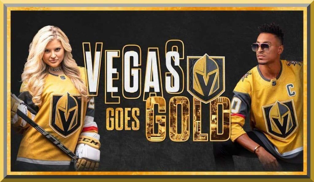
Anyhoo, there was uni news yesterday — without any warning, the Vegas Golden Knights dropped a new third sweater yesterday — the much awaited gold one. We’ve known the third jersey would be coming pretty much since the team first unveiled their inaugural unis a few years back. In addition to the current dark gray home sweater and white road jersey, the new gold jersey is almost exactly the same, save for the gold (which looks more like a mustard to me). You can click on all the photos below to enlarge.
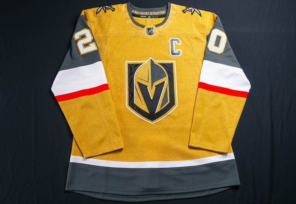
Before we get into the new jersey itself, I want to say that I (and my mild form of OCD) love it when teams do this — that is, make three basically identical jerseys, save for the color swaps. I may be in the minority there, but I’m actually very pleased the team didn’t create some bizarro new third jersey that was completely different than their home/roads. We’ve seen what happens when teams do that.
Now take a look back at that jersey above. Here’s another shot:
Something looks a bit…different, yes? Well, according to adidas/NHL, “The third jersey is the first all-metallic gold jersey in the history of the National Hockey League.” What, pray tell, does that mean? Well, the Golden Knights explained their new jerseys thusly:
They feature “new cresting materials and construction technology, the Gold jersey reduces crest weight by up to 46%.”
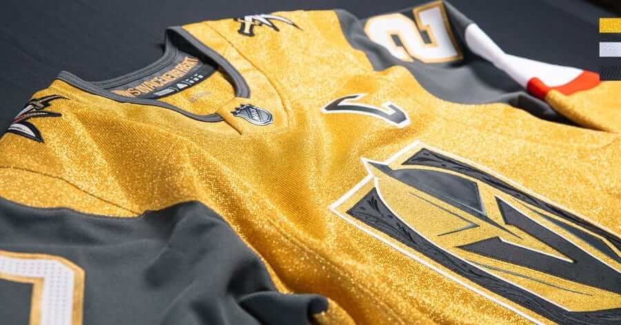
Hoo boy. But it sure looks sparkly, satiny. That must be the metallic of which they spoke.
“The sleeves of the jersey feature an embossed white filigree pattern.”
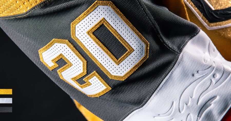
This will, of course, be invisible from more than three feet away, but it’s kind of an interesting feature. (A filigree pattern is one of those ornate squiggly things.) I suppose it will look nice on the authentics people will buy, but other than being unique, it seems kinda pointless.
“The kit will be worn with white gloves typically worn with the Golden Knights away sweater.”
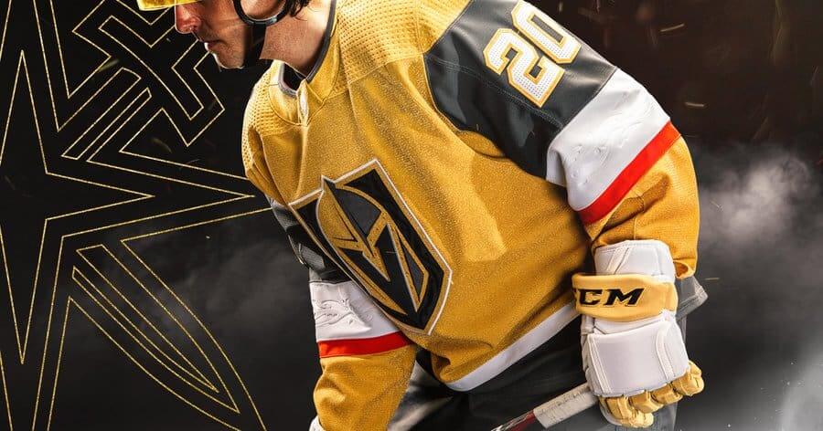
I love the white gloves. I know they can get “dirty” quickly, but it’s a sorely underused glove color in hockey. And yes, the team actually used the word “kit” to describe the uniform.
“Players will wear the grey helmet associated with home uniforms while wearing the gold jersey.”
I kinda wish they’d gone with the white helmet to match the gloves, or even a gold helmet. I don’t dislike the gray however. It’s funny, they wear white gloves and buckets with the white jersey, and black gloves and gray helmets with the home jersey. So this is kind of splitting the difference (there goes my OCD again).
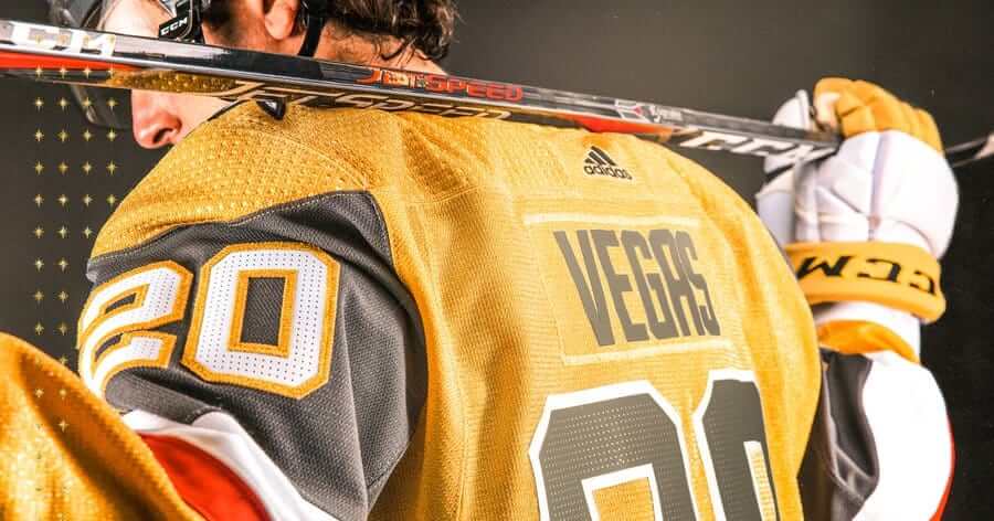
And why are the jerseys so shiny? “adidas Hockey has applied a metallic ultraknit material for the first time ever.”
The shoulders of the gold jersey feature the Golden Knights secondary logo:
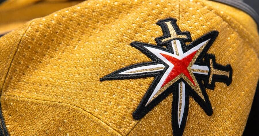
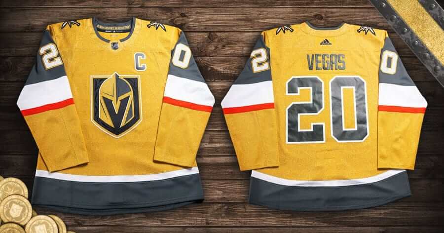
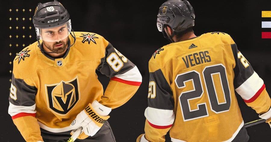
Here’s a look at the front and back, side-by-side:

As you can see the jersey keeps the exact current logo in the same spot as the home/road, and features solid black block NOB, with numbers rendered in gray outlined in white. Everything is identical to the white jersey except the gold elements have been swapped for white on the back numbers and also on the sleeves and hem. Sleeve numbers are white, outlined in gold, on gray:
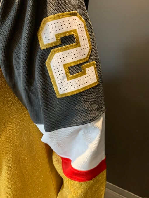
Breezers are gray, and the socks follow the sleeve striping pattern (gold, thin red, white, gray).

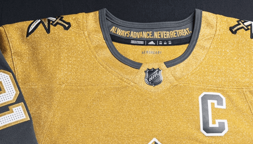
In this closeup of the inside collar slogan (“ALWAYS ADVANCE. NEVER RETREAT.”), you can sort of see the metallicky sheen to the jersey:
And of course, what would a jersey reveal be without the obligatory hype video:
Here it is in all its Golden glory 😍 #VegasGoesGold pic.twitter.com/Ijram8lT8J
— Vegas Golden Knights (@GoldenKnights) October 2, 2020
But wait…this is Vegas, so there’s not one but two hype videos (this one featuring Wayne Newton and Lil Jon — side note, I saw Wayne Newton in Vegas like 30 years ago with my then wife, and he was great…and I swear I thought he passed away a few years ago. Glad to see he’s alive and apparently very well!).
YOU'RE GONNA WANT TO WATCH THIS ONE 🤩 #VegasGoesGold pic.twitter.com/hxF8feVIY2
— Vegas Golden Knights (@GoldenKnights) October 2, 2020
Overall? As far as third jerseys go (and considering it’s basically a mirror image of the home/road), I like it. I’m not sure about this “metallic” sheen, and obviously we’ll need to see how it looks under the lights and on the ice to render a final judgement. For a team based in Sin City, they’ve kept their uniforms pretty basic through their first three seasons and that’s something. Perhaps the metallic jersey will add a bit of reflectivity in the lights and really cause it to sparkle. (AFAIK, the team did not base this uni on Elvis’ jacket, but I wouldn’t put it past them either.)
So there you have it, dear readers. What are your thoughts?


A Fall Festival of Colorful Cricket
(A cricket report from Jimmer Vilk)
Unless you count Thomas Hayward, who in the 10th month of 1864 scored 52 runs to lead a combined Cambridgeshire/Yorkshire squad to victory over a Kent/Nottinghamshire team, English first-team domestic cricket doesn’t really have a “Mr. October.” That’s because, with four exceptions, the season ends in September.
According to Sky Sports statistician Benedict Bermange, “To 1778, 1832 and 1864, we can now add 2020.”
Blame Covid-19 for this year’s foray into cricketing history. The English game started four months late this year, with condensed seasons of red-ball and white-ball cricket. The red-ball competition (with traditional white unis and 4-day games) ended last week. The white-ball version is the T20 Blast (2 to 3-hour games and colorful unis), which we covered here a few years ago.
The Blast opened this month with the quarterfinals of the competition, which brings us to today’s (weather permitting) Finals Day. Picture the NCAA Final Four, but all in one day. As soon as the semifinals are over, the winners go back out and play for the title. And who wins the title of best-looking team? Let’s see what you think.
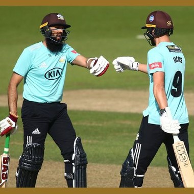
Semifinal #1: Surrey vs Gloucestershire
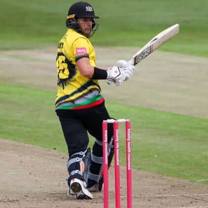
Surrey retains their duck-egg blue and black look, with brown helmets and black hats. Gloucestershire has gotten artsy, adding a splash of colors to the bottom of their yellow jerseys. The back numbers are inside what looks like a giant ink splotch.
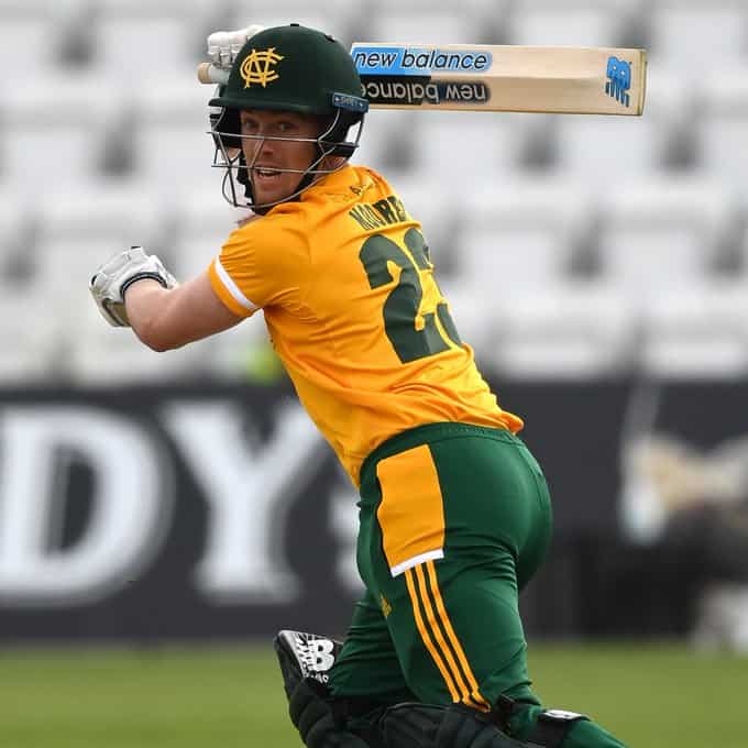
Semifinal #2: Nottinghamshire vs Lancashire
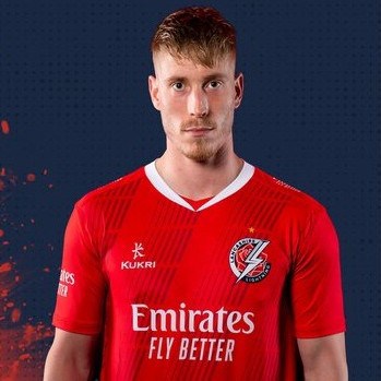
Notts keeps looking like a John Deere company team (not that there’s anything wrong with that), while the Red Rose of Lancashire, known as the Lightning in the T20 format, fully embraces their namesake color.
Hopefully, as in the previous 17 years of the competition, weather won’t be an issue. And hopefully fans can return next season, because Finals Day has become quite the spectacle, both on the field and in the stands. Even without the crowd, it should be a fun day. If you get a chance to see it, I highly recommend it. Happy Finals Day!


The “BEST OF” Kreindler’s Korner
Hey guys & gals. You’ve enjoyed Kreindler’s Korner for several years now, mostly on the weekends, on Uni Watch, but with the recent coronavirus outbreak, Graig’s time is just too precious and he needs to tend to other things besides coming up with a new writeup each weekend.
So, going forward, for as long as the COVID-19 situation is bad in New York, I’m going to run a few “Best of’s” until Graig returns.
Here’s today’s offering:
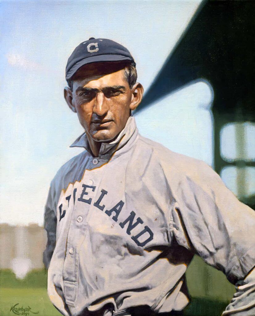
Title: “A New Home”
Subject: Joe Jackson, 1911
Medium: Oil on linen
Size: 18″ x 22″Like most baseball history buffs, I’ve always been fascinated with Joe Jackson. It’s hard not to be, as his tale has been so incredibly intriguing on every level: his beginnings as a mill hand, how he acquired his nickname, his otherworldly statistics, the Black Sox scandal in 1919, the aftermath, and even how his merits and foibles continue to be debated today. Though gone since 1951, in 2018, he remains very much alive.
In this painting, he appears with the Cleveland Naps in 1911, his first full year with the club. The photograph I had used for reference was especially appealing, not only from a standpoint of light and (possible) color, but also its unique design. It’s the architecture of Comiskey that really sells it here, with the awkward slope of the roof coming straight down onto Jackson’s neck, and then that movement being echoed by the shadow shape on his shoulder and down his arm. Speaking in terms of classical picture making or portraiture, that structure of the ballpark should have had some serious editing done to it to make the image more ‘successful,’ whether that’s changing its shape or getting rid of it altogether.
I guess the fact that it comes down and seemingly cuts his head off just resonated with me in some way. Perhaps it was a metaphor for the treatment he received from Commissioner Kenesaw Mountain Landis in 1920? There’s probably some of that in there, but I also just think it was that shape that made the piece so interesting. In a way, I found that I was breaking the rules of picture making by leaving it there. And I guess when you speak of Joe Jackson, the idea of questionably breaking the rules is a familiar motif.
Thanks, Graig! You can (and should!) follow Graig on Twitter.


MLB Regular Season Uni Tracking
For several years, reader Ed Kendrick has tracked the uniforms for a bunch of MLB teams, and this year he’s expanded it to almost half the league! This season (well, sort of season), he tracked the uni machinations for TWELVE teams: Arizona, Baltimore, Boston, Cincinnati, Houston, Miami, Milwaukee, San Diego, San Francisco, Texas, Toronto and Washington.
Ed recently wrote, “I have provided a Google Sheet document detailing MLB tracking for Arizona, Baltimore, Boston, Cincinnati, Houston, Miami, Milwaukee, San Diego, San Francisco, Texas, Toronto, and Washington.
In addition, there is a separate tab set up for the postseason and uniform tracking as well.”


Guess The Game…
from the scoreboard
Today’s scoreboard comes from ojai67.
The premise of the game (GTGFTS) is simple: I’ll post a scoreboard and you guys simply identify the game depicted. In the past, I don’t know if I’ve ever completely stumped you (some are easier than others).
Here’s the Scoreboard. In the comments below, try to identify the game (date & location, as well as final score). If anything noteworthy occurred during the game, please add that in (and if you were AT the game, well bonus points for you!):
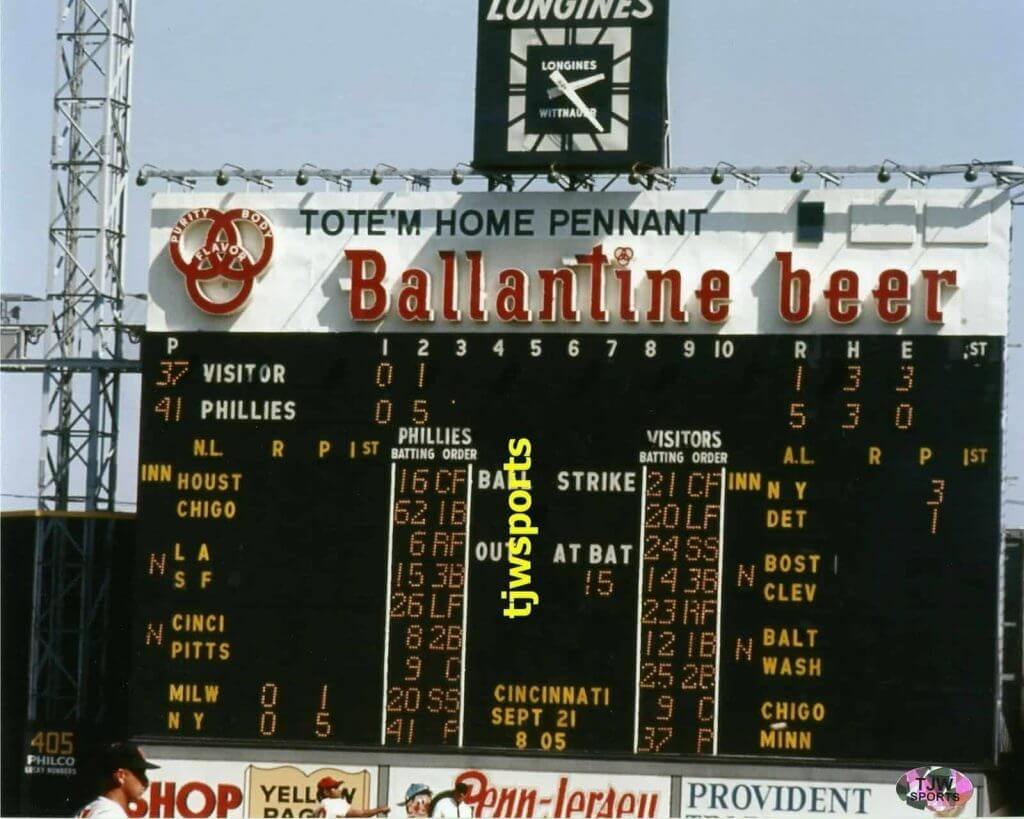
Please continue sending these in! You’re welcome to send me any scoreboard photos (with answers please), and I’ll keep running them.


Click to enlarge
And now a few words from Paul
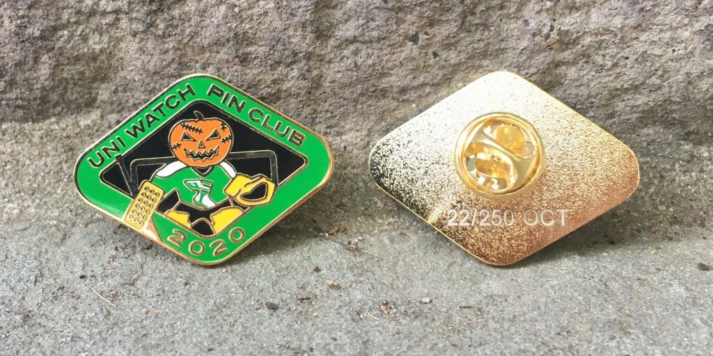
Hi there. In case you missed it on Thursday, the Uni Watch Pin Club’s October design is now available. As you can see above, it features a jack-o’-goalie (complete with Gerry Cheevers-style stitch marks on his face!). It was produced in a limited/numbered edition of 250 pins, and more than half have already sold. You can order yours here.
Need to get caught up? Here are our January, February, March, May, June, July, August, and September pins. (Sorry, April sold out!)
Also: I’m trying to get at least a ballpark sense of how many people have been collecting ’em all. If that’s you, and if you plan to purchase the remaining pins to complete the year-long collection (in which case you’ll qualify for a bonus pin, available only to collect-’em-all-ers), please shoot me a note. No need to provide any documentation or proof — that will come later. For now, I’m just trying to get a rough sense of how many people we’re talking about. Thanks!
Okay, that’s it from me this weekend. Now, onto the ticker.


The Ticker
By Anthony Emerson

Baseball News: Padres OF Wil Myers appears to have borrowed teammate Joey Lucchesi’s belt during last night’s Wild Card game against the Cardinals — and apparently, he’s been doing it for much of the season (from Joanna Zweip). … During that same game, Cardinals P Jack Flaherty wore some pretty amazing stirrups (from @GoodLifeShaun). … During last night’s Marlins/Cubs Wild Card game, the commentators took a moment to lay into the Marlins ugly unis (from Kyle Coons and Jon Keefer). … The Worcester Red Sox, the Red Sox’s relocated Triple-A affiliate, have unveiled their new mascot, which is just a smiley face wearing red socks and a baseball cap (from Matt G.). … Sometimes we get the perfect reminder that not everyone is as sports-obsessed as us.

NFL News: The Browns will wear their Color Rash unis on Sunday against the Cowboys (from Beau Parsons).
.
.
College/High School Football News: Black-white-white for Southern Mississippi against North Texas. … Western New England University has new unis. … BFBS has extended onto the field in Ames, Iowa (from Sean Jankowski). … Zamir White and Tyson Campbell were named captains for Georgia’s game today. Why is that notable? Both White and Campbell wear No. 3! … The following are all from Phil: Mississippi State is going maroon-maroon-white against Arkansas. … Tennessee is going white-orange-white today. … Florida is going orange-blue-white against South Carolina.

Hockey News: On January 2, 2000, the Habs and Rangers played a color-vs-color game as part of new millennium celebrations. Pictures from this game are exceedingly rare, but some of Mike Engle‘s Facebook friends were discussing the game, and one happened to have a Patrice Brisebois card with a shot from that game on it. … Looks like the Flames are finally going with their retro unis full time in 2020-21 (from Kary Klismet). … Also from Kary: The Peterborough IceKats, a girls’ youth hockey team in Peterborough, Ontario, has a new logo. … The Junior B team in British Columbia formerly known as the Saanich Braves are now known as the Saanich Predators, and have a pretty nice new logo (from Jim Wooley).

Soccer News: Renderings have been released of a new soccer stadium in Jena, Germany, which will be home to fourth-tier side FC Carl Zeiss Jena (from Kary Klismet).
.

Grab Bag: Check THIS out: a neon salesman’s sample case from the 1930s! (from Jon Solomonson). … The Ohio Aviators, a rugby team, have unveiled the kits they’ll wear during the World Tens Series in Bermuda. The team had been dormant since the 2017 collapse of PRO Rugby, the first professional rugby league in North America and the predecessor to Major League Rugby. … Boise’s Plantation Country Club has changed its name to The River Club (from Evan Feick). … The first photos of the remodeled Hayward Field, home of the University of Oregon’s track and field team, have been released (from Kary Klismet).


And finally… I hope everyone has a good Saturday and is staying safe.
Thoughts and prayers are with the President and First Lady (and everyone else who has contracted COVID-19). This is a reminder that the coronavirus is an ongoing threat to our country and can happen to anyone — ANYONE — so please be safe and wear a mask, k?
As I mentioned last week, my days out at the summer place will be winding down soon (probably will close up next weekend), so there probably won’t be too many more sunset photos after then. But yesterday, after being cold, cloudy/rainy/overcast all of the morning and afternoon, ended up with the skies parting, so I did catch another nice sunset. But during the morning, we had wind and some of the craziest cloud patterns I’ve seen in a while. This picture doesn’t do it justice, but it looked like there were waves up in the sky:

Even though I’m somewhat of a weather buff (and hurricane watcher/tracker), I never really got into the different types of clouds, so I have no idea what those are (or are called). If anyone knows, I’d love to find out more. I took that photo after completing my morning run.
And here’s how the daylight ended…

I’m gonna miss those.
Everyone have a good Saturday and I’ll catch you back here for SMUW tomorrow.
Peace,
PH
GTGFTS
September 10, 1964 Phillies 5, Cardinals 1
Notable as Vic Power’s debut with the Phils, having been acquired from the Angels the previous day to help the team down the stretch. Things got off to a good start.
Also notable….5 errors from STL, resulting in only 1 of the 5 runs being earned. Plus, Mike Cuellar picks off 2 runners in only 3 innings of relief. A lousy day if you’re a STL fan.
I beg everyone’s indulgence, as the ’64 Cardinals are what amounts to the team of my youth. Notables on the scoreboard: #21, Curt Flood, of the reserve clause Floods. #20, the recently deceased Lou Brock, the man who made base stealing fashionable. #14, Ken Boyer, to date the most recent Captain of the Cardinals. #12, Bill White, future president of the National League when that position actually meant something. #9, Bob Uecker, future star of “Mr. Belvedere,” “Major League” and beloved long standing announcer of the Milwaukee Brewers. Then, of course, there is the ’64 Phillies Collapse and the subsequent World Series victory over the New York by gum Yankees. My childhood was more than I deserved.
I had to spot the Cardinal player in the navy cap down in the lower left to be sure of my guess of which team is missing from the NL side of the board. I find it funny that the Phillies kept “VISITOR” on the board instead of making an effort to accommodate the visiting team with their actual name or city. But I guess that was part of the “mind game!”
About the 2000 Rangers and Canadiens colour vs. colour game.
Don’t know if you guys recall, but was this the game that the Habs switched to the white helmet mid-game? I do remember seeing some of a game back around that time that when Montreal wore the white helmet with their red uniforms for part of a game.
Yes. Everybody in blue helmets was for the first period only, before the adjustment. I remember seeing those highlights on SportsCenter. I would have been 11. Still wish more pictures were easy to find.
I wish teams would keep helmets in their secondary colors to give them more options with their dark jerseys, and to create the potential of color-on-color games. Nothing looks more beer-league than a mismatched white sweater/bucket in a hockey game.
New Vegas Sweaters look really good. I am getting a Star Trek/Captain Kirk vibe from them, which is a good thing for me!
Southern Miss would be wearing black, white, white as opposed to blue white, white.
Thanks, fixed.
Blue-white-white for Southern Mississippi against North Texas.
Should be black instead of blue for Southern Miss.
Attention Worcester Red Sox: Syracuse University called. They want their mascot back.
The cloud formation, according to my wife (an amateur cloud spotter), may be an Asperatus. The CloudSpotter website says that this formation is yet to be recognized as an official cloud classification but they are forging ahead with the type. Perhaps noted weather enthusiast and the best player in baseball, Mike Trout, can weigh in.
Awesome! Thank you.
Re: it’s technically called an alternate by the team not color rush. Thought I guess it’s become the default vernacular to call any monochromatic uniform a color rush. Also this will be the game in a row that they will wear a brown , but that streak still end week 5 because they are playing in Pittsburgh and the Steelers never wear white at home
Well, not anymore they don’t.
They did for several games back in the 60s, but since they moved into Three Rivers and the new stadium, I don’t think they’ve ever worn white.
Golden Knights do surpise me with small details about their uniforms when they are unveiled.
I thought for sure they would have a black helmet when their unveiled their inaugural uniforms. I was pleasantly surprised when they unveiled it with a dark grey helmet.
I was not expecting that they would go with dark grey pants for the 3rd uniform. That works out good because generally you cannot go with non-white helmet, non-white jersey and pants being 3 separate colours. Grey helmet, gold jersey, black pants would not have worked well.
With you on the OCD, which is why this little detail bothers me. The home and away jersey have a two color collar, while the gold is solid gold. Everything else is in check though.
With that 46% reduction in crest weight, those Vegas wingers will be flying across the blue line like Cournoyer. In all seriousness though, back in the day someone like John Ziegler or Clarence Campbell probably would have banned them summarily. We’ve come a long way, baby.
Alas, for the first time, rain has delayed the T20 Finals Day.
If they can’t play on tomorrow’s scheduled makeup day, there’s talk of deciding everything with an indoor bowl-out…like penalty kicks without a goalie.
link
Let’s hope it doesn’t come to that.
Just out of curiosity — how does one actually miss the wicket? Seems like a 1′ putt from there.
Bowling is a lot harder than throwing, seeing as how you can’t bend your elbow. I guess that limits the accuracy a bit. Plus, one of the guys in the video said they don’t train very much on trying to hit the stumps. With a batter usually in front of them, they’re bowling at a different length most of the time.
Now if you have a bowler who can throw a good yorker, you might be in good shape for a bowl-off.
link
So…basically you break a tie by doing something rarely done, which is hard to do, by guys who probably don’t practice, to determine a winner of a completely *different* type of game.
Seems about right.
Pretty sure they only use it in absolute last-resort scenarios now. Like rain of ark-building proportions. If they can squeeze in three 5-over games (30 delivers per side instead of 120) instead, they (and I) would be satisfied.
In reply to Phil’s point.
An analogy would be it’s like settling a baseball game by asking pitchers to hit a much smaller strike zone, in the middle/middle.
the classic seam bowler’s delivery is either just outside off-stump or would clip the top of off-stump if unimpeded. It’s the equivalent of painting the corners..
Bowling to hit middle stump is rare, because it’s (mostly) going to get blocked.
But, tbf, I would expect any professional bowler to be able to hit an undefended set of stumps every time, if that’s what they’re trying to do.
I first saw the new Vegas threads on Twitter. My very first thought was, “Cool, they’ve revealed the entire uniform, not just the jersey!” (Seems like this website has conditioned my uni-senses more than I’ve realized.)
I think that third/alternate uni is very well done. It’s totally Vegas without going over the top. It’s like the difference between Notre Dame’s helmets (gold) and Georgia Tech’s (golden). I do recall the late 90s Astros caps had a gold bill which I absolutely loved. Were they the last team to have a sparkly gold uni element?
Nice headline today too ;-)
I know I’m literally the only person on the planet with this opinion, but I really liked the Flames’ primary home and away unis, and I will miss them.
Feels like jersey makers are tripping over themselves to leap forward technologically when they could use materials and processes from 30 years ago.
RE: Las Vegas Knights
Want light jerseys or softer crests? Go fully sublimated like Tackla did for National teams and Europeans clubs in the late 1980s/early 1990s.
Want shiny jerseys? Bring back Hi-Li/Ice Sheen which made IHL/ECHL jerseys in the 1990s (also, very light-weight yet fairly durable):
link
I kinda wish the color of the gold was more similar to Purdue like their logo. Strange that the would deviate.
It appears to be Asperitas, a type of wave-like cloud formation usually found with altocumulus and stratocumulus clouds. I’ll see them off and on here in Wisconsin — perhaps they’re more common in the Midwest? Any fellow weather buffs can confirm/correct this info.
Sweet info. Thanks!
As already noted the scoreboard was from Sept. 10, 1964 at Connie Mack Stadium, Phillies hosting the Cardinals. 5-1 was the final score (as scoreboard already is showing), with Chris Short beating Ray Sadecki. This was right before the epic Phillie collapse began, losing a 6.5 game lead with 12 to play. RIP Bob Gibson, and Lou Johnson as well.
Vegas. Your Wayne Newton remark- good for you and the Missus to to have seen that. At that time, You were certainly a forward thinking “Young Pup”
The “filigree” pattern on the VGK jersey you mention is actually desert sage, the Nevada State flower. It borders the helmet on the jersey crest and is also embossed on the gold stripe of the grey and white sweaters and it’s also used throughout the team’s online branding.
Wayne Newton kind of reminds me of Data on TNG.
I like those gold jerseys, but I’ve got to be that guy about this pet-peeve word choice:
“the Vegas Golden Knights dropped a new third sweater yesterday”
Can we stamp out this horrible social-media-era usage of “drop” to mean “reveal”? I don’t care how much people in the fashion or advertising industries like it; it’s so ambiguous that this exact same word can be used to express a 180°-opposed meaning. Some day a few years from now we will see:
“The Knights are dropping their third jersey and will wear only home and road sweaters this year.”
This word means “let something fall” and makes much more sense when describing something that a team is ceasing to use and is metaphorically letting go of, not something that they are showing to people.
Consider these sentences: “The Pirates had been wearing red alternate jerseys at home, but dropped them in 2008.” – “I heard the Padres might drop the blue color scheme and wear brown next season.”
The only way to know which meaning is being used is to know if the thing being “dropped” is already in use or not. It’s completely ridiculous. Copy editors should be slashing through this terrible word with a big red pen!