By Phil Hecken and the SMUW Crew
Follow @PhilHecken
“Every uni tells a story.”
–Rod Stewart (probably)
Ah yes, we’re now entering that period of College Football where a return to “normalcy” seems closer and closer. The SEC began play yesterday (with the B1G starting in less than a month, and the PAC-12 aiming for an early November start), so if we don’t have a major COVID explosion, the Power 5 will all play at some point this season. Let’s hope it happens!
Now then, a return to normalcy involves not only a full slate of games and packed houses (something we won’t be seeing this year), but it also means several schools will be breaking out crazy one-offs, BFBS, GFGS, throwbacks, etc., even though we should be happy just seeing any football at all. And yesterday, Pitt broke out a GFGS one-off, with a ridiculously named outfit. Yes, every picture uni tells a story, and well, Pitt’s was a doozy. We’re not here for the stories, however, we’re here for the on-field uni.
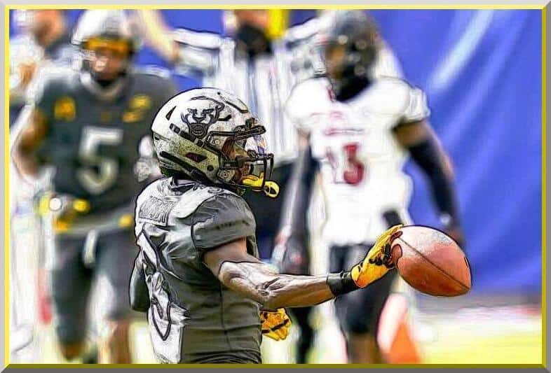
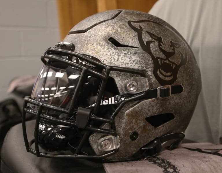
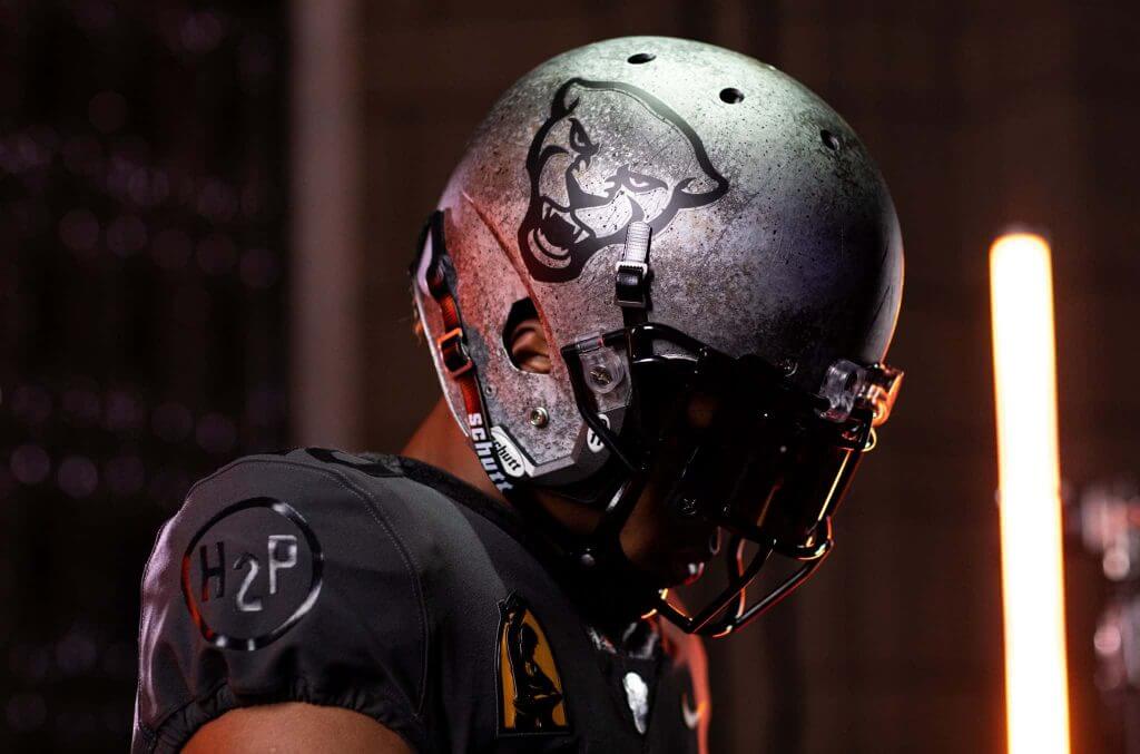
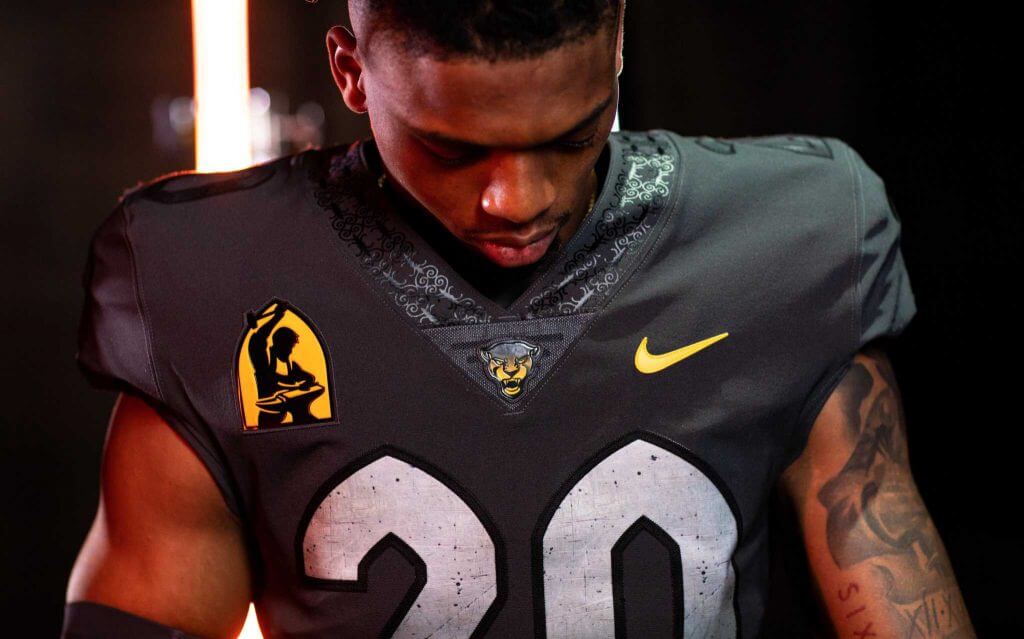
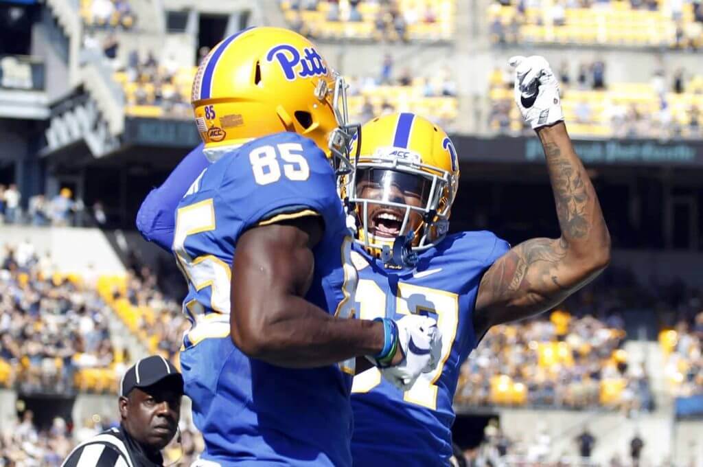
I suppose there was nothing wrong with the GFGS getup the Panthers wore — other than you know, it was GFGS and completely unnecessary. If Pitt’s colors were gray and gold more gray with gold accents, it wasn’t even that bad. I even thought the helmet was pretty cool:
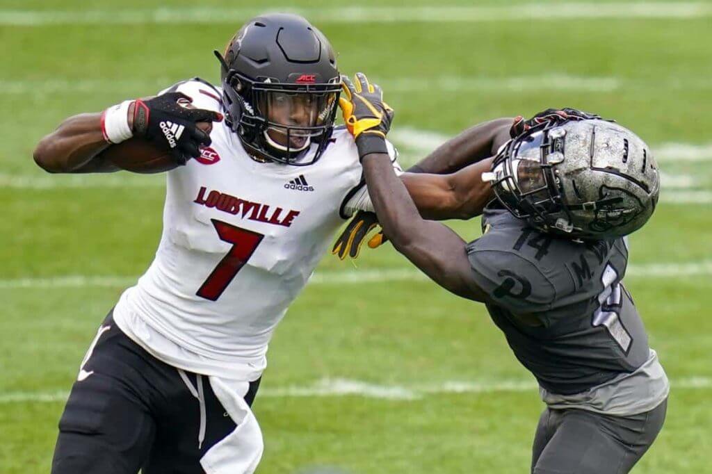
It’s just that an all gray uniform, on a sunny field, against a team (Louisville) who were wearing black hats and britches, didn’t provide nearly enough contrast and otherwise was just visually unappealing.
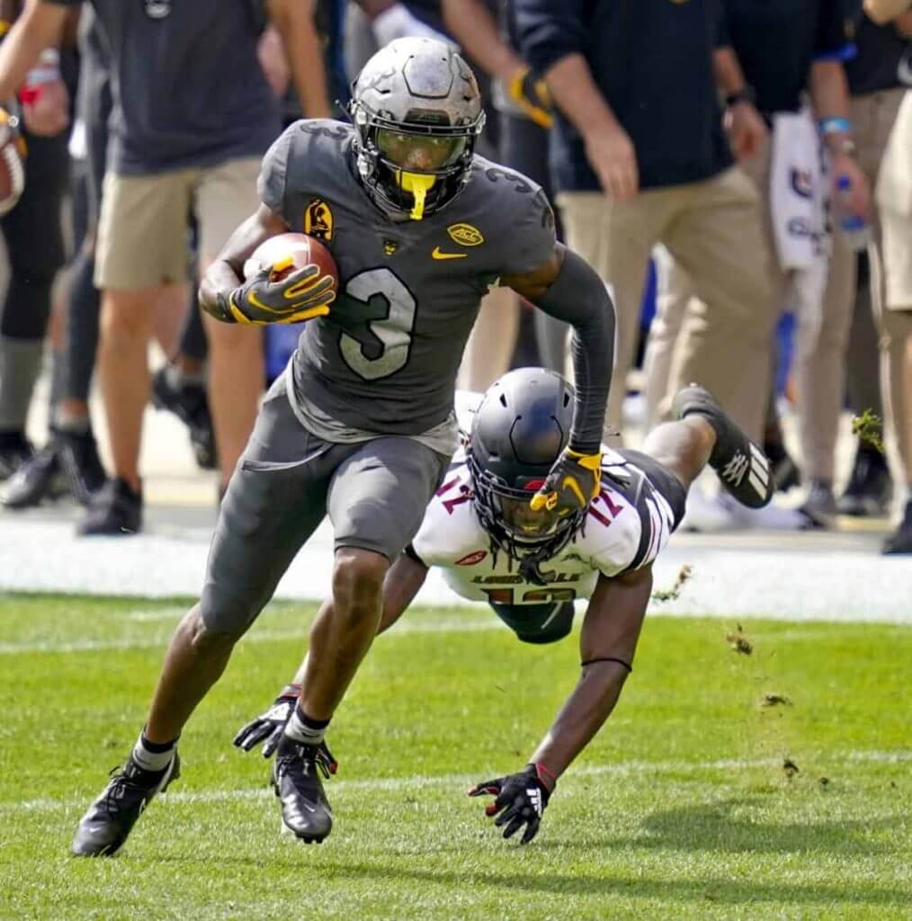
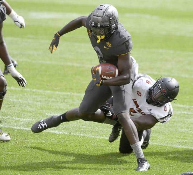
Normally games in sunlight look great and bring out colors. But when your colors are GFGS vs. B/W/B, the sun just wasn’t doing either set of unis any favors.
We’ve got a lot to get to today, so I’ll end my first SMUW rant here. I now turn it over to Terry D. with your…
Sunday Morning Uni Watch
By Terry Duroncelet, Jr.
The SEC has entered the chat, upset alerts, and throwbacks galore! Here’s an admittingly-short –but hopefully effective– rundown of Week 4. It is Week 4, right? Time is an illusion to me at this point.
From Saturday:
• Oklahoma State wore some dazzling white throwback uniforms against West Virginia, in honor of Thurman Thomas being the first one to be inducted into their Ring of Honor. WVU wore blue/gold/blue, and at first, I thought I’d prefer either blue/blue/gold for better contrast (or even gold/blue/gold), but this was a LOOKER.
• Ole Miss has taken powder blue to eleven zero. Honestly, they can keep this in the rotation from now until the end of time, and I would have exactly zero complaints about it. That’s the one thing you can always count on with the SEC: most of the uniforms –and inter-conference matchups featuring said unis– are always so vibrant, so colorful. Case in-point: Florida even broke out the seldom-seen orange pants! From that same game: Jim Lighthall sends this in: “Saw this on Saturday. Ole Miss WR Elijah Moore was using this mouthpiece that looks like a pacifier!! Actually I can’t even be sure it’s a mouthpiece!!”
• The Atlanta Falcons Oklahoma slightly altered their Rough Rider unis in their game against Kansas State by replacing the crimson stripe with a black one. At first, I thought “well, that’s kinda lame, and I actually like the RR alts”, but in that last image, you can see that the entire team were also wearing ‘UNITY’ nose bumpers, so that could be the reason for the stripe swap (similar to Duke wearing black ‘D’ decals last week and the week before (original h/t/ to Blaise D’Sylva).
• Georgia wore their 1980 champs throwbacks against Arkansas. While Silver Britches are quintessential to Georgia’s brand, I wouldn’t mind seeing the red every now ‘n’ then.
• Texas Tech wore (I believe) fauxbacks against Texas.
• Brett Baker spotted a boof’d nose bumper in the LSU/Miss State tilt.
• Did anyone have “Troy wears ‘TROY’ on the helmets for the first time since 1982” on their 2020 bingo card? (Blaise, again)
• Kansas not only purged the grey fade off of their white helmets (what they looked like before), but they also paid tribute to the late Gale Sayers with this nice memorial decal. Sayers wore #48 during his time at Kansas (h/t to the KU Equipment team’s Twitter). It’s also worth noting that their matchup from last year was a delight, as well. Obviously more so than this year IMO, but I’ll take it.
• I want to take this time to highlight my favorite matchups, because MAN, there were some great-looking games this weekend, including (but almost definitely not limited to): Tulane/Southern Miss, Florida/Ole Miss, Kansas/Baylor, Oklahoma State/West Virginia, Alabama/Mizzou, and Syracuse/Georgia Tech *chef’s kiss*. Contrast Matters: Inject My Eyeballs with that Visual Serotonin Edition.
And that’s gonna do it for Week 4. Tune in next week for PINKTOBER SPOOPY SEASON PART 2 (hey, if stores are lining their aisles and displays with X-Mas garb in LATE-AUGUST, Halloween can have an extra month). See you next week!
Thanks, TJ! Now, on to the rest of your SMUW.

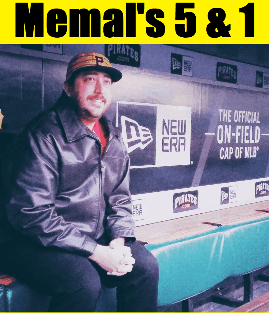
Memal’s 5 & 1
Following in the footsteps of the original “5 & 1,” Jim Vilk, Catherine Ryan after him, and finally Joe Ringham, in 2019 we introduced a new “5 & 1” (five good looking and one stinker) uni-vs-uni matchups — Michael “Memal” Malinowski. Like Joe, Catherine & Jim, Memal will pick HIS 5 best looking/1 awful matchup, and occasionally have some honorable mentions (both good and bad). You may agree and you may disagree — these are, after all, just opinions and everyone has one. Feel free to let him know what you think in the comments section.
Here’s Memal
This week several conferences announced they will be holding shortened seasons, good news that coincided with what I think has been the best Saturday of college football yet this year, and it looks like it’s only going to get better as more and more teams return to the field.
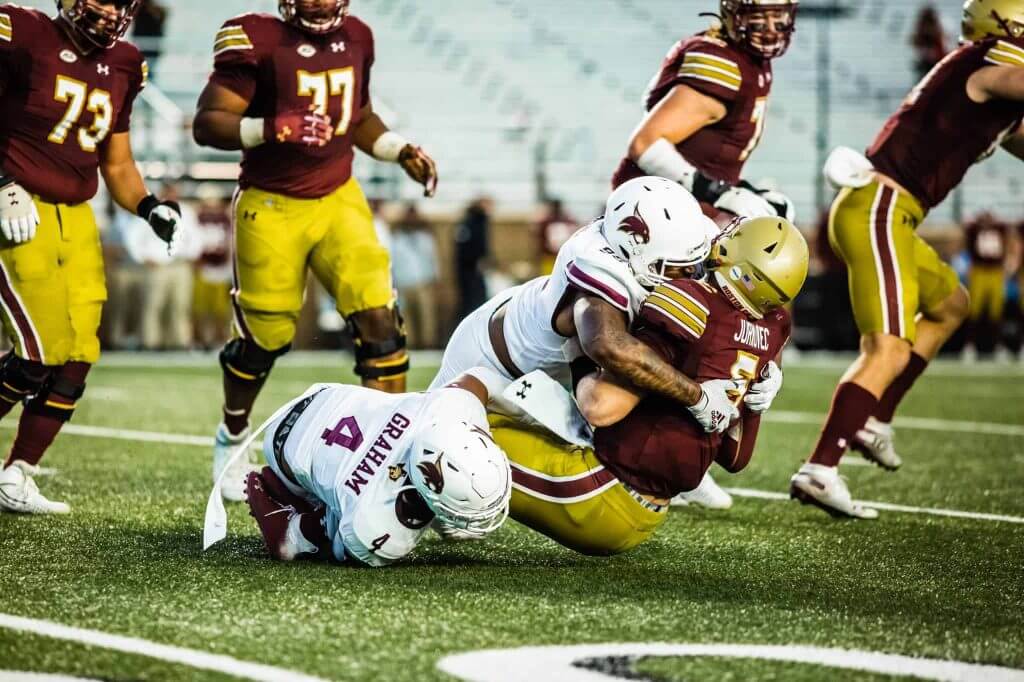
5. Texas State @ Boston College
Alumni Stadium played host to a fine looking inter-conference matchup between the Bobcats in all white and the Eagles in gold/maroon/gold. For the second weekend in a row, Texas State faced a team in maroon and gold and managed to stand apart visually just fine. Week in and week out, the Bobcats stay looking sharp!
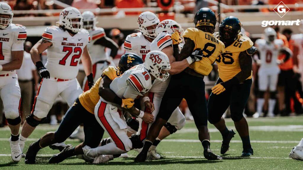
4. West Virginia @ Oklahoma State
The Cowboys brought out their fantastic 80’s throwbacks in all white look in honor of Thurman Thomas being added to the team’s ring of fame. I don’t always care to see the Mountaineers in yellow jerseys, but against Okie State’s all whites they looked sharp and contrasted quite nicely!
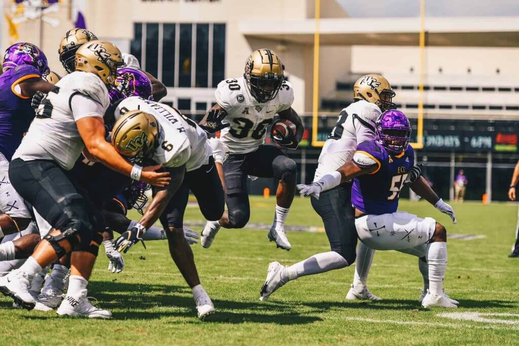
3. UCF @ East Carolina
There was nothing showy about this uni matchup, just two teams in their standard home and aways, the Pirates sporting purple/purple/white and the Knights in gold/white/black. What I really liked were the contrast of the different unique features of their uniforms, such as the different number fonts, the sword stripe on UCF’s helmets, and the pirate symbols down the side of ECU’s pants. Not your regular uniform features, but unique touches that stick with the themes of the team’s identities.
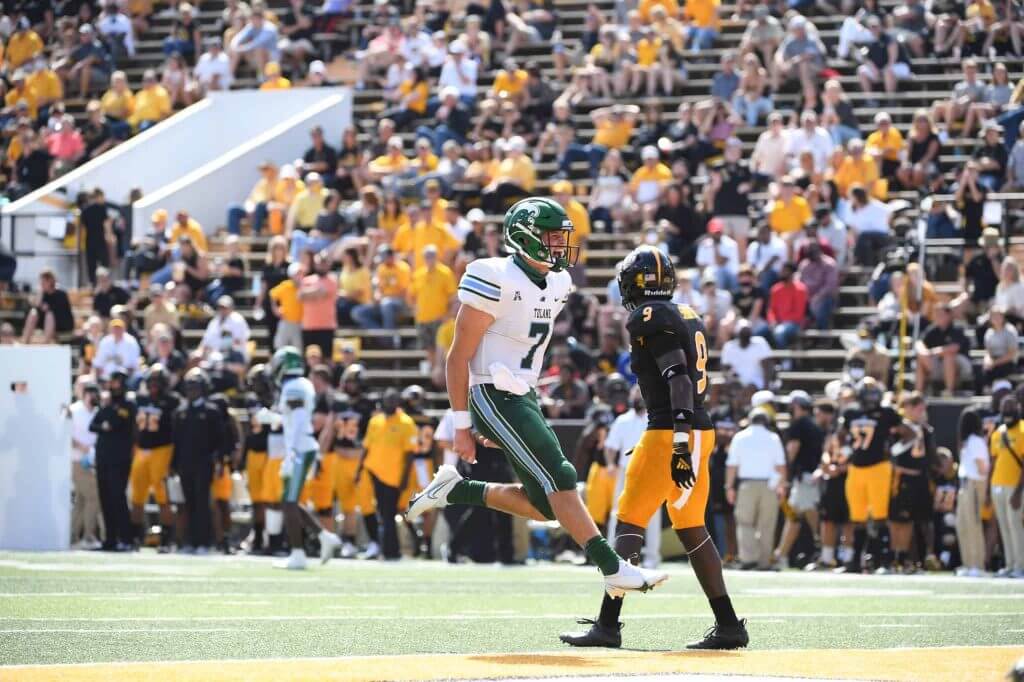
2. Tulane @ Southern Mississippi
The Battle for the Bell looked so sharp in the photos I found while it was going on I found it online and watched it awhile! Tulane’s sky blue and olive against the black and gold of the Golden Eagles resonated through my eight year old lap screen and kept me fixed for a quarter like I had a rooting interest in the game.
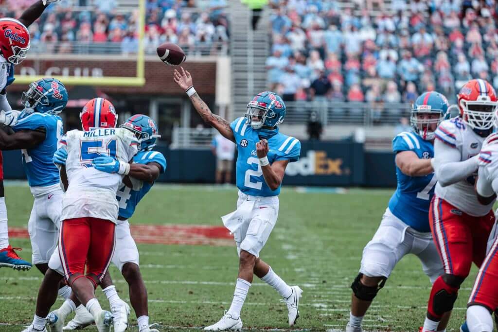
1. Florida @ Ole Miss
Here’s an example of when a team implements an alternate uniform to great effect! The Rebels went all out with the powder blue for their season opener and it looked fantastic against the orange/white/orange combo worn by the Gators. Once again, the use of powder blue is a unique touch that stays true to the Rebel’s identity.
And because somebody has to be the sacrificial lamb…
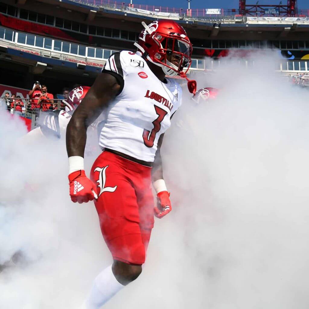
&1 – Louisville @ Pitt
…and here is an example of an alternate uniform done wrong. Louisville looked fine, Pitt’s helmet was alright and how it used the panther head logo worked well, but those gray uniforms made me wish they would have just gone with black and used a little more gold to try and connect with the city of Pittsburgh’s sports identity. It may be the Steel City, but the population doesn’t wear steel and chrome accessories like they do Steelers, Penguins, and Pirates gear.
Thanks, Memal! OK readers? What say you? Agree or disagree with Memal’s selections? Let him know in the comments below.
NCAA Uni Tracking
Uni Watch will again track the uniform combinations worn by the “Power 5” conferences. All of the 2019 trackers are back! Unfortunately, not all of the conferences are back. Here’s how the trackers would track, if all the schools were playing:
We’ve got Rex Henry (tracking the ACC), Dennis Bolt (tracking the PAC-12), Kyle Acker (tracking the Big XII), and Ethan Dimitroff (tracking the B1G AND the SEC). Rex, Dennis, and Kyle and are all returning from 2015, and Ethan is back after joining the NCAA Uni Tracking a couple seasons ago. Ethan continues his dual role of tracking both the B1G and the SEC.
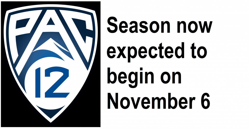
But this year the B1G and PAC-12 aren’t playing at all. So we won’t have tracking for them this season. UPDATE: Both the B1G and PAC now will try to play in the 2020 season.
Here are the Uni Trackers for the Power 5 Conferences (I’ve left all the previous tracker info in their usual slots, even if the conferences aren’t playing. In case you want to click on any of the links):
Rex is up first today (ACC):
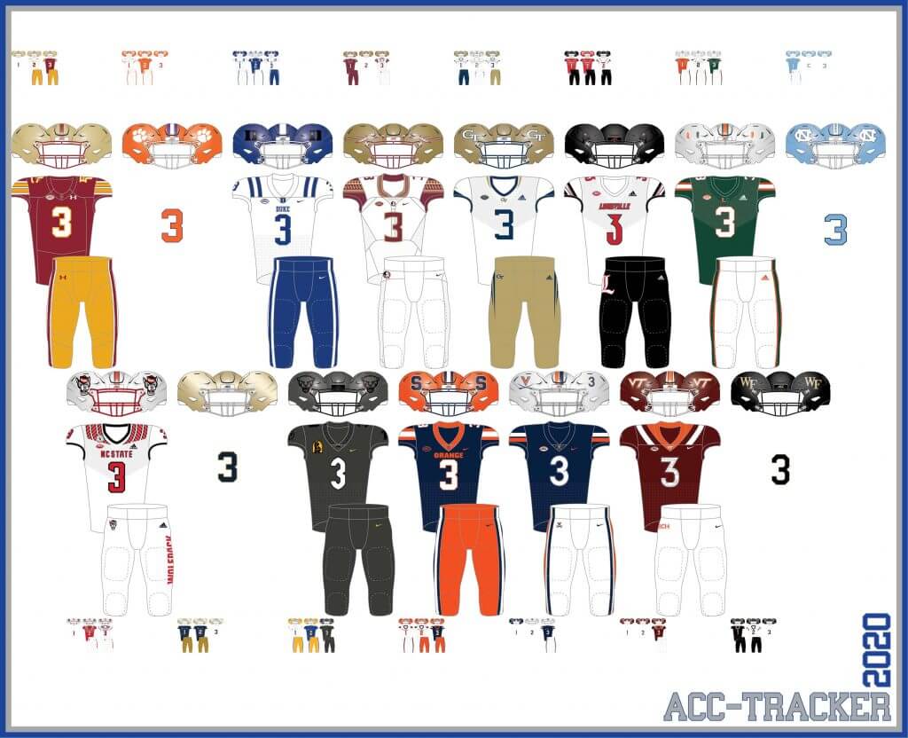
ACC
More Here.
Follow Rex on Twitter here.
And now, here’s Dennis with the PAC-12:
PAC-12
More here.
Follow Dennis on Twitter here.
And here is Ethan, with the SEC:
SEC
And be sure to check out Ethan’s WVU Mountaineer Tracker.
Follow Ethan on Twitter here.
And here is Kyle with the Big XII:
Big XII
Follow Kyle on Twitter here.
And here’s Ethan with the B1G:
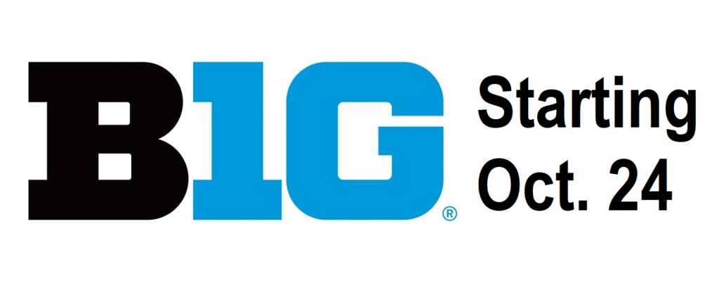
B1G
What They Should Have Worn
I’m pleased to present you a new feature on SMUW. Each week Logan Patterson will pick a Saturday game where the teams don’t necessarily look nearly as good as they could. Logan fixes that. Sometimes he simply delves into a team’s past for inspiration, other times he creates entirely new looks for a team. Sometimes he tweaks a previous look. But in the end, he comes up with a combo for both teams — “What They Should Have Worn” or “WTSHW” for short.
Here’s Logan
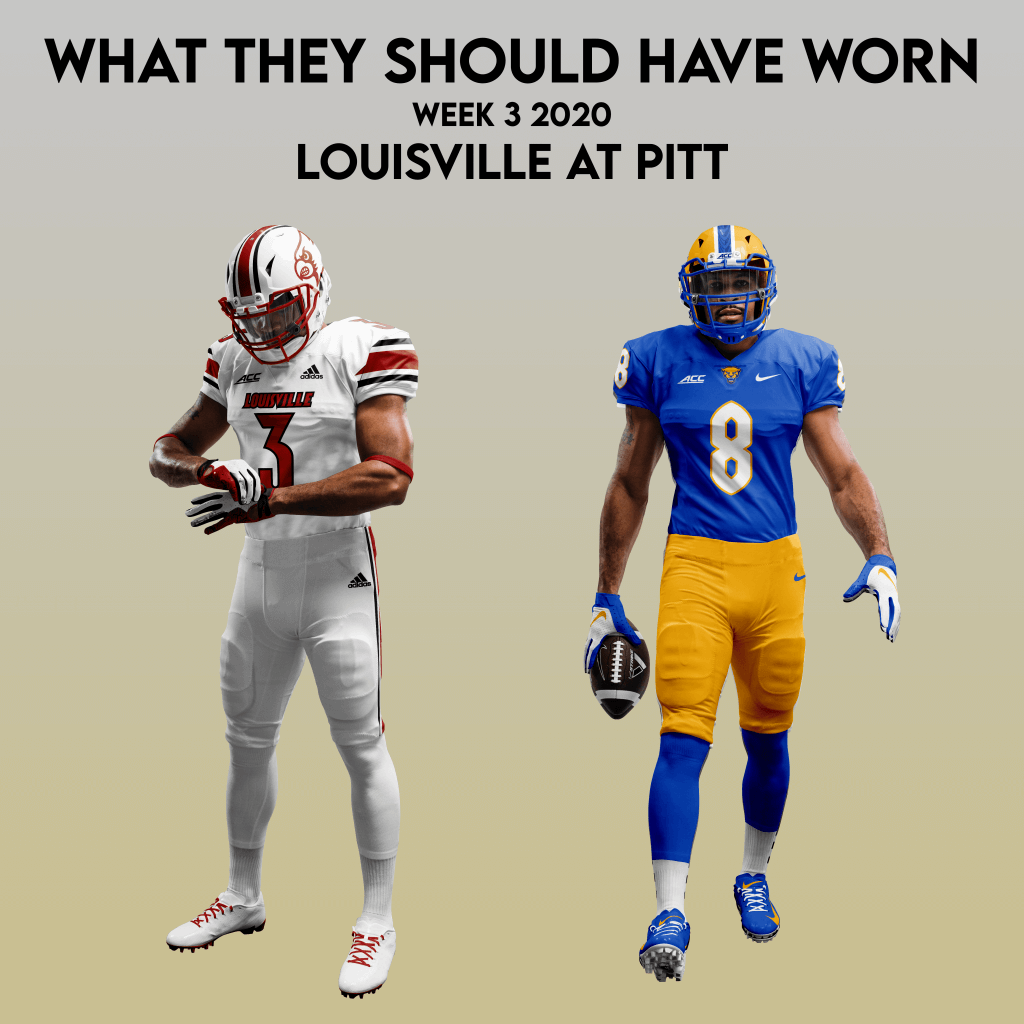
WTSHW – Louisville at Pitt (Sept. 26, 2020)
By Logan Patterson
When I pitched the idea for this column to Phil a few months ago, I was thinking I’d address uniform matchup wrongs that just needed minor tweaks, as well as those that are totally baffling. This week’s matchup deals with that latter.
Hey Louisville – Pitt, what the hell?
I feel like most of the blame should go to Louisville here. Pitt officially unveiled their version of a “city edition” uniform earlier this week – a black and steel gray one-off. I actually think it’s a pretty sweet look, well put together from head-to-toe and a fun alternate with purpose and thoughtfulness.
Louisville could have done a few, fairly easy things to make this a nice looking matchup. Had they worn their own “city edition” threads — the Muhammed Ali all-whites they debuted last year, this would have looked pretty cool! Alternatively, their current standard set would have looked nice in red/white/red, giving plenty of contrast.
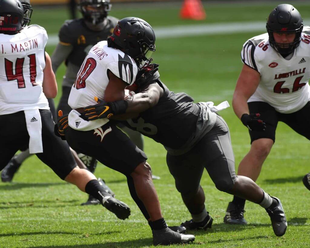
But instead, Louisville donned a black/white/black combo that looked awful against the colorless Pitt squad.
Maybe these decisions are made way ahead of time and it’s a crapshoot for equipment managers to make a good looking game. I’ll try to be generous and assume that’s the case. I really enjoyed the triple stripe theme Louisville wore from approximately 2010-15.
For the Cards, I basically married that look with their recent logo uses and typeface.
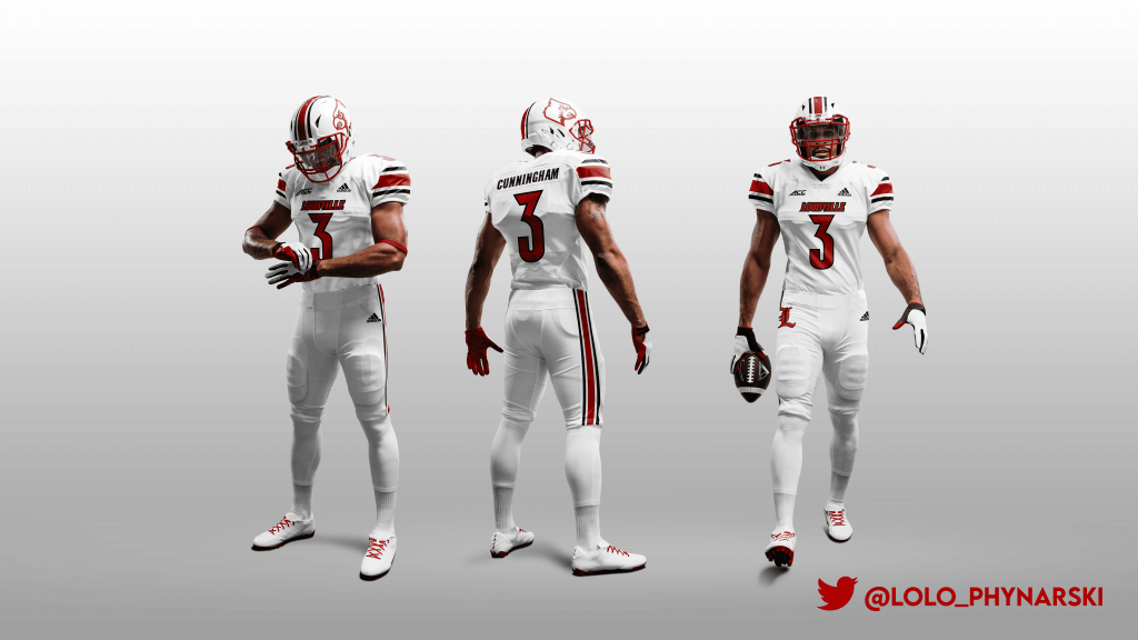
If you play this one safe, you can get a pretty stellar matchup. I’d have loved to see Pitt in one of college football’s best looks, their gold/blue/golds at home. I’d offer a few minor tweaks though. Make the white stripes on the helmet a tad wider, and use white numbers rather than gold on the jersey numbers. They went that route in 2017 when they wore the old palette as a throwback, but went with gold numbers in the 2019 rebrand.
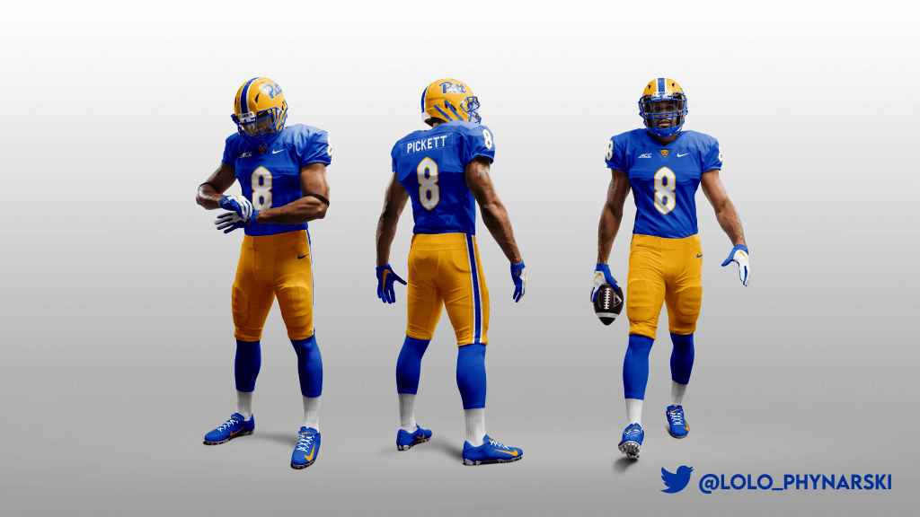
Here’s what they should have worn. Like the FSU-GT piece from week one, I’ve ditched the ACC football logo for the wordmark.
Thanks, Logan. You can follow Logan on twitter @lylo_phynarski.
Meet The SMUW Crew!
I can’t believe I haven’t done this before, because the entire crew has been doing this for a number of years (some longer than others), and I never really gave them their proper due. Two weeks ago we “met” my Duck Tracker and PAC-12 Tracker, Dennis Bolt (and it now looks like he may end up being busy this season after all), and last weekend, Memal.
Today, we’re going to meet the guy who may have started this whole giant SMUW thing — the man who reviews all the games right at the top of the thread — Terry “TJ” Duroncelet, Jr. One fine Sunday morning, I can’t even remember how many years ago, Terry posted a VERY long comment basically doing what he does every Sunday during football season: giving his take on the previous days’ tilts. I IMMEDIATELY contacted TJ and asked if he wanted to do the “lede” for Sundays in fall, because that was the beginning of the full SMUW as we know it. I had had Duck Tracking and some uni trackers before, and Jimmer Vilk had done his 5 & 1, but no one really looked at so many of the games. And thus, we had the true beginnings of SMUW. And Terry’s never taken a day off or ever failed to deliver in the years since! (Sure, maybe he gets me his writeup’s in the wee hours of the morning, but he always comes thru. So I don’t get much sleep Saturday nights during College Football Season, but it’s still worth it).
So please everyone, here’s your official introduction to Terry, along with his photo (click to enlarge) and bio:

Terry Duroncelet Jr.
Age 29
Southeast LAI am a California-native that’s been living in Southeast Louisiana for just over 9 years now. Currently, I work as a rep for a men’s clothier for my everyday job. My fascination with uniforms dates back to… I want to say 1997, when my dad got a Playstation (PS1) and Madden NFL 98. He let me play it one day, and I stumbled into the “Legends” section, where I discovered teams like the ’76 Raiders, the ’67 Packers, etc., and was also my first time seeing the two-bar facemask. From then on, I was hooked. From being enamored when the Broncos, Bucs, and Jets changed their uniforms, to remembering when the Oilers became the Titans, to learning details about my own high school’s team uniforms and the room they were all organized in, I couldn’t get enough.
Then, after the 2007-2008 school year had wrapped up, I remember seeing literally 4 seconds of a highlight reel on ESPN, and I believe the two teams were the White Sox and Tigers playing a game in Negro League throwbacks. I was determined to find them, so I went to the Internet (as slow as my connection was 12 years ago), and stumbled across Uni Watch’s white cap article (I can’t find it, but I’m sure someone knows which article I’m talking about), and I think the unis were covered in the ticker. I liked what I saw, but then went about my business, until almost a year later, in March of 2009, when I came across the site on three separate occasions (being the uni unveilings for the Lions, Jaguars, and 49ers), checking back everyday in the one class I was a T.A. for my senior year. 11 years later, and not much has changed!
Longtime Saints, Chargers, Lakers, Braves, LSU, Alabama, and UCLA fan (no personal alum status, but my sister did receive her undergrad degree at UCLA). In my spare time, my main interests are in music and drumming, as well as computers.
Thanks, TJ (for everything)!
In the coming weeks, we’ll meet the remaining SMUW contributors!
Threads Of Our Game
Occasionally I receive an e-mail update from Craig Brown, the designer and proprietor of the website, Threads of our Game. As the header explains, the website is a databuse of 1800s base ball uniforms. If you haven’t checked it out before, you’re welcome.
Anyway, got an e-mail yesterday with the subject line: “1898 Cleveland — a team heading in the wrong direction”. The body was as follows…
Hello baseball historians,
As we know, 1898 was considered a bad year for Cleveland, one of the premier National League teams of the decade. Maybe it was the poor home attendance, or the inability to play Sunday games in Cleveland, or being forced to play 94 games on the road (vs. only 55 at home), or the endless speculation of a franchise shift? OR…maybe it was the 1898 uniforms? Look closely at the team picture, and specifically at the letter N in “Cleveland” sewn onto the shirts. You could certainly say that things were heading in the wrong direction for this team. Thankfully, there are no Ns in “St. Louis.”
See the uniform here.
Thank you for your time. The above text can also be found in the Threads News Feed here.
Craig
How great is that? Very! Thanks, Craig!
Click to enlarge
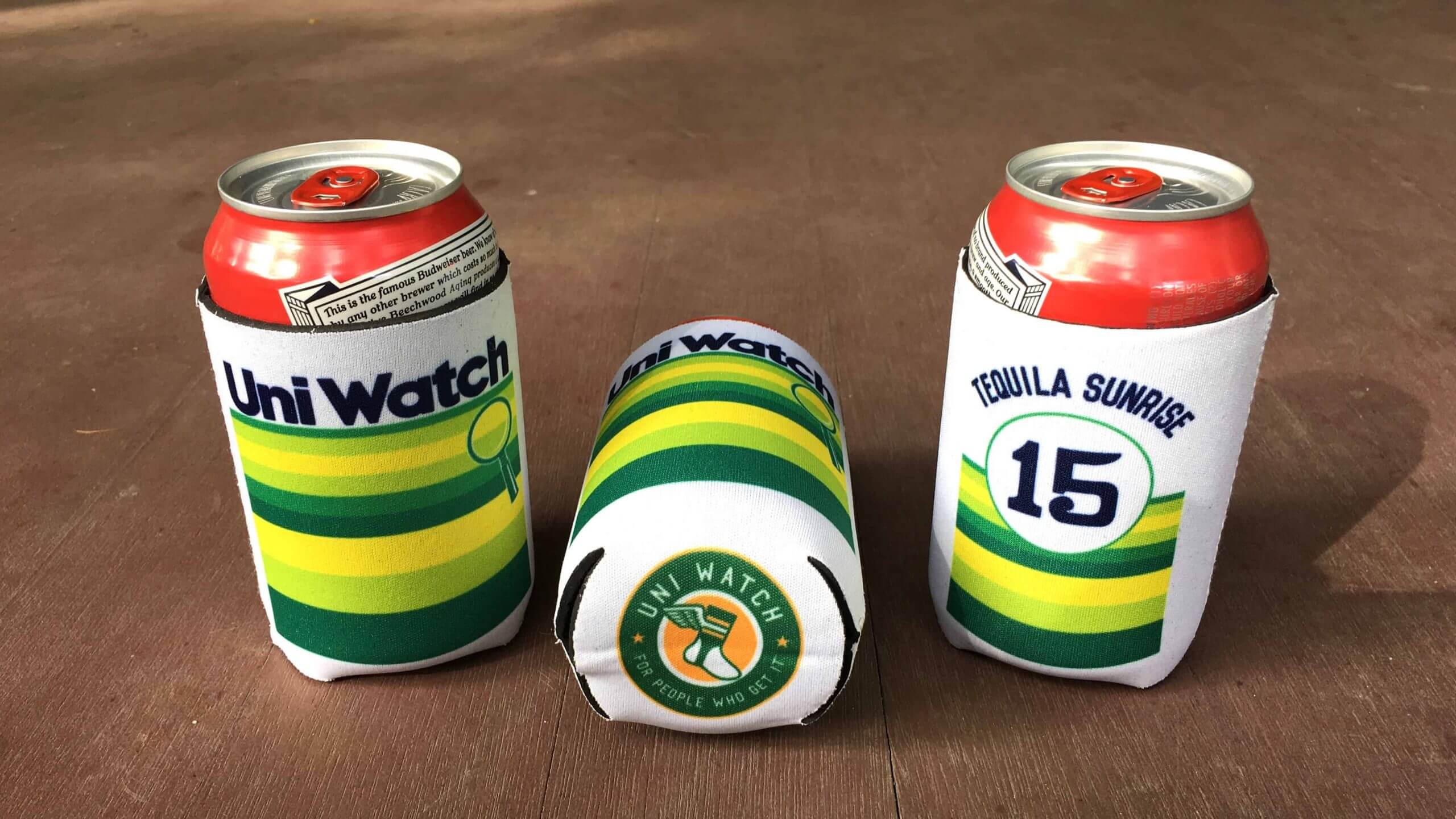
ITEM! New Uni Watch Koozies: Paul here. I’m happy to report that after getting loads of requests, we now have collapsible Uni Watch Koozies available! They feature our tequila sunrise design on the front and back, along with the Uni Watch circular logo on the bottom. Full ordering details here.
Also, in case you missed it this past week, a new item — Ribs — has been added to the menu of theoretical T-shirts (click to enlarge):
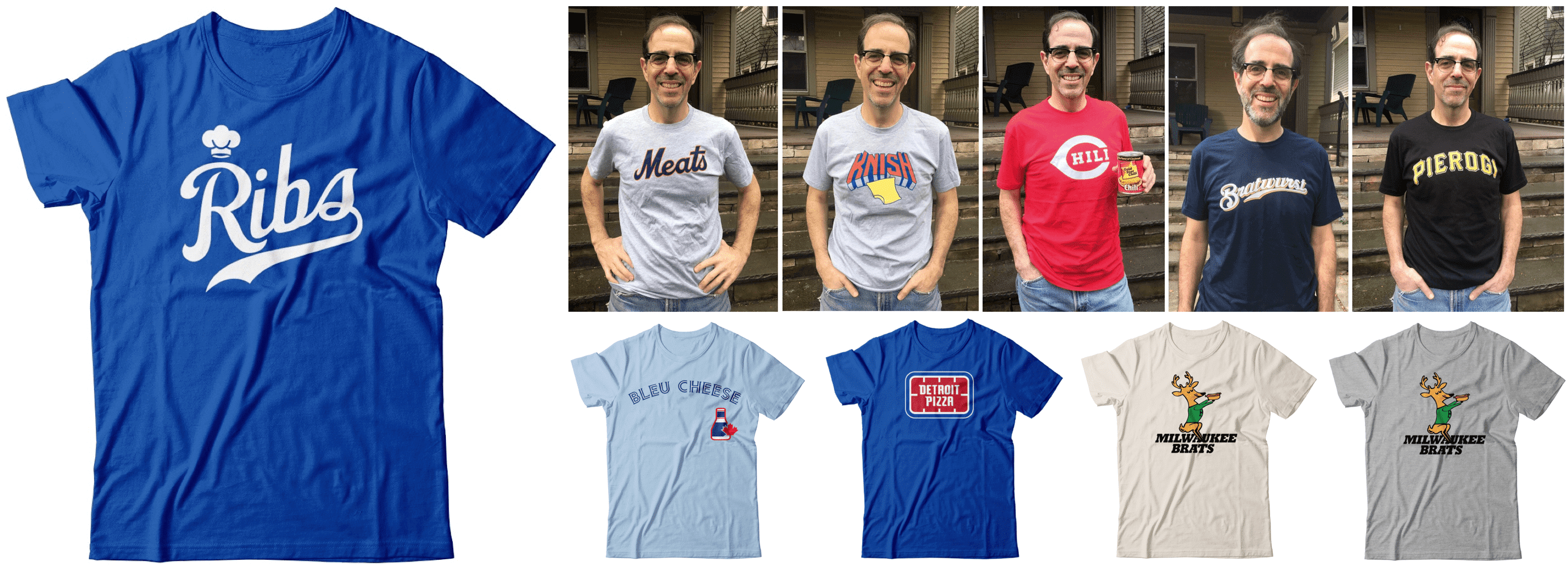
Wouldn’t it be fun, just theoretically, if these designs were actually available? If you agree, let’s discuss.

Also! Teespring is running another one of its 10%-off sales. That means you can save some coin on Uni Watch merch and we’ll still make our full profit — a win-win!
This discount applies to everything in the Uni Watch, Uni Rock, and Naming Wrongs online shops. To claim your discount, use the checkout code GOLDEN for any orders you make now through this Monday, Sept. 28.
My thanks, as always, for your support and consideration. That’s it from me — now back your regularly scheduled Phil-fest!
Uni Watch News Ticker
By Phil

Baseball News: Reader (and tweeter) Josh Claywell tweets, “from Friday, but I didn’t see it in the ticker today. Alex Gordon wore the wrong hat.” … Speaking of the Royals, Adam Franz writes, “I think this is a well done tribute.” And here’s some video of that from Jakob Fox and Erik Spoonmore). … Just like Royals players have, Mike Moustakas paid tribute to Alex Gordon with the pine tar stain across the back of his jersey (from Dan Hayes). … Yesterday Jacob DeGrom honored Tom Seaver on his cleats (from Slade Heathcott). … Reader Justin Baird works at a spring training complex and we have framed jerseys up of all the different teams that have used his facility over the years. He noticed this circa 2002 Hanwha Eagles jersey has a pocket sewed in the front (lower left). “I know Earl Weaver had a pocket sewed into his jersey so my assumption is that it could be a manager’s jersey?” Anyone know more? … Justin Turner is wearing cleats that honored Kobe Bryant yesterday (from Jakob Fox). … Every time Nelson Cruz wipeed rain off his helmet last night, he moved the logo (from pbowyer). Here’s another view from Josh Krueger.

NFL News: Big shock here: the Seahawks will wear blue jerseys, at home, against the Cowboys. They will most assuredly go mono-blue. … In another no-brainer, the Eagles will wear midnight green jerseys at home, against the Bengals. Video doesn’t show pants, but expect white. … A week after braking out their gorgeous Color Rash fauxbacks, the Saints will go mono black on SNF tonight.
College Football News: THE Ohio State updated its practice jersey to the new Nike template AND added Buckeye leafs inside the numbers says John Sabol, who excitedly adds, “This would look amazing on the game jerseys with gray sleeves.” … We may have seen this before, and apologies in advance, but check out this 3D ASU Sparky wall art (from Kevin Cearfoss).

Hockey News: ” BCHL preseason underway. Some notable colour vs colour with Nanaimo Clippers at Victoria Grizzlies,” tweets Wade Heidt, adding “Hey @BCHLGrizzlies, these are different than regular dark unis. Is this your new look or these unis just for preseason?”

NBA News: According to u/EvanP11 via r/basketballjerseys on Reddit, they found this at a local Dick’s. If true, it looks like the Lakers will bring back the blue Elgin Baylor-era jerseys next season (from StaticShaq).

Soccer News: We don’t have a 5 & 1 for soccer like we do for college football (but maybe we should, because this would totally be the & 1): “My nomination for ugliest uniform matchup of the weekend” says MauricioGómezMontoya. I think even Memal would agree. … Check out Wilfried Zaha’s cleats from yesterday (from our own Anthony Emerson). … Hmmmm. Is light blue vs. dark blue enough contrast? (from Cody).

Grab Bag: St. Laurence High School in Burbank, IL has a new gym floor (from Ed Kozak). … High School mascot update from Chris Huff: The Richland HS Rebels (suburban Fort Worth) are now the Richland Royals. … This is pretty cool: In 1973, Sports Illustrated came to Onondaga and wrote about the importance and roughness of box lacrosse played in the Syracuse War Memorial (from Michael Sullivan). … The new center hung scoreboard at the “Carrier Dome”, at 7,000 ²ft, is the second largest in the US, according to the announcers on the ESPN digital broadcast (from Michael MPH).
And finally… whew! Great stuff from everyone today, and once again, my tremendous thanks to the entire SMUW crew.
To all those celebrating Yom Kippur, have a good holiday and an easy fast!
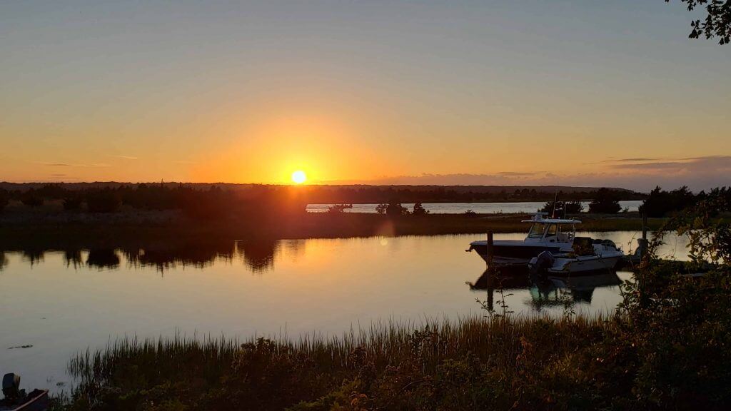
I’m winding my time out east down (probably will close the house up in two weeks), so I probably won’t have too many more sunset (or post-sunset) photos, but yesterday was an absolutely spectacular day, with just a few clouds. And in what is kind of rare, a small catamaran made its way in the small inlet you see in the foreground (it’s not particularly wide, so most sailboats go around the island and use the main channel in the harbor, which is in the background). It’s not really wide enough to tack well (it can be done) and any sailboats that do traverse this inlet usually do so under motor.
But the sunset, as I said, was spectacular. I’m gonna miss these:
Everyone have a good week and I’ll catch you back here next Saturday.
Peace,
PH
Logan’s suggestion for Louisville-Pitt would have looked so much better than what the teams wore, but personally I think it would be even better if Louisville wore red- white- red.
Also, it was nice to get to know you, Terry. I appreciate your efforts each week. Thanks!
Agreed, that would have looked really nice. I considered doing this as a color on color even with the cards in white/red/white.
Louisville looked
finelike Louisville…predictably bad, Pitt’s helmetwas alright and how it used the panther head logo worked well, but those gray uniformsmade me wish they would have just gone with black and used a little more gold to try and connect with the city of Pittsburgh’s sports identity worn their regular ones.It might be time to consider renaming the 5&1 to the 5&Louisville.
Did that wrong…take two.
Louisville looked
finelike Louisville…predictably bad, Pitt’s helmetwas alright and how it used the panther head logo worked well, but those gray uniformsmade me wish they would have justgone with black and used a little more gold to try and connect with the city of Pittsburgh’s sports identityworn their regular ones.I keep a spreadsheet to track how often and where I rank teams and saw that fact, but I still had to rank that game there because I was so disgusted with Pitt’s unis.
I’m a Pittsburgher and graduated from Pitt and the more I thought of Pitt coming out in a black uniform with gold numbers, gold helmet with a black stripe, gold pants, the more I wish they would have gone that route.
Perhaps next week when I get to the &1 I will follow Lou’s advice and say, “And the game that made me cringe the most…”
Well Vilk, you did predict early in the week the Pitt uni would be the &1 and here we are. It’s not surprising to me that Uni Watch is pretty much the only place I’ve seen negative reviews (and the sideline gear was selling like proverbial hotcakes early in the week).
I never coordinate with any of the contributors, and I’d planned to write about the Pitt costumes long before I received Memal’s &1 or Logan’s WTSHW. That should tell you something Douggie ;)
This alternate was everything that the 2010 Pitt pro combat wasn’t. That was a dud. This one had really good homages and wasn’t just alt for alt sake. I went back to re-read the piece Jason Bernard and I did ten years ago on Backyard Brawl history and the lead up to the Pro Combat game, sadly nearly all the flickr links are dead :(
This one was definitely less of a dud than the 2010 alt, so we’re in partial agreement…
the sideline gear was selling like proverbial hotcakes
Popular doesn’t always equal good. I’m sure Louisville sells lots of their gear as well.
The 1898 Cleveland uniforms looked fine to me. You seemed to suggest there was a backwards ‘N’ on them? If so, that photo wasn’t linked.
I’m guessing you didn’t read the linked article, with a bunch of photos showing the backwards “N”.
It’s link, you need to scroll down.
I will say that Memal is doing a better job this year so far.
However, I have complained about this before and will do so again:
“ And because somebody has to be the sacrificial lamb…” Suggests that there were no bad uniform matchups but since something had to be picked….. In most cases the choice is an actual poor set of uniforms, and there is therefore no “sacrificial lamb”. I really wish you would stop using that as template language.
But…but…tradition!!!
I carried it over from the previous 5&1 providers and have at times thought of dropping it when the &1 wasn’t so obvious. I think I’ll change it up on going. Thanks Lou!
@ MauricioGómezMontoya I agree!
Four different jerseys in the Nats-Mets doubleheader yesterday. White vs gray in game 1, navy vs royal in game 2. It happened with the Mets at least once before, against the Marlins. Was it a regular feature everywhere this season?
Man, that Ole Miss uni is a thing of genuine beauty.
Greatness IS possible
Watching the Browns/Washington game and the announcer just said this is the first NFL game to feature two logo less helmets since 1962. Browns/ Steelers.
Wrong.
1994. Cardinals/Browns.
link
There may have been others, but I know of that one for sure.
Packers/Bears from that year as well.
link
Packers/Eagles,
link^3
Steelers/Cardinals
link^9
And there was at least one Packers/Lions game in this century.
link
Pretty sure there have been more.
Definitely sure none of them have involved the Seahawks, before anyone gets any ideas.
But that was only in 1976 anyway.
Ok, it was a Thanksgiving game, but Lions/Packers 2001:
link
Georgia’s red pants got all the attention, but damn those throwback jerseys looked beautiful! Just a perfect balance of red and black,anchored by those black varsity block numbers that have the effect of making the red in the sleeve stripe and collar pop even more. A million times nicer than what they usually wear.
I can’t believe the Jets actually take the field in these uniforms.
A rare non-white jersey game today. Tampa’s pewter @ Denver’s orange.