For all photos, click to enlarge
Good morning, and happy autumnal equinox! Autumn is my favorite season and “autumnal” is my favorite adjective (I like how the silent “n” suddenly gains a voice), so this is a good day.
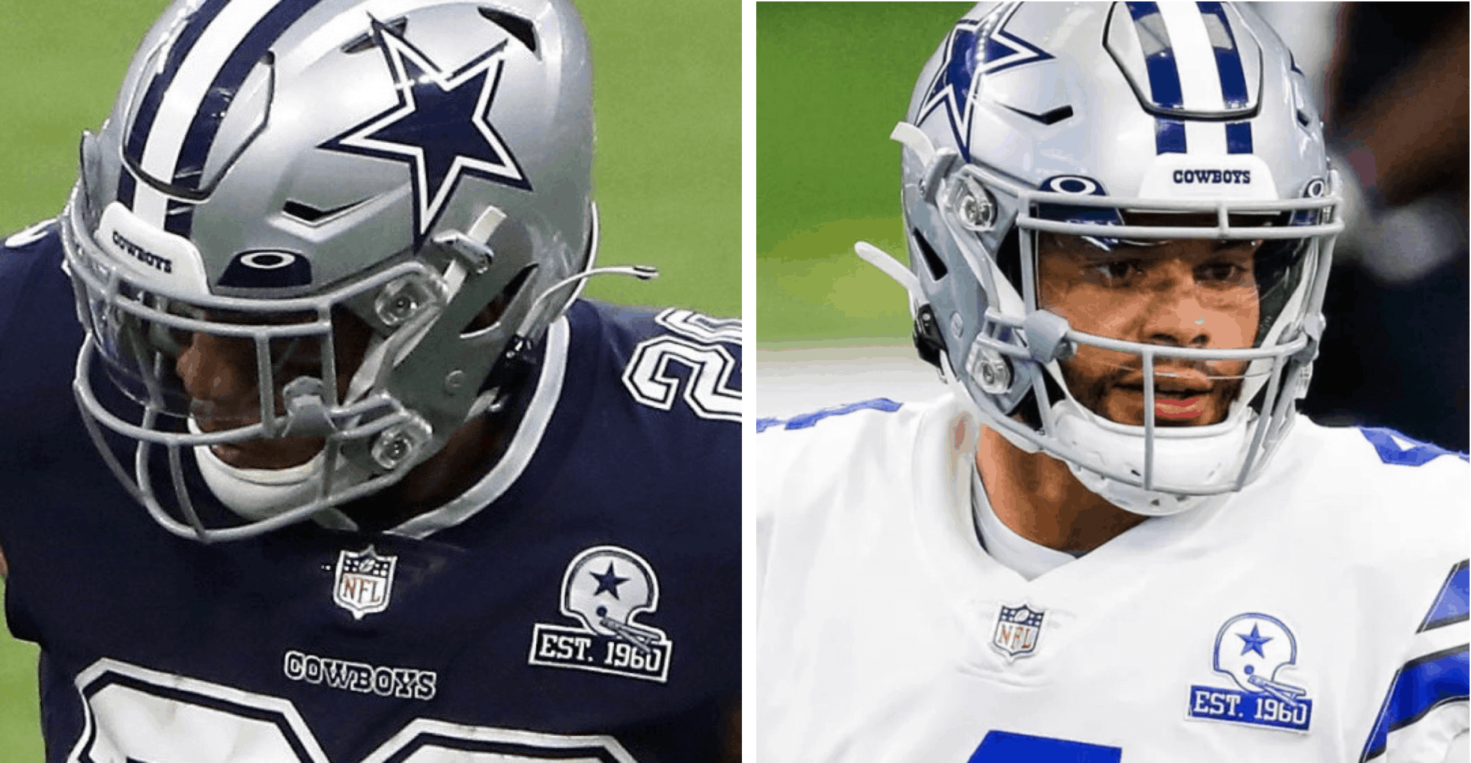
Now then: As I was putting together yesterday’s Monday Morning Uni Watch post, I received a note from reader Marshall Doig, who noticed something that nobody else had picked up on: It looked like the Cowboys were using two different 60th-anniversary patches — one with navy graphics, to go with the team’s navy jersey (worn for Week One), and one with royal graphics, to go with the white jersey (worn for Week Two).
The patch colors certainly look different in the two photos shown above, right? But it also looks like the helmet star and striping are darker with the navy jersey, lighter with the white jersey. Obviously, Dallas has only one helmet design. So if the helmets look different in the two photos, it must be due to the lighting or the exposure or something along those lines, which could also affect our perception of the patches. In short: Photo evidence can be tricky, especially when dealing with something as notoriously fickle as the Cowboys’ various shades of blue.
So I emailed a Cowboys rep. While I was waiting for a response, I spent more time than I’d like to admit poring over additional photos from the team’s first two games. As I suspected might be the case, the results were inconclusive, and at some points even confounding. For example, take a look at these two photos from Week One:
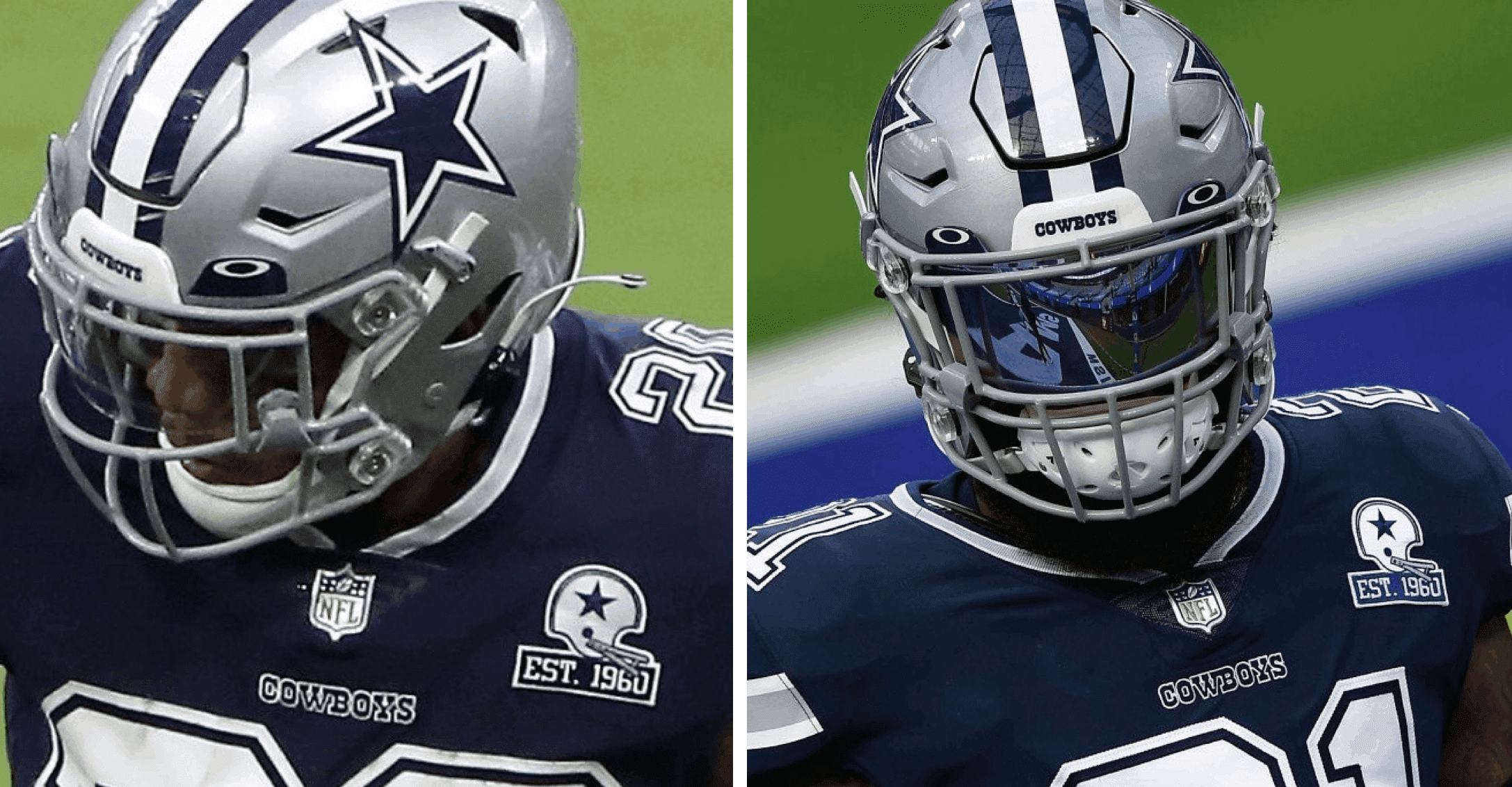
In the photo on the left, all of the blue graphics on the patch seem to match the color of the jersey. But in the photo on the right, the “Est. 1960” bar definitely looks lighter than the jersey. (Also, the helmet on the patch on the left looks silver while the one on the right looks white, but let’s stick to the shades of blue for now.)
Similarly, here are two different photos of Cowboys quarterback Dak Prescott from this past Sunday:
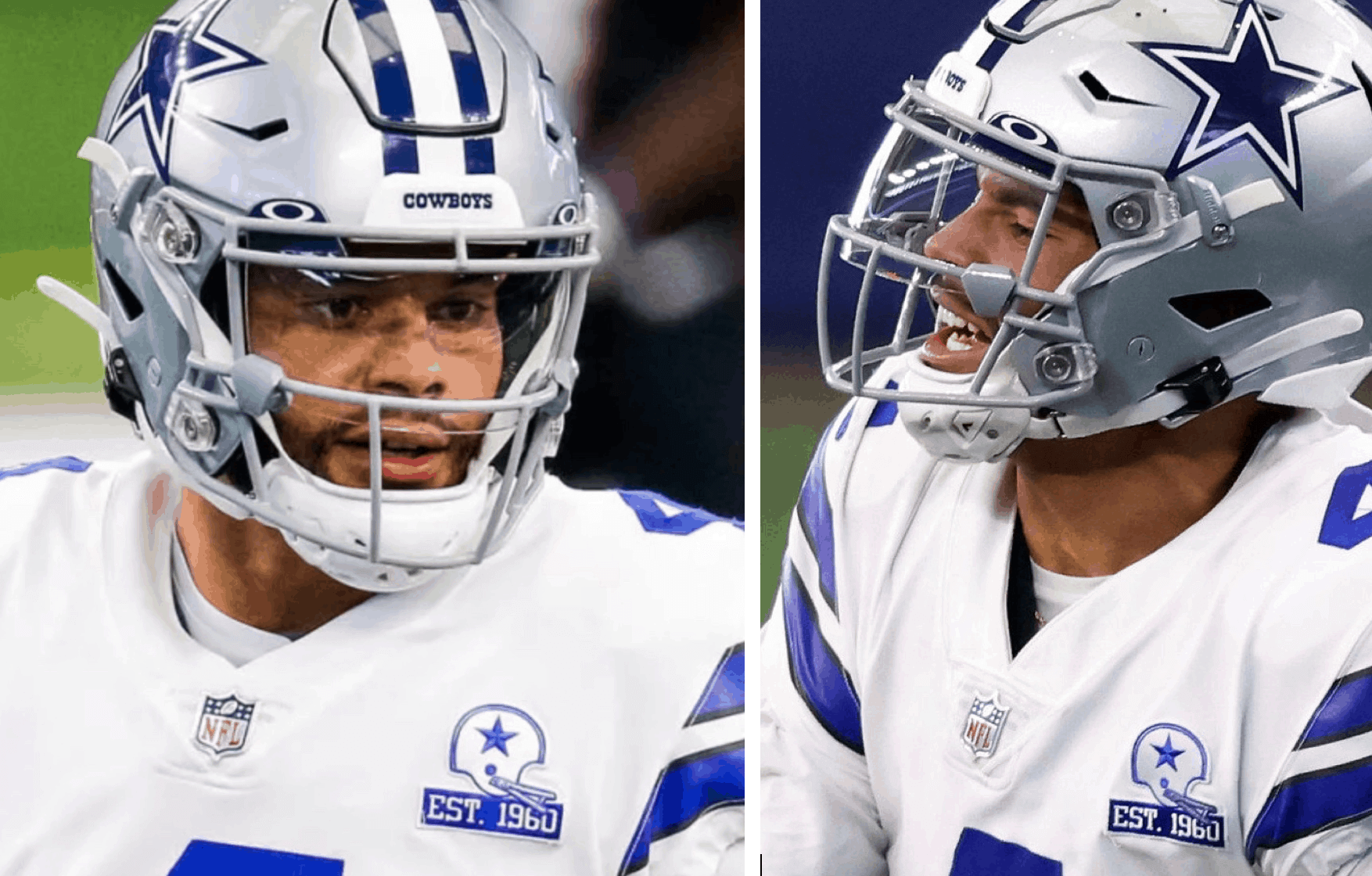
In the photo on the left, the entire patch appears to have royal blue graphics. But in the photo on the right, the “Est. 1960” bar appears darker. Obviously, they can’t both be right, since these are photos of the same player in the same game. Just goes to show how light, reflection, and even things like embroidery thread glossiness can affect stuff like this.
After a bit I heard back from the Cowboys rep, who confirmed that they are indeed using two different patch designs for the two different jerseys. As it happens, they aren’t scheduled to wear the navy jerseys again this season anyway (although they could conceivably end up wearing them in the playoffs), but I’m assuming they’ll use the navy patch with their Color Rash uni on Thanksgiving, since that that design features navy numbers and trim.
Also! The Cowboys rep confirmed that the team has indeed adjusted the shade of its silver-blue pants — a possibility that I explored a bit in yesterday’s post. “We switched the pant color a bit to the ‘Cowboys Star Blue’ — the name of the dye lot on the fabrication of the pant,” he said. “We updated the dye lot for 2020 to have more blue in the color, since over the last few years it had become more greenish than the blue/green tint it originally had.”
Interesting that the dye lot shifted over the years — that would seem to be an(other) indictment of Nike, right? Also interesting that the team didn’t announce the color shift — or, for that matter, the separate patch designs — but maybe that’s the kind of information that isn’t making the cut when the team’s staff is busy with pandemic-related preparations.
Of course, it would be nice if the Cowboys could simply wear one consistent shade of silver on all of their pants and their helmet, but that’s another battle for another day. For now, at least the people who thought the pants looked different on Sunday can be assured that their eyes weren’t playing tricks on them.
Meanwhile, as long as we’re talking about the NFL and patches: I finally heard back from the Chargers, who provided me with the digital design that was used for the inaugural-season stadium patch they wore on Sunday:
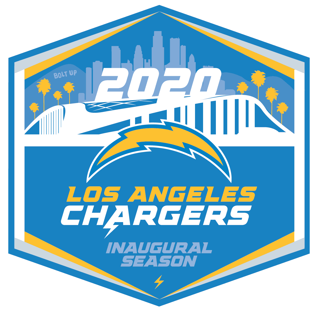
A team spokesman confirmed to me that the patch was only for the home opener and will not be worn again.
(My thanks to Marshall Doig, whose eagle-eyed patch observation made today’s post possible.)
Collector’s Corner
By Brinke Guthrie
Follow @brinkeguthrie
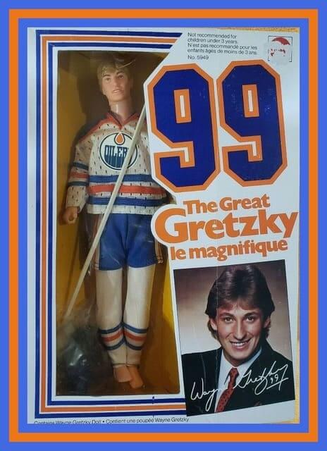
When your nickname is the Great One, you open yourself to all sorts of marketing possibilities. Case in point, this 1983 Wayne Gretzky Action Figure Doll from Mattel. As it says on the box, le magnifique! It looks like Wayne’s never been removed from the box so his hair is still perfect, and comes with his own stick. Looks like they used real jersey fabric for the jersey, too!
Now for the rest of this week’s picks:
• Great artwork on this 1970s box for Fleer NFL Football Patches. It’s so evocative of the period with the multi-colored silhouettes.
• I’ve seen plenty of officially licensed waste baskets on eBay, but I don’t recall seeing one with a basketball backboard, like this one for the Chicago Cubs. I’d be careful if you’re bidding on it, though, because they tend to be in very rusty condition on the inside.
• For the young New England Patriots fan who has everything; your very own 1980s Patriots BMX bike kit.
• The TV Quarterback is some little thing that hangs on the side of your armchair and holds your remote and your TV Guide. (What about your favorite gameday beverage? Need a spot for my cold Yoo-hoo!) This ad features the Cowboys and the Niners, so I really don’t know what’s in the box.
• This Lou Gehrig Hall of Fame Collector’s Statue dates back to 1963.
• Here’s another Bronx Bombers item: This vintage New York Yankees seat cushion caught my eye because, even though I don’t drink and have no loyalty to Miller, I’ve always thought the name “High Life” and slogan “Champagne of Beers” were great.
• Here we have a Detroit Tigers snowman from 1968. I guess this would hang on the Christmas tree!
• This vintage New York Giants cereal bowl would be a nice fit at Uni Watch HQ! And here’s one for Jets fans too.
• Speaking of the Giants, this 1970s NFL glass includes the Giants “disco NY” logo.
• Check out this 1946 roulette wheel baseball game! The instructions say “Poosh-M-Up Triple Play.” You also get a copy of “Pro-Base Ball Official Rules.”
• Here’s a 1980s “door hanger” for the Sacramento Kings that emphatically states to anyone in your house (especially your mom, who might “tidy things up” a bit), “Don’t Bother Me. Don’t Touch Anything! I Like My Room This Way!”


ITEM! New membership raffle: Reader Collin Lehman recently won a membership raffle and has generously paid it forward by purchasing a membership for me to raffle off. He’s asked that this raffle be open only to essential workers, first responders, and others who’ve continued working in public during the pandemic.
This will be a one-day raffle. To enter, please send an email that describes the type of work you do to the raffle address. One entry per person. I’ll announce the winner tomorrow.
Meanwhile, the winners of yesterday’s raffle are Rodney Hartwig and Graham Block, who’ve each won a set of three Uni Watch Coasters. Congrats to them, and my repeated thanks to reader Max Weintraub for sponsoring that one.
Click to enlarge
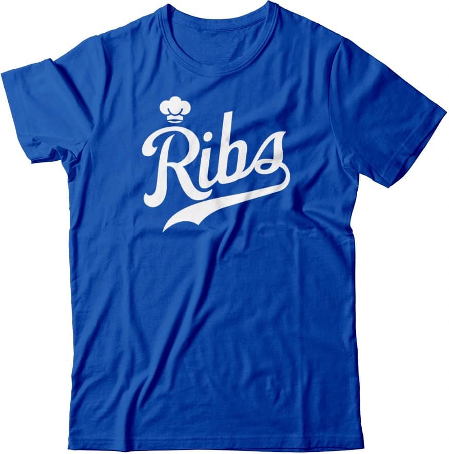
ITEM! Theoretical update: Our theoretical menu has a new addition — Ribs!
Wouldn’t it be fun — just, you know, hypothetically — if this shirt actually existed and was available for purchase? If you agree (about this or about any of the other theoretical shirts), shoot me a note and we’ll have a theoretical discussion.
The Ticker
By Alex Hider

Baseball News: Reds 1B Joey Votto wore a team clubhouse employee shirt during Sunday’s postgame interview. Votto says clubhouse staff presents the shirts to players who have been with the team for 10 years, and he and former Reds P Bronson Arroyo are the only ones who have received one (from Mitch Cumstein). … White Sox P Jimmy Cordero rolled up the sleeve on his pitching arm last night (from David Nakoneczny). … Brian Bennett’s wife found an old photo of her grandfather playing for the Unity Lodge #736 of the Independent Order of Odd Fellows in the early 1900s. Check out the boys in front wearing “mascot” jerseys! … The Red Sox had a jersey giveaway yesterday but advertised it with an older, Majestic jersey (from Matt Rashford). … Grayson College, a JuCo in Texas, has new logos commemorating their national championships.

NFL News: Colts LB Darius Leonard threw his gloves into the crowd after Sunday’s game — but he didn’t realize his wedding ring fell off inside his glove. Luckily the fan spotted the ring, and it’s on its way back to Leonard (from Mike Chamernik). … We had previously Ticker-reported that Steelers C Maurkice Pouncey had decided not to honor East Pittsburgh police shooting victim Antwon Rose Jr. on his helmet. He instead chose to honor fallen police officer Eric Kelly on Sunday (from Tim Dunn). … Speaking of the Steelers, S Minkah Fitzpatrick wants to use his “My Cause, My Cleats” shoes to showcase “positivity through artwork,” so he’s holding a fan design contest and will pick his favorite design (from Jerry Wolper). … NOLA.com briefly ran a box score online Monday that mistakenly used a Cardinals logo in place of a Raiders logo. “Obviously done by a disgruntled Oakland fan,” Kevin McLaughlin said. … Bills QB Josh Allen has his own cereal, Josh’s Jaqs. The box features him in a logo-less, generic version of Buffalo’s uniforms (from Devin Babcock). … According to the Broncos Uni Tracker, Denver has the most wins and highest winning percentage in navy blue since adopting their current uni set in 1997. … Interesting chart shows how far away each team’s nominal city hall is from its NFL stadium. … Saints DL Cameron Jordan’s captaincy patch was coming loose from his jersey during last night’s game against the Raiders. … The NFL has fined three head coaches — Denver’s Vic Fangio, Seattle’s Pete Carroll and San Francisco’s Kyle Shanahan — $100K apiece for not wearing masks this past weekend.
College/High School Football News: Air Force unveiled their newest alternate set, which honors the Tuskegee Airmen. … New Jackson State football coach Deion Sanders was introduced yesterday with a team-branded blazer and mask (from Ignacio Salazar). … Kentucky LB Chris Oats will miss the season with an “undisclosed emergency.” Coach Mark Stoops says the team will rotate his No. 22 among his teammates to honor him for the rest of the season (from Josh Hinton). … Syracuse shared new photos from inside the Carrier Dome, where its new self-supporting roof is nearly complete (from @PhillyPartTwo). … The field at Lockney High School in Texas is marked for both six-man and 11-man football, presumably so it could play host to neutral-site playoff games in both sports (from Eric Maddy).

Hockey News: New third uniforms for the Maine Mariners of the ECHL (from Wade Heidt). … New pad set for Alaska-Anchorage G Brandon Perrone (from Travis Ward). … Couple of design concepts for the Columbus Blue Jackets, a club that could probably use a makeover (from @Z89Design). … Stanley Cup Finals observation from @Kurzy17: “Four players from the Stars (Tyler Seguin, Jamie Benn, Alexander Radulov, John Klingberg), and one player from the Lightning (Alex Killorn) are wearing Easton E400 helmets. Easton’s hockey wing was bought out by Bauer in 2016 and no longer pays the NHL’s licensing fees. The uni-worthy aspect of this is that Killorn’s helmet has been rebranded with the Bauer logo, while Dallas players’ helmets are unbranded.”

Basketball News: Reynolds High School in North Carolina renovated its playing surface and changed its floor design (from James Gilbert).

Grab Bag: The wall art in the dojo on the Netflix series Cobra Kai features some kerning issues (from Timmy Donahue). … Also from Timmy: Taiwan is holding a vote to determine the logo it will put on packages to identify domestic pork products.

Click to enlarge

What Paul did last night: Yesterday was my half-birthday. I declined Mary’s offer to bake me half a cake, but we haven’t had much to celebrate around here, so we got a 40-ouncer for last night’s Pandemic Porch Cocktails™ (it just felt a bit more festive) and then went and got Chinese takeout.
As always, you can see the full set of Pandemic Porch Cocktails™ photos — now more than six months’ worth — here.
I loved that seafoam color of the Cowboys pants. I know the differing shades of silver and blue bother a lot of people, but I thought the greenish hue paired well with the rest of the uniform.
I remember I was with family at my brother’s place watching a Cowboys game on TV a few years ago and my mom, who isn’t as uniform-observant, actually noticed those Cowboys pants and asked me and my brother if their pants were green. She was trying to determine if her eyes were messing with her or if the color was really that greenish blue hue.
Kerning! Another word I’ve learned through Uni-Watch that when used elsewhere will earn me confused looks. Can’t wait!
I am tired of hype videos for jersey reveals. I wish teams would just provide some well lit photos instead of having us sit through 90 seconds of video for 35 seconds of uniform footage. I know those videos are for recruits and not for Those Who Get It, but still.
Jimmy Cordero always rolls up the sleeve on his pitching arm.
We didn’t realize. Thanks for that info!
Yep – had that Wayne Gretzky Doll as a little kid in the early-to-mid 1980s.
Gretzky’s friend and former teammate Mark Messier had a similar doll later. The manufacturer didn’t get the doll really accurate. Messier didn’t have as much hair when he played for the Canucks.
link
link
I always loved how they used totally out-of-scale mesh for the jersey.
I don’t think Nike makes the Cowboys’ pants. They have a gloss finish, which Nike doesn’t do. Could’ve sworn they’re produced by a third-party manufacturer who slaps a Swoosh on for contractual reasons.
There’s no reason for this. What if Nike told the Yankees, “Sorry, we don’t do pinstripes. Pick something else.”
I mentioned this elswhere in regards to the AFA Red Tails unis but…
I think it’s a fantastic idea but the execution is really poor.
What it appears to me that they did here is they made the front of the helmet resemble the nose of the plane and the BOTTOM OF THE SHOE is apparently the namesake Red Tail. So like, if the player is face down on the field and has his arms straight out, he looks like the airplane?
That is pretty fucking stupid.
I was about to say the same thing. And why not make the back of the pants red because y’know… “Red Tails?” Maybe the Washington Football Team will get this right if they go with that team name.
Why do you hate the Washington Football Team?;) No, Red Tails only has ONE positive connotation (the connection with the heroic Tuskeegee Airmen), it fails on every other level. We’ve already seen the photo of the baboon; no need to reinforce that unsavory image. Also, Washington will be a laughingstock every time some divisional opponent lights them up. The Sports sections will have a field day crowing “Cowboys/Giants/Eagles Kick Washington’s Red Tails Back to DC” or “DC’s Red Tails Glowing After Historic Butt-Kicking”. It will be a constant source of mockery.
Where?
yeah, where?
Friendster
Agreed on “autumnal”…and “autumn” instead of “fall.” They are, well, more aesthetically appealing (in my opinion) when referring to the new season.
Totally agree on the beauty of the word autumnal. Autumn is vastly preferential to fall which has another meaning it can keep all for itself.
those AF helmets are fantastic
Fantastic AF :).
wait wait wait, YOU want the silvers to match?! you, paul lukas, my idol, my friend, does not recognise that the cowboys have maybe THE best uniform in sport? why does it have to match? if they tried to match and failed viking styke, that’s different, but intentional unique design passed down through history should be changed for people who want silver to be silver instead of recognizing that the cowboys just ARE blues and silver. leading back to your recent post, noticing that the cowboys silver pants actually had a blue-green tinge was one of my earliest and favourite early UWing memories. why on the cornmother’s big ol blue-green planet would you want to make the cowboys as generic as any other team? i can’t say how heartbroken i am by this opinion, and i hate/hated/will hate the cowboys forever too. how is having two types of silver any different then choosing between red-white pantaloons on the road for the chefs? it’s absurd.
i bet putting on those crazy bloomers is probably the best part of suiting up for any rook on the boys who is appreciating doing that for the first time. curtain-drapers kill me, you are like an ideologue that see’s only one path to greatness, his path to greatness, and want to snuff out a rainbow of voices. always a bad modus operandi you clearly have let your giants fandom influence you.
Ah, Robert — you are, of course, correct.
I hang my head in well-deserved shame.
Totally agree with RMP. Bummed they have been moving away from the idiosyncrasies (like that weird neckline eyelet thing). Wishing for one silver pant is like aligning the Detroit Tigers D’s or Yankees NY on jersey, and hat. Shouldn’t happen!
Love the projection.
But if anything, I think it’s his 49ers fandom influencing him ;)
I’m a fan the greenish Cowboys pants, but the new ones look great too. Silver to match the helmets might be too bland.
sorry, i got a little ramblin’ when my head exploded, you know i love you:)
the silver-grey pants don’t clash with the horrible navy-tops like the blilver does, so changing is necessary the way i see it. and it’s uniqueness is cool/unique, as is their use of 3 shades of blue.
actually i don’t think they take enough advantage of the shade choices. for instance i prefer the 70’s prussian blue-topps, yet a 4th shade of blue, but that’s my bag. disliking the blilver is fine, but saying it’s a bad choice? not a waffle tight position(IMHO).
i should start proofreading. if i’m gong to be critical, i have to be better, talk about shame.
You mean you haven’t been proofreading all these years?
It’s hard enough to get him to use right proper capitalization.
When’s the last time the Pokes wore the royal blue jersey? January 1981, against the Eagles? I know they think they are bad luck, but all their blue jerseys are unlucky, so why not at least revisit the original template?
As a guy who loves Chinese food who’s wife despises it, I get so interested in people’s orders. Please, if you have a moment, can you indulge a Chinese food-starved uni-enthusiast with what your order was?
– Spare ribs
– Shrimp fried rice
– General Tso’s chicken
– Steamed pork dumplings
Obviously, that is all very “Americanized” Chinese food. There are other Chinese restaurants in NYC (but not in our neighborhood) where we’d order very, very differently.
My birthday dinner yesterday also consisted of Chinese take-out. However in my case it wasn’t a default based on what is possible with the current situation, generally it would be my first choice anyway.
I thought the Cowboys pants were greenish going back to the 60s, and just didn’t show up that way on TV. If fact wasn’t it this color specifically because they showed up looking great on TV. However with HD and better quality TVs, this color just didn’t look the same anymore on TV, and the green really stood out. Makes sense they changed it, but it’s too bad they just didn’t standardize on silver pants for both uniforms.
The greenish britches 1st appeared in 1986. With only low def television available at the time, this change made the “home” pants appear more silver-gray than before.
Before that, the Cowboys wore blueish-gray/silver from 1965 to 1985. The exception, was 1971-1973 when they wore grayish pants with no blue hue at all. To be even more pedantic…the pants in the 60’s and 70s were two toned. The front part of the pants were more gray/silver while the back of the pants were blueish gray.
As for standardizing….no way! The quirks make the Cowboys’ unis unique.
Baker Mayfield, Ben Roethlisberger, Lamar Jackson, and Joe Burrow are the starting quarterbacks in the AFC North. What makes them unique?
Their numbers are in numerical order 6, 7, 8, 9.
I am not sure if this has ever happened within an NFL division.
I have thought about it and can’t come up with an example.
Re: Josh’s Jaqs, what are “Jaqs”? I’m not finding any useful definitions on Google.
From Urban Dictionary…
JAQ
The act of asking leading questions to influence your audience, then hiding behind the defense that they’re “Just Asking Questions,” even when the underlying assumptions are completely insane.
I’m pretty sure it’s meant to be a play on Apple Jacks cereal.
Doing some cursory digging – Apple Jacks were originally called Apple O’s, which makes sense for a toroidal, apple flavored cereal.
In addition to the old timey alcoholic apple beverage (which I don’t think applies here) applejack or apple jacks can also refer to a small fried hand pie. Sort of a sweet, apple empanada. It’s possible that’s where Apple Jacks cereal name came from.
That distance from the city hall link shows comparisons of certain stadiums to the nearest big city (e.g., Gilette Stadium to Boston). There is an error in this chart.
I never knew Paul Brown Stadium in Cincinnati was only 0.6 miles from the Phoenix city hall…
Idea: “Chowder” in Celtics script.
Ooooh. I like. Or even better, how about “chowdah”?
Not Celtics script. Use the old *New England* Patriots script when the wordmark logo was script with a Flying Elvis over the P…and have a chowder ladle instead of Elvis.
The uniform concepts for the Blue Jackets made me think: are uniforms and team names honoring the Union side of the Civil War any better than those that honor the Confederacy? Yes, they don’t carry the secession/rebel baggage or the slavery or white supremacy connections, but racism was (is) still alive in the Union. I guess in general, is that era one that merits honoring? Obviously a weighty discussion, but I think it’d be interesting given the recent uptick of reevaluation of Civil War iconography, ie. Ole Miss, Rebels, Oregon/ OSU rivalry game, etc.
That Gretzky doll is a travesty. He may be the Great One, but Le Magnifique is and will always be Mario Lemieux.
I became a Cowboys fan when I was at the second game ever played at Texas Stadium. Tho I moved to Bengals country for 27 years, I’ve now been in Niners land for 21 years. But I still have a soft spot for the Cowboys, but goodness it’s time for some uniformity here. The stripes on the helmet, the star, the sleeves, the numbers and the pant stripes all need to be the SAME BLUE. Make the pants and helmet match.
Done.
I like this idea. I am always for the Cowboys going back to when the blues matched. They did up to 1980. If I had my way I would bring this back:
link
The white uniforms that they usually wear would barely change, other than the adjustment to the helmet so that the blues and silvers match. The blue uniforms which they rarely wear could be celebrated for the fact they are throwbacks.
Bring back the Cowboy number font that the Colts have brought back.
link
My favorite idiosyncrasy was the missing bottom serif on the TV number two that maybe 15 NFL teams wore at one time or another from the 60s through the 90s, plus UNC basketball, plus the White Sox on their pants and many others. I would say it is the most used font in NFL history.
link
The Raiders still wear this classic Sand-Knit font and unfortunately, they “fixed” the 2s.
link
My best friend, who is a butcher, is turning 50 soon. Now I’m torn as to which T-shirt to get him for his birthday. The Ribs one looks (and sounds) good but I think the Meats one is the best. Now to find out what size he wears…
No maple syrup on the link?
What else you gonna put on your link?
crap. I meant that for today’s post.